CHAPTER 9
MANAGING DATA QUALITY INDICATORS WITH PARADATA BASED STATISTICAL QUALITY CONTROL TOOLS: THE KEYS TO SURVEY PERFORMANCE
9.1 INTRODUCTION
Survey data and the paradata that describe how they were collected can be thought of as emerging from a system of interdependent processes, each of which includes individual moving parts. There is the recruitment process, during which units are sampled and approached for participation. From those approaches, case dispositions, like “Completed Survey,” or “Doorstep Refusal,” become paradata that describe this phase of the data collection system. There is the process of measuring the participating sample units, which produces paradata in the form of keystroke files and time stamps that yeild measures of question duration and interview pace. Recording, plotting, and monitoring the paradata produced by these operations offers opportunities to control these processes. Using paradata this way to manage survey data collection can lead to more efficient operations that produce higher quality data at lower cost (Groves and Heeringa, 2006). This chapter discusses opportunities and challenges for survey analytics, quality control, and quality assurance using paradata. It covers the role of statistical process and quality control concepts in paradata-based quality control and assurance programs, as well as an overview of key performance indicators (KPIs) derived from paradata (e.g., interviews per hour, daily completion rate, or average interview duration). It focuses on how to develop and use control charts and related quality control displays in active data collection to meet quality and cost goals in real time. These goals are usually established as part of a comprehensive quality control and assurance program.
Choosing indicators of overall survey performance is a complex process, so this chapter provides a general perspective on the development of KPIs in the survey context and discusses examples of KPIs that can be created with paradata. The factors that make a paradata-based survey performance indicator a “key” performance indicator include operational needs, management goals, client priorities, logical or theoretical justifications for use, and empirical evidence that they work well as performance indicators. The vast array of possible indicators available from paradata (described in other chapters in this volume) warrants a deliberative practice in choosing KPIs for a quality control program (see Doran, 1981; Fitz-Gibbon, 1990), lest the pursuit of quality become a proverbial fishing expedition. This chapter describes and justifies some of the indicators made possible by extensive paradata collection and briefly discusses the processes involved in determining which KPIs to use.
With a manageable number of KPIs selected, a survey organization can begin to think concretely about what “control and assurance” of quality means for each indicator. Tools for assessing, monitoring, and maintaining quality control abound, and most of them are applicable to survey data collection in some way. This chapter focuses on the tools of statistical process control (SPC) and statistical quality control (SQC), which have been used for decades as the quality control and assurance tools of choice in several industries (Shewhart, 1931, 1939; Juran and Gryna, 1988). SPC techniques are designed specifically to measure variation in a process over time, while SQC techniques are a more general class of statistical tools to measure and improve operational procedures (see Juran and Gryna, 1988, for a complete discussion). The goal of statistically controlling the quality of a product, rather than conducting 100% inspection, is to find an economic balance between the effort expended in quality control review and the probability of finding a defective product. Inspecting 100% of production (e.g., individual questionnaire results or interviewer assignments in the survey context) is labor and cost-intensive. Control charts and related statistical quality control tools help balance cost and thoroughness by using statistical principles to separate potentially problematic cases from cases that vary naturally around a production average. Control charts in particular guide a manager or supervisor in deciding when to intervene in an active data collection process so time is not spent exploring false alarms. The decision rules for when to intervene are based on empirical control limits that are derived from data on the process itself, rather than arbitrary specifications, so that natural and expected process variation and problematic process variation can be identified. This chapter shows several examples of control charts and other graphical SQC tools that can offer insights into the causes of variability in survey KPIs. The specific features of these quality control tools will be discussed in Sections 9.3, 9.4, and 9.5. These charts are presented in a hypothetical quality control application with real data, discuss what managers can do with the information produced by control charts and related tools, and propose how KPI monitoring systems might be structured and implemented in large data collection environments.
The general concepts of SPC and SQC graphical tools presented in this chapter are found in the broader practice of quality control and assurance (Montgomery, 1985; Ryan, 2000; Wheeler, 2004). Successful quality control programs begin with a deep understanding of the process to which control will be applied, and explicit specification of the indicators that reflect the key quality components of that process. For example, survey interviewers are often trained to conduct interviews at a certain pace (Olson and Peytchev, 2007). Interviewers who interview too quickly or too slowly may introduce errors in measurement and item nonresponse. A quality control program can monitor the average interview pace over time. Similarly, high item nonresponse rates can introduce bias in statistical estimates and thus should be minimized. Even if no bias is introduced, data users prefer datasets little item missing data. This could lead to a quality control program monitoring the proportion of missing data. Steps to develop control charts for these two key performance indicators (interview pace and item missing data rate) are demonstrated with empirical examples.
Throughout the chapter, we endeavor to present insights about the use of paradata-based quality control and assurance techniques to the fields of survey methodology and survey practice—specifically, graphical SPC and SQC tools that have been useful in other operational fields, such as education, nursing, and medicine (Carey and Lloyd, 2001; Benneyan et al., 2003; Jenicke et al., 2008; Chen et al., 2010; Pujar et al., 2010). Survey data collection is an apt field of application for these techniques, but the first step in any SPC/SQC implementation is understanding the KPIs that are relevant to a specific survey operation.
9.2 DEFINING AND CHOOSING KEY PERFORMANCE INDICATORS (KPIs)
Before adopting any particular quality control tool (e.g., a control chart), survey methodologists and managers should think about their quality control and assurance goals. Do they involve simply monitoring a process that is already known to operate within tolerance limits, or is research required to explore the stability of the process? Do the goals involve improving the process or just monitoring it to be sure it does not degrade? What is the specific KPI or set of KPIs that are relevant to the primary quality assurance goals of the organization (e.g., costs, sample representativeness, adherence to interviewing protocols)? Do the KPIs unfold over time, and if so, what time scale is most appropriate if a manager needs to intervene during data collection? Most importantly, what quality statements does the organization want to make (e.g., “We had a maximum of 10% item missing data per interview last month” or “Our interview pace averages 3.5 min per question and falls within reliable tolerance limits”)? Anchoring a quality control and assurance program with specific statements simplifies the vast number of decisions inherent in implementing a program, but the statements an organization wants to make about its quality need to be thoughtfully and explicitly developed. We begin addressing these decisions by confronting the challenge of choosing a KPI.
When massive amounts of paradata are available to survey management, the potential KPIs available as targets of a quality control program are almost infinite. The survey mode will partially determine the appropriate KPIs. Various productivity and effort metrics have been developed in centralized computer-assisted telephone interviewing (CATI) (Durand, 2005; Link, 2006; Guterbock et al., 2011), including metrics like dials per hour and interviews per hour as measures of the effort and productivity of individual interviewers. Some researchers have attempted to implement graphical SPC and SQC techniques with CATI productivity metrics to make these metrics easier to use (Peng and Feld, 2011). Dial rates and interview completion rates tell a manager how much effort interviewers are expending to complete cases, but what about the way they administer interviews (e.g., interview pace)? What about their performance in converting refusals (Durand, 2005)? Each of these components of the job can be thought of as a performance indicator for CATI data collection. Similar indicators exist in face-to-face interviews as well (Lepkowski et al., 2010). In CAPI data collection from the field, a laptop computer or equally mobile device generally replaces paper interview forms in large-scale, modern survey data collection. Even in surveys for which the primary interview is conducted solely faace to face, the overall interview effort may be supplemented with contact attempts and interviews in other modes.
In addition to the technology used, survey modes differ in the communication channels available to the interviewer and respondent, and in the operational and technical components of their implementation. This means that different modes will likely require different KPIs. For example, interviewers in centralized CATI settings work in shifts with other staff, are closely monitored, and are generally required to log in to a time-keeping machine at the start of their shift. Such structured and automated record-keeping clearly defines the universe of “work hours” which makes calculation of effort and productivity metrics fairly straightforward. Field interviewers working out of their homes, on the other hand, set their own hours and work much more independently in general. They also may have additional tasks such as route planning and travel which do not have equivalent tasks in CATI interviewing. As a result, indicators from centralized CATI data collection are often not directly applicable to face-to-face surveys or even decentralized CATI interviews. The salient distinction between modes for survey management with KPIs is that the interviewer’s experience of the interview, the respondent’s experience of the interview, and the technological infrastructure vary widely across modes.
The differences between telephone and face-to-face modes in general and CATI and CAPI interviewing technologies in particular highlight the need for different KPIs in different modes of data collection. Yet there are similarities in the motivating concepts behind mode-specific KPIs. For example, a dials per hour effort indicator used in CATI is conceptually similar to a contact attempts per hour indicator in face-to-face interviews because both measure the amount of effort that is applied to cases in the interviewer’s workload. Each of these two KPIs can be expressed as
(9.1) ![]()
The general form of the statistic will be the same across mode, but the specific elements included in the denominator will be different because route planning and travel time that are present in a CAPI interviewer’s day are not present in a CATI interviewer’s day. Thus comparisons across modes are risky. There are at least two reasons that comparing these rates is not advisable. First, if the time interviewers spend planning their routes and driving to assigned locations are not separable from time spent knocking on doors and actually attempting contact (i.e., the conceptual equivalent of dialing a phone and talking to a respondent in a CATI mode), the indicator will represent very different kinds of work in each mode. Second, knocking on doors and face-to-face interaction are different physical and social processes from dialing a phone number and talking to someone on the phone. Each set of actions likely has a different average duration, and possibly a different range of values as well. If this is indeed true, the two processes should not be compared, even if they include conceptually similar actions. Different production standards for each mode would be necessary.
Some KPIs are only applicable to one mode. For example, KPIs like “number of miles traveled per contact” are only relevant for face-to-face interviewing where interviewers travel to respondents. The fact that each process would have a different expected average and range may seem at odds with the notion of a common dimension of data collection across phone and face-to-face modes. Yet seeking useful KPIs is essential in the increasingly complex world of survey data collection. In multi-mode settings, for example, a manager would want to understand the performance of similar KPIs in each mode to ask strategic management questions like “How productive are we being in our phone efforts compared to our face-to-face efforts?” Hybrid multi-mode designs that combine multiple modes concurrently and sequentially highlight the naive fantasy of choosing a single KPI that can be used to evaluate a survey or compare surveys against each other. Rather than one paradata-based metric that summarizes data quality, contemporary survey researchers seek “families” of indicators that can speak to the quality of data and can be used to guide survey operations (Groves et al., 2008).
Using paradata to guide the search for more efficient survey methods has led survey methodologists to explore various KPIs for a variety of management goals. The KPIs explored in the extant literature fall into a few broad families including effort metrics, statuses of active cases, productivity metrics, and measures of dataset balance or representativeness (Groves et al., 2009; Lepkowski et al., 2010; Mitchell et al., 2011). Although the specific names given to these KPI constructs vary across applications, they include some common elements that can be grouped together. Like most measurement situations involving latent quantities, the essential feature of data collection that a KPI is designed to measure (e.g., productivity, effort) involves linking operational definitions to abstract constructs. For example, hours per interview can be used as a productivity metric to evaluate how long it takes an interviewer to complete cases on average—the focus being on optimizing interviewer behavior. Hours per interview could also be used as an effort KPI if the hours are used as a proxy for salaries paid—the focus being on reducing interviewing costs.
The categories described below are derived from contemporary thinking and research on survey data collection process models (Groves and Heeringa, 2006; Lepkowski et al., 2010). This list is by no means exhaustive, but captures major KPI groups:
Interviewer or Data Collection Effort Effort describes expenditure of resources (e.g., hours, miles) that occur in data collection. Hours or miles can be used as proxy measures of cost when they are easier to obtain than actual costs, which may include overhead rates and other adjustments. Effort also includes KPIs that are basic descriptions of the workforce (e.g., number of interviewers working), and indicators that show work has been done, but has not resulted in a completed interview.
Interviewer or Staff Productivity Productivity describes what is gained for effort. Common productivity KPIs are interviews per hour or day, or other metrics that reflect completion of sample cases. This chapter follows other models of survey KPIs in defining “productivity” in terms of completed cases (Kirgis and Lepkowski, 2010). In conjunction with indicators of effort, a manager can determine how much productivity is being gained for the effort expended, where productivity is defined by completed survey interviews or other statuses that represent production of an end product (e.g., forms scanned per hour in a paper and pencil processing facility).
Status of Active Sample (i.e., work yet to be done) These are statuses and features of cases still considered open and workable, including appointments, refusals, households with no one home over multiple attempts, unconfirmed vacant units, and units of other uncertain or not-yet-final status (Kirgis and Lepkowski, 2010). For surveys with eligibility screeners, this may include screening rates and number of eligible respondents identified. Active sample status metrics will sometimes include summaries of contact histories, such as the number of households with eight or more calls, the occurrence of locked buildings and barriers to contact, refusals given by household members, and the lag between contact attempts (e.g., cases with no contact attempts in 3 or more days).
Dataset Balance and Representativeness (i.e., “macro data” quality) These KPIs can be as simple as response rates of key demographic subgroups based on screener interviews, or neighborhood information from other data sources (e.g., recent demographic data). They can also be more complex inferential indicators like R-indicators (Schouten et al., 2009) or the fraction of missing information based on imputation results (Wagner, 2010).
Survey Output This category includes measures of the results of the overall data collection process, such as the number of complete cases or number of missing responses on key variables. It can be thought of as “the data that would be delivered to the client.”
Measurement Process Quality (e.g., “micro data” quality) For some data users and data quality stakeholders, the KPIs of most interest are measures of what happens during the interview. The original conceptualization of paradata (Couper, 1998) focused on measures like these that are derived from interview software such as keystroke data, time stamps, and other detailed information about the process of the interview. Popular KPIs in this category include various time measures calculated from raw time stamps, including total interview duration, section durations, interview pace (e.g., questions per minute), as well as interview start times that can be used for detecting potential falsification based on interviews done outside of normal waking hours, sometimes defined as 7 A.M to 11 P.M.
Table 9.1 details the KPI categories defined above with specific examples. The specific KPIs, are not meant to be prescriptive, nor all inclusive. These selected KPIs are simply suggestions, based in practice and use, for measuring a complex operational system. Although an individual KPI or its component variables can be used for a variety of purposes, the categorization in Table 9.1 provides a structure for thinking about how seemingly uninformative process data can be used as indicators of very important latent features of data collection. As more survey analytic research seeks to find uses of paradata in active survey management, new quantitative survey-quality KPIs will certainly be developed by combining variables in unique ways and by defining new paradata variables (Brackstone, 1999; U.K. Office of National Statistics, 2007).
Table 9.1 Classification of Key Performance Indicators (KPIs) by the Feature of Data Collection They Attempt to Measure
| Key Performance Indicator (KPI)a | Calculation |
| Interviewer or Data Collection Effort (i.e., resources expended) | |
| Data collection budget expenditure | Hours recorded and miles traveled multiplied by appropriate rates |
| Mean interviewer hours worked overall | Cumulative interviewer hours billed/Number of interviewers billing |
| Mean interviewer hours worked in last n days | Interviewer hours billed over n days/Number of interviewers billing in those days |
| Number of interviewers working | Number of interviewers reporting hours to “interviewing” job code |
| Percent of interviewing staff working each day | Number of interviewers with any billed hours for the day/Number of interviewers assigned to survey |
| Mean number of contact attempts per case | Number of attempts/Number of cases worked |
| Miles per noncontact | Number of miles/Number of noncontacts |
| Miles per refusal | Number of miles/Number of refusals |
| Ratio of interview calls to screener callsb | Number of interview attempts/Number of screener attempts |
| Contact attempts (“calls”) per hour | Contact attempts (calls)/Interviewer hours billed |
| Hours per contact attempt | Total billed hours/Total contact attempts |
| Miles per contact attempt | Total billed miles/Total contact attempts |
| Percent of contact attempts in peak hoursc | Contact attempts made during peak hours/All contact attempts |
| Percent of contact attempts with any contact (hit rate) | Contact attempts with contact/All contact attempts |
| Percent of contact attempts with contact reporting reluctance (fail rate) | Cases with reluctance/Contact attempts with contact |
| Mean number of contact attempts per interviewer | Total attempts/Total interviewers working |
| Mean number contact attempts per hour | Total attempts/Total hours billed |
| Interviewer or Staff Productivity (i.e., completed product for resources expended) | |
| Mean number of completed interviews per contact attempt by mode | Total number of interviews/Number of contact attempts; Conditional on mode |
| Interviewer-level response rate | Interviews completed/All eligible units assigned to interviewer |
| Hours per interview | Total billed hours/Total interviews |
| Miles per interview | Total billed miles/Total interviews |
| Percent of contact attempts with any contact resulting in interview or partial (partial success rate) | Contact attempts with interview or partial interview/All contact attempts |
| Mean number of contact attempts per interview | Total attempts/Total interviews completed |
| Status of Active Sample (i.e., what's been worked and left to be worked) | |
| Mean number of days since last contact attempt | (Date Today-Last Call Date for open cases)/Number of open sample units |
| Number of occupied units | Total units visited in which active residence was determined |
| Number of cases with 8+ calls | Sum of an indicator for each case identifying it as have eight or more attempts |
| Number of locked buildings | Total multi-unit structures visited in which interviewer could not enter the building |
| Firm appointment | Number of sample units with a firm appointment to complete the interview |
| Propensity to complete interview at call | Unit-level estimated propensity from a logistic regression or survival model predicting the propensity to complete the survey at the next contact attempt |
| Dataset Balance and Representativenessd (i.e., quality of statistical estimates that will be produced from the data) | |
| Response rate (see Groves et al., 2008 for discussion of weaknesses) | Completed interviews/(Completes + Refusals + Elig. Noncontacts) |
| Fraction of missing information from multiply imputed data files | See Wagner (2010) |
| Variance of response rates for key subgroups | Response rates for key demographic subgroups summarized by days in the field |
| Response propensity model fit indices | Indicators for the fit or predictive ability of response propensity models |
| R-indicators | See Schouten et al. (2009) |
| Key survey estimates by number of contact attempts or day in field | Use survey data to calculate key estimates of interest on a rolling basis over days in the field |
| Eligibility rate | Proportion of units with eligible respondents; Rate of within-HH eligibility |
| Survey Output (i.e., completed product that could be delivered to a client) | |
| Completed interviews by day | Total number of interviews completed each day in the field |
| Cumulative completed interviews | Cumulative number of interviews completed |
| Measurement Process Quality (i.e., quality of the data collected) | |
| Interview duration | Interview end time—Interview start time |
| Interview pace | Interview duration/Number of questions asked |
| Item nonresponse rate for key items | Number of cases with missing data/Number of cases receiving the question |
| Average rate of items missing (respondent-level) | Sum item missing data indicator for all questions asked in the survey/Number of questions asked |
| aWe present basic KPI calculations here. Many KPIs can be evaluated by day in the survey field period or some other meaningful time frame. Some are most meaningful as cumulative counts or proportions. We avoid detailed calculation specifics for many KPIs in this table to leave room for adaptation and innovation. bWe use the phrases “contact attempt” and “call” interchangeably, the latter having the benefit of being shorter. cFor a classic reference on call scheduling see Shanks (1983) and for a contemporary discussion see Wagner, Chapter 7 (this volume). dSee Groves et al. (2008) for a deeper discussion of these indicators. |
|
A dedicated survey design and management team needs to take explicit steps to sort through the possible KPIs based on the paradata systems available to them; however, the ideal relationship between indicator and measurement is the other way around. Paradata systems should be developed based on the quality control needs of the survey. Most survey organizations will find themselves between the two extremes, having some ability to customize paradata collection if specific KPIs are needed, but also being bound by the production systems of the organization. Regardless of where an organization falls on this continuum, a reflective evaluation of the options at hand should be undertaken keeping in mind: (a) the needs of clients, data users, and other stakeholders, and (b) the specific quality control statements the organization wants to make about their data collection system. There are also practical considerations: an organization must consider whether adjusting survey operations in response to a KPI is feasible, or whether technological or organizational barriers will inhibit the use of that KPI. As a guidepost, it may be helpful to know whether other organizations use similar or different KPIs on comparable surveys. A KPI without a goal is only minimally more helpful than no KPIs at all. Being confronted with a plethora of KPIs can overly complicate a quality control program, particularly when there is little empirical support or clear operational plan for a majority of the KPIs. KPI selection and revision is an iterative process that can begin without having any data in hand. Once KPIs are selected, quality control planning can shift to methods for displaying KPIs in such a way that they support the quality control goals of the survey and then assist in finding inefficiencies in data collection.
9.3 KPI DISPLAYS AND THE ENDURING INSIGHT OF WALTER SHEWHART
SPC, SQC, and programs based on these concepts and techniques, such as 6-Sigma®, provide a wealth of tools for quality assurance and improvement applications (Montgomery, 1985; Juran and Gryna, 1988; Dransfield et al., 1999; see www.asq.org for details on various SPC/SPQ training programs). They have a common history in the groundbreaking work of Walter A. Shewhart, who first described a visual display for monitoring a process over time and applying “tolerance bounds” to aid in making a decision about when to intervene to catch problematic variation.
In 1924, Shewhart wrote a short memo to his supervisor at Western Electric’s Hawthorne factory. Shewhart provided advice on the presentation of process data saying, “…the [data] summary should not mislead the user into taking any action that the user would not take if the data were presented in a time series” (as quoted in Wheeler (1993) as “Shewhart’s second rule of data presentation”, p. 13). Explicit in Shewhart’s early descriptions of the control chart and process control is the realization that all predictable stochastic processes have a both a stable (i.e., predictable) trajectory and random variability (i.e., instability). The control chart helps isolate each component of the process (Shewhart, 1931, 1939). To the data quality manager, a control chart helps separate signal (i.e., a real problem) from noise (i.e., natural variability in the process). These concepts have come to be called special cause and common cause variation, respectively (Gitlow et al., 1989). There are various rules for detecting special cause variability. The traditional control chart is a graphical representation of process data (i.e., paradata) that displays the variability of a KPI over time, and guides the manager’s decision about when to intervene and when to let the process continue without intervention. Interventing at every small change, when a KPI is above or below an arbitrary target value is inefficient and risks disrupting or “over-correcting” the process, resulting in shifting the process average away from its ideal performance over time. Thus control charts help control a process by controlling manager behavior.
While control charts originally developed as a tool for controlling manufacturing processes, they have been applied in a variety of contexts with repeated operational processes in the past few decades, such as healthcare (Carey and Lloyd, 2001; Benneyan et al., 2003; Chen et al., 2010; Pujar et al., 2010) and education (Fitz-Gibbon, 1990; Jenicke et al., 2008). Medical applications seek to control outcomes such as “adverse reactions to procedures” and education applications try to optimize “student success” or “retention through graduation.” Survey process KPIs are somewhere in between the relative clarity and predictability of a mechanical manufacturing process and the complex operational dynamics of healthcare and education. In manufacturing applications, the temperature of a compound, dimensions of a bolt, or the number of defective units returned by customers might each be a relevant KPI for part of the manufacturing and sales of a physical product. Quality assurance and improvement techniques and applications have evolved beyond Shewhart’s original memo and control chart to include a number of tools to monitor process behavior such as control charts, Pareto plots, and analysis of means (ANOM) charts (Ryan, 2000; Wheeler, 2004). Each of these charts can be a valuable visual display tool for monitoring KPIs in any operational setting, including survey data collection and processing. They are attractive because they allow survey managers to make concrete and verifiable statements about the quality of their process (e.g., “Our interview pace falls within quantifiable tolerance limits.”) and offer analytic insights in near real time, which provides opportunities to correct erroneous data before a production cycle has ended. Walter Shewhart was probably not thinking about how to manage surveys when he invented the control chart, but he shared a common operational efficiency goal with contemporary survey methodologists and survey managers who seek to find ways to use paradata to optimize data collection efforts: to catch erroneous or faulty processes quickly, but without checking every instance of the process in detail.
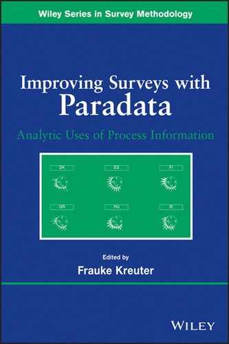
Shewhart’s original graphical data display probably looked similar to the control charts in Figure 9.1 (sometimes called a Shewhart chart or process behavior chart). Figure 9.1 uses hypothetical data to demonstrate monitoring the measurement process KPI “average interview duration”. This particular combination of two charts is sometimes called an ![]() and s chart, because the upper chart plots the means of a continuous variable (
and s chart, because the upper chart plots the means of a continuous variable (![]() ) and the lower chart plots the standard deviation of that variable (s). Figure 9.1 is a prototype provided to introduce SPC terminology. Other charts are discussed throughout the chapter, including charts for categorical data and data that are not plotted over time. The figure has been annotated to explain components of the control chart.
) and the lower chart plots the standard deviation of that variable (s). Figure 9.1 is a prototype provided to introduce SPC terminology. Other charts are discussed throughout the chapter, including charts for categorical data and data that are not plotted over time. The figure has been annotated to explain components of the control chart.
FIGURE 9.1 Example process control chart of average interview duration and the standard deviation of interview duration. Created from hypothetical data and does not represent any real production process.
The (![]() ) control chart is essentially a time series plot with additional features. The time series in this example is the “average interview duration at each day” in a hypothetical field period, displayed as individual data points (dots) for each day of data collection connected with dark solid lines. In application, this time series would come from the active process of a live data collection operation in which data are being monitored in real time, or as close to real time as possible. The process average is the thin gray horizontal line at the center of the chart, and it comes from a pilot test of the survey protocol or existing data from past periods of data collection. It is the average of daily averages in that exploratory phase or previously collected data, and is a fixed value against which new data are compared. In this hypothetical example, the process average from earlier data is just over 60 min and the upper control limit is around 90. These values serve as guideposts against which data from the implementation phase are plotted.
) control chart is essentially a time series plot with additional features. The time series in this example is the “average interview duration at each day” in a hypothetical field period, displayed as individual data points (dots) for each day of data collection connected with dark solid lines. In application, this time series would come from the active process of a live data collection operation in which data are being monitored in real time, or as close to real time as possible. The process average is the thin gray horizontal line at the center of the chart, and it comes from a pilot test of the survey protocol or existing data from past periods of data collection. It is the average of daily averages in that exploratory phase or previously collected data, and is a fixed value against which new data are compared. In this hypothetical example, the process average from earlier data is just over 60 min and the upper control limit is around 90. These values serve as guideposts against which data from the implementation phase are plotted.
The lower (s) chart in Figure 9.1 has a construction parallel to the upper (![]() ) plot, but shows the standard deviation of the process. A chart plotting the range of values instead of the standard deviation can be used if the calculations need to be done by hand or if the staff using the charts cannot be trained to understand a standard deviation. A measure of variability, whether standard deviation or range, is an essential part of modern control charts because they are used together with the
) plot, but shows the standard deviation of the process. A chart plotting the range of values instead of the standard deviation can be used if the calculations need to be done by hand or if the staff using the charts cannot be trained to understand a standard deviation. A measure of variability, whether standard deviation or range, is an essential part of modern control charts because they are used together with the ![]() chart to monitor the process average and overall process stability (Wheeler, 2004).
chart to monitor the process average and overall process stability (Wheeler, 2004).
The best chart for a given situation depends on the KPI measured and plotted. For example, the y-axis in the ![]() chart in Figure 9.1 is appropriate for a continuous KPI, while a categorical KPI, such as the proportion of items completed, or proportion of units failing a quality control test would warrant a p chart with a different y-axis. Thus the operational definition of the KPI and its level of measurement (e.g., categorical, continuous, or count) defines the specific type of chart to be used. An example of a control chart with a categorical KPI is shown later in the chapter. This chapter also contains an example of a control chart that does not include a plot of variability for each subgroup. See the Appendix for guidelines for selecting appropriate control charts.
chart in Figure 9.1 is appropriate for a continuous KPI, while a categorical KPI, such as the proportion of items completed, or proportion of units failing a quality control test would warrant a p chart with a different y-axis. Thus the operational definition of the KPI and its level of measurement (e.g., categorical, continuous, or count) defines the specific type of chart to be used. An example of a control chart with a categorical KPI is shown later in the chapter. This chapter also contains an example of a control chart that does not include a plot of variability for each subgroup. See the Appendix for guidelines for selecting appropriate control charts.
The x-axis in a control chart is determined by a relevant time scale for the process. This time scale selection is critical for quality control. Groupings on this x-axis facilitate the identification of special cause variation (i.e., variation beyond that which is expected as a natural part of the process), and intervention. For example, the metric “days-in-field” is reasonable if data can be reviewed and acted on daily. The SPC concept of rational subgrouping says that rational data groupings should maximize between-group variability and minimize within-group variability when the process is in control, thus making special cause variation more evident when the process is not in control. Smaller subgroups increase the sampling variability of observations and may introduce sampling error. One rule of thumb is to ensure at least five observations per subgroup, but Wheeler (2004) provides evidence that smaller subgroup sample sizes have an impact on detecting small shifts in a process, but not large shifts (see Section 10.1 in Wheeler, 2004). A standard deviation cannot be calculated for a sample size of one, so some statistical programs will not plot any point on the s chart in such an instance. Control charts exist for subgroups of size 1, for example, if individual observations need to be tracked over time (see Figure A.1).
Obtaining and displaying the data can be considered two distinct steps (see Wheeler, 2004, Chapter 6 for a discussion of rational subgrouping). For example, a sampling plan for KPIs based on CAPI keystroke paradata might capture the paradata and plot them as they are transmitted back to the survey’s central database daily, or instantaneously during the survey field period.1 Rational sampling and rational subgrouping are used together in quality control and assurance programs with control charts and other visual quality control displays. In addition to maximizing between-group variability and minimizing within-group variability to identify special cause variation, the data should be displayed in such a way that intervention is possible when special cause variation is seen. Not all rational subgroups are time based, as will be demonstrated with an ANOM chart, but traditional control charts require time-based rational subgroups (Montgomery, 1985).
The control limits (dotted lines bounding the process average) in the upper chart are the operationalization of the expected natural variability in process data, and are based on the same exploratory data that determines the process average. Both the process average and control limits are used in an implementation phase to judge whether the active process is in control. For example, a point falling above or below the control limits is an indication that the process may not be operating in as expected. More detailed rules for making that judgment are discussed in Section 9.3.2. Control limits are sometimes called “the voice of the process” (Scherkenbach, 1986), because they come from data about the process itself, as opposed to specification limits, which are arbitrary and referred to as “the voice of the customer.” Statistically, they are three standard deviations from the process average, taking into account sample size in the live data collection during which the chart is used, and are thus commonly referred to as 3σ (read as three sigma) limits. Specification limits are either technical specifications or other quantitative specifications that have been judged by a designer, stakeholder, or other “customer” to be important goals for the process, (e.g., the 60% response rate rules of thumb for publishing in some academic journals, or the 80% response rate standard required by the of U. S. Office of Management and Budget for all government survey; see U.S. Office of Management and Budget, 2006). They are not based on empirical information about the process, as are control limits, so they do not provide an estimate of the as process behavior to expect. Neither type of limit is essentially better than the other, but control limits are overwhelmingly preferred to specification limits for controlling a process. Some quality control experts argue strongly and convincingly against the use of specification limits at all (Deming, 1982; Wheeler, 2004). In the tradition of SPC, this chapter focuses on empirical control limits.
There are rules for determining whether or not a process is in control. One rule for identifying special cause variation in the process is whether a single point falls outside of the 3σ limits. By that rule, a quick glance at Figure 9.1 shows special cause variability on day 7. The cause of that data point is not common to the rest of the data points, and thus further exploration is warranted to find out exactly what happened. All the other data points plotted in Figure 9.1 are caused by variation common to the process itself. Exploring them further would not produce any insights about problems with data collection activities.
Shewhart originally referred to control limits as “action limits” and special cause variation as “assignable cause” offering some insight into the relationship between the two (Wheeler, 2004). The term “assignable cause” (sometimes called “attributable cause”) means that a specific, documentable source within the operations that accounts for a specific point falling outside control limits can be isolated. In survey data collection, this can be the improper application of protocols, a glitch in the computerized interviewing software, or other technical or human problems. For example, the data for day 7 in Figure 9.1 might include a newly trained interviewer who misunderstood the survey protocols and skipped an entire section of the questionnaire in all of his or her interviews, thus driving down the subgroup average for that day. Alternatively, imagine a problem in the CAPI software, data transmission, or KPI calculation that cut many of the interview durations in half on that day only. This data point could also be due to natural events (e.g., thunderstorms that affected interviewer work), but the true assignable cause cannot be known without further exploration into the data produced on day 7. To determine the cause, the manager or supervisor would look for reasonable evidence of the suspected cause by retracing the data stream, talking with interviewers, or even by conducting follow-up interviews with the affected respondents. Each of these is a way to gather more information about the data points that make up that subgroup’s mean. Depending on the data collection rules and the specific assignable cause identified, data from that day or from that interviewer may be reviewed and removed from the deliverable data file, or the data may simply be removed from the control chart for the purposes of monitoring control. In all cases, evidence of special cause variation, as displayed in the chart, should prompt a manager to take immediate action to determine the source or sources of the variation.
Numerous control charts and related visual displays are available in any SPC or control chart software program, but only a few are highlighted in this chapter. Charts may be created with rational subgroups of one observation (e.g., XmR charts), essentially plotting individual points over time (see Ryan, 2000; Wheeler, 2004, Chapter 5). See Figure A.1 in the Appendix of this chapter for a description of the various kinds of charts available and how to choose which to use. In addition to control charts described in this chapter, there are other graphical SQC techniques that managers may use to control KPIs. The ANOM chart looks much like the control chart, but the rational subgroups are not time based. The chart compares each subgroup’s average or proportion to the average or proportion of all subgroups with a rationale similar to analysis of variance. The groups on the x-axis could be interviewers, states, or other categorical variables, and the limits are referred to as decision limits using alpha levels identical to statistical test alpha settings. Examples of both control charts and ANOM charts are shown later in this chapter.
9.3.1 Understanding a Process: Impediments to Clear Quality Control Steps
A thorough quality control and assurance effort seeks to understand what the process looks like in a state of control with all assignable causes of variability removed. If an in-control state cannot be established for the process, special causes will not be accurately identified when the chart is used in practice, resulting in over- or under-identification of real problems. An important part of understanding a process is the physical verification of contributions to special cause variation seen in a chart. A point can fall outside 3σ limits for a number of reasons. If the true reason is not discovered, one cannot be certain whether the point was a violation of protocol, a technical glitch, some other aberration, or a rare but legitimate value. Without such detailed qualitative information, it is not clear whether the point came from the process being measured or from a different process.2
This can be a particularly daunting and confusing task for managers and researchers monitoring processes that are not well defined or have not yet been empirically evaluated. A poorly defined process will lead the researcher or manager in circles trying to determine whether aberrant points are erroneous. If the process is conceptually and procedurally well defined, but the data have never been reviewed empirically, exploring the process with a control chart may reveal that the KPI is produced by more than one process. For example, the pace of an interview, though quantifiable as a single time series in a chart, is actually determined by at least two related but unique underlying processes: the interviewers’ rate of speech and the respondents’ rate of speech. Similarly, data collection modes (face to face vs. phone) can be thought of as different processes not just because they have different technical and interpersonal features but because their expected durations will be different (i.e., phone interviews have shorter durations than face-to-face interviews on average). In complex operational settings like large-scale survey data collection, multiple underlying processes often work to produce a single, quantifiable KPI. Organizational structures, differences in staff training, regional differences in case assignments, and many other contextual features may all feed into one KPI, like interview pace or item nonresponse rate. Various rules exist for identifying control chart patterns that can indicate the mixing of multiple processes in a single process average (see Montgomery, 1985; Wheeler, 2004; SAS Institute, Inc., 2010).
Entangled processes can sometimes be separated by measuring them independently. For example, interviewer pace and respondent pace could be separated by taking more refined measurements of each value independently, setting time stamps on the words spoken by the respondent and interviewer separately. When prior wave paradata are used, physically separating processes at the point the data are recorded may not be possible. Thus, it is helpful to know if there are likely to be multiple sources of variability in the data. The geographic clustering of survey interviewers and respondents in face-to-face data collection (Schnell and Kreuter, 2005) is a known example of the mixing of multiple processes in one outcome. When sources of variation are known, statistical techniques can be used to model the process data before they are charted to remove the influence of undesired sources of variation in the process average and bounds and protect against increasing false negatives and false positives in the use of the chart. Such adjustments produce a process average that is comparable across the rational subgroups in the control chart, and control limits that will accurately flag special cause variability. Multilevel models are one approach to handling multiple sources of variation in process data (Rodriguez, 1994), but an approach based on cluster analysis is demonstrated.
9.3.1.1 Data Structures for Control Charts
Charts used in quality control and assurance are designed to monitor very specific processes, so the structure of the data need to be synchronized with the goals of the quality assurance program. For example, the reader can imagine Figure 9.1 coming from either an interview level or interviewer level data set. The chart simply needs to accurately reflect the sources of variation that contribute to the process. A mis-specified or mis-modeled process can lead to control limits that are either too wide or too narrow, thus over-producing or under-producing signals of special cause variation (i.e., producing false positives and false negatives). Choosing to include all interviews from all interviewers and cases without statistical adjustment might be a misleading way to present the process. In addition to possibly producing incorrect control limits, the data might not be displayed at a level of sufficient detail to facilitate intervention and assignment of causes. Another way to think of process control is the stability of an individual interviewer’s performance over time. In that case, a chart like Figure 9.1 would only contain data from a single interviewer. It may also be appropriate to use other types of charts in conjunction with control charts, like ANOM charts to compare rational subgroups that are not time measures (e.g., groups of interviewers). Such an example with real data is shown in the Section 9.5.
The examples in this chapter use interview time measures that are calculated from question-level time stamps, but “interview start time” and “interview end time” are all that is needed to calculate “interview duration” for each interview and reproduce the chart in Figure 9.1. If interviewer and sample unit ID numbers are in the data file, then individual interviewers can be identified when exploring special cause variation. If not, the exploration will be limited to interviews. Such detailed data are not required to produce the chart, but their absence will obscure assignable causes. In other words, managers and quality assurance staff require the ability to “drill down” into the chart data to further research potential assignable causes.
A wise paradata chart creator will think through the issues discussed here before developing and using a chart, and there are many helpful guides cited in this chapter (Montgomery, 1985; Wheeler, 1993; Ryan, 2000; Wheeler, 2004; Burr, 2005; SAS Institute, Inc., 2010). Previous attempts to apply control charts to survey data collection (Biemer and Caspar, 1993; Sun, 1996; Morganstein and Marker, 1997; Reed and Reed, 1997; Pierchala and Surti, 2009; Corsetti et al., 2010; Hefter and Marquette, 2011; Peng and Feld, 2011) or other settings in which human actors are the objects of quality control (Carey and Lloyd, 2001; Woodall, 2006; Hanna, 2009) should also be reviewed to assist control chart developers. Working with the wrong charts leads to incorrect or confused inferences about control of the process and the efficiency of the overall data collection system. If charts do not lead to quality control actions, time and money will be wasted in their development.
9.3.2 Rules for Finding Special Cause Variation in a Control Chart
If a chart has accurate empirical limits against which its control can be judged, how do we identify threats to the process control? The term “out of control” is loosely used, to refer to a process that yields data that either fall outside of control limits or show systematic variation within control limits. Conversely, an in-control process is one in which all variation comes from a common cause, the natural variability in the process. The phrase “out of control” does not mean that it is operationally disorganized, that is running amok, or cannot be contained (as a runaway car can be said to be “out of control”). Some processes that are statistically “out of control” may actually be severely chaotic, but this is not necessarily the case. One outlying case beyond 3σ defines a process as out of control, and triggers a control alert that leads to review by a manager. It may be found to be an idiosyncratic outlier or problem with the measurement (e.g., a typing error when recording a response in CAPI). Sometimes, an outlying case will be a legitimate value with no assignable cause, because 3σ limits purport to catch about 99% of acceptable process data. Due diligence investigating observations that have potential assignable causes is as much a cornerstone of quality control with SPC as the 3σ limits used to identify them.
A subgroup mean or proportion being above or below control limits is Shewhart’s original rule for detecting special cause variation (Shewhart, 1931). Other detection rules have been developed since then. The Western Electric Zone Tests (National Institute of Standards and Technology; Western Electric Co., Inc., 1956) are four basic rules for detecting special cause variation based on 1σ, 2σ, and 3σ zones around the process average control charts. They are:
The first rule identifies excessive variation that is likely due to a single dominant assignable cause (e.g., weather that affects production on 1 day only). The other three rules indicate that a shift in the process average may have occurred.
There are also two rules proposed by Western Electric (1956) for detecting trends in process data:
The quality control literature describes a variety of detection rules that are slight modifications of these predominent rules including: a trend of seven or eight consecutive points running up or down; one or more points near a warning or control limit; “an unusual or nonrandom pattern in the data” (Montgomery, 1985, p. 115); individual points or a short series of points consecutively alternating above and below 1σ, 2σ, or 3σ limits on either side of the process average; several consecutive points at the same (or nearly the same) value without a change in direction; 15 or more points falling within 1σ of the process average; eight or more points in a row falling on both sides of the central line beyond 1σ from the process average; and 10 of 11, 12 of 14, 14 of 17, or 16 of 20 points in a row on the same side of the process average (see Wheeler (2004), p. 136 for a discussion of these rules, their application, and critiques).3
Montgomery (1985) also advises that a series of points falling too close to the process average, even if seemingly random around it, can be a sign of having too many sources of variability feeding into the plotted process. A process like this looks stable and in control, and a naïve interpretation of such a pattern would be to not explore the process further because it is in control by primary detection rules. However, if the specific process of interest is not isolated in the chart because it is mixed with other processes, then the combined variability will make it very difficult to accurately detect signals of special cause variation. In other words, true special cause variation in one process may cancel out true special cause variation in the other process and produce a chart that seems to be in control. This motivates the need for an intensive exploratory phase, which will be discussed in Section 9.4.
Rules for detecting special causes abound, and control chart users need to conscientiously choose which rules to use depending on the types of problems they are trying to detect and the acceptable false negative and false positive rates for their purposes. SAS PROC SHEWHART implements eight detection rules based on the rules discussed above, referring to them as “tests” of special cause variation: (Test 1) one point beyond 3σ, (Test 2) nine points in a row beyond 1σ, (Test 3) six points in a row steadily increasing or decreasing, (Test 4) 14 consecutive points alternating up and down, (Test 5) two of three consecutive points beyond 2σ, (Test 6) four of five consecutive points beyond 1σ, (Test 7) 15 consecutive points on either or both sides of the process average that fall between the central line and 1σ, and (Test 8) eight consecutive points on either or both sides of the process average and no points between the process average and 1σ.4
Modern applications sometimes distinguish between Shewhart’s original definition of “action limits” and other “warning limits”, where warning limits are an indication that the process may go out of control, but no action is taken based on that point alone (e.g., a point between 2σ and 3σ). This can be a helpful distinction in situations where the process develops quickly (e.g., rational subgroups are in minutes or hours) and quick response is needed when an action limit is surpassed, when exploration for assignable causes requires preparation, or when it takes significant effort to stop or adjust the process (e.g., communication runs through multiple chains of command).
The probability of finding special cause variation using 3σ detection limits is based on the first rule alone (i.e., one point beyond 3σ). Thus, using multiple detection rules with a single chart will increase the number of potential assignable causes captured, but it will also increase the probability of observing false positives. Wheeler (2004) cites evidence from statistical simulations that show using steadily increasing or decreasing points as a signal of special cause variation results in more false alarms than specificity in detecting assignable causes. In application, the number of rules and the σ limits can be set based on economic conditions specific to the process and organization, such as the costs of: researching identified points to assign causes, releasing a product with errors, or remaking the product when units or batches need to be discarded (see Montgomery (1985) for an in-depth discussion of economic optimization of control charts).
Survey managers and methodologists need to decide which rules to apply to their charts, so decisions during production are made easily and systematically without deliberation. Other advanced statistical techniques, like Bayesian models to detect shifts in time series (Erdman and Emerson, 2008) can be applied to quality control and assurance situations. Bayesian methods have also been used to develop empirical quality indices (Lahiri and Li, 2009). Some of these techniques may be particularly useful when process data are very unstable or nonstationary (see Rodriguez (1994), and Chapter 13, this volume).
The task of statistically controlling a process by interpreting control charts with clear rules may seem simple, but creating a meaningful chart with an interpretable process average and control limits that are useful for survey practice can quickly become complex. Without clear steps from goal to control, managers and methodologists risk becoming lost in a mire of operational complexity and uninterpretable data. Section 9.4 describes a set of proposed steps for developing control charts and implementing SPC/SQC with a survey analytic and management focus. In many survey management situations, basic control charts like Figure 9.1 simply do not apply or at least need to be modified, so variations of control charts are addressed in Section 9.5.
9.4 IMPLEMENTATION STEPS FOR SURVEY ANALYTIC QUALITY CONTROL WITH PARADATA CONTROL CHARTS
Simply creating control charts or other graphical paradata displays with data at hand and using them to manage a survey will not effectively control a process. Some very important developmental steps need to be taken before paradata-based charts are used for real time management and control of a process. Two steps that required for a complete SQC/SPC program should be clearly distinguished from each other. The first is an initial process exploration phase which is concerned with understanding the data and the process(es) that produce it. The process control and quality assurance implementation phase, in which control charts and related paradata visualizations are used, comes only after completing several explicit steps in the exploration phase. The steps proposed are common to SPC and SQC programs in other fields (Montgomery, 1985; Ryan, 2000), and apply to any KPI or set of KPIs that are the focus of a quality control program. The goal of the exploratory phase is to understand the process and extract quantitative and qualitative information about it. Selected KPIs are evaluated with statistical and nonstatistical techniques, but without using the information gained for direct quality control purposes which will come later. This phase should demonstrate that the process is stable and repeatable, and provides the average, standard deviation (or range), and control limits that will be used in the control charts created in the implementation phase. Qualitatively, this phase provides concrete examples of assignable causes and a holistic understanding of the process from start to finish, including the source and flow of data streams that provide data for the chart, staff roles and actions that might support or impede process control, and expected and realized operational protocols. An understanding of the entire process will be essential in the process control implementation phase. Three general steps to follow in the process exploration phase are outlined below.
The final control limits and process average that result from the exploratory phase serve as the expected performance bounds for the process and are carried forward into the process control implementation phase. The process range or process standard deviation comes forward, as well. A control chart used in practice will have control limits and a process average that do not change when new data are collected. When applied, the average of the rational subgroup (i.e., each time point on the x-axis) is plotted on a chart containing the expected process average and control limits from the exploratory phase. The pattern of those subgroup means are judged relative to the process average and control limits to determine whether the system is maintaining control. In practice, after the production phase begins, there are only two reasons control limits are recalculated: (1) a change in the operational process is known to occur (e.g., new protocol, new staff, a new interview), so that the expected process average and variability will be different, or (2) a sustained process shift is observed in the chart and attributed to a legitimate cause like those listed above. Otherwise, the limits serve as fixed standards against which new process data are compared. Results of a process exploration phase and ideas for implementing a paradata-based quality control program using control charts and related graphical paradata displays are discussed further in Sections 9.5 and 9.6.
9.5 DEMONSTRATING A METHOD FOR IMPROVING MEASUREMENT PROCESS QUALITY INDICATORS
This demonstration summarizes the results of a process exploration phase and proposed chart implementation steps focusing on interview pace and item nonresponse rate. These KPIs are calculated from CAPI paradata collected as keystroke files, time stamps, and non-substantive survey responses (e.g., “don't know” and refused responses) for individual survey questions recorded as part of the data collection for the National Health Interview Survey (NHIS)5. We use paradata from the sample adult module, which is one of four modules in the NHIS instrument. Paradata from 36 months of NHIS data collection (January, 2008--December, 2010) comprise the dataset used in the examples below.
Face-to-face interviewers employed by the U.S. Census Bureau work from their homes and are managed by supervisory staff who either work from home or from Regional Offices (ROs) around the country.6 Interviewers administer in-person and telephone interviews on laptop computers programmed with Blaise survey interviewing software. This demonstration is just one example of how paradata can be used for quality control and assurance as part of a broader survey analytics program. The two indicators we discuss (interview pace and item nonresponse rates) have implications for overall survey data quality.
Interview pace has implications for data collection costs and data quality. Interviews that take longer than average will cost more and may obtain more unit or item nonresponse if individual items are skipped due to length or if the interview is terminated due to the slow pace (Olson and Peytchev, 2007). Overly brief interviews, on the other hand, could indicate that an interviewer is not asking all the questions, not reading the questions as written, or even falsifying data, each of which could lower data quality. Quick interview pace can also be an indicator of shallower question processing by respondents (Ehlen et al., 2007). Interview pace7 in the sample adult module was operationalized as the number of seconds per question and calculated by dividing the total number of seconds for the adult module by the number of questions asked. The number of questions asked can vary across respondents, and this was taken into account in the calculation of interview pace.
Item nonresponse is another major component of data quality. Item missing data requires a data user to ignore cases in an analysis, or to perform imputation before analyzing the data. Both options complicate analyses and risk errors in inference, so many surveys try to minimize missing data in the interview phase. The examples focus on item nonresponse to a question asking for whom the respondent works, and operationalize it as the presence of either a “don’t know” response or refusal to provide an answer. Item nonresponse rate is calculated as the number of “don’t know” and refused responses divided by the number of respondents who were asked the question.
The figures that follow demonstrate one potential application of control charts and ANOM charts for evaluating quality control and assurance using SPC and SQC principles. Benefits and limitations of the different techniques demonstrated are discussed as well. In addition to the results of an exploratory phase, specific charts and a procedure for their review are proposed. January, 2008--November, 2010 serve as the prior process data for the demonstrated process exploration phase.
All of the data presented here were first processed with a statistical clustering technique to separate geographic variation in the KPIs from other sources of variation. As a first step in that clustering, a variable reduction procedure was used to select variables from the U.S. Census Bureau’s Planning Database (PDB; see Bruce and Robinson (2006) for a description of the PDB). This database has been used to create the Census Bureau’s Hard-to-Count (HTC) score (Bates and Mulry, 2011). The resulting list of PDB variables used in this second step included: tract-level percent Hispanic, Asian, Native Hawaiian or Pacific Islander, and White, the percent of buildings with two or more units, the percent of people living below the poverty level, the percent of vacant housing units, the percent of the population under age 18, and the percent of linguistically isolated households.
The selected variables were then used to group Census tracts into clusters within each Regional Office (RO) using a k means clustering procedure, so that each tract was in a single cluster within an RO. Interviewers sometimes work in more than one tract, so they could appear in more than one chart when charts are created at the tract level as they are in this demonstration. Interviewers do not generally work in multiple ROs at the same time (see Sirkis and Jans (2011) for more details about this procedure).
After clustering, control charts were created for individual clusters within each RO Grouping by RO was performed for two reasons. First, interviewers are managed directly by ROs, presenting a functional boundary for quality control implementation. Second, ROs themselves are also a potential source of variability in KPIs.
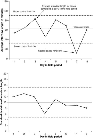
The first step in this SPC/SQC demonstration simulates process control by removing points beyond 3σ limits in a plot of the pace of the adult interview module (in seconds per question). In practice, this would be done by seeking and assigning specific causes to those points and then removing their data but here the data were simply removed to demonstrate the control chart development steps. Figure 9.2 shows an in-control process for adult interview pace for 3 years of NHIS data from one cluster within one RO. In terms of process behavior, Figure 9.2 represents how a practitioner wants the chart to look after an exploratory phase is completed. All subgroup averages fall within the 3σ upper control limits (UCL) and lower control limits (LCL), and the process is in-control, and no tests of special causes are activated in the chart.
FIGURE 9.2 Demonstration example of an in-control process average for adult interview duration. Created from paradata from CAPI (Blaise) audit trail data collected on the National Health Interview Survey (January, 2008--December, 2010).
The time points on the x-axis in this example are months of data collection, and subgroup sizes range from 6 to 194 interviews per month. While the subgroups include data from completed interviews each month, interviewers may appear in multiple subgroups. The lack of independence across subgroups is one limitation of this type of chart for monitoring control at this level, and will be addressed later when discussing solutions and additional charts. The process average ![]() is 8.18 seconds per question, and the process standard deviation varies slightly over subgroups, so a single number cannot be displayed in center line of the s chart. See SAS Institute, Inc. (2010) for details on the standard deviation calculations in this chart. The most noticeable difference between this chart and the example in Figure 9.1 is that the 3σ control limits (i.e., UCL and LCL) are not fixed across subgroups in Figure 9.2. This is because there is a different number of observations in each survey month.
is 8.18 seconds per question, and the process standard deviation varies slightly over subgroups, so a single number cannot be displayed in center line of the s chart. See SAS Institute, Inc. (2010) for details on the standard deviation calculations in this chart. The most noticeable difference between this chart and the example in Figure 9.1 is that the 3σ control limits (i.e., UCL and LCL) are not fixed across subgroups in Figure 9.2. This is because there is a different number of observations in each survey month.
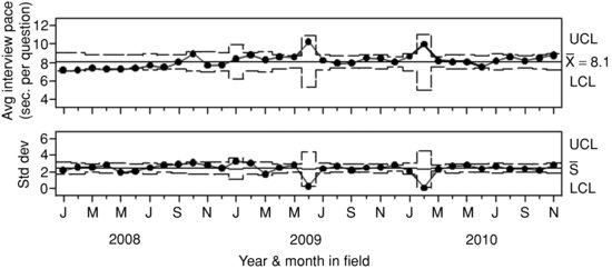
Figure 9.3 simulates a process control phase by applying the empirical process average, process standard deviation and control limits from the exploration phase (Figure 9.2) to “new data” (December, 2010). Using the process average from Figure 9.2 (![]() = 8.1), and control limits established in the exploration phase, the process that includes December 2010 is clearly out of control, violating the 3σ rule (Shewhart’s first rule of process control) for detecting special cause variation. Observing such behavior in practice would lead to drilling down into the nested units within that subgroup to see if the causes of the deviation could be isolated.
= 8.1), and control limits established in the exploration phase, the process that includes December 2010 is clearly out of control, violating the 3σ rule (Shewhart’s first rule of process control) for detecting special cause variation. Observing such behavior in practice would lead to drilling down into the nested units within that subgroup to see if the causes of the deviation could be isolated.
FIGURE 9.3 Demonstration of how an out-of-control point appears when the process average and control limits from the process exploration phase are used to judge new data in the process control implementation phase. Created from paradata from CAPI (Blaise) audit trail data collected on the National Health Interview Survey (January, 2008--December, 2010).
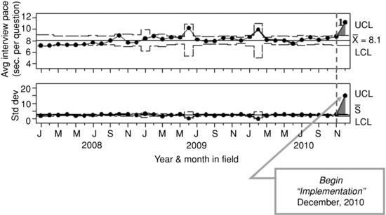
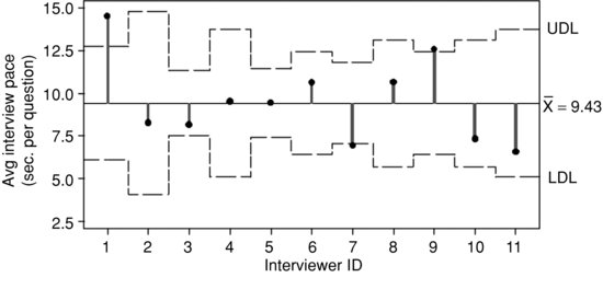
After noticing that the December data puts the process out of control, the second step in the review process is to look at variability in interviewer pace within December 2010. The data in this chart already represent a single RO and cluster (based on the statistical clustering procedure), so the next rational subgrouping of the data is by interviewer. Figure 9.4 shows an ANOM chart with the interviewers who collected data in December 2010. An ANOM chart is conceptually similar to the Shewhart chart, but is used when rational subgroups are nominal categories, such as interviewer ID number. The “control limits” in the chart are referred to as “decision limits” by convention to distinguish them from control limits in Shewhart charts like Figures 9.1, 9.2, and 9.3. Decision limits are interpreted in a similar way as control limits, though the Western Electric Rules that identify patterns in time do not apply because the rational subgroups are not ordered in time. The ANOM chart below compares the average of each interviewer to the overall average with a similar logic to analysis of variance.9 The average duration among these interviewers in December is 9.43 seconds per question.10 If the interview pace for an individual interviewer’s workload exceeds the decision limits (as it does for interviewers 1, 7, and, 9 in Figure 9.4), then that interviewer’s average interview pace is considered statistically different from the overall average. Like control chart subgroups, if the sample size per subgroup is low, the bounds will be wider and observations will be subject to greater sampling error (see Wheeler, 2004, Chapter 10.1 for a discussion).
FIGURE 9.4 Sample adult interview time ANOM chart showing interviewers in December 2010. Created from paradata from CAPI (Blaise) audit trail data collected on the National Health Interview Survey (December, 2010).
Comparing interviewers against an overall average does not tell the whole quality control story. The process average representing each interviewer’s historical performance is also relevant. A manager may want to look at control charts of this embedded process, and identify interviewers that fall beyond the decision limits if the total number of interviewers is so large that reviewing each interviewer is impractical. Alternatively, a quality control program could be developed that begins at the ANOM chart with interviewers as rational subgroups rather than the RO and cluster-level, then drills down to individual interviewer-level control charts if the primary quality control goal is interviewer-level consistency. While these techniques are presented in an integrated step-by-step chart review process, they represent different aspects of quality control and assurance, and could be combined in various ways depending on a survey organization’s needs and quality control goals.
Figure 9.5 shows an example of an interviewer-level control chart for interviewer 7 from Figure 9.4.11 Interviewer 7’s historical interview pace is 6.9 seconds per question, which is coincidentally about the same value this interviewer produced in December 2010. Figure 9.5 shows an interviewer-level process that is almost entirely in-control despite a pace in December that was quick relative to other interviewers that month. Recall that the data were clustered at the tract level to make comparisons within a chart more equitable, but without more information about interviewer 7 and his or her caseload, it can only be said that the process is incontrol, not that the process average is a desirable one. This is one limitation of interpreting control charts. A process’s natural state may not be an ideal state. It is also possible that an interviewer who falls within decision limits in Figure 9.4 has an historical process average that is not in control with respect to his or her process average. This would not be noticed if interviewer-level charts are only reviewed when the interviewer’s monthly value falls outside the ANOM decision limits. These limitations of control chart interpretation and inference highlight the need to match the chart creation and review process to clear quality control goals (e.g., controlling within interviewer variation or within RO variation).
FIGURE 9.5 Sample adult interview pace for Interviewer 7. Created from paradata from CAPI (Blaise) audit trail data collected on the National Health Interview Survey (January, 2008--December, 2010).
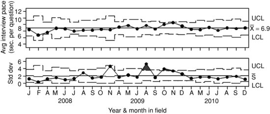
Although the process average is in control, Figure 9.5 shows two points in the standard deviation chart outside 3σ bounds (August and October, 2009). This would lead a user to investigate the data comprising the value for that rational subgroup because the standard deviations of the subgroup averages for those months are higher than expected. A manager should explore those months to be comfortable that the excess variation did not itself represent a problem. For example, two extreme values falling on opposing ends of the measurement scale could average each other out, resulting in an acceptable subgroup average but high subgroup standard deviation.
Lest the reader think that only continuous data can be plotted in a control chart, Figure 9.6 shows a “proportion of non-conforming units” chart or “p-chart” on which is plotted the item nonresponse rate for a question asking for whom the respondent works. This chart could be produced for any item in a survey, and could be produced separately for “don’t know” and refused responses if they are distinguishable in the data. In Figure 9.6 the y-axis is the proportion of “don’t know” responses and refused items together, or the overall item nonresponse rate. The process proportion is 0.034 (i.e., 3.4% of the times the employer question was posed to respondents it was met with “don’t know” or was refused). The chart indicates no potential special cause variability and the process is in control.
FIGURE 9.6 Item nonresponse rate where process is in control. Created from non-substantive responses from the National Health Interview Survey adult module item “WHOWORKFOR” (January, 2008--December, 2010).
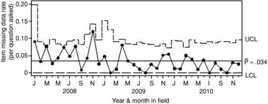
Control charts themselves do not tell survey managers why the process is out of control or in control. They do not determine that a point is erroneous or fraudulent. Only a closer qualitative review can lead to an assignable cause. Managers need to examine other information and talk with the staff involved before drawing a conclusion about the nature of any suspect observation, especially if punitive or corrective actions are the next official steps. A supervisor will probably want to (1) review other paradata and survey responses for the points in question; (2) discuss the points in question with other field managers involved; (3) speak with the interviewers who conducted the interviews; or (4) conduct follow-up interviews with respondents from the interviews in question, if possible. The review will involve formal and informal conversations with staff, reviewing data in a survey control system or dashboard (Mitchell et al., 2011), making use of simple ad hoc tables and lists, or a combination of these techniques. If the investigation explores the source of the process anomaly until an assignable cause can be attributed to the observation, it will produce insights into the individual actions that produces the KPI and solutions to the avoid similar problems in the future. If users abandon these practices and the overarching control chart approach, evaluation efforts may become a fishing expedition or arbitrary application of cutoff rules, resulting in wasted time and effort, and possibly data of lower overall quality because legitimate data will be flagged as problematic and removed.
9.6 REFLECTIONS ON SPC, VISUAL DATA DISPLAYS, AND CHALLENGES TO QUALITY CONTROL AND ASSURANCE WITH SURVEY ANALYTICS
While this chapter presents one approach to quality control and assurance based in SPC and SQC, practitioners should think creatively about how to apply graphical paradata displays to their own paradata-based data quality needs. As long as charts are actionable, identify meaningful trends, benchmark against known and reasonable (preferably empirical) standards, highlight variability, and identify outliers or other tangible units with extreme values that can be reviewed, they should produce clues about causes of problems in the data collection system. Each of these features also happens to be an attribute of the traditional control chart. Consequently, readers may find it advantageous to consider KPI displays grounded in SPC and SQC theory and techniques in order to reap the benefits of these approaches, (see Wheeler (2004) for a statistical but accessible review, or Wheeler (1993) for a lighter review). To add to our the examples, two alternative paradata displays demonstrate quality assurance tools that do not use control charts: a simple line chart using a static benchmark, and a Pareto plot.
Using survey sponsors and data user expectations as a “voice of the customer” can make a simple chart more actionable and meaningful when the “voice of the process” is not available or is not the most important benchmark against which to judge the process. For example, the 80% response rate required by the U.S. Office of Management and Budget (2006) for U.S. federal government surveys is one example of a customer’s voice. The 80% response rate standard doesn’t reflect the active data collection, but is an a priori quantifiable goal for judging the goodness of survey data collection efforts. Some surveys may never reach 80%, while some will always reach far beyond 80% depending on the target population, mode, and available resources. Process control experts advise using strong quantitative information to inform process control and quality control standards (Deming, 1982; Wheeler, 1993). Yet, Figure 9.7 with its horizontal benchmark for the OMB specification and vertical line on the day at which that benchmark was reached is slightly more useful than a line chart with no reference. If an 80% cutoff is the only standard, we could have stopped data collection on day 8 or 9 and save the money that was spent on reaching the hardest to reach respondents.
FIGURE 9.7 Cumulative response rate by day in field with specification benchmark based on regulatory requirement. Created from case disposition paradata collected as standard procedure for the Current Population Survey. Months presented are November, 2011--January, 2012.
Shewhart advises quality managers to view process data in time when time is meaningful, but the Pareto plot (Figure 9.8) is another cornerstone of quality control. The plot is named for the “Pareto Principle” or “80/20 Rule” which asserts that 80% of the problems in a given context come from only 20% of the potential causes. This chart is helpful when determining the most frequent operational problems and the proportion of problems accounted for by each category. Face-to-face noncontact reasons are one such situation.
FIGURE 9.8 Pareto plot of personal visit noncontact reasons recorded in CHI. Created from Contact History Instrument (CHI) paradata collected as standard procedure for the Current Population Survey. Data presented in this chart are from November, 2010--January, 2011.
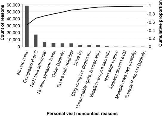
The Pareto plot is a simple histogram of the frequency (or percent/proportion) of a categorical KPI sorted by the relative frequency of each category from highest to lowest. For example, Figure 9.8 shows reasons for not obtaining contact with a household member on each contact attempt. A cumulative percent line is plotted above the histogram giving the user a quick view of both the proportion of instances in each category and the cumulative proportion. The chart has the benefit of quickly and clearly showing what the biggest noncontact problems are so methods can be devised to counteract them.
9.7 SOME ADVICE ON USING CHARTS
Making charts is only the tip of the survey management iceberg. Using them efficiently in practice involves clearly explaining the displays and their use to managers, so that they are not intentionally or unintentionally misused. Successful implementation also involves giving management staff time and resources to explore and document potential special cause variation and other problems. This is not a luxury but a requirement of sound quality control practice. Implementation challenges can be reduced by developing a clear, concise, and integrated quality control process. Such a process can be a simple set of steps like those outlined here, or a sophisticated automated survey analytics dashboard based on a paradata warehouse that merges multiple survey control systems. Clarity of purpose and ease of use are more important than the mode of delivery, or the technical sophistication of the system. If managers have all the charts needed at hand, they can work efficiently to research and identify aberrations in the process, and use that information to maintain process control.
Besides paradata charts, there are many other ways to adjust and control processes. In the absence of, or in addition to visual displays, quality control and assurance improvements can be achieved by implementing strategically designed experiments using common research designs and statistical testing techniques. Experiments are sometimes preferred over control charts if a process is not well understood, or if there are clear opportunities for major improvements in quality assurance such as changing a data collection protocol or interview training program, redesigning a questionnaire, or introducing a new piece of technology that makes the interviewer’s job easier (Western Electric Co., Inc., 1956; Templin, 2009). When large changes like these can be tested in randomized experiments, they may be a better use of researchers’ time and effort than creating control charts and applying other SQC techniques because of the degree of quality improvement that can be gained for the amount of effort expended in research. Many survey data collection processes that have room to improve their levels of quality control and assurance fit this profile.
Finally, context matters. A chart made for upper management to intervene with surveys as whole units will be different from a chart designed for field supervisors to intervene with individual interviewers. No single chart can meet all survey quality control and assurance needs, particularly in larger survey operations with many moving parts. Yet, all the charts in the world, thoughtfully designed by world-renowned quality control experts, will not overcome an organizational culture that is not ready and willing to accept them (Deming, 1982; Ishikawa and Lu, 1985). Even if a manager can overcome technological and institutional data access barriers to create a chart, the insights gained may conflict with commonly held beliefs about the organization’s data quality. This alone can be a roadblock to quality improvement.
A proactive organization accepts the need for change, conducts quality control and assurance analyses, makes changes based on the results, and institutionalizes a recursive practice of evaluation and adjustment as part of its core philosophy. Such a cycle of improvement is found in all quality control approaches (Deming, 1982; Scherkenbach, 1986). Any organization, large or small, can become proactive by asking itself
Answers to these challenging questions put an organization’s purpose and attitude in sharp focus. The answers are not simple, and should be carefully deliberated so that the organizational culture is primed for deep, honest, and the sometimes image-threatening insights that paradata analysis and SPC/SQC can produce. A Deming anecdote summarizes how a lack of organizational clarity about the priority of KPIs can complicate the mission of rank-and-file staff, risking overall efficiency and product quality. Imagine a scheduling clerk named Christine, whose job closely parallels that of a survey interviewer.
“She must take 25 calls per hour. She must be courteous…She is continually plagued by obstacles: (a) the computer reports no information, whereupon she is forced to use [physical] directories and guides. Christine, what is your job? Is it: To take 25 calls per hour? Or to give callers courteous satisfaction?…It cannot be both.” (Deming, 1982 p. 73)
Survey managers and survey methodologists need to determine the key performance indicators for their staff in order to avoid similar confusion about interviewers' job priorities. In parallel, methodologists and managers must find insightful uses of paradata that shed light on data collection processes and systems. If history is a guide, these complementary endeavors will secure the future of cheaper, better, and more efficient surveys.
If control charts and SPC/SQC concepts are so directly applicable to surveys, why haven’t they been applied more often? The technical terminology and unique statistical calculations required to produce control charts may make them inaccessible to people without statistical training, and sometimes even to people with statistical training. Yet, the control chart was developed and has been refined to be used by factory workers with less than a high school education while working on fast-moving production lines. Several pioneering survey methodologists have documented the possibility of using SPC/SQC techniques in survey data collection (Biemer and Caspar, 1993; Morganstein and Marker, 1997; Reed and Reed, 1997; Corsetti et al., 2010), but the techniques do not seem to have been regularly adopted except in a few documented cases (Mersch et al., 1990; Sun, 1996; Pierchala and Surti, 2009; Peng and Feld, 2011; Hefter and Marquette, 2011), and some of those involve clerical processing or data editing. For many data quality control concerns, SPC/SQC techniques could be a large part of a practitioner’s toolbox, and a rewarding line of research that improves our field of practice. With burgeoning paradata applications in survey methodology and analytics, we believe that opportunities to apply these techniques more fully will only increase.
APPENDIX
Table A.1 Other Types of Charts Used in SPC and Their SAS Statement in PROC SHEWHART
| Chart | SAS Statement | Use and Benefits |
| Histogram | proc capability; histogram; | Distribution analysis as first step in process exploration |
| Cumulative density (CDF) | proc capability; cdfplot; | Distribution analysis as first step in process exploration |
| Normal probability plot | proc capability; probplot; | Distribution analysis as first step in process exploration |
| Run charts | proc shewhart; boxchart; | Initial exploration of a process using rational subgrouping |
| Box chart | proc shewhart; boxchart; | Explore potential rational subgroups |
| Pareto plot | proc pareto; | To see where most problems come from, when problems can be categorized |
| Cumulative sum chart (CUSUM) | proc shewhart; xchart; | Good for monitoring small-to-moderate deviations in measurement data |
FIGURE A.1 Guide to selecting the right control chart. Adapted from SAS Institute, Inc. (2010).
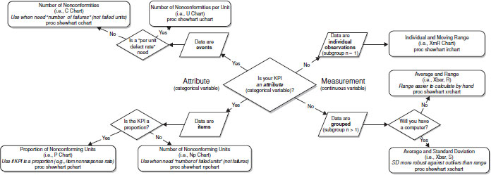
ACKNOWLEDGMENTS
Most of this work was completed when the first author was employed by the U.S. Census Bureau. Any views expressed are those of the authors and not necessarily those of the U.S. Census Bureau. The authors thank, Cat Truxillo (SAS, Inc) for her introduction to SPC and continued guidance, James Dahlhamer and Renee Gindi NCHS for their intimate involvement in the development of this chapter, and their internal reviewers, including Chandra Erdman (who provided Figure 9.7) and Paul Marck for sharing his knowledge of SPC.
REFERENCES
Bates, N. and Mulry, M.H. (2011). Using a Geographic Segmentation to Understand, Predict, and Plan for Census and Survey Mail Nonresponse. Journal of Official Statistics, 27(4):601–618.
Benneyan, J.C., Lloyd, R.C., and Plsek, P.E. (2003). Statistical Process Control as a Tool for Research and Healthcare Improvement. Quality and Safety in Health Care, 12:458–464.
Biemer, P.P. and Caspar, R. (1993). Continuous Quality Improvement for Survey Operations: General Principles and Applications. In Proceedings of the Joint Statistical Meetings. http://www.amstat.org/sections/srms/proceedings/papers/1993_006.pdf.
Brackstone, G. (1999). Managing Data Quality in a Statistical Agency. Survey Methodology, 25(2):139–149.
Bruce, A. and Robinson, G. (2006). Tract-Level Planning Database. Internal Census Bureau Report.
Burr, J.T. (2005). Elementary Statistical Quality Control. 2nd edition, Marcel Dekker.
Carey, R.G. and Lloyd, R.C. (2001). Measuring Quality Improvement in Healthcare: A Guide to Statistical Process Control Applications. ASQ Press.
Chen, T.T., Chang, Y.J., Ku, S.L., and Chung, K.P. (2010). Statistical Process Control as a Tool for Controlling Operating Room Performance: Retrospective Analysis and Benchmarking. Journal of Evaluation in Clinical Practice: International Journal of Public Health Policy and Health Services Research, 16:905–910.
Corsetti, G., Giammatteo, M., and Martini, A. (2010). Monitoring Process and Non-sampling Errors Control in PLUS Sample Survey. In Proceedings of the European Conference on Quality in Official Statistics. http://q2010.stat.fi/media//presentations/session-24/corsetti_giammatteo_martini_q2010_v2_paper.pdf.
Couper, M. (1998). Measuring Survey Quality in a CASIC Environment. Proceedings of the Survey Research Methods Section, http://www.amstat.org/sections/srms/proceedings/papers/1998_006.pdf.
Deming, W. (1982). Out of the Crisis. Cambridge University Press, Cambridge.
Doran, G.T. (1981). There’s a S.M.A.R.T. Way to Write Management’s Goals and Objectives. Management Review, 70(11):35–36.
Dransfield, S., Fisher, N., and Vogel, N. (1999). Using Statistics and Statistical Thinking to Improve Organisational Performance. International Statistical Review/Revue Internationale de Statistique, 67(2):99–122.
Durand, C. (2005). Measuring Interviewer Performance in Telephone Surveys. Quality and Quantity, 39:763–778.
Ehlen, P., Schober, M.F., and Conrad, F.G. (2007). Modeling Speech Disfluency to Predict Conceptual Misalignment in Speech Survey Interfaces. Discourse Processes, 44(3):245–265.
Erdman, C. and Emerson, J.W. (2008). A Fast Bayesian Change Point Analysis for the Segmentation of Microarray Data. Bioinformatics, 24(19):2143–2148.
Fitz-Gibbon, C. (1990). Performance Indicators. BERA Dialogues, Number 2.
Gitlow, H., Gitlow, S. Oppenheim, A., and Oppenheim, R. (1989). Tools and Methods for the Improvement of Quality. Richard D. Irwin.
Groves, M.R., Brick, J.M., Couper, M., Kalsbeek, W., Harris-Kojetin, B., Kreuter, F., Pennell, B.E., Raghunathan, T., Smith, T.W., Tourangeau, R., Bowers, A., Jans, M., Kennedy, C., Levenstein, R., Olson, K., Peytcheva, E., Ziniel, S., and Wagner, J. (2008). Issues Facing the Field: Alternative Practical Measures of Representativeness of Survey Respondent Pools. Survey Practice. http://surveypractice.wordpress.com/2008/10/30/issues-facing-the-field/
Groves, R., Mosher, W., Lepkowski, J., and Kirgis, N. (2009). Planning and Development of the Continuous National Survey of Family Growth. National Center for Health Statistics, Vital Health Statistics, Series 1, 1(48).
Groves, R.M. and Heeringa, S.G. (2006). Responsive Design for Household Surveys: Tools for Actively Controlling Survey Nonresponse and Costs. Journal of the Royal Statistical Society, Series A, 169(3):439–457.
Guterbock, T.M., Lavrakas, P.J., Thompson, T., and ZuWallak, R. (2011). Cost and Productivity Ratios in Dual-frame RDD Telephone Surveys. Survey Practice. http://surveypractice.wordpress.com/2011/04/25/cost-and-productivity-ratios-in-dual-frame-rdd-telephone-surveys/
Hanna, L.A. (2009). The Use of Statistical Control Charts to Monitor and Improve the Management of Education Department Resources. Journal of Nurses in Staff Development, 25(3):118–126.
Hefter, S. and Marquette, E. (2011). Using Statistical Process Control Techniques in the American Community Survey. In Proceedings of the Joint Statistical Meetings. http://www.amstat.org/sections/srms/proceedings/y2011/Files/302182_68002.pdf.
Ishikawa, K. and Lu, D.J. (1985). What is Total Quality Control?: The Japanese Way. Prentice-Hall.
Jenicke, L., Kumar, A., and Holmes, M. (2008). A Framework for Applying Six Sigma Improvement Methodology in an Academic Environment. The TQM Journal, 20(5):453–462.
Juran, J.M. and Gryna, F.M. (1988). Juran’s Quality Control Handbook, 4th edition. McGraw Hill.
Kirgis, N. and Lepkowski, J.M. (2010). A Management Model for Continuous Data Collection: Reflections from the National Survey of Family Growth, 2006-2010. NSFG Paper No. 10-011.
Lahiri, P. and Li, H. (2009). An Adaptive Hierarchical Bayes Quality Measurement Plan. Applied Stochastic Models in Business and Industry, 25:468–477.
Lepkowski, J.M., Axinn, W., Kirgis, N., West, B.T., Ndiaye, S.K., Mosher, W., and Groves, R.M. (2010). Use of Paradata in a Responsive Design Framework to Manage Field Data Collection Report 10-012, June, 2010. NSFG Survey Methodology Working Papers.
Link, M.W. (2006). Predicting the Persistence and Performance of Newly Recruited Telephone Interviewers. Field Methods, 8(3):305–320.
Mersch, M., Gbur, P., and Russell, C. (1990). Statistical Process Control in Decennial Census Industry and Occupation Coding. In Proceedings of the Joint Statistical Meetings. http://www.amstat.org/sections/srms/proceedings/papers/1993_007.pdf.
Mitchell, S., Carley-Baxter, L., Day, O., Peytchev, A., and Sadler-Redmond, S. (2011). Developing Standardized Paradata and Dashboards for Use Across Multiple Surveys. Paper presented at the FedCASIC Workshop, Washington DC.
Montgomery, D.C. (1985). Introduction to Statistical Quality Control. Wiley and Sons, Inc.
Morganstein, D. and Marker, D. (1997). Continuous Quality Improvement in Statistical Agencies. In Lyberg, L., Biemer, P., Collins, M., De Leeuw, E., Dippo, C., Schwarz, N., and Trewin, D., editors, Survey Measurement and Process Quality, pages 475–500. Wiley and Sons, Inc.
National Institute of Standards and Technology. What are Variables Control Charts. In Engineering Statistics Handbook. http://www.itl.nist.gov/div898/handbook/pmc/section3/pmc32.htm.
Olson, K. and Peytchev, A. (2007). Effect of Interviewer Experience on Interview Pace and Interviewer Attitudes. Public Opinion Quarterly, 71(2):273–286.
Peng, D. and Feld, K. (2011). Quality Control in Telephone Survey Interviewer Monitoring. Survey Practice. http://surveypractice.wordpress.com/2011/04/25/quality-control/
Pierchala, C.E. and Surti, J. (2009). Control Charts as a Tool for Data Quality Control. Journal of Official Statistics, 25(2):167–191.
Pujar, S., Calvert, S., Cortina-Borja, M., Chin, R.F.M., Smith, R.A., Cross, J.H., Das, K., Pitt, M., and Scott, R.C. (2010). Statistical Process Control (SPC)—A Simple Objective Method for Monitoring Seizure Frequency and Evaluating Effectiveness of Drug Interventions in Refractory Childhood Epilepsy. Epilepsy Research, 9:205–213.
Reed, S. and Reed, J. (1997). The Use of Statistical Quality Control Charts in Monitoring Interviewers. Proceedings of the Joint Statistical Meetings. http://www.amstat.org/sections/srms/Proceedings/papers/1997_154.pdf
Rodriguez, R.N. (1994). Recent Issues in Statistical Process Control: SAS Solutions using Statistical Modeling Procedures. Proceedings of the SAS Users Group International. http://support.sas.com/rnd/app/qc/papers/spcsugi94.pdf
Ryan, T.P. (2000). Statistical Methods for Quality Improvement, 2nd edition. Wiley and Sons, Inc., New York.
SAS Institute, Inc. (2010). Course Notes for Statistical Process Control Using SAS/QC Software. Developed by Catherine Truxillo. Book code: E1847, Course code: QC92, Version prepared September 27, 2010.
Scherkenbach, W.W. (1986). The Deming Route to Quality and Productivity: Road Maps and Roadblocks. Mercury Press.
Schnell, R. and Kreuter, F. (2005). Separating Interviewer and Sampling-Point Effects. Journal of Official Statistics, 21(3):389–410.
Schouten, B., Cobben, F., and Bethlehem, J. (2009). Indicators for the Representativeness of Survey Response. Survey Methodology, 35(1):101–113.
Shanks, J.M. (1983). The Current Status of Computer-Assisted Telephone Interviewing. Sociological Methods and Research, 12(2):119–142.
Shewhart, W. (1931). Economic Control of Quality of Manufactured Product. van Nostrand Reinhold Co., Princeton, NJ.
Shewhart, W.A. (1939). Statistical Method from the Viewpoint of Quality Control. The Graduate School, the Department of Agriculture.
Sirkis, R. and Jans, M. (2011). Using Statistical Process Control to Understand Variation in Computer-assisted Personal Interviewing Data. Proceedings of the Joint Statistical Meetings. http://www.amstat.org/sections/srms/proceedings/y2011/Files/300484_65051.pdf
Sun, W. (1996). Using Control Charts in Surveys. Proceedings of the Joint Statistical Meetings. http://www.amstat.org/sections/srms/proceedings/papers/1996_024.pdf
Templin, P. (2009). Control vs. Confusion. Industrial Engineer, 41(8):20.
U.K. Office of National Statistics (2007). Guidelines for Measuring Statistical Quality, Version 3.1. http://tinyurl.com/d7daqw2
U.S. Office of Management and Budget (2006). Standards and Guidelines for Statistical Surveys. http://www.whitehouse.gov/omb/inforeg_statpolicy#pr
Wagner, J. (2010). The Fraction of Missing Information as a Tool for Monitoring the Quality of Survey Data. 74(2):223–243.
Western Electric Co., Inc. (1956). Statistical Quality Control Handbook, 2nd edition. Mack Printing Company.
Wheeler, D.J. (1993). Understanding Variation: The Key to Managing Chaos. SPC Press.
Wheeler, D.J. (2004). Advanced Topics in Statistical Process Control: The Power of Shewhart’s Charts. SPC Press.
Woodall, W.H. (2006). The Use of Control Charts in Health-Care and Public Health Surveillance. Journal of Quality Technology, 38(2).
1. Instead of “sampling” per se, all paradata can be used, as we do in this chapter. Sampling from an operational data stream (e.g., random selection of data transferred from interviewers to headquarters, random selection of batches of paper forms being processed) is a solution if resources are limited or if there are obstacles preventing access to all of the data. This reduces the number of cases in the control chart, and thus the number of specic observations that need to be explored in detail when special cause variation is observed. Sampling risks missing problematic cases that occur in the data not sampled and reduces sample size per rational subgroup. A strategically designed random sample that includes important subgroups and data sources, should represent the process adequately enough to catch all types of assignable causes.
2. Wheeler (2004) suggests viewing data in a control chart (or the appropriate chart for the level of measurement and rational subgrouping used) even before the process is fully understood. In fact, an initial control chart with “dirty data” is a good first step in identifying extreme points or patterns to research further in the quest to understand the process thoroughly.
3. These detection rules are meant to find specific process anomalies, such as trends, “stratification” (i.e., including values that are systematically different in a single subgroup), and “mixtures” (i.e., two or more separate underlying processes producing the data in the chart, although each subgroup comes from only one measured processes). We refer the reader to the texts cited here for more explicit discussion, and address these issues as ones of “multiple sources of variation” generally speaking.
4. Test 2 can be further specified to look for 7, 8, 9, 11, 14, or 20 points. Test 3 can be modified to require 6, 7, or 8 points. For a discussion of how these limits are implemented in SAS PROC SHEWHART, see http://tinyurl.com/bo7xevz and SAS Institute, Inc. (2010).
5. The U.S. Census Bureau collects NHIS data for the National Center for Health Statistics (NCHS).
6. At the time of this writing, the U.S. Census Bureau was transitioning from a field force managed out of 12 ROs to six ROs and a management design in which field staff managers (Survey Statistician—Field) work from their homes.
7. “Interview pace” is not the same construct as “interviewer pace.” The latter is the literal speech rate of the interviewer, and the former includes the respondent’s speech rate, response latency, and any other delays that that occur during the interview.
8. The notation ![]() is used for the process average because it is an average of subgroup averages (
is used for the process average because it is an average of subgroup averages (![]() 's).
's).
9. See http://support.sas.com/documentation/onlinedoc/91pdf/sasdoc_91/qc_ug_7312.pdf for details about the calculation of decision limits in SAS proc shewhart.
10. The geographic clustering technique we used resulted in each RO having multiple clusters, so we refer to both RO and cluster in the charts throughout the rest of the chapter.
11. Months with only one case were excluded from the interviewer-level control charts. To calculate the standard deviation chart, there needs to be at least two observations per rational subgroup. If not, control limits will not be calculated. If only one case per subgroup is present, the subgroup should be dropped. If all subgroups have only one observation, an XmR chart can be used (see Appendix).