
15.6 Case Study: Unsupervised Machine Learning, Part 1—Dimensionality Reduction
In our data science presentations, we’ve focused on getting to know your data. Unsupervised machine learning and visualization can help you do this by finding patterns and relationships among unlabeled samples.
For datasets like the univariate time series we used earlier in this chapter, visualizing the data is easy. In that case, we had two variables—date and temperature—so we plotted the data in two dimensions with one variable along each axis. Using Matplotlib, Seaborn and other visualization libraries, you also can plot datasets with three variables using 3D visualizations. But how do you visualize data with more than three dimensions? For example, in the Digits dataset, every sample has 64 features and a target value. In big data, samples can have hundreds, thousands or even millions of features.
To visualize a dataset with many features (that is, many dimensions), we’ll first reduce the data to two or three dimensions. This requires an unsupervised machine learning technique called dimensionality reduction. When you graph the resulting information, you might see patterns in the data that will help you choose the most appropriate machine learning algorithms to use. For example, if the visualization contains clusters of points, it might indicate that there are distinct classes of information within the dataset. So a classification algorithm might be appropriate. Of course, you’d first need to determine the class of the samples in each cluster. This might require studying the samples in a cluster to see what they have in common.
Dimensionality reduction also serves other purposes. Training estimators on big data with significant numbers of dimensions can take hours, days, weeks or longer. It’s also difficult for humans to think about data with large numbers of dimensions. This is called the curse of dimensionality. If the data has closely correlated features, some could be eliminated via dimensionality reduction to improve the training performance. This, however, might reduce the accuracy of the model.
Recall that the Digits dataset is already labeled with 10 classes representing the digits 0–9. Let’s ignore those labels and use dimensionality reduction to reduce the dataset’s features to two dimensions, so we can visualize the resulting data.
Loading the Digits Dataset
Launch IPython with:
ipython --matplotlibthen load the dataset:
In [1]: from sklearn.datasets import load_digitsIn [2]: digits = load_digits()
Creating a TSNE Estimator for Dimensionality Reduction
Next, we’ll use the TSNE estimator (from the sklearn.manifold module) to perform dimensionality reduction. This estimator uses an algorithm called t-distributed Stochastic Neighbor Embedding (t-SNE)10 to analyze a dataset’s features and reduce them to the specified number of dimensions. We first tried the popular PCA (principal components analysis) estimator but did not like the results we were getting, so we switched to TSNE. We’ll show PCA later in this case study.
Let’s create a TSNE object for reducing a dataset’s features to two dimensions, as specified by the keyword argument n_components. As with the other estimators we’ve presented, we used the random_state keyword argument to ensure the reproducibility of the “render sequence” when we display the digit clusters:
In [3]: from sklearn.manifold import TSNEIn [4]: tsne = TSNE(n_components=2, random_state=11)
Transforming the Digits Dataset’s Features into Two Dimensions
Dimensionality reduction in scikit-learn typically involves two steps—training the estimator with the dataset, then using the estimator to transform the data into the specified number of dimensions. These steps can be performed separately with the TSNE methods fit and transform, or they can be performed in one statement using the fit_transform method:11
In [5]: reduced_data = tsne.fit_transform(digits.data)TSNE’s fit_transform method takes some time to train the estimator then perform the reduction. On our system, this took about 20 seconds. When the method completes its task, it returns an array with the same number of rows as digits.data, but only two columns. You can confirm this by checking reduced_data’s shape:
In [6]: reduced_data.shapeOut[6]: (1797, 2)
Visualizing the Reduced Data
Now that we’ve reduced the original dataset to only two dimensions, let’s use a scatter plot to display the data. In this case, rather than Seaborn’s scatterplot function, we’ll use Matplotlib’s scatter function, because it returns a collection of the plotted items. We’ll use that feature in a second scatter plot momentarily:
In [7]: import matplotlib.pyplot as pltIn [8]: dots = plt.scatter(reduced_data[:, 0], reduced_data[:, 1],...: c='black')...:
Function scatter’s first two arguments are reduced_data’s columns (0 and 1) containing the data for the x- and y-axes. The keyword argument c='black' specifies the color of the dots. We did not label the axes, because they do not correspond to specific features of the original dataset. The new features produced by the TSNE estimator could be quite different from the dataset’s original features.
The following diagram shows the resulting scatter plot:
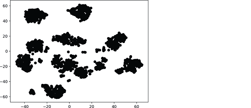
There are clearly clusters of related data points, though there appear to be 11 main clusters, rather than 10. There also are “loose” data points that do not appear to be part of specific clusters. Based on our earlier study of the Digits dataset this makes sense because some digits were difficult to classify.
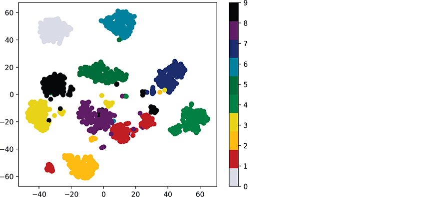
Visualizing the Reduced Data with Different Colors for Each Digit
Though the preceding diagram shows clusters, we do not know whether all the items in each cluster represent the same digit. If they do not, then the clusters are not helpful. Let’s use the known targets in the Digits dataset to color all the dots so we can see whether these clusters indeed represent specific digits:
In [9]: dots = plt.scatter(reduced_data[:, 0], reduced_data[:, 1],...: c=digits.target, cmap=plt.cm.get_cmap('nipy_spectral_r', 10))...:...:
In this case, scatter’s keyword argument c=digits.target specifies that the target values determine the dot colors. We also added the keyword argument
cmap=plt.cm.get_cmap('nipy_spectral_r', 10)which specifies a color map to use when coloring the dots. In this case, we know we’re coloring 10 digits, so we use get_cmap method of Matplotlib’s cm object (from module matplotlib.pyplot) to load a color map ('nipy_spectral_r') and select 10 distinct colors from the color map.
The following statement adds a color bar key to the right of the diagram so you can see which digit each color represents:
In [10]: colorbar = plt.colorbar(dots)Voila! We see 10 clusters corresponding to the digits 0–9. Again, there are a few smaller groups of dots standing alone. Based on this, we might decide that a supervised-learning approach like k-nearest neighbors would work well with this data. In the exercises, you’ll reimplement the colored clusters in a three-dimensional graph.
 Self Check
(Fill-In) With dimensionality reduction training the estimator, then using the estimator to transform the data into the specified number of dimensions can be performed separately with the
TSNEmethods ___________ and ___________, or in one statement using thefit_transformmethod.
Answer:
fit,transform.(True/False) Unsupervised machine learning and visualization can help you get to know your data by finding patterns and relationships among unlabeled samples.
Answer: True.