
Having come this far, you are now equipped with the knowledge of how to create next generation AI 2.0 applications. In your arsenal, you have weapons, such as Cognitive Services, IoT Hub, and Blockchain, to help you create truly cutting-edge intelligent solutions for clients, customers, or your own organization. From a developer’s perspective, you are fully equipped. However, developing solutions is only part of a bigger picture, no matter how big it is.
While solutions solve problems, they usually generate a ton of data along the way, some of which is consumed by the application itself to make instantaneous decisions. It is no longer uncommon for an application to generate massive mountains of data (think several gigabytes per hour), something that is not always possible to consume and analyze simultaneously by the application itself. This is especially true in scenarios involving IoT. Such data is then stored (in cloud) for later analysis using Big Data techniques. “Later” could be minutes, hours, or days.
However, real-time analysis of such massive amounts of data is sometimes desirable. Healthcare is one domain where real-time analysis and notifications could save lives. For example, monitoring the pulse rate of all patients in a hospital, to keep tabs on their heart conditions, and raising alarms when abnormal rates are detected. Timely attention can make all the difference in saving a patient’s life.
You saw a preliminary form of real-time analysis in Chapter 3, where our solution backend was continuously reading all data written to our IoT Hub to detect high temperature conditions. To keep things simple, our solution catered to only one patient (we had exactly one simulated device to fake sending a virtual patient’s vitals to the hub). In the real world, a sufficiently large hospital may have hundreds or thousands of patients at any given point in time. Although the solution in Chapter 3 is designed to be scale up to millions of devices—thanks to Azure’s IoT Hub service—our primitive solution backend application will crash when trying to analyze such volumes of data in real time.
Azure Stream Analytics (ASA) provides a way to perform complex analyses on large amounts of data in real time. Power BI complements ASA by providing beautiful visual charts and statistics—based on results produced by ASA—that even completely non-tech-savvy staff can use to take decisions.
Create, configure, start, and stop an Azure Stream Analytics job
Use a storage backend (Azure Blob Storage) to store ASA analysis results
Create graphical dashboards in Power BI to show ASA analysis results in real time
Azure Stream Analytics
Data that systems deal with is in one of two forms—static or stream. Static data is unchanging or slow changing data usually stored in files and databases. For example, historic archives, old log files, inventory data, etc. For a thorough analysis of such data, no matter how large, one can use data analytics applications, libraries, and services. Azure HDInsight, Hadoop, R, and Python are commonly used tools for this purpose. You may use Stream Analytics for analysis of static data, but that is not what it is made for.
Streaming data, on the other hand, is a continuous, real-time chain of data records that a system receives at a rate of hundreds or thousands of records per second. You may have heard the terms “stream” and “streaming” in the context of online videos, especially when they are being made available live (directly from recording camera to viewers, in real time). Apart from being consumed by end users, video streams can also be analyzed to produce key statistics, such as occurrences of a person or object through the video, dominant colors, faces, and emotions, etc. We saw hints about video analytics using AI (cognitive services) in Chapters 4 and 5. But analyzing video streams is not as common as analyzing other data streams.
Examples of Streaming Data and Analysis That Can Be Performed on Them
Data Stream | Example Analysis Use Case |
|---|---|
Pages visited and elements clicked (buttons, textboxes, links, etc.) on a website by all its visitors. Plus, data about visitors themselves—IP address (location), browser, OS, etc. Collectively known as clickstream. | Finding out most visited pages, most read sections, most popular visitor locations, etc. |
Social media posts for a trending topic. | Finding out the overall and location-based sentiments about the topic. |
Stock market prices. | Calculating value-at-risk, automatic rebalancing of portfolios, suggesting stocks to invest in based on overall intra-hour performance. |
Frequent updates (telemetry data) from a large number of IoT devices. | Depends on the type of data collected by the devices. |
Azure Stream Analytics is specially designed to deal with streaming data. As a result, it excels in situations requiring real-time analysis. Like other Azure services, ASA is highly scalable and capable of handling up to 1GB data per second.
It provides an easy-to-use SQL-like declarative language, called Stream Analytics query language, to perform simple to complex analysis on streaming data. You write queries exactly the way you write in SQL—SELECT, GROUP, JOIN—everything works the same way. The only major difference here is that since you are dealing with never-ending streaming data, you need to define time-specific boundaries to pick the exact data set to analyze. In other words, since static data changes very slowly or doesn’t change at all, analysis is performed on the whole data. Streaming data is continuous with no predefined end. In most situations, the system performing analysis cannot predict when the data will end. So, it must pick small, time-bound pieces of data stream to analyze. The shorter the time window, the closer the analysis is to real time.
Note
It is important to note that performing extremely complex analyses of the scale of Big Data takes significant time. For this reason, Stream Analytics solutions (ASA, Apache Storm, etc.) are not recommended for very complex analyses. For situations where running an analysis may take minutes to hours, streaming data should first be stored in a temporary or permanent storage and then processed like static data.

Azure Stream Analytics workflow
Performing IoT Stream Data Analysis
Let’s start with something basic. In Chapter 3, we created an IoT Hub in Azure and a simulated device in C# that could send to the hub a patient’s vitals every three seconds. We’ll reuse these to perform real-time analysis for just one patient. Later, we’ll create more simulated devices to generate fake data for more patients and use that data for perform more complex real-time analytics.
Creating an Azure Stream Analytics Job
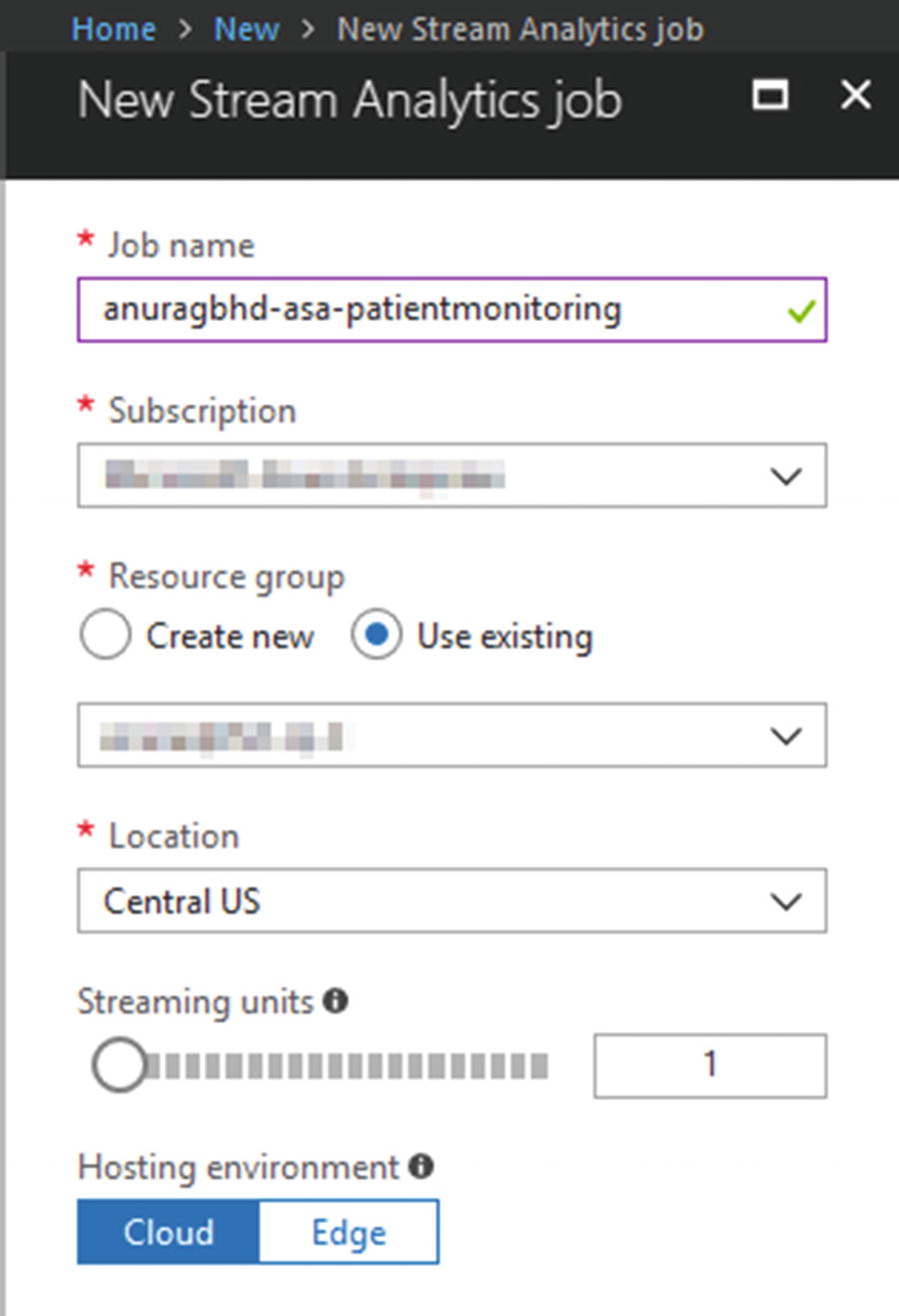
Creating a new ASA job
Click on the Create button and wait a few seconds for the deployment to complete.
Adding an Input to an ASA Job
By default, an ASA job is created in stopped mode. We’ll first configure it by specifying input and output before starting the job. Once the job starts, you cannot edit input and output settings.
From the newly created ASA job’s overview page in Azure Portal, go to Job Topology ➤ Inputs. You will see two options to add an input—Add Stream Input and Add Reference Input. The latter option lets you add reference data, which is static data that we can use to complement our streaming data. In a lot of situations, it may be metadata that can be joined with streaming data to aid in analysis. For example, a reference input may be a list of all patients along with their names, ages, and other attributes. These are things that are not present in streaming data records to reduce redundancy and save network bandwidth. While running a real-time Stream Analytics query, we may need a patient’s age to more accurately determine diseases.
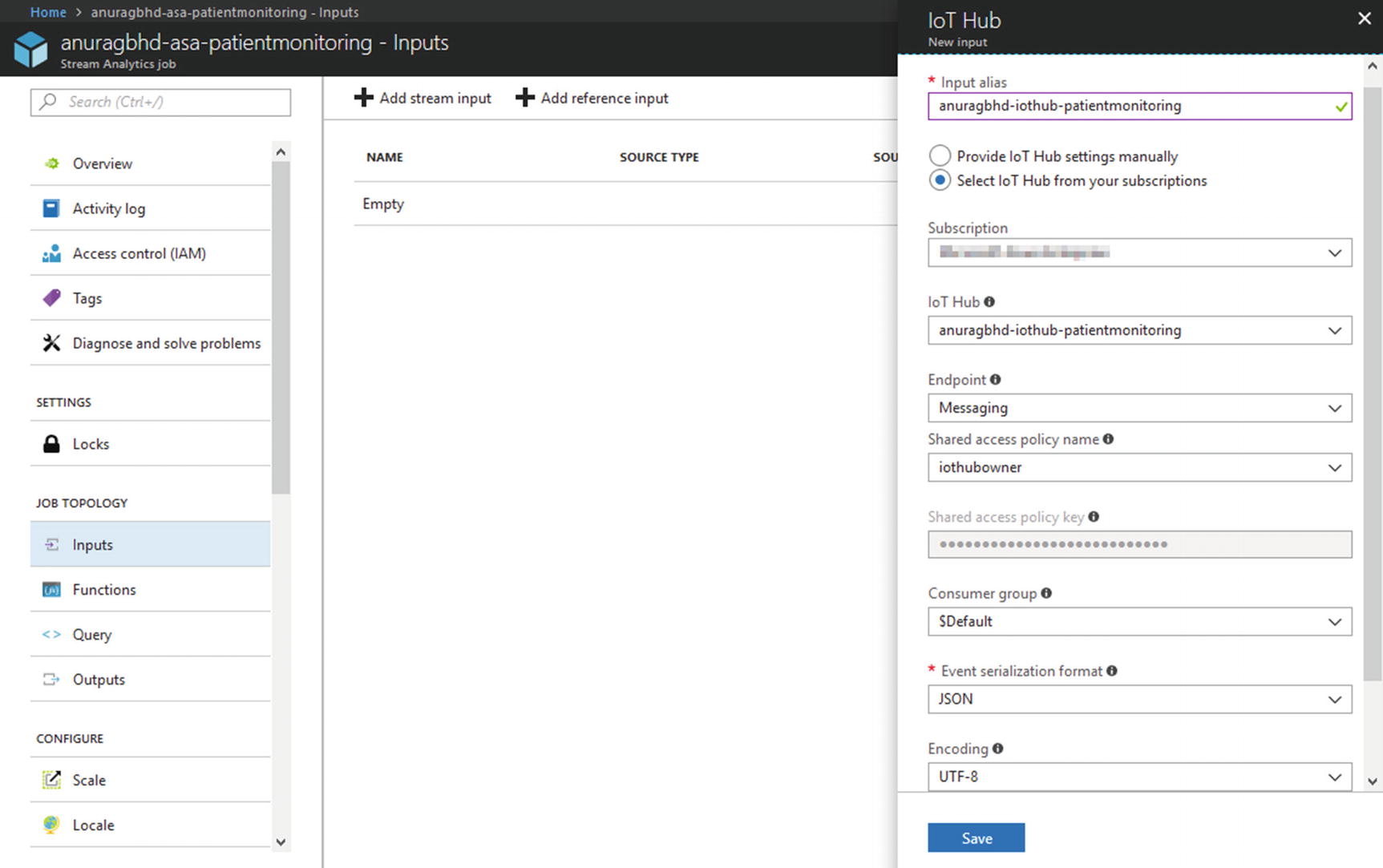
Adding an existing IoT Hub as a stream input to an ASA job
Clicking Save will add the input to your job and immediately perform a test to check the connection to the specified hub. You should receive a "Successful Connection Test" notification post.
Testing Your Input
Before moving to the next step—specifying an output in our ASA job—it’s a good idea to run a sample SA query on the input data stream just to ensure that the job is configured correctly. We’ll run the query directly on real-time data received by our IoT Hub. For this, we’ll have to fire up the simulated device that we created in Chapter 3 to start sending data to our hub.
Open the IoTCentralizedPatientMonitoring solution in Visual Studio. With only the SimulatedDevice project set as the startup project, run the solution. When our simulated device is up and sending messages to the hub, return to Azure Portal. From the ASA job’s side menu, go to Job Topology ➤ Query.
Note
You do not need to start a Stream Analytics job in order to run test queries. This can be done by providing the job sample data for specified inputs, which can be done in two ways—uploading the data file (.json, .csv, etc.) or sampling data from a streaming input.

Sampling data from a streaming input, such as IoT Hub
Azure will start collecting data (for the next three minutes) being received by the hub in a temporary storage. After it is finished sampling, Azure will notify you about it. If, at this point, you close your browser’s tab or navigate to another page, the sampled data will be lost.
Testing with a Pass-Through Query
Once the data is sampled and ready to be queried, you may stop the simulated device to prevent your IoT Hub from being metered further. Now, modify the query in the editor to update YourInputAlias to the name of your hub input. You may leave YourOutputAlias as is.
As you may recall from your SQL knowledge, SELECT * FROM <table> picks up and displays all rows and columns from the specified table. In the context of Stream Analytics, this is what is called a “pass-through” query. It selects all data from the given input and sends it to the given output. Ideally, you’d specify constraints and filters (e.g., the WHERE clause) to perform analysis and send only those records to an output that match your criteria.
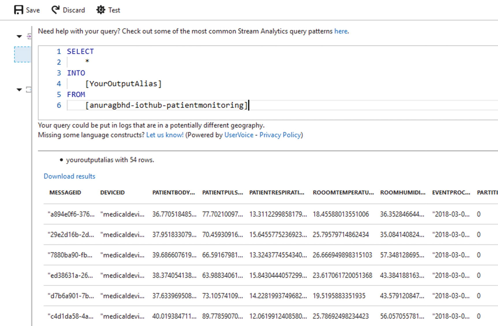
Results from the pass-through query
To recall, a message from a device looks like this:
You can match column names in the SA query result with the attribute names in the sample message. Apart from these, we see IoT Hub specific columns such as EventProcessedUtcTime, PartitionId, etc.
Testing with a Real-World Query
Let’s try a more complex query to cater to a real-world scenario. In Chapter 3, we wrote our solution backend to detect high body temperature conditions. Along similar lines, we’ll write a query to detect high pulse rate conditions. Our solution backend was very basic and naïve in checking for high temperatures in each message received from a medical device. We will not do the same to detect high pulse rates. Instead, we will check for high values among pulse rates averaged from within time intervals of 30 seconds each. In other words, we want to tag pulse rates as high if they are consistently above a certain threshold (say, 90) during a period of 30 seconds.
The query for this sort of condition will look like this:
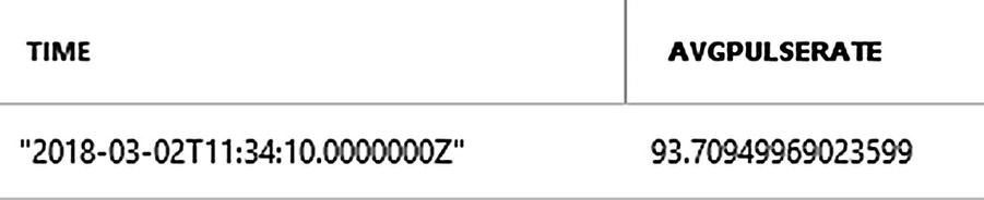
Result from running a constraint-bound SA query
In the real-world, an ASA job will deal with data from hundreds or thousands of devices, lending this query its real worth. Let’s break the query down for better understanding.
The most unusual thing in the entire query is the keyword TumblingWindow . Stream Analytics deals with streaming data. Unlike static data, streaming data has no start or end; it’s just a continuous stream of incoming data records that may or may not end in the near future. A question then arises: starting when and how long should streaming data be analyzed in one go? A bit earlier in the chapter, we talked about analyzing time-bound windows of streaming data. TumblingWindow provides us with those time-bound windows while performing aggregate operations using GROUP BY. An equivalent keyword we use with a JOIN is DATEDIFF.
TumblingWindow takes in two parameters—unit of time and its measure—in order to group data during that time interval. In our query, we group incoming data records every 30 seconds and check for the average pulse rate of the patient during that time interval.
Tip
If you are still confused, do not forget that we ran this query on sampled data, which was already a snapshot—a three-minute window—of an ongoing stream. So, ASA created six 30-second groups and displayed the final result after analyzing them. When we start our ASA job, it will start working with an actual stream. Analysis will be performed and a result spat out (to specified outputs) every 30 seconds.
TIMESTAMP BY provides a way to specify which time to consider while creating time-bound windows. By default, Stream Analytics will consider the time of arrival of a data record for the purpose. This may be fine in some scenarios, but it’s not what we want. In healthcare applications, time when data was recorded by the IoT device is more important than the time when that data was received by Azure (IoT Hub or Stream Analytics), since there may be a delay of a few milliseconds to a couple of seconds between the two events. That’s why, in our query, we chose to timestamp by EventEnqueuedUtcTime, which is closer to when the data was recorded.
Selecting System.Timestamp provides us with the end time for each window.
Adding an Output to an ASA Job
While running test queries on sampled input, ASA generated its output directly in the browser. However, this is not how it works in a real-world scenario. ASA requires you to specify at least one output sink (container) where the results will be stored or displayed on a more permanent basis. Stored results may be analyzed further to arrive at decisions.
Although ASA supports a long list of output options, we’ll go with a popular choice called blob storage . Azure’s blob service provides a highly-scalable storage for unstructured data. It also provides a RESTful API to access data stored in it. In most cases, you’d want to stored ASA results as JSON in a blob and retrieve it later in a web or mobile app via its REST API.

Creating a new blog storage to store ASA job output
The name cannot contain special characters (even hyphens and underscores). That is why we have deviated here from our usual naming scheme. The access tier you choose will impact your pricing. Blob storage does not have a free tier, but the cost of storing data is negligible (almost zero) for small amounts of data. You choose Hot if the blob data is going to be accessed frequently; choose Cool if data is going to be stored more frequently than accessed. We will use the latter in this case.

Adding a blob storage output in an ASA job
As in the case of specifying a hub as an input, here you get to choose an Azure Blob storage from within the same subscription or outside of it. For an external blob, you need to manually enter Storage Account and Storage Account Key. Ensure that you have JSON select as serialization format. For JSON, the Format field will have two options—Line Separated and Array. If you intend to access blob data via a graphical tool (e.g., Azure Storage Explorer), Line Separated works well. If, however, the intention is to access blob data via its REST API, the Array option is better since that makes it easier to access JSON objects in JavaScript. Leave the rest of the fields as is and click on Create. Azure will perform a connection test immediately after the new output is added.
Testing Your Output
Return to your ASA job’s query editor and paste the same query that we used earlier, except this time specify your blob’s output alias after INTO.
Click Save to save the query. Go to the Overview page and start the job. It may take a couple of minutes for the job to start. You’ll be notified when it’s started. When a job is running, you may not edit query or add/edit inputs and outputs.
From Visual Studio, start the simulated device again if you’d earlier stopped it. You may want to increase its update frequency to 10 or 20 seconds to reflect a more realistic value.
Let it run for a few minutes to allow for our specified high pulse rate condition to be met. In the meantime, download and install Azure Storage Explorer from http://storageexplorer.com . This is a nifty little desktop application for accessing Azure storage accounts, such as blob, data lake, Cosmos DB, etc.
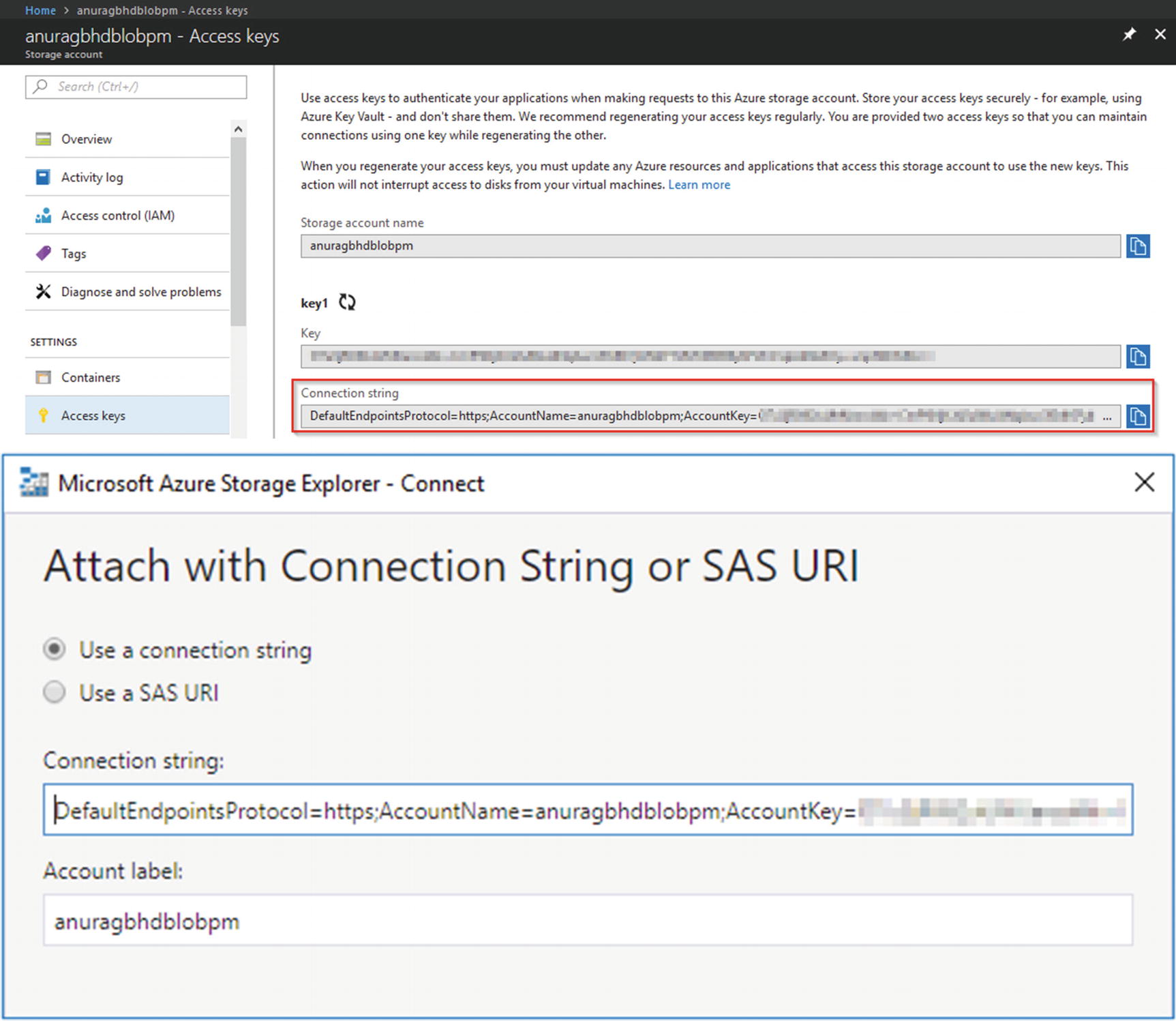
Copying the blob storage’s connection string from Azure Portal to Azure Storage Explorer
Once the application has successfully connected to your blob storage, you will see its name under Storage Accounts in the Explorer pane. Expand it and go to Blob Containers ➤ <your blob container name>. In the Details pane on the right, you should see a listing corresponding to a .json file . If you do not see anything there, the high pulse rate condition has never been met. You could wait for a few minutes more or relax the condition a bit by setting Avg(PatientPulseRate) > 80 (you will need to stop your ASA job, edit the query, and start the job again). Double-click the .json file to open it locally in your default text editor. You should see something similar to the following.
Note
Each time an ASA job is stopped and started again, the subsequent outputs from the job are written to a new .json file (blob) in the same blob container. You will see as many blobs in Azure Storage Explorer as the times the ASA job was started.
You can access these results programmatically in the web and mobile apps using blob storage’s comprehensive REST APIs . Check https://docs.microsoft.com/en-us/rest/api/storageservices/list-blobs and https://docs.microsoft.com/en-us/rest/api/storageservices/get-blob for more details.
Let your simulated device run for a while longer and keep refreshing the Details pane in Azure Storage Explorer to see how Stream Analytics processes streaming input and generates output in real time.
Visualizing ASA Results Using Power BI
While blob storage provides an easy, scalable method to store Stream Analytics results, it is difficult to visualize the stored results using either Azure Storage Explorer or REST API. Power BI is a collection of business intelligence and analytics tools that work with dozens of types of data sources to deliver interactive, visual insights via a GUI interface. Some data sources it supports include SQL databases (SQL Server, Oracle, and PostgreSQL), blob storage, MS Access, Excel, HDFS (Hadoop), Teradata, and XML.
Power BI is offered as a web, desktop, and mobile app to quickly create dashboards and visualizations filled with charts (line, bar, pie, time-series, radar, etc.), maps, cartograms, histograms, grids, clouds, and more. Dashboards can be generated and viewed within Power BI or published to your own website or blog.
Important
In order to sign up for or use Power BI, you need a work email address that is integrated with Microsoft Office 365. You cannot use personal email IDs (Gmail, Yahoo Mail, or even Hotmail) to sign up for Power BI.
Adding Power BI as an Output in an ASA Job
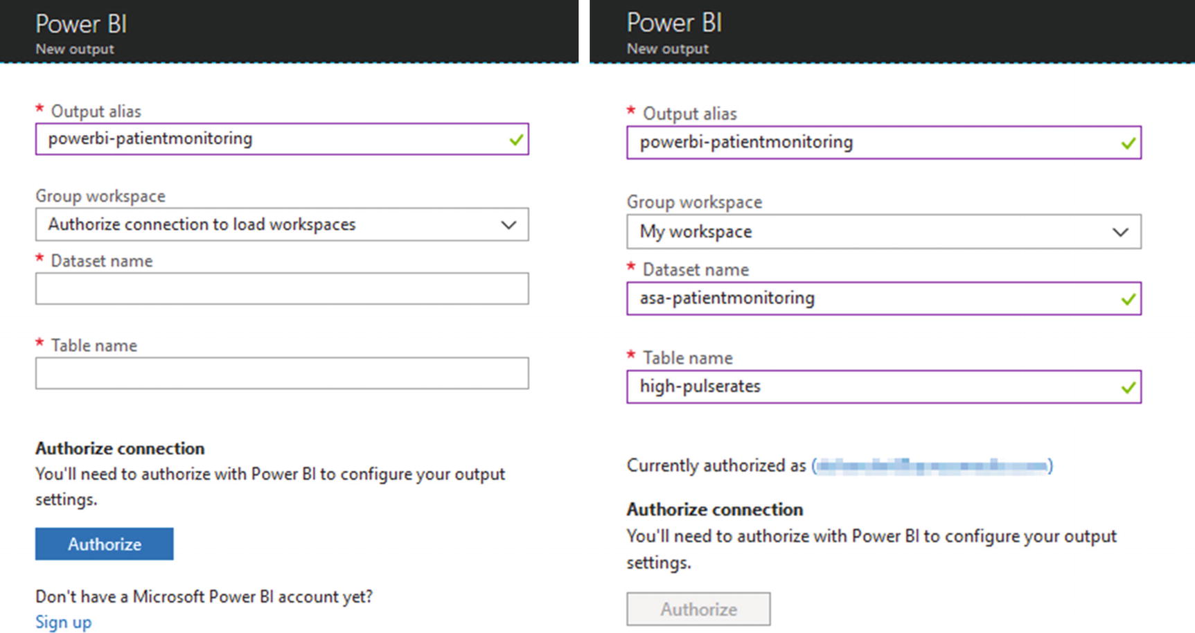
Adding Power BI as an output in the Stream Analytics job: before and after authorizing a connection to Power BI
Make note of the values you fill in for Dataset Name and Table Name. We kept these as asa-patientmonitoring and high-pulserates, respectively, which are consistent with the naming scheme we follow. Azure will automatically create the specified dataset and table in Power BI, if it’s not already present. The existing dataset with the same name will be overwritten.
Updating the SA Query
With the output created, let’s head back to query editor. We’ll need to update our query to redirect results to our Power BI output. There are two ways to do it—replace the current output alias (blob) with the new (Power BI) or add a second SELECT INTO statement for the new output. Both approaches are shown next.
Replacing the existing output:
Adding additional output:
Notice carefully that we have selected another value—the count of each recorded high pulse rate instance. Although this value will be 1 for each instance, we’ll need it for plotting our line chart a little later.
It is also possible to send different results to different outputs. You do that by writing a separate SELECT ... INTO ... FROM statement, one after the other, for each output. Update your query, click Save, and start the job again. This is also a good time to fire up that simulated device once again. Go to Visual Studio and start the project.
Creating Dashboards in Power BI
Go to https://powerbi.com and log in with your work account. If you expand the My Workspace section in the left sidebar and look at DATASETS, you should see the name of the dataset you specified earlier if the ASA job produced at least one result.

Adding a new tile in a dashboard in Power BI
On the Choose a Streaming Dataset screen, select the name of your dataset and click Next. On the Visualization Design screen, select Card as the visualization type, and then add highprinstances in the Fields section. On the next screen called Tile Details, fill in a title and a subtitle and click Apply. Your new tile will be live immediately.
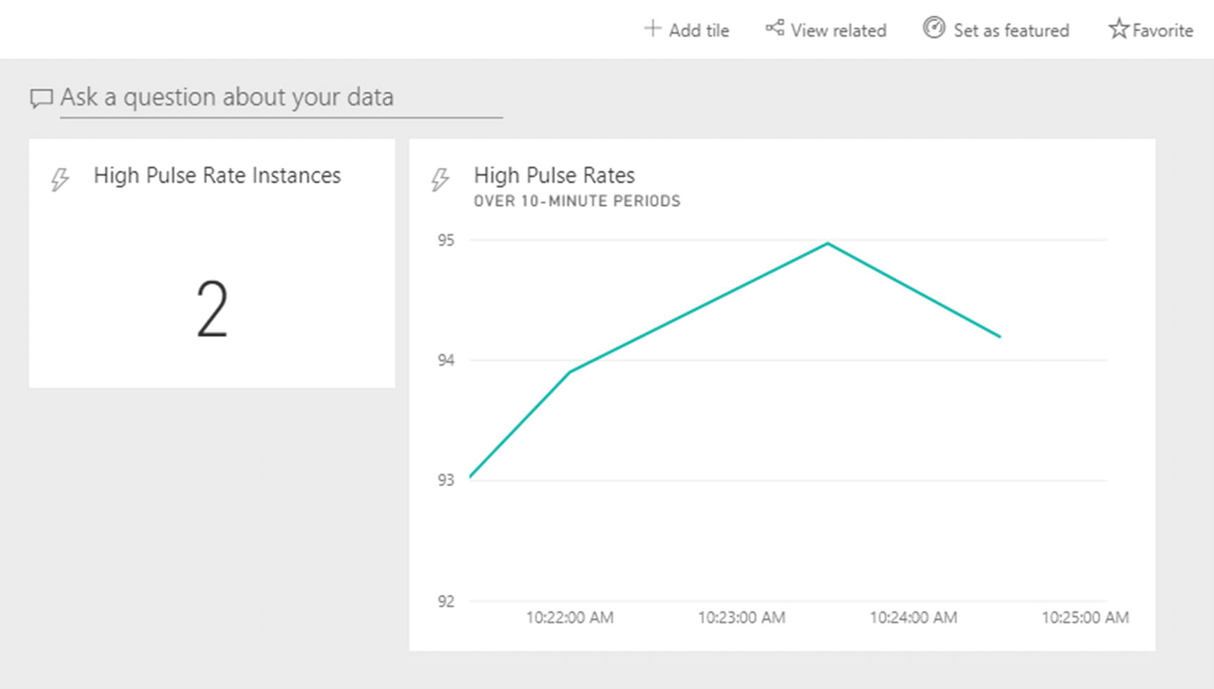
A Power BI dashboard with two tiles
Feel free to create more titles using the data at hand and then watch them update in real time.
Next Steps
With the power of Stream Analytics and Power BI in your hands, we encourage you to try slightly more complex scenarios. Try solving the problem mentioned in the following exercise, or take hints from it to solve a different problem.
Real-Time Dengue Outbreak Detection
Dengue fever is a mosquito-borne viral disease, common in certain South and Southeast Asian regions, such as India and Singapore. If not detected and treated early, dengue can be fatal. As per online statistics, hundreds of millions of people are affected by the disease each year and about 20,000 die because of it. The disease starts as a regular virus and gradually becomes severe in some cases (within 7-10 days). Dengue outbreaks recur every year in certain areas, and timely detection of such outbreaks may help in timely and effective public health interventions.
High fever
Rapid breathing
Severe abdominal pain
Your task is to design a real-time dengue outbreak detection system that one hospital or several hospitals (perhaps on a Blockchain) can use to take timely action.
System Design
Body temperature
Respiration rate
Abdominal pain score
Location
The location of a person can be easily tracked via GPS. As for determining a pain score, there are devices in the market that do this. Check this: http://gomerblog.com/2014/06/pain-detector . Alternatively, a proper measurement of functional magnetic resonance imaging (fMRI) brain scans can also give indications of pain levels, as reported here https://www.medicalnewstoday.com/articles/234450.php .
Your job initially is not to use such sophisticated medical devices for taking measurements, but to create about a dozen simulated devices for the job that report telemetry data for each patient.
You can then write an SA query to perform aggregate operations on incoming data stream and count the number of cases where telemetry values are above certain thresholds at the same location. If you get multiple locations reporting a bunch of dengue cases around the same time, you have the outbreak pattern.
Recap
Create a new Stream Analytics job in the Azure Portal
Add (and test) an input (hub) to an ASA job
Write queries that work on time-bound windows of streaming data
Add (and test) a blob storage output to an ASA job
Access Stream Analytics results stored in a blob using Azure Storage Explorer
Add Power BI as an output to an ASA job
Create a dashboard with multiple tiles in Power BI to visualize ASA results
In the next chapter, you will take data analytics to the next level by using Azure machine learning.