
JavaServer Faces Standard Components
The JSF framework allows developers to build applications utilizing a series of views, and each view consists of a series of components. The framework is kind of like a puzzle in that each piece must fit into its particular place in order to make things work smoothly. Components are just another piece of the puzzle. Components are the building blocks that make up JSF views. One of the strengths of using the JSF framework is the abundance of components that are available for use within views. To developers, components can be tags that are placed within the XHTML views. Components resemble standard HTML tags; they contain a number of attributes, an opening tag and a closing tag, and sometimes components that are to be embedded inside of others. Components can also be written in Java code, and their tags can be bound to Java code that resides within a JSF managed bean.
A number of components come standard with the JSF framework. The recipes in this chapter will cover the standard components in detail, and it will provide examples that will allow you to begin using components in your applications right away.
This chapter focuses on the JSF standard component library, and toward the end it features some recipes showing how to use external component libraries. The example in this chapter will grow from the first recipe throughout each recipe to the final recipe. In the end, a newsletter page for the Acme Bookstore will be complete and full-featured.
Before tackling the recipes, though, the following section provides a brief overview of the standard JSF components and associated common component tags. This will help you get the most out of the recipes.
Table 5-1 lists the components that are available with a clean install of the JSF framework.
Table 5-1 . JSF HTML Components
| Component | Tag | Description |
|---|---|---|
| UIColumn | h:column | Represents a column of data in the dataTable component |
| UICommand | h:commandButton | Submits a form |
| h:commandLink | Links pages or actions | |
| UIData | h:dataTable | Represents a table used for iterating over collections of data |
| UIForm | h:form | Represents an input form |
| UIGraphic | h:graphicImage | Displays an image |
| UIInput | h:inputHiddenh:inputSecreth:inputTexth:inputTextarea | Includes a hidden variable in a form Allows text entry without displaying the actual text Allows text entry Allows multiline text entry |
| UIOutcomeTarget | h:link | Links to another page or location |
| UIMessage | h:message | Displays a localized message |
| UIMessages | h:messages | Displays localized messages |
| UIOutput | h:outputFormath:outputLabelh:outputLink | Displays a formatted localized message Displays a label for a specified field Links to another page or location |
| UIPanel | h:panelGridh:panelGroup | Displays a table Groups components |
| UISelectBoolean | h:selectBooleanCheckbox | Displays a Boolean choice |
| UISelectItem | h:selectItem | Represents one item in a list of items for selection |
| UISelectItems | h:selectItems | Represents a list of items for selection |
| UISelectMany | h:selectManyCheckbox | Displays a group of check boxes that allow multiple user choices |
| h:selectManyListboxh:selectManyMenu | Allows a user to select multiple items from a list Allows a user to select multiple items from a drop-down menu | |
| UISelectOne | h:selectOneListboxh:selectOneMenuh:selectOneRadio | Allows a user to select a single item from a list Allows a user to select a single item from a drop-down menu Allows a user to select one item from a set |
JSF provides a number of core tags that can be used to provide more functionality for the components. For example, these tags can be embedded inside JSF component tags and specify rules that can be used to convert the values that are displayed or used as input for the component. Other uses of the core tags are to provide a list of options for a select component, validate input, and provide action and event listeners. Table 5-2 describes the JSF core tags.
Table 5-2 . JSF Core Tags
| Tag | Function |
|---|---|
| f:actionListener | Registers an action listener method with a component |
| f:phaseListener | Registers a PhaseListener to a page |
| f:setPropertyActionListener | Registers a special form submittal action listener |
| f:valueChangeListener | Registers a value change listener with a component |
| f:converter | Registers an arbitrary converter with a component |
| f:convertDateTime | Registers a DateTimeConverter instance with a component |
| f:convertNumber | Registers a NumberConverter with a component |
| f:facet | Adds a nested component to particular enclosing parents |
| f:metadata | Registers a particular facet with a parent component |
| f:selectItem | Encapsulates one item in a list |
| f:selectItems | Encapsulates all items of a list |
| f:validateDoubleRange | Registers a DoubleRangeValidator with a component |
| f:validateLength | Registers a LengthValidator with a component |
| f:validateLongRange | Registers a LongRangeValidator with a component |
| f:validator | Registers a custom validator with a component |
| f:validateRegex | Registers a RegExValidator with a component (JSF 2.0) |
| f:validateBean | Delegates validation of a local value to a BeanValidator (JSF 2.0) |
| f:validateRequired | Ensures that a value is present in a parent component |
 Note The common sources and the completed classes to run the application for Chapter 5 are contained within the org.javaeerecipes.chapter05 package, and one or more recipes throughout this chapter will utilize classes contained within that package.
Common Component Tag Attributes
Each standard JSF component tag contains a set of attributes that must be specified in order to uniquely identify it from the others, register the component to a managed bean, and so on. There is a set of attributes that are common across each component tag, and this section lists those attributes, along with a description of each. All attributes besides id can be specified as JSF EL.
- binding: A managed bean property can be specified for this attribute, and it can be used to bind the tag to a component instance within a managed bean. Doing so allows you to programmatically control the component from within the managed bean.
- id: This attribute can be set to uniquely identify the component. If you do not specify a value for the id attribute, then JSF will automatically generate one. Each component within a view must have a unique id attribute, or an error will be generated when the page is rendered. I recommend you specify a value for the id attribute on each component tag, because then it will be easy to statically reference the tag from a scripting language or a managed bean if needed. If you let JSF automatically populate this attribute, it may be different each time, and you will never be able to statically reference the tag from a scripting language.
- immediate: This attribute can be set to true for input and command components in order to force the processing of validations, conversions, and events when the request parameter values are applied.
- rendered: The rendered attribute can be used to specify whether the component should be rendered. This attribute is typically specified as a JSF EL expression that is bound to a managed bean property yielding a Boolean result. The EL expression must be an rvalue expression, meaning that it is read-only and cannot set a value.
- style: This attribute allows a CSS style to be applied to the component. The specified style will be applied when the component is rendered as output.
- styleClass: This attribute allows a CSS style class to be applied to the component. The specified style will be applied when the component is rendered as output.
- value: This attribute identifies the value of a given component. For some components, the value attribute is used to bind the tag to a managed bean property. In this case, the value specified for the component will be read from, or set within, the managed bean property. Other components, such as the commandButton component, use the value attribute to specify a label for the given component.
Common JavaScript Component Tags
Table 5-3 lists a number of attributes that are shared by many of the components, which enable JavaScript functionality to interact with the component.
Table 5-3. Common Component Atrributes
| Attribute | Description |
|---|---|
| onblur | JavaScript code that should be executed when the component loses focus. |
| onchange | JavaScript code that should be executed when the component loses focus and the value changes. |
| ondblclick | JavaScript code that should be executed when the component has been clicked twice. |
| onfocus | JavaScript code that should be executed when the component gains focus. |
| onkeydown | JavaScript code that should be executed when user presses a key down and the component is in focus. |
| onkeypress | JavaScript code that should be executed when user presses a key and the component is in focus. |
| onkeyup | JavaScript code that should be executed when key press is completed and the component is in focus. |
| onmousedown | JavaScript code that should be executed when user clicks the mouse button and the component is in focus. |
| onmouseout | JavaScript code that should be executed when user moves mouse away from the component. |
| onmouseover | JavaScript code that should be executed when user moves mouse onto the component. |
| onmousemove | JavaScript code that should be executed when user moves mouse within the component. |
| onmouseup | JavaScript code that should be executed when mouse button click is completed and the component is in focus. |
| onselect | JavaScript code that should be executed when the component is selected by user. |
Binding Components to Properties
All JSF components can be bound to managed bean properties. Do so by declaring a property for the type of component you want to bind within the managed bean and then by referencing that property using the component’s binding attribute. For instance, the following dataTable component is bound to a managed bean property and then manipulated from within the bean.
In the view:
<h:dataTable id="myTable" binding="#{myBean.myTable}" value="#{myBean.myTableCollection}"/>
In the bean:
// Provide getter and setter methods for this property
private javax.faces.component.UIData myTable;
. . .
myTable.setRendered(true);
. . .
Binding can prove to be very useful in some cases, especially when you need to manipulate the state of a component programmatically before re-rendering the view.
5-1. Creating an Input Form
Problem
You want to add input fields to a form within your application.
Solution
Create an input form by enclosing child input components within a parent form component. There are four JSF components that will allow for text entry as input. Those components are inputText, inputSecret, inputHidden, and inputTextarea. Any or all of these components can be placed within a form component in order to create an input form that accepts text entry.
In the example for this recipe, you will create an input form that will be used to sign up for the Acme Bookstore newsletter. The user will be able to enter their first and last names, an e-mail address, a password, and a short description of their interests.
The View: recipe05_01.xhtml
The following code is for the view recipe05_01.xhtml, which constructs the layout for the input form:
<?xml version='1.0' encoding='UTF-8' ?>
<!--
Book:  Java EE7 Recipes
Recipe: 4-7
Author: J. Juneau
-->
<!DOCTYPE html PUBLIC "-//W3C//DTD XHTML 1.0 Transitional//EN" "http://www.w3.org/TR/xhtml1/DTD/xhtml1-transitional.dtd">
<html xmlns="http://www.w3.org/1999/xhtml"
      xmlns:ui="http://xmlns.jcp.org/jsf/facelets"
      xmlns:f="http://xmlns.jcp.org/jsf/core"
      xmlns:h="http://xmlns.jcp.org/jsf/html">

    <body>

        <ui:composition template="layout/custom_template_search.xhtml">
            <ui:define name="content">
                <h:messages globalOnly="true"  errorStyle="color: red" infoStyle="color: green"/>
                <h:form id="contactForm">
                    <h1>Subscribe to Newsletter</h1>
                    <p>
                        Enter your information below in order to be added to the Acme Bookstore newsletter.
                    </p>

                    <br/>
                    <label for="first">First: </label>
                    <h:inputText id="first" size="40" value="#{contactController1.current.first}"/>
                    <br/>
                    <label for="last">Last: </label>
                    <h:inputText id="last" size="40" value="#{contactController1.current.last}"/>
                    <br/>
                    <label for="email">Email: </label>
                    <h:inputText id="email" size="40" value="#{contactController1.current.email}"/>
                    <br/>
                    <label for="password">Enter a password for site access:</label>
                    <h:inputSecret id="password" size="40" value="#{contactController1.current.password}"/>
                    <br/><br/>
                    <label for="description">Enter your book interests</label>
                    <br/>
                    <h:inputTextarea id="description" rows="5" cols="100" value="#{contactController1.current.description}"/>
                    <br/>
                    <h:commandButton id="contactSubmit" action="#{contactController1.subscribe}" value="Save"/>
                </h:form>
            </ui:define>
        </ui:composition>

    </body>
</html>
Note As you can see from the example, HTML can be mixed together with JSF component tags. An HTML label tag is used to specify a label for each input component in this recipe. In Recipe 5-3, you will learn about the JSF component that is used to render a label.
To learn more about how the commandButton component works, please see Recipe 5-2.
Managed Bean: ContactController.java
Each view that contains an input form needs to have an associated managed bean, right? The managed bean in this case is RequestScoped, and the name of the bean class is ContactController. The listing for the ContactController class is as follows:
package org.javaeerecipes.chapter05.recipe05_01;


import java.util.ArrayList;
import java.util.LinkedHashMap;
import java.util.List;
import java.util.Map;
import javax.faces.application.FacesMessage;
import javax.faces.bean.ManagedBean;
import javax.faces.bean.RequestScoped;
import javax.faces.component.UIComponent;
import javax.faces.context.FacesContext;
import javax.faces.event.ValueChangeEvent;
import javax.faces.model.SelectItem;
import javax.faces.validator.ValidatorException;
import javax.inject.Inject;

/**
 * Chapter 5
 *
 * @author juneau
 */
@RequestScoped
@ManagedBean(name = "contactController")
public class ContactController implements java.io.Serializable {

    private Contact current;

    /**
     * Creates a new instance of ContactController
     */
    public ContactController() {

    }

    /**
     * Obtain the current instance of the Contact object
     * @return Contact
     */
    public Contact getCurrent(){
        if (current == null){
            current = new Contact();
        }
        return current;
    }

    /**
     * Adds a subscriber to the newsletter
     * @return String
     */
    public String subscribe(){
        // No implementation yet, will add to a database table in Chapter 7
        FacesMessage facesMsg = new FacesMessage(FacesMessage.SEVERITY_INFO,
                "Successfully Subscribed to Newsletter for " + getCurrent().getEmail(), null);
        FacesContext.getCurrentInstance().addMessage(null, facesMsg);
        return "SUBSCRIBE";
    }

    /**
     * Navigational method
     * @return String
     */
    public String add(){
        return "ADD_SUBSCRIBER";
    }
}
Note At this time, nothing happens when the submit button is clicked other than a nice “Success” message being displayed on the screen. Later in the book, you will revisit the subscribe method and add the code for creating a record within an underlying database. The input screen should look like Figure 5-1 when rendered.
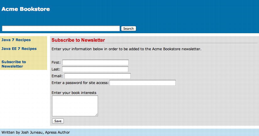
Figure 5-1 . JSF input form for subscribing to the Acme Bookstore newsletter
How It Works
The JavaServer Faces framework ships with a slew of standard components that can be utilized within JSF views. There are four standard components that can be used for capturing text input: inputText, inputSecret, inputHidden, and inputTextarea. These component tags, as well as all of the other standard JSF component tags, share a common set of attributes and some attributes that are unique to each specific tag. To learn more about the common attributes, please see the related section in the introduction to this chapter. In this recipe, I will go over the specifics for each of these input components. The form component, specified via the h:form tag, is used to create an input form within a JSF view. Each component that is to be processed within the form should be enclosed between the opening and closing h:form tags. Each form typically contains at least one command component, such as a commandButton. A view can contain more than one form component, and only those components that are contained within the form will be processed when the form is submitted.
Note I recommend you always specify the id attribute for each component. Most importantly, specify the id attribute for the form component. If you do not specify the id attribute for a given JSF component, then one will be automatically generated for you. The automatic generation of JSF component ids prohibits the ability to statically reference a component from within a scripting language, such as JavaScript, or a managed bean. For instance, in the example for this recipe, the form id attribute is set to contactForm, and the first inputText component id is set to first. This allows you to reference the component statically by appending the form id to the component id from a scripting language or managed bean. In the case of the example, you’d reference the first component as contactForm:first.
Each of the input tags support the list of attributes that is shown in Table 5-4, in addition to those already listed as common component attributes in the introduction to this chapter.
Table 5-4 . Input Component Tag Attributes
| Attribute | Description |
|---|---|
| converter | Allows a converter to be applied to the component’s data. |
| converterMessage | Specifies a message that will be displayed when a registered converter fails. |
| dir | Specifies the direction of text displayed by the component. ( LTR is used to indicate left-to-right, and RTL is used to indicate right-to-left.) |
| immediate | Flag indicating that, if this component is activated by the user, notifications should be delivered to interested listeners and actions immediately (that is, during the Apply Request Values phase) rather than waiting until the Invoke Application phase. |
| label | Specifies a name that can be used for component identification. |
| lang | Allows a language code to be specified for the rendered markup. |
| required | Accepts a Boolean to indicate whether the user must enter a value for the given component. |
| requiredMessage | Specifies an error message to be displayed if the user does not enter a value for a required component. |
| validator | Allows a validator to be applied to the component. |
| valueChangeListener | Allows a managed bean method to be bound for event-handling purposes. The method will be called when there is a change made to the component. |
The inputText component is used to generate a single-line text box within a rendered page. The inputText component value attribute is most commonly bound to a managed bean property so that the values of the property can be retrieved or set when a form is processed. In the recipe example, the first inputText component is bound to the managed bean property named first. The EL expression #{contactController1.current.first} is specified for the component value, so if the managed bean’s first property contains a value, then it will be displayed within the inputText component. Likewise, when the form is submitted, then any value that has been entered within the component will be saved within the first property in the managed bean.
The inputSecret component is used to generate a single-line text box within a rendered page, and when text is entered into the component, then it is not displayed; rather, asterisks are displayed in place of each character typed. This component makes it possible for a user to enter private text, such as a password, without it being displayed on the screen for others to read. The inputSecret component works identically to the inputText component, other than hiding the text with asterisks. In the example, the value of the inputSecret component is bound to a managed bean property named password via the #{contactController1.current.password} EL expression.
The inputTextarea component is used to generate a multiline text box within a rendered page. As such, this component has a couple of additional attributes that can be used to indicate how large the text area should be. The inputTextarea has the rows and cols attributes, which allow a developer to specify how many rows (height) and how many columns (wide) of space the component should take up on the page, respectively. Other than those two attributes, the inputTextarea component works in much the same manner as the inputText component. In the example, the value attribute of the inputTextarea component is specified as #{contactController1.current.description}, so the description property will be populated with the contents of the component when the form is submitted.
The input component I have not yet discussed is the inputHidden component. This component is used to place a hidden input field into the form. It works in the same manner as the inputText component, except that it is not rendered on the page for the user to see. The value for an inputHidden component can be bound to a managed bean property in the same way as the other components. You can use such a component for passing a hidden token to and from a form.
As you can see, the days of passing and receiving request parameters within JSP pages are over. Utilizing the JSF standard input components, it is possible to bind values to managed bean properties using JSF EL expressions. This makes it much easier for developers to submit values from an input form for processing. Rather than retrieving parameters from a page, assigning them to variables, and then processing, the JSF framework takes care of that overhead for you. Although I have not covered the usage of all input component attributes within this recipe, I will cover more in the recipes that follow as I will build upon the Acme Bookstore newsletter subscription page.
5-2. Invoking Actions from Within a Page
Problem
You want to trigger a server-side method to be invoked from a button or link on one of your application pages.
Solution
Utilize the commandButton or commandLink components within your view to invoke action methods within a managed bean. The command components allow for the user invocation of actions within managed beans. Command components bind buttons and links on a page directly to action methods, allowing developers to spend more time thinking about the development of the application and less time thinking about the Java servlet–processing life cycle.
In the example for this recipe, a button and a link are added to the newsletter page for the Acme Bookstore. The button that will be added to the page will be used to submit the input form for processing, and the link will allow a user to log into the application and manage their subscription and bookstore account.
Note This recipe will not cover any authentication features; it focuses only on invoking actions within managed beans. For more information regarding authentication, please see Chapter 14.
The following code is for the newsletter subscription view including the command components. The sources are for the file named recipe05_02.xhtml.
<?xml version='1.0' encoding='UTF-8' ?>
<!--
Book:  Java EE7 Recipes
Recipe: 5-2
Author: J. Juneau
-->
<!DOCTYPE html PUBLIC "-//W3C//DTD XHTML 1.0 Transitional//EN" "http://www.w3.org/TR/xhtml1/DTD/xhtml1-transitional.dtd">
<html xmlns="http://www.w3.org/1999/xhtml"
      xmlns:ui="http://xmlns.jcp.org/jsf/facelets"
      xmlns:f="http://xmlns.jcp.org/jsf/core"
      xmlns:h="http://xmlns.jcp.org/jsf/html">

    <body>

        <ui:composition template="layout/custom_template_search.xhtml">
            <ui:define name="content">
                <h:messages globalOnly="true"  errorStyle="color: red" infoStyle="color: green"/>
                <h:form id="contactForm">
                    <h1>Subscribe to Newsletter</h1>
                    <p>
                        Enter your information below in order to be added to the Acme Bookstore newsletter.
                    </p>

                    <br/>
                    <label for="first">First: </label>
                    <h:inputText id="first" size="40" value="#{contactController2.current.first}"/>
                    <br/>
                    <label for="last">Last: </label>
                    <h:inputText id="last" size="40" value="#{contactController2.current.last}"/>
                    <br/>
                    <label for="email">Email: </label>
                    <h:inputText id="email" size="40" value="#{contactController2.current.email}"/>
                    <br/>
                    <label for="password">Enter a password for site access:</label>
                    <h:inputSecret id="password" size="40" value="#{contactController2.current.password}"/>
                    <br/><br/>
                    <label for="description">Enter your book interests</label>
                    <br/>
                    <h:inputTextarea id="description" rows="5" cols="100" value="#{contactController2.current.description}"/>
                    <br/>
                    <h:commandButton id="contactSubmit" action="#{contactController2.subscribe}" value="Save"/>
                    <br/><br/>
                    <h:commandLink id="manageAccount" action="#{contactController2.manage}" value="Manage Subscription"/>
                </h:form>
            </ui:define>
        </ui:composition>

    </body>
</html>
Managed Bean: ContactController.java
The managed bean that contains the action methods is named ContactController, which was created in Recipe 5-1. The following code excerpt is taken from the ContactController class, and it shows the updates that have been made to the methods for this recipe.
Note The complete implementation of ContactController resides within the package org.javaeerecipes.chapter05.
. . .
    /**
     * Adds a subscriber to the newsletter
     * @return String
     */
    public String subscribe(){
        // Using a list implementation for now,
        // but will add to a database table in Chapter 7

        // Add the current contact to the subscription list
        subscriptionController.getSubscriptionList().add(current);
        FacesMessage facesMsg = new FacesMessage(FacesMessage.SEVERITY_INFO,
                "Successfully Subscribed to Newsletter for " + getCurrent().getEmail(), null);
        FacesContext.getCurrentInstance().addMessage(null, facesMsg);
        return "SUBSCRIBE";
    }

    /**
     * Navigational method
     * @return String
     */
    public String add(){
        return "ADD_SUBSCRIBER";
    }

    /**
     * This method will allow a user to navigate to the manageAccount view.
     * This method will be moved into another managed bean that focuses on
     * authentication later on.
     * @return
     */
    public String manage(){
        return "/chapter05/manageAccount";
    }
. . .
When the view is rendered, the resulting page looks like Figure 5-2.
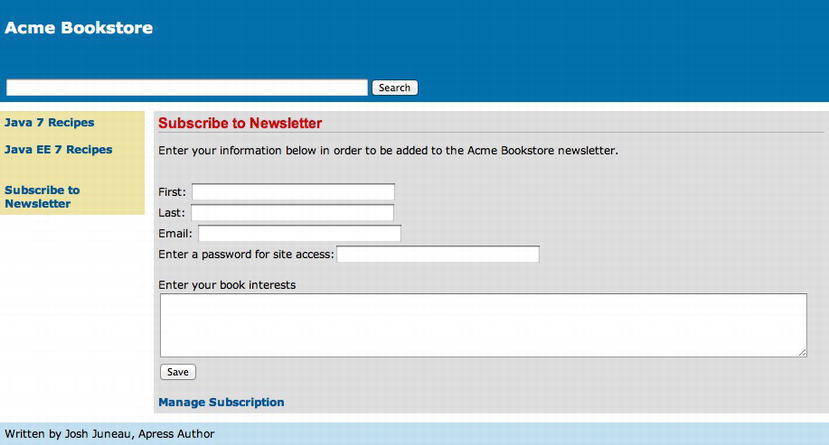
Figure 5-2 . Utilizing command components within a view
How It Works
The command components make JSF vastly different from using JSP technology. In the older technologies, form actions were used to handle request parameters and perform any required business logic with them. With the JSF command components, Java methods can be bound directly to a button or a link and invoked when the components are activated (button or link clicked). In the example for this recipe, both the commandButton and commandLink components are utilized. The commandButton component is used to submit the form request parameters for processing, and the commandLink component is bound to an action method that performs a redirect to another application page.
The command components have a handful of attributes that are of note. Those attributes, along with a description of each, are listed in Table 5-5 and Table 5-6.
Table 5-5. commandButton Component Additional Attributes
| Attribute | Description |
|---|---|
| action | EL that specifies a managed bean action method that will be invoked when the user activates the component. |
| actionListener | EL that specifies a managed bean action method that will be notified when this component is activated. The action method should be public and accept an ActionEvent parameter, with a return type of void. |
| class | CSS style class that can be applied to the component. |
| dir | Direction indication for text (LTR: left-to-right; RTL: right-to-left). |
| disabled | A Boolean to indicate whether the component is disabled. |
| image | Absolute or relative URL to an image that will be displayed on the button. |
| immediate | Flag indicating that, if this component is activated by the user, notifications should be delivered to interested listeners and actions immediately (that is, during the Apply Request Values phase) rather than waiting until the Invoke Application phase. |
| label | Name for the component. |
| lang | Code for the language used for generating the component markup. |
| readonly | Boolean indicating whether the component is read only. |
| rendererType | Identifier of renderer instance. |
| tabindex | Index value indicating number of tab button presses it takes to bring the component into focus. |
| title | Tooltip that will be displayed when the mouse hovers over component. |
| transient | Boolean indicating whether component should be included in the state of the component tree. |
| type | Indicates type of button to create. Values are submit (default), reset, and button. |
Table 5-6. commandLink Component Additional Attributes
| Attribute | Description |
|---|---|
| action | EL that specifies a managed bean action method that will be invoked when the user activates the component. |
| accessKey | Access key value that will transfer the focus to the component. |
| cords | Position and shape of the hotspot on the screen. |
| dir | Direction indication for text (LTR: left-to-right; RTL: right-to-left). |
| disabled | Specifies a Boolean to indicate whether the component is disabled. |
| hreflang | Language code of the resource designated by the hyperlink. |
| immediate | Flag indicating that, if this component is activated by the user, notifications should be delivered to interested listeners and actions immediately (that is, during the Apply Request Values phase) rather than waiting until the Invoke Application phase. |
| lang | Code for the language used for generating the component markup. |
| rel | Relationship from the current document to the anchor specified by the hyperlink. |
| rev | Reverse anchor specified by this hyperlink to the current document. |
| shape | Shape of the hotspot on the screen. |
| tabindex | Index value indicating number of tab button presses it takes to bring the component into focus. |
| target | Name of a frame where the resource retrieved via the hyperlink will be displayed. |
| title | Tooltip that will be displayed when the mouse hovers over component. |
| type | Indicates type of button to create. Values are submit (default), reset, and button. |
| charset | Character encoding of the resource designated by the hyperlink. |
The commandButton and commandLink components in the example to this recipe specify only a minimum number of attributes. That is, they both specify id, action, and value attributes. The id attribute is used to uniquely identify each of the components. The action attribute is set to the JSF EL, which binds the components to their managed bean action methods. The commandButton component has an action attribute of #{contactController2.subscribe}, which means that the ContactController class’s subscribe method will be invoked when the button on the page is clicked. The commandLink has an action attribute of #{contactController2.manage}, which means that the ContactController class’s manage method will be invoked when the link is clicked. Each of the components also specifies a value attribute, which is set to the text that is displayed on the button or link when rendered.
As you can see, only a handful of the available attributes are used within the example. However, the components can be customized using the additional attributes that are available. For instance, an actionListener method can be specified, which will bind a managed bean method to the component, and that method will be invoked when the component is activated. JavaScript functions can be specified for each of the attributes beginning with the word on, activating client-side functionality.
Command components vastly change the landscape of Java web application development. They allow the incorporation of direct Java method access from within user pages and provide an easy means for processing request parameters.
5-3. Displaying Output
Problem
You want to display text from a managed bean property within your application pages.
Solution
Incorporate JSF output components into your views. Output components are used to display static or dynamic text onto a page, as well as the results of expression language arithmetic. The standard JSF component library contains four components that render output: outputLabel, outputText, outputFormat, outputLink, and link. The Acme Bookstore utilizes each of these components within the bookstore newsletter application façade.
In the following example, the newsletter subscription view has been rewritten to utilize some of the output components:
<?xml version='1.0' encoding='UTF-8' ?>
<!--
Book:  Java EE7 Recipes
Recipe: 5-3
Author: J. Juneau
-->
<!DOCTYPE html PUBLIC "-//W3C//DTD XHTML 1.0 Transitional//EN" "http://www.w3.org/TR/xhtml1/DTD/xhtml1-transitional.dtd">
<html xmlns="http://www.w3.org/1999/xhtml"
      xmlns:ui="http://xmlns.jcp.org/jsf/facelets"
      xmlns:f="http://xmlns.jcp.org/jsf/core"
      xmlns:h="http://xmlns.jcp.org/jsf/html">

    <body>

        <ui:composition template="layout/custom_template_search.xhtml">
            <ui:define name="content">
                <h:messages globalOnly="true"  errorStyle="color: red" infoStyle="color: green"/>
                <h:form id="contactForm">
                    <h1>Subscribe to Newsletter</h1>
                    <p>
                        <h:outputText id="newsletterSubscriptionDesc"
                                      value="#{contactController.newsletterDescription}"/>
                    </p>

                    <br/>
                    <h:outputLabel for="first" value="First: "/>
                    <h:inputText id="first" size="40" value="#{contactController.current.first}"/>
                    <br/>
                    <h:outputLabel for="last" value="Last: "/>
                    <h:inputText id="last" size="40" value="#{contactController.current.last}"/>
                    <br/>
                    <h:outputLabel for="email" value="Email: "/>
                    <h:inputText id="email" size="40" value="#{contactController.current.email}"/>
                    <br/>
                    <h:outputLabel for="password" value="Enter a password for site access: "/>
                    <h:inputSecret id="password" size="40" value="#{contactController.current.password}"/>
                    <br/><br/>
                    <h:outputLabel for="description" value="Enter your book interests"/>
                    <br/>
                    <h:inputTextarea id="description" rows="5" cols="100"
                                                value="#{contactController.current.description}"/>
                    <br/>
                    <h:commandButton id="contactSubmit" action="#{contactController.subscribe}"
                                                    value="Save"/>
                    <br/><br/>
                    <h:commandLink id="manageAccount" action="#{contactController.manage}"
                                                 value="Manage Subscription"/>
                    <br/><br/>
                    <h:outputLink id="homeLink" value="home.xhtml">Home</h:outputLink>
                </h:form>
            </ui:define>
        </ui:composition>

    </body>
</html>
Managed Bean: ContactController.java
The ContactController managed bean has been modified throughout the recipes within this chapter to incorporate new functionality as the recipes move forward. In this recipe, a new property has been added to the ContactController that contains the description of the newsletter.
Note The hard-coded newsletter description is not a good idea for use in a production application. It is used in this example for demonstration purposes only. For a production application, utilization of resource bundles or database storage would be a more viable approach for storing Strings of text.
The following source excerpt from the ContactController class shows the changes:
. . .
private String newsletterDescription;

    /**
     * Creates a new instance of ContactController
     */
    public ContactController() {
        current = null;
        newsletterDescription = "Enter your information below in order to be " +
                "added to the Acme Bookstore newsletter.";
    }
. . .
/**
     * @return the newsletterDescription
     */
    public String getNewsletterDescription() {
        return newsletterDescription;
    }

    /**
     * @param newsletterDescription the newsletterDescription to set
     */
    public void setNewsletterDescription(String newsletterDescription) {
        this.newsletterDescription = newsletterDescription;
    }
. . .
The resulting page looks like Figure 5-3. Note that the text is the same, because it is merely reading the same text from a managed bean property. Also note that there is now an additional link added to the bottom of the page, which reads Home.
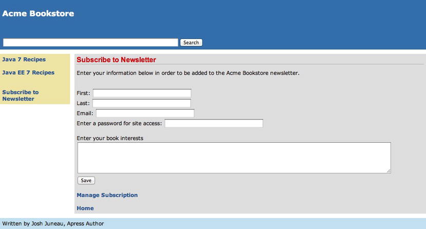
Figure 5-3 . Utilizing output components within a view
How It Works
Output components can be used to display output that is generated within a managed bean or to render a link to another resource. They can be useful in many cases for displaying dynamic output to a web view. The example for this recipe demonstrates three out of the five different output component types: outputText, outputLink, and outputLabel. Each of the components shares a common set of attributes, which are listed in Table 5-7.
Note The outputText component has become a bit less important since the release of JSF 2.0 because the Facelets view definition language implicitly wraps inline content with a similar output component. Therefore, the use of the outputText tag within JSF 2.0 is necessary only if you want to utilize some of the tag attributes for rendering, JavaScript invocation, or the like.
Table 5-7. Common Output Component Attributes (Not Listed in Introduction)
| Attribute | Description |
|---|---|
| class | CSS class for styling |
| converter | Converter that is registered with the component |
| dir | Direction of text (LTR: left-to-right; RTL: right-to-left) |
| escape | Boolean value to indicate whether XML- and HTML-sensitive characters are escaped |
| lang | Code for language used when generating markup for the component |
| parent | Parent component |
| title | Tooltip text for the component |
| transient | Boolean indicating whether component should be included in the state of the component tree |
The outputText component in the example contains a value of #{contactController.newsletterDescription}, which displays the contents of the newsletterDescription property within ContactController. Only the common output component attributes can be specified within the h:outputText tag. Therefore, an attribute such as class or style can be used to apply styles to the text displayed by the component. If the component contains HTML or XML, the escape attribute can be set to true to indicate that the characters should be escaped.
The outputFormat component shares the same set of attributes as the outputText component. The outputFormat component can be used to render parameterized text. Therefore, if you require the ability to alter different portions of a String of text, you can do so via the use of JSF parameters (via the f:param tag). For example, suppose you wanted to list the name of books that someone has purchased from the Acme Bookstore; you could use the outputFormat component like in the following example:
<h:outputFormat value="Cart contains the books {0}, {1}, {2}"/>
    <f:param value="Java 7 Recipes"/>
    <f:param value="JavaFX 2.0: Introduction by Example"/>
    <f:param value="Java EE 7 Recipes"/>
</h:outputFormat>
The outputLink and outputLabel components can each specify a number of other attributes that are not available to the previously discussed output components. The additional attributes are listed in Table 5-8 (outputLink) and Table 5-9 (outputLabel). The outputLink component can be used to create an anchor or link that will redirect an application user to another page when the link is clicked. In the example, the outputLink component is used to redirect a user to a view named home.xhtml. The value for the outputLink component can be set to a static page name, as per the example, or it can contain a JSF EL expression corresponding to a managed bean property. It is also possible to pass parameters to another page using the outputLink component by nesting f:param tags between opening and closing h:outputLink tags as follows:
<h:outputLink id="homeLink" value="home.xhtml">
    <h:outputText value="User Home Page"/>
    <f:param name="username" value="#{contactController.current.email}"/>
 </h:outputLink>
The previous example would produce a link with the text User Home Page when rendered on the page. It would produce the following HTML link, where emailAddress corresponds to the EL expression of #{contactController.current.email}:
<a href="home.xhtml?username=emailAddress">Home Page</a>
Similarly, rather than displaying a link as text on the page, an image can be used by embedding a graphicImage component (see Recipe 5-6 for details).
The outputLabel component renders an HTML <label> tag, and it can be used in much the same way as the outputText component. In the example, the outputLabel component values are all using static text, but they could also utilize JSF EL expressions to make use of managed bean property values if that is more suitable for the application.
Table 5-8. outputLink Additional Attributes
| Attribute | Description |
|---|---|
| acccessKey | Access key value that will transfer the focus to the component. |
| binding | ValueExpresssion linking this component to a property in a backing bean. |
| charset | The character encoding of the resource designated by this hyperlink. |
| cords | Position and shape of the hotspot on the screen. |
| dir | Direction indication for text (LTR: left-to-right; RTL: right-to-left). |
| disabled | Specifies a Boolean to indicate whether the component is disabled. |
| fragment | Identifier for the page fragment that should be brought into focus when the target page is rendered. |
| hreflang | Language code of the resource designated by the hyperlink. |
| lang | Code for the language used for generating the component markup. |
| rel | Relationship from the current document to the anchor specified by the hyperlink. |
| rev | Reverse anchor specified by this hyperlink to the current document. |
| shape | Shape of the hotspot on the screen. |
| tabindex | Index value indicating number of Tab button presses it takes to bring the component into focus. |
| target | Name of a frame where the resource retrieved via the hyperlink will be displayed. |
| title | Tooltip that will be displayed when the mouse hovers over component. |
| type | Type of button to create. Values are submit (default), reset, and button. |
Table 5-9. outputLabel Additional Attributes
| Attribute | Description |
|---|---|
| acccessKey | Access key value that will transfer the focus to the component. |
| binding | ValueExpresssion linking this component to a property in a backing bean. |
| dir | Direction indication for text (LTR: left-to-right; RTL: right-to-left). |
| escape | Flag indicating that characters that are sensitive in HTML and XML markup must be escaped. |
| for | Client identifier of the component for which this element is a label. |
| lang | Code for the language used for generating the component markup. |
| tabindex | Index value indicating number of Tab button presses it takes to bring the component into focus. |
| title | Tooltip that will be displayed when the mouse hovers over component. |
| type | Type of button to create. Values are submit (default), reset, and button. |
The last output component that I’ll cover in this recipe is the link component. It was introduced to JSF in release 2.0, and it makes the task of adding links to a page just a bit easier. Both the outputLink and link components produce similar results, but link has just a couple of different attributes that make it react a bit differently. The value attribute of the h:link tag specifies the label or text that should be used when the link is rendered on the page, and the outcome attribute specifies the page that should be linked to. The following example of the link component produces the same output as the outputLink component in the example for this recipe:
<h:link id=""homeLink"" value=""Home"" outcome=""home""/>
Parameters and images can also embedded within the h:link tag, in the same manner as with outputLink. The link component also contains some custom attributes, as listed in Table 5-10.
Table 5-10. link Component Additional Attributes
| Attribute | Description |
|---|---|
| charset | Character encoding of the resource that is designated by the hyperlink. |
| cords | Position and shape of the hotspot on the screen, usually used when generating maps or images containing multiple links. |
| disabled | Flag to indicate that the component should never receive focus. |
| fragment | Identifier for the page fragment that should be brought into focus when the link is clicked. The identifier is appended to the # character. |
| hreflang | Language of the resource designated by this link. |
| includeviewparams | Boolean indicating whether to include page parameters when redirecting. |
| outcome | Logical outcome used to resolve a navigational case. |
| rel | Relationship from the current document to the resource specified by link. |
| rev | Reverse link from the anchor specified from this link to the current document. |
| shape | Shape of the hotspot on the screen. |
| target | Name of the frame in which the resource linked to is to be displayed. |
| type | Content type of resource that is linked to. |
This recipe provided a high-level overview of the JSF standard output components. In JSF 2.0+, it is important to note that you can simply include a JSF EL expression without using an output component to display text within a page. However, these components can still be quite useful under certain circumstances, making them an important set of components to have within your arsenal.
5-4. Adding Form Validation
Problem
To ensure that valid data is being submitted via your form, you need to incorporate some validation on your input fields.
Solution #1
Utilize prebuilt JSF validator tags on the view’s input components where possible. JSF ships with a handful of prebuilt validators that can be applied to components within a view by embedding the validator tag within the component you want to validate. The following code excerpt is taken from a JSF view that defines the layout for the newsletter subscription page of the Acme Bookstore application. The sources can be found in the view named recipe05_04.xhtml, and the excerpt demonstrates applying prebuilt validators to some inputText components.
. . .
<h:outputLabel for="first" value="First: "/>
<h:inputText id="first" size="40" value="#{contactController.current.first}">
    <f:validateLength minimum="1" maximum="40"/>
 </h:inputText>
<br/>
<h:message id="firstError"
                    for="first"
                    errorStyle="color:red"/>
<br/>
<h:outputLabel for="last" value="Last: "/>
<h:inputText id="last" size="40" value="#{contactController.current.last}">
    <f:validateLength minimum="1" maximum="40"/>
</h:inputText>
<br/>
<h:message id="lastError"
                     for="last"
                     errorStyle="color:red"/>
<br/>
. . .
In the preceding code excerpt, you can see that the f:validateLength validator tags have been embedded in different inputText components. When the form is submitted, these validators will be applied to the values within the inputText component fields and will return an error message if the constraints have not been met.
Solution #2
Utilize JSF bean validation by annotating managed bean fields with validation annotations. It is possible to perform validation from within the managed bean by annotating the property field declaration with the validation annotations that are needed. When the form is submitted, then the bean validation will be performed.
Note An f:validateBean tag can be embedded within the component in the view if making use of validationGroups in order to delegate the validation of the local value to the Bean Validation API. If using f:validateBean, the validationGroups attribute will serve as a filter that instructs which constraints should be enforced.
The following code excerpt is taken from the JSF view that defines the layout for the newsletter subscription page of the Acme Bookstore application. The sources can be found in the view named recipe05_04.xhtml.
. . .
<h:outputLabel for="email" value="Email: "/>
<h:inputText id="email" size="40" value="#{contactController.current.email}"/>
<br/>
<h:message id="emailError"
                     for="email"
                     errorStyle="color:red"/>
. . .
Next is an excerpt from the ContactController managed bean that demonstrates applying a validator annotation to the email property field declaration:
. . .
@Pattern(regexp = "[a-zA-Z0-9]+@[a-zA-Z0-9]+\.[a-zA-Z0-9]+", message = "Email format is invalid.")
    private String email;
. . .
When the form is submitted, the validation on the email field will occur. If the value entered into the inputText component does not validate against the regular expression noted in the annotation, then the message will be displayed within the corresponding messages component.
Solution #3
Create a custom validator method within a managed bean, and register that method with an input component by specifying the appropriate EL for the component’s validator attribute. The following code excerpt is taken from the JSF view that defines the layout for the newsletter subscription page of the Acme Bookstore application. The sources can be found in the view named recipe05_04.xhtml, and the excerpt demonstrates a custom validator method to a component by specifying it for the validator attribute.
 . . .
<h:outputLabel for="password" value="Enter a password for site access: "/>
<h:inputSecret id="password" size="40" redisplay="true" value="#{contactController.current.password}"/>
<br/>
<h:outputLabel for="passwordConfirm" value="Confirm Password: "/>
<h:inputSecret id="passwordConfirm" size="40" redisplay="true"
                         validator="#{contactController.validatePassword}"/>
<br/>
<h:message id="passwordConfirmError"
                     for="passwordConfirm"
                     style="color:red"/>
. . .
Note If you are thinking outside of the box, you’ll see that the previous code fragment would be an excellent choice for creating into a composite component! If a composite component is created, then it would be as simple as adding a tag such as <custom:passwordValidate> to your form. Please see Recipe 4-4 for more details on developing composite components.
The validator attribute specifies the validatePassword method within the ContactController managed bean. The following excerpt is taken from ContactController, and it shows the validator method’s implementation:
. . .
/**
     * Custom validator to ensure that password field contents match
     * @param context
     * @param component
     * @param value
     */
    public void validatePassword(FacesContext context,
                                 UIComponent component,
                                 Object value){
        Map map = context.getExternalContext().getRequestParameterMap();
        String passwordText = (String) map.get(("contactForm:password"));
        String confirmPassword = value.toString();

        if (!passwordText.equals(confirmPassword)) {
            throw new ValidatorException(new FacesMessage("Passwords do not match"));
        }
    }
. . .
When the form is submitted, the validatePassword method will be invoked during the Process Validations phase. The method will read the values of both the password and passwordConfirm fields, and an exception will be thrown if they do not match. For example, if the input form for the newsletter subscription page is submitted without any values, then the page should be re-rendered and look like Figure 5-4.
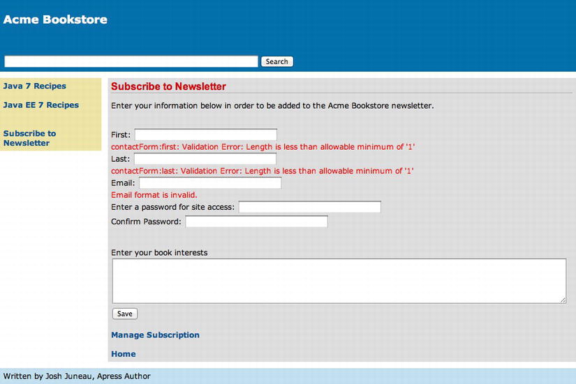
Figure 5-4 . Validation errors on input fields
How It Works
There are a few different ways in which to apply validation to form input fields. The easiest way to apply validation to an input component is to utilize the prebuilt validator tags that ship with JSF. There are prebuilt tags for validating data for a specified length, range, and so on. Please see Table 5-2 in the introduction to this chapter for the complete list of validator tags. You can also choose to apply validation to input components using bean validation. Bean validation requires validation annotations to be placed on the property declaration within the managed bean. Yet another possible way to perform validation is to create a custom validation method and specify the method within the input component’s validator attribute. This section will provide a brief overview of each prebuilt validation tag, cover the basics of bean validation, and demonstrate how to build a custom validation method.
Note It is possible to create a class that implements the Validator interface to perform validation. For more information, please see Recipe 3-7.
No matter which validation solution you choose to implement, the validation occurs during the Process Validations phase of the JSF life cycle. When a form is submitted, via a command component or an Ajax request, all validators that are registered on the components within the tree are processed. The rules that are specified within the attributes of the component are compared against the local value for the component. At this point, if any of the validations fails, the messages are returned to the corresponding message components and displayed to the user.
To utilize the prebuilt validation tags, they must be embedded between opening and closing input component tag and specify attributes according to the validation parameters you want to set. In Solution #1 for this recipe, you learned how to use the f:validateLength validator tag, which allows validation of component data for a specified length. The minimum and maximum attributes are set to the minimum string length and maximum string length, respectively.
The f:validateLongRange validator can be used to check the range of a numeric value that has been entered. The minimum and maximum attributes of f:validateLongRange are used to determine whether the value entered falls within the lower and upper bounds, respectively.
Similar to f:validateLongRange is the f:validateDoubleRange validator, which is used to validate the range of a floating-point value. Again, the minimum and maximum attributes of f:validateDoubleRange are used to determine whether the value entered falls within the lower and upper bounds, respectively.
New with the release of JSF 2.0 was the f:validateRequired validator, which is used to ensure that an input field is not empty. No attributes are needed with this validator; simply embed it within a component tag to ensure that the component will not contain an empty value.
Another new validator that shipped with the JSF 2.0 release was the f:validateRegex validator. This validator uses a regular expression pattern to determine whether the value entered matches the specified pattern. The validator’s pattern attribute is used to specify the regular expression pattern, as shown in the example for Solution #1 to this recipe.
In Solution #2, JSF bean validation is demonstrated, which was also a new feature of the JSF 2.0 release. Bean validation allows you to annotate a managed bean field with constraint annotations that indicate the type of validation that should be performed. The validation automatically occurs on the annotated fields when a form is submitted that contains input components referencing them. A handful of standard constraint annotations can be applied to bean fields, as listed in Table 5-11. Each annotation accepts different attributes; please see the online documentation at http://docs.oracle.com/javaee/6/api/ for more details.
Table 5-11 . Constraint Annotations Used for Bean Validation
| Annotation | Description |
|---|---|
| @AssertFalse | The annotated element must be false. |
| @AssertTrue | The annotated element must be true. |
| @DecimalMax | The annotated element must be a decimal that has a value less than or equal to the specified maximum. |
| @DecimalMin | The annotated element must be a decimal that has a value greater than or equal to the specified minimum. |
| @Digits | The annotated element must be a number within the accepted range. |
| @Future | The annotated element must be a date in the future. |
| @Max | The annotated element must be a number that has a value less than or equal to the specified maximum. |
| @Min | The annotated element must be a number that has a value greater than or equal to the specified minimum. |
| @NotNull | The annotated element must not be null. |
| @Null | The annotated element must be null. |
| @Past | The annotated element must be a date in the past. |
| @Pattern | The annotated element must match the pattern specified in the regular annotation’s regular expression. |
| @Size | The annotated element must be between the specified boundaries. |
When using bean validation, the input component that references an annotated bean field can contain an f:validateBean tag to customize behavior. The f:validateBean tag’s validationGroups annotation can be used to specify validation groups that can be used for validating the component. For instance, such a solution may resemble something like the following:
<h:inputText id="email" value="#{contactController.email}">
    <f:validateBean validationGroups="org.javaeerecipes.validation.groups.EmailGroup"/>
</h:inputText>
Note Validation groups define a subset of constraints that can be applied for validation. A validation group is represented by an empty Java interface. The interface name can then be applied to annotation constraints within a bean class in order to assign such constraints to a particular group. For instance, the following field that is annotated with @Size specifies a group of Email.class:
@Size(min=2, max=30, groups=Email.class)
private String email;
When utilizing the f:validateBean tag, any constraint annotations that are contained within the specified group will be applied to the field for validation.
When using bean validation, a custom error message can be displayed if the validation for a field fails. To add a custom message, include the message attribute within the annotation, along with the error message that you want to have displayed. As a best practice, error messages should be pulled from a message bundle.
The example for Solution #3 demonstrates the use of a custom validator method in order to perform validation on an input component. The input component’s validator attribute can reference a managed bean method that has no return type and accepts a FacesContext, a UIComponent, and an Object, as a validation method. The method can utilize the parameters to gain access to the current FacesContext, the UIComponent that is being validated, and the current value that is contained in the object, respectively. The validation logic can throw a javax.faces.validator.ValidatorException if the value does not pass validation and then return a message to the user via the exception. In the example, the method named validatePassword is used to compare the two password field contents to ensure that they match. The first two lines of code within the method are used to obtain the value of the component with the id of password and save it into a local variable. The actual validation logic compares that value against the incoming parameter’s Object value, which is the current value of the component being validated, to determine whether there is a match. If not, then a ValidationException is thrown with a corresponding message. That message will then be displayed within the messages component that corresponds to the component being validated.
As mentioned at the beginning of this recipe, there are a few ways to validate input. None of them is any better than the other; their usage depends upon the needs of your application. If you are going to be changing validation patterns often, then you may want to stick with the prebuilt validator tags so that you do not need to recompile code in order to change the validation. On the other hand, if you know that your validation will not change, then it may be easier for you to work with the bean validation technique. Whatever the case, validation can be made even easier with Ajax, and that topic will be covered in Chapter 6.
5-5. Adding Select Lists to Pages
Problem
You want to provide a list of options to choose from for some of the input fields within your page.
Solution
Use the JSF selectOneMenu, selectManyMenu, selectOneListbox, or selectManyListbox component, depending upon the type of list your application requires. Each of these selection components allows for either one or many selections to be made from a particular set of values. The example for this recipe adds to the newsletter subscription page of the Acme Bookstore. The bookstore application will allow the customer to select their occupation from a drop-down list and to select one or more newsletters to which they would like to subscribe from a multiple-select list. Since they’ll be selecting only a single option for their occupation, a selectOneMenu is used. However, since multiple newsletter selections can be made, a selectManyListbox is the best choice.
The following excerpt is taken from the JSF view named recipe05_05.xhtml, and it demonstrates the usage of these components:
. . .
<h:outputLabel for="occupation" value="Occupation: "/>
<h:selectOneMenu id="occupation" value="#{contactController.current.occupation}">
    <f:selectItem itemLabel="" itemValue=""/>
    <f:selectItems value="#{contactController.occupationList}"/>
</h:selectOneMenu>
<br/><br/>
<h:outputLabel for="newsletterList" value="Newsletters:"/>
<h:selectManyListbox id="newsletterList" value="#{contactController.current.newsletterList}">
    <f:selectItems value="#{contactController.allNewsletters}"/>
</h:selectManyListbox>
. . .
Managed Bean: ContactController.java
The components are bound to properties within the ContactController managed bean. The following excerpt, taken from ContactController, shows the declaration of the properties, along with their corresponding accessor methods:
. . .
// Declaration of the managed bean properties
private List<String> occupationList;
private Map<String, Object> allNewsletters;
. . .
// Example of populating the object
private void populateOccupationList(){
        occupationList = new ArrayList();
        occupationList.add("Author");
        occupationList.add("IT Professional");
}

// Example of populating the object
private void populateNewsletterList(){
    newsletterList = new LinkedHashMap<String,Object>();
    newsletterList.put("Java 7 Recipes Weekly", "Java");
    newsletterList.put("JavaFX Weekly", "FX");
    newsletterList.put("Oracle PL/SQL Weekly", "Oracle");
    newsletterList.put("New Books Weekly", "New Books");
}

. . .
/**
    * @return the occupationList
    */
public List<String> getOccupationList() {
    return occupationList;
}

/**
    * @param occupationList the occupationList to set
    */
public void setOccupationList(List<String> occupationList) {
    this.occupationList = occupationList;
}

/**
    * @return the newsletterList
    */
public Map<String,Object> getNewsletterList() {
    return newsletterList;
}

/**
    * @param newsletterList the newsletterList to set
    */
public void setNewsletterList(Map<String,Object> newsletterList) {
    this.newsletterList = newsletterList;
}
. . .
The newly updated newsletter subscription page should look like Figure 5-5.
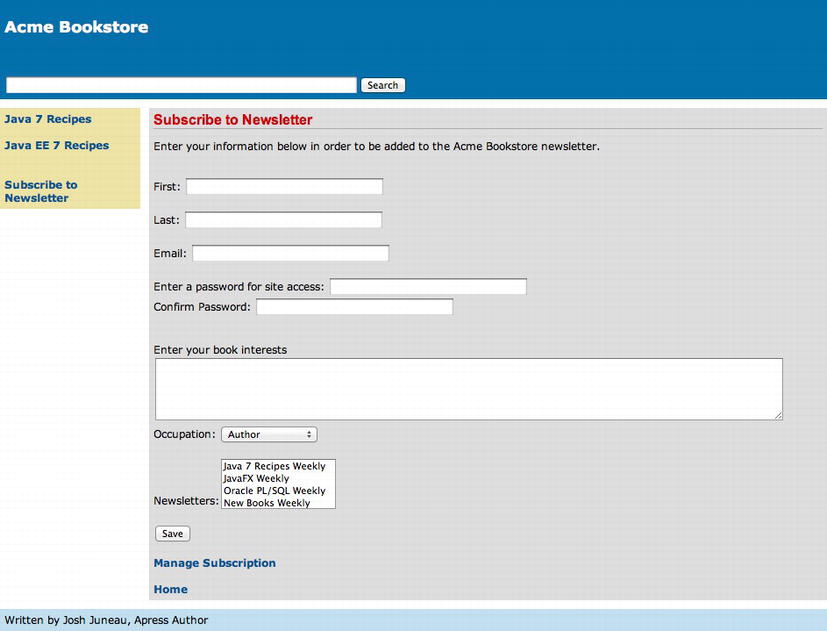
Figure 5-5 . Selection components including lists of values
How It Works
To ensure data integrity, it is always a good idea to include input components that are prepopulated with data if possible. Doing so ensures that users are not entering free-text values of varying varieties into text boxes, and it also gives the user a convenient choice of options. Utilizing selection components provides the user with a list of values to choose from, allowing one or more selections to be made. The standard JSF component library ships with four input components that accept lists of data from which a user can choose one or more selections. The selection components are selectOneListbox, selectManyListbox, selectOneMenu, and selectManyMenu. Each of these components shares a common set of attributes. Those common attributes that were not already displayed within Table 5-2 are listed within Table 5-12.
Table 5-12 . Select Component Attributes
| Attribute | Description |
|---|---|
| accesskey | Access key that, when pressed, transfers focus to the component |
| dir | Direction indication for text (LTR: left-to-right; RTL: right-to-left) |
| disabled | Boolean value to indicate whether the component is disabled |
| disabledClass | CSS style class to apply to the rendered label on disabled options |
| enabledClass | CSS style class to apply to the rendered label on enabled options |
| label | Localized user-presentable name for the component |
| lang | Code describing the language used in the generate markup for the component |
| size | Number of available options to be shown at all times (selectManyListbox) |
| tabindex | Index value indicating number of Tab button presses it takes to bring the component into focus |
| title | Tooltip that will be displayed when the mouse hovers over component |
Populating the Select Lists
Before diving into each of the four components and a brief description of how they work, it is important to note that each component displays a collection of data, and the f:selectItem or f:selectItems tags are used to specify that set of data. If you want to list each data item separately, then the f:selectItem tag should be used. One f:selectItem tag represents one element within the collection of values. The f:selectItem tag contains several attributes, but I will cover only some of the important ones in this discussion. Every f:selectItem tag should minimally contain both the itemValue and itemLabel attributes, specifying the value for the element and the label that is to be displayed, respectively. These attributes accept a JSF EL expression, or a string of text. In the example, both the itemValue and itemLabel attributes are left blank, which will render an empty selection for the first menu choice. When the user selects an option from the list, the itemValue attribute value is set into the corresponding selection component’s value.
The f:selectItems tag can be used to specify a collection of data that should be used for the component. A List of SelectItem objects can be built within a managed bean and specified for the f:selectItems tag. Much like the f:selectItem tag, several attributes can be used with this tag, and I’ll cover the essential ones here. Both the itemValue and itemLabel attributes can also be specified for the f:selectItems tag, corresponding to a List or Map of values, and a string label, respectively. However, most often, the value attribute is specified, referencing a managed bean property that contains a Collection or array of objects. The Collection or array can contain any valid Java object, and in the example a LinkedHashMap is used to populate the newsletterList property. Oftentimes it is easier to populate individual SelectItem objects and then load them into a List for use with the f:selectItems tag. The following lines of code show how to utilize SelectItem objects to populate the newsletters:
private void populateNewsletterList() {
        allNewsletters = new LinkedHashMap<String, Object>();
        allNewsletters.put("Java 7 Recipes Weekly", "Java");
        allNewsletters.put("JavaFX Weekly", "FX");
        allNewsletters.put("Oracle PL/SQL Weekly", "Oracle");
        allNewsletters.put("New Books Weekly", "New Books");
    }
Regarding Each Component Type
The selectOneMenu is probably the most commonly used selection component, and it renders a collection of data into a drop-down list. The user can select one entry from the menu, and the selected entry will be set into the managed bean property that is specified for the value attribute of the component. In the example to this recipe, the value is set to #{contactController.current.occupation}, so when an entry from the list is selected, then it will be set into the currently selected Contact object’s occupation field.
The selectOneListbox allows a user to select one value from a list of data. The user can see at least a few of the entries within the list within a box on the screen and can select one of the options from the list box. The selectOneListbox contains an additional attribute named collectionType, which allows the type of collection to be specified using a literal value.
Both the selectManyMenu and selectManyListbox components allow the user to choose more than one option in the selection list. The example demonstrates how to use a selectManyListbox component, allowing the user to choose more than one newsletter from the list. The main difference when using one of these components is that the managed bean property value for the component must be able to accept more than one value. In the example, the selectManyListbox component value references the Contact class’s newsletterList field. The newsletterList field is declared as a List of String objects, so when the user selects more than one value from the newsletterList, all of the choices can be stored in the current Contact object.
In the example for this recipe, two components are used to display lists of options for selection. One of the components allows a user to select one value from the collection and displays the options in a drop-down list, and the other allows a user to select more than one value and displays the options within a list box.
5-6. Adding Graphics to Your Pages
Problem
You want to incorporate a graphic into your site template or other select application pages.
Solution
Place the images that you want to display into a library within your application’s resources folder, and then use the graphicImage component to display them. The book.xhtml view for the Acme Bookstore application contains an image of each book in the store. To render the image, the book image name is populated from the image field of the Book managed bean. The following code excerpt taken from book.xhtml demonstrates how to use the h:graphicImage tag:
<h:graphicImage id="bookImage"
                            library="image"
              style="width: 100px; height: 120px" name="#{book.image}"/>
How It Works
Since the inception of JSF, the graphicImage component has been used to display images. Using the library attribute of the graphicImage component, a JSF view can reference an image resource without needing to specify a fully qualified path to the image file. In the solution to this recipe, the value specified for the library attribute is image, meaning that the image can be found within the resourceimage folder. It also provides the convenience of accepting JSF EL in attributes as needed so that images can be dynamically loaded based upon the current values within the corresponding managed bean properties. The graphicImage component makes it easy to display images, both dynamically and statically.
The h:graphicImage tag supports a number of attributes, above and beyond the standard JSF component attributes, as listed in Table 5-13.
Table 5-13 . graphicImage Component-Specific Attributes
| Attribute | Description |
|---|---|
| alt | Alternate textual description of the element rendered by the component |
| dir | Direction indication for text (LTR: left-to-right; RTL: right-to-left) |
| height | Overrides the height of the image |
| ismap | Boolean indicating whether the image is to be used as a server-side image map |
| lang | Code describing the language used in the generated markup for the component |
| longdesc | URI to a long description of the image represented by the element |
| title | Advisory title information about the markup elements generated by the component |
| usemap | Name of a client-side image map for which this element provides the image |
| width | Overrides the width of the image |
When the page is rendered in the example to this recipe, the image that resides within the application’s resources/image directory that corresponds to the name attribute on the tag will be displayed. If the user selects a different book from the menu, then that book’s image will be displayed using the same graphicImage component, because the name specified for the image can be changed depending upon the currently selected book object in the managed bean.
By utilizing a graphicImage within your views, you enable your images to take on the dynamic characteristics of standard JSF components.
5-7. Adding Check Boxes to a View
Solution
Utilize the selectOneCheckbox and selectManyCheckbox components within the view. These components allow you to specify a Boolean value as input by simply checking a box for a true value and deselecting the check box for a false value.
The following code excerpt is taken from the view named recipe05_07.xhtml, and it demonstrates the usage of these components:
. . .
<h:outputLabel for="notifyme" value="Would you like to receive other promotional email?"/>
<h:selectBooleanCheckbox id="notifyme"
value="#{contactController.current.receiveNotifications}"/>
<br/><br/>
<h:outputLabel for="notificationTypes"
                         value="What type of notifications are you interested in recieving?"/>
<h:selectManyCheckbox id="notifyTypes" value="#{contactController.current.notificationType}">
    <f:selectItems value="#{contactController.notificationTypes}"/>
</h:selectManyCheckbox>
. . .
Each of the components is bound to a Contact object, so when the form is submitted, the current Contact object will receive the data if valid. The following listing contains excerpts from the updated Contact class, an object that is used to hold the contact’s information. For the complete listing, please see the Contact.java sources within the org.javaeerecipes.chapter05 packages in the sources.
. . .
private boolean receiveNotifications;
private Map<String, Object> notificationType;
. . .

/**
    * @return the receiveNotifications
    */
public boolean isReceiveNotifications() {
    return receiveNotifications;
}

/**
    * @param receiveNotifications the receiveNotifications to set
    */
public void setReceiveNotifications(boolean receiveNotifications) {
    this.receiveNotifications = receiveNotifications;
}

/**
     * @return the notificationTypes
     */
    public Map<String, Object> getNotificationTypes() {
        return notificationTypes;
    }

    /**
     * @param notificationTypes the notificationTypes to set
     */
    public void setNotificationTypes(Map<String, Object> notificationTypes) {
        this.notificationTypes = notificationTypes;
    }
The last piece of the puzzle is the list of notification types that are bound to the f:selectItems tag that is embedded within the h:selectManyCheckbox component. These are bound to a property named notificationTypes in the ContactController managed bean. The following listing contains the relevant excerpts from that class.
. . .
// Declaration
private Map<String, Object> notificationTypes;
. . .
// Population occurs within the constructor, calling the populateNotificationTypes method
/**
    * Creates a new instance of ContactController
    */
public ContactController() {
    current = null;
    passwordConfirm = null;
    newsletterDescription = "Enter your information below in order to be " +
            "added to the Acme Bookstore newsletter.";
    populateOccupationList();
    populateNewsletterList();
    populateNotificationTypes();

}

private void populateNotificationTypes() {
        notificationTypes = new HashMap<>();
        notificationTypes.put("Product Updates", "1");
        notificationTypes.put("Best Seller Alerts","2");
        notificationTypes.put("Spam", "3");

    }
. . .
The resulting newsletter subscription input screen for the Acme Bookstore application including the new check box components will look like Figure 5-6.
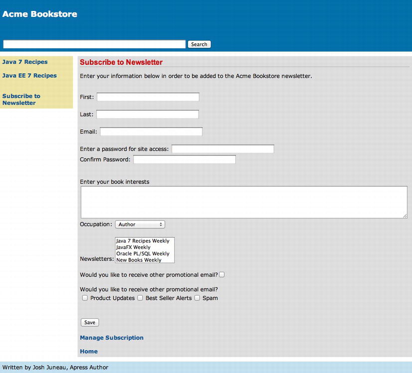
Figure 5-6 . Incorporating check boxes into your pages
How It Works
Check boxes are very common in applications because they provide an easy means for a user to enter a Boolean value. The box is either checked or not, and a checked box relates to a true value, leaving an unchecked box relating to a false value. The JSF standard component library ships with a couple of different check box selection components, namely, the selectBooleanCheckbox and the selectManyCheckbox. The selectBooleanCheckbox renders a single HTML input element with type="checkbox" on the page, whereas the selectManyCheckbox component renders multiple HTML input elements with type="checkbox". As with all JSF components, the check box selection components share a standard set of attributes above and beyond the common JSF component attributes, which are listed in Table 5-14.
Table 5-14 . Check Box Selection Component Attributes
| Attribute | Description |
|---|---|
| accessKey | Access key that, when pressed, transfers focus to the element |
| border | Width of the border to be drawn around the table containing the options list (selectManyCheckbox) |
| dir | Direction indication for text (LTR: left-to-right; RTL: right-to-left) |
| disabled | Boolean value indicating whether the element must receive focus or be included in a submit |
| label | Localized user presentable name for the component |
| lang | Code describing the language used in the generated markup for the component |
| layout | Orientation of the options list to be created (selectManyCheckbox) |
| readonly | Boolean indicating whether the component is read-only |
| tabindex | Index value indicating number of Tab button presses it takes to bring the component into focus |
| title | Tooltip that will be displayed when the mouse hovers over component |
A selectBooleanCheckbox component value attribute EL expression should correspond to a Boolean property within the managed bean. In the example to this recipe, the selectBooleanCheckbox value is set to #{contactController.current.receiveNotifications}, a Boolean field in the current Contact object that indicates whether the contact wants to receive notifications. If the user checks the box for the component, then the value for the receiveNotifications field will be set to true; otherwise, it will be set to false. The value attribute is the only attribute that is required for use. However, oftentimes the valueChangeListener attribute is set to a method within a managed bean that will be invoked if the value for the component value changes. This is most useful when using an Ajax form submit so that the client can see the results of a ValueChangeEvent immediately, rather than after the form is re-rendered. To learn more about working with valueChangeListeners, please see Chapter 6.
The selectManyCheckbox component displays one or more check boxes on a page. The value attribute for this component should correspond to a String array. Each check box contained within the component has a corresponding String value. Now you are probably thinking to yourself, what does a String have to do with a Boolean value? In fact, each String in the array corresponds to a check box on the page, and when a box is checked, the String that corresponds to that box is added to the array. If no boxes are checked, then there are no Strings added to the array. Therefore, the presence of the String signifies that the check box corresponding to that String value has been checked. To add check boxes, individual f:selectItem tags can be used for each check box, or a collection of check boxes can be added using the f:selectItems tag. If using f:selectItem, then the itemValue attribute is set to the String value that corresponds to that check box, and the itemLabel attribute is set to the check box label. In the example, the f:selectItems tag is used to populate check boxes for the component. The f:selectItems tag in the example contains a value attribute that is set to #{contactController.notificationTypes}, which corresponds to the notificationTypes field in the ContactController class. If you take a look at the notificationTypes field, you will see that it is declared as a Map<String, Object>, and each element in the array will correspond to a check box. When the ContactController class is instantiated, the populateNotificationTypes method is called, which populates the Map with the values for each check box. The following listing is that of the populateNotificationTypes method. Each element in the Map corresponds to a check box.
private void populateNotificationTypes() {
        notificationTypes = new HashMap<>();
        notificationTypes.put("Product Updates", "1");
        notificationTypes.put("Best Seller Alerts","2");
        notificationTypes.put("Spam", "3");

    }
Check boxes make it easy for a user to indicate a true or false (checked or unchecked) value for a given option. The JSF check box selection components help organize content on a page, and they provide a good means of ensuring data integrity since the user does not have to enter free text.
5-8. Adding Radio Buttons to a View
Problem
You want to display a set of items on a page in the form of radio buttons and allow the user to select only one of them.
Solution
Use radio buttons on your page to provide the user the option of selecting one item from a set. Radio buttons are often a nice solution when you want to display all options on the screen at once but allow only one selection. For this recipe, the Acme Bookstore wants to add a radio button on the newsletter subscription page to determine whether the subscriber is male or female.
The View: recipe05_08.xhtml
The following excerpt is taken from the JSF view named recipe05_08.xhtml, and it demonstrates the selectOneRadio component:
. . .
<h:outputLabel for="gender" value="Gender: "/>
<h:selectOneRadio id="gender" value="#{contactController.current.gender}">
    <f:selectItem itemValue="M" itemLabel="Male"/>
    <f:selectItem itemValue="F" itemLabel="Female"/>
</h:selectOneRadio>
<br/><br/>
<h:message id="genderError"
            for="gender"
            errorStyle="color:red"/>
<br/>
. . .
Managed Bean
The component is bound to a managed bean property named gender that has been added to the Contact class. The following listing contains excerpts from the Contact class, which show the updates for incorporating the new field:
. . .
private String gender;
. . .
/**
    * @return the gender
    */
public String getGender() {
    return gender;
}

/**
    * @param gender the gender to set
    */
public void setGender(String gender) {
    this.gender = gender;
}
. . .
When the selectOneRadio component is rendered on the screen, it adds a radio button for each of the available options. The updated Acme Bookstore newsletter page looks like that in Figure 5-7.
Figure 5-7 . Using a selectOneRadio component
How It Works
Radio buttons are very similar to check boxes in that they provide the user with an on or off value for a designated page value. The value added to using radio buttons is that they make it easy to display several options on the screen at once and allow the user to select only one of them. If a user tries to select a different option, then the currently selected item becomes unselected, forcing the user to select only one option. The JSF selectOneRadio component is used to render radio buttons on a page, and the component works in much the same manner as the selectManyCheckbox (Recipe 5-7).
The selectOneRadio shares all of the same attributes as the selectBooleanCheckbox component. Please see Table 5-14 for a listing of those attributes. The selectOneRadio component also contains a number of additional attributes, as listed in Table 5-15.
Table 5-15. selectOneRadio Attributes (in Addition to Those Listed in Table 5-14)
| Attribute | Description |
|---|---|
| disabledClass | CSS style class to apply to the rendered label on disabled options |
| enabledClass | CSS style class to apply to the rendered label on enabled options |
To use the selectOneRadio component, the value attribute should be set to a String. In the example, the value for the selectOneRadio component is set to the gender field in the current Contact object. When one of the radio buttons is selected, the String value corresponding to that button will be set into the field value. The radio buttons are populated using either the f:selectItem tag or the f:selectItems tag, much like the selectManyCheckbox component (Recipe 5-7). In the example, two f:selectItem tags are used to add two radio buttons to the component; the itemValue attribute is the String that will be submitted for the selected button, and the itemLabel attribute is the String that is displayed next to the corresponding button.
If you want to use an f:selectItems tag to populate a collection of radio buttons, the f:selectItems value attribute should be set to a managed bean property that is declared as a String array, a Map, or a List of SelectItem objects. To see an example, please review the example for the selectManyCheckbox component in Recipe 5-7.
Radio buttons are an easy way to display multiple options to a user and allow them to select one. If you understand how a selectManyCheckbox component works, then the selectOneRadio is very similar.
5-9. Structuring View Layout
Problem
Your page layout is becoming too crowded and unorganized so you want to organize it better by separating components into different sections.
Solution
Construct the page using a number of panelGrid and panelGroup components. The panelGrid component renders into an HTML table, so it allows JSF components to be organized using a table structure. For this recipe, the newsletter subscription page of the Acme Bookstore has been reorganized using a series of panelGrid and panelGroup components in an attempt to better organize the components into page sections. The components within each section of the page now correspond to each other so that the form is more intuitive for a user to populate.
The following listing is that of the view named recipe05_09.xhtml, which is the reorganized JSF view for the newsletter subscription page:
<?xml version='1.0' encoding='UTF-8' ?>
<!--
Book:  Java EE7 Recipes
Recipe: 5-9
Author: J. Juneau
-->
<!DOCTYPE html PUBLIC "-//W3C//DTD XHTML 1.0 Transitional//EN" "http://www.w3.org/TR/xhtml1/DTD/xhtml1-transitional.dtd">
<html xmlns="http://www.w3.org/1999/xhtml"
      xmlns:ui="http://xmlns.jcp.org/jsf/facelets"
      xmlns:f="http://xmlns.jcp.org/jsf/core"
      xmlns:h="http://xmlns.jcp.org/jsf/html">

    <body>

        <ui:composition template="layout/custom_template_search.xhtml">
            <ui:define name="content">
                <h:messages globalOnly="true"  errorStyle="color: red" infoStyle="color: green"/>
                <h:form id="contactForm">
                    <h1>Subscribe to Newsletter</h1>
                    <p>
                        <h:outputText id="newsletterSubscriptionDesc"
                                      value="#{contactController.newsletterDescription}"/>
                    </p>

                    <br/>
                    <h:panelGrid columns="2" bgcolor="" border="0">
                        <h:panelGroup>
                            <h:outputLabel for="first" value="First: "/>
                            <h:inputText id="first" size="40" value="#{contactController.current.first}">
                                <f:validateLength minimum="1" maximum="40"/>
                            </h:inputText>
                        </h:panelGroup>
                        <h:panelGroup>

                            <h:outputLabel for="last" value="Last: "/>
                            <h:inputText id="last" size="40" value="#{contactController.current.last}">
                                <f:validateLength minimum="1" maximum="40"/>
                            </h:inputText>
                        </h:panelGroup>

                        <h:message id="firstError"
                                   for="first"
                                   errorStyle="color:red"/>

                        <h:message id="lastError"
                                   for="last"
                                   errorStyle="color:red"/>
                        <h:panelGroup>
                            <h:outputLabel for="email" value="Email: "/>
                            <h:inputText id="email" size="40" value="#{contactController.current.email}"/>
                        </h:panelGroup>
                        <h:panelGroup/>
                        <h:message id="emailError"
                                   for="email"
                                   errorStyle="color:red"/>
                        <h:panelGroup/>


                        <h:selectOneRadio title="Gender" id="gender"
                             value="#{contactController.current.gender}">
                            <f:selectItem  itemValue="M" itemLabel="Male"/>
                            <f:selectItem itemValue="F" itemLabel="Female"/>
                        </h:selectOneRadio>
                        <h:panelGroup>
                            <h:outputLabel for="occupation" value="Occupation: "/>
                            <h:selectOneMenu id="occupation" value="#{contactController.current.occupation}">
                                <f:selectItems  itemvalue="#{contactController.occupationList}"/>
                            </h:selectOneMenu>
                        </h:panelGroup>
                        <h:message id="genderError"
                                   for="gender"
                                   errorStyle="color:red"/>

                    </h:panelGrid>
                    <br/>
                    <h:outputLabel for="description" value="Enter your book interests"/>
                    <br/>
                    <h:inputTextarea id="description" rows="5" cols="75"
                         value="#{contactController.current.description}"/>

                    <br/>
                    <h:panelGrid columns="2">
                        <h:outputLabel for="password" value="Enter a password for site access: "/>
                        <h:inputSecret id="password" size="40"
                             value="#{contactController.current.password}"/>

                        <h:outputLabel for="passwordConfirm" value="Confirm Password: "/>
                        <h:inputSecret id="passwordConfirm" size="40"
                             value="#{contactController.passwordConfirm}"
                                       validator="#{contactController.validatePassword}"/>
                    </h:panelGrid>
                    <h:message id="passwordConfirmError"
                               for="passwordConfirm"
                               style="color:red"/>
                    <br/>
                    <hr/>
                    <br/>

                    <h:panelGrid columns="3">
                        <h:panelGroup>
                            <h:outputLabel for="newsletterList" value="Newsletters:" style=" "/>
                            <h:selectManyListbox id="newsletterList"
                                 value="#{contactController.current.newsletterList}">
                                <f:selectItems value="#{contactController.newsletterList}"/>
                            </h:selectManyListbox>
                        </h:panelGroup>
                        <h:panelGroup/>
                        <h:panelGroup>
                            <h:panelGrid columns="1">
                                <h:panelGroup>
                                    <h:outputLabel for="notifyme"
                                      value="Would you like to receive other promotional email?"/>
                                    <h:selectBooleanCheckbox id="notifyme"
                                         value="#{contactController.current.receiveNotifications}"/>
                                </h:panelGroup>
                                <h:panelGroup/>
                                <hr/>
                                <h:panelGroup/>
                                <h:panelGroup>
                                    <h:outputLabel for="notificationTypes"
                                    value="What type of notifications are you interested in recieving?"/>
                                    <br/>
                                    <h:selectManyCheckbox id="notifyTypes"
                                    value="#{contactController.current.notificationType}">
                                        <f:selectItems value="#{contactController.notificationTypes}"/>
                                    </h:selectManyCheckbox>
                                </h:panelGroup>
                            </h:panelGrid>
                        </h:panelGroup>
                    </h:panelGrid>
                    <hr/>
                    <br/>

                    <h:commandButton id="contactSubmit" action="#{contactController.subscribe}"
                                                    value="Save"/>
                    <h:panelGrid columns="2" width="400px;">
                        <h:commandLink id="manageAccount" action="#{contactController.manage}"
                                                     value="Manage Subscription"/>

                        <h:outputLink id="homeLink" value="home.xhtml">Home</h:outputLink>
                    </h:panelGrid>
                </h:form>
            </ui:define>
        </ui:composition>

    </body>
</html>
When the reorganized page is rendered, it will look similar to what is shown in Figure 5-8.
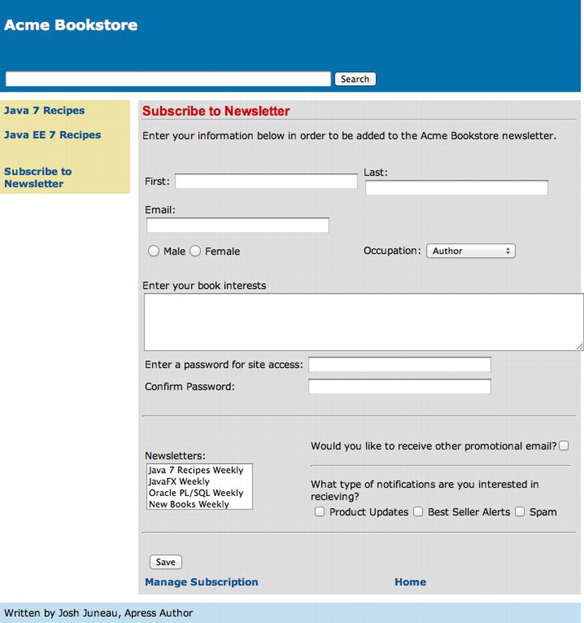
Figure 5-8 . Organizing page content with panelGrid and panelGroup
How It Works
Sometimes it makes sense to organize the layout of a web page using Cascading Style Sheets. This is often the case when there are a series of page sections, images that must be placed in precise locations, and fonts of varying styles and sizes. Other times it makes sense to organize the layout of a web page using HTML tables. Such is true when there are various fields that share similar fonts and organization needs to be uniform, whereas the fields are laid out with respect to the fields around them. Table-based layout is usually easy to apply to input forms that include a multitude of input components with corresponding labels. Uniform layout for input forms can help the overall user experience, making page flow that creates an easy experience. The JSF standard component known as the panelGrid is rendered into an HTML table, and it can be used to create uniform layout with ease.
You may ask, why would I use a panelGrid when a standard HTML table will do? There are a few good reasons to use a panelGrid as opposed to an HTML table. The best reason is for readability. To create a three-column table using HTML markup, you would have to write something similar to the following code:
<table>
    <tr>
        <td>
        <h:outputText value="#{myBean.myValue}"/>
        </td>
    </tr>
    <tr>
        <td>
        <h:outputText value="#{myBean.myValue}"/>
        </td>
    </tr>
    <tr>
        <td>
         <h:outputText value="#{myBean.myValue}"/>
        </td>
    </tr>
</table>
If using a panelGrid, the code would resemble the following listing:
<h:panelGrid columns="3">
    <h:outputText value="#{myBean.myValue}"/>
    <h:outputText value="#{myBean.myValue}"/>
    <h:outputText value="#{myBean.myValue}"/>
</h:panelGrid>
As you can see from the previous variance, the panelGrid component makes for much more readable markup. The other reasons to use panelGrid include the ability to utilize ValueExpressions for each of the attributes and the ability to bind panelGrids to managed bean properties. In the code for the solution to this recipe, the newsletter subscription page has been reworked to include a section on the top pertaining to the personal information about the contact individual, as well as a section at the bottom pertaining to the subscription. Fields have been organized using panelGrid components, along with some panelGroup components nested throughout. The panelGrid component contains a set of attributes that allow you to style the header, rows, footer, and so forth. Table 5-16 contains a listing of the attributes, with the exception of JavaScript code attributes that are shared with the other JSF standard components.
Table 5-16. panelGrid Attributes
| Attribute | Description |
|---|---|
| bgcolor | Name or code of the background color for the table. |
| bodyrows | Comma-separated list of row indices for which a new <tbody> element should be started. |
| border | Width (pixels) of the border to be drawn around the table. |
| captionClass | Space-separated list of CSS style classes that will be applied to any caption generated for the table. |
| captionStyle | CSS style(s) to be applied when the caption is rendered. |
| cellpadding | Definition of how much space the user agent should leave between the border of each cell and its contents. |
| cellspacing | Definition of how much space the user agent should leave between the left side of the table and the leftmost column, the top of the table and the top of the top side of the topmost row, and so on, for the right and bottom of the table. This also specifies how much space to leave between cells. |
| columnClasses | Comma-delimited list of CSS styles that will be applied to the columns of the table. A space-separated list of classes may also be specified for any individual column. |
| columns | Number of columns to render before starting a new row. |
| dir | Direction indication for text (LTR: left-to-right; RTL: right-to-left). |
| footerClass | Space-separated list of CSS style classes that will be applied to any footer generated for the table. |
| frame | Code specifying which sides of the frame surrounding the table will be visible. |
| headerClass | Space-separated list of CSS style classes that will be applied to any header generated for the table. |
| lang | Code describing the language used in the generated markup for the component. |
| rowClasses | Comma-delimited list of CSS style classes that will be applied to the rows of the table. A space-separated list of classes can also be specified for each individual row. |
| rules | Code specifying which rules will appear between the cells of the table. Valid values include none, groups, rows, cols, and all. |
| summary | Summary of the table’s purpose and structure, for user agents rendering to nonvisual media. |
| title | Advisory title information about markup elements generated for the component. |
| width | Width of the entire table. |
When using a panelGrid, the columns and rows attributes determine how many columns and rows the rendered table will include. For instance, a panelGrid that specifies columns="3" and rows="4" will have four rows of three columns of cells, for a total of 12 cells. The panelGroup component can be utilized for grouping one or more JSF components together so they occupy a single cell within the panelGrid. Any number of components can be embedded inside opening and closing h:panelGroup tags in order to have them treated as a single component within the table and, therefore, have them grouped into the same table cell. The panelGroup component contains a number of attributes, but they are rarely needed. In the example for this recipe, the panelGroup component is used to group the input fields together with their labels in most cases. The following excerpt from the example demonstrates the use of the panelGroup component:
<h:panelGroup>
    <h:outputLabel for="newsletterList" value="Newsletters:" style=" "/>
    <h:selectManyListbox id="newsletterList"
        value="#{contactController.current.newsletterList}">
          <f:selectItems value="#{contactController.newsletterList}"/>
    </h:selectManyListbox>
</h:panelGroup>
Just like HTML tables, panelGrid components can be nested inside each other. If there comes a need to create a table within a table, then doing so is very easy. The newly formatted newsletter subscription page contains a nested panelGrid component for laying out the subscription details section.
Page layout can be very important for the usability of an application. If a page is difficult to navigate, then users will become frustrated, and the application will be difficult to use at best. For years, HTML tables have been used as a means of structuring forms in an organized fashion. The panelGrid component adds value to this technique, making it the preferred way to organize JSF views in situations where CSS is not going to be a major benefit.
5-10. Displaying a Collection of Data
Problem
You are interested in displaying a collection of data within one of your JSF application pages.
Solution
Utilize a dataTable component to display a collection of data. A dataTable component can be used to iterate over a collection of data, providing a handle for each row object so that column data can be interrogated if need be or simply displayed. For this example, the book page is being updated to display the table of contents for a chosen book. The table of contents will be displayed within a dataTable component that has been customized for readability.
The following listing is that of the view named recipe05_10.xhtml, which is an incomplete snapshot of the book.xhtml view:
<?xml version='1.0' encoding='UTF-8' ?>
<!--
Recipe 5-10
Author: J. Juneau
-->
<!DOCTYPE html PUBLIC "-//W3C//DTD XHTML 1.0 Transitional//EN" "http://www.w3.org/TR/xhtml1/DTD/xhtml1-transitional.dtd">
<html xmlns="http://www.w3.org/1999/xhtml"
      xmlns:ui="http://xmlns.jcp.org/jsf/facelets"
      xmlns:f="http://xmlns.jcp.org/jsf/core"
      xmlns:h="http://xmlns.jcp.org/jsf/html">
<h:head>
        <meta http-equiv="Content-Type" content="text/html; charset=UTF-8"/>
        <title>Acme Bookstore</title>
    </h:head>
    <h:body>
        <ui:composition template="./layout/custom_template_search.xhtml">

            <ui:define name="content">
                <h:form id="componentForm">
                    <h1>Author List for #{ch5AuthorController.currentBook.title}</h1>
                    <p>
                        Below is the list of authors.  Click on the author's last name
                        for more information regarding the author.
                    </p>

                    <h:graphicImage    id="javarecipes" library="image"
                                    style="width: 100px; height: 120px"
                                    name="#{ch5AuthorController.currentBook.image}"/>
                    <br/>
                    <h:dataTable id="authorTable" border="1" value="#{ch5AuthorController.authorList}"
                                 var="author">
                        <f:facet name="header">
                            #{ch5AuthorController.currentBook.title} Authors
                        </f:facet>
                        <h:column>
                            <h:commandLink id="authorName" action="#{ch5AuthorController.displayAuthor(author.last)}"
                                           value="#{author.first} #{author.last}"/>
                        </h:column>
                    </h:dataTable>
                    <br/><br/>
                    <h:dataTable id="bookDetail" border="1"
                                 value="#{ch5AuthorController.currentBook.chapters}"
                                 var="book" style="width:100%"
                                 rowClasses="tocTableOdd, tocTableEven" columnClasses="col1">
                        <f:facet name="header">
                            #{ch5AuthorController.currentBook.title} Details
                        </f:facet>

                        <h:column>
                            <f:facet name="header">
                                Chapter
                            </f:facet>
                            <h:outputText value="#{book.chapterNumber}"/>
                        </h:column>
                        <h:column>
                            <f:facet name="header">
                                Title
                            </f:facet>
                            <h:outputText value="#{book.title}"/>
                        </h:column>

                    </h:dataTable>
                    <br/>
                    <br/>
                </h:form>
            </ui:define>
        </ui:composition>
    </h:body>
</html>
CSS
The dataTable utilizes some CSS style classes in order to make it easier to read. The following excerpt is taken from the Acme Bookstore application style sheet named styles.css, and it contains the styles utilized by the table. The styles.css sheet is linked to the view because it is declared as a resource within the template.
.tocTableOdd{
    background: #c0c0c0;
}

.tocTableEven{
    background: #e0e0e0;
}

.col1{
    text-indent: 15px;
    font-weight: bold;
}
To accommodate the new table, a class named Chapter has been added to the application. The Chapter class is an object that will contain the chapter number, the title, and a description of each chapter. There is to be one Chapter object instantiated for each chapter in every book. To view the listing, please see the org.javaeerecipes.chapter05.Chapter class in the sources. To populate the Chapter objects for each book, the AuthorController managed bean has been updated. The following excerpt is taken from the AuthorController managed bean, and it shows how the chapters are populated into the Book objects.
Note The example demonstrates hard-coding of Strings within Java classes. This is generally a bad idea, and the use of a database or resource bundle for obtaining Strings is a better fit for enterprise applications. This code is for demonstration purposes only; to learn more about using databases to store Strings, please refer to later chapters of this book.
. . .
public void populateAuthors(){
. . .
    Book book1 = new Book("Java 7 Recipes", "java7recipes.png");
    book1 = addChapters1(book1);
. . .
}
. . .
private Book addChapters1(Book book){
    Chapter chapter1 = new Chapter(1, "Getting Started with Java 7", null);
    Chapter chapter2 = new Chapter(2, "Strings", null);
    Chapter chapter3 = new Chapter(3, "Numbers and Dates", null);
    Chapter chapter4 = new Chapter(4, "Data Structures, Conditionals, and Iteration", null);
    Chapter chapter5 = new Chapter(5, "Input and Output", null);
    Chapter chapter6 = new Chapter(6, "Exceptions, Logging, and Debugging", null);
    Chapter chapter7 = new Chapter(7, "Object Oriented Java", null);
    Chapter chapter8 = new Chapter(8, "Concurrency", null);
    Chapter chapter9 = new Chapter(9, "Debugging and Unit Testing", null);
    Chapter chapter10 = new Chapter(10, "Unicode, Internationalization, and Currency Codes", null);
    Chapter chapter11 = new Chapter(11, "Working with Databases (JDBC)", null);
    Chapter chapter12 = new Chapter(12, "Java 2D Graphics and Media", null);
    Chapter chapter13 = new Chapter(13, "Java 3D", null);
    Chapter chapter14 = new Chapter(14, "Swing API", null);
    Chapter chapter15 = new Chapter(15, "JavaFX Fundamentals", null);
    Chapter chapter16 = new Chapter(16, "Graphics with JavaFX", null);
    Chapter chapter17 = new Chapter(17, "Media with JavaFX", null);
    Chapter chapter18 = new Chapter(18, "Working with Servlets", null);
    Chapter chapter19 = new Chapter(19, "Applets", null);
    Chapter chapter20 = new Chapter(20, "JavaFX on the Web", null);
    Chapter chapter21 = new Chapter(21, "Email", null);
    Chapter chapter22 = new Chapter(22, "XML and Web Services", null);
    Chapter chapter23 = new Chapter(23, "Networking", null);
    List <Chapter> chapterList = new ArrayList();
    chapterList.add(chapter1);
    chapterList.add(chapter2);
    chapterList.add(chapter3);
    chapterList.add(chapter4);
    chapterList.add(chapter5);
    chapterList.add(chapter6);
    chapterList.add(chapter7);
    chapterList.add(chapter8);
    chapterList.add(chapter9);
    chapterList.add(chapter10);
    chapterList.add(chapter11);
    chapterList.add(chapter12);
    chapterList.add(chapter13);
    chapterList.add(chapter14);
    chapterList.add(chapter15);
    chapterList.add(chapter16);
    chapterList.add(chapter17);
    chapterList.add(chapter18);
    chapterList.add(chapter19);
    chapterList.add(chapter20);
    chapterList.add(chapter21);
    chapterList.add(chapter22);
    chapterList.add(chapter23);
    book.setChapters(chapterList);
    return book;

}
. . .
The resulting table of contents within the book page will look like Figure 5-9.
Figure 5-9 . Using a dataTable component
How It Works
The JSF dataTable component can be used to display collections of data in a uniform fashion. The dataTable component is easy to work with, and it allows the flexibility to work with each field within a data collection. There are other means of displaying collections of data, such as the ui-repeat Facelets tag or the use of a panelGrid component, but a dataTable makes a developer’s life easy if the table does not need to be customized to the nth degree.
The dataTable component contains various attributes that can be used to customize the look and feel of the table, as well as some behavioral characteristics. Each of those attributes is listed in Table 5-17. Each dataTable also contains column components, which are declared within a dataTable component using the h:column tag. As with any other JSF tag, there are many attributes that correspond to the h:column tag, as listed in Table 5-18.
Table 5-17. dataTable Attributes
| Attribute | Description |
|---|---|
| bgcolor | Name or code of the background color for the table. |
| bodyrows | Comma-separated list of row indices for which a new <tbody> element should be started. |
| border | Width (pixels) of the border to be drawn around the table. |
| captionClass | Space-separated list of CSS style classes that will be applied to any caption generated for the table. |
| captionStyle | CSS style to be applied when the caption is rendered. |
| cellpadding | Definition of how much space the user agent should leave between the border of each cell and its contents. |
| cellspacing | Definition of how much space the user agent should leave between the left side of the table and the leftmost column, the top of the table and the top of the top side of the topmost row, and so on, for the right and bottom of the table. This also specifies how much space to leave between cells. |
| columnClasses | Comma-delimited list of CSS styles that will be applied to the columns of the table. A space-separated list of classes can also be specified for any individual column. |
| columns | Number of columns to render before starting a new row. |
| dir | Direction indication for text (LTR: left-to-right; RTL: right-to-left). |
| footerClass | Space-separated list of CSS style classes that will be applied to any footer generated for the table. |
| frame | Code specifying which sides of the frame surrounding the table will be visible. |
| headerClass | Space-separated list of CSS style classes that will be applied to any header generated for the table. |
| lang | Code describing the language used in the generated markup for the component. |
| rowClasses | Comma-delimited list of CSS style classes that will be applied to the rows of the table. A space-separated list of classes may also be specified for each individual row. |
| rules | Code specifying which rules will appear between the cells of the table. Valid values include none, groups, rows, cols, and all. |
| summary | Summary of the table’s purpose and structure for user agents rendering to nonvisual media. |
| title | Advisory title information about markup elements generated for the component. |
| width | Width of the entire table. |
Table 5-18 . h:column Attributes
| Attribute | Description |
|---|---|
| footerClass | CSS class that will be applied to the column footer |
| headerClass | CSS class that will be applied to the column header |
The easiest way to describe the dataTable is to walk through an example. The solution to this recipe contains a JSF view, in which there are two dataTable components utilized. The first dataTable has an id attribute of authorTable, and the second has an id attribute of bookTable. You are most interested in the second dataTable, whose id attribute equals bookTable, although the first dataTable functions in much the same way. The bookTable component is used to iterate over a collection of Chapter objects and display the corresponding chapter number and title for the currently selected book. The value attribute of the dataTable is set to #{ch5AuthorController.currentBook.chapters}, which corresponds to a List<String> property within the AuthorController managed bean. A dataTable can iterate over many different collection types, including a List, DataModel, and array. Beginning with the release of JSF 2.2, the common Collection interface also became supported. The var attribute of the dataTable component is used to specify a handle that allows access to the collection data at the row level. This means you can hone in on a specific field of the data collection if needed. The dataTable tag does not display anything on its own; it must have column components embedded within it in order to display the content. Each h:column tag within a dataTable correlates to a single column of the resulting table when it is rendered. For instance, if you look at the first h:column tag within the dataTable that has an id of bookDetail, it has an embedded outputText component, which specifies a value of #{book.chapterNumber}. This specific column is used to display the chapter number, which is a field within the Chapter object that correlates to the currentBook object’s chapters List.
A column component can contain any valid JSF component, or it can contain plain JSF EL correlating to a data field within the collection. If you look at the dataTable that has an id attribute of authorTable, you will see that a commandLink component is used within one of the columns. Oftentimes such is the case, because you may want to link to the currently selected row’s data from within a table cell. The dataTable with an id of authorTable contains a good example of doing just that. The commandLink in the table contains an action attribute that specifies a method within the AuthorController class, and the currently selected row’s value, lastName, is passed to the method as a parameter. The underlying method uses that parameter to retrieve all the data for the selected row and display it in a different view.
<h:commandLink id="authorName" action="#{ch5AuthorController.displayAuthor(author.last)}"
                            value="#{author.first} #{author.last}"/>
To place a header or footer on the table, you must embed a facet into the table using an f:facet tag. The f:facet tag contains a number of typical JSF component attributes, but one that stands out for this component is the name attribute. The name attribute is used to specify what type of facet the tag is, and in the case of the dataTable those names are header and footer. To create the table header or footer, simply embed the f:facet tag, specifying the name of the facet (type of facet to create) inside the dataTable component.
Note A unique data type that can be used for a dataTable collection is the DataModel. To have the ability to display row numbers, use a DataModel.
The dataTable component can be extremely useful in situations when you need to display a collection of data. One of the pitfalls to using the dataTable is that it does not provide an overabundance of customizability. However, it is very possible to extend the functionality of the dataTable to suit one’s need. There are plenty of third-party component libraries that do just that; they provide extended dataTables that feature sorting, row expansion, inline editing, and so forth. To learn more about using these custom dataTable components, please see Chapter 6.
5-11. Utilizing Custom JSF Component Libraries
Solution
Obtain the latest stable version of the JSF component library that you’d like to utilize, and configure it for use within your application. This recipe will cover the configuration of the RichFaces and PrimeFaces component libraries, both of which contain a number of customized components that can add a great deal of functionality to your applications. To download RichFaces, please visit the site www.richfaces.org, and to download the PrimeFaces library, please visit the site www.primefaces.org. Each of these component sites can be used together within a single JSF application.
Once you have downloaded the libraries, add them to your JSF application by adding the component library JAR file to the WEB-INF/lib directory within your application’s web source directory. Note that you may also need to include additional JAR files with your application in order to utilize external libraries. For instance, the PrimeFaces library recommends that you also include external libraries such as commons-collections.jar and commons-beanutils.jar, among others. Please see each library’s documentation for complete details on each external JAR that needs to be included within your application in order to gain full functionality.
After the libraries have been placed within the WEB-INF/lib directory, you can begin to utilize the library’s components within your application by declaring their corresponding tag libraries within the application views in which you want to use them. The following tag declarations are used to allow usage of RichFaces 4.x and PrimeFaces 4.x+ components within a JSF view:
xmlns:rich="http://richfaces.org/rich"
xmlns:a4j="http://richfaces.org/a4j"
xmlns:p="http://primefaces.org/ui"
How It Works
The JSF standard component library contains a vast number of components for use within applications. However, many individuals and organizations require the use of more customized components and components that build upon the functionality of the standard components. Utilizing a third-party JSF component library is very easy and usually involves nothing more than downloading the distribution, including the recommended JAR files within your application, and referencing the tag libraries from within the views. However, it is best to take care when utilizing more than one third-party JSF component library within the same application, because there may be some compatibility issues/conflicts that arise between them.
Once you have followed the procedures outlined in the solution to this recipe, you will be able to begin adding components from the RichFaces and PrimeFaces libraries into your views. These libraries include exciting components such as the autoComplete component, which renders an input text box that will automatically complete a string of text when the user begins to type. While I will not delve into any details of the components in this chapter, you will begin using them within Chapter 6.
5-12. Implementing File Uploading
Problem
You want to add a file upload component to your application.
Solution
Make use of the JSF file upload component to create an Ajax or non-Ajax-based file upload system for your application. To utilize the inputFile component, it must be placed within a JSF form that has an enctype set to multipart/form-data and does not specify an id attribute. The h:form element contains the attributes enctype and prependId, which can be used to specify these requirements, respectively. A JSF command component or the f:ajax tag should be set to an action method within the managed bean that will save the file to disk.
The following JSF view demonstrates the use of the inputFile component in a non-Ajax solution:
<h:form prependId="false" enctype="multipart/form-data">
    Choose a file to upload to the server:
    <br/>
     <h:inputFile id="uploadFile" value="#{ajaxBean.file}"/>
    <br/>
    <h:commandButton action="#{ajaxBean.uploadFile()}" value="Upload File"/>
</h:form>
The sources for the uploadFile method that is invoked via the commandButton are as follows:
public void uploadFile() {

        try(InputStream is = file.getInputStream();) {
            byte[] b = new byte[1024];
            is.read(b);
            String fileName = file.getName();
            FileOutputStream os = new FileOutputStream("/Java_Dev/" + fileName);

        } catch (IOException ex) {
            Logger.getLogger(AjaxBean.class.getName()).log(Level.SEVERE, null, ex);
        }
}
How It Works
JSF 2.2 includes a new file upload component that relies upon new Servlet 3.1 file upload support. The file upload support can be Ajax-enabled or non-Ajax-enabled. A new JSF component named inputFile has been added to the list of standard JSF components. This component can be used with or without the f:ajax tag, so files can be uploaded with a page refresh (non-Ajax) or without (Ajax).
The following line of code demonstrates how to set the attributes for a form containing an inputFile component:
<h:form prependId="false" enctype="multipart/form-data">
The value attribute of the inputFile component is set to a variable of type javax.servlet.http.Part within the AjaxBean managed bean, and the commandButton has an action set to the managed bean’s uploadFile method. To make the solution utilize Ajax, simply embed an f:ajax tag into the commandButton, which invokes the underlying managed bean method.
The addition of a native file upload component to JSF is much welcomed. For years now, JSF developers have had to rely on third-party libraries to handle file-uploading procedures. The scope of components that requires third-party integration is becoming more narrow, and the default JSF component tool set is becoming complete enough to be the only requirement for standard enterprise applications.