Chapter 7. Evaluative Research
Within 30 minutes I realized, Oh my God, it’s broken. Holy shit, we totally fucked up.
—Bill Nguyen, founder of photo-sharing service Color (http://bkaprt.com/jer2/07-01/)
Your initial forays into clarifying requirements, understanding users, and checking out the competition helped you think up an appropriate design solution. Awesome! Now it’s a good idea to assess how well it works for the intended audience and its intended purpose before you stage a splashy public launch.
Evaluation is assessing the merit of your design. It’s the research you never stop doing. There are several ways to go about it, depending on where you are in the project.
In the early stages, evaluation takes the form of heuristic analysis and usability testing. You can test an existing site or application before redesigning. If you have access to a competitor’s service or product, you can test that. You can test rough sketches, or test a friend on speaker pretending to be a voice app.
Once a site or application is live, even if it’s in private alpha, you can start looking at quantitative data and use site analytics to see how people are actually interacting with the system and whether that meets your expectations.
The best way to assess a functional design is through a combination of quantitative and qualitative methods. The numbers will tell you what’s going on; humans will help you understand why it’s happening.
Heuristic Analysis
Despite its fancy name (which comes from the Greek heuriskein, to find out), heuristic analysis is the most casual method of evaluating usability. “Heuristic” in English simply means “based on experience”; a heuristic is a qualitative guideline, an accepted principle of usability. The more you know about using and designing interactive systems, the better you’ll be at heuristic analysis.
Godfather of usability Jakob Nielsen and his colleague Rolf Molich came up with the idea for heuristic analysis way back in 1990 (http://bkaprt.com/jer2/07-02/). The method is very simple: evaluators (at least two or three, ideally) individually go through a site or application with a checklist of principles in hand and score the site for each one.
Nielsen’s ten heuristics (http://bkaprt.com/jer2/07-03/) are:
- System status visibility. The system should provide appropriate feedback.
- Match between system and real world. Use language familiar to the user and follow conventions.
- User control and freedom. Provide emergency exits, undo, and redo.
- Consistency and standards. Things that appear the same should behave the same.
- Error prevention. Don’t just let users escape from errors: help users avoid them.
- Recognition rather than recall. Options should be visible. Instructions should be easy to find. Don’t make the user have to remember information.
- Flexibility and efficiency of use. Support shortcuts for expert users.
- Aesthetic and minimalist design. Avoid providing irrelevant information.
- Help users recognize and recover from errors. Error messages should be helpful.
- Help and documentation. Ideally, the system should be usable without documentation, but help should still be available and task-oriented.
Several of these heuristics focus on error prevention and recovery, which remains the most neglected area of system design. Every time an application displays “Unknown Error” or an unhelpful error code number with no instruction, you know someone should have done a little heuristic evaluation.
The advantage of heuristic analysis is that it’s a quick and cheap way to identify potential issues. You don’t need to recruit users. You can just get two colleagues to sit down and do it in an hour. It’s a good way to deal with obvious issues in early prototypes before bringing in users.
The downside is that it’s very simplistic and may not catch every issue that would come up in context. Less experienced evaluators may not see all the problems. Different evaluators will find different issues. Some expert evaluators may find issues that don’t present a problem to actual users. It focuses on the system itself rather than the relationship between the user and the system. The advantages were greater back in the day when fewer people were familiar with technology and recruiting people was much more difficult.
Heuristic inspection is not a substitute for usability testing, but it can be a good sanity check. The number of sites and applications that launch with major usability flaws is evidence of its continued usefulness.
Every internal design review is an opportunity for a mini heuristic evaluation. If you’re about to embark on a major redesign, it makes a tremendous amount of sense to identify key issues through usability testing.
Usability Testing
Usability is the absolute minimum standard for anything designed to be used by humans. If a design thwarts the intended users who attempt the intended use, that design is a failure from the standpoint of user-centered design.
Despite the vast amount of knowledge we possess about usability, unusable objects are all around us: the completely unintelligible “universal” remote, the spiteful web form that discards every piece of entered data, the deceptive door that only appears to open outward until you walk into it. Each interaction brings a little more sadness into the world.
This amounts to basic manners. As a designer or a developer, you either care about usability or you’re a jerk. And the easier it is for your customers to switch to an alternative, the more important usability is to the success of your product or service.
The more complex a system is to design and build, the more work is required to make sure it’s usable—but that work is always worth doing. (This is also an argument for keeping feature sets simple.) If the desire to rush to market trumps usability, you might see your first-mover advantage dissolve as soon as a competitor copies your functionality and leapfrogs your ease of use. Barriers to usability are barriers to sales.
Don’t make me drink
Usability testing can save you from introducing unnecessary misery into the world—or having it associated with your brand.
According to Nielsen (http://bkaprt.com/jer2/07-04/), usability is a quality attribute defined by five components:
- Learnability: How easy is it for users to accomplish basic tasks the first time they come across the design?
- Efficiency: Once users have learned the design, how quickly can they perform tasks?
- Memorability: When users return to the design after a period of not using it, how easily can they reestablish proficiency?
- Errors: How many errors do users make, how severe are the errors, and how easily can they recover from the errors?
- Satisfaction: How pleasant is it to use the design?
Every aspect of a digital design that thwarts an intention it purports to fulfill may as well be a shard of glass. Would you offer a broken glass to a guest? All of your users are your guests. It is your job to make sure they don’t cut themselves on the stuff you make.
Cheap tests first, expensive tests later
Usability testing can be more or less expensive. Don’t use expensive testing—costly in money or time—to discover what you can find out with cheap tests. Find out everything you can with paper prototypes or quick sketches before you move to a prototype. Find out everything you can in the comfort of your own office before you move into the field. Test with a general audience before you test with specific audiences who take more time and effort to find.
In fact, start even earlier than that. Test a competitor’s product before you even put pencil to paper. Then test some sketches. And then test at every stage as much as you can.
How often you test depends on how frequently significant design decisions are being made. You can test every two weeks in conjunction with development sprints, if that’s how you roll. I’m not going to tell you when to do usability testing in your design and development cycle, but I will tell you when not to do it: right before you are about to launch. A good rule of thumb:
- The second-most-expensive kind of usability testing is the kind that you put off until late in the process, when you risk discovering huge usability problems that will be very difficult to fix.
- The most expensive usability testing of all is the kind your customers do for you after launch by way of customer service.
Try to avoid these situations.
Preparing for usability testing
The most difficult part of usability testing is determining how it fits into your process as a decision-making input. There is no one way, but there are a few essential principles:
- Build usability practices into your workflow from the start, the same way you account for internal reviews of work in progress.
- Create a testing process and checklist that includes all of the information and equipment you need.
- Always be recruiting. Maintain a database, even just a Google doc, of potential participants and their contact information.
- Decide who’s in charge of this stuff. A point person makes everything operate more smoothly.
What you will need
- A plan.
- A prototype or sketch.
- Four to eight participants of each target-user type based on personas (ideally) or marketing segments.
- A facilitator.
- An observer.
- One or more methods of documentation.
- A timer or watch.
Usability test plans
A usability test revolves around tasks. Ideally, you have personas you have been using throughout the design process and you can use them and their core tasks as a jumping-off point for usability. The features you want to test should likewise have associated scenarios and tasks. For each feature, write a very brief story that offers background on how the user arrived there and what they are trying to accomplish.
Not all tasks are created equal. When you go into a usability test, you should have a clear idea which failures are a bigger deal.
The ur-example of a deal-breaker task is using an online shopping cart. If a user can do anything at all on your site, they need to be able to successfully give you money. For websites with the goal of marketing a physical location, finding the address and operating hours is generally the most essential task.
Once you have your tasks, create a test plan to run and document each round of testing. According to the sages of usability at the Nielsen Norman Group (http://bkaprt.com/jer2/07-05/), your test plan should include:
- Name of the product or site being testing
- Study goals
- Logistics: time, dates, location, and format of study
- Participant profiles
- Tasks
- Metrics, questionnaires
- Description of the system (e.g., mobile, desktop, computer settings)
Reducing the time you spend on planning will save your precious brain cells for analyzing and reacting to the results.
Recruiting
Participants are the fuel that makes usability tests go, and they are single-use, so you need a good supply of them. You can bring people back to see if your improvements have really improved things for them, but they might be tainted—influenced by their previous experience with your design—and won’t necessarily give you an accurate depiction of how someone is going to approach this system for the first time.
Recruiting for usability testing is substantively the same as for ethnographic interviews. It is essential that the people you select for the test share some key goals with your target users. Otherwise, they won’t be able to immerse themselves sufficiently in the scenarios you give them.
Facilitating
Once you have your prototype, your plan, and your recruits, it’s time to run the test. This is the fun part. As long as you have an open mind, nothing is more interesting and valuable than seeing your precious theories of how people will interact with a design crash against the rocky shoals of reality.
The first step is to choose a facilitator. Facilitating a usability test isn’t hard, but it does take the right temperament. Since a usability test is a guided journey of the imagination (imagine you’re using a fully realized application to do something personally meaningful), a bad facilitator will tank the whole test, no matter how on-target the participants are. It’s up to the facilitator to present the scenarios and tasks that are being tested. Unclear tasks can’t be tested.
A good facilitator is personable and patient. A good facilitator can warm the participant up like Conan O’Brien and then dispassionately observe as the participant flails about with no idea what to do next, probably also just like Conan O’Brien.
This requires a balance of sociability and self-awareness. Making small talk is fine and helpful up front. Once the test starts, you’ll need some self-control so you don’t intervene. It’s one of those things that gets easier with practice.
The greatest danger inherent in the actual designer or developer of the system facilitating the test is that they will not be able to sit idly by while their creation fails to perform or elicits derision from the participant. Small hints and leading questions will begin to creep into the program. Follow the general guidelines for user interviews in Chapter 3. In particular, avoid leading the user and helping them when they get lost. Embrace uncomfortable silences.
Frequently, participants who encounter a usability issue are quick to blame themselves rather than the system. This is how people have been conditioned by frequent exposure to less-than-usable products. If this happens, ask the participant to describe how they expected the system to work and why they had that expectation.
Be honest with your team about who should be facilitating. If you don’t have a good facilitator on your team, you can always contract with someone or try to get a volunteer from another department. And again, practice.
Observing and documenting
Even if you are set up to record, it’s very important to have a second person observing the tests and taking notes. This allows the facilitator to be responsive and observers to be as observant as possible, creating the smallest number of distractions.
Audio recording is fantastic. Designers should record everything all the time (with consent). We are all unreliable witnesses and it’s useful to have a reference for anything the notetaker misses. Audio files are easy to store and share. You can listen to them on the train home.
Make sure that if you promise anyone on your team video, it’s the right video for the right purpose. As any episode of RuPaul’s Drag Race: Untucked will show you, the value of video is frequently a matter of good editing, and good editing takes vast amounts of time. And take care that your archives of research notes and recordings comply with any confidentiality agreements you made with the participants.
If you are testing a tricky device, such as a smartphone or ereader, you may have to make a tricky little sled for it. A sled is simply a framework that holds the device you’re testing along with necessary peripherals and cameras.
Usability testing applications on mobile devices remains awkward, so it’s a terrific place for innovation. There is a great need for evaluating the usability of mobile interfaces, particularly in their context of use (walking around outside, rather than seated in your conference room), but there is no one clear, comfortable way both to observe the user over their shoulder and to capture the activity on their screen.
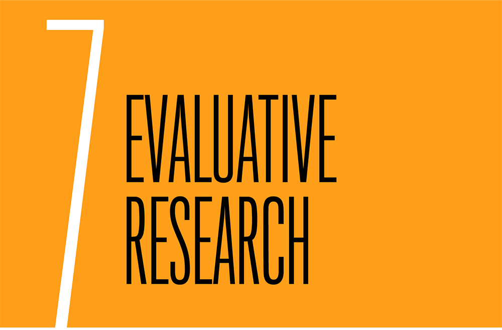
UX researcher Jenn Downs’ solution to this conundrum is to have a user set up a video chat on a MacBook and then hug it from the back so the iSight camera catches video of their interaction on the phone and the audio through the microphone (Fig 7) (http://bkaprt.com/jer2/07-06/).
The observer will need to note the following:
- the participant’s reaction to the task
- how long it takes to complete the task
- if the user failed to complete the task
- any terminology that presented a stumbling block
The notetaker should work from a copy of the test script with space to insert annotations. The most important items to note are areas where the user exhibited nonverbal frustration, verbatim quotes, and any features that were particularly successful or unsuccessful. If the notetaker can manage an approximate time code, that will make analysis easy.
Eye-tracking
Eye-tracking measures where someone is looking, for how long, and in what direction. Observation and analytics can tell you where a user taps with a finger or hovers with a mouse, but where that user directs their gaze is a mystery only a non-trivial amount of cash can reveal. Whether paying top dollar for this data is worthwhile remains a deeper mystery still.
As the sci-fi future of controlling interfaces directly with our eyes encroaches, eye-tracking may become more commonplace. Some decent headsets have now become relatively affordable, but the amount of expertise and time required to create, administer, and analyze a study remains substantial. If the calibration isn’t perfect, precision is an illusion.
Only consider eye-tracking when questions remain after you have exhausted less finicky and expensive research and testing methods, or if you’re testing with populations who are unable to articulate what is drawing their attention on a page.
Analyzing and presenting test data
The aim of usability testing is to identify specific, significant problems in order to fix them. The outcome is essentially a ranked punch list with a rationale. Keep your source materials (e.g., session recordings or notes) organized so you can easily refer to them or provide more detail to anyone who is either interested or skeptical. Focus your written documentation on the issues, their severity, and recommended fixes.
How bad and how often?
Rate each problem users encountered during the test on each of the following two scales: severity and frequency. You must look at both to ensure you’re prioritizing real obstacles, rather than chasing a fluke.
Severity:
- High: an issue that prevents the user from completing the task at all
- Moderate: an issue that causes some difficulty, but doesn’t prevent the user from completing the task
- Low: a minor problem that doesn’t affect the user’s ability to complete the task
Frequency:
- High: 30% or more participants experience the problem
- Moderate: 11–29% of participants experience the problem
- Low: 10% or fewer of participants experience the problem
It’ll end in tiers
Once you’ve conducted the tests and rated the issues, sort them into three tiers. Each represents the combination of severity and frequency. Also take into account how core the related task is to your application. (For example, confusion over changing a profile picture may be less core than obstacles to entering payment information.) Rename the tiers if it will make things more fun for you.
- Tier 1: high-impact problems that often prevent a user from completing a task. If you don’t resolve these, you have a high risk to the success of your product.
- Tier 2: either moderate problems with low frequency or low problems with moderate frequency.
- Tier 3: low-impact problems that affect a small number of users. There is a low risk to not resolving these.
Now, get to work
As soon as you have usability-test results, you can take action. Start with Tier 1 issues. Identify potential fixes with the lowest level of technical effort. Implement these fixes; then test again.
Need to convince someone before you can make changes? Watching actual users struggle with the system is more convincing than reading a report, and offers all the agitation of a suspense film. (“Why doesn’t he see the button? It’s right there!”) If you’re starting to see frequent repeated usability issues, try to schedule sessions when it’s convenient for important people to observe. Verbatim quotes and video clips of failure presented in conjunction with a report can also be effective. Just make sure to connect the tasks you tested and the problems you found to high-priority business goals.
Put the competition to the test
In addition to conducting usability testing on your own site or application, you can also conduct it on those of your competitors (presuming that you have access and that competitive evaluation isn’t prohibited by the terms and conditions).
To conduct a benchmark usability study, identify a small common set of tasks to test across your website and those of your competitors. Use a common scoring system across all sites and tasks to identify which of the competitive group was most usable overall, and most usable per key task. Following a redesign, you can run the study again to verify improvement relative to competitors.