Chapter 9. Surveys

At its core, all business is about making bets on human behavior.
—“The Power of ‘Thick’ Data,” the Wall Street Journal (http://bkaprt.com/jer2/09-01/, subscription required)
A survey is a method of collecting data from a predefined group of people using standardized questions. The questions can be asked in person or over the phone, or distributed on paper or collected online. The proliferation of online survey platforms has made it possible for anyone to create a survey in minutes. This is not a good thing.
Surveys are the most dangerous research tool — misunderstood and misused. They frequently blend qualitative and quantitative questions; at their worst, surveys combine the potential pitfalls of both.
A lot of important decisions are made based on surveys. When faced with a choice, or a group of disparate opinions, running a survey can feel like the most efficient way to find a direction or to settle arguments (and to shirk responsibility for the outcome). Which feature should we build next? We can’t decide ourselves, so let’s run a survey. What should we call our product? We can’t decide ourselves, so let’s run a survey.
If you ever think to yourself, “Well, a survey isn’t really the right way to make this critical decision, but the CEO really wants to run one. What’s the worst that can happen?”
Brexit.
Easy Feels Right
It is too easy to run a survey. Surveys are easy to create and easy to distribute, and the results are easy to tally. And our poor human brains are biased toward information that feels easy for us to process, regardless of reality. This ease makes survey results feel true and valid, no matter how false or misleading they are.
Surveys also shut out paths to genuine learning. Talking to real people and analyzing the results? That sounds hard. Blasting questions out to thousands of people to net a pile of quantifiable data with no gross human contact? Easy!
It’s much harder to write a good survey than to conduct good qualitative user research—something like the difference between building an instrument for remote sensing and sticking your head out the window to see what the weather is like. Given a decently representative (and properly screened) research participant, you could sit down, shut up, turn on the recorder, and get useful data just by letting them talk. But if you write bad survey questions, you get bad data at scale with no chance of recovery. It doesn’t matter how many answers you get if they don’t provide a useful representation of reality.
A bad survey won’t tell you it’s bad. Bad code will have bugs. A bad interface design will fail a usability test. A bad user interview is as obvious as it is uncomfortable. But feedback from a bad survey can only come in the form of a secondary source of information contradicting your analysis of the survey results.
Most seductively, surveys yield responses that are easy to count, and counting things feels certain and objective and truthful. Even when you are counting lies. And once a statistic gets out —such as “75% of users surveyed said they love videos that autoplay on page load”—that simple “fact” will burrow into the brains of decision-makers and set up shop.
From time to time, designers write to me with their questions about research. Usually these questions are more about politics than methodologies. A while back this showed up in my inbox:
Direct interaction with users is prohibited by my organization, but I have been allowed to conduct a simple survey by email to identify usability issues.
Tears of sympathy and frustration streamed down my face. This is so typical, so counterproductive. The question was, of course, “What do I do about that?”
Too many organizations treat direct interactions with users like a breach of protocol. I understand that there are sensitive situations, often involving personal data or early prototypes or existing customer relationships. But you can do perfectly valid user research or usability testing and never interact with current customers or current users, or reveal company secrets, or require people to breach privacy.
A survey is a survey. A survey should never be a fallback for when you can’t do the right type of research—because designing a good survey is not easy. Surveys are the most difficult research method of all.
Math First
Managers should not trust a model they don’t understand.
—Tom Redman, Data Driven: Profiting from Your Most Important Business Asset
Designers often find themselves up against the idea that survey data is better and more reliable than qualitative research just because the number of people it is possible to survey is so much larger than the number of people you can realistically observe or interview.
Taking small samples from large populations is a valid statistical technique for getting accurate information about the wider population. However, getting a truly representative sample requires great care. As the Pew Research center puts it: “A survey sample is a model of the population of interest” (http://bkaprt.com/jer2/09-02/). The more your sample differs from the population at large, the more sampling bias you are dealing with, and the less accurate the model.
So, unless you are very careful with how you sample, you can end up with a lot of bad, biased data that is totally meaningless and opaque.
If you survey enough representatives of a population, the results will probably be representative, all other things being equal. This doesn’t mean the answers to your questions will be true—simply that they will represent how that population as a whole would have answered those questions. (Maybe everyone lies about their spending habits or motivations in similar ways!)
And it’s possible to fiddle with the stats to justify your favorite definition of “enough” representatives. Bad researchers manipulate results to make it seem like the conclusions are more definitive (that is to say, statistically significant) than they are.
Into the woods
I will now use a fantasy analogy to explain survey-sample math at a very sketchy level. A course in basic statistics is a good idea before you start surveying—or using any quantitative method—but you need to understand why most quantitative research has a higher proportion of -ish than many people would like to believe.
Imagine you are studying the centaurs who live in the Foloi oak forest. You want to survey the centaurs in order to be more effective at selling them waist packs in the coming season. (How did you think centaurs carried their snacks?)
Your target population is all the centaurs in the forest. The set of centaurs you have the ability to contact is your sampling frame. (Ideally, the population of centaurs and your sampling frame are the same, but maybe your centaur mailing list is out of date.) The sample is the subset of individual centaurs whose specific data you actually collect. The goal is to be able to generalize to all the centaurs in the forest from the sample.
What constitutes a good or adequate sample is already a judgment call. The larger your sample size, the lower the margin of error. The greater a proportion of the total population you survey, the more representative the results will be.
Here is your magic formula:

Don’t worry. Every survey tool comes with a sample-size calculator and there are a bajillion of them on the web. That is just a peek under the hood. Let’s break that formula down.
N = population size
This is the total number of centaurs. This is usually a guess or an estimate and depends on how you define your target population. Is it all centaurs? Only adult centaurs? Only single adult centaurs? Maybe some centaurs moved over from the next valley when housing prices increased, so you aren’t really sure how many centaurs are in the forest these days.
e = margin of error
This is the difference between a sample statistic and the unknowable value for the whole population—for example, a variance of +/- 5%, which is pretty standard. The higher this number, the less likely it is that the results of the survey are true for the whole population.
For design and marketing research, it’s unlikely you’ll be doing random sampling anyway—you’ll survey the centaurs who happen to be around that morning, or who pass by the tree with the survey nailed to it, or who are in your professional network—so your sample will be biased.
This statistic doesn’t include other types of errors (like non-responses or faulty memories). You will never totally eliminate error.
z = confidence level
A 95% confidence level means if you theoretically repeated the survey a hundred times at the same time of day in the same part of the forest at the same time of year, the results would be within the margin of error ninety-five times—that is to say, the same-ish. (There’s that -ish again.) In scientific research, 95% is pretty standard; in business, a 90% chance of something being true is okay. You will never be totally confident. The z-score represents the number of standard deviations a given proportion is away from the mean, or roughly how far off from the average.
p = percentage value
The p value is a complex and core idea in statistical analysis. Roughly, it’s the probability that you would get the same results at random. A p value of less than .05 is the accepted criterion for significance.
Quantitative studies don’t always yield statistically significant results. Sometimes you end up with a whole pile of annoying ambiguity and you don’t know whether you can arrive at any meaningful conclusions at all. The pressure to show results has led to the practice of p-hacking, which just means manipulating the inputs and rerunning the analysis—drop a few of the outliers, say, or add in a few more respondents. While tacking on a few more interviews is often okay in qualitative studies, it is not cool in quantitative research.
The bottom line
So, if you know there are a thousand centaurs in the forest, and you want a 5% margin of error and a 95% confidence level, you are going to need to survey 278 centaurs.
For reasons of math, the larger the total population, the smaller the percentage of the population you need to include in your sample for the same confidence level. If there are ten thousand centaurs in the forest, you only need to include 370. And, given a hundred thousand, just 383. This is why the Pew Research center can report that 27% of US Facebook users do not feel that the list of attributes on their ad preferences page represents them, based on surveying 963 people (http://bkaprt.com/jer2/09-03/).
Lowering your confidence level and increasing your margin of error also allows you to get away with a smaller sample size. If you are willing to go to a 90% confidence level and a 10% margin of error, you can survey sixty-eight out of ten thousand centaurs and the results you get will be within 10% of the overall population 90% of the time.
For example, if twenty out of the sixty-eight respondents (~30%) indicated that they purchased a waist pack in the last year, you can say you are 90% sure between 20–40% of the total population would have answered the same way, to the extent the sample is representative (Fig 9.1).
This is not to say that surveying four hundred people means that you can automatically generalize from the results.
Especially because we haven’t even gotten to the…
Survey response rate
The percentage of those contacted who complete the survey is the response rate. Only the individuals who actually provide data when presented with the opportunity to participate in the survey count as part of your sample. You have to put your survey in front of far more people than you need responses from.
It would be great if there were one number that represented the ideal response rate to shoot for, but it can be all over the place. The response rate to a given survey depends on factors like population, context, and length of survey. If you’re trying to reach a specific and reclusive group, like cave-dwelling hermits, or asking for feedback on a site that already generates seventeen pop-ups, your rate will be lower.
If you need a sample size of 370 centaurs and your survey is getting a 2% response rate, you need to get your call to action in front of 18,500 centaurs. That number represents a high potential for trampling.
This doesn’t even touch statistical significance of the results. When respondents differ in meaningful ways from nonrespondents, that’s nonresponse bias. For example, if the best centaurs in the forest don’t respond to your survey because they’re too busy sewing their own waist packs, that is significant nonresponse bias—and it will not show up in the survey results.
While multiple contact attempts may increase response rates, you have to consider this in the context of how many surveys from different researchers your target audience is exposed to. Survey fatigue is real. Anyone proposing a survey should keep a diary of all of the surveys they encounter in an average week on the web.
The stated purpose, placement, and design of your survey have a strong influence on your response rate. Often, factors that improve response rate also increase sampling bias. Generalizing from centaurs who already have strong feelings about waist packs might give you a skewed perception of the population overall, and nothing about your data will indicate that is the case.

How much does the math matter?
In the years since the first edition of this book came out, the question I have heard most frequently is this: “How do I convince managers to pay attention to qualitative research when all they care about are numbers?”
The tendency of managers to substitute metrics for meaning is a phenomenon known as surrogation. This can result in actions that undermine the very strategy those metrics are supposed to support. Many managers confuse the size of a sample with how representative it is, or prefer quantitative methods overall, simply because surrogation has slipped into their thinking. Fighting it requires perpetually returning the focus to your true objectives.
For uncovering the insights you need to meet those objectives, quantitative surveys might be a giant waste of time.
If you’re deciding what to order for lunch at your company’s staff offsite, by all means send out a survey. It’s a fine way to find out you should arrange a tapas buffet for everyone except Frank who answered “burgers,” and if he doesn’t get a burger, he’s going to get his knickers in a twist. The results will inform just one meal, so the risk is low.
On the other hand, if you’re considering shifting $5 million in resources from your organization’s live event budget to online courses and digital materials, you don’t want to base that on your own subjective interpretations of thin data from a skewed sample. You’ll probably get better information from qualitative research, or a combination of interviews and analytics designed to serve your goals.
Planning a Survey
A survey is a direct-to-user message about your company’s priorities, attention to detail, and respect for their time. Create a survey experience that honors user time, and represents the best of your brand.
—Annie Steele, head of research at Stripe
So, I haven’t talked you out of running a survey. The place to start is where you start with all research: with your design goal, and with what you need to know in order to achieve that goal, your research objective. You should also be clear on the decisions the results will inform and the actions you might take based on the results.
Your survey design goal is to create an interaction that encourages and allows the respondent to provide you with reliable, true information about themselves. In order to do this, you need to know a fair amount about your target population before designing the survey. Here are a few key questions you need to answer:
- Who should we be surveying?
- In what context should we be surveying them?
- Will the people we’re surveying be willing and able to provide truthful, useful answers to our questions?
- What do we think will motivate them to respond?
- Is there another, better way to get the information we need without interrupting our users or customers with a survey?
The more clarity you have about your objectives, the more effective your surveys will be. You need to ensure that you ask the right number of questions, that they are possible to answer, and that you have already decided a clear path from survey results to action.
Writing surveys
As with all other studies, what you need to know determines the design. Every choice must be intentional and designed to serve your objective; otherwise you’ll end up on a Tilt-A-Whirl of bias.
Once you know your objective and audience, you need to decide:
- how many questions to ask
- question order
- whether the questions will be open or closed
- for closed questions, whether you offer options or a scale
Even given the same subject matter and respondents, the type and order of questions can vastly change your results. For example, asking a narrow question before a broad one will constrain the respondent’s thinking. A closed question requires you to have considered all possible options from their perspective. The right choices depend on the objective, the context, and the respondents. Are you surveying people on their mobile devices where space and attention are limited? Did I mention this was hard? It’s really hard.
In other words, to write a good survey, you need to be very clear on what you want to know and why a survey is the right way to get that information. Start with the answers you need, and then write clear questions:
Answer: X% of our active users have dogs at home.
Question: Do you have a dog at home?
Answer: This is the reason this page has a high bounce rate.
Question: What were you looking for on this page?
No matter what type of questions you write, there are a few things to keep in mind:
- Ask more general questions first.
- Write simple, succinct questions using specific language familiar to your audience.
- Only ask one question at a time; don’t combine two or more questions into one.
- Avoid loaded or leading questions that contain embedded assumptions or preferred answers, such as “Which Jeff Goldblum character is the most charming?”
- Don’t ask people to recall the distant past, or to predict the future.
- Offer the right number of response options—enough to cover all likely answers, but not so many that they overwhelm.
Question structure
Just as there are two types of data—quantitative and qualitative—there are two types of questions: closed-ended and open-ended.
An open-ended question, like “How did you find out about us?” allows the respondent to answer anything they like in the input field. These are the easiest to ask, but require the most work on the part of the respondent. If you ask too many, you might end up with a lot of blanks.
A closed-ended, or structured, question relies on answers in the form of a set of categories. The answers may be single response, multiple response, or scaled choices. Well-written structured questions may be easier for the respondent to answer and are definitely easier for the researcher to tally. This ease comes at the price of additional diligence to ensure that the options reflect reality.
When writing the selection of responses for a structured question, you should make certain that the list covers sufficient alternatives and that the answers are unique (i.e., they do not overlap).
Single answer
The most basic structured question allows the respondent to select one answer from a list of options.
Is a hot dog a sandwich?
( ) Yes
( ) No
This simple question contains an important lesson. Counting the responses to this question will not tell you whether or not a hot dog is a sandwich. It will merely tell you how many of the responses to the given question were “yes” and how many were “no.” Depending on how you administer this survey, you might not even be able to tell whether or not each response was from a unique individual human.
You need to ensure that the answers are mutually exclusive and comprehensive enough to include all possible categories that might fit. For example:
What best describes your home?
( ) Single-family home
( ) Apartment
( ) Trailer home
( ) Townhouse
What if the respondent lives in a yurt or a houseboat? You can accommodate unexpected responses by adding a choice for “Other” with a freeform text box. But you still run the risk of making a subset of people feel bad or misunderstood when they don’t see their situation reflected in the list.
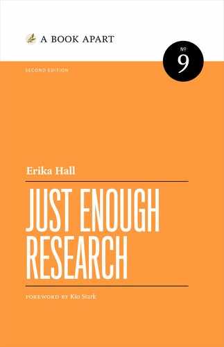
Multiple answer
Keep these questions relevant and intelligible to your respondent. If you use technical terminology, make sure that it matches the vocabulary of your intended audience. Ask only one thing at a time; don’t mix time frames or levels of specificity (Fig 9.2).
Using Scales
When answer choices can be represented by points on a scale, and the order matters, these are called scalar questions. Scales are tricky—not only does the wording need to be familiar and meaningful, but the type of scale you choose has to reflect your respondents’ mental models (14/10 heckin’ floofy). Otherwise, they’re likely to pick an arbitrary response that doesn’t map to their real-world attitudes and behaviors.
Interval scale
An interval scale is a range of values with a meaningful mathematical difference between them. The respondent rates the object or attribute directly, rather than through a statement. “On a scale of 1–10, rate the design.” “Give the book 1 to 5 stars.”
The chief benefit of asking for a rating on an interval scale is that you can find the mean (average), which you cannot do with the Likert scale (which I’ll describe in a bit).
There is no way to tell exactly what the mean means, however. A hotel with a 4.8 rating on Trip Advisor may be excellent, or the proprietor may have a very large and supportive family. A movie with a 2.1 rating on Rotten Tomatoes may be terrible, or the victim of a troll attack.
Means also don’t tell the whole tale. If you survey all the onsite employees at your company about their ideal office temperature, you’ll be able to calculate an average from their answers—and then everyone will be equally unhappy when it turns out you’ve missed distinct clusters of people who like it warm and people who like it cool.
Satisfaction-packed
A popular topic for surveys is “satisfaction.” Customer satisfaction—to what extent a product or service meets expectations—has become the most widely used metric in companies’ efforts to measure and manage customer loyalty. It’s an abstract idea, and very dependent on context, like price and what other options are available at the time. For example, many people find ride-hailing apps like Uber and Lyft satisfactory because of cost and convenience; however, the prices are kept artificially low to attract riders. Would riders be just as satisfied with the same service at a sustainable price?
There’s a whole industry based on providing customer-satisfaction metrics. And when there is an industry that makes money from the existence of a metric, that makes me skeptical of a metric.
Here is another cry for help I received not too long ago:
My boss is a convert to Foresee. She was skeptical of it at first, but she’s a very analytical person and was converted by its promise of being able to quantify unquantifiable data— like “satisfaction.”
The boss in question is “a very analytical person.” This means she is a person with a bias toward quantitative data. The designer who wrote to me was concerned about the potential for pop-up surveys to sabotage the very customer experience they were trying to measure. (Classic surrogation.)
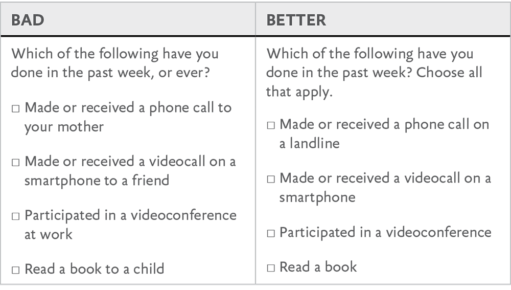
Looking at a typical customer satisfaction survey (Fig 9.3), it’s unclear how the questions map to actual business-success metrics. What does “Rate the options available for navigating this site” even mean? What actual business success metric does that map to? “Rate the number of clicks”—on a ten-point scale? People will choose the number of clicks they remember making rather than giving that number a rating. And “accuracy of information”? Unless they’re operating in “god mode,” no user could know the answer to that. None of this speaks to what the website is actually for, or how actual humans think or make decisions. Just because a thing has numbers doesn’t make it magically objective or meaningful.
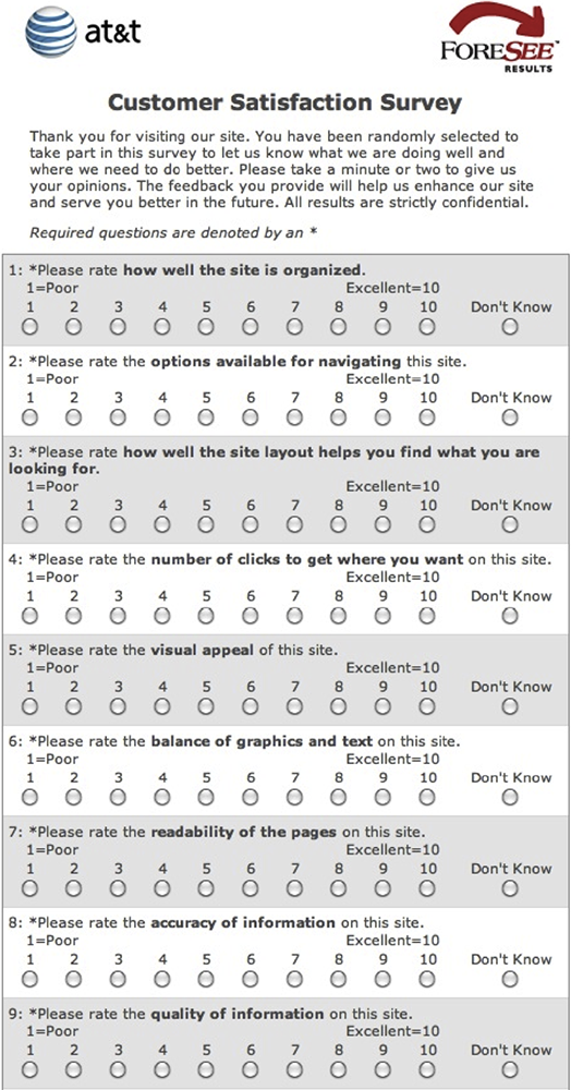
Fig 9.3: Enjoy this example of a Foresee customer satisfaction survey I grabbed at random from among the dozen I come across every week. These are the questions that for some reason seemed like the right ones to ask.
The sleight of hand here is that these so-called customer-satisfaction questions are a random assortment of abstract site qualities presented for quantitative evaluation, completely devoid of context. This is some customer-research alchemy right here. So, you’re counting on the uncountable while the folks selling these surveys are counting their money. Enjoy your phlogiston.
The Likert scale
After all, we are interested in measuring the attitudes of the members of the group, not those of the experimenter.
—Rensis Likert, “A Technique for the Measurement of Attitudes” (1932)
The psychologist and pioneering social scientist Rensis Likert (pronounced LICK-urt) deserves better. His name is most closely associated with the survey scale he developed as part of his PhD thesis. Respondents specify their level of agreement or disagreement with a series of statements on a scale (Fig 9.4). The scale is bipolar and symmetrical. It must contain an equal number of evenly distributed positive and negative choices. His goal in creating this scale was to improve on earlier methods and find a simpler, equally accurate, way to assess the distribution of attitudes in a population.
Likert went on to work for the USDA, surveying farmers about their feelings toward New Deal programs. He later joined a US military program to survey civilians in Japan and Germany about their morale after being bombed. Then he founded the University of Michigan Institute for Social Research (ISR), still one of the leading academic survey research organizations. He wrapped it all up as an organizational psychologist and author of several books on management science.
In other words, he put a lot of thought into his work. So don’t just slap a scale on something and call it a Likert.
Fig 9.4: An example question from the 1932 paper in which Likert introduced the scale (http://bkaprt.com/jer2/09-04/, PDF).
A true Likert scale is a five- or seven-point rating of agreement and disagreement (Fig 9.5). The labels indicate the magnitude of difference. On a frequency scale, how far is it from sometimes to rarely? This will vary from one person to another and, as Likert pointed out in his original paper, from one “cultural group” to another. It’s all relative.

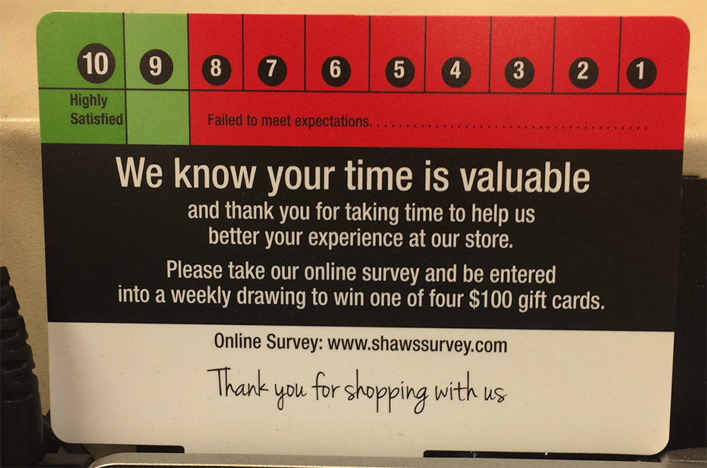
Some researchers eliminate the neutral middle option to create a forced choice. But I think it’s critical to understand the degree to which people don’t know and don’t care about things. This is often the biggest surprise to stakeholders. If you are asking about a scale in which neutrality is impossible, like “How familiar are you with Tide Pods?” then it makes sense not to offer that option. If you want to get technical, ordered response scale is a good way to describe other Likert-type scales that don’t fit the criteria of symmetrical, labeled responses, such as the Foresee survey we saw earlier (Fig 9.1).
When it comes to evaluating your survey responses, consider whether the neutral choice is really neutral in the common understanding of the term. “Neutral” could mean anything from “I don’t understand the question” to “I’m not comfortable taking a position” to “I reject the framing.” Just something to keep in mind as you think about how much it’s really possible to glean from surveys.
Designing a Likert scale survey
Want to make your own Likert? Here’s how to do it:
- Select your topic. Customer satisfaction? Attitudes toward gentrification? Aspirations about saving money? Your analysis will be clearer if you focus your survey on one topic at a time.
- Pick your poles. Agree/Disagree? Always/Never?
- Decide on the number of anchors and their labels. Five or seven? It may be tempting to get more granular, but how many shades of response make sense for your topic and your audience? Likert himself was a fan of five.
- Write your statements or questions. These must be worded in the language of your target respondents, which you can find in qualitative research like interviews, input from customer support channels, or phrases gleaned from social media.
Using one consistent scale and set of labels per survey makes life easier for everyone, and reduces the chance of error. And being consistent means you can compare results over time.
Using statements instead of questions can introduce acquiescence bias—people have a harder time saying no due to the strong social norm of being agreeable. Strategies to counteract this include leading with the negative pole or reformulating the question in a way that avoids asking for agreement:
Electric scooters are a convenient way to commute.
Strongly Disagree
Disagree
Neutral
Agree
Strongly Agree
How inconvenient or convenient are electric scooters as a way to commute?
Very Inconvenient
Inconvenient
Neither Inconvenient nor Convenient
Convenient
Very Convenient
Analyzing Likert data
Remember, Likert survey data is quantitative data, so analyze it using quantitative methods. You need to understand whether your results are statistically significant; what are the chances that you would have gotten that distribution of responses at random? If you don’t follow this process, then you will just be treating your results as a bunch of anecdotes and slapping your own bias on it.
Likert data are ordinal and discrete, and have a limited range. This means that you can rank the categories of response between your two poles, but the differences between any two ranks could differ wildly. The most popular and second-most-popular answer could be much closer together than the second and third.
For example, imagine you surveyed ninety-seven people in your neighborhood about electric scooters using a single question, and the results came back:
I would feel safe riding an electric scooter in the neighborhood where I live.
Strongly Disagree: 35
Disagree: 7
Neutral:19
Agree: 20
Strongly Agree: 16
Cool, but you can’t count them up and average them—the mean is meaningless here. If you want to know the mode, the value that was chosen most often, you can line the responses up in descending order:
Strongly disagree: 35
Agree: 20
Neutral: 19
Strongly agree: 16
Disagree: 7
“Strongly disagree” was chosen most often, a whopping 36% of the time—there’s your mode.
Visualizing the distribution in a bar chart from positive to negative can also be handy (Fig 9.6). What this shows you is that, of the people you surveyed, most report feeling neutral to positive about safety, but a substantial minority are very negative. How do you interpret that information? Well, it depends. How representative is your sample? Did you oversample parents of young children and retired people because you conducted the survey by going door to door in the middle of a weekday? Do you have to account for a large nonresponse bias because you emailed the survey out to far more people than answered? Are there three thousand people in your neighborhood, or a hundred?

If you gathered additional information about the respondents such as age, gender, or level of education, there are further statistical tests you could run to determine whether responses are correlated with any of those.
A quick web search will show you just how much discussion is happening around what to do, exactly, with this sort of data. Quantitative data doesn’t guarantee objective interpretation .
Net Promoter Score
Asking someone about what they’ll do in the future isn’t about loyalty. It’s about optimism.
—Jared Spool, “Net Promoter Score Considered Harmful” (http://bkaprt.com/jer2/09-05/)
In a 2003 Harvard Business Review article, “The One Number You Need to Grow,” Bain management consultant Fred Reichheld introduced the Net Promoter Score, or NPS (http://bkaprt.com/jer2/09-06/). Through his consulting work, he’d found customer-satisfaction surveys to be overly complicated, yielding low response rates and ambiguous results that didn’t correlate with growth. After seeing a presentation from the Enterprise Rent-A-Car CEO about their success assessing customer loyalty, Reichheld spent two years formulating his one-question miracle survey:
How likely is it that you would recommend [company X] to a friend or colleague?
He also sought to create a scale that would eliminate the need for statistical analysis, so that just about anyone in a company could assess the results and take action. He settled on an eleven-point scale, as in this Ticketmaster example (Fig 9.7).
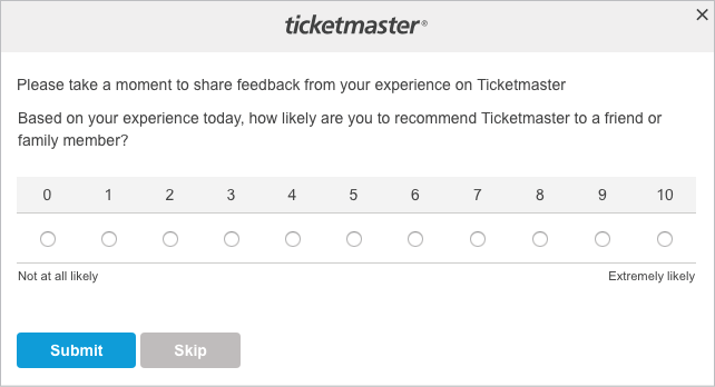
Fig 9.7: Because the experience of buying a concert ticket includes such a complex interplay of inventory scarcity and monopoly power, this question is too reductive to be meaningful.
Here’s where the real consultant magic happens. Based on correlating survey responses with actual reported referrals and purchase history from four thousand customers, Reichheld created and named three clusters, devised a scoring system, and then trademarked the whole darn thing (Fig 9.8).

A potential NPS ranges from -100 to 100. Reichheld defined scores of 0–6 as “Detractors,” which each count as -1. Ratings of 7–8 are “Passive” and count for 0. And “Promoter” ratings of 9 or 10 count as 1 point each. So, if you survey a hundred customers and they all give you an 8, then your NPS is 0. For…reasons. This is why any positive score is considered “good” and anything over 50 is excellent.
Managers love NPS because it was designed to be loveable by managers. It’s simple and concrete and involves fancy consultant math, which makes it seems special. But is this metric as broadly applicable and powerful as it claims to be?
Nah.
- NPS is not a research tool. I shouldn’t even be talking about NPS in a research book. As Reichheld states in his original article, NPS is “an operating management tool”: “When a customer reported a neutral or negative experience, marking him a potential detractor, the interviewer requested permission to immediately forward this information to the branch manager, who was trained how to apologize, identify the root cause of the problem, and resolve it.” So, it’s not about learning, but about flagging and resolving less than awesome customer experiences. Well, then, that is something totally different, and expensive.
- It’s misused as a substitute for research. NPS feels like useful data when it isn’t, making organizations feels like they’ve learned something when they haven’t. Even if you attach an open text box that allows the customer to provide more details, it’s simply not designed to be a research tool. Some poor customer service person is just going to be going through those answers, cherry-picking responses.
- The eleven-point scale isn’t magic. Follow-up studies by other researchers have shown that simply calculating the mean is just as good. Not to mention: a 0 is actually much different from a 6, so treating those scores the same way is suspect.
- It may not be about loyalty at all. Expressing an intention to recommend may not have anything to do with customer satisfaction, and depends on everything from the cultural context of the response to whether others in the customer’s peer group have a shared need. And what about response bias? It only captures current customers, not potential customers or non-customers, or people who are too pissed off to take the survey.
- Better scores don’t necessarily map to business health. NPS is about expectations. A fantastic way to exceed expectations is to charge less for a service than it costs to provide. And people game the shit out of it (Fig 9.9), especially when their bonuses are tied to it.
In short: nothing about NPS explains why your score is what it is or what you should do about it (besides follow up with each individual to try to resolve their issue, I guess).
Quantitative versus Qualitative Surveys
Unlike for quantitative surveys, qualitative survey metrics are rarely representative for the whole target audience; instead, they represent the opinions of the respondents.…Unless you use sound statistics tools, you cannot say whether these results are the result of noise or sample selection, as opposed to truly reflecting the attitudes of your whole user population.
—Susan Farrell, “28 Tips for Creating Great Qualitative Surveys” (http://bkaprt.com/jer2/09-07/)
Read that. Read it again. That is a polite way of saying you can’t generalize from metrics yielded by qualitative surveys. If a hundred people respond to an Instagram poll about Pillsbury canned dough and eighty indicate a “somewhat favorable” opinion, you still don’t know what proportion of all Instagram users have a somewhat favorable opinion of Pillsbury canned dough (Fig 9.10). Even if the app only showed the poll to users who had previously been shown a Pillsbury ad, you couldn’t even generalize to what proportion of users who had been shown the ad.
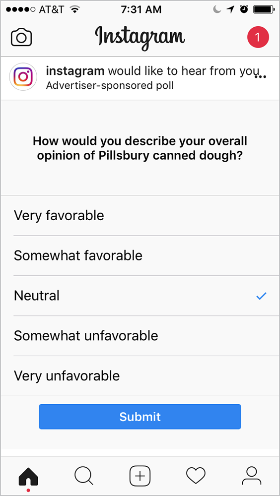 Fig 9.10: Don’t pee in the public pool of customer goodwill by adding to the onslaught of pointless interruptions. This only makes it harder for those doing good research.
That said, you can use surveys to gather qualitative data if you treat them like sources of qualitative data. This means you are focusing on descriptions and not treating your results as measurements of anything. You need to decide in advance how you will analyze and use the data.
In the words of Susan Farrell: “If you won’t act on the data, don’t ask that question.” Do the research that yields data you can act on, not the kind that leaves you acting like you forgot what you needed to know in the first place.
Surveys. Sixty percent of the time, they work every time. That’s probably optimistic.