
JLabel is the simplest JComponent. It is a string, image, or both that appears onscreen. The contents can be left-, right-, or center-aligned according to an argument to the constructor. The default is left-aligned. JLabel is a cheap, fast way to get a picture or text on the screen.
// remember, we are only showing relevant statements from main()
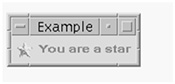
ImageIcon icon = new ImageIcon("star.jpg");
JLabel jl = new JLabel("You are a star", icon, JLabel.CENTER);
frame.add( jl );
frame.pack(); // size the JFrame to fit its contents
Note the way we can bring in an image from a GIF or JPEG file by constructing an ImageIcon with a pathname to a file. Labels do not generate any events in and of themselves. It is possible, however, to get and set the text of a label. You might do that in response to an event from a different component. The constructors for JLabel include the following:
public javax.swing.JLabel(java.lang.String);
public javax.swing.JLabel(java.lang.String,int);
public javax.swing.JLabel(java.lang.String,javax.swing.Icon,int);
public javax.swing.JLabel(javax.swing.Icon);
public javax.swing.JLabel(javax.swing.Icon,int);
The int parameter is a constant from the JLabel class specifying left-, right- or center-alignment in the area where the label is displayed.
JLabels are typically used to augment other controls with descriptions or instructions. Most JComponents that display some text (such as JButton, JLabel, JOptionPane etc.) are happy to display HTML. Start the text with <html> and end with </html>. You can easily display multi-line buttons, and mix fonts and colors. Here is a JButton with two lines of text:
JButton jb = new JButton("<html>Multi<br>line</html>");
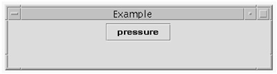
This is a GUI button. You supply code for the action that is to take place when the button is pressed.
jb.addActionListener( new ActionListener() {
int i = 1;
public void actionPerformed(ActionEvent e)
{ System.out.println("pressed "+ i++); }
} );
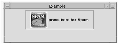
When you press this button, the event handler prints out the number of times it has been pressed. You can easily create buttons with images as well, similar to this example:
Icon spIcon = new ImageIcon("spam.jpg");
JButton jb = new JButton("press here for Spam", spIcon);
You can add a keyboard accelerator to a button, and you can give it a symbolic name for the text string that it displays. This helps with internationalizing code.
Program an “Alice in Wonderland” JFrame with two buttons, one of which makes the frame grow larger, the other smaller. The Component method setSize(int, int) will resize a component. (Easy; approximately 20 lines of code.)
This is a text string that acts as a hint or further explanation. You can set it for any JComponent. It appears automatically when the mouse lingers on that component and it disappears when you roll the mouse away.
Tooltips don't generate any events so there is nothing to handle.
We'll add a tooltip to the JLabel that we showed on the previous page.
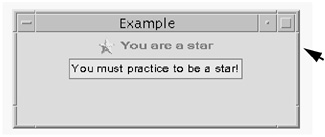
JLabel jl = ...
jl.setToolTipText("You must practice to be a star!");
Notice that you don't directly create a JToolTip object. That is done for you behind the scenes. You invoke the setToolTipText()method of JComponent.
It's quick and easy to create tooltips; use them generously.
This is an area of the screen where you can enter a line of text. There are two subclasses: JTextArea (several lines in size) and JPasswordField (which doesn't echo what you type). You can display some initial text. The text is selectable (you can highlight it with the cursor) and can be set to be editable or not editable.
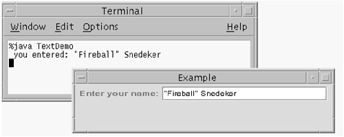
JLabel jl = new JLabel("Enter your name:");
JTextField jtf = new JTextField(25); // field is 25 chars wide
Text fields generate key events on each keystroke and an ActionEvent when the user presses a carriage return. This makes it convenient to validate individual keystrokes as they are typed (as in ensuring that a field is wholly numeric) and to retrieve all the text when the user has finished typing. The following code gets the text:
jtf.addActionListener( new ActionListener() {
public void actionPerformed(ActionEvent e)
{ System.out.println(
" you entered: " + e.getActionCommand() ); }
} );
Container c = jframe.getContentPane();
c.add( jl );
c.add( jtf );
In this example, running the program, typing a name, and hitting carriage return will cause the name to be echoed on system.out. You should write some code to try to implement a listener for each keystroke.
A checkbox screen object that represents a boolean choice: pressed, not pressed, on, or off. Usually some text explains the choice. For example, a “Press for fries” JLabel would have a JCheckBox “button” allowing yes or no. You can also add an icon to the JCheckBox, just the way you can with JButton.
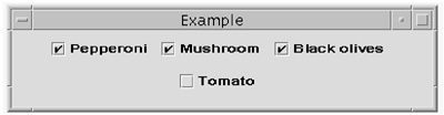
JCheckBox jck1 = new JCheckBox("Pepperoni");
JCheckBox jck2 = new JCheckBox("Mushroom");
JCheckBox jck3 = new JCheckBox("Black olives");
JCheckBox jck4 = new JCheckBox("Tomato");
Container c = jframe.getContentPane();
c.add( jck1 ); c.add( jck2 ); // etc...
Checkbox generates both ActionEvent and ItemEvent every time you change it. This seems to be for backward compatibility with AWT. We already saw the code to handle ActionEvents with Button. The following code registers an ItemListener:
jck2.addItemListener( new ItemListener()
{ // anonymous class
public void itemStateChanged(ItemEvent e) {
if (e.getStateChange()==e.SELECTED)
System.out.print("selected ");
else System.out.print("de-selected ");
System.out.print("Mushroom
");
}
} );
In this example, running the program and clicking the “Mushroom” checkbox will cause the output of selected Mushroom in the system console.
Handlers in real programs will do more useful actions as necessary like assigning values and creating objects. The ItemEvent contains fields and methods that specify which object generated the event and whether it was selected or deselected.
There is an AWT component known as Canvas. It is a screen area that you can use for drawing graphics or receiving user input. When you need to draw arbitrary shapes and text in arbitrary places (e.g. a graph or a drawing program) you extend Canvas and override its paint() method to add the behavior you need. A Canvas has few methods. All its functionality is either inherited from Component (setting font, color, size) or from functionality you add when you extend the class.
There is no JCanvas component in Swing. The AWT component Canvas was just like the AWT component Panel, except Panel was also a container. The Swing version of Panel, JPanel, does double duty. It replaces both Canvas and Panel.
To draw on a JPanel, you supply your own version of the method paintComponent(Graphics g). To do that, you need to extend the class and override the paintComponent() method[1] for this Container. That gives you a Graphics context—the argument to paintComponent()—which is used in all drawing operations. The many methods of java.awt.Graphics let you render (the fancy graphics word for “draw”) lines, shapes, text, etc., on the screen.
A simpler alternative for simpler drawings is to use JLabel to create the picture and add it to JPanel as shown in the following code.
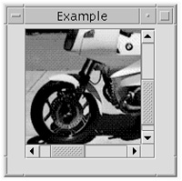
Figure 21-8 is the result from running the following code:
class MyJPanel extends JPanel {
JLabel jl = new JLabel(new ImageIcon( "bmw.jpg"));
{ add(jl); // instance initializer just for fun
addKeyListener( new KeyAdapter() {
public void keyPressed(KeyEvent e) {
char c = e.getKeyChar();
System.out.println("got char "+c);
}
} );
}
}
...
public static void main(String[] args) {
setupFrame();
MyJPanel mjp = new MyJPanel();
jframe.getContentPane().add(mjp);
jframe.setVisible(true);
mjp.requestFocus();
}
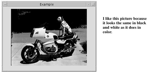
I have also added a KeyListener for the JPanel here. That allows you to make keystrokes on top of the JPanel and have the callback take place for each one individually. All you do is echo the characters to prove you got them. With the picture backdrop and the capture of individual keystrokes, you have the basics of a computer game right there.
You have to request the focus for a component before key events will be sent to it, and the component has to be visible at the time you do that.
JRadioButtons are used when you have a group of checkboxes and you want a maximum of one of them to be selected. This was done with a CheckboxGroup in the AWT, but the design has been cleaned up and simplified in Swing. JRadioButton, JCheckBox, and JButton are now subclasses of AbstractButton and have common consistent behavior, can be given images, can be embedded in menus, and so on.
The term “radio buttons” arises from the old manual station selection buttons in car radios. When you pressed in one of the buttons, all the others would pop out and be deselected. ButtonGroups work the same way.
On Windows, mutually exclusive checkboxes are round, while multiple selection checkboxes are square. This is one of those “look and feel” differences between window systems.
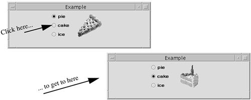
This example shows some more sophisticated things you can do in your event handler. In this example, we have a JLabel with a picture of the choice. In the event handler, we set the label to correspond to the RadioButton choice.
The ButtonGroup class automatically takes care of arming the previous radio button when you press another. Review the following code example:
// JRadioButton code
final JLabel piclabel
= new JLabel(new ImageIcon( pieString + ".jpg"));
/** Listens to the radio buttons. */
class RadioListener implements ActionListener {
public void actionPerformed(ActionEvent e) {
// getting the event causes update on Jlabel icon
piclabel.setIcon(
new ImageIcon( e.getActionCommand()+".jpg"));
}
}
JRadioButton pieButton = new JRadioButton(pieString);
pieButton.setMnemonic('b'),
pieButton.setActionCommand(pieString);
pieButton.setSelected(true);
JRadioButton cakeButton = new JRadioButton(cakeString);
JRadioButton iceButton = new JRadioButton(iceString);
// Group the radio buttons.
ButtonGroup group = new ButtonGroup();
group.add(pieButton);
group.add(cakeButton);
group.add(iceButton);
// Register a listener for the radio buttons.
RadioListener myListener = new RadioListener();
pieButton.addActionListener(myListener);
cakeButton.addActionListener(myListener);
iceButton.addActionListener(myListener);
// Put the radio buttons in a column in a panel to line up
JPanel radioPanel = new JPanel();
radioPanel.setLayout(new GridLayout(0, 1));
radioPanel.add(pieButton);
radioPanel.add(cakeButton);
radioPanel.add(iceButton);
jframe.getContentPane().add(radioPanel);
jframe.getContentPane().add(piclabel);
jframe.setVisible(true);
This is a utility pane that can pop up some common warning and error messages. It's as easy to use as JToolTip, and it works the same way. You don't instantiate it directly, but you call a method to make it happen.
JOptionPane is similar to a VB msgbox or dialog. There are several different types of JOptionPane, some of which just display a message (click OK to dismiss it). Others ask the user to input a String or click a radio button. You get the input by calling a method such as getValue(). See the javadoc for more details.
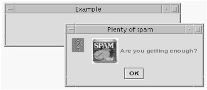
Icon s = new ImageIcon("spam.jpg");
JLabel jl = new JLabel("Are you getting enough?", s,JLabel.CENTER);
JOptionPane.showMessageDialog( null, // parent frame
jl, // Object to display
"Plenty of spam", // title bar message
JOptionPane.QUESTION_MESSAGE );
Of all the JComponents, this one is probably my favorite. It works so hard for you with so little effort on your part.
A JScrollPane provides a scrollable view of any lightweight component. You instantiate a JScrollPane with the thing you want to scroll as an argument to the constructor. Then you set the ScrollPane's preferred size with a method call, add it to your container, and you're done! This is so much easier than messing around with individual and highly buggy scrollbars that we had in JDK 1.0.
By default, a scroll pane attempts to size itself so that its client displays at its preferred size. Many components have a simple preferred size that's big enough to display the entire component. You can customize a scroll pane with many refinements on how much to scroll, which of the scroll bars to show, custom decorations around the sides, and so on. The visible area in the pane is called the “viewport.”
In this code, we put the JPanel subclass that we created earlier into a JScrollPane:
MyJPanel mjp = new MyJPanel();
JScrollPane jsp = new JScrollPane( mjp );
jsp.setPreferredSize( new Dimension(150, 150));
jframe.getContentPane().add(jsp);
You won't need to interact with your scroll pane very frequently, as it does so much of the right thing by default. However, you can implement the Scrollable interface if your enthusiasm extends to wanting to get callbacks for individual clicks on the scroll bars.
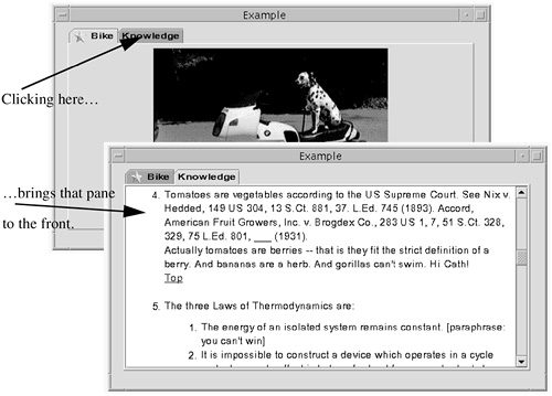
A Tabbed Pane is a component that lets you economize on-screen real estate. It simulates a folder with tabbed page dividers. You have a series of “tabs” (labels) along the top, associated with components on a larger rectangular area beneath. By clicking a tab label, you bring its associated component to the front. We'll show an example using the JEditorPane and the JPanel.
You can make the tabs appear on any of the four sides of the TabbedPane. You can even have more than one row of tabs, but the human factors of that are so appalling that Sun added new behavior in JDK 1.4. Usually, when you have multiple rows in a tabbed pane, any tab that's clicked jumps to the bottom row of tabs (so its pane appears in front). As a result, clicking on some tabs causes all of them to change places. To prevent this, you can pass an argument to the constructor saying that you want tabs to scroll, not to wrap, when you have more tabs than will fit on one line.
// set up the editor pane, as before
JEditorPane jep =null;
try {
jep = new JEditorPane( "file:///tmp/know.html" );
} catch (Exception e) {System.out.println("error: "+e); }
jep.setEditable(false); // turns off the ability to edit
JScrollPane jsp = new JScrollPane( jep );
jsp.setPreferredSize( new Dimension(550, 250));
// set up the JPanel, as before
MyJPanel mjp = new MyJPanel();
jframe.getContentPane().add(mjp);
// create a tabbed pane and add them to it.
JTabbedPane jtp = new JTabbedPane();
ImageIcon ic = new ImageIcon("star.jpg");
jtp.addTab("Bike", ic, mjp,
"1989 BWM RS100/1996 Dalmatian Annie");
jtp.addTab("Knowledge", null, jsp, "who knew?");
jframe.getContentPane().add(jtp);
jframe.setVisible(true);
}
The method to add a tab and the component together takes the following four arguments:
public void addTab(String title,
Icon icon,
Component component,
String tip)
The title is the phrase to put on the tab. The icon is a little picture with which you can decorate the phrase. For example, on the “Bike” pane I use a star, and on the “Knowledge” pane I use null to signify no picture. The third parameter is the component that you want associated with that tab. The final parameter is a String representing tooltip text that you get for free with this component.
This is a very powerful JComponent! JEditorPane allows you to display and edit documents that contain HTML, Rich Text Format, or straight Unicode characters. It formats the text and displays it.
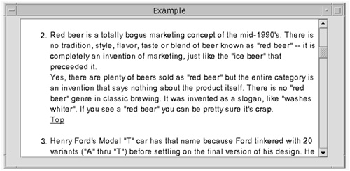
You can load the component from a URL or a String containing a URL as shown here, or from the contents of a String itself. In the following example, the JEditor pane is placed in a ScrollPane so it displays and scrolls well.
JEditorPane jep =null;
try {
jep = new JEditorPane( "file:///tmp/know.html" );
} catch (Exception e) {System.out.println("error: "+e); }
jep.setEditable(false); // turns off the ability to edit
JScrollPane jsp = new JScrollPane( jep );
jsp.setPreferredSize( new Dimension(550, 250));
jframe.getContentPane().add(jsp);
Notice how trivial it is to display an HTML file and to wrap a JScrollPane around it. JEditorPane is a subclass of the less specialized JTextComponent.
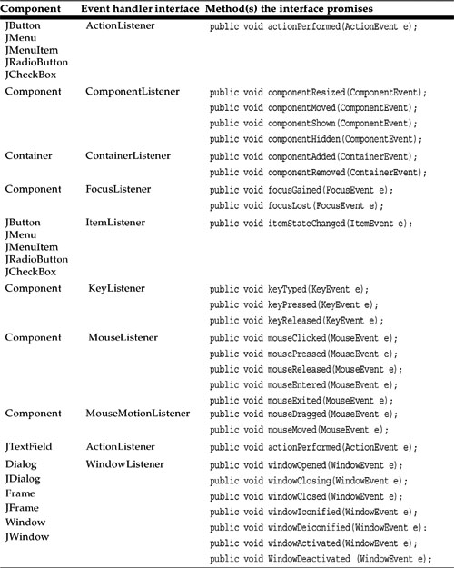
Let's quickly review the match between components and events shown in Components and events.
[1] A more descriptive name for the paintComponent() method would be how_to_draw_me().