In Chapter 11, Data Cleaning and Manipulation, we spent a considerable amount of time geocoding battles. Let's use the coordinates to pin battles on the map—perhaps this will give us some better understanding of the data.
For that, we'll use a special (and spatial) library: geopandas. As you can guess, geopandas is based on pandas and provides multiple geospatial methods. In essence, geopandas allows us to read geospatial data and work with it as a pandas dataframe, providing geospatial methods (adjacency, spatial inclusion, Boolean operations, and more) and plotting capabilities.
Before we start plotting, it would be nice to have some sort of a base map for our data, as a context. Here, we used an open dataset of modern country boundaries, based on the Natural Earth dataset (https://www.naturalearthdata.com/). We don't even need to download it—the data is small enough for us to read it from the web on every run. As the boundary file is naive—there is no specific projection; we'll add the MERCATOR reference system manually—this is optional but will help us to remap to a different projection:
import geopandas as gp
url = 'https://unpkg.com/world-atlas@1/world/50m.json'
MERCATOR = {'init': 'epsg:4326', 'no_defs': True}

borders = gp.read_file(url)
borders.crs = MERCATOR
Now, let's see what the borders look like overall:
borders.plot(figsize=(10, 5))
This code will result in the following screenshot:

Okay, we see that the borders cover the whole planet (there is a glitch with Russia as its territory stretches over 180 degree longitude, into negative degrees—luckily, we won't have this issue once we zoom in).
As we'll be plotting Europe, let's use an appropriate projection, ETRS-LAEA. Its EPSG number can be found on https://spatialreference.org/.
To convert into other projections, just use the to_crs method:
borders = borders.to_crs(epsg=3035)
Next, we need to convert our existing dataframe into GeoDataFrame with points. Luckily, geopandas has a built-in helper function for that. We'll convert them into the same projection, as well:
gdf = gp.GeoDataFrame(
 data, geometry=gp.points_from_xy(data['Longitude'], data['Latitude'])).to_crs(borders2.crs)
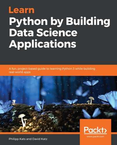
Now, we can combine the two, encoding the total casualties for the marker size:
ax=borders2.plot(color='lightgrey', edgecolor='white', figsize=(12,12))

gdf.plot(ax=ax, color='red', markersize=(data['killed total']/1000).clip(lower=1), alpha=.2);


ax.margins(x=-.4, y=-0.4) # Values in (-0.5, 0.0) zooms in to center
ax.set_axis_off()
Note how we use the output of the first plot and store it in ax variable, which we then path to the second chart—this way, both will plot on the same canvas in the order they execute as margins essentially "zooming in" on Europe while set_axis_off removes axes for the chart.
Here is the outcome:

The circles represent battles, with the size matching the number of total casualties. As you can see, the Stalingrad siege is quite an outlier—both spatially and by the number of casualties.
Great! We were able to plot our graphics on the map, and indeed it gives us a better understanding of the data we're working on. One limitation with this map and all of the other charts we made so far is that they are static. matplotlib has some interaction capacity; for example, you can set your chart to be pannable and zoomable, but it won't provide tooltip, selection, or any other advanced interaction. Luckily, we have other visualization libraries that can do that, for example, altair.