
The idea behind panel (and Voila) is very simple and appealing: given that we essentially build web pages with our code and charts—the notebooks—we simply convert them into dashboards. The best part of that is that all of the code and every visualization library that can be used in Jupyter can be used in the dashboards; we could even use our existing Altair charts if we wanted. Let's try building something from the same dataset! As with Altair, we'll start with a Jupyter Notebook:
import sqlite3

import param
import panel as pn
import datetime as dt
pn.extension()
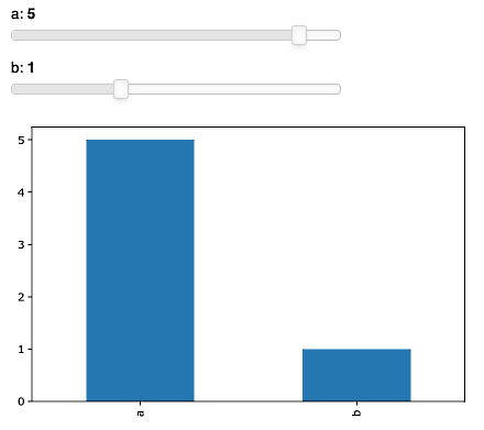
Now, the panel package is designed to make it extremely easy to build interactive widgets as part of your exploration process. To build an interaction, you just need a function with default values—panel will use them to understand the value types and generate input widgets accordingly. Here is an extremely naive example:
def interact_example(a=2, b=3):

    plot = plt.figure()
    ax = plot.add_subplot(111)

    pd.Series({'a':a, 'b':b}).plot(kind='bar',ax=ax)

    plt.tight_layout()
    plt.close(plot)
    return plot

pn.interact(interact_example)
The following screenshot is a result of the preceding code. The bar chart is interactive and responds to changes in input:
Here, we use matplotlib as a base visualization tool. Let's now try it on with a more complex task—showing the aggregate statistics on the 311 data we collected in Chapter 16, Data Pipelines with Luigi, live.