
Now when you verify that your data is indexed successfully in Elasticsearch, we can go ahead and look at the Kibana interface to get some useful analytics from the data.
As described in the previous chapter, we will start the Kibana service from the Kibana installation directory.
$ bin/kibana
Now, let's see Kibana up and running similar to the following screenshot on the browser, by going to the following URL:
http://localhost:5601
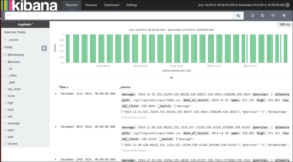
Kibana Discover page
As we already set up Kibana to take logstash-* indexes by default, it displays the indexed data as a histogram of counts, and the associated data as fields in the JSON format.
First of all, we need to set the date filter to filter based on our date range so that we can build our analysis on the same. Since we took data from July 1, 2014 to December 31, 2014, we will configure our date filter for the same.
Clicking on the Time Filter icon at the extreme top-right corner, we can set an Absolute Time Filter based on our range as follows:
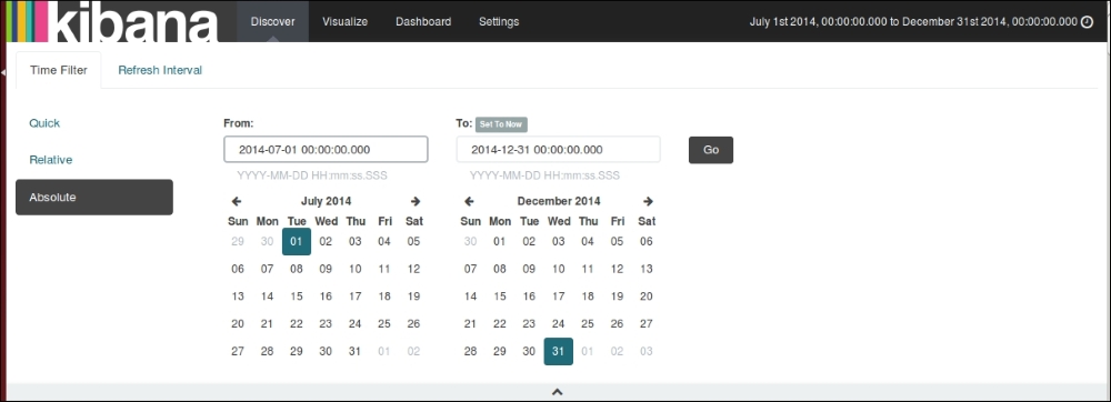
Kibana Time Filter
Now, we are all set to build beautiful visualizations on the collected dataset using the rich set of visualization features that Kibana provides.
Before we build the visualization, let's confirm whether all fields are indexed properly with their associated data types so that we can perform the appropriate operations on them.
For this, let's click on the Settings page at the top of the screen and select the logstash-* index pattern on the left of the screen. The page looks something like this:
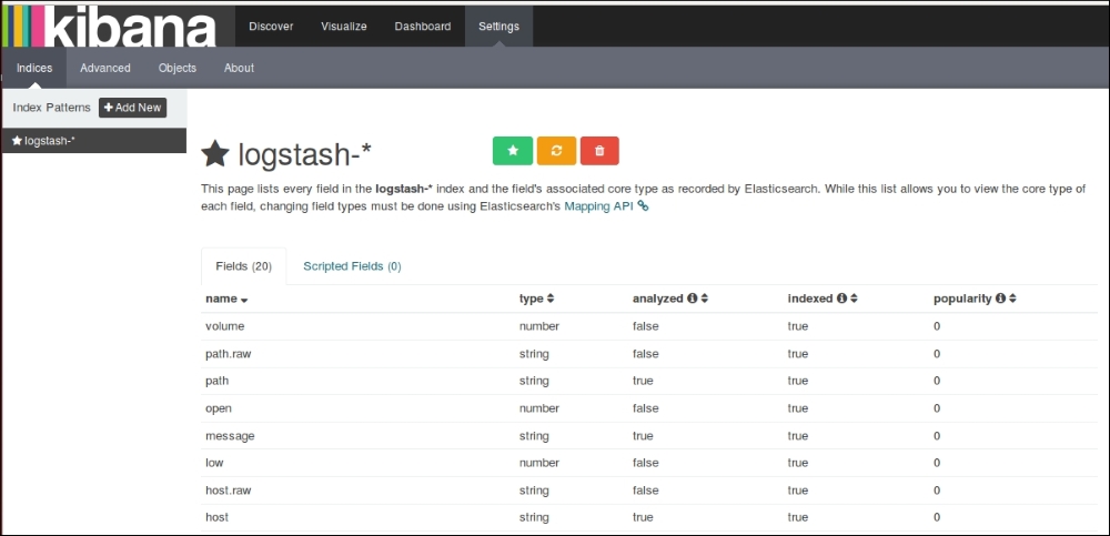
Kibana Settings page
It shows all our fields that were indexed, their data types, index status, and popularity value.
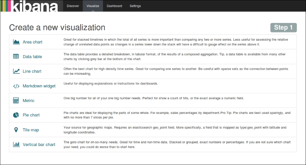
Let's build some basic visualizations from the Kibana visualizations page, and we will use them later in dashboard.
Click on the visualization page link at the top of the Kibana home page, and click on the new visualization icon.
This page shows various types of visualizations that are possible with the Kibana interface:
Kibana visualization menu
The first visualization that we will build is a line chart showing weekly close price index movement for the GOOG script over a six month period.
Select Line Chart from the visualization menu, and then we'll select Y-Axis metrics as Max, and Field as close. In the buckets section, select Aggregation as Date Histogram based on the @timestamp field, and Interval as Weekly, and click on Apply.
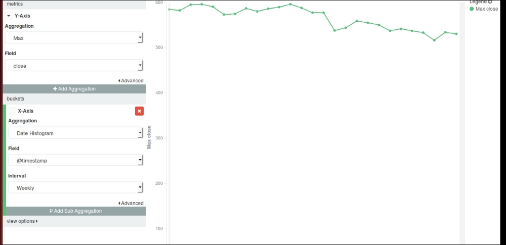
Kibana Line chart
Now, save the visualization using some name for the line chart, which we will pull into the dashboard later.
We will build a vertical bar chart representing the movement of weekly traded volumes over a six month period.
Select Vertical Bar Chart from the visualization menu, and select Y-Axis Aggregation as Sum, and Field as volume. In the buckets section, select X-Axis Aggregation as Date Histogram, and Field as @timestamp, and Interval as Weekly. Click on Apply to see a vertical bar chart representing the weekly total volume traded over a six month period.
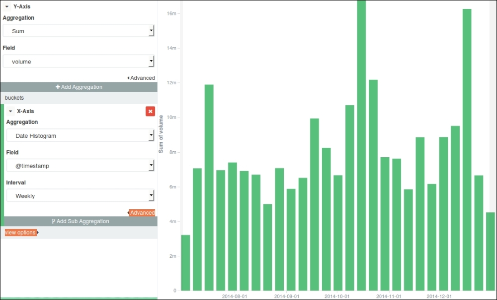
Kibana Vertical Bar Chart
Now, save the visualization using some name for the bar chart, which we will pull into the dashboard later.
Metric represents one big number that we want to show as something special about data.
We will show the Highest Volume Traded in a single day in a six month period using Metric.
Click on Metric in the visualization menu, and select Metric Aggregation as Max, Field as volume. Click on Apply to see the result of visualization on the right as follows:
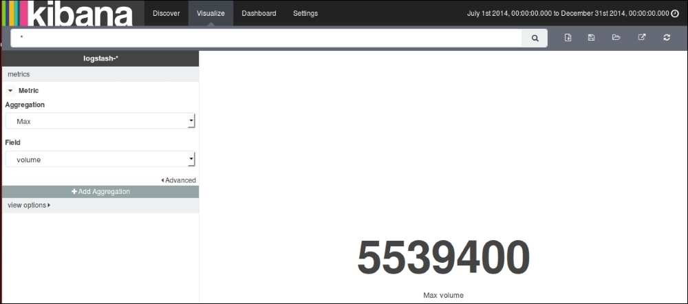
Kibana Metric
Now, save the visualization using some name for the Metric, which we will pull into the dashboard later.
Data tables are meant to show detailed breakdowns in a tabular format for results of some composed aggregations.
We will create a data table of Monthly Average volume traded over six months.
Select Data table from the visualization menu, click on split rows and select Aggregation as Average and Fields as volume. In the buckets section, select Aggregation as Date Histogram, Fields as @timestamp, and Interval as Monthly. Click on Apply to see the image as in the following screenshot:
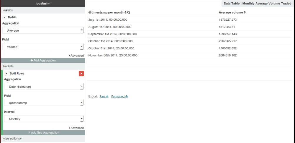
Kibana Data table
Now, save the visualization using some name for the data table, which we will pull into the dashboard later.
After we have built some visualizations, let's build a dashboard that includes these visualizations.
Select the dashboard page link at top of the page, and click on the Add Visualization link to select visualizations from your saved visualizations and arrange them.
The Dashboard, after including a line chart, bar chart, data table, and Metric, looks like this:
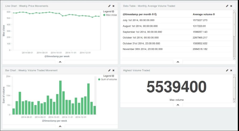
Kibana Dashboard
Now, we can save this dashboard using the save button, and it can be pulled later and shared easily.
Dashboards can be embedded as an IFrame in other systems or can be directly shared as links.
Click on the share button to see the options to share:
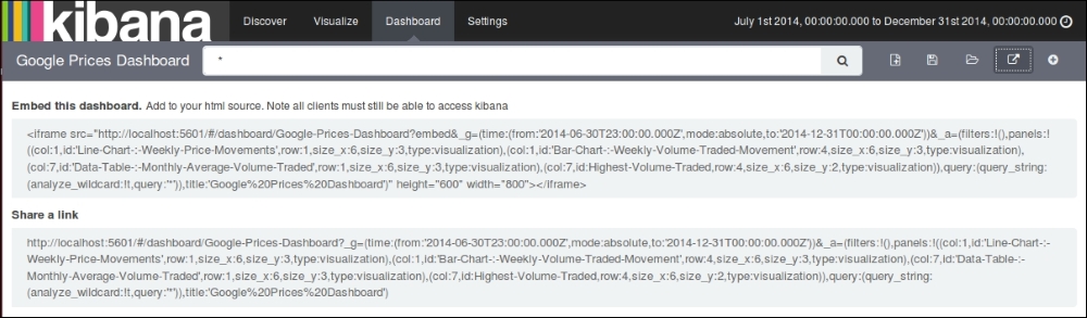
Kibana Share options
If you have completed everything up to this point, then you have successfully set up your first ELK data pipeline.