
Now that you have verified that your data is indexed successfully in Elasticsearch, we can go ahead and look at the Kibana interface to get some useful analytics from the data.
As described in Chapter 1, Introduction to ELK Stack, we will start the Kibana service from the Kibana installation directory:
$ bin/kibana
Now, let's see Kibana up and running with a screen similar to the following screenshot on the browser with this URL:
http://localhost:5601
We can verify our index and fields in the Settings page under the indices tab as follows:
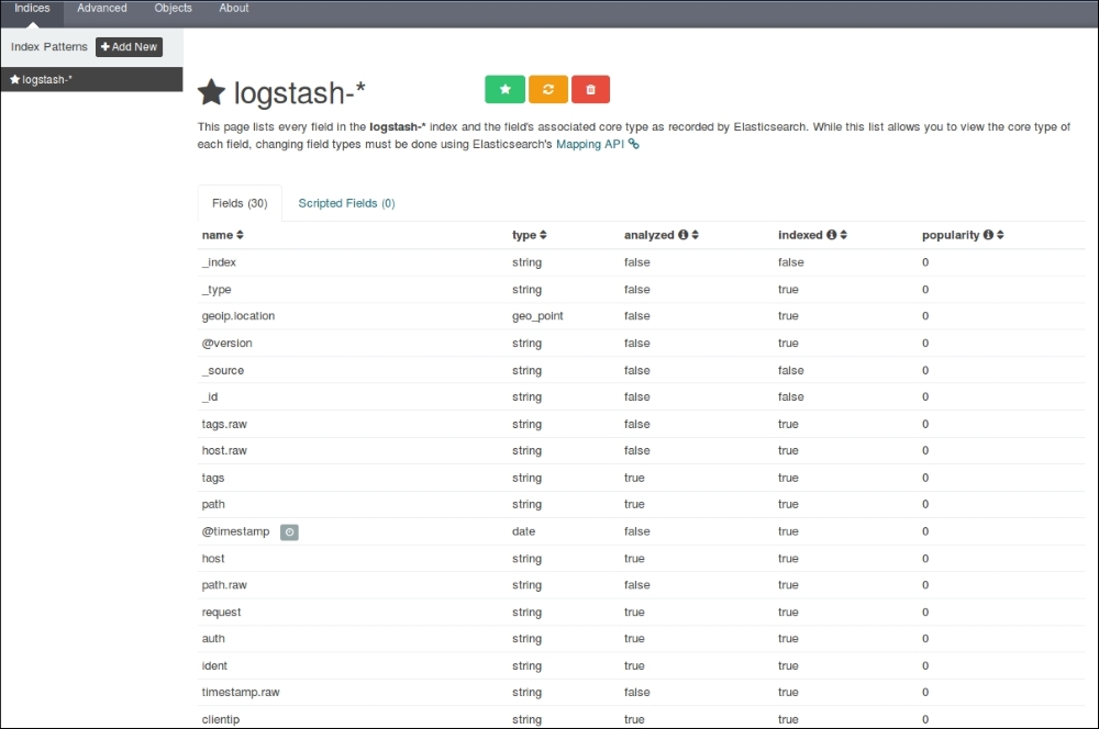
Kibana Settings page
It shows all our fields that were indexed, their data types, index status, and popularity value.
As we have already set up Kibana to take the logstash-* indexes by default, it starts to display the indexed data as a histogram of counts, and the associated data as fields in the JSON format as follows:
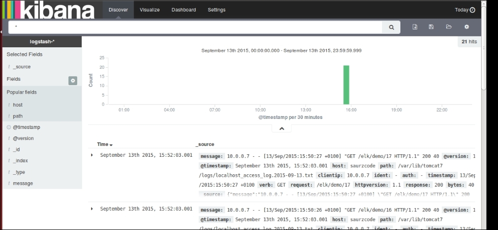
The Kibana Discover page showing indexed values
After our data is indexed, we can perform some quick searches on our fields to analyze some data.
To search for a specific client IP, we can type search command as clientip: 10.0.0.7 and the indexed document on the page displays matching highlighted values:
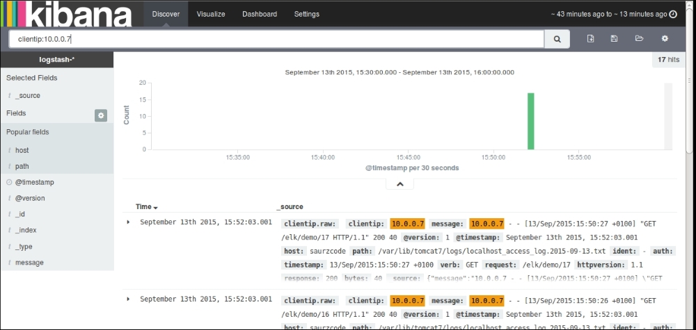
Search on fields in the Discover page
To search all GET requests coming from specific client IP, we can issue a query like this:
clientip:10.0.0.7 AND verb:GET
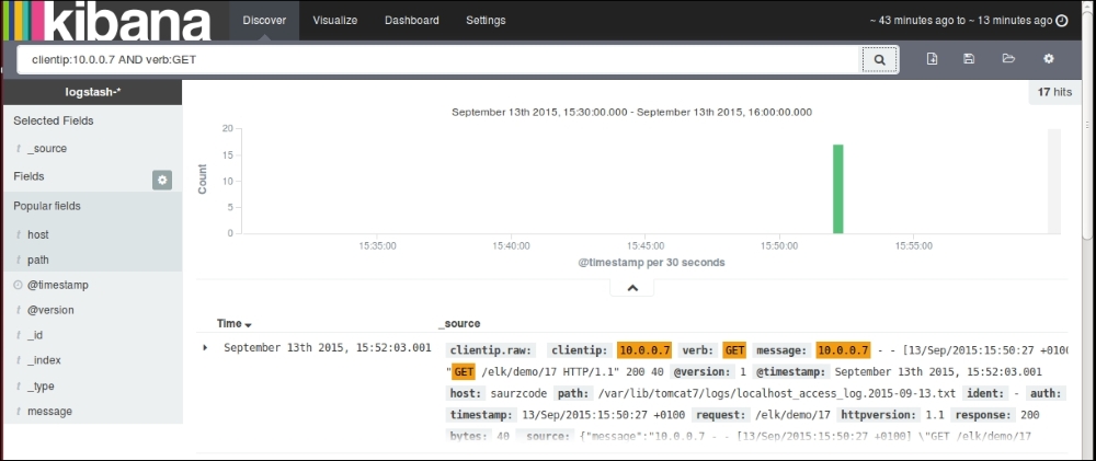
Searching on fields
To search all instances of a particular GET request coming from a specific client IP we can issue a query like the one shown in the following screenshot:
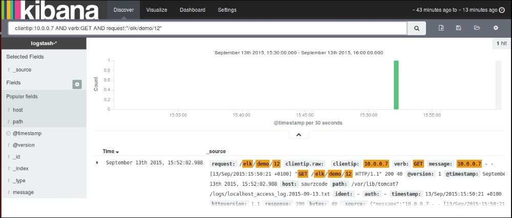
Searching on fields II
Once our data is fully indexed, the Discover page will look something like this, with a default histogram based on the count of documents over time:
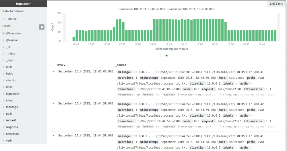
The Discover page after full indexing
Let's build some basic visualizations from the Kibana Visualize page, and we will use them later in dashboard.
Click on the Visualize page link at the top of the Kibana home page and click on the new visualization icon.
This page shows various types of visualizations that are possible with the Kibana interface:
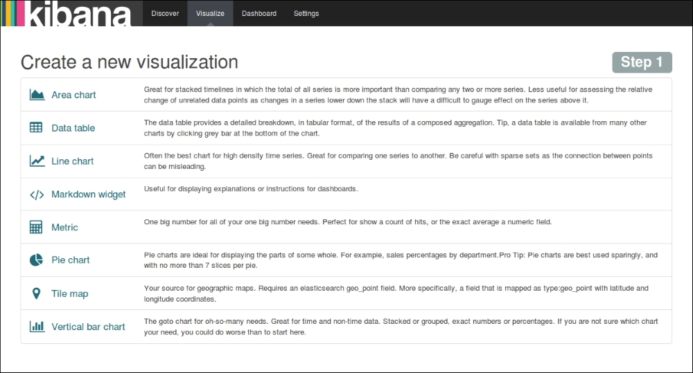
Kibana visualization menu
The first visualization that we will build is a Line chart showing the number of hits over time for the application. To do this, we'll choose the Y-axis metrics as Count and the X-axis bucket as Date Histogram, and then click on Apply. The resulting Line chart looks like this:
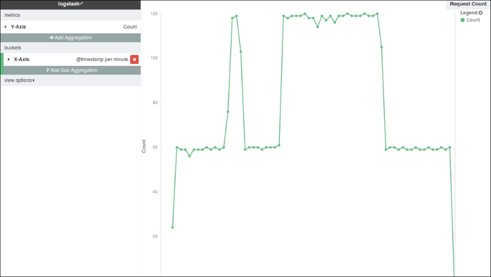
Line Chart – Request Count
Now, save the visualization using any name for the Line chart, which we will pull in Dashboard later.
We can build an Area chart based on the number of bytes transferred over time as follows. To do this, we'll choose the Y-axis metrics as Average and choose Field as bytes. The resulting Area chart looks like this:
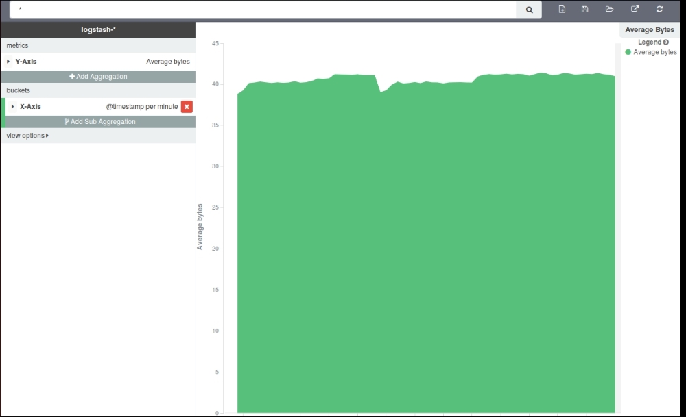
Area Chart – Average Bytes
Now, save the visualization using any name for the Area chart, which we will pull in Dashboard later.
We'll build a vertical split bar chart showing the number of requests split across multiple clients. For the Y-axis metrics, we will use Count, and for the X-axis aggregation, we'll use Date Histogram. We'll use sub aggregation using the Split Bars feature, and split it using the clientip term:
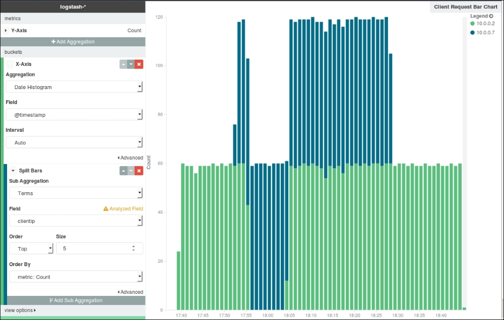
Bar Chart – Requests by Clients
Now, save the visualization using any name for the Bar chart, which we will pull in Dashboard later.
Markdown is lightweight markup language that has a simple formatting syntax for various documentation needs. We'll build one Markdown to give an explanation of our Dashboard:
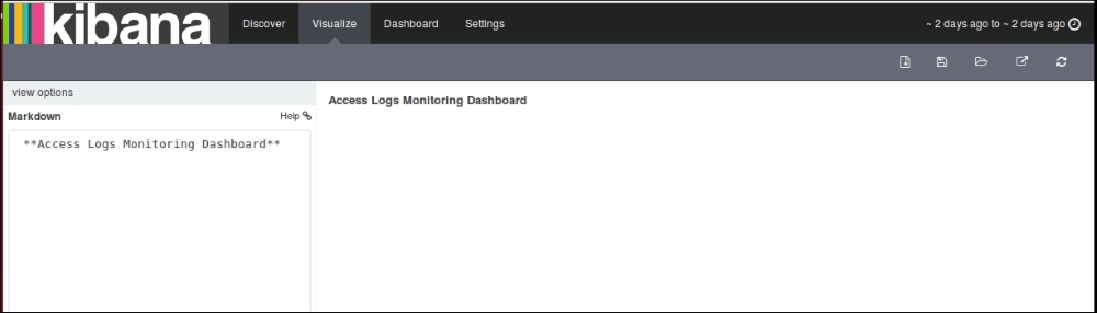
Markdown
On the Dashboard page, we can choose from our list of saved visualizations or searches to include them in our Dashboard:
Add visualization or searches to Dashboard
After we have selected the visualizations that we want to include in our dashboard, we can drag and drop and arrange them accordingly. The resulting dashboard looks like this:
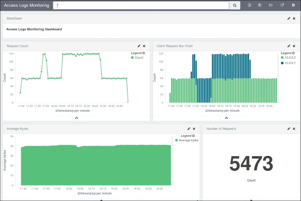
Dashboard – Access Logs Monitoring
Once completed, we can choose to share the dashboard using the share button, which also gives us the code to be used if we want to include it as an embedded dashboard in some other application:
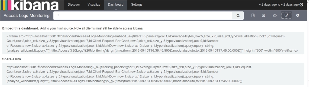
Share Dashboard