
In this section, I will be using the data recorded from running the Hello World simulation. Follow the steps from the previous section to create the event log, and the vector, scalar, and analysis files.
OMNeT++ allows you to create many different visualizations from your networks. They are defined in the sections that follow.
This chart shows the relationship between two or more datasets. This includes the histogram which you have seen earlier. With the analysis file for the network open, open the Vectors tab. In the location module filter, click on the downward arrow of the combo box, and then click on *.queue to filter in only modules that use a queue. Now highlight any number of rows, right-click on the highlighted part, and now click on Plot. This is the output I see once I have zoomed in on a particular part of a chart:
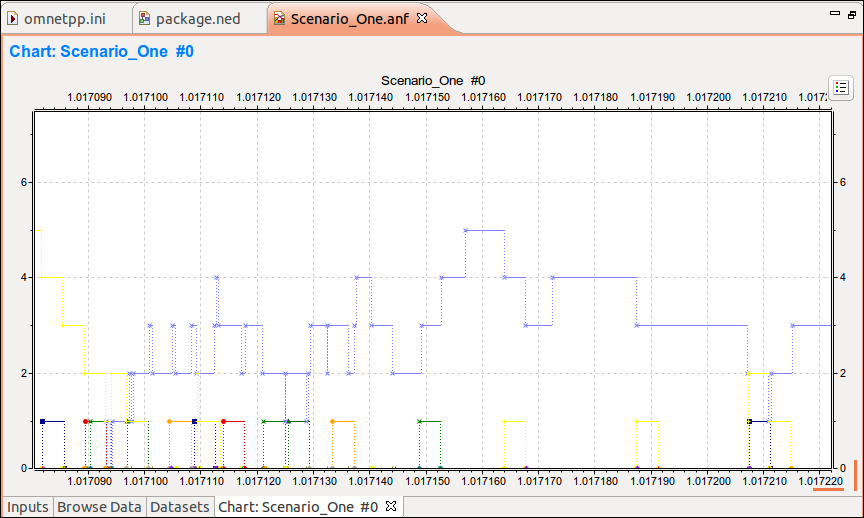
This output shows us the various queues I selected and how they rise and fall over time.