8
Telling a Data Story with Dashboards
In data discovery and analysis, you will likely create numerous data visualizations. Each of these visualizations gives you a snapshot of a story within the data. Each insight into the data answers a question or two. At times, the discovery and analysis phase is enough for you to make a key decision and the cycle is complete. In other cases, you will need to bring the snapshots together to communicate a complete and compelling story to your intended audience.
Tableau allows you to bring together related data visualizations into a single dashboard. This dashboard could be a static view of various aspects of the data or a fully interactive environment, allowing users to dynamically filter, drill down, and interact with the data visualizations.
In this chapter, we'll take a look at most of these concepts within the context of several in-depth examples, where we'll walk through the dashboard design process, step by step. As before, don't worry about memorizing lists of instructions. Instead, focus on understanding why and how the components and aspects of dashboards work.
This chapter will cover the following topics:
- Introduction to dashboards
- Designing dashboards in Tableau
- Designing for different displays and devices
- Interactivity with actions
- Stories
For the examples in this chapter, we'll return to the Superstore Sales sample data we used in the previous chapters. Go ahead and create a new workbook with a connection to that dataset, and we'll begin by introducing the key concepts of dashboards.
Introduction to dashboards
Before diving into some practical examples, let's take some time to understand what a dashboard is and why you might create one.
Dashboard definition
From a Tableau perspective, a dashboard is an arrangement of individual visualizations, along with other components, such as legends, filters, parameters, text, containers, images, extensions, buttons, and web objects, that are arranged on a single canvas. Ideally, the visualizations and components should work together to tell a complete and compelling data story. Dashboards are usually (but not always) interactive.
Dashboard objectives
The primary objective of a dashboard is to communicate data to a certain audience with an intended result. Often, we'll talk about telling the data story. That is, there is a narrative (or multiple narratives) contained within the data that can be communicated to others.
While you can tell a data story with a single visualization or even a series of complex dashboards, a single Tableau dashboard is the most common way to communicate a single story. Each dashboard seeks to tell a story by giving a clear picture of certain information. Before framing the story, you should understand what story the data tells. How you tell the story will depend on numerous factors, such as your audience, the way the audience will access the dashboard, and what response you want to elicit from your audience.
Stephen Few, one of the leading experts in the field of data visualization, defines a dashboard as a visual display of the most important information that's needed to achieve one or more objectives, consolidated and arranged on a single screen so the information can be monitored at a glance.
This definition is drawn from Few's paper Dashboard Confusion, which can be read here: https://www.perceptualedge.com/articles/ie/dashboard_confusion.pdf.
This definition is helpful to consider because it places some key boundaries around the data story and the way we will seek to tell it in Tableau. In general, your data story should follow these guidelines:
- The data story should focus on the most important information. Anything that does not communicate or support the main story should be excluded. You may wish to include that information in other dashboards.
- The data story that you tell must meet your key objectives. Your objectives may range from giving information to providing an interface for further exploration, to prompting your audience to act or make key decisions. Anything that doesn't support your objectives should be reserved for other dashboards.
- The data story should be easily accessible, and the main idea should be clear. Depending on your audience, you may wish to explicitly state your conclusions from the data, or you may want to guide your audience so that they can draw their own.
When you set out to build a dashboard, you'll want to carefully consider your objectives. Your discovery and analysis should have uncovered various insights into the data and its story. Now, it's your responsibility to package that discovery and analysis into a meaningful communication of the story to your particular audience in a way that meets your objectives and their needs. The way you handle this task is called your approach.
Dashboard approaches
There are numerous possible approaches to building dashboards based on your objectives. The following is by no means a comprehensive list:
- Guided analysis: You've done the analysis, made the discoveries, and thus have a deep understanding of the implications of the data story. Often, it can be helpful to design a dashboard that guides your audience through a similar process of making the discoveries for themselves, so the need to act is clear. For example, you may have discovered wasteful spending in the marketing department, but the team may not be ready to accept your results unless they can see how the data led you to that conclusion.
- Exploratory: Many times, you do not know what story the data will tell when the data is refreshed in the next hour, next week, or next year. What may not be a significant aspect of the story today might be a major decision point in the future. In these cases, your goal is to provide your audience with an analytical tool that gives them the ability to explore and interact with various aspects of the data on their own. For example, today, customer satisfaction is high across all regions. However, your dashboard needs to give your organization the ability to continually track satisfaction over time, dynamically filter by product and price, and observe any correlations with factors such as quality and delivery time.
- Scorecard/Status snapshot: There may be a wide agreement on Key Performance Indicators (KPIs) or metrics that indicate good versus poor performance. You don't need to guide the audience through discovery or force them to explore. They just need a high-level summary and the ability to drill down into details to quickly find and fix problems and reward success. For example, you may have a dashboard that simply shows how many support tickets are still unresolved. The manager can pull up the dashboard on a mobile device and immediately take action if necessary.
- Narrative: This type of dashboard emphasizes a story. There may be aspects of exploration, guided analysis, or performance indication, but primarily you are telling a single story from the data. For example, you may desire to tell the story of the spread of an invasive species of insect, including where it started, how quickly it spread, the results, and the efforts to contain it. Your dashboard should tell the story, using data, in a visual way.
We'll look at several in-depth examples to better understand a few of these different approaches and incorporate many of the skills we've covered in previous chapters. First, we'll introduce some key aspects of designing dashboards in Tableau.
Your dashboard may have a hybrid approach. For example, you might have an exploratory dashboard that prominently displays some KPIs. However, be careful to not overload a dashboard. Trying to meet more than one or two objectives with any single dashboard will likely result in an overwhelming mess.
Designing dashboards in Tableau
No matter your objective or approach, the practical task of designing a dashboard in Tableau will look similar each time. In this section, we will go through some fundamental concepts.
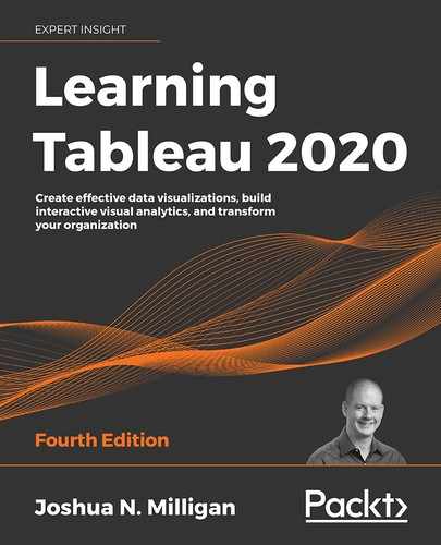
Objects
Dashboards are made up of objects that are arranged on a canvas. You'll see a list of objects that can be added to a dashboard in the left-hand pane of a dashboard:
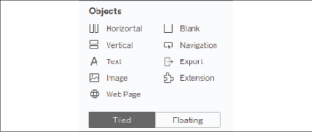
Figure 8.1: Objects available to add to a dashboard
The pane includes these objects:
- Horizontal: A layout container within which other objects will be arranged in a single row (horizontally).
- Vertical: A layout container within which other objects will be arranged in a single column (vertically).
- Text: An object that allows you to include richly formatted text in your dashboard.
- Image: An image (for example,
.gif,.png, or.jpeg) that can be positioned and sized on your dashboard. Optionally, you may set a URL for navigation when a user clicks the image. - Web Page: An object that allows you to embed web content in the dashboard. You may set the URL at design time. We'll also consider how to use actions to dynamically change the URL.
- Blank: A blank object that can be used as a placeholder or to provide spacing options.
- Navigation: A navigation button allows you to define user navigation to other sheets and dashboards in the workbook.
- Export: An export object allows you to create a link or button that gives the user an easy option to export the dashboard as an image, PDF, or PowerPoint.
- Extension: One of a growing number of tools developed by Tableau and third parties (or maybe even you!) that leverages the extensions API to provide extended functionality to dashboards. This could allow you to accomplish things such as gathering extensive usage data, dynamically updating parameters, incorporating visualizations from other platforms (such as D3), and much more.
In addition to the objects that you can add through the sidebar, there are other objects that may be applicable to a given dashboard:
- Filters: These will appear as controls for the end user so that they can select values to filter
- Parameters: Similar to filters, these will show up as controls for the end user to select a parameter option
- Page controls: These are controls that give the end user options for paging through the data and may be used to animate visualizations and dashboards
- Legends: These include color, size, and shape legends to help the end user understand various visualizations
- Highlighters: These allow the user to highlight various dimension values within views
- Dashboard title: A special text object that displays the name of the dashboard sheet by default
Tiled versus floating
An object is either tiled or floating. If it is a tiled object, it will snap into the dashboard or layout container where you drop it. If it is a floating object, it will float over the dashboard in layers. You can change the order of the layers for a floating object.
You'll notice the Tiled or Floating buttons directly beneath the Objects pallet in the preceding image. These buttons define the default setting for objects that you place on the dashboards, but you can change whether any given object is tiled or floating.
Hold down the Shift key as you drag an object to quickly change it from tiled to floating, or from floating to tiled.
As you become experienced in designing dashboards, you'll likely develop a preference for designing using a predominately tiled approach or a predominately floating approach. (You can mix tiled and floating objects on any dashboard). Many designers find one design method or the other fits their style. Here are some considerations:
- Precision: Floating objects can be sized and positioned to exact pixel-perfection, while tiled objects will depend greatly upon their containers for position and size.
- Speed: Many designers find a tiled layout much faster to create as they don't have to worry about precision or layering.
- Dynamic resizing: Floating objects work well on a fixed-size dashboard, but a dashboard that dynamically resizes based on window size will shift floating objects, often into undesirable locations. Tiled objects move and resize more reliably (but not always perfectly!).
- Flexibility: Certain design techniques can be accomplished with one approach or the other. For example, transparent visualizations can be layered on top of background images using a floating technique. However, sheet swapping (which we'll consider in Chapter 11, Dynamic Dashboards) is often accomplished with a tiled approach.
- Maintenance: Changes to the layout of a floating dashboard might be harder and more tedious than doing so for tiled layouts.
Experiment with various design techniques and feel free to develop your own style!
Manipulating objects on the dashboard
You may wish to manipulate an object once it is part of a dashboard. Every object has certain controls that become visible when you select it:
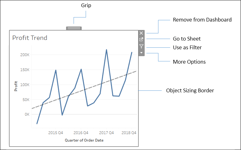
Figure 8.2: Various controls become accessible once you select a dashboard object
- Grip: Click and drag the grip to move the object.
- Remove from Dashboard: Click this to remove the object from the dashboard.
- Go to Sheet: To edit a single visualization on a dashboard, use this button to navigate to the individual sheet.
- Use as Filter: Clicking here will enable the view to be used as a filter. Selecting a mark in the view will now filter other views on the dashboard. We'll look at the specifics of filter actions later in this chapter and how you can have finer control over how a view can be used as a filter.
- More Options: This drop-down arrow reveals a host of options for the object, including control display options for parameters and filters; showing or hiding titles or captions on views; adding legends, parameters, and filters to the dashboard; formatting, layout, and size options; and more.
- Object Sizing Border: Hovering over the border will cause your cursor to change to a sizing cursor. You can drag the border to adjust the size of the object.
You may notice different sizing behavior based on what type of container an object is inside and whether the object is tiled or floating.
In the first sections of this chapter, we have introduced the theoretical fundamentals of dashboards and some key elements of their design. Now, let's apply these concepts with a practical example.
A dashboard to understand profitability
Having covered some conceptual topics as well as practical matters related to dashboard design, we'll dive into an example.
Let's say you've been tasked with helping management find which items are the least profitable. Management feels that most of the least profitable items should be eliminated from their inventory. However, since you've done your analysis, you've discovered that certain items, while not profitable overall, have made a profit at times in various locations. Your primary objective is to give management the ability to quickly see an analysis of the least profitable items to identify whether an item has always been unprofitable, answering the question, "Is the least profitable item always unprofitable?" This example will combine aspects of a guided analytics dashboard and an exploratory tool.
Building the views
Use the Superstore Sales dataset and follow these steps to build the individual views that will form the basis of the dashboard:
- Create a bar chart showing profit by category. Sort the categories in descending order by the sum of profit.
- Add the Department field to Filters and show a filter. To accomplish this, use the drop-down menu of the Department field in the data pane and select Show Filter.
- Name the sheet Overall Profit by Category:
Figure 8.3: A bar chart showing the sum of profit by category with Department as a filter
- Create another similar view showing profit by item. Sort the items in descending order by the sum of profit.
- You'll notice that there are too many items to see at once. For your objectives on this dashboard, you can limit the items to only the top 10 least profitable ones. Add the Item field to the Filters shelf, select the Top tab, and adjust the settings to filter by field. Specify Bottom 10 by
Sum(Profit):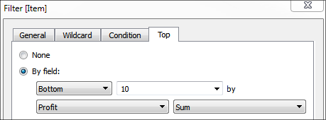
Figure 8.4: Use the Top tab to set the number of items to display
- Rename the sheet Top 10 Least Profitable Items:
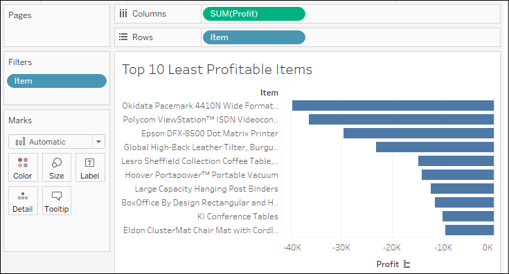
Figure 8.5: The resulting bar chart shows the top 10 least profitable items
- Create another sheet that displays a filled map of profit by state. You can accomplish this rather quickly by double-clicking the State field in the data window and then dropping Profit on the Color shelf. (Note: if your regional settings are not US, you may need to use the Edit Locations option to set the country to the United States.)
- Rename the sheet to Profit by State:
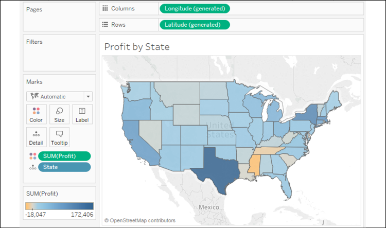
Figure 8.6: A filled map showing profit by state
- Create one final sheet to show when profits were made or lost. Ensure that the Order Date field has been added as the Quarter date value and that it is continuous (green).
- Add a linear trend line. To do this, switch to the Analytics tab of the left sidebar and drag Trend Line from Model to the view. Alternatively, right-click a blank area of the canvas of the view and select Trend Lines | Show Trend Lines.
- Rename the sheet to Profit Trend:
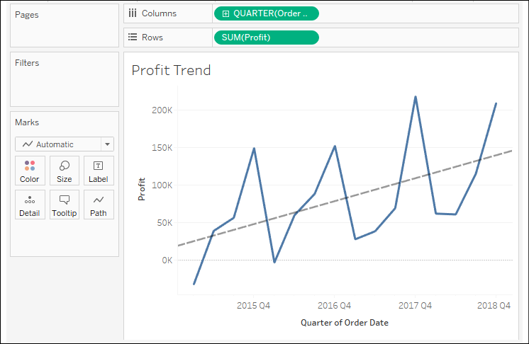
Figure 8.7: A line chart showing the trend of profit by quarter
Now that you've created the views that will make up the dashboard, let's start to put the dashboard together!
Creating the dashboard framework
At this point, you have all of the necessary views to achieve the objectives for your dashboard. Now, all that remains is to arrange them and enable the interactivity that's required to effectively tell the story:
- Create a new dashboard by clicking the New Dashboard tab to the right of all existing worksheet tabs or by selecting Dashboard | New Dashboard from the menu.
- Rename the new dashboard
Is Least Profitable Always Unprofitable?. - At the bottom of the left sidebar, check Show dashboard title.
- Add the views to the dashboard by dragging them from the Dashboard pane of the left sidebar and dropping them into the dashboard canvas. Arrange them as follows:
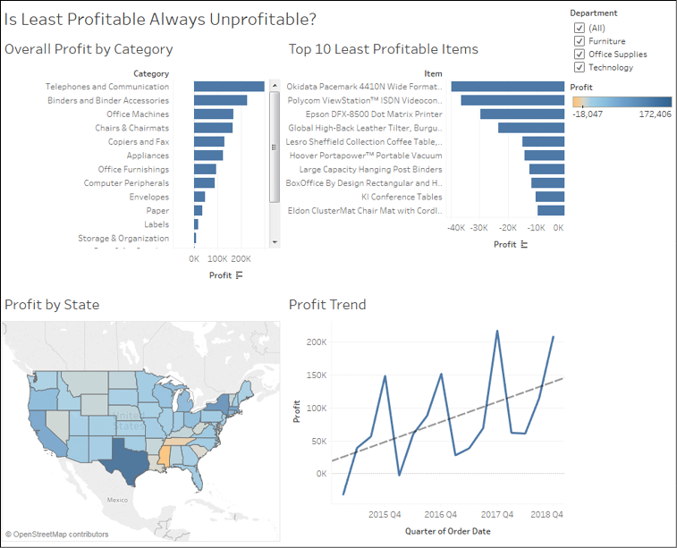
Figure 8.8: All views are placed on the dashboard
After adding views to the dashboard, you'll want to take some time to reposition and resize various elements and views.
- Use the drop-down menu on the Department filter and change the control to Single Value (drop-down).
- You'll notice that changing the value of the filter only changes the Overall Profit by Category view. You can adjust which views the filter applies to by using the drop-down menu. Using the drop-down menu, select Apply to Worksheets | All Using This Data Source.
Options for applying filters may be set using the drop-down on the filter control or on the field on the filters shelf in the view. The options include the following:
- All Using Related Data Sources: The filter will be applied to all data sources where the field used for filtering is related between data sources. Relationships may be edited from Data | Edit Relationships on the main menu.
- All Using This Data Source: The filter will be applied to any view using the data source as the primary data source.
- Selected Worksheets...: The filter will be applied to the worksheets you select.
- Only This Worksheet: The filter will be applied only to the current worksheet.
Now, let's get back to creating our dashboard framework.
- From the left sidebar, drag and drop a text object above Overall Profit by Category and enter the following instructions:
- Select a Department from the drop-down
- Select a category below
- Select an Item below
- Using the grip, move the Department filter immediately above the Top 10 Least Profitable Items view.
- Size the text object to align the Top 10 view with the overall view.
- Move the Profit color legend below the Profit by State view.
- Use the drop-down menu of Overall Profit by Category to Fit | Entire View. This will ensure that all of the categories are visible without the need for a scrollbar.
- Additionally, fit Top 10 Least Profitable Items to Entire View.
At this point, your dashboard should look similar to the following:

Figure 8.9: The polished dashboard with rearranged and resized objects
We now have a dashboard with all the views we want to include. As you've seen, it's easy to add views and objects and rearrange them as desired. Let's continue by examining how to drive a story with actions.
Implementing actions to guide the story
You now have a framework that will support the telling of the data story. Your audience will be able to locate the least profitable items within the context of a selected category. Then, the selection of an item will answer the question of whether it has always been unprofitable in every location. To enable this flow and meet your objectives, you'll often need to enable interactivity. In this case, we'll use actions. We'll conclude this example with some specific steps and then unpack the intricacies of actions later in the chapter:
- Click the Use as Filter button on the Overall Profit by Category view. This will cause the view to be used as an interactive filter for the entire dashboard. That is, when the user selects a bar, all other views will be filtered based on the selection:
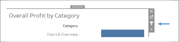
Figure 8.10: The Use As Filter control on the Profit by Category view
- From the main menu, select Dashboard | Actions. You'll see a list containing one action named Filter 1 (generated). This is the action that was created when you selected Use as Filter previously:

Figure 8.11: Filter 1 (generated) was created when the filter control was clicked
- Click the Add Action > button and select Filter. The resulting dialog gives you options for selecting the source and target, as well as additional options for the action.
- Here, we want an action that filters everything except the Overall Profit by Category view when the user selects an item. In the Add Filter Action dialog, set Source Sheets to Top 10 Least Profitable Items, and Target Sheets to Profit by State and Profit Trend. Make sure that the action is set to run on Select. Name the filter Filter by Item, and then click OK on this dialog. Do the same on the Actions dialog:
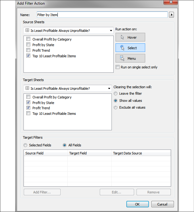
Figure 8.12: Setting options for the Filter by Item action
You now have three filters (two are actions) that drive the dashboard:
- Selecting a department from the drop-down will filter the entire dashboard (and actually all views in the workbook as you set it to filter every view using the data source)
- Selecting a category (clicking a bar or header) will filter the entire dashboard to that selection
- Selecting an item (clicking a bar or header) will filter the Profit by State and Profit Trend dashboards
You can clear a selection in a view by clicking a blank area or by clicking the selected mark one more time. For example, if you click the bar for Bookcases to select it (and thus filter the rest of the dashboard), you may click the bar one more time to deselect it.
Experiment with the filters and actions to see how your dashboard functions.
Context filtering
You may have noticed that when you use the drop-down filter to select a single department or select a single category, you have fewer than 10 items in the Top 10 view. For example, selecting Furniture from the Department filter and clicking on the bar for Tables results in only three items being shown. This is because the Top Item filter is evaluated at the same time as the action filter. There are only three items with the category of Tables that are also in the Top 10.
What if you want to see the top 10 items within the category of Tables? You can accomplish this using context filters.
Context filters are a special kind of filter in Tableau that are applied before other filters. Other filters are then applied within the context of the context filters. Conceptually, context filters result in a subset of data upon which other filters and calculations operate. In addition to Top Filters, Computed Sets and Fixed Level of Detail calculations are also computed within the context defined by context filters.
In this case, navigate to the Top 10 sheet and add the Department filter and the newly added action (Category) filter to the context using the drop-down menu of the fields on the Filters shelf. Once added to the context, those fields will be gray on the filters shelf. Now, you will see the top 10 items within the context of the selected department and category:
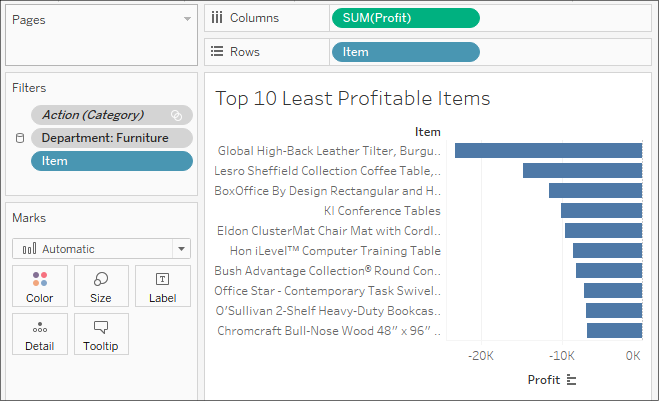
Figure 8.13: The 10 least profitable items will be within the context of the Action (Category) and Department filters
Notice that adding filters to the context causes the fields to be color-coded gray on the Filters shelf.
If you edit the action on the dashboard, the filter might be automatically updated and you may have to re-add it to the context.
Go ahead and step through the actions by selecting a couple of different categories and a couple of different items. Observe how the final dashboard meets your objectives by telling a story:

Figure 8.14: The final dashboard with filters triggered by selection
The user has selected Technology from the Department drop-down, Telephones and Communications from the Category list, and then Item 10631, which is the least profitable item within the category. This reveals the states where the item was sold (color-coded by profit) and a time series of profit for the item.
Should management remove item 10631 from the inventory? Not without first considering that the item only lost profit in one instance and that the trend is positive toward greater profitability. Granted, the original loss was a large loss, but this was also a long time ago and every subsequent sale of the item resulted in a gain. The results of your findings may lead to further analysis to determine what factors play a part in the profit and loss for the item and better decision making by management.
When you look at the Chapter 08 Completed workbook, you'll only see a tab at the bottom for the dashboard. The individual views have been hidden. Hiding tabs for sheets that are used in dashboards or stories is a great way to keep your workbook clean and guide your audience away from looking at sheets that are meant to be seen in the context of a dashboard or story. To hide a sheet, right-click the tab and select Hide Sheet. To unhide a sheet, navigate to the dashboard or story using the sheet, right-click the sheet in the left-hand side pane and uncheck Hide Sheet. Additionally, you can hide or unhide all sheets that are used in a dashboard by right-clicking the dashboard tab and selecting the appropriate option. Sheets that are used in tooltips may be hidden or unhidden in the same way.
You now have a fully interactive dashboard! You built the views, added them to the dashboard, and then created some meaningful calculations. Along the way, you learned about top filters and context filters. Now, let's consider how you might design dashboards for different displays and devices.
Designing for different displays and devices
When designing a dashboard, some of the first questions you'll often ask yourself are: How will my audience view this dashboard? What kind of device will they use? With the wide adoption of mobile devices, this latter question becomes very important because what looks great on a large flat-screen monitor doesn't always look great on a tablet or phone.
The top of the Dashboard tab on the left sidebar reveals a button to preview the dashboard on various devices, as well as a drop-down for Size options:

Figure 8.15: The Device Preview option allows you to design and preview your dashboard for other devices
Clicking the Device Preview button not only allows you to see how your dashboard will look with various device types (and even specific models) but also allows you to add a layout for each device type, which you can customize:

Figure 8.16: Customizable options for devices
You can not only see how your dashboard will appear on various devices and models but also how it will look based on the orientation of the device and whether the Tableau Mobile app is used (if available for the selected device).
Clicking the Add Layout button (that is, the Add Tablet Layout button in the preceding screenshot) will add a layout under the Dashboard tab on the left sidebar:

Figure 8.17: Each layout can be configured with various options
Each layout can have its own size and fit options, and the layout options allow you to switch from Default to Custom. This gives you the ability to rearrange the dashboard for any given layout. You may even remove views and objects for a certain layout. For example, you might simplify a dashboard to one or two views for a phone while leaving three or four in place for a desktop display.
The Chapter 08 Completed workbook contains an example of the profit analysis dashboard and has a couple of layout options. For example, here is that dashboard formatted for display on a phone in which the dashboard will fit according to the width of the phone and allow scrolling up and down:
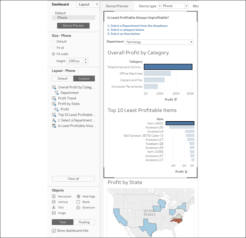
Figure 8.18: The phone layout of the dashboard
As you can see, the arrangement of the dashboard for the phone means that Profit by State and Profit Trend do not appear within the preview boundaries for a phone device. However, they are only a finger swipe away.
Interactivity with actions
In Tableau, an action is a user-initiated event that triggers a response from Tableau. You've seen a few examples of actions being used in dashboards already. We'll now consider some details of how actions work in Tableau.
Tableau supports six kinds of actions:
- Filter actions: The user's action causes one or more filters to be applied to one or more views.
- Highlight actions: The user's action causes specific marks and headers to be highlighted in one or more views.
- URL actions: The user's action causes a specific URL to be opened (either in a browser, a new tab, or in an embedded web object).
- Go to Sheet: The user's action causes navigation to a selected sheet or dashboard.
- Parameter actions: The user's action changes the value of a parameter. This allows the user to visually interact with parameters in new and exciting ways!
- Set actions: The user's action defines a set. Sets may be used in calculations, filters, and on shelves to define visual attributes of marks. This opens a lot of possibilities to allow complex and creative interactions.
Certain actions are automatically generated by Tableau based on shortcuts. For example, you can select Use as Filter from the drop-down menu of a view on a dashboard, which results in an automatically generated filter action. Enabling highlighting using the button on a discrete color legend or from the toolbar will automatically generate a highlight action:
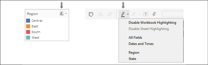
Figure 8.19: Options for enabling highlighting
You can also create or edit dashboard actions by selecting Dashboard | Actions from the menu. Let's consider the details of each type of action.
Filter actions
Filter actions are defined by one or more source sheets that pass one or more dimensional values as filters to target sheets upon an action. Remember that every mark on a sheet is defined by a unique intersection of dimensional values. When an action occurs involving one or more of those marks, the dimensional values that comprise the mark(s) can be passed as filters to one or more target sheets.
When you create or edit a filter action, you will see options like these:

Figure 8.20: Options for filter actions
This screen allows you to do the following:
- Name the filter.
- Choose Source and Target sheets. The Source sheet is where the user will initiate the action (hover, selection, menu) and the Target sheet is where the response will be applied (filtering in this example, but also highlighting).
- Set the action that triggers the filter and whether the selection of multiple marks or only a single mark initiates the action.
- Choose what happens when the selection is cleared.
- Specify which dimensions are used to pass filter values to the Target sheet(s).
Try to name your actions using names that help you differentiate between multiple actions in the dashboard. Additionally, if your action is set to run on Menu, then the name you use will be shown as a link in the tooltip. Use the arrow to the right of the name to insert special field placeholders. These will be dynamically updated with the values of the fields for a mark when the user sees the menu option in a tooltip.
You may select as many source and target sheets as you desire. However, if you specify particular Target filters in the bottom section, the fields you select must be present in the source sheet (for example, on Rows, Columns, and Detail). You will receive a warning if a field is not available for one or more Source sheets and the action will not be triggered for those sheets. Most of the time, your source and target will be the same dashboard. Optionally, you can specify a different target sheet or dashboard, which will cause the action to navigate to the target in addition to filtering.
When filter actions are defined at the worksheet level (when viewing a worksheet, select Worksheet | Actions from the menu), a menu item for that action will appear as menu items for every mark on every sheet that uses the same data source. You can use this to quickly create navigation between worksheets and from dashboards to individual worksheets.
Filter actions can be set to occur on any one of three possible actions:
- Hover: The user moves the mouse cursor over a mark (or taps a mark on a mobile device).
- Select: The user clicks or taps a mark, and a rectangle/radial/lasso selects multiple marks by clicking and dragging a rectangle around them and clicks a header (in which case all marks for that header are selected). A user may deselect by clicking/tapping the already selected mark, clicking/tapping an empty space in the view, or by clicking/tapping the already selected header.
- Menu: The user selects the menu option for the action on the tooltip.
Consider the following example of a filter action that's triggered when a bar is selected in the source:
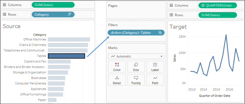
Figure 8.21: Clicking the bar for Tables passes Category as a filter to the Target sheet
Each bar mark in the source is defined by the Category dimension. When the bar for Tables is selected, a single filter is set on the target.
If the mark is defined by more than one dimension (for example, Category and Region), then the target sheet will still have a single filter with the combination of dimension values that had been selected.
In this example, the filter contains Office Machines and West, matching the dimensions that define the selected square:
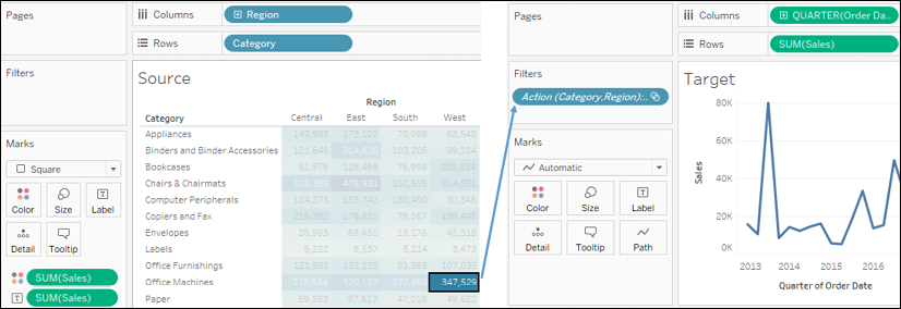
Figure 8.22: Clicking the square for the intersection of Office Machines and West passes both dimensional values as a single action filter to the target
By default, all dimensions present in the source view are used in a filter action. Optionally, you can specify which fields should be used. You can use the Selected Fields option in the Edit Filter Actions dialog to accomplish the following:
- Filter based on fewer dimensions. For example, if you only selected the Region field, then selecting the preceding square would only pass the West region as a filter to the target.
- Filter a target view using a different data source. The Selected Fields option allows you to map the source field to a target field (even if the target field has a different name, though the values must still match). For example, if the target used a data source where East was a possible value for a field named Area, you could map Region from the source to Area in the target.
Filter actions are very useful for narrowing focus, drilling into detail, and seeing different aspects of a selected dimension. You'll find yourself using them often. Let's consider another type of action: highlight actions.
Highlight actions
This type of action does not filter target sheets. Instead, highlight actions cause marks that are defined, at least in part, by the selected dimensional value(s) to be highlighted in the target sheets. The options for highlight actions are very similar to filter actions, with the same configuration options for source and target sheets, and which events are able to trigger the action.
Consider a dashboard with three views and a highlight action based on the Region field. When the action is triggered for the East region, all marks defined by East are highlighted. The dimension(s) that are used for the highlight must be present in all views where you want the highlighting to be applied. Both the map and scatter plot have Region on the Detail part of the Marks card:

Figure 8.23: Clicking the bar for East has highlighted all other marks associated with that dimensional value
Highlighters (also called data highlighters) are shown as user controls (similar to filters and parameters) that cause highlighting based on user interaction. They can be applied to one or more views and will highlight the marks of the views. They do not create an action. To add highlighters, select any discrete (blue) field in the view and use the drop-down menu to click Show Highlighter. Alternatively, you can use the menu and select Analysis | Highlighters. On a dashboard, you can add a highlighter by using a view's drop-down menu and selecting Highlighters.
URL actions
URL actions allow you to dynamically generate a URL based on an action and open it within a web object in the dashboard or in a new browser window or tab. URL actions can be triggered by the same hover, menu, and select events as other actions. The name of the URL action differentiates it and will appear as the link when used as a menu.
The URL includes any hardcoded values you enter as well as placeholders that are accessible via the arrow to the right of the URL text box. These placeholders include fields and parameters. The values will be dynamically inserted into the URL string when the action is triggered based on the values for the fields that make up the selected mark(s) and current values for parameters.
If you have included a web object in the dashboard, the URL action will automatically use that as the target. Otherwise, the action opens a new browser window (using your default browser, when the dashboard is viewed in desktop or reader) or a new tab (when the dashboard is viewed in a web browser).
Some web pages have different behaviors when viewed in iframes. The browser object does not use iframes in Tableau Desktop or Tableau Reader but does when the dashboard is published to Tableau Server, Tableau Online, or Tableau Public. You will want to test URL actions based on how your dashboards will be viewed by your audience.
You may specify a target for the URL action when you create or edit the URL action:
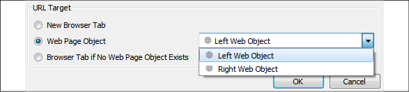
Figure 8.24: Options for a URL action
Options include New Browser Tab, Web Page Object (you may select which object if you have more than one on the dashboard), and Browser Tab if No Web Page Object Exists. If you have more than one web page object on the dashboard, you may wish to give them meaningful names to make selection easier.
To accomplish this, switch to the Layout tab on the left-hand side pane and expand Item hierarchy until you locate the objects you wish to rename. Right-click the object and select Rename Dashboard Item…:
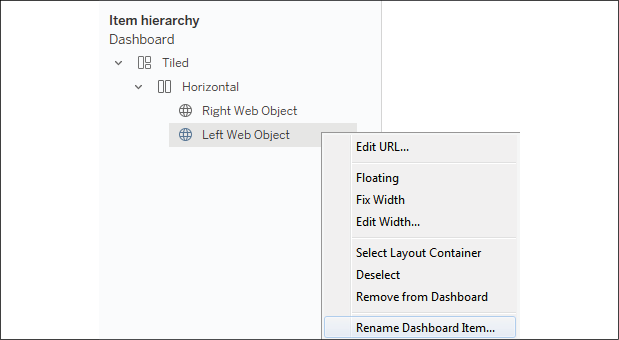
Figure 8.25: Dashboard objects can be renamed using the item hierarchy and the right-click context menu
After you have renamed the object, you will be able to more readily identify which one is the target of the URL action.
Next, we'll consider another type of action that accomplishes a specific result: navigation.
Go to Sheet actions
Go to Sheet actions (also called navigation actions) allow you to specify navigation to another dashboard or sheet in the workbook based on user interaction with one or more views. For example, clicking a bar in a bar chart might navigate to another dashboard. These are similar to filter actions that define another sheet as a target, but Go to Sheet actions do not set any filters.
Parameter actions
Parameter actions allow you to set the value of a parameter based on a user action. When you create a parameter action, you'll set options using a screen like this:
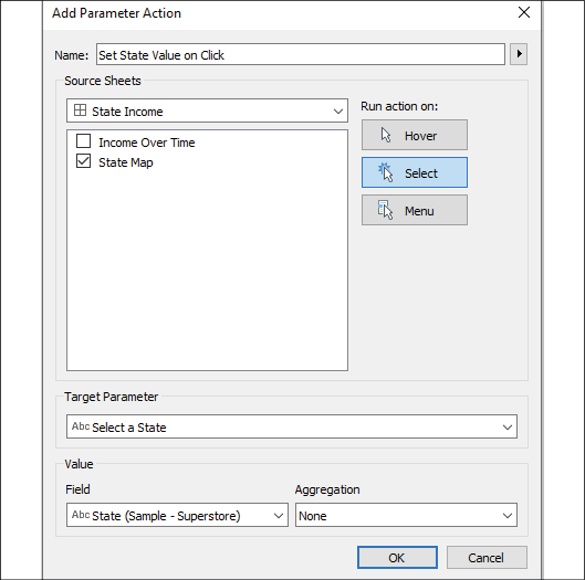
Figure 8.26: Options for a parameter action
As with other actions, you may select the sheets and user interactions (Hover, Select, Menu) that trigger the action. Additionally, you will set the target parameter and specify which field will set the value. You may use any field in the sheet and may also specify an aggregation for the field.
We saw in Chapter 4, Starting an Adventure with Calculations and Parameters, how parameters can be used to accomplish all kinds of results. You can use them in calculations, filters, and Top N sets, and you can use them to define reference lines and alter the visual aspects of any view. This opens a world of possibilities for driving an interactive experience using views and triggers.
Set actions
Set actions allow you to populate a set with one or more values for one or more dimensions. This is very powerful because sets can be used on any shelf to encode any visual element, can be leveraged in calculations, and can be used as filters. They can be used in all of these ways—and in different ways—in different views. This gives you incredible flexibility in what can be accomplished with set actions. We'll first take a moment to define sets more clearly and then look at an example of a set action.
Sets
A set in Tableau defines a collection of records from the data source. At a row-level, each record is either in or out of the set. There are two types of sets:
- Dynamic sets (sometimes called computed or calculated sets)
- Fixed sets
A dynamic set is computed for a single dimension based on a conditional calculation you define. As the data changes, the results of the condition may change and records may switch between in and out of the set.
For example, if you were to use the drop-down menu on Customer Name in the data pane and select Create | Set, then you could stipulate a condition that defines which records belong to the set:
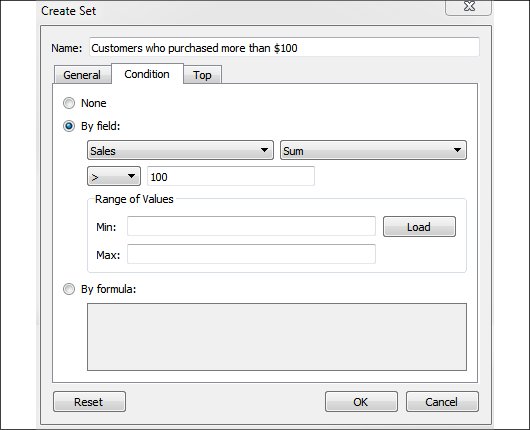
Figure 8.27: A dynamic set based on a condition
In this example, we've created a dynamic set named Customers who purchased more than $100 with a condition that's set by the sum of sales being greater than 100. You'll notice that there are also options for computing By formula or Top N. All of these conditions are going to be at an aggregate level (across the entire dataset or across the context if context filters are used) and then each record is evaluated as to whether it is in or out of the set. In this case, the total sales for each customer will be computed across the dataset and then each record will be counted in or out of the set based on whether the customer for that record has total sales greater than $100.
A fixed set is a list of values for one or more dimensions. If the values for a single record match the list defined by the set, then the record is in the set, and out otherwise. For example, you might create another set based on the Customer Name field, this time with the General tab:
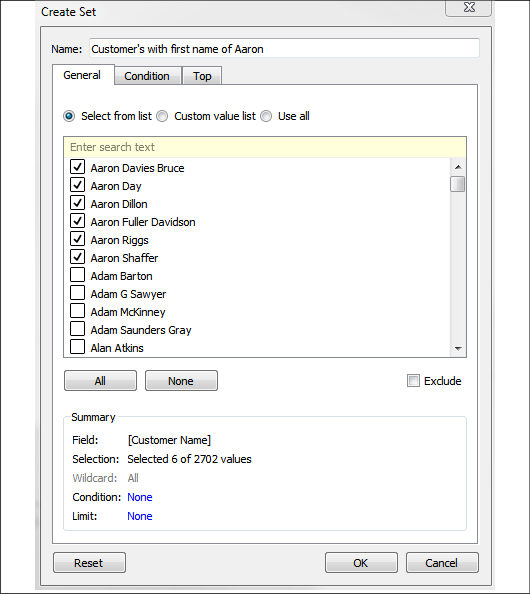
Figure 8.28: A static set based on the selection of members
Here, you can select individual values that will define what is in or out of the set. Note the option to exclude rather than include values. In this case, we've created a set named Customers with first name of Aaron. Any records that have a Customer Name value that matches one of the 6 values we selected will be in the set. All others will be out. Because this is a fixed set, the values are not ever calculated or recalculated. If records with a customer named Aaron Burr show up in the dataset next week, they will still be out of the set.
As we'll see in the following example, set actions operate on fixed sets.
A set action example
You'll find an example of a set action in the Chapter 08 Complete.twbx workbook in the dashboard named Sales by Region and Category (set actions), which looks like this:
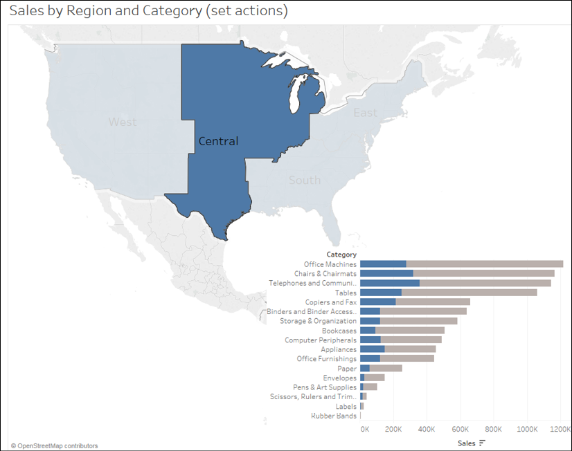
Figure 8.29: The set action allows brushing: highlighting the portion of the bars that belong to the selection
The dashboard consists of two views: a map and a bar chart. Selecting a region on the map triggers a set action that updates the bar chart. A filter action would filter the bar chart, causing the length of each bar to only show the value for the selected region. Here, however, the set action is used to show the portion of the overall bar that belongs to that region while still retaining the full length of the bar for all regions.
To replicate this interactivity, follow these steps:
- Use the drop-down menu on the Region field under Dimensions on the data pane to select Create | Set. Name the set Region Set.
- In the resulting Create Set dialog, under the General tab, check one or more values. This creates a fixed set. In this example, it does not matter which, if any, values you select because you'll configure the set action to update the values momentarily.
- Create a bar chart of Sales by Category.
- Drag Region Set from Sets on the data pane and drop it on Color:
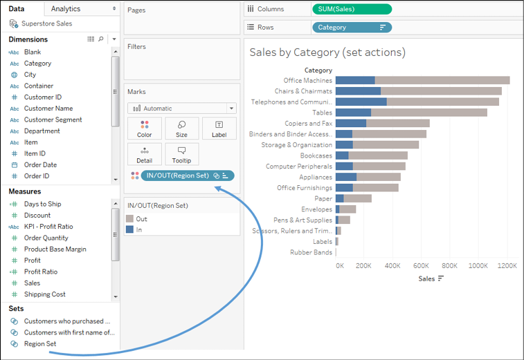
Figure 8.30: Drag and drop the set on Color to show the difference between In and Out of the set
You may use a set on shelves, just as you would any other field. Notice how the set gives two values, that is, In and Out, which define two colors. You may wish to adjust the colors to emphasize In.
You may use sets in calculated fields as well. For example, the code [Region Set] gives a Boolean true/false result for each record, indicating whether it is in the set.
Conclude the set action example by creating a region map, the dashboard, and implementing the set action:
- Use the drop-down menu on Region to select Geographic Role | Create from... | State. This tells Tableau to treat Region as a geographic field based on its relationship with the geographic field State.
- In a new, blank view, double-click the Region field to create the map view. Now that Region is recognized as a geographic field, Tableau will generate latitude, longitude, and the geometries that are necessary to render the shapes.
- Add both the map and bar chart views to a single dashboard. You may position them however you'd like.
- Add a set action by selecting Dashboard | Actions from the menu and then Add Action | Change Set Values... in the resulting dialog. The resulting dialog has many similar features to other action types:
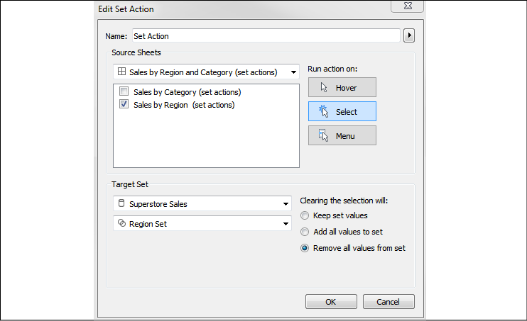
Figure 8.31: Options for the set action
You'll notice options to give the action values for Name; Run action on: Hover, Select, or Menu; and options for Clearing the selection. Just like other action types, you may also specify Source sheets that trigger the action. Target Set allows you to specify which data source and which fixed set in that data source will have values updated based on the action. In this case, we want to update Region Set when a selection is made on the Sales by Region (set actions) view. We'll elect to remove all values from the set when the selection is cleared.
Once you have created the preceding action, your dashboard should function very similarly to the example that was shown at the beginning of this section. Selecting a region on the map highlights the portion of the bars that correspond to that region. This technique is known as brushing, or proportional brushing.
This technique is only one of hundreds of the possible applications of set actions. Since sets can be used on any shelf and in calculations, updating the values via set actions opens up almost limitless possibilities for user interaction and analytics.
Having looked at the various kinds of actions, let's move on to consider another example of a different kind of dashboard.
A regional scorecard dashboard
Now, we'll consider another example dashboard that demonstrates slightly different objectives. Let's say everyone in the organization has agreed upon a KPI of profit ratio. Furthermore, there is consensus that the cut-off point between an acceptable and poor profit ratio is 15%, but management would like to have the option of adjusting the value dynamically to see whether other targets might be better.
Consider the following dashboard:

Figure 8.32: A simple profit KPI dashboard
This dashboard allows your audience to very quickly evaluate the performance of each region over the last six months. Executive management could very quickly pull this dashboard up on their mobile devices and take appropriate action as needed.
The dashboard provides interactivity with the KPI target parameter. Additional drill-down capability into other dashboards or views could be provided if desired. If this view were published on Tableau Server, it is not unreasonable to think that regional managers might subscribe to the view and receive a scheduled email containing an up-to-date image of this dashboard.
Let's consider how to create a similar dashboard:
- Create a float type parameter named
Profit Ratio KPI Targetset to an initial.15, formatted as a percentage. - Create a calculation named
Profit Ratiowith the codeSUM([Profit]) / SUM([Sales]). This is an aggregate calculation that will divide the profit total by the sum of sales at the level of detail defined in the view. - Create a second calculation named
KPI - Profit Ratiowith the following code:IF [Profit Ratio] >= [Profit Ratio KPI Target] THEN "Acceptable" ELSE "Poor" ENDThis code will compare the profit ratio to the parameterized cut-off value. Anything equal to or above the cut-off point will get the value of
Acceptable, and everything below will get the value ofPoor. - Create a new sheet named Region Scorecard. The view consists of
Regionon Rows,Order Dateas a discrete date part on Columns, and theKPI - Profit Ratiofield on both shape and color. You'll observe that the shapes have been edited to use checkmarks and Xs, and that the color palette is using colorblind-safe blue and orange. - Add column grand totals using the Analytics pane and format the grand totals with a custom label of Overall, with bold font and light gray shading.
- Add Order Date as a filter and set it to the top 6 by field (Order Date as Min). This will dynamically filter the view to the last six months:
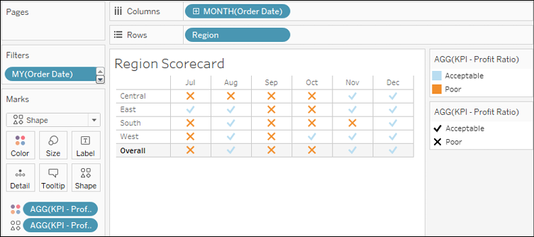
Figure 8.33: This view defines the Region scorecard showing Acceptable versus Poor results per region per month
- Create another sheet named Profit Ratio by Region.
- If you skipped the set actions example, use the drop-down menu on
Regionto select Geographic Role | Create from... | State. This tells Tableau to treat Region as a geographic field based on its relationship with the geographic field State. - Double-click the Region field in the data pane. Tableau will automatically generate a geographic visualization based on Region. We'll examine the creation of custom geographies in more detail in Chapter 12, Exploring Mapping and Advanced Geospatial Features.
- Place Profit Ratio on Color and Label. You will also want to format Profit Ratio as a percentage. You may do so by formatting the field in this view specifically, or by setting the default number format for the field in the data pane (the latter is probably preferred as you will almost always want it to display as a percentage).
- Additionally, add Region to Label. Rearrange the fields in the marks card to reorder the label or click the Label shelf to edit the label text directly.
- Apply the same filter to this view as you did to the Region Scorecard view. You may wish to navigate to the Region Scorecard sheet and use the drop-down on Order Date on the Filters shelf to apply the existing filter to multiple sheets:

Figure 8.34: The filled map shows profit by region
Once both views have been created, you can arrange the views as a dashboard. The example in the Chapter 08 Complete workbook has a phone layout applied to it as seen here:

Figure 8.35: A phone layout for the KPI dashboard
Experiment with various layouts and positioning of the elements.
By default, all objects that are added to the dashboard are tiled. Tiled objects snap in place and appear beneath floating objects. Any object can be added to the dashboard as a floating object by switching the toggle under New Objects in the left window, or by holding Shift while dragging the objects to the dashboard.
Existing objects can be switched between floating and tiled by holding Shift while moving the object or using the drop-down caret menu. The drop-down caret menu also gives you options for adjusting the floating order of objects. Additionally, floating objects can be resized and positioned with pixel precision by selecting the floating object and using the positioning and sizing controls in the lower left.
You can mix tiled and floating elements, but many dashboard authors prefer to build dashboards that are composed entirely of one or the other. This ensures consistency between different layouts and sizes of screens (especially if the dashboard is set to an Automatic or Range sizing option).
This example illustrates a dashboard used for quick lookup and rapid decision making. What if we want to tell a more complex story and show progression of detail and maybe even present the data story in a specific order? Let's consider how to leverage a feature of Tableau designed specifically for that purpose.
Stories
The stories feature allows you to tell a story using interactive snapshots of dashboards and views. The snapshots become points in a story. This allows you to construct a guided narrative or even an entire presentation.
Let's consider an example in which story points might be useful. The executive managers are pleased with the Regional Scorecard dashboard you developed previously. Now, they want you to make a presentation to the board and highlight some specific issues for the South region. With minimal effort, you can take your simple scorecard, add a few additional views, and tell an entire story:
- First, we'll build a couple of additional views. Create a simple geographic view named
ProfitRatio KPI by State. Make this a filled map with the KPI – Profit Ratio field, defining color. - Add Profit Ratio to the Detail part of the Marks card so that it is available for later use:
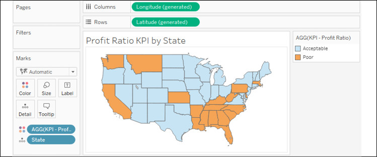
Figure 8.36: Profit Ratio KPI by State uses color encoding to show Acceptable versus Poor
- Create one additional view named
Profit Ratio by Quarter. Use Order Date as a continuous date value on Columns and Profit Ratio on Rows. - Set the mark type to bars. Add a reference line for the Profit Ratio KPI Target parameter value (you can right-click the Profit Ratio axis and set it to Add Reference Line...).
- Add KPI – Profit Ratio to Color. You may also wish to click the Color shelf and add a border.
- Go ahead and filter the view to the South region and use the drop-down menu to apply that filter to the Profit Ratio KPI by State view as well:
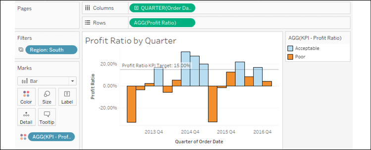
Figure 8.37: Profit Ratio by Quarter shows whether a given quarter was Acceptable or Poor based on the target
- Create a new dashboard with the two new views arranged in the same way as what's shown in the following screenshot. Add the Profit Ratio KPI Target parameter and Region filter if they do not show.
- Use the drop-down on Profit Ratio KPI by State to use that view as a filter:
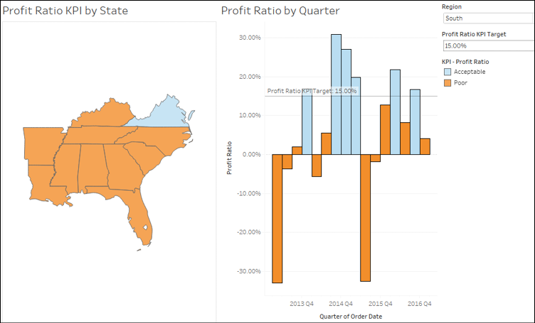
Figure 8.38: The Profit Ratio KPI by State and by Quarter views on the same dashboard
- Create a new story by selecting Story | New Story from the menu, or by using the new story tab at the bottom next to the existing sheets:
The Story interface consists of a sidebar with all visible dashboards and views. At the top, you'll see the story title, which can be edited via a double-click. Each new point in the story will appear as a navigation box with text that can also be edited. Clicking on the box will give you access to the story point, where you can then add a single dashboard or view.
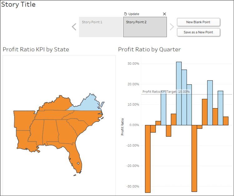
Figure 8.39: Adding a story point
You can create new story points using the New Blank Point button (for a new story point), the Duplicate button (which will create a duplicate snapshot of the currently selected story point), or the Save as New Point button (which will capture the current state of the dashboard as a new story point).
Clicking on a story point navigation box will bring up the snapshot of the view or dashboard for that story point. You may interact with the dashboard by doing such things as making selections, changing filters, changing parameter values, and adding annotations. Changing any aspect of the dashboard will present you with an option to update the existing story point to the current state of the dashboard. Alternatively, you can use the Revert button above the navigation box to return to the original state of the dashboard. Clicking X will remove the story point.
Each story point contains an entirely independent snapshot of a dashboard. Filter selections, parameter values, selections, and annotations will be remembered for a particular story point but will have no impact on other story points or any other sheet in the dashboard.
You may rearrange story points by dragging and dropping the navigation boxes.
We'll build the story by completing the following steps:
- Give the story the title South Region Analysis.
- Add the Regional Scorecard dashboard as the first story point. Select the South region in the map. Give the story point the following text: The South Region has not performed well the last 6 months:
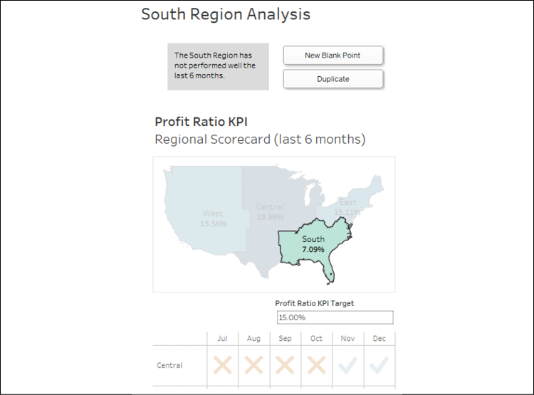
Figure 8.40: The first story point highlights performance in the South region
- Click the New Blank Point button to create a new story point and add the Profit Ratio Analysis dashboard to the point.
- Give this story point a caption of Only one state has met the 15% target overall.
- Right-click Virginia on the map and select Annotate | Mark. Keep the state and profit ratio as part of the annotation:
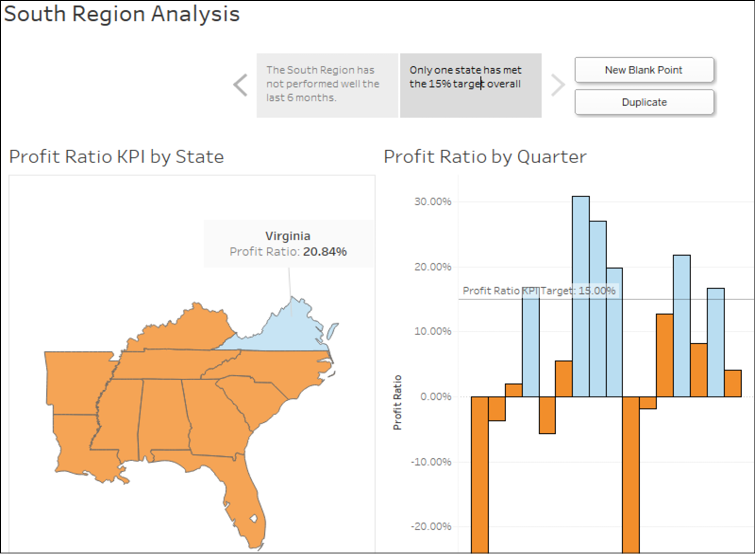
Figure 8.41: The second story point dives into the details
- Click the Duplicate button to copy the current story point. Give this new story point a caption of 3 states would meet a goal of 10%. Set Profit Ratio KPI Target to
10.00%and update the point. - Click the Duplicate button again and give the newly created point a caption of Certain states have performed well historically.
- Right-click the annotation for Virginia, select Remove to delete it, and then add a similar annotation for Louisiana. Then, click Louisiana to select that state.
- Make sure to click the Update button to capture the state of the dashboard.
In presentation mode, the buttons for adding, duplicating, updating, or removing story points are not shown. Your final story should look similar to this:
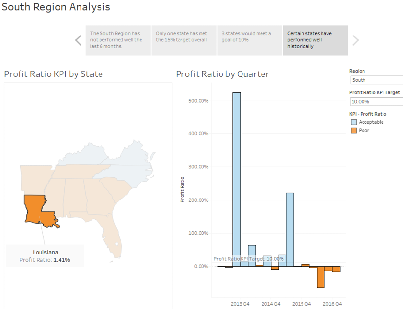
Figure 8.42: This story point highlights quarterly results for a single state
Take some time to walk through the presentation. Clicking navigation boxes will show that story point. You can fully interact with the dashboard in each story point. In this way, you can answer questions on the fly and dig into details, and then continue through the story.
A great way to learn about dashboard techniques (and data visualization techniques in general) is to subscribe to Viz of the Day (http://www.tableau.com/public/community/viz-of-the-day). A new visualization, dashboard, or story is featured each day. When you see a design technique or visualization you want to understand, you can download the workbook and explore the various techniques that were used.
Summary
When you are ready to share your discovery and analysis, you will likely use dashboards to relate the story to your audience. The way in which you tell the story will depend on your objectives, as well as your audience and the mode of delivery. Using a combination of views, objects, parameters, filters, and legends, you can create an incredible framework for telling a data story. Tableau allows you to specifically design layouts for different devices to ensure that your audience has the best experience possible. By introducing actions and interactivity, you can invite your audience to participate in the story. Story points will allow you to bring together many snapshots of dashboards and views to craft and present entire narratives.
In the next chapter, we'll turn our attention to some deeper analysis involving trends, distributions, forecasting, and clustering.