9
Visual Analytics – Trends, Clustering, Distributions, and Forecasting
The rapid visual analysis that is possible using Tableau is incredibly useful for answering numerous questions and making key decisions. But it barely scratches the surface of the possible analysis. For example, a simple scatterplot can reveal outliers, but often, you want to understand the distribution or identify clusters of similar observations. A simple time series helps you to see the rise and fall of a measure over time, but often, you want to see the trend or make predictions for future values.
Tableau enables you to quickly enhance your data visualizations with statistical analysis. Built-in features such as trend models, clustering, distributions, and forecasting allow you to quickly add value to your visual analysis. Additionally, Tableau integrates with the R and Python platforms, which opens endless options for the manipulation and analysis of your data.
This chapter will cover the built-in statistical models and analysis, including the following topics:
- Trends
- Clustering
- Distributions
- Forecasting
We'll look at these concepts in the context of a few examples using some sample datasets. You can follow and reproduce these examples using the Chapter 9 workbook.
When analyzing data that changes over time, understanding the overall nature of change is vitally important. Seeing and understanding trends is where we'll begin.
Trends
World Population.xlsx is included in the Chapter 09 directory. It contains one record for each country for each year from 1960 to 2015, measuring population. Using this dataset, let's take a look at the historical trends of various countries. Create a view similar to the one shown in the following screenshot, which shows the change in population over time for Afghanistan and Australia. You'll notice that Country Name has been filtered to include only Afghanistan and Australia and the field has additionally been added to the Color and Label shelves:

Figure 9.1: Population values for Afghanistan and Australia over time
From this visualization alone, you can make several interesting observations. The growth of the two countries' populations was fairly similar up to 1980. At that point, the population of Afghanistan went into decline until 1988, when it started to increase. At some point around 1996, the population of Afghanistan exceeded that of Australia. The gap has grown wider ever since.
While we have a sense of the two trends, they become even more obvious when we see the trend lines. Tableau offers several ways of adding trend lines:
- From the menu, select Analysis | Trend Lines | Show Trend Lines.
- Right-click on an empty area in the pane of the view and select Show Trend Lines.
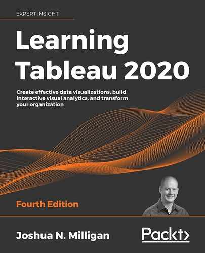
- Click on the Analytics tab on the left-hand sidebar to switch to the Analytics pane. Drag and drop Trend Line on the trend model of your choice (we'll use Linear in this example and discuss the others later in this chapter):
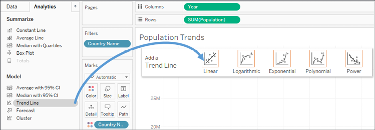
Figure 9.2: Adding a trend line to a view by dragging and dropping from the Analytics pane
Once you've added Trend Line to your view, you will see two trend lines: one for each country. We'll look at how we can customize the display shortly. For now, your view should look like this:

Figure 9.3: Each trend line shows the overall trend for the respective country
Trends are computed by Tableau after the query of the data source and are based on various elements in the view:
- The two fields that define X and Y coordinates: The fields on Rows and Columns that define the x and y axes describe coordinates, allowing Tableau to calculate various trend models. In order to show trend lines, you must use a continuous (green) field on both Rows and Columns. The only exception to this rule is that you may use a discrete (blue) date field. If you use a discrete date field to define headers, the other field must be a continuous field.
- Additional fields that create multiple, distinct trend lines: Discrete (blue) fields on the Rows, Columns, or Color shelves can be used as factors to split a single trend line into multiple, distinct trend lines.
- The trend model selected: We'll examine the differences in models in the next section, Trend models.
Observe in Figure 9.3 that there are two trend lines. Since Country Name is a discrete (blue) field on Color, it defines a trend line per color by default.
Earlier, we observed that the population of Afghanistan increased and decreased within various historical periods. Note that the trend lines are calculated along the entire date range. What if we want to see different trend lines for those time periods?
One option is to simply select the marks in the view for the time period of interest. Tableau will, by default, calculate a trend line for the current selection. Here, for example, the points for Afghanistan from 1980 to 1988 have been selected and a new trend is displayed:
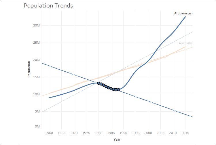
Figure 9.4: The default settings specify that trend lines will be drawn for selections
Another option is to instruct Tableau to draw distinct trend lines using a discrete field on Rows, Columns, or Color.
Go ahead and create a calculated field called Period that defines discrete values for the different historical periods using code like this:
IF [Year] <= 1979
  THEN "1960 to 1979"
ELSEIF [Year] <= 1988
  THEN "1980 to 1988"
ELSE "1988 to 2015"
END
When you place it on columns, you'll get a header for each time period, which breaks the lines and causes separate trends to be shown for each time period. You'll also observe that Tableau keeps the full date range in the axis for each period. You can set an independent range by right-clicking on one of the date axes, selecting Edit Axis, and then checking the option for Independent axis range for each row or column:
Figure 9.5: Here, the discrete dimension Period creates three separate time periods and a trend for each one
In this view, transparency has been applied to Color to help the trend lines stand out. Additionally, the axis for Year was hidden (by unchecking the Show Header option on the field). Now you can clearly see the difference in trends for different periods of time. Australia's trends only slightly change in each period. Afghanistan's trends vary considerably.
With an understanding of how to add trend lines to your visualization, let's dive a bit deeper to understand how to customize the trend lines and model.
Customizing trend lines
Let's examine another example that will allow us to consider various options for trend lines. Using the Real Estate data source, create a view like this one:

Figure 9.6: Trend lines on a scatterplot are often useful for better understanding correlation and outliers
Here, we've created a scatterplot with the sum of Size (Sq Ft) on Columns to define the x axis and the sum of Price on Rows to define the y axis. Address has been added to the Detail of the Marks card to define the level of aggregation. So, each mark on the scatterplot is a distinct address at a location defined by the size and price. Type of Sale has been placed on Color. Trend lines have been shown. As per Tableau's default settings, there are three: one trend line per color. The confidence bands have been hidden.
Assuming a good model, the trend lines demonstrate how much and how quickly Price is expected to rise in correlation with an increase in Size for each type of sale.
In this dataset, we have two fields, Address and ID, each of which defines a unique record. Adding one of those fields to the Level of Detail effectively disaggregates the data and allows us to plot a mark for each individual property. Sometimes, you may not have a dimension in the data that defines uniqueness. In those cases, you can disaggregate the data by unchecking Aggregate Measures from the Analysis menu.
Alternately, you can use the drop-down menu on each of the measure fields on rows and columns to change them from measures to dimensions while keeping them continuous. As dimensions, each individual value will define a mark. Keeping them continuous will retain the axes required for trend lines.
Let's consider some of the options available for trend lines. You can edit trend lines by using the menu and selecting Analysis | Trend Lines | Edit Trend Lines... or by right-clicking on a trend line and then selecting Edit Trend Lines.... When you do, you'll see a dialog box like this:
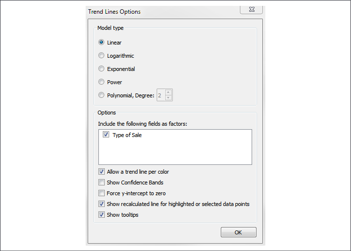
Figure 9.7: Tableau offers many options for configuring trend lines
Here, you have options for selecting a Model type; selecting applicable fields as factors in the model; allowing discrete colors to define distinct trend lines; showing Confidence Bands; forcing the y-intercept to zero; showing recalculated trends for selected marks; and showing tooltips for the trend line. We'll examine these options in further detail.
You should only force the y-intercept to zero if you know that it must be zero. With this data, it is almost certainly not zero (that is, there are no houses in existence that are 0 square feet that are listed for $0).
For now, experiment with the options. Notice how either removing the Type of Sale field as a factor or unchecking the Allow a trend line per color option results in a single trend line.
You can also see the result of excluding a field as a factor in the following view where Type of Sale has been added to Rows:
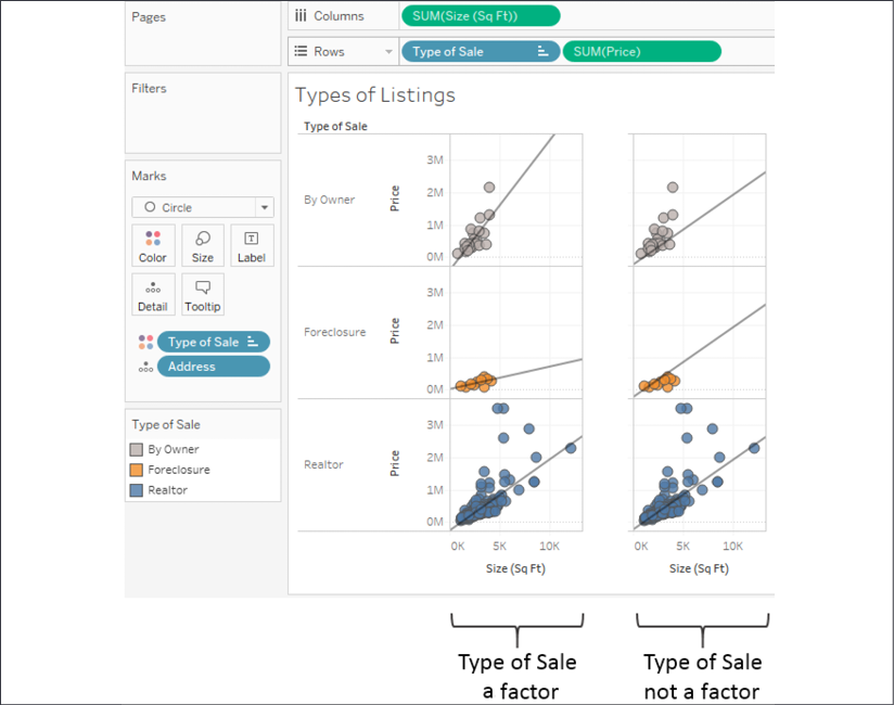
Figure 9.8: Including a field as a factor tells Tableau whether it contributes to the trend model
As represented in the left-hand portion of the preceding screenshot, Type of Sale is included as a factor. This results in a distinct trend line for each type of sale. When Type of Sale is excluded as a factor, the same trend line (which is the overall trend for all types) is drawn three times. This technique can be quite useful for comparing subsets of data to the overall trend.
Customizing the trend lines is only one aspect of using trends to understand the data. Also, of significant importance is the trend model itself, which we'll consider customizing in the next section.
Trend models
Let's return to the original view and stick with a single trend line as we consider the trend models that are available in Tableau. The following models can be selected from the Trend Line Options window.
Linear
We'd use a linear model if we assumed that, as Size increases, Price will increase at a constant rate. No matter how much Size increased, we'd expect Price to increase so that new data points fall close to the straight line:
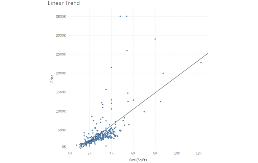
Figure 9.9: Linear trend
Logarithmic
We'd employ a logarithmic model if we expected the law of diminishing returns in effect—that is, the size can only increase so much before buyers will stop paying much more:
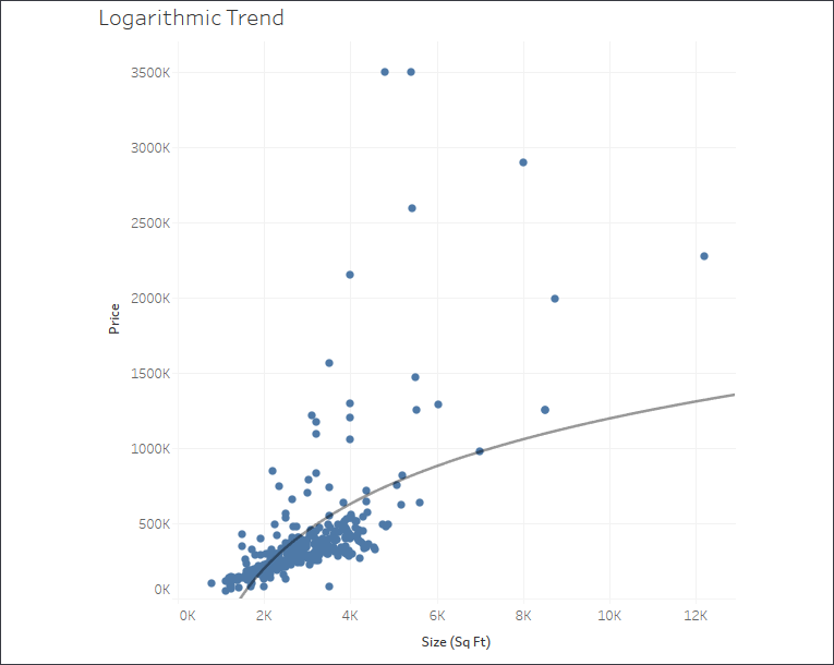
Figure 9.10: Logarithmic trend
Exponential
We'd use an exponential model to test the idea that each additional increase in size results in a dramatic (exponential!) increase in price:
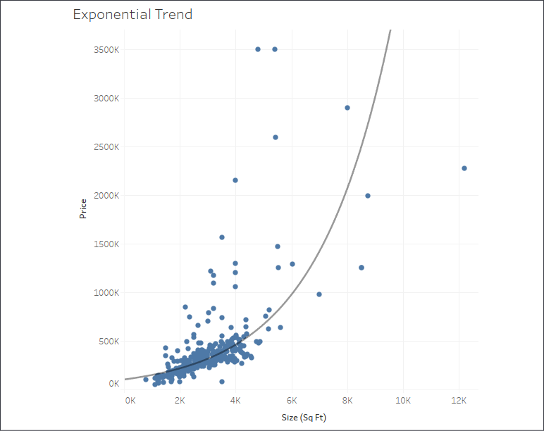
Figure 9.11: Exponential trend
Power
We'd employ a power trend model if we felt the relationship between size and price was non-linear and somewhere between a diminishing logarithmic trend and an explosive exponential trend. The curve would indicate that the price was a function of the size to a certain power. A power trend predicts certain events very well, such as the distance covered by the acceleration of a vehicle:

Figure 9.12: Power trend
Polynomial
We'd use this model if we felt the relationship between Size and Price was complex and followed more of an S-shaped curve where initially increasing the size dramatically increased the price but, at some point, the price leveled off. You can set the degree of the polynomial model anywhere from 2 to 8. The trend line shown here is a 3rd degree polynomial:
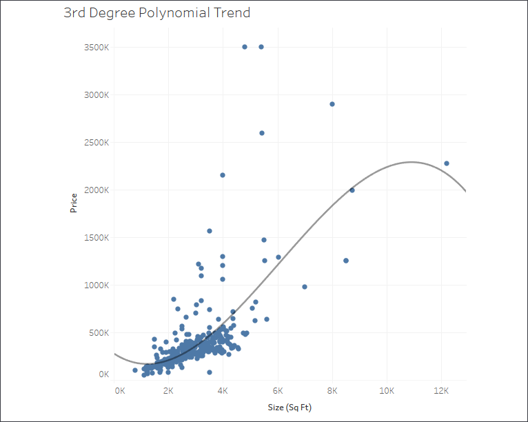
Figure 9.13: 3rd degree polynomial trend
You'll want to understand the basics of the trend models so that you can test and validate your assumptions of the data. Some of the trend models are clearly wrong for our data (though statistically still valid, it is highly unlikely that prices will exponentially increase). A mixture of common sense along with an ever-increasing understanding of statistics will help you as you progress through your journey.
You may also wish to analyze your models for accuracy, and we'll turn there next.
Analyzing trend models
It can be useful to observe trend lines, but often we want to understand whether the trend model we've selected is statistically meaningful. Fortunately, Tableau gives us some visibility into the trend models and calculations.
Simply hovering over a single trend line will reveal the formula as well as the R-Squared and P-value for that trend line:
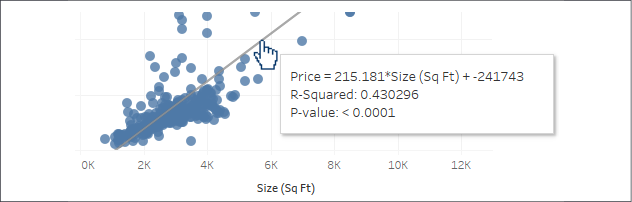
Figure 9.14: Tooltip displayed by hovering over the trend line
A P-value is a statistical concept that describes the probability that the results of assuming no relationship between values (random chance) are at least as close as the results predicted by the trend model. A P-value of 5% (.05) would indicate a 5% chance of random chance describing the relationship between values at least as well as the trend model. This is why P-values of 5% or less are typically considered to indicate a significant trend model. A P-value higher than 5% often leads statisticians to question the correlation described by the trend model.
Additionally, you can see a much more detailed description of the trend model by selecting Analysis | Trend Lines | Describe Trend Model... from the menu or by using the similar menu from a right-click on the view's pane. When you view the trend model, you'll see the Describe Trend Model window:
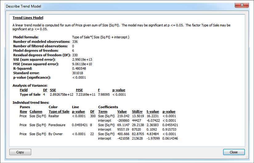
Figure 9.15: The Describe Trend Model window
You can also get a trend model description in the worksheet description, which is available from the Worksheet menu or by pressing Ctrl + E. The worksheet description includes quite a bit of other useful summary information about the current view.
The wealth of statistical information shown in the window includes a description of the trend model, the formula, the number of observations, and the p-value for the model as a whole and for each trend line. Note that, in the screenshot shown previously, the Type field was included as a factor that defined three trend lines. You may find that the p-value is different for different lines in a visualization (for example, the lines in Figure 9.6). At times, you may even observe that the model is statistically significant overall even though one or more trend lines may not be.
Additional summary statistical information can be displayed in Tableau Desktop for a given view by showing a summary. From the menu, select Worksheet | Show Summary. The information displayed in the summary can be expanded using the drop-down menu on the Summary card:
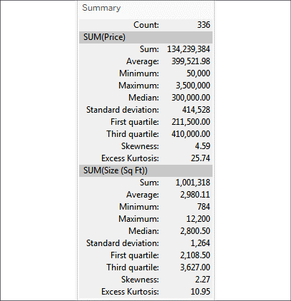
Figure 9.16: Summary information
The wealth of information available via tooltips and summaries will help you evaluate your trend models and understand the accuracy and details. But we can even go further, by exporting and analyzing statistical data for the trend models. We'll consider that next.
Exporting statistical model details
Tableau also gives you the ability to export data, including data related to trend models. This allows you to, more deeply—and even visually, analyze the trend model itself. Let's analyze the third-degree polynomial trend line of the real estate price and size scatterplot without any factors. To export data related to the current view, use the menu to select Worksheet | Export | Data. The data will be exported as a Microsoft Access Database (.mdb) file and you'll be prompted where to save the file.
The ability to export data to Access is limited to a PC only. If you're using a Mac, you won't have the option. You may wish to skim this section, but don't worry that you aren't able to replicate the examples.
On the Export Data to Access screen, specify an access table name and select whether you wish to export data from the entire view or the current selection. You may also specify that Tableau should connect to the data. This will generate the data source and make it available with the specified name in the current workbook:
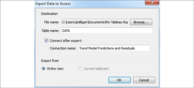
Figure 9.17: The Export Data to Access dialog box
The new data source connection will contain all the fields that were in the original view as well as additional fields related to the trend model. This allows us to build a view like the following, using the residuals and predictions:
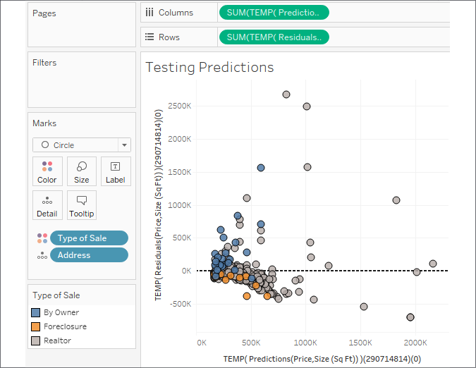
Figure 9.18: A view using residuals and predictions to test the model
A scatterplot of predictions (x axis) and residuals (y axis) allows you to visually see how far each mark was from the location predicted by the trend line. It also allows you to see whether residuals are distributed evenly on either side of zero. An uneven distribution would likely indicate problems with the trend model.
You can include this new view along with the original on a dashboard to explore the trend model visually. Use the highlight button on the toolbar to highlight the Address field:

Figure 9.19: The highlight button
With the highlight action defined, selecting marks in one view will allow you to see them in the other. You could extend this technique to export multiple trend models and dashboards to evaluate several trend models at the same time:

Figure 9.20: Placing the original view alongside the testing view allows you to see the relationship
Advanced statistics and more with R and Python
You can achieve even more sophisticated statistical analysis leveraging Tableau's ability to integrate with R or Python. R is an open source statistical analysis platform and programming language with which you can define advanced statistical models. Python is a high-level programming language that has quickly gained a wide following among data analysts and data scientists for its ease of use. It contains many capabilities for data cleansing as well as libraries of statistical functions.
To use R or Python, you'll first need to install either an R server or TabPy (a Python API available from Tableau) and then configure Tableau to use an R server or TabPy. To learn more about installing and using R Server or TabPy, check out these resources:
R: https://www.tableau.com/solutions/r
Python: https://www.tableau.com/about/blog/2017/1/building-advanced-analytics-applications-tabpy-64916
It's beyond the scope of this book to dive into the complexities of R and Python, but having an awareness of the capability will enable you to pursue the topic further.
Next, we'll take a look at Tableau's capability for identifying complex relationships within data using clustering.
Clustering
Tableau gives you the ability to quickly perform clustering analysis in your visualizations. This allows you to find groups, or clusters, of individual data points that are similar based on any number of your choosing. This can be useful in many different industries and fields of study, as in the following examples:
- Marketing may find it useful to determine groups of customers related to each other based on spending amounts, frequency of purchases, or times and days of orders.
- Patient care directors in hospitals may benefit from understanding groups of patients related to each other based on diagnoses, medication, length of stay, and the number of readmissions.
- Immunologists may search for related strains of bacteria based on drug resistance or genetic markers.
- Renewable energy consultants may like to pinpoint clusters of windmills based on energy production and then correlate that with geographic location.
Tableau uses a standard k-means clustering algorithm that will yield consistent results every time the view is rendered. Tableau will automatically assign the number of clusters (k), but you have the option of adjusting the value as well as assigning any number of variables.
As we consider clustering, we'll turn once again to the real estate data to see whether we can find groupings of related houses on the market and then determine whether there's any geographic pattern based on the clusters we find.
Although you can add clusters to any visualization, we'll start with a scatterplot, because it already allows us to see the relationship between two variables. That will give us some insight into how clustering works, and then we can add additional variables to see how the clusters are redefined.
Beginning with the basic scatterplot of Address by Size and Price, switch to the Analytics pane and drag Cluster to the view:

Figure 9.21: Adding clusters by dragging and dropping from the Analytics pane
When you drop Cluster onto the view, Tableau will generate a new Clusters field (automatically placed on Color here) and will display a Clusters window containing the fields used as Variables and an option to change the Number of Clusters. Variables will contain the measures already in the view by default:
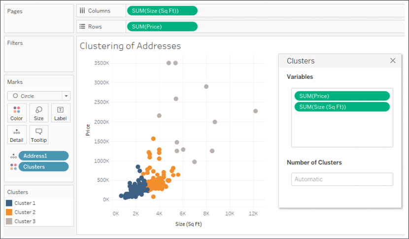
Figure 9.22: Clusters of individual addresses based on Price and Size
Variables are all the factors that the clustering algorithm uses to determine related data points. Number of Clusters determines into how many groups the data is partitioned. In the preceding view, you'll observe three clusters of houses:
- Those with a low price and a smaller size (blue)
- Those with an average price and size (orange)
- Those with a high price and a large size (gray)
Because the two variables used for the clusters are the same as those used for the scatterplot, it's relatively easy to see the boundaries of the clusters (you can imagine a couple of diagonal lines partitioning the data).
You can drag and drop nearly any field into and out of the Variables section (from the data pane or the view) to add and remove variables. The clusters will automatically update as you do so. Experiment by adding Bedrooms to the Variables list and observe that there's now some overlap between Cluster 1 and Cluster 2 because some larger homes only have two or three bedrooms while some smaller homes might have four or five. The number of bedrooms now helps define the clusters. Remove Bedrooms and note that the clusters are immediately updated again.
Once you have meaningful clusters, you can materialize the clusters as groups in the data source by dragging them from the view and dropping them into the Data pane:
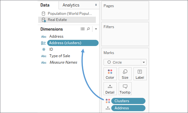
Figure 9.23: Materializing a cluster by dragging the Clusters field from the view to the Data pane
The cluster group will not be recalculated at render time. To recalculate the cluster group, use the dropdown on the field in the Data pane and select Refit.
Using a cluster group allows you to accomplish a lot, including the following:
- Cluster groups can be used across multiple visualizations and can be used in actions on dashboards.
- Cluster groups can be edited, and individual members moved between groups if desired.
- Cluster group names can be aliased, allowing more descriptive names than Cluster 1 and Cluster 2.
- Cluster groups can be used in calculated fields, while clusters can't.
In the following example, a map of the properties has been color-coded by the Address (clusters) group in the previous view to help us to see whether there's any geographic correlation to the clusters based on price and size. While the clusters could have been created directly in this visualization, the group has some of the advantages mentioned:
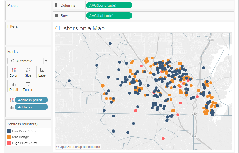
Figure 9.24: This view uses the clusters we identified to additionally understand any geospatial relationships
In the view here, each original cluster is now a group that has been aliased to give a better description of the cluster. You can use the drop-down menu for the group field in the data pane or, alternately, right-click the item in the color legend to edit aliases.
There are a lot of options for editing how maps appear. You can adjust the layers that are shown on maps to help to provide additional context for the data you are plotting. From the top menu, select Maps | Map Layers. The layer options will show in the left-hand sidebar. The preceding map has had Streets, Highways, County Borders, and Zip Code Borders enabled to give each address a more precise context of location. The layers that are available to select will depend on the zoom level of the map.
In looking at the previous view, you do indeed find neighborhoods that are almost exclusively Low Price & Size (Cluster 1) and others that are almost exclusively Mid-Range (Cluster 2). Consider how a real-estate investor might use such a visualization to look for a low-priced house in a mid-range neighborhood.
Distributions
Analyzing distributions can be quite useful. We've already seen that certain calculations are available for determining statistical information such as averages, percentiles, and standard deviations. Tableau also makes it easy to quickly visualize various distributions, including confidence intervals, percentages, percentiles, quantiles, and standard deviations.
You may add any of these visual analytic features using the Analytics pane (alternately, you can right-click an axis and select Add Reference Line). Just like reference lines and bands, distribution analytics can be applied within the scope of a table, pane, or cell. When you drag and drop the desired visual analytic, you'll have options for selecting the scope and the axis. In the following example, we've dragged and dropped Distribution Band from the Analytics pane onto the scope of Pane for the axis defined by Sum(Price):
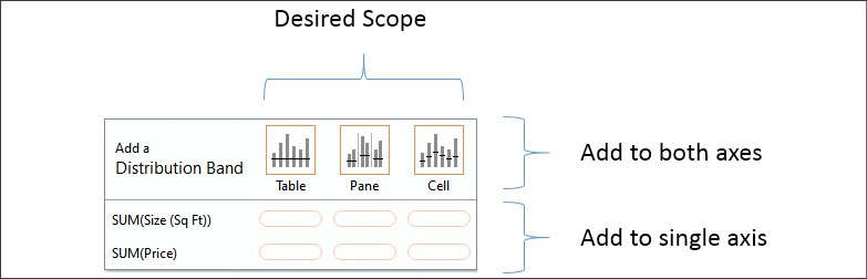
Figure 9.25: Defining the scope and axis as you add reference lines and distributions from the Analytics pane
Once you've selected the scope and axis, you'll be given options to change settings. You may also edit lines, bands, distributions, and box plots by right-clicking the analytic feature in the view or by right-clicking the axis or the reference lines themselves.
As an example, let's take the scatterplot of addresses by price and size with Type of Sale on Columns in addition to color:

Figure 9.26: A scatterplot divided into three columns
Next, we drag and drop the Distribution band from the Analytics pane onto Pane only for the axis defined by Price. This brings up a dialog box to set the options:
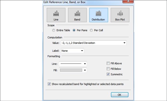
Figure 9.27: The dialog box for adding or editing lines, bands, distributions, or box plots
Each specific Distribution option specified in the Value drop-down menu under Computation has unique settings. Confidence Interval, for example, allows you to specify a percent value for the interval. Standard Deviation allows you to enter a comma-delimited list of values that describe how many standard deviations and at what intervals. The preceding settings reflect specifying standard deviations of -2, -1, 1, and 2. After adjusting the label and formatting as shown in the preceding screenshot, you should see results like this:
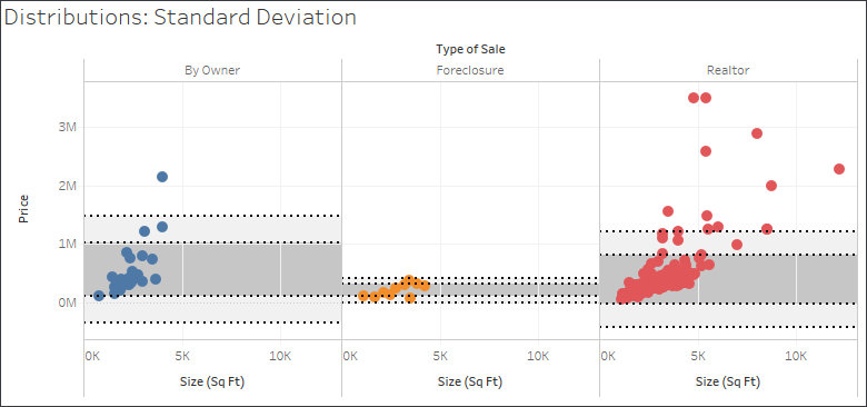
Figure 9.28: Two standard deviations of Price for each Type of Sale
Since you applied the standard deviations per pane, you get different bands for each type of sale. Each axis can support multiple distributions, reference lines, and bands. You could, for example, add an average line in the preceding view to help a viewer to understand the center of the standard deviations.
On a scatterplot, using a distribution for each axis can yield a very useful way to analyze outliers. Showing a single standard deviation for both Area and Price allows you to easily see properties that fall within norms for both, one, or neither (you might consider purchasing a house that was on the high end of size but within normal price limits!):
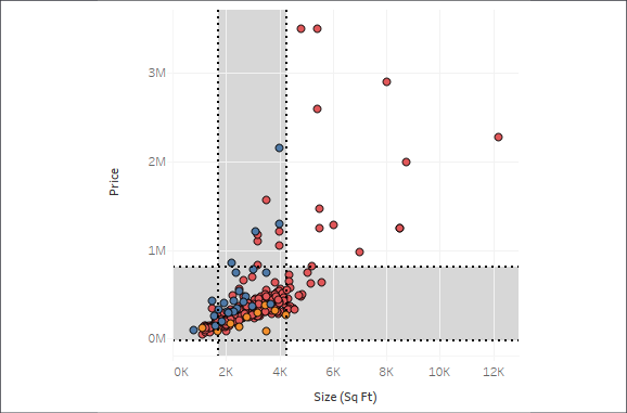
Figure 9.29: One standard deviation for both Price and Size of all houses
Forecasting
As we've seen, trend models make predictions. Given a good model, you expect additional data to follow the trend. When the trend is over time, you can get some idea of where future values may fall. However, predicting future values often requires a different type of model. Factors such as seasonality can make a difference not predicted by a trend alone. Tableau includes built-in forecasting models that can be used to predict and visualize future values.
To use forecasting, you'll need a view that includes a date field or enough date parts for Tableau to reconstruct a date (for example, a Year and a Month field). Tableau also allows forecasting based on integers instead of dates. You may drag and drop a forecast from the Analytics pane, select Analytics | Forecast | Show Forecast from the menu, or right-click on the view's pane and select the option from the context menu.
Here, for example, is the view of the population growth over time of Afghanistan and Australia with forecasts shown:
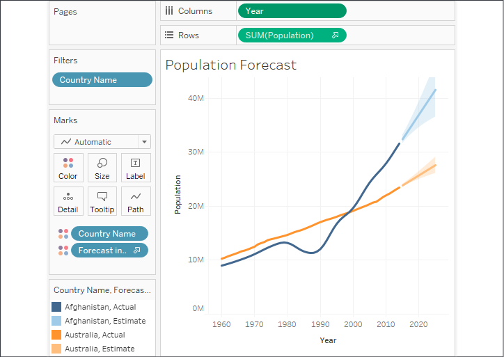
Figure 9.30: A forecast of the population for both Afghanistan and Australia
Note that, when you show the forecast, Tableau adds a forecast icon to the SUM(Population) field on Rows to indicate that the measure is being forecast. Additionally, Tableau adds a new special Forecast indicator field to Color so that forecast values are differentiated from actual values in the view.
You can move the Forecast indicator field or even copy it (hold the Ctrl key while dragging and dropping) to other shelves to further customize your view.
When you edit the forecast by selecting Analytics | Forecast | Forecast Options... from the menu or use the right-click context menu on the view, you'll be presented with various options for customizing the trend model, like this:
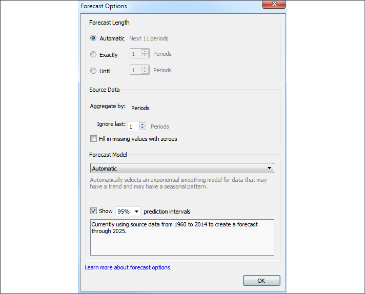
Figure 9.31: The Forecast Options dialog box
Here, you have options to set the length of the forecast, determine aggregations, customize the model, and set whether you wish to show prediction intervals. The forecast length is set to Automatic by default, but you can extend the forecast by a custom value.
The options under Source Data allow you to optionally specify a different grain of data for the model. For example, your view might show a measure by year, but you could allow Tableau to query the source data to retrieve values by month and use the finer grain to potentially achieve better forecasting results.
Tableau's ability to separately query the data source to obtain data at a finer grain for more precise results works well with relational data sources. However, Online Analytical Processing (OLAP) data sources aren't compatible with this approach, which is one reason why forecasting isn't available when working with cubes.
By default, the last value is excluded from the model. This is useful when you're working with data where the most recent time period is incomplete. For example, when records are added daily, the last (current) month isn't complete until the final records are added on the last day of the month. Prior to that last day, the incomplete time period might skew the model if it's not ignored.
The model itself can be set to automatic with or without seasonality, or can be customized to set options for seasonality and trend. To understand the options, consider the following view of Sales by Month from the Superstore sample data:
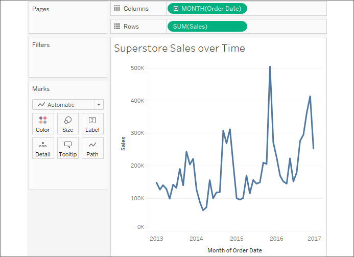
Figure 9.32: This time series shows a cyclical or seasonal pattern
The data displays a distinct cyclical or seasonal pattern. This is very typical for retail sales and other types of data. The following are the results of selecting various custom options:
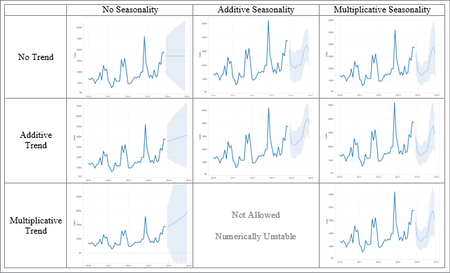
Figure 9.33: Selecting various forecast models will yield different results
Examining the differences above will help you understand the differences in the options. For example, note that no seasonality results in a straight line that does not fluctuate with seasons. Multiplicative trends result in sharper inclines and decreases, while multiplicative seasonality results in sharper variations.
Much like trends, forecast models and summary information can be accessed using the menu. Selecting Analytics | Forecast | Describe Forecast will display a window with tabs for both the summary and details concerning the model:

Figure 9.34: Tableau describes the forecast model
Clicking the Learn more about the forecast summary link at the bottom of the window will give you much more information on the forecast models used in Tableau.
Forecast models are only enabled given a certain set of conditions. If the option is disabled, ensure that you're connected to a relational database and not OLAP, that you're not using table calculations, and that you have at least five data points.
Summary
Tableau provides an extensive set of features for adding value to your analysis. Trend lines allow you to more precisely identify outliers, determine which values fall within the predictions of certain models, and even make predictions of where measurements are expected. Tableau gives extensive visibility into the trend models and even allows you to export data containing trend model predictions and residuals. Clusters enable you to find groups of related data points based on various factors. Distributions are useful for understanding a spread of values across a dataset. Forecasting allows a complex model of trends and seasonality to predict future results. Having a good understanding of these tools will give you the ability to clarify and validate your initial visual analyses.
Next, we'll consider some advanced visualization types that will expand the horizons of what you are able to accomplish with Tableau and the way in which you communicate data to others!