
12
Exploring Mapping and Advanced Geospatial Features
Up until now, we've seen examples of maps and geospatial visualizations that leverage some of the basic functionality of Tableau. In this chapter, we'll embark on a journey to uncover the vast range of mapping and geospatial features available. From levering the built-in geospatial database and supplementing it with additional data and spatial files, to using advanced geospatial functions, we'll explore what's possible with Tableau.
As we've done previously, this chapter will approach the concepts through some practical examples. These examples will span various industries, including real estate, transportation, and healthcare. As always, these examples are broadly applicable, and you'll discover many ways to leverage your data and uncover answers in the spatial patterns you'll find.
In this chapter, we'll cover the following topics:
- Overview of Tableau maps
- Rendering maps with Tableau
- Using geospatial data
- Leveraging spatial functions
- Creating custom territories
- Tableau mapping: tips and tricks
- Plotting data on background images
Overview of Tableau maps
Tableau contains an internal geographic database that allows it to recognize common geographic elements and render a mark at a specific latitude and longitude on a map. In many cases, such as with a country or state, Tableau also contains internal shapefiles that allow it to render the mark as a complex vector shape in the proper location. Tableau also leverages your specific geospatial data, such as latitude and longitude, shapefiles, and spatial objects. We'll consider some of those possibilities throughout this chapter. For now, we'll walk through some of the basics of how Tableau renders maps and some of the customizations and options available.
Rendering maps with Tableau
Consider the following screenshot (the Basic Map example in the Chapter 12 workbook), with certain elements numbered for reference:
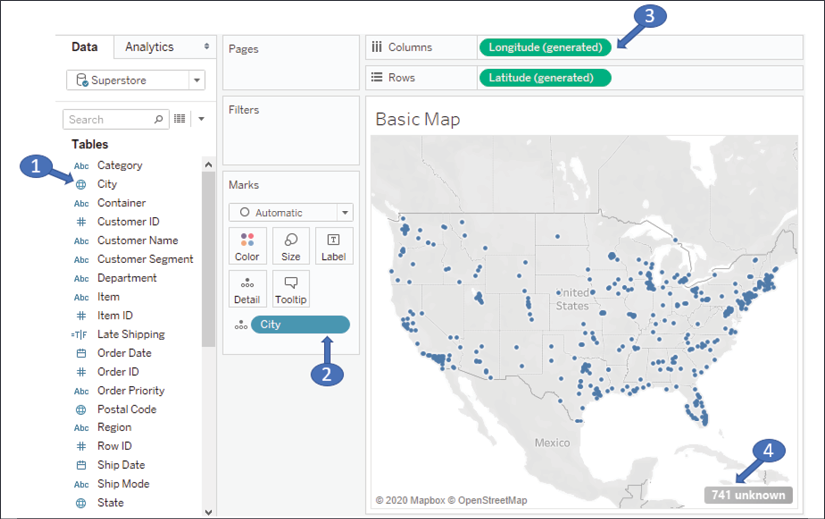
Figure 12.1: A basic geospatial rendering in Tableau
The numbers indicate some of the important aspects of Tableau's ability to render maps:
- A geographic field in the data is indicated with a globe icon. Fields that Tableau recognizes will have this icon by default. You may assign a geographic role to any field by using the menu and selecting Geographic Role.
- The geographic field in the view (in this case, on Detail) is required to render the map.
- If Tableau is able to match the geographic field with its internal database, the Latitude (generated) and Longitude (generated) fields placed on Rows and Columns along with the geographic field(s) on the Marks card will render a map.
- Values that are not matched with Tableau's geographic database will result in an indicator that alerts you to the fact that there are unknown values.
You may right-click the unknown indicator to hide it, or click it for the following options:
- To edit locations (manually match location values to known values or latitude/longitude)
- Filter out unknown locations
- Plot at the default location (latitude and longitude of 0, a location that is sometimes humorously referred to as Null Island, located just off the west coast of Africa)
Tableau renders marks on the map similar to the way it would on a scatterplot (in fact, you might think of a map as a kind of scatterplot that employs some complex geometric transformations to project latitude and longitude). This means you can render circles, dots, and custom shapes on the map.
Under the marks, the map itself is a vector image retrieved from an online map service. We'll consider the details and how to customize the map layers and options next.
Customizing map layers
The map itself—the land and water, terrain, topography, streets, country and state borders, and more—are all part of a vector image that is retrieved from an online map service (an offline option is available).
Marks are then rendered on top of that image. You already know how to use data, calculations, and parameters to adjust how marks are rendered, but Tableau gives you a lot of control over how maps are rendered.
Use the menu to explore various options by selecting Map | Background Maps. Here, for example, is a Dark Map:
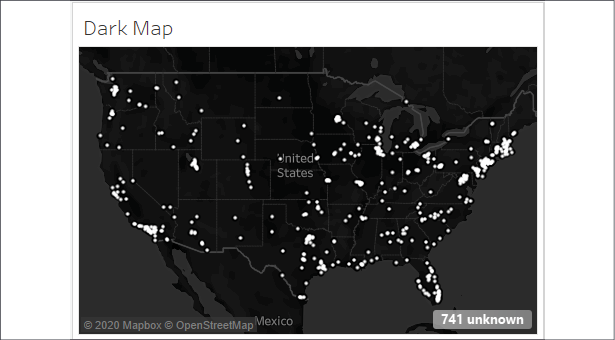
Figure 12.2: Dark Map is one of many options for map backgrounds
This map contains the exact same marks as the previous screenshot. It simply uses a different background. Other options include Light, Streets, Satellite, and more.
If you will be using Tableau in an environment where the internet is not available (or publishing to a Tableau server that lacks an internet connection), select the Offline option. However, be aware that the offline version does not contain the detail or zoom levels available in the online options.
Additional layer options can be found by selecting Map | Map Layers from the menu. This opens a Map Layers pane that looks like this:
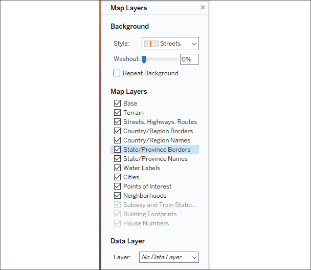
Figure 12.3: The Map Layers pane
The Map Layers pane gives you options for selecting a background, setting washout, selecting features to display, and setting a Data Layer. Various options may be disabled depending on the zoom level (for example, Building Footprints is not enabled unless you zoom in close enough on the map). Data Layer allows you to apply a filled map to the background based on various demographics. These demographics only appear as part of the image and are not interactive and the data is not exposed to either user interaction or calculation.
You may also use the menu options Map | Background Maps | Manage Maps to change which map service is used, allowing you to specify your own WMS server, a third party, or to use Mapbox maps. This allows you to customize the background layers of your map visualizations in any way you'd like.
The details of these capabilities are outside the scope of this book, however, you'll find excellent documentation from Tableau at https://help.tableau.com/current/pro/desktop/en-us/maps_mapsources_wms.htm.
Customizing map options
Additionally, you can customize the map options available to end users. Notice the controls that appear when you hover over the map:
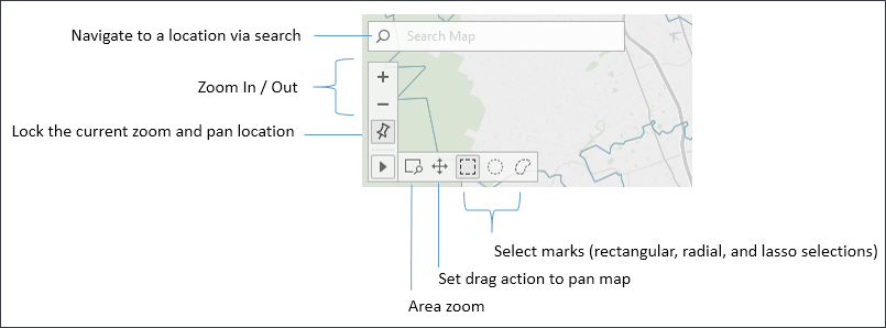
Figure 12.4 : Available controls when customizing a map
These controls allow you to search map, zoom in and out, pin the map to the current location, and use various types of selections.
You can also use keyboard and mouse combinations to navigate the map. Use Ctrl + Mouse wheel or Shift + Ctrl + Mouse Click to zoom. Click and hold or Shift + Click to pan.
Additional options will appear when you select Map | Map Options from the top menu:

Figure 12.5: Map Options
These options give you the ability to set what map actions are allowed for the end user and whether to show a scale. Additionally, you can set the units displayed for the scale and radial selections. The options are Automatic (based on system configuration), Metric (meters and kilometers), and U.S. (feet and miles).
There are quite a few other geospatial capabilities packed into Tableau and we'll uncover some of them as we next explore how to leverage geospatial data.
Using geospatial data
We've seen that with any data source, Tableau supplies Latitude (generated) and Longitude (generated) fields based on any fields it matches with its internal geographic database. Fields such as country, state, zip code, MSA, and congressional district are contained in Tableau's internal geography. As Tableau continues to add geographic capabilities, you'll want to consult the documentation to determine specifics on what the internal database contains.
However, you can also leverage specific geospatial data in your visualizations. We'll consider ways to use data that enable geospatial visualizations, including the following:
- Including
LatitudeandLongitudeas values in your data. - Importing a
.csvfile containing definitions ofLatitudeandLongitudeinto Tableau's database. - Leveraging Tableau's ability to connect to various spatial files or databases that natively support spatial objects.
We'll explore each of these options in the following section and then look at how to extend the data even further with geospatial functions in the next.
Including latitude and longitude in your data
Including latitude and longitude in your data gives you a lot of flexibility in your visualizations (and calculations). For example, while Tableau has built-in geocoding for countries, states, and zip codes, it does not provide geocoding at an address level. Supplying latitude or longitude in your data gives you the ability to precisely position marks on the map.
You'll find the following example in the Chapter 12 workbook using the Real Estate data source:
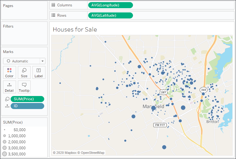
Figure 12.6: A map of houses for sale, sized by price
Here, each individual house could be mapped with a precise location and sized according to price. In order to help the viewer visually, the Streets background has been applied.
There are many free and commercial utilities that allow you to geocode addresses. That is, given an address, these tools will add latitude and longitude.
If you are not able to add the fields directly to your data source, you might consider using cross-database joins or data blending. Another alternative is to import latitude and longitude definitions directly into Tableau. We'll consider this option next.
Importing definitions into Tableau's geographic database
In order to import from the menu, select Map | Geocoding | Import Custom Geocoding.... The import dialog contains a link to documentation describing the option in further detail:
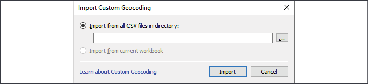
Figure 12.7: The Import Custom Geocoding dialog box
By importing a set of definitions, you can either:
- Add new geographic types
- Extend Tableau's built-in geographic types
Latitude and longitude define a single point. At times, you'll need to render shapes and lines with more geospatial complexity. For that, you'll want to consider some of the geospatial functions and spatial object support, which we'll look at next.
Leveraging spatial objects
Spatial objects define geographic areas that can be as simple as a point and as complex as multi-sided polygons. This allows you to render everything from custom trade areas to rivers, roads, and historic boundaries of counties and countries. Spatial objects can be stored in spatial files and are supported by some relational databases as well.
Tableau supports numerous spatial file formats, such as ESRI, MapInfo, KML, GeoJSON, and TopoJSON. Additionally, you may connect directly to ESRI databases as well as relational databases with geospatial support, such as ESRI or SQL Server. If you create an extract, the spatial objects will be included in the extract.
Many applications, such as Alteryx, Google Earth, and ArcGIS, can be used to generate spatial files. Spatial files are also readily available for download from numerous organizations. This gives you a lot of flexibility when it comes to geospatial analysis.
Here, for example, is a map of US railroads:

Figure 12.8: Map of US railroads
To replicate this example, download the shapefile from the United States' Census Bureau here: https://catalog.data.gov/dataset/tiger-line-shapefile-2015-nation-u-s-rails-national-shapefile.
Once you have downloaded and unzipped the files, connect to the tl_2015_us_rails.shp file. In the preview, you'll see records of data with ID fields and railway names. The Geometry field is the spatial object that defines the linear shape of the railroad segment:

Figure 12.9: Map of US railroads preview
On a blank sheet, simply double-click the Geometry field. Tableau will include the geographic collection in the detail and introduce automatically generated latitude and longitude fields to complete the rendering. Experiment with including the ID field in the detail and with filtering based on Fullname.
Consider using cross-database joins to supplement existing data with custom spatial data. Additionally, Tableau supports spatial joins, which allow you to bring together data that is only related spatially, even if no other relationships exist.
Next, we'll take a look at leveraging some spatial functions and even a spatial join or two to extend your analytics.
Leveraging spatial functions
Tableau continues to add native support for spatial functions. At the time of writing, Tableau supports the following functions:
Makeline()returns a line spatial object given two points.Makepoint()returns a point spatial object given two coordinates.Distance()returns the distance between two points in the desired units of measurement.Buffer()creates a circle around a point with a radius of the given distance. You may specify the units of measurement.
We'll explore a few of these functions using the Hospital and Patients dataset in the Chapter 12 workbook. The dataset reimagines the real estate data as a hospital surrounded by patients, indicated in the following view by the difference in Shape, Size, and Color:
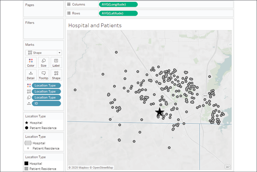
Figure 12.10: A hospital (represented by the star) surrounded by patients
There are numerous analytical questions we might ask. Let's focus on these:
- How far is each patient from the hospital?
- How many patients fall within a given radius?
- Which patients are outside the radius?
To start answering these questions, we'll create some calculated fields that give us the building blocks. In order to use multiple points in the same calculation, the latitude and longitude of the hospital will need to be included with each patient record. One way to achieve this is by using a couple of FIXED Level of Detail (LOD) expressions to return the values to each row.
We'll create a calculation called Hospital Latitude with the following code:
{FIXED : MIN(IF [Location Type] == "Hospital" THEN [Latitude] END)}
And a corresponding calculation called Hospital Longitude with the following code:
{FIXED : MIN(IF [Location Type] == "Hospital" THEN [Longitude] END)}
In each case, the latitude and longitude for the hospital is determined with the IF/THEN logic and returned as a row-level result by the FIXED LOD expression. This gives us the building blocks for a couple of additional calculations. We'll next consider a couple of examples, contained in the Chapter 12 workbook.
MAKELINE() and MAKEPOINT()
As we consider these two functions, we'll create a calculated field to draw a line between the hospital and each patient. We'll name our calculation Line and write this code:
MAKELINE(
    MAKEPOINT([Hospital Latitude], [Hospital Longitude]),
    MAKEPOINT([Latitude], [Longitude])
)
MAKELINE() requires two points, which can be created using the MAKEPOINT() function. That function requires a latitude and longitude. The first point is for the hospital and the second is the latitude and longitude for the patient.
As the function returns a spatial object, you'll notice the field has a geography icon:
![]()
Figure 12.11: Geography icon added to Line field
On a new visualization, if you were to double-click the Line field, you'd immediately get a geographic visualization because that field defines a geospatial object. You'll notice the COLLECT(Line) field on Detail, and Tableau's Longitude (generated) and Latitude (generated) on Columns and Rows. The geospatial collection is drawn as a single object unless you split it apart by adding dimensions to the view.
In this case, each ID defines a separate line, so adding it to Detail on the Marks card splits the geospatial object into separate lines:

Figure 12.12: Each line originates at the hospital and is drawn to a patient
What if we wanted to know the distance covered by each line? We'll consider that next in an expanded example.
DISTANCE()
Distance can be a very important concept as we analyze our data. Knowing how far apart two geospatial points are can give us a lot of insight. The calculation itself is very similar to MAKELINE() and we might create a calculated field named Distance to the Hospital with the following code:
DISTANCE(
    MAKEPOINT([Hospital Latitude], [Hospital Longitude]),
    MAKEPOINT([Latitude], [Longitude]),
    'mi'
)
Similar to the MAKELINE() calculation, the DISTANCE() function requires a couple of points, but it also requires a unit of measurement. Here, we've specified miles using the argument 'mi', but we could have alternately used 'km' to specify kilometers.
We can place this calculation on Tooltip to see the distance covered by each line:

Figure 12.13: The tooltip now displays the distance from the hospital to the patient
This simple example could be greatly extended. Right now, we can tell that patient ID 5 is 2.954… miles away from the hospital when we hover over the line. We could improve the display by rounding down the distance to 2 decimal places or looking up the patient's name. We could greatly increase the analytical usefulness by using the distance as a filter (to analyze patients that are over or under a certain threshold of distance) or using distance as a correlating factor in more complex analysis.
We can accomplish some of this visually with Buffer(), which we'll explore next!
BUFFER()
Buffer is similar to DISTANCE(), but the reverse. Rather than calculating a distance between two points, the BUFFER() function allows you to specify a point, a distance, and a unit of measurement to draw a circle with a radius of the specified distance around the point.
For example, you might want to visualize which patients fall within a 3-mile radius of the hospital. To do that, we'll create a calculated field named Hospital Radius, with the following code:
IF [Location Type] == "Hospital"
THEN BUFFER(MAKEPOINT([Latitude], [Longitude]), 3, 'mi')
END
This code first checks to make sure to perform the calculation only for the hospital record. The BUFFER() calculation itself uses the latitude and longitude to make a point and then specifies a 3-mile radius.
In order to visualize the radius along with the individual marks for each patient, we'll create a dual-axis map. A dual-axis map copies either the latitude or longitude fields on rows or columns and then uses the separate sections of the Marks card to render different geospatial objects. Here, for example, we'll plot the points for patients as circles and the radius using the Automatic mark type:
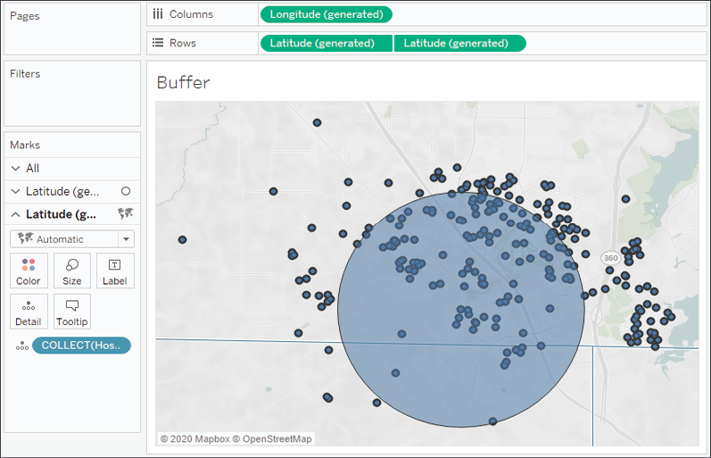
Figure 12.14: Patients who fall within a 3-mile radius of the hospital
Notice that we've used the generated Latitude and Longitude fields. These serve as placeholders for Tableau to visualize any spatial objects. On the first section of the Marks card, we include the Latitude and Longitude fields from the data. On the second, we included the Hospital Radius field. In both cases, the generated fields allow Tableau to use the geographic or spatial objects on the Marks card to define the visualization.
We've barely scratched the surface of what's possible with spatial functions. For example, you could parameterize the radius value to allow the end user to change the distance dynamically. You could use MAKEPOINT() and BUFFER() calculations as join calculations in your data source to bring together spatially related data. With this data, for example, you could intersect join the hospital record on BUFFER() to the patient records on MAKEPOINT() to specifically work with a dataset that includes or excludes patients within a certain radius. This greatly increases your analytic capabilities.
With a good understanding of the geospatial functions available, let's shift our focus just a bit to discuss another topic of interest: creating custom territories.
Creating custom territories
Custom territories are geographic areas or regions that you create (or that the data defines) as opposed to those that are built in (such as country or area code). Tableau gives you two options for creating custom territories: ad hoc custom territories and field-defined custom territories. We'll explore these next.
Ad hoc custom territories
You can create custom territories in an ad hoc way by selecting and grouping marks on a map. Simply select one or more marks, hover over one, and then use the Group icon. Alternately, right-click one of the marks to find the option. You can create custom territories by grouping by any dimension if you have latitude and longitude in the data or any geographic dimension if you are using Tableau's generated latitude and longitude.
Here, we'll consider an example using zip code:
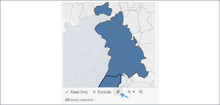
Figure 12.15: After selecting the filled regions to group as a new territory, use the paperclip icon to create the group
You'll notice that Tableau creates a new field, Zip Code (group), in this example. The new field has a paperclip and globe icon in the data pane, indicating it is a group and a geographic field:

Figure 12.16: A group and geographic field
Tableau automatically includes the group field on Color.
You may continue to select and group marks until you have all the custom territories you'd like. With zip code still part of the view level of detail, you will have a mark for each zip code (and any measure will be sliced by zip code). However, when you remove zip code from the view, leaving only the Zip Code (group) field, Tableau will draw the marks based on the new group:
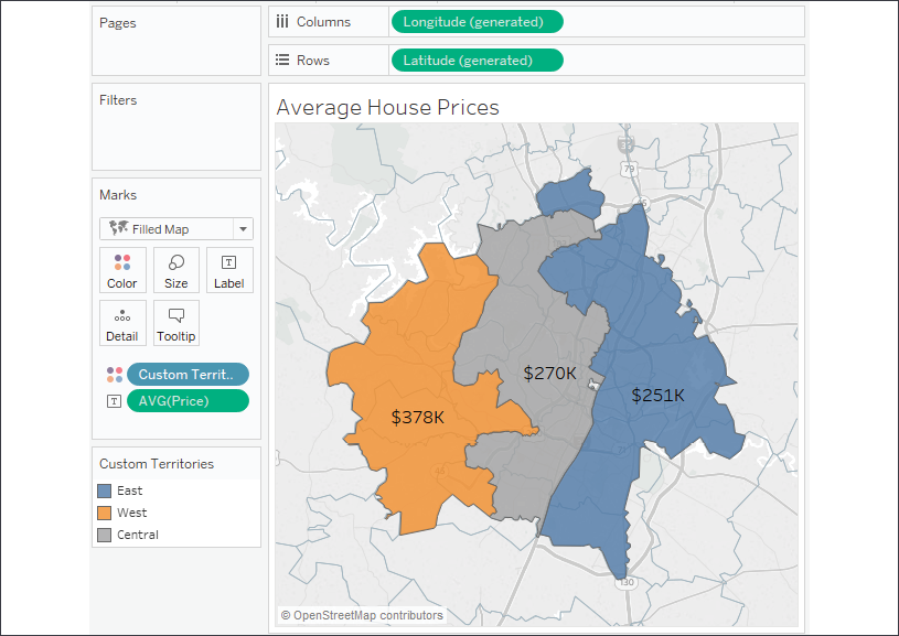
Figure 12.17: Grouping by Custom Territories
Here, the group field has been renamed Custom Territories and the group names have been aliased as East, West, and Central. We can see the average price of houses in each of the custom territories.
The details of these capabilities are outside the scope of this book, however, you'll find excellent documentation from Tableau at https://help.tableau.com/current/pro/desktop/en-us/maps_mapsources_wms.htm.
With a filled map, Tableau will connect all contiguous areas and still include disconnected areas as part of selections and highlighting. With a symbol map, Tableau will draw the mark in the geographic center of all grouped areas.
Sometimes the data itself defines the territories. In that case, we won't need to manually create the territories. Instead, we'll use the technique described next.
Field-defined custom territories
Sometimes your data includes the definition of custom territories. For example, let's say your data had a field named Region that already grouped zip codes into various regions. That is, every zip code was contained in only one region. You might not want to take the time to select marks and group them manually.
Instead, you can tell Tableau the relationship already exists in the data. In this example, you'd use the drop-down menu of the Region field in the data pane and select Geographic Role | Create From... | Zip Code. Region is now a geographic field that defines custom territories:
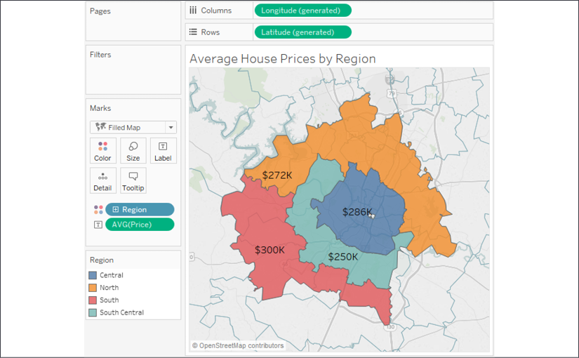
Figure 12.18: The custom regions here are defined by the Region field in the data
In this case, the regions have been defined by the Region field in the data. If the regions are redefined at a later date, Tableau will display the new regions (as long as the data is updated). Using field-defined custom regions gives us confidence that we won't need to manually update the definitions.
Use ad hoc custom territories to perform quick analysis, but consider field-defined custom territories for long-term solutions because you can then redefine the territories in the data without manually editing any groups in the Tableau data source.
Tableau mapping – tips and tricks
There are a few other tips to consider when working with geographic visualizations:
Use the top menu to select Map | Map Layers for numerous options for what layers of background to show as part of the map.
- Other options for zooming include using the mouse wheel, double-clicking, Shift + Alt + click, and Shift + Alt + Ctrl + click.
- You can click and hold for a few seconds to switch to pan mode.
- You can show or hide the zoom controls and/or map search by right-clicking the map and selecting the appropriate option.
- Zoom controls can be shown on any visualization type that uses an axis.
- The pushpin on the zoom controls alternately returns the map to the best fit of visible data or locks the current zoom and location.
- You can create a dual-axis map by duplicating (Ctrl + drag/drop) either the Longitude on Columns or Latitude on Rows and then using the field's drop-down menu to select Dual Axis. You can use this technique to combine multiple mark types on a single map:
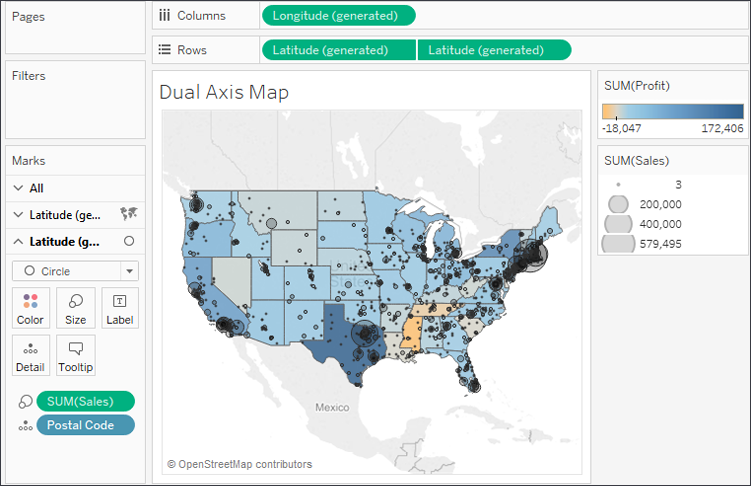
Figure 12.19: Dual Axis Map showing Profit at a state level and Sales at a Postal Code level
You can use dual axes to display various levels of detail or to use different mark types. In this case, both are accomplished. The map leverages the dual axis to show Profit at a state level with a filled map and Sales at a Postal Code level with a circle:
- When using filled maps, consider setting Washout to 100% in the Map Layers window for clean-looking maps. However, only filled shapes will show, so any missing states (or counties, countries, or others) will not be drawn:
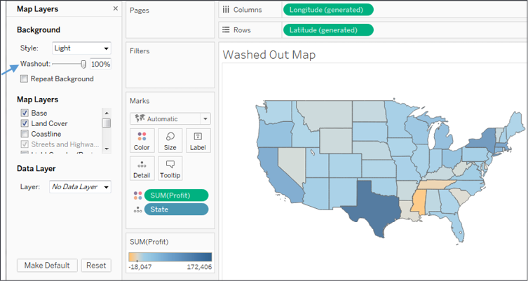
Figure 12.20: Washed Out Map
- You can change the source of the background map image tiles using the menu and selecting Map | Background Maps. This allows you to choose between None, Offline (which is useful when you don't have an internet connection but is limited in the detail that can be shown), or Tableau (the default).
- Additionally, from the same menu option, you can specify Map Services... to use a
WMS serverorMapbox.
- When using filled maps, consider setting Washout to 100% in the Map Layers window for clean-looking maps. However, only filled shapes will show, so any missing states (or counties, countries, or others) will not be drawn:
Next, we'll conclude this chapter by exploring how plotting your data onto background images can further enhance data visualization and presentation.
Plotting data on background images
Background images allow you to plot data on top of any image. Consider the possibilities! You could plot ticket sales by seat on an image of a stadium, room occupancy on the floor plan of an office building, the number of errors per piece of equipment on a network diagram, or meteor impacts on the surface of the moon.
In this example, we'll plot the number of patients per month in various rooms in a hospital. We'll use two images of floorplans for the ground floor and the second floor of the hospital. The data source is located in the Chapter 12 directory and is named Hospital.xlsx. It consists of two tabs: one for patient counts and another for room locations based on the x/y coordinates mapped to the images. We'll shortly consider how that works. You can view the completed example in the Chapter 12 Complete.twbx workbook or start from scratch using Chapter 12 Starter.twbx.
To specify a background image, use the top menu to select Map | Background Images and then click the data source to which the image applies – in this example, Patient Activity (Hospital). On the Background Images screen, you can add one or more images.
Here, we'll start with Hospital - Ground Floor.png, located in the Chapter 12 directory:
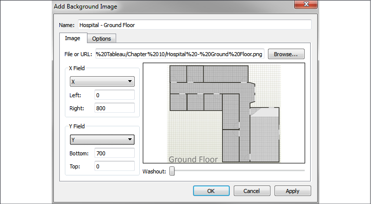
Figure 12.21: Add Background Image pane
You'll notice that we mapped the fields X and Y (from the Locations tab) and specified Right at 800 and Bottom at 700. This is based on the size of the image in pixels.
You don't have to use pixels, but most of the time it makes it far easier to map the locations for the data. In this case, we have a tab of an Excel file with the locations already mapped to the x and y coordinates on the image (in pixels). With cross-database joins, you can create a simple text or Excel file containing mappings for your images and join them to an existing data source. You can map points manually (using a graphics application) or use one of many free online tools that allow you to quickly map coordinates on images.
We'll only want to show this blueprint for the ground floor, so switching to the Options tab, we'll ensure that the condition is set based on the data. We'll also make sure to check Always Show Entire Image:
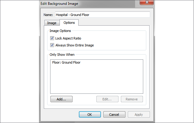
Figure 12.22: Edit Background Image pane
Next, repeating the preceding steps, we'll add the second image (Hospital - 2nd Floor.png) to the data source, ensuring it only shows for 2nd Floor.
Once we have the images defined and mapped, we're ready to build a visualization. The basic idea is to build a scatterplot using the X and Y fields for axes. But we have to ensure that X and Y are not summed because if they are added together for multiple records, then we no longer have a correct mapping to pixel locations. There are a couple of options:
- Use X and Y as continuous dimensions.
- Use
MIN,MAX, orAVGinstead ofSUM, and ensure that Location is used to define the view level of detail. - Additionally, images are measured from 0 at the top to Y at the bottom, but scatterplots start with 0 at the bottom and values increase upward. So, initially, you may see your background images appear upside-down. To get around this, we'll edit the y axis (right-click and select Edit Axis) and check the option for Reversed.
We also need to ensure that the Floor field is used in the view. This is necessary to tell Tableau which image should be displayed. At this point, we should be able to get a visualization like this:
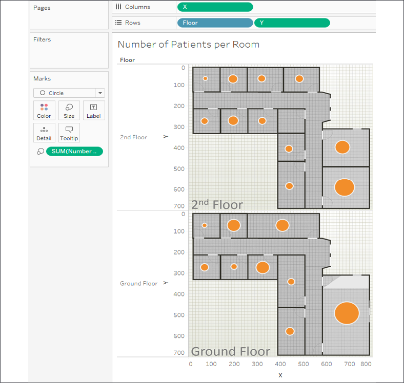
Figure 12.23: Plotting the number of patients per room on a floorplan image
Here, we've plotted circles with the size based on the number of patients in each room. We could clean up and modify the visualization in various ways:
- Hide the x and y axes (right-click the axis and uncheck Show Header)
- Hide the header for Floor, as the image already includes the label
- Add Floor to the Filter shelf so that the end user can choose to see one floor at a time
The ability to plot marks on background images opens a world of possibilities for communicating complex topics. Consider how you might show the number of hardware errors on a diagram of a computer network, the number of missed jump shots on a basketball court, or the distance between people in an office building. All of this, and more, is possible!
Summary
We've covered a lot of ground in this chapter! The basics of visualizing maps are straightforward, but there is a lot of power and possibility behind the scenes. From using your own geospatial data to leveraging geospatial objects and functions, you have a lot of analytical options. Creating custom territories and plotting data on background images expand your possibilities even further.
Next, we'll turn our attention to a brand new feature of Tableau 2020.2: Data Model! And we'll explore the difference between data model relationships, joins, blends, and see how all of them can be used to perform all kinds of valuable analysis!