MATLAB provides extensive capabilities for visualizing your data. You can produce 2D plots, 3D plots, and animations; view images; and create histograms, contour and surface plots, as well as other graphical representations of your data. You are probably familiar with making simple 2D plots with lines and markers, and pie and bar charts, but you may not be aware of the additional possibilities made available by the MATLAB low-level routines that underpin the frequently used functions like plot. There are also interactive capabilities for editing plots and figures and adding annotations before printing or exporting them.
MATLAB excels in scientific visualization and in engineering visualization of 3D objects. Three-dimensional visualization is used to visualize data that is a function of two parameters, for example, the height on the surface of the Earth, or to visualize objects. The former is used in all areas of science and engineering. The latter is particularly useful in the design and simulation of any kind of machine including robots, aircraft, automobiles, and spacecraft.
Three-dimensional visualization of objects can be further divided into engineering visualization and photo-realistic visualization. The latter helps you understand what an object looks like and how it is engineered. When the inside of an object is considered, we move into the realm of solid modeling which is used for creating models suitable for the manufacturing of the object. Photo-realistic rendering focuses on the interaction of light with the object and the eye. MATLAB does provide some capabilities for lighting and camera interaction but does not provide true photo-realistic rendering.
- graphics
– Low-level routines for figures, axes, lines, text, and other graphics objects.
- graph2d
– Two-dimensional graphs like linear plots, log scale plots, and polar plots.
- graph3d
– Three-dimensional graphs like lines, meshes, and surfaces; control of color, lighting, and the camera.
- specgraph
– Specialized graphs, the largest category. Special 2D graphs like bar and pie charts and histograms, contour plots, special 3D plots, volume and vector visualization, image display, movies, and animation.
A good command of these functions allows you to create very sophisticated graphics as well as to adapt them to different publication media, whether you need to adjust the dimensions, color, or font attributes of your plot. In this chapter, we will present recipes that cover what you need to know to use MATLAB graphics effectively. We don’t have space to discuss every available plotting routine, and that is well covered in the available help, but we will cover the basic functionality and provide recipes for common usage.
3.1 Plotting Data Interactively from the MATLAB Desktop
Problem
You would like to plot data in your workspace but aren’t sure of the best method for visualizing it.
Solution
PLOTS tab with plot icon ribbon.
How It Works
Let’s create some sample data to demonstrate this interactive capability, which is a fairly new feature in MATLAB. We’ll start with some trigonometric functions to create sample data that oscillates.
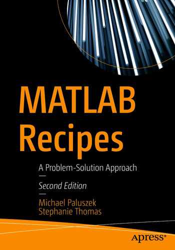
![]()
We now have two vector variables available in the workspace. Select the PLOTS tab in the desktop as shown in Figure 3.1, then select the y variable in the Workspace display. The variable will appear on the far left of the PLOTS tab area, and various plot icons in the ribbon will become active: plot, bar, area, pie, and so on. Note the radio buttons on the far left for either reusing the current figure for the plot or creating a new figure.
Close all open figures with a close all and click the plot icon to create a new figure with a simple 2D plot of the data. Note that clicking the icon results in the plot command being printed to the command line:
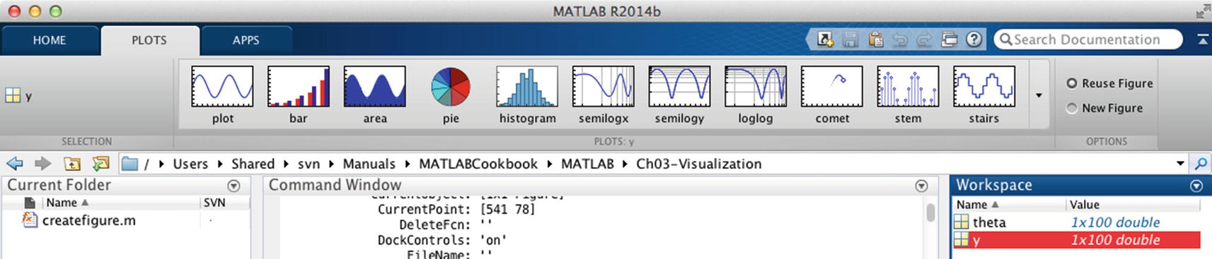
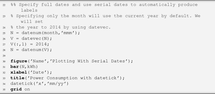
![]()
Linear plot of trigonometric data.
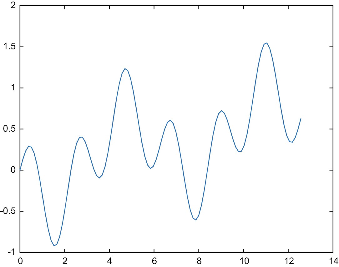
You simply click another plot icon to replot the data using a different function, and again the function call will be printed to the command line. The plot icons that are displayed are not all the plots available, but simply the default favorites from among all the many options; to see more icons, click the pop-up arrow at the right of the icon ribbon. The available plot types are organized by category, and there is a Catalog button that you can press to bring up a dedicated plot catalog window with the documentation for each function.
Parametric area plot of trigonometric data.
![]()
Note how this time the x-axis range is from 0 to 4π as expected.
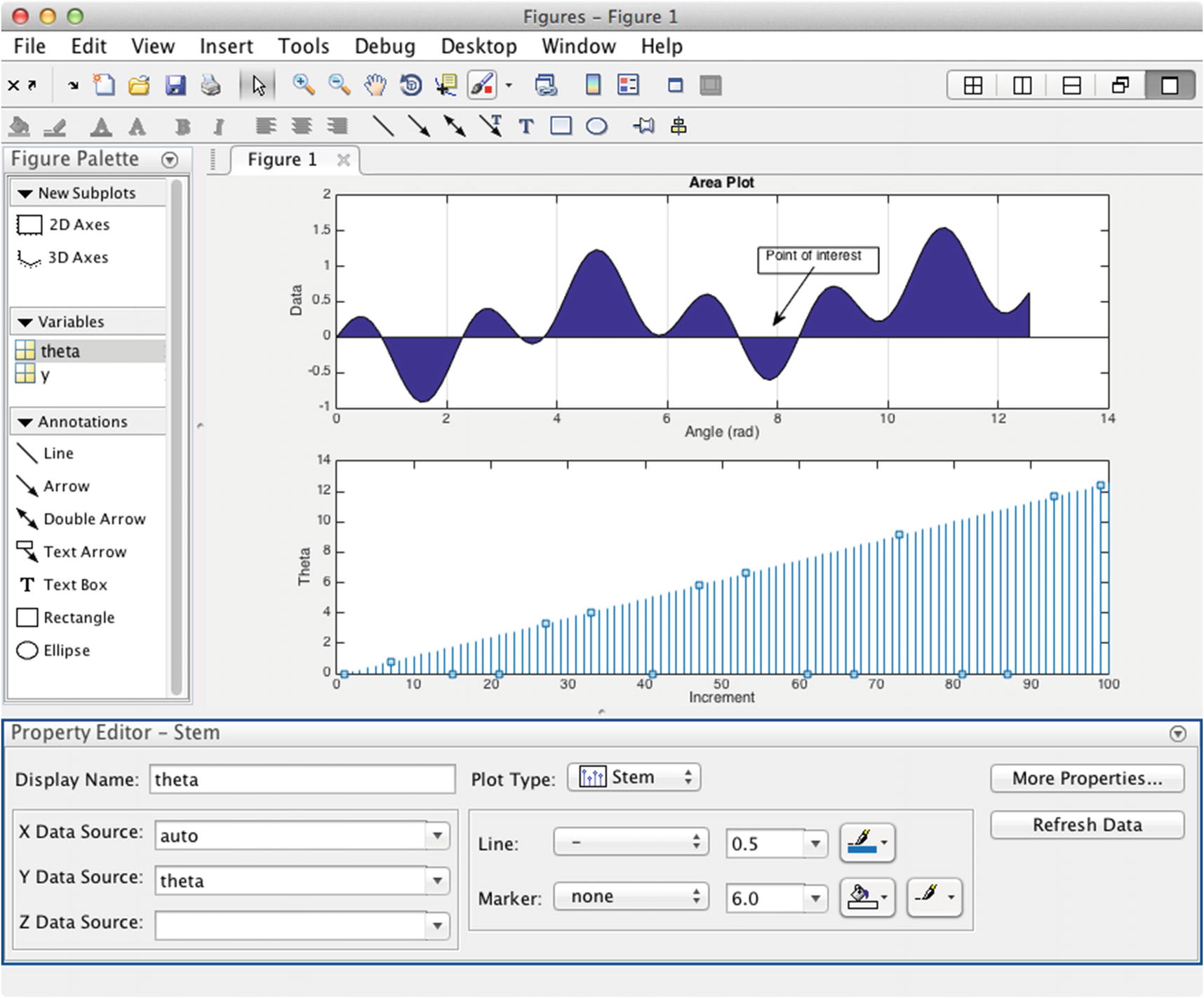
Plot of trigonometric data in the Figure Palette.
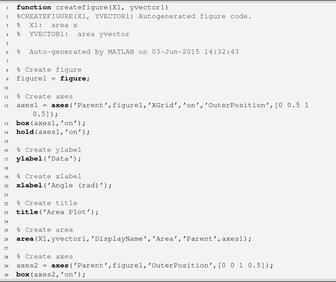
The same changes can be made programmatically as will be shown in the following recipes. In fact, you can generate code from the Figure Palette, and MATLAB will create a function with all the commands necessary to replicate your figure from your data. The Generate Code command is under the File menu of the window. This allows you to interactively create a visualization that works with some example data and then programmatically adapt it to your toolbox. MATLAB calls the new autogenerated function createfigure. You can see the use of the following functions: figure, axes, box, hold, ylabel, xlabel, title, area, stem, and annotation.
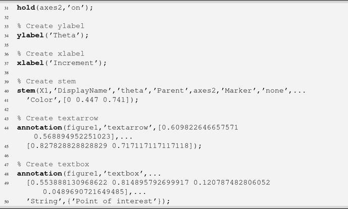
Note that this code did not in fact use the subplot function, but rather the option to specify the exact axes location in the figure with the 'OuterPosition' property. Note also how the units of the axes position and of the annotations are between 0 and 1, that is, normalized. This is in fact an option for axes, as can be seen by the following call using gca to get the handle to the current axes:
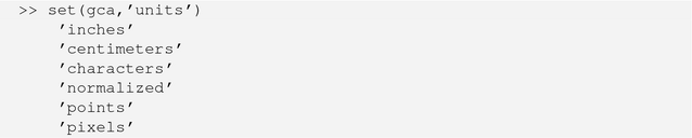
Using other units may be helpful for certain applications, but normalized units are always the default.
Zoom in
Zoom out
Hand tool – Move an object in the plane of the figure
Rotate tool – Rotate the view
Data cursor
Brush/select data
Colorbar
Legend
The hand and rotate tools are very helpful with 3D data. The data cursor displays the values of a plot point right in the figure. The brush highlights a segment of data using a contrast color of your choosing using the colors pop-up. The colorbar and legend buttons serve as on/off switches.
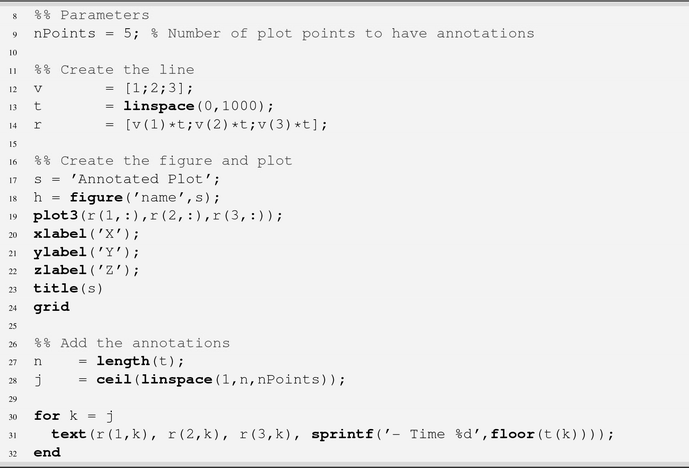
3.2 Incrementally Annotate a Plot
Problem
You need to annotate a curve in a plot at a subset of points on the curve.
Solution
Use the text function to annotate the plot.
How It Works
We will call text within a for loop in AnnotatePlot. Use sprintf to create the text for the annotations, which gives you control over the formatting of any numbers. In this case, we will use %d for integer display. linspace creates an evenly spaced index array into the data to give us the selected points to annotate, in this case, five points. linspace is used to produce evenly spaced points.

Annotated three-dimensional plot.
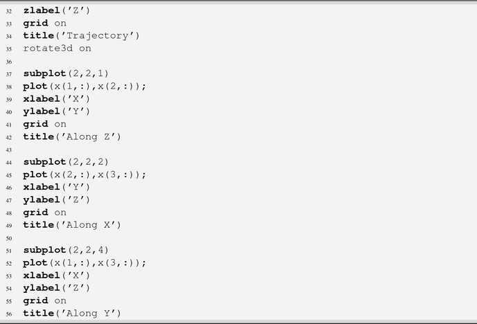
3.3 Create a Custom Plot Page with Subplot
Problem
You need multiple plots of your data for a particular application, and as you rerun your script, they are cluttering your screen and hogging memory. We often create many dozens of plots as we work on our commercial toolboxes.
Solution
Create a single plot with several subplots on it so you only need one figure to see the results of one run of your application.
How It Works

QuadPlot using subplot for axes placement.
Note that you must use the size of your axes array, in this case (2,2), in each call to subplot.

In the latest versions of MATLAB, you can easily access figure and axes properties using field names. For instance, let’s get the figure generated by the demo using gcf, then look at the children, which should include our four subplots.
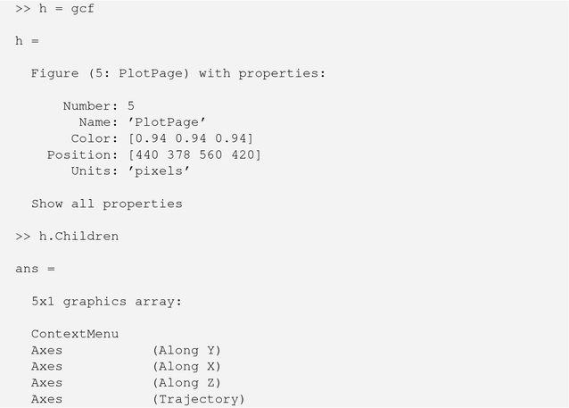
Note that the titles of our axes are helpfully displayed. If you wanted to add additional objects or change the properties of the axes, you could access the handles this way. Or, you might want to provide the handles as an output for your function. You can also make a subplot in a figure the current axes just by calling subplot again with the array size and ID.
![]()
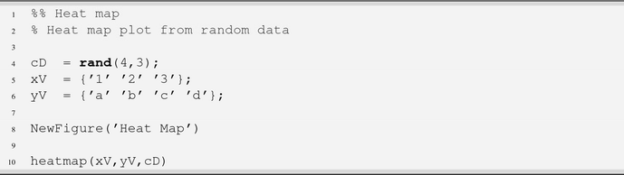
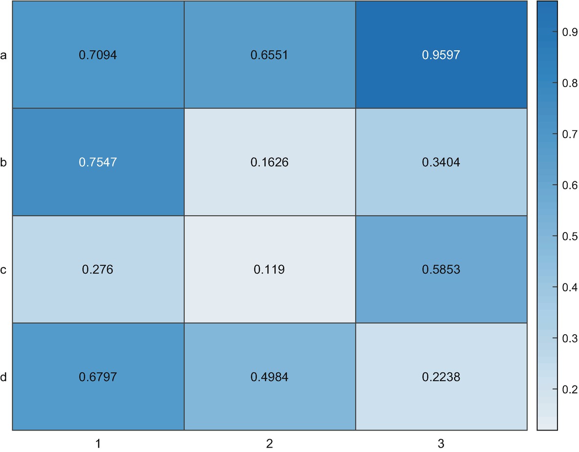
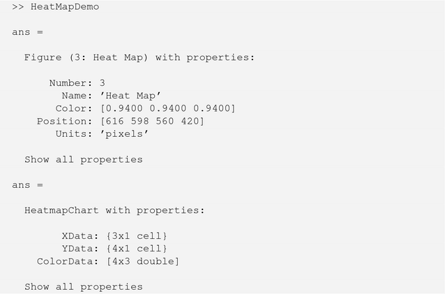
3.4 Create a Heat Map
Problem
You would like to create a heat map from data. A heat map shows the variation of magnitude using color in a two-dimensional image.
Solution
You can create a heat map using the heatmap function.
How It Works
We’ll create a random set of data and two cell arrays for the x and y names.
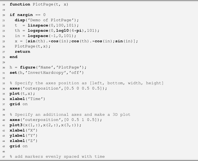
3.5 Create a Plot Page with Custom-Sized Axes
Problem
You would like to group some plots together in one figure but not as evenly spaced subplots.
Solution
You can create custom-sized axes using the 'OuterPosition' property of the axes, placing them anywhere in the figure you wish.
How It Works
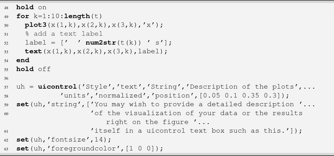
We’ll create a custom figure with two plots, one spanning the width of the figure and a second smaller axes. This will leave room for a block of descriptive text, which might describe the figure itself or display the results. In order to make the plots more interesting, we will add markers and text annotations using num2str.
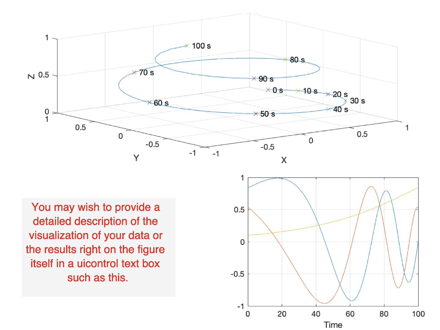
PlotPage with custom-sized plots.
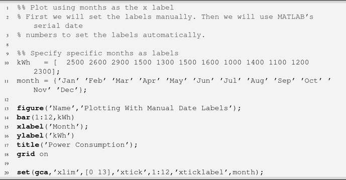
3.6 Plotting with Dates
Problem
You want to plot data as a function of time using dates on the x axis.
Solution
Access the tick labels directly using handles for the axis, or use datetick with serial date numbers.
How It Works
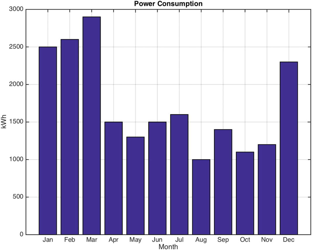
Plotting with manual month labels.
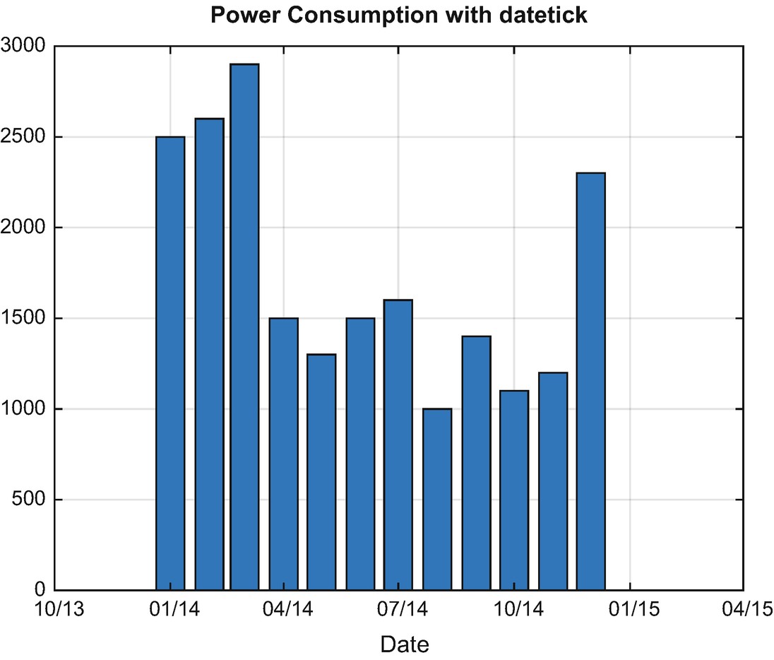
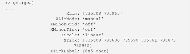
Plotting using datetick with serial dates.
Note that the ticks themselves are no longer one per month; if you want to specify them manually, you now need to use date numbers. We have printed out the properties using get to show the XTicks used.
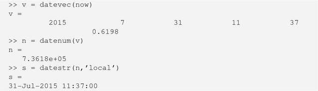
MATLAB’s serial date numbers do not correspond to other serial date formats like Julian date. MATLAB simply counts days from Jan-1-0000, so the year 2000 starts at a serial number of 2000*365 = 730,000. The following quick example demonstrates this as well as using now to get the current date:
3.7 Generating a Color Distribution
Problem
You want to assign colors to markers or lines in your plot.
Solution
Specify the HSV components algorithmically from around the color wheel and convert to RGB.
How It Works
ColorDistribution chooses n colors from around the color wheel. The colors are selected using the hue component of HSV, with a full range from 0 to 1. Parameters allow the user to separately specify the saturation and value for all the colors generated. You could alternatively use these components to select a variety of colors of one hue.
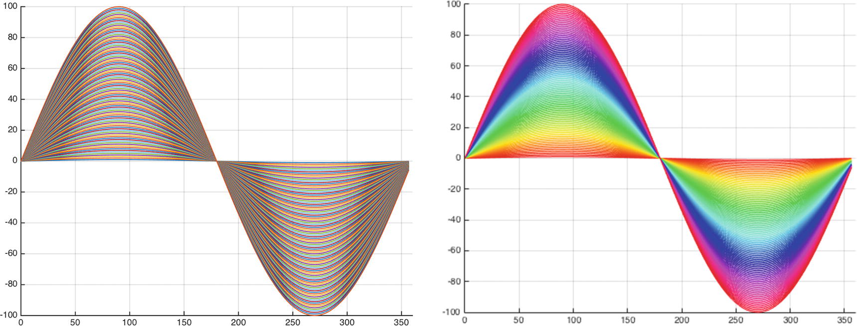
Original lines and lines with a color distribution with values and saturation of 1.
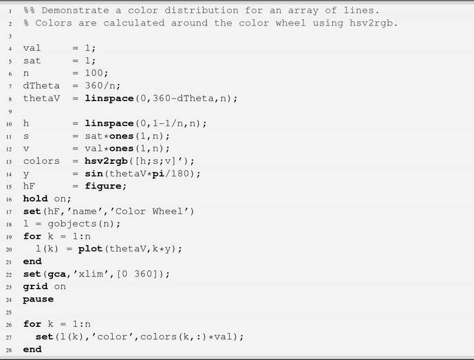
Figure 3.11 plots a color distribution.
3.8 Visualizing Data over 2D or 3D Grids
Problem
You need to perform a calculation over a grid of data and view the results.
Solution
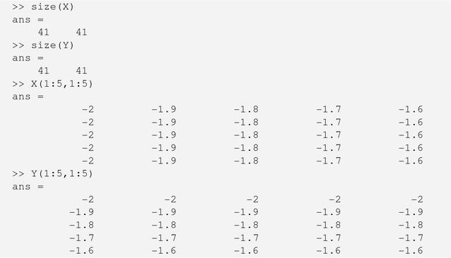
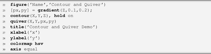
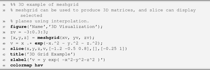
The function meshgrid produces grids over x and y that can be used for calculations and subsequently input to surf. This is also useful for contour and quiver plots.
How It Works
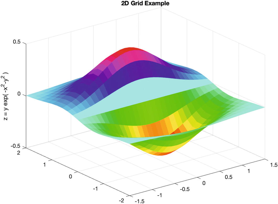
3D surface generated over a 2D grid.

The generated matrices are square and consist of the input vector replicated in the correct dimension. You could achieve the same result by hand using repmat, but meshgrid eliminates the need to remember the details.
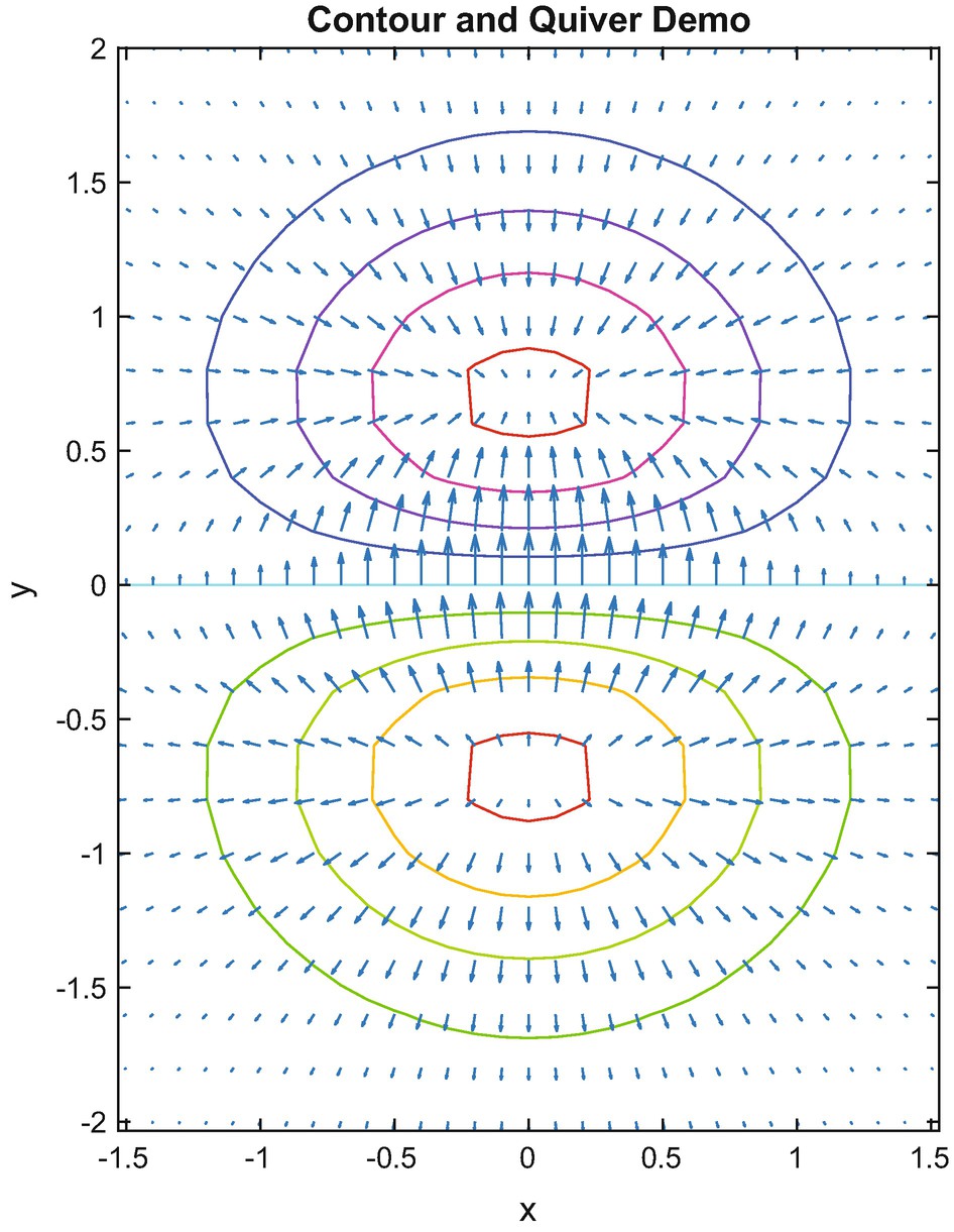
3D surface visualized as contours.
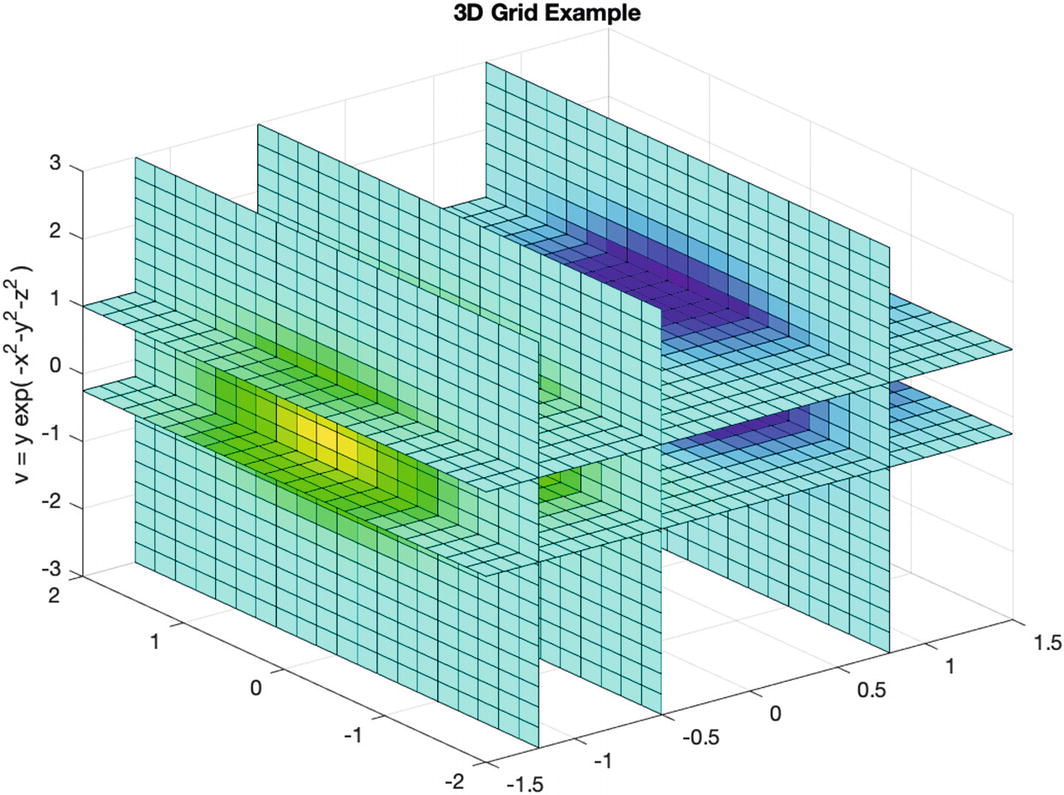
3D volume with slices.
3.9 Generate 3D Objects Using Patch
Problem
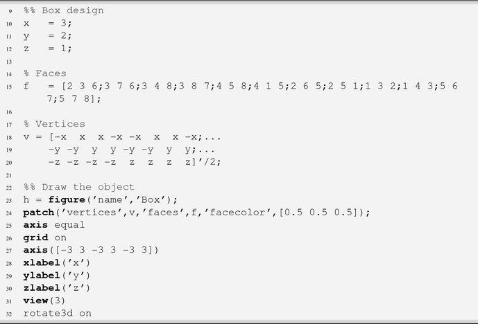
You would like to draw a 3D box.
Solution
You can create a 3D box using the patch function.
How It Works

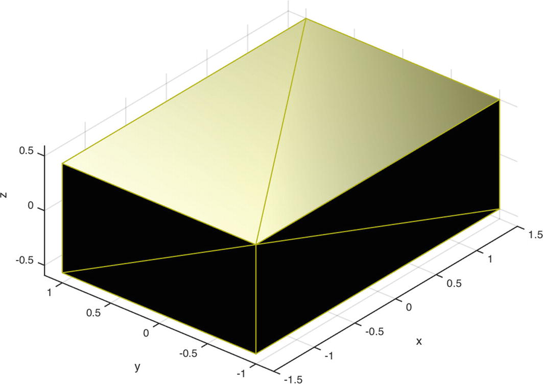
Box generated using patch.
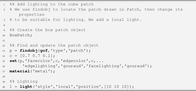
3.10 Working with Light Objects
Problem
You would like to illuminate the 3D box drawn in the previous recipe.
Solution
You can create ambient or directed light objects using the light function. Light objects affect both patch and surface objects, which are created by surf, mesh, pcolor, fill, fill3, and patch.
How It Works
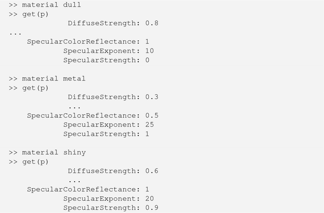
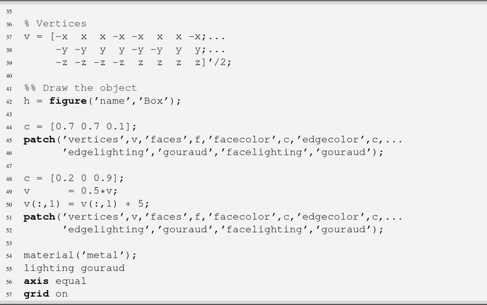
The main properties for working with light objects are color, style, position, and visible. The style may be infinite, with the light shining in parallel rays from a specified direction, or local, with a point source shining in all directions. The position property has a different meaning for each of these styles. PatchWithLighting adds a local light to the box script. We modify the box surface properties using material to get different effects.
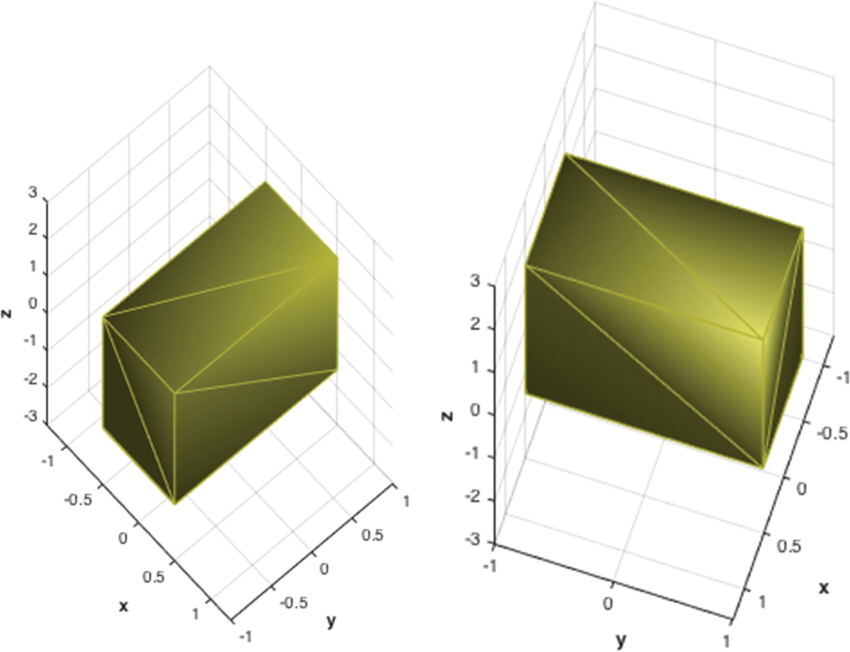
Box illuminated with a local light object. The left box has “dull” material. The one on the right has “metal.”
The dull, shiny, and metal settings for material set the patch properties to produce these effects. We can easily print the effects to the command line using get.
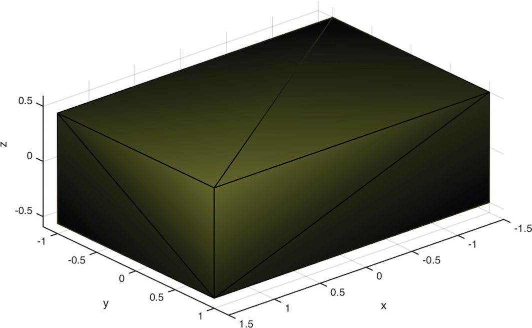
Shiny box with ambient lighting removed (AmbientStrength set to 0) and a different camera viewpoint.
Shiny box with flat lighting.
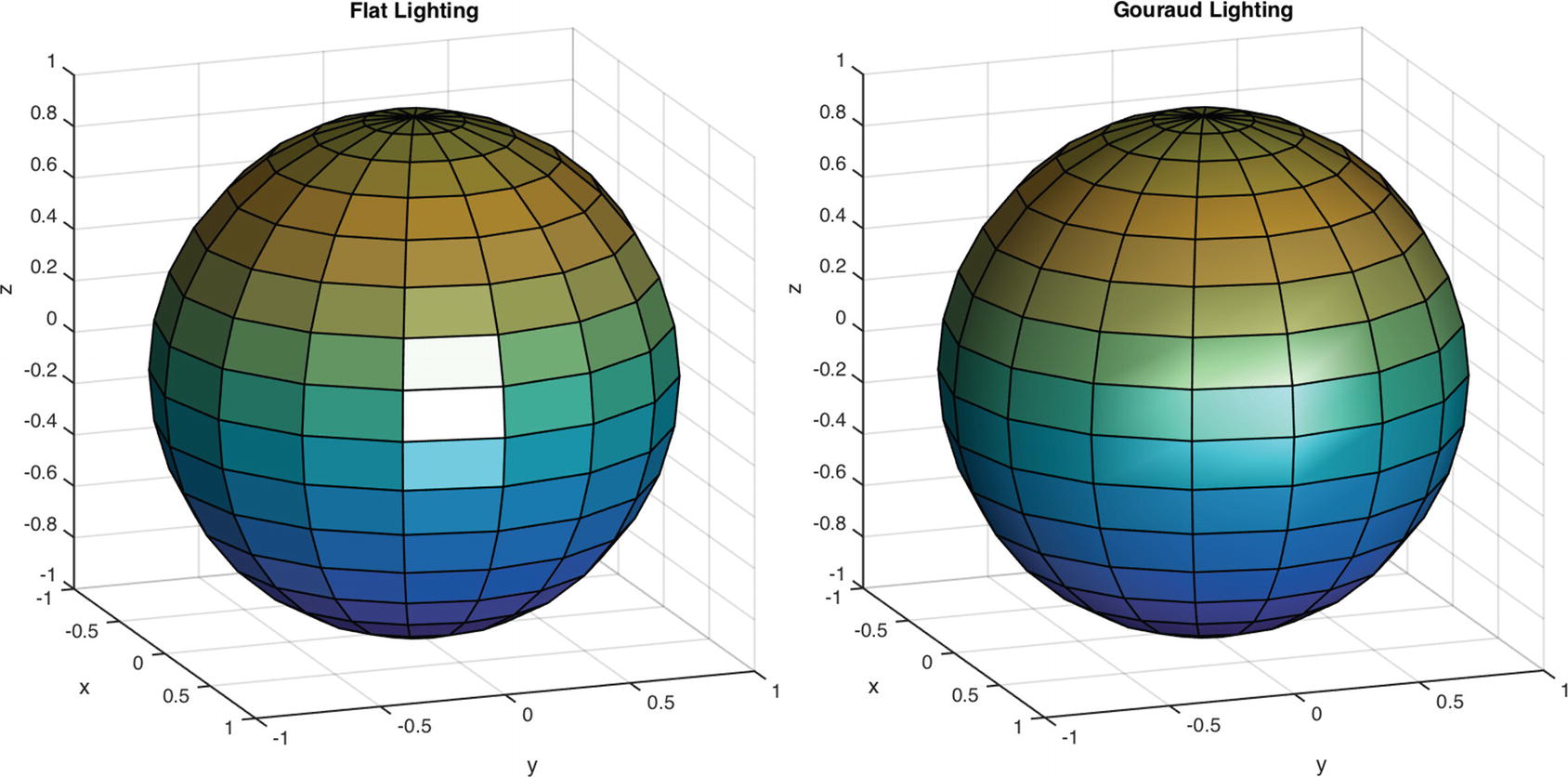
Sphere illuminated with an infinite light object. The left sphere has flat lighting. The one on the right has Gouraud.
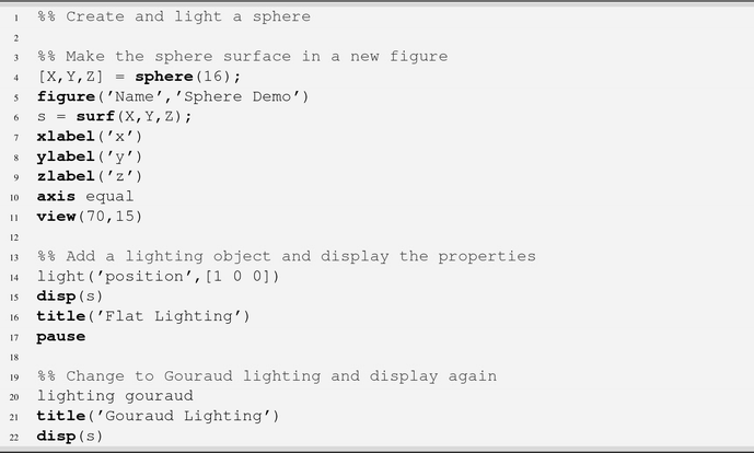
In addition to a sphere function, MATLAB also provides cylinder and ellipsoid.
3.11 Programmatically Setting the Camera Properties
Problem
You would like to have a camera in your scene that can be pointed.
Solution
Use the MATLAB cam functions. These provide the same functionality as the buttons in the camera toolbar, but with repeatability and the ability to pass in variables for the parameters. We demonstrate this in the script PatchWithCamera.m.
How It Works
We make two boxes in the scene. One is scaled and displayed from the other by 5 in x. We use the MATLAB functions camdolly, camorbit, campan, camzoom, and camroll to control the camera. We put all of these functions in the PatchWithCamera.m script and provide examples of two sets of parameters. Note that without lighting, the edges disappear.

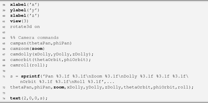
Additional functions for interacting with the scene camera include campos and camtarget, which can be used to set the camera position and target. This can be used to image one object from the vantage point of another. camva sets the camera view angle, so you can model a real camera’s field of view. camup specifies the camera “up” vector or the direction of the top of the frame.
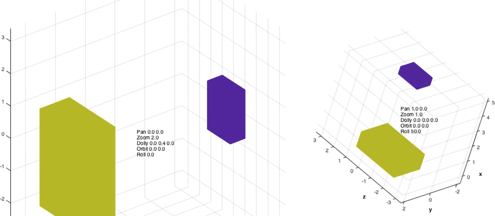
Boxes with different camera parameters.
3.12 Display an Image
Problem
You would like to draw an image.
Solution
You can read in an image directly from an image file and draw it in a figure window. MATLAB supports a variety of formats including GIF, JPG, TIFF, PNG, and BMP. Our solution is in the script ReadImage.m.
How It Works
We read in a black and while image using imread and display it using imagesc. imagesc scales the color data into the colormap. It is necessary to apply the grayscale colormap; otherwise, you’ll get the colors in the default colormap. In parula, this is blue and yellow.

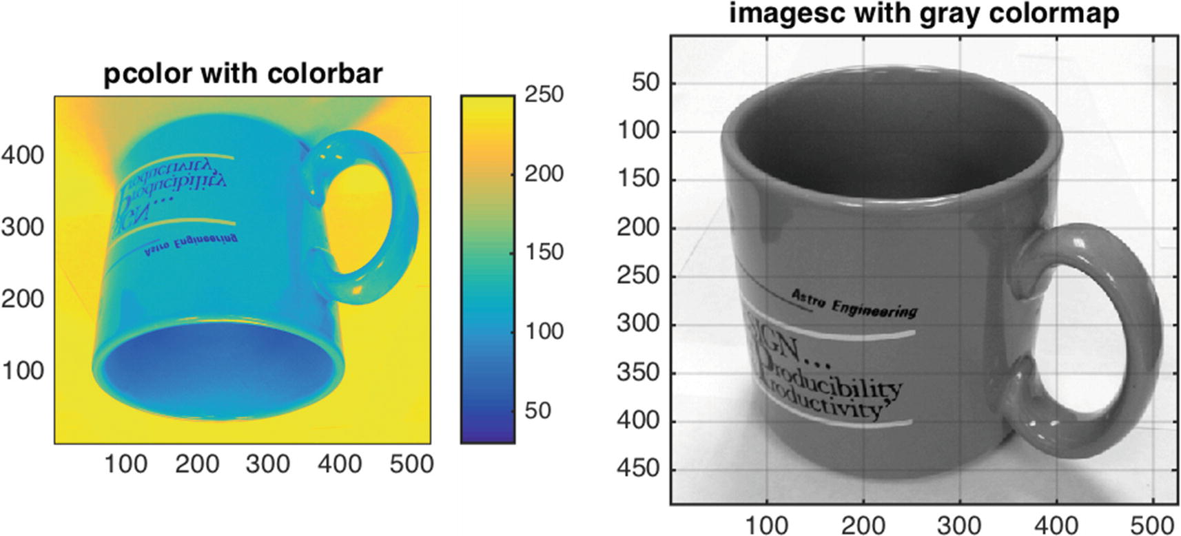
Mug displayed using pcolor and imagesc.
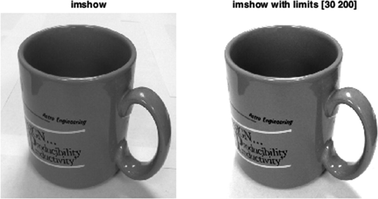
Mug displayed using imshow, with color limits applied on the right.
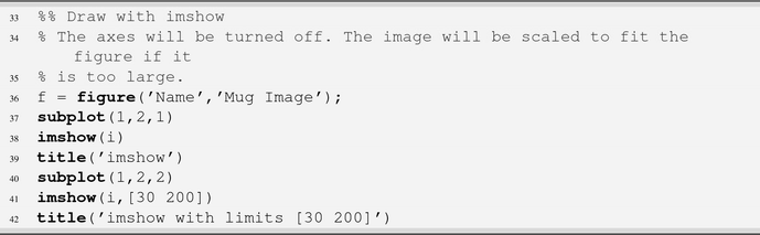
Not all images use the full depth available; for instance, this mug image has a minimum value of 30 and a maximum of 250. imshow allows you to set the color limits of the image directly, and the pixels will be scaled accordingly. We can darken the image by increasing the lower color limit and brighten the image by lowering the upper color limit.
3.13 Graph and Digraph
Problem
We have a stochastic process for which we want a graphical representation.
Solution
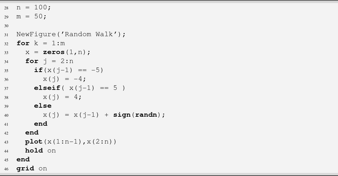
Use graph and digraph in the script RandomWalk.m.
How It Works
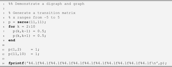
Generate a transition matrix showing the probability of transition from one state to a second state.
The code in RandomWalk.m creates a digraph, graph, and a random walk. The first part creates a transition matrix.
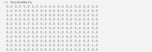
When we run RandomWalk at the command line we get the below output:
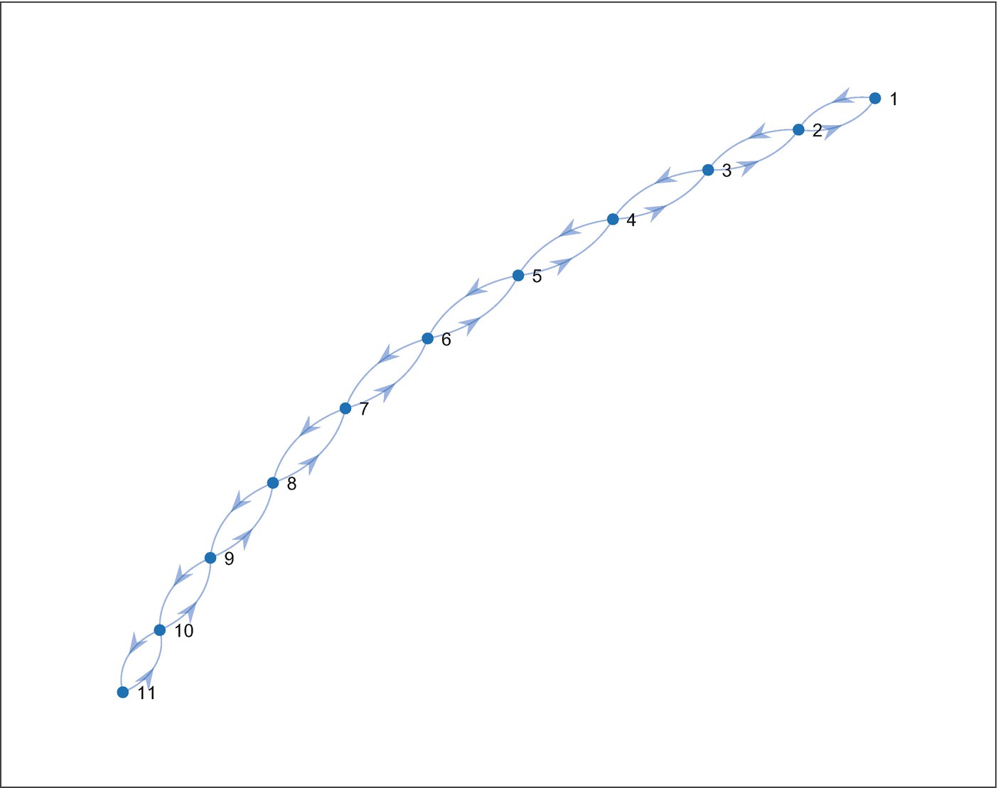
Digraph for the random walk.
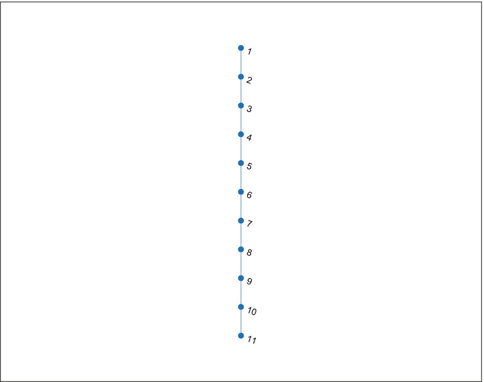
Digraph for the random walk.

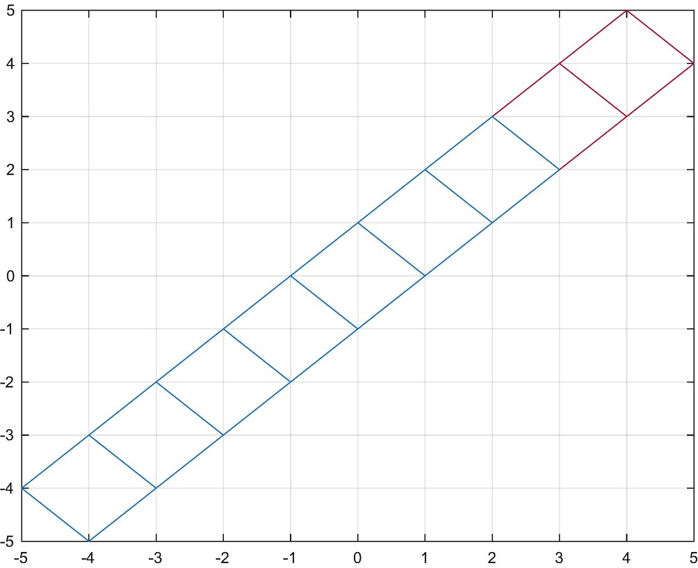
The random walk. The lines show the connections between the nodes in the random walk. All possible paths are shown.
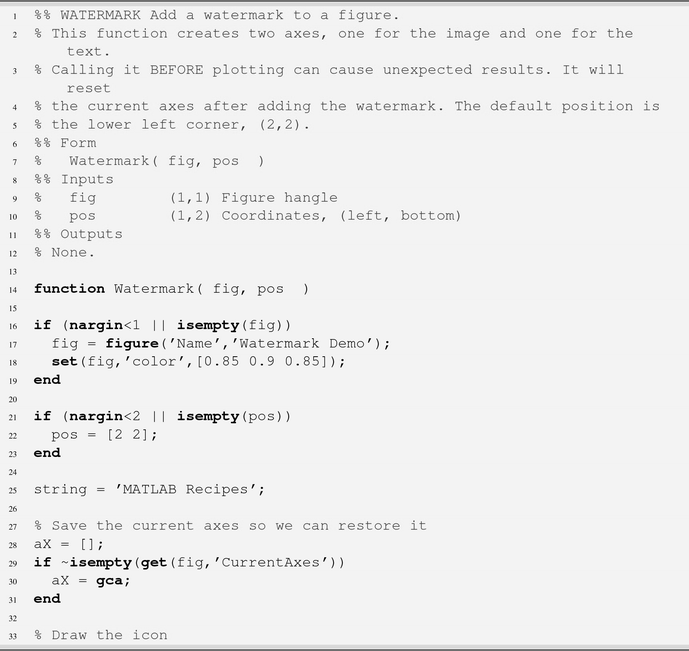
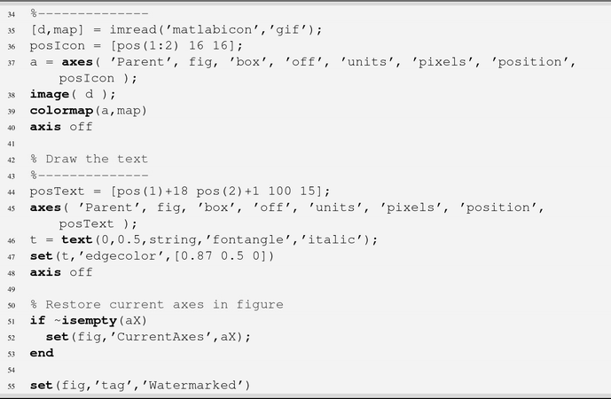
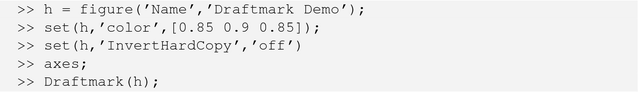
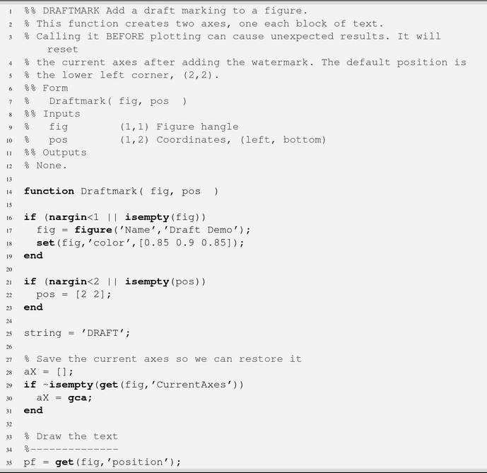
3.14 Adding a Watermark
Problem
You have a lot of great graphics in your toolbox, and you would like them to be marked as having been created by your company. Alternatively, or additionally, you may want to mark images with a version number or date of the software that generated them.
Solution
You can use low-level graphics functions to add a textual or image watermark to figures that you generate in your toolbox. The tricky part is adding the items to the figure at the correct time so they are not overridden.
How It Works
Company watermark.

Draft watermark.

If you want to get very fancy, you could draw objects across the front of the figure and give them transparency, but it has to be fill or patch objects; text cannot be given transparency.
Chapter Code Listing
File | Description |
AnnotatePlot | Add text annotations evenly spaced along a curve |
BoxPatch | Generate a cube using patch |
ColorDistribution | Demonstrate a color distribution for an array of lines |
DraftMark | Add a draft marking to a figure |
GridVisualization | Visualize data over 2D and 3D grids |
PatchWithCamera | Generate two cubes using patch and point a camera at the scene |
PatchWithLighting | Add lighting to the cube patch |
PlotPage | Create a plot page with several custom plots in one figure |
PlottingWithDates | Plot using months as the x label |
QuadPlot | Create a quad plot page using subplot |
ReadImage | Draw a JPEG image in a figure multiple ways |
SphereLighting | Create and light a sphere |
Watermark | Add a watermark to a figure |