
Taxes affect the economic choices made by individuals, but so do the expenditures for which the taxes are collected. Government spends money by purchasing goods and services and by providing benefits in the form of transfer payments and subsidies. We use the letter G to denote government purchase of goods and services and T to denote taxes minus transfer payments.
In our simplified version of NIPA accounting, we consider all government purchases to be consumption spending, such as spending on the wages for government workers. But it is important to recognize, as do the NIPA accounts, that some government purchases are for infrastructure projects like roads and schools.
Here we will consider government spending on transfer payments, consumption, and infrastructure. Spending on consumption and infrastructure involves the diversion of factor services from the private sector to government purchases. Transfer payments simply take money provided by taxpayers and then redistribute that money to recipients in the form of social or safety-net benefits.
Transfer Payments
Let’s start with transfer payments. We have seen how income taxes reduce the cost of leisure and thus impel workers to substitute leisure for work. Transfer payments can have the same effect. Means-tested transfer payments create a disincentive to increase earnings since eligibility for benefits depends on keeping earnings below a certain level.
In Chapter 2, we showed that total transfer payments by all U.S. government entities amounted to $2,786 billion in 2016. The Congressional Budget Office has put total means-tested federal transfer payments at $745 billion for fiscal year 2017 (CBO 2017a). This is made up in part of expenditures on Medicaid ($389 billion) and Supplemental Security Income (SSI) benefits for disabled persons at $55 billion (CBO 2017b). About 74 million people were enrolled in Medicaid and Children’s Health Insurance Program (CHIP) in December 2017 (Medicaid 2017), which provided $550 billion in benefits to 67 million enrollees (MACStats: Medicaid and CHIP Data Book 2017). The U.S. Department of Agriculture reports that it provided $64 billion in SNAP benefits (previously known as “food stamps”) in FY 2017, for an average annual benefit of about $1,500 (USDA 2017). In 2018, eligible couples are entitled to $1,125 in SSI benefits per month (SSA 2018).
Medicaid eligibility rules vary from one state to another. In 2017, Massachusetts adults with incomes below 138 percent of the federal poverty level were eligible for Medicaid (KFF 2017). For SNAP benefits the U.S. threshold is 130 percent of the poverty level (CBPP 2018). Under 2018 rules, an individual who earns more than $1,180 per month is ineligible for SSI benefits (SSA, 2018).
Figure 8.1 charts the rise in U.S. transfer payments over the last 70 years. U.S. transfer payments were 3.01% of GDP in October 1947 and increased to 10.62% in October 2017.
Let’s return to our worker, Adam, in order to illustrate how transfer payments like these affect the work–leisure calculus. Figure 8.2 shows how Adam offers less labor when government-provided benefits replace part of his wage. We assume that Adam pays no taxes. In the absence of government benefits, he is on curve AB, along which his wage rate is $50 per hour and along which he chooses point X, where he works for 12 hours and earns $600 and thus reaches his highest attainable level of utility U1.
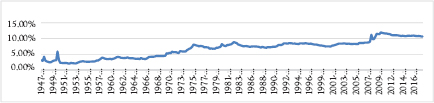
Figure 8.1 U.S. government transfer payments as a percent of GDP
Source: U.S. Bureau of Economic Analysis and Federal Reserve Bank of St. Louis.
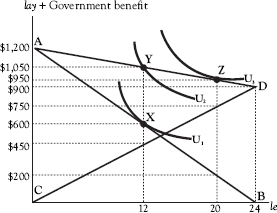
Figure 8.2 The replacement rate and labor supply
Now the government institutes a system of benefits under which he receives $900 if he doesn’t work at all (i.e., sets his leisure at 24 hours) and gives up $0.75 in benefits for every dollar he earns. Under this system, he reduces his benefits to zero if he works all 24 hours.
Curve CD show how his benefits increase with leisure. Now Adam must find the optimal point on curve AD, which we obtain by adding curves AB and CD vertically and which shows the actual leisure–income choices before him. Adam could increase utility by keeping work and leisure constant and moving to point Y. But the fact that leisure is cheaper now causes him to move to point Z, where he now works only four hours. His total income rises to $950, of which $200 is labor income and the remaining $750 government benefits.
In his book The Redistribution Recession, Casey Mulligan shows that government policies subsidizing leisure have caused a reduction in the supply of labor (Mulligan 2012). In Mulligan’s terminology, a recipient of safety-net benefits enjoys a replacement rate. The replacement rate is “the fraction of productivity that the average non-employed person receives in the form of means-tested benefits,” and the self-reliance rate is “the fraction of lost productivity not replaced by means-tested benefits—and is merely 1 minus the replacement rate” (Mulligan 2012, p. 75). Thus in the forgoing example, the replacement rate rr is 75% (= $37.50/$50), and the self-reliance rate srr is 25% (= $12.50/$50) or 1 – rr.
Note that when the government benefits are introduced the individual’s MRSLeLay temporarily exceeds the amount he must sacrifice for another hour of leisure. Thus, he will expand his leisure and will continue to do so until he reaches point Z, where his MRSLeLay has adjusted downward by enough so that
![]()
which equals the slope of curve AD.
Figure 8.1 illustrates the demand curve faced by an individual worker, for example, Adam. Adam’s labor supply curve rotates upward from curve ![]() to curve
to curve ![]() as the social benefit is provided. At any quantity of labor, w now lies above Adam’s
as the social benefit is provided. At any quantity of labor, w now lies above Adam’s ![]() . In order to be willing to continue providing 12 units of labor, given that MRSLeLay was $50 before the benefit program, Adam would now have to receive a wage of
. In order to be willing to continue providing 12 units of labor, given that MRSLeLay was $50 before the benefit program, Adam would now have to receive a wage of ![]() . Then w would exceed the MRSLeLay by
. Then w would exceed the MRSLeLay by ![]() .
.
We can think of the reduction in Adam’s MRSLeLay from w to w(1 − rr) as having the same behavioral impact as the imposition of a tax on labor equal to rr, in which case we would write his after-tax wage rate as w(1 − t) = w(1 − rr).
Figure 8.3 illustrates demand and supply for the labor market, where we determine the effect on hours worked of a benefit offered to a single worker. The quantity of labor provided by the worker falls from 12 to four hours. This is exactly parallel to what we could have expected if the government had imposed a 75% tax on the worker’s labor.
In Figure 8.4, the market wage rate rises from $50 to $80 as a result of the institution of the benefit program. Now MRSLeLay falls from $80 to $20 (= $80 × (1 – 0.75)) and the quantity of labor provided by all workers falls from 1,200 to 400 hours, given that there are 100 workers with identical preferences. Again, the benefit program has the same effect as the imposition of a 75% tax on labor income.
Mulligan uses this framework to estimate how the expansion of safety-net programs over the period 2008 to 2009 reduced the self-reliance rate and, with it, the number of hours people are willing to work. Included in the safety-net programs he considers are SNAP, extensions of unemployment insurance benefits, and programs that offer debt forgiveness to home owners. Another team of economists found “that most of the persistent increase in unemployment in the great recession can be accounted for by the unprecedented extensions of unemployment benefit eligibility” (Hagedorn et al. 2013, p. 1).
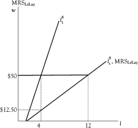
Figure 8.3 Decrease in labor supply I
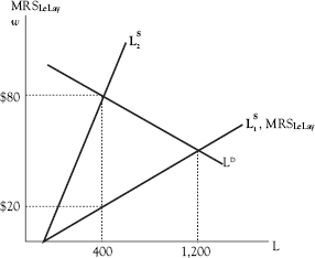
Figure 8.4 Decrease in labor supply L
Mulligan determines that the self-reliance rate was 59.6% before the recession began but then fell to 51.6% by the end of the recession in mid-2009. This was a change of
![]()
Mulligan finds that this decrease in the self-reliance rate caused hours worked in the fourth quarter of 2009 to be 10.5% less than they would have been without the safety-net expansion.
Using Mulligan’s data, we can estimate the effect of the safety-net expansion on total hours worked. Table 8.1 reports (1) actual hours worked by private-sector workers in the fourth quarter of 2007 (according to the author’s estimate), (2) an estimate of what hours worked would have been in the fourth quarter of 2009 had there been no expansion in the safety net, (3) actual hours worked in the fourth quarter of 2009, and (4) an estimate of what hours worked in the fourth quarter of 2009 would have been under Mulligan’s assumptions about the sensitivity of hours worked to the calculated change in the self-reliance rate.
According to these data, workers put in 5.756 billion fewer hours of work in the fourth quarter of 2009, because of the safety-net expansion, than they would have put in, had there been no safety-net expansion. If we use the 2007 fourth quarter data on average weekly hours for private sector workers, this translates to an equivalent of 1.3 million workers who stayed out of the labor force in the fourth quarter of 2009 because of the safety-net expansion.1
Had the safety-net legislation not been adopted, the labor force participation rate (LFPR) would, according to these findings, have been 65.3% in the fourth quarter of 2009, higher than the actual LFPR, which was 64.8%. The LFPR was 62.9% in June 2018.2
Table 8.1 Changes in hours worked under safety net expansion
Quarter |
Total hours worked (billions) |
Change from 2007. Q4 hours (billions) |
Change from 2007.Q4 hours (%) |
2007.Q4 actual hours |
52.145 |
- |
- |
2009.Q4 estimated (no safety-net expansion) hours |
54.492 |
2.347 |
4.5 |
2009.Q4 actual hours |
47.817 |
−4.328 |
−8.3 |
2009.Q4 estimated (safety-net expansion) |
48.756 |
−3.389 |
−6.5 |
Mulligan puts the shrinkage in output from the fourth quarter of 2007 to fourth quarter of 2009 at 3.9% and the shrinkage in work hours at 8.3%. His model shows a predicted 2.7% shrinkage in output and a 6.5% shrinkage in employment (Mulligan 2012, p. 103). He attributes the difference to factors not explained by his model.
Government Consumption
The relevant question when it comes to government consumption is whether individuals see that consumption as providing a substitute for consumption in the private sector. As discussed in Chapter 7, a tax imposed to fund, say, government-provided health care provides benefits that reduce the need to spend on privately provided health care. If (and I don’t recommend this) the government, for example, imposed a tax to raise revenue that would be used to provide free access to the clinics like the CVS Minute Clinic near my house, then I would no longer have to pay to go to the private CVS clinic. This would largely offset the negative income effect of the higher tax and reduce my incentive to sacrifice leisure and to work more. Government spending on defense would not have this effect since that spending would not represent a direct cost saving similar to the cost saving on buying the services of the clinic.
Infrastructure Spending
Infrastructure spending (or, more generally, government capital spending) differs from other forms of government spending insofar as it affects the productivity of private capital. Government provision of a Minute Clinic is best considered to be government consumption, because like private consumption, it directly creates utility for individual consumers. Infrastructure spending, on the other hand, is best seen as increasing total factor productivity. Highway improvements increase Z in the Cobb-Douglas production function by increasing the productivity of trucks, which are part of the private capital stock, and of the workers who drive the trucks. Such improvements are akin to technical advances, such as improvements in the gas mileage of trucks, for their effects on the economy.
The dividing line between government consumption and government capital spending is, to be sure, arbitrary. Individual consumers benefit from highway improvements, too, in that such improvements shorten the time needed to get to a vacation destination and to work. But it makes sense to see government payment of wages for a nurse working at a Minute Clinic as consumption but government highway spending as investment.
There is a large body of work on the subject of measuring the productivity improvements from infrastructure spending. A trade report summarizes this literature and offers a range of estimates based on 68 studies. In this report, the authors conclude that a 1% rise in the public sector capital stock will lead to a 0.03% rise in productivity (Holtz-Eakin and Mandel 2015, p. 13). According to the BEA, general government fixed assets were worth $10,565 billion in 2016. GDP in 2016 equaled $18,625 billion. An expenditure of $100 billion on infrastructure would, by these numbers, add $5.3 billion to GDP.
Chapter 2 of Volume II ties government spending into government tax policy for a broader consideration of how the two combine to determine government fiscal policy.
1 According to the U.S. Bureau of Labor Statistics, average weekly hours for private sector workers was 34.4 in the fourth quarter of 2007.
2 Figure 5.11 in Volume II, Chapter 5 shows that the LFPR began what appears to be a long-term decline in the early 2000s. The start of the decline coincided with the recession of 2001 and has picked up speed since 2011 with the onset baby boomer retirements. Importantly, Mulligan adjusted for the aging of the population in making his estimates for 2007–2009.