
In Visual Basic, the form is the container for all the controls that make up the user interface. When a Visual Basic application is executing, each window it displays on the Desktop is a form. The terms form and window describe the same entity. A window is what the user sees on the Desktop when the application is running. A form is the same entity at design time. The proper term is Windows form, as opposed to web form, but I will refer to them as forms. This term includes both typical Windows forms and dialog boxes, which are simple forms you use for very specific actions, such as to prompt the user for a particular piece of data or to display critical information. A dialog box is a form with a small number of controls, no menus, and usually an OK and a Cancel button to close it.
Forms have a built-in functionality that is always available without any programming effort on your part. You can move a form around, resize it, and even cover it with other forms. You do so with the mouse or with the keyboard through the Control menu.
In previous chapters, you concentrated on placing the elements of the user interface on forms, setting their properties, and adding code behind selected events. Now you'll look at forms themselves and at a few related topics. In this chapter, you'll learn how to do the following:
Use form properties
Design applications with multiple forms
Design dynamic forms
Design menus
Forms have many trivial properties that won't be discussed here. Instead, let's jump directly to the properties that are unique to forms and then look at how to manipulate forms from within an application's code.
Applications are made up of one or more forms—usually more than one. You should craft your forms carefully, make them functional, and keep them simple and intuitive. You already know how to place controls on the form, but there's more to designing forms than populating them with controls. The main characteristic of a form is the title bar on which the form's caption is displayed (see Figure 6.1).
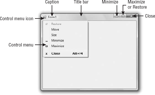
Clicking the Control menu icon opens the Control menu, which contains the commands listed in Table 6.1. On the right end of the title bar are three buttons: Minimize, Maximize, and Close. Clicking these buttons performs the associated function. When a form is maximized, the Maximize button is replaced by the Restore button. When clicked, the Restore button resets the form to its size and position before it was maximized, and it's replaced by the Maximize button. To access the Control menu from the keyboard, press Alt and then the down arrow key.
Table 6.1. Commands of the Control menu
Command | Effect |
|---|---|
Restore | Restores a maximized form to the size it was before it was maximized; available only if the form has been maximized. |
Move | Lets the user move the form around with the arrow keys. |
Size | Lets the user resize the form with the arrow keys. |
Minimize | Minimizes the form. |
Maximize | Maximizes the form. |
Close | Closes the current form. (Closing the application's main form terminates the application.) |
You're familiar with the appearance of forms, even if you haven't programmed in the Windows environment in the past; you have seen nearly all types of windows in the applications you're using every day. The floating toolbars used by many graphics applications, for example, are actually forms with a narrow title bar. The dialog boxes that prompt for critical information or prompt you to select the file to be opened are also forms. You can duplicate the look of any window or dialog box through the following properties of the Form object.
These two properties let you specify the default Accept and Cancel buttons. The Accept button is the one that's automatically activated when you press Enter, no matter which control has the focus at the time; it is usually the button with the OK caption. Likewise, the Cancel button is the one that's automatically activated when you hit the Esc key; it is usually the button with the Cancel caption. To specify the Accept and Cancel buttons on a form, locate the AcceptButton and CancelButton properties of the form and select the corresponding controls from a drop-down list, which contains the names of all the buttons on the form. For more information on these two properties, see the section "Forms versus Dialog Boxes," later in this chapter.
This property determines how the control is scaled, and its value is a member of the AutoScaleMode enumeration: None (automatic scaling is disabled); Font (the controls on the form are scaled relative to the size of the font); Dpi, which stands for dots per inch (the controls on the form are scaled relative to the display resolution); and Inherit (the controls are scaled according to the AutoScaleMode property of their parent class). The default value is Font; if you change the form's font size, the controls on it are scaled to the new font size. As a result, the entire form is resized.
The AutoScroll property is a True/False value that indicates whether scroll bars (as shown in Figure 6.2) will be automatically attached to the form if the form is resized to a point that not all its controls are visible. Use this property to design large forms without having to worry about the resolution of the monitor on which they'll be displayed. Scrolling forms are not very common, but they're easy to implement. The AutoScroll property is used in conjunction with two other properties (described a little later in this section): AutoScrollMargin and AutoScrollMinSize. Note that the AutoScroll property applies to a few controls as well, including the Panel and SplitContainer controls. For example, you can create a form with a fixed and a scrolling pane by placing two Panel controls on it and setting the AutoScroll property of one of them (the Panel control you want to scroll) to True.
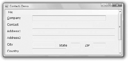
Figure 6.2. If the controls don't fit in a form's visible area, scroll bars can be attached automatically.
The AutoScroll property is rarely used with data-entry forms, but it's used routinely to display large images. You'll see how to create a scrolling form for displaying large images later in this chapter in the section on anchoring and docking controls.
This property is available from within your code only (you can't set this property at design time but it can be set at runtime from within your code), and it indicates the number of pixels that the form was scrolled up or down. Its initial value is zero, and it takes on a value when the user scrolls the form (provided that the AutoScroll property is True). Use this property to find out the visible controls from within your code or to scroll the form from within your application's code to bring a specific control into view.
This is a margin, expressed in pixels, that's added around all the controls on the form. If the form is smaller than the rectangle that encloses all the controls adjusted by the margin, the appropriate scroll bar(s) will be displayed automatically.
This property lets you specify the minimum size of the form before the scroll bars are attached. If your form contains graphics that you want to be visible at all times, set the Width and Height members of the AutoScrollMinSize property to the dimensions of the graphics. (Of course, the graphics won't be visible at all times, but the scroll bars indicate that there's more to the form than can fit in the current window.) Notice that this isn't the form's minimum size; users can make the form even smaller. To specify a minimum size for the form, use the MinimumSize property, described later in this section.
Let's say the AutoScrollMargin property of the form is 180×150. If the form is resized to fewer than 180 pixels horizontally or 150 pixels vertically, the appropriate scroll bars will appear automatically as long as the AutoScroll property is True. If you want to enable the AutoScroll feature when the form's width is reduced to anything fewer than 250 pixels, set the AutoScrollMinSize property to (250, 0). In this example, setting AutoScrollMinSize.Width to anything less than 180, or AutoScrollMinSize.Height to anything less than 150, will have no effect on the appearance of the form and its scroll bars.
The FormBorderStyle property determines the style of the form's border; its value is one of the FormBorderStyle enumeration members, which are shown in Table 6.2. You can make the form's title bar disappear altogether by setting the form's FormBorderStyle property to FixedToolWindow, the ControlBox property to False, and the Text property (the form's caption) to an empty string. However, a form like this can't be moved around with the mouse and will probably frustrate users.
Table 6.2. The FormBorderStyle enumeration
Value | Effect |
|---|---|
| A window with a fixed visible border "raised" relative to the main area. Unlike the None setting, this setting allows users to minimize and close the window. |
| A fixed window used to implement dialog boxes. |
| A fixed window with a single-line border. |
| A fixed window with a Close button only. It looks like a toolbar displayed by drawing and imaging applications. |
| A borderless window that can't be resized. This setting is rarely used. |
| (default) A resizable window that's used for displaying regular forms. |
| Same as the |
Create a simple form and try out the various settings of the FormBorderStyle property to find out how this property affects the appearance of the form.
This property is also True by default. Set it to False to hide the control box icon and disable the Control menu. Although the Control menu is rarely used, Windows applications don't disable it. When the ControlBox property is False, the three buttons on the title bar are also disabled. If you set the Text property to an empty string, the title bar disappears altogether.
These two properties, which specify whether the Minimize and Maximize buttons will appear on the form's title bar, are True by default. Set them to False to hide the corresponding buttons on a form's title bar.
These two properties read or set the minimum and maximum size of a form. When users resize the form at runtime, the form won't become any smaller than the dimensions specified by the MinimumSize property or any larger than the dimensions specified by the MaximumSize property. The MinimumSize property is a Size object, and you can set it with a statement like the following:
Me.MinimumSize = New Size(400, 300)
Or you can set the width and height separately:
Me.MinimumSize.Width = 400
Me.MinimumSize.Height = 300
The MinimumSize.Height property includes the height of the form's title bar; you should take that into consideration. If the minimum usable size of the form is 400×300, use the following statement to set the MinimumSize property:
Me.MinimumSize = New Size(400, 300 + SystemInformation.CaptionHeight)
The default value of both properties is (0, 0), which means that no minimum or maximum size is imposed on the form and the user can resize it as desired.
This property enables the form to capture all keystrokes before they're passed to the control that has the focus. Normally, when you press a key, the KeyPress event of the control with the focus is triggered (as well as the KeyUp and KeyDown events), and you can handle the keystroke from within the control's appropriate handler. In most cases, you let the control handle the keystroke and don't write any form code for that.
Some forms perform certain actions when you hit a specific key (the F5 key for refreshing the form being a very common example), no matter which control on the form has the focus. If you want to use these keystrokes in your application, you must set the KeyPreview property to True. Doing so enables the form to intercept all keystrokes, so you can process them from within the form's keystroke event handlers. To handle a specific keystroke at the form's level, set the form's KeyPreview property to True and insert the appropriate code in the form's KeyDown or KeyUp event handler (the KeyPress event isn't fired for the function and other non-character keys).
The same keystrokes are then passed to the control with the focus, unless you kill the keystroke by setting its SuppressKeystroke property to True when you process it on the form's level. For more information on processing keystrokes at the form level and using special keystrokes throughout your application, see the Contacts project later in this chapter as well as the TextPad project discussed in Chapter 5, "The Basic Window Controls."
This property gets or sets the style of the sizing handle to display in the lower-right corner of the form. You can set it to a member of the SizeGripStyle enumeration: Auto (the size grip is displayed as needed), Show (the size grip is displayed at all times), or Hide (the size grip is not displayed, but users can still resize the form with the mouse).
The StartPosition property, which determines the initial position of the form when it's first displayed, can be set to one of the members of the FormStartPosition enumeration: CenterParent (the form is centered in the area of its parent form), CenterScreen (the form is centered on the monitor), Manual (the position of the form is determined by the Location property), WindowsDefaultLocation (the form is positioned at the Windows default location), and WindowsDefaultBounds (the form's location and bounds are determined by Windows defaults). The Location property allows you to set the form's initial position at design time or to change the form's location at runtime.
This property is a True/False setting that lets you specify whether the form will remain on top of all other forms in your application. Its default value is False, and you should change it only on rare occasions. Some dialog boxes, such as the Find & Replace dialog box of any text-processing application, are always visible, even when they don't have the focus. For more information on using the TopMost property, see the discussion of the TextPad project in Chapter 5. You can also add a professional touch to your application by providing a CheckBox control that determines whether a form should remain on top of all other forms of the application.
Use the Size property to set the form size at design time or at runtime. Normally, the form width and height are controlled by the user at runtime. This property is usually set from within the form Resize event handler to maintain a reasonable aspect ratio when the user resizes the form. The Form object also exposes the Width and Height properties for controlling its size.
The first step in designing your application interface is, of course, the analysis and careful planning of the basic operations you want to provide through your interface. The second step is to design the forms. Designing a form means placing Windows controls on it and setting the control properties (and finally, of course, writing code to handle the events of interest). Visual Studio is a rapid application development (RAD) environment. This doesn't mean that you're expected to develop applications rapidly. It has come to mean that you can rapidly prototype an application and show something to the customer. And this is made possible through the visual tools that come with Visual Studio, especially the new Form Designer.
To place controls on your form, you select them in the Toolbox and then draw, on the form, the rectangle in which the control will be enclosed. Or you can double-click the control's icon to place an instance of the control on the form. Or you can just drag the desired control from the Toolbox and drop it on the form. All controls have a default size, and you can resize the control on the form by using the mouse.
Each control's dimensions can also be set in the Properties window through the Size property. The Size property is a composite property that exposes the Width and Height fields, which are expressed in pixels. Likewise, the Location property returns (or sets) the coordinates of the top-left corner of the control. In "Building Dynamic Forms at Runtime" later in this chapter, you'll see how to create new controls at runtime and place them in a specific location on a form from within your code.
As you place controls on the form, you can align them in groups with the relevant commands from the Format menu. Select multiple controls on the form by using the mouse and the Shift (or Ctrl) key, and then align their edges or center them vertically and horizontally with the appropriate command from the Format menu. To align the left edges of a column of TextBoxes, choose the Format
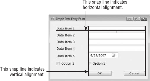
As you move controls around with the mouse, a blue snap line appears when the controls become aligned with another control. Release the mouse while the snap line is visible to leave the control aligned with the one indicated by the snap lines. The blue snap lines indicate edge alignment. Most of the time, you need to align not the edges of two controls but their baselines (the baseline of the text on the control). The snap lines that indicate baseline alignment are red. Figure 6.3 shows both types of snap lines. When you're aligning a Label control with its matching TextBox control on a form, you want to align their baselines, not their frames (especially if you consider that the Label controls are always displayed without borders). If the control is aligned with other controls in both directions, two snap lines will appear—a horizontal one and a vertical one.
One of the most important (and most overlooked) aspects of designing forms is the alignment of the controls on the form. Whether the form contains a lot of controls or just a few, the application is more professional looking and easier for the end user to interact with when the programmer spends the time to align the controls one to another and group them functionally. Try to group controls together based on their functionality. Try to present an uncluttered interface to the end user. Once you have aligned the controls on the form as discussed in this section, you can select them all and lock them in place by setting their Locked property to True. When the Locked property is True, the designer won't allow you to move them around by mistake.
Another important issue in form design is the tab order of the controls on the form. As you know, by default, pressing the Tab key at runtime takes you to the next control on a form. The tab order of the controls is the order in which they were placed on the form, but this is hardly ever what we want. When you design the application, you can specify the order in which the controls receive the focus (the tab order, as it is known) with the help of the TabIndex property. Each control has its own TabIndex setting, which is an integer value. When the Tab key is pressed, the focus is moved to the control whose tab order immediately follows the tab order of the current control (the one with the next larger TabIndex property value).
To specify the tab order of the various controls, you can set their TabIndex property in the Properties window or you can choose the Tab Order command from the View menu. The tab order of each control will be displayed on the corresponding control, as shown in Figure 6.4. (The form shown in the figure is the Contacts application, which is discussed shortly.)
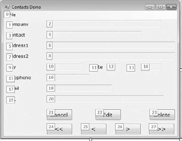
To set the tab order of the controls, click each control in the order in which you want them to receive the focus. You must click all of them in the desired order, starting with the first control in the tab order. Each control's index in the tab order appears in the upper-left corner of the control. When you're finished, choose the Tab Order command from the View menu again to hide the numbers. Note that Label controls never receive the focus, but they have their own TabIndex value. When the next control to receive the focus is a Label control, the focus is moved automatically to the next control in the tab order until a control that can actually receive the focus is reached.
Designing functional forms is a crucial step in the process of developing Windows applications. Most data-entry operators don't work with the mouse, and you must make sure that all the actions (such as switching to another control, opening a menu, clicking a button, and so on) can be performed with the keyboard. This requirement doesn't apply to graphics applications, of course, but most applications developed with VB are business applications, and users should be able to perform most of the tasks with the keyboard, not with the mouse.
In my experience, the most important aspect of the user interface of a business application is the handling of the Enter keystroke. When a TextBox control has the focus, the Enter keystroke should advance the focus to the next control in the tab order; when a list control (such as the ListBox or ListView control) has the focus, the Enter keystroke should invoke the same action as double-clicking the current item. The idea is to package as much intelligence into the Enter keystroke as possible. The sample project in the following section demonstrates many of the features you'd expect from a data-entry application.
If you're developing a data-entry form, you must take into consideration the needs of the users. Make a prototype and ask the people who will use the application to test-drive it. Listen to their objections carefully, collect all the information, and then use it to refine your application's user interface. Don't defend your design—just learn from the users. They will uncover all the flaws of the application and they'll help you design the most functional interface. In addition, they will accept the finished application with fewer objections and complaints if they know what to expect.
I want to conclude with a simple data-entry application that demonstrates many of the topics discussed here as well as a few techniques for designing easy-to-use forms. Figure 6.5 shows a data-entry form for maintaining contact information, and I'm sure you will add your own fields to make this application more useful.
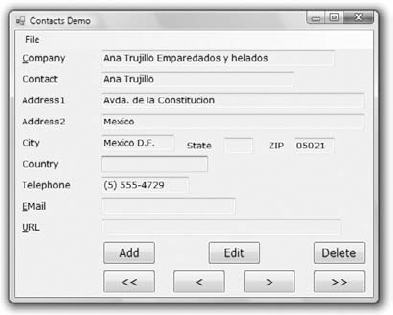
You can navigate through the contacts by clicking the arrow keys on the keyboard as well as add new contacts or delete existing ones by clicking the appropriate buttons. When you're entering a new contact, the buttons shown in Figure 6.5 are replaced by the usual OK and Cancel buttons. The action of adding a new contact, or editing an existing one, must end by clicking one of these two buttons. After a new contact is committed or the action is canceled, the usual navigation buttons appear again.
Now, it's your turn to design the Contacts project. Create a new VB project and place the controls you see in Figure 6.5 on the application's form, align them appropriately, and lock them in position. Or, if you prefer, open the Contacts sample project available for download from www.sybex.com/go/masteringvb2010. After the controls are on the form, the next step is to set their tab order. You must specify a value for the TabIndex property even for controls that never receive focus, such as the Label controls. In addition to setting the tab order of the controls, use shortcut keys to give the user quick access to the most common fields. The shortcut keys are displayed as underlined characters on the corresponding labels. Notice that the Label controls have shortcut keys, even though they don't receive the focus. When you press the shortcut key of a Label control, the focus is moved to the following control in the tab order, which (on this form) is the TextBox control next to it.
If you open the application and run it now, you'll see that the focus moves from one TextBox to the next with the Tab key and that the labels are skipped. After the last TextBox control, the focus is moved to the buttons and then back to the first TextBox control. To add a shortcut key for the most common fields, determine which fields will have shortcut keys and then which keys will be used for that purpose. Being the Internet buffs that we all are, let's assign shortcut keys to the Company, EMail, and URL fields. Locate each label's Text property in the Properties window and insert the & symbol in front of the character you want to act as a shortcut for each Label. The Text property of the three controls should be &Company, &EMail, and &URL.
Shortcut keys are activated at runtime by pressing the shortcut character while holding down the Alt key. The shortcut key will move the focus to the corresponding Label control, but because labels can't receive the focus, the focus is moved immediately to the next control in the tab order, which is the adjacent TextBox control.
The contacts are stored in an ArrayList object, which is similar to an array but a little more convenient. We'll discuss ArrayLists in Chapter 12, "Storing Data in Collections." For now, you can ignore the parts of the application that manipulate the contacts and focus on the design issues.
Start by loading the sample data included with the application that you downloaded from www.sybex.com/go/masteringvb2010. Open the File menu and choose Load. You won't be prompted for a filename; the application always opens the same file in its root folder (it's the CONTACTS.BIN file). After reading about the OpenFileDialog and SaveFileDialog controls, you can modify the code so that it prompts the user to choose the file to read from or write to. Then enter a new contact by clicking the Add button or edit an existing contact by clicking the Edit button. Both actions must end with the OK or Cancel button. In other words, users must explicitly end the operation and cannot switch to another contact while adding or editing a contact without committing or discarding the changes.
The code behind the various buttons is straightforward. The Add button hides all the navigational buttons at the bottom of the form and clears the TextBoxes in anticipation of a new contact record. The OK button saves the new contact to an ArrayList structure and redisplays the navigational buttons. The Cancel button ignores the data entered by the user and likewise displays the navigational buttons. In all cases, when the user switches back to the view mode, the code locks all the TextBoxes by setting their ReadOnly property to True.
Although the Tab key is the Windows method of moving to the next control on the form, most users will find it more convenient to use the Enter key for that purpose. The Enter key is the most important one on the keyboard, and applications should handle it intelligently. When the user presses Enter in a single-line TextBox, for example, the obvious action is to move the focus to the following control. I included a few statements in the KeyDown event handlers of the TextBox controls to move the focus to the following one:
Private Sub txtAddress1_KeyDown(...) Handles txtAddress1.KeyDown
    If e.KeyData = Keys.Enter Then
        e.SuppressKeyPress = True
        txtAddress2.Focus()
    End If
End Sub
If you use the KeyUp event handler instead, the result won't be any different, but an annoying beeping sound will be emitted with each keystroke. The beep occurs when the button is depressed, so you must intercept the Enter key as soon as it happens and not after the control receives the notification for the KeyDown event. The control will still catch the KeyUp event and it will beep because it's a single-line TextBox control (the beep is an audible warning that the specific key shouldn't be used in a single-line TextBox control). To avoid the beep sound, the code "kills" the keystroke by setting the SuppressKeystroke property to True.
The code shown in the preceding KeyDown event handler will work, but you must repeat it for every TextBox control on the form. A more convenient approach is to capture the Enter keystroke in the form's KeyDown event handler and process it for all TextBox controls. First, you must figure out whether the control with the focus is a TextBox control. The property Me.ActiveControl returns a reference to the control with the focus. To find out the type of the active control and compare it to the TextBox control's type, use the following If statement:
If Me.ActiveControl.GetType Is GetType(TextBox) Then
' process the Enter key
End If
Once you can figure out the active control's type, you need a method of simulating the Tab keystroke from within your code so you don't have to code every TextBox control's KeyDown event. An interesting method of the Form object is the ProcessTabKey method, which imitates the Tab keystroke. Calling the ProcessTabKey method is equivalent to pressing the Tab key from within your code. The method accepts a True/False value as an argument, which indicates whether it will move the focus to the next control in the tab order (if True) or to the previous control in the tab order.
Start by setting the form's KeyPreview property to True and then insert the following statements in the form's KeyDown event handler:
If e.KeyCode = Keys.Enter Then
    If Me.ActiveControl.GetType Is GetType(TextBox) Then
e.SuppressKeyPress = True
If e.Shift Then
Me.ProcessTabKey(False)
Else
Me.ProcessTabKey(True)
End If
End If
End IfThe last topic demonstrated in this example is how to capture certain keystrokes regardless of the control that has the focus. We'll use the F10 keystroke to display the total number of contacts entered so far. Assuming that you have already set the form's KeyPreview property to True, enter the following code in the form's KeyDown event:
If e.Keycode = keys.F10 Then
   MsgBox("There are " & MyContacts.Count.ToString & " contacts in the database")
   e.Handled = True
End If
Listing 6.1 shows the complete handler for the form's KeyDown event, which also allows you to move to the next or previous contact by using the Alt+Plus or Alt+Minus keys, respectively.
Example 6.1. Handling keystrokes in the form's KeyDown event handler
Public Sub Form1_KeyDown(ByVal sender As Object,
            ByVal e As System.WinForms.KeyEventArgs)
                        Handles Form1.KeyUp
   If e.Keycode = Keys.F10 Then
      MsgBox("There are " & MyContacts.Count.ToString &
             " contacts in the database")
      e.Handled = True
   End If
   If e.KeyCode = Keys.Subtract And e.Modifiers = Keys.Alt Then
      bttnPrevious.PerformClick
   End If
   If e.KeyCode = Keys.Add And e.Modifiers = Keys.Alt Then
      bttnNext.PerformClick
   End If
   If e.KeyCode = Keys.Enter Then
       If Me.ActiveControl.GetType Is GetType(TextBox) Then
           e.SuppressKeyPress = True
           If e.Shift Then
               Me.ProcessTabKey(False)
           Else
               Me.ProcessTabKey(True)
End If
End If
End If
End SubA common issue in form design is the design of forms that can be properly resized. For instance, you might design a nice form for a given size, but when it's resized at runtime, the controls are all clustered in the upper-left corner. Or a TextBox control that covers the entire width of the form at design time suddenly "cringes" on the left when the user drags out the window. If the user makes the form smaller than the default size, part of the TextBox could be invisible because it's outside the form. You can attach scroll bars to the form, but that doesn't really help — who wants to type text and have to scroll the form horizontally? It makes sense to scroll vertically because you get to see many lines at once, but if the TextBox control is wider than the form, you can't read entire lines.
Visual Studio provides several techniques for designing forms that scale nicely. The two most important of them are the Anchor and Dock properties.
The Anchor property lets you attach one or more edges of the control to corresponding edges of the form. The anchored edges of the control maintain the same distance from the corresponding edges of the form.
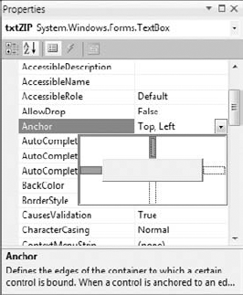
Place a TextBox control on a new form, set its MultiLine property to True, and then open the control's Anchor property in the Properties window. You will see a rectangle within a larger rectangle and four pegs that connect the small control to the sides of the larger box (see Figure 6.6). The large box is the form, and the small one is the control. The four pegs are the anchors, which can be either white or gray. The gray anchors denote a fixed distance between the control and the edge of the form. By default, the control is placed at a fixed distance from the upper-left corner of the form. When the form is resized, the control retains its size and its distance from the upper-left corner of the form.
Let's say you're designing a simple form with a TextBox control that must fill the width of the form, be anchored to the top of the form, and leave some space for a few buttons at the bottom. You also want your form to maintain this arrangement regardless of its size. Make the TextBox control as wide as the form (allowing, perhaps, a margin of a few pixels on either side). Then place a couple of buttons at the bottom of the form and make the TextBox control tall enough that it stops above the buttons. This is the form of the Anchor sample project.
Now open the TextBox control's Anchor property and make all four anchors gray by clicking them. This action tells the Form Designer to resize the control accordingly, so that the distances between the sides of the control and the corresponding sides of the form remain the same as those you set at design time. Select each button on the form and set their Anchor properties in the Properties window: Anchor the left button to the left and bottom of the form and the right button to the right and bottom of the form.
Resize the form at design time without running the project and you'll see that all the controls are resized and rearranged on the form at all times. Figure 6.7 shows the Anchor project's main form in two different sizes.
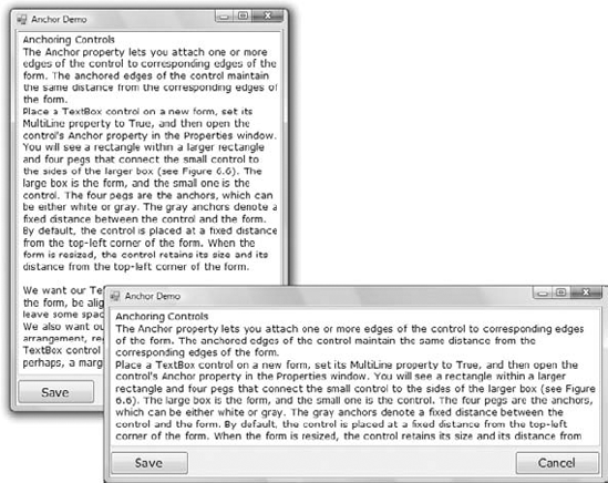
Figure 6.7. Use the Anchor property of the various controls to design forms that can be resized gracefully at runtime.
Yet, there's a small problem: If you make the form very narrow, there will be no room for both buttons across the form's width. The simplest way to fix this problem is to impose a minimum size for the form. To do so, you must first decide the form's minimum width and height and then set the MinimumSize property to these values. You can also use the AutoScroll properties, but it's not recommended that you add scroll bars to a small form like ours. Use the AutoScroll properties for large forms with many controls that can't be resized with the form.
In addition to the Anchor property, most controls provide a Dock property, which determines how a control will dock on the form. The default value of this property is None.
Create a new form, place a multiline TextBox control on it, and then open the Dock property for the control. The various rectangular shapes are the settings of the property. If you click the middle rectangle, the control will be docked over the entire form: It will expand and shrink both horizontally and vertically to cover the entire form. This setting is appropriate for simple forms that contain a single control, usually a TextBox, and sometimes a menu. Try it out.
Let's create a more complicated form with two controls (see the Docking sample project at www.sybex.com/go/masteringvb2010). The form shown in Figure 6.8 contains a TreeView control on the left and a ListView control on the right. The two controls display folder and file data on an interface that's very similar to that of Windows Explorer. The TreeView control displays the directory structure, and the ListView control displays the selected folder's files.
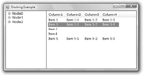
Place a TreeView control on the left side of the form and a ListView control on the right side of the form. Then dock the TreeView to the left and the ListView to the right. If you run the application now, as you resize the form, the two controls remain docked to the two sides of the form—but their sizes don't change. If you make the form wider, there will be a gap between the two controls. If you make the form narrower, one of the controls will overlap the other.
End the application, return to the Form Designer, select the ListView control, and set its Dock property to Fill. This time, the ListView will change size to take up all the space to the right of the TreeView. The ListView control will attempt to fill the form, but it won't take up the space of another control that has been docked already. The TreeView and ListView controls are discussed in the tutorial "The TreeView and ListView Controls," which you can download from www.sybex.com/go/masteringvb2010. That's why I've populated them with some fake data at design time. In the tutorial, you'll learn how to populate these two controls at runtime with folder names and filenames, respectively, and build a custom Windows Explorer.
An interesting technique I should mention here is how to create a scrolling form for displaying large images. The basic requirement is that the image can't take up the entire form; you need some space for a menu, a few buttons, or other controls to interact with the form. The image must be displayed on a PictureBox control with its SizeMode property set to AutoSize. This setting causes the PictureBox to adjust to the size of the image it contains. Place the various controls you need for your interface on the form, as shown here, and then place a Panel on the form. Anchor the Panel to all four edges of the form so that it's resized along with the form. Then set its AutoScroll property to True. Finally, place a PictureBox control on the Panel and align its upper-left corner with the upper-left corner of the Panel control. Do not anchor or dock this control, because its size will be determined by the size of the image it contains, not by its container's size. Now assign a large image to the PictureBox control (you can use any of the images in the Sample Pictures folder).
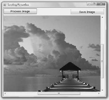
If you run the application now, you will see as much of the upper-left corner of the image as can fit on the Panel control. You can resize the form to see more of the image or scroll it around with the two scroll bars to bring any segment of the image into view. This technique allows you to display an image of any size on a form of any (usually smaller) size.
So far, the form for the Docking sample project you've designed behaves better than the initial design, but it's not what you really expect from a Windows application. The problem with the form in Figure 6.8 is that users can't change the relative widths of the controls. In other words, they can't make one of the controls narrower to make room for the other, which is a fairly common concept in the Windows interface.
The narrow bar that allows users to control the relative sizes of two controls is a splitter. When the cursor hovers over a splitter, it changes to a double arrow to indicate that the bar can be moved. By moving the splitter, you can enlarge one of the two controls while shrinking the other. The Form Designer provides a special control for creating resizable panes on a form: the SplitContainer control. We'll design a new form with two TextBoxes and a splitter between them so that users can change the relative size of the two controls.
Start by placing a SplitContainer control on the form. The SplitContainer consists of two Panel controls, the Panel1 and Panel2 controls, and a vertical splitter between them. This is the default configuration; you can change the orientation of the splitter by using the control's Orientation property. Also by default, the two panels of the Splitter control are resized proportionally as you resize the form. If you want to keep one of the panels fixed and have the other one take up the remaining space of the form, set the control's FixedPanel property to the name of the panel you want to retain its size.
Next, place a TextBox control in the left panel of the SplitContainer control and set its Multiline property to True. You don't need to do anything about its size because we'll dock it in the panel to which it belongs. With the TextBox control selected, locate its Dock property and set it to Fill. The TextBox control will fill the left panel of the SplitContainer control. Do the same with another TextBox control, which will fill the right panel of the SplitContainer control. Set this control's Multiline property to True and its Dock property to Fill.
Now run the project and check out the functionality of the SplitContainer. Paste some text on the two controls and then change their relative sizes by sliding the splitter between them, as shown in Figure 6.9. You will find this project, called Splitter1, at www.sybex.com/go/masteringvb2010 among the sample projects for this chapter.
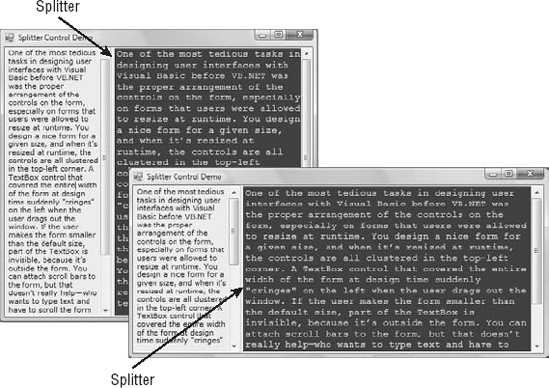
Figure 6.9. The SplitContainer control lets you change the relative size of the controls on either side.
Let's design a more elaborate form with two SplitContainer controls, such as the one shown in Figure 6.10. (It's the form in the Splitter2 sample project.) This form, which resembles the interface of Microsoft Office Outlook, consists of a TreeView control on the left (where the folders are displayed), a ListView control (where the selected folder's items are displayed), and a TextBox control (where the selected item's details are displayed). Because we haven't discussed the ListView and TreeView controls yet, I'm using three TextBox controls with different background colors; the process of designing the form is identical regardless of the controls you put on it.
Start by placing a SplitContainer control on the form. Then place a multiline TextBox control on the left panel of the SplitContainer control and set the TextBox control's Dock property to Fill. The TextBox control will fill the left panel of the SplitContainer control. Place another SplitContainer in the right panel of the first SplitContainer control. This control will be automatically docked in its panel and will fill it. Its orientation, however, is vertical, and the splitter will separate the panel into two smaller vertical panes. Select the second SplitContainer control, locate its Orientation property in the Properties window, and set it to Horizontal.
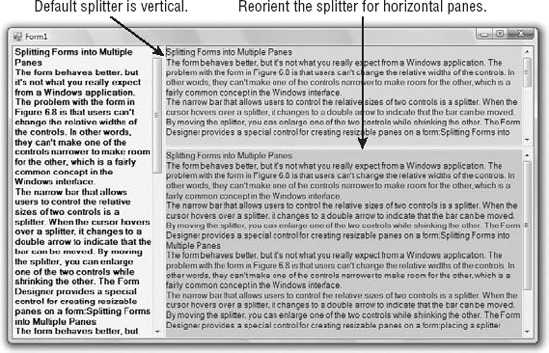
Now you can fill each of the panels with a TextBox control. Set each TextBox control's BackgroundColor to a different color, its MultiLine property to True, and its Dock property to Fill. The TextBox controls will fill their containers, which are the panels of the two SplitContainer controls, not the form. If you look up the properties of a SplitContainer control, you'll see that it's made up of two Panel controls, which are exposed as properties of the SplitContainer control, the Panel1 and Panel2 controls. You can set many of the properties of these two constituent controls, such as their font and color, their minimum size, and so on. They even expose an AutoScroll property so that users can scroll the contents of each one independently of the other. You can also set other properties of the SplitContainer control, such as the SplitterWidth property, which is the width of the splitter bar between the two panels in pixels, and the SplitterIncrement property, which is the smallest number of pixels that the splitter bar can be moved in either direction.
So far, you've seen what the Form Designer and the Form object can do for your application. Let's switch our focus to programming forms and explore the events triggered by the Form object.
The Form object triggers several events. The most important are Activated, Deactivate, FormClosing, Resize, and Paint.
When more than one form is displayed, the user can switch from one to the other by using the mouse or by pressing Alt+Tab. Each time a form is activated, the Activated event takes place. Likewise, when a form is activated, the previously active form receives the Deactivate event. Insert the code you want to execute when a form is activated (set certain control properties, for example) and when a form loses the focus or is deactivated in these two event handlers. These two events are the equivalents of the Enter and Leave events of the various controls. Notice that there's an inconsistency in the names of the two events: the Activated event takes place after the form has been activated, whereas the Deactivate event takes place right before the form is deactivated.
The FormClosing event is fired when the user closes the form by clicking its Close button. If the application must terminate because Windows is shutting down, the same event will be fired. Users don't always quit applications in an orderly manner, and a professional application should behave gracefully under all circumstances. The same code you execute in the application Exit command must also be executed from within the FormClosing event. For example, you might display a warning if the user has unsaved data, you might have to update a database, and so on. Place the code that performs these tasks in a subroutine and call it from within your menu's Exit command as well as from within the FormClosing event's handler.
You can cancel the closing of a form by setting the e.Cancel property to True. The event handler in Listing 6.2 displays a message box informing the user that the data hasn't been saved and gives them a chance to cancel the action and return to the application.
Example 6.2. Canceling the closing of a form
Public Sub Form1_FormClosing (...) Handles Me.FormClosing
    Dim reply As MsgBoxResult
    reply = MsgBox("Document has been edited. " &
             "OK to terminate application, Cancel to " &
             "return to your document.", MsgBoxStyle.OKCancel)
    If reply = MsgBoxResult.Cancel Then
       e.Cancel = True
    End If
End Sub
The e argument of the FormClosing event provides the CloseReason property, which reports how the form is closing. Its value is one of the following members of the CloseReason enumeration: FormOwnerClosing, MdiFormClosing, None, TaskManagerClosing, WindowsShutDown, ApplicationExitCall, and UserClosing. The names of the members are self-descriptive, and you can query the CloseReason property to determine how the window is closing.
The Resize event is fired every time the user resizes the form by using the mouse. In the past, programmers had to insert quite a bit of code in the Resize event's handler to resize the controls and possibly rearrange them on the form. With the Anchor and Dock properties, much of this overhead can be passed to the form itself. If you want the two sides of the form to maintain a fixed ratio, however, you have to resize one of the dimensions from within the Resize event handler. Let's say the form's width-to-height ratio must be 3:4. Assuming that you're using the form's height as a guide, insert the following statement in the Resize event handler to make the width equal to three-fourths of the height:
Private Form1_Resize (...) Handles Me.Resize
   Me.Width = (0.75 * Me.Height)
End Sub
The Resize event is fired continuously while the form is being resized. If you want to keep track of the initial form's size and perform all the calculations after the user has finished resizing the form, you can use the ResizeBegin and ResizeEnd events, which are fired at the beginning and after the end of a resize operation, respectively. Store the form's width and height to two global variables in the ResizeBegin event and use these two variables in the ResizeEnd event handler to adjust the positions of the various controls on the form.
The Scroll event is fired by forms that have the AutoScroll property set to True when the user scrolls the form. The second argument of the Scroll event handler exposes the OldValue and NewValue properties, which are the displacements of the form before and after the scroll operation. This event can be used to keep a specific control in view when the form's contents are scrolled.
The AutoScroll property is handy for large forms, but it has a serious drawback: It scrolls the entire form. In most cases, you want to keep certain controls in view at all times. Instead of a scrollable form, you can create forms with scrollable sections by exploiting the AutoScroll properties of the Panel and/or the SplitContainer controls. You can also reposition certain controls from within the form's Scroll event handler. Let's say you have placed a few controls on a Panel container and you want to keep this panel at the top of a scrolling form. The following statements in the form's Scroll event handler reposition the panel at the top of the form every time the user scrolls the form:
Private Sub Form1_Scroll(...) Handles Me.Scroll
    Panel1.Top = Panel1.Top + (e.NewValue - e.OldValue)
End SubThis event takes place every time the form must be refreshed, and we use its handler to execute code for any custom drawing on the form. When you switch to another form that partially or totally overlaps the current one and then switch back to the first form, the Paint event will be fired to notify your application that it must redraw the form. The form will refresh its controls automatically, but any custom drawing on the form won't be refreshed automatically. This event is discussed in more detail in the tutorial "Drawing and Painting with Visual Basic 2008," where the Framework's drawing methods are presented. You can download the tutorial from www.sybex.com/go/masteringvb2010.
Most practical applications are made up of multiple forms and dialog boxes. One of the operations you'll have to perform with multiform applications is to load and manipulate forms from within other forms' code. For example, you might want to display a second form to prompt the user for data specific to an application. You must explicitly load the second form and read the information entered by the user when the auxiliary form is closed. Or you might want to maintain two forms open at once and let the user switch between them. A text editor and its Find & Replace dialog box is a typical example.
You can access a form from within another form using its name. Let's say that your application has two forms, named Form1 and Form2, and that Form1 is the project's startup form. To show Form2 when an action takes place on Form1, call the Show method of the auxiliary form:
Form2.Show
This statement brings up Form2 and usually appears in a button's or menu item's Click event handler. To exchange information between two forms, use the techniques described in the section "Sharing Variables between Forms" later in this chapter.
The Show method opens a form in a modeless manner: The two forms are equal in stature on the desktop, and the user can switch between them. You can also display the second form in a modal manner, which means that users can't return to the form from which they invoked it without closing the second form. While a modal form is open, it remains on top of the desktop, and you can't move the focus to any other form of the same application (but you can switch to another application). To open a modal form, use the ShowDialog method:
Form2.ShowDialog
A dialog box is simply a modal form. When you display forms as dialog boxes, change the border of the forms to the setting FixedDialog and invoke them with the ShowDialog method. Modeless forms are more difficult to program because the user may switch among them at any time. Moreover, the two forms that are open at once must interact with one another. When the user acts on one of the forms, it might necessitate changes in the other, and you'll see shortly how this is done. If the two active forms don't need to interact, display one of them as a dialog box.
When you're finished with the second form, you can either close it by calling its Close method or hide it by calling its Hide method. The Close method closes the form, and its resources are returned to the system. The Hide method sets the form's Visible property to False; you can still access a hidden form's controls from within your code, but the user can't interact with it.
A typical application has more than a single form. When an application starts, the main form is loaded. You can control which form is initially loaded by setting the startup object in the project Properties window. To open this dialog box, right-click the project's name in the Solution Explorer and select Properties. In the project's Properties pages, switch to the Application tab and select the appropriate item in the Startup Form combo box. By default, the IDE suggests the name of the first form it created, which is Form1. If you change the name of the form, Visual Basic will continue using the same form as the startup form with its new name.
You can also start an application by using a subroutine without loading a form. This subroutine is the MyApplication_Startup event handler, which is fired automatically when the application starts. To display the AuxiliaryForm object from within the Startup event handler, use the following statement:
Private Sub MyApplication_Startup (...) Handles Me.Startup
      System.Windows.Forms.Application.Run(New AuxiliaryForm())
End Sub
To view the MyApplication_Startup event handler, click the View Application Events button at the bottom of the Application pane in the project's Properties window. This action will take you to the MyApplication code window, where you can select the MyApplication Events item in the object list and the Startup item in the events list.
Loading and displaying a form from within another form's code is fairly trivial. In some situations, this is all the interaction you need between forms. Each form is designed to operate independently of the others, but they can communicate via public variables (see the following section). In most situations, however, you need to control one form from within another's code. Controlling the form means accessing its controls and setting or reading values from within another form's code.
The preferred method for two forms to communicate with each other is through public variables. These variables are declared in the form's declarations section, outside any procedure, with the keyword Public. If the following declarations appear in Form1, the variable NumPoints and the array DataValues can be accessed by any procedure in Form1 as well as from within the code of any form belonging to the same project:
Public NumPoints As Integer
Public DataValues(100) As Double
To access a public variable declared in Form1 from within another form's code, you must prefix the variable's name by the name of the form, as in the following:
Form1.NumPoints = 99
Form1.DataValues(0) = 0.3395022
In effect, the two public variables have become properties of the form in which they were declared. You can use the same notation to access the controls on another form. If Form1 contains the TextBox1 control, you can use the following statement to read its text:
Form1.TextBox1.Text
The controls on a form can be accessed by the code in another form because the default value of the Modifiers property of the controls on a form is Friend, which means that all components in a solution can access them. Other settings of the Modifiers property are Public (any application can access the control) and Private (the control is private to the form to which it belongs and cannot be accessed from code outside its own form). There are two more values, Protected and Protected Friend, which apply to inherited forms, a topic that's not covered in this book.
If a button on Form1 opens the auxiliary form Form2, you can set selected controls to specific values before showing the auxiliary form. The following statements should appear in a button's or menu item's Click event handler:
Form2.TextBox1.Text = "some text"
Form2.DateTimePicker1.Value = Today
Form2.Show()
You can also create a variable to represent another form and access the auxiliary form through this variable. Let's say you want to access the resources of Form2 from within the code of Form1. Declare the variable auxForm to represent Form2 and then access the resources of Form2 with the following statements:
Dim auxForm As Form2
auxForm.TextBox1.Text = "some text"
auxForm.DateTimePicker1.Value = Today
auxForm.Show
Dialog boxes are special types of forms with very specific functionality that prompt the user for data. The Open and Save dialog boxes are two of the most familiar dialog boxes in Windows. They're so common that they're actually known as common dialog boxes. Technically, a dialog box is a good old form with its FormBorderStyle property set to FixedDialog. Like forms, dialog boxes might contain a few simple controls, such as Labels, TextBoxes, and Buttons. Don't overload a dialog box with controls and functionality; you'll end up with a regular form. Dialog boxes are supposed to present a few options and perform very simple tasks. There are exceptions, of course, like the Printer Setup dialog box, but dialog boxes are usually simple forms with a pair of OK/Cancel buttons.
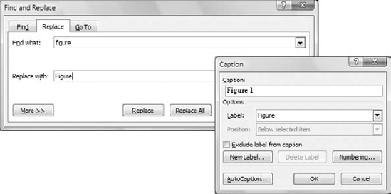
Figure 6.11 shows a couple of dialog boxes you have certainly seen while working with Windows applications. The Caption dialog box of Word is a modal dialog box: You must close it before switching to your document. The Find and Replace dialog box is modeless: It allows you to switch to your document, yet it remains visible while open even if it doesn't have the focus.
Notice that some dialog boxes, such as Open, Color, and even the humble MessageBox, come with the Framework, and you can incorporate them in your applications without having to design them.
A characteristic of dialog boxes is that they provide an OK and a Cancel button. The OK button tells the application that you're finished using the dialog box and the application can process the information in it. The Cancel button tells the application that it should ignore the information in the dialog box and cancel the current operation. As you will see, dialog boxes allow you to quickly find out which buttons were clicked to close them so that your application can take a different action in each case.
In short, the difference between forms and dialog boxes is artificial. If it were really important to distinguish between the two, they'd be implemented as two different objects—but they're the same object. So, without any further introduction, let's look at how to create and use dialog boxes.
To create a dialog box, start with a Windows form, set its FormBorderStyle property to FixedDialog, and set the ControlBox, MinimizeBox, and MaximizeBox properties to False. Then add the necessary controls on the form and code the appropriate events, as you would do with a regular Windows form.
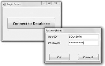
Figure 6.12 shows a simple dialog box that prompts the user for an ID and a password (see the Password sample project available for download from www.sybex.com/go/masteringvb2010). The dialog box contains two TextBox controls (next to the appropriate labels) and the usual OK and Cancel buttons.
Now, to design your own Password main form, start a new project, rename the form MainForm, and place a button on it. This is the application main form, and we'll invoke the dialog box from within the button's Click event handler. Then add a new form to the project, name it PasswordForm, and place on it the controls shown in Figure 6.12.
To display a modal form, you call the ShowDialog method instead of the Show method. You already know how to read the values entered on the controls of the dialog box. You also need to know which button was clicked to close the dialog box. To convey this information from the dialog box back to the calling application, the Form object provides the DialogResult property. This property can be set to one of the values shown in Table 6.3 to indicate which button was clicked. The DialogResult.OK value indicates that the user has clicked the OK button on the form. There's no need to place an OK button on the form; just set the form's DialogResult property to DialogResult.OK.
Table 6.3. The DialogResult enumeration
Value | Description |
|---|---|
| The dialog box was closed with the Abort button. |
| The dialog box was closed with the Cancel button. |
| The dialog box was closed with the Ignore button. |
| The dialog box was closed with the No button. |
| The dialog box hasn't been closed yet. Use this option to find out whether a modeless dialog box is still open. |
| The dialog box was closed with the OK button. |
| The dialog box was closed with the Retry button. |
| The dialog box was closed with the Yes button. |
The dialog box need not contain any of the buttons mentioned here. It's your responsibility to set the value of the DialogResult property from within your code to one of the settings shown in the table. This value can be retrieved by the calling application. The code behind the two buttons in the dialog box is quite short:
Private Sub bttnOK_Click(...) Handles bttnOK.Click
    Me.DialogResult = DialogResult.OK
Me.Close
End Sub
Private Sub bttnCancel_Click(...) Handles bttnCancel.Click
Me.DialogResult = DialogResult.Cancel
Me.Close
End SubThe event handler of the button that displays this dialog box should contain an If statement that examines the value returned by the ShowDialog method:
If PasswordForm.ShowDialog = DialogResult.OK Then
   ' { process the user selection }
End If
Depending on your application, you might allow the user to close the dialog box by clicking more than two buttons. Some of them must set the DialogResult property to DialogResult.OK, others to DialogResult.Cancel.
If the form contains an Accept and a Cancel button, you don't have to enter a single line of code in the modal form. The user can enter values on the various controls and then close the dialog box by pressing the Enter or Cancel key. The dialog box will close and will return the DialogResult.OK or DialogResult.Cancel value. The Accept button sets the form's DialogResult property to DialogResult.OK automatically, and the Cancel button sets the same property to DialogResult.Cancel. Any other button must set the DialogResult property explicitly. Listing 6.3 shows the code behind the Log In button on the sample project's main form.
Example 6.3. Prompting the user for an ID and a password
Private Sub Button1_Click(...) Handles Button1.Click
   If PasswordForm.ShowDialog() = DialogResult.OK Then
      If PasswordForm.txtUserID.Text = "" Or
              PasswordForm.txtPassword.Text = "" Then
         MsgBox("Please specify a user ID and a password to connect")
         Exit Sub
      End If
      MsgBox("You were connected as " & PasswordForm.txtUserID.Text)
   Else
      MsgBox("Connection failed for user " & PasswordForm.txtPassword.Text)
   End If
End SubIt's time to write an application that puts together the topics discussed in this section. The MultipleForms project, available for download from www.sybex.com/go/masteringvb2010, consists of a main form, an auxiliary form, and a dialog box. All three components of the application interface are shown in Figure 6.13. The buttons on the main form display both the auxiliary form and the dialog box.
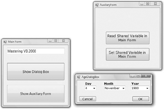
Let's review the various operations you want to perform — they're typical for many situations, not for only this application. At first, you must be able to invoke both the auxiliary form and the dialog box from within the main form; the Show Auxiliary Form and Show Dialog Box buttons do this. The main form contains a variable declaration: strProperty. This variable is, in effect, a property of the main form and is declared as public with the following statement:
Public strProperty As String = "Mastering VB 2010"
The main form calls the auxiliary form's Show method to display it in a modeless manner. The auxiliary form button with the caption Read Shared Variable In Main Form reads the strProperty variable of the main form with the following statement:
Private Sub bttnReadShared_Click(...) Handles bttnReadShared.Click
   MsgBox(MainForm.strProperty, MsgBoxStyle.OKOnly,
               "Public Variable Value")
End Sub
Using the same notation, you can set this variable from within the auxiliary form. The following event handler prompts the user for a new value and assigns it to the shared variable of the main form:
Private Sub bttnSetShared_Click(...) Handles bttnSetShared.Click
   Dim str As String
   str = InputBox("Enter a new value for strProperty")
   MainForm.strProperty = str
End Sub
The two forms communicate with each other through public properties. Let's make this communication a little more elaborate by adding an event. Every time the auxiliary form sets the value of the strProperty variable, it raises an event to notify the main form. The main form, in turn, uses this event to display the new value of the string on the TextBox control as soon as the code in the auxiliary form changes the value of the variable and before it's closed.
To raise an event, you must declare the event name in the form's declaration section. Insert the following statement in the auxiliary form's declarations section:
Event strPropertyChanged()
Now add a statement that fires the event. To raise an event, call the RaiseEvent statement and pass the name of the event as an argument. This statement must appear in the Click event handler of the Set Shared Variable In Main Form button, right after setting the value of the shared variable. As soon as the user clicks the button, the auxiliary form notifies the main form by raising the strPropertyChanged event. Listing 6.4 shows the revised event handler.
Example 6.4. Raising an event
Private Sub bttnSetShared_Click(...) Handles bttnSetShared.Click
   Dim str As String
   str = InputBox("Enter a new value for strProperty")
   MainForm.strProperty = str
   RaiseEvent strPropertyChanged
End Sub
The event will be raised, but it will go unnoticed if you don't handle it from within the main form's code. To handle the event, you must create a variable that represents the auxiliary form with the WithEvents keyword:
Dim WithEvents FRM As New AuxiliaryForm()
The WithEvents keyword tells VB that the variable is capable of raising events and that VB should listen for events from the specific form. If you expand the drop-down list with the objects in the code editor, you will see the name of the FRM variable, along with the other controls you can program. Select FRM in the list and then expand the list of events for the selected item. In this list, you will see the strPropertyChanged event. Select it and the definition of an event handler will appear. Enter these statements in this event's handler:
Private Sub FRM_strPropertyChanged() Handles FRM.strPropertyChanged
   TextBox1.Text = strProperty
   Beep()
End Sub
It's a simple handler, but it's adequate for demonstrating how to raise and handle custom events on the form level. If you want, you can pass arguments to the event handler by including them in the declaration of the event. To pass the original and the new value through the strPropertyChanged event, use the following declaration:
Event strPropertyChanged(ByVal oldValue As String,
                         ByVal newValue As String)
If you run the application now, you'll see that the value of the TextBox control in the main form changes as soon as you change the property's value in the auxiliary form. You can actually change the value of the variable several times before closing the auxiliary form, and each time the current value will be displayed on the main form.
Of course, you can update the TextBox control on the main form directly from within the auxiliary form's code. Use the expression MainForm.TextBox1 to access the control and then manipulate it as usual. Events are used to perform some actions on a form when an action takes place. The benefit of using events, as opposed to accessing members of another form from within your code, is that the auxiliary form need not know anything about the form that called it. The auxiliary form raises the event, and it's the calling form's responsibility to handle it. Moreover, the event handler in the main form may perform other actions in addition to setting a control's value; it may submit something to a database, log the action, and perform any other operation suited for the application at hand.
Let's see now how the main form interacts with the dialog box. What goes on between a form and a dialog box is not exactly interaction; it's a more timid type of behavior. The form displays the dialog box and waits until the user closes the dialog box. Then it looks at the value of the DialogResult property to find out whether it should even examine the values passed back by the dialog box. If the user has closed the dialog box with the Cancel (or an equivalent) button, the application ignores the dialog box settings. If the user closed the dialog box with the OK button, the application reads the values and proceeds accordingly.
Before showing the dialog box, the code of the Show Dialog Box button sets the values of certain controls on the dialog box. In the course of the application, it usually makes sense to suggest a few values in the dialog box so that the user can accept the default values by pressing the Enter key. The main form reads a date on the dialog box's controls and then displays the dialog box with the statements given in Listing 6.5.
Example 6.5. Displaying a dialog box and reading its values
Protected Sub Button3_Click(...) Handles Button3.Click
' Preselects the date 4/11/1980
   AgeDialog.cmbMonth.Text = "4"
   AgeDialog.cmbDay.Text = "11"
   AgeDialog.CmbYear.Text = "1980"
   AgeDialog.ShowDialog()
   If AgeDialog.DialogResult = DialogResult.OK Then
      MsgBox(AgeDialog.cmbMonth.Text & " " &
             AgeDialog.cmbDay.Text & "," &
             AgeDialog.cmbYear.Text)
   Else
      MsgBox("OK, we'll protect your vital personal data")
End If End Sub
To close the dialog box, you can click the OK or Cancel button. Each button sets the DialogResult property to indicate the action that closed the dialog box. The code behind the two buttons is shown in Listing 6.6.
Example 6.6. Setting a dialog box DialogResult property
Protected Sub bttnOK_Click(...) Handles bttnOK.Click Me.DialogResult = DialogResult.OK End Sub Protected Sub bttnCancel_Click(...) Handles bttnCancel.Click Me.DialogResult = DialogResult.Cancel End Sub
Because the dialog box is modal, the code in the Show Dialog Box button is suspended at the line that shows the dialog box. As soon as the dialog box is closed, the code in the main form resumes with the statement following the one that called the ShowDialog method of the dialog box. This is the If statement in Listing 6.5 that examines the value of the DialogResult property and acts accordingly.
Sometimes you won't know in advance how many instances of a given control might be required on a form. Let's say you're designing a form for displaying the names of all tables in a database. It's practically impossible to design a form that will accommodate every database users might throw at your application. Another typical example is a form for entering family-related data, which includes the number of children in the family and their ages. As soon as the user enters (or changes) the number of children, you should display as many TextBox controls as there are children to collect their ages.
For these situations, it is possible to design dynamic forms, which are populated at runtime. The simplest approach is to create more controls than you'll ever need and set their Visible properties to False at design time. At runtime, you can display the controls by switching their Visible properties to True. As you know already, quick-and-dirty methods are not the most efficient ones. You must still rearrange the controls on the form to make it look nice at all times. The proper method to create dynamic forms at runtime is to add controls to and remove them from your form as needed from within your code using the techniques discussed in the following sections.
Just as you can create new instances of forms, you can also create new instances of any control and place them on a form. The Form object exposes the Controls property, which is a collection that contains all the controls on the form. This collection is created automatically as you place controls on the form at design time, and you can access the members of this collection from within your code. It is also possible to add new members to the collection, or remove existing members, with the Add and Remove methods of the Form object accordingly.
All the controls on a form are stored in the Controls collection, which is a property of the Form object. The Controls collection exposes members for accessing and manipulating the controls at runtime, and they're the usual members of a collection:
AddMethodThe
Addmethod adds a new element to theControlscollection. In effect, it adds a new control on the current form. TheAddmethod accepts a reference to a control as an argument and adds it to the collection. Its syntax is the following, wherecontrolObjis an instance of a control:Controls.Add(controlObj)
To place a new Button control on the form, declare a variable of the Button type, set its properties, and then add it to the
Controlscollection:Dim bttn As New System.Windows.Forms.Button bttn.Text = "New Button" bttn.Left = 100 bttn.Top = 60 bttn.Width = 80 Me.Controls.Add(bttn)
RemoveMethodThe
Removemethod removes an element from theControlscollection. It accepts as an argument either the index of the control to be removed or a reference to the control to be removed (a variable of the Control type that represents one of the controls on the form). The syntax of these two forms of theRemovemethod is as follows:Me.Controls.Remove(index) Me.Controls.Remove(controlObj)
CountProperty andAllMethodThe
Countproperty returns the number of elements in theControlscollection. Notice that if there are container controls, such as a Panel control, the controls in the containers are not included in the count. The Panel control has its ownControlscollection. TheAllmethod returns all controls on a form (or a container control) as an array of theSystem.WinForms.Controltype.ClearMethodThe
Clearmethod removes all the elements of theControlsarray and effectively clears the form.
The Controls collection is also a property of any control that can host other controls. As you recall from our discussion of the Anchor and Dock properties, it's customary to place controls on a panel and handle them collectively as a section of the form. They are moved along with the panel at design time, and they're rearranged as a group at runtime. The Panel belongs to the form's Controls collection, and it provides its own Controls collection, which lets you access the controls on the panel.
The ShowControls project (shown in Figure 6.14) demonstrates the basic methods of the Controls property. Download the ShowControls project from www.sybex.com/go/masteringvb2010, open it, and add any number of controls on the main form. You can place a panel to act as a container for other controls as well. Just don't remove the button at the top of the form (the Scan Controls On This Form button); it contains the code to list all the controls.
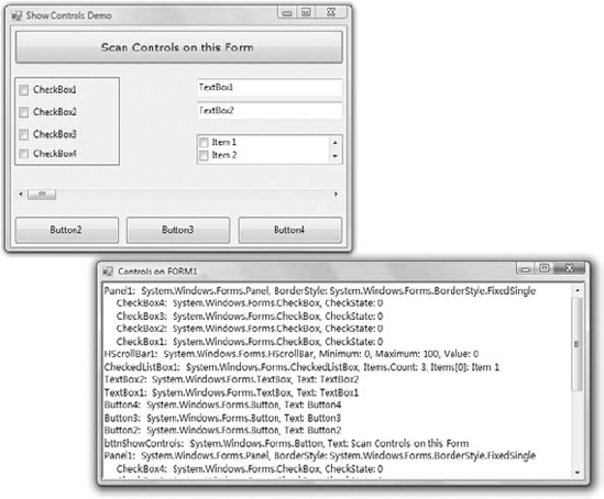
The code behind the Scan Controls On This Form button enumerates the elements of the form's Controls collection. The code doesn't take into consideration containers within containers. This would require a recursive routine, which would scan for controls at any depth. The code that iterates through the form's Controls collection and prints the names of the controls in the Output window is shown in Listing 6.7.
Example 6.7. Iterating the Controls collection
Private Sub Button1_Click(...) Handles Button1.Click
Dim Control As Windows.Forms.Control
For Each Control In Me.Controls
Debug.WriteLine(Control.ToString)
If Control.GetType Is GetType(System.Windows.Forms.Panel) Then
Dim nestedControl As Windows.Forms.Control
For Each nestedControl In Control.Controls
Debug.WriteLine(" " & nestedControl.ToString)
Next
End If
Next
End SubThe form shown in Figure 6.15 produced the following (partial) output (the controls on the Panel are indented to stand out in the listing):
Panel1: System.Windows.Forms.Panel,
BorderStyle: System.Windows.Forms.BorderStyle.FixedSingle
CheckBox4: System.Windows.Forms.CheckBox, CheckState: 0
CheckBox3: System.Windows.Forms.CheckBox, CheckState: 0
HScrollBar1: System.Windows.Forms.HScrollBar,
Minimum: 0, Maximum: 100, Value: 0
CheckedListBox1: System.Windows.Forms.CheckedListBox,
Items.Count: 3, Items[0]: Item 1
TextBox2: System.Windows.Forms.TextBox,
Text: TextBox2To find out the type of individual controls, call the GetType method. The following statement examines whether the control in the first element of the Controls collection is a TextBox:
If Me.Controls(0).GetType Is GetType(System.Windows.Forms.TextBox) Then
MsgBox("It's a TextBox control")
End IfNotice the use of the Is operator in the preceding statement. The equals operator would cause an exception because objects can be compared only with the Is operator. (You're comparing instances, not values.)
To access other properties of the control represented by an element of the Controls collection, you must first cast it to the appropriate type. If the first control of the collection is a TextBox control, use the CType() function to cast it to a TextBox variable and then request its SelectedText property:
If Me.Controls(0).GetType Is GetType(System.Windows.Forms.TextBox) Then Debug.WriteLine(CType(Me.Controls(0), TextBox).SelectedText) End If
The If statement is necessary, unless you can be sure that the first control is a TextBox control. If you omit the If statement and attempt to convert the control to a TextBox, a runtime exception will be thrown if the object Me.Controls(0) isn't a TextBox control.
To demonstrate how to handle controls at runtime from within your code, I included the DynamicForm project (Figure 6.15) on www.sybex.com/go/masteringvb2010. It's a simple data-entry window for a small number of data points. The user can specify at runtime the number of data points she wants to enter, and the number of TextBoxes on the form is adjusted automatically.
The control you see at the top of the form is the NumericUpDown control. All you really need to know about this control is that it displays an integer in the range specified by its Minimum and Maximum properties and allows users to select a value. It also fires the ValueChanged event every time the user clicks one of the two arrows or types another value in its edit area. This event handler's code adds or removes controls on the form so that the number of text boxes (as well as the number of corresponding labels) matches the value on the control. Listing 6.8 shows the handler for the ValueChanged event of the NumericUpDown1 control.
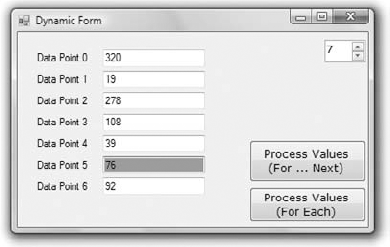
Example 6.8. Adding and removing controls at runtime
Private Sub NumericUpDown1_ValueChanged(...) Handles NumericUpDown1.ValueChanged
Dim TB As New TextBox()
Dim LBL As New Label()
Dim i, TBoxes As Integer
' Count all TextBox controls on the Form
For i = 0 To Me.Controls.Count - 1
If Me.Controls(i).GetType Is
GetType(System.Windows.Forms.TextBox) Then
TBoxes = TBoxes + 1
End If
Next
' Add new controls if number of controls on the Form is less
' than the number specified with the NumericUpDown control
If TBoxes < NumericUpDown1.Value Then
TB.Left = 100: TB.Width = 120
TB.Text = ""
For i = TBoxes To CInt(NumericUpDown1.Value) - 1
TB = New TextBox()
LBL = New Label()
If NumericUpDown1.Value = 1 Then
TB.Top = 20: TB.TabIndex = 0
Else
TB.Top = Me.Controls(Me.Controls.Count - 2).Top + 25
End If
' Set the trivial properties of the new controls
LBL.Left = 20: LBL.Width = 80
LBL.Text = "Data Point " & i
LBL.Top = TB.Top + 3
TB.Left = 100: TB.Width = 120TB.Text = ""
' add controls to the form
Me.Controls.Add(TB)
Me.Controls.Add(LBL)
TB.TabIndex = Convert.ToInt32(NumericUpDown1.Value)
' and finally connect their GotFocus/LostFocus events
' to the appropriate handler
AddHandler TB.Enter,
New System.EventHandler(AddressOf TBox_Enter)
AddHandler TB.Leave,
New System.EventHandler(AddressOf TBox_Leave)
Next
Else
For i = Me.Controls.Count - 1 To Me.Controls.Count -
2 * (TBoxes - CInt(NumericUpDown1.Value)) Step −2
Me.Controls.Remove(Controls(i))
Me.Controls.Remove(Controls(i - 1))
Next
End If
End SubThe code is lengthy but straightforward; most of the statements just set the basic properties of the Label and TextBox controls on the form. Ignore the AddHandler statements for now; they're discussed in the following section. First, the code counts the number of TextBoxes on the form; then it figures out whether it should add or remove elements from the Controls collection. To remove controls, the code iterates through the last n controls on the form and removes them. The number of controls to be removed is the following, where TBoxes is the total number of controls on the form minus the value specified in the NumericUpDown control:
2 * (TBoxes - NumericUpDown1.Value)
If the value entered in the NumericUpDown control is less than the number of TextBox controls on the form, the code removes the excess controls from within a loop. At each step, it removes two controls, one of them a TextBox and the other a Label control with the matching caption. (That's why the loop variable is decreased by two.) The code also assumes that the first two controls on the form are the Button and the NumericUpDown controls. If the value entered by the user exceeds the number of TextBox controls on the form, the code adds the necessary pairs of TextBox and Label controls to the form.
To add controls, the code initializes a TextBox (TB) and a Label (LBL) variable. Then, it sets their locations and the label's caption. The left coordinate of all labels is 20, their width is 80, and their Text property (the label's caption) is the order of the data item. The vertical coordinate is 20 pixels for the first control, and all other controls are 3 pixels below the control on the previous row. After a new control is set up, it's added to the Controls collection with one of the following statements:
Me.Controls.Add(TB)    ' adds a TextBox control
Me.Controls.Add(LBL)   ' adds a Label control
To use the values entered by the user on the dynamic form, we must iterate the Controls collection, extract the values in the TextBox controls, and read their values. Listing 6.9 shows how the Process Values button scans the TextBox controls on the form and performs some basic calculations with them (counting the number of data points and summing their values).
Example 6.9. Reading the controls on the form
Private Sub Button1_Click(...) Handles Button1.Click
    Dim TBox As TextBox
    Dim Sum As Double = 0, points As Integer = 0
    Dim iCtrl As Integer
    For iCtrl = 0 To Me.Controls.Count - 1
        If Me.Controls(iCtrl).GetType Is
                GetType(System.Windows.Forms.TextBox) Then
            TBox = CType(Me.Controls(iCtrl), TextBox)
            If IsNumeric(TBox.Text) Then
                Sum = Sum + Val(TBox.Text)
                points = points + 1
            End If
        End If
    Next
    MsgBox("The sum of the " & points.ToString &
           " data points is " & Sum.ToString)
End SubDynamic forms are actually quite common even in business-line applications. There are situations where users are expected to enter or review multiple items of information on a single form. If each data item consists of several fields (such as names, ages, and the like), your best bet is to design a form like the following one.
This form, which is part of the DynamicDataEntry project, is a more typical example of a dynamic form, which allows users to enter an unknown number of dependant members (or any other entity, for that matter). Although you can create an auxiliary form where the user can enter each entry, the form shown here works better because it allows the user to focus on a single form.
Initially the form is populated with the appropriate controls for entering a single member. Users can click the "Add new member" link to create a new entry. On the left you see the form in its initial state and on the right you see the same form after adding four members. The "Remove member" link removes the last member from the form. Users can enter any number of dependant members on this form by adding new entries. If the number of entries exceeds the height of the form, a scroll bar appears. Notice that the scroll bar scrolls the entries for the members and not the fixed items on the form, which are the two links at the top and the Done Entering Members button at the bottom. You can change the structure of each entry to enable other types of data (such as room types in a hotel reservation system, a student's courses and grades, the statistics of various teams, and so on).
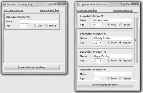
I will not present the full code for the application here; it is well documented and you can examine it on your own. The individual entries are made up of a number of controls, all on a Panel control. This allows you to use the same name for the controls. There's no naming conflict since the controls belong to a different Panel. All individual panels are placed on another larger Panel control, which is anchored to all four sides of the form and resizes nicely along with the form. The AutoScroll property on this Panel control was set to True so that the appropriate scroll bars appear automatically should the user have a large number of members to enter.
Adding and removing entries is quite straightforward. I will show you only the code that iterates through all entries and processes them:
For Each ctrl As Control In Me.Controls("pnlAllMembers").Controls
    If ctrl.GetType Is GetType(System.Windows.Forms.Panel) Then
        Name = ctrl.Controls("txtName").Text
        Age = CType(ctrl.Controls("cbAge"), ComboBox).SelectedItem
        If CType(ctrl.Controls("rdMale"), RadioButton).Checked
                            Then sex = "Male"
        If CType(ctrl.Controls("rdFemale"), RadioButton).Checked
                            Then sex = "Female"
        message &= "NAME: " & Name & vbCrLf &
                   "AGE: " & Age & vbCrLf &
                   "SEX: " & sex & vbCrLf &
"-----------------------------" & vbCrLf
End If
NextThe outer loop goes through the controls on the pnlAllMembers Panel control, which is the large panel with the entries. If the current control is a Panel, we can process it. Normally, all child controls on the pnlAllMembers Panel will be also Panel controls; you may choose to add other control as well. Then the code accesses each individual control by name. txtName is the name of the TextBox control for the member's name and it's always the same regardless of the entry to which it belongs. The code gradually builds a string with the data of the dependant members and displays them. A real-world application would submit the same data to a database, convert it to XML format, and store it locally or process the data in some other meaningful way. You can open the DynamicDataEntry project and examine its code, which is actually quite short considering all the flexibility.
If you make the form wide, the various entries will still be lined up in a single column, leaving most of the form empty. How about entering some code in the form's resizing events to display the entries in multiple columns depending on the width of the form?
You saw how to add controls on your forms at runtime and how to access the properties of these controls from within your code. In many situations, this is all you need: a way to access the properties of the controls (the text on a TextBox control or the status of a CheckBox or RadioButton control). What good is a Button control, however, if it can't react to the Click event? The only problem with the controls you add to the Controls collection at runtime is that they don't react to events. It's possible, though, to create event handlers at runtime, and this is what you'll learn in this section.
To create an event handler at runtime, create a subroutine that accepts two arguments — the usual sender and e arguments — and enter the code you want to execute when a specific control receives a specific event. The type of the e argument must match the definition of the second argument of the event for which you want to create a handler. Let's say that you want to add one or more buttons at runtime on your form and these buttons should react to the Click event. Create the ButtonClick() subroutine and enter the appropriate code in it. The name of the subroutine can be anything; you don't have to make up a name that includes the control's or the event's name.
After the subroutine is in place, you must connect it to an event of a specific control. The ButtonClick() subroutine, for example, must be connected to the Click event of a Button control. The statement that connects a control's event to a specific event handler is the AddHandler statement, whose syntax is as follows:
AddHandler control.event, New System.EventHandler(AddressOf ButtonClick)
Consider, for example, an application that performs certain calculations with an existing subroutine. To connect the ProcessNow() subroutine to the Click event of the Calculate button, use the following statement:
AddHandler Calculate.Click,
     New System.EventHandler(AddressOf ProcessNow)
You can use similar statements to connect the same subroutine to other control event handlers. You can also associate multiple controls' Click event handler with the ProcessNow() subroutine.
Let's add a little more complexity to the DynamicForm application. I'll program the Enter and Leave events of the TextBox controls added to the form at runtime. When a TextBox control receives the focus, I'll change its background color to a light yellow, and when it loses the focus, I'll restore the background to white so the user knows which box has the focus at any time. I'll use the same handlers for all TextBox controls. (The code for the two handlers is shown in Listing 6.10.)
Example 6.10. Event handlers added at runtime
Private Sub TBox_Enter(ByVal sender As Object,
                       ByVal e As System.EventArgs)
   CType(sender, TextBox).BackColor = color.LightCoral
End Sub

Private Sub TBox_Leave(ByVal sender As Object,
                       ByVal e As System.EventArgs)
   CType(sender, TextBox).BackColor = color.White
End Sub
The two subroutines use the sender argument to find out which TextBox control received or lost the focus, and they set the appropriate control's background color. (These subroutines are not event handlers yet because they're not followed by the Handles keyword — at least, not before we associate them with an actual control and a specific event.) This process is done in the same segment of code that sets the properties of the controls we create dynamically at runtime. After adding the control to the Me.Controls collection, call the following statements to connect the new control's Enter and Leave events to the appropriate handlers:
AddHandler TB.Enter, New System.EventHandler(AddressOf TBox_Enter)
AddHandler TB.Leave, New System.EventHandler(AddressOf TBox_Leave)
Note that you don't have to raise the event from within your code; neither do you specify the arguments to the event. Since you've associated the two routines with the Click event handler, the compiler knows that they're Click event handlers and passes the appropriate arguments to them. All you have to do is make sure the signatures of the two routines match the signature of the Click event handler.
Run the DynamicForm application and see how the TextBox controls handle the focus-related events. With a few statements and a couple of subroutines, we were able to create event handlers at runtime from within our code.
Menus are among the most common and most characteristic elements of the Windows user interface. Even in the old days of character-based displays, menus were used to display methodically organized choices and guide the user through an application. Despite the visually rich interfaces of Windows applications and the many alternatives, menus are still the most popular means of organizing a large number of options. Many applications duplicate some or all of their menus in the form of toolbar icons, but the menu is a standard fixture of a form. You can turn the toolbars on and off, but not the menus.
Menus can be attached only to forms, and they're implemented through the MenuStrip control. The items that make up the menu are ToolStripMenuItem objects, which belong to a MenuStrip control (they're the menu options) or to another ToolStripMenuItem (they form submenus). As you will see, the MenuStrip control and ToolStripMenuItem objects give you absolute control over the structure and appearance of the menus of your application. The MenuStrip control is a variation of the Strip control, which is the base of menus, toolbars, and status bars.
You can design menus visually and then program their Click event handlers. In principle, that's all there is to a menu: You specify its items (the menu commands) and then you program each command's actions, as if the menu items were buttons. Depending on the needs of your application, you might want to enable and disable certain commands, add context menus to some of the controls on your form, and so on. Because each item in a menu is represented by a ToolStripMenuItem object, you can control the application's menus from within your code by manipulating the properties of the ToolStripMenuItem objects. Let's start by designing a simple menu, and I'll show you how to manipulate the menu objects from within your code as we go along.
Double-click the MenuStrip icon in the Toolbox. (You'll find the MenuStrip control in the Menus & Toolbars tab of the Toolbox.) An instance of the MenuStrip control will be added to the form, and a single menu command will appear on your form. Its caption will be Type Here. If you don't see the first menu item on the form right away, select the MenuStrip control in the Components tray below the form. Do as the caption says: Click it and enter the first command caption, File, as shown in Figure 6.16. To add items under the File menu, press Enter. To enter another command in the main menu, press Tab. Depending on your action, another box will be added and you can type the caption of the next command in it. Press Enter to move to the next item vertically and Tab to move to the next item horizontally. To insert a separator enter a hyphen (-) as the item's caption.
When you hover the pointer over a menu item, a drop-down button appears to the right of the item. Click this button to select the type of item you'll place on the menu. This item can be a MenuItem object, a separator, a ComboBox, or a TextBox. In this chapter, I'll focus on menu items, which are by far the most common elements on a menu. The last two options, however, allow you to build elaborate menus, reminiscent of the Office menus.
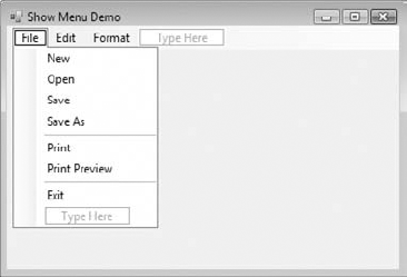
Enter the items you wish to include in the File menu — New, Open, Save, SaveAs, and Exit — and then click somewhere on the form. All the temporary items (the ones with the Type Here caption) will disappear, and the menu will be finalized on the form.
To add the Edit menu, select the MenuStrip icon to activate the visual menu editor and then click the File item. In the new item that appears next to the File item on the control, enter the string Edit. Press Enter and you'll switch to the first item of the Edit menu. Fill the Edit menu with the usual editing commands. Table 6.4 shows the captions (property Text) and names (property Name) for each menu and each command. You can also insert a standard menu with the Insert Standard Items command of the MenuStrip object's context menu.
Table 6.4. The captions and names of the File and Edit menus
Caption | Name | Caption | Name |
|---|---|---|---|
File | FileMenu | Tools | ToolsMenu |
New | FileNew | Edit | EditMenu |
Open | FileOpen | Undo | EditCopy |
Save | FileSave | Redo | EditRedo |
Save As | FileSaveAs | Cut | EditCut |
FilePrint | Copy | EditCopy | |
Print Preview | FilePrintPreview | Paste | EditPaste |
Exit | FileExit | Select All | EditSelectAll |
| Help | HelpMenu |
The bold items in Table 6.4 are the names of the first-level menus (File and Edit); the captions that are indented in the table are the commands on these two menus. The default names of the menu items you add visually to the application's menu are based on the item's caption followed by the suffix ToolStripMenuItem (FileToolStripMenuItem, NewToolStripMenuItem, and so on). You'll probably want to change the default names to something less redundant. To do so, change the Name property in the Properties window. To view the properties of a menu item, right-click it and select Properties from the context menu. One of the properties you should try out is the LayoutStyle property, which determines the orientation of the menu.
The most convenient method of editing a menu is to use the Items Collection Editor window, which is shown in Figure 6.17. This isn't a visual editor, but you can set all the properties of each menu item in the dialog box without having to switch to the Properties window.
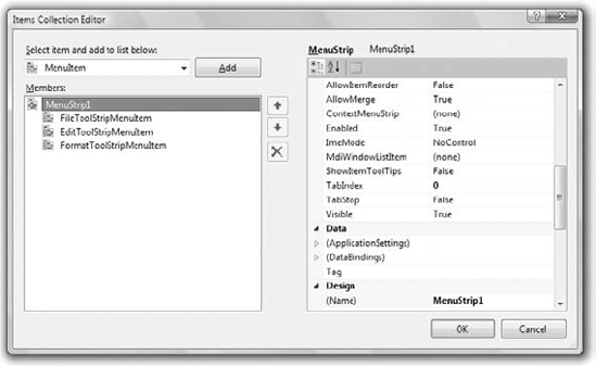
The Add button adds to the menu an item of the type specified in the combo box next to it (a menu item, combo box, or text box). To insert an item at a different location, add it to the menu and then use the arrow buttons to move it up or down. As you add new items, you can set their Text and Name properties on the right pane of the editor. You can also set their font, set the alignment and orientation of the text, and specify an image to be displayed along with the text. To add an image to a menu item, locate the Image property and click the ellipsis button. A dialog box in which you can select the appropriate resource will appear. Notice that all the images you use on your form are stored as resources of the project. You can add all the images and icons you might need in a project to the same resource file and reuse them at will. The TextImageRelation property allows you to specify the relative positions of the text and the image. You can also select to display text only, images only, or text and images for each menu item with the DisplayStyle property.
If the menu item leads to a submenu, you must also specify the submenu's items. Locate the DropDownItems property and click the ellipsis button. An identical window will appear, in which you can enter the drop-down items of the current menu item. Notice that the menu on the form is continuously updated while you edit it in the Items Collection Editor window, so you can see the effects of your changes on the form. Personally, I'm more productive with the editor than with the visual tools, mainly because all the properties are right there and I don't have to switch between the design surface and the Properties window.
Note that except for MenuItems, you can add ComboBoxes and TextBoxes to a menu. The TextBox control can be used to facilitate search operations, similar to the Search box of the browsers. You can also display a number of options in a ComboBox control on the menu. The advantage of the ComboBox menu item is that the selected option is visible at all times. ComboBoxes are used in the menus of Office applications a lot (a typical example is the Font name and size ComboBoxes that allow you to change the current selections' font name and size).
The ToolStripMenuItem class represents a menu command, at any level. If a command leads to a submenu, it's still represented by a ToolStripMenuItem object, which has its own collection of ToolStripMenuItem objects: the DropDownItems property, which is a collection and it's made up of ToolStripMenuItem objects. The ToolStripMenuItem class provides the following properties, which you can set in the Properties window at design time or manipulate from within your code:
CheckedSome menu commands act as toggles, and they are usually selected (checked) to indicate that they are on or deselected (unchecked) to indicate that they are off. To initially display a check mark next to a menu command, set its
Checkedproperty to True. You can also access this property from within your code to change the checked status of a menu command at runtime. For example, to toggle the status of a menu command calledFntBold, use this statement:FntBold.Checked = Not FntBold.Checked
EnabledSome menu commands aren't always available. The Paste command, for example, has no meaning if the Clipboard is empty (or if it contains data that can't be pasted in the current application). To indicate that a command can't be used at the time, you set its
Enabledproperty to False. The command then appears grayed out in the menu, and although it can be highlighted, it can't be activated.IsOnDropDownIf the menu command represented by a ToolStripMenuItem object belongs to a submenu, its
IsOnDropDownproperty is True; otherwise, it's False. TheIsOnDropDownproperty is read-only and False for the items on the first level of the menu.VisibleTo remove a command temporarily from the menu, set the command's
Visibleproperty to False. TheVisibleproperty isn't used frequently in menu design. In general, you should prefer to disable a command to indicate that it can't be used at the time (some other action is required to enable it). Making a command invisible frustrates users, who might spend time trying to locate the command in another menu.
When a menu item is selected by the user, it triggers a Click event. To program a menu item, insert the appropriate code in the item's Click event handler. The Exit command's code would be something like the following:
Sub menuExit(...) Handles menuExit.Click
   End
End Sub
If you need to execute any cleanup code before the application ends, place it in the CleanUp() subroutine and call this subroutine from within the Exit item's Click event handler:
Sub menuExit(...) Handles menuExit.Click
   CleanUp()
   End
End Sub
The same subroutine must also be called from within the FormClosing event handler of the application's main form because some users might terminate the application by clicking the form's Close button.
An application's Open menu command contains the code that prompts the user to select a file and then open it. You will see many examples of programming menu commands in the following chapters. All you really need to know now is that each menu item is a ToolStripMenuItem object and each fires the Click event every time it's selected with the mouse or the keyboard. In most cases, you can treat the Click event handler of a ToolStripMenuItem object just like the Click event handler of a Button.
Another interesting event of the ToolStripMenuItem is the DropDownOpened event, which is fired when the user opens a menu or submenu (in effect, when the user clicks a menu item that leads to a submenu). In this event's handler, you can insert code to modify the submenu. The Edit menu of just about any application contains the ubiquitous Cut/Copy/Paste commands. These commands are not meaningful at all times. If the Clipboard doesn't contain text, the Paste command should be disabled. If no text is selected, the Copy and Cut commands should also be disabled. Here's how you could change the status of the Paste command from within the DropDownOpened event handler of the Edit menu:
If My.Computer.Clipboard.ContainsText Then
    PasteToolStripMenuItem.Enabled = True
Else
    PasteToolStripMenuItem.Enabled = True
End If
Likewise, to change the status of the Cut and Copy commands, use the following statements in the DropDownOpened event of the ToolStripMenuItem that represents the Edit menu:
If txtEditor.SelectedText.Trim.Length > 0 Then
    CopyToolStripMenuItem.Enabled = True
    CutToolStripMenuItem.Enabled = True
Else
    CopyToolStripMenuItem.Enabled = False
    CutToolStripMenuItem.Enabled = False
End IfMenus provide a convenient way to display a large number of choices to the user. They allow you to organize commands in groups, according to their functions, and are available at all times. Opening menus and selecting commands with the mouse, however, can be an inconvenience. When using a word processor, for example, you don't want to have to take your hands off the keyboard and reach for the mouse. To simplify menu access, Windows forms support access keys and shortcut keys.
Access keys allow the user to open a menu by pressing the Alt key and a letter key. To open the Edit menu in all Windows applications, for example, you can press Alt+E. E is the Edit menu's access key. After the menu is open, the user can select a command with the arrow keys or by pressing another key, which is the command's access key, without holding down the Alt key.
Access keys are designated by the designer of the application and are marked with an underline character. To assign an access key to a menu item, insert the ampersand symbol (&) in front of the character you want to use as an access key in the ToolStripMenuItem's Text property.
Because the & symbol has a special meaning in menu design, you can't use it in a menu item's caption. To actually display the & symbol in a caption, prefix it with another & symbol. For example, the caption &Drag produces a command with the caption Drag (the first character is underlined because it's the access key). The caption Drag && Drop will create another command whose caption will be Drag & Drop. Finally, the string &Drag && Drop will create another command with the caption Drag & Drop (note the underline character in front of the first uppercase D in the string).
Shortcut keys are similar to access keys, but instead of opening a menu, they run a command when pressed. Assign shortcut keys to frequently used menu commands so that users can reach them with a single keystroke. Shortcut keys are combinations of the Ctrl key and a function or character key. For example, the usual access key for the Close command (after the File menu is opened with Alt+F) is C, but the usual shortcut key for the Close command is Ctrl+W.
To assign a shortcut key to a menu command, drop down the ShortcutKeys list in the ToolStripMenuItem's Properties window and select a keystroke. Specify a modifier (Shift, Ctrl, or Alt) and a key. When assigning access and shortcut keys, take into consideration the well-established Windows standards. Users expect Alt+F to open the File menu, so don't use Alt+F for the Format menu. Likewise, pressing Ctrl+C universally performs the Copy command; don't use Ctrl+C as a shortcut for the Cut command.
Dynamic menus change at runtime to display more or fewer commands, depending on the current status of the program. The following sections explore two techniques for implementing dynamic menus:
Creating short and long versions of the same menu
Adding and removing menu commands at runtime
A common technique in menu design is to create long and short versions of a menu. If a menu contains many commands and most of the time only a few of them are needed, you can create one menu with all the commands and another with the most common ones. The first menu is the long one, and the second is the short one. The last command in the long menu should be Short Menu, and when selected, it should display the short version. The last command in the short menu should be Long Menu (or Full Menu), and it should display the long version.
Figure 6.18 shows a long and a short version of the same menu from the LongMenu project. The short version omits infrequently used commands and is easier to handle.
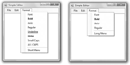
To implement the LongMenu command, start a new project and create a menu with the options shown in Figure 6.18. Listing 6.11 is the code that shows/hides the long menu in the MenuSize command's Click event.
Example 6.11. The MenuSize menu item's Click event
Private Sub mnuSize_Click(...) Handles mnuSize.Click
    If mnuSize.Text = "Short Menu" Then
        mnuSize.Text = "Long Menu"
    Else
        mnuSize.Text = "Short Menu"
    End If
    mnuUnderline.Visible = Not mnuUnderline.Visible
    mnuStrike.Visible = Not mnuStrike.Visible
    mnuSmallCaps.Visible = Not mnuSmallCaps.Visible
    mnuAllCaps.Visible = Not mnuAllCaps.Visible
End Sub
The subroutine in Listing 6.11 doesn't do much. It simply toggles the Visible property of certain menu commands and changes the command's caption to Short Menu or Long Menu, depending on the menu's current status.
I conclude the discussion of menu design with a technique for building dynamic menus, which grow and shrink at runtime. Many applications maintain a list of the most recently opened files in the File menu. When you first start the application, this list is empty, and as you open and close files, it starts to grow.
The RunTimeMenu project, available for download from www.sybex.com/go/masteringvb2010, demonstrates how to add items to and remove items from a menu at runtime. The main menu of the application's form contains the Run Time Menu submenu, which is initially empty.
The two buttons on the form add commands to and remove commands from the Run Time Menu. Each new command is appended at the end of the menu, and the commands are removed from the bottom of the menu first (the most recently added commands are removed first). To change this order and display the most recent command at the beginning of the menu, use the Insert method instead of the Add method to insert the new item. Listing 6.12 shows the code behind the two buttons that add and remove menu items.
Example 6.12. Adding and removing menu items at runtime
Private Sub bttnAddItem_Click(...) Handles bttnAddItem.Click
   Dim Item As New ToolStripMenuItem
   Item.Text = "Run Time Option" &
             RunTimeMenuToolStripMenuItem.DropDownItems.Count.ToString
   RunTimeMenuToolStripMenuItem.DropDownItems.Add(Item)
   AddHandler Item.Click, New System.EventHandler(AddressOf OptionClick)
End Sub

Private Sub bttnRemoveItem_Click(...) Handles bttnRemoveItem.Click
   If RunTimeMenuToolStripMenuItem.DropDownItems.Count > 0 Then
       Dim mItem As ToolStripItem
       Dim items As Integer =
                   RunTimeMenuToolStripMenuItem.DropDownItems.Count
       mItem = RunTimeMenuToolStripMenuItem.DropDownItems(items - 1)
   RunTimeMenuToolStripMenuItem.DropDownItems.Remove(mItem)
   End If
End Sub
The Remove button's code uses the Remove method to remove the last item in the menu by its index after making sure the menu contains at least one item. The Add button adds a new item and sets its caption to Run Time Option n, where n is the item's order in the menu. In addition, it assigns an event handler to the new item's Click event. This event handler is the same for all the items added at runtime; it's the OptionClick() subroutine. All the runtime options invoke the same event handler — it would be quite cumbersome to come up with a separate event handler for different items. In the single event handler, you can examine the name of the ToolStripMenuItem object that invoked the event handler and act accordingly. The OptionClick() subroutine used in Listing 6.13 displays the name of the menu item that invoked it. It doesn't do anything, but it shows you how to figure out which item of the Run Time Menu was clicked.
Nearly every Windows application provides a context menu that the user can invoke by right-clicking a form or a control. (It's sometimes called a shortcut menu or pop-up menu.) This is a regular menu, but it's not anchored on the form. It can be displayed anywhere on the form or on specific controls. Different controls can have different context menus, depending on the operations you can perform on them at the time.
To create a context menu, place a ContextMenuStrip control on your form. The new context menu will appear on the form just like a regular menu, but it won't be displayed there at runtime. You can create as many context menus as you need by placing multiple instances of the ContextMenuStrip control on your form and adding the appropriate commands to each one. To associate a context menu with a control on your form, set the ContextMenu property for that control to the name of the corresponding context menu.
Designing a context menu is identical to designing a regular menu. The only difference is that the first command in the menu is always ContextMenuStrip and it's not displayed along with the menu.
- Visual form design
Forms expose a lot of trivial properties for setting their appearance. In addition, they expose a few properties that simplify the task of designing forms that can be resized at runtime. The
Anchorproperty causes a control to be anchored to one or more edges of the form to which it belongs. TheDockproperty allows you to place on the form controls that are docked to one of its edges. To create forms with multiple panes that the user can resize at runtime, use the SplitContainer control. If you just can't fit all the controls in a reasonably sized form, use theAutoScrollproperties to create a scrollable form.- Master It
You've been asked to design a form with three distinct sections. You should also allow users to resize each section. How will you design this form?
- Design applications with multiple forms.
Typical applications are made up of multiple forms: the main form and one or more auxiliary forms. To show an auxiliary form from within the main form's code, call the auxiliary form's
Showmethod, or the ShowDialog method if you want to display the auxiliary form modally (as a dialog box).- Master It
How will you set the values of selected controls in a dialog box, display them, and then read the values selected by the user from the dialog box?
- Design dynamic forms.
You can create dynamic forms by populating them with controls at runtime through the form's
Controlscollection. First, create instances of the appropriate controls by declaring variables of the corresponding type. Then set the properties of each of these variables that represent controls. Finally, place the control on the form by adding the corresponding variable to the form'sControlscollection.- Master It
How will you add a TextBox control to your form at runtime and assign a handler to the control's
TextChangedevent?
- Design menus.
Both form menus and context menus are implemented through the MenuStrip control. The items that make up the menu are ToolStripMenuItem objects. The ToolStripMenuItem objects give you absolute control over the structure and appearance of the menus of your application.
- Master It
What are the two basic events fired by the ToolStripMenuItem object?