
Just as you can design custom classes, you can use Visual Studio to design custom controls. The process is very similar, in the sense that custom controls have properties, methods, and events, which are implemented with code that's identical to the code you'd use to implement these members with classes. The difference is that controls have a visual interface and interact with the user. In short, you must provide the code to draw the control's surface as well as react to selected user actions from within the control's code.
In this chapter, you'll learn how to enhance the functionality of existing controls, a common practice among developers, as well as how to build custom controls from scratch. Specifically, you will learn how to do the following:
Extend the functionality of existing Windows Forms controls with inheritance
Build compound custom controls that combine multiple existing controls
Build custom controls from scratch
Customize the rendering of the items in a ListBox control
Before I get to the details of how to build custom controls, I want to show you how they relate to other types of projects. I'll discuss briefly the similarities and differences among Windows controls, classes, and Windows projects. This information will help you get the big picture and put together the pieces of the following sections.
An application interacts with the user through its interface. The developer decides how the forms interact with the user, and the user has to follow the rules. Something similar happens with custom controls. The custom control provides a well-defined interface, which consists of properties and methods. This is the only way to manipulate the control. Just as users of your applications don't have access to the source code and can't modify the application, developers can't see the control's source code and must access it through the interface exposed by the control. After an instance of the custom control is placed on the form, the developer can manipulate it through its properties and methods, but you never get to see the code.
In preceding chapters, you learned how to implement interfaces consisting of properties and methods and how to raise events from within a class. This is how you build the interface of a custom Windows control: You implement properties with Property procedures, and you implement methods as Public procedures. Although a class can provide a few properties and any number of methods, a control must provide a large number of properties. A developer who places a custom control on a form expects to see the properties that are common to all the controls (properties to set the control dimensions, the color, and the text font; the Index and Tag properties; and so on). Fortunately, many of the standard properties are exposed automatically. The developer also expects to be able to program all the common events, such as the mouse and keyboard events, as well as some events that are unique to the custom control.
The design of a Windows control is similar to the design of a form. You place controls on a form-like object, called UserControl, which is the control's surface. It provides nearly all the methods of a standard form, and you can adjust its appearance with the drawing methods. In other words, you can use familiar programming techniques to draw a custom control or you can use existing controls to build a custom control.
The major difference between forms and custom controls is that custom controls can exist in two runtime modes. When the developer places a control on a form, the control is actually running. When you set properties through the Properties window, something happens to the control — its appearance changes or the control rejects the changes. It means that the code of the custom control is executing, even though the project in which the control is used is in design mode. When the developer starts the application, the custom control is already running. However, the control must be able to distinguish when the project is in design or execution mode and behave accordingly. Here's the first property of the UserControl object you will be using quite frequently in your code: the DesignMode property. When the control is positioned on a form and used in the Designer, the DesignMode property is True. When the developer starts the project that contains the control, the DesignMode property is False.
This dual runtime mode of a Windows control is something you'll have to get used to. When you design custom controls, you must also switch between the roles of Windows control developer (the programmer who designs the control) and application developer (the programmer who uses the control).
In summary, a custom control is an application with a visible user interface as well as an invisible programming interface. The visible interface is what the developer sees when an instance of the control is placed on the form, and it's also what the user sees on the form when the project is placed in runtime mode. The developer using the control can manipulate it through its properties and methods. The control's properties can be set at both design time and runtime, whereas methods must be called from within the code of the application that uses the control. The properties and methods constitute the control's invisible interface (or the developer interface, as opposed to the user interface). You, the control developer, will develop the visible user interface on a UserControl object, which is almost identical to the Form object; it's like designing a standard application. As far as the control's invisible interface goes, it's like designing a class.
The simplest type of custom Windows control you can build is one that enhances the functionality of an existing control. Fortunately, they're the most common types of custom controls, and many developers have their own collections of enhanced Windows controls. The Windows controls are quite functional, but you won't be hard-pressed to come up with ideas to make them better.
The TextBox control, for example, is a text editor on its own, and you have seen how easy it is to build a text editor by using the properties and methods exposed by this control. Many programmers add code to their projects to customize the appearance and the functionality of the TextBox control.
Let's say you're building data-entry forms composed of many TextBox controls. To help the user identify the current control on the form, it would be nice to change its color while it has the focus. If the current control has a different color from all others, users will quickly locate it.
Another thing you can do with the TextBox control is format its contents as soon as it loses focus. Let's consider a TextBox control that must accept dollar amounts. After the user enters a numeric value, the control could automatically format the numeric value as a dollar amount and perhaps change the text's color to red for negative amounts. When the control receives the focus again, you can display the amount without any special formatting so that users can edit it quickly. As you will see, it's not only possible but actually quite easy to build a control that incorporates all the functionality of a TextBox and some additional features that you provide through the appropriate code. You already know how to add features such as the ones described here to a TextBox from within the application's code. But what if you want to enhance multiple TextBox controls on the same form or reuse your code in multiple applications?
The best approach is to create a new Windows control with all the desired functionality and then reuse it in multiple projects. To use the proper terminology, you can create a new custom Windows control that inherits the functionality of the TextBox control. The derived control includes all the functionality being inherited from the control, plus any new features you care to add to it. This is exactly what we're going to do in this section.
Let's call our new custom control FocusedTextBox. Start a new project, and in the New Project dialog box, select the template Windows Forms Control Library. Name the project FocusedTextBox. The Solution Explorer for this project contains a single item, the UserControl1 item. UserControl1 (see Figure 9.1) is the control's surface — in a way, it's the control's form. This is where you'll design the visible interface of the new control using the same techniques you would use to design a Windows form.
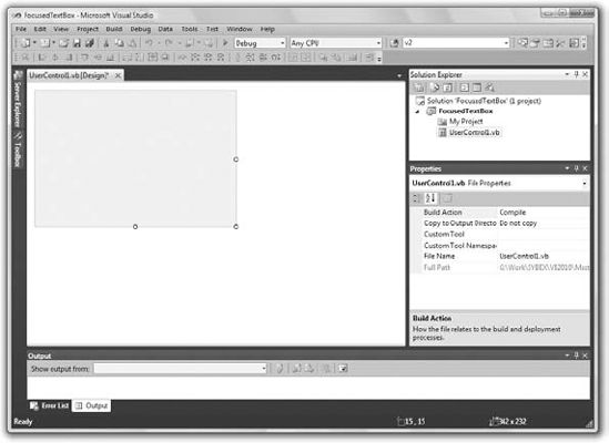
Start by renaming the UserControl1 object to FocusedTextBox. Then save the project by choosing File
Partial Public Class FocusedTextBox
Inherits System.Windows.Forms.UserControl
The first statement says that the entire file belongs to the FocusedTextBox class; it's the part of the class that contains initialization code and other statements that the user does not need to see because it's left unchanged in most cases. To design an inherited control, we must change the second statement to the following:
Inherits System.Windows.Forms.TextBox
This statement tells the compiler that we want our new control to inherit all the functionality of the TextBox control. You must also modify the InitializeComponent method in the FocusedTextBox.Designer.vb file by removing the statement that sets the control's AutoScaleMode property. This statement applies to the generic UserControl object but not to the TextBox control.
As soon as you specify that your custom control inherits the TextBox control, the UserControl object will disappear from the Designer. The Designer knows exactly what the new control must look like (it will look and behave exactly like a TextBox control), and you're not allowed to change its appearance.
If you switch to the FocusedTextBox.vb file, you'll see that it's a public class called FocusedTextBox. The Partial class by the same name is part of this class; it contains the code that was generated automatically by Visual Studio. When compiled, both classes will produce a single DLL file. Sometimes we need to split a class's code into two files, and one of them should contain the Partial modifier. This keyword signifies that the file contains part of the class. The FocusedTextBox.vb file is where you will insert your custom code. The Partial class contains the code emitted by Visual Studio, and you're not supposed to touch it. Inherited controls are an exception to this rule because we have to be able to modify the Inherits statement, but the role of the Partial modifier is to enable us to split classes into two separate files.
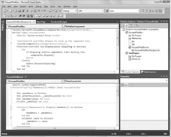
Let's test the control and verify that it exposes the same functionality as the TextBox control. Figure 9.2 shows the IDE while you're developing an inherited control. Notice that the FocusedTextBox control has inherited all the properties of the TextBox control, such as the MaxLength and PasswordChar properties.
To test the control, you must add it to a form. A control can't be executed outside the context of a host application. Add a new project to the solution (a Windows Forms Application project) with the File
To test the control you just designed, you need to place an instance of the custom control on the form of the test project. First, you must build the control. Select the FocusedTextBox item in the Solution Explorer, and from the Build menu, select the Build FocusedTextBox command (or right-click the FocusedTextBox component in the Solution Explorer and select Build from the context menu). The build process will create a DLL file with the control's executable code in the Bin folder under the project's folder.
Then switch to the test project's main form and open the Toolbox. You will see a new tab, the FocusedTextBox Components tab, which contains all the custom components of the current project. The new control has already been integrated into the design environment, and you can use it as you would any of the built-in Windows controls. Every time you edit the code of the custom control, you must rebuild the control's project for the changes to take effect and update the instances of the custom control on the test form. The icon that appears before the custom control's name is the default icon for all custom Windows controls. You can associate a different icon with your custom control, as explained in the section "Classifying the Control's Properties," later in this chapter.
Place an instance of the FocusedTextBox control on the form and check it out. It looks, feels, and behaves just like a regular TextBox. In fact, it is a TextBox control by a different name. It exposes all the members of the regular TextBox control: You can move it around, resize it, change its Multiline and WordWrap properties, set its Text property, and so on. It also exposes all the methods and events of the TextBox control.
As you can see, it's quite trivial to create a new custom control by inheriting any of the built-in Windows controls. Of course, what good is a control that's identical to an existing one? The idea is to add some extra functionality to the TextBox control, so let's do it. Switch to the control project and view the FocusedTextBox object's code. In the code editor's pane, expand the Objects list and select the item FocusedTextBox Events. This list contains the events of the TextBox control because it is the base control for our custom control.
Expand the Events drop-down list and select the Enter event. The following event handler declaration will appear:
Private Sub FocusedTextBox_Enter(...) Handles Me.Enter

End Sub
This event takes place every time our custom control gets the focus. To change the color of the current control, insert the following statement in the event handler:
Me.BackColor = Color.Cyan
(Or use any other color you like; just make sure it mixes well with the form's default background color. You can also use the members of the SystemColors enumeration, to help ensure that it mixes well with the background color.) We must also program the Leave event so that the control's background color is reset to white when it loses the focus. Enter the following statement in the Leave event's handler:
Private Sub FocusedTextBox_Leave(...) Handles Me.Leave
   Me.BackColor = Color.White
End Sub
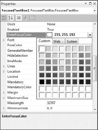
Having a hard time picking the color that signifies that the control has the focus? Why not expose this value as a property so that you (or other developers using your control) can set it individually in each project? Let's add the EnterFocusColor property, which is the control's background color when it has the focus.
Because our control is meant for data-entry operations, we can add another neat feature. Some fields on a form are usually mandatory, and some are optional. Let's add some visual indication for the mandatory fields. First, we need to specify whether a field is mandatory with the Mandatory property. If a field is mandatory, its background color will be set to the value of the MandatoryColor property, but only if the control is empty.
Here's a quick overview of the control's custom properties:
EnterFocusColorWhen the control receives the focus, its background color is set to this value. If you don't want the currently active control to change color, set its
EnterFocusColorproperty to white.MandatoryThis property indicates whether the control corresponds to a required field if
Mandatoryis True or to an optional field ifMandatoryis False.MandatoryColorThis is the background color of the control if its
Mandatoryproperty is set to True. TheMandatoryColorproperty overwrites the control's default background color. In other words, if the user skips a mandatory field, the corresponding control is painted with the color specified by theMandatoryColorproperty, and it's not reset to the control's default background color. Required fields behave like optional fields after they have been assigned a value.
If you read the previous chapter, you should be able to implement these properties easily. Listing 9.1 is the code that implements the four custom properties. The values of the properties are stored in the private variables declared at the beginning of the listing. Then the control's properties are implemented as Property procedures.
Example 9.1. The Property procedures of the FocusedTextBox custom control
Dim _mandatory As Boolean
Dim _enterFocusColor, _leaveFocusColor As Color
Dim _mandatoryColor As Color

Property Mandatory() As Boolean
    Get
        Mandatory = _mandatory
    End Get
    Set(ByVal value As Boolean)
        _mandatory = Value
    End Set
End Property

Property EnterFocusColor() As System.Drawing.Color
    Get
        Return _enterFocusColor
    End Get
    Set(ByVal value As System.Drawing.Color)
        _enterFocusColor = value
    End Set
End Property

Property MandatoryColor() As System.Drawing.Color
    Get
        Return _mandatoryColor
    End Get
    Set(ByVal value As System.Drawing.Color)
        _mandatoryColor = value
    End Set
End Property
The last step is to use these properties in the control's Enter and Leave events. When the control receives the focus, it changes its background color to EnterFocusColor to indicate that it's the active control on the form (the control with the focus). When it loses the focus, its background is restored to the usual background color, unless it's a required field and the user has left it blank. In this case, its background color is set to MandatoryColor. Listing 9.2 shows the code in the two focus-related events of the UserControl object.
Example 9.2. Enter and Leave events
Private _backColor As Color
Private Sub FocusedTextBox_Enter(...) Handles MyBase.Enter
   _backColor = Me.BackColor
   Me.BackColor = _enterFocusColor
End Sub

Private Sub FocusedTextBox_Leave(...) Handles MyBase.Leave
   If Trim(Me.Text).Length = 0 And _mandatory Then
      Me.BackColor = _mandatoryColor
   Else
      Me.BackColor = _backColor
   End If
End SubBuild the control again with the Build
Pretty impressive, isn't it? Even if you have no use for an enhanced TextBox control, you'll agree that building it was quite simple. Next time you need to enhance one of the Windows controls, you'll know how to do it. Just build a new control that inherits from an existing control, add some custom members, and use it. Create a project with all the "enhanced" controls and use them regularly in your projects. All you have to do is add a reference to the DLL that implements the control in a new project, just like reusing a custom class.
Let's go back to the FocusedTextBox control — there are some loose ends to take care of. First, you must specify the category in the Properties window under which each custom property appears. By default, all the properties you add to a custom control are displayed in the Misc section of the Properties window. To specify that a property be displayed in a different section, use the Category attribute of the Property procedure. As you will see, properties have other attributes too, which you can set in your code as you design the control.
Properties have attributes, which appear in front of the property name and are enclosed in a pair of angle brackets. All attributes are members of the System.ComponentModel class, and you must import this class to the module that contains the control's code. The following attribute declaration in front of the property's name determines the category of the Properties window in which the specific property will appear:
<Category("Appearance")> Public PropertyIf none of the existing categories suits a specific property, you can create a new category in the Properties window by specifying its name in the Category attribute. If you have a few properties that should appear in a section called Conditional, insert the following attribute in front of the declarations of the corresponding properties:
<Category("Conditional")> Public PropertyWhen this control is selected, the Conditional section will appear in the Properties window, and all the properties with this attribute will be under it.
Another attribute is the Description attribute, which determines the property's description that appears at the bottom of the Properties window when the property is selected. You can specify multiple attributes as follows:
<Description("Indicates whether the control can be left blank")>
<Category("Appearance")>
Property Mandatory() As Boolean
   '  the property procedure's code
End Property
The most important attribute is the DefaultValue attribute, which determines the property's default (initial) value. The DefaultValue attribute must be followed by the default value in parentheses:
<Description("Indicates whether the control can be left blank")>
<Category("Appearance"), DefaultValue(False)>
Property Mandatory() As Boolean
   '  the property procedure's code
End Property
Some attributes apply to the class that implements the custom controls. The DefaultProperty and DefaultEvent attributes determine the control's default property and event. To specify that Mandatory is the default property of the FocusedTextBox control, replace the class declaration with the following:
<DefaultProperty("Mandatory")> Public Class FocusedTextBoxEvents are discussed later in the chapter, but you already know how to raise an event from within a class. Raising an event from within a control's code is quite similar. Open the FocusedTextBox project, examine its code, and experiment with new properties and methods.
As you may have noticed, all custom controls appear in the Toolbox with the same icon. You can specify the icon to appear in the Toolbox with the ToolboxBitmap attribute, whose syntax is as follows, where imagepath is a string with the absolute path to a 16×16-pixel bitmap:
<ToolboxBitmap(imagepath)> Public Class FocusedTextBox
The bitmap is actually stored in the control's DLL and need not be distributed along with the control.
Now we're ready to move on to something more interesting. This time, we'll build a control that combines the functionality of several controls, which is another common scenario. You will literally design its visible interface by dropping controls on the UserControl object, just like designing the visible interface of a Windows form.
A compound control provides a visible interface that consists of multiple Windows controls. The controls that make up a compound control are known as constituent controls. As a result, this type of control doesn't inherit the functionality of any specific control. You must implement its properties and methods with custom code. This isn't as bad as it sounds, because a compound control inherits the UserControl object, which exposes quite a few members of its own (the Anchoring and Docking properties, for example, are exposed by the UserControl object, and you need not implement these properties — thank Microsoft). You will add your own members, and in most cases you'll be mapping the properties and methods of the compound controls to a property or method of one of its constituent controls. If your control contains a TextBox control, for example, you can map the custom control's WordWrap property to the equivalent property of the TextBox. The following property procedure demonstrates how to do it:
Property WordWrap() As Boolean
   Get
      WordWrap = TextBox1.WordWrap
   End Get
   Set(ByVal Value As Boolean)
      TextBox1.WordWrap = Value
   End Set
End Property
You don't have to maintain a private variable for storing the value of the custom control's WordWrap property. When this property is set, the Property procedure assigns the property's value to the TextBox1.WordWrap property. Likewise, when this property's value is requested, the procedure reads it from the constituent control and returns it. In effect, the custom control's WordWrap property affects directly the functionality of one of the constituent controls.
The same logic applies to events. Let's say your compound control contains a TextBox and a ComboBox control, and you want to raise the TextChanged event when the user edits the TextBox control and the SelectionChanged event when the user selects another item in the ComboBox control. First, you must declare the two events:
Event TextChanged
Event SelectionChanged
Then, you must raise the two events from within the appropriate event handlers: the TextChanged event from the TextBox1 control's TextChanged event handler and the SelectionChanged event from the ComboBox1 control's SelectedIndexChanged event handler:
Private Sub TextBox1_TextChanged(...)
            Handles FocusedTextBox1.TextChanged
    RaiseEvent TextChanged()
End Sub

Private Sub ComboBox1_SelectedIndexChanged(...)
            Handles ComboBox1.SelectedIndexChanged
    RaiseEvent SelectionChanged()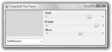
End SubIn this section, you're going to build a compound control that's similar to the Color dialog box. The ColorEdit control allows you to specify a color by adjusting its red, green, and blue components with three scroll bars or to select a color by name. The control's surface at runtime on a form is shown in Figure 9.4.
Create a new Windows Control Library project, the ColorEdit project. Save the solution and then add a new Windows Application project, the TestProject, and make it the solution's startup project, just as you did with the first sample project of this chapter.
Now, open the UserControl object and design its interface as shown in Figure 9.4. Place the necessary controls on the UserControl object's surface and align them just as you would do with a Windows form. The three ScrollBar controls are named RedBar, GreenBar, and BlueBar, respectively. The Minimum property for all three controls is 0; the Maximum for all three is 255. This is the valid range of values for a color component. The control at the top-left corner is a Label control with its background color set to black. (We could have used a PictureBox control in its place.) The role of this control is to display the selected color.
The ComboBox at the bottom of the custom control is the NamedColors control, which is populated with color names when the control is loaded. The Color class exposes 140 properties, which are color names (beige, azure, and so on). Don't bother entering all the color names in the ComboBox control; just open the ColorEdit project and you will find the AddNamedColors() subroutine, which does exactly that.
The user can specify a color by sliding the three ScrollBar controls or by selecting an item in the ComboBox control. In either case, the Label control's background color will be set to the selected color. If the color is specified with the ComboBox control, the three ScrollBars will adjust to reflect the color's basic components (red, green, and blue). Not all possible colors that you can specify with the three ScrollBars have a name (there are approximately 16 million colors). That's why the ComboBox control contains the Unknown item, which is selected when the user specifies a color by setting its basic components.
Finally, the ColorEdit control exposes two properties: NamedColor and SelectedColor. The NamedColor property retrieves the selected color's name. If the color isn't selected from the ComboBox control, the value Unknown will be returned. The SelectedColor property returns or sets the current color. Its type is Color, and it can be assigned any expression that represents a color value. The following statement will assign the form's BackColor property to the SelectedColor property of the control:
UserControl1.SelectedColor = Me.BackColor
You can also specify a color value with the FromARGB method of the Color object:
UserControl1.SelectedColor = Color.FromARGB(red, green, blue)
The implementation of the SelectedColor property (shown in Listing 9.3) is straightforward. The Get section of the procedure assigns the Label's background color to the SelectedColor property. The Set section of the procedure extracts the three color components from the value of the property and assigns them to the three ScrollBar controls. Then it calls the ShowColor subroutine to update the display. (You'll see shortly what this subroutine does.)
Example 9.3. SelectedColor property procedure
Property SelectedColor() As Color
   Get
      SelectedColor = Label1.BackColor
   End Get
   Set(ByVal Value As Color)
      HScrollBar1.Value = Value.R
HScrollBar2.Value = Value.G
HScrollBar3.Value = Value.B
ShowColor()
End Set
End PropertyThe NamedColor property (see Listing 9.4) is read-only and is marked with the ReadOnly keyword in front of the procedure's name. This property retrieves the value of the ComboBox control and returns it.
Example 9.4. NamedColor property procedure
ReadOnly Property NamedColor() As String
   Get
      NamedColor = ComboBox1.SelectedItem
   End Get
End Property
When the user selects a color name in the ComboBox control, the code retrieves the corresponding color value with the Color.FromName method. This method accepts a color name as an argument (a string) and returns a color value, which is assigned to the namedColor variable. Then the code extracts the three basic color components with the R, G, and B properties. (These properties return the red, green, and blue color components, respectively.) Listing 9.5 shows the code behind the ComboBox control's SelectedIndexChanged event, which is fired every time a new color is selected by name.
Example 9.5. Specifying a color by name
Private Sub ComboBox1_SelectedIndexChanged(...) Handles ComboBox1.SelectedIndexChanged
   Dim namedColor As Color
   Dim colorName As String
   colorName = ComboBox1.SelectedItem
   If colorName <> "Unknown" Then
      namedColor = Color.FromName(colorName)
      HScrollBar1.Value = namedColor.R
      HScrollBar2.Value = namedColor.G
      HScrollBar3.Value = namedColor.B
      ShowColor()
   End If
End Sub
The ShowColor() subroutine simply sets the Label's background color to the value specified by the three ScrollBar controls. Even when you select a color value by name, the control's code sets the three ScrollBars to the appropriate values. This way, we don't have to write additional code to update the display. The ShowColor() subroutine is quite trivial:
Sub ShowColor()
   Label1.BackColor = Color.FromARGB(255, HScrollBar1.Value,
           HScrollBar2.Value, HScrollBar3.Value)
End Sub
The single statement in this subroutine picks up the values of the three basic colors from the ScrollBar controls and creates a new color value with the FromARGB method of the Color object. The first argument is the transparency of the color (the alpha channel), and we set it to 255 for a completely opaque color. You can edit the project's code to take into consideration the transparency channel as well. If you do, you must replace the Label control with a PictureBox control and display an image in it. Then draw a rectangle with the specified color on top of it. If the color isn't completely opaque, you'll be able to see the underlying image and visually adjust the transparency channel.
To test the new control, you must place it on a form. Build the ColorEdit control and switch to the test project (add a new project to the current solution if you haven't done so already). Add an instance of the new custom control to the form. You don't have to enter any code in the test form. Just run it and see how you specify a color, either with the scroll bars or by name. You can also read the value of the selected color through the SelectedColor property. The code behind the Color Form button on the test form does exactly that (it reads the selected color and paints the form with this color):
Private Sub Button1_Click(...) Handles Button1.Click
    Me.BackColor = ColorEdit1.SelectedColor
End SubThis is the most complicated but most flexible type of control. A user-drawn control consists of a UserControl object with no constituent controls. You are responsible for updating the control's visible area with the appropriate code, which you must insert in the control's OnPaint method. (This method is invoked automatically every time the control's surface must be redrawn.)
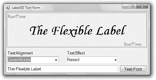
To demonstrate the design of user-drawn controls, we'll develop the Label3D control, which is an enhanced Label control and is shown in Figure 9.5. It provides all the members of the Label control plus the capability to render its caption in three-dimensional type. The new custom control is called Label3D, and its project is the FlexLabel project. It contains the Label3D project (which is a Windows Control Library project) and the usual test project (which is a Windows Application project).
At this point, you're probably thinking about the code that aligns the text and renders it as carved or raised. A good idea is to start with a Windows project, which displays a string on a form and aligns it in all possible ways. A control is an application packaged in a way that allows it to be displayed on a form instead of on the Desktop. As far as the functionality is concerned, in most cases it can be implemented on a regular form. Conversely, if you can display 3D text on a form, you can do so with a custom control.
Designing a Windows form with the same functionality is fairly straightforward. You haven't seen the drawing methods yet, but this control doesn't involve any advanced drawing techniques. All we need is a method to render strings on the control. To achieve the 3D effect, you must display the same string twice, first in white and then in black on top of the white. The two strings must be displaced slightly, and the direction of the displacement determines the effect (whether the text will appear as raised or carved). The amount of displacement determines the depth of the effect. Use a displacement of 1 pixel for a light effect and a displacement of 2 pixels for a heavy one.
The first step of designing a user-drawn custom control is to design the control's interface: what it will look like when placed on a form (its visible interface) and how developers can access this functionality through its members (the programmatic interface). Sure, you've heard the same advice over and over, and many of you still start coding an application without spending much time designing it. In the real world, especially if they are not a member of a programming team, people design as they code (or the other way around).
The situation is quite different with Windows controls. Your custom control must provide properties, which will be displayed automatically in the Properties window. The developer should be able to adjust every aspect of the control's appearance by manipulating the settings of these properties. In addition, developers expect to see the standard properties shared by most controls (such as the background color, the text font, and so on) in the Properties window. You must carefully design the methods so that they expose all the functionality of the control that should be accessed from within the application's code, and the methods shouldn't overlap. Finally, you must provide the events necessary for the control to react to external events. Don't start coding a custom control unless you have formulated a clear idea of what the control will do and how developers will use it at design time.
The Label3D control displays a caption like the standard Label control, so it must provide a Font property, which lets the developer determine the label's font. The UserControl object exposes its own Font property, so we need not implement it in our code. In addition, the Label3D control can align its caption both vertically and horizontally. This functionality will be exposed by the Alignment property, whose possible settings are the members of the Align enumeration: TopLeft, TopMiddle, TopRight, CenterLeft, CenterMiddle, CenterRight, BottomLeft, BottomMiddle, and BottomRight. The (self-explanatory) values are the names that will appear in the drop-down list of the Alignment property in the Properties window.
Similarly, the text effect is manipulated through the Effect property, whose possible settings are the members of the Effect3D custom enumeration: None, Carved, CarvedHeavy, Raised, and RaisedHeavy. There are basically two types of effects (raised and carved text) and two variations on each effect (normal and heavy).
In addition to the custom properties, the Label3D control should also expose the standard properties of a Label control, such as Tag, BackColor, and so on. Developers expect to see standard properties in the Properties window, and you should implement them. The Label3D control doesn't have any custom methods, but it should provide the standard methods of the Label control, such as the Move method. Similarly, although the control doesn't raise any special events, it must support the standard events of the Label control, such as the mouse and keyboard events.
Most of the custom control's functionality exists already, and there should be a simple technique to borrow this functionality from other controls instead of implementing it from scratch. This is indeed the case: The UserControl object, from which all user-drawn controls inherit, exposes a large number of members.
Start a new project of the Windows Control Library type, name it FlexLabel, and then rename the UserControl1 object Label3D. Open the UserControl object's code window and change the name of the class from UserControl1 to Label3D.
Every time you place a Windows control on a form, it's named according to the UserControl object's name and a sequence digit. The first instance of the custom control you place on a form will be named Label3D1, the next one will be named Label3D2, and so on. Obviously, it's important to choose a meaningful name for your UserControl object. Note that although this custom control is basically a Label control, it won't inherit from an existing control. You must implement it from scratch in your code.
As you will soon see, the UserControl is the "form" on which the custom control will be designed. It looks, feels, and behaves like a regular VB form, but it's called a UserControl. UserControl objects have additional unique properties that don't apply to a regular form, but to start designing new controls, think of them as regular forms.
You've set the scene for a new user-drawn Windows control. Start by declaring the Align and Effect3D enumerations, as shown in Listing 9.6.
Example 9.6. Align and Effect3D enumerations
Public Enum Align
   TopLeft
   TopMiddle
   TopRight
   CenterLeft
   CenterMiddle
   CenterRight
   BottomLeft
   BottomMiddle
   BottomRight
End Enum
Public Enum Effect3D
   None
   Raised
   RaisedHeavy
   Carved
   CarvedHeavy
End Enum
The next step is to implement the Alignment and Effect properties. Each property's type is an enumeration. Listing 9.7 shows the implementation of the two properties.
Example 9.7. Alignment and Effect properties
Private Shared mAlignment As Align
Private Shared mEffect As Effect3D
Public Property Alignment() As Align
   Get
      Alignment = mAlignment
   End Get
   Set(ByVal Value As Align)
      mAlignment = Value
      Invalidate()
   End Set
End Property

Public Property Effect() As Effect3D
   Get
      Effect = mEffect
   End Get
   Set(ByVal Value As Effect3D)
      mEffect = Value
      Invalidate()
   End Set
End Property
The current settings of the two properties are stored in the private variables mAlignment and mEffect. When either property is set, the Property procedure's code calls the Invalidate method of the UserControl object to force a redraw of the string on the control's surface. The call to the Invalidate method is required for the control to operate properly in design mode. You can provide a method to redraw the control at runtime (although developers shouldn't have to call a method to refresh the control every time they set a property), but this isn't possible at design time. In general, when a property is changed in the Properties window, the control should be able to update itself and reflect the new property setting, and this is done with a call to the Invalidate method. Shortly, you'll see an even better way to automatically redraw the control every time a property is changed.
Finally, you must add one more property, the Caption property, which is the string to be rendered on the control. Declare a private variable to store the control's caption (the mCaption variable) and enter the code from Listing 9.8 to implement the Caption property.
Example 9.8. Caption Property procedure
Private mCaption As String
Property Caption() As String
   Get
      Caption = mCaption
   End Get
   Set(ByVal Value As String)
      mCaption = Value
      Invalidate()
   End Set
End Property
The core of the control's code is in the OnPaint method, which is called automatically before the control repaints itself. The same event's code is also executed when the Invalidate method is called, and this is why we call this method every time one of the control's properties changes value. The OnPaint method enables you to take control of the paint process and supply your own code for painting the control's surface. The single characteristic of all user-drawn controls is that they override the default OnPaint method. This is where you must insert the code to draw the control's surface — that is, draw the specified string, taking into consideration the Alignment and Effect properties. The OnPaint method's code is shown in Listing 9.9.
Example 9.9. UserControl object's OnPaint method
Protected Overrides Sub OnPaint(
         ByVal e As System.Windows.Forms.PaintEventArgs)
    Dim lblFont As Font = Me.Font
    Dim lblBrush As New SolidBrush(Color.Red)
    Dim X, Y As Integer
    Dim textSize As SizeF =
           e.Graphics.MeasureString(mCaption, lblFont)
    Select Case mAlignment
        Case Align.BottomLeft
            X = 2
            Y = Convert.ToInt32(Me.Height - textSize.Height)
        Case Align.BottomMiddle
            X = CInt((Me.Width - textSize.Width) / 2)
            Y = Convert.ToInt32(Me.Height - textSize.Height)
        Case Align.BottomRight
            X = Convert.ToInt32(Me.Width - textSize.Width - 2)
            Y = Convert.ToInt32(Me.Height - textSize.Height)
Case Align.CenterLeft
X = 2
Y = Convert.ToInt32((Me.Height - textSize.Height) / 2)
Case Align.CenterMiddle
X = Convert.ToInt32((Me.Width - textSize.Width) / 2)
Y = Convert.ToInt32((Me.Height - textSize.Height) / 2)
Case Align.CenterRight
X = Convert.ToInt32(Me.Width - textSize.Width - 2)
Y = Convert.ToInt32((Me.Height - textSize.Height) / 2)
Case Align.TopLeft
X = 2
Y = 2
Case Align.TopMiddle
X = Convert.ToInt32((Me.Width - textSize.Width) / 2)
Y = 2
Case Align.TopRight
X = Convert.ToInt32(Me.Width - textSize.Width - 2)
Y = 2
End Select
Dim dispX, dispY As Integer
Select Case mEffect
Case Effect3D.None : dispX = 0 : dispY = 0
Case Effect3D.Raised : dispX = 1 : dispY = 1
Case Effect3D.RaisedHeavy : dispX = 2 : dispY = 2
Case Effect3D.Carved : dispX = −1 : dispY = −1
Case Effect3D.CarvedHeavy : dispX = −2 : dispY = −2
End Select
lblBrush.Color = Color.White
e.Graphics.DrawString(mCaption, lblFont, lblBrush, X, Y)
lblBrush.Color = Me.ForeColor
e.Graphics.DrawString(mCaption, lblFont, lblBrush, X + dispX, Y + dispY)
End SubThis subroutine calls for a few explanations. The Paint method passes a PaintEventArgs argument (the ubiquitous e argument). This argument exposes the Graphics property, which represents the control's surface. The Graphics object exposes all the methods you can call to create graphics on the control's surface. The Graphics object is discussed briefly in Chapter 11 and in more detail in the tutorial "Drawing and Painting with Visual Basic 2010," but for this chapter all you need to know is that the MeasureString method returns the dimensions of a string when rendered in a specific font and the DrawString method draws the string in the specified font. The first Select Case statement calculates the coordinates of the string's origin on the control's surface, and these coordinates are calculated differently for each type of alignment. Then another Select Case statement sets the displacement between the two strings so that when superimposed they produce a three-dimensional effect. Finally, the code draws the string of the Caption property on the Graphics object. It draws the string in white first, then in black. The second string is drawn dispX pixels to the left and dispY pixels below the first one to give the 3D effect. The values of these two variables are determined by the setting of the Effect property.
The event handler of the sample project contains a few more statements that are not shown here. These statements print the strings DesignTime and RunTime in a light color on the control's background, depending on the current status of the control. They indicate whether the control is currently in design (if the DesignMode property is True) or runtime (if DesignMode is False), and you will remove them after testing the control.
To test your new control, you must first add it to the Toolbox and then place instances of it on the test form. You can add a form to the current project and test the control, but you shouldn't add more components to the control project. It's best to add a new project to the current solution.
Visual Studio supports a simple method of testing custom controls. Instead of using a test project, you can press F5 to "run" the Windows Control project. Right-click the name of the Label3D project (the Windows Control project in the solution) in Solution Explorer, and from the context menu choose Set As Startup Project. Then press F5 to start the project. A dialog box (shown in the following screen shot) will appear with the control at runtime and its Properties window.
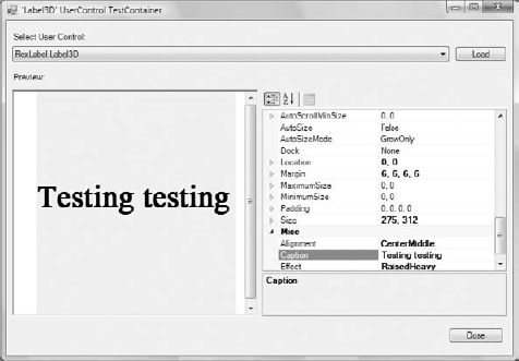
In this dialog box, you can edit any of the control's properties and see how they affect the control at runtime. If the control reacts to any user actions, you can see how the control's code behaves at runtime.
You can't test the control's methods, or program its events, but you'll get an idea of how the control will behave when placed on a form. Use this dialog box while you're developing the control's interface to see how it will behave when placed on a test form and how it reacts when you change its properties. When you're happy with the control's interface, you should test it with a Windows project from which you can call its methods and program its events.
Add the TestProject to the current solution and place on its main form a Label3D control as well as the other controls shown earlier in Figure 9.5. If the Label3D icon doesn't appear in the Toolbox, build the control's project and a new item will be added to the FlexLabel Components tab of the Toolbox.
Now double-click the Label3D control on the form to see its events. Your new control has its own events, and you can program them just as you would program the events of any other control. Enter the following code in the control's Click event:
Private Sub Label3D1_Click(...) Handles Label3D1.Click
   MsgBox("My properties are " & vbCrLf &
          "Caption = "  Label3D1.Caption.ToString & vbCrLf &
          "Alignment = "  Label3D1.Alignment.ToString & vbCrLf &
          "Effect = "  Label3D1.Effect.ToString)
End Sub
To run the control, press F5 and then click the control. You will see the control's properties displayed in a message box.
The other controls on the test form allow you to set the appearance of the custom control at runtime. The two ComboBox controls are populated with the members of the appropriate enumeration when the form is loaded. In their SelectedIndexChanged event handler, you must set the corresponding property of the FlexLabel control to the selected value, as shown in the following code:
Private Sub AlignmentBox_SelectedIndexChanged(...)
            Handles AlignmentBox.SelectedIndexChanged
   Label3D1.Alignment = AlignmentBox.SelectedItem
End Sub

Private Sub EffectsBox_SelectedIndexChanged(...)
            Handles EffectsBox.SelectedIndexChanged
   Label3D1.Effect = EffectsBox.SelectedItem
End Sub
The TextBox control at the bottom of the form stores the Caption property. Every time you change this string, the control is updated because the Set procedure of the Caption property calls the Invalidate method.
The UserControl object exposes many of the events you need to program the control, such as the key and mouse events, and you need not insert a single line of code in the custom control's code. In addition, you can raise custom events. The Windows controls raise an event every time a property value is changed. If you examine the list of events exposed by the Label3D control, you'll see the FontChanged and SizeChanged events. These events are provided by the UserControl object. As a control developer, you should expose similar events for your custom properties, the OnAlignmentChanged, OnEffectChanged, and OnCaptionChanged events. This isn't difficult to do, but you must follow a few steps. Start by declaring an event handler for each of the Changed events:
Private mOnAlignmentChanged As EventHandler
Private mOnEffectChanged As EventHandler
Private mOnCaptionChanged As EventHandler
Then declare the actual events and their handlers:
Public Event AlignmentChanged(ByVal sender As Object, ByVal ev As EventArgs)
Public Event EffectChanged(ByVal sender As Object, ByVal ev As EventArgs)
Public Event CaptionChanged(ByVal sender As Object, ByVal ev As EventArgs)
When a property changes value, you must call the appropriate method. In the Set section of the Alignment Property procedure, insert the following statement:
OnAlignmentChanged(EventArgs.Empty)
And finally, invoke the event handlers from within the appropriate OnEventName method:
Protected Overridable Sub OnAlignmentChanged(ByVal e As EventArgs)
   Invalidate()
   If Not (mOnAlignmentChanged Is Nothing) Then
                    mOnAlignmentChanged.Invoke(Me, e)
End Sub

Protected Overridable Sub OnEffectChanged(ByVal e As EventArgs)
   Invalidate()
   If Not (mOnEffectChanged Is Nothing) Then
                       mOnEffectChanged.Invoke(Me, e)
End Sub

Protected Overridable Sub OnCaptionChanged(ByVal e As EventArgs)
   Invalidate()
   If Not (mOnCaptionChanged Is Nothing) Then
                       mOnCaptionChanged.Invoke(Me, e)
End Sub
As you can see, the OnPropertyChanged events call the Invalidate method to redraw the control when a property's value is changed. As a result, you can now remove the call to the Invalidate method from the Property Set procedures. If you switch to the test form, you will see that the custom control exposes the AlignmentChanged, EffectChanged, and CaptionChanged events. The OnCaptionChanged method is executed automatically every time the Caption property changes value, and it fires the CaptionChanged event. The developer using the Label3D control shouldn't have to program this event.
When you select the custom control in the Objects drop-down list of the editor and expand the list of events for this control, you'll see all the events that the UserControl object may fire. Let's add a custom event for our control. To demonstrate how to raise events from within a custom control, we'll return for a moment to the ColorEdit control you developed a little earlier in this chapter.
Let's say you want to raise an event (the ColorClick event) when the user clicks the Label control displaying the selected color. To raise a custom event, you must declare it in your control and call the RaiseEvent method. Note that the same event may be raised from many different places in the control's code.
To declare the ColorClick event, enter the following statement in the control's code. This line can appear anywhere, but placing it after the private variables that store the property values is customary:
Public Event ColorClick(ByVal sender As Object, ByVal e As EventArgs)
To raise the ColorClick event when the user clicks the Label control, insert the following statement in the Label control's Click event handler:
Private Sub Label1_Click(...) Handles Label1.Click
   RaiseEvent ColorClick(Me, e)
End Sub
Raising a custom event from within a control is as simple as raising an event from within a class. It's actually simpler to raise a custom event than to raise the usual PropertyChanged events, which are fired from within the OnPropertyChanged method of the base control.
The RaiseEvent statement in the Label's Click event handler maps the Click event of the Label control to the ColorClick event of the custom control. If you switch to the test form and examine the list of events of the ColorEdit control on the form, you'll see that the new event was added. The ColorClick event doesn't convey much information. When raising custom events, it's likely that you'll want to pass additional information to the developer.
Let's say you want to pass the Label control's color to the application through the second argument of the ColorClick event. The EventArgs type doesn't provide a Color property, so we must build a new type that inherits all the members of the EventArgs type and adds a property: the Color property. You can probably guess that we'll create a custom class that inherits from the EventArgs class and adds the Color member. Enter the statements of Listing 9.10 at the end of the file (after the existing End Class statement).
Example 9.10. Declaring a custom event type
Public Class ColorEvent
   Inherits EventArgs
   Public color As Color
End Class
Then, declare the following event in the control's code:
Public Event ColorClick(ByVal sender As Object, ByVal e As ColorEvent)
And finally, raise the ColorClick event from within the Label's Click event handler (see Listing 9.11).
Example 9.11. Raising a custom event
Private Sub Label1_Click(...) Handles Label1.Click
   Dim clrEvent As ColorEvent
   clrEvent.color = Label1.BackColor
   RaiseEvent ColorClick(Me, clrEvent)
End Sub
Not all events fired by a custom control are based on property value changes. You can fire events based on external conditions or a timer, as discussed in Chapter 8.
By adding a test project to the Label3D custom control project, we designed and tested the control in the same environment. A great help, indeed, but the custom control can't be used in other projects. If you start another instance of Visual Studio and attempt to add your custom control to the Toolbox, you won't see the Label3D entry there.
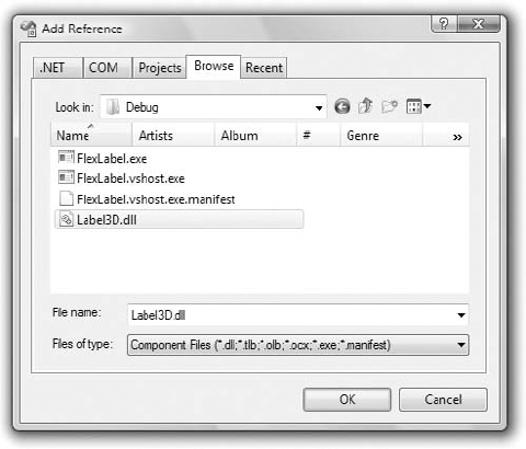
To add your custom component in another project, open the Choose Toolbox Items dialog box and then click the .NET Framework Components tab. Be sure to carry out the steps described here while the .NET Framework Components tab is visible. If the COM Components tab is visible instead, you can perform the same steps, but you'll end up with an error message (because the custom component is not a COM component).
Click the Browse button in the dialog box and locate the FlexLabel.dll file. It's in the Bin folder under the FlexLabel project's folder. The Label3D control will be added to the list of .NET Framework components, as shown in Figure 9.6. Select the check box in front of the control's name; then click the OK button to close the dialog box and add Label3D to the Toolbox. Now you can use this control in your new project.
The UserControl object has a rectangular shape by default. However, a custom control need not be rectangular. It's possible to create irregularly shaped forms too, but unlike irregularly shaped controls, an irregularly shaped form is still quite uncommon. Irregularly shaped controls are used in fancy interfaces, and they usually react to movement of the mouse. (They may change color when the mouse is over them or when they're clicked, for example.)
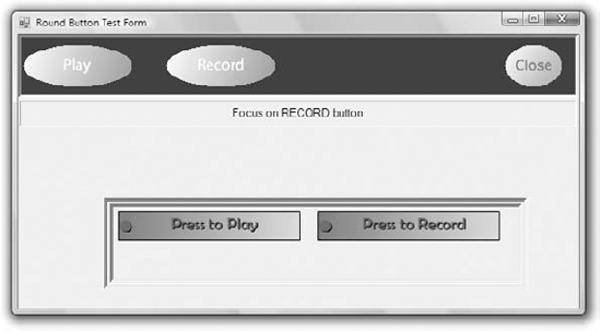
To change the default shape of a custom control, you must use the Region object, which is another graphics-related object that specifies a closed area. You can even use Bezier curves to make highly unusual and smooth shapes for your controls. In this section, we'll do something less ambitious: We'll create controls with the shape of an ellipse, as shown in the upper half of Figure 9.7. To follow the code presented in this section, open the NonRectangularControl project; the custom control is the RoundControl Windows Control Library project, and Form1 is the test form for the control.
You can turn any control to any shape you like by creating the appropriate Region object and then applying it to the Region property of the control. This must take place from within the control's Paint event. Listing 9.12 shows the statements that change the shape of the control.
Example 9.12. Creating a nonrectangular control
Protected Sub PaintControl(ByVal sender As Object,
              ByVal pe As PaintEventArgs) Handles Me.Paint
    pe.Graphics.TextRenderingHint = Drawing.Text.TextRenderingHint.AntiAlias
    Dim roundPath As New GraphicsPath()
    Dim R As New Rectangle(0, 0, Me.Width, Me.Height)
    roundPath.AddEllipse(R)
    Me.Region = New Region(roundPath)
End Sub
First, we retrieve the Graphics object of the UserControl; then we create a GraphicsPath object, the roundPath variable, and add an ellipse to it. The ellipse is based on the enclosing rectangle. The R object is used temporarily to specify the ellipse. The new path is then used to create a Region object, which is assigned to the Region property of the UserControl object. This gives our control the shape of an ellipse.
Listing 9.12 shows the statements that specify the control's shape. In addition, you must insert a few statements to display the control's caption, which is specified by the control's Caption property. The caption is rendered normally in yellow unless the mouse is hovering over the control, in which case the same caption is rendered with a 3D effect. You already know how to achieve this effect: by printing the same string twice in different colors with a slight displacement between them.
Listing 9.13 shows the code in the control's MouseEnter and MouseLeave events. When the mouse enters the control's area (this is detected by the control automatically — you won't have to write a single line of code for it), the currentState variable is set to State.Active (State is an enumeration in the project's code), and the control's caption appears in raised type. In the control's MouseLeave event handler, the currentState variable is reset to State.Inactive and the control's caption appears in regular font. In addition, each time the mouse enters and leaves the control, the MouseInsideControl and MouseOutsideControl custom events are fired.
Example 9.13. RoundButton control's MouseEnter and MouseLeave events
Private Sub RoundButton_MouseEnter(...) Handles MyBase.MouseEnter
    currentState = State.Active
    Me.Refresh()
    RaiseEvent MouseInsideButton(Me)
End Sub

Private Sub RoundButton_MouseLeave(...) Handles MyBase.MouseLeave
    currentState = State.Inactive
    Me.Refresh()
    RaiseEvent MouseOusideButton(Me)
End Sub
These two events set up the appropriate variables, and the drawing of the control takes place in the Paint event's handler, which is shown in Listing 9.14.
Example 9.14. RoundButton control's Paint event handler
Protected Sub PaintControl(ByVal sender As Object,
                           ByVal pe As PaintEventArgs) Handles Me.Paint
    pe.Graphics.TextRenderingHint = Drawing.Text.TextRenderingHint.AntiAlias
    Dim roundPath As New GraphicsPath()
    Dim R As New Rectangle(0, 0, Me.Width, Me.Height)
    roundPath.AddEllipse(R)
    Me.Region = New Region(roundPath)
Dim Path As New GraphicsPath
Path.AddEllipse(R)
Dim grBrush As LinearGradientBrush
If currentState = State.Active Then
grBrush = New LinearGradientBrush(
New Point(0, 0),
New Point(R.Width, R.Height),
Color.DarkGray, Color.White)
Else
grBrush = New LinearGradientBrush(
New Point(R.Width, R.Height),
New Point(0, 0), Color.DarkGray,
Color.White)
End If
pe.Graphics.FillPath(grBrush, Path)
Dim X As Integer =
(Me.Width - pe.Graphics.MeasureString(
currentCaption, currentFont).Width) / 2
Dim Y As Integer = (Me.Height - pe.Graphics.MeasureString(
currentCaption, currentFont).Height) / 2
If currentState = State.Active Then
pe.Graphics.DrawString(currentCaption,
currentFont, Brushes.Black, X, Y)
pe.Graphics.DrawString(currentCaption,
currentFont,
New SolidBrush(currentCaptionColor), X - 1, Y - 1)
Else
pe.Graphics.DrawString(currentCaption,
currentFont,
New SolidBrush(currentCaptionColor), X, Y)
End If
End SubThe OnPaint method uses graphics methods to fill the control with a gradient and center the string on the control. They're the same methods we used in the example of the user-drawn control earlier in this chapter. The drawing methods are discussed in detail in the tutorial "Drawing with VB 2010," which can be found at www.sybex.com/go/masteringvb2010.
The code uses the currentState variable, which can take on two values: Active and Inactive. These two values are members of the State enumeration, which is shown next:
Public Enum State
   Active
   Inactive
End Enum
The test form of the project shows how the RoundButton control behaves on a form. You can use the techniques described in this section to make a series of round controls for a totally different look and feel.
The Play button's Click event handler in the test form changes the caption of the button according to the control's current state. It also disables the other RoundButton controls on the test form. Here's the Click event handler of the Play button:
Private Sub bttnplay_Click(...) Handles bttnPlay.Click
    If bttnPlay.Caption = "Play" Then
        Label1.Text = "Playing..."
        bttnPlay.Caption = "STOP"
        bttnPlay.Color = Color.Red
        bttnRecord.Enabled = False
        bttnClose.Enabled = False
    Else
        Label1.Text = "Stopped Playing"
        bttnPlay.Caption = "Play"
        bttnPlay.Color = Color.Yellow
        bttnRecord.Enabled = True
        bttnClose.Enabled = True
    End If
End Sub
There are many methods for drawing shapes and paths, and you may wish to experiment with other oddly shaped controls. How about a progress indicator control that looks like a thermometer? Or a button with an LED that turns on or changes color when you press the button, like the buttons in the lower half of Figure 9.7? The two rectangular buttons are instances of the LEDButton custom control, which is included in the NonRectangularControl project. Open the project in Visual Studio and examine the code that renders the rectangular buttons emulating an LED in the left corner of the control.
Next, I'll show you how to customize the list controls (such as the ListBox, ComboBox, and TreeView controls). You won't build new custom controls; actually, you'll hook custom code into certain events of a control to take charge of the rendering of its items.
Some of the Windows controls can be customized far more than it is possible through their properties. These are the list controls that allow you to supply your own code for drawing each item. You can use this technique to create a ListBox control that displays its items in different fonts, uses alternating background colors, and so on. You can even put bitmaps on the background of each item, draw the text in any color, and create items of varying heights. This is an interesting technique because without it, as you recall from our discussion of the ListBox control, all items have the same height and you must make the control wide enough to fit the longest item (if this is known at design time). The controls that allow you to take charge of the rendering process of their items are the ListBox, CheckedListBox, ComboBox, and TreeView controls.
To create an owner-drawn control, you must program two events: the MeasureItem and DrawItem events. In the MeasureItem event, you determine the dimensions of the rectangle in which the drawing will take place. In the DrawItem event, you insert the code for rendering the items on the control. Every time the control is about to display an item, it fires the MeasureItem event first and then the DrawItem event. By inserting the appropriate code in the two event handlers, you can take control of the rendering process.
These two events don't take place unless you set the DrawMode property of the control accordingly. Because only controls that expose the DrawMode property can be owner drawn, you have a quick way of figuring out whether a control's appearance can be customized with the techniques discussed in this section. The DrawMode property can be set to Normal (the control draws its own surface), OwnerDrawnFixed (you can draw the control, but the height of the drawing area remains fixed), or OwnerDrawnVariable (you can draw the control and use a different height for each item). The same property for the TreeView control has three different settings: None, OwnerDrawText (you provide the text for each item), and OwnerDrawAll (you're responsible for drawing each node's rectangle).
The default look of the ListBox control will work fine with most applications, but you might have to create owner-drawn ListBoxes if you want to use different colors or fonts for different types of items or populate the list with items of widely different lengths.
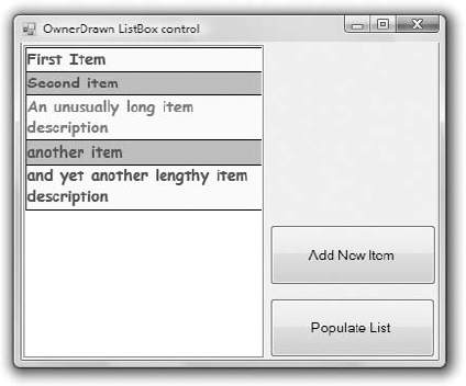
The example you'll build in this section, shown in Figure 9.8, uses an alternating background color, and each item has a different height, depending on the string it holds. Lengthy strings are broken into multiple lines at word boundaries. Because you're responsible for breaking the string into lines, you can use any other technique — for example, you can place an ellipsis to indicate that the string is too long to fit on the control, use a smaller font, and so on. The fancy ListBox of Figure 9.8 was created with the OwnerDrawnList project.
To custom-draw the items in a ListBox control (or a ComboBox, for that matter), you use the MeasureItem event to calculate the item's dimensions and the DrawItem event to actually draw the item. Each item is a rectangle that exposes a Graphics object, and you can call any of the Graphics object's drawing methods to draw on the item's area. The drawing techniques we'll use in this example are similar to the ones we used in the previous section.
Each time an item is about to be drawn, the MeasureItem and DrawItem events are fired in this order. In the MeasureItem event handler, we set the dimensions of the item with the statements shown in Listing 9.15.
Example 9.15. Setting up an item's rectangle in an owner-drawn ListBox control
Private Sub ListBox1_MeasureItem(ByVal sender As Object,
                 ByVal e As System.Windows.Forms.MeasureItemEventArgs)
                 Handles ListBox1.MeasureItem
     If fnt Is Nothing Then Exit Sub
     Dim itmSize As SizeF
     Dim S As New SizeF(ListBox1.Width, 200)
     itmSize = e.Graphics.MeasureString(ListBox1.Items(e.Index).ToString, fnt, S)
     e.ItemHeight = itmSize.Height
     e.ItemWidth = itmSize.Width
  End Sub
The MeasureString method of the Graphics object accepts as arguments a string, the font in which the string will be rendered, and a SizeF object. The SizeF object provides two properties: the Width and Height properties, which you use to pass to the method information about the area in which you want to print the string. In our example, we'll print the string in a rectangle that's as wide as the ListBox control and as tall as needed to fit the entire string. I'm using a height of 200 pixels (enough to fit the longest string that users might throw at the control). Upon return, the MeasureString method sets the members of the SizeF object to the width and height actually required to print the string.
The two properties of the SizeF object are then used to set the dimensions of the current item (properties e.ItemWidth and e.ItemHeight). The custom rendering of the current item takes place in the ItemDraw event handler, which is shown in Listing 9.16. The Bounds property of the handler's e argument reports the dimensions of the item's cell as you calculated them in the MeasureItem event handler.
Example 9.16. Drawing an item in an owner-drawn ListBox control
Private Sub ListBox1_DrawItem(ByVal sender As Object,
               ByVal e As System.Windows.Forms.DrawItemEventArgs)
               Handles ListBox1.DrawItem
   If e.Index = −1 Then Exit Sub
   Dim txtBrush As SolidBrush
   Dim bgBrush As SolidBrush
   Dim txtfnt As Font
   If e.Index / 2 = CInt(e.Index / 2) Then
   ' color even numbered items
      txtBrush = New SolidBrush(Color.Blue)
      bgBrush = New SolidBrush(Color.LightYellow)
   Else
   ' color odd numbered items
      txtBrush = New SolidBrush(Color.Blue)
      bgBrush = New SolidBrush(Color.Cyan)
   End If
   If e.State And DrawItemState.Selected Then
' use red color and bold for the selected item
txtBrush = New SolidBrush(Color.Red)
txtfnt = New Font(fnt.Name, fnt.Size, FontStyle.Bold)
Else
txtfnt = fnt
End If
e.Graphics.FillRectangle(bgBrush, e.Bounds)
e.Graphics.DrawRectangle(Pens.Black, e.Bounds)
Dim R As New RectangleF(e.Bounds.X, e.Bounds.Y,
e.Bounds.Width, e.Bounds.Height)
e.Graphics.DrawString(ListBox1.Items(e.Index).ToString, txtfnt, txtBrush, R)
e.DrawFocusRectangle()
End SubTo test the custom-drawn ListBox control, place two buttons on the form, as shown in Figure 9.8. The Add New Item button prompts the user for a new item (a string) and adds it to the control's Items collection. Listing 9.17 shows the code that adds a new item to the list. Note that the code is identical to the code you'd use to add items to a regular ListBox control.
- Extend the functionality of existing Windows Forms controls with inheritance.
The simplest type of control you can build is one that inherits an existing control. The inherited control includes all the functionality of the original control plus some extra functionality that's specific to an application and that you implement with custom code.
- Master It
Describe the process of designing an inherited custom control.
- Build compound controls that combine multiple existing controls.
A compound control provides a visible interface that combines multiple Windows controls. As a result, this type of control doesn't inherit the functionality of any specific control; you must expose its properties by providing your own code. The UserControl object, on which the compound control is based, already exposes a large number of members, including some fairly advanced ones such as the
AnchoringandDockingproperties, and the usual mouse and key events.- Master It
How will you map certain members of a constituent control to custom members of the compound control?
- Build custom controls from scratch.
User-drawn controls are the most flexible custom controls because you're in charge of the control's functionality and appearance. Of course, you have to implement all the functionality of the control from within your code, so it takes substantial programming effort to create user-drawn custom controls.
- Master It
Describe the process of developing a user-drawn custom control.
- Customize the rendering of items in a ListBox control.
The Windows controls that present lists of items display their items in a specific manner. The Framework allows you to take control of the rendering process and change completely the default appearance of the items on these controls. The controls that allow you to take charge of the rendering process of their items are the ListBox, CheckedListBox, ComboBox, and TreeView controls.
To create an owner-drawn control, you must set the
DrawModeproperty to a member of theDrawModeenumeration and insert the appropriate code in the eventsMeasureItemandDrawItem. TheMeasureItemevent is where you decide about the dimensions of the rectangle in which the drawing will take place. TheDrawItemevent is where you insert the code for rendering the items on the control.- Master It
Outline the process of creating a ListBox control that wraps the contents of lengthy items.