
In previous chapters, we explored the environment of Visual Basic and the principles of event-driven programming, which is the core of VB's programming model. In the process, we briefly explored a few basic controls through the examples. The .NET Framework provides many more controls, and all of them have a multitude of trivial properties (such as Font, BackgroundColor, and so on), which you can set either in the Properties window or from within your code.
This chapter explores in depth the basic Windows controls: the controls you'll use most often in your applications because they are the basic building blocks of typical rich client-user interfaces. Rather than look at the background and foreground color, font, and other trivial properties of all controls, we'll look at the properties unique to each control and see how these properties are used in building functional, rich user interfaces.
In this chapter, you'll learn how to do the following:
Use the TextBox control as a data-entry and text-editing tool
Use the ListBox, CheckedListBox, and ComboBox controls to present lists of items
Use the ScrollBar and TrackBar controls to enable users to specify sizes and positions with the mouse
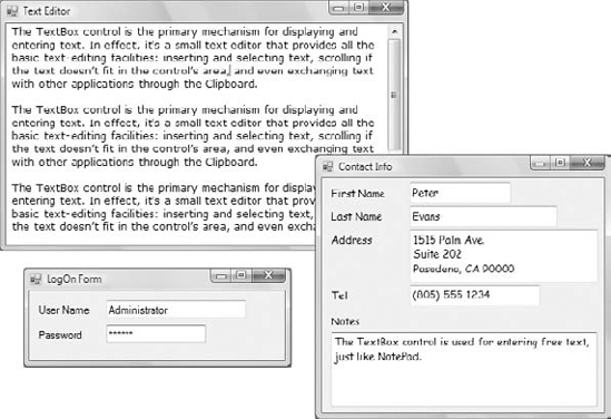
The TextBox control is the primary mechanism for displaying and entering text. It is a small text editor that provides all the basic text-editing facilities: inserting and selecting text, scrolling if the text doesn't fit in the control's area, and even exchanging text with other applications through the Clipboard.
The TextBox control is an extremely versatile data-entry tool that can be used for entering and editing single lines of text, such as a number or a password or an entire text file. Figure 5.1 shows a few typical examples. All the boxes in Figure 5.1 contain text—some a single line, some several lines. The scroll bars you see in some text boxes are part of the control. You can specify which scroll bars (vertical and/or horizontal) will be attached to the control, and they appear automatically whenever the control's contents exceed the visible area of the control.
Let's start with the properties that specify the appearance and, to some degree, the functionality of the TextBox control; these properties are usually set at design time through the Properties window. Then, we'll look at the properties that allow you to manipulate the control's contents and interact with users from within your code.
This property sets (or returns) the alignment of the text on the control, and its value is a member of the HorizontalAlignment enumeration: Left, Right, or Center. The TextBox control doesn't allow you to format text (mix different fonts, attributes, or colors), but you can set the font in which the text will be displayed with the Font property as well as the control's background color with the BackColor property.
This property determines whether the TextBox control will hold a single line or multiple lines of text. Every time you place a TextBox control on your form, it's sized for a single line of text and you can change its width only. To change this behavior, set the MultiLine property to True. When creating multiline TextBoxes, you will most likely have to set one or more of the MaxLength, ScrollBars, and WordWrap properties in the Properties window.
This property determines the number of characters that the TextBox control will accept. Its default value is 32,767, which was the maximum number of characters the VB 6 version of the control could hold. Set this property to zero so that the text can have any length up to the control's capacity limit—2,147,483,647 characters, to be exact. To restrict the number of characters that the user can type, set the value of this property accordingly.
The MaxLength property of the TextBox control is often set to a specific value in data-entry applications to prevent users from entering more characters than can be stored in a database field. A TextBox control for entering international standard book numbers (ISBNs), for instance, shouldn't accept more than 13 characters.
This property lets you specify the scroll bars you want to attach to the TextBox if the text exceeds the control's dimensions. Single-line text boxes can't have a scroll bar attached, even if the text exceeds the width of the control. Multiline text boxes can have a horizontal or a vertical scroll bar or both.
If you attach a horizontal scroll bar to the TextBox control, the text won't wrap automatically as the user types. To start a new line, the user must press Enter. This arrangement is useful for implementing code editors in which lines must break explicitly. If the horizontal scroll bar is missing, the control inserts soft line breaks when the text reaches the end of a line, and the text is wrapped automatically. You can change the default behavior by setting the WordWrap property.
This property determines whether the text is wrapped automatically when it reaches the right edge of the control. The default value of this property is True. If the control has a horizontal scroll bar, however, you can enter very long lines of text. The contents of the control will scroll to the left, so the insertion point is always visible as you type. You can turn off the horizontal scroll bar and still enter long lines of text; just use the left/right arrow keys to bring any part of the text into view. You can experiment with the WordWrap and ScrollBars properties in the TextPad sample application, which is described later in this chapter.
Notice that the WordWrap property has no effect on the actual line breaks. The lines are wrapped automatically, and there are no hard breaks (returns) at the end of each line. Open the TextPad project, enter a long paragraph, and resize the window—the text is automatically adjusted to the new width of the control.
A TextBox control with its MaxLength property set to 0, its MultiLine and WordWrap properties set to True, and its ScrollBars property set to Vertical is, on its own, a functional text editor. Place a TextBox control with these settings on a form, run the application, and check out the following:
Enter text and manipulate it with the usual editing keys: Delete, Insert, Home, and End.
Select multiple characters with the mouse or the arrow keys while holding down the Shift key.
Move segments of text around with Copy (Ctrl+C), Cut (Ctrl+X), and Paste (Ctrl+V or Shift+Insert) operations.
Right-click the control to see its context menu; it contains all the usual text-editing commands (and a few Unicode-related commands you'll never use).
Exchange data with other applications through the Clipboard.
You can do all this without a single line of code! If you use the My object, you can save and load files by using two lines of code. Shortly, you'll see what you can do with the TextBox control if you add some code to your application, but first let's continue our exploration of the properties that allow us to manipulate the control's functionality.
These two properties specify how the TextBox control reacts to the Enter and Tab keys. The Enter key activates the default button on the form, if there is one. The default button is usually an OK button that can be activated with the Enter key, even if it doesn't have the focus. In a multiline TextBox control, however, we want to be able to use the Enter key to change lines. The default value of the AcceptsReturn property is False, so pressing Enter does not create a new line on the control. If you leave this property's value set to False, users can still create new lines in the TextBox control, but they'll have to press Ctrl+Enter. If the form contains no default button, the Enter key creates a new line regardless of the AcceptsReturn setting.
Likewise, the AcceptsTab property determines how the control reacts to the Tab key. Normally, the Tab key takes you to the next control in the Tab order, and we generally avoid changing the default setting of the AcceptsTab property. In a multiline TextBox control, however, you may want the Tab key to insert a Tab character in the text of the control instead; to do this, set the control's AcceptsTab property to True (the default value is False). If you change the default value, users can still move to the next control in the Tab order by pressing Ctrl+Tab. Notice that the AcceptsTab property affects only the TextBox controls.
This property tells the control to change the casing of the characters as they're entered by the user. Its default value is Normal, and characters are displayed as typed. You can set it to Upper or Lower to convert the characters to upper- or lowercase automatically.
This property turns the characters typed into any character you specify. If you don't want to display the actual characters typed by the user (when entering a password, for instance), use this property to define the character to appear in place of each character the user types.
The default value of this property is an empty string, which tells the control to display the characters as entered. If you set this value to an asterisk (*), for example, the user sees an asterisk in the place of every character typed. This property doesn't affect the control's Text property, which contains the actual characters. If the PasswordChar property is set to any character, the user can't copy or cut the text on the control.
If you want to display text on a TextBox control but prevent users from editing it (such as for an agreement or a contract they must read, software installation instructions, and so on), you can set the ReadOnly property to True. When ReadOnly is set to True, you can put text on the control from within your code and users can view it yet they can't edit it.
To prevent editing of the TextBox control with VB 6, you had to set the Locked property to True. Oddly, the Locked property is also supported, but now it has a very different function. The Locked property of VB 2010 locks the control at design time (so that you won't move it or change its properties by mistake as you design the form).
Most of the properties for manipulating text in a TextBox control are available at runtime only. The following sections present a breakdown of each property.
The most important property of the TextBox control is the Text property, which holds the control's text. You can set this property at design time to display some text on the control initially and read it from within your code to obtain the user's input and process it.
Notice that there are two methods of setting the Text property at design time. For single-line TextBox controls, set the Text property to a short string, as usual. For multiline TextBox controls, open the Lines property and enter the text in the String Collection Editor window, which will appear. In this window, each paragraph is entered as a single line of text. When you're finished, click OK to close the window; the text you entered in the String Collection Editor window will be placed on the control. Depending on the width of the control and the setting of the WordWrap property, paragraphs may be broken into multiple lines.
At runtime, use the Text property to extract the text entered by the user or to replace the existing text. You can also manipulate it with the members of the String class. The following expression returns the number of characters in the TextBox1 control:
Dim strLen As Integer = TextBox1.Text.Length
The IndexOf method of the String class will locate a specific string in the control's text. The following statement returns the location of the first occurrence of the string Visual in the text:
Dim location As Integer
location = TextBox1.Text.IndexOf("Visual")
For more information on locating strings in a TextBox control, see the section "VB 2010 at Work: The TextPad Project" later in this chapter, where we'll build a text editor with search-and-replace capabilities.
To store the control's contents in a file, use a statement such as the following:
My.Computer.FileSystem.WriteAllText(
       "MyText.txt", TextBox1.Text, False, System.Text.Encoding.UTF8)
The first argument is the name of the file where the text will be saved and the second argument is the text to be saved. The following argument is a True/False value that indicates whether the text will be appended to the file (if True) or whether it will replace the file's contents. That holds true if the file exists, of course. If the file doesn't exist, a new one will be created.
Similarly, you can read the contents of a text file into a TextBox control by using a statement such as the following:
TextBox1.Text = My.Computer.FileSystem.ReadAllText("MyText.txt")To locate all instances of a string in the text, use a loop like the one in Listing 5.1. This loop locates successive instances of the string Basic and then continues searching from the character following the previous instance of the word in the text. To locate the last instance of a string in the text, use the LastIndexOf method. You can write a loop similar to the one in Listing 5.1 that scans the text backward.
Example 5.1. Locating all instances of a string in a TextBox
Dim startIndex = −1
startIndex = TextBox1.Text.IndexOf("Basic", startIndex + 1)
While startIndex > 0
   Console.WriteLine "String found at " & startIndex
   startIndex = TextBox1.Text.IndexOf("Basic", startIndex + 1)
End While
To test this code segment, place a multiline TextBox and a Button control on a form; then enter the statements of the listing in the button's Click event handler. Run the application and enter some text on the TextBox control. Make sure the text contains the word Basic or change the code to locate another word, and click the button. Notice that the IndexOf method performs a case-sensitive search.
Use the Replace method to replace a string with another within the line, the Split method to split the line into smaller components (such as words), and any other method exposed by the String class to manipulate the control's text.
The AppendText method appends the string specified by its argument to the control as is, without any line breaks between successive calls. If you want to append individual paragraphs to the control's text, you must insert the line breaks explicitly, with a statement such as the following (vbCrLf is a constant for the carriage return/newline characters):
Dim newString = "enter some text here"
TextBox1.AppendText(newString & vbCrLf)
In addition to using the Text property, you can access the text on the control by using the Lines property. The Lines property is a string array, and each element holds a paragraph of text. You can iterate through the text lines with a loop such as the following:
Dim iLine As Integer
For iLine = 0 To TextBox1.Lines.Length - 1
   ' process string TextBox1.Lines(iLine)
    Debug.WriteLine TextBox1.Lines(iLine)Next
Because the Lines property is an array, it supports the Length property, which returns the number of items in the array. Each element of the Lines array is a string, and you can call any of the String class's methods to manipulate it. Just keep in mind that you can't alter the text on the control by editing the Lines array. However, you can set the control's text by assigning an array of strings to the Lines property at design time.
The TextBox control provides three properties for manipulating the text selected by the user: SelectedText, SelectionStart, and SelectionLength. Users can select a range of text with a click-and-drag operation and the selected text will appear in reverse color. You can access the selected text from within your code through the SelectedText property and its location in the control's text through the SelectionStart and SelectionLength properties.
This property returns the selected text, enabling you to manipulate the current selection from within your code. For example, you can replace the selection by assigning a new value to the SelectedText property. To convert the selected text to uppercase, use the ToUpper method of the String class:
TextBox1.SelectedText = TextBox1.SelectedText.ToUpper
Use these two properties to read the text selected by the user on the control or to select text from within your code. The SelectionStart property returns or sets the position of the first character of the selected text, somewhat like placing the cursor at a specific location in the text and selecting text by dragging the mouse. The SelectionLength property returns or sets the length of the selected text.
Suppose the user is seeking the word Visual in the control's text. The IndexOf method locates the string but doesn't select it. The following statements select the word in the text, highlight it, and bring it into view so that users can spot it instantly:
Dim seekString As String = "Visual"
Dim strLocation As Long
strLocation = TextBox1.Text.IndexOf(seekString)
If strLocation > 0 Then
   TextBox1.SelectionStart = strLocation
   TextBox1.SelectionLength = seekString.Length
End If
TextBox1.ScrollToCaret()
These lines locate the string Visual (or any user-supplied string stored in the seekString variable) in the text and select it by setting the SelectionStart and SelectionLength properties of the TextBox control. If the located string lies outside the visible area of the control, the user must scroll the text to bring the selection into view. The TextBox control provides the ScrollToCaret method, which brings the section of the text with the cursor (the caret position) into view.
The few lines of code shown previously form the core of a text editor's Find command. Replacing the current selection with another string is as simple as assigning a new value to the SelectedText property, and this technique provides you with an easy implementation of a Find and Replace operation.
In addition to using the SelectionStart and SelectionLength properties, you can select text on the control with the Select method, which accepts as arguments the starting position and the length of the selection:
TextBox1.Select(start, length)
A variation of the Select method is the SelectAll method, which selects all the text on the control. Finally, the DeselectAll method deselects any text on the control.
The selected text in the TextBox does not remain highlighted when the user moves to another control or form; to change this default behavior, set the HideSelection property to False. Use this property to keep the selected text highlighted, even if another control, form, or a dialog box, such as a Find & Replace dialog box, has the focus. Its default value is True, which means that the text doesn't remain highlighted when the TextBox loses the focus.
An interesting feature of the TextBox control is that it can automatically undo the most recent edit operation. To undo an operation from within your code, you must first examine the value of the CanUndo property. If it's True, the control can undo the operation; then you can call the Undo method to undo the most recent edit.
An edit operation is the insertion or deletion of characters. Entering text without deleting any is considered a single operation and will be undone in a single step. Even if the user has spent an hour entering text (without making any corrections), you can make all the text disappear with a single call to the Undo method. Fortunately, the deletion of the text becomes the most recent operation, which can be undone with another call to the Undo method. In effect, the Undo method is a toggle. When you call it for the first time, it undoes the last edit operation. If you call it again, it redoes the operation it previously undid. You can disable the redo operation by calling the ClearUndo method, which clears the undo buffer of the control. You should call it from within an Undo command's event handler to prevent an operation from being redone. In most cases, you should give users the option to redo an operation, especially because the Undo method can delete an enormous amount of text from the control.
The TextPad application, shown in Figure 5.2, demonstrates most of the TextBox control's properties and methods described so far. TextPad is a basic text editor that you can incorporate into your programs and customize for special applications. The TextPad project's main form is covered by a TextBox control, whose size is adjusted every time the user resizes the form. This feature doesn't require any programming—just set the Dock property of the TextBox control to Fill.
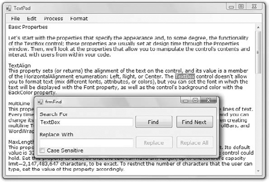
The name of the application's main form is frmTextPad, and the name of the Find & Replace dialog box is frmFind. You can design the two forms as shown in the figures of this chapter, or you can open the TextPad project. To design the application's interface from scratch, place a MenuStrip control on the form. The control will be docked to the top of the form automatically. Then place a TextBox control on the main form, name it txtEditor, and set the following properties: Multiline to True, MaxLength to 0 (to edit text documents of any length), HideSelection to False (so that the selected text remains highlighted even when the main form doesn't have the focus), and Dock to Fill, so that it will fill the form.
The menu bar of the form contains all the commands you'd expect to find in any text editing application; they're listed in Table 5.1.
The File menu commands are implemented with the Open and Save As dialog boxes, the Font command with the Font dialog box, and the Color command with the Color dialog box. These dialog boxes are discussed in the following chapters, and as you'll see, you don't have to design them yourself. All you have to do is place a control on the form and set a few properties; the Framework takes it from there. The application will display the standard Open File/Save File/Font/Color dialog boxes, in which the user can select or specify a filename, or select a font or color. Of course, we'll provide a few lines of code to actually move the text into a file (or read it from a file and display it on the control), change the control's background color, and so on. I'll discuss the commands of the File menu in Chapter 7, "More Windows Controls."
The options on the Edit menu move the selected text to and from the Clipboard. For the TextPad application, all you need to know about the Clipboard is that the SetText method places the currently selected text on the Clipboard and the GetText method retrieves information from the Clipboard (see Figure 5.3).
Table 5.1. The TextPad form's menu
Command | Description | |
|---|---|---|
File | New | Clears the text |
Open | Loads a new text file from disk | |
Save | Saves the text to its file on disk | |
Save As | Saves the text with a new filename on disk | |
Prints the text | ||
Exit | Terminates the application | |
Edit | Undo/Redo | Undoes/redoes the last edit operation |
Copy | Copies selected text to the Clipboard | |
Cut | Cuts the selected text | |
Paste | Pastes the Clipboard's contents to the editor | |
Select All | Selects all text in the control | |
Find & Replace | Displays a dialog box with Find and Replace options | |
Process | Convert To Upper | Converts selected text to uppercase |
Convert To Lower | Converts selected text to lowercase | |
Number Lines | Numbers the text lines | |
Format | Font | Sets the text's font, size, and attributes |
Page Color | Sets the control's background color | |
Text Color | Sets the color of the text | |
WordWrap | Toggle menu item that turns text wrapping on and off |
The Copy command, for example, is implemented with a single line of code (txtEditor is the name of the TextBox control). The Cut command does the same, and it also clears the selected text. The code for these and for the Paste command, which assigns the contents of the Clipboard to the current selection, is presented in Listing 5.2.
If no text is currently selected, the Clipboard's text is pasted at the pointer's current location. If the Clipboard contains a bitmap (placed there by another application) or any other type of data that the TextBox control can't handle, the paste operation will fail; that's why we handle the Paste operation with an If statement. You could provide some hint to the user by including an Else clause that informs them that the data on the Clipboard can't be used with a text-editing application.
Figure 5.3. The Copy, Cut, and Paste operations of the TextPad application can be used to exchange text with any other application.
Example 5.2. The Cut, Copy, and Paste commands
Private Sub EditCopyItem_Click(...)
                Handles EditCopyItem.Click
    If txtEditor.SelectionLength > 0 Then
        Clipboard.SetText(txtEditor.SelectedText)
    End If
End Sub

Private Sub EditCutItem_Click(...)
                Handles EditCutItem.Click
    Clipboard.SetText(txtEditor.SelectedText)
    txtEditor.SelectedText = ""
End Sub

Private Sub EditPasteItem_Click(...)
                 Handles EditPasteItem.Click
    If Clipboard.ContainsText Then
        txtEditor.SelectedText = Clipboard.GetText
    End If
End Sub
The commands of the Process and Format menus are straightforward. The Format menu commands open the Font or Color dialog box and change the control's Font, ForeColor, and BackColor properties. You will learn how to use these controls in the following chapter. The Upper Case and Lower Case commands of the Process menu are also trivial: They select all the text, convert it to uppercase or lowercase, respectively, and assign the converted text to the control's SelectedText property with the following statements:
txtEditor.SelectedText = txtEditor.SelectedText.ToLower
txtEditor.SelectedText = txtEditor.SelectedText.ToUpper
Notice that the code uses the SelectedText property to convert only the selected text, not the entire document. The Number Lines command inserts a number in front of each text line and demonstrates how to process the individual lines of text on the control. However, it doesn't remove the line numbers, and there's no mechanism to prevent the user from editing the line numbers or inserting/deleting lines after they have been numbered. Use this feature to create a numbered listing or to number the lines of a file just before saving it or sharing it with another user. Listing 5.3 shows the Number Lines command's code and demonstrates how to iterate through the TextBox control's Lines array.
Example 5.3. The Number Lines command
Private Sub ProcessNumberLinesItem_Click(...)
                Handles ProcessNumberLines.Click
    Dim iLine As Integer
    Dim newText As New System.Text.StringBuilder()
    For iLine = 0 To txtEditor.Lines.Length - 1
        newText.Append((iLine + 1).ToString & vbTab &
                       txtEditor.Lines(iLine) & vbCrLf)
    Next
    txtEditor.SelectAll()
    Clipboard.SetText(newText.ToString)
    txtEditor.Paste()
End Sub
This event handler uses a StringBuilder variable. The StringBuilder class, discussed in Chapter 11, "The Framework at Large," is equivalent to the String class; it exposes similar methods and properties, but it's much faster at manipulating dynamic strings than the String class.
The last option in the Edit menu—and the most interesting—displays a Find & Replace dialog box (shown earlier in Figure 5.2). This dialog box works like the similarly named dialog box of Microsoft Word and many other Windows applications. The buttons in the Find & Replace dialog box are relatively self-explanatory:
- Find
The Find command locates the first instance of the specified string in the text after the cursor location. If a match is found, the Find Next, Replace, and Replace All buttons are enabled.
- Find Next
This command locates the next instance of the string in the text. Initially, this button is disabled; it's enabled only after a successful Find operation.
- Replace
This command replaces the current selection with the replacement string and then locates the next instance of the same string in the text. Like the Find Next button, it's disabled until a successful Find operation occurs.
- Replace All
This command replaces all instances of the string specified in the Search For box with the string in the Replace With box.
To design the Find & Replace form, add a new form to the project (select Add New Item from the project's context menu) and place the following controls on it:
A TextBox control and the
Search forLabel control.A TextBox control and the
Replace withLabel control.A CheckBox control with the caption Case Sensitive.
The Find, Find Next, Replace, and Replace All buttons.
Set the new form's TopMost property to True; you want this form to remain on top of the main form, even when it doesn't have the focus. Whether the search is case sensitive or not depends on the status of the Case Sensitive CheckBox control. If the string is found in the control's text, the program will highlight it by selecting it. In addition, the code will call the TextBox control's ScrollToCaret method to bring the selection into view. The Find Next button takes into consideration the location of the pointer and searches for a match after the current location. If the user moves the pointer somewhere else and then clicks the Find Next button, the program will locate the first instance of the string after the current location of the pointer—and not necessarily after the last match. Of course, you can always keep track of the location of each match and continue the search from this location. The Find button executes the code shown in Listing 5.4.
Example 5.4. The Find button
Private Sub bttnFind_Click(...) Handles bttnFind.Click
    Dim selStart As Integer
    If chkCase.Checked = True Then
        selStart =
             frmTextPad.txtEditor.Text.IndexOf(
             searchWord.Text, StringComparison.Ordinal)
    Else
        selStart =
            frmTextPad.txtEditor.Text.IndexOf(
            searchWord.Text,
            StringComparison.OrdinalIgnoreCase)
    End If
    If selStart = −1 Then
        MsgBox("Text not found")
        Exit Sub
    End If
frmTextPad.txtEditor.Select(
selStart, searchWord.Text.Length)
bttnFindNext.Enabled = True
bttnReplace.Enabled = True
bttnReplaceAll.Enabled = True
frmTextPad.txtEditor.ScrollToCaret()
End SubThe Find button examines the value of the chkCase CheckBox control, which specifies whether the search will be case sensitive and calls the appropriate form of the IndexOf method. The first argument of this method is the string we're searching for; the second argument is the search mode, and its value is a member of the StringComparison enumeration: Ordinal for case-sensitive searches and OrdinalIgnoreCase for case-insensitive searches. If the IndexOf method locates the string, the program selects it by calling the control's Select method with the appropriate arguments. If not, it displays a message. Notice that after a successful Find operation, the Find Next, Replace, and Replace All buttons on the form are enabled.
The code of the Find Next button is the same, but it starts searching at the character following the current selection:
selStart = frmTextPad.txtEditor.Text.IndexOf(
            searchWord.Text,
            frmTextPad.txtEditor.SelectionStart + 1,
            StringComparison.Ordinal)
The Replace button replaces the current selection with the replacement string and then locates the next instance of the find string. The Replace All button replaces all instances of the search word in the document. Listing 5.5 presents the code behind the Replace and Replace All buttons.
Example 5.5. The Replace and Replace All operations
Private Sub bttnReplace_Click(...) Handles bttnReplace.Click
    If frmTextPad.txtEditor.SelectedText <> "" Then
        frmTextPad.txtEditor.SelectedText = replaceWord.Text
    End If
     bttnFindNext_Click(sender, e)
End Sub

Private Sub bttnReplaceAll_Click(...) Handles bttnReplaceAll.Click
    Dim curPos, curSel As Integer
    curPos = frmTextPad.txtEditor.SelectionStart
    curSel = frmTextPad.txtEditor.SelectionLength
    frmTextPad.txtEditor.Text =
         frmTextPad.txtEditor.Text.Replace(
         searchWord.Text.Trim, replaceWord.Text.Trim)
frmTextPad.txtEditor.SelectionStart = curPos
frmTextPad.txtEditor.SelectionLength = curSel
End SubThe Replace method is case sensitive, which means that it replaces instances of the search argument in the text that have the exact same spelling as its first argument. For a case-insensitive replace operation, you must write the code to perform consecutive case-insensitive search-and-replace operations. Alternatively, you can use the Replace built-in function to perform case-insensitive searches. Here's how you'd call the Replace function to perform a case-insensitive replace operation:
Replace(frmTextPad.txtEditor.Text,  searchWord.Text.Trim,
      replaceWord.Text.Trim, , , CompareMethod.Text)
The last, optional, argument determines whether the search will be case-sensitive (CompareMethod.Binary) or case-insensitive (CompareMethod.Text).
When you're searching for a string in the text, the active form is the frmFind form and any selection you make from within your code in the main form's TextBox control isn't highlighted by default. You must set the HideSelection property of the TextBox control to False to highlight the selected text on a control that doesn't currently have the focus. This is a common property for many controls, and you should remember to change it to False if you want the selection to remain visible even when the control loses the focus. (You will use this property most often with the TextBox, ListBox, ListView, and TreeView controls.)
The Undo command (shown in Listing 5.6) is implemented with a call to the Undo method. However, because the Undo method works like a toggle, we must also toggle its caption from Undo to Redo (and vice versa) each time the command is activated.
Example 5.6. The Undo/Redo command of the Edit menu
Private Sub EditUndoItem_Click(...)
            Handles EditUndoItem.Click
    If EditUndoItem.Text = "Undo" Then
        If txtEditor.CanUndo Then
            txtEditor.Undo()
            EditUndoItem.Text = "Redo"
        End If
    Else
        If txtEditor.CanUndo Then
            txtEditor.Undo()
            EditUndoItem.Text = "Undo"
        End If
    End If
End Sub
The TextBox control doesn't provide more granular undo operations—unlike Word, which keeps track of user actions (insertions, deletions, replacements, and so on) and then undoes them in steps. If you edit the text after an undo operation, you can no longer redo the last undo operation. This means that as soon as the contents of the TextBox control change, the caption of the first command in the Edit menu must become Undo, even if it's Redo at the time. To detect the action of editing the control's contents and reset the Undo command's caption, insert the following statement in the TextChanged event of the TextBox control:
EditUndoItem.Text = "Undo"
If you need a more-granular undo feature, you should use the RichTextBox control, which is discussed in detail in Chapter 7. The RichTextBox control can display formatted text, but it can also be used as an enhanced TextBox control.
Another event that is quite commonly used in programming the TextBox control is the KeyPress event, which occurs every time a key is pressed and reports the character that was pressed. You can use this event to capture certain keys and modify the program's behavior depending on the character typed.
By capturing keystrokes, you can process the data as they are entered, in real time. For example, you can make sure that a TextBox accepts only numeric or hexadecimal characters and rejects all others. To implement a binary editor, use the KeyPress event handler shown in Listing 5.7.
Example 5.7. Handling keystrokes
Private Sub TextBox1_KeyPress(...) Handles TextBox1.KeyPress
    If Char.IsLetterOrDigit(e.KeyChar) Then
        Select Case UCase(e.KeyChar)
            Case "1", "2", "3", "4", "5", "6", "7", "8", "9", "0"
                TextBox1.SelectedText = e.KeyChar
            Case "A", "B", "C", "D", "E", "F"
                TextBox1.SelectedText = UCase(e.KeyChar)
        End Select
        e.Handled = True
    End If
End Sub
The very first executable statement in the event handler examines the key that was pressed and exits if it is a special editing key (Delete, Backspace, Ctrl+V, and so on). If so, the handler exits without taking any action. The KeyChar property of the e argument of the KeyPress event reports the key that was pressed. The code converts it to a string and then uses a Case statement to handle individual keystrokes. If the user pressed the a or the 1 key, for example, the code displays the corresponding uppercase character ("1" or "A"). If the character pressed is not among the characters that may appear in hexadecimal values, the code skips it by setting the Handled property to True.
You can process the characters pressed from within the KeyDown event handler, only this time you must set the SuppressKeyPress property to True:
Private Sub TextBox1_KeyDown(...) Handles TextBox1.KeyDown
    Dim ch As Windows.Forms.Keys
    ch = e.KeyCode
    If Char.IsLetterOrDigit(Chr(ch)) Then
        Select Case ch
            Case Keys.D1, Keys.D2, Keys.D3, Keys.D4, Keys.D5,
                 Keys.D6, Keys.D7, Keys.D8, Keys.D9, Keys.D0
                TextBox1.SelectedText = Chr(ch)
            Case Keys.A, Keys.B, Keys.C, Keys.D, Keys.E, Keys.F
                TextBox1.SelectedText = UCase(Chr(ch))
            Case Else

        End Select
        e.SuppressKeyPress = True
    End If
End SubAnother common feature used in all types of applications is the assignment of special operations to the function keys. The Notepad application, for example, uses the F5 function key to insert the current date and time at the cursor's location. You can do the same with the TextPad application, but you can't use the KeyPress event—the KeyChar argument doesn't report function keys. The events that can capture the function keys are the KeyDown and KeyUp events. Also, unlike the KeyPress event, these two events don't report the character pressed but instead report the key's code (a special number that distinguishes each key on the keyboard, also known as the scancode) through the e.KeyCode property.
The keycode is unique for each key, not each character. Lower- and uppercase characters have different ASCII values but the same keycode because they are on the same key. For example, the number 4 and the $ symbol have the same keycode because the same key on the keyboard generates both characters. Along with the key's code, the KeyDown and KeyUp events also report the state of the Shift, Ctrl, and Alt keys through the e.Shift, e.Alt, and e.Control properties.
The KeyUp event handler shown in Listing 5.8 uses the F5 and F6 function keys to insert the current date and time in the document. It also uses the F7 and F8 keys to insert two predefined strings in the document.
Example 5.8. KeyUp event examples
Private Sub txtEditor_KeyUp(ByVal sender As Object,
      ByVal e As System.Windows.Forms.KeyEventArgs)
      Handles txtEditor.KeyUp
    Select Case e.KeyCode
        Case Keys.F5 :
                 txtEditor.SelectedText =
                 Now().ToLongDateString
        Case Keys.F6 :
                 txtEditor.SelectedText =
                 Now().ToLongTimeString
        Case Keys.F7 :
                 txtEditor.SelectedText =
                 "MicroWeb Designs, Inc."
        Case Keys.F8 :
                 txtEditor.SelectedText =
                 "Another user-supplied string"
    End Select
End Sub
Windows already uses some of the function keys (for example, the F1 key for help), and you shouldn't modify their original functions. With a little additional effort, you can provide users with a dialog box that lets them assign their own strings to function keys. You'll probably have to take into consideration the status of the Shift, Control, and Alt properties of the event's e argument. To find out whether two of the modifier keys are pressed along with a key, use the AND operator with the appropriate properties of the e argument. The following If clause detects the Ctrl and Alt keys:
If e.Control AND e.Alt Then
   { Both Alt and Control keys were down}
End If
If you need to control the keystrokes from within your code (a rather common scenario in an advanced, functional user interface design), you should be aware of the order of the events fired every time a key is pressed. First, the KeyDown event is fired; this event is fired before the keystroke is passed to the control. This is the event in which you should "kill" any keystrokes that you don't want to be processed normally by the control, or replace them with a different key. Then the KeyPress event is fired, if the keystroke corresponds to a character, number, or symbol but not a control key. Finally, the KeyUp event is fired. By that time, the keystroke has already been processed by the control and it's too late to kill or replace the original keystroke. Can you guess what will happen if you insert the following statements in a TextBox control's (or Form's) KeyDown event handler?
If e.KeyCode = Keys.A Then
    e.SuppressKeyPress = True
End If
The A key will never be processed, as if the keyboard isn't working with this application.
One set of interesting properties of the TextBox control are the autocomplete properties. Have you noticed how Internet Explorer prompts you with possible matches as soon as you start typing an address or your username in a text box (or in the address bar of the browser)? You can easily implement such boxes with a single-line TextBox control and the autocomplete properties. Please note that these properties apply to single-line TextBoxes only.
Let me review the properties that relate to automatic completion. You may wish to open the AutoCompleteTextBoxes project (available for download from www.sybex.com/go/masteringvb2010) to experiment with the settings of these properties while reading the text. The AutoCompleteMode property determines whether, and how, the TextBox control will prompt users, and its setting is a member of the AutoCompleteMode enumeration: Suggest, Append, SuggestAppend, and None. In Append mode, the TextBox control selects the first matching item in the list of suggestions and completes the text. In SuggestAppend mode, the control suggests the first matching item in the list, as before, but it also expands the list. In Suggest mode, the control simply opens a list with the matching items but doesn't select any of them. Regular TextBox controls have their AutoCompleteMode property set to None.
The AutoCompleteSource property determines where the list of suggestions comes from; its value is a member of the AutoCompleteSource enumeration, which is shown in Table 5.2.
Table 5.2. The members of the AutoCompleteSource enumeration
Member | Description |
|---|---|
| The suggested items are the names of system resources. |
| The suggested items are the URLs visited by the target computer. Does not work if you're deleting the recently viewed pages. |
| The suggested items come from a custom collection. |
| The suggested items are filenames. |
| The suggested items come from the computer's history list. |
| The suggested items come from the Recently Used folder. |
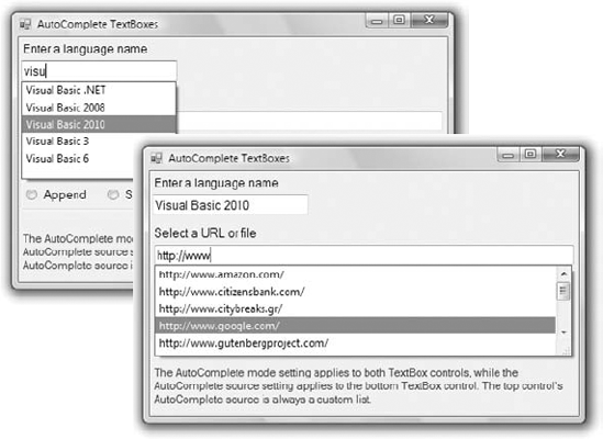
| The control doesn't suggest any items. |
To demonstrate the basics of the autocomplete properties, I've included the AutoCompleteTextBoxes project, which you can download from www.sybex.com/go/masteringvb2010. The main form of the project is shown in Figure 5.4. This project allows you to set the autocomplete mode and source for a single-line TextBox control. The top TextBox control uses a custom list of words, while the lower one uses one of the built-in autocomplete sources (file system, URLs, and so on).
Once you set the AutoCompleteSource to CustomSource, you must also populate an AutoCompleteStringCollection object with the desired suggestions and assign it to the AutoCompleteCustomSource property. The AutoCompleteStringCollection is just a collection of strings. Listing 5.9 shows statements in a form's Load event that prepare such a list and use it with the TextBox1 control.
Example 5.9. Populating a custom AutoCompleteSource property
Private Sub Form1_Load(...) Handles MyBase.Load
    Dim knownWords As New AutoCompleteStringCollection
    knownWords.Add("Visual Basic 2008")
    knownWords.Add("Visual Basic .NET")
    knownWords.Add("Visual Basic 6")
    knownWords.Add("Visual Basic")
    knownWords.Add("Framework")
    TextBox1.AutoCompleteCustomSource = knownWords
    TextBox1.AutoCompleteSource = AutoCompleteSource.CustomSource
    TextBox1.AutoCompleteMode = AutoCompleteMode.Suggest
    TextBox2.AutoCompleteSource = AutoCompleteSource.RecentlyUsedList
    TextBox2.AutoCompleteMode = AutoCompleteMode.Suggest
End Sub
The TextBox1 control on the form will open a drop-down list with all possible matches in the knownWords collection as soon as the user starts typing in the control, as shown in the top part of Figure 5.4.
Typical business applications contain numerous forms for data entry, and the most common element on data-entry forms is the TextBox control. Data-entry operators are very efficient with the keyboard, and they should be able to use your application without reaching for the mouse.
Seasoned data-entry operators can't live without the Enter key; they reach for this key at the end of each operation. In my experience, a functional interface should add intelligence to this keystroke: the Enter key should perform the obvious or most likely operation at any time. When data is being entered, for example, it should take the user to the next control in the Tab order. Consider a data-entry screen like the one shown in the following image, which contains several TextBox controls, a DataTimePicker control for entering dates, and two CheckBox controls. This is the main form of the Simple Data Entry Form sample project, which you will find at www.sybex.com/go/masteringvb2010 along with the other projects available for use with this book.
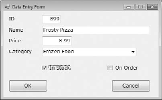
The application demonstrates how to use the Enter key intelligently: Every time the Enter key is pressed, the focus is moved to the next control in the Tab order. Even if the current control is a CheckBox, this keystroke doesn't change the status of the CheckBox controls; it simply moves the focus forward.
You could program the KeyUp event of each control to react to the Enter key, but this approach can lead to maintenance problems if you add new controls to an existing form. The best approach is to intercept the Enter keystroke at the form level, before it reaches a control. To do so, you must set the KeyPreview property of the form to True. This setting causes the key events to be fired first at the form level and then at the control that has the focus. In essence, it allows you to handle certain keystrokes for multiple controls at once. The KeyUp event handler of the sample project's main form intercepts the Enter keystroke and reacts to it by moving the focus to the next control in the Tab order via the ProcessTabKey method. This method simulates the pressing of the Tab key, and it's called with a single argument, which is a Boolean value: True moves the focus forward, and False moves it backward. Here's the code in the KeyDown event handler of the application's form that makes the interface much more functional and intuitive (you can open the DataEntry project, examine all of the code, and see how it functions):
Private Sub frmDataEntry_KeyDown(
               ByVal sender As Object,
               ByVal e As System.Windows.Forms.KeyEventArgs)
               Handles Me.KeyUp
    If e.KeyCode = Keys.Enter And Not (e.Alt Or e.Control) Then
        If Me.ActiveControl.GetType Is GetType(TextBox) Or
              Me.ActiveControl.GetType Is GetType(CheckBox) Or
              Me.ActiveControl.GetType Is
              GetType(DateTimePicker) Then
            If e.Shift Then
                Me.ProcessTabKey(False)
            Else
                Me.ProcessTabKey(True)
            End If
        End If
    End If
End Sub
It's important to program the KeyDown event if you want to be able to process keystrokes before the control captures them, or even if you want to cancel keystrokes. If you insert the same code in the KeyUp event, the keystrokes will be processed by the control first and then by your code. There are a couple of things you should notice about this handler. First, it doesn't react to the Enter key if it was pressed along with the Alt or Ctrl key. The Shift key, on the other hand, is used to control the direction in the Tab order. The focus moves forward with the Enter keystroke and moves backward with the Shift + Enter keystroke. Also, the focus is handled automatically only for the TextBox, CheckBox, and DataTimePicker controls. When the user presses the Enter key when a button has the focus, the program reacts as expected by invoking the button's Click event handler.
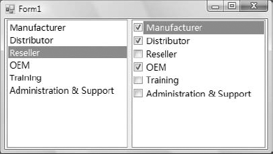
The ListBox, CheckedListBox, and ComboBox controls present lists of choices from which the user can select one or more of the items. The first two are illustrated in Figure 5.5.
The ListBox control occupies a user-specified amount of space on the form and is populated with a list of items. If the list of items is longer than can fit on the control, a vertical scroll bar appears automatically.
The CheckedListBox control is a variation of the ListBox control. It's identical to the ListBox control, but a check box appears in front of each item. The user can select any number of items by checking or clearing the boxes. As you know, you can also select multiple items from a ListBox control by pressing the Shift or Ctrl key.
The ComboBox control also contains multiple items but typically occupies less space on the screen. The ComboBox control is an expandable ListBox control: The user can expand it to make a selection and collapse it after the selection is made. The real advantage of the ComboBox control, however, is that the user can enter new information in the ComboBox rather than being forced to select from the items listed.
To add items to any of the three controls at design time, locate the Items property in the Properties window for the control and click the ellipsis button. When the String Collection Editor window pops up, you can add the items you want to display in the list. Each item must appear on a separate text line, and blank text lines will result in blank lines in the list. These items will appear in the list when the form is loaded, but you can add more items (or remove existing ones) from within your code at any time. They appear in the same order as entered on the String Collection Editor window unless the control has its Sorted property set to True, in which case the items are automatically sorted regardless of the order in which you've specified them.
The next sections explore the ListBox control's properties and methods. Later in the chapter, you'll see how the same properties and methods can be used with the ComboBox control.
In the following sections, you'll find the properties that determine the functionality of the ListBox, CheckedListBox, and ComboBox controls. These properties are usually set at design time, but you can change the settings from within your application's code.
This property can be set to a True/False value that indicates whether the control's height will be adjusted to avoid the partial display of the last item. When IntegralHeight is set to True, the control's actual height changes in multiples of the height of a single line, so only an integer number of rows are displayed at all times.
The Items property is a collection that holds the list items for the control. At design time, you can populate this list through the String Collection Editor window. At runtime, you can access and manipulate the items through the methods and properties of the Items collection, which are described in the section "Manipulating the Items Collection" later in this chapter.
A ListBox control can display its items in multiple columns if you set its MultiColumn property to True. The problem with multicolumn ListBoxes is that you can't specify the column in which each item will appear. ListBoxes (and CheckedListBoxes) with many items and the MultiColumn property set to True expand horizontally, not vertically. A horizontal scroll bar will be attached to a multicolumn ListBox so that users can bring any column into view. This property does not apply to the ComboBox control.
This property, which applies to the ListBox and CheckedListBox controls only, determines how the user can select the list's items. The possible values of this property—members of the SelectionMode enumeration—are shown in Table 5.3.
Table 5.3. The SelectionMode enumeration
Value | Description |
|---|---|
None | No selection at all is allowed. |
One | (Default) Only a single item can be selected. |
MultiSimple | Simple multiple selection: A mouse click (or pressing the spacebar) selects or deselects an item in the list. You must click all the items you want to select. |
MultiExtended | Extended multiple selection: Press Shift and click the mouse (or press one of the arrow keys) to select multiple contiguous items. This process highlights all the items between the previously selected item and the current selection. Press Ctrl and click the mouse to select or deselect multiple single items in the list. |
When this property is True, the items remain sorted at all times. The default is False because it takes longer to insert new items in their proper location. This property's value can be set at design time as well as runtime. The items in a sorted ListBox control are sorted in ascending and case-sensitive order, also known as phone book order. Because of this, the ListBox control won't sort numeric data. The number 10 will appear in front of the number 5 because the numeric value of the string 10 is smaller than the numeric value of the string 5. If the numbers are formatted as 010 and 005, they will be sorted correctly.
The Text property returns the selected text on the control. Although you can set the Text property for the ComboBox control at design time, this property is available only at runtime for the other two controls. Notice that the items need not be strings. By default, each item is an object. For each object, however, the control displays a string, which is the same string returned by the object's ToString method.
To manipulate a ListBox control from within your application, you should be able to do the following:
Add items to the list
Remove items from the list
Access individual items in the list
The items in the list are represented by the Items collection. You use the members of the Items collection to access the control's items and to add or remove items. The Items property exposes the standard members of a collection, which are described later in this section.
Each member of the Items collection is an object. In most cases, we use ListBox controls to store strings, but it's also common to store objects to this control. When you add an object to a ListBox control, a string is displayed on the corresponding line of the control. This is the string returned by the object's ToString method. You can display any other property of the object by setting the control's ValueMember property to the name of the property.
If you add a Font object and a Rectangle object to the Items collection with the statements
ListBox1.Items.Add(New Font("Verdana", 12, FontStyle.Bold))
ListBox1.Items.Add(New Rectangle(0, 0, 100, 100))
then the following strings appear on the first two lines of the control:
[Font: Name=Verdana, Size=12, Units=3, GdiCharSet=1, gdiVerticalFont=False]
{X=0, Y=0, Width=100, Height=100}
However, you can access the members of the two objects because the ListBox stores objects, not their descriptions. The following statement prints the width of the Rectangle object (the output produced by the statement is highlighted):
Debug.WriteLine(ListBox1.Items.Item(1).Width)
100
The expression in the preceding statement is late-bound, which means that the compiler doesn't know whether the first object in the Items collection is a Rectangle object and it can't verify the member Width. If you attempt to call the Width property of the first item in the collection, you'll get an exception at runtime indicating that the code has attempted to access a missing member. The missing member is the Width property of the Font object.
The proper way to read the objects stored in a ListBox control is to examine the type of the object first and then attempt to retrieve a property (or call a method) of the object, but only if it's of the appropriate type. Here's how you would read the Width property of a Rectangle object:
If ListBox1.Items.Item(0).GetType Is
GetType(Rectangle) Then
   Debug.WriteLine(CType(ListBox1.Items.Item(0), Rectangle).Width)
End If
To add items to the list, use the Items.Add or Items.Insert method. The Add method accepts as an argument the object to be added to the list. New items are appended to the end of the list, unless the Sorted property has been set to True. The following loop adds the elements of the array words to a ListBox control, one at a time:
Dim words(100) As String
{ statements to populate array }
Dim i As Integer For i = 0 To 99 ListBox1.Items.Add(words(i)) Next
Then, to iterate through all the items on the control, use a loop such as the following:
Dim i As Integer
For i = 0 To ListBox1.Items.Count − 1
   { statements to process item ListBox1.Items(i) }
Next
You can also use the For Each...Next statement to iterate through the Items collection, as shown here:
Dim itm As Object
For Each itm In ListBox1.Items
   { process the current item, represented by the itm variable }
Next
When you populate a ListBox control with a large number of items, call the BeginUpdate method before starting the loop and call the EndUpdate method when you're done. These two methods turn off the visual update of the control while you're populating it, and they speed up the process considerably. When the EndUpdate method is called, the control is redrawn with all the items.
To insert an item at a specific location, use the Insert method, whose syntax is as follows:
ListBox1.Items.Insert(index, item)
Remember that you must declare the item prior to using it. If you don't initialize it, you will get a null ref.
The item parameter is the object to be added, and index is the location of the new item. (The first item's index in the list is zero).
The Clear method removes all the items from the control. Its syntax is quite simple:
ListBox1.Items.Clear
This is the number of items in the list. If you want to access all the items with a For...Next loop, the loop's counter must go from 0 to ListBox.Items.Count – 1, as shown in the example of the Add method.
The CopyTo method of the Items collection retrieves all the items from a ListBox control and stores them in the array passed to the method as an argument. The syntax of the CopyTo method is as follows, where destination is the name of the array that will accept the items, and index is the index of an element in the array where the first item will be stored:
ListBox1.CopyTo(destination, index)
The array that will hold the items of the control must be declared explicitly and must be large enough to hold all the items.
To remove an item from the list, you can simply call the Items collection's Remove method, passing the object to be removed as an argument. If the control contains strings, pass the string to be removed. If the same string appears multiple times on the control, only the first instance will be removed.
You can also remove an item by specifying its position in the list via the RemoveAt method, which accepts as argument the position of the item to be removed:
ListBox1.Items.RemoveAt(index)
The index parameter is the order of the item to be removed, and the first item's order is 0.
The Contains method of the Items collection—not to be confused with the control's Contains method—accepts an object as an argument and returns a True/False value that indicates whether the collection contains this object. Use the Contains method to avoid the insertion of identical objects into the ListBox control. The following statements add a string to the Items collection only if the string isn't already part of the collection:
Dim itm As String = "Remote Computing"
If Not ListBox1.Items.Contains(itm) Then
    ListBox1.Items.Add(itm)
End IfThe ListBox control allows the user to select either one or multiple items, depending on the setting of the SelectionMode property. In a single-selection ListBox control, you can retrieve the selected item by using the SelectedItem property and its index by using the SelectedIndex property. SelectedItem returns the selected item, which is an object. The text of the selected item is reported by the Text property.
If the control allows the selection of multiple items, they're reported with the SelectedItems property. This property is a collection of objects and exposes the same members as the Items collection. Because the ComboBox does not allow the selection of multiple items, it provides only the SelectedIndex and SelectedItem properties.
To iterate through all the selected items in a multiselection ListBox control, use a loop such as the following:
For Each itm As Object In ListBox1.SelectedItems
   Debug.WriteLine(itm)
Next
The itm variable should be declared as Object because the items in the ListBox control are objects. If they're all of the same type, you can convert them to the specific type and then call their methods. If all the items are of the Rectangle type, you can use a loop like the following to print the area of each rectangle:
For Each itm As Rectangle In ListBox1.SelectedItems
   Debug.WriteLine(itm.Width * itm.Height)
Next
The ListBox Demo application (shown in Figure 5.6) demonstrates the basic operations of the ListBox control. The two ListBox controls on the form operate slightly differently. The first has the default configuration: Only one item can be selected at a time, and new items are appended after the existing item. The second ListBox control has its Sorted property set to True and its MultiSelect property set according to the values of the two RadioButton controls at the bottom of the form.
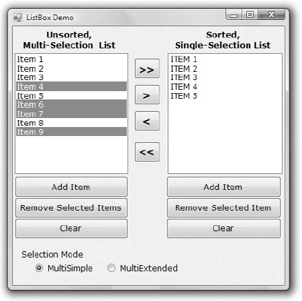
The code for the ListBox Demo application contains much of the logic you'll need in your ListBox manipulation routines. It shows you how to do the following:
Add and remove items at runtime
Transfer items between lists at runtime
Handle multiple selected items
Maintain sorted lists
The Add Item buttons use the InputBox() function to prompt the user for input, and then they add the user-supplied string to the ListBox control. The code is identical for both buttons (see Listing 5.10).
Example 5.10. The Add Item buttons
Private Sub bttnSourceAdd_Click(...)
            Handles bttnSourceAdd.Click
    Dim ListItem As String
    ListItem = InputBox("Enter new item's name")
    If ListItem.Trim <> "" Then
        sourceList.Items.Add(ListItem)
    End If
End Sub
Notice that the subroutine examines the data entered by the user to avoid adding blank strings to the list. The code for the Clear buttons is also straightforward; it simply calls the Clear method of the Items collection to remove all entries from the corresponding list.
The code for the Remove Selected Item button is different from that for the Remove Selected Items button (both are presented in Listing 5.11). The code for the Remove Selected Item button removes the selected item, while the Remove Selected Items buttons must scan all the items of the left list and remove the selected one(s).
Example 5.11. The Remove buttons
Private Sub bttnDestinationRemove_Click(...)
               Handles bttnDestinationRemove.Click
    destinationList.Items.Remove(destinationList.SelectedItem)
End Sub
Private Sub bttnSourceRemove_Click(...)
Handles bttnSourceRemove.Click
Dim i As Integer
For i = 0 To sourceList.SelectedIndices.Count − 1
sourceList.Items.RemoveAt(sourceList.SelectedIndices(0))
Next
End SubNotice that the code of the second event handler (the one that removes multiple selected items) always removes the first item in the SelectedIndices collection. If you attempt to remove the item SelectedIndices(i), you will remove the first selected item during the first iteration. After an item is removed from the selection, the remaining items are no longer at the same locations. (In effect, you have to refresh the SelectedIndices collection.) The second selected item will take the place of the first selected item, which was just deleted, and so on. By removing the first item in the SelectedIndices collection, we make sure that all selected items, and only those items, will be eventually removed.
The two single-arrow buttons (located between the ListBox controls shown in Figure 5.6) transfer selected items from one list to another. The button with the single arrow pointing to the right transfers the items selected in the left list after it ensures that the list contains at least one selected item. Its code is presented in Listing 5.12. First, it adds the item to the second list, and then it removes the item from the original list. Notice that the code removes an item by passing it as an argument to the Remove method because it doesn't make any difference which one of two identical objects will be removed.
Example 5.12. Moving the selected items
Private Sub bttnSourceMove_Click(...)
              Handles bttnSourceMove.Click
    While sourceList.SelectedIndices.Count > 0
        destinationList.Items.Add(sourceList.Items(
                    sourceList.SelectedIndices(0)))
        sourceList.Items.Remove(sourceList.Items(
                    sourceList.SelectedIndices(0)))
    End While
End Sub
The second single-arrow button transfers items in the opposite direction. The destination control (the one on the right) doesn't allow the selection of multiple items, so you can use the SelectedIndex and SelectedItem properties. The event handler that moves a single item from the right to the left ListBox is shown next:
sourceList.Items.Add(destinationList.SelectedItem)
destinationList.Items.RemoveAt(destinationList.SelectedIndex)
Two of the most useful methods of the ListBox control are the FindString and FindStringExact methods, which allow you to quickly locate any item in the list. The FindString method locates a string that partially matches the one you're searching for; FindStringExact finds an exact match. If you're searching for Man and the control contains a name such as Mansfield, FindString matches the item but FindStringExact does not.
Both the FindString and FindStringExact methods perform case-insensitive searches. If you're searching for visual and the list contains the item Visual, both methods will locate it. The syntax for both methods is the same, where searchStr is the string you're searching for:
itemIndex = ListBox1.FindString(searchStr)
An alternative form of both methods allows you to specify the index where the search begins:
itemIndex = ListBox1.FindString(searchStr,
                                startIndex)
The FindString and FindStringExact methods work even if the ListBox control is not sorted. You need not set the Sorted property to True before you call one of the searching methods on the control. Sorting the list will help the search operation, but it takes the control less than 100 milliseconds to find an item in a list of 100,000 items, so the time spent to sort the list isn't worth it. Before you load thousands of items in a ListBox control, however, you should probably consider a more-functional interface.
The application you'll build in this section (seen in Figure 5.7) populates a list with a large number of items and then locates any string you specify. Click the button Populate List to populate the ListBox control with 10,000 random strings. This process will take a few seconds and will populate the control with different random strings every time. Then, you can enter a string in the TextBox control at the bottom of the form. As you type characters (or even delete characters in the TextBox), the program will locate the closest match in the list and select (highlight) this item.
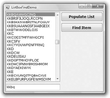
The sample application reacts to each keystroke in the TextBox control and locates the string you're searching for as you enter characters. The Find Item button does the same, but I thought I should demonstrate the efficiency of the ListBox control and the type of functionality you'd expect in a rich client application.
The code (shown in Listing 5.13) attempts to locate an exact match via the FindStringExact method. If it succeeds, it reports the index of the matching element. If not, it attempts to locate a near match with the FindString method. If it succeeds, it reports the index of the near match (which is the first item on the control that partially matches the search argument) and terminates. If it fails to find either an exact or a near match, it reports that the string wasn't found in the list.
Example 5.13. Searching the list
Private Sub TextBox1_TextChanged(...) Handles TextBox1.TextChanged
    Dim srchWord As String = TextBox1.Text.Trim
    If srchWord.Length = 0 Then Exit Sub
    Dim wordIndex As Integer
    wordIndex = ListBox1.FindStringExact(srchWord)
    If wordIndex >= 0 Then
        ListBox1.TopIndex = wordIndex
        ListBox1.SelectedIndex = wordIndex
    Else
        wordIndex = ListBox1.FindString(srchWord)
        If wordIndex >= 0 Then
            ListBox1.TopIndex = wordIndex
            ListBox1.SelectedIndex = wordIndex
        Else
            Debug.WriteLine("Item " & srchWord &
                            " is not in the list")
        End If
    End If
End Sub
If you search for SAC, for example, and the control contains a string such as SAC or sac or sAc, the program will return the index of the item in the list and will report an exact match. If no exact match can be found, the program will return something like SACDEF, if such a string exists on the control, as a near match. If none of the strings on the control starts with the characters SAC, the search will fail.
The application is quite responsive even if you increase the size of the ListBox control to 100,000 items, except that the process of generating the random strings and populating the control takes considerably longer. In a practical application, however, you should never have to display that many items to the user. (Consider an overhaul of your application interface before you present the user with an enormous list.)
The Populate List button creates 10,000 random items with the help of the Random class. First, it generates a random value in the range 1 through 20, which is the length of the string (not all strings have the same length). Then the program generates as many random characters as the length of the string and builds the string by appending each character to it. These random numbers are in the range of 65 to 91 and they're the ANSI values of the uppercase characters.
By the way, this technique for generating random strings is not a contrived sample of VB code. I've used similar techniques on several occasions to populate large database tables with data and optimize my queries and data-driven applications for performance.
The ComboBox control is similar to the ListBox control in the sense that it contains multiple items and the user may select one, but it typically occupies less space onscreen. The ComboBox is practically an expandable ListBox control, which can grow when the user wants to make a selection and retract after the selection is made. Normally, the ComboBox control displays one line with the selected item because this control doesn't allow multiple-item selection. The essential difference, however, between ComboBox and ListBox controls is that the ComboBox allows the user to specify items that don't exist in the list.
There are three types of ComboBox controls. The value of the control's DropDownStyle property determines which box is used; these values are shown in Table 5.4.
Table 5.4. DropDownStyle options for the ComboBox control
Value | Effect |
|---|---|
DropDown | (Default) The control is made up of a drop-down list, which is visible at all times, and a text box. The user can select an item from the list or type a new one in the text box. |
DropDownList | This style is a drop-down list from which the user can select one of its items but can't enter a new one. The control displays a single item, and the list is expanded as needed. |
Simple | The control includes a text box and a list that doesn't drop down. The user can select from the list or type in the text box. |
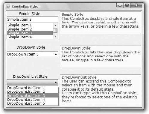
The ComboBox Styles project, shown in Figure 5.8, demonstrates the three styles of the ComboBox control. This is another common element of the Windows interface, and its properties and methods are identical to those of the ListBox control. Load the ComboBox Styles project in the Visual Basic IDE and experiment with the three styles of the ComboBox control.
The DropDown and Simple ComboBox styles allow the user to select an item from the list or enter a new one in the edit box of the control. Moreover, they're collapsed by default and they display a single item unless the user expands the list of items to make a selection. The DropDownList style is similar to a ListBox control in the sense that it restricts the user to selecting an item (the user cannot enter a new one). However, it takes much less space on the form than a ListBox does because normally it displays a single item. When the user wants to make a selection, the DropDownList expands to display more items. After the user has made a selection, the list contracts to a single line again. Finally, the DropDownList style of the control doesn't allow the user to enter a new string in the edit area; users are restricted to selecting one of the existing items.
Most of the properties and methods of the ListBox control also apply to the ComboBox control, shown in Figure 5.9. The Items collection gives you access to the control's items, and the SelectedIndex and SelectedItem properties give you access to the current selection. You can also use the FindString and FindStringExact methods to locate any item in the control from within your code. Both methods return the index of the item you're searching for on the control, or the value −1 if no such item exists.
There's one aspect worth mentioning regarding the operation of the control. Although the edit box at the top allows you to enter a new string, the new string doesn't become a new item in the list. It remains there until you select another item or you clear the edit box. You can provide some code to add any string entered by the user in the control's edit box to the list of existing items.
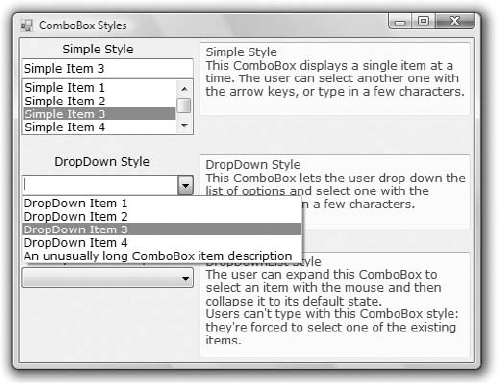
The most common use of the ComboBox control is as a lookup table. The ComboBox control takes up very little space on the form, but it can be expanded at will. You can save even more space when the ComboBox is contracted by setting it to a width that's too small for the longest item. Use the DropDownWidth property, which is the width of the segment of the drop-down list. By default, this property is equal to the control's Width property. The second ComboBox control in Figure 5.9 contains an unusually long item. The control is wide enough to display the default selection. When the user clicks the arrow to expand the control, the drop-down section of the control is wider than the default width so that the long items can be read.
Although the ComboBox control allows users to enter text in the control's edit box, it doesn't provide a simple mechanism for adding new items at runtime. Let's say you provide a ComboBox with city names. Users can type the first few characters and quickly locate the desired item. But what if they want to specify a new city name? You can provide this capability with two simple techniques. The simpler one is to place a button with an ellipsis (three periods) right next to the control. When users want to add a new item to the control, they can click the button and be prompted for the new item.
A more-elegant and user-friendly approach is to examine the control's Text property as soon as the control loses focus or the user presses the Enter key. If the string entered by the user doesn't match an item on the control, you must add a new item to the control's Items collection and select the new item from within your code. The FlexComboBox project demonstrates how to use both techniques in your code. The main form of the project, which is shown in Figure 5.10, is a simple data-entry screen. It's not the best data-entry form, but it's meant for demonstration purposes.
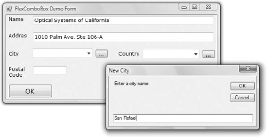
Figure 5.10. The FlexComboBox project demonstrates two techniques for adding new items to a ComboBox at runtime.
You can either enter a city name (or country name) and press the Tab key to move to another control or click the button next to the control to be prompted for a new city/country name. The application will let you enter any city/country combination. You should provide code to limit the cities within the selected country, but this is a nontrivial task. You also need to store the new city names entered on the first ComboBox control to a file (or a database table) so users will find them there the next time they run the application. I haven't made the application elaborate; I've added the code only to demonstrate how to add new items to a ComboBox control at runtime.
The ellipsis button next to the City ComboBox control prompts the user for the new item via the InputBox() function. Then it searches the Items collection of the control via the FindString method, and if the new item isn't found, it's added to the control. Then the code selects the new item in the list. To do so, it sets the control's SelectedIndex property to the value returned by the Items.Add method or the value returned by the FindString method, depending on whether the item was located or added to the list. Listing 5.14 shows the code behind the ellipsis button.
Example 5.14. Adding a new item to the ComboBox control at runtime
Private Sub Button1_Click(...) Button1.Click
   Dim itm As String
   itm = InputBox("Enter new item", "New Item")
   If itm.Trim <> "" Then AddElement(ComboBox1, itm)
End Sub
The AddElement() subroutine, which accepts the control you are adding to and a string as arguments and adds the string to the control, is shown in Listing 5.15. If the item doesn't exist in the control, it's added to the Items collection. If the item is already a member of the Items collection, it's selected. As you will see, the same subroutine will be used by the second method for adding items to the control at runtime.
Example 5.15. The AddElement() subroutine
Sub AddElement(ByRef control As ComboBox, ByVal newItem As String)
    Dim idx As Integer
    If ComboBox1.FindString(newItem) > 0 Then
        idx = control.FindString(newItem)
    Else
        idx = control.Items.Add(newItem)
    End If
    control.SelectedIndex = idx
End Sub
You can also add new items at runtime by adding the same code in the control's LostFocus event handler:
Private Sub ComboBox1_LostFocus(...) Handles ComboBox1.LostFocus
   Dim newItem As String = ComboBox1.Text
   AddElement(ComboBox1, newItem)
For an even more functional interface, capture the Enter keystroke in the control's KeyUp event, add the new item to the list (if needed), and then move the focus to the next control on the form, as discussed earlier in this chapter.
The ScrollBar and TrackBar controls let the user specify a magnitude by moving a selector between its minimum and maximum values. In some situations, the user doesn't know in advance the exact value of the quantity to specify (and in this case, a text box would suffice), so your application must provide a more-flexible mechanism for specifying a value along with some type of visual feedback.
The vertical scroll bar that lets a user move up and down a long document is a typical example of the use of the ScrollBar control. The scroll bar and visual feedback are the prime mechanisms for repositioning the view in a long document or in a large picture that won't fit entirely in a window.
The TrackBar control is similar to the ScrollBar control, but it doesn't cover a continuous range of values. The TrackBar control has a fixed number of tick marks and users can place the slider's indicator to the desired value.
In short, the ScrollBar control should be used when the exact value isn't as important as the value's effect on another object or data element. The TrackBar control should be used when the user can type a numeric value and the value your application expects is a number in a specific range—for example, integers between 0 and 100 or a value between 0 and 5 inches in steps of 0.1 inches (0.0, 0.1, 0.2...5.0). The TrackBar control is preferred to the TextBox control in similar situations because there's no need for data validation on your part. The user can specify only valid numeric values with the mouse.
There's no ScrollBar control per se in the Toolbox; instead, there are two versions of it: the HScrollBar and VScrollBar controls. They differ only in their orientation, but because they share the same members, I will refer to both controls collectively as ScrollBar controls. Actually, both controls inherit from the ScrollBar control, which is an abstract control: It is used to implement vertical and horizontal scroll bars, but it can't be used directly on a form. Moreover, the HScrollBar and VScrollBar controls are not displayed in the Common Controls tab of the Toolbox. You have to open the All Windows Forms tab to locate these two controls.
The ScrollBar control is a long stripe, which allows users to select a value between the two ends of the control. The left (or bottom) end of the control corresponds to its minimum value; the other end is the control's maximum value. The current value of the control is determined by the position of the indicator, which can be scrolled between the minimum and maximum values. The basic properties of the ScrollBar control, therefore, are properly named Minimum, Maximum, and Value.
MinimumThe control's minimum value. The default value is 0, but because this is an Integer value, you can set it to negative values as well.
MaximumThe control's maximum value. The default value is 100, but you can set it to any value that you can represent with the Integer data type.
ValueThe control's current value, specified by the indicator's position.
To cover a range of non-integers, you must supply the code to map the actual values to Integer values. For example, to cover a range from 2.5 to 8.5, set the Minimum property to 25, set the Maximum property to 85, and divide the control's value by 10. If the range you need is from −2.5 to 8.5, set the Minimum property to −25 and the Maximum value to 85, and divide the Value property by 10.
There are two more properties that allow you to control the movement of the indicator: the SmallChange and LargeChange properties. The first property is the amount by which the indicator changes when the user clicks one of the arrows at the two ends of the control. The LargeChange property is the displacement of the indicator when the user clicks somewhere in the scroll bar itself. You can manipulate a scroll bar by using the keyboard as well. Press the arrow keys to move the indicator in the corresponding direction by SmallChange and the Page Up/Page Down keys to move the indicator by LargeChange.
Figure 5.11 shows the main form of the Colors sample project, which lets the user specify a color by manipulating the value of its basic colors (red, green, and blue) through scroll bars. Each basic color is controlled by a scroll bar and has a minimum value of 0 and a maximum value of 255. By adjusting the value of each of the basic colors, you can create (almost) any color imaginable. This is what the Colors application does.
As the scroll bar is moved, the corresponding color is displayed, and the user can easily specify a color without knowing the exact values of its primary components. All the user needs to know is whether the desired color contains, for example, too much red or too little green. With the help of the scroll bars and the immediate feedback from the application, the user can easily pinpoint the desired color.
You can monitor the changes of the ScrollBar's value from within your code by using two events: ValueChanged and Scroll. Both events are fired every time the indicator's position is changed. If you change the control's value from within your code, only the ValueChanged event will be fired.
The Scroll event can be fired in response to many different actions, such as the scrolling of the indicator with the mouse, a click on one of the two buttons at the ends of the scroll bars, and so on. If you want to know the action that caused this event, you can examine the Type property of the second argument of the event handler. The value of the e.Type property is a member of the ScrollEventType enumeration (LargeDecrement, SmallIncrement, Track, and so on).
The two PictureBox controls display the color designed with the three scroll bars. The left PictureBox is colored from within the Scroll event, whereas the other one is colored from within the ValueChanged event. Both events are fired as the user scrolls the scroll bar's indicator, but in the Scroll event handler of the three scroll bars, the code examines the value of the e.Type property and reacts to it only if the event was fired because the scrolling of the indicator has ended. For all other actions, the event handler doesn't update the color of the left PictureBox.
If the user attempts to change the Color value by clicking the two arrows of the scroll bars or by clicking in the area to the left or to the right of the indicator, both PictureBox controls are updated. While the user slides the indicator or keeps pressing one of the end arrows, only the PictureBox to the right is updated.
The conclusion from this experiment is that you can program either event to provide continuous feedback to the user. If this feedback requires too many calculations, which would slow down the reaction of the corresponding event handler, you can postpone the reaction until the user has stopped scrolling the indicator. You can detect this condition by examining the value of the e.Type property. When it's ScrollEventType.EndScroll, you can execute the appropriate statements. Listing 5.16 shows the code behind the Scroll and ValueChanged events of the scroll bar that controls the red component of the color. The code of the corresponding events of the other two controls is identical.
Example 5.16. Programming the ScrollBar control's scroll event
Private Sub redBar_Scroll(...) Handles redBar.Scroll
    If e.Type = ScrollEventType.EndScroll Then
        ColorBox1()
        lblRed.Text = "RED " & redBar.Value.ToString("###")
    End If
End Sub

Private Sub redBar_ValueChanged(...) Handles redBar.ValueChanged
    ColorBox2()
End Sub
The ColorBox1() and ColorBox2() subroutines update the color of the two PictureBox controls by setting their background colors. You can open the Colors project in Visual Studio and examine the code of these two routines.
The TrackBar control is similar to the ScrollBar control, but it lacks the granularity of ScrollBar. Suppose that you want the user of an application to supply a value in a specific range, such as the speed of a moving object. Moreover, you don't want to allow extreme precision; you need only a few distinct settings. The user can set the control's value by sliding the indicator or by clicking on either side of an indicator like the one shown in Figure 5.12.
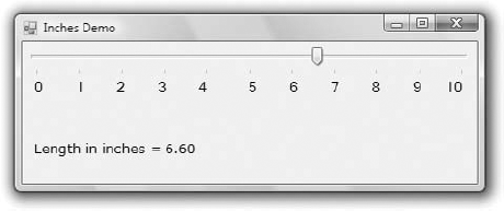
Figure 5.12. The Inches application demonstrates the use of the TrackBar control in specifying an exact value in a specific range.
Granularity determines how specific you want to be in measuring. In measuring distances between towns, a granularity of a mile is quite adequate. In measuring (or specifying) the dimensions of a building, the granularity could be on the order of a foot or an inch. The TrackBar control lets you set the type of granularity that's necessary for your application.
Similar to the ScrollBar control, SmallChange and LargeChange properties are available. SmallChange is the smallest increment by which the Slider value can change. The user can change the slider by the SmallChange value only by sliding the indicator. (Unlike with the ScrollBar control, there are no arrows at the two ends of the Slider control.) To change the Slider's value by LargeChange, the user can click on either side of the indicator.
Figure 5.12 demonstrates a typical use of the TrackBar control. The form in the figure is an element of a program's user interface that lets the user specify a distance between 0 and 10 inches in increments of 0.2 inches. As the user slides the indicator, the current value is displayed on a Label control below the TrackBar. If you open the Inches application, you'll notice that there are more stops than there are tick marks on the control. This is made possible with the TickFrequency property, which determines the frequency of the visible tick marks.
You might specify that the control has 50 stops (divisions) but that only 10 of them will be visible. The user can, however, position the indicator on any of the 40 invisible tick marks. You can think of the visible marks as the major tick marks and the invisible ones as the minor tick marks. If the TickFrequency property is 5, only every fifth mark will be visible. The slider's indicator, however, will stop at all tick marks.
When using the TrackBar control on your interfaces, you should set the TickFrequency property to a value that helps the user select the desired setting. Too many tick marks are confusing and difficult to read. Without tick marks, the control isn't of much help. You might also consider placing a few labels to indicate the value of selected tick marks, as I have done in this example.
The properties of the TrackBar control in the Inches application are as follows:
Minimum = 0
Maximum = 50
SmallChange = 1
LargeChange = 5
TickFrequency = 5
The TrackBar needs to cover a range of 10 inches in increments of 0.2 inches. If you set the SmallChange property to 1, you have to set LargeChange to 5. Moreover, the TickFrequency is set to 5, so there will be a total of five divisions in every inch. The numbers below the tick marks were placed there with properly aligned Label controls.
The label at the bottom needs to be updated as the TrackBar's value changes. This is signaled to the application with the Change event, which occurs every time the value of the control changes, either through scrolling or from within your code. The ValueChanged event handler of the TrackBar control is shown next:
Private Sub TrackBar1_ValueChanged(...) Handles TrackBar1.ValueChanged
   lblInches.Text = "Length in inches = " &
              Format(TrackBar1.Value / 5, "#.00")
End Sub
The Label controls below the tick marks can also be used to set the value of the control. Every time you click one of the labels, the following statement sets the TrackBar control's value. Notice that all the Label controls' Click events are handled by a common handler. (There are more event handlers following the Handles keyword in the listing.)
Private Sub Label_Click(...) Handles Label1.Click, Label2.Click, ...
    TrackBar1.Value = CInt(CType(sender, Label).text) * 5
End Sub
The code is a bit complicated, but it will compile with the Strict option on. The CType() function converts its argument, which is an Object variable and may represent any of the Labels on the form, to a Label object. Then it converts the Label's caption to an integer value (the string "1" to the numeric value 1, and so on) by calling the CInt() function. CInt() is a VB function; the equivalent method of the Framework is System.Convert.ToInt32. The captions of all Labels are numbers by design, so the conversion will never fail. This value is then assigned to the Value property of the TrackBar control.
- Use the TextBox control as a data-entry and text-editing tool.
The TextBox control is the most common element of the Windows interface, short of the Button control, and it's used to display and edit text. You can use a TextBox control to prompt users for a single line of text (such as a product name) or a small document (a product's detailed description). You can actually implement a functional text editor by placing a TextBox control on a form and setting a few of its properties.
- Master It
What are the most important properties of the TextBox control? Which ones would you set in the Properties windows at design time?
- Master It
How would you implement a control that suggests lists of words matching the characters entered by the user?
- Use the ListBox, CheckedListBox, and ComboBox controls to present lists of items.
The ListBox control contains a list of items from which the user can select one or more, depending on the setting of the
SelectionModeproperty.- Master It
How would you locate an item in a ListBox control?
- Use the ScrollBar and TrackBar controls to enable users to specify sizes and positions with the mouse.
The ScrollBar and TrackBar controls let the user specify a magnitude by scrolling a selector between its minimum and maximum values. The ScrollBar control uses some visual feedback to display the effects of scrolling on another entity, such as the current view in a long document.
- Master It
Which event of the ScrollBar control would you code to provide visual feedback to the user?