
“I tried to use CSS for my layouts but gave up and used tables instead.” This is a common sentiment. If you have been in web development long, you’ve probably heard this. You might have even said this yourself, I know I have many times. But it doesn’t need to be this way. Once you understand a few things about how browsers lay out elements, CSS layouts become doable. Eventually they actually become easy.
On the one hand, doing CSS-based layouts is about web development, both mobile and desktop. It has nothing to do in particular with mobile web development. But if you are going to do responsive layouts, it is important because table elements you might use for a full-size website layout are going to make mobile development much harder.
First Steps
The first thing to keep in mind is that browsers come with default styling. In some ways this is very helpful, but I’ve found that default styling can get in the way when trying to do precise CSS layouts. Some developers use what are called “CSS resets” to reset all of the browsers’ styling to a baseline so as to remove cross-browser inconsistencies. The basic idea of a CSS reset is something like the first part of the following CSS selection:
html, body, div, span, applet, object, iframe,
h1, h2, h3, h4, h5, h6, p, blockquote, pre,
a, abbr, acronym, address, big, cite, code,
del, dfn, em, img, ins, kbd, q, s, samp,
small, strike, strong, sub, sup, tt, var,
b, u, i, center,
dl, dt, dd, ol, ul, li,
fieldset, form, label, legend,
table, caption, tbody, tfoot, thead, tr, th, td,
article, aside, canvas, details, embed,
figure, figcaption, footer, header, hgroup,
menu, nav, output, ruby, section, summary,
time, mark, audio, video {
  margin: 0;
  padding: 0;
}

div, span, li
{
  font-family: Helvetica;
}
As you can see, it goes through all the HTML elements and “resets” any default margins and paddings. Using a CSS reset is highly recommended. Some prefer to use CSS normalizers, which attempt to normalize the CSS instead of resetting everything to nothing. This is a fine approach as well, though CSS resets make things a bit easier for me. To use a CSS reset properly, put the reset as the first CSS imported into the page. Later styles that you supply will override the reset.
This is an example of a simple page without the reset and the same page with the margin and padding reset above. This screenshot was taken in Chrome on Windows 7, though what you see in this screenshot in Figure 2-1 is similar to what you would see in Internet Explorer or Firefox. The gray bar at the top is a part of Chrome, not a part of the page; this was included so you could see exactly how much spacing is put in the top of the document by default.
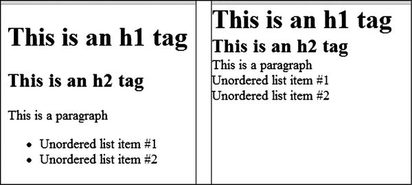
Figure 2-1. Default browser styling versus using a CSS reset
By default, browsers include margin and padding on many elements like those above, including the body of the document. Without the default margin and padding the spacing between each element is determined by its actual width and height. Removing default margin and padding makes calculating sizes for things easier and makes the task of this chapter much simpler: this is because margin and padding contribute to height and width calculations, as you will see below.
The above is the base styling for all the rest of the styling in this chapter. The first part is a selection from Eric Meyer’s CSS reset (http://meyerweb.com/eric/tools/css/reset/). His reset is normally more elaborate, but the entire thing is not needed here.
As a short note on terminology, I am going to use the word “container” a lot. This always refers to the DOM element that contains another element. Let’s say we have a span inside a div. The div is the “container” of the span. If any element is in the root of the body element, body is its container.
Finally, you will notice that the width is included in each screenshot in the chapter. The exact width of the window will be important in many of our examples. This is calculated with the following script:
window.onload = function () {

    var pageWidth = document.getElementById('pageWidth'),
    pageWidth.innerHTML = window.innerWidth;

    window.addEventListener('resize', function () {
        pageWidth.innerHTML = window.innerWidth;
    });
}
The Basic Rules
Let’s start with a few fundamentals before we work with layouts. Now that we have our setup, we can begin. I will explain how layout with CSS works by enumerating the most important points as rules. This will help us succinctly state how the browsers work, as well as give us points of reference we can use later.
Display: Block, Inline, and Inline Block
The first fundamentals to discuss are how display: block, display: inline and display: inline-block work. Here we see all three in Figure 2-2.
<span style="border: solid 1px red;">I am a span</span>
<div style="border: solid 1px blue">I am a div</div>
<span style="border: solid 1px green; display: inline-block;">I have display: inline-block</span>
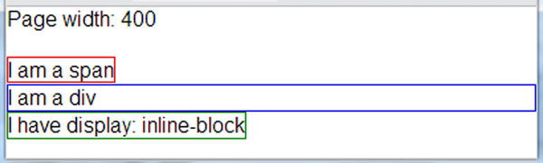
Figure 2-2. Three values of display exemplified, inline, block, and inline-block
First of all, spans are by default “inline” for their display value and divs are block, so these values do not need to be specified. And an element’s behavior can be changed. As you can see, the last element has a style value to override its default display value.
Note how they behave. Inline elements take up only the width of the content in them. The text of “I am a span” is only so wide, so the first span takes up exactly that much space. Other examples of elements that are inline include b, i, strong and em. Block elements take up the entire horizontal space of their container, like the div above. Other examples of elements that are block by default are p and li. Inline-block elements are most like inline elements but you get more capabilities. Note the following in Figure 2-3.
<span style="border: solid 1px red; width: 250px; height: 40px;">I am a span</span>
<div style="border: solid 1px blue; width: 250px; height: 40px;">I am a div</div>
<span style="border: solid 1px green;
  display: inline-block;
  width: 250px;
  height: 40px;">I have display: inline-block</span>
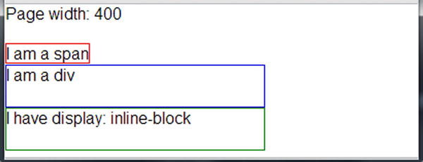
Figure 2-3. Width and height applied to inline, block and inline-block elements
Inline elements will not respond to width and height styling, but block elements will. Inline block elements will act like inline elements by default in that their initial size will be determined by the size of their content but are like block elements in that their width and height values can be set by CSS. Though padding seems to work fine with inline elements, it appears that only left and right margin works for them, so if you want to be able to set top and bottom margins, you will have to use inline-block or block elements.
An interesting thing happens if you float any of these elements. Essentially, they become block-level. If you take the same markup as before and add float: left, you get Figure 2-4.
<span style="border: solid 1px red; width: 250px; height: 40px; float: left;">I am a span</span>
<div style="border: solid 1px blue; width: 250px; height: 40px; float: left;">I am a div</div>
<span style="border: solid 1px green;
  display: inline-block;
  width: 250px;
  height: 40px;
  float: left;">I have display: inline-block</span>

Figure 2-4. Inline, block, and inline-block elements when they are floated
Inline and block elements are quite old and have universal support. Inline-block is generally well supported on recent browsers. Internet Explorer 6 and 7 exhibit some quirky behavior but in some cases will be just fine, and in others you will need to resort to some hacks. If you are dealing with more recent browsers, you should be safe.
Let’s boil down these ideas into our first three rules:
 CSS Rule #1 Inline elements are as wide as their content, and their dimensions cannot be set with CSS.
CSS Rule #2 Block elements span the width of their container by default but can have their dimensions set with CSS.
CSS Rule #3 Inline-block elements by default are as wide as their content, but their dimensions can be set with CSS.
If there’s anything that people find conceptually difficult in CSS, it’s the concept of floats. I was confused about them for the longest time. But hopefully the following will help you if you are not clear on how they work. Float exists to change how an element behaves in the normal flow of a page. By default, elements flow one after another in a page and top down in the order of the markup in the source file.
The basic purpose of floating is to take an element and cause it to float within the content after it. In other words, CSS floats change the flow of the document. Imagine, if you will, an image floating in a group of words. The floating image displaces the words around it, causing them to flow around the image. Here in Figure 2-5 is an example of an image floated left in a paragraph.
<p><img src="peanut.jpg" style="float: left;" />This is Peanut. Peanut was made for me by my daughter...
Though we mourn the loss of the sock, the addition of Peanut to the family is definitely worth it.
</p>
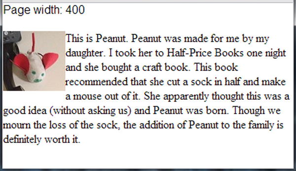
Figure 2-5. Image floated left in a paragraph element. The text could use some margin from the image, but this is just meant to illustrate how floated elements work
Here in Figure 2-6 is the same markup with float: right and then no float with the same markup.
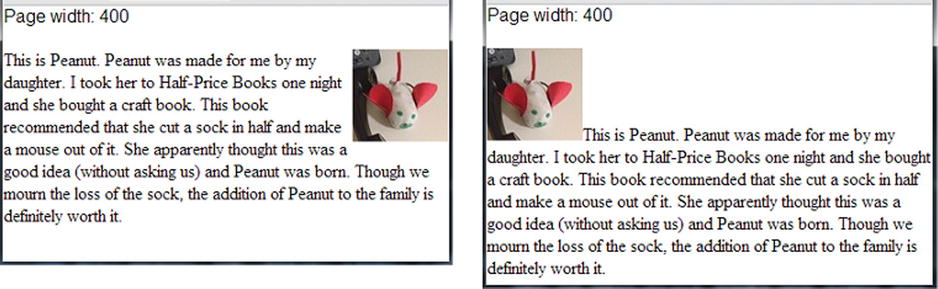
Figure 2-6. On the left, the image has float: right applied. On the right, no float is applied
As you can see from the above images, the picture that is floated left will have the surrounding content flow around it to the right, and the picture floated right will have the surrounding content flow to its left. If the image is not floated, it acts like an img tag normally would, as an inline element. In terms of the DOM and how floated elements work, the floated element stays in its position (in a sense) but is also removed from the normal flow of the document. In the float examples above, the image stays in its position in the DOM but floats to the left or right depending on the float value used. So if something is floated, the content that follows it will flow around it.
The flowing behavior only applies if there is enough horizontal width for the elements to flow. In the above example, the larger the image, the less words would be able to float horizontally beside it. If the image was too large, no words would flow around it. So for a float behavior to be useful, it must allow enough horizontal space for the elements that would follow and float around it.
We should also note at this point that a floated element becomes a block element, even if it is normally an inline element like img. But note that a floated element only takes up the space needed for its content (though its width can be set with CSS). In this sense they seem to behave somewhat like inline-block elements, though this is not technically accurate. If you take a series of mixed-display elements and float them, you see in Figure 2-7 that they all seem to be acting like content-sized block elements.
<div style="float: left; border: solid 1px red;">Div one</div>
<div style="float: left; border: solid 1px blue;">Div two</div>
<span style="float: left; border: solid 1px yellow;">Span one</span>
<span style="float: left; border: solid 1px green;">Span two</span>
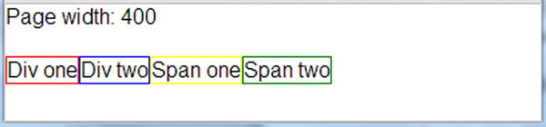
Figure 2-7. Two divs and two spans, all floated
This leads us to our next rule.
CSS Rule #4 If an element is floated, it takes on the characteristics of a block element regardless of its CSS display setting and the content that follows it flows around it.
So to reiterate, this means that floated elements can have their width set, which is something very important for layouts using floats. So if you explicitly set the width of the elements, you get Figure 2-8.
<div style="float: left; border: solid 1px red; width: 90px;">Div one</div>
<div style="float: left; border: solid 1px blue; width: 90px;">Div two</div>
<span style="float: left; border: solid 1px yellow; width: 90px;">Span one</span>
<span style="float: left; border: solid 1px green; width: 90px;">Span two</span>

Figure 2-8. Two divs and two spans, all floated, with width values
So why do you need to care about width? Let’s say you have two divs with more content than the above example and float them. You may see something you do not expect, as in Figure 2-9.
<div style="float: left; border: solid 1px red;">This is some text. It is too wide.</div>
<div style="float: left; border: solid 1px blue;">This is some text. It is too wide.</div>
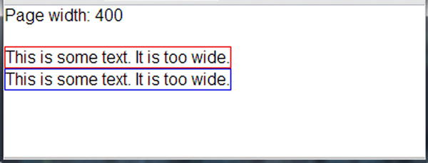
Figure 2-9. Divs too wide to float
Both elements are actually floated, but they are too wide to float next to each other. This gives us our next rule.
CSS Rule #5 Two elements cannot float next to each other if the width of the two is greater than the available width of the container.
This means that if you are trying to float two things side by side and one wraps when you don’t think it should, something is probably wider than you expect. This is exactly why many people recommend always setting an explicit width on floated items, whether that width is set in pixels, ems, or percentages. If this content happened to by dynamic (perhaps out of a CMS), any float logic may fail to apply because the dynamically changed content is too wide. So if we set the width of each piece of content to 198 pixels, things will line up as we expect. Though you might expect 200 pixels to be the correct width (since our page is 400 pixels wide), it needs to be a bit narrower. We’ll discuss calculating width shortly in the section entitled “Calculating Width.” Figure 2-10 has our floated elements with their width set.
<div style="float: left; border: solid 1px red; width: 198px;">This is some text. It is too wide.</div>
<div style="float: left; border: solid 1px blue; width: 198px;">This is some text. It is too wide.</div>
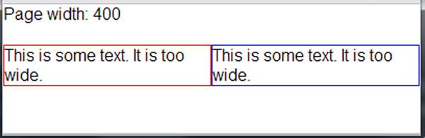
Figure 2-10. Two divs arranged side-by-side with floats
So then we have our next rule.
CSS Rule #6 Always set an explicit width for floated elements so they will behave consistently.
Another thing that frequently frustrates would-be masters of floats is the concept of clearing floats. Floats not only affect themselves but content around them, so you can clear floats to tell the browser to start ignoring the floats and return back to “normal” layout mode. Take the following example. Let us say you have three divs, the first two are floated and have widths set but the last one has neither.
<div style="float: left; border: solid 1px red; width: 100px;">Float 1</div>
<div style="float: left; border: solid 1px blue; width: 100px;">Float 2</div>
<div style="border: solid 1px green;">Not floated</div>
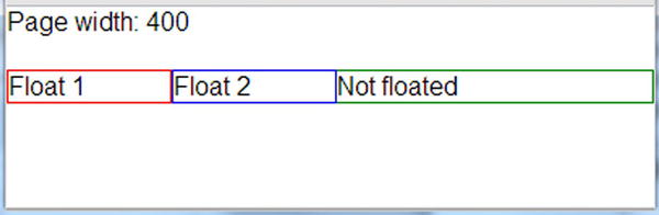
Figure 2-11. Floated elements affecting a non-floated element
Given a 400-pixel container, you might assume that the first two appear side by side but the last would appear below them. Unfortunately, if you thought that, you would be wrong, as you can see in Figure 2-11.
Remember the very first discussion of floats? Floated elements make other elements float around them. In this case we have two floated elements. Since they do not take up the entire horizontal space available to them, the next piece of content will try to flow around them. This “not floated” text is not floated (obviously) but rather it is wrapping around the elements that are above it, since it is wide enough to fit next to them. If the element was larger (if the width was set or the content was wider), this would not be the case. So if we want that third element to appear below the two floated elements (no matter its actual width) we need to clear the floats. If we do that, we get what we expect in Figure 2-12.
<div style="float: left; border: solid 1px red; width: 100px;">Float 1</div>
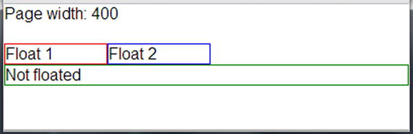
Figure 2-12. Example of clearing a float
<div style="float: left; border: solid 1px blue; width: 100px;">Float 2</div>
<div style="border: solid 1px green; clear: left;">Not floated</div>
Since the floats we want to clear are left floats, we use clear: left. If the floats are right, we could use clear: right. You could also clear floats of either type with clear: both. So the CSS clear property tells the browser to stop applying the logic of floats to elements around them. This is very important to remember, so we should make it one of our rules.
CSS Rule #7 Clear your floats when you are done with them so that the float behavior gets turned off.
Collapsing Containers
Another interesting characteristic of floated elements is that their containers often collapse. And by collapse, I mean that sometimes containers will have zero height. Above we said that floated elements are removed from the normal flow of the document. In the case of Peanut (see Figure 2-4), the floated element (an img) was in a paragraph and the paragraph did not collapse. The reason it did not is that the paragraph had content in it (the text of the paragraph) other than the floated element (the image). Although the floated element affected how the content is arranged in the paragraph, the height of the paragraph was actually determined by the height of the text content in it. To clarify, what would be the height of the container in the following?
<div id="theContainer">
    <div style="height: 100px; float: left; width: 100px;">Div #1</div>
    <div style="height: 200px; float: left; width: 100px;">Div #2</div>
    <div style="height: 50px; width: 100px; display: inline-block;">Div #3</div>
</div>
If you said “50 pixels,” then you are correct. The first two div elements are floated and so are taken out of the document flow and do not directly affect the height of their container. The third element is not floated, so the container calculates its height based on its own “normal” child element, so the container is 50 pixels tall. Here is another very similar example:
<div id="theContainer" style="background-color: #808080;">
    <div style="height: 100px; float: left; width: 100px;">Div #1</div>
    <div style="height: 200px; float: left; width: 100px;">Div #2</div>
    <div style="height: 50px; float: left; width: 100px;">Div #3</div>
</div>
In this case the height of the container is 0 pixels. No one will see background color, because an element with a background color but with 0 height will not appear on the screen. The element is still there, however. Fortunately, there is a trick for cases like this. You can set overflow: auto on the container, and it will calculate the size of the floats in it and determine its height accordingly. So in the case of both of the previous two samples, if you apply overflow: auto to the container, its height would be 200 pixels, the height of the tallest child element. This behavior gives us our last float-related rule.
CSS Rule #8 If all the child elements of a container are floated, that container will collapse its size unless an overflow value is set.
Coming to grips with floats was the biggest conceptual challenge for me in CSS, but these rules cover the most important behavior of floats, especially in regard to layout.
Calculating Width
Calculating width is the last of our CSS layout fundamentals. Soon we will be creating CSS-based layouts easily; but to do so, we need to be able to determine how big an element will be. Many would assume that the width of an element is equivalent to the value assigned in the CSS width property. The truth is far more complicated: width value only applies to the width of the content. It is important that you make a distinction between the width of a bit of content versus the total width of an element. The width of content will either be the width of the content calculated by its actual size or set with the CSS width property. The total width of an element equals left margin + left border + left padding + content width + right padding + right border + right margin (see Figure 2-13). When we refer to “total width” from here on, we mean this larger width, because that’s what really matters for positioning with CSS.
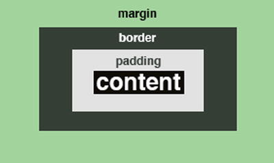
Figure 2-13. Calculating width includes the content, padding, border, and margin
Back in Figure 2-10, we had two floated, side-by-side elements with a CSS width of 198 pixels and a border in a container the size of 400 pixels. Now you probably know why the elements needed to be that width and no larger. The border had a width of 1 pixel, which added 2 pixels of total width because the border was on both sides of the element. So the total width of each was actually 200 pixels, even though the element was set to a width of 198 pixels with CSS. The lesson here is that if you are going to create layouts that have multiple elements side by side, you have to pay close attention to the total width of the elements so that the extra bits of width elements get from padding, border and margin do not throw off your layout.
Box-Sizing
Every element in HTML is essentially a box. Some people refer to HTML’s “box model.” The box model is how the browser determines the size of the box, or the total size of the element as we have been calling it.
There is a CSS property called “box-sizing” with pretty wide support for what we are going to use it for (border-box) that you can use to change how elements calculate the size of their box/total width. This CSS property has three values: content-box, padding-box, and border-box. If the first option is specified, the width property in CSS will only affect the content. In other words, the default sizing of an element is content-box, which is what we have been discussing. The padding-box option makes the CSS width property affect both the content and the padding. So if you set a width of 100 pixels on an element, it will force the width of the element to be 100 pixels including both content and padding, unlike before. The third option, border-box, makes the CSS width property apply to the content width, the padding and the border but not the margin. How about some examples? Take a look at Figure 2-14.
<style>
  .box {
    border: solid 5px #000;
    padding: 5px;
    width: 250px;
  }

  .content-box {
    -moz-box-sizing: content-box;
    -webkit-box-sizing: content-box;
    box-sizing: content-box;
  }

  .padding-box {
    -moz-box-sizing: padding-box;
    -webkit-box-sizing: padding-box;
    box-sizing: padding-box;
  }

  .border-box {
    -moz-box-sizing: border-box;
    -webkit-box-sizing: border-box;
    box-sizing: border-box;
  }
</style>

<div style="width: 270px; background-color: #CCC;">270 pixels wide</div>
<div class="box content-box">content box</div>
<div style="width: 260px; background-color: #CCC;">260 pixels wide</div>
<div class="box padding-box">padding box</div>
<div style="width: 250px; background-color: #CCC;">250 pixels wide</div>
<div class="box border-box">border box</div>
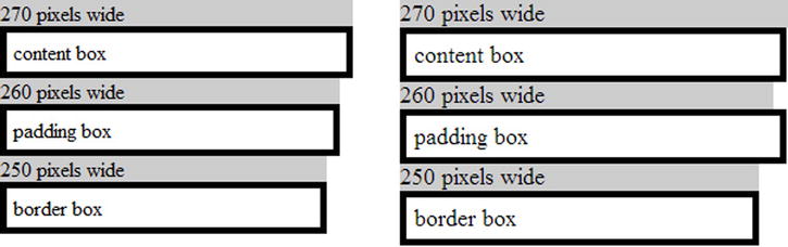
Figure 2-14. Box-sizing examples from desktop Firefox (left) and Chrome (right)
For reference in the screenshots, each example box has a reference box above set to the width that they should be if the property was implemented. The first example uses the default box model for the web, content-box. In this case total width is left margin + left border + left padding + content + right padding + right border + right margin, which comes out to a total width of 270 pixels.
In the second example, the padding is included in the content width, so the total width is left margin + left border + content + right border + right margin, which comes out to a total of 320 pixels.
In the third example, the padding and border are included in the content width, so the total width is left margin + content + right margin, which comes to a total of 310 pixels.
Which should you use? Because of almost non-existent (as of early 2013) browser support for padding-box, at this point that option is not very feasible. The third has really good support as long as you do not intend to target Internet Explorer 7 or earlier. To get widest support, use –moz-box-sizing: border-box and –webkit-box-sizing: border-box prefixes along with the unprefixed CSS setting.
One method that some are recommending is to apply a box-sizing rule universally in a site. You could easily do it like this:
*
{
  -moz-box-sizing: border-box;
  -webkit-box-sizing: border-box;
  box-sizing: border-box;
}
This actually works great for mobile with the exception of HTC Android browsers. For whatever reason, there is a bug in every HTC Android browser that I have tried (all Android 2.2 and 2.3) when this rule is applied to text inputs. When the input is not in focus, the input looks normal. But when focused, the default border of the input disappears and leaves the cursor hanging in the air. If this bug does not bother you, then feel free to use this since mobile support is quite good on modern mobile browsers. Though I like the idea in many ways, the rest of our discussion will not be using this rule. HTC has lots of Android phones on the market, and I would rather not be triggering this bug. So from now on we are back to default, where sizing is determined by total margin, total border, total padding, and content size.
CSS Rule #9 Width is determined by the following formula unless you change the box-sizing: left margin + left border + left padding + content width + right padding + right border + right margin.
Laying Out a Page in CSS
Now we finally get to the primary discussion of the chapter, which is how you can lay out a page effectively using CSS. We are going to accomplish two tasks to help us apply the rules above. The first task will be to create a page with a header and a two-column content area, one of which will be a sidebar. It will also have a footer. The other task will be to create a horizontal menu out of an unordered list, a very common task for a web developer. For both of these tasks we will have a fixed width to keep this simple as we learn the rules. In the next chapter we will discuss how to turn both of these fixed-width layouts into fluid, responsive layouts.
Creating a Page with a Sidebar
The page we will create is a page with a header, a sidebar (on the left), a main content area (on the right) and a footer. It is conceptually a two-column layout. All the rules discussed can be just as easily applied to create a three or four column layout. But to keep it simple, we will stick with two columns and the page will look a lot like Figure 2-15.
Figure 2-15. Basic layout of a page with a sidebar—a very common page layout
The most basic HTML I would use to build this structure would look like the following:
<div id="page">
  <div id="header">
    Header content
  </div>
  <div id="sidebar">
    Sidebar content
  </div>
  <div id="content">
    Main content
  </div>
  <div id="footer">
    Footer content
  </div>
</div>
The various bits of content for the page would go into each of these containers, and this content would have its own styling. But this shell would define the areas where our content belonged. The only superfluous element is the root element with the id of “page.” This is not actually needed, but we can use it to constrain the size of all of the child elements. Let’s start with the CSS to give us some basic colors and to setup the header and footer.
#page {
  width: 960px;
}

#header {
  background-color: #bdbdbd;
  height: 100px;
  width: 100%;
}

#sidebar {
  background-color: #d2d2d2;
}

#content {
}

#footer {
  background-color: #bdbdbd;
  height: 30px;
  width: 100%;
}
By constraining the container (the div with the id of “page”) to 960 pixels we get two benefits. First, all elements that should span the entire page area can just be set to a size of 100 percent and everything will fit correctly. Second, we can easily center the content in the browser by setting the CSS margin setting to margin: 0 auto if we are so inclined. Now the entire page acts as a unit.
The next thing to do is to setup our two columns in the middle: the sidebar and the main content area. We will set the sidebar to a little less than a third of the content’s size. We will follow rule #5 and #6 above and set our width to make sure there is enough space for both elements when floated. We will also follow rule #7 and clear the floats so the footer appears below the sidebar and content areas.
#sidebar {
  background-color: #d2d2d2;  float: left;
  width: 200px;
}

#content {
  float: left;
  width: 760px;
}
#footer {
  background-color: #bdbdbd;
  clear: both;
  height: 30px;
  width: 100%;
}
The sample in Figure 2-16 works well in getting us our two-column layout, but we have some issues. The first issue is that there is no spacing. The text could use some padding so it doesn’t lie too close to the edges of its container, and a little text layout adjustment makes sense as well. The second issue is that one column is obviously shorter than we want. We will solve these problems one at a time.
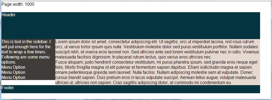
Figure 2-16. CSS for creating a two-column content body, sidebar, and content area
Adding Some Padding
Let us make some simple padding and spacing changes and see if this improves things. I’ll start with adding 20 pixels of padding to the content area and see what I get in Figure 2-17.
#content {
  float: left;
  padding: 20px;
  width: 760px;
}

Figure 2-17. Adding padding messed up our nice two-column layout
This is not what we wanted. We just wanted more padding between the text and its container. If there is anything that frustrates developers who still have problems with float-based layouts, it is this kind of problem. But if you go back to our rules above, this makes sense. And the good news is that this is easily avoidable!
Once again, two floated elements will only float up next to each other if there is enough horizontal space for both to fit (rule #5). In this case there is not enough space, so the second block wraps under the first. Second, we need to remember our rules about width calculation (rule #9). Total element width is made up of the content width plus all surrounding margin, border, and padding. So by adding 20 pixels of padding to each side of the element, we have increased the size of the column on the right from 760 pixels to 800 pixels. The size of the sidebar is 200 pixels, which puts us at a width of 1000 pixels, which will not fit in the 960-pixel-width page container. Fortunately, this means the fix is easy. Instead of the above CSS, use the following:
#content {
    background-color: #E5D9CF;
    float: left;
    padding: 20px;
    width: 720px;
}
So now that we remember that any margin, border, and padding added to the elements must be subtracted from the width of the elements, spacing things out is quite easy. So we can make some changes and our content is less crammed.
#sidebar {
  background-color: #d2d2d2;
  float: left;
  padding: 20px;
  width: 160px;
}

#sidebar p {
    font-size: .8em;
    line-height: 1.4em;
}

#sidebar ol {
    margin: 10px 0 0 20px;
}

#sidebar li {
    font-size: .8em;
    font-weight: bold;
    list-style-type: none;
    margin: 8px 0;
}

#content {
  background-color: #e6e6e6;
  float: left;
  padding: 20px;
  width: 720px;
}

#content p {
    line-height: 1.4em;
    margin: 0 0 20px 0;
}
What you see in Figure 2-18 works great and will work for many layouts. But it can be improved, and next we will discuss how this can be done.
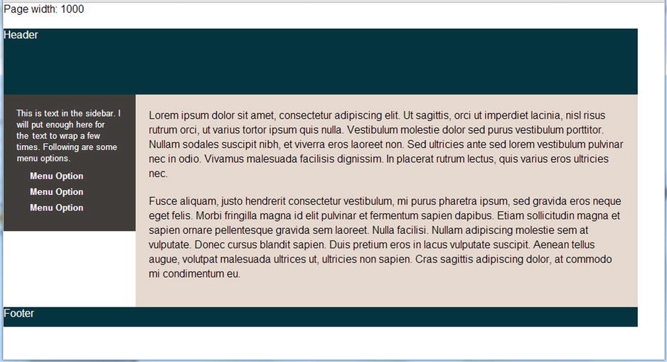
Figure 2-18. Now with padding to give our content some space to breathe
We are left with the height problem of our two columns. We want both columns to extend all the way to the footer, but this is not happening because the default height value of elements is determined by their content. If we were using a table to lay out this content, we wouldn’t have this problem because the whole row would be sized the height of the largest cell. In my experience, once you understand the “gotchas” for calculating width, this is the only negative to doing float-based layouts.
But we can solve this. To do so, we could explicitly set the height of each column via CSS, perhaps height: 200px. But this is problematic. What if the user increases the browser’s text size? What if you are using this as a template for other pages with different content? This is a solution to consider only if you can assume your content will be inflexible. But we will not. Here are two solutions to this problem.
Display Like a Table without a Table
First, you could try removing the float layout and use display: table-cell on both columns. The display value tells elements of the page to act as if they were table elements. So if you want two divs to act like two cells in a table row, set this as the display property. Following is the same CSS from above with the new display values set. Note that the float had to be removed for this to work.
#sidebar {
  background-color: #403d3a;
  display: table-cell;
  color: #FFF;
  padding: 20px;
  width: 160px;
}

#content {
  display: table-cell;
  background-color: #E5D9CF;
  padding: 20px;
  width: 720px;
}
When this is suggested, many bring up the rather obvious fact that we are trying to avoid the inflexibility of the table element but still using sizing mechanisms that are named after tables. The problem with using tables for layout is primarily two-fold. First, they are rather inflexible, and this is going to be a big problem when we get to the next chapter and try to change the layout of things based on screen size. Second, using a table to express layout keeps the markup from being semantically accurate. When you do this, you’re mixing presentation and data. But CSS is about presentation. Putting presentation-related code there makes sense. To complain (as some do) that using display: table-cell gets us back where we started misses the point of why using the table element for layout was bad. So I think this is fine, and you can use this without having to worry too much about the CSS Float Police. But using the strategy has a drawback in that this display mode is not supported in Internet Explorer 6 and 7. If you’re not supporting those browsers (and if you’re just building a mobile site for relatively new smartphones, you probably aren’t), you may have good enough mobile browser support to use this technique.
Faux Columns
Another technique is called “faux columns” and is very old. The great thing about aging techniques like this is that they should work on just about any browser that has CSS support for floats, which is certainly Android and iOS, as well as many others. This technique is at least as old as Dan Cederholm’s 2004 “A List Apart” article by the same name (http://alistapart.com/article/fauxcolumns), which introduced the technique. The only negative thing about this approach is that it achieves the effect by using a background image instead of pure CSS.
This technique is called “faux” columns because the floated elements appear to be columns of equal height even though they really are not. The first thing to do is wrap our two elements in another element that we can attach a background image to. Next create a background image of the desired proportions (960 pixels in width, 1 pixel in height) with the column design that you want and set that as a background image of the new containing element and then have it repeat vertically. In this particular example, you want the solid colors of the columns to appear to extend to the maximum height of both, so you would use an image with those colors. The dark brown color takes up about 180 pixels on the left and the tan color the remaining pixels on the right. In other words, do this to get what we see in Figure 2-19.
<div id="contentWrapper">
  <div id="sidebar">
    <p>This is text in the sidebar...</p>
      <ol>
        <li>Menu Option</li>
        <li>Menu Option</li>
        <li>Menu Option</li>
      </ol>
  </div>
  <div id="content">
    <p>Lorem ipsum dolor...</p>
  </div>
</div>

#contentWrapper {
  background-image: url(fixed-faux-column-background.jpg);
  background-repeat: repeat-y;
  overflow: auto;
}
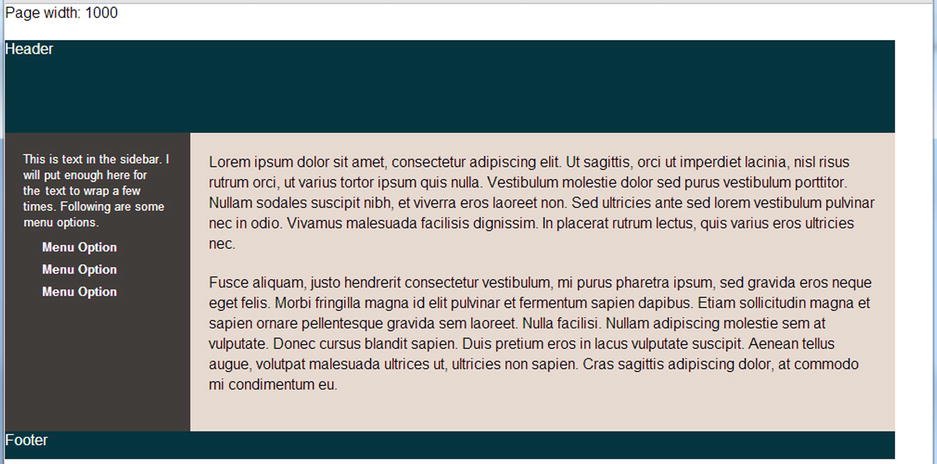
Figure 2-19. The page after implementing faux columns
So we see how to set a background image and repeat it vertically. No surprise there. The more important thing to point out is the overflow: auto setting. Recall above (rule #8) that a container that contains only floated elements will have no height because the floated elements are taken out of the normal page layout flow. Without this CSS property applied, the outer div is 0 pixels tall, so you never see the background. Setting overflow: auto tells the browser to calculate that space taken up by the floated elements, which gives you the appropriate size for setting the background image. So even though the two columns do not technically stretch to the bottom, it looks as though they do. And the total height of the area will be determined by the tallest of the two columns, which will stretch the container and maintain the illusion of equal-sized columns.
Whether you choose to not deal with the column problem or to solve it one of these ways, you have options. Though laying out columns is admittedly a bit awkward in CSS, it’s a solvable problem as long as you know the rules.
Creating a Horizontal Menu in CSS
Another very common design element on the web is the horizontal menu. Like the multi-column layout above, many find styling these difficult. Here we will take what we have learned and create a horizontal menu using several of the techniques above. Figure 2-20 shows what it will look like when it is finished.
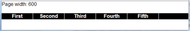
Figure 2-20. A horizontal menu
It is generally considered a best practice to use a list for a menu since a menu is nothing more than a list of links (even if you use the new HTML5 nav element). In our case, we will use an unordered list.
<ul>
  <li><a href="first.htm">First</a></li>
  <li><a href="second.htm">Second</a></li>
  <li><a href="third.htm">Third</a></li>
  <li><a href="fourth.htm">Fourth</a></li>
  <li><a href="fifth">Fifth</a></li>
</ul>
Before we jump in to changing the default layout of lists, we should understand why a list is displayed like it is by default. If you have a list with a few items in it (if it is a ul like the list above, you will see a bulleted list), the list items do not stack up on top of each other because of their list-ness. They stack up because the li element is a block-level element. You may recall from above that block-level elements (that is, those that are by default display: block), will take up the entire horizontal width of their container (rule #2), forcing the next element to appear below instead of to the side. So you need to augment this behavior if you want to turn this vertical list into a horizontally stacking menu.
Laying Out the Menu Using Floats
Let’s try using floats. Since we want to float the list items, the first thing to do is set a width on them (rule #6) and then apply a value of float: left to the list items to have them stack up to the left. We want a black background spanning the entire menu, so we can’t put a background on the list items since they do not reach all the way across the screen. So we will set the background color of the containing ul and set its overflow: auto value so it doesn’t collapse (rule #8). The following is our resulting CSS, including some extra style to handle text colors and borders. I hope you agree that this is fairly easy once you learn the rules.
<style type="text/css">

  ul {
    background-color: #000;
    overflow: auto;
  }

  li {
    border-right: solid 1px #FFF;
    float: left;
    list-style-type: none;
    text-align: center;
    width: 100px;
  }

  a {
    color: #FFF;
    font-weight: bold;
    text-decoration: none;
  }

</style>
Laying Out the Menu Using Display: Inline-block
Inline-block should also work well for making the menu horizontal because they can stack horizontally and their width can be set (rule #3), so setting both display and width gets us our basic layout. Unlike floats, inline-block elements do not escape the document flow, so the containing ul does not need to have its overflow value tweaked. You can often accomplish the same design using inline-block as you can using float, which is the case here.
Though you may not see it, because our background color is black, there is actually a space between the menu items given the markup. So the menu items take up more horizontal space using this method than with using floats. This is because there are spaces between them in the DOM. Unlike floated elements, they are in the normal flow, so spaces between them in the HTML markup cause this behavior. The easiest way to solve this is to remove the spaces in the DOM by lining the elements directly up against each other. You can also set the font size on the ul to 0 but then reset the font size on the li. For this example I will just ignore the issue and let the spaces remain. And remember that you have to set the background color on the container and not the items: this is because the list items do not span the entire width of the container, just like the float example above.
ul {
    background-color: #000;
}

li {
    border-right: solid 1px #FFF;
    display: inline-block;
    list-style-type: none;
    text-align: center;
    width: 100px;
}

a {
    color: #FFF;
    font-weight: bold;
    text-decoration: none;
}
Summary
So you have seen two examples of how to do layout with CSS without using a single HTML table. Once you know the rules, doing layouts with pure CSS is not nearly as daunting a task as many think it is. However, this is a book on mobile, so we should not stop here. Our 960-pixel layouts above might work on larger tablets but will fail spectacularly on smaller devices, so we need fluid layouts that adapt to the size of the screen. You saw briefly how to do that in Chapter 1. Chapter 3 will give you more examples and work through common issues in responsive layouts.