
24
Data Binding
One of the best features of Angular is the built-in data binding. Data binding is the process of linking data from a component with what is displayed in a web page. When data in the component changes, the UI rendered to the user is automatically updated. Angular provides a very clean interface to link the model data to elements in a web page.
Understanding Data Binding
Data binding means linking data in an application with the UI element that is rendered to the user. When data is changed in the model, the web page is automatically updated. This way, the model is always the only source for data represented to the user, and the view is just a projection of the model. The glue that puts the view and the model together is data binding.
There are many ways in Angular to use data binding to make an application look and act in different ways. The following is a list of the types of data binding available with Angular that are discussed in this chapter:
 Interpolation: You can use double curly braces (
{{}}) to get values directly from the Component class.
Property binding: You can use this type of binding to set the property of an HTML element.
Event binding: You can use this type of binding to handle user inputs.
Attribute binding: This type of binding allows the setting of attributes to an HTML element.
Class binding: You can use this type of binding to set CSS class names to the element.
Style binding: You can use this type of binding to create inline CSS styles for the element.
Two-way binding with ngModel: You can use this type of binding with data entry forms to receive and display data.
Interpolation
Interpolation involves using the {{}} double curly braces to evaluate a template expression. This can be in a hard-coded form, or it can reference a property of the Component class.
The syntax for interpolation should look familiar from Chapter 23, “Expressions.” However, you can also use interpolation to give an HTML tag property a value (for example, the img tag). Here is an example of the syntax to do this:
<img src="{{imgUrl}}"/>
Now let’s look at an example that shows some cool things you can do with interpolation binding.
Listing 24.1 shows an Angular component. This component has a template that contains types of interpolation and expressions wrapped in {{}} brackets. The Component class gives values to be used within the {{}} brackets. (Be sure to change the imageSrc variable to the appropriate image name.)
Figure 24.1 shows the rendered web page. As you can see, interpolation can use strings from the Component class to populate the template.
Listing 24.1 interpolation.component.ts: Interpolation with Strings and a Function
01 import { Component } from '@angular/core';
02
03 @Component({
04   selector: 'app-root',
05   template: `
06     {{str1 + ' ' + name}}
07     <br>
08     <img src="{{imageSrc}}" />
09     <br>
10     <p>{{str2 + getLikes(likes)}}</p>
11   `,
12   styles: [`
13     img{
14       width: 300px;
15       height: auto;
16     }
17     p{
18       font-size: 35px;
19       color: darkBlue;
20     }
21   `]
22 })
23 export class AppComponent {
24   str1: string = "Hello my name is"
25   name: string = "Brendan"
26   str2: string = "I like to"
27   likes: string[] = ['hike', "rappel", "Jeep"]
28   getLikes = function(arr: any){
29     var arrString = arr.join(", ");
30     return " " + arrString
31   }
32   imageSrc: string = "../assets/images/angelsLanding.jpg"
33 }
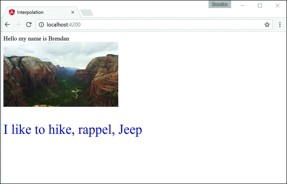
Figure 24.1 Using interpolation to combine strings, define an imageSrc URL, and run a function
Property Binding
You use property binding when you need to set the property of an HTML element. You do this by defining the value you want within the Component class. Then you bind that value to the component template, using the following syntax:
<img [src]="myValue">
Note
In many cases, it is possible to use interpolation to achieve the same results you get with property binding.
Now let’s take a look at an example of property binding. Listing 24.2 shows an Angular component. This component has a template that contains types of property binding. It also makes a comparison between property binding and interpolation.
Figure 24.2 shows the rendered web page. As you can see, interpolation can use strings from the Component class to populate the template.
Listing 24.2 property.component.ts: Property Binding with Logic and the Application of a Class Name
01 import { Component } from '@angular/core';
02
03 @Component({
04   selector: 'app-root',
05   template: `
06     <img [src]="myPic"/>
07     <br>
08     <button [disabled]="isEnabled">Click me</button><hr>
09     <button disabled="{!isEnabled}">Click me</button><br>
10     <p [ngClass]="className">This is cool stuff</p>
11   `,
12   styles: [`
13     img {
14       height: 100px;
15       width auto;
16     }
17     .myClass {
18       color: red;
19       font-size: 24px;
20     }
21   `]
22 })
23 export class AppComponent {
24   myPic: string = "../assets/images/sunset.JPG";
25   isEnabled: boolean = false;
26   className: string = "myClass";
27 }
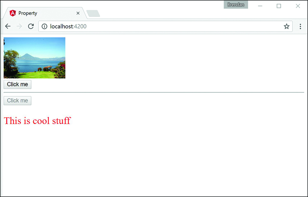
Figure 24.2 Using property binding to define an imageSrc URL, set a button to disabled mode, and assign a class name
Attribute Binding
Attribute binding is similar to property binding but is tied to the HTML attribute rather than the DOM property. You are not likely to use attribute binding very often, but it is important to know what it is and how to use it. You will generally only use attribute binding on attributes that do not have a corresponding DOM property (for example, aria, svg, and table span attributes). You define an attribute binding by using the following syntax:
<div [attr.aria-label] = "labelName"></div>
Note
Because attribute binding and property binding function almost the same way, we do not present an example for attribute binding in this book.
Class Binding
You use class binding to bind CSS style tags to HTML elements. It assigns the class based on the result of an expression being true or false. If the result is true, the class gets assigned. The following is an example of the syntax:
<div [class.nameHere] = "true"></div>
<div [class.anotherName] = "false"></div>
Now let’s take a look at an example of class binding. Listing 24.3 shows an Angular component that has a template. This template contains types of class binding that show how to apply a class name using two different methods.
Figure 24.3 shows the rendered web page. As you can see, the class names take effect and allow the CSS styles to change the HTML.
Listing 24.3 class.component.ts: Property Binding with Logic and the Application of a Class Name
01 import { Component } from '@angular/core';
02
03 @Component({
04   selector: 'app-root',
05   template: `
06     <div [class]="myCustomClass"></div>
07     <span [class.redText]="isTrue">Hello my blue friend</span>
08   `,
09   styles: [`
10     .blueBox {
11       height: 150px;
12       width: 150px;
13       background-color: blue;
14     }
15     .redText{
16       color: red;
17       font-size: 24px;
18     }
19   `]
20 })
21 export class AppComponent {
22   myCustomClass: string = 'blueBox';
23   isTrue = true;
24 }
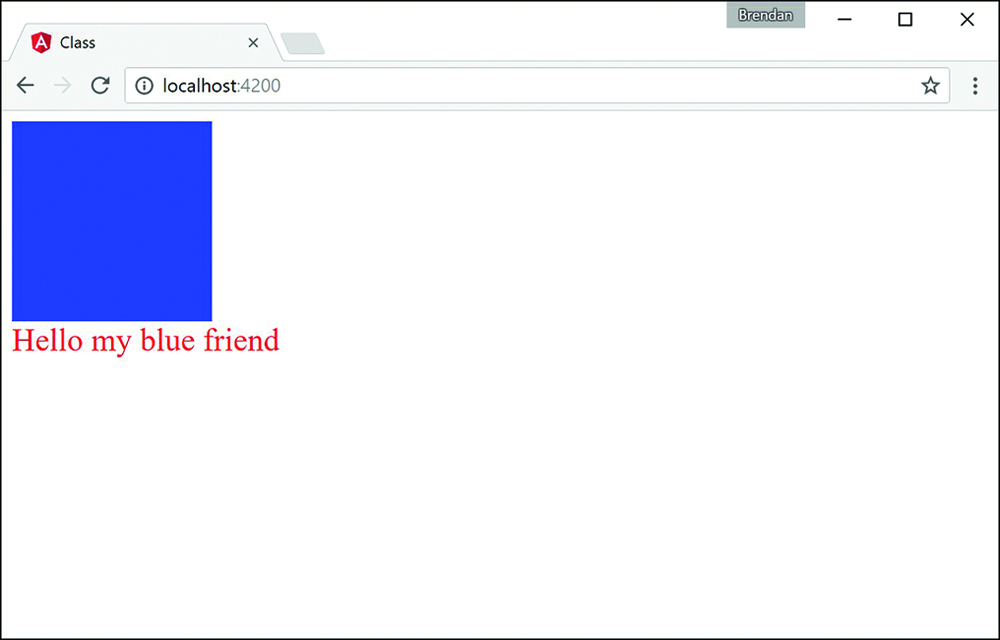
Figure 24.3 An Angular application that applies class binding to add custom classes to HTML elements
Style Binding
You use style binding to assign inline styles to an HTML element. Style binding works by defining the CSS style property in the brackets, with the assignment expression in the quotation marks. The syntax looks almost the same as for class binding but with style instead of class as the prefix:
<p [style.styleProperty] = "assignment"></p>
<div [style.backgroundColor] = "'green'"></div>
Now let’s take a look at an example of style binding. Listing 24.4 shows an Angular component that has a template. This template contains types of style binding that show how to apply custom inline styles to an application.
Figure 24.4 shows the rendered web page. As you can see, the styles take effect, and the CSS styles change the HTML accordingly.
Listing 24.4 style.component.ts: Style Binding to Change the Appearance of the HTML
01 import { Component } from '@angular/core';
02
03 @Component({
04   selector: 'app-root',
05   template: `
06     <span [style.border]="myBorder">Hey there</span>
07     <div [style.color]="twoColors ? 'blue' : 'forestgreen'">
08       what color am I
09     </div>
10     <button (click)="changeColor()">click me</button>
11   `
12 })
13 export class AppComponent {
14   twoColors: boolean = true;
15   changeColor = function(){
16     this.twoColors = !this.twoColors;
17   }
18   myBorder = "1px solid black";
19 }
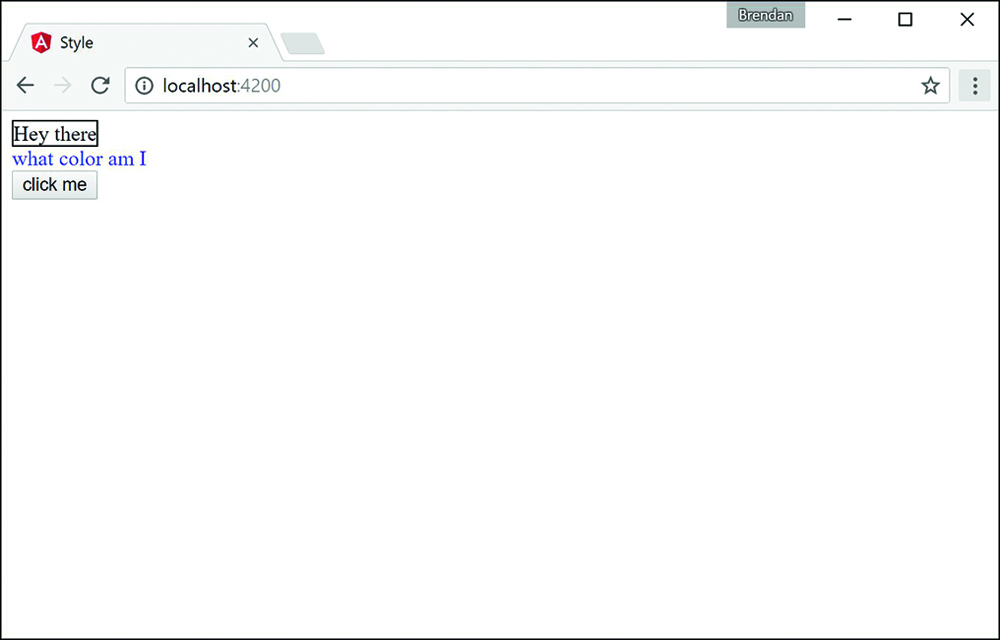
Figure 24.4 The rendered web page with custom styles applied via a button that runs a function to adjust the value of the twoColors variable
Event Binding
You use event binding to handle user inputs such as clicking, keystrokes, and mouse movements. Angular event binding is similar to HTML event attributes; the major difference is that the prefix “on” is removed from the binding, and instead the event is surrounded by parentheses (()). For example, onkeyup in HTML looks like (keyup) in Angular.
A common purpose for event binding is to run functions from the component. The following is the syntax for click event binding:
<button (click)="myFunction()">button</button>
Let’s look at an example of event binding. Listing 24.5 shows an Angular component. This component has event binding that calls a function to change the image URL once clicked.
Figure 24.5 shows the rendered web page. You can see both the initial web page and the results of clicking the button to trigger the event.
Listing 24.5 event.component.ts: Event Binding to Change the Image URL That Displays on the Web Page
01 import { Component } from '@angular/core';
02
03 @Component({
04   selector: 'app-root',
05   template: `
06     <div (mousemove)="move($event)">
07       <img [src]="imageUrl"
08         (mouseenter)="mouseGoesIn()"
09         (mouseleave)="mouseLeft()"
10         (dblclick)="changeImg()" /><br>
11         double click the picture to change it<br>
12         The Mouse has {{mouse}}<hr>
13       <button (click)="changeImg()">Change Picture</button><hr>
14       <input (keyup)="onKeyup($event)"
15         (keydown)="onKeydown($event)"
16         (keypress)="keypress($event)"
17         (blur)="underTheScope($event)"
18         (focus)="underTheScope($event)">
19         {{view}}
20       <p>On key up: {{upValues}}</p>
21       <p>on key down: {{downValues}}</p>
22       <p>on key press: {{keypressValue}}</p>
23       <p (mousemove)="move($event)">
24         x coordinates: {{x}}
25         <br> y coordinates: {{y}}
26       </p>
27     </div>
28   `,
29   styles: [`
30     img {
31       width: auto;
32       height: 300px;
33     }
34   `]
35 })
36 export class AppComponent {
37   counter = 0;
38   mouse: string;
39   upValues: string = '';
40   downValues: string = '';
41   keypressValue: string = "";
42   x: string = "";
43   y: string = '';
44   view: string = '';
45
46   mouseGoesIn = function(){
47     this.mouse = "entered";
48   };
49   mouseLeft = function(){
50     this.mouse = "left";
51   }
52   imageArray: string[] = [
53     "../assets/images/flower.jpg",
54     "../assets/images/lake.jpg", //extensions are case sensitive
55     "../assets/images/bison.jpg",
56   ]
57   imageUrl: string = this.imageArray[this.counter];
58   changeImg = function(){
59     if(this.counter < this.imageArray.length - 1){
60       this.counter++;
61     }else{
62       this.counter = 0;
63     }
64     this.imageUrl=this.imageArray[this.counter];
65   }
66   onKeyup(event:any){
67     this.upValues = event.key;
68     //this.upValues += event.target.value + ' | ';
69   }
70   onKeydown(event:any){
71     this.downValues = event.key;
72     //this.downValues += event.target.value + " | ";
73   }
74   keypress(event:any){
75     this.keypressValue = event.key;
76     //this.keypressValue += event.target.value + " | ";
77   }
78   move(event:any){
79     this.x = event.clientX;
80     this.y = event.clientY;
81   }
82   underTheScope(event:any){
83     if(event.type == "focus"){
84       this.view = "the text box is focused";
85     }
86     else if(event.type == "blur"){
87       this.view = "the input box is blurred";
88     }
89     console.log(event);
90   }
91 }
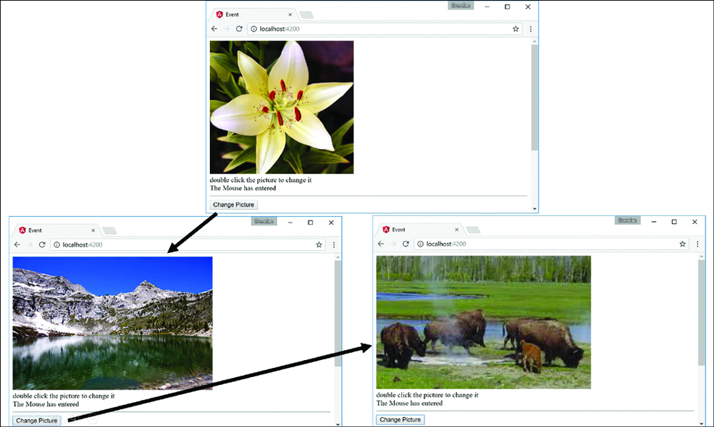
Figure 24.5 The initial result when the web page is loaded and the result from the event being triggered
Two-Way Binding
Two-way binding allows for data to be easily displayed and updated simultaneously. This makes it easy to reflect any changes the user makes to the DOM. Angular does this by using ngModel to watch for changes and then update the value. This is the syntax:
<input [(ngModel)] = "myValue">
Now let’s take a look at an example of two-way binding. Listing 24.6 shows an Angular component that has a template. This template shows different ways to accomplish two-way data binding.
Figure 24.6 shows the rendered web page. It shows that the styles take effect and the CSS styles change the HTML accordingly.
Listing 24.6 twoWay.component.ts: Different Methods to Implement Two-Way Data Binding
01 import { Component } from '@angular/core';
02 @Component({
03   selector: 'app-root',
04   template: `
05     <input [(ngModel)]="text"><br>
06     <input bindon-ngModel="text"><br>
07     <input [value]="text" (input)="text=$event.target.value">
08     <h1>{{text}}</h1>
09   `
10 })
11 export class AppComponent {
12   text: string = "some text here";
13 }
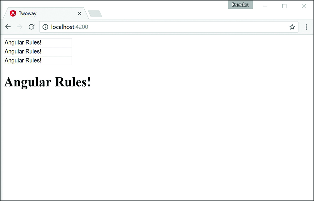
Figure 24.6 An Angular application that shows multiple ways to accomplish two-way data binding. The variable and the view are updated every time there is a change to the input field
Summary
Angular allows for powerful and very useful types of data binding. As you have seen in this chapter, you can bind data in the application model to the UI elements that are rendered to the user. This chapter goes over the available types of data binding and how to implement them. Data binding allows for data to be both displayed to the user and updated by the user in a simple and efficient manner.
Next
The next chapter talks about built in directives. You will learn about what they are, as well as how to implement them in your Angular templates.