
25
Built-in Directives
One of the most powerful features Angular provides is directives. Directives extend the behavior of HTML, enabling you to create custom HTML elements, attributes, and classes with functionality specific to an application. Angular provides many built-in directives, which provide the capability to interact with form elements, bind data in a component to the view, and interact with browser events.
This chapter discusses the built-in directives and how to implement them in Angular templates. You will learn how to apply these directives in your Angular templates and support them in back-end controllers to quickly turn a rendered view into an interactive application.
Understanding Directives
Directives are a combination of Angular template markup and supporting TypeScript code. Angular directive markups can be HTML attributes, element names, or CSS classes. The TypeScript directive code defines the template data and behavior of the HTML elements.
The Angular compiler traverses the template DOM and compiles all directives. Then it links the directives by combining a directive with a scope to produce a new live view. The live view contains the DOM elements and functionality defined in the directive.
Using Built-in Directives
Much of the Angular functionality that you need to implement in HTML elements is provided through built-in directives. These directives provide a wide variety of support for Angular applications. The following sections describe most of the Angular directives, which fall into three categories:
 Component: A directive with a template
Structural: A directive that manipulates elements in the DOM
Attribute: A directive that manipulates the appearance and behavior of a DOM element
The following sections describe these three types of directives. You do not need to understand all the directives right away. The following sections provide tables for reference. In addition, the following sections and chapters provide sample code for using many of these directives.
Components Directives
Angular components are a form of structural directive that utilize a template. A component creates a selector that is used as an HTML tag to dynamically add HTML, CSS, and Angular logic to the DOM. Components are at the heart of Angular.
Structural Directives
Several directives dynamically update, create, and remove elements from the DOM. These directives create the layout, look, and feel of an application. Table 25.1 lists these directives and describes the behavior and usage of each.
Table 25.1 Structural Directives
Directive |
Description |
|
This directive is used to create a copy of a template for each item within an iterable object. Here is an example:
|
|
When this directive is present in an element, that element is added to the DOM if the value returns
|
|
This directive displays a template based on the value passed in it. As with <div [ngSwitch]="timeOfDay">
<span [ngSwitchCase]="'morning'">Morning</span>
<span [ngSwitchCase]="'afternoon'">Afternoon</span>
<span [ngSwitchDefault]="'daytime'">Evening</span>
The |
|
This directive evaluates the value it has stored against the value passed into |
|
This directive creates the HTML template if all the above |
The directives in Table 25.1 are used in a variety of different ways in various parts of the code. They allow for dynamic manipulation of the DOM, based on what data is passed to them. Structural directives dynamically manipulate the DOM by using expressions or values. Two of the most common structural directives are ngIf and ngSwitch.
ngIf displays a section of HTML if a value or an expression returns true. ngIf uses the * symbol to let Angular know it’s there. The following is an example of the syntax for ngIf:
<div *ngIf="myFunction(val)" >...</div>
<div *ngIf="myValue" >{{myValue}}</div>
Note
ngFor is another example of a directive that uses the * symbol as a prefix to let Angular know it’s there.
ngSwitch uses ngSwitchCase, which displays a section of HTML if a value or an expression returns true. ngSwitch is surrounded by [] as a form of one-way data binding to pass the data to each ngSwitchCase for evaluation. The following is an example of the syntax for ngSwitch:
<div [ngSwitch]="time">
      <span *ngSwitchCase="'night'">It's night time </span>
      <span *ngSwitchDefault>It's day time </span>
Listing 25.1 shows an Angular component which has a template that contains built-in structural directives. The ngIf directive dynamically adds and removes HTML from the DOM. ngSwitch does the same thing as ngIf, but it allows for more options, along with a default option if all the cases return false.
Lines 6 and 7 in Listing 25.1 use ngIf to determine whether the HTML should be displayed.
Line 10 shows the extended form of ngFor to dynamically add HTML based on the amount of data passed to it. (This example simply shows another method of using the ngFor directive, but the rest of the book will use the shorter form *ngFor.)
Line 15 uses the shorthand form of the ngFor directive to display data. This method is used throughout the rest of this book.
Lines 20 through 26 use ngSwitchCase to determine which piece of HTML should be displayed.
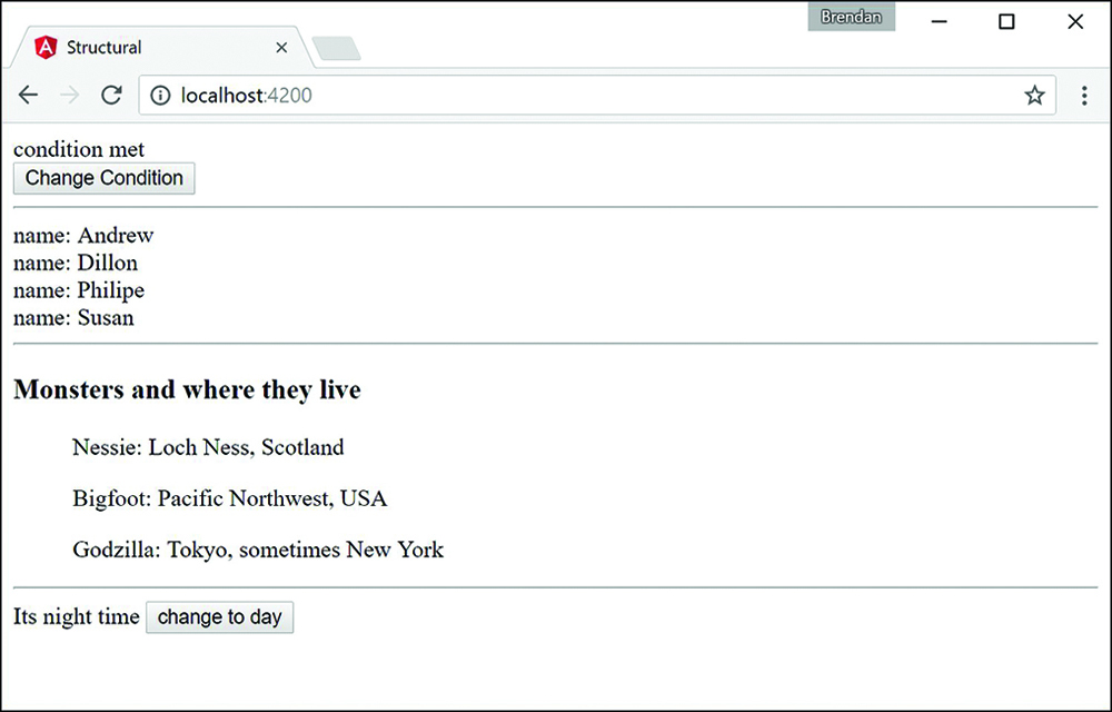
Figure 25.1 shows the rendered web page. As you can see, interpolation can use strings from the Component class to populate the template.
Listing 25.1 structural.component.ts: Structural Built-in Functions
01 import { Component } from '@angular/core';
02
03 @Component({
04   selector: 'app-root',
05   template: `
06     <div *ngIf="condition">condition met</div>
07     <div *ngIf="!condition">condition not met</div>
08     <button (click)="changeCondition()">Change Condition</button>
09     <hr>
10     <template ngFor let-person [ngForOf]="people">
11       <div>name: {{person}}</div>
12     </template>
13     <hr>
14     <h3>Monsters and where they live</h3>
15     <ul *ngFor="let monster of monsters">
16         {{monster.name}}:
17         {{monster.location}}
18     </ul>
19     <hr>
20     <div [ngSwitch]="time">
21       <span *ngSwitchCase="'night'">It's night time
22       <button (click)="changeDay()">change to day</button>
23       </span>
24       <span *ngSwitchDefault>It's day time
25       <button (click)="changeNight()">change to night</button></span>
26     </div>
27   `
28 })
29 export class AppComponent {
30   condition: boolean = true;
31   changeCondition = function(){
32     this.condition = !this.condition;
33   }
34   changeDay = function(){
35     this.time = 'day';
36   }
37   changeNight = function(){
38     this.time = 'night'
39   }
40   people: string[] = [
41     "Andrew", "Dillon", "Philipe", "Susan"
42   ]
43   monsters = [
44     { name: "Nessie",
45       location: "Loch Ness, Scotland" },
46     { name: "Bigfoot",
47       location: "Pacific Northwest, USA" },
48     { name: "Godzilla",
49       location: "Tokyo, sometimes New York" }
50   ]
51   time: string = 'night';
52 }
Attribute Directives
Angular attribute directives modify how HTML elements look and behave. They are injected straight into the HTML and dynamically modify how the user interacts with an HTML segment. Attribute directives are so named because they often look like normal HTML attributes. An example of an attribute directive that you’ve been using throughout the book is ngModel, which modifies an element by changing the display value.
Table 25.2 lists the attribute directives and describes the behavior and usage of each.
Table 25.2 Attribute Directives
Directive |
Description |
|
This directive watches a variable for changes and then updates display values based on those changes. Consider these examples: <input [(ngModel)]="text"><br> <h1>{{text}}</h1> |
|
This directive creates a form group and allows it to track the values and validation within that form group. By using <form #formName="ngForm" (ngSubmit)="onSubmit(formName)"> </form> |
|
This directive updates the styles of an HTML element. |
The directives in Table 25.2 are used in a variety of different ways in various parts of the code. They allow for manipulation of an application’s behavior. The following example shows how to use some of the built-in attribute directives to build a form that submits data to a simulated database.
Listing 25.2 shows an Angular component. Lines 9 through 14 set the default values for the variables used throughout the application. Lines 15 through 17 define the enabler method, which sets the Boolean isDisabled to the opposite value of what it was. Lines 18 through 30 define the addClass method, which pushes a value from the event target to the selectedClass array.
Listing 25.3 shows an Angular template file that uses ngModel, ngClass, ngStyle, and ngForm to modify the look and behavior of the HTML template. Lines 7 through 12 create an HTML selection element that assigns a color to the color variable on the attribute component. Lines 14 through 18 create an HTML selection element that uses the change event to invoke the addClass method and pass in the event object. Lines 16 through 21 display the output of the component variables, using the ngClass and ngStyle directives to dynamically modify the look of the elements.
The code in Listing 25.4 is the CSS for the component that sets up the styles for the application.
Figure 25.2 shows the rendered web page. It shows that interpolation can use strings from the Component class to populate the template.
Listing 25.2 attribute.component.ts: A Component That Builds and Manages an Angular Form
01 import { Component } from '@angular/core';
02
03 @Component({
04   selector: 'app-root',
05   templateUrl: './attribute.component.html',
06   styleUrls: ['./attribute.component.css']
07  })
08 export class AppComponent {
09   colors: string[] = ["red", "blue", "green", "yellow"];
10   name: string;
11   color: string = 'color';
12   isDisabled: boolean = true;
13   classes:string[] = ['bold', 'italic', 'highlight'];
14   selectedClass:string[] = [];
15   enabler(){
16     this.isDisabled = !this.isDisabled;
17   }
18   addClass(event: any){
19     this.selectedClass = [];
20     var values = event.target.options;
21     var opt: any;
22
23     for (var i=0, iLen = values.length; i<iLen; i++){
24       opt = values[i];
25
26       if (opt.selected){
27         this.selectedClass.push(opt.text);
28       }
29     }
30   }
31 }
Listing 25.3 attribute.component.html: An Angular Template for the Attribute Component
01 <form>
02   <span>name: </span>
03   <input name="name" [(ngModel)]="name">
04   <br>
05   <span>color:</span>
06   <input type="checkbox" (click)="enabler()">
07   <select #optionColor [(ngModel)]="color" name="color"
08           [disabled]="isDisabled">
09     <option *ngFor="let color of colors" [value]="color">
10       {{color}}
11     </option>
12   </select><hr>
13   <span>Change Class</span><br>
14   <select #classOption multiple name="styles" (change)="addClass($event)">
15     <option *ngFor="let class of classes" [value]="class" >
16       {{class}}
17     </option>
18   </select><br>
19   <span>
20     press and hold control/command
21     <br>
22     to select multiple options
23   </span>
24 </form>
25 <hr>
26 <span>Name: {{name}}</span><br>
27 <span [ngClass]="selectedClass"
28     [ngStyle]="{'color': optionColor.value}">
29 color: {{optionColor.value}}
30 </span><br>
Listing 25.4 attribute.component.css: A CSS File That Styles the Application
01 .bold {
02   font-weight: bold;
03 }
04 .italic {
05   font-style: italic;
06 }
07 .highlight {
08   background-color: lightblue;
09 }
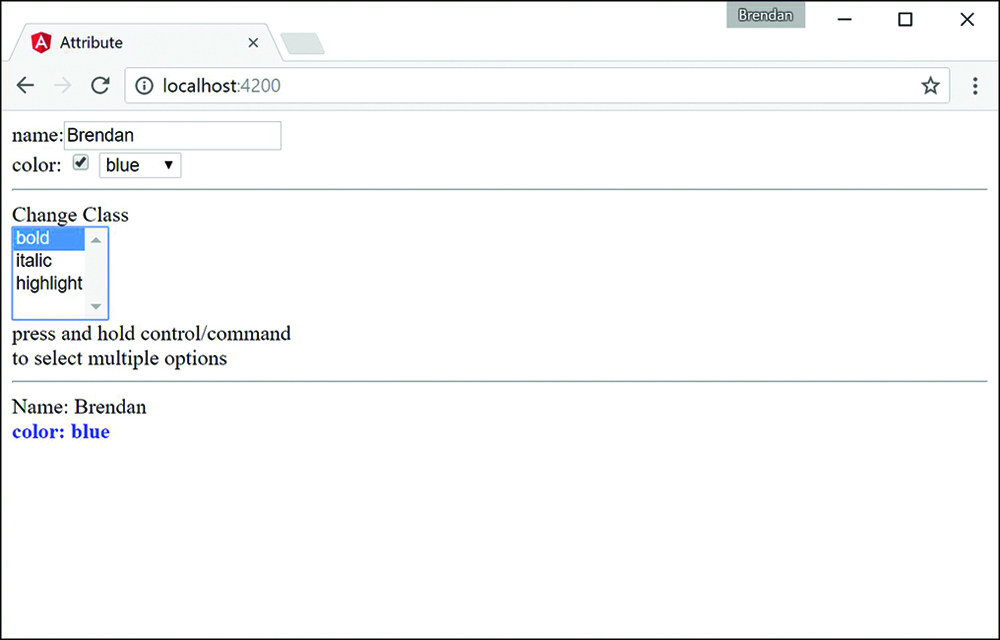
Figure 25.2 An Angular application that shows multiple ways to apply attribute directives to modify the behavior of the DOM
Summary
Angular offers many built-in directives that provide functionality to manipulate the look, feel, and behavior of an application, without requiring you to write large amounts of code. This chapter goes over some of the available built-in directives and provides examples of how to utilize Angular’s built-in directives.
Next
In this chapter you learned about built-in directives. In the next Chapter you will learn about custom directives and how to make your own directives that you can implement in Angular.