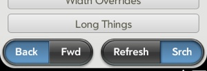
Mojo supports four types of menu widgets. Each is fairly unique, but they share some common design elements and can be used in similar ways. You should review the User Interface Guidelines to see how best to apply each menu type and for general information on designing menus for your application.
- Application menu
A conventional desktop-style menu that drops down from the top-left corner of the screen when the user taps in that area.
- View menu
Menus used across the top of the screen. They can be used as display headers or action buttons, to pop up submenus, or to toggle settings.
- Command menu
Used to set menus or (more typically) buttons across the bottom of the screen for actions, to pop up submenus, or to toggle settings.
- Submenu
Can be used in conjunction with the other menu types to provide more options, or can be attached to any element in the page.
Application, View, and Command menus are technically very similar:
they use a single model definition with a menu items array, and are
configured through setupWidget(). Menu
selections generate commands, which are propagated to registered
commanders through the Commander Chain.
We’ll cover these three widgets in the next section on Menu
widgets.
The Submenu shares many of the model properties with Menu widgets, but is instantiated through a direct function call and is handled differently. The Submenu widget will be addressed fully in its own section later in the chapter.
The System UI includes another menu, called the Connection menu, which is similar to the Application menu in appearance and is anchored to the top-right of the screen. It is restricted for system use and is not available to applications.
Unlike all other widgets, Menu widgets are not declared in your scene view file, but are simply instantiated and handled from within your assistant. From a design perspective, Menu widgets float above other scene elements, attached to the scene’s window rather than a point in the scene. Because of this, it wouldn’t work for their positions to be determined within the HTML. They are in the DOM, so you can use CSS to style them, but the framework determines their positions according to predefined constraints and the individual menu’s attributes and model properties.
A Menu widget is instantiated by a call to setupWidget(), specifying the menu type,
attributes, and model. The menu types take the form Mojo.Menu.type, where type can be one of
appMenu, viewMenu, or commandMenu.
Menus have just a few attribute properties that differ between the
Application menu and the Command/View menus; they’ll be described in the
following sections. The model is primarily made up of the items array, which
includes an object for each menu item and optional properties. Other
than the items array there is simply a visible property to set
the entire menu to invisible (false)
or visible (true). If not present,
the menu defaults to visible.
The major options are in the items array. You can include selectable items
and groups at the top level of any menu, where groups allow you to
specify a second level of selectable items. Items can have a label and an icon. Icons can specify either an application-supplied icon
image (found at iconPath) or one of
the framework’s icons (using the icon
property).
Each item includes a command value, which is propagated through the Commander Chain when the item is selected. This is a rather significant topic, which we’ll touch on briefly here, but you should review the section Commander Chain to get a full description.
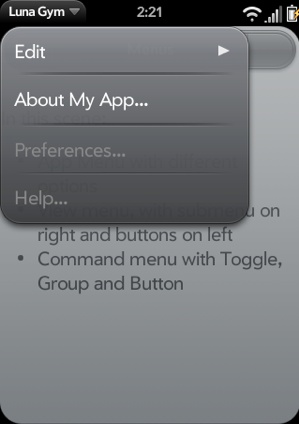
The Application menu appears in the upper-left corner of the screen when the user taps the left side of the status bar. It includes some system-defined and some application-defined actions, and is intended to have an application-wide scope for the most part. Figure 4-4 shows an example of an Application menu.
The Application menu contains a few required items: Edit (an item group including Cut, Copy, and Paste), Preferences, and Help; the latter items are disabled by default. You are free to add any other items to the menu, and to enable Preferences and/or Help by including command handlers to take the appropriate actions within your application.
Now let’s add an Application menu to News, with an “About News”
item. Unlike our earlier example, we’ll declare the
Application menu attributes and model as global variables, and add the
handleCommand() method to the News
stage assistant. This makes the Application menu available to all of
the News scene assistants:
// Setup App Menu for all scenes; all menu actions handled in
//  StageAssistant.handleCommand()
News.MenuAttr = {omitDefaultItems: true};

News.MenuModel = {
    visible: true,
    items: [
        {label: "About News...", command: "do-aboutNews"},
        Mojo.Menu.editItem,
        Mojo.Menu.prefsItem,
        Mojo.Menu.helpItem
    ]
};
// -----------------------------------------
// handleCommand - called to handle app menu selections
//
StageAssistant.prototype.handleCommand = function(event) {
    if(event.type == Mojo.Event.command) {
        switch(event.command) {

            case "do-aboutNews":
                    var currentScene = this.controller.activeScene();
                    currentScene.showAlertDialog({
                      onChoose: function(value) {},
// ** These next two lines are wrapped for book formatting only **
                        title: "News — v#{version}".interpolate({
                          version: News.versionString}),
                        message: "Copyright 2009, Palm Inc.",
                        choices:[
                            {label:"OK", value:""}
                                   ]
                          });
            break;
        }
    }
};
The following menu properties are unique to the Application menu:
By choosing omitDefaultItems,
we must manually add back any of the default items in the model
definition if they are to be displayed in the menu. If you want to
change some but not all items, you can use system constants to replace
the items that aren’t changing. In the News.MenuModel, the default items Mojo.Menu.editItem, Mojo.Menu.prefsItem, and Mojo.Menu.helpItem are all added back into
the model to allow us to change the order of the items.
The News.MenuAttr declares
that this menu will override the default items. The News.MenuModel puts the About News item at
the top of the menu and by referencing the default items keeps them in
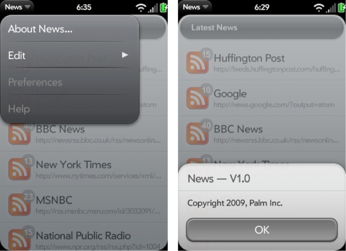
the menu with the framework still handling them. Within the handleCommand method, the do-aboutNews command handler puts up an
Alert Dialog with the About News information.
When the Application menu commands are propagated, they are
handled by the stage-assistant, but the handlers need to be aware of
the current scene. The local variable currentScene is set to the active scene
controller at the beginning of handleCommand. From there, currentScene applies scene assistant
functions, such as showAlertDialog,
to whichever scene is currently displayed.
All this work has been done in stage-assistant.js, but the Application
menu is actually displayed within the scenes. To configure and display
the Menu widget, each scene assistant’s setup method will include this
setupWidget() call:
//  Setup Application Menu
this.controller.setupWidget(Mojo.Menu.appMenu, News.MenuAttr, News.MenuModel);
You can override the application-wide behavior for a specific
scene by defining scene-specific application menu attributes or model
before setting up the Application menu, and including a handleCommand method in that scene to handle
the Application menu commands there. Don’t forget to call Mojo.Event.stopPropagation() if you use any
of the same commands used in your global Application menu. Figure 4-5 shows the
Application menu and the resulting About box.
Warning
Be sure that you do not call
Mojo.Event.stopPropagation() or
event.stop() on events you do not handle. This is
a common pitfall: stopping all events in
handleCommand. This breaks a parts of the system
UI such as back gestures and character picker.
By consolidating the Application menu declaration and handler in the stage assistant, it’s easy to provide a common set of menu options across all of the scenes. As an example, let’s add a Preferences scene to News.
Note
By default, the Application Menu disables Preferences and
Help. If you simply want to enable one or both commands, you can
include a handler for Mojo.Event.commandEnable in
the handleCommand method and call
Mojo.Event.stopPropagation() for the command that
you want to enable.
In the previous chapter, we implemented the Ajax requests in feedlist-assistant.js, which retrieves the initial feed data. Let’s extend that feature to periodically update the feeds, and we’ll set the interval, the period between feed updates, in a preferences scene.
Create a Preferences scene using palm-generate:
palm-generate -t new_scene -p "name=preferences" com.palm.app.news
The scene’s view file, preferences-scene.html, would look like this:
<div class="palm-page-header">
  <div class="palm-page-header-wrapper">
    <div class="icon news-mini-icon"></div>
    <div class="title">News Preferences</div>
  </div>
</div>

<div class="palm-group">
  <div class="palm-group-title"><span>Feed Updates</span></div>
  <div class="palm-list">
      <div class="palm-row">
         <div class="palm-row-wrapper">
            <div x-mojo-element="ListSelector" id="feedCheckIntervalList">
            </div>
         </div>
      </div>
    </div>
  </div>
</div>
The header is one of the framework style classes, palm-page-header, used on most preferences
scenes. You’ll also note the icon
and the news-mini-icon styles, which allow us to add some CSS to
insert a small news icon in the header. The icon must be added to the
images directory at the News
application’s root level:
/* Header Styles  */
.icon.news-mini-icon {
    background: url(../images/header-icon-news.png) no-repeat;
    margin-top: 13px;
    margin-left: 17px;
}
After the header styling, you can see some list style classes
followed by a List Selector widget declaration to pick the interval
setting. The preferences-assistant.js will set up the
List Selector and add a listener for selections using that List
Selector. The handler, feedIntervalHandler, updates the global
variable, feedUpdateInterval, after
a selection is made:
/*  Preferences - NEWS

    Copyright 2009 Palm, Inc.  All rights reserved.
    Preferences - Handles preferences scene, where the user can:
        - select the interval for feed updates

    App Menu is disabled in this scene.

*/

function PreferencesAssistant() {

}

PreferencesAssistant.prototype.setup = function() {

    // Setup list selector for UPDATE INTERVAL
    this.controller.setupWidget("feedCheckIntervalList",
        {
            label: "Interval",
            choices: [
                {label: "Manual Updates",   value: 0},
                {label: "5 Minutes",        value: 300000},
                {label: "15 Minutes",       value: 900000},
                {label: "1 Hour",           value: 3600000},
                {label: "4 Hours",          value: 14400000},
                {label: "1 Day",            value: 86400000}
            ]
        },
        this.feedIntervalModel = {
            value : News.feedUpdateInterval
        });

    this.changeFeedIntervalHandler = this.changeFeedInterval.bindAsEventListener(this);
    this.controller.listen("feedCheckIntervalList",
      Mojo.Event.propertyChange, this.changeFeedIntervalHandler);

};

// Cleanup - remove listeners
PreferencesAssistant.prototype.cleanup = function() {
    this.controller.stopListening("feedCheckIntervalList",
        Mojo.Event.propertyChange, this.changeFeedIntervalHandler);
};

//    changeFeedInterval - Handle changes to the feed update interval
PreferencesAssistant.prototype.changeFeedInterval = function(event) {
    Mojo.Log.info("Preferences Feed Interval Handler; value = ",
        this.feedIntervalModel.value);
    News.feedUpdateInterval = this.feedIntervalModel.value;
};
The feedUpdateInterval is
used by the stage assistant’s setWakup() method to set the timer for the
updates.
With the Preferences scene coded, we can hook it up by returning
to the stage assistant and changing the News.MenuModel to override the default
Preferences command:
News.MenuModel = {
    visible: true,
    items: [
        {label: "About News...", command: "do-aboutNews"},
        Mojo.Menu.editItem,
        {label: "Preferences...", command: "do-newsPrefs"},
        Mojo.Menu.helpItem
    ]
};
Next, we’ll add a handler for do-newsPrefs in the handleCommand method to push the Preferences
scene:
                case "do-newsPrefs":
                    this.controller.pushScene("preferences");
                break;
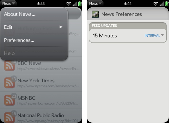
When you run the application now, you’ll see that the Preferences item is enabled and when selected brings up the new scene. Figure 4-6 shows the Application menu and the resulting Preferences scene.
You should also notice that we didn’t have to modify any of the scene assistants, yet the Preferences option is available in every scene. This approach makes it simple to consolidate common Application menu handling throughout your application.
Our final Application menu example will demonstrate the command
enable feature of the Commander Chain. We’ll add a manual feed update feature to the
Application menu by adding a new item to the News.MenuModel called “Update All
Feeds”:
News.MenuModel = {
    visible: true,
    items: [
        {label: "About News...", command: "do-aboutNews"},
        Mojo.Menu.editItem,
        {label: "Update All Feeds", checkEnabled: true, command: "do-feedUpdate"},
        {label: "Preferences...", command: "do-newsPrefs"},
        Mojo.Menu.helpItem
    ]
};
Because this command should be disabled whenever a feed update
is in progress, a new property, checkEnabled, is set to true. This property will instruct the
framework to propagate a Mojo.Event.commandEnable event through the
commander chain anytime the menu is displayed. If any recipient calls
event.preventDefault() in response,
then the menu item is disabled.
Here’s how this is handled in the stage assistant’s handleCommand() method:
// -----------------------------------------
// handleCommand - called to handle app menu selections
//
StageAssistant.prototype.handleCommand = function(event) {
    if (event.type == Mojo.Event.commandEnable) {
        if (News.feedListUpdateInProgress && (event.command == "do-feedUpdate")) {
            event.preventDefault();
        }
    }

    else {

        if(event.type == Mojo.Event.command) {
            switch(event.command) {

                case "do-aboutNews":
                    var currentScene = this.controller.activeScene();
                    currentScene.showAlertDialog({
                            onChoose: function(value) {},
// ** These next two lines are wrapped for book formatting only **
                            title: "News — v#{version}".interpolate({
                              version: News.versionString}),
                            message: "Copyright 2009, Palm Inc.",
                            choices:[
                                {label:"OK", value:""}
                                       ]
                              });
                break;

                case "do-newsPrefs":
                    this.controller.pushScene("preferences");
                break;

                case "do-feedUpdate":
                    this.feeds.updateFeedList();
                break;
            }
        }
    }
};
At the top, we check for the Mojo.Event.commandEnable event, and if it is
tied to a do-feedUpdate command and an update is
in progress, we’ll inhibit the menu item by calling event.preventDefault(). You can learn more
about this in the section Commander Chain.
The View menu presents items as variable-sized buttons, either singly
or in groups across the top of the scene. The items are rendered in a
horizontal sequence starting from the left of the screen to the right.
The button widths can be adjusted using the items width property, and the framework adjusts
the space between the buttons automatically. Use dividers or empty
list items to influence the spacing to get specific layouts.
Typically, you would use the View menu for actionable buttons, buttons with an attached submenu, or header displays. You can group buttons together or combine actionable buttons with header information, as in the example shown in Figure 4-7.
View menus allow us to style the storyList
scene headers and to provide a simple way to switch between story
feeds. We’re going to change storyList-assistant.js to include a View
menu with both Next Feed and Previous Feed menu buttons, and methods
to push the new scene for either the next feed or previous feed when
selected.
First, let’s add the View menu. In this next code sample, the
this.feedMenuModel is set up with
three menu items that are all based on the feed that is displayed in
this instance of the storyList scene:
FeedMenuPrev, a local variable set to either the Previous menu item or an empty item if the feed is the first feed in the feedlist, meaning that theselectedFeedIndexis zeroFeedMenuNext, a local variable set to either the Next menu item or an empty item if the feed is the last feed in the feedlist, meaning that theselectedFeedIndexis one less than the length of the feedlistA literal that displays the feed’s title
The setup method starts with some conditional assignments to
feedMenuPrev and feedMenuNext to
deal with the boundary cases of the first and last feeds,
then the View Menu widget is setup in a setupWidget() call.
Items that do not specify any visible attributes (such as
label and icon), and are not groups, are treated as
dividers. During layout of the menu
buttons, all extra space is equally distributed to each of the
dividers. If there are no dividers, any extra space is placed between
the menu items, with the first and last menu items always aligned to
the left and right of the scene. The boundary cases of the first feed
and last feed will create dividers in feedMenuPrev and feedMenuNext to maintain the header’s visual
style and format.
/*  StoryListAssistant - NEWS

    Copyright 2009 Palm, Inc.  All rights reserved.

    Displays the feed's stories in a list, user taps display the
    selected story in the storyView scene. Major components:
    - Setup view menu to move to next or previous feed
    - Story View; push story scene when a story is tapped

    Arguments:
    - feedlist; Feeds.list array of all feeds
    - selectedFeedIndex; Feed to be displayed
*/

function StoryListAssistant(feedlist, selectedFeedIndex) {
    this.feedlist = feedlist;
    this.feed = feedlist[selectedFeedIndex];
    this.feedIndex = selectedFeedIndex;
    Mojo.Log.info("StoryList entry = ", this.feedIndex);
    Mojo.Log.info("StoryList feed = " + Object.toJSON(this.feed));
}


StoryListAssistant.prototype.setup =  function() {
    // Setup scene header with feed title and next/previous feed buttons. If
    // this is the first feed, suppress Previous menu; if last, suppress Next menu
    var feedMenuPrev = {};
    var feedMenuNext = {};

    if (this.feedIndex > 0)    {
        feedMenuPrev = {
            icon: "back",
            command: "do-feedPrevious"
        };
    } else    {
        // Push empty menu to force menu bar to draw on left (label is the force)
        feedMenuPrev = {icon: "", command: "", label: "  "};
    }

    if (this.feedIndex < this.feedlist.length-1)    {
        feedMenuNext = {
            iconPath: "images/menu-icon-forward.png",
            command: "do-feedNext"
        };
    } else    {
        // Push empty menu to force menu bar to draw on right (label is the force)
        feedMenuNext = {icon: "", command: "", label: "  "};
    }

    this.feedMenuModel =     {
        visible: true,
        items:     [{
            items: [
                feedMenuPrev,
                { label: this.feed.title, width: 200 },
                feedMenuNext
            ]
        }]
    };

    this.controller.setupWidget(Mojo.Menu.viewMenu,
        { spacerHeight: 0, menuClass:"no-fade" }, this.feedMenuModel);

    // Setup App Menu
    this.controller.setupWidget(Mojo.Menu.appMenu, News.MenuAttr, News.MenuModel);

    // Setup story list with standard news list templates.
    this.controller.setupWidget("storyListWgt",
        {
            itemTemplate: "storyList/storyRowTemplate",
            listTemplate: "storyList/storyListTemplate",
            swipeToDelete: false,
            renderLimit: 40,
            reorderable: false
        },
        this.storyModel = {
            items: this.feed.stories
        }
    );

    this.readStoryHandler = this.readStory.bindAsEventListener(this);
    this.controller.listen("storyListWgt", Mojo.Event.listTap,
        this.readStoryHandler);
};
Continuing on with our example, we’ll add the handleCommand() method after the activate() and readStory() methods, which are
unchanged:
// handleCommand - handle next and previous commands
StoryListAssistant.prototype.handleCommand = function(event) {
    if(event.type == Mojo.Event.command) {
        switch(event.command) {
            case "do-feedNext":
                this.nextFeed();
                break;
            case "do-feedPrevious":
                this.previousFeed();
                break;
        }
    }
};

// nextFeed - Called when the user taps the next menu item
StoryListAssistant.prototype.nextFeed = function(event) {
    Mojo.Controller.stageController.swapScene(
        {
            transition: Mojo.Transition.crossFade,
            name: "storyList"
        },
        this.feedlist,
        this.feedIndex+1);
};

// previousFeed - Called when the user taps the previous menu item
StoryListAssistant.prototype.previousFeed = function(event) {
    Mojo.Controller.stageController.swapScene(
        {
            transition: Mojo.Transition.crossFade,
            name: "storyList"
        },
        this.feedlist,
        this.feedIndex-1);
};
The handleCommand method is
called for the Next and Previous commands and results in a swapScene() call to
push the next scene. We discussed in Chapter 2 that swapScene() is similar to pushScene(), but
rather than leaving the old scene on the scene stack, swapScene() pops it as part of the
operation.
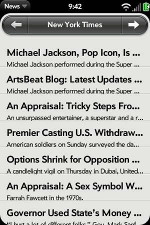
Figure 4-8 shows
the News application’s storyList with these
changes.
The Command menu items are presented at the bottom of the screen, but are
similar to the View menu in most other ways. Items will include
variable-sized buttons that you can combine into groups and in a
horizontal layout from left to right. You can override the default
positioning by including dividers to force an item to the right or the
middle of the screen, or by including an item’s entry with the disable property set to true. Typically, you
would use the Command menu for actionable buttons, buttons with
dynamic behavior, or for attaching a submenu to a button to give
further options.
As with the View menu, you can adjust button widths from within the item’s property width, and the framework adjusts the space between the buttons automatically (as shown in Figure 4-9).
You can also define toggle buttons or include buttons with other dynamic behavior (Figure 4-10).
If you’d like to group several items together, include an
items array and the toggleCmd, which will
be set by the framework to the command of the currently selected items
in the nested items array. You can group buttons together or combine
actionable buttons into a toggle group, as shown in Figure 4-11.
We’ve been using buttons within the Story view to go back and forth between stories within a feed, but here we’ll replace those buttons with Command menus. It’s really straightforward now that we’ve covered the basics with the Application and View menus.
Change the storyView-assistant.js to include a command
menu. Similar to the View menu, the Next and Previous buttons normally
are assigned to generate do-viewNext or do-viewPrevious commands, except when the
current story is the first or last story in the feed. The first part
of the setup method will create the items array with the correct
entries, then call setupWidget() to
instantiate the menu. Since we’re replacing the buttons that were in
the scene, remove the listeners from the setup method (and the button
declarations from the scene’s view file).
Notice that the items are put into a menu group so that they are styled together. We use dividers on either side of the group to force the group to be centered in the scene. Notice the visual difference from the Application menu’s grouping, where subitems are combined into an expanding item. With View and Command menus, the button groups are presented as an integrated view element:
/*  StoryViewAssistant - NEWS

    Copyright 2009 Palm, Inc.  All rights reserved.

    Passed a story element, displays that element in a full scene view and offers
    options for next story (right command menu button), and previous
    story (left command menu button)
    Major components:
    - StoryView; display story in main scene
    - Next/Previous; command menu options to go to next or previous story

    Arguments:
    - storyFeed; Selected feed from which the stories are being viewed
    - storyIndex; Index of selected story to be put into the view
*/

function StoryViewAssistant(storyFeed, storyIndex) {
    this.storyFeed = storyFeed;
    this.storyIndex = storyIndex;
}

// setup - set up menus
StoryViewAssistant.prototype.setup = function() {
       this.storyMenuModel = {
         items: [
            {},
            {items: []},
            {}
         ]};

        if (this.storyIndex > 0)    {
           this.storyMenuModel.items[1].items.push({
               icon: "back",
               command: "do-viewPrevious"
            });
        } else {
            this.storyMenuModel.items[1].items.push({
                icon: "", command: "",
                label: "  "
            });
        }

        if (this.storyIndex < this.storyFeed.stories.length-1)    {
            this.storyMenuModel.items[1].items.push({
                icon: "forward",
                command: "do-viewNext"
            });
        } else {
            this.storyMenuModel.items[1].items.push({
                icon: "", command: "",
                label: "  "
            });
        }
    this.controller.setupWidget(Mojo.Menu.commandMenu,
        undefined, this.storyMenuModel);

    // Setup App Menu
    this.controller.setupWidget(Mojo.Menu.appMenu, News.MenuAttr, News.MenuModel);

    // Update story title in header and summary
    var storyViewTitleElement = this.controller.get("storyViewTitle");
    var storyViewSummaryElement = this.controller.get("storyViewSummary");
    storyViewTitleElement.innerHTML = this.storyFeed.stories[this.storyIndex].title;
    storyViewSummaryElement.innerHTML = this.storyFeed.stories[this.storyIndex].text;

};
The activate method is unchanged, but we replace the button handlers with command handlers, as shown in this next code sample:
// ---------------------------------------------------------------
// Handlers to go to next and previous stories, display web view
// or share via messaging or email.
StoryViewAssistant.prototype.handleCommand = function(event) {
    if(event.type == Mojo.Event.command) {
        switch(event.command) {
            case "do-viewNext":
                Mojo.Controller.stageController.swapScene(
                    {
                        transition: Mojo.Transition.crossFade,
                        name: "storyView"
                    },
                    this.storyFeed, this.storyIndex+1);
                break;
            case "do-viewPrevious":
                Mojo.Controller.stageController.swapScene(
                    {
                        transition: Mojo.Transition.crossFade,
                        name: "storyView"
                    },
                    this.storyFeed, this.storyIndex-1);
                break;

          }
    }
};
That’s it. Run the application and tap a feed and then a story to see the results (shown in Figure 4-12).
Pop-up submenus can offer a transient textual list of choices to the user, typically off of another menu type or from a DOM element in the scene. Submenus accept standard menu models and some unique properties, but unlike the other menu types, Submenu does not use the Commander Chain for propagating selections. Instead, a callback is used to handle selections.
A modal list will appear with the label choices presented. When
the user taps one, the onChoose
callback function will be called (in the scope of the scene assistant)
with the command property of the chosen item as an argument. If the user
taps outside the pop-up menu, it’s still dismissed and the onChoose function is called with undefined instead.
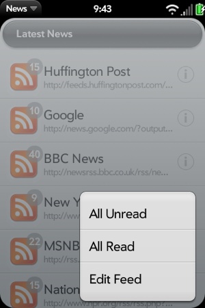
We will use a submenu to present options when the users taps the info button on the News feed list. For each feed, you can choose between Mark Read, Mark Unread, or Edit Feed. The first two options mark all the stories as either read or unread based on the selection, while the last option brings up the Add Feed dialog.
To bring up the submenu, we’ll add an icon called info, to each list entry in the feed list,
as shown in the feedList scene, to serve as an
access point. The change is made in feedRowTemplate.html just before the
entries for the feedlist-title and
feedlist-url. The custom class will
be used in News.css to load the
icon’s image while the framework classes will fix the position of the
icon properly within the list row and align it to the right:
<div class="feedlist-info icon right" id="info"></div>
<div class="feedlist-title truncating-text">#{title}</div>
<div class="feedlist-url truncating-text">#{-url}</div>
Next, we’ll modify the showFeed() method of feedlist-assistant.js to detect taps on the
info icon. If it’s a tap anywhere
else, the storyList scene will be pushed as
before.
Otherwise, the Submenu will be created, with an arguments list
starting with onChoose, which
specifies popupHandler to handle
the user’s menu selection. The other arguments include the placeNear property to
locate the submenu near the tapped icon and the array of menu items.
You’ll notice that we save the event.index value by assigning it to
this.popupIndex for use later in
popupHandler. We’ll need to
reference the tapped list entry when it comes time to apply the action
indicated by the Submenu selection:
// ------------------------------------------------------------------
// Show feed and popup menu handler
//
// showFeed - triggered by tapping a feed in the this.feeds.list.
//   Detects taps on the unReadCount icon; anywhere else,
//   the scene for the list view is pushed. If the icon is tapped,
//   put up a submenu for the feedlist options
FeedListAssistant.prototype.showFeed = function(event) {
        var target = event.originalEvent.target.id;
        if (target !== "info") {
          Mojo.Controller.stageController.pushScene("storyList",
            this.feeds.list, event.index);
        }
        else  {
            var myEvent = event;
            var findPlace = myEvent.originalEvent.target;
            this.popupIndex = event.index;
            this.controller.popupSubmenu({
              onChoose:  this.popupHandler,
              placeNear: findPlace,
              items: [
                {label: "All Unread", command: "feed-unread"},
                {label: "All Read", command: "feed-read"},
                {label: "Edit Feed", command: "feed-edit"}
                ]
              });
        }
};
The handler, popupHandler,
uses a switch statement to invoke the appropriate command handler. The
command handlers for “All Unread” and “All Read” handle the actions
for marking all stories in the selected feed as unread or read,
updating the feed’s numUnRead, and calling modelChanged to update the scene’s displayed
view. Once the actions are complete, the handler exits and the
framework cleans up the display by removing the Submenu.
Targeting the submenu can sometimes be a little tricky. The
framework will automatically place the submenu in the center of the
window, but you can override it by setting placeNear to a specific DOM element. In our
example, it’s placed near the info
icon, which was defined as the tap target for this submenu. It’s a
good idea to use fixed targets for menu placement:
// popupHandler - choose function for feedPopup
FeedListAssistant.prototype.popupHandler = function(command) {
        var popupFeed=this.feeds.list[this.popupIndex];
        switch(command) {
            case "feed-unread":
                Mojo.Log.info("Popup - unread for feed:",
                  popupFeed.title);

                for (var i=0; i<popupFeed.stories.length; i++ ) {
                    popupFeed.stories[i].unreadStyle = News.unreadStory;
                }
                popupFeed.numUnRead = popupFeed.stories.length;
                this.controller.modelChanged(this.feedWgtModel);
                break;

            case "feed-read":
                Mojo.Log.info("Popup - read for feed:",
                  popupFeed.title);
                for (var j=0; j<popupFeed.stories.length; j++ ) {
                    popupFeed.stories[j].unreadStyle = "";
                }
                popupFeed.numUnRead = 0;
                this.controller.modelChanged(this.feedWgtModel);
                break;

            case "feed-edit":
                Mojo.Log.info("Popup edit for feed:",
                  popupFeed.title);
                this.controller.showDialog({
                    template: "feedList/addFeed-dialog",
                    assistant: new AddDialogAssistant(this,
                        this.feeds, this.popupIndex)
                });
                break;

       }
};
For the “Edit Feed” choice, the handler uses the AddDialogAssistant to display the selected
feed’s URL and name so that they can be changed. A new argument,
this.popupIndex, is added to the
AddDialogAssistant call to enable
the AddDialogAssistant and its
methods, checkIt and checkOk, to look for an edit case. These
changes are not shown here because they are not directly related to
the Submenu, but you can look at the full News source in Appendix D to see where the changes
were made.
Figure 4-13 shows a
Submenu with these changes within the feedList
scene.

