Pickers are used to present a common UI for selecting inputs in a variety of application scenarios. Mojo offers pickers for common objects such as a date, time, or number, or to select files.
The next section covers the first three pickers, since they are conventional widgets and are very similar to each other. After that, we will look at the File picker. It’s accessed through function calls, and is actually implemented as a separate application wrapped with a framework interface.
The models for the date, time, and integer pickers are very similar. The pickers are declared within your scene’s view file and wrapped with styling divs as shown here:
<div class="palm-group unlabeled">
  <div class="palm-list">
    <div id="DatePkrId" x-mojo-element="DatePicker"></div>
  </div>
</div>
This creates a picker that spans the width of the screen and is enclosed with an unlabeled group frame (as shown in Figure 5-6).
These pickers present choices as a linear sequence of values that wraps around; when you scroll to the end of the sequence, they simply continue back at the beginning. There’s no way to override this behavior.
As shown in Figure 5-6, a date
picker allows selection of month, day, and year values. The Date
picker’s model has a single property, named date by default, which should be assigned a
JavaScript Date object. You can change the model property’s name
through the attributes modelProperty, and can assign an optional
label that’s displayed to the left of the picker. You can use the
JavaScript functions GetMonth(), GetDate(), or GetYear() to extract those parts of the Date
object that you need.
A Time picker is similar to a date picker, focusing on the time fields of the Date object and with
an optional attributes property, minuteInterval, which defaults to the
integer 5. As shown in Figure 5-7, a time picker allows
selection of hours, minutes, and either A.M. or P.M. for time
selection. The picker will suppress the AM/PM capsule if the 24-hour
time format is selected in the user preferences or by the
locale.
You can use the JavaScript functions GetHours(), GetMinutes(), and GetSeconds() to extract what you need from
the Date object.
A simple number picker is included as the integer picker.
Shown in Figure 5-8, the integer picker
offers a selection between minimum and maximum integer values, both of
which are specified by required min
and max widget properties.
The integer picker is similar to the date and time pickers in
all ways, except that its default model property is named value.
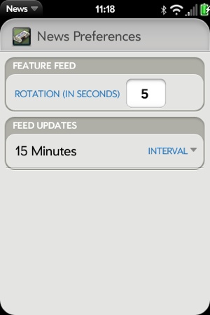
News doesn’t have many opportunities to use a picker, but we can add a picker to the Preferences scene to set the feed rotation period. There are arguably better options for handling this UI, so this isn’t intended as a good UI design example, but as a way of demonstrating the coding for a Picker widget. By default, the interval is set to 5 seconds, but with this picker, the user can customize to any period between 1 and 60 seconds.
The Integer picker declaration is added to preferences-scene.html in front of the list
selector widget for the update interval. Wrap it in a couple of divs
with palm-group and palm-list styles:
<div class="palm-group">
    <div class="palm-group-title"><span>Feature Feed</span></div>
        <div class="palm-list">
            <div x-mojo-element="IntegerPicker" id="featureFeedDelay">
            </div>
        </div>
    </div>
</div>
The widget setup is included in the setup method of preferences-assistant.js, as shown next.
The widget is set up with a range from 1 to 20 seconds and initialized
to the current global interval, News.featureStoryInterval, which is in
milliseconds. A listener is added for Mojo.Event.propertyChange events:
// Setup Integer Picker to pick feature feed rotation interval
this.controller.setupWidget("featureFeedDelay",
    {
        label:    "Rotation (in seconds)",
        modelProperty:    "value",
        min: 1,
        max: 20
    },
    this.featureDelayModel = {
        value : News.featureStoryInterval/1000
    });

this.changeFeatureDelayHandler = this.changeFeatureDelay.bindAsEventListener(this);
this.controller.listen("featureFeedDelay", Mojo.Event.propertyChange,
    this.changeFeatureDelayHandler)
The handler is added to the bottom of the preferences assistant,
updating the global interval with the selected value, in milliseconds,
and restarts the interval timer with the new value. The interval timer
would be set by the FeedListAssistant upon
activation or when the feed list is first updated:
//    changeFeatureDelay - Handle changes to the feature feed interval
PreferencesAssistant.prototype.changeFeatureDelay = function(event) {
    Mojo.Log.info("Preferences Feature Delay Handler; value = ",
        this.featureDelayModel.value);

    //  Interval is in milliseconds
    News.featureStoryInterval = this.featureDelayModel.value*1000;

    // If timer is active, restart with new value
    if(News.featureStoryTimer !== null) {
        this.controller.window.clearInterval(News.featureStoryTimer);
        News.featureStoryTimer = null;
    }
};
Figure 5-9 shows the new Preferences scene with the integer picker in place.
WebOS devices have a media partition, a FAT32 file partition that is available to applications and is accessible to desktop operating systems, whether PC, Mac, or Linux, when the device is attached through a USB cable. This access mechanism is called USB mode.
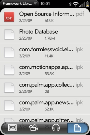
The file picker presents a file browser that users can use to navigate the directory structure and optionally select a file. The file picker presents a flat listing of all files on disk, regardless of directory structure, and allows filtering by file type (such as file, image, audio, or video) Depending on the options provided by the calling application, the selected file will either be opened in an appropriate viewer or have its reference returned.
The file picker behaves like a full-screen widget, but isn’t technically a widget. It is actually an application that is pushed into the current scene, similar to a viewer, maintaining the calling application’s context.
The presentation of the files will differ by file type. For example:
Files: Name and icon
Images: Thumbnail grid
Audio and Video: Name and thumbnail
Figure 5-10 shows the file view, with the other view options presented as Command menu items across the bottom of the scene.


