You read about text widgets in Chapter 3, including the available styling options. Some of these options are also available with any text element that you include in your scene’s HTML. Plus, you can use Mojo’s standard text styles or override those styles within your CSS. In this section, you’ll see how to apply type styles as truncation and capitalization functions, as well as some basic alignment techniques.
Prelude is the primary font family for webOS. Its warm and welcoming appearance belies its underlying strength and readability. Prelude’s designer, David Berlow of the Font Bureau, says of the typeface, “We wanted something that just disappears on the device, becoming such an integral part of the Palm webOS design, you don’t notice.”
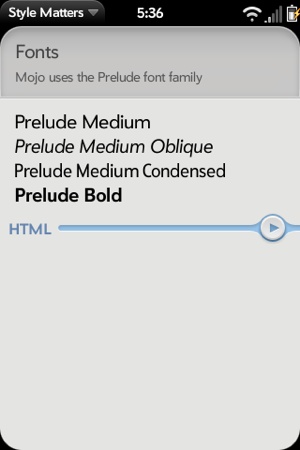
You have a choice of typestyles, as shown in Figure 7-1, which are built into the framework so that you get them by default.
Use the optional classes condensed or oblique with most text classes to modify the
base class with a condensed or oblique font style.
Table 7-1 summarizes the available typestyles.
Table 7-1. Prelude typestyles
Typestyle | Technique |
|---|---|
Prelude Medium | Provided with all text elements and classes by default |
Prelude Medium Oblique | Add |
Prelude Medium Condensed | Add |
Prelude Medium Bold | Add
|
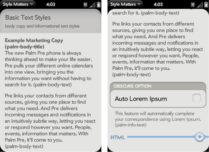
Body text can be styled with a few basic text classes; some examples are shown in Figure 7-2.
This scene is created with HTML using the classes described in Table 7-2. The following excerpt shows the HTML for the title and text styles:
<div class="palm-text-wrapper">
    <div class="palm-body-title">
        Example Marketing Copy
    </div>

    <div class="palm-body-text">
        The new Palm Pre phone is always thinking ahead to make your life easier.
        Pre pulls your different online calendars into one view, bringing you the
        information you want without having to search for it.

    ...

    </div>
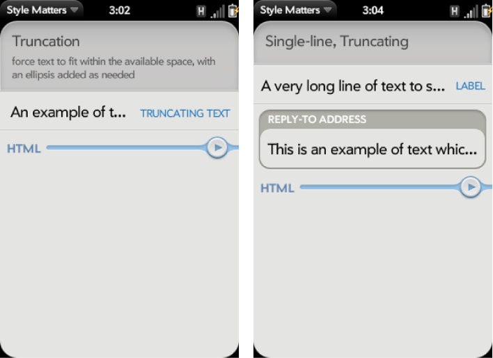
</div>Text truncation is a standard feature of the Text Field widget,
and an option for any HTML text element. You can add the truncating-text class to a conventional
div element that contains a text string, and the string will be
constrained to a single line and properly terminated with ellipses, as
shown in Figure 7-3.
The leftmost example truncates a text string within a conventional div:
<div class="palm-list">
    <div class="palm-row first" x-mojo-touch-feedback="delayed">
        <div class="palm-row-wrapper">
            <div class="label">Truncating text</div>
            <div class="title truncating-text">
                An example of text
                which is so long you
                could not possibly fit
                it on a single line.
            </div>
        </div>
    </div>
</div>
In the righthand example, there are two text fields, each using
single-line truncation, but within differently styled elements. The Text
Field widget is composed of several elements, which have the truncating-text class assigned to them. You
don’t need to specify the class within your HTML; it’s provided by
default. If instead you want your text to wrap and your text field to
grow vertically, set the mulitline property to
true.
Some widgets and styles shift text strings to uppercase or apply capitalization. Specific framework styles will be capitalized by default. See Table 7-3 for a list of those styles.
Use the un-capitalize class to
override autocapitalization in those styles.
The Text Field widget also performs capitalization by default, but it is
controlled by the textCase property in
the widget’s attributes rather than through HTML class assignments. By default, textCase is set to Mojo.Widget.steModeSentenceCase, but you can set it to Mojo.Widget.steModeTitleCase for all
caps, or to Mojo.Widget.steModeLowerCase to disable
autocapitalization.
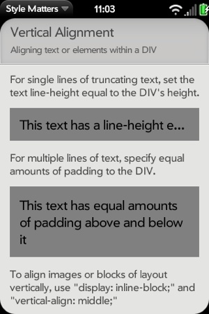
There are a few techniques for vertically aligning text or
elements within a div that you might find useful. For single lines of truncating text, set the text line-height equal to the div’s height:
.single-line  {
  margin: 15px 0;
  padding: 0 15px;
  height: 50px;
  background: grey;
  line-height: 50px;
}
For multiple lines of text, specify equal amounts of padding to the div:
.multi-line {
  margin: 15px 0;
  padding: 15px;
  background: grey;
}
These two examples are shown in Figure 7-4; the top shaded box demonstrates the single-line alignment and the lower shaded box shows the multi-line alignment.
To align images or blocks of layout vertically, use display: inline-block and vertical-align: middle with your CSS rules for
the specific div.


