
Chapter 2
Basic Image-Editing Concepts
IN THIS CHAPTER
 Understanding and changing resolution
Resampling images
Working with file formats
Understanding color
When you open a picture in Photoshop Elements, you’re looking at a huge grid of pixels. These pixels are tiny, colored squares, and the number of pixels in a picture determines the picture’s resolution.
This relationship between pixels and resolution is important for you to understand in all your Elements work. You’ll find the concepts covered in this chapter especially helpful when creating selections (as we explain in Chapter 8), printing files (Chapter 15), and sharing files (Chapter 16).
Additionally, you need to understand color modes, which define how many colors an image contains. Color modes are important when you’re using tools in the Tools panel and Panel Bin and printing and sharing files. Basically, you want to choose a color mode for your image that is best suited for print or onscreen and the type of image you have (a photo with lots of colors versus a line drawing with only a few colors, for example).
Like resolution and color modes, the file format in which you save an image often depends on your desired output — print or screen — so this chapter concludes with an introduction to choosing a file format. Additionally, this chapter helps you understand the basics of working with resolution, color modes, and file formats that are essential to great results in your final images. We talk about changing resolution by resizing images, converting color modes, and saving the results in different file formats.
Grappling with the Ubiquitous Pixels
Most digital images are composed of millions of tiny, square pixels. Each pixel has one, and only one, color value. The arrangement of the pixels of different shades and colors creates an optical illusion when you view an image onscreen. For example, black-and-white pixels might create the impression that you’re looking at something gray — not at tiny black-and-white squares.
Just about everything you do in Elements has to do with changing pixels:
- Surrounding pixels with selection tools to select what appear to be objects in your image
- Making pixels darker or lighter to change contrast and brightness
- Changing shades and tints of pixels for color correction
- Performing a variety of other editing tasks
An image made of pixels is a raster image. If you open a file in Elements that isn’t made of pixels, you can let Elements rasterize the data. In other words, Elements converts other data to pixels if the document wasn’t originally composed of pixels.
 Images not made of pixels are typically vector images. You can also have vector content in an Elements file. Text added with the Type tool, for example, is a vector object. When you save an Elements file with the Text layer intact or save it as a Photoshop PDF file, the vector data is retained. We talk more about vector data in Chapters 13 and 14. For this chapter, you just need to focus on raster data.
 To use most of the tools and commands in Elements, you must be working on a raster image file. If your data isn’t rasterized, many tools and commands are unavailable.
The pixels in an image determine an image’s resolution and dimensions, as we explain in the following sections.
Understanding resolution
The number of pixels in an image file determines the image’s resolution, which is measured in pixels per inch (ppi). For example:
- If you have 300 pixels across a 1-inch horizontal line, your image resolution is 300 ppi.
- If you have 72 pixels across 1 inch, your image resolution is 72 ppi.
Image resolution is critical to properly outputting files in the following instances:
-
Printing images: The optimal resolution for print is 300 ppi. If the image resolution is too low, the image prints poorly. If the resolution is too high, you waste time processing all the data that needs to be sent to your printer.
Note: Printing to inkjet printers in the best quality often does not require having a 300 ppi image. Much depends on the printer. Some printers can print perfectly at 35 ppi. Desktop printers can print optimally at a ppi of 180, 210, 280, and so on. When printing to a desktop printer, consult the printer’s manual for the optimum printer resolution.
-
Showing images onscreen: The best resolution for onscreen images is a more complicated issue. There is no standard optimum resolution that fits all monitors. If you want to be precise, take the screen resolution described in your monitor’s manual — say, 2,560 for the horizontal resolution — and divide that number by the actual width of your computer monitor. Say that your monitor width is 23.4 inches. The result of 2,560 ÷ 23.4 is 109. Optimum resolution for this kind of monitor is 109 ppi. The old standard of 72 ppi is outdated, but if you don’t want to do the math, images will display just fine at 72 ppi on Mac computers and 96 ppi on Windows machines.
Zoom levels also impact viewing images. If you zoom in on an image, it appears more pixelated. When creating images for screen viewing, you might think about how much a user is likely to zoom in on a photo and set the resolution accordingly — such as 2x, 3x, and so on as the actual ppi.
To see how image resolution and screen resolution combine and impact what you see onscreen, look at Figure 2-1. You see an image reduced to 50 percent and then at different zoom sizes. When the size changes, the monitor displays your image at different resolutions. For example, if you view a photo with a resolution of 72 ppi and reduce the size to 50-percent view on your monitor, the resolution on the monitor appears as though the photo is at 144 ppi. When the size is 100 percent, the image resolution is the same as the monitor resolution. Table 2-1 provides a closer look at these differences in resolution.
This relationship between the image resolution and viewing the image at different zoom levels is an important concept to grasp. If you grab an image off the web and zoom in on it, you may see a view like the 800-percent view shown in Figure 2-1. If you acquire a digital camera image, you may need to zoom out to a 16-percent view to fit the entire image in the image window.
These displays vary so much because of image resolution. That image you grabbed off a web page might be a 216-pixel square image at 72 ppi, and that digital camera image might be a 2,400-x-3,120-pixel image at 240 ppi. To fill the entire window with the web image, you need to zoom in on the file. When you zoom in, the image appears as though it’s reduced in resolution.
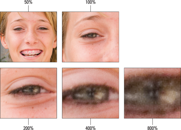
FIGURE 2-1: The same image is viewed at different zoom levels.
TABLE 2-1 How Image and Display Resolutions Affect What You See Onscreen
|
Image Resolution |
Display Resolution |
Zoom Level |
How Image Appears Onscreen |
|---|---|---|---|
|
72 ppi |
72 ppi |
100% |
Image appears onscreen at its actual resolution, so the onscreen display is the same as what you’d see if you printed the image. The print won’t be crisp, however, because the resolution is too low for print. A low resolution looks fine on a monitor but not on paper. |
|
72 ppi |
72 ppi |
50% |
Image appears smaller onscreen, as though it has a higher image resolution (144 ppi, or twice the resolution that it actually has). |
|
72 ppi |
72 ppi |
200% |
Image appears larger onscreen, as though it has a lower image resolution (36 ppi, or half of its actual resolution). The display needs to simulate “spreading out” the pixels to make the image appear bigger. |
|
300 ppi |
72 ppi |
100% |
Image appears larger onscreen than it will in print, because the monitor can display only 72 ppi. A print of this image will look clear and crisp, because 300 ppi is the ideal resolution for prints. |
|
300 ppi |
72 ppi |
50% |
Image appears smaller onscreen but will print larger than the monitor view. |
|
300 ppi |
72 ppi |
200% |
Image appears larger onscreen but will print smaller than the monitor view. |
When you zoom into or out of an image, you change the resolution as it appears on your monitor. No resolution changes are made to the file. The image resolution remains the same until you use one of the Elements tools to reduce or increase the image resolution.
Understanding image dimensions
Image dimensions involve the physical size of your file. If the size is 4-x-5 inches, for example, the file can be any number of different resolution values. After the file is open in Elements, you can change the dimensions of the image, the resolution, or both.
When you change only the dimensions of an image (not the number of pixels it contains), an inverse relationship exists between the physical size of your image and the resolution. When image size is increased, resolution decreases. Conversely, when you raise resolution, you reduce image size.
The Art of Resampling
In some cases, images are too large, and you need to reduce their resolution and physical size. In other cases, you might need a higher resolution to output your images at larger sizes. This method of sizing — changing the size, as well as the number of pixels — is dubbed resampling an image. Specifically, reducing resolution is downsampling, and raising resolution is upsampling.
Here’s a quick example to clarify the benefit of resampling. Say you have a photo taken with a digital single-lens reflex (DSLR) camera, which takes pretty high-resolution photos. The photo could easily have a resolution of 300 ppi and dimensions of 14 x 10 inches. If you just want to make a few color corrections in Elements and then make 7-x-5-inch prints for your family members, resampling the file keeps the file size manageable for both your computer’s memory and for uploading to a printing service. Because you decreased the photo’s dimensions, the photo still maintains the resolution you need for a high-quality photo print (that is, 300 pixels per inch or less, depending on the printer). If you just changed the photo’s dimensions without resampling, the photo’s resolution would almost double, making for an unnecessarily large file.
 Use caution when you resample images; when you resample, you either toss away pixels or manufacture new pixels. To protect your images during resampling, work on a copy of your image, instead of the original file.
You can change an image’s size and resolution in a couple of different ways. One method is cropping images. You can use the Crop tool with or without resampling images. For more information on using the Crop tool, see Chapter 10. Another method is using the Image Size dialog box, which you use in many of your editing sessions in Elements.
To resample an image with the Image Size dialog box, follow these steps:
-
Choose Image ⇒ Resize ⇒ Image Size.
Alternatively, you can press Ctrl+Alt+I (⌘ +Option+I on the Mac). The Image Size dialog box opens, as shown in Figure 2-2.
The Pixel Dimensions area in the Image Size dialog box shows the file size (in this example, 12.1M). This number is the amount of space the image takes up on your hard drive. The width and height values are fixed unless with the default Resample Image check box at the bottom of the dialog box enabled.
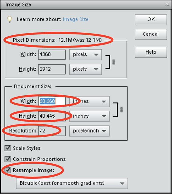
FIGURE 2-2: The Image Size dialog box.
-
In the Document Size area, redefine dimensions and resolution.
The options are
- Width: Type a value in the text box to resize the image’s width. Then press Tab to move out of the field and implement the change. From the drop-down list to the right of the text box, you can choose a unit of measure: percent, inches, centimeters, millimeters, points, picas, or columns.
-
Height: The Height options are the same as the Width.
 If you keep the sizing proportional, you typically edit either the Width or Height text box, but not both. When you alter either width or height, the resolution changes respectively.
 - Resolution: Type a value in the text box to change resolution and then press Tab to commit the change. After you edit the resolution, the Width and Height values are changed inversely (if the Constrain Proportions check box is selected).
-
(Optional) If you’re okay with resampling your image to get the desired size, select the Resample Image check box.
With this check box selected, you can change dimensions and pixels at the same time, which results in either reducing or increasing the number of pixels. When the check box is deselected, the values for dimensions are linked; changing one value automatically changes the other values.
-
(Optional) If you select the Resample Image check box, choose a resampling method from the drop-down list below it or select the other resample options above it (or do both).
From the drop-down list, you see three options for Bicubic plus Nearest Neighbor and Bilinear. Adjacent to the method name, Elements provides a description to help you know when to choose one over the other.
In the drop-down list, you find different choices for resampling. See Table 2-2 for details on each method.
When you select the Resample Image check box, the two check boxes above it become active. Here’s what they do:
- Scale Styles: Elements has a Styles panel from which you can add a variety of different style effects to images. (See Chapter 12 for details.) When you apply a style, such as a frame border, the border appears at a defined width. When you select the Scale Styles check box and then resize the image, the Styles effect is also resized. Leaving the check box deselected keeps the style at the same size while the image is resized.
- Constrain Proportions: By default, this check box is selected, and you should leave it that way unless you want to intentionally distort an image.
- When you’re done selecting your options, click OK to resize your image.
TABLE 2-2 Resolutions and Printing
|
Output Device |
Optimum |
Acceptable Resolution |
|---|---|---|
|
Desktop laser printers |
300 ppi |
200 ppi |
|
Desktop color inkjet printers |
300 ppi |
180 ppi |
|
Large-format inkjet printers |
150 ppi |
120 ppi (some printers require much less) |
|
Professional photo lab printers |
300 ppi |
200 ppi |
|
Desktop laser printers (black and white) |
170 ppi |
100 ppi |
|
Magazine quality — offset press |
300 ppi |
225 ppi |
|
Screen images (web, slideshows, and video) |
72 ppi |
72 ppi |
|
Tablet devices and smartphones |
150+ ppi |
150 ppi |
Choosing a Resolution for Print or Onscreen
Resolution in your Elements work is paramount in printing files. Good ol’ 72-ppi images can be forgiving, and you can get many of your large files scrunched down to 72 ppi for websites and slideshows. For a nice-looking print, however, you need a much higher resolution. Many different printing output devices exist, and their resolution requirements vary.
For your own desktop printer, plan to print a variety of test images at different resolutions and on different papers. You can quickly determine the best file attributes by running tests. When you send files to service centers, ask the technicians what file attributes work best with their equipment.
White does not print as a color. When you use white, it appears transparent on your prints and the color appears the same as the paper color you’re using.
For a starting point, refer to Table 2-2 for the recommended resolutions for various output devices.
If you find choosing a resolution for printing to be confusing, just leave it all up to the printer driver to take care of the sampling.
Working with File Formats
Elements provides you with a long list of file formats, many of which are outdated. Although many different file formats are available, use only a few. Figure 2-3 shows the open Format drop-down list that you see in the Save or Save As dialog box.
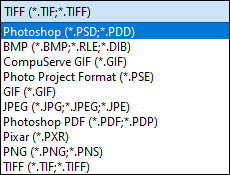
FIGURE 2-3: The drop-down list of file formats that Elements supports.
In the following sections, we explain the formats you typically work with most often.
JPEG (*.jpg, *.jpeg, *.jpe)
JPEG (Joint Photographic Experts Group) is perhaps the most common file format now in use. That’s in large part because of smaller file sizes that make web viewing and exchanging files much easier. You can use JPEG files for prints or share them online via a web page or email attachment. Creative professionals wouldn’t dream of using the JPEG format in design layouts, but everyone else uses the format for all kinds of documents.
You need to exercise some caution when you’re using the JPEG format. JPEG files are compressed to reduce file size, so you can scrunch an image of several megabytes into a few hundred kilobytes. When you save a file with JPEG compression, however, you experience data loss. You might not see this on your monitor, or it might not appear noticeably on photo prints if you’re using low compression while preserving higher quality. However, when you save with maximum compression, more pixels are tossed away, and you definitely notice image degradation.
When you save, open, and resave an image in JPEG format, each new save degrades the image more. If you need to submit JPEG images to photo labs for printing your pictures, keep saving in the Photoshop PSD file format until you’re ready to save the final image. Save in JPEG format when you want to save the final file for printing and use a low compression with high quality.
When you select JPEG for the format and click Save, the JPEG Options dialog box opens, as shown in Figure 2-4. You choose the amount of compression by typing a value in the Quality text box or by moving the slider below the Quality text box. The acceptable range is from 0 to 12 — 0 is the lowest quality and results in the highest compression, and 12 is the highest quality that results in the lowest amount of compression.
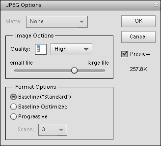
FIGURE 2-4: When saving in JPEG format, choose the amount of compression you want to apply to the saved image.
Notice that you also have choices in the Format Options area of the JPEG Options dialog box. The Progressive option creates a progressive JPEG file commonly used with web browsers. This file type shows progressive quality while the file downloads from a website. The image first appears in a low-quality view and shows higher-resolution views until the image appears at full resolution when it’s completely downloaded in your browser window.
PNG (*.png)
PNG (Portable Network Graphics) is another format used with web pages. PNG supports all color modes, 24-bit images, and transparency. One disadvantage of using PNG is that color profiles can’t be embedded in the images, as they can with JPEG. An advantage, however, is that PNG uses lossless compression, resulting in images without degradation.
PNG is also an option in the Save for Web dialog box. Choose File ⇒ Save for Web to export your photos as PNG.
When saving images for the web, if you have an image with just a few colors, such as a logo, try the GIF or PNG-8 format. If you need transparency in an image, you need to use either GIF or PNG-24. Quite often, you’ll find that PNG-24 results in the best-looking image.
TIFF (*.tif, *.tiff)
TIFF (Tagged Image File Format) is the most common format used by graphic designers. TIFF is generally used for importing images in professional layout programs, such as Adobe InDesign and QuarkXPress, and when commercial photo labs and print shops use equipment that supports downloading TIFF files directly to their devices. (Note: Direct downloads are used in lieu of opening a Print dialog box.)
Inasmuch as creative professionals have used TIFF for so long, a better choice for designers using a program such as Adobe InDesign is saving in the native Photoshop PSD file format. This requires a creative professional to save only one file in native format without bothering to save both native and TIFF formats.
TIFF, along with Photoshop PSD and Photoshop PDF, supports saving layered files and works in all color modes. When you save in TIFF, you can also compress files in several different compression schemes, but compression with TIFF files doesn’t lose data unless you choose a JPEG compression.
When you choose TIFF from the Format drop-down list and click Save in the Save/Save As dialog box, the TIFF Options dialog box opens. Your options for image compression include
- NONE: Selecting this option results in no compression. You use this option when sending files to creative professionals for creating layouts in programs such as Adobe InDesign. (None of the three compression schemes listed next is recommended for printing files to commercial printing devices.)
- LZW: This lossless compression scheme results in much lower file sizes without destroying data.
- ZIP: ZIP is also a lossless compression scheme. You can favor ZIP compression over LZW when you have large areas of the same color in an image.
- JPEG: JPEG is lossy and results in the smallest file sizes. Use JPEG here the same as when you apply JPEG compression with files saved in the JPEG format.
Leave the remaining items in the dialog box at defaults and click OK to save the image.
Getting Familiar with Color
In this section, you find some fundamental principles to make your work in Elements easier when you’re editing color images.
Your first level of understanding color is to understand what RGB is and how it works. RGB stands for red, green, and blue. These are the primary colors in the computer world. Forget about what you know about primary colors in an analog world; computers see primary colors as RGB. RGB color is divided into color channels. Although you can’t see the individual channels in Elements, you still need to understand just a little about color channels.
When you see a color pixel (a tiny square), the color is represented as different levels of gray in each channel. This may sound confusing at first but stay with us for just a minute. When you have a color channel, such as the red channel, and you let all light pass through the channel, you end up with a bright red. If you screen that light a little with a gray filter, you let less light pass through, thereby diluting the red color. This is how channels work. Individually, they all use different levels of gray that permit up to 256 levels of light to pass through them. When you change the intensity of light in the different channels, you ultimately change the color.
Each channel can have up to 256 levels of gray that mask out light. The total number of possibilities for creating color in an RGB model is achieved by multiplying the values for each channel (256 × 256 × 256). The result is more than 16.7 million; that’s the total number of colors a computer monitor can display in RGB color.
This is all well and good as far as theory goes, but what does that mean in practical terms? Actually, you see some of this information in Elements’ tools and dialog boxes. As an experiment, open a file in Elements and choose Enhance ⇒ Adjust Lighting ⇒ Levels; the Levels dialog box shown in Figure 2-5 opens.
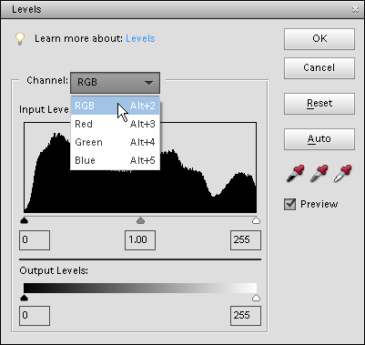
FIGURE 2-5: The Levels dialog box.
Notice that the Channel drop-down list shows you Red, Green, and Blue as individual channels, as well as a composite RGB selection. Furthermore, the Output Levels area shows you values ranging from 0 on the left to 255 on the right. Considering that 0 is a number, you have a total of 256 different levels of gray.
What’s important is that you know that your work in color is related to RGB images that comprise three different channels. There are 256 levels of gray that can let through or hold back light and change brightness values and color. See Chapters 10 and 11 for more on using tools, such as levels, to adjust color in this way.
Getting Color Right
In Elements, when it comes to color, the challenge isn’t understanding color theory or definitions, but rather matching the RGB color you see on your computer monitor as closely as possible to your output. Output can be a printout from a color printer or a screen view on a web page.
We say match “as closely as possible” because you can’t expect to achieve an exact match. You have far too many printer and monitor variables to deal with. However, if you properly manage color, you can get a very close match.
To match color between your monitor and your output, you need to first calibrate your monitor and then choose a color workspace profile. In the following sections, you can find all the details.
Color the easy way
The upcoming sections are complex and require some dedicated effort to follow the descriptions. If you’re interested in sharing photos only onscreen (that is, on your own website or on Instagram, Facebook, Twitter, and so on) and you plan to leave the printing to others, you don’t need to bother with color correction and going through a maze of steps to get the color perfected. In that case, you can skip the technical stuff in the following sections.
Your only consideration for onscreen viewing is your overall monitor brightness. If your monitor displays images darker or lighter than other computers viewing your images, you need to follow the upcoming sections and understand how to adjust your overall monitor brightness.
Calibrating your monitor
Your monitor needs to be calibrated to adjust the gamma and brightness; correct any color tints or colorcasts; and generally get your monitor to display, as precisely as possible, accurate colors on your output. You can choose among a few tools to adjust monitor brightness. These tools range from a low-cost hardware device that sells for less than $100 to expensive calibration equipment of $3,000 or more.
Gamma is the brightness of midlevel tones in an image. In technical terms, gamma is a parameter that describes the shape of the transfer function for one or more stages in an imaging pipeline.
We skip the costly high-end devices and software utilities that don’t do you any good and suggest that you make, at the very least, one valuable purchase for creating a monitor profile: a hardware profiling system. On the low end, some affordable devices go a long way toward helping you adjust your monitor brightness and color balance. The Pantone Huey calibration tool costs around $75. The newest Datacolor Spyder (SpyderX) costs $150. These are hardware tools to help you create monitor profiles for working with color. The best way to find a device that works for you is to search the Internet for hardware descriptions, dealers, and costs.
On LCD/LED monitors, you need to adjust the hardware controls to bring your monitor into a match for overall brightness with your photo prints. Be certain to run many test prints and match your prints against your monitor view to make the two as similar as possible.
You have a lot to focus on when calibrating monitors and getting the color right on your monitor and your output. We talk more about color prints in Chapter 15.
Choosing a color workspace
After you adjust your monitor color by using a hardware profiling system, your next step is to choose your color workspace. In Elements, you have a choice between two workspace colors: either sRGB or Adobe RGB (1998). You access your color workspace settings by choosing Edit ⇒ Color Settings. The Color Settings dialog box opens, as shown in Figure 2-6.
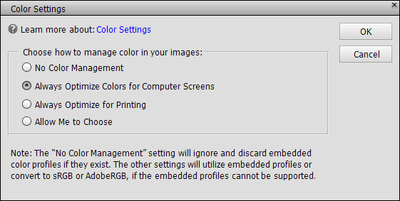
FIGURE 2-6: The Color Settings dialog box.
The Color Settings dialog box gives you these options:
- No Color Management: This choice turns off all color management. Don’t choose this option for any work you do in Elements. When using No Color Management, you need to work with files that have color profiles embedded in the photos. You most likely won’t use these types of photos. For information on when you might use the No Color Management option, see Chapter 15.
- Always Optimize Colors for Computer Screens: Selecting this radio button sets your workspace to sRGB. sRGB color is used quite often for viewing images on your monitor, but this workspace often results in the best choice for color printing, too. Many color printers can output all the colors you can see in the sRGB workspace. In addition, many photo services we talk about in Chapter 15 prefer this workspace color.
- Always Optimize for Printing: Selecting this option sets your color workspace to Adobe RGB (1998). The color in this workspace represents the best color you can see on newer monitors, as well as many of the newer inkjet printers. As a default, this is your best choice.
- Allow Me to Choose: When you select this option, Elements prompts you for a profile assignment when you open images that contain no profile. This setting is handy if you work back and forth between screen and print images.
Understanding how profiles work
You probably created a monitor color profile when you calibrated your monitor. You probably also selected a color profile when you opened the Color Settings dialog box and selected your workspace color. When you start your computer, your monitor color profile kicks in and adjusts your overall monitor brightness and corrects for any colorcasts. When you open a photo in Elements, color is converted automatically from your monitor color space to your workspace color.
At print time, you use another color profile to output your photos to your desktop color printer. Color is then converted from your workspace color to your printer’s color space. In Chapter 15, we show you how to use color profiles for printing. For now, just realize that each of these color profiles, and using each one properly, determine whether you can get good color output.