
7
Working with Model Explainability
The justification of model selection and performance is just as important as model training. You can have N trained models using different algorithms, and all of them will be able to make good enough predictions for real-world problems. So, how do you select one of them to be used in your production services, and how do you justify to your stakeholders that your chosen model is better than the others, even though all the other models were also able to make accurate predictions to some degree? One answer is performance metrics, but as we saw in the previous chapter, there are plenty of performance metrics and all of them measure different types of performance. Choosing the correct performance metric boils down to the context of your ML problem. What else can we use that will help us choose the right model and also further help us in justifying this selection?
The answer to that is visual graphs. Human beings are visual creatures and, as such, a picture speaks a thousand words. A good graph can explain more about a model than any metric number. The versatility of graphs can be very useful in explaining the model’s behavior and how it fits as a solution to our ML problem.
H2O’s explainability interface is a unique feature that wraps over various explainability features and visuals that H2O auto-computes for a model or list of models, including the H2O AutoML object.
In this chapter, we shall explore the H2O explainability interface and how it works with the H2O AutoML object. We shall also implement a practical example to understand how to use the explainability interface in Python and R. Finally, we shall go through and understand all the various explainability features that we get as outputs.
In this chapter, we are going to cover the following main topics:
By the end of this chapter, you should have a good idea of how to interpret model performance by looking at the various performance metrics described by the model explainability interface.
Technical requirements
For this chapter, you will require the following:
- The latest version of your preferred web browser.
- An Integrated Development Environment (IDE) of your choice or a Terminal.
- All the experiments conducted in this chapter are performed on a Terminal. You are free to follow along using the same setup or you can perform the same experiments using any IDE of your choice.
All the code examples for this chapter can be found on GitHub at https://github.com/PacktPublishing/Practical-Automated-Machine-Learning-on-H2O/tree/main/Chapter%207.
So, let’s begin by understanding how the model explainability interface works.
Working with the model explainability interface
The model explainability interface is a simple function that incorporates various graphs and information about the model and its workings. There are two main functions for model explainability in H2O:
- The h2o.explain() function, which is used to explain the model’s behavior on the entire test dataset. This is also called global explanation.
- The h2o.explain_row() function, which is used to explain the model’s behavior on an individual row in the test dataset. This is also called local explanation.
Both these functions work on either a single H2O model object, a list of H2O model objects, or the H2O AutoML object. These functions generate a list of results that consists of various graphical plots such as a variable importance graph, partial dependency graph, and a leaderboard if used on multiple models.
For graphs and other visual results, the explain object relies on visualization engines to render the graphics:
- For the R interface, H2O uses the ggplot2 package for rendering.
- For the Python interface, H2O uses the matplotlib package for rendering.
With this in mind, we need to make sure that whenever we are using the explainability interface to get visual graphs, we run it in an environment that supports graph rendering. This interface won’t be of much use in Terminals and other non-graphical command-line interfaces. The examples in this chapter have been run on Jupyter Notebook, but any environment that supports plot rendering should work fine.
The explainability function has the following parameters:
- newdata/frame: This parameter is used to specify the H2O test DataFrame needed to compute some of the explainability features such as the SHAP summary and residual analysis. The parameter name that’s used in the R explainability interface is newdata, while the same in the Python explainability interface is frame.
- columns: This parameter is used to specify the columns to be considered in column-based explanations such as individual conditional expectation plots or partial dependency plots.
- top_n_features: This parameter is used to specify the number of columns to be considered based on the feature importance ranking for column-based explanations. The default value is 5.
Either the columns parameter or the top_n_features parameter will be considered by the explainability function. Preference is given to the columns parameter, so if both the parameters are passed with values, then top_n_features will be ignored.
- include_explanations: This parameter is used to specify the explanations that you want from the explainability function’s output.
- exclude_explanations: This parameter is used to specify the explanations that you do not want from the explainability function’s output. include_explanations and exclude_explanations are mutually exclusive parameters. The available values for both parameters are as follows:
- leaderboard: This value is only valid for the list of models or the AutoML object.
- residual_analysis: This value is only valid for regression models.
- confusion_matrix: This value is only valid for classification models.
- varimp: This value stands for variable importance and is only valid for base models, not for stacked ensemble models.
- varimp_heatmap: This value stands for heatmap of variable importance.
- model_correlation_heatmap: This value stands for heatmap of model correlation.
- shap_summary: This value stands for Shapley additive explanations.
- pdp: This value stands for partial dependency plots.
- ice: This value stands for individual conditional expectation plots.
- plot_overrides: This parameter is used to override the values for individual explanation plots. This parameter is useful if you want the top 10 features to be considered for one plot but specific columns for another:
list(pdp = list(top_n_features = 8))
- object: This parameter is used to specify the H2O models or the H2O AutoML object, which we will cover shortly. This parameter is specific to the R explainability interface.
Now that we know how the explainability interface works and what its various parameters are, let’s understand it better with an implementation example.
We shall use Fisher’s Iris flower dataset, which we used in Chapter 1, Understanding H2O AutoML Basics, to train models using AutoML. We will then use the explainability interface on the AutoML object to display all the explainability features it has to provide.
So, let’s start by implementing it in Python.
Implementing the model explainability interface in Python
To implement the model explainability function in Python, follow these steps:
The explainability interface performs heavy computations behind the scenes to calculate the data needed to plot the graphs. To speed up processing, it is recommended to initialize the H2O server with as much memory as you can allocate.
- Import the dataset using h2o.importFile(“Dataset/iris.data”):
data = h2o.import_file("Dataset/iris.data")
- Set which columns are the features and which columns are the labels:
features = data.columns
label = "C5"
- Remove the label from among the features:
features.remove(label)
- Split the DataFrame into training and testing DataFrames:
train_dataframe, test_dataframe = data.split_frame([0.8])
- Initialize the H2O AutoML object:
aml = h2o.automl.H2OAutoML(max_models=10, seed = 1)
- Trigger the H2O AutoML object so that it starts auto-training the models:
aml.train(x = features, y = label, training_frame = train_dataframe)
- Once training has finished, we can use the H2O explainability interface, h2o.explain(), on the now-trained aml object:
aml.explain(test_dataframe)
The explain function will take some time to finish computing. Once it does, you should see a big output that lists all the explainability features. The output should look as follows:
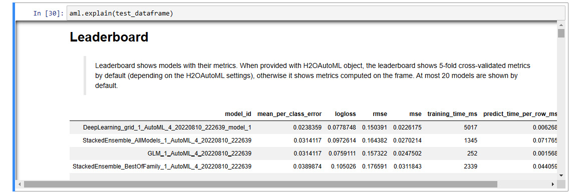
Figure 7.1 – Model explainability interface output
- You can also use the h2o.explain_row() interface to display the model explainability features for a single row of the dataset:
aml.explain_row(test_dataframe, row_index=0)
The output of this should give you a leaderboard of the models making predictions on the first row of the dataset.
- To get additional information about the model from an explainability point of view, you can further extend the explainability interface by using the explain_row() function on the leader model, as follows:
aml.leader.explain_row(test_dataframe, row_index=0)
The output of this should give you all the applicable graphical model explainability features for that model based on its predictions on that row.
Now that we know how to use the model explainability interface in Python, let’s see how we can use this interface in the R Language.
Implementing the model explainability interface in R
Similar to how we implemented the explainability interface in Python, H2O has provisions to use the explainability interface in the R programming language as well.
To implement the model explainability function in R, follow these steps:
- Import the h2o library and spin up a local H2O server:
library(h2o)
h2o.init(max_mem_size = "12g")
- Import the dataset using h2o.importFile(“Dataset/iris.data”):
data = h2o.import_file("Dataset/iris.data")
- Set the C5 column as the label:
label <- "C5"
- Split the DataFrame into training and testing DataFrames and assign them to the appropriate variables:
splits <- h2o.splitFrame(data, ratios = 0.8, seed = 7)
train_dataframe <- splits[[1]]
test_dataframe <- splits[[2]]
- Run the H2O AutoML training:
aml <- h2o.automl(y = label, training_frame = train_dataframe, max_models = 10)
- Use the H2O explainability interface on the now-trained aml object:
explanability_object <- h2o.explain(aml, test_dataframe)
Once the explainability object finishes its computation, you should see a big output that lists all the explainability features.
- Just like Python, you can also extend the model explainability interface function so that it can be run on a single row using the h2o.explain_row() function, as follows:
h2o.explain_row(aml, test, row_index = 1)
This will give you the leaderboard of models making predictions on the first row of the dataset.
- Similarly, you can expand this explainability interface by using the h2o.explain_row() function on the leader model to get more advanced information about the leader model:
h2o.explain_row(aml@leader, test, row_index = 1)
In these examples, we have used the Iris flower dataset to solve a multinomial classification problem. Similarly, we can use the explainability interface on trained regression models. Some of the explainability features are only available depending on whether the trained model is a regression model or a classification model.
Now that we know how to implement the model explainability interface in Python and R, let’s look deeper into the output of the interface and try to understand the various explainability features that H2O computed.
Exploring the various explainability features
The output of the explainability interface is an H2OExplanation object. The H2OExplanation object is nothing but a simple dictionary with the explainability features’ names as keys. You can retrieve individual explainability features by using a feature’s key name as a dict key on the explainability object.
If you scroll down the output of the explainability interface for the H2O AutoML object, you will notice that there are plenty of headings with explanations. Below these headings, there’s a brief description of what the explainability feature is. Some have graphical diagrams, while others may have tables.
The various explainability features are as follows:
- Leaderboard: This feature is a leaderboard comprising all trained models and their basic metrics ranked from best performing to worst. This feature is computed only if the explainability interface is run on the H2O AutoML object or list of H2O models.
- Confusion Matrix: This feature is a performance metric that generates a matrix that keeps track of correct and incorrect predictions of a classification model. It is only available for classification models. For multiple models, the confusion matrix is only calculated for the leader model.
- Residual Analysis: This feature plots the predicted values against the residuals on the test dataset used in the explainability interface. It only analyzes the leader model based on the model ranking on the leaderboard. It is only available for regression models. For multiple models, residual analysis is performed on the leader model.
- Variable Importance: This feature plots the importance of variables in the dataset. It is available for all models except for stacked models. For multiple models, it is only performed on the leader model, which is not a stacked model.
- Variable Importance Heatmap: This feature plots a heatmap of variable importance across all the models. It is available for comparing all models except stacked models.
- Model Correlation Heatmap: This feature plots the correlation between the predicted values of different models. This helps group together models with similar performance. It is only available for multiple model explanations.
- SHAP Summary of Top Tree-Based Model: This feature plots the importance of variables in contributing to the decision-making that’s done by complex tree-based models such as Random Forest and neural networks. This feature computes this plot for the top-ranking tree-based model in the leaderboard.
- Partial Dependence Multi Plots: This feature plots the dependency between the target feature and a certain set of features in the dataset that we consider important.
- Individual Conditional Expectation (ICE) Plots: This feature plots the dependency between the target feature and a certain set of features in the dataset that we consider important for each instance separately.
Comparing this to the output you got from the model explainability interface in the experiment we performed in the Working with the model explainability interface section, you will notice that some of the explainability features are missing from the output. This is because some of these features are only available to the type of model trained. For example, residual analysis is only available for regression models, while the experiment conducted in the Working with the model explainability interface section is a classification problem that trained a classification model. Hence, you won’t find residual analysis in the model’s explainability output.
You can perform the same experiment using a regression problem; the model explainability interface will output regression-supported explainability features.
Now that we know about the different explainability features that are available in the explanation interface, let’s dive deep into them one by one to get an in-depth understanding of what they mean. We shall go through the output we got from our implementation of the explainability interface in Python and R.
In the previous chapters, we understood what the leaderboard and confusion matrix are. So, let’s start with the next explanation feature: residual analysis.
Understanding residual analysis
Residual analysis is performed for regression models. As described in Chapter 5, Understanding AutoML Algorithms, in the Understanding generalized linear models and Introduction to linear regression sections, residuals are the difference between the values predicted by the regression model and the actual values for that same row of data. Analyzing these residual values is a great way of diagnosing any problems in your model.
A residual analysis plot is a graph where you plot the residual values against the predicted values. Another thing we learned in Chapter 5, Understanding AutoML Algorithms, in the Understanding generalized linear models and Understanding the assumptions of linear regression sections, is that one of the primary assumptions in linear regression is that the distribution of residuals is normally distributed.
So, accordingly, we expect our residual plot to be an amorphous collection of points. There should not be any patterns between the residual values and the predicted values.
Residual analysis can highlight the presence of heteroscedasticity in a trained model. Heteroscedasticity is said to have occurred if the standard deviation of the predicted values changes over different values of the features.
Consider the following diagram:
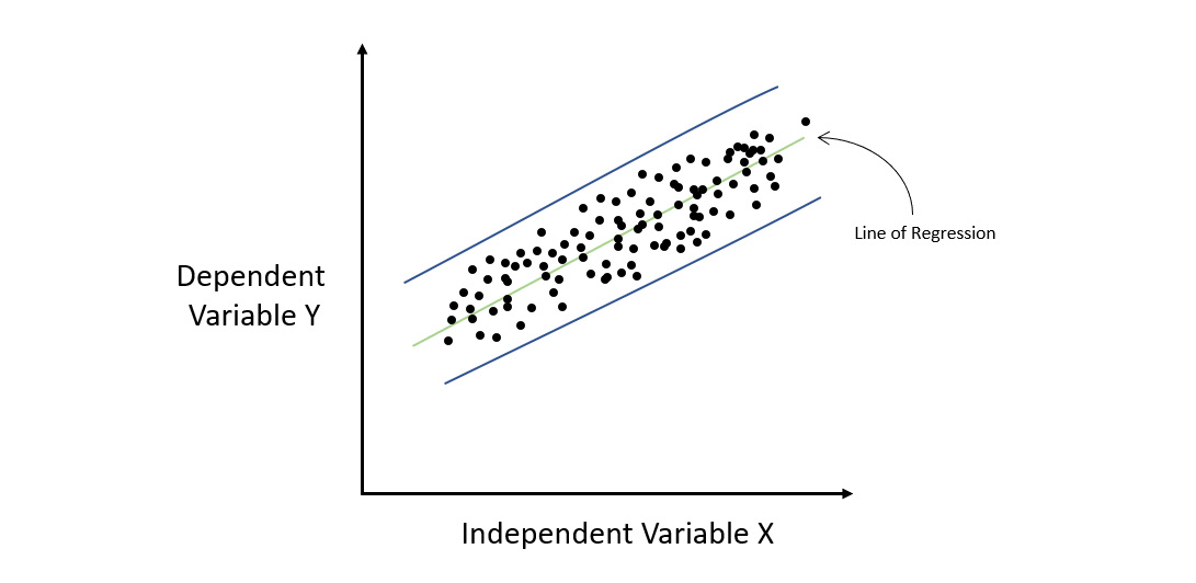
Figure 7.2 – Regression graph for a homoscedastic dataset
The preceding diagram shows a regression plot where we had some sample data that maps the relationship between X and Y. Let’s fit a straight line through this data, which represents our linear model. If we calculate the residuals for every point as we go from left to right on the X-axis, we will notice that the error rate remains fairly constant throughout all the values of X. This means that all the error values lie between the parallel blue lines. Such a situation where the distribution of errors or residuals is constant throughout the independent variables is called homoscedasticity.
The opposite of homoscedasticity is heteroscedasticity. This is where the error rate varies over the change in the value of X. Refer to the following diagram:
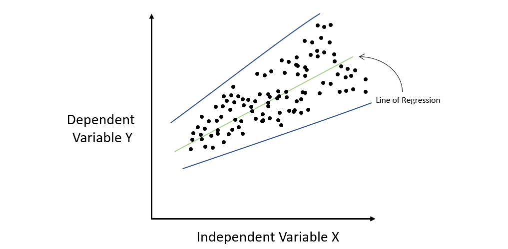
Figure 7.3 – Regression graph for a heteroscedastic dataset
As you can see, the magnitude of the errors made by the linear model increases with an increase in X. If you plot the blue error lines encompassing all the errors, then you will notice that they gradually fan out and are not parallel. This situation where the distribution of errors or residuals is not constant throughout the independent variables is called heteroscedasticity.
What heteroscedasticity tells us is that there is some sort of information that the model has not been able to capture and learn from. Heteroscedasticity also violates linear regressions’ basic assumption. Thus, it can help you identify that you may need to add the missing information to your dataset to correctly train your linear model or that you may need to implement some non-linear regression algorithm to get a better-performing model.
Since residual analysis is a regression-specific model explainability feature, we cannot use the Iris dataset classification experiment that we performed in the Working with the model explainability interface section. Instead, we need to train a regression model and then use the model explainability interface on that model to get the residual analysis output. So, let’s look at a regression problem using the Red Wine Quality dataset. You can find this dataset at https://archive.ics.uci.edu/ml/datasets/wine+quality.
This dataset consists of the following features:
- fixed acidity: This feature explains the amount of acidity that is non-volatile, meaning it does not evaporate over some time.
- volatile acidity: This feature explains the amount of acidity that is volatile, meaning it will evaporate over some time.
- citric acid: This feature explains the amount of citric acid present in the wine.
- residual sugar: This feature explains the amount of residual sugar present in the wine.
- chlorides: This feature explains the number of chlorides present in the wine.
- free sulfur dioxide: This feature explains the amount of free sulfur dioxide present in the wine.
- total sulfur dioxide: This feature explains the amount of total sulfur dioxide present in the wine.
- density: This feature explains the density of the wine.
- pH: This feature explains the pH value of the wine, with 0 being the most acidic and 14 being the most basic.
- sulphates: This feature explains the number of sulfates present in the wine.
- alcohol: This feature explains the amount of alcohol present in the wine.
- quality: This is the response column that notes the quality of the wine. 0 indicates that the wine is very bad, while 10 indicates that the wine is excellent.
We will run our basic H2O AutoML process of training the model and then use the model explainability interface on the trained AutoML object to get the residual analysis plot.
Now, let’s observe the residual analysis plot that we get from this implementation and then see how we can retrieve the required information from the graph. Refer to the following diagram:
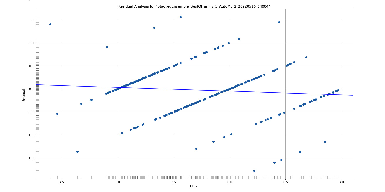
Figure 7.4 – Residual analysis graph plot for the Red Wine Quality dataset
Here, you can see the residual analysis for the stacked ensemble model, which is the leader of the AutoML trained models. On the X-axis, you have Fitted, also called predicted values, while on the Y-axis, you have Residuals.
On the left border of the Y-axis and below the X-axis you will see a grayscale column and row, respectively. These help you observe the distribution of those residuals across the X and Y axes.
To ensure that the distribution of residuals is normal and that the data is not heteroskedastic, you need to observe this grayscale on the Y-axis. A normal distribution would ideally give you a grayscale that is the darkest at the center and lightens as it moves away.
Now that you understood how to interpret the residual analysis graph, let’s learn more about the next explainability feature: variable importance.
Understanding variable importance
Variable importance, also called feature importance, as the name suggests, explains the importance of the different variables/features in the dataset in making predictions. In any ML problem, your dataset will often have multiple variables that contribute to the characteristics of your prediction column. However, in most cases, you will often have some features that contribute more compared to others.
This understanding can help scientists and engineers remove any unwanted features that introduce noise from the dataset. This can further improve the quality of the model.
H2O calculates variable importance differently for different types of algorithms. First, let’s understand how variable importance is calculated for tree-based algorithms.
Variable importance in tree-based algorithms is calculated based on two criteria:
- Selection of the variable for deciding on the decision tree
- Improvement in the squared error over the whole tree because of the selection
Whenever H2O is building a decision tree as a part of training a tree-based model, it will use one of the features as a node to further split the tree. As we studied in Chapter 5, Understanding AutoML Algorithms, in the Understanding the Distributed Random Forest algorithm section, we know that every node split in the decision tree aims to reduce the overall squared error. This deducted value is nothing but the difference between the squared errors of the parent node against the children node.
H2O considers this reduction in squared error in calculating the feature importance. The squared error for every node in the tree-based model leads to the variance of the response value for that node being lowered. The squared error for every node in the tree-based model leads to the variance of the response value for that node being lowered.
Thus, accordingly, the equation for calculating the squared error of the tree is as follows:

Here, we have the following:
- MSE means mean squared error
- N indicates the total number of observations
- VAR means variance
The equation for calculating variance is as follows:

Here, we have the following:
 indicates the value of the observation
 indicates the mean of all the observations
- N indicates the total number of observations
For tree-based ensemble algorithms such as the Gradient Boosting Algorithm (GBM), the decision trees are trained sequentially. Every tree is built on top of the previous tree’s errors. So, the feature importance calculation is the same as how we do it for individual nodes in single decision trees.
For Distributed Random Forest (DRF), the decision trees are trained in parallel, so H2O just averages the results to calculate the feature importance.
For XGBoost, H2O calculates the feature importance from the gains of the loss function for individual features when building the tree.
For deep learning, H2O calculates the feature importance using a special method called the Gedeon method.
For Generalized Linear Models (GLMs), variable importance is the same as the predictor weights, also called the coefficient magnitudes. If, during training, you decide to standardize the data, then the standardized coefficients are returned.
The following diagram shows the feature importance that was calculated for our experiment on the Iris flower dataset:
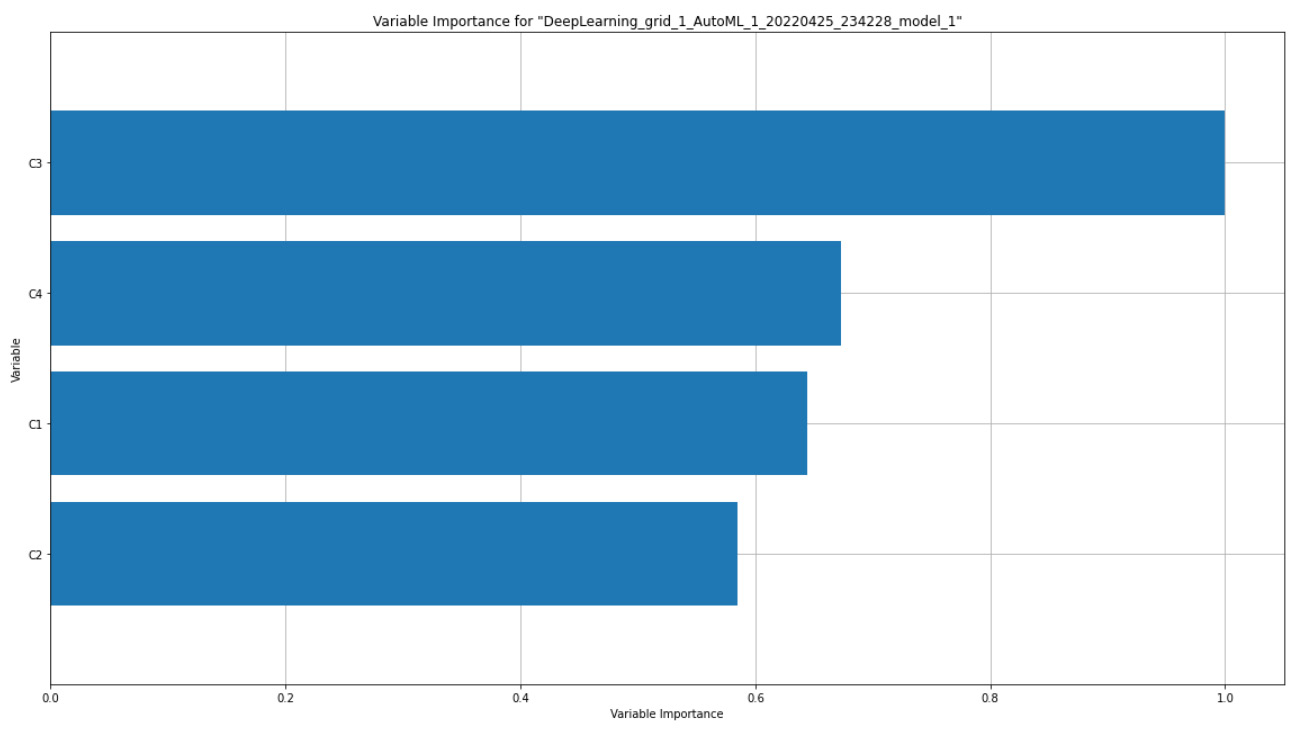
Figure 7.5 – Variable importance graph for the Iris flower dataset
The preceding diagram shows the variable importance map for a deep learning model. If you compare it with your leaderboard, you will see that the variable importance graph is plotted for the most leading model, which is not a stacked ensemble model.
On the Y-axis of the graph, you have the feature names – in our case, the C1, C2, C3, and C4 columns of the Iris flower dataset. On the X-axis, you have the importance of these variables. It is possible to get the raw metric value of feature importance, but H2O displays the importance values by scaling them down between 0 and 1, where 1 indicates the most important variable while 0 indicates the least important variable.
Since variable importance is available for both classification and regression models, you will also get a variable importance graph as an explainability feature of the Red Wine Quality regression model. The graph should look as follows:
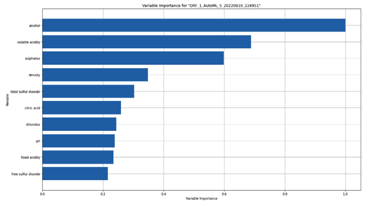
Figure 7.6 – Variable importance graph for the Red Wine Quality dataset
Now that you know how to interpret a feature importance graph, let’s understand feature importance heatmaps.
Understanding feature importance heatmaps
When displaying feature importance for a specific model, it is fairly easy to represent it as a histogram or bar graph. However, we often need to compare the feature importance of various models so that we can understand which feature is deemed important by which model and how we can use this information to compare model performance. H2O AutoML will inherently train multiple models with different ML algorithms. Therefore, a comparative study of the model performance is a must and a graphical representation of feature importance can be of great help to scientists and engineers.
To represent the feature importance of all the models trained by H2O AutoML in a single graph, H2O generates a heatmap of feature importance.
A heatmap is a data visualization graph where the color of the graph is affected by the amount of density or magnitude of a specific value.
Some H2O models compute the variable importance on encoded versions of categorical columns. Different models also have different ways of encoding categorical values. So, comparing the variable importance of these categorical columns across all the models can be tricky. H2O does this comparison by summarizing the variable importance across all the features and returning a single variable importance value that represents the original categorical feature.
The following is the feature importance heatmap for the Iris flower dataset experiment:
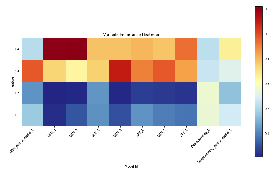
Figure 7.7 – Variable importance heatmap
Here, we can see the top 10 models on the leaderboard.
The heatmap has the C1, C2, C3, and C4 features on the Y-axis and the model IDs on the X-axis. The color of the plots indicates how important the model considers the feature during its prediction. More importance equals more value, which, in turn, turns the respective plot red. The lower the importance, the lower the importance value of the feature will be; the color will become cooler and become blue.
Now that you know how to interpret feature importance heatmaps, let’s learn about model correlation heatmaps.
Understanding model correlation heatmaps
Another important comparison between multiple models is model correlation. Model correlation can be interpreted as how similar the models are in terms of performance when you compare their prediction values.
Different models trained using the same or different ML algorithms are said to be highly correlated if the predictions made by one model are the same or similar to the predictions made by the other.
In a model correlation heatmap, H2O compares the prediction values of all the models that it trains and compares them to one another.
The following is the model correlation heatmap graph we got from our experiment on the Iris flower dataset:
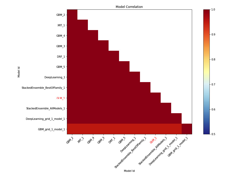
Figure 7.8 – Model correlation heatmap for the Iris flower dataset
Tip
To understand this explainability feature graph, kindly refer to the Model Correlation section in the output you got after executing the explain() function in your code.
On the X and Y axes, we have the model IDs. Their cross-section on the graph indicates the correlation value between them. You will notice that the heat points on the graph within the X and Y axes have the same model ID, which will always be 1; therefore, the plot will always be red. This is correct as, technically, it’s the same model and when you compare the prediction values of a model with itself, there will be 100% correlation.
To get a better idea of the correlation between different models, you can refer to these heat values. Dark red points indicate high correlation, while those with cool blue values indicate low correlation. Models highlighted in red are interpretable models such as GLMs.
You may notice that since the model correlation heatmap supports stacked ensemble models and feature importance heatmaps don’t, if you ignore the stacked ensemble models in the model correlation heatmap (Figure 7.8), the rest of the models are the same as the ones in the feature importance heatmap (Figure 7.7).
Now that you know how to interpret model correlation heatmaps, let’s learn more about partial dependency plots.
Understanding partial dependency plots
A Partial Dependence Plot (PDP) is a graph diagram that shows you the dependency between the predicted values and the set of input features that we are interested in while marginalizing the values of features in which we are not interested.
Another way of understanding a PDP is that it represents a function of input features that we are interested in that gives us the expected predicted values as output.
A PDP is a very interesting graph that is useful in showing and explaining the model training results to members of the organization that are not so skilled in the domain of data science.
First, let’s understand how to interpret a DPD before learning how it is calculated. The following diagram shows the PDP we got for our experiment when using the Iris flower dataset:
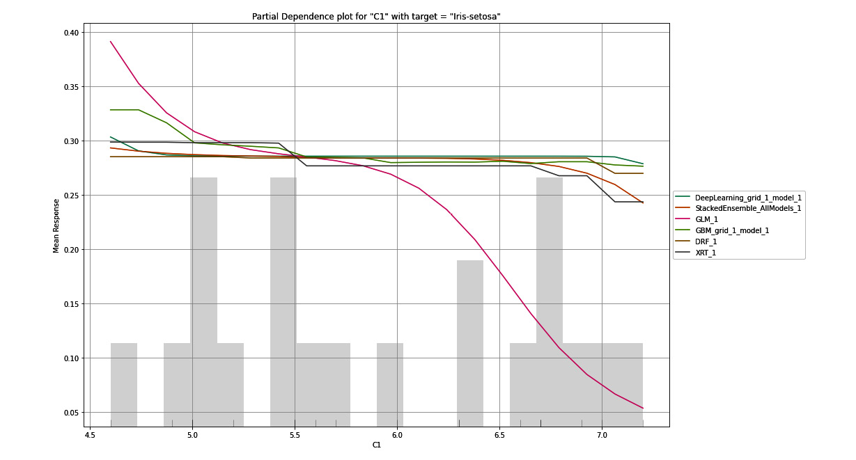
Figure 7.9 – PDP for the C1 column with Iris-setosa as the target
Tip
To understand this explainability feature graph, kindly refer to the Partial Dependency Plots section in the output you got after executing the explain() function in your code.
The PDP plot is a graph that shows you the marginal effects of a feature on the response values. On the X-axis of the graph, you have the selected feature and its range of values. On the Y-axis, you have the mean response values for the target value. The PDP plot aims to tell the viewer what the mean response value predicted by the model for a given value of the selected feature is.
In Figure 7.9, the PDP graph is plotted for the C1 column for the target value, which is Iris-setosa. On the X-axis, we have the C1 column, which stands for the sepal length of the flower in centimeters. The range of these values ranges from the minimum value present in the dataset to the maximum value. On the Y-axis, we have the mean response values. For this experiment, the mean response values are probabilities that the flower is an Iris-setosa, which is the selected target value of the plot. The colorful lines on the graph indicate the mean response values predicted by the different models trained by H2O AutoML for the range of C1 values.
Looking at this graph gives us a good idea of how the response value is dependent on the single feature, C1, for every individual model. We can see that so long as the sepal length lies between 4.5 to 6.5 centimeters, most of the models show an approximate probability that there is a 35% chance that the flower is of the Iris-setosa class.
Similarly, in the following graph, we have plotted the PDP graph for the C1 column, only this time the target response column is Iris-versicolor:
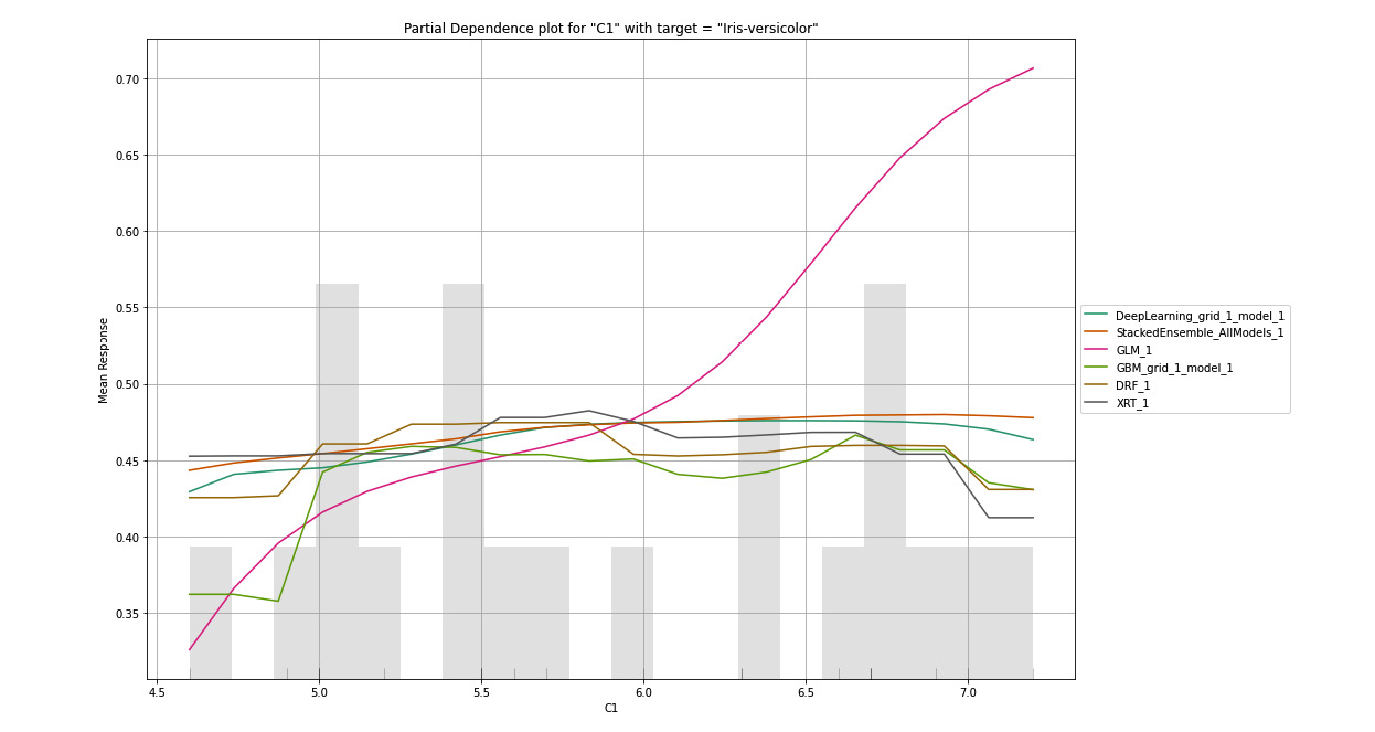
Figure 7.10 – PDP for the C1 column with Iris-versicolor as the target
Tip
To understand this explainability feature graph, kindly refer to the Partial Dependency Plots section in the output you got after executing the explain() function in your code.
Here, we can see that so long the values of C1 are between 4.5 to 6.5, there is around a 27% to 40% chance that the flower is of the Iris-versicolor class. Now, let’s look at the following PDP plot for C1 for the third target value, Iris-virginica:
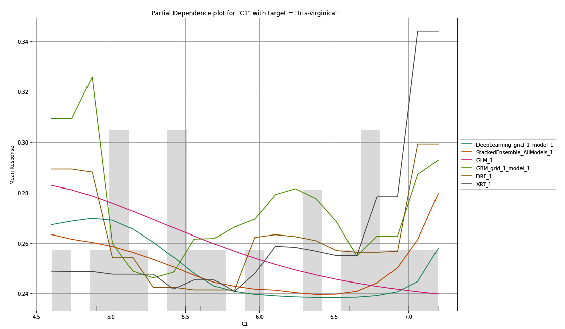
Figure 7.11 – PDP for the C1 column with Iris-virginica as the target
Tip
To better understand this explainability feature graph, kindly refer to the Partial Dependency Plots section in the output you got after executing the explain() function in your code.
You will notice that, for Iris-virginica, all the models predict differently for the same values of C1. This could mean that the Iris-virginica class is not strongly dependent on the sepal length of the flower – that is, the C1 value.
Another case where PDP might be useful is in model selection. Let’s assume you are certain that a specific feature in your dataset will be contributing greatly to the response value and you train multiple models on it. Then, you can choose the model that best suits this relationship as that model will make the most realistically accurate predictions.
Now, let’s try to understand how the PDP plot is generated and how H2O computes these plot values.
The PDP plot data can be calculated as follows:
- Choose a feature and target value to plot the dependency.
- Bootstrap a dataset from the validation dataset, where the value of the selected feature is set to the minimum value present in the validation dataset for all rows.
- Pass this bootstrapped dataset to one of the models trained by H2O AutoML and calculate the mean of the prediction values it got for all rows.
- Plot this value on the PDP graph for that model.
- Repeat steps 3 and 4 for the remaining models.
- Repeat step 2, but this time, increment the value of the selected feature to the next value present in the validation dataset. Then, repeat the remaining steps.
You will do this for all the feature values present in the validation dataset and plot them on the results for all the models on the same PDP graph.
Once finished, you will repeat the same process for different combinations of the feature and target response values.
H2O will make multiple PDP plots for all the combinations of features and response values. The following is a PDP plot where the selected feature is C2 and the selected target value is Iris-setosa:
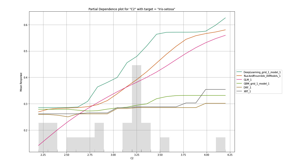
Figure 7.12 – PDP for the C2 column with Iris-setosa as the target
Tip
To better understand this explainability feature graph, kindly refer to the Partial Dependency Plots section in the output you got after executing the explain() function in your code.
Similarly, it created different combinations of the PDP plot for the C3 and C4 features. The following is a PDP plot where the selected feature is C3 and the selected target value is Iris-versicolor:
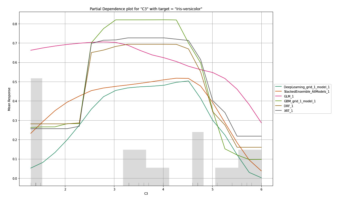
Figure 7.13 – PDP for the C3 column with Iris-versicolor as the target
Tip
To better understand this explainability feature graph, kindly refer to the Partial Dependency Plots section in the output you got after executing the explain() function in your code.
Now that you know how to interpret feature importance heatmaps, let’s learn about SHAP summary plots.
Understanding SHAP summary plots
For sophisticated problems, tree-based models can become difficult to understand. Complex tree models can be very large and complicated to understand. The SHAP summary plot is a simplified graph of the tree-based model that gives you a summarized view of the model’s complexity and how it behaves.
SHAP stands for Shapley Additive Explanations. SHAP is a model explainability feature that takes an approach from game theory to explain the output of an ML model. The SHAP summary plot shows you the contribution of the features toward predicting values, similar to PDPs.
Let’s try to interpret a SHAP value from an example. The following is the SHAP summary we get from the Red Wine Quality dataset:
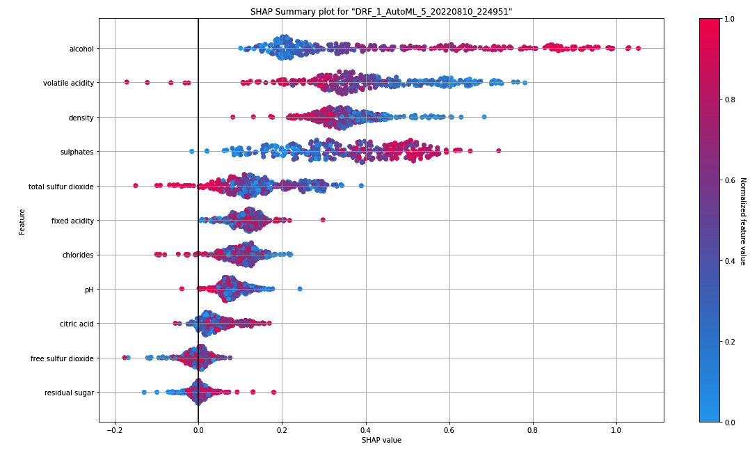
Figure 7.14 – SHAP summary plot for the Red Wine Quality dataset
Tip
To better understand this explainability feature graph, kindly refer to the SHAP Summary section in the output you get after executing the explain() function on your regression model.
On the right-hand side, you can see a bluish-red bar. This bar represents the normalized value of the wine quality in color. The redder the color, the better the quality; the bluer the color, the poorer the wine quality. In binomial problems, the color will be a stark contrast between red and blue. However, in regression problems, like in our example, we can have a whole spectrum of colors, indicating the range of possible numerical values.
On the Y-axis, you have the features from the dataset. They are in descending order from top to bottom based on the feature’s importance. In our example, the alcohol content is the most important feature in the dataset; it contributes more to the final prediction value.
On the X-axis, you have the SHAP value. The SHAP value denotes how the feature helps the model toward the expected outcome. The more positive the SHAP value, the more the feature contributes to the outcome.
Let’s take the example of alcohol from the SHAP summary. Based on this, we can see that alcohol has the highest SHAP value among the rest of the features. Thus, alcohol contributes greatly to the model’s prediction. Also, the points on the graph for alcohol with the highest SHAP value are in red. This also indicates that high alcohol content contributes to a positive outcome. Keeping this in mind, what we can extract from this graph is that the feature alcohol content plays an important part in the prediction of the quality of the wine and that the higher the content of the alcohol, the better the quality of the wine.
Similarly, you can interpret the same knowledge from the other features. This can help you compare and understand which features are important and how they contribute to the final prediction of the model.
One interesting question on the SHAP summary and the PDP is, what is the difference between them? Well, the prime difference between the two is that PDP explains the effect of replacing only one feature at a time on the output, while the SHAP summary considers the overall interaction of that feature with other features in the dataset. So, PDP works on the assumption that your features are independent of one another, while SHAP takes into account the combined contributions of different features and their combined effects on the overall prediction.
Calculating SHAP values is a complex process that is derived from game theory. If you are interested in expanding your knowledge of game theory and how SHAP values are calculated, feel free to explore them at your own pace. A good starting point for understanding SHAP is to follow the explanations at https://shap.readthedocs.io/en/latest/index.html. At the time of writing, H2O acts as a wrapper for the SHAP library and internally uses this library to calculate the SHAP values.
Now that we know how to interpret a SHAP summary plot, let’s learn about explainability feature, Individual Conditional Expectation (ICE) plots.
Understanding individual conditional expectation plots
An ICE plot is a graph that displays a line for every instance of an observation that shows how the prediction for the given observation changes when the value of a feature changes.
ICE plots are similar to PDP graphs. PDP focuses on the overall average effect of a change in a feature on the prediction outcome, while ICE plots focus on the dependency of the outcome on individual instances of the feature value. If you average the ICE plot values, you should get a PDP.
The way to compute ICE plots is very simple, as shown in the following screenshot:
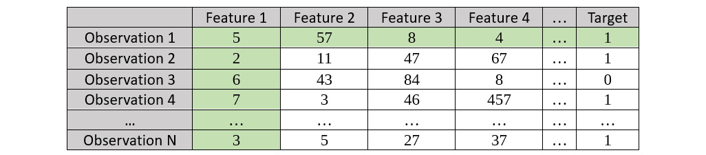
Figure 7.15 – Sample dataset for ICE graph plots highlighting Observation 1
Once your model has been trained, you must perform the following steps to calculate the ICE plots:
- Consider the first observation – in our example, Observation 1 – and plot the relationship between Feature 1 and the respective Target value.
- Keeping the values in Feature 1 constant, create a bootstrapped dataset while replacing all the other feature values with those seen in Observation 1 in the original dataset; mark all other observations as Observation 1.
- Calculate the Target value of the observations using your trained model.
Refer to the following screenshot for the bootstrapped dataset:
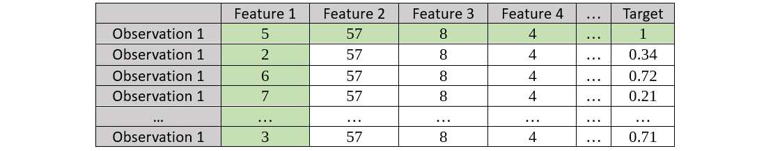
Figure 7.16 – Bootstrapped dataset for Observation 1 for Feature 1
- Repeat the same for the next observation. Consider the second observation – in our example, Observation 2 – and plot the relationship between Feature 1 and the respective Target value:
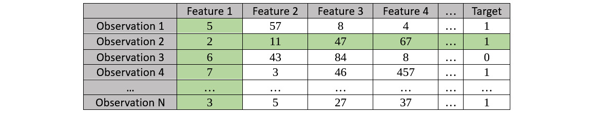
Figure 7.17 – Sample dataset for an ICE plot highlighting Observation 2
- Keep the values in Feature 1 constant and create a bootstrapped dataset; then, calculate the Target values using the trained model. Refer to the following resultant bootstrapped dataset:
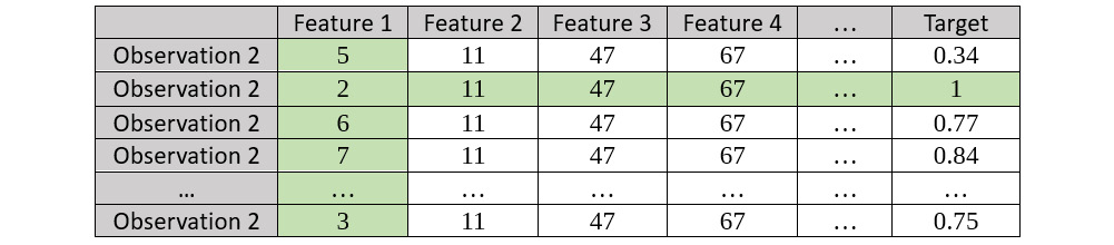
Figure 7.18 – Bootstrapped dataset for Observation 2 for Feature 1
- We repeat this process for all observations against all features.
- The results that are observed from these bootstrapped datasets are plotted on the individual ICE plots per feature.
Let’s see how we can interpret the ICE plot and extract observable information out of the graph. Refer to the following screenshot, which shows the ICE plot we get after running the model explainability interface on the AutoML object that was trained on the Red Wine Quality dataset:
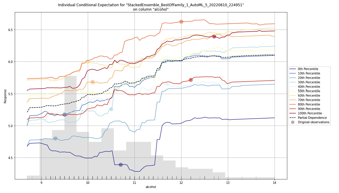
Figure 7.19 – ICE plot for the Red Wine Quality dataset
As the heading states, this is an ICE plot on the alcohol feature column of the dataset for a stacked ensemble model trained by H2O AutoML. Keep in mind that this model is the leader of the list of models trained by AutoML. ICE plots are only plotted for the leader of the dataset. You can also observe the ICE plots of the other models by extracting the models using their model IDs and then running the ice_plot() function on them. Refer to the following code example:
model = h2o.get_model("XRT_1_AutoML_2_20220516_64004")
model.ice_plot(test_dataframe, "alcohol")
On the X-axis of the graph, you have the range of values for the alcohol feature. On the Y-axis, you have the range of values of the predicted outcomes – that is, the quality of the wine.
On the left-hand side of the graph, you can see the legends stating different types of lines and their percentiles. The ICE plot plots the effects for each decile. So, technically, when plotting the ICE plot, you compute a line for every observation. However, in a dataset that contains thousands if not millions of rows of data, you will end up with an equal number of lines on the plot. This will make the ICE plot messy. That is why to better observe this data, you must aggregate the lines together to the nearest decile and plot a single line for every percentile partition.
The dotted black line is the average of all these other percentile lines and is nothing but the PDP line for that feature.
Now that you know how to interpret an ICE plot, let’s look at learning curve plots.
Understanding learning curve plots
The learning curve plot is one of the most used plots by data scientists to observe the learning rate of a model. The learning curve shows how your model learns from the dataset and the efficiency with which it does the learning.
When working on an ML problem, an important question that often needs to be answered is, how much data do we need to train the most accurate model? A learning curve plot can help you understand how increasing the dataset affects your overall model performance.
Using this information, you can decide if increasing the size of the dataset can result in better model performance or if you need to work on your model training to improve your model’s performance.
Let’s observe the learning curve plot we got from our experiment on the Red Wine Quality dataset for the XRT model trained by AutoML:
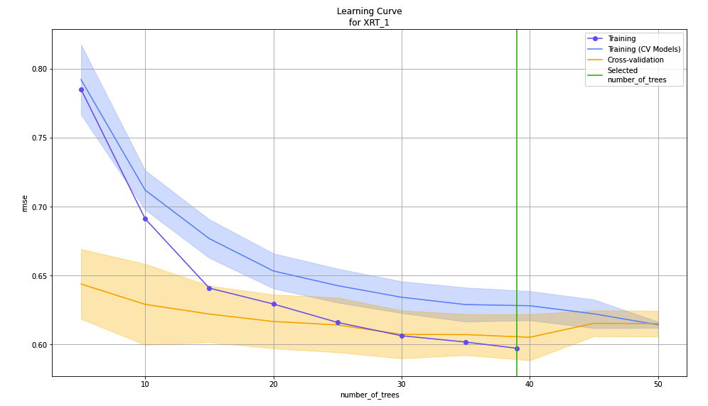
Figure 7.20 – Learning curve plot for the XRT model on the Red Wine Quality dataset
On the X-axis of the graph, you have the number of trees created by the XRT algorithm. As you can see, the algorithm created around 40 to 50 trees in total. On the Y-axis, you have the performance metric, RMSE, which is calculated at every stage during the model training as the algorithm creates the trees.
As shown in the preceding screenshot, the RMSE metric decreases as the algorithm creates more trees. Eventually, the rate at which the RMSE lowers decreases over a certain number of trees created. Any trees created over this number do not contribute to the overall improvement in the model’s performance. Thus, the learning rate eventually decreases over the increase in several trees.
The lines on the graph depict the various datasets that were used by the algorithm during training and the respective RMSE during every instance of creating the trees.
At the time of writing, as of H2O version 3.36.1, the learning curve plot is not part of the default model explainability interface. To plot the learning curve, you must plot it using the following function on the respective model object:
model = h2o.get_model("GLM_1_AutoML_2_20220516_64004")
model.learning_curve_plot()
The learning curve plot is different for different algorithms. The following screenshot shows a learning plot for a GLM model trained by AutoML on the same dataset:
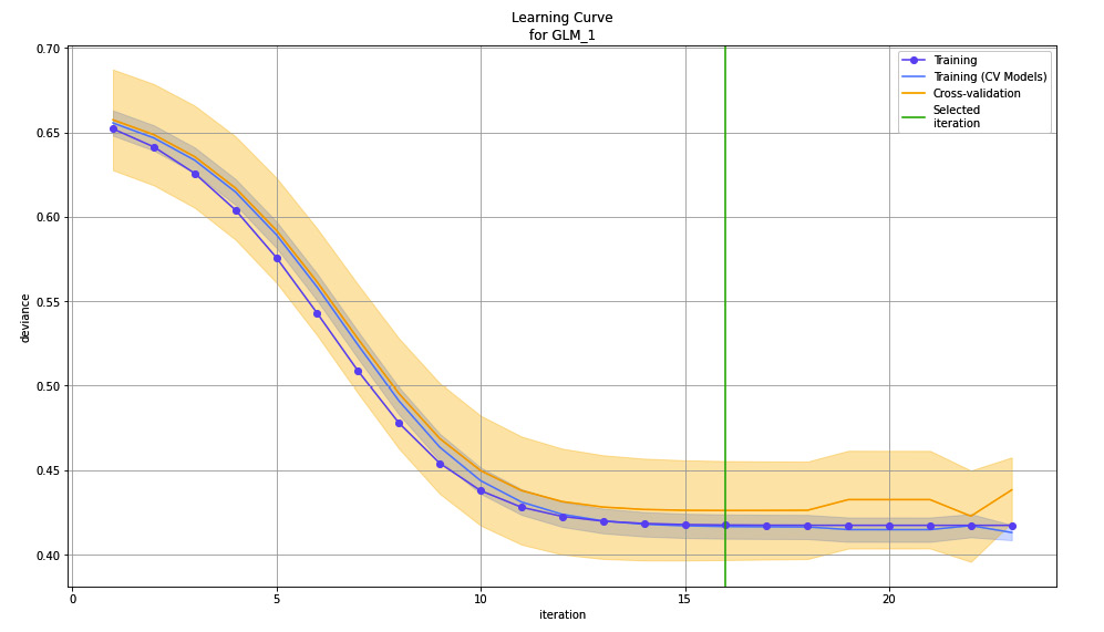
Figure 7.21 – Learning curve plot for the GLM model on the Red Wine Quality dataset
As you can see, instead of the number of trees on the X-axis, we now have iterations. The number of trees is relevant for tree-based algorithms such as XRT and DRF, but linear models such as GLM running on the linear algorithm makes more sense to aid with learning. On the Y-axis, you have deviance instead of RMSE as deviance is more suitable for measuring the performance of a linear model.
The learning curve is different for different types of algorithms, including stacked ensemble models. Feel free to explore the different variations of the learning curve for different algorithms. H2O already takes care of selecting the appropriate performance metric and the steps in learning, depending on the algorithms, so you don’t have to worry about whether you chose the right metric to measure the learning rate or not.
Summary
In this chapter, we focused on understanding the model explainability interface provided by H2O. First, we understood how the explainability interface provides different explainability features that help users get detailed information about the models trained. Then, we learned how to implement this functionality on models trained by H2O’s AutoML in both Python and R.
Once we were comfortable with its implementation, we started exploring and understanding the various explainability graphs displayed by the explainability interface’s output, starting with residual analysis. We observed how residual analysis helps highlight heteroscedasticity in the dataset and how it helps you identify if there is any missing information in your dataset.
Then, we explored variable importance and how it helps you identify important features in the dataset. Building on top of this, we learned how feature importance heatmaps can help you observe feature importance among all the models trained by AutoML.
Then, we discovered how model correlation heatmaps can be interpreted and how they help us identify models with similar prediction behavior from a list of models.
Later, we learned about PDP graphs and how they express the dependency of the overall outcome over the individual features of the dataset. With this knowledge in mind, we explored the SHAP summary and ICE plots, where we understood the two graphs and how each focuses on different aspects of outcome dependency on individual features.
Finally, we explored what a learning plot is and how it helps us understand how the model improves in performance, also called learning, over the number of observations, iterations, or trees, depending on the type of algorithms used to train the model.
In the next chapter, we shall use all the knowledge we’ve learned from the last few chapters and explore the other advanced parameters that are available when using H2O’s AutoML feature.