
6
Understanding H2O AutoML Leaderboard and Other Performance Metrics
When we train ML models, the statistical nuances of different algorithms often make it difficult to compare one model with another model that is trained using a different algorithm. From a professional standpoint, you will eventually need to select the right model to solve your ML problem. So, the question arises: how do you compare two different models solving the same ML problem and decide which one is better?
This is where model performance metrics come in. Model performance metrics are certain numerical metrics that give an accurate measurement of a model’s performance. The performance of a model can mean various things and can also be measured in several ways. The way we evaluate a model, whether it is a classification model or a regression model, only differs by the metrics that we use for that evaluation. You can measure how accurately the model classifies objects by measuring the number of correct and incorrect predictions. You can measure how accurately the model predicted a stock price and note the magnitude of the error between the predicted value and the actual value. You can also compare how the model fairs with outliers in data.
H2O provides plenty of model performance measuring techniques. Most of them are automatically calculated and stored as the model metadata whenever a model is trained. H2O AutoML further automates the selection of models as well. It does so by presenting you with a leaderboard comparing the different performance metrics of the trained models. In this chapter, we will explore the different performance metrics that are used in the AutoML leaderboard, as well as some additional metrics that are important for users to know.
We shall explore these performance metrics according to the following sections:
- Exploring the H2O AutoML leaderboard performance metrics
- Exploring other important performance metrics
By the end of this chapter, you should understand how a model’s performance is measured and how we can use these metrics to get an understanding of its prediction behavior.
So, let’s begin by exploring and understanding the H2O AutoML leaderboard performance metrics.
Exploring the H2O AutoML leaderboard performance metrics
In Chapter 2, Working with H2O Flow (H2O’s Web UI), once we trained the models on a dataset using H2O AutoML, the results of the models were stored in a leaderboard. The leaderboard was a table containing the model IDs and certain metric values for the respective models (see Figure 2.33).
The leaderboard ranks the models based on a default metric, which is ideally the second column in the table. The ranking metrics depend on what kind of prediction problem the models are trained on. The following list represents the ranking metrics used for the respective ML problems:
- For binary classification problems, the ranking metric is AUC.
- For multi-classification problems, the ranking metric is the mean per-class error.
- For regression problems, the ranking metric is deviance.
Along with the ranking metrics, the leaderboard also provides some additional performance metrics for a better understanding of the model quality.
Let’s try to understand these performance metrics, starting with the mean squared error.
Understanding the mean squared error and the root mean squared error
Mean Squared Error (MSE), also called Mean Squared Deviation (MSD), as the name suggests, is a metric that measures the mean of the squares of errors of the predicted value against the actual value.
Consider the following regression scenario:

Figure 6.1 – The MSE in a regression scenario
This is a generic regression scenario where the line of regression passes through the data points plotted on the graph. The trained model makes predictions based on this line of regression. The error values show the difference between the actual value and the predicted value, which lies on the line of regression, as denoted by the red lines. These errors are also called residuals. When calculating the MSE, we square these errors to remove any negative signs, as we are only concerned with the magnitude of the error and not its direction. The squaring also gives more weight to larger error values. Once all the squared errors have been calculated for all the data points, we calculate the mean, which gives us the final MSE value.
The MSE is a metric that tells you how close the line of regression is to the data points. Accordingly, the fewer error values the line of regression has against the data points, the lower your MSE value will be. Thus, when comparing the MSE of different models, the model with the lower MSE is ideally the more accurate one.
The mathematical formula for the MSE is as follows:

Here, n would be the number of data points in the dataset.
The Root Mean Squared Error (RMSE), as the name suggests, is the root value of the MSE. So accordingly, its mathematical formula is as follows:

The difference between the MSE and the RMSE is straightforward. While the MSE is measured in the squared units of the response column, the RMSE is measured in the same units as the response column.
For example, if you have a linear regression problem that predicts the price of its stock in terms of dollars, the MSE measures the errors in terms of squared dollars, while RMSE measures the error value as just dollars. Hence, the RMSE is often used over the MSE, as it is slightly easier to interpret the model quality from the RMSE than the MSE.
Congratulations – you are now aware of what MSE and RMSE metrics are and how they can be used to measure the performance of a regression model.
Let’s move on to the next important performance metric, which is the confusion matrix.
Working with the confusion matrix
A classification problem is an ML problem where the ML model tries to classify the data inputs into the pre-specified classes. What makes the performance measurement of classification models different from regression models is that in classification problems, there is no numeric magnitude of the error between the predicted value and the actual value. The predicted value is either correctly classified into the right class or it is incorrectly classified. To measure model performance for classification problems, data scientists rely on certain performance metrics that are derived from a special type of matrix called a confusion matrix.
A confusion matrix is a tabular matrix that summarizes the correctness of the prediction results of a classification problem. The matrix presents the count of correct and incorrect predicted values alongside each other, as well as breaking them down by each class. This matrix is called a confusion matrix, as it shows how confused the model is when classifying the values.
Consider the example of the heart disease prediction dataset we used. It is a binary classification problem where we want to predict whether a person with certain health conditions is likely to suffer from heart disease or not. In this case, the prediction is either Yes, also called a positive classification, meaning the person is likely to suffer from heart disease, or No, also called a negative classification, meaning the person is not likely to suffer from heart disease.
The confusion matrix of this scenario will be as follows:

Figure 6.2 – A binomial confusion matrix
The rows of the confusion matrix correspond to the classifications predicted by the model. The columns of the confusion matrix correspond to the actual class values of the model.
In the top-left corner of the matrix, we have true positives – these are the number of Yes actuals that were correctly predicted as Yes. In the top-right corner, we have the false positives – these are the number of Yes actuals that were incorrectly predicted as No. In the bottom-left corner, we have false negatives – these are the number of No actuals that were incorrectly predicted as Yes values. And finally, we have the true negative – these are the number of No actuals that were correctly predicted as No.
The confusion matrix for a multinomial classification with six possible classes will look as follows:

Figure 6.3 – A multinomial confusion matrix
Using the confusion matrix of two classification models, you can compare the number of true positives and true negatives that were predicted by the individual algorithms and select the one with the greater number of correct predictions as the better model.
Despite being very easy to interpret the prediction quality of a model using the confusion matrix, it is still difficult to compare two or more models solely based on the number of true positives and true negatives.
Consider a scenario where you want to classify some medical records to identify whether the patient has a brain tumor. Let’s assume that a specific model’s confusion matrix has a high number of true positives and true negatives compared to other models and also has a high number of false positives. In this case, the model will incorrectly flag a lot of normal medical records as indicative of a potential brain tumor. This might result in hospitals making incorrect decisions and performing risky surgeries that were never needed. In such a scenario, models with less accuracy but the smallest number of false positives are preferable.
Hence, more sophisticated metrics are developed on top of the confusion matrix. They are as follows:
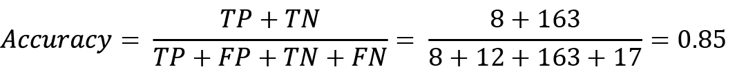
- Accuracy: Accuracy is a metric that measures the number of correctly predicted positive and negative predictions against the total number of predictions made. This is calculated as follows:

Here, the abbreviations stand for the following:
- TP stands for True Positive.
- TN stands for True Negative.
- FP stands for False Positive.
- FN stands for False Negative.
This metric is useful when you want to compare how well a classification model correctly makes predictions, irrespective of whether the prediction value is positive or negative.
- Precision: Precision is a metric that measures the number of correct positive predictions made compared to the total number of positive predictions made. This is calculated as follows:

This metric is especially useful when measuring the performance of a classification model that is trained on data with a high number of negative results and only a few positive results. Precision is not affected by the imbalance of positive and negative classification values, as it only considers positive values.
- Sensitivity or recall: Sensitivity, also known as recall, is a probability measurement for how well a model can predict true positives. Sensitivity is measured by identifying what percentage of predictions were correctly identified as positive in a binomial classification. This is calculated as follows:

If your classification ML problem aims to accurately identify all the positive predictions, then the sensitivity of the model should be high.
- Specificity: While sensitivity is the probability measurement of how well a model can predict true positives, specificity is measured by identifying what percentage of predictions were correctly identified as negative in a binomial classification. This is calculated as follows:
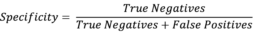
If your classification ML problem aims to accurately identify all the negative predictions, then the specificity of the model should be high.
There is always a trade-off between sensitivity and specificity. A model with high sensitivity will often have very low specificity and vice versa. Thus, the context of the ML problem plays a very important part in deciding whether you want a model with high sensitivity or high specificity to solve the problem.
For multinomial classification, you calculate the sensitivity and specificity for each class type. For sensitivity, your true positives will remain the same, but the false negatives will change depending on the number of incorrect predictions made for that class. Similarly, for specificity, the true negatives will remain the same – however, the false positives will change depending on the number of incorrect predictions made for that class.
Now that you have understood how a confusion matrix is used for measuring classification models and how sensitivity and specificity are built on top of it, let’s now move on to the next metric, which is the receiver operating characteristic curve and its area under the curve.
Calculating the receiver operating characteristic and its area under the curve (ROC-AUC)
Another good way of comparing classification models is via a visual representation of their performance. One of the most widely used visual evaluation metrics is the Receiver Operating Characteristic and its Area Under the Curve (ROC-AUC).
The ROC-AUC metric is split into two concepts:
- The ROC curve: This is the graphical curve plotted on a graph that summarizes the model’s classification ability at various thresholds. The threshold is a classification value that separates the data points into different classes.
- AUC: This is the area under the ROC curve that helps us compare which classification algorithm performed better depending on whose ROC curve covers the most area.
Let’s consider an example to better understand how ROC-AUC can help us compare classification models. Refer to the following sample dataset:
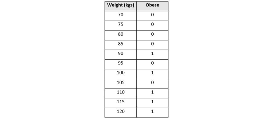
Figure 6.4 – An obesity dataset
This dataset has two columns:
- Weight (kgs): This is a numerical column that contains the weight of a person in kilograms
- Obese: This is a categorical column that contains either 1 or 0, where 1 indicates the person is obese and 0 indicates that the person is not obese
Let’s plot this dataset onto a graph where Weight, being the independent variable, is on the x-axis, and Obese, being the dependent variable, is on the y-axis. This simple dataset on a graph will look as follows:

Figure 6.5 – The plotted obesity dataset
Let’s fit a classification line through this data using one of the simplest classification algorithms called logistic regression. Logistic regression is an algorithm that predicts the probability that a given sample of data belongs to a certain class. In our example, the algorithm will predict the probability of whether the person is obese or not depending on their weight.
The logistic regression line will look as follows:

Figure 6.6 – A plotted obesity dataset with a classification line
Note that since logistic regression predicts the probability that data might belong to a certain class, we have converted the y-axis into the probability that the person is obese.
During prediction, we will first plot the sample weight data of the person on the x-axis. We will then find its respective y value on the line of classification. This value is the probability that the respective person is obese.
Now, to classify whether the person is obese or not, we will need to decide what the probability cut-off line that separates obese and not obese will be. This cut-off line is called the threshold. Any probability value above the threshold can be categorized as obese and any value below it can be categorized as not obese. The threshold can be any value between 0 and 1:

Figure 6.7 – An obesity dataset classification with a threshold line
As you can see from the diagram, multiple values are incorrectly classified. This is bound to happen in any classification problem. So, to keep a track of the correct and incorrect classification, we will create a confusion matrix and calculate sensitivity and specificity to evaluate how well the model performs for the selected threshold.
But as mentioned previously, there can be many thresholds for classification. Thresholds with high values will minimize the number of false positives but the trade-off is that classification for that class will become stricter, leading to more false negatives. Similarly, if the threshold value is too low, then we will end up with more False Positives.
Which threshold performs best depends on your ML problem. However, a comparative study of different thresholds is needed to find a suitable value. Since you can create any number of thresholds, you will end up creating plenty of confusion matrices eventually. This is where the ROC-AUC metric comes in.
The ROC-AUC metric summarizes the performance of the model at different thresholds and plots them on a graph. In this graph, the x-axis is the False Positive rate, which is 1 - specificity, while the y-axis is the true positive rate, which is nothing but sensitivity.
Let’s plot the ROC graph for our sample dataset. We will start by using a threshold that classifies all samples as obese. The threshold on the graph will look as follows:

Figure 6.8 – A plotted obesity classification with a very low threshold
We will now need to calculate the sensitivity (and 1 - specificity) values needed to plot our ROC curve, so accordingly, we will need to create a confusion matrix first. The confusion matrix for this threshold will look as follows:
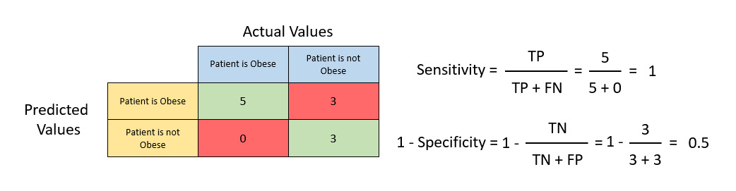
Figure 6.9 – A confusion matrix with sensitivity and 1 - specificity
Calculating the sensitivity and 1 - specificity values using the formula mentioned previously, we get a sensitivity equal to 1 and a 1 - specificity equal to 0.5. Let’s plot this value in the ROC graph. The ROC graph will look as follows:

Figure 6.10 – The ROC graph
The blue line in the diagram indicates that the sensitivity is equal to the 1 - specificity – in other words, the true positive rate is equal to the False Positive rate. Any ROC points on this line indicate that the model trained using this threshold has an equal likelihood of predicting a correct positive as predicting an incorrect positive. So, to find the best threshold, we aim to find a ROC point that has as high a sensitivity as possible and as low a 1 - specificity as possible. This would indicate that the model has a high likelihood of predicting a correct positive prediction and a much smaller likelihood of predicting an incorrect positive prediction.
Let’s now raise the threshold and repeat the same process to calculate the ROC value for this new threshold. Let’s assume this new threshold has a sensitivity of 1 and a 1 - specificity of 0.25. Plotting this value in the ROC graph, we get the following result:

Figure 6.11 – A ROC graph with the new threshold
The new ROC value for the new threshold is on the left side of the blue line and also of the previous ROC point. This indicates that it has a lower false positive rate compared to the previous threshold. Thus, the new threshold is better than the previous one.
Raising the threshold value way too high will make the model predict that all the values are not obese. Basically, it will incorrectly predict all the values as false, increasing the number of false negatives. Based on the sensitivity equation, the higher the number of false negatives, the lower the sensitivity. So, this will eventually lower your sensitivity, reducing the model’s ability to predict the true positives.
We repeat this same process for different threshold values and plot their ROC values on the ROC graph. If we connect all these dots, we get the ROC curve:
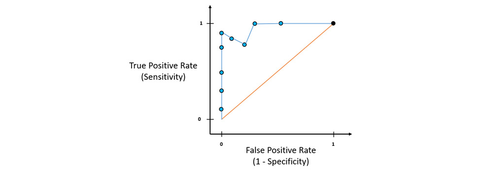
Figure 6.12 – The ROC graph with a ROC curve
Just by looking at the ROC graph, you can identify which threshold values are better than the others, and depending on how many false positive predictions your ML problem can tolerate, you can select the ROC point with the right false positive rate as your final threshold value reference. This explains what the ROC curve does.
Now, suppose you have another algorithm trained with different thresholds and you plot its ROC points on this same graph. Assume the plots look as follows:

Figure 6.13 – A ROC graph with multiple ROC curves
How would you compare which algorithm performed better? Which threshold is the optimum one for that algorithm’s model?
This is where AUC helps us. AUC is nothing but the area under the ROC curve. The whole ROC graph will have a total area of 1. The red line splits the area into half, so ideally, all potentially good algorithms should have an AUC greater than 0.5. The greater the AUC is, the better the algorithm is:
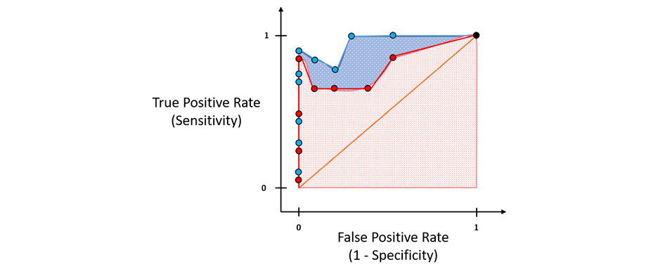
Figure 6.14 – The AUC of the ROC curve
Just by visualizing this, you can see which algorithm is better from its AUC. Similarly, the AUC values help engineers and scientists identify which algorithm to choose and which threshold to use as the optimal ML model for classification.
Congratulations, you just understood how the ROC-AUC metric works and how it can help you compare model performance. Let’s now move on to another similar performance metric called the Precision-Recall curve (PR curve).
Calculating the precision-recall curve and its area under the curve (AUC-PR)
With ROC-AUC, despite being a very good metric to compare models, there is a minor drawback to relying on it exclusively. In a very imbalanced dataset, where there is a large number of true negative values, the x-axis of the ROC graph will be very small, as specificity has a true negative value as its denominator. This forces the ROC curve toward the left side of the graph, raising the ROC-AUC value toward 1, which is technically incorrect.
This is where the PR curve proves beneficial. The PR curve is similar to the ROC curve, the only difference being that the PR curve is a function that uses precision on the y-axis and recall on the x-axis. Neither precision nor recall uses true negatives in their calculation. Hence, the PR curve and its AUC metric are suitable when there is an imbalance in the classes of the dataset that impacts the true negatives during prediction, or when your ML problem is not concerned with true negatives at all.
Let’s understand the PR curve further using an example. We will use the same sample obesity dataset that we used for understanding the ROC-AUC curve. The process of plotting the records of the dataset on the graph and creating its confusion matrix is the same as for the ROC-AUC curve.
Now, instead of calculating the sensitivity and 1 – specificity from the confusion matrix, this time, we shall calculate the precision and recall values:

Figure 6.15 – Calculating the precision and recall values
As you can see from the preceding diagram, we got precision values of 0.625 and recall values of 1. Let’s plot these values onto the PR graph as shown in the following diagram:

Figure 6.16 – The PR graph
Similarly, by moving the threshold line and creating the new confusion matrix, the precision and recall values will change based on the distribution of the predictions in the confusion matrix. We repeat this same process for different threshold values, calculate the precision and recall values, and then plot them onto the PR graph:

Figure 6.17 – A PR graph and its PR curve
The blue line that joins all the points is the PR curve. The point that represents a threshold value closest to the black point, so closest to having a precision value of 1 and a recall value of 1, is the ideal classifier.
When comparing different algorithm models, you will have multiple PR curves in the PR graph:

Figure 6.18 – A PR graph with multiple PR curves
The preceding diagram shows you the multiple PR curves that can be plotted on the same graph to give you a better comparative view of the performances of different algorithms. With one glance, you can see that the algorithm represented by the blue line has a threshold value that is closest to the black point and should ideally be the best performing model.
Just as with ROC-AUC, you can also use the AUC-PR to calculate the area under the PR curves to get a better understanding of the performances of different algorithms. Based on this, you know that the algorithm represented by the red PR curve is better than the one with the yellow curve and the algorithm represented by the blue PR curve is better than both the red and yellow curves.
Congratulations! You now understand the AUC-PR metric in the H2O AutoML leaderboard and how it can be another good model performance metric that you can refer to when comparing models trained by H2O AutoML.
Let’s now move on to the next performance metric, which is called log loss.
Working with log loss
Log loss is another important model performance metric for classification models. It is primarily used to measure the performance of binary classification models.
Log loss is a way of measuring the performance of a classification model that outputs classification results in the form of probability values. The probability values can range from 0, which means that the data has zero probability that it belongs to a certain positive class, to 1, which means the data has a 100% chance of belonging to a certain positive class. The log loss value can range from 0 to infinity and the goal of all ML models is to minimize the log loss as much as possible. Any model with a log loss value as close to 0 as possible is regarded as the better performing model.
Log loss calculation is entirely statistical. However, it is important to understand the intuition behind the mathematics to better understand its application when comparing model performances.
Log loss is a metric that measures the divergence of the predicted probability from the actual value. So, if the predicted probability diverges very little from the actual value, then your log loss value will be forgiving – however, if the divergence is greater, the log loss value will be that much more punishing.
Let’s start by understanding what prediction probability is. We shall use the same obesity dataset that we used for the ROC-AUC curve. Assume we ran a classification algorithm that calculated the prediction probability that the person is obese and let’s add those values to a column in the dataset, as seen in the following screenshot:

Figure 6.19 – The obesity dataset with the prediction probabilities added
We will have a certain threshold value that decides what the prediction probability value has to be for us to classify the data as obese or not obese. Let’s assume the threshold is 0.5 – in this case, a prediction probability value above 0.5 is classified as obese and anything below it is classified as not obese.
We now calculate the log loss value of each data point. The equation for calculating the log loss of each record is as follows:

Here, the equation can be broken down as follows:
- y is the actual classification value, that is, 0 or 1.
- p is the prediction probability.
- log is the natural logarithm of the number.
In our example, since we are using the obese class as a reference, we shall set y to 1. Using this equation, we calculate the log loss value of individual data values as follows:
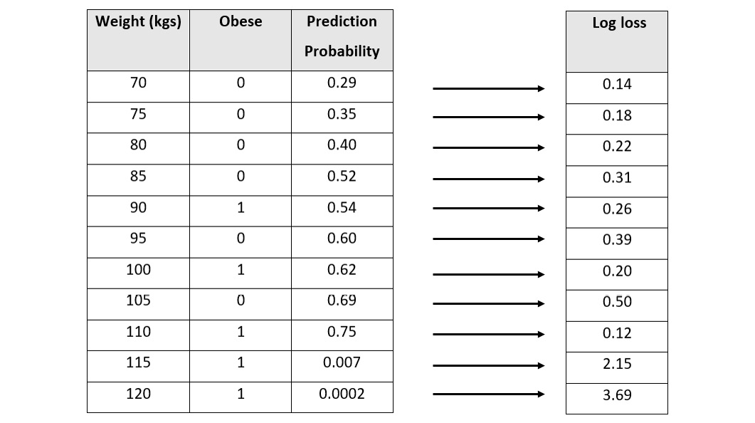
Figure 6.20 – An obesity dataset with the log loss values per record
Now, let’s plot these values into a log loss graph where we set the log loss values on the y-axis and the prediction probability on the x-axis:
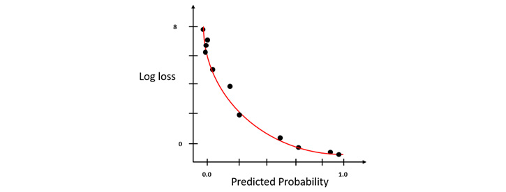
Figure 6.21 – A log loss graph where y = 1
You will notice that the log loss value exponentially rises as the predicted probability diverges away from the actual value. The lesser the divergence, the less the increase in log loss will be. This is what makes log loss a good comparison metric, as it compares not only which model is good or bad but also how good or bad it is.
Similarly, if you wanted to use the not obese class as a reference for log loss, then you would inverse the prediction probabilities, calculate the log loss values, and plot the graph, or you could just calculate the log loss value by setting y to 0 and use the log loss values calculated to plot the log loss graph. This graph will be a mirror image of the previous graph (see Figure 6.21):
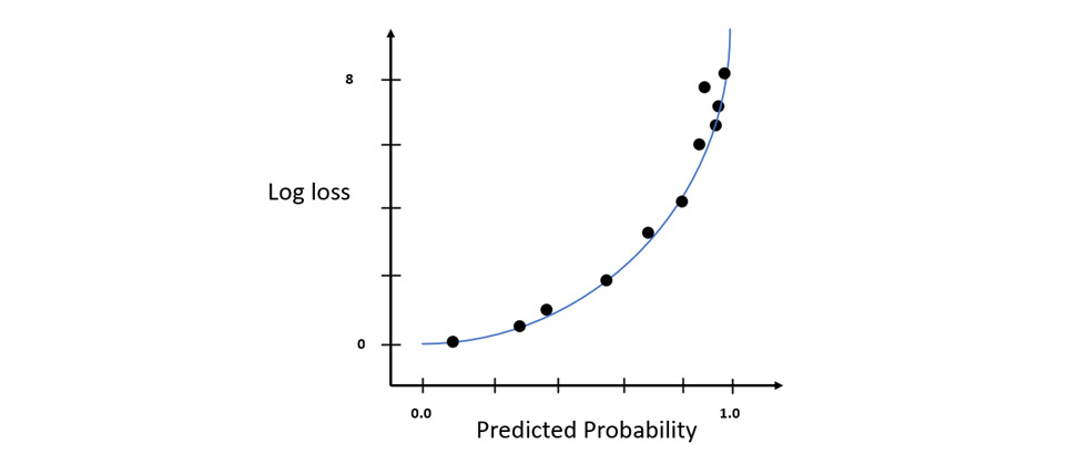
Figure 6.22 – A log loss graph where y = 0
The log loss value of the model, also called the skill of the model, is the average of the log loss values for all the records in the dataset. Accordingly, the equation for the log loss of the model is as follows:

Here, the equation can be broken down as follows:
- n is the total number of records in the dataset.
- y is the actual classification value, that is, 0 or 1.
- p is the prediction probability.
- log is the natural logarithm of the number.
In an ideal world, a model with perfect scoring capabilities and skills is said to have a log loss equal to 0. To correctly apply log loss to compare models, both models must be trained using the same dataset.
Congratulations! We have just covered how log loss is statistically calculated. In the next section, we shall explore some other important metrics that are not a part of the H2O AutoML leaderboard but are nonetheless important in terms of understanding model performance.
Exploring other model performance metrics
The H2O AutoML leaderboard summarizes the model performances based on certain commonly used important metrics. However, there are still plenty of performance metrics in the field of ML that describe different skills of the ML model. These skills can often be the deciding factor in what works best for your given ML problem and hence, it is important that we are aware of how we can use these different metrics. H2O also provides us with these metrics values by computing them once training is finished and storing them as the model’s metadata. You can easily access them using built-in functions.
In the following subsections, we shall explore some of the other important model performance metrics, starting with F1.
Understanding the F1 score performance metric
Precision and recall, despite being very good metrics to measure a classification model’s performance, have a trade-off. Precision and recall cannot both have high values at the same time. If you increase the precision by adjusting your classification threshold, then it impacts your recall, as the number of false negatives might increase, reducing your recall value, and vice versa.
The precision metric works to minimize incorrect predictions, while the recall metric works to find the greatest number of positive predictions. So, technically, we need to find the right balance between these two metrics.
This is where the F1 score performance metric comes into the picture. The F1 score is a metric that tries to maximize both precision and recall at the same time and gives an overall score for the model’s performance.
The F1 score is the harmonic mean of the precision and recall values. The harmonic mean is just one of the variations for calculating the mean of values. With the harmonic mean, we calculate the reciprocal of the arithmetic mean of the reciprocals of all the observations. The reason we use a harmonic mean for calculating the F1 score is that using a general arithmetic mean would lead to the equation giving equal importance to all degrees of error. The harmonic mean, on the other hand, punishes high values of error by lowering the F1 score accordingly. This is the reason why the harmonic mean is used to generate the F1 score, as the score value calculated gives a better representation of the model’s performance.
The F1 score ranges from 0 to 1, where 1 indicates that the model has perfect precision and recall values, while 0 indicates that either the precision or recall value is 0.
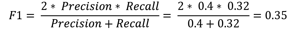
The equation for calculating the F1 score is as follows:

Let’s take the example of a confusion matrix as follows:
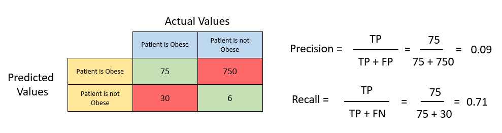
Figure 6.23 – An example confusion matrix with precision and recall values
Let’s calculate the precision value for the matrix:

Similarly, lets now calculate the recall value of the matrix:
Now, plugging the precision and recall values into the F1 score equation, we get the following:

We got an F1 score of 0.15. You can now compare the performance of another model by similarly calculating its F1 score and comparing it to this one. If the F1 score of the new model is greater than 0.15, then that model is more performant than this one.
The benefit of the F1 score is that when comparing classification models, you don’t need to balance the precision and recall values of multiple models and make a decision based on the comparisons between two contrasting metrics. The F1 score summarizes the optimum values of precision and recall, making it easier to identify which model is better.
Despite being a good metric, the F1 score still has certain drawbacks. Firstly, the F1 score does not consider true negatives when calculating the score. Secondly, the F1 Score does not adequately capture the performance of a multi-class classification problem. You can technically calculate the F1 score for multi-class classification problems using macro-averaging – however, there are better metrics that can be used instead.
Let’s look at one such metric that overcomes the drawbacks of the F1 score, which is the absolute Matthews correlation coefficient.
Calculating the absolute Matthews correlation coefficient
Consider an example where we are trying to predict, based on a given fruit’s size, whether it is a grape or a watermelon. We have 200 samples, out of which 180 are grapes and 20 are watermelon. Pretty simple, yes – the bigger the size, the more likely it is to be a watermelon, while a smaller size indicates it is a grape. Assume that we trained a classifier taking the grape as the positive class. This classifier was able to classify the fruits as follows:
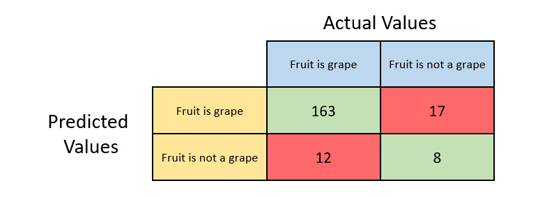
Figure 6.24 – A fruit classification confusion matrix with the grape as the positive class
Let’s quickly calculate the scalar classification metrics that we previously covered.
The accuracy of the classifier will be as follows:

The precision of the classifier will be as follows:

The recall of the classifier will be as follows:

The F1 score of the classifier will be as follows:

Based on these metric values, it seems that our classifier is performing really well when making a prediction for grapes. So, what if we want to predict watermelons instead? Let’s change the positive class to watermelons instead of grapes. The confusion matrix for this scenario will be as follows:
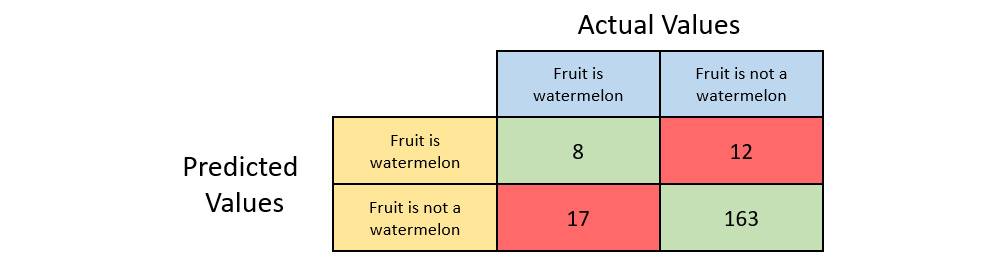
Figure 6.25 – A fruit classification confusion matrix with watermelon as the positive class
We’ll quickly calculate the scalar classification metrics that we previously covered.
The accuracy of the classifier will be as follows:
The precision of the classifier will be as follows:

The recall of the classifier will be as follows:

The F1 score of the classifier will be as follows:
As we can see from the metric values, accuracy has remained the same but precision, recall, and the F1 score have drastically gone down. Accuracy, precision, recall, and the F1 score, despite being very good metrics for measuring classification performance, have some drawbacks when there is a class imbalance in the dataset. In our grape and watermelon dataset, we only had 20 samples of watermelon in the dataset but 180 samples of grape. This imbalance in data can cause asymmetry in the metric calculation, which can be misleading.
Ideally, as data scientists and engineers, it is often advisable to keep the data as symmetrical as possible to keep the measurements of these metrics as relevant as possible. However, in a real-world dataset with millions of records, it will be difficult to maintain this symmetry. So, it would be beneficial to have some sort of metric that treats both the positive and negative class as equal and gives an overall picture of the classification model’s performance.
This is where the absolute Matthews Correlation Coefficient (MCC), also called the phi coefficient, comes into play. The equation for the MCC is as follows:

During computation, it treats the actual class and the predicted class as two different variables and identifies the correlation coefficient between them. The correlation coefficient is nothing but a numerical value that represents some statistical relationship between the variables. The higher this correlation coefficient value, the better your classification model is.
The MCC values range from -1 to 1. 1 indicates that the classifier is perfect and will always classify the records correctly. A MCC of 0 indicates that there is no correlation between the classes and the prediction from the model is completely random. -1 indicates that the classifier will always incorrectly classify the records.
A classifier with a MCC value of -1 does not mean the model is bad in any sense. It only indicates that the correlation coefficient between the predicted and the actual class is negative. So, if you just reverse the predictions of the classifier, you will always get the correct classification prediction. Also, the MCC is perfectly symmetrical – thus, it treats all the classes equally to provide a metric that considers the overall performance of the model. Switching the positive and negative classes does not affect the MCC value. Thus, if you just take the absolute value of the MCC, it still does not lose the value’s relevance. H2O often uses the absolute value of MCC for an easier understanding of the model’s performance.
Let’s calculate the MCC value of the fruit classification confusion matrix with grape as the positive class:

Similarly, let’s calculate the MCC value of the fruit classification confusion matrix with watermelon as the positive class:

As you can see, the MCC value remains the same, at 0.277, even if we switch the positive and negative classes. Also, A MCC of 0.277 indicates that the predicted class and the actual class are weakly correlated, which is correct considering the classifier was bad at classifying watermelons.
Congratulations, you now understand another important metric called the absolute MCC.
Let’s now move to the next performance metric, which is R2.
Measuring the R2 performance metric
R2, also called the coefficient of determination, is a regression model performance metric that aims to explain the relationship between the dependent variable and the independent variable in terms of how much of a change in the independent variable affects the dependent variable.
The value of R2 ranges from 0 to 1, where 0 indicates that the regression line is not correctly capturing the trend in the data and 1 indicates that the regression line perfectly captures the trend in the data.
Let’s better understand this metric using a graphical example of a dataset. Refer to the below image for the height-to-weight regression graph:
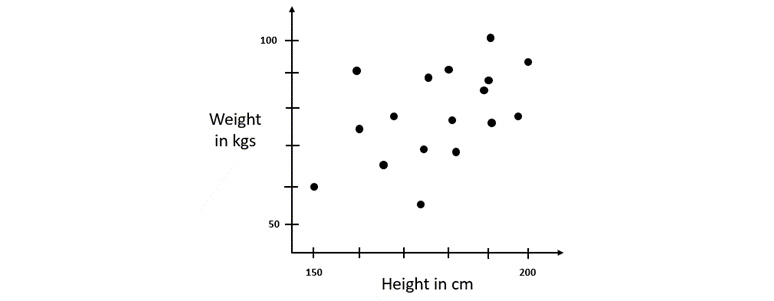
Figure 6.26 – A height-to-weight regression graph
The dataset has two columns:
- Height: This is a numerical column that contains the height of a person in centimeters
- Weight: This is a numerical column that contains the weight of a person in kilograms
Using this dataset, we are trying to predict someone’s weight based on their height.
So firstly, let’s use the average of all the weights as a general regression line to predict the weights. Technically, it does make sense, as the majority of people will have an average range of weight for a grown adult body – even though there might be some errors, it is still a plausible way of predicting a person’s weight.
If we plot this dataset on a graph, the mean value used for prediction will look as follows:
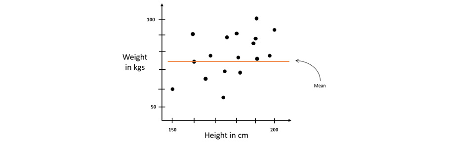
Figure 6.27 – The height-to-weight regression graph with a mean line
As you can see, there is definitely some error between the predicted values of the weight, which is the mean, and the actual values. As mentioned previously, this kind of error is called a residual. Calculating the square of the residuals gives us the squared error. The sum of these squared errors of all the records gives us the variation around the mean line.
Now let’s perform linear regression and fit a line through the data so that we get another regression line. This regression line should ideally be a better predictor than using the mean value alone. The regression line on the graph should look as follows:
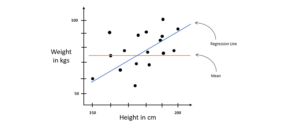
Figure 6.28 – The height-to-weight regression dataset with a regression line
Let’s calculate the residual square of errors for this line too – this gives us the variation around the regression line.
Now, we need to figure out a way to identify which line is better, regression or mean, and by how much. This is where R2 can be used to compare the two regression lines. The equation for calculating R2 is as follows:

Let’s assume the sum of squares of residuals around the regression line is 7 and the sum of squares of residuals around the mean line is 56. Plugging these values into the R2 equation, we get the following value:

The value 0.875 is a percentage. This value explains that 87.5 percent of the total variation in the values of y is described by the variations in values of x. The remaining 12.5 percent may be because of some other factors in the dataset such as muscle mass, fat content, or any other factor.
From an ML perspective, a higher value of R2 indicates that the relationship between the two variables explains the variations in the data and as such, the linear model has captured the pattern of the dataset accurately. A lower R2 value indicates that the linear model has not fully captured the pattern of the dataset and there must be some other factors that contribute to the dataset’s pattern.
This sums up how the R2 metric can be used to measure to what degree the linear model is correctly capturing the trends in the data.
Summary
In this chapter, we focused on understanding how we can measure the performance of our ML models and how we can choose one model over the other depending on which is more performant. We started by exploring the H2O AutoML leaderboard metrics since they are the most readily available metrics that AutoML provides out of the box. We first covered what the MSE and the RMSE are, what the difference between them is, and how they are calculated. We then covered what a confusion matrix is and how we calculate accuracy, sensitivity, specificity, precision, and recall from the values in the confusion matrix. With our new understanding of sensitivity and specificity, we understood what a ROC curve and its AUC are, and how they can be used to visually measure the performance of different algorithms, as well as the performance of different models of the same algorithms trained on different thresholds. Building on the ROC-AUC metric, we explored the PR curve, its AUC, and how it overcomes the drawbacks faced by the ROC-AUC metric. And finally, within the leaderboard, we understood what log loss is and how we can use it to measure the performance of binary classification models.
We then explored some important metrics outside of the realm of the leaderboard, starting with the F1 score. We understood how the F1 score incorporates both recall and precision into a single metric. We then understood the MCC and how it overcomes the drawbacks of precision, recall, and the F1 score when measured against imbalanced datasets. And finally, we explored the R2 metrics, which explain the relationship between the dependent variable and the independent variable in terms of how much of a change in the independent variable affects the dependent variable.
With this information in mind, we are now capable of correctly measuring and comparing models to find the most performant model to solve our ML problems. In the next chapter, we shall explore more about the various model explainability features that H2O provides, which give advanced details about a model and its features.