
We've looked at a lot of things we can do with dimensional data, and we've picked apart how to build cubes and mine the data contained in them. However, most of our work has been in BIDS, which isn't exactly a user-friendly front end. So how do we get the value of our OLAP solutions out to "the general population"? In this chapter we'll look at the various front ends we can leverage to display the data in our cubes.
We'll start with Excel 2007, which we've used in a few exercises. I'll review connecting to an OLAP data source, and building pivot tables and pivot charts. Then I'll show how to use native Excel functions on OLAP data to create some presentable interactive reports. Also from the Office suite, I'll show how to connect Visio to SSAS for rendering data using Visio shapes.
We'll also look at publishing Excel spreadsheets to SharePoint Excel Services for other users. On the topic of SharePoint, we're also going to check out the new KPI lists feature in MOSS 2007, which enables publishing OLAP data in the form of scorecard-style green/yellow/red indicators.
For static consumption of dimensional data, we'll look at SQL Server Reporting Services. In 2008 there were significant improvements in the charting engine and some great new features in reports in general. We'll definitely leverage these improvements for our OLAP charting. We'll also look at the new Report Builder that gives average users the ability to create their own reports.
I'll spend some time on PerformancePoint and ProClarity—Microsoft's business intelligence tools, which were recently rolled into SharePoint. PerformancePoint provides the ability to build dashboards in SharePoint for tracking performance metrics. ProClarity is a great tool for ad-hoc analysis.
Finally we'll look at some ways to work with Analysis Services from code, using both Analysis Management Objects (manipulating cubes via an object model) and ADOMD.NET (running queries against multidimensional data sources).
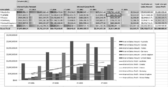
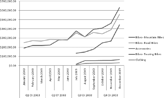
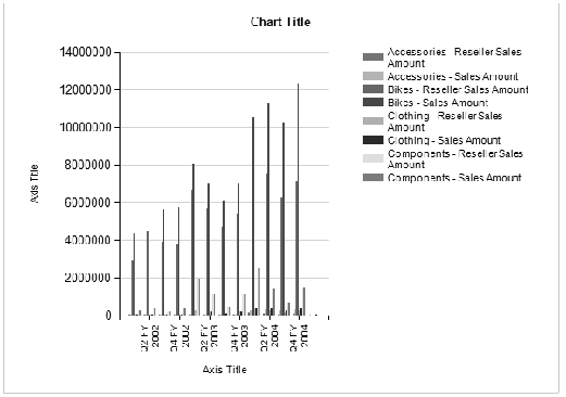
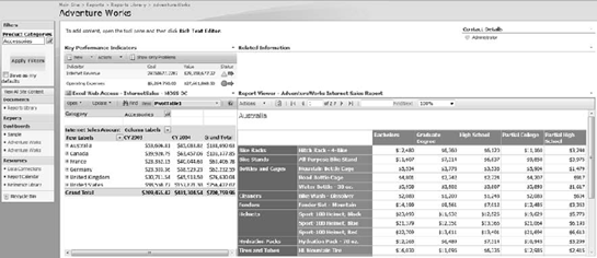
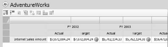
In earlier chapters we used Excel to view cube data and as a data mining client. In this chapter we'll dig a bit deeper into the capabilities of Excel as a front end for Analysis Services. Aside from the basic usefulness as a browser similar to the browser in BIDS, you also have all the formatting and analysis features of Excel, truly blurring the line between the back-end OLAP engine and the desktop tools. The end result can be very powerful and informative reports, as shown in Figure 14-1.
Note
This section is wholly about Excel 2007. While Excel 2003 does have a plug-in available that gives similar capabilities, we'll be sticking with the latest version of Excel for this discussion.
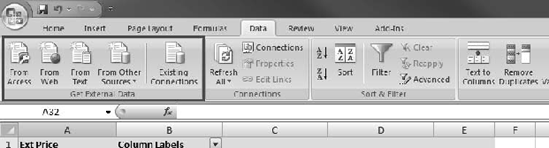
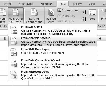
The starting point for bringing OLAP data into Excel is the Data tab in the ribbon. The Data tab has a number of features related to working with tables of numbers in Excel. However, we're going to start with the section on the far left—Get External Data, highlighted in Figure 14-2. Note the listed options—importing data from Access, web-based tables (while we're not covering this here, it's very cool—check it out), and text (importing CSV files).
Those three options, with the options under "From Other Sources" (which we'll look at in a moment), are to create new data connections, which will be stored in the local file system. If you already have the data connection you need, then you can click the Existing Connections button to browse for it. This will allow you to look for connections in either the local file system or a SharePoint data connection library. However, since we don't have a connection already, we want to check options available under the From Other Sources drop-down, shown in Figure 14-3.
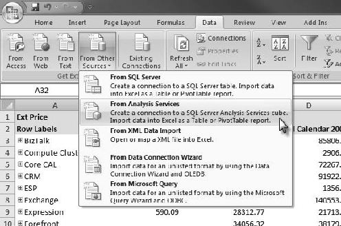
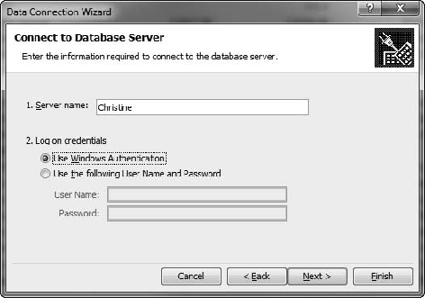
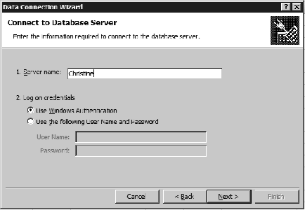
When we select the option to import from Analysis Services, Excel will present us with a dialog for the server name and instance, as shown in Figure 14-4. If you enter the server name by itself, the connection will link to the default instance (remember that you can install multiple SSAS instances on a single server). If you need to indicate a specific instance, then use a backslash: serverinstance. On this dialog you can also indicate whether to use Windows integrated authentication or a specific user name and password.
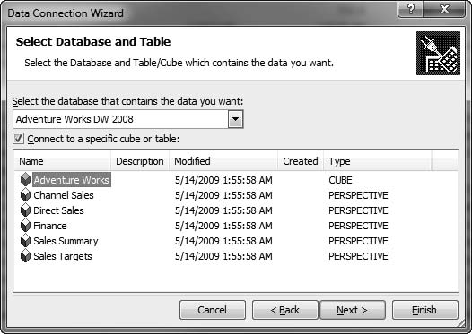
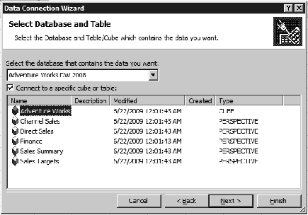
The next page in the wizard lists the databases on the server in a drop-down at the top, as shown in Figure 14-5. Once you've selected a database, it lists the cubes and perspectives in the database. Then you can select a cube or perspective for the connection. (You can also uncheck "Connect to a specific cube or table"—then you'll be prompted to select the cube or perspective when you use the connection.)
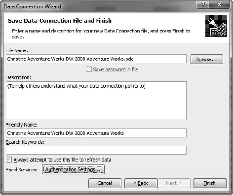
The final page of the wizard, as shown in Figure 14-6, allows you to define the connection file. This includes the file name and location, a description, and the friendly name to be displayed for the connection file. You can also add metadata keywords to be used when indexing the data connection file. We'll cover the Excel Services Authentication Settings later in the chapter.
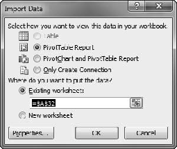
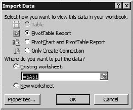
Once you finish the data connection wizard, Excel will use the connection you created, and show the Import Data dialog, which you can see in Figure 14-7. Here you can select whether to create a PivotTable, a PivotChart, both, or neither. You can also choose whether to place the created items in the current worksheet or to create a new worksheet for them.
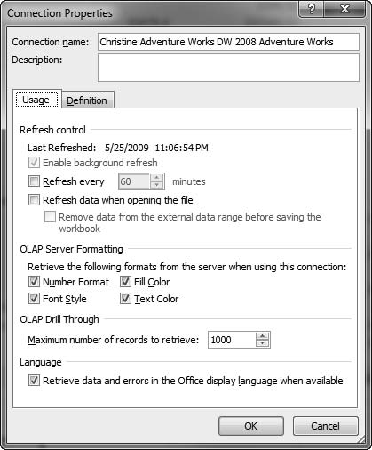
The Properties button at the bottom of the Import Data dialog will give you options governing the connection in the workbook, as shown in Figure 14-8. The dialog will show you when the data was last refreshed (remember that in Excel you work on a static snapshot of the data until it's refreshed). You can also set properties on when to refresh the data—on a regular basis, or when the file is opened. The connection can always be refreshed manually using the Refresh button on the Data tab in the ribbon.
Note
Be wary of setting connections to automatically refresh. Most business users expect to have control over when the data refreshes. Many financial analysts will store a file as a financial report, and it can cause unhappiness if the numbers change when the file is reopened.
The OLAP Server Formatting section allows you to select which aspects of formatting Excel will retrieve from the cube and automatically apply. Finally, the Definition tab is as it sounds—the definition of the connection is stored here, and you can edit it if necessary.
Once you've created the connection, Excel will create the pivot table and pivot charts for you in the workbook. Each of them has a corresponding task pane that's active when they are (click in the pivot table, the pivot table task bar displays; click in the pivot chart, the task bars for the pivot table and pivot chart display). The pivot chart does require a pivot table—if you create a pivot chart on its own (from the Insert tab), Excel will also create an attached pivot table.
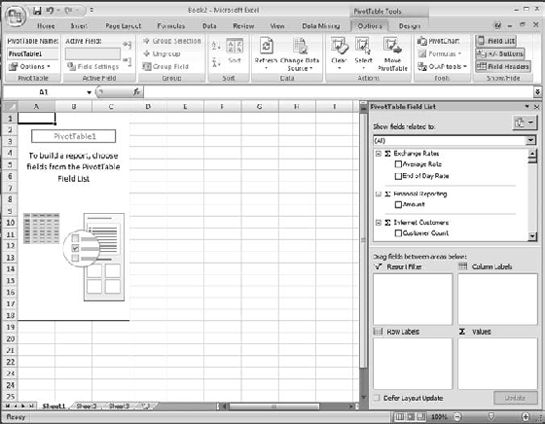
When you create a data connection in Excel 2007, Excel creates the pivot table constructor for you, as shown in Figure 14-9. The constructor consists of the placeholder in the worksheet and the task pane on the right-hand side (the task pane can be moved if you choose to.) The task pane has a list of available measures and dimensions in the upper section and the table detail sections in the lower section.
Tip
For more information on dealing with task panes, see http://office.microsoft.com/en-us/help/HA010785861033.aspx.
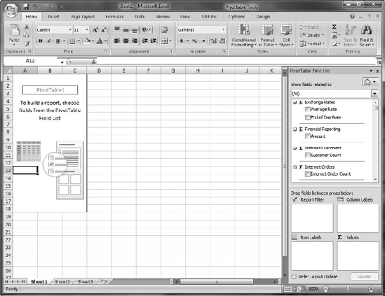
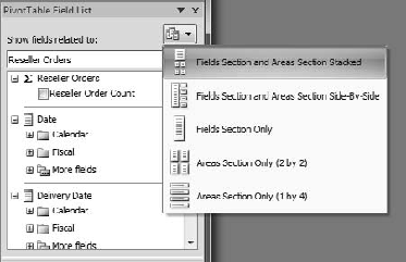
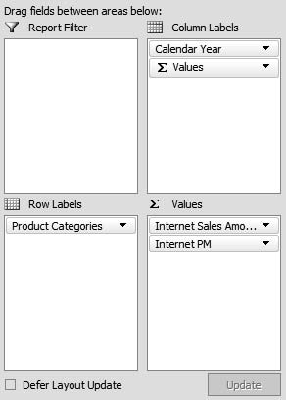
You can change the layout of the task pane by using the drop-down button at the top, as shown in Figure 14-10. Under the layout selector is a drop-down list that lets you filter the measures and dimensions by dimension group. At the bottom of the task pane is a checkbox labeled Defer Layout Update. If you're working with a large cube, some updates may take a few seconds (or longer...). The cube will be more responsive as you pare down the amount of data you're working with, so you may want to check this to hold off on updating the table while you're setting up the initial filters. You can then click the Update button to update the table when you want to, or uncheck the box when you've got a smaller data set.
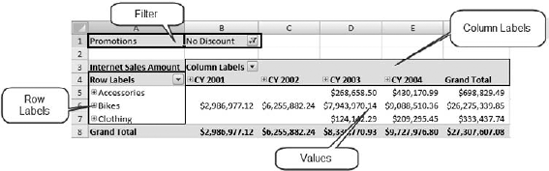
The four areas at the bottom of the task pane are Report Filter, Column Labels, Row Labels, and Values. These correspond to the table, as shown in Figure 14-11. You can either check the check box for measures to show those in the pivot table, or drag them to the Values area. You'll have to drag dimension hierarchies to the other areas as needed.
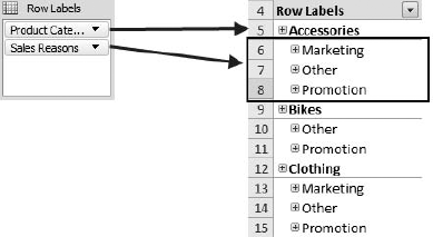
Another aspect of assembling a pivot table that's worth noting is the ability to nest dimensions. Simply dragging another hierarchy to a row or column will nest them in the pivot table, as shown in Figure 14-12. Note that you can create the hierarchy in whichever order you choose—group by Sales Reasons first, and then by Product Categories if you need to.
The easiest way to work with a pivot table is with the PivotTable Tools ribbons, which appear when you click inside the pivot table. There are two ribbons—one for general options and one for design, as shown in Figures 14-13 and 14-14. The ribbons are fairly self-explanatory, but I strongly recommend browsing through them as you start working with pivot tables, as it can be easy to forget they're there and get frustrated trying to work with the pivot table itself. For example, selecting a pivot table to move it in a workbook is nontrivial, but straightforward with the Move PivotTable button on the Options ribbon.
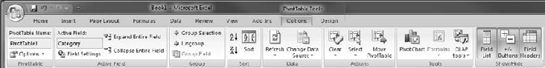
The most notable function on the Options tab is the ability to rename the pivot table. If you work with Excel named ranges a lot, you may find yourself a bit baffled as to how to name the pivot table by selecting a range on the worksheet. The easy answer is to just click inside the table and rename it on the Options tab. You can also select fields (column and row headers, value fields) and work with their settings, and expand or collapse them.
With the Group Selection and Ungroup buttons you can select members from a hierarchy and create a custom grouping. For example, if you have all 50 states listed, you may want to group them into geographic regions. To do so, just select the states you want to group together and click the Group Selection button. Repeat to create additional groups—as you go, any ungrouped members will be swept into a group called Other.
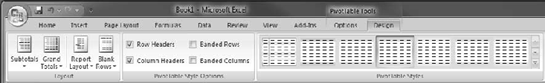
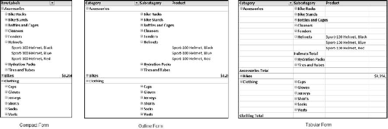
The pivot table design ribbon is pretty descriptive—it provides the tools to change the appearance and layout of your pivot table. The drop-down buttons in the Layout section allow you to select whether to show grand totals and subtotals (for rows and/or columns), and whether to insert blank rows between items. The Report Layout selector offers compact, outline, or tabular layouts, as shown in Figure 14-15.
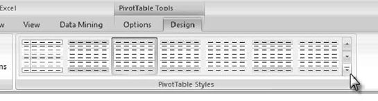
The checkboxes in the PivotTable Style Options section let you switch the styles for row and column headers on and off, and select whether to shade alternating rows or columns. Finally, the PivotTable Styles gallery provides a number of preformatted styles for pivot tables. You can preview how the style will affect your table by mousing over the styles without clicking on them. Also, you can drop down the gallery with the lower down-arrow to the right of the display, as shown in Figure 14-16.
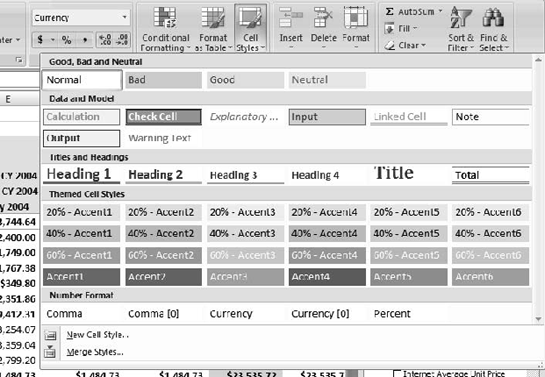
Formatting the contents of a pivot table is as easy as highlighting the cells you want to change the format on and using the controls in the ribbon or the context menu. Note that you won't be able to alter the structure of the pivot table—for example, trying to merge cells in a pivot table will raise an error prompting you with the options for what you're trying to do. You can also use the Cell Styles down shown, shown in Figure 14-17, for quick access to some standard styles and number formats. (I just discovered that there's a quick style on there for Currency with no decimals. I've been doing that by hand....)
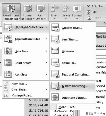
Another powerful option in Excel 2007 is to use conditional formatting for values. With conditional formatting, you can apply a specific style to cells based on the specific numeric value or the value in relation to other values, or even if it contains a specific text or is a date between certain dates. Conditional formatting is under the Conditional Formatting drop-down gallery in the Styles section of the Home tab on the ribbon. Figure 14-18 shows the Conditional Formatting gallery opened to the Highlight Cells Rules selection.
Selecting New Rule near the bottom of the drop-down opens a dialog that provides a more fine-grained rule-editing capability. Ultimately you have the option of entering a formula to select which cells to format, and a custom format using any of the Excel cell formatting styles.
One of my favorite format schemes is to apply data bars to a selection of cells, shown in Figure 14-19. The bars behind the numbers give a quick visual indication of the relative magnitude of the values. It is important, however, to be careful not to include any subtotal or total rows, as those will obviously be far larger and dominate the layout.
Now that we understand how to create and format a pivot table, we also want to be able to use these values in other calculations (that's a major reason we're using Excel, right?). So let's take a look at the ins and outs of using pivot table values in formulas.
Let's say you wanted to create a column next to your pivot table showing what the numbers would look like with 10% growth added on top. So you click in a cell, type an equal sign, and then click on a cell in the pivot table to reference it. You'll end up with something looking like this:
=GETPIVOTDATA("[Measures].[Internet Sales Amount]",$A$3,
"[Product].[Product Categories]",
"[Product].[Product Categories].[Product].&[374]")
This is the function Excel puts in place to fetch the pivot table value, and it's the reference you'll get. This will work well enough—type "*110%" afterwards and you'll see it calculates fine. The problem is when you copy that formula and try to paste it for all the values in the column. You'll get the same value for every cell. Why is that?
The GETPIVOTDATA function in this case has four arguments. These are the data field (Internet Sales Amount), a descriptor for the pivot table ($A$3, the cell reference for the table anchor), the field, and then the unique name for the specific cell. So when we copy and paste the cell reference, it keeps the unique name and we get the same value.
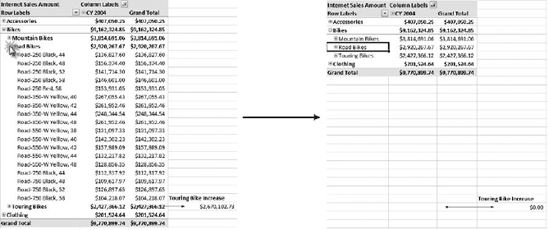
Couldn't we just type a cell reference for the value? Well, that would work, except that if either rows or columns contain a hierarchy, the user can expand and collapse the members of that hierarchy, giving us the result shown in Figure 14-20. Since the GETPIVOTDATA formula uses unique names to identify cells, then so long as the pointer to the pivot table is valid, the value will still work.
Note
One problem you can still run into is if the value you're referencing gets hidden. For example, in Figure 14-20, if you were referencing a specific bike model and you then closed up the subcategory, the reference would break as well (but it would be valid again if the user opened that category again).
Now that we have a feeling for putting our data together and formatting it in a pivot table, let's create some visual displays of our data with pivot charts.
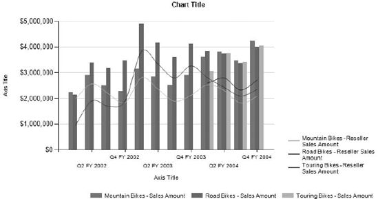
Being able to visualize data is every bit as important as actually viewing the data itself. In this section we're going to create pivot charts in Excel to give a graphical view of the data in the pivot table. Figure 14-21 shows an example of such a chart.
It's important to remember that a pivot chart is always bound to a pivot table. When we talk about ProClarity and SQL Server Reporting Services charts later in the chapter, we'll look at some very powerful charting capabilities as the result of linking directly to SSAS cubes. However, Excel pivot charts are limited to what's in the pivot table.
There are three ways to create a pivot chart in Excel:
From the Insert tab on the ribbon, drop-down the PivotTable button and select PivotChart. You will be prompted to select either a table or range, or to use an external data source. Excel will automatically create a pivot table linked to the data source, and the pivot chart linked to the pivot table.
When you create a data connection, one of the options is to create a pivot chart with the pivot table.
If you've already created a pivot table, then while the table has focus, the Options tab under PivotTable Tools in the ribbon has a PivotChart button.
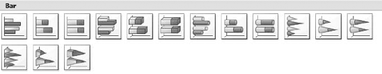
There are many types of charts available in Excel, including bar charts, line charts, pie charts, and area charts. For each chart type there are various stylistic subtypes, as shown in Figure 14-22 for bar charts. Be careful not to spend too much time worrying about which type of chart to use—remember that the goal is to convey information, not win a beauty contest. For a more in-depth discussion about charting and chart types, I recommend Show Me the Numbers by Stephen Few (2004, Analytics Press).
Each of the subtypes is generally a minor stylistic variation on the main chart type, but there are some significant standouts, most notably the stacked variations (where values are added together or presented as percentages).
Note
When creating a chart from pivot table data, you can't use an XY (scatter) chart, bubble chart, or stock chart, since these chart types require additional dimensions of data. Unfortunately, they're not disabled in the chart-type selector, so you'll get an error if you try to use them.
As with the pivot table, when you create a pivot chart, Excel presents you with a number of new tabs on the ribbon to manage the chart, shown in Figure 14-23. This time we have four tabs:
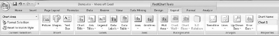
Design: Here you can change the fundamentals of the chart—the chart type, data, rough layout (title and legend), and style.
Layout: This tab offers more specific layout options. There are selectors for the chart and axis titles, legend, data table (if there is one), axes, gridlines, plot area, and specific parts of the chart itself. You can also set the chart name here and insert objects into the chart.
Format: More finely-grained formatting for the chart objects. By selecting a chart item, e.g., the title or data labels, you can use the format galleries in the Format tab to apply a specific font, outline, fill, or other formatting.
Analyze: Here you'll find the toggles for the field list and filters, as well as a button to refresh the pivot chart data and expand or collapse hierarchies, if used.
Pivot charts really are fairly straightforward—since they're bound to the underlying pivot table, most of your work will be done ensuring the data in that table is in the proper format for the chart. In Exercise 14-1 we're going to use the AdventureWorks cube to create a pivot table and pivot chart so we can get a feel for how they work together.
Create an Excel PivotTable and PivotChart
In this exercise we'll walk through using Excel as a front end for an Analysis Services cube, including connecting to the cube, building a pivot table, configuring the pivot chart, and applying some Excel formatting.
Open Excel 2007.
Click the From Other Sources button to drop-down the selector, and then click From Analysis Services, as shown in Figure 14-24.
This will open the Data Connection wizard, shown in Figure 14-25. Enter the name of your SSAS server ("localhost" if it's on the same machine).
Click the Next button.
The next page allows you to select the database and cube that you want for the pivot table. Select Adventure Works DW 2008 (or whatever you named your AdventureWorks database) and then the Adventure Works cube, as shown in Figure 14-26.
On the "Save Data Connection File and Finish" page, you can leave the defaults or edit the file name, friendly name, and description if you choose to. This step creates the data connection file in your file system (by default in $DOCUMENTSMy Data Sources).
Click the Finish button.
Now you should see the Import Data dialog, which prompts whether you want to create a PivotTable, PivotTable and PivotChart, or just create the connection file (Figure 14-27). Select PivotTable Report and leave "Existing worksheet" selected for the location.
Click the OK button.
You'll have a PivotTable placeholder and the PivotTable Field List task pane open, as shown in Figure 14-28. (If you don't see the task pane, click inside the PivotTable placeholder, select the PivotTable Tools – Options tab in the ribbon, and then click Field List in the Show/Hide section to the far right.)
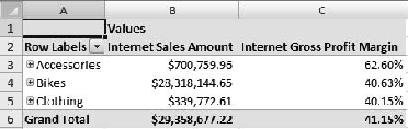
Now let's add some data to our pivot table. In the Field List on the right, check the boxes for
Internet Sales AmountandInternet Gross Profit Margin. This will add the two values to the pivot table. With no dimensions or filters, they represent their respective values for the entire cube. (Also note that the Column Labels section now has an entry for Values to indicate the values dimension added with the two measure members.)Let's break these measures down by product. In the "Show fields related to" drop-down at the top of the PivotTable Field List task pane, select Internet Sales.
Scroll down in the list of fields—under Product check the box next to Product Categories. Note the categories now in the left-hand column, as shown in Figure 14-29.
Click on the [+] next to Bikes to see the category open and display the subcategories underneath.
Scroll to the Date dimension in the PivotTable Field List. Click [+] to open the Calendar folder.
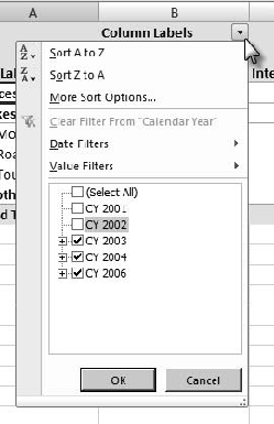
Check the box next to Calendar Year. This moves the Calendar Year hierarchy of the Date Dimension to the Column Labels area.
We don't have a lot of data for Calendar Years 2001 and 2002, so let's leave them off for now. In the pivot table click the drop-down arrow next to Column Labels and uncheck 2001 and 2002, as shown in Figure 14-30.
Click the OK button.
We now have a pivot table showing Internet sales and profit margin by Category/Subcategory/Product and by calendar year.
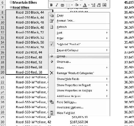
Open up the subcategory Road Bikes by clicking the [+] symbol next to it.
Select the cells with Road-250 bikes by clicking and dragging. Then right-click and select Group, as shown in Figure 14-31.
The group will be named Group1 by default—rename it Road-250.
Do the same for the Road-350, Road-550, Road-650, and Road-750 bikes.
Now we can look at numbers by product line. (The cube actually has a hierarchy for Product Lines, but you get the idea.)
"Internet Gross Profit Margin" is a bit verbose, so let's trim it a bit. Right-click on one of the column headers, and then select Value Field Settings.
For Custom Name, type Internet PM. Note the other options available here for manipulating the display of the value field.
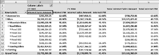
Now we have Sales and Profit Margin broken down by calendar year and product, as shown in Figure 14-32. The Fields area in the sidebar should look like Figure 14-33.
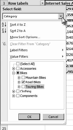
If we're focused on our Road Bike models, having the other categories and subcategories displayed can be a bit distracting—let's hide them. Click on the drop-down arrow next to Row Labels.
In the "Select field" selector, uncheck Accessories, Clothing, and Components. Then click the [+] next to Bikes, and uncheck Mountain Bikes and Touring Bikes, as shown in Figure 14-34.
Click the OK button and you should be left with a cleaner display, as shown in Figure 14-35.
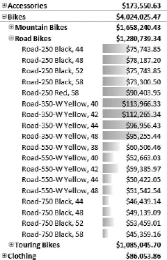
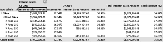
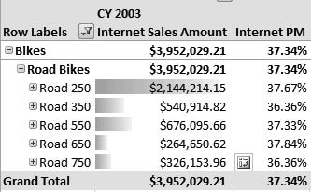
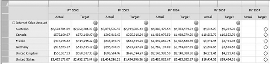
For CY 2003, the Road 250 stands out with $2.1M out of almost $4M in sales, but it takes some staring and thinking to figure out how the other models rank. Let's add a visual cue.
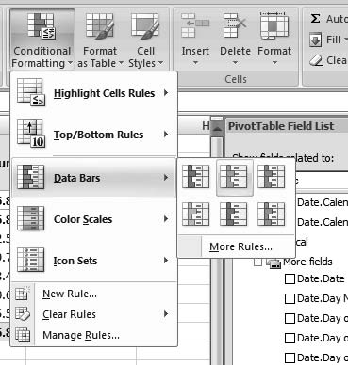
Click and drag to highlight the sales amounts for CY 2003 for the five Road models.
Click the Conditional Formatting button in the ribbon (on the Home tab), and then select Data Bars and choose one of the color schemes, as shown in Figure 14-36.
You should see each of the values, now accented with a color bar showing their relative values, as shown in Figure 14-37.
Note
The color bars themselves shouldn't be read like a chart; they just show relative values.
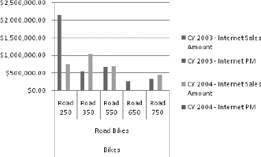
Now that we've seen how to create a pivot chart in Excel, let's quickly put a pivot table on top.
Click a cell inside the pivot table to bring up the task pane and PivotTable Tools.
In the PivotTable Tools/Options tab, click the PivotChart button in the Tools section.
This will open the Insert Chart dialog, which prompts you to select a chart type. Leave the default selection and click the OK button.
You should see a chart similar to Figure 14-38. Note that Excel has created series for both the year and the measures.
If you look at the PivotChart Filter Pane, you'll see that you can filter the fields down, but not much else.
Experiment with right-clicking on various parts of the chart to understand the options available.
Save the workbook—we'll use this later with Excel Services.
In my experience, Excel 2007 is awesome for pivot tables—if you need to do tabular analysis on SSAS data, Excel is a top-tier client. Unfortunately, the fact that the pivot chart is bound to a pivot table, combined with the lack of ability to manipulate data in the chart, makes it pretty limited. Later in this chapter we'll look at Reporting Services and ProClarity for more powerful charting tools. For now let's look at the other member of the Office family that understands Analysis Services—Visio.
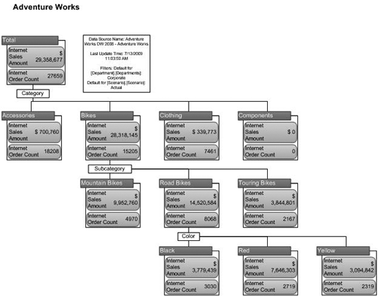
With Visio 2003, Microsoft started introducing more data-binding capabilities into the product. We won't dive too deeply into this, other than to look at the SSAS integration. Visio 2007 includes a construct called a pivot diagram, which we can use to map cube data. An example of a breakdown of Internet sales data is shown in Figure 14-39.
Note
I read a comment online that I have to agree with—Visio is generally used for designing, not reporting. There are some publication capabilities built into Visio, but they're not used as extensively as Excel Services, and certainly nothing like Reporting Services. So pivot diagrams are fairly niche; but if you have the need to bring Analysis Services data into Visio, there it is.
Creating a pivot diagram is pretty easy to do—in a new Visio drawing, select PivotDiagram → Insert PivotDiagram. This will start the PivotDiagram wizard, which is essentially a dialog box to either select an existing connection or create a new connection (which will launch the New Connection wizard we're familiar with).
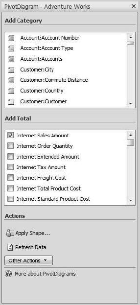
Once you've created the connection, Visio will add a shape representing the default measure from the measure group, and add a task pane listing measures ("Totals") and dimension hierarchies ("Categories") in the selected cube, as shown in Figure 14-40. Checking a Total adds it to the diagram. If you select a pivot node (the shapes in the pivot diagram) and select a Category, Visio will add a breakdown of that hierarchy under the selected node (replacing an existing hierarchy if one is in place).
This operates in much the same way as the ProClarity Decomposition Tree, which we'll look at later in the chapter. There are two significant differences:
ProClarity is web-based and enables publishing charts to the web, while Visio is client-based.
ProClarity charts are similar to all charts in that once you've designed a chart, it's relatively inflexible. On the other hand, Visio pivot diagrams are composed of Visio shapes, so in addition to manipulating nodes with data, you can simply drag them, edit them, or add additional data.
We won't walk through an exercise, because when considered with the other front ends we're going to look at, the task of creating a pivot diagram is pretty straightforward. Now let's look at some ways we can publish SSAS data for broad consumption, starting with SQL Server Reporting Services.
Another one of the BI services in the SQL Server platform is SQL Server Reporting Services. Reporting Services is a web-based service for hosting and publishing reports. Reports are natively published in HTML format, but can also be rendered as XML, in Excel, PDF, TIFF, or Word. While Reporting Services runs as a SQL Server service, it can render reports from a variety of data sources, though the data source we're most interested in is, of course, SQL Server Analysis Services.
Note
Remember that SQL Server services can be run "a la carte." Even if you have a significant investment in SQL Server 2005 as your data storage, you can still use SQL Server 2008 Reporting Services for reporting, and given the improvements in SSRS 2008, I highly recommend doing so.
Let's take a look at some of the features of SSRS—paired with Analysis Services, this is an incredibly powerful platform for reporting on business data. We're going to look at reports in general, and then a new feature in SSRS 2008 called Tablix, which combines the best features of tables and matrices. We'll examine the new charting engine in Reporting Services, and finally take a quick look at the new Report Builder and how it enables self-service reporting.
Note
This is going to be a fairly lightweight overview of SQL Server Reporting Services. For a more in-depth examination of the subject, I recommend Microsoft SQL Server 2008 Reporting Services by Brian Larson (McGraw-Hill, 2008) or Pro SQL Server 2008 Reporting Services by Landrum, McGehee, and Voytek (APress, 2008).
Between the new tablix control and advanced charting engine, Reporting Services is more powerful than ever. Formatting reports is more intuitive, and far more WYSIWYG than previously.
The report designer is once again BIDS—in this case you can create either a new project with a wizard or just an empty project. Reports use data connections—either shared connections deployed to the server, or connections embedded in the report. (The benefit of a shared connection is that it's easy to modify it in either BIDS or SSMS—to point it at a different server, change a password, etc.)
Once you've created a report project, report design is fairly straightforward—create datasets for your needs, and then create regions on the report using the datasets to populate them. You have three types of data regions: tablix regions, charts, and gauges, as shown in Figure 14-41.
Let's take a look at each of these data containers and how they can relate to visually presenting Analysis Services data.
In SQL Server 2005 Reporting Services, you had the option of creating a report with a table, as shown in Figure 14-42, or a matrix, as shown in Figure 14-43. Tables were great for straight tabular data—record after record (think green-bar reports). Matrices were used for aggregating data (a topic that should be near and dear to our hearts now)—generally think of them like pivot tables.
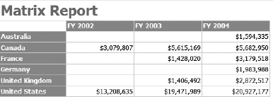
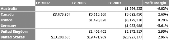
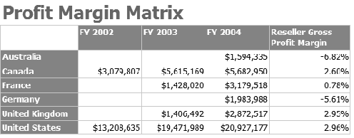
These two options were "good enough" for most purposes; however, most report developers would eventually learn that many reports don't fall squarely into being either tabular or a matrix, but rather a hybrid between the two. For example, a report user may want the report in 14-43 to have some summary information as well. Consider the report in Figure 14-44, which shows the profit margins by country. Veterans of SQL Server 2005 Reporting Services know this is a nontrivial task to accomplish.
Adding columns outside a grouping, splitting cells in the report, and adding other forms of data outside the main paradigm of "table" or "matrix" have generally meant either doing gymnastics in SQL to get a data set that roughly conforms to the required report, or writing code to generate the data values. As a report designer, we don't have the option to tell our user "your requirements don't match what the software can do. Please adjust your expectations accordingly."
In response to the limitations of the table/matrix approach in SSRS 2005, Microsoft has added a component called tablix to Reporting Services. The tablix data region combines the capabilities of the matrix and table—you can add pivot-type features to a table, table-type features to a matrix, and "mix and match." The end result is that reports like the one shown in Figure 14-45 are possible.
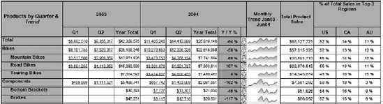
Note that we have a matrix (products broken down by calendar quarter), but there's also a year-over-year percentage and trend, a sparkline chart, total sales, and breakdown by top three regions. Before 2008, a chart request like this would have meant a significant amount of code behind the scenes. Tablix makes it easy.
If you've cracked open BIDS and looked for Tablix in the toolbox, you won't find it. You'll see Table and Matrix items, but no Tablix. Where is it? Well, you're looking at it. Both the table and matrix toolbox items are simply special cases of the tablix control—adding either of these gives you the same capabilities in the long run. This was an excellent design decision on Microsoft's part, as you won't ever run into a situation where you'll need a feature in a table and think "I can do this in a matrix..."
So you start with a table or matrix, and then the tablix features start to reveal themselves. For example, in our matrix with the summary columns we just have to right-click on the rightmost column to see the context menu shown in Figure 14-46. By having the ability to add columns (either inside or outside the current grouping) we've got a lot more flexibility.
Note
A tablix data region is still limited to being tied to a single dataset, so keep that in mind. You can add subreports to nest datasets for more complex reports.
Let's take a moment to build a quick report using the tablix control—this will be an easy introduction to Reporting Services as well as leveraging the tablix capabilities.
Build a Report with Tablix
This exercise will show you how to build a basic matrix report on SSAS data, as well as introduce the tablix features. We won't cover deployment of the report or more advanced SSRS features.
Open BIDS, create a new project (File → New → Project).
Select Report Server Project Wizard and give the project a name.
Click the OK button to open the Report wizard.
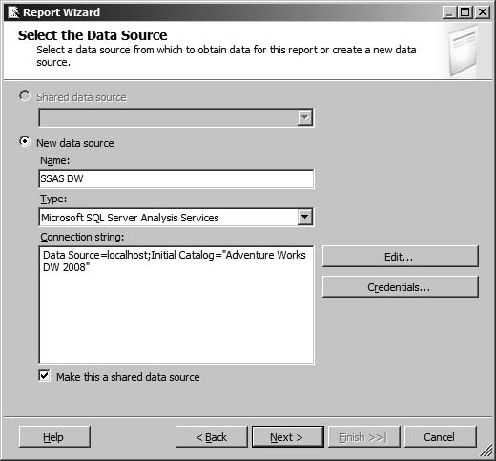
Ensure "New data source" is selected. Name it SSAS DW.
Select Microsoft SQL Server Analysis Services as the data source type.
Click the Edit button. In the Connection Properties dialog enter the server name for your SSAS server, and then select Adventure Works DW 2008 for the database. Click the OK button.
Check the box for "Make this a shared data source," as shown in Figure 14-47.
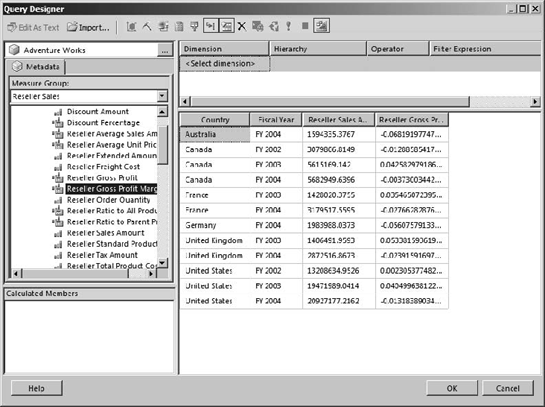
In the Design the Query page, click the Query Builder button. This will open a dimensional data editor that should look pretty familiar by now.
Open the Measures group, and then Reseller Sales. Drag Reseller Sales Amount over to the designer.
Under Geography, drag Country to the designer.
Under Date, open Fiscal and drag Date.Fiscal Year to the designer.
Note
The designer query results will show a tabular view of the data. This can be a bit unnerving when we plan to design a matrix, but it will all work out—you'll see.
Drag Reseller Gross Profit Margin over to the designer; it should look like Figure 14-48.
Click the OK button.
Click the Next > button.
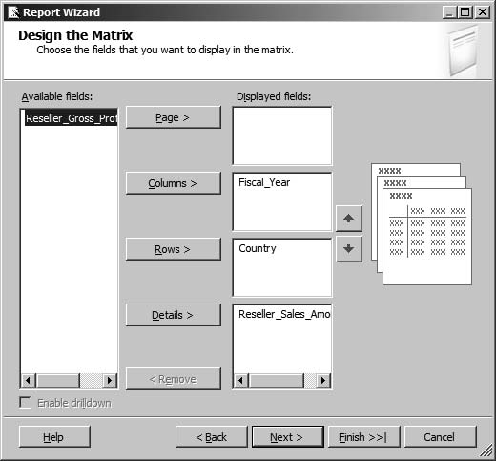
In the Report Type page, select Matrix, and then click the Next > button.
In the designer, select Fiscal Year and click the Columns button.
Select Country and click the Rows button.
Select Reseller_Sales_Amount and click the Details button.
Leave Reseller_Gross_Profit_Margin in the left pane, as shown in Figure 14-49.
Click the Next button.
Select a style and click the Next button.
Leave the defaults for the Report Server and folder—we won't be deploying the report.
Click the Next button.
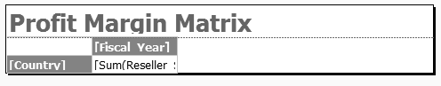
Name the report Profit Margin Matrix and click the Finish button.
The report should end up as shown in Figure 14-50.
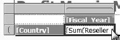
If you click on the Preview tab at the top of the designer, you can see how this looks now. Let's fix the formatting—right-click on the cell where it says [Sum(Reseller ... and select Text Box Properties.
In the Text Box Properties dialog, select Number in the left-hand pane. For Category, select Currency. Set the decimal places to 0 and check the box for "Use 1000 separator." Click the OK button.
Now let's add the Profit Margin to our table. With a matrix in SSRS 2005, the only option would have been to add the new measure at the same granularity as the existing measure.
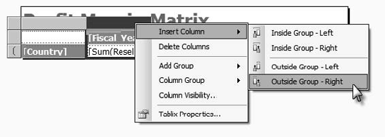
If you click in the detail cell, you should see the tablix headers appear, as shown in Figure 14-51.
Right-click on the column header above the Fiscal Year label, opening the context menu shown in Figure 14-52.
Select Insert Column, and then Outside Group – Right to indicate we're adding the column outside the grouping signified by the Fiscal Year.
Now click inside the newly created textbox—you should get a drop-down showing the fields in the dataset. Select Reseller_Gross_Profit_Margin. Note that BIDS has automatically inserted a SUM function on the field.
In the text box properties, change the formatting for the profit margin text box to Percentage.
Click the Preview tab—you should see a report similar to Figure 14-53.
Note that the profit margin isn't broken down by fiscal year—it's a summary value on the end.
Save the project.
For more information about tablix, a good place to start is "Understanding the Tablix Data Region" at http://msdn.microsoft.com/en-us/library/bb677552.aspx.
Now that we've looked at tabular results of numerical data, let's take a look at a more visual representation using the new charting engine in SSRS 2008.
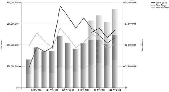
The charting engine in SSRS 2005 wasn't too bad, but it had its share of challenges. In 2007, Microsoft licensed the reporting engine from Dundas Software. The result of this effort is the charting engine in SSRS 2008. SSRS 2008 includes new chart types, advanced support for multiple series in a single chart, secondary axes, and a host of new layout features. An advanced SSRS 2008 chart is shown in Figure 14-54.
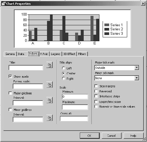
To me, one of the best enhancements is access to properties. In SSRS 2005, all charting properties were accessed through a single properties dialog, as shown in Figure 14-55. This was limiting to say the least—any little change or tweak to an axis or chart meant digging through pages of properties and hoping you had the right one—lots of trial and error.
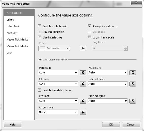
In SSRS 2008, you can format each chart component by simply right-clicking on it and selecting Properties. For example, to format the y axis in SSRS 2005, you have to right-click on the chart, select Properties, select the y-axis tab, and then enter the format code for the numerical format you want (yes, you have to know the format codes...). In SSRS 2008, you simply right-click on the y axis, and select Axis Properties to open the Value Axis Properties dialog shown in Figure 14-56. Also note that as you make changes in SSRS 2008, they are shown dynamically on the chart, though the dialog may be covering the part of the chart you're changing...
The best way to understand working with charts in Reporting Services is to build one. In Exercise 14-3 we'll create a chart from dimensional data, including two different data series.
Create a Chart in SSRS 2008
In this exercise we'll use the AdventureWorks data to create a two-axis chart like the one in Figure 14-54.
Open BIDS to the project you created in Exercise 14-2.
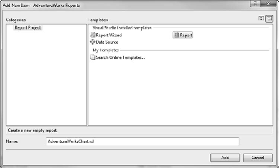
Right-click on Reports in the Solution Explorer, select Add..., and then New Item.
This will open the Add New Item dialog, as shown in Figure 14-57.
Select Report and give it the name AdventureWorksChart. Then click the Add button.
In the Report Data pane on the right for the new report, click the New button and select Data Source.
In the Data Source Properties dialog, select "Use shared data source reference" and select the AdvWorks data source in the drop-down list box.
Click the OK button.
Click the New button in the Report Data pane and select Dataset to open the Dataset Properties dialog.
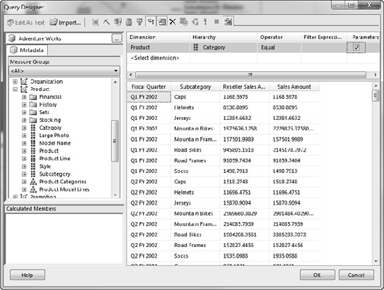
Ensure DataSource1 is selected in the Data source drop-down. Click the Query designer button to open the multidimensional query designer.
Drag ResellerReseller_Sales_Amount and Sales SummarySales_Amount from the measure groups to the design pane.
Drag ProductCategory to the filter area at the top of the query designer. Scroll to the right and check the box under Parameter.
Drag ProductSubcategory and DateFiscalDate.FiscalFiscal Quarter to the design pane, so that it looks as shown in Figure 14-58.
Click the OK button.
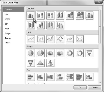
Now open the Toolbox in BIDS (View → Toolbox).
Click on the Chart item in the toolbox and click and drag to fill the report canvas.
In the Select Chart Type dialog, select the default Column chart, as shown in Figure 14-59.
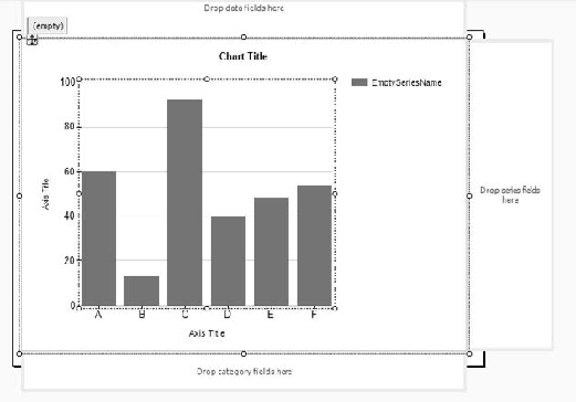
Switch back to the Report Data tab (or View → Report Data). Click on the chart to select it, and then click the chart area. You should see areas appear around the chart to drop data fields, as shown in Figure 14-60.
Drag the Reseller_Sales_Amount and Sales_Amount fields from the Report Data pane on the left to the area above the chart labeled "Drop data fields here."
Drag the Subcategory field to the area labeled "Drop series fields here."
Drag the Fiscal_Quarter field to the area below the chart labeled "Drop category fields here."
If you preview the chart now, you should see something similar to Figure 14-61, which isn't very useful at all.
To make the chart more readable, let's change the Reseller Sales data to a line chart—right-click on the data field that reads [Sum(Reseller_Sales_Amount)] and select Change Chart Type.
Select the second line chart, and then click the OK button.
Now let's add some formatting to the y axis—right-click on it, and then select Axis Properties.
In the Value Axis Properties dialog, select the Number page, and then Currency. Check "Use 1000 separator" and set Decimal Places to 0.
Click the OK button.
Finally, let's break up the legends. Right-click on the bars in the chart, select Chart → Add New Legend. This will create a second (empty) legend in the Chart area.
Right-click on the bars again, and select Series Properties. Select the Legend page, and then under "Show in legend:" select ChartLegend1.
Click the OK button and you'll see the sales amount data legend is now in the new legend area. You can drag the legend areas around to format the chart to your taste. When you're done, preview the chart.
You'll have to select a category from the parameter at the top of the preview page—the category Bikes usually works well. Then click the View Report button.
You should end up with a chart similar to that shown in Figure 14-62.
SQL Server 2005 Reporting Services introduced a client-side ad-hoc report designer, named Report Builder. It was fairly good, but suffered from the limitation that reports could be built based only on predesigned report models (basically a lightweight cube residing in the report server).
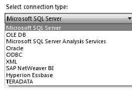
SQL Server 2008 Reporting Services brings us Report Builder 2.0, a free download from Microsoft.com. (You can find the download link at http://www.microsoft.com/sqlserver/2008/en/us/report-builder.aspx). Report Builder 2.0 allows end users to create ad-hoc reports from any number of data sources, as shown in the default connection type list in Figure 14-63.
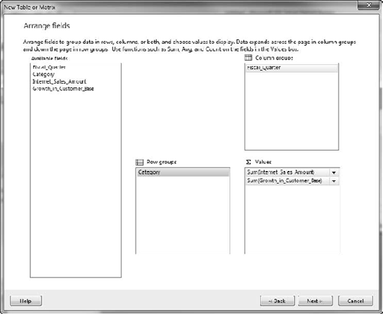
When you create a new report, you can either create the report by hand, or use one of the two wizards (Table/Matrix or Chart). The wizards will walk you through the familiar process of creating a data connection, and building a query. If you selected Table/Matrix, then the first layout screen will be a little different, as shown in Figure 14-64, but the rest is pretty straightforward.
For the most part, Report Builder works exactly like BIDS for designing reports (at least in basic data access, layout, and formatting). Once a user finishes a report design, the user can save it back to the Report Server or SharePoint library where reports are published.
Note
Report Builder 1.0 was a "click-once" deployment application, and when Reporting Services was run in SharePoint integrated mode, Report Builder could be automatically run from the reports library. Report Builder 2.0 takes a little more work. It must be installed on the client, and the reports library has to be "tweaked" to activate the builder.
That finishes up the quick tour of Reporting Services and Report Builder. Let's take a look at our next stop for displaying dimensional data—Microsoft Office SharePoint Server (MOSS) 2007.
Microsoft Office SharePoint Server (MOSS) 2007 introduced a number of new features that make it a great platform for business applications. For our purposes, we're deeply interested in two of these new features—KPI lists and Excel Services.
Note
Another new feature in MOSS 2007 is InfoPath Forms Server, which gives you a way to easily create and publish web-based forms. This is important because often a major part of the problem with a data warehouse is getting data in. InfoPath can solve the "data entry by hand" problems pretty easily. For more information about InfoPath, see my book Pro InfoPath 2007 (APress, 2007).
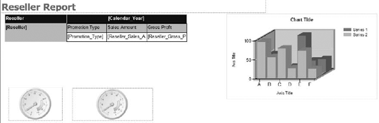
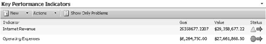
MOSS makes it very easy to assemble a dashboard with KPI lists and related content, specifically focusing on Excel Services spreadsheets for reporting. Before January 2009, SharePoint dashboards were somewhat problematic, as the KPI capabilities were fairly limited from a business intelligence perspective. However, after Microsoft moved PerformancePoint from being a separate product to MOSS Enterprise with KPI lists, Excel Services, and InfoPath Services, MOSS is a very respectable BI platform. Figure 14-65 shows a dashboard in MOSS using a KPI list, Excel Services, and SQL Server Reporting Services report (we'll add PerformancePoint in later).
KPI Lists are a way to build ad-hoc dashboards from data available to SharePoint, including SharePoint lists, SQL Server Analysis Services, Excel spreadsheets, and manually-entered data. A KPI list is a standard SharePoint list, designed with some extra logic for representing a KPI-type indicator. You can see a MOSS KPI list in Figure 14-66.
The final native feature in MOSS that we're interested in is Excel Services. Excel Services allows you to publish a spreadsheet from Excel 2007 to a thin client display on a SharePoint page, while still maintaining all data connections, formulas, etc. This allows Excel power users to create "reports" in the platform they are most familiar with, but then publish those reports in a full-fidelity display.
I've always found KPI lists to be a little odd. They seem very powerful at first—a web-based scorecard key performance indicator feature that can be hooked to any number of data items (including SharePoint list data). However, when you've worked with KPIs in other products, the KPIs in MOSS come up very short.
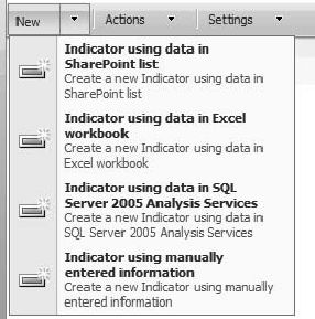
MOSS KPIs can use data from several sources, as shown in Figure 14-67. Once you select a data source, you'll be given a definition page appropriate for the data source.
The definition page for SSAS data requires you to select a data connection from a library on the SharePoint server. Once you select a data connection to an Analysis Server, MOSS will provide a list of KPIs on the server, as shown in Figure 14-68. You can then give the indicator a name, and a URL for the KPI to use as a link to details.
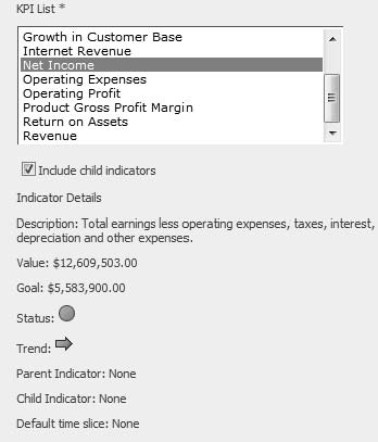
That's it—everything about the KPI must come from the definition in SSAS. This is, of course, a blessing and a curse. It follows our "one version of the truth" philosophy to the letter. However, any changes we need in a KPI (for example, tweaking a display format) require making changes to the cube. KPIs are then stored in a SharePoint list, and dashboard presentation is about configuring a view for the KPI list.
As I mentioned, it is an odd little beast. It does exactly one thing. I feel it would be a good tool for SSAS KPIs as a lightweight indicator, or for creating KPIs from data stored in SharePoint lists. But they're not useful for much else.
Excel Services is a very robust platform—the server enables processing large, complex Excel spreadsheets on server hardware, and also publishing Excel spreadsheets to a thin client. This enables consumption of Excel spreadsheets as analytics reports.
Note
The spreadsheets in the web-based display are not interactive as spreadsheets (you can't click in a cell and start typing). However, they can be parameterized, and end users can change parameters to drive the display.
Excel Services is a pretty robust subject, and the configuration alone is fairly complex. For that reason I'm going to leave covering the topic to the experts, and recommend Professional Excel Services by Shahar Prish (Wrox, 2007) if you want to dig more deeply into using Excel Services.
PerformancePoint was launched in 2007 as a standalone product (PerformancePoint Server 2007). PerformancePoint Server offered advanced business intelligence capabilities, including scorecards, strategy maps (using Visio), analytic charts, and a planning engine. In January 2009, Microsoft announced that they were moving the capabilities of PerformancePoint into MOSS 2007, with the exception of the planning engine, which was being retired.
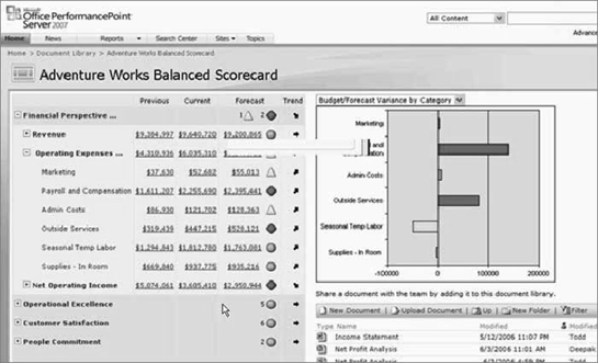
All the features of PerformancePoint work with a broad array of data sources, but scorecards and analytics really shine with an Analysis Services data source. The scorecards, key performance indicators, charts, and dashboards are all designed to leverage dimensions and members. A PerformancePoint Server scorecard is shown in Figure 14-69.
The PerformancePoint designer is a click-once application executed from a web page on the server. The Dashboard Designer is a WYSIWYG designer that allows you to create data sources, KPIs, reports, and scorecards, as shown in Figure 14-70. Once you've designed a dashboard (consisting of one or more scorecards and associated analytics reports), you can publish it to SharePoint, where it will generate a page to display the components of the dashboard.

Let's run through a quick exercise to build a scorecard in PerformancePoint 2007. Follow along with Exercise 14-4.
Build a Scorecard in PPS 2007
In this exercise you'll learn to build a scorecard using data from Analysis Services that you load into PerformancePoint 2007.
Open a browser, and navigate to
http://[server]:40000/where [server] is the name of your PerformancePoint Server.This will open the Dashboard Designer site. Click the Run button next to Download Dashboard Designer to open the Designer.
Once the Designer is open, right-click on Data Sources in the Workspace Browser on the left, and select New Data Source.
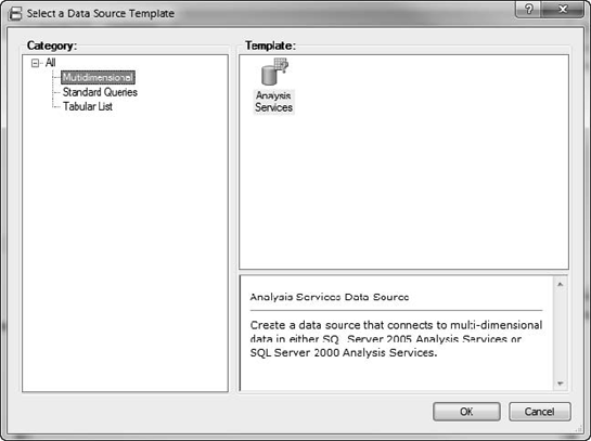
In the Select a Data Source Template dialog, select Multidimensional, and Analysis Services, and then click the OK button, as shown in Figure 14-71.
Name the data source AdventureWorks, and then click the Finish button.
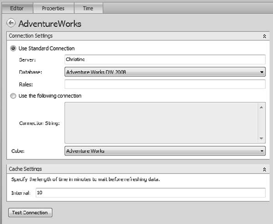
In the configuration editor, enter the name of the server, and then select the AdventureWorks DW 2008 database.
Select the AdventureWorks cube, as shown in Figure 14-72.
Right-click on the new data source and select Publish.
Now right-click on Scorecards in the Workspace Browser and select New Scorecard.
Select Microsoft, and then Analysis Services. Click the OK button.
Name the scorecard AdventureWorks in the Create an Analysis Services Scorecard wizard. Click Next.
Select the AdventureWorks data source you just created. Click Next.
Ensure "Create KPIs from SQL Server Analysis Services measures" is selected. Click Next.
Click Add KPI.
We'll accept the defaults of Internet Sales Amount, for now. Click Next.
Don't make any changes on Add Measure Filters. Click Next.
Check Add Column Members, and then click the Select Dimension button.
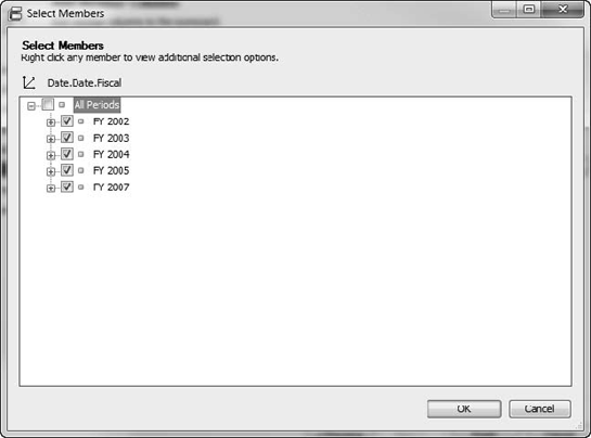
Select Date.Date.Fiscal and click OK.
Click Select Members, and then right-click on All Periods and select Check Children, which should select all the Fiscal Years (Figure 14-73.)
Click OK, Finish, and then Close.
You should now have a scorecard that shows the Internet Sales Amount for each FY, as shown in Figure 14-74.
Let's drill down a bit. In the Details pane on the right, click and drag Customer Country until it's on the right border of where Internet Sales Amount is, as shown in Figure 14-75.
Right-click on All Customers in the dialog and select Check Children, and then click the OK button.
Now we have the countries lined up underneath our KPI. If you click Update on the Edit tab, it should populate, as shown in Figure 14-76.
That's the "quick and dirty" on creating a scorecard in PerformancePoint Services. To dig much deeper into the subject, I humbly recommend my book Pro PerformancePoint Server 2007, published by Apress in 2007.
In this chapter, I introduced you to several front-end tools to display your cube data. You used Excel 2007 pivot tables to attach to an SSAS cube to retrieve and display data. You also worked with formulas and pivot charts. After giving you a quick look into using Visio 2007, I guided you through the new Tablix component added to SSRS. Finally, you discovered the new KPI list and Excel Services features in MOSS 2007.
You did it! This chapter concludes your exploration of Pro SQL Server 2008 Analysis Services. The authors sincerely hope that you have gained valuable experience and insights into SSAS by choosing to spend your time with us. Thank you.