8
Web Content Management
WHAT'S IN THIS CHAPTER?
- Understand how the Publishing Framework supports web content management
- Develop site columns and content types for Publishing content
- Develop Page Layouts and Master Pages for publishing sites
- Configure navigation for publishing sites
- Customize the content with the Query web part
- Set up and use content conversion when publishing sites
Web Content Management is a subset of Enterprise Content Management in SharePoint 2010. The conceptual models that you use for defining, administering, and managing enterprise content are equally relevant to web content systems. Whereas Enterprise Content Management systems typically focus on Document and Records management functions, Web Content Management tends to focus on Page management functions. Fundamentally, the approaches between the two are differentiated only in the artifacts that you process.
THE CONTENT LIFECYCLE IN WEB CONTENT MANAGEMENT
Understanding the conceptual models for content management begins with a clear definition of the content lifecycle. The content lifecycle defines the process by which content is created/captured, managed, distributed, and retained. It is a process model that is familiar to most developers because it is related to and mirrors the Software Development lifecycle that is typically employed in projects.
In SharePoint 2010, creating and capturing content encompasses many different roles and forms. Developers are concerned with the creation of taxonomies in the form of site collections and sites, information architecture in the form of site columns and content types, templates in the form of Master Pages and Page Layouts, and content retention in the form of lists and libraries. Designers are concerned with the creation of branding, the user experience, and navigation artifacts. Business content owners are concerned with the creation of content, using templates to create the pages that end users view on the sites, as well as the creation of reusable content artifacts such as text, HTML, and images. Finally, site visitors and members are concerned with the creation of social content through comments, personalization, and rating systems.
Considering the variety of mechanisms that SharePoint 2010 provides to create and capture content in its Web Content Management system, it is important to understand the procedures for managing all of the content channels that are available. In the past, content management was handled by the developers who were the sole gatekeepers of the static pages. Later, management of the content was handed over to the content owners, who used web-based technologies to manage the content that appeared on the pages, while the developers continued to be the gatekeepers of the templates. SharePoint 2010's content-management procedures add to the existing model by modularizing the locations of content in the system, allowing each role to manage its own content in the system.
Controlling distribution over a large variety of content sources and management processes is very important. Distribution policies provide a mechanism for determining who will see content, where content is deployed, and when content is available. It is the function of the Web Content Management system to provide mechanisms that allow the content creators to indicate whom content is intended for and when content is valid in the system. The Web Content system also allows the business to encapsulate all new content within a framework of workflows and governance that manages the variety of content inputs into the system.
Retention policies govern the final phase in the content's lifecycle. As content ages and becomes obsolete in the system, or is no longer published for general consumption because of the dictates of the distribution policy, the retention policies define how content is disposed within the system. This may include the removal of content from the system, the storage of content in specified libraries or repository locations, or even the movement of content into durable archive systems.
For the SharePoint developer, the content lifecycle is an important conceptual model. This model assists the developer in identifying and using the capabilities that SharePoint offers in support of the content lifecycle. It also assists the developer in defining the components necessary to support the four phases of content life: 1) content types, site columns, and Page Layouts provide the means to create and capture content in the system; 2) workflows and information policies attached to content types provide the means to manage content as it is created in the SharePoint site; 3) workflows and policies also provide the means to distribute content; and 4) record-management policies and custom code provide the means to manage the retention of content and pages as they leave the system.
Finally, the content lifecycle helps you identify the taxonomy needed to support each phase of the content lifecycle. The taxonomy represents the logical categorization of content, lists, libraries, and pages in a SharePoint site, which is normally represented in a site model. SharePoint provides the Pages library and reusable content libraries that support the capture/creation of content in the system, but you need to consider other lists and libraries to handle the movement of content through the system at its various stages. Having a view of content as a living entity that is conceptually modeled in a lifecycle helps you understand the system as it grows.
Separation of Content and Development
Web Content Management in SharePoint 2010 includes technologies that allow you to separate the design and development of the website from the content that makes up the website. These technologies give greater control to both IT and business users over the parts of the website that they are most concerned about.
Before the creation of web content systems, websites consisted of static web pages. These pages included styling, layout, and content mingled together. This mingling later included client programming and server programming as technologies advanced and added more capabilities to the systems. In these systems, the pages were developed and deployed to the web by designers and developers.
The challenge of static systems is that the creation of sites and pages is a burdensome process whereby business stakeholders provide content to the developers who in turn integrate the content into the design and programming of individual pages. Testing and approval of sites and pages was equally burdensome because it included an additional step of getting business sign-off on the content. In some organizations, this included the involvement of legal departments.
SharePoint 2010 addresses the issues of static site development by separating the three main roles of actors in website creation: Designers/Developers, Authors, and Approvers. SharePoint allows Designers/Developers to leverage the software development techniques and lifecycle that they are familiar with to create web assets and templates that are independent of business content. Authors are able to use these assets and templates to create sites and pages, focusing only on the content of the pages. Finally, the deployment of designed assets and content is managed by version control mechanisms and approval workflows that allow Approvers to review assets and content independent of the creation process.
The Important Role of Information Architecture
Information architecture provides the conceptual models that facilitate Web Content Management and mediates the activities and roles of designers, authors, and approvers. It is the information architectural model that informs the development of templates, creation of lists and libraries, and workflows, and provides an overall framework for user interaction within the system.
The development of information architecture in SharePoint tends to begin with the development of the site's hierarchy. The hierarchy provides a common model that designers, developers, content authors, and business stakeholders can all understand. When developed visually with a tool such as Microsoft Visio, the hierarchy is solidified in the minds of the team and provides a basis from which to develop the remaining assets in the taxonomy.
Working with a model of the site's hierarchy, designers and content authors begin to separate the components of the site's information architecture into asset categories, such as site columns and content types, that can be subjected to detailed design. This results in design documents or models that identify Page Layouts needed for content authoring; content types and site columns needed to support the layouts; Master Pages, style sheets, and images needed for branding; lists and libraries to store content; and web parts to display content aggregations.
As well as identifying the necessary assets that make up the web content system, the hierarchical model demonstrates the important distinction between the physical hierarchy and the user experience through navigational constructs. Using SharePoint's built-in navigational components and web parts, designers can achieve an effective navigational structure that is independent of the physical location of lists, libraries, sites, and pages.
Time spent developing complete information architecture models for a SharePoint web content system ensures a robust and effective implementation. Poor planning results in unanticipated changes to underlying components of the system, which often leads to excessive refactoring in the site, including making changes to content types that are in use requiring additional effort to deploy, or changes to the data types of site columns that affect code in the Page Layouts. More than anything else, a solid information architecture spares you many headaches.
FOUNDATIONS OF WEB CONTENT MANAGEMENT
SharePoint Server 2010 implements Web Content Management using the Publishing Site features. These features, when activated, add SharePoint components that enable Web Content Management on the site. These components include Master Pages, Page Layouts, content types, reusable content lists, and custom actions.
Activating the Publishing Features
SharePoint Server 2010 provides two site templates that activate the Publishing features during site provisioning: Publishing Portal and Enterprise Wiki. The Publishing Portal template is a generic template that you can use as a foundation for internal and public-facing publishing sites. The template provisions a site that contains a single home page with a few instructional notes included in the Page Content field and the Publishing features activated. The Enterprise wiki site is a specialized intranet site that implements wiki-based publishing.
The Publishing features aren't limited to the two templates that are available during site creation; they can be activated on any existing site. To enable the Publishing features on an existing site, activate the Office SharePoint Server Publishing Infrastructure feature in the site collection features list (Site Actions  Site Settings Manage site collection features) and activate Office SharePoint Server Publishing in the site features list of each site that you want to have Publishing features (Site Actions Site Settings Manage site features).
Publishing Feature Components
Activating the publishing features in your site provisions a number of components, which include site columns, content types, layouts, Master Pages, and lists. It also makes a number of changes to the way in which the sites work by applying workflows, limiting provisioning, and adding publishing-specific permission groups. Taken together, these components implement Enterprise Content Management methodologies.
The Pages library is the document library that provides the document management functionality for all web pages in the managed site. As authors create pages using the Page Layouts, the completed pages are saved to this library. The library manages the publishing process by implementing two key components of content management. First, the pages in the library are subject to versioning with check-in/check-out support. Authors check out web pages to collaborate on the content of the web page and check in changes as they are completed. The checked-in changes are saved as minor versions of the web page that are not visible to the public until the page is published as a major version and approved by a content approver.
The second key component implemented in the Pages library is the application of an optional approval workflow that is automatically launched when a content author publishes a major version of a web page. When the author clicks the Publish button on the Ribbon or uses the actions menu in the Pages library, the workflow launches the Start Workflow page, which prompts the author to enter some basic workflow information. This is a parallel approval workflow that ensures controlled publication of content to the site.
Besides adding a document management capability to the web pages in the site, the Publishing features also provide controls over the look and feel of the site using Master Pages, Page Layouts, and Cascading Style Sheets that allow designers to manage branding of the site as well as the templates that are available to content authors. Using the Page Layout and Site Template settings page (Site Actions Site Settings Page Layouts and Site Templates), the designer can select which site templates authors can use when creating subsites within their content areas.
The Publishing framework differentiates content authors, content approvers, and designers/developers by implementing an Approvers and a Designers permission group; it leverages the Members group for authors. The Publishing features implement these groups in the libraries and workflows that are created during the provisioning process.
Page Processing Model
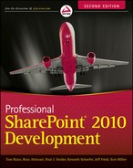
When a site visitor requests a page, SharePoint combines content and templates from the site to render the final page. SharePoint begins by retrieving the requested page from the Page library. This provides SharePoint with the metadata that identifies the web page, as well as the content that the author entered into the page. Next, SharePoint retrieves the Master Page and the Layout Page from the Master Pages and Page Layouts gallery. SharePoint determines the correct Page Layout by examining the content type of the requested web page. Finally, SharePoint combines the Master Page, Page Layouts, and content into a rendered HTML page that it sends back to the end user's browser, as shown in Figure 8-1.
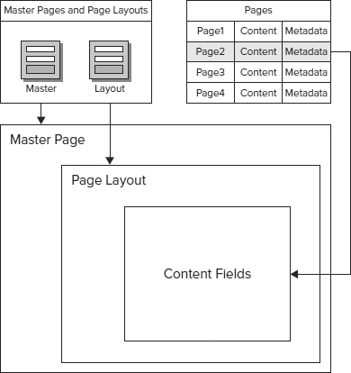
FIGURE 8-1
There is an important relationship between the templates and content that is defined by content types as shown in Figure 8-2. The content type is the glue between the template and the data. Data is stored in fields that are defined by the site columns in the content type. These fields exist in the Pages library where the actual content is stored. It is the association of the content type with the Pages library that makes the site columns available to store content. The template contains the field placeholders where the data is displayed to the end user. It is the association of the content type to the template that makes the fields available to use as placeholders in the template. Therefore, the content type sits between both the template and data by association to both.
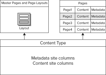
FIGURE 8-2
SITE VARIATIONS
Site variations are a publishing feature that manages the publication of content from a source site to one or more variation sites. Another way of looking at the site variations is to think of each site as an audience for the content in the root site. In this manner, content publishers on the root site may choose the content to publish to its variations. Likewise, the content authors on the variations sites may approve or reject content that comes from the root site.
The most common application of the variations feature is to enable support for multiple languages in a web content solution; however, this is not the only solution in which variations may play a role. Other applications of site variations include remote offices, alternate devices, projects, and brands. In each of these applications, the site variation receives content from the root site and then modifies that content according to the purpose of the site variation.
Preparing for Variations
Site variations are a site collection capability that is included with the Publishing framework in SharePoint 2010. To enable variations, you must activate the SharePoint Server Publishing Infrastructure or create a site collection using one of the Publishing templates.
If you are using site variations to support multilingual scenarios, you need to download and install the appropriate language packs before setting up variations. When the language pack is installed and you create a site for a specific language variation, the target site menus and labels are automatically translated into the appropriate language. As well, if your target is a language that uses a different orientation from the root site (such as, right to left in Arabic), the target site reorients accordingly.
 If you install a language pack after a site is created for a language, it will not translate the target site. For example, if you have a root site in English and create a variation that targets the German language without the language pack, your site is rendered in English. If you later install the pack, the site continues to be rendered in English. You need to remove the variation and recreate it to get the language.
Creating Variations
The options to configure variations are located in the Site Collection Administration menu in Site Settings, as shown in Figure 8-3. These three options give you the ability to configure variations for the site collection, set up variations sites into a hierarchy, and monitor the variations over time.
FIGURE 8-3
Variations Settings
The first link titled “variations” takes you to the Variations Setting page where you may configure the broad publishing behavior for this site collection's variations. These behaviors include setting whether site and pages created in the root site will automatically publish to the target sites or if they must be published manually; whether pages deleted on the target sites should be recreated on subsequent publications; how updates are handled during publishing; and whether notifications are sent when publishing occurs.
In most cases, you utilize the default settings; however, the first setting in the Variations Settings is to designate the URL of the root site (as shown in Figure 8-4). When the publishing infrastructure is first activated, this setting does not contain a value. Until you include a value, you will not be able to create a hierarchy of site variations. If the root site of the site collection will be the root site, you only need to enter a slash in the setting.
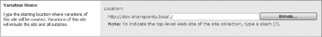
FIGURE 8-4
Variations Labels
After you have established the global settings for the variations, you can begin defining the variations sites. Each variation site has an associated Variation Label that contains metadata that describes the variation site. The label of the site is the text that will appear in navigation.
Although you set the variation home in the Variation Settings page, you need to create a label for your source site. In the example shown in Figure 8-5, I am creating a label for my source site using the English language as the base for a multilingual set of site variations. There is a subtle difference between the label and the display name properties that you need to keep in mind. The label is the string value that appears in the URL of the site variation. The display name is the string value that appears in the navigation of the site collection.
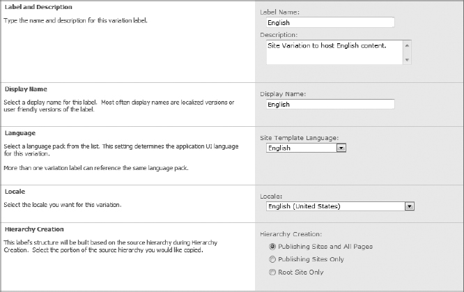
FIGURE 8-5
The difference between language and locale is very important to the end user experience in multilingual settings. The language setting determines which language pack the variation uses for rendering pages in the target site. This setting requires language pack installation before a language can be selected. The Locale setting determines whether this variation is loaded into the user's browser as the default site. It is based on the user's locale settings defined in the operating system. For example, if you create a variation for the German language and set its locale to German (Germany), any user whose operating system locale is set to German (Germany) is automatically routed to the German variation when he/she navigates to the URL of the site collection.
Language packs do not translate content to the target language. They merely change the display of out-of-the-box menu items and labels based on resource files that are installed with the language pack. There is no language translation occurring here.
The hierarchy settings determine the scope of publishing from the source site to the target sites. The default is to publish all content and structure from the source site to the targets, including pages and subsites. The option to include only publishing sites will publish only the subsites without pages into the target sites. Lastly, the root site–only option excludes all subsites.
When creating the source site label, you need to configure the Source Variation setting (shown in Figure 8-6). You simply designate this site as the source and then select a template to base the variations on. That is to say, the selected template is what SharePoint uses to create new site variations during the Create Site job definition. Be aware of the warning that SharePoint displays. Once you click the Create Hierarchies button, you can no longer change which site is the source nor can you change the template.

FIGURE 8-6
After creating the source label, the other labels are created in the same fashion. Figure 8-7 shows variations created for German and Arabic. At this point, you need to tell SharePoint to create the variations sites and establish their relationships. This is done by selecting the Create Hierarchies button in the variations labels page.
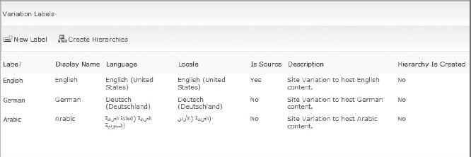
FIGURE 8-7
Publishing begins after the hierarchy is created. This means that any pre-existing content in the site collection or in the source site will not be published to any new variations sites. This is also true when you add a variation site to an existing hierarchy. Any existing content will not be published to the new variation. This is why it is very important to set up hierarchies as early in the implementation process as possible.
Variations Timer Jobs
In SharePoint 2010, the work of creating hierarchies and publishing is handled by a set of five timer jobs, as shown in Figure 8-8. These jobs are managed through the Job Definitions page located in the Monitoring section of Central Administration.
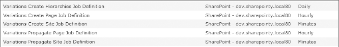
FIGURE 8-8
If you are like me, you are probably managing your own development environment and you don't have the time or patience to wait for each of these timer jobs to run after you create variations. Rather than change the schedules of the jobs to have them run more often, and thus affect the performance of an already skeletonized system, the most efficient way to get the jobs run is to select the link for the job you need to run and click the Run Now button (as shown in Figure 8-9).

FIGURE 8-9
After the timer jobs are run, you can return to your site and find links to each of the variations that you defined. Likewise, when you access the URL of the site collection, you are taken to the variation that matches the locale of your workstation.
One thing to remember is that the source site is a subsite in the site collection. It is not the same as the site collection's root site. Therefore, when you open site settings you will notice that site collection administration has the link to go to the top-level site settings.
SITE COLUMNS
Site columns are an important part of the Publishing framework because they represent content and metadata in the site's web pages. Site columns do not actually contain the content of the web page — that is the function of the list or library that houses the site column. Rather, the site column defines the data format of the content contained in the list or library.
Site columns are used in two distinct ways in a Publishing site. First, the Pages library uses the site column definition to store content and metadata about the page. In this way, the Pages library uses site columns consistently with all other lists in SharePoint. The second way in which site columns are used is as placeholders for content in Layout Pages. Authors enter content into content locations specified by the designer. The designer makes these content placeholders available by associating the placeholder with the site column. It is this match between the field placeholder and the site column in the Page library that allows SharePoint to save content to the library as well as to retrieve it for page rendering.
The challenge of working with site columns in a Publishing site is differentiating between site columns that define content storage fields in a list from site columns that define metadata content that helps to identify the content container. For example, the Scheduled Start Date field of a Publishing Article page is a metadata field that describes when the page should be published. The Page Image field is a content storage field that holds the URL to an image that will appear with the article text on the rendered web page. Some fields represent a gray area between content and metadata, in particular the Title field, which is metadata for the page but is also the HTML title tag content that appears in the browser's window caption.
The processes for creating site columns that will represent metadata and creating site columns that will represent web page content are identical. SharePoint makes no differentiation between the usage models for the site columns. The differentiation becomes important when you begin developing Layout Pages that provide the input fields to the author. Considering the difference at this stage saves you time and debugging later in the development process.
Browser-Based Site Column Development
SharePoint 2010 allows designers to define site columns from the browser-based site settings interface (Site Actions Site Settings Site columns). The Site Columns gallery lists all site columns defined for the site by group.
To create a site column, execute the following steps:
- Click the Create button at the top of the Site Column Gallery listing.
- Enter the Name, Type, Group, and Additional Column Settings for the site column.
- Optionally, SharePoint 2010 adds the ability to include validation logic for each site column.
Browser-based site column development presents three substantial problems for the developer. The first is limited portability of the site column definition. When created by the browser interface, the site column is added directly to the site's content database. When it is necessary to define a site column across many site collections, the designer needs to define the site column in each site collection. For enterprises that use multi-staged environments, this means that the site column needs to be created many times, which is an error-prone approach.
The second substantial problem with the browser-based approach to site column development is the lack of source control that is typical in most development shops. This makes differentiating custom site columns from SharePoint-defined site columns difficult. It is equally difficult to track changes over time, a task that is normally managed using a source control system such as Team Foundation Server.
Finally, the Site Column Definition page does not differentiate between the internal name of the site column and the display name; rather, it presents only the display name and uses that value as the internal name. This results in what is known as the “space problem.” The internal name for a site column cannot contain space characters; therefore, when SharePoint saves the site column in the browser interface, it replaces each space in the name field with the value _x0020_. This creates problems later when you reference the name in a Content Query web part or in your source code. The workaround in the browser interface is to create the site column with no spaces in the name, save it, and then edit the site column to add the spaces back into the name. This causes SharePoint to save an internal name without spaces and then update the display name with spaces.
Feature-Based Site Column Development
Using a SharePoint Feature is the most common approach to developing site columns for a solution when the developer wants a source control manageable code file. The developer uses Collaborative Application Markup Language (CAML) to define Field elements in the Feature's Elements file. When the Feature is activated within a site collection, all of the fields defined in the Elements file are deployed to the site collection as site columns. Visual Studio 2010 includes improved integration and tools for SharePoint development that makes the process of creating a SharePoint Solution and Feature to hold site columns easier than it was in the past. Although Visual Studio 2010 does not include a specific template to create site columns, it does include a blank template that enables you to add site columns to the feature's Elements file.
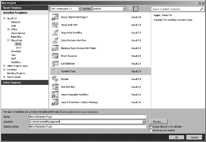
To develop a CAML-based site column in Visual Studio, create a new project (File New Project). In the New Projects dialog box shown in Figure 8-10, expand the SharePoint Installed Templates node for SharePoint and select the 2010 node. Select the Empty SharePoint Project template. Enter a project name and click OK to create a SharePoint Feature and solution.
The following example presents a web content management solution for a Human Resources department. The purpose of the solution is to allow Human Resources personnel to add web pages to the site that provide benefits information to employees. The following site columns provide metadata and content for page instances in the Human Resources site. Later the sample will add content types that will be tied into the Page Layouts.

FIGURE 8-10
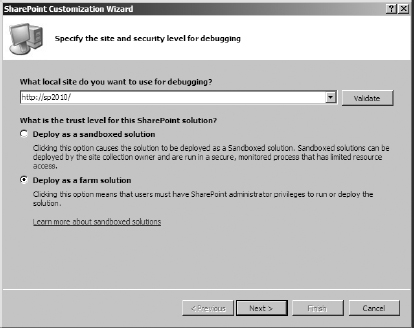
SharePoint 2010 introduces the concept of Sandbox Solutions. These are solutions that can be deployed to a specific site collection as a user solution and are managed in the Solutions gallery (Site Actions Site Settings Solutions). This allows for the deployment of solutions to a testing environment where server resets are not necessary. When you create a project based on the SharePoint project templates, Visual Studio asks you whether the project should be sandboxed or server-based, as shown in Figure 8-11. Since most development occurs on dedicated development virtual machines or in a development environment where you have administrator privileges, it is more efficient to deploy as a farm solution. The examples in this chapter assume that you are deploying to the farm.
If you opt to deploy as a Sandboxed Solution and would like to change to a farm solution later, you may do so by selecting the project in the Visual Studio Solution Explorer. Change the Sandboxed Solution property in the Properties pane to False.
Visual Studio 2010 creates a new project that includes references to Microsoft.SharePoint.dll and Microsoft.SharePoint.Security.dll. It is strongly named and includes two special folders specific to SharePoint projects: Feature and Package. The Feature folder represents the SharePoint Features included in this project. The Package folder represents the SharePoint solution that's compiled into a WSP file that deploys the Features to the designated solution store.
The Empty SharePoint Project template does not include any features in the Features folder. To add a new feature to this project, right-click the Features folder, and click Add Feature. This adds a new Feature component to the folder; double-click the Feature1 icon in Solution Explorer to modify the Feature's metadata using the Feature designer, as shown in Figure 8-12.
The feature's scope determines where the feature can be activated within SharePoint. There are four possible scopes that you may select for a feature:
- Farm: Activates a feature for the entire SharePoint farm and is available in Central Administration.
- WebApplication: Activates a feature for all sites in a web application and is available in Central Administration.
- Site: Activates a feature for all sites in a site collection and is available in Site Collection Features in the site collection root site's site settings.
- Web: Activates a feature for a website and is available in Site Features in the web's Site Settings.
Certain components, like site columns, content types, Master Pages, and Page Layouts, are installed at the site collection level and made available to all sites within the collection. These components require that the scope for the feature be set to Site.
FIGURE 8-12
Next, add a new item to the project (right-click the project name and then click Add New Item) and select the Empty Element template from the Add New Item dialog box, as shown in Figure 8-13.
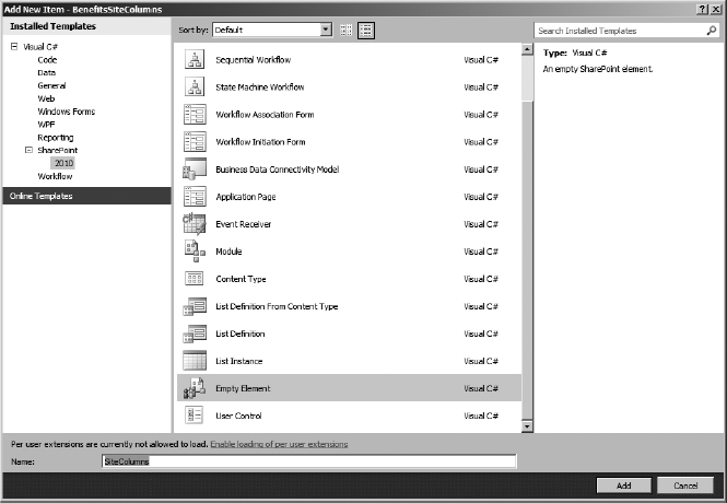
FIGURE 8-13
The Empty Element template is an XML file into which you can enter CAML field definitions. The following example shows the CAML definition for site columns. The DisplayName, Description, and Group attributes define the values that display in many of the browser-based interfaces including the site column gallery, and site column pickers in List properties. The type attribute indicates the data type of the site column: the available data type values are documented in the CAML section of the MSDN library.

<Elements xmlns=“http://schemas.microsoft.com/sharepoint/”>
   <Field ID=“{76C140E1-D827-433B-AD38-257F9594B846}”
          Name=“BenefitProvider”
          DisplayName=“Provider Name”
          Group=“Human Resources”

          Type=“Text”
          Required=“FALSE”/>
   <Field ID=“{A1758D70-B479-469C-90BB-C3038ED42B15}”
          Name=“BenefitProviderLogo”
          DisplayName=“Provider Logo”
          Group=“Human Resources”
          Type=“Image”
          Required=“FALSE”/>
   <Field ID=“{5F516D92-969C-4661-81B9-C9210E2A2FDC}”
          Name=“BenefitType”
          DisplayName=“Benefit Category”
          Group=“Human Resources”
          Type=“Choice”
          Required=“FALSE”>
     <CHOICES>
       <CHOICE>Medical</CHOICE>
       <CHOICE>Dental</CHOICE>
       <CHOICE>Vision</CHOICE>
       <CHOICE>Insurance</CHOICE>
     </CHOICES>
   </Field>
   <Field ID=“{521D5F12-16BC-4E82-997C-F28933ABE59E}”
          Name=“BenefitDescription”
          DisplayName=“Benefit Description”
          Group=“Human Resources”
          Type=“HTML” RichText=“TRUE” RichTextMode=“FullHtml”
          Required=“FALSE”/>
 </Elements>
Because CAML provides attributes for the DisplayName and Name you avoid the spaces problem that the browser-based interface presents. Using CAML you can define a Name field that does not contain spaces; however, if you place spaces in the Name attribute, SharePoint saves the name with the _x0020_ string as it does with the browser-based approach.
To deploy the site columns defined in the Elements file, right-click the project name in the Visual Studio Solution Explorer and select Deploy. This deploys the solution file to the solution store and activates the Feature in the targeted site collection. You can validate the installation of your site columns in SharePoint Designer or by viewing the Site Columns gallery in the Site Settings of the target Site Collection.
Feature-based site column development also avoids the problems of portability and synchronization of browser-based development. Using a SharePoint Solution for deployment, a feature can be installed across multi-stage environments with minimal effort. Portability becomes a matter of site administration and feature management. Features also ensure that site columns across environments remain synchronized in their metadata, eliminating the possibility of misspellings.
Object Model-Based Site Column Development
Using the SharePoint object model is a very powerful method for implementing site columns in SharePoint, as well as other SharePoint customizations. The object model is also a familiar model to seasoned .NET developers who prefer to work with code rather than CAML. Finally, the object model provides additional flexibility for the developer because it allows the creation of assets from entry points other than SharePoint features, such as Application pages and .NET applications.
The most significant problem with developing site columns in CAML occurs when you are modifying or enhancing a feature that has already deployed site columns into the site collection. In this situation, site columns are often assigned to content types and/or lists and may have data in place. Because the CAML feature does not validate the contents of the site, it may experience problems or cause exceptions when you attempt to upgrade the feature.
Using object model code in a feature receiver allows you to perform validation on your site and additional data-massaging work before upgrading your feature. Also, you have the option to include the definition and creation of the site columns in object model code rather than in CAML, in which case your feature may consist solely of a receiver with no Elements file attached.
Creating site columns in code using a feature receiver in Visual Studio 2010 is very similar to creating a CAML feature to create site columns. Create a new project (File New Project) and select an empty SharePoint project template to build the foundation of the project. Right-click the Features folder in Solution Explorer, and add a feature to the project. You will set the properties of the feature in the Feature Designer, but you don't add an empty elements file to the project as you did with the CAML approach.
Rather than add the empty elements, right-click the feature in the Features folder and select Add Event Receiver from the drop-down menu. This adds a class under the Features folder in Solution Explorer, as shown in Figure 8-14.
FIGURE 8-14
The Visual Studio–generated class contains commented override methods for each of the feature's events. Uncomment the methods you want to add code to and add the code. In this example, the FeatureActivated method creates two site columns and adds them to the site collection.
public override void FeatureActivated(SPFeatureReceiverProperties properties)
{
  using (SPSite site = (SPSite)properties.Feature.Parent)
  {
    using (SPWeb web = site.RootWeb)
    {
      try
      {
        string benefitsDescription = web.Fields.Add(
          “Benefits_Description”, SPFieldType.Note, false);
        string benefitsYear = web.Fields.Add(

           “Benefits_Year”, SPFieldType.DateTime, false);
        web.Update();

        SPField benefitsDescriptionField = web.Fields[benefitsDescription];
        benefitsDescriptionField.Title = “Description”;
        benefitsDescriptionField.Description = “Describe the benefits document”;
        benefitsDescriptionField.Group = “Human Resources”;
        benefitsDescriptionField.Update();

        SPField benefitsYearField = web.Fields[benefitsYear];
        benefitsYearField.Title = “Year”;
        benefitsYearField.Description = “Year the benefits document is valid”;
        benefitsYearField.Group = “Human Resources”;
        benefitsYearField.Update();
      }
      catch (Exception ex)
      {
        Console.Write(ex.ToString());
      }
    }
  }
}
The code begins by connecting to the site collection using the properties of the feature rather than using the SPContext class. The SPContext class returns a reference to a site collection only when the code is running within a SharePoint site; otherwise, no context exists. In the case of a feature, a system administrator may not be using the Site Settings pages to activate features; rather, she may be using a command-line script to activate the feature, in which case there is no SharePoint context. Therefore, FeatureActivating methods should use the feature's properties to get the site collection.
The root web of the site collection contains the collection of SPFields (site columns) defined in the site collection. To create a site column in code, simply use the collection's Add method to define a new site column. The first argument is the name of the site column, the second is the data type, and the last flags whether the site column is required. A call to the SPWeb's Update method saves the site column to the site collection.
To configure the additional attributes of the site columns, you need to reference each one, modify its properties, and update it. If this code is in the same method that you created the site column, getting the reference is easy because the field collection's Add method returns the internal name of the site column as a string. Using this string, you can instantiate an SPField object with a reference to the internal name. Finally, modify the site column's properties and call the Update method to save the completed site column.
Unlike the site columns defined using CAML, when this feature is deactivated, it does not remove the site columns from the site collection. To add this behavior, you need to override the FeatureDeactivating method and add code to remove the site columns that you created in code.
public override void FeatureDeactivating(SPFeatureReceiverProperties properties)
{
  if(properties.Feature.FeatureDefinitionScope != SPFeatureDefinitionScope.Site)
  {
    throw new Exception(“This feature must be a ‘Site’ feature”);
  }
  using (SPSite site = (SPSite)properties.Feature.Parent)
  {
    using (SPWeb web = site.RootWeb)
    {
      try
      {
        web.Fields[“Benefits_Description”].Delete();
        web.Fields[“Benefits_Year”].Delete();
      }
      catch (Exception ex)
      {
        Console.WriteLine(ex.ToString());
      }
    }
  }
}
This simple example replicates the behavior demonstrated in the CAML code; however, it could easily include code that iterates through the lists in the site collection and that cleans up existing data that might be using these site columns. The code could also create lists, content types, or other related assets that are necessary to the web content solution.
CONTENT TYPES
Content types are a conceptual container for content and processes in the system. They encapsulate metadata in the form of site columns and functionality in the form of information policies and workflow. In a publishing site, content types are a bridge between the content-holding site columns and the template-oriented Page Layouts. Without a defined content type, SharePoint has no way of associating a Page Layout with the content contained in the Pages library.
It is important to remember that you assign the content type to the Page Layout and add the content type to the Pages library.
Understanding Content Type IDs
Before you can develop a content type for any use in SharePoint, you must understand how content type IDs work. Unlike all other elements in SharePoint where the ID value is a GUID that identifies the element to SharePoint, the content type ID also contains hierarchical logic that identifies where the content type exists within the system.
Every content type in SharePoint must inherit from a parent content type. Similar to object inheritance in code, content types inherit all site columns, workflows, and information policies, from their parent content type.
There are two approaches to defining content type IDs: the Hex approach and the GUID approach. The Hex approach defines a content type ID by adding a two-digit Hex value other than “00” to the end of the parent's content type ID. The GUID approach adds the value “00” followed by a GUID (with all special characters stripped out) to the parent's content type ID.
Hex: [parent content type ID] + [2-digit hex value]
GUID: [parent content type ID] + 00 + [GUID with no {} or - characters]
For example, suppose you create a content type for an HR benefits document that inherits from the Document content type. Using the Hex approach would result in a content type ID that begins with the Document content type ID 0x0101 followed by a two-digit hex value 03.
Hex: 0x010103
Using the GUID approach for the same content type would also begin with the Document content type ID 0x0101, but it would be followed by 00 and then a GUID that is stripped of special characters, 24CB1116BE6D49e9B482D492532921F2.
GUID: 0x01010024CB1116BE6D49e9B482D492532921F2
There are three approaches to finding the content type ID of a parent content type. First, you can open the Content Type Properties page from the Content Types gallery and then look in the page URL for the ctype attribute. Second, you can go into the Features folder of the SharePoint Root in Windows Explorer and open the Elements file, where the Content Type is defined. Finally, if you have SharePoint Designer 2010, it contains a Content Type section that shows the properties of every content type in your site, including the ID.
The best practice recommended by Microsoft is to use the GUID approach to define all custom content types in the system. The GUID approach avoids collisions between content type IDs that can occur with the Hex approach if the Hex values are not carefully managed by designers of the system. For example, the Hex value provided in the previous example for the benefits document (03) is acceptable because it is not one of the out-of-the-box IDs; however, a quick look at the SDK documentation in the “Base Content Type Hierarchy” section shows that there are a number of out-of-the-box types using neighboring hex values. It would be easy to collide with some of the Microsoft-defined content type IDs.
Content type IDs are limited to a 1,024 character size. Given a deep content type hierarchy, you can quickly run out of space for defining a content type ID. In these situations, you will need to use an approach that mixes both methods. You begin with the GUID approach to inherit from the parent content type, which results in a “base” content type that acts similarly to a namespace in code. Then, you switch to a Hex approach to define internal children types.
Browser-Based Content Type Development
SharePoint provides a browser-based approach to creating content types that is similar to creating site columns in the browser (Site Actions Site Settings Site content types). The process by which the content type is created in the site works somewhat differently from that for other elements in SharePoint. The initial content type definition establishes the name, parent, and group of the content type.
After SharePoint creates the content type, it displays the Content Type Properties page rather than redirecting you back to the Content Type gallery. The Content Type Properties page provides the links and capabilities to add more site columns to the content type, as well as to add, modify, or delete workflows and information policies.
Browser-based content type development suffers from the same portability and source management issues that browser-based site column development presents. SharePoint 2010 introduces a content management capability called Enterprise Content Types that automatically publishes content types across site collection boundaries within a SharePoint farm. This is a very powerful feature that merits close examination in your solutions; however, it does not work across multi-environment settings. Likewise, Enterprise Content Types do not provide any form of source control for content type definitions in your development lifecycle. Even when you use Enterprise Content Types, you should still define the content type with either the feature or object model approaches.
Feature-Based Content Type Development
Feature-based content type development works within the SharePoint Solution and Feature framework in exactly the same way that feature-based site column development works. The content type is defined in the feature's Elements file using CAML. Because content types are containers for custom site columns, it is a common practice to define the custom site columns at the top of the Elements file and then define the custom content types at the bottom. This enables you to deploy both the site columns and their containers in one SharePoint Feature.
Visual Studio 2010's SharePoint tools include a template for content types that provides the basic framework for defining a content type in CAML. To begin creating a content type, create a new project (File New Project) and select the Content Type SharePoint Project template to build the foundation of the project, as shown in Figure 8-15.
Next, Visual Studio asks you to select the parent content type. When creating a content type to use with a Page Layout, you must inherit from one of the Page Layouts, as shown in Figure 8-16.

FIGURE 8-16
Visual Studio 2010 creates a CAML-based definition for the content type, including a content type ID that uses the GUID method. An added benefit is that it includes the parent's ID as a comment for easy reference. In most cases, you will want to modify the generated metadata values to content that is more fitting to your information architecture.
<?xml version=“1.0” encoding=“utf-8”?>
<Elements xmlns=“http://schemas.microsoft.com/sharepoint/”>
  <!-- Parent ContentType: Article Page (0x010100C568DB52D9D0A14D9B2FDCC96666E9F2007
948130EC3DB064584E219954237AF3900242457EFB8B24247815D688C526CD44D) -->
  <ContentType ID=“0x010100C568DB52D9D0A14D9B2FDCC96666E9F2007948130EC3DB064584E2199
54237AF3900242457EFB8B24247815D688C526CD44D007b07c2cdb6004430bfd2fe7a3eff5ecb”
               Name=“Benefits Information Page”
               Group=“Human Resources”
               Description=“Benefits Information page layout content type”

               Version=“0”>
    <FieldRefs>
    </FieldRefs>
  </ContentType>
</Elements>
To complete the content type definition, add field references within the <FieldRefs></FieldRefs> elements. Each field reference element associates a site column with the content type. Note that it is not necessary to include field references for fields inherited from the parent content type.
<?xml version=“1.0” encoding=“utf-8”?>
<Elements xmlns=“http://schemas.microsoft.com/sharepoint/”>
  <!-- Parent ContentType: Article Page (0x010100C568DB52D9D0A14D9B2FDCC96666E9F2007
948130EC3DB064584E219954237AF3900242457EFB8B24247815D688C526CD44D) -->
  <ContentType ID=“0x010100C568DB52D9D0A14D9B2FDCC96666E9F2007948130EC3DB064584E219
54237AF3900242457EFB8B24247815D688C526CD44D007b07c2cdb6004430bfd2fe7a3eff5ecb”
               Name=“Benefits Information Page”
               Group=“Human Resources”
               Description=“Benefits Information page layout content type”
               Version=“0”>
    <FieldRefs>
       <FieldRef ID=“{76C140E1-D827-433B-AD38-257F9594B846}”
          Name=“BenefitProvider”/>
       <FieldRef ID=“{A1758D70-B479-469C-90BB-C3038ED42B15}”
          Name=“BenefitProviderLogo”/>
       <FieldRef ID=“{5F516D92-969C-4661-81B9-C9210E2A2FDC}”
          Name=“BenefitType”/>
       <FieldRef ID=“{521D5F12-16BC-4E82-997C-F28933ABE59E}”
          Name=“BenefitDescription”/>
   </FieldRefs>
  </ContentType>
</Elements>
The challenge presented with this example is that the content type definition references site columns that are defined in a separate feature. If the other feature is not activated first, SharePoint displays an error page when you attempt to run this project. There are two ways to deal with this challenge. The first is to modify the feature definition to add a feature dependency between the two features.
In Visual Studio 2010, adding a feature dependency is very easy, especially if the feature is already installed on your targeted SharePoint site. To add the dependency, open the Feature Designer by double-clicking the feature in Visual Studio's Solution Explorer. At the bottom of the Designer, expand the section at the bottom labeled Feature Activation Dependencies, then click the Add button to add the dependency.
Visual Studio shows a list of the Features installed in the target SharePoint site, as shown in Figure 8-17. You can select one or more of the installed features to make this feature dependent. You also have the option to enter the feature information for dependencies that you have not installed on the target SharePoint site. After you click Add, the feature is updated to include the dependencies, as shown in Figure 8-18.

FIGURE 8-17
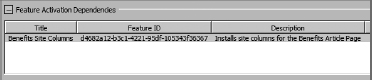
FIGURE 8-18
The second way to deal with the dependency created by this content type definition is to refactor the features so that the site columns are included in the same feature as the content type. This is a matter of either cutting and pasting the Site Column CAML into the content type's Elements file or adding the site column Elements file to the current project.
Object Model-Based Content Type Development
As with site columns, you can create content types using the SharePoint object model. The object model provides you the flexibility to develop content types with .NET applications, application pages, web parts, and feature receivers using a code-based approach.
The most significant challenge when working with content types occurs when business needs necessitate a change to the structure of existing content types. This may be the addition or subtraction of site columns, the inclusion of a workflow, or modification of other elements that content types contain. If the content type is in use by a list or content, you will not be able to deploy your modifications.
Object model code provides you with the means to develop mechanisms that will not only deploy updated content type definitions but also manage existing content. In these cases, a feature receiver can iterate through the site to find content and lists that are using a content type, extract those components from the site, modify the content type, and reinsert the content. These procedures are code-intensive and outside a discussion of Web Content Management, but understanding the basic concept of content type development with the object model will help you deal with upgrade situations when they arise.
To create a content type using object model code and a feature receiver, create a new Visual Studio project (File New Project) and select an empty SharePoint project template. Right-click the Features folder in Solution Explorer, and add a feature to the project. You will set the properties of the feature in the Feature Designer, but you will not add an empty element or a content type element to the feature; rather, right-click the feature and select Add Event Receiver from the drop-down menu.
In this example, uncomment the FeatureActivated and FeatureDeactivating methods to include code that creates a content type and removes it when the feature is activated and deactivated, respectively. Creating a content type in object model code takes three distinct steps that mirror the three steps followed in the CAML approach: define the parent, create the content type, and add additional components.
public override void FeatureActivated(SPFeatureReceiverProperties properties)
{
  using (SPSite site = (SPSite)properties.Feature.Parent)
  {
    using (SPWeb web = site.RootWeb)
    {
      try
      {
        SPContentType parentType = web.AvailableContentTypes[“Document”];

        SPContentType contentType =
          new SPContentType(parentType, web.ContentTypes, “Benefits Document”);
        contentType.Group = “Human Resources”;
        contentType.Description = “Benefits documentation and forms”;

        web.ContentTypes.Add(contentType);
        web.Update();

        SPField descriptionField = web.AvailableFields[“Benefits_Description”];
        contentType.FieldLinks.Add(new SPFieldLink(descriptionField));
        SPField yearField = web.AvailableFields[“Benefits_Year”];
        contentType.FieldLinks.Add(new SPFieldLink(yearField));

        contentType.Update();
      }
      catch (Exception ex)
      {
        Console.WriteLine(ex.ToString());
      }
    }
  }
}
public override void FeatureDeactivating(SPFeatureReceiverProperties properties)
{
  using (SPSite site = (SPSite)properties.Feature.Parent)
  {
    using (SPWeb web = site.RootWeb)
    {
      try
      {
        SPContentType contentType = web.AvailableContentTypes[“Benefits Document”];
        contentType.Delete();
        web.Update();
      }
      catch (Exception ex)
      {
        Console.WriteLine(ex.ToString());
      }
    }
  }
}
This example begins by getting a reference to the Parent content type, using the AvailableContentTypes collection. In this case, the content type inherits from the document type. The next section of the code creates an instance of SPContentType, passing in the parent content type, the collection that the content type will be added to, and the name of the content type. You can set other properties of the content type such as Group and Description in the next few lines. Finally, the content type is added to the ContentTypes collection of the root web, and the web is updated to save the content type.
The last step in the process is to add the associated site columns to the content type and update it with those changes. The code retrieves each site column from the AvailableSiteColumns collection in the root web. The site columns are added to the content type as SPFieldLink objects that are added to the FieldLink collection in the content type. Finally, the Update method saves the changes to the content type.
As with the CAML-based approach, using existing site columns sets up a feature dependency that can be handled in the same way as in the previous example, by setting a dependency in the feature or by including the site column code in this receiver. An additional option available to object model code is to include validation methods that look for the site columns in the site collection and either activate their features from code or create them from code.
Client Object Model-Based Content Type Development
SharePoint 2010 includes a client object model that allows your code to run on a separate server or workstation. This model supports building .NET forms and console applications, as well as WPF, Silverlight, and EMCA script applications. Client Object Model code operates through a set of client side objects that represent components on the SharePoint server rather than interacting directly with the components as the Server Object Model does. This means that you need to establish a connection to the SharePoint server and load the objects that you need into the client application in order to access them.
Initially, this may appear to be more cumbersome than necessary to accomplish the same task as the server object model; however, the client object model provides some interesting possibilities for Web Content Management. Because the client application does not need to run on the SharePoint server, you can set up an authoring environment that is separate from content authoring environments, thus adding more modularization to the topology.
To create a content type using the client object model in Visual Studio 2010, create a new project (File New Project) and select a Console Application template, as shown in Figure 8-19.
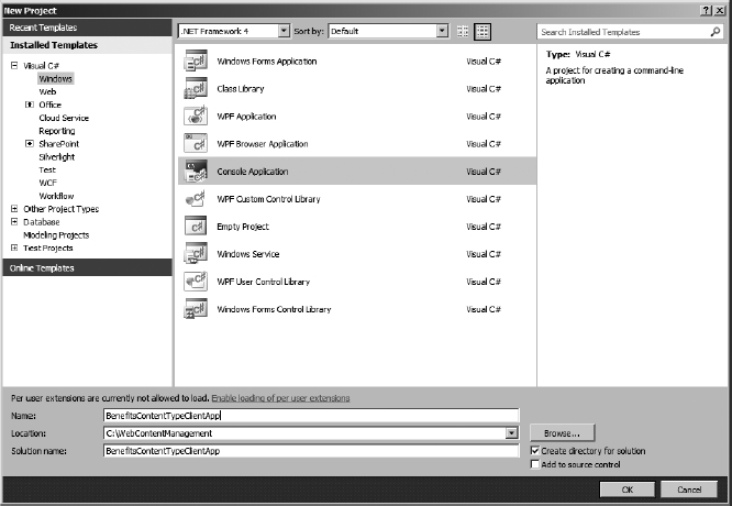
After the project starts, you need to add references to the Microsoft.SharePoint.Client.dll and Microsoft.SharePoint.Client.Runtime.dll assemblies located in the 14ISAPI folder. They are also listed under the .NET component listing in the Add References dialog box. Next, you add code to the main program that will make the connection to the site collection. Because client object model code can run externally to the SharePoint application server, it works through a ClientContext object. The ClientContext object provides access to objects in the site collection, but they must be explicitly loaded into the context in order to code against them.
static void Main(string[] args)
{
   // Get a reference to the site collection
   ClientContext clientContext = new ClientContext(“http://sp2010”)
   Web web = clientContext.Web;

   // Load reference to content type collection
   ContentTypeCollection contentTypes = web.ContentTypes;
   clientContext.Load(contentTypes);
   clientContext.ExecuteQuery();
 }
Unlike server object model code, in which you can create an instance of the SPContentType class and add it to the ContentTypes collection, client object model makes use of an Information class that contains the template of the content type. The information class works in a similar manner to the SPContentType class with the exception of the parent's reference; rather than pass in a reference to the parent's content type, client object model code gets the parent's ID.
static void Main(string[] args)
{
  // Get a reference to the site collection
  ClientContext clientContext = new ClientContext(“http://sp2010”);
  Web web = clientContext.Web;

  // Load reference to content type collection
  ContentTypeCollection contentTypes = web.ContentTypes;
  clientContext.Load(contentTypes);
  clientContext.ExecuteQuery();

  // Create a Content Type Information object
  ContentTypeCreationlnformation benefitArticleInfo =
    new ContentTypeCreationInformation();
  benefitArticleInfo.Name = “Benefits Article”;
  benefitArticleInfo.ParentContentType = contentTypes.GetById(
“0x010100C568DB52D9D0A14D9B2FDCC96666E9F2007948130EC3DB064584E219954237AF39002
42457EFB8B24247815D688C526CD44D”);
  benefitArticleInfo.Group = “Human Resources”;

  // Create the content type
  ContentType benefitArticle = contentTypes.Add(benefitArticleInfo);
  clientContext.ExecuteQuery();

}
After the Information object is completed, a ContentType object is added to the ContentTypes collection that you loaded with the ClientContext using the Information object. Although this adds the content type, the type does not exist in the site collection until the ClientContext executes the query.
Working with content types is central to Web Content Management development. Understanding all of the ContentType creation objects will give you a greater ability to develop flexible and powerful solutions for your web content systems.
PAGE LAYOUTS
In its most basic form, a Page Layout is a template that is used to author content in the web content solution. In this way, it is very similar to an input form. What makes the Page Layout unique is that it represents a WYSIWYG (what you see is what you get) input form for a web page. The author enters content into the Layout Pages at the locations on the page where the content will be rendered in response to visitor requests.
The Page Layout does not implement the overall branding for the site, so an individual Layout Page needs to implement specific styles and elements that keep the page consistent with the branding strategy of the site. SharePoint combines the Page Layout with the Master Page to render the page to the browser. This means that your Page Layout will consist of content placeholder elements that will instruct SharePoint where to place elements of the Page Layout inside the Master Page.
From a content-authoring perspective, the Page Layout dictates how the authoring experience functions. It accomplishes this in two ways. First, every Page Layout must be associated with a content type that is available in the Pages library and inherits from the Page content type. Second, the Page Layout implements editable fields that provide authoring areas on the page. These fields match up with the site columns defined in the content type.
Although each Page Layout can be associated with only one content type, content types are not limited to one Page Layout. This offers you a lot of flexibility when designing Page Layouts for web content solutions. A good example of this flexibility is the Article pages that are included in the Publishing framework. There is a Page Layout that shows the page image on the left, one with the image on the right, and one with only the body content.
Finally, because the Page Layout is a template for authoring and rendering content, the Designer may make changes to the Page Layout without affecting the underlying content.
Developing Page Layouts
The development process for creating Page Layout consists of two distinct steps. The first is the development of the Page Layout template that SharePoint uses for authoring and rendering content. This step consists of developing an .aspx file with content placeholders that leverage the Master Page's branding, and fields for accepting authored input, as well as other web page elements necessary to achieve the desired functional and design effects.
The second step of the process is the deployment of the Page Layout in SharePoint, where the content type association is made and the template becomes available for use. Page layouts are uploaded to the Master Pages and Page Layouts gallery (Site Actions Site Settings Master Pages and Page Layouts) in the SharePoint site collection.
Creating a Page Layout with SharePoint Designer
SharePoint Designer 2010 makes the process of developing templates and deploying them to SharePoint easier by connecting directly to the target web site and its associated content database. With SharePoint Designer 2010, you create a Layout Page directly in the Master Pages and Page Layouts gallery, thereby allowing SharePoint Designer to save the Page Layout directly in the gallery.
SharePoint Designer 2010's site navigation pane, shown in Figure 8-20, includes a link to view the Page Layouts that are loaded in the Master Pages and Page Layouts gallery. When the Page Layouts item is selected in the navigation pane, SharePoint Designer also displays a custom Ribbon that contains actions specific to Layout Pages in SharePoint. These include check-in/check-out of existing Page Layouts, importing and exporting of Page Layouts, and access to the Master Pages and Page Layouts gallery's list settings.
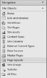
FIGURE 8-20
To create a new Layout Page using SharePoint Designer, click the New Layout Page button in the SharePoint Designer Ribbon. As shown in Figure 8-21, the new action calls a dialog box that asks for the basic information necessary to create a Page Layout, notably the content type group and name of the associated content type that defines the authored content fields for the layout, and the filename and title of the Layout Page.
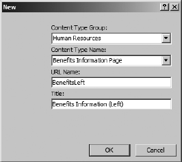
FIGURE 8-21
After SharePoint Designer gets the information necessary to create the Page Layout, it instantiates the page in the Master Pages and Page Layouts gallery and opens it in the Code View window. This is an important point because the deployment is essentially completed. If you open the Master Pages and Page Layouts gallery from within the Site Settings of the SharePoint site, the new Page Layout displays in the gallery in a draft mode. This means that anyone with the appropriate permissions can see and use the Page Layout in your site.
SharePoint Designer provides a Code view and a Design view. The Design Editor is integrated into SharePoint so that it loads the branding that is defined by the Master Page into the Designer, giving you a complete view of the Page Layout as you develop its design. In Design view, you build the content of the Page Layout in the area designated by a box containing the label PlaceHolderMain (Custom), as shown in Figure 8-22.
FIGURE 8-22
When SharePoint Designer loads the page into the Editor, it examines the associated content type and lists the available fields in the Toolbox pane. SharePoint Designer also separates the available fields into two categories: Page Fields and Content Fields. Page Fields are authored fields that indicate metadata for the page and are not rendered to the browser window during page views. Content Fields contain the authored content for the page that is rendered to the browser during page views. See Figure 8-23. Using the toolbox, you drag and drop the fields onto the Layout Page.
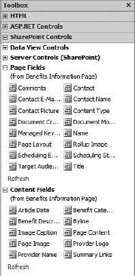
FIGURE 8-23
Adding fields to your Page Layout in Design mode inserts either a SharePointWebControls or PublishingWebControls element into the page. SharePointWebControls are the ASP.NET server controls that are included as part of the SharePoint Foundation in the Microsoft.SharePoint.WebControls namespace. PublishingWebControls are ASP.NET server controls that are included as part of SharePoint Server in the Microsoft.SharePoint.Publishing.WebControls namespace. The specific control depends on the site column and content type associated with the Layout Page; most site columns are rendered with SharePointWebControls, but any publishing field is rendered with the PublishingWebControls. The connection between the site column and the web control is made with the FieldName attribute of the web control. The value of this attribute is the internal name of the site column that defines the storage model for the field.
SharePoint 2010 is designed to make the migration from SharePoint 2007 easy. It accomplishes this by supporting assets created in SharePoint 2007. In a Page Layout, SharePoint adds a new web control, UIVersionedContent. The UIVersionedContent control is a container control that holds a ContentTemplate. The template contains the ASP.NET and HTML that renders for the contained section. The UIVersion attribute of the UIVersionedControl informs SharePoint which version the contained code supports: 3 for SharePoint 2007 and 4 for SharePoint 2010. The out-of-the-box Article pages make heavy use of the UIVersionedContent control and merit close examination if you are developing Page Layouts that may be rendered as SharePoint 2007 or 2010 Master Pages.
The disadvantage of using SharePoint Designer is that, when it instantiates a new Page Layout, it is doing so inside the content database. This means that the Page Layout is limited to the site in which it was created. In scenarios where a multi-stage environment is used, or you are developing locally and then deploying to a SharePoint server, additional steps are necessary to export the page out of SharePoint Designer and to package it into a feature. This is the subject of the next section.
Create a Page Layout with Visual Studio
Developing a Page Layout with Visual Studio 2010 requires that you consider the deployment path for the layout. Normally, Page Layouts are deployed using the Module element in a feature. The feature is then packaged into a SharePoint Solution for deployment. Visual Studio 2010 includes SharePoint tools that simplify the development effort required to build the deployment packages.
Visual Studio 2010 does not include a project template for a Page Layout; rather, it includes a project template for a module. This template creates all the necessary feature artifacts and a Solution package. The purpose of a Module element is to provide a mechanism for provisioning assets into the content database. In this case, the module provisions the Page Layout into the Master Pages and Page Layouts gallery.
To create a Layout Page in Visual Studio, create a new project (File New Project) and select the Module template. Visual Studio creates a Module folder that contains the SharePoint Elements file and a sample text file. The Elements file contains the instructions that provision files into SharePoint when the feature is activated.
There are two approaches to creating the Page Layout. The first approach is to manually add a Web Form page to the module by right-clicking the Module1 folder and selecting Add New Item from the pop-up menu. Because the SharePoint project template is not an ASP.NET web application, the Web Form (.aspx) page template is not available in the Add New Item dialog box. To work around this, select the Text File template and give the file an .aspx extension. This adds a blank file to the module and creates an entry in the Module's Elements file for the Page Layout.
To build the Page Layout, start by adding the minimal declarations and content placeholders. This serves as the foundation for the layout.
<%@ Page language=“C#” Inherits=“Microsoft.SharePoint.Publishing.PublishingLayoutPage, Microsoft.SharePoint.Publishing, Version=14.0.0.0, Culture=neutral, PublicKeyToken=71e9bc e111e9429c”
meta:webpartpageexpansion=“full”
meta:progid=“SharePoint.WebPartPage.Document” %>
<%@ Register Tagprefix=“SharePointWebControls” Namespace=“Microsoft.SharePoint.
WebControls”
Assembly=“Microsoft.SharePoint,
Version=14.0.0.0,
Culture=neutral,
PublicKeyToken=71e9bce111e9429c” %>
<%@ Register
Tagprefix=“WebPartPages”
Namespace=“Microsoft.SharePoint.WebPartPages”
Assembly=“Microsoft.SharePoint,
Version=14.0.0.0,
Culture=neutral,
PublicKeyToken=71e9bce111e9429c” %>
<%@ Register
Tagprefix=“PublishingWebControls” Namespace=“Microsoft.SharePoint.Publishing.WebControls”
Assembly=“Microsoft.SharePoint.Publishing,
Version=14.0.0.0,
Culture=neutral,
PublicKeyToken=71e9bce111e9429c” %>
<%@ Register
Tagprefix=“PublishingNavigation” Namespace=“Microsoft.SharePoint.Publishing.Navigation”
Assembly=“Microsoft.SharePoint.Publishing,
Version=14.0.0.0,
Culture=neutral,
PublicKeyToken=71e9bce111e9429c” %>
<asp:Content ContentPlaceholderID=“PlaceHolderPageTitle” runat=“server”>
   <SharePointWebControls:FieldValue
id=“PageTitle”
FieldName=“Title”
runat=“server”/>
</asp:Content>
<asp:Content ContentPlaceholderID=“PlaceHolderMain” runat=“server”>

</asp:Content>
Next, add the web content, styles, and layouts necessary to the branding of the Page Layout. Finally, use SharePointWebControls to identify the locations for Page and Content Fields in the layout.
<asp:Content ContentPlaceholderID=“PlaceHolderPageTitle” runat=“server”>
   <SharePointWebControls:FieldValue
id=“PageTitle” FieldName=“Title” runat=“server” />
</asp:Content>
<asp:Content ContentPlaceholderID=“PlaceHolderMain” runat=“server”>
  <div class=“article article-left”>
     <div class=“captioned-image”>
        <div class=“image”>
        <PublishingWebControls:RichImageField id=“ImageField”
FieldName=“PublishingPageImage” runat=“server”/>
      </div>
      <div class=“caption”>
        <PublishingWebControls:RichHtmlField id=“Caption”
FieldName=“PublishingImageCaption”
AllowTextMarkup=“false”
AllowTables=“false”
AllowFonts=“false”
PreviewValueSize=“Small” runat=“server”/>
      </div>
      <div class=“image”>
        <PublishingWebControls:RichImageField id=“ProviderImageField”
FieldName=“ProviderImage” runat=“server”/>
       </div>
     </div>
     <div class=“article-header”>
       <div class=“date-line”>
           <SharePointWebControls:DateTimeField id=“datetimefield3”
FieldName=“ArticleStartDate” runat=“server”/>
     </div>
     <div class=“by-line”>
        <SharePointWebControls:TextField FieldName=“ArticleByLine” runat=“server”/>
     </div>
   </div>
   <div class=“article-content”>
   <PublishingWebControls:RichHtmlField id=“Content”
FieldName=“PublishingPageContent” runat=“server”/>
   </div>
   <PublishingWebControls:EditModePanel runat=“server” id=“editmodepanel1”
CssClass=“edit-mode-panel”>
     <!-- Add field controls here to bind custom metadata
viewable and editable in edit mode only.-->
      <PublishingWebControls:RichImageField id=“ContentQueryImage”
FieldName=“PublishingRollupImage”
AllowHyperLinks=“false” runat=“server” />
      <asp:Label text=“<%$Resources:cms,Article_rollup_image_text%>” runat=“server” />
    </PublishingWebControls:EditModePanel>
  </div>
</asp:Content>
The second way to create a Page Layout is to first create the page in SharePoint Designer with all placeholders, content, styling, and fields in place. Then, use the Export button on the Ribbon to save a copy of the Page Layout to a local folder. Right-click the Module folder in the Visual Studio Solution Explorer, and select Add Existing Item to add the exported Page Layout to the project. As with adding a new file, this will automatically create an entry in the Module's Elements file.
The last step in the Page Layout development process is to modify the module's Elements file so that it provisions the Page Layout into the “Master Pages and Page Layouts” folder. It is also a good idea to rename the module and feature folders with more descriptive names and to set the properties of the feature and package to better indicate what the Module feature deploys to SharePoint.
In Visual Studio, open the Elements file located in the Module folder. If the sample.txt file is listed in the Elements file, delete the file from the Solution Explorer. To get the Page Layout into the Master Pages and Page Layouts gallery, modify both the Module element and the File element.
The Module element determines where files are provisioned in a SharePoint site collection. Visual Studio 2010 creates a Module element that has no attribute settings that provides the files to the root of the site collection's root web. You need to add the Url and RootWebOnly attributes to ensure that the Page Layout is provisioned to the Master Pages and Page Layouts gallery.
  <?xml version=“1.0” encoding=“utf-8”?>
  <Elements xmlns=“http://schemas.microsoft.com/sharepoint/”>
    <Module Name=“BenefitsLayout” Url=“_catalogs/masterpage” RootWebOnly=“TRUE”>
      <File Path=“BenefitsLayoutBenefitsInformation.aspx” />
    </Module>
  </Elements>
Although the Module element will now supply the layout file to the proper location in SharePoint, you cannot use it as a Page Layout template. The Layout Page needs to be assigned a content type for the page and a publishing content type for the content. This is done by adding Property elements to the File element.
<?xml version=“1.0” encoding=“utf-8”?>
<Elements xmlns=“http://schemas.microsoft.com/sharepoint/”>
  <Module Name=“BenefitsLayout” Url=“_catalogs/masterpage” RootWebOnly=“TRUE”>
     <File Path=“BenefitsLayoutBenefitsInformation.aspx”
           Url=“BenefitsInformation.aspx”
           Type=“GhostableInLibrary”>
       <Property Name=“Title”
        Value=“Benefits Information Page” />
       <Property Name=“MasterPageDescription”
        Value=“Use benefits page to publish content related to benefits information” />
       <Property Name=“ContentType”
        Value=“$Resources:cmscore,contenttype_pagelayout_name;” />
       <Property Name=“PublishingAssociatedContentType”
        Value=“;#Benefits Information Page;#0x010100C568DB52D9D0A14D9B2FDCC96666
E9F2007948130EC3DB064584E219954237AF3900242457EFB8B24247815D688C526CD44D007b07
c2cdb6004430bfd2fe7a3eff5ecb;#” />
    </File>
</Module>
</Elements>
The ContentType property assigns a content type to the Page Layout. This is the content type that contains metadata and processing logic for the Layout Page within the gallery. Normally, this is the Page Layout content type that provides metadata for Title, Description, Contact, Preview Image, and a few other fields that are relevant to the Page Layout's .aspx file. These properties are viewable and editable from the Item menu in the Master Page and Page Layouts gallery.
The PublishingAssociatedContentType is the content type that is added to the Pages library to inform the storage of authored content using the Page Layout. This content type provides the fields that the author enters content into when creating a new page using this layout.
Although this example, and the Visual Studio 2010 template, demonstrates a single file, you can add as many file elements as you have Page Layouts. Remember that it is the module element that determines where the files will be provisioned into the site; therefore, if you add file elements for files that should be provisioned elsewhere, you need to create new module elements for those files.
At this point, the Layout Pages are completed and the feature contains the necessary information to provision the Layout Page into the site collection. Run or deploy the project into the target SharePoint site. To test the deployment of the Page Layout, create a new page in the SharePoint browser interface. After SharePoint creates the new page, click the Page Layout drop-down button in the Ribbon. The new Page Layout appears in the list. Click the Page Layout, and SharePoint reloads the page, using the defined Layout Page. Verify that the expected fields are available and that the Layout Page appears correctly in SharePoint.
MASTER PAGES
Most Web Content Management solutions include a design specification that dictates the graphic and communication designs for the website. These designs include not only the look and feel of the sites but also the navigational elements and user experience presented by the design of the site. Taken together, these designed schemes make up the branding of the sites and pages in SharePoint.
Master Pages provide an entry point for branding a site according to a design specification. Master Pages consist of references to Cascading Style Sheets (CSS), navigation control definitions, search control definitions, and content placeholder definitions that provide areas for Layout Pages to place content in the final rendered page.
In SharePoint, Master Pages are defined within the Site Settings (Site Actions Site Settings Master Page) of each website, and the ability to set or change the assigned Master Page is a permission that may be granted or revoked based on the governance plan for the site. This approach to setting the Master Page at a more global level, where it can be governed, addresses a common concern of designers, which is how to control the branding of the sites when other SharePoint capabilities, such as self-service site creation and content authoring, are enabled.
Within the Publishing framework, there are two Master Pages that you set: Site Master and System Master. The Site Master Page provides the branding for all authored pages on the site, meaning any page created from a Page Layout. The System Master Page provides branding to the list and library pages, forms, and administrative pages for the site.
Master Pages are deployed to the same Master Pages and Page Layouts gallery as Page Layouts. This means that the procedures for developing and deploying Master Pages are similar to those outlined in the previous section for Page Layouts. The chief difference lies within the construction of the Master Page. Whereas a Page Layout has an associated content type that provides fields that are placed into the layout, the Master Page provides ASP.NET content placeholders where Page Layouts are rendered as well as other SharePoint components.
Creating a Master Page with SharePoint Designer
Before developing a Master Page, it is important to understand that every Master Page has an assigned content type that describes the Master Page file itself. The assigned content type provides metadata and processes to the Master Page, which can be set or modified within the Master Pages and Page Layouts gallery.
In SharePoint, there are two Master Page content types installed with the Publishing framework. The first is a hidden content type called System Master Page and inherits from the Document content type. This is the Master Page content type that is typically assigned to Master Pages for non-publishing sites and for System Master Pages. The second content type is called Publishing Master Page and inherits from the System Master Page. This content type is typically assigned to Site Master Pages in the Publishing framework.
SharePoint Designer 2010's navigation pane includes a section specifically for Master Pages. This section displays the Master Pages and Page Layouts gallery filtered to show only the Master Pages. The Master Pages Ribbon provides three create options: two for Master Pages and one to create a web page from an existing Master Page. The Blank Master Page button creates a System Master Page that contains a single content placeholder and no other information. The From Content Type button allows you to create a Site Master Page from the Publishing Master Page or other specific content type.
To create a Site Master Page in SharePoint Designer 2010, click the From Content Type drop-down list and select Publishing Master Page. SharePoint Designer adds an untitled Master Page to the Master Pages gallery and sets the filename to rename mode so that you can enter the name of the Master Page. At this point, a customized Master Page exists within your site and is checked out as a draft. If you check in and publish this Master Page, it will be available to set in the site; no additional deployment steps are necessary.
The Publishing Master Page that SharePoint Designer creates is a bare minimum Master Page. The bare minimum includes all of the content placeholders expected by the Publishing framework for Site Master Pages, references to SharePoint's core style sheets for the site and the Ribbon, and other declarations and script necessary for the page to work within a Publishing site collection. The result is a Master Page that renders with no styling or layout; it simply renders everything in order from top to bottom.
In SharePoint 2010, pages are standards-compliant; they do not use tables to lay out content. Rather, the bare minimum Master Page includes <div></div> elements that mark the major sections of the Master Page with assigned CSS classes that are semantic. This means that you may use the latest styling techniques to achieve nearly any visual effect that is possible on the web today.
As with everything in SharePoint Designer, the greatest limitation is that it saves the Master Page directly to the content database in customized form. This limits your ability to work with the Master Page in multi-stage environments; however, you can export the completed Master Page to a local filesystem and package it into a Visual Studio created SharePoint project that will deploy the Master Page to other environments in an uncustomized form.
Creating a Master Page with Visual Studio
To develop a Master Page in Visual Studio 2010, you follow the same approach that you use for a Page Layout. You include the Master Page in a Module project that will provision the Master Page into the Master Pages and Page Layouts gallery when the Feature is activated.
To create a Master Page in Visual Studio, create a new project (File New Project) and select the Module template. Visual Studio creates a Module folder that contains the SharePoint Elements file and a Sample text file. The Elements file contains the instructions that provision files into SharePoint when the feature is activated.
Master Pages are substantially more difficult to develop than Page Layouts. For example, a missed field control in a Page Layout has no more ill effect on the page than providing no data entry field for the author to use; however, a missed content placeholder in a Master Page throws an exception when a page is rendered with the incomplete Master Page, which makes any page that attempts to use the missing content placeholder unbrowsable. Because of the complexity and risks involved in developing Master Pages, it is best to import a bare minimum Master Page or a base Master Page from which to work rather than begin with a blank text file.
Using the procedures outlined in the previous section on developing Master Pages with SharePoint Designer 2010, you can create a bare minimum Master Page and export it using the Ribbon's Export File button, or develop a completed Master Page and export it. SharePoint Designer 2010's functionality and design-time workflow is sufficiently advanced and intuitive so that there is no reason not to completely develop the Master Page in SharePoint Designer and use Visual Studio only to package and deploy the Master Page in an uncustomized form.
After completing the Master Page in SharePoint Designer and exporting it to your filesystem, import it into the Module folder in Solution Explorer. Right-click the Module folder and select Add Existing Item. If you have not done so, delete the sample.txt file from the Module folder.
The Module element supplies files to a SharePoint site collection. The module created by Visual Studio provides a definition that will supply the listed files to the root of the root web in a site collection. To get the Master Page into the Master Pages and Page Layouts gallery, you need to add the Url attribute to the Module element. The Url attribute instructs SharePoint where to provision the files contained in the module. In this case, the Master Page gallery is located at _catalogs/masterpage.
<?xml version=“1.0” encoding=“utf-8”?>
<Elements xmlns=“http://schemas.microsoft.com/sharepoint/”>
  <Module Name=“CorporateMaster”
          Url=“_catalogs/masterpage”
          Path=“CorporateMaster”
          RootWebOnly=“TRUE”>
    <File Path=“Corporate.master” Url=“Corporate.master” />
</Module>
</Elements>
If you deploy the module at this point, it supplies the Master Page to the Master Pages and Page Layouts gallery, but you will not see the Master Page in the gallery. To make the Master Page available to the gallery, you need to add the Type attribute to the File element. The Master Page must be GhostablelnLibrary so that it can be customized using SharePoint Designer. In some cases, it is possible that the Master Page may already exist in the Master Pages gallery. When you want to preserve any existing Master Page, you can add the IgnoreIfAlreadyExists attribute and give it a value of FALSE. If you do set this value to FALSE, you must keep in mind that any upgrade to this feature will not make updates that you may make in your IDE available to the Master Page.
<?xml version=“1.0” encoding=“utf-8”?>
<Elements xmlns=“http://schemas.microsoft.com/sharepoint/”>
  <Module Name=“CorporateMaster”
          Url=“_catalogs/masterpage”
          Path=“CorporateMaster”
          RootWebOnly=“TRUE”>
     <File Path=“Corporate.master”
           Url=“Corporate.master”
           Type=“GhostableInLibrary” />
</Module>
</Elements>
Finally, you need to add properties to the Master Page to set its Master Page content type and UI version. The ContentType property sets the system or site content type for this Master Page, as discussed in the previous section. In SharePoint 2010, Microsoft has made the migration path from SharePoint 2007 easier by adding support for SharePoint 2007 assets. This allows organizations to upgrade the SharePoint servers without forcing the organization to completely rebuild all custom development. The UIVersion property tells SharePoint what version of SharePoint this Master Page is compatible with; a value of 4 indicates SharePoint 2010 site content and a value of 3 indicates SharePoint 2007 site content. Notice that these values are consistent with the UIVersionedContent control introduced in the Page Layouts section.
<?xml version=“1.0” encoding=“utf-8”?>
<Elements xmlns=“http://schemas.microsoft.com/sharepoint/”>
  <Module Name=“CorporateMaster”
          Url=“_catalogs/masterpage”
          Path=“CorporateMaster”
          RootWebOnly=“TRUE”>
    <File Path=“Corporate.master”
          Url=“Corporate.master”
          Type=“GhostableInLibrary”>
       <Property Name=“ContentType”
                      Value=“$Resources:cmscore,contenttype_masterpage_name;” />
      <Property Name=“UIVersion”
                      Value=“4” />
    </File>
</Module>
</Elements>
After you have modified the Module and File elements and added the properties for the Master Page file, deploy the solution to your target SharePoint site. The Master Page is available to the Master Page and Page Layouts gallery. To test the Master Page, use Site Settings (Site Actions Site Settings Master Page) to set it as either the Site or System Master Page, according to its purpose.
Setting the Master Page in Code
In many cases, you will want to not only deploy a Master Page to the site collection, but also set the Master Page automatically, without the additional step of going into Site Settings. Using a Feature Receiver and object model code, you can easily set the Master Page.
To add a feature receiver to the Master Page project from the previous section, right-click on the feature and select Add Event Receiver from the drop-down menu. Then uncomment the FeatureActivated and FeatureDeactivating methods in the receiver's class.
The SPWeb class contains two properties that correspond to the Site and System Master Pages: CustomMasterUrl represents the Site Master Page, and MasterUrl represents the System Master Page. Provide the Url for each Master Page and call the SPWeb's Update method to save your changes.
public override void FeatureActivated(SPFeatureReceiverProperties properties)
{
   using (SPSite site = (SPSite)properties.Feature.Parent)
   {
      using (SPWeb web = site.RootWeb)
      {
         try
         {
           web.CustomMasterUrl = “/_catalogs/masterpage/Corporate.master”;
           web.MasterUrl = “/_catalogs/masterpage/v4.master”;
           web.Update();
         }
         catch (Exception ex)
         {
           Console.WriteLine(ex.ToString());
         }
      }
   }
}

public override void FeatureDeactivating(SPFeatureReceiverProperties properties
{
    using (SPSite site = (SPSite)properties.Feature.Parent)
    {
      using (SPWeb web = site.RootWeb)
      {
        try
        {
          web.CustomMasterUrl = “/_catalogs/masterpage/nightandday.master”;
          web.MasterUrl = “/_catalogs/masterpage/v4.master”;
          web.Update();
        }
        catch (Exception ex)

        {
          Console.WriteLine(ex.ToString());
        }
      }
    }
}
NAVIGATION
Up to this point, this chapter has focused on the physical structure of the Publishing Framework: how to provide templates for authored content and branding. These topics are relevant to the designers and content authors of the site, but the site's visitors interact with the rendered output of these files. Visitors to your website are more concerned with the presentation of content and the site's navigation.
Navigation in SharePoint 2010 is based on the ASP.NET provider model. This model provides an interface between a datasource that contains the navigational structure and the rendering components that display the structure in the web page. The site's Master Page sets up the structure by declaring the menu and providers, which are integrated into the overall branding strategy.
The specific rendering of navigational components is handled in a site-centric manner. Each site's settings allow configuration of navigational components that may inherit settings from the parent site or begin with a new navigational structure based on the site's hierarchy.
SharePoint offers a wide variety of customization mechanisms for sites. Taken together, SharePoint's navigation is flexible and capable of achieving nearly any information architecture.
Customizing Navigation with Site Settings
Out of the box, SharePoint 2010 sites provide dynamic navigation in the form of a top navigation tab bar, a left navigation Quick Launch toolbar, and breadcrumbs. By default, the top navigation bar displays a tab for each site and page contained within the root site of the site collection. Additionally, the tabs form drop-down menus to display the sites and pages contained within each tab. The Quick Launch toolbar shows the same information but is usually limited to showing only sites and pages that are below the current page.
In many cases, project requirements necessitate modification of the default navigational behavior. The out-of-the-box navigation settings are changed in the Site Settings (Site Actions Modify Navigation) of each site within the site collection. Within the root site of the site collection, some options are disabled because they set inheritance parameters; these options are available at the subsite level. The Site Navigation Settings are divided into three sections that provide settings for Global Navigation (top navigation tabs), Current Navigation (Quick Launch toolbar), and Navigation Editing and Sorting.
The Global Navigation settings allow you to specify which items show in the top navigation bar. Selecting the options to show subsites and/or pages instructs SharePoint to display the sites or pages as additional tabs across the top navigation bar. The number of dynamic items to show determines the maximum number of tabs that will be displayed in the top navigation. This setting does not affect the number of items that appear in drop-down menus when a tabbed site contains pages and subsites. To set the maximum number of items in the menu, you set the number on the subsite's Navigation Settings page.
At the root site level the only display option is to show the sites and pages below the root, as shown in Figure 8-24, but at the subsite level you have the option to use the parent's global navigation or to reset the top navigation to begin with the subsite's content. Most users, through their interactions with other websites, have come to expect the top navigation of a site to remain static across the site, thus the term “Global” navigation. Changing the inheritance pattern for the top navigation may create confusion for your end users.
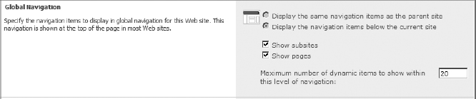
FIGURE 8-24
The Current Navigation settings are nearly identical to the Global Navigation settings, offering the same options to show subsites and pages, as well as to determine the number of items that appear in the Quick Launch toolbar. Where the Current Navigation settings differ is in the display options available to the subsites.
Whereas users expect the top navigation to remain static across a site, most users expect sidebar navigation to dynamically change based on the selected page or subsite. SharePoint provides the option to display the parent's sidebar navigation: at second-level sites, this setting will probably create a confusing experience for the end user, but at the lower levels this may be a valid setting. For example, if you have a benefits site under a Human Resources department site, it may be desirable to show the Human Resources navigation rather than a benefits-specific navigation.
The other two display options begin at the selected site's level when presenting navigation items, but they differ in determining whether to show all of the sibling sites, as shown in Figure 8-25. At the second level of the hierarchy, showing the siblings may replicate links that are available on the top navigation, but at lower levels, showing siblings may make a more effective navigation experience.
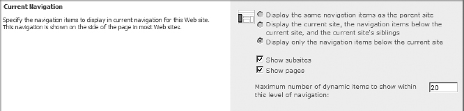
FIGURE 8-25
The Editing and Sorting section is a powerful configuration component that allows you to go beyond the out-of-the-box dynamic navigation. Editing and Sorting allows you to control where and whether dynamic components appear on the navigation bars. At the root site level, the Editing and Sorting section shows the links for both the Global Navigation and Current Navigation bars; at the subsite level, only Current Navigation is available.
In most cases, you will want to sort the navigation manually rather than automatically. An effective user experience is governed by an information architecture that outlines the order in which links appear in the top and sidebar navigation schemes, rather than an alphabetical arrangement. When manual sorting is selected, as shown in Figure 8-26, you have the ability to move pages and sites up and down within the Global and Current Navigation nodes.

FIGURE 8-26
You also have the option to delete or hide pages and subsites. While the user experience for both options is the same — no link — there is a substantial operational difference. When a site or page is deleted from the navigation, it is removed from the dynamic navigation scheme. If you change your mind later and want to have the item back in the navigation, you need to go into the list or library's settings (List Settings General Settings Title, description and navigation) and select the Yes radio button to display the list on the Quick Launch. Dynamic links will be updated if the site's name changes, but the title of a static link is entered into the navigation by hand, which means that it must be updated by hand if the site changes.
Finally, the Editing and Sorting section allows you to add headings and static links to the navigation scheme. Static links have a title, URL, and description and can target an audience. This allows you to develop a complete navigational scheme that includes other external sites and pages that are relevant to the global or current navigation. One thing to keep in mind is that the difference between a heading and a link is presentational only; headings may have a URL.
While the navigational settings in SharePoint 2010 are powerful and offer a lot of flexibility for configuring navigation in a site, they are cumbersome and not portable. If you have a very large site collection with complex information architecture, configuring navigation at each site may be too time consuming. Also, if you are developing in a multi-stage environment, your only deployment options are to migrate the site from one environment to another or to reenter the navigation in each environment. Before exploring the programmatic methods for dealing with navigation, it is important to understand how SharePoint implements navigation.
Implementing Navigation in the Master Page
How and where navigational elements appear in the site is determined by the Master Page as part of the site's branding strategy. In the Master Page, the navigational elements leverage ASP.NET menu controls and site map datasource controls. The datasource control implements the provider model to the ASP Menu control, which, in turn, renders the navigation on the page.
The attributes available to the SharePoint:AspMenu control are the same as those available to the corresponding ASP.NET menu control, which provides the same functionality. This is a great advantage to ASP.NET developers, who can leverage their existing knowledge of the ASP menu control. In the Master Page, four attributes require your attention.
<SharePoint:AspMenu ID=“GlobalNav” runat=“server” DataSourceID=“SiteMapDataSource1”
  UseSimpleRendering=“true” Orientation=“Horizontal” EncodeTitle=“false”
  StaticDisplayLevels=“1” MaximumDynamicDisplayLevels=“1”
  CssClass=“top-nav-menu band-menu”
  SkipLinkText=“<%$Resources:cms,masterpages_skiplinktext%>”/>
- DataSourcelD: This attribute identifies the PortalSiteMapDataSource that the menu should use as its provider.
- Orientation: This attribute allows you to set the menu to be horizontal or vertical.
- StaticDisplayLevels: This attribute sets the default number of hierarchical levels to show in the menu.
- MaximumDynamicDisplayLevels: This attribute sets the default number of menu items to show in the fly-out menus.
The PublishingNavigation:PortalSiteMapDataSource control sets the provider that the menu control will use for rendering menu items. Whereas the menu control determines how the menu items are rendered, the datasource determines what is available to the menu control. The attributes of this control provide instructions to the provider that determines which nodes are provided to the menu.
<PublishingNavigation:PortalSiteMapDataSource ID=“siteMapDataSource1” runat=“server”
  SiteMapProvider=“GlobalNavigation” EnableViewState=“true”
  StartFromCurrentNode=“true” StartingNodeOffset=“0” ShowStartingNode=“false”
  TreatStartingNodeAsCurrent=“true” TrimNonCurrentTypes=“Heading”/>
- SiteMapProvider: This sets the provider that retrieves nodes from SharePoint.
- ShowStartingNode: When this is set to true, the menu receives a node that represents the starting node. For example, the global navigation begins at the root site. If this is set to true, the menu receives a node representing the root site.
- StartFromCurrentNode: When this is set to true, the DataSource object uses a set of rules for determining where it is in the navigational scheme and uses that as a starting location.
- StartingNodeOffset: This property works in conjunction with the StartFromCurrentNode property to determine the starting location of the dataset. The value can be positive or negative, depending on whether you want to start lower in the hierarchy or higher.
Out of the box, SharePoint 2010 includes a number of SiteMapProviders. SiteMapProviders are configured in the web.config file in the sitemap section. As with the other components of navigation in SharePoint, you can leverage your knowledge of ASP.NET's provider model to create your own providers and add them to SharePoint.
The two most important providers in publishing sites are the CombinedNavSiteMapProvider and the CurrentNavSiteMapProvider, which are associated with the Global Navigation and Current Navigation menus, respectively.
Customizing Navigation Using the Object Model
As noted earlier, customizing navigation from within the Navigation Settings page for each site is cumbersome and lacks portability. These limitations are easily overcome by using the SharePoint object. Likewise, the object model provides the ability to create static navigational structures and modify the existing structure similarly to the way you perform customizations in the Editing and Sorting section of the navigation settings.
To customize navigation in Visual Studio, create a new Visual Studio project (File New Project) and select an empty SharePoint Project template. Right-click the Features folder in Solution Explorer and add a feature to the project. You will set the properties of the feature in the Feature Designer, but you will not add an empty element or a content type element to the feature; rather, right-click the feature and select Add Event Receiver from the drop-down menu.
Adding static navigational structures using the object model is a matter of getting a reference to the navigational component that you want to modify and adding nodes to it. The SPNavigation object in each website includes properties for TopNavigationBar and QuickLaunch, which are both SPNavigationNodeCollections.
public override void FeatureActivated(SPFeatureReceiverProperties properties)
{
  using (SPSite site = (SPSite)properties.Feature.Parent)
  {
    // Add a static link to the root site's quick launch bar
    using (SPWeb web = site.RootWeb)
    {
      try
      {
     // Get reference to the left navigation
     SPNavigationNodeCollection leftNav = web.Navigation.QuickLaunch;
   }
   catch (Exception ex)
   {
     Console.WriteLine(ex.ToString());
   }
  }
 }
}
When adding items to the Node Collections, the only difference between a heading node and a link node is that a heading node will contain children. To create a node, instantiate SPNavigationNode and pass in the Title, Url, and a flag to indicate whether the link is internal or external to the site collection. SPNavigationNodeCollection provides methods to add a node as the first or last element, or at a specific location in the collection.
public override void FeatureActivated(SPFeatureReceiverProperties properties)
{
  using (SPSite site = (SPSite)properties.Feature.Parent)
  {
    // Add a static link to the root site's quick launch bar
    using (SPWeb web = site.RootWeb)
    {
      try
      {
        // Get reference to the left navigation
        SPNavigationNodeCollection leftNav = web.Navigation.QuickLaunch;

        // Create a heading node to hold links
           SPNavigationNode heading = new SPNavigationNode(“Links”, web.Url,
 true);
           leftNav.AddAsFirst(heading);

           web.Update();
         }
         catch (Exception ex)
         {
           Console.WriteLine(ex.ToString());
         }
      }
   }
}
The SPNavigationNode class has a Children property that returns SPNavigationNodeCollection. To create a heading node, simply add nodes to an existing node's children rather than to the Navigation Node collection.
public override void FeatureActivated(SPFeatureReceiverProperties properties)
{
  using (SPSite site = (SPSite)properties.Feature.Parent)
  {
    // Add a static link to the root site's quick launch bar
    using (SPWeb web = site.RootWeb)
    {
      try
      {
        // Get reference to the left navigation
        SPNavigationNodeCollection leftNav = web.Navigation.QuickLaunch;

       // Create a heading node to hold links
       SPNavigationNode heading = new SPNavigationNode(“Links”, web.Url, true)
       leftNav.AddAsFirst(heading);

       // Create a new node and add it to the end of the navbar
       SPNavigationNode wroxLink = new SPNavigationNode(
         “Wrox Books”, “http://www.wrox.com”, true);
       wroxLink.IsVisible = true;
       leftNav[0].Children.AddAsFirst(wroxLink);

      web.Update();
    }
    catch (Exception ex)
    {
      Console.WriteLine(ex.ToString());
    }
  }
 }
}
Using the object model, you can move beyond simply adding static links to the navigation bars to iterating through external site collections or a SharePoint list to provide additional navigation options that are not readily available out of the box.
Customizing Navigation with Web Parts
In SharePoint 2010, there is no shortage of navigational options. SharePoint includes two web parts that expand your ability to provide an effective navigational scheme: the Summary Links web part and the Table of Contents web part.
The Table of Contents web part provides an additional level of navigation from a more localized perspective than the top navigation and Quick Launch toolbar, which are included in the Master Page. It is the perfect tool when an additional sidebar navigational element is called for in the information architecture but cannot be included the Master Page.
From a configuration perspective, the Table of Contents web part provides many of the same dynamic options as Global and Current Navigation. In the Content Settings of the web part, shown in Figure 8-27, you establish where the web part will begin listing content, the number of levels to show, and whether to show the starting location. An interesting option that the Table of Contents web part provides is to show hidden pages and sites. Recall from the “Navigation Settings” section, that the Editing and Sorting section allows you to hide sites and pages from Global and Current Navigation — the Table of Contents can display those items that are not shown, at a global level.
The Presentation settings, shown in Figure 8-28, allow you to set the styles for headers and items in the Table of Contents. These style settings are defined in XSL files located in the Styles library. You can extend or replace the referenced XSL by exporting and reimporting the Table of Contents web part. This technique for modifying XSL is discussed in the Content by Query web part.
Finally, the Organization section, shown in Figure 8-29, provides options for sorting according to SharePoint's navigation settings or according to specific metadata for the items. The ability to change the sorting in the Table of Contents is not as rich as it is in the Editing and Sorting section of Navigation Settings, but it will generally fit most situations.
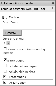
FIGURE 8-27
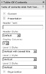
FIGURE 8-28
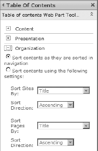
FIGURE 8-29
The Summary Links web part complements the Table of Contents web part in that it provides the capability to create a static navigational structure. The Summary Links web part adds options for links that are more flexible and extensive than those available when adding static links in the Editing and Sorting section of the navigation settings. You can create not only static links to internal and external sites and pages but also links to people.
The Summary Links web part adds properties to the link, as shown in Figure 8-30, that allow you to display a description with the link, an image with alternative text, and a ToolTip. These settings provide a very flexible mechanism for links that you can use to construct static directories of people, pages, documents, or other related links that have a unique styling and a user experience that has an appealing design.
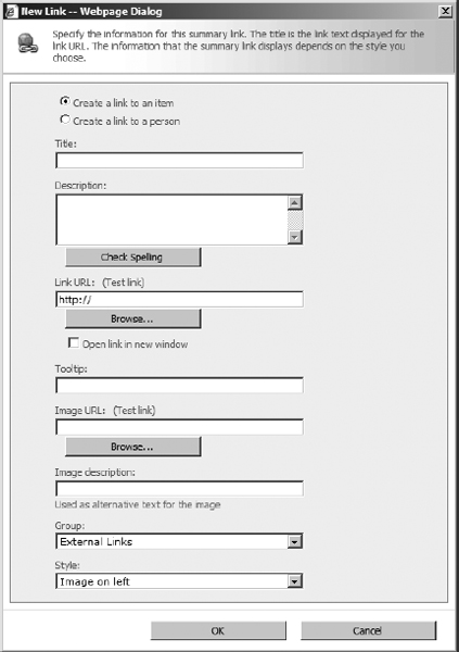
FIGURE 8-30
Like the Table of Contents web part, the Summary Links web part gets style information from an XSL file located in the Styles library. The out-of-the-box styles provide different user experiences for the link content that range from displaying a simple list of links to displaying a digest of information for the links.
The number of options that SharePoint provides for defining and customizing navigation in a site is evidence of the importance of navigation in constructing a positive user experience for the visitor. Although search capabilities have improved dramatically in the past few years, browsing through the structure of a website remains the primary model for user interaction.
CONTENT BY QUERY WEB PART
The Content by Query web part is one of the most important development tools available in SharePoint. Out of the box, the Content by Query web part provides a lot of very powerful configuration options. Content authors can configure the web part to roll up and present content across the site collection. From a development point of view, understanding how to configure the Content by Query web part is important when more advanced customizations are necessary for the project. Developers can export the XML of the Content by Query web part to achieve more advanced configurations. Rather than exporting an empty Content by Query web part, it is much more effective for you to configure the Content by Query web part using the web UI to get the closest possible configuration and then export it. This will save a lot of development time when customizing.
Using the Content by Query Web Part
The Content by Query web part divides the properties into two major categories and a number of more manageable sections, thus allowing the content author or developer a more organized approach to configuring the part. The two major sections are Query and Presentation: Query provides the web part with the information necessary to perform the content query, and Presentation provides the information to render the query results in the web part.
The first step in configuring the Content by Query web part is to define the source that contains the content to execute a query against, as shown in Figure 8-31. This can be the entire site collection, a specific branch of the site collection's hierarchy, or a specific list. The selection of the source is a more global selection that is narrowed by the other settings in the web part. These settings allow the content author to narrow the larger site collection and branch sources down to a specific type of list/library, as well as to narrow down the query by a content type.
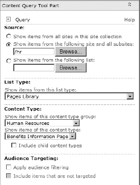
FIGURE 8-31
In SharePoint 2010, the Content by Query web part allows the content author to apply multiple filters to the query results, as shown in Figure 8-32. The filters allow the author to select fields from the specified content type to filter the query results based on comparison criteria. What makes the filtering noteworthy for the developer is that it supports the use of a page field value and a query string value as the input to the comparison value. In the example that follows, the web part is using the Title field on the Page Layout to filter the query results where the category is equal to the text entered into the Title field. It is also using the Category variable in the query string to filter the results.
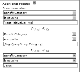
FIGURE 8-32
The use of these special tokens allows the developer or author to create a single configuration for the web part that can be added to multiple pages that will present different results. The developer need only to configure the web part one time, export it, and upload it to each page.
After the author has configured the results that the Content by Query web part will return, the Presentation section allows configuration of the results. The Grouping and Sorting sections, shown in Figure 8-33, work as one would expect; the author selects the field to group by or sort by, the direction, and a dimensional limit. Although these settings are fundamental, you can achieve a number of different layouts with these settings alone.
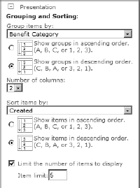
FIGURE 8-33
Behind the scenes, the Content by Query web part stores the query results as XML. It uses a set of XSL files that are contained in the site collection's Style library to perform the rendering of the content in the part. The Styles section of the web part properties, shown in Figure 8-34, displays the definitions that appear in these XSL files. The Group Style selection displays the XSL logic that is stored in the Header.xsl file, and the Item Style selection displays the XSL that is stored in the ItemStyle.xsl file. Lastly, the media player style comes from an XSL file that must be developed separately and selected for the web part.
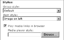
FIGURE 8-34
The Fields to Display section defines which site columns in the query results will be displayed for each of the four main fields of the Content by Query web part, as shown in Figure 8-35. Each field can contain more than one site column, and the columns are evaluated in the order of appearance. If the first site column contains no content, the next column is checked and so forth until a site column contains content.
Finally, a powerful function of the Content by Query web part is that it supports publication of query results using RSS, as shown in Figure 8-36.

FIGURE 8-35
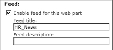
FIGURE 8-36
Customizing Content by Query Web Part in XML
The Content by Query web part properties available in the SharePoint UI may seem extensive, but these are not the complete set of customizations that can be made to the web part. Developers can customize both the querying behavior and presentation logic in ways that go beyond those provided in the Web Part properties pane.
When a content author or developer adds a web part to a web part zone in a page, SharePoint inserts an XML document that contains a reference to the web part's assembly and all of the property values that apply to the web part. SharePoint allows you to export the XML to a local .webpart file. When exporting a .webpart file, SharePoint saves the XML along with the property settings that are currently active in the Web Part properties pane.
Although the additional properties in the .webpart file are available to a developer using SharePoint Designer 2010, the more common scenario is to export the .webpart file to a local folder and make modifications using Visual Studio. Visual Studio provides two advantages over all other methods. First, the .webpart code may be entered into a version control system like Team Foundation Server; and second, the .webpart file can be packaged into a SharePoint feature and solution for more controlled deployments.
The two categories of properties that are available in the .webpart file tend to match up with the two categories in the Web Part properties pane: query and presentation. The query properties affect the behavior of the Content by Query web part and the presentation properties affect the display of the content. The query properties provide a great deal more flexibility in defining what is queried within the site collection. When developing these properties in the XML file, the properties defined in the XML will trump any settings entered by authors or developers in the Web Part properties pane. The presentation properties also provide more flexibility in defining the display of content in the web part, but unlike the query properties settings made in the Web Part properties pane, the presentation properties trump the XML file.
Five properties support the most common developer customizations to the Content by Query web part.
- QueryOverride: Replaces the content source with a CAML-based query that allows for more control over query operation
- WebsOverride: Dictates whether the query will recurse over subsites
- ListsOverride: Allows you to query any kind of list, even those that are not defined in the Web Part properties pane, such as custom lists that you develop
- ViewFieldsOverride: Requests a specific set of fields from the query.
- DataColumnRenames: Renames column names before the data is passed to the XSL
For many of the properties in the .webpart file, configuring a value is a matter of adding the value to the XML element as you would with any XML document. For example, you can change the Title property by changing the text between the property's opening and closing tags. On one hand, if the element is closed, meaning that it is a single tag that ends with the /> characters, make it an open element and insert the value. On the other hand, some properties require a CAML statement between the opening and closing tags, which is the case with the query properties. Because CAML statements are themselves XML statements, you cannot simply enter them inside the property tags. The CAML must be enclosed in a CDATA section within the property tags. This is done by placing the CAML statement between the <![CDATA[ and ]]> characters. For example: <![CDATA[ <Lists ServerTemplate=“101”></Lists> ]]>.
The QueryOverride property allows you to insert a custom-developed CAML query into the Content by Query web part. This allows you to build a set of data that can apply filtering and sorting before the web part's presentation categories conduct their operations. Taking into consideration all of the possibilities, the query override offers a more granular solution than the basic settings provided in the Web Part properties pane.
<property name=“QueryOverride” type=“string” >
  <![CDATA[
    <Where>
      <Or>
        <Eq>
          <FieldRef Name=“BenefitType” />
          <Value Type=“Choice” >Medical</Value>
        </Eq>
        <Eq>
          <FieldRef Name=“BenefitProvider” />
          <Value Type=“Text” >United Medical</Value>
        </Eq>
        </Or>
      </Where>
      <OrderBy>
        <FieldRef Name=“Created” Ascending=“False” />
       </OrderBy>
     ]]>
   </property>
The WebsOverride property simply tells the Content by Query web part whether to run the query against the current site only or to recursively search through all subsites under the current site. The implementation of this property is a closed XML tag that either has the Recursive attribute or does not; however, the tag is contained in a CDATA section in the property tag, which may appear somewhat unusual to some developers.
<![CDATA[
   <Webs Recursive=“True”/>
]]>
 <![CDATA[
   <Webs/>
]]>
The ListsOverride property allows you to define the type of list that the query is executed against. The CAML data in this property defines whether the query executes against a specific list or a list type. Locating a listing of all ServerTemplate options can be a bit tricky. This attribute is based on the SPListTemplateType enumeration in the SharePoint object model. The enumeration values are listed in the SharePoint Foundation 2010 Class Library Reference (Server Class Library Reference Core Class Library Reference Microsoft.SharePoint Namespace SPListTemplateType Enumeration).
<property name=“ListsOverride” type=“string”>
  <![CDATA[
    <Lists ServerTemplate=“850”></Lists>
           ]]>
</property>
The ViewFieldsOverride retrieves data of the specified type from the fields included in the CAML query. If the nullable attribute is included in the declaration, the query will return items that do not have this column.
<property name=“ViewFiryeldsOverride” type=“string”>
  <![CDATA[
    <FieldRef Name=“Title” Nullable=“True” Type=“Text”/>
    <FieldRef Name=“PublishingPageContent” Nullable=“True” Type=“HTML”/>
  ]]>
</property>
DataColumnRenames is a handy property for making XSL easier. This property maps the column name to a different name in the XSL. An example would be a set of properties that will have the same XSL transformation applied. Rather than define the transformation for each property name, the DataColumnRenames allows you to map all of the properties to a single XSL name.
<![CDATA[<property name=“DataColumnRenames” type=“string”>BenefitsProvider,HR</
property>]]
Using Custom XSL to Modify the Presentation of Content
SharePoint 2010 uses XSL files to transform the query result's XML content into rendered HTML. These XSL files are located in the Publishing Framework's Style library in a folder called XSL Style Sheets. Out of the box, this folder contains seven XSL files that are used for rendering the content of all three publishing web parts: Summary Links, Table of Contents, and Content by Query. All three web parts share the Header.xsl and ItemStyle.xsl files; the remaining XSL files are specific to each web part.
Although you may edit these files directly using SharePoint Designer or another editing tool, it is more common to create a separate custom XSL file for rendering customizations that may be necessary for the Content by Query web part. The customized XSL sheet can then be provided to the Style library using a feature and associated with the Content by Query web part by customizing the .webpart file.
Do not let the name of the Style Library folder, “XSL Style Sheets,” distract you from what the XSL files accomplish. They provide the logic to render XML data in an HTML format. Conceptually, it may be easier to think of these as layout sheets. The graphical style, or appearance, of the content in the browser remains the province of the Cascading Style Sheets.
The most effective method for creating a custom XSL file is to download one of the existing XSL files from the Style library and add it to a Module element in Visual Studio, then remove all template elements that you do not need. This gives you an abridged version of the XSL that you can then add your own custom templates to.
The styles that each XSL sheet defines and that you will customize are the two selections that appear in the Styles section of the Web Part properties pane. The XSL templates defined in the Header.xsl file populate the drop-down selection for the Group Style entry in Styles, and each template defined in the ItemStyle.xsl file populates the Item Style drop-down selection.
To create a new template definition for your CQWP, it is most effective to start with one of the preexisting templates in the appropriate style sheet, such as itemstyle.xsl. Within the XSL file, a number of XML blocks are defined with the <xsl:template…></xsl:template> tag pairs. These represent the different styles that are available. The name attribute is the string value that appears in the Item Style drop-down box in the CQWP properties pane. Creating your own is a simple matter of selecting the tags and everything in between for the style that most closely resembles the one you will build.
<xsl:template name=“BenefitsHighlight”
match=“Row[@Style='ImageRight']” mode=“itemstyle” >
    …
</xsl:template>
Within the template enclosed tags can be separated into two distinct sections. The first section contains variable declarations and the second section contains a div tag. The variables section processes the XML data that is running through the XSL file. SharePoint 2010 includes a number of functions that will help you process the data that is coming in through the query. Table 8-1 includes some of the more common functions.
TABLE 8-1: Table XSL Variable Functions
| FUNCTION | DESCRIPTION |
| OuterTemplate.GetSafeLink | This function returns a safe URL that is derived from the UrlColumnName value. If the URL is not safe, this method returns a blank string. |
| OuterTemplate.GetSafeStaticUrl | Similarly to GetSafeLink, this function returns a safe URL from an item's UrlColumnName; otherwise, it returns a blank string. |
| OuterTemplate.GetTitle | This function returns the data in the Title column. |
Source: http://msdn.microsoft.com/en-us/library/bb447557(office.14,classic).aspx
<xsl:template name=“BenefitsHighlight”
      match=“Row[@Style='ImageRight']” mode=“itemstyle”>
        <xsl:variable name=“SafeLinkUrl”>
            <xsl:call-template name=“OuterTemplate.GetSafeLink”>
                <xsl:with-param name=“UrlColumnName” select=“'LinkUrl'”/>
            </xsl:call-template>
        </xsl:variable>
        <xsl:variable name=“SafeImageUrl”>
             <xsl:call-template name=“OuterTemplate.GetSafeStaticUrl”>
                 <xsl:with-param name=“UrlColumnName” select=“'ImageUrl'”/>
             </xsl:call-template>
        </xsl:variable>
        <xsl:variable name=“DisplayTitle”>
            <xsl:call-template name=“OuterTemplate.GetTitle”>                   <xsl:with-param name=“Title” select=“@Title”/>
                <xsl:with-param name=“UrlColumriName” select=“'LinkUrl'”/>
            </xsl:call-template>
        </xsl:variable>
…
</xsl:template>
The div section of the XSL template defines the HTML formatting of the rendered output. This section uses a combination of HTML and XSL to provide the layout instructions for SharePoint. Keep in mind that SharePoint 2010 is standards-compliant; therefore, you should use semantic HTML with div tags in your layout. Rely on your Cascading Style Sheets to provide the formatting and branding of your output.
<xsl:template name=“BenefitsHighlight”
        match=“Row[@Style='ImageRight1]” mode=“itemstyle”> <xsl:variable name=“SafeLinkUrl”>
       <xsl:call-template name=“OuterTemplate.GetSafeLink”>
           <xsl:with-param name=“UrlColumnName” select=“'LinkUrll”/>
       </xsl:call-template>
       </xsl:variable>
       <xsl:variable name=“SafeImageUrl”>
           <xsl:call-template name=“OuterTemplate.GetSafeStaticUrl”>
               <xsl:with-param name=“UrlColumnName” select=“'ImageUrl'”/>
           </xsl:call-template>
       </xsl:variable>
       <xsl:variable name=“DisplayTitle”>
           <xsl:call-template name=“OuterTemplate.GetTitle”>
               <xsl:with-param name=“Title” select=“@Title”/>
               <xsl:with-param name=“UrlColumnName” select=“'LinkUrl'”/>
          </xsl:call-template>
      </xsl:variable>
      <div class=“item”>
          <xsl:if test=“string-length($SafeImageUrl) != 0”>
              <div class=“image-area-right”>
                  <a href=“{$SafeLinkUrl}”>
                    <xsl:if test=“$ItemsHaveStreams = 'True'”>
                      <xsl:attribute name=“onclick”>
                        <xsl:value-of select=“@OnClickForWebRendering”/>
                      </xsl:attribute>
                    </xsl:if>
                    <xsl:if test=“$ItemsHaveStreams != 'True'
and @OpenInNewWindow = 'True'”>
                        <xsl:attribute name=“onclick”>
                          <xsl:value-of disable-output-escaping=“yes”
select=“$OnClickTargetAttribute”/>
                      </xsl:attribute>
                    </xsl:if>
                    <img class=“image” src=“{$SafeImageUrl}” title=“{@ImageUrlAltText}”>
                      <xsl:if test=“$ImageWidth != ‘’”>
                        <xsl:attribute name=“width”>
                          <xsl:value-of select=“$ImageWidth” />
                        </xsl:attribute>
                      </xsl:if>
                      <xsl:if test=“$ImageHeight != ‘’”>
                 <xsl:attribute name=“height”>
                   <xsl:value-of select=“$ImageHeight” />
                 </xsl:attribute>
               </xsl:if>
             </img>
           </a>
         </div>
      </xsl:if>
      <div class=“link-item”>
          <xsl:call-template name=“OuterTemplate.CallPresenceStatusIconTemplate”/>
             <a href=“{$SafeLinkUrl}” title=“{@LinkToolTip}”>
               <xsl:if test=“$ItemsHaveStreams = 'True'”>
                 <xsl:attribute name=“onclick”>
                   <xsl:value-of select=“@OnClickForWebRendering” />
                 </xsl:attribute>
               </xsl:if>
               <xsl:if test=“$ItemsHaveStreams != 'True' and @OpenInNewWindow =
'True'”>
                 <xsl:attribute name=“onclick”>
                   <xsl:value-of disable-output-escaping=“yes”
select=“$OnClickTargetAttribute”/>
                 </xsl:attribute>
               </xsl:if>
               <xsl:value-of select=“$DisplayTitle”/>
             </a>
             <div class=“description”>
                 <xsl:value-of select=“@Description” />
             </div>
         </div>
     </div>
 </xsl:template>
When you look through the pre-existing styles in the SharePoint XSL files, you will notice the use of variables that begin with the @ character. For example, in the previous code listing, the last display item is for @Description. This is a special token that SharePoint reads prior to rendering the CQWP properties pane. Any occurrence of an @ variable in the style will appear as a textbox in the CQWP properties pane. This eliminates the need to export the web part and modify the query XML to get custom site columns to appear in the results.
For example, the custom Page Layout for benefits information contains a benefit provider name. If you want to include this value in the display of your content in the CQWP, you first add an @ variable into the XSL file, and then input the site column name into the CQWP properties pane. In this example, the provider name is added below the description in the XSL.
<div class=“link-item”>
              <xsl:call-template name=“OuterTemplate.CallPresenceStatusIconTemplate”/>
                <a href=“{$SafeLinkUrl}” title=“{@LinkToolTip}”>
                  <xsl:if test=“$ItemsHaveStreams = 'True'”>
                     <xsl:attribute name=“onclick”>
                        <xsl:value-of select=“@OnClickForWebRendering”/>
                        </xsl:attribute>
                  </xsl:if>
                  <xsl:if test=“$ItemsHaveStreams != 'True' and @OpenInNewWindow =
'True'”>
                    <xsl:attribute name=“onclick”>
                      <xsl:value-of disable-output-escaping=“yes” select=“$OnClickTargetA
ttribute”/>
                    </xsl:attribute>
                  </xsl:if>
                  <xsl:value-of select=“$DisplayTitle”/>
                </a>
                <div class=“description”>
                    <xsl:value-of select=“@Description” />
                </div>
                  <div class=“provider”>
                           <xsl:value-of select=“@Provider”/>
                  </div>
             </div>
After the new style is uploaded to the style library or deployed via a feature to SharePoint, you can select the style in the CQWP properties. After selecting the style, the new property appears in the properties pane where you can enter the site column that you want to appear in that location of the rendered output (as shown in Figure 8-37).
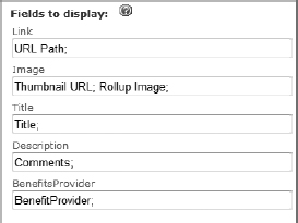
FIGURE 8-37
You are not required to match the @ variable name with the site column name in the CQWP. The variable is a placeholder for any site column that you place there. The variable name that you use will show as the caption for the textbox.
After you have completed your custom XSL file, you need to associate the file with the Content by Query web part that will be using the styles defined in the file. This is done by modifying the .webpart file; if you have not exported the Content by Query web part, you need to follow the steps in the previous section to export it.
There are two properties that you modify to associate your custom style sheet. The first property is ItemXslLink. This is the property that points your web part to your custom XSL file. This element expects a string, not a CDATA section; simply add the location of the file.
<property name=“ItemXslLink” type=“string”>
  /Style Library/XSL Style Sheets/HrItemStyle.xsl
</property>
The second property that you modify is the ItemStyle or GroupStyle property, which sets the selected style in the Style section of the Web Part properties pane. While changing or setting this property in your .webpart file is not required, it is generally a good idea to make sure that the property value matches an available XSL template in your custom XSL file. At the very least, your custom XSL should include the definition for the default template, and these two properties could be set to the default value. Keep in mind that the settings you provide to these two properties are the initial values that are used when the web part is added to the page. If the content author changes these values, the web part will use the manually set values.
<property name=“ItemStyle” type=“string”>ImageRight</property>
Before developing custom XSL for your Content by Query web part implementations, it is wise to become familiar with the out-of-the-box XSL files. Microsoft has provided XSL layouts that cover many situations that you will encounter. The underlying XSL files provide ample examples of source code for customizing your own XSL files.
Redeploying the Content by Query Web Part Using Visual Studio
Your customized Content by Query web part can be uploaded manually into SharePoint using the Ribbon, and your customized XSL files can be manually uploaded into the Style library and published. The manual approach suffers from the same portability issues as the SharePoint Designer approach, and it is much more time-consuming. Therefore, in most cases, you package your customized part and XSL files into a feature using module elements that can then be deployed with SharePoint solutions across farms.
To deploy customized web parts using Visual Studio, create a new project (File New Project) and select the Module template. Visual Studio creates a Module folder that contains the SharePoint Elements file and a sample text file. The Elements file contains the instructions that provision files into SharePoint when the feature is activated.
Delete the sample.txt file from the Module element, and add the customized .webpart file by right-clicking the Module folder and selecting Add Existing item from the pop-up menu. Next, open the Elements.xml file, which you will need to modify. Web parts, whether customized or custom coded, are provisioned in the Web Parts gallery. Add a Url attribute to the Module element, and enter _catalogs/wp for the location to provision to the gallery.
<Elements xmlns=“http://schemas.microsoft.com/sharepoint/”>
  <Module Name=“WebParts”
          Url=“_catalogs/wp”
          RootWebOnly=“TRUE”>
    <File Path=“WebPartsModified_HR_Benefits_Articles.webpart”
          Url=“WebPartsModified_HR_Benefits_Articles.webpart” />
  </Module>
</Elements>
When you add a file to the Modules folder, Visual Studio automatically creates a file element in the Elements file. The URL for the file will match the folder structure that Visual Studio maintains for the project. You will need to change the Url attribute of the file element so that the .webpart file is provisioned to the root of the gallery; also, add the Type attribute with a value of GhostableInLibrary. It is generally a good idea to provide the Group property to the file. This creates a group in the Web Part picker that contains your web part; otherwise, your provisioned web part appears in the same group as the Content by Query web part, which may cause some confusion for content authors.
<Elements xmlns=“http://schemas.microsoft.com/sharepoint/”>
  <Module Name=“WebParts”
          Url=“_catalogs/wp”
          RootWebOnly=“TRUE”>
    <File Path=“WebPartsModified_HR_Benefits_Articles.webpart”
       Url=“Modified_HR_Benefits_Articles.webpart”
       Type=“GhostableInLibrary”>
      <Property Name=“Group”
                Value=“Human Resources” />
    </File>
</Module>
</Elements>
If you are deploying both a customized web part and an XSL file, you need to add a second Module element to the project. Each Module element dictates where its child files will be available in SharePoint; therefore, you need one module to supply it to the Web Parts gallery, and one module to supply it to the Style library. The only code difference between the two modules is the Url attribute of the Module element.
<Elements xmlns=“http://schemas.microsoft.com/sharepoint/”>
  <Module Name=“StyleSheets”
          Url=“Style Library/XSL Style Sheets”
          RootWebOnly=“TRUE”>
    <File Path=“StyleSheetsHrItemStyle.xsl”
          Url=“HrItemStyle.xsl”
          Type=“GhostableInLibrary” />
  </Module>
</Elements>
After you have completed the module files, right-click the project in the Visual Studio Solution Explorer and click Deploy. In your target SharePoint environment, you can add the customized web part as you would any other web part. You place the page in Edit mode, select a Web Part zone, and click Add Web Part. If you have provided values for any of the override properties in your .webpart file, you will see a notification in the Web Part properties pane that indicates that a content author or developer is no longer able to edit the query properties of the web part. If you have included a custom XSL file, the Style section drop-down menus include entries for the XSL templates defined in your files.
Learning how to customize the Content by Query web part and its associated XSL files is an essential skill for all Web Content Management developers. Mastering this one area of SharePoint development often saves you a lot of time and effort when fulfilling a variety of presentation and content roll-up requirements.
CONTENT CONVERSION
SharePoint 2010 introduces the use of the Ribbon as an authoring and administration component that mirrors the authoring experience of Office applications. The addition of the Ribbon makes authoring content from within a SharePoint site substantially easier, more configurable, and more familiar to the content author. The Ribbon makes SharePoint's browser interface a capable and perhaps desirable authoring environment.
Despite the addition of the Ribbon and its functionality, there will be many situations in which a different authoring environment or offline authoring is desirable or necessary. SharePoint includes the capability to convert a document authored with an external tool into a SharePoint web page. Out of the box, SharePoint includes converters that will convert Word (both .docx and .docm), InfoPath, and XML documents to web pages in SharePoint. Using the object model, you can add new document converters to SharePoint that allow conversion from other formats.
Setting Up Document Conversion
To use document converters in your SharePoint site, you need to first activate the conversion services and then configure your site to use them. Enabling document conversion begins with the services on the server (Central Administration System Settings Services on Server). The Document Conversions Load Balancer Service must be started first, followed by the Document Conversions Launcher Service.
Document conversions must be explicitly enabled for each web application, as shown in Figure 8-38. To enable the conversions, access the Configure Document Conversions settings in Central Administration (General Application Settings External Service Connections Configure document conversions). This page includes options for customizing the settings of each converter installed in the web application.
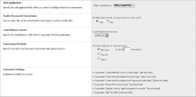
FIGURE 8-38
Document conversions are made available within the site collection by adding them to content types, as shown in Figure 8-39. The Manage Document Conversion for This Content Type link is available in the Content Type properties page. This provides a great deal of control not only over what content types can be converted but also over which converters can be used for each content type.

FIGURE 8-39
Using Document Conversion
Using document conversion to create a page from a document is a straightforward experience for the content author. Because the converter is associated with the content type, you aren't limited to a particular document library. Rather, you load the document into a library, assign the content type to the uploaded document, and then right-click and select Convert Document from the menu, as shown in Figure 8-40.

FIGURE 8-40
You also have the flexibility to select the target location where the converter-generated page will be saved by SharePoint, as shown in Figure 8-41. In some cases, the document-conversion process can be very resource-intensive. For this reason, you have the choice to set the processing in either synchronous or asynchronous modes in the Processing options. The remainder of the properties and options are specific to each converter.
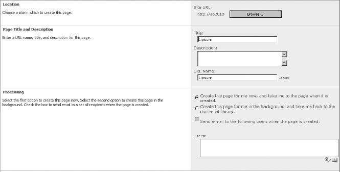
FIGURE 8-41
After the conversion is completed, SharePoint maintains a link between the original document and the generated page. This two-way link allows you to run conversions again when the document is updated. SharePoint allows you to generate multiple conversions on a document. This can take the form of a single converter being run repeatedly to generate additional pages or multiple converters being run on a single originating document. In any case, it is only the last conversion that is maintained for the update linkage. All other conversions must be repeated manually.
Understanding document conversions and how they work in SharePoint saves you time when performing custom development time when looking at offline or external authoring scenarios.
SUMMARY
Web Content Management in SharePoint 2010 brings together a variety of roles that traditionally were always present in the design and development of web pages but were often channeled through a design team. The traditional approach had a tendency to make the development of content and design a slow and cumbersome effort that detracted from the dynamism that is necessary for competitive websites. SharePoint addresses the limitations of traditional web design and development by allowing designers to brand sites, developers to build components, and content authors to generate and maintain content independently of each other, yet within a controlled environment.
Building on solid information architecture, developers are able to build the site structure, content types, templates, and components that the authors need to build the content that makes up the site. Visual Studio 2010's integration with SharePoint 2010 and the variety of templates available to developers make the development effort easier and more intuitive. The templates in Visual Studio ultimately generate SharePoint features and solutions that enhance the portability of the development effort from one environment to another.
Designers are able to build on the information foundation built by the developers to create a unique branding experience with Master Pages, Page Layouts, and style sheets. The flexibility of defining branding independently of the content or functionality of the site extends to the built-in web parts, which leverage XSL files and CSS styles to define the rendering of web part contents.
SharePoint also offers a rich authoring experience in which content authors can interact with a SharePoint user interface that resembles the familiar Office interface. Yet, when working in Office is necessary or preferred, the author has the option to use converters to create new pages.
For the developer, it is important to remember that content types and information architecture take a central role in any successful Web Content Management implementation. Second in importance is to understand what SharePoint provides out of the box in all areas of web management so that costly time and money are not invested on unnecessary solutions.