
CHAPTER 5
GATHERING REQUIREMENTS AND CREATING A COMP
Once a designer understands the fundamentals of building a mortised site, then the fun begins—actually building the site. There are 10 general steps a designer should follow when building a mortised site:
1. Gather and base a site on requirements. Requirements determine, among other things, how many graphics the designer will use, what colors will be used, how fast the site must be, what future growth or changes the design must accommodate, and what content and functionality will be included on the homepage and subsequent pages.
2. Create comp(s) for the client. It’s simpler and more efficient to build the look and feel of the site (that is, a comp) in Photoshop than to build the actual homepage piece by piece. Comps are also important because they can define many of the styles that are cascaded throughout the site.
3. Receive a decision on the chosen comp and make edits. Once a comp is decided upon, the client may very well request that a few changes be made to the design, such as “lighten the blue and replace the orange with yellow,” or “replace this section of text with that one,” or “use another photo in the upper-right corner.” After the edits are received, the changes are made, and the selected comp is then resubmitted for approval. Sometimes, this process can take several iterations before the final comp is approved.
4. Break up the comp into XHTML, graphics, and CSS. At this point, the selected comp is sliced into different images and saved as compressed images. XHTML and CSS are then used to bring together the images, text, and possible functionality.
5. Test the page in most commonly used browsers. The designer should usually test a page in IE, Firefox, Chrome, and Safari as elements are added to it. Otherwise, after spending hours building a page, it might not function correctly in a browser that was not used during development. Sometimes, the browsers that need to be tested will change depending on site requirements or which browsers are most commonly used.
6. Save components of the page as include files and test again. To decrease the download time for subsequent pages and make maintenance considerably easier, the designer should save individual components, such as the menu, header, and footer, as separate include files. The design should then be tested again.
7. Build second- and third-level pages from the homepage template. Usually, the homepage design can be taken and reused as the general template structure for subsequent pages if it makes use of cached images and include files, which decrease download time. The designer then enters content into the body of each page of the site.
8. Work with the client as the site is built. The designer should have the client view the pages as they are built. Otherwise, if the requirements were misunderstood by either party, corrections could still be made before considerable time is wasted working on a site that will likely need redesigning. Another common issue with requirements is that while they may sometimes look good on paper, better ideas come about when the site is built.
9. Test the entire site. On larger sites where the budget allows, the designer can hire a professional tester(s) to test a site. However, on sites with limited budgets, it is usually the designer and client who test the site.
10. Implement the site. The designer uploads the site to the live server, whether it is an internal or external Web server.
GATHERING AND BASING A SITE ON REQUIREMENTS
Requirements are the roadmap for the designer to build upon. Misunderstandings between the client and designer are considerably less likely when requirements exist.
Requirements can be included in a couple of informal emails or phone calls, or they can be included in more involved documents that can be many pages long. Although requirements are not always gathered in the same way, the designer should always try to document as much as possible before beginning work.
While there is no set way to collect requirements, an example of how and what to collect is explained using the redesign of the Allos Therapeutics, Inc. site shown in Figure 5.1.
Figure 5.1
Allos Therapeutics, Inc.’s old design.
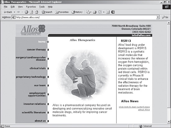
© 2014 Allos Therapeutics, Inc.
Under the guidance of the director of corporate communications, the company wanted to redesign its site to have a fresh, upbeat, professional look and be database-driven. The director wanted to incorporate Allos’ new branding, as well as create a contemporary site that uses updated, relevant information.
The director and designer initially spoke together on the phone several times before scheduling a meeting. The director had a good idea of what she wanted. She had the entire site map laid out, along with several sentences describing the requirements for each page. She also knew the general look and feel that she was interested in. Having worked on many sites, the director knew the requirements would need input, revisions, and consensual agreement from her staff before beginning work on the site. Following a meeting with her peers, she and the designer discussed the various options and implications that the new site should address. At this point, the designer collected what is known as the front-end requirements.
Using the answers to those questions and specific requests made by the director about the site’s database functionality, the designer created and delivered three comps. Incorporating some of the aspects from the other two designs, Figure 5.2 illustrates the look, feel, and functionality that were decided upon.
Figure 5.2
Redesigned site for Allos Therapeutics, Inc.
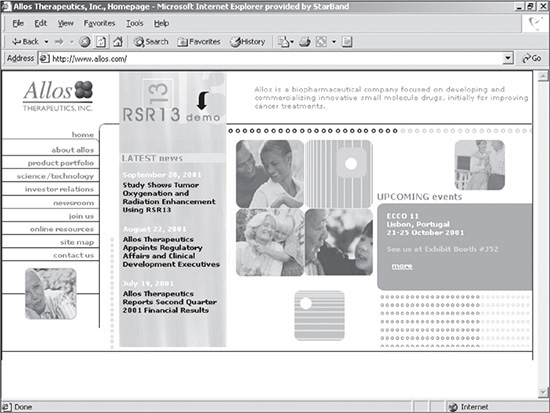
© 2014 Allos Therapeutics, Inc.
Following are some of the various attributes of the new design:
 There was a dominance of yellow, which gave the site the fresh, upbeat, professional look desired. However, because yellow is a color that can become overwhelming for some people, the majority of it was removed on subsequent pages.
Since the client wanted the content to be dynamically generated from a database, each section was designed to be expandable without disrupting the design. This is why content containers were nested in each column.
Because the second- and third-level pages had varying amounts of content, a nested container was designed into the right side of the page (see Figure 5.3). If a page had limited content, the area could be included to make the content area look fuller. If, on the other hand, a page had a lot of content, the container, which created an additional column, could be removed.
To provide consistent navigation, the same expandable menu was saved as an include file in the left column for all pages. This also made future maintenance simple, enabling the designer to edit the entire site by changing only one file.
The header was also saved as an include file to simplify maintenance.
Figure 5.3
Second-level page with right-hand container added to limit the amount of content that is necessary to fill a page.
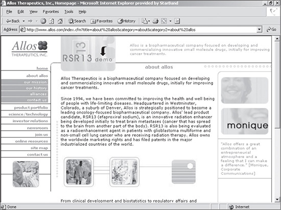
© 2014 Allos Therapeutics, Inc.
The requirements process does not always end after a requirements document is approved. Throughout the building process, the director and designer added, deleted, and edited pages, as well as adjusted the functionality of the site. Fortunately, because many of the major requirements (such as the site’s look and feel and site table structure) were finalized at the beginning of the project, future changes were minimal.
Many times with smaller sites, clients do not have the time, experience, or interest in discussing requirements. They simply want a site. In these cases, the client prefers to leave the decisions to the designer. The designer should still try, nonetheless, to provide options, explain the pros and cons of those options, and let the client make the decisions whenever possible. One example of such a decision is resolution. If a client recently purchased a computer with default resolution that is greater than the standard resolution of the average user’s monitor, the designer should explain the situation to the client. By explaining the issue at hand, the client knows that if the site were created for her computer, it would probably be too wide for the majority of users with the standard resolution.
CREATING A COMP FOR THE CLIENT
Designing a comp is where the majority of the creative aspects of building a site occurs. It is where the designer lays out the text, images, possible functionality, and colors in a composition that will closely resemble the final product. The comp is then delivered to the client for possible editing and ultimate approval.
When creating a comp, the designer should take the technical as well as aesthetic aspects of a site into consideration. One thought process, for example, might be, “If I place this content in the header, will it remain there for the rest of the site, or will it be replaced by another element? If it is replaced by other content, what will that content be? Will it be text, or will it be a text-field box for testimonials?” In other words, at this point the designer considers what kind of programming will be required to get the page or site to function properly.
As previously mentioned, a comp is created in image editing software. For the purposes of this book, all examples use Adobe Photoshop (see Figure 5.4).
Figure 5.4
Comp being developed in Photoshop.
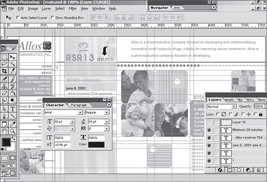
© 2014 Allos Therapeutics, Inc.
There are several advantages to creating a comp with Photoshop:
A design can be created more quickly than when built as an actual Web page using XHTML, graphics, and CSS.
Changes can be made quickly to a design during the comp process or in the future, once the site is live and the client requests a change.
Because Photoshop uses layers, the design is extremely flexible. If a designer needs to replace one image that is on its own layer, only that layer needs to be changed.
The slicing technology included with Photoshop allows for the designer to add slices (boxes) on the file and then create and save many individual images from the one file. For example, if an older version of a logo is used in the comp while a newer one is being created, the designer can switch the logo eventually, save the new slice that creates the newer image, and then just upload that one particular file to the server.
Because the look, feel, and styles included in the comp will be cascaded down throughout the entire site, it is important to make sure the feeling and appearance they project is correct. This is why the designer, depending on the client’s budget, should provide at least three different comps. It not only gives the client a choice of designs, but it also gives her the ability to mix and match certain pieces of the various designs. The client, for example, might say, “I like the black-and-white treatment you did to the photos in the first design. Can you add those to the third design?” Much of the designing of a comp is left to the creativity of the designer.
Varying Methods for Developing Comps
The way in which a designer delivers comps can vary. Sometimes, a lot of them will be delivered at once, or each one could be delivered after feedback is provided on the previous one. Many times, the latter works better because the designer can incorporate the latest edits more efficiently and effectively, along with earlier ones that remain pertinent.
Creating a Source Directory
There are many types of files (Web files, images, and source files) that go into creating a mortised site. If all files were saved together in one directory, individual files would be difficult to find, which is why a designer should use a consistent filing and naming system.
Creating a basic folder system before beginning a site takes at most a minute, but it saves the designer time and headaches when looking for files in the future. Here is one filing system method that requires four directories:
Web project name: This folder is usually named after a specific project. After years of creating and archiving many sites, it is easy to forget the specific site URL of the site, which is why it is sometimes wise to name the folder after the site itself. This is particularly helpful if the site URL doesn’t match that of the company, or if the designer can’t remember if the site is “.com” or “.net.”
Images: This is where all the images used in the site are located. It is generally common practice to separate Web files from image files of websites.
Sources: Because a designer may often have to refer back to the original PSD file(s), it is wise to keep them in a consistent area. A good place to store this folder is in a subdirectory under the Images folder. Some developers save the source files in a completely different area so the files are not accidentally copied over to a live server. Not only does a designer not want to allow access to such files, but they also can be an extremely large upload.
Stock: While stock photos can be saved in the Sources folder, it is a good practice to save them in their own folder. Otherwise, if there are only three or four PSD files included in the Sources folder, they could be difficult to find if they are among all the other stock photo images.
In addition to using an organized folder system, a designer should also try to be consistent with the naming of files. This is particularly important for the Images folder. Because a mortised site can contain images used for spacing, backgrounds, and photos, it is generally helpful to use a naming convention that keeps such images in their respective families. One good method is to include the family of the image first in the name and then include the text that identifies that specific image in the second half of the file name. For example, if the image is a background for the menu, the name could be bg_menu.gif. The “bg_” classifies the image as a background image, and the “menu” identifies the image as the background behind the menu.
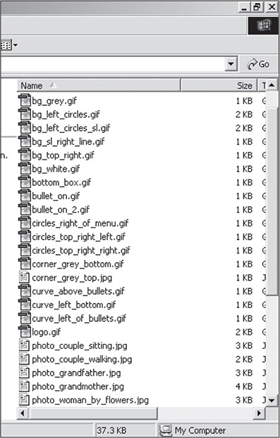
The advantage to this naming convention is that it is easy to find one file among many, especially if the designer knows what family the image is in. Figure 5.5 shows the Images folder for a site that has 35 images. Notice that all the background images are identified as “bg_,” all the bullets as “bullet_,” and all the photos as “photo_.” If the designer uses an image for second- or third-level pages that has the same name as an image for the first level or homepage, an “_sl” (standing for “second level”) can be added to the end of the image name. If the background image for a menu is different on the second level, for example, it could be named bg_menu_sl.gif.
Figure 5.5
Directory files using a consistent naming convention that identifies them in families.
© 2014 Cengage Learning.
Collecting and Documenting Stock Images
Using stock images is one way to make a site appear professional. Fortunately for the Web designer, stock photos can be much less expensive than for print designers. A high-resolution, print-ready image that costs $600 can cost around $150 for the low-resolution version (72 dpi)—exactly what is needed for Web design.
Prices generally range from $1 to more than $1,000, depending on which company the designer purchases from and whether the image is royalty-free. Generally, and depending on the company, royalty-free means that the image’s number of uses and applications is unlimited by the designer once the image is purchased—as long as the image is not used in pornographic or defamatory ways. It is important to check the usage agreement before purchasing a photo because not all agreements are the same.
Images can usually be purchased online either individually or bundled together with other images. They also can be collectively downloaded, depending on the stock photo company. Buying an individual image is less expensive, and the image’s subject matter (for example, the Amazon River dolphin) might be one that the designer will never need additional photos of. On the other hand, if the designer is going to be creating many high-tech websites, an online bundle of unique, high-tech images might be the way to go. Bundled stock collections are more expensive, but they contain many similar images for a subject, which dramatically drops the cost of each individual photo. One photo, for example, that costs $30 individually could be bundled with 100 similar images for $400, which drops the price to $4 per image. It simply depends on how much the designer anticipates using use such photos.
When collecting stock images for a design, it is a good practice to document all the images— that is, what the image is, which site it was found on, how much it costs, and the photo ID. (Most sites give a specific identifier or stock number for each image, such as #IE55648.) The designer can store this information in a text file in the Sources folder. That way, it is easy to know where to go when the image needs to be officially purchased for a site.
Because nearly all stock image companies allow the designer to download and temporarily use comp versions of images in their comp designs, the designer should not purchase the official image(s) until final approval and payment for the site has been received. Until that time, the designer should leave the watermarked (comp) version or thumbnail of the image(s) in the site—all the more incentive for the client to pay her bill.
Selecting Colors
Color plays an integral part in any website, which is why a professional Web designer should have a sound understanding of color theory. Color not only helps set the look and feel of a site, but it also can be used to increase the usability of a site by leading the user’s eye and to help prioritize content.
Many color schemes are possible when designing a site. The designer can use a black-and-white scheme with one or two spot colors, a monochromatic scheme (different shades of one color), complementary schemes (colors that complement each other), or split-complementary schemes (two colors that are “one off” of a color that complements a color on the other side of a color wheel).
One of the questions a designer should ask a client before designing a site is what type of mood or feel the site should convey. The answer to this question can then be translated into the choice of colors used in a site, if the branding for the company hasn’t already been determined. If, for instance, the client wanted a secure, conservative look, probably the best color to start with would be blue. It is a cool color that is used in many instances to convey a safe, reserved feeling.
The audience also comes into play when using color. Colors do not represent the same emotions in various countries. While white, for example, is used in weddings in the United States, it is used in funerals in China. The designer, therefore, might want to research colors when designing international sites. Another audience issue that the designer must consider is color blindness. The most common form is red/green color blindness; red and green look similar to someone with this blindness.
Color References for a Designer
Sites can be run through www.vischeck.com to determine how they will appear to color blind people. It also gives definitions and examples of the different types of color blindness.
Following are a couple of references that will give the designer a foundation for color theory:
Color Harmony: A Guide to Creative Color Combinations by Hideako Chijiiwa (Rockport Publishers, 1987)
Color Bytes: Blending the Art and Science of Color by Jean Bourges (Specialty Marketing Group, 1997)
Color wheel: A good color wheel will show the designer different combinations, such as complementary and split-complementary colors. Color wheels can generally be found in art stores and online.
Deciding Layout
While there are obvious aesthetic considerations for the layout of a site, there are technical aspects as well. If the site is not designed correctly for the technical aspects, many repercussions can arise in the future for both the designer and, possibly, the programmer.
Depending on the design and site requirements, following are four aspects of layout that should be taken into consideration:
Vertical versus horizontal space: A designer needs to consider the amount and type of content a site needs to support before designing the framework for the site. If the body requires a lot of room for content, then a wider design will be necessary. If the content is limited, then the designer is going to want to keep the body area narrow to avoid appearing as though it lacks substance. A good way to control the space of the content area is by using either a vertical or a horizontal menu. When placed in the header, a horizontal menu allows the designer to use the full area below it for space-intensive sites, such as Web applications that may include many columns of content. Vertical menus, on the other hand, can take up horizontal space and help supplement sites that lack content.
If the screen simply does not offer enough room for content, the only other option, other than reducing font sizes, is to increase the required resolution of a site. A site with 1280 × 800 resolution has nearly 25 percent more screen space than a site with 1024 × 768 resolution.
If the screen offers too much room, the designer has an alternative to using vertical menus—he can fill the space with fixed content. A designated space, such as that shown in the right side of Figure 5.3, can be used on any pages that do not have enough content. This space can either include photos or other content that has less priority.
Menu width: If possible, a vertical menu should be wide enough so that menu items do not have to be carried over to a second line. Sometimes this involves renaming menu items to be shorter, and sometimes it requires making the menu area wider. If the designer needs to make the menu area wider, it should not take away valuable space in the body of the site. If it does take away valuable space, adding a tag to have the longer menu item(s) take up two lines instead of one is probably wiser.
Height of header: The header area of a site generally remains the same throughout all pages of a site. If it is too high vertically, then valuable space is lost on pages that require large amounts of content. On the other hand, some sites have very limited content, which justifies using a header with more height. A good practice is to take the requirements of all the pages into consideration before building spatial areas, such as the header.
Placement of rounded edges and corners: Many sites use rounded edges and corners. The advantage to rounded edges is that they soften the look of a site. Figure 5.6 uses a rounded corner just to the left of the upper part of the body of the page.
Figure 5.6
Design that uses a rounded edge for the upper-left corner of the page body.
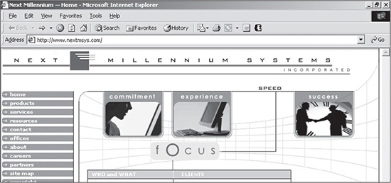
© 2014 Next Millennium Systems, Inc. All rights reserved.
Developing Layers
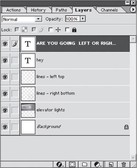
As previously mentioned, using layers in Photoshop saves a designer an inordinate amount of time when creating and editing a comp. Any item, whether text, shapes, or photos, can be saved on its own layer. That way, items cannot only be moved individually, but they can also be replaced individually without disrupting content on other layers. Figure 5.7, for example, is an image that consists of six layers, including the white background. The Photoshop Layers panel is shown in Figure 5.8.
Figure 5.7
Image that is made up of layers.

© 2014 Cengage Learning.
Figure 5.8
Layers panel in Photoshop.
© 2014 Cengage Learning.
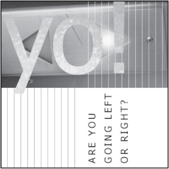
If the client requested the text to be changed to “yo!,” all the designer would need to do is open the file in Photoshop, click on the layer that says “hey,” select the Text tool, click on the text in the file, and retype “hey” to read as “yo!”
While making this change, the designer could also move the lines or the “ARE YOU GOING LEFT OR RIGHT?” text, and reposition the newly retyped “yo!” text (see Figure 5.9). When creating comps for homepages, it is not unusual to create as many as 60 to 80 layers, which, additionally, can be nested within parent layers, called Groups—in other words, a layer can serve as a folder for additional layers.
Another advantage of layers is that they can be turned off easily so that if the client wanted to see the image in Figure 5.9 without the word “yo!,” the designer could simply shut off that layer and save a new version of the Photoshop PSD file.
Figure 5.9
Same image as Figure 5.7 but with layers edited.
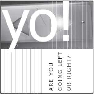
© 2014 Cengage Learning.
Layers can also be merged together for further editing. The “yo!” in Figure 5.9 could be merged with the elevator lights image. The two could then, for instance, have a motion blur added. When all the layers are merged together, the PSD file is flattened (the selected layers are merged to make one layer). Rarely will the designer ever want to flatten an image. If Figure 5.7 had been flattened, it would require considerable time and effort to cut “hey” out of the image, re-create the elevator image behind the word that was also cut out, and retype the word “yo!” Unfortunately, Photoshop PSD files can be flattened accidentally, which is why it is wise for a designer to back up all files. It usually takes only one accident and one experience with re-creating 70 layers of a comp for the designer to learn this lesson.
Making Copies of Layers
When merging several layers together at a time in Photoshop, the designer may want to make copies of the layers and turn them off before merging. This allows the designer to come back and edit pieces of the merged layer more easily in the future, if necessary.
Using Masks
Masks are extremely useful when a designer wants to control the shape or placement of an image. According to Adobe, a mask enables a designer to “isolate and protect areas of an image as you apply color changes, filters, or other effects to the rest of the image.”
If a designer wanted to set an image inside the word “yo!” from Figure 5.9, the text could be rasterized (converted to a bitmapped image, which will not allow textual editing) and used as a mask. In Figure 5.10, the letters are used as a mask for an image of water. In other words, the water image is placed inside the letters. This can be advantageous when there is a photo or shape included in a design that cannot be moved, but the designer needs to replace it with another image. All the designer need do is use the original image as a mask, which the new image is then inserted into. Because the mask will initially be created as its own layer, the old layer can then be turned off or deleted to ensure that the edges of the image are smooth.
Figure 5.10
Image that uses the letters “yo!” as a mask for an image of water.
© 2014 Cengage Learning.
RECEIVING A DECISION ON THE CHOSEN COMP AND MAKING EDITS
Websites are in continual evolution. They especially evolve during the comp process. A design that works for a designer may not work for the person leading the project or that person’s boss or peers. Frequently, the person in charge of the project will say, “It looks great to me. Let me just run it by so-and-so real quickly, and we’ll be ready to go.” While this sounds positive, there is usually a good chance that the next person will suggest additional changes.
The varying steps in the approval process make it wise for the designer to wait for approval on a comp before breaking it up into XHTML, graphics, and CSS. Because the breaking-up process can be time consuming and difficult to subsequently change, it is best to wait rather than begin, stop, and start all over again. Even though a design should be flexible, it can only be flexible for certain changes. If the client says, “My boss really wants you to move the menu from the left to the center,” this edit will usually call for reworking the entire design.
Each site will go through its own unique process of approval. One site might require only one person’s approval, while another site might require a committee’s approval. There are several rules that the designer should follow when attempting to get approval:
Be patient. There is a fine line between calling the client every day and showing the proper follow-through. Most companies, especially in corporate America, move slowly. While a client with a few people involved in approving a comp may do so quickly on the phone, it could take days to weeks for a corporate client to approve a certain desired look and feel.
Attempt to document all communications. If the designer has the choice between calling or emailing a client, the wiser choice, many times, is to email. Not only is an email less intrusive, but it is also a good way of documenting communications. Whenever a client requests a change, the designer should ask for the change(s) to be submitted via email. That way, it protects both parties. Most disagreements or misunderstandings can be resolved by looking back at previous emails.
Offer alternatives. Not all clients are going to be as technically or artistically minded as their designer. They may simply not know the various options a site can offer. Offering alternatives also lets the client know that the designer is keeping the client’s best interests in mind. Color alternatives can be a good thing to offer a client if there is not a set palette. Because the slightest disproportion of a color can change the entire look and feel of a site, it is difficult to imagine changes without testing.
Do not get attached to the work. For every client who trusts the judgment of the designer, there are two who would prefer that a design look the way they desire. It is always amazing how quickly a design can change for the worse, at least in the designer’s viewpoint. It is important, therefore, that the designer not become attached to a design. The paying client has the final say. If there is an affinity for a specific design look, the designer can always ask for permission to use the preferred version in a portfolio.
Limit the number of changes from the outset. Many times the approval process can get out of control. What once was one design can turn into three or four versions without the client’s paying for the extra changes. This is why the designer should explain the approval process before beginning work on the designs. That way, there are no surprises when additional charges for excessive changes are incurred.
SUMMARY
There are 10 general steps to building a mortised site. One of the first and most important steps is gathering requirements and basing the site on those requirements. While requirements involve more work up front, defining requirements can make the development of a site considerably more time- and cost-efficient, as well as more effective.
Once the requirements are collected, the designer creates the comp(s) in Photoshop. There are several procedures a designer should follow to ensure that the comping process goes smoothly: create a source directory, collect and document stock images, and select colors.
After the first draft of a comp is completed, the designer works with the client to edit and finalize the site’s functionality, appearance, and usability.