
CHAPTER 3
THINGS TO CONSIDER BEFORE BEGINNING
Working in a logical, practical manner is one of the keys to becoming a professional Web designer. It is particularly important to be logical and practical when working on the technical aspects of a site, such as collecting requirements, taking the client’s concerns into mind, and designing for scalability and flexibility. While contemplating the design in depth beforehand requires more initial time and forethought, doing so can save many hours, if not days, addressing future problems.
USING REQUIREMENTS
Site requirements can best be compared to a recipe that tells a designer what needs to be included in the site, the steps required to complete each task, plus additional information, such as how to present the site and the types of people it will serve. Although every designer’s or company’s requirements might be different, they all share a common goal—an agreed-upon document that helps serve as a road map, as best as possible, to the completed site.
When constructing a site, some of the most important information a designer needs to document includes the following:
 Look and feel requirements: These include content placement, how the site conveys the company’s message, the color palette, and fonts and image concepts to be presented.
Bandwidth requirements: The way a site is designed will determine how large of a download the site will require. By understanding the bandwidth (download size) requirements, a designer can determine how many graphics to use.
Resolution requirements: A site with improper resolution can hinder its usability or credibility.
Scalability requirements: Because nearly all sites are in continual evolution, it is important for the designer to consider how the site can be expanded or changed in the future.
Content requirements: The content volume of a site will influence nearly all other requirements, including the look and feel, the bandwidth, resolution, and scalability.
Depending on the size of a website, different levels of documentation are necessary. Many small sites (around 5 to 15 pages) only require the designer and client to email or call each other during the development process. Larger sites (more than 15 pages) often require more thorough documentation, which includes an official requirements document. Without such documentation, the designer could have a site nearly completed when the client says, “Oh, that’s not what I meant. You actually need to do it this way.” At that point, changes are not only time-consuming and painful, but the designer is left in the awkward position of whether to make the corrections pro bono or charge the client an additional fee. This mode of edits continually coming in with no foreseeable end is referred to as scope creep.
Because of documentation time, site requirements might increase the cost of the site. However, while initially taking more time and money, requirements can save considerable expense when the designer has everything planned prior to development.
Take, for example, a 20-field form. Without requirements, the form might start out at 20 fields. The client, though, after seeing the first draft, says, “Oh, I forgot a few items we need to add.” They probably do not know that this involves making changes to not only the form, but also to the database and additional server-side scripted pages that complete the functionality. And that is just the first draft. The client might then run the form by a peer or boss who will have additional changes that the designer will have to incorporate. Before long, the same form could include 35 fields.
This may seem like a small-scale issue. However, it can become quite problematic, resulting in larger-scale meltdowns, such as major design problems. The designer might create a site with a horizontal navigation menu at the top. Then the client comes back with five additional sections to add to the site after weeks or months of development. What then? The initial solution would be to add the items to the menu. What if the menu already takes up the full width of the screen? One possibility would be to add another row of menu items. But this might look awkward or impede the usability of the site, or the design simply might not support a vertical stretch of the header area. Taking a very long step backward, the designer then realizes that the lacking requirements have drastically changed the scope of the project. A lot of the site is now going to need to be redesigned.
Collecting the Requirements
Requirements lacking detail can be just as detrimental as not having requirements at all. There are many different areas that should be addressed when documenting requirements. While many answers to questions are collected to help in the marketing and back-end (programming) development of the site, many can also be used by a designer to ensure that the design best supports current and future demands. Getting a feel for the areas that need to be addressed comes with experience; however, here is a minimal list of areas that will probably need to be documented. An in-depth requirements document should probably cover the following areas:
Site/client name: Not all sites have the same name as the company they are designed for. Therefore, this is important to know before beginning a design.
Prepared by: It is always helpful for your client to know who prepared the document and how to get in touch with that person.
Date: While it might seem obvious, knowing the date helps the designer write future summary reports and track site-design efficiency.
Client contact(s): The more contacts the better. A designer can never have too many people to call when various questions arise during development, although it is suggested that there be one final decision maker.
Version: While the version of the requirements document should also be covered with the naming convention of the document (for example, requirements_v3.doc), it is also wise to include it in the document itself. Sometimes, the version number will remind the designer to save the current document as a new document.
Executive summary: This summary gives the designer and design team the gist of the site. Half the battle of designing a site is getting “the big picture.” An executive summary helps make more sense of the specifics.
Assumptions: Many times the designer and client do not share the same assumptions. For example, the designer might not know that an intranet site also needs to serve as an extranet site, which could change the technical requirements. The fewer the presumptions, the more effective and efficient the development will be.
Dependencies: While not all sites have dependencies, it is important to know if any exist. An example of one possible dependency could be if the site must rely on another company or site for live content, such as an RSS (Really Simple Syndication) feed.
Objectives: It is easy for a designer to lose focus when getting into a project. Being able to revisit the objectives of a site can be helpful in regaining and clarifying that focus.
Action items: Action items provide more detailed information on what specific steps need to be taken to accomplish various tasks.
Detailed requirements (includes front-end questions, functional requirements, and a site map/flowchart): These are the heart of a requirements document, at least for a designer. They give the specific details on design, content, and functionality that a designer needs to include when creating the site. An example of such a requirement might read, “Include login form area on the homepage that includes the User ID and Password fields, along with a Submit button.”
Proposed solution(s): Talking about and documenting solutions are two different things. While the client may think one thing after a phone conversation, the solution actually written out may present another picture. Such documentation helps to prevent misunderstandings.
Possible future site considerations: Because sites are in continual evolution, it is important to create a scalable design that can handle future additions. In other words, the client may say, “We need only 15 pages for this phase; however, the design will need to accommodate another 20 pages in phase 2.”
Sign-off section: Signing off on a document provides closure for the client and assurance for the designer, signifying that both sides are in agreement on the road map of a site.
Front-end requirements and flowcharts are usually more beneficial when designing comps for a site. It is from these two documents that a designer bases the design, site architecture, and navigation.
When collecting requirements, there are three rules a designer would be wise to follow:
Document everything: One of the best methods for documenting things is for the designer to Cc or Bcc himself or herself on all emails. It is surprising how many of these emails are eventually referenced again.
Save each document as a different version: Not only is it wise to back up all files in case of a hard-drive failure, but it is also smart to back up all files in case of human failure. Whether human failure means accidentally deleting a file or clarifying a point of confusion by going back to previous versions of a document, it is wise to save all files, whether graphics or text, as new versions. The first round of writing requirements, for instance, could possibly be saved as requirements_v1.doc, with the “v1” representing “version 1.” When that document is revised, it should then be saved as requirements_v2.doc for version 2. It is just as important to save versions of graphics files. Many times a client will request changes, realize they do not work well, and then come back and say, “Well, I think we liked the first version better.” At that point, it is much easier to open the original version of the file than to have to re-create it.
Receive a sign-off on the requirements before beginning work: Until a designer receives the sign-off to begin work, whether it will be with an email or a deposit check, nothing is set in stone. One minute a client may say, “Yes, that is exactly what we want,” and the next time the response may be, “Well, we just met, and we have some more changes we want to add before you start.” At that point, precious time has not been spent working on a comp (or composite) that will need to satisfy completely different requirements.
A Photoshop Comp
A comp, as described in this book, is a graphics file that shows what the homepage will look like in terms of layout, color, images, text, functionality, and typography. Comps are generally created and edited in Adobe Photoshop (as PSD files) before eventually being broken up into XHTML, graphics, and CSS.
Obtaining Front-End Requirements
If the designer does not have the time or resources to collect in-depth requirements, a shorter version of a requirements document can be used to collect information. Such a document should provide the designer with enough information to enable him to create a design that supports the look and feel, architecture, and future possibilities of a site. Here are 13 questions a designer should try to have answered before beginning a site’s comp:
1. Who is the audience, and what is the purpose of the site?
2. What is the feeling you want to convey to your audience with your website?
3. Will the site need to be expandable, in terms of sections, in the future?
4. What browser platform and resolution (for example, Chrome/Firefox or 1024 × 768 or higher) do you require?
5. How many levels, or “clicks,” can the deepest information be?
6. What is the most important information that should be put on the homepage?
7. When can text and graphics (logo) samples be supplied for designing the comp?
8. Do the images and colors on the site need to be consistent with any existing branding?
9. Does it matter if the site scrolls vertically?
10. What kind of functionality (for example, forms, dynamic text, or multimedia elements) does your site need to have?
11. What is the desired download size of the homepage?
12. Does your company have a tagline?
13. What is the proposed deadline(s)?
The designer can send the document to the client to fill out or fill out the document himself over initial meetings, phone calls, or emails. Usually, having the designer fill out the document is the best choice simply because the client may not have enough design experience or savvy to answer all the questions. Once completed, the designer should reiterate and confirm the answers, as well as receive a sign-off before beginning the site’s comp.
Creating a Flowchart
Smaller sites do not necessarily require a flowchart simply because it is not difficult to visualize a site with About Us, Services, Products, Testimonials, and Contact sections. Larger sites, especially application sites with 10 or more pages, are considerably easier to create when the designer has a flowchart. Not only is it easier to visualize the site, but it also saves a lot of time clarifying questions.
Figure 3.1 illustrates the possible complexity of an application site. When initially looking at the site, the user would see only six items on the menu, including a link back to the homepage. Surfing through the site, though, it quickly becomes apparent that the site contains more than 30 different pages.
The flowchart in Figure 3.1 was created using Microsoft Visio. While flowcharts can be created in other programs, such as Microsoft PowerPoint, Visio contains functionality that not only easily creates but also easily edits documents. With Visio, a designer could select all the items under the Client Info section on the left, move them wherever desired, and have all the flow lines move with the boxes while automatically skipping over other stationary flow lines. This can save innumerable hours when working with a client that continually makes changes.
Figure 3.1
Flowchart showing a site that contains more than 30 different pages.
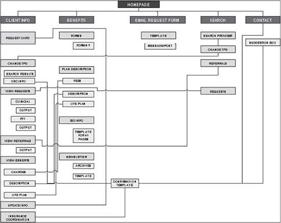
© 2014 Cengage Learning.
Another advantage to creating a flowchart is that it can be used to create a site map by taking out workflow lines, explanations, and back-end items. While it may not be necessary to include all sections in a sitemap, doing so only helps to increase the site usability.
Knowing Bandwidth Requirements
The amount of bandwidth a user can download determines how many graphical elements should be incorporated into a design. If the anticipated audience’s bandwidth limitations are strict, the homepage design may possibly have to fit under 30–100KB. On the other hand, if the bandwidth limitations are liberal, the limit for the homepage design could be anywhere from 100KB to 1,000KB or even higher. As previously mentioned, user bandwidth is a relative term. No matter what the supposed connection speed is, many factors influence what that bandwidth really is. Some of those factors include the following:
How many users are concurrently hitting the same site? The media used to occasionally report on sites going down because the sites’ servers were not equipped to handle so many immediate users. While the problem of a server going down is an extreme example, a server does not need to go completely down to have its download speed compromised.
What is the overall usage of the Internet? Whether it is a dial-up modem, DSL, or cable access, every user can fall victim to slow downloads as a result of a bogged down Internet. One hour the Internet could be pumping the bits like wildfire, and the next it could be spitting bits one at a time. A common example of slowing down of data transfer is when, during the school year and around 3 p.m. to 4 p.m., kids get home from school and log on to the Internet en masse.
What is the condition of the phone line coming into the computer? A phone line can also slow down an Internet connection. A user could have a 56K modem but only receive 36K service because of the incoming line. Distance also can play into this problem, and DSL technology is limited to a certain distance it can pump bits. Generally speaking, this is a moot issue. However, there are still instances where a phone line can be an issue for people living in rural areas, whether in the U.S. or other countries.
Understanding various factors that affect the data transfer of a site is why it does not make sense to design a site totally on the basis of the actual time it takes to download. There are too many factors that may change the download time from minute to minute. It is better to build sites that meet a goal of so many kilobytes. This number includes everything—the Web page(s) used to build the homepage, the homepage itself, and the graphics used.
There are three general instances when a larger site might be designed without any bandwidth issues:
Intranet versus Internet site: Intranet sites, which are internal business networks, usually offer a considerably higher bandwidth than the external Internet, which is subject to many more variables.
Corporate versus a more general audience: Sometimes, a more advanced corporation, such as Cisco, will have an audience with higher bandwidth capability than a site designed for a more general audience, such as a mom-and-pop shop that sells homemade gift baskets.
High-bandwidth functionality versus purely content-driven: Often, the purpose of a site also allows for a higher bandwidth flexibility. For instance, an online music store is going to have users with higher bandwidth than a site that is designed to offer pure text content.
DECIDING ON RESOLUTION
One of the biggest considerations with Web design is designing for resolution. Websites are designed for a certain monitor resolution. Monitors, however, have varying resolutions that are set independently of the site.
If the user’s monitor resolution does not match the resolution the site was designed for, the site will appear differently than was originally intended. In other words, the way a monitor resizes a screen is similar to that of a television set. Whether a monitor screen size is 17 inches or 30 inches, the content will be dynamically resized to fill the entire screen the same way, at least horizontally. However, the problem is that computer monitors, unlike television sets, allow the user different resolutions. If the resolution of a monitor, for example, is set at 800 × 640 pixels, a site that is designed for 1024 × 768 resolution will appear too wide. If the resolution of the monitor is 1024 × 768, the same site will appear either too narrow and short, or it will be stretched horizontally.
Figures 3.2, 3.3, and 3.4 show how A5design’s site, which was designed for 1024 × 768 resolution, appears on monitor resolutions of 800 × 600, 1024 × 768, and 1280 × 800, respectively.
The Web design industry for years designed sites for 640 × 480 resolution. Then around 1999, more sites began to be designed for 800 × 600 resolution. Since 2006, most sites have been designed for 1024 × 768 resolution.
It is difficult to say when or if another major expansion will occur. Most likely, it will take longer to reach that level because more and more baby boomers, who make up a growing segment of the Internet, are tired of not being able to read smaller text, which is usually a result of higher-resolution monitors. Although there are work-arounds, people, by nature, don’t like change. This is only theory, though. Many times it’s difficult to truly know how standards will evolve.
Figure 3.2
Site at 800 × 600 resolution.
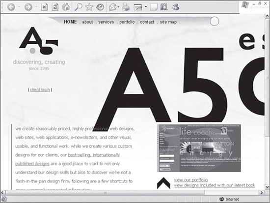
Source: a5design.com.
Figure 3.3
Site at 1024 × 768 resolution.
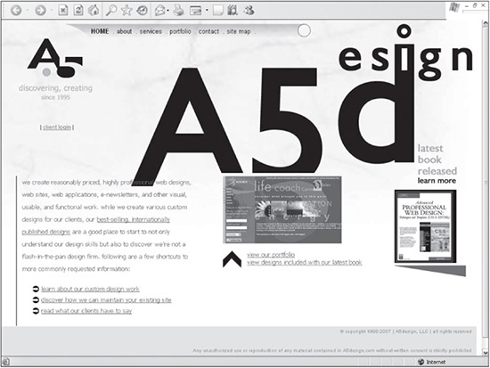
Source: a5design.com.
Figure 3.4
Site at 1280 × 800 resolution.
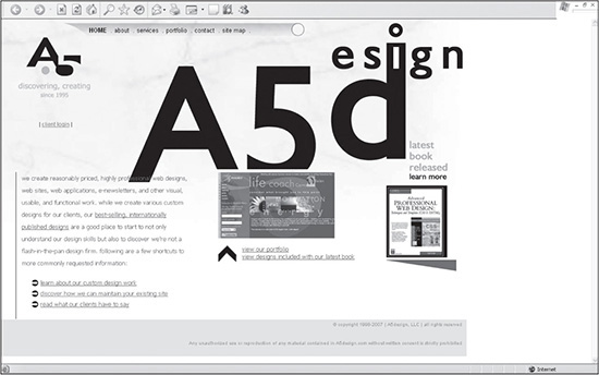
Source: a5design.com.
The real question a designer needs to ask is “What is critical mass?” This ultimately determines what the newer resolution should be designed for. This is a call that, many times, a designer can leave to the client. Some people would say 75 percent of all users would be critical mass. Others might say 95 percent, claiming that taking the risk of losing 25 percent of a user base is not worth the benefit of going to a higher resolution. Making such a decision cannot be based solely on general statistics. It should also be based on the type of audience a site is geared toward. If the audience is high-tech, a site will likely be designed for the highest acceptable resolution much sooner than if the site were geared toward a more general audience, such as a search-engine site intended to satisfy the largest audience possible. It is the job of the designer to know the statistics, understand the implications of the various resolutions, and, if need be, make the call on the resolution if the client “doesn’t care.”
When going to a higher resolution, the designer must consider the quantity and ratio of content. As resolution increases, so does the screen real estate. Jumping from a resolution of 800 × 600 to 1024 × 768 increases the available screen area by nearly 40 percent. When designing for a content-intensive page, this extra space can be advantageous. The designer can either add more content or make current content look less busy by reworking the layout.
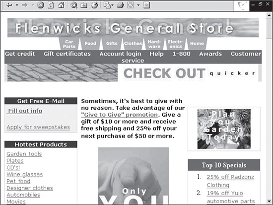
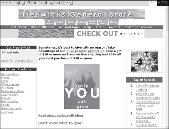
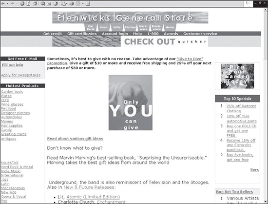
Designing for a higher resolution does not necessarily mean that the designer need disregard monitors with lower resolutions. One trick that designers frequently use is to design a site where the least important information is delegated to a column to the right. That way, the most important information, which is on the left, is still viewable by a user when the monitor is set to a lower resolution. Figures 3.5 and 3.6 are screenshots of a site designed specifically for this issue. Looking at the right-hand side of the screenshot in Figure 3.5, there is a column of advertisements that the user is probably not going to be as interested in.
When dropped down to a lower resolution, the column to the right is no longer visible. However, the main content to the left is still viewable.
Figure 3.5
Site designed for a standard resolution.
© 2014 Cengage Learning.
Figure 3.6
Same site as in Figure 3.5, but in a lower resolution.

© 2014 Cengage Learning.
Designing a site in this manner is a smart and easy way to address monitors with lower resolutions. It is generally good practice to show a little of the right-hand column so that the low-resolution user knows that there is more information available by scrolling to the right.
Designing Fixed Versus Relative Sites
A site designed for a lower resolution will not dynamically resize to fit the screen of a monitor with a larger resolution, but it can stretch horizontally to at least fill the full width. These kinds of pages, which use this relative resizing to fit a screen, are called relative or jello pages. Figures 3.7 through 3.9 are the same site viewed at the resolutions of 640 × 480, 800 × 600, and 1024 × 768.
The advantage of these sites is that they fill up the full width of the higher-resolution screen. It can be distracting to some users if the site does not at least fill the screen horizontally.
Figure 3.7
Relative site at 640 × 480 resolution.
© 2014 Cengage Learning.
Figure 3.8
Relative site at 800 × 600 resolution.
© 2014 Cengage Learning.
Principle Remains the Same, Despite Resolution
While most of these site resolutions are antiquated, the principle remains the same in terms of varying sizes.
The disadvantage of relative sites is that the layout can be compromised, which can hurt the site’s usability. As it stretches across the screen, the site will reposition certain text and images horizontally. Research has shown that after the text reaches a certain point in terms of width, the user will be less likely to continue reading it. Also, if the design was created to lead a user’s eye to certain areas, those areas will not necessarily be in the same position at a higher resolution.
Figure 3.9
Relative site at 1024 × 768 resolution.
© 2014 Cengage Learning.
Most designers like to have control over the layout, which relative pages do not allow. Many designers spend time strategically, and sometimes artistically, placing text and images to be visually more effective. Relative pages, however, might distort the intended layout at difference resolutions. Special care must be taken when designing a page with fixed sizes on the tables to allow for expansion.
In order to tackle some of the resolution issues, designers can either force the width of the site or choose which columns will not expand by specifying a width in CSS for specific containers.
Creating Versions of a Site to Satisfy Differing Resolutions
If controlling the look and feel of a site for different resolutions is important enough, a designer can develop different versions of the same site for different resolutions. Branching JavaScript can be used to detect a user’s resolution automatically and serve up the right code for a specific resolution. Such a solution involves much more time in creating and maintaining the site, but it also ensures a controlled look and feel for differing resolutions.
Deciding on Color Depth
Color depth is not nearly as complicated an issue as resolution is. Color depth refers to the number of colors a monitor can display. Similar to GIFs, the numbers increase exponentially, beginning with 2 (that is, 2, 4, 8, 16, 32, 64, 128, 256, and so on). After a certain bit depth, the human eye cannot detect a difference.
In the mid-1990s, there was a considerable break point in the number of colors a monitor provided, which designers needed to be aware of. The difference was between 8-bit (256 colors) and 16-bit (65,536 colors) depth. While saving an image as a GIF with 256 colors made it look very much like a normal photo, monitors did not offer the same quality. Figures 3.10 through 3.12 are the same JPG photo with the monitor resolution set to 8-bit, 16-bit, and 32-bit.
Using 16-bit resolution to view images is more than adequate. Today’s monitors offer 32-bit color, which can display 16.7 million colors. But because the human eye can only detect approximately two million colors, 32-bit is somewhat overkill, as seen with Figures 3.11 and 3.12, which show no “visible” difference.
Why does this all matter? The truth is, it doesn’t that much anymore. For the most part, it’s included merely as a history lesson for the reader. Some designers still design for monitors with 256 colors, thus the color-safe palette, which is used to guarantee that browsers display colors the same, rather than providing their own versions of a “light blue.” However, this is no longer necessary. Monitors have supported at least 16-bit color depth since 1996. Usage statistics confirm the fact that the majority of users have at least 16-bit color depth. A designer should still understand the issue because it occasionally comes up with other design jobs, such as creating icons.
Figure 3.10
Monitor color depth set to 8-bit color (256 colors).

© 2014 Cengage Learning.
Figure 3.11
Monitor color depth set to 16-bit color (65,536 colors).

© 2014 Cengage Learning.
Figure 3.12
Monitor color depth set to 32-bit color (16.7 million colors).

© 2014 Cengage Learning.
DESIGNING FOR SCALABILITY
Back in the mid-1990s there were very few extremely large sites (hundreds or thousands of pages). The majority of sites were small by today’s standards and built with only static content. Because revising these small sites was so easy, it was common practice to redesign them every six months to a year. Today, sites are exponentially larger, more technically complicated, and more in tune with brand recognition. It is no longer easy or cost-effective to redesign a large site.
More importantly for some designers, a site must be easily maintainable. The fun part of Web design is creating a site. The real work begins when the client requests maintenance. This is why it is important that designers build sites that are scalable in two possible ways:
Editable sites: A designer should be able to edit pages and sections of a site without any major rework of the design.
Modular sites: A homepage, for example, should be comprised of several files, or pieces put together, that can be easily replaced or edited. An analogy would be that of changing the oil in a car. If it were not possible to easily drain and refill the oil via a plug on the bottom and cap on the top, a mechanic would have to remove the engine, take it apart, drain and refill the oil, and then put the engine back into the vehicle.
Scalable sites are not difficult to create. They simply require a little more forethought by both the designer and client. In addition to the forethought that goes into creating a flexible design, two aspects are used to create scalable sites—nested containers and include files.
Using Include Files
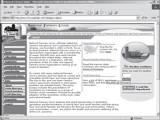
Include files are used by developers to call code that is used repeatedly throughout a site. In other words, a single file could be reused by 10 different pages. Include files are commonly used to contain the footer information of the site, which would, very likely, be used on every single page. Such files are a blessing to designers. They reduce development and maintenance time, which can be considerable, depending on the size of a site. Another advantage of include files is that they make a site modular. In other words, they allow for one page, such as the homepage, to be built with various individual pages. Those same pieces can then be used to build other pages. Figure 3.13, which is a second-level page of a site, is a good example of modular functionality. The area on the right containing the oval circle is an include file. This file not only serves a functional purpose, but it also reduces the amount of space of the body if the content is not as long as other pages.
Figure 3.14 is a third-level page of the same site that requires the full width of the body for the map. To accommodate this space, the designer simply removed the include file on the right.
Figure 3.13
Modular site that uses an include file in the right section of the body.
Source: National Farmers Union.
Figure 3.14
Third-level page of the site in Figure 3.13 where the right section was removed.

Source: National Farmers Union.
Creating a Flexible Design
The look and feel of a site is obviously a determining factor for its shelf life. If the site looks outdated, it will make the company or individual that the site represents appear outdated. Another factor that plays into the shelf life of a site is flexibility, which involves a designer’s ability to add and delete pages and portions of pages.
If a designer needs to spend hours changing the layout of a site because the client wants to add two sections, but the menu will not support it, then the site has a poor, inflexible design. If the designer simply needs to add only a few rows of content in a nested container, then that is a flexible design.
Figure 3.15 is an example of an inflexible design. Notice the menu at the bottom center of the page. Not only are the items in an area that does not allow much vertical expansion, but the menu items are also images, which are easy to create but more difficult to maintain. Another weakness of this design is that the menu items have to be repositioned for subsequent pages, usually at the top or left of the main body.
Figure 3.15
Example of an inflexible design.
© 2014 Cengage Learning.
There are three areas of a site that should be designed to be flexible:
Menu navigation: This is probably the most common flexibility problem of designs. If a site undergoes edits, many times the client is going to add or delete menu items. While deleting is not as much of a problem, adding items is. The menu, therefore, needs to be able to have items added to it without requiring a redesign.
Another flexibility problem is in making the menu too narrow, whether it is a vertical or horizontal menu. (Navigation and developing menus are discussed in Chapter 4.)
Content layout: Whether a site has a low or high amount of content, there is almost always the possibility that new text or graphics will be added; therefore, the layout of the site should be able to accommodate such changes without being compromised. The site in Figure 3.15 would not be able to handle growth in the content area unless the font sizes were reduced, which might not be a wise decision because the entire site is very graphic-intensive. If the amount of text were increased, it would flow over the images to the right and to the bottom.
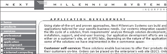
Title areas: It is necessary for a user to be able to identify second- and third-level pages. One way to identify pages past the homepage is to include a text description, such as in Figure 3.16. It is wise to build an area that can handle some of the longer section names. The site in Figure 3.16 allows plentiful room to add even the longest of titles. As wide as “Application Development” is, it could be longer and still be supported by the design.
Per the seven rules of Web design (see Chapter 1, “Overview of Web Development Today”), there is nearly always an exception. So is the case for flexibility. The downside to flexibility is that it limits a designer in what can be done with the layout of a site. Many sites that do not require much, if any, maintenance are perfect candidates for designing flowing graphical designs that are comprised of minimal text. A perfect example would be a short-term site, such as a site of an upcoming movie that might be in existence for only six months, after which it probably would be taken down or left unmaintained. In a rare case like this, the designer does not need to worry as much about creating a site that can be easily managed.
Figure 3.16
A design that supports long second- and third-level titles.
Source: Next Millennium Systems, Inc.
SUMMARY
A well-designed site is a well-thought-out site. Much of the work that goes into a design begins with collecting requirements so the designer understands the needs of the site. Such efforts can drastically reduce future time spent making corrections or redesigning.
A designer should take many requirements, such as bandwidth concerns, resolution, and color depth, into consideration before beginning the design. Once this information is collected, the designer should create flexible, scalable sites using include files.