
CHAPTER 4
ENHANCING USABILITY
Users don’t like being confused or having to wait when they go to a site. Studies have shown that visitors spend no longer than 10 to 20 seconds on the homepage, alone. This is not a lot of time to communicate a message. Usability, therefore, is king when trying to keep a user at the site—not only on the homepage, but also on subsequent pages.
Download time, resolution, and browser compatibility are three previously discussed areas that can make or break the usability of a site. There are, though, three areas that have not yet been discussed that are just as, if not more, important: site architecture, layout, and navigation.
SIMPLIFYING ARCHITECTURE
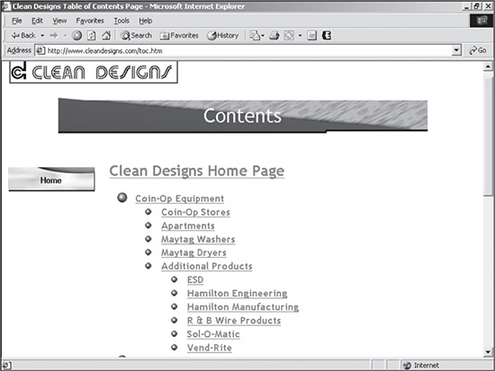
Architecture is the way a site is constructed and flows in terms of sections and pages. A site map is a visual representation of the site’s architecture. As shown in Figure 4.1, a user can discover how this site is laid out by reading the Contents site map page. It is easy to see that the Sol-O-Matic page is in the Additional Products section, which, in turn, falls under the Coin-Op Equipment heading.
The designer should never rely solely on providing users with a site map for their understanding of how a site is constructed. Rather, the site should be intuitive in the way it is designed. Following are several aspects a designer should consider when creating the architecture of a site.
Use a Consistent Naming Convention
A designer typically should not try to get creative when naming sections and pages, unless they are unique to only that site. While it was more acceptable to be creative in the mid-1990s, this is no longer the case because certain usability standards have been set. In other words, users expect to see one thing, so why run the risk of losing them if they cannot find what they are expecting?
The company contact section in most sites is a perfect example; it is common practice to put contact information in a Contact, Contact Us, or Customer Service link on the site. This is an easily understandable, general, catchall term that can include the postal address, email address(es), and phone and fax numbers. If the designer, on the other hand, were to name the link Information Center, the user might not make the initial association.
Source: Clean Designs, Inc.
One instance where it is slightly more acceptable to be creative with naming conventions is when a site has a metaphorical theme, such as a town theme, for its sections. Naming the Contact Us section as the Post Office is going to be fairly intuitive, as long as every section falls under a similar naming convention, such as Library, General Store, and Town Hall. Using metaphorical themes, though, can be risky. The designer is taking the chance that the majority of users will understand the theme and meanings of the sections. When designing a site for an international audience, the risk of confusion becomes even higher.
Limit the Clicking
Back in the mid-1990s, the standard number of clicks to get to any page from the homepage was as high as five or six. Today, however, it is generally wise to try to design a site so that a user can reach the majority of information within three clicks, although there are always exceptions to the rule. Limiting the number of clicks simply allows the user to get to the content more quickly, thus limiting the frustration of having to deal with numerous hyperlinks and waiting to download additional pages. There are certainly exceptions to this rule, such as forms and application sites with large amounts of content that require more clicks, but three clicks should always be the goal of a designer. Figure 4.1 demonstrates the value of limiting the number of clicks that a user must make. Note that all of the sections are within three clicks of the homepage.
Avoid Linking the User Out of the Section
Linking a user out of a section means that when a user clicks into, for example, the About Us section, and then clicks a subnavigation item Email Us, he ends up in the Contact Us section. It can be confusing to the user if the subnavigation of a site unexpectedly changes because the hyperlink is connected to another section.
Breadcrumbs Only Quick Fix
While using the breadcrumbs technique (showing the page path in the title, About Us/History/Early Years) can be helpful, it does not eliminate the confusion of unexpectedly ending up in a new section of a site when the user expects to remain in that section.
While this particular example is not overly confusing, it becomes more so when the flow becomes circular. Take Figure 4.2 for an example. If a user came to this site and clicked the Professional Services bullet on the menu to the left, the hyperlink would take that user to the subpage displayed in the right-hand section of the figure. The subnavigation on that page, however, is where the confusing circular navigation begins. If the user were to click on RIZNA Consulting, the hyperlink would go to the RIZNA Consulting section, which also is in the left-hand menu area. If the user were to click on Running Consulting in the subnavigation menu, he would return to Professional Services, completely making a loop back to where the trip started. To confuse the issue even more, the subnavigation items Virtual Consulting and Technologies Used, which are on both of those pages, take the user to entirely different pages in different sections.
The problem of circular flow usually occurs when a client wants the site to appear to have more pages than it really has. Ultimately, this problem makes the site appear disorganized and should be avoided at all costs for the sake of usability.
Figure 4.2
Site that confuses the user with its circular flow.
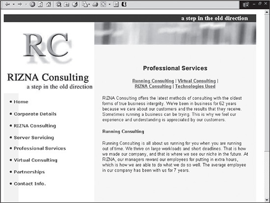
© 2014 Cengage Learning.
Create Cascading Architecture Versus Flat Architecture
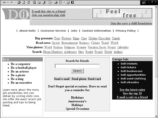
Flat architecture has long been a staple of many sites. Flat architecture involves putting as much information on the homepage as possible so that the user only needs to click once or twice to find the desired page. The problem with a flat-architecture site, such as the one in Figure 4.3, is that the user becomes overwhelmed, confused, and frustrated with the difficult navigation. The site offers so much information that it is difficult for the user to find items without having to search the entire page slowly.
Cascading architecture, on the other hand, eliminates a lot of the confusion by organizing similar types of content in their own intuitive subsections of a site. Then when the user clicks, for example, on a link entitled Finance, similar items, such as tips, news, portfolio information, a stock ticker, and other financial areas, are all bundled on the same, concise Finance page. By combining consistent information on one “mini-homepage,” the user does not have to drudge through all the submenus, lists, and shortcuts that are randomly included all over the homepage of a flat-architecture site.
Figure 4.3
Site that uses flat architecture to place as many links as possible on one page.
© 2014 Cengage Learning.
CREATING LAYOUT
A good layout is essential for the presentation of a professional image of a site. It also is important for the usability of a site. A user should be able to locate information with complete ease. Much of this is accomplished with the layout. Layout, in this instance, refers more to the positioning of elements, rather than the site’s look and feel. Two areas a designer must consider when creating a layout are scrolling and positioning.
Scrolling Versus Not Scrolling
Everyone or every study on usability has an opinion on whether a site should scroll or not. It is one of those design issues that will never have a resolution, only trends advocating or opposing it. Because scrolling is always up for debate, it is smart for the designer to make it one of the required front-end questions for the client. Here are some of the pros and cons of scrolling.
Pros of Scrolling
 The design can fit more content on one page.
The user does not have to click and wait for another page to load, which not only takes time, but the user must also refocus her eyes on a new area, most likely at or near the top of the screen.
It is easy to navigate quickly if the user has a mouse with a scroller wheel or a stylus, which also allows for easy cursor movement.
Cons of Scrolling
It takes less effort to click on a link that opens a new page than to mouseover to the scrollbar, click on it, and drag it up or down.
Because scrollable pages are longer, their download time is typically larger.
One instance where scrolling is absolutely unacceptable is when the designer creates wide pages that force the user to scroll horizontally. Not only does it contradict accepted usability standards, but it also requires more motion than vertical scrolling because the Web page width is wider than its height.
Positioning Content
Perhaps the most important component of a professional, intuitive design is the positioning of content. The user should not have to go searching for the most relevant information of the site. Rather, it should be positioned where it is easy to find.
Probably the first item a designer must address is the positioning of the menu. Since the mid-1990s, designers have experimented with placing the menu on the left, right, top, center, or bottom of the page—anywhere a designer can imagine, a menu has been placed there.
Over the years, placing the menu to the left or on the top of the page has become the more traditional standard. There are technical reasons for this, which are explained in the next section.
The second area a designer should address is the header. This area typically includes any of the following items:
Company logo
Advertisements
Links, such as “Login,” for globally used functionality
Company tagline
Hyperlinks, such as “Save 20% today,” which do not necessarily belong in the menu
Content
When designing the header section of a site, a smart strategy is to use as much content that can be cached by the browser as possible. This decreases the download time of subsequent pages that use the same header file because content is already cached in the computer’s memory. While it is tempting to create a unique header for every section of a site, the designer should ask the question, “Does it improve or hinder communication?” There is a difference between being creative to improve communication and being creative just to be different. Associating a color with a specific section might be beneficial, or it might just confuse the user, depending on the execution of the design elements.
When creating the header, a designer can take advantage of existing Web-usability standards. It is very common, for example, for a logo to be placed in the upper-left corner of a site. Because so many sites use this same design structure, users are accustomed to looking there for the logo. What a designer can do is place content in the upper-left corner that is deemed by the client to be more important than the logo. That way, the designer takes advantage of Web usability to increase the usability of that particular site.
The final area to consider when positioning is the body. Because designs can be shifted and shaped however desired, the best positioning location is not an easy call. Typically, the prime real estate of a site is the upper-center to upper-left section of the page(s). Users who come in at lower resolutions are going to lose the right side and bottom of a design before anywhere else; this, by default, makes the right and bottom areas less effective for communicating. This is not to say that these areas cannot be effectively used in a design. If the designer leads the user’s eye with graphics or color, any section of the initial screen can be used.
The bottom line is that there are exceptions to every rule, and a designer should experiment with positioning. No site is perfect, and nearly all sites are in constant evolution. If Web designs became too similar and predictable, the user’s eye would become lazy and less controllable.
Users, of course, are the ultimate judges. If a site does not compel them to stay, then the designer has not done a good job of communicating.
DEVELOPING NAVIGATION
Both usability and maintenance are issues to consider when creating the navigation, or menu(s), of a site. As mentioned previously, the menu is a key component of effective Web design. It should intuitively help a user find any item. If it doesn’t, the designer runs the risk of losing the user who becomes frustrated and leaves the site. There also are technical reasons for designing a smart menu. Maintaining a site is not always easy or convenient. Therefore, a menu should be designed so that items can be easily added, edited, or deleted.
Creating Consistency
To confuse is to lose a user. Following an inconsistent menu is the same as using a map that constantly changes from minute to minute. There are three flaws a designer should avoid when creating the menu:
Moving the menu: When inside the site, it is considered poor design to move the menu vertically or horizontally to accommodate other content that is added to the area. The user should be able to always look in the same area(s) for the same menu (s). A secondary menu is sometimes necessary for certain pages when the global menu (main menu included on all pages) will not support them. These menus should be placed in the same place on every page, rather than being placed wherever or whenever they may fit.
Changing the menu: Once a menu is past the homepage, it should be set in stone. A designer should not be adding items unless there are pages or subcategories being added below parent sections that existed in the original menu on the homepage. For example, the designer can confuse the user by adding a section of an existing menu on one or two pages and then eliminating it from the menu on all other pages. The user is not always going to follow such changes.
Limiting the number of menus: A menu serves as a convenient, concise listing of sections or pages of a site that a user can locate quickly. Once a designer begins adding mini-menus to other areas of a design, intuitive navigation is decreased. An example of such menus is shown in Figure 4.4. One menu is to the right of the global menu, which is in the upper-left corner of the page; the other menu is in the row below the World Tradeshow content.
Figure 4.4
Site that includes two mini-menus in addition to a global menu.
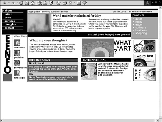
© 2014 Cengage Learning.
Portal sites, which offer many resources and services, are usually the most common abusers of multiple-menu design. While there may be a menu for larger sections of the site, there may also be two or three other mini-menus that the user has to find. A well-designed site should rarely use more than two menus on any given page. Often, links or sections in mini-menus can be included in the global menu. Sometimes, they may fit very well in existing sections, or they might need to have a special subsection created.
Using Text for Menu Items
Creating images for menu items can add to the look of a site, but most of the time they require a lot more work on the designer’s part to add or edit them in the future. Often, text with a simple mouseover image that can be repeated can be used in place of individual images for each item. Not only does this solution decrease the download size of a site, but it also makes a menu very easy to create and edit.
Deciding Whether to Use a Horizontal or Vertical Structure
Both horizontally and vertically structured menus have advantages and disadvantages. A horizontal menu structure allows the designer to use the full width of the screen for content. This is particularly useful for application sites that display large amounts of information in columns. Using a horizontal menu, though, has a drawback. There is only so much room to expand sideways. Therefore, if a design exceeds the width of the page, the designer will need to add another row for the menu, which can hurt usability, or the site will require a redesign. Another problem is that the menu can easily exceed the viewable area of monitors with lesser resolution. If, for example, the site is designed for 1024 × 768 resolution, a monitor with 800 × 600 resolution will lose 224 pixels on the right side of the screen. The advantages and disadvantages of a vertical menu are exactly opposite to those of a horizontal menu. An advantage is that vertical menus can be expanded easily because they stretch the page downward, which requires the user to simply scroll down. Because they take up horizontal space, vertical menus naturally minimize the amount of horizontal room the designer needs to work with. While this can be a disadvantage for an application site, it can actually be considered an advantage for a site that is lacking in content. A designer can use a wider vertical menu to take up the overall space of a low-content site.
Allowing Enough Width
Whether using a horizontal or vertical menu structure, the designer should always take the length of menu items into account before designing. If many of the items are long, then the menu might not even initially fit the width of the screen. Vertical menus also fall prey to this problem, although not as badly. If a menu item is too long in a vertical menu, it will either stretch the menu too wide or wrap around to the next line. Many times, the client will need to rename the menu items so they fit in a specified space.
Understanding the Different Types of Menus
There are four main types of menus that are used in websites, and each has its pros and cons. Many of the considerations for deciding which menu type to use are the same as those faced when designing an entire site: download time, browser support, and maintenance. Following are the various menus:
JavaScript or Java applets: These menus can expand and contract when items are clicked. The advantages of these menus are that they allow the user to view the entire site by quickly scanning the navigation on one page, and they can be cached. The disadvantages are that they are more difficult to maintain (unless dynamically built on the fly using data from the database).
Macromedia Flash: If the designer wants to build more creative menus, Flash is the way to go. It not only allows a designer with limited programming experience to build graphically animated menus, but Flash also allows audio to be added when a user mouses over or clicks on menu items. The disadvantages are that the user must have the Flash plug-in, these menus are more difficult to maintain, and they can annoy the user if not designed correctly. This last reason is similar to one of the overriding problems with multimedia sites—form precedes function. Users, for example, do not always want to see a round ball spin, shrink, expand, or change to a rectangle when each menu item is activated. The wow factor is great the first time, but quickly loses its appeal thereafter.
HTML text with mouseover: These menus, which use text along with a couple of small mouseover images, are supported by all browsers, require only a small download, and can be dynamic. They still let the user know when an item has been selected, and they are extremely easy to maintain. A disadvantage is that while the designer can be creative with the mouseover images, the font types are limited to Web text unless embedded fonts are used, which requires a plug-in and the download of the font. Another disadvantage is that while they can be dynamically created with a database-driven site, each time a new menu is created, the user’s browser cannot take advantage of caching the menu.
CSS: One of the most simple menu options is CSS menus. There are several different versions included with the designs in this book that run either horizontally or vertically. More importantly, there are CSS dropdown menus that are easy to update while also being search-engine friendly, not to mention that they also don’t require JavaScript code that can be more complicated and code-intensive. Stu Nicholls with CSSplay (www.cssplay.co.uk/menus/) has come up with an incredibly flexible and easy-to-use system that is well supported. Figure 4.5 shows a site that uses CSSplay’s menu system.
Figure 4.5
A simple yet powerful CSS menu provided for free by www.cssplay.co.uk.
© 2014 Stu Nicholls.
This CSS menu system is included online for the designer to use.
Because menus are so important to the usability of a site, it is important that the designer uses the right type of menu. If the audience is more advanced, Java, JavaScript, or Flash menus may be the way to go. If the audience contains both advanced and novice users, then HTML or CSS menus should probably be used, depending on how they’re created.
Most of the designs included with this book use XHTML or CSS menus because of their limited download and ease of adding, editing, and deleting.
DESIGNING FOR ACCESSIBILITY
There are some Internet users who consider usability as much of a technical issue as a visual, navigational, or comprehensibility issue. In other words, can the content of a site actually be obtained and used—that is, is it accessible?
When planning a site, the designer needs to consider different issues, such as will the content need to be obtained by a voice browser? If a user has a slow connection, is it possible to read what an image is about before seeing it? Or is it wise to use server-side processing when client-side processing will suffice?
DESIGNING FOR CONTENT
The amount of content in a site usually determines how a site will be designed. Some clients simply need a couple of pages put up, while others need full-blown, database-driven sites that include thousands of pages. Therefore, the designer needs to understand the site’s requirements before beginning. If a site has little content, then the remaining space can be supplemented with images. If a site requires more content, the designer will, most likely, use fewer images to keep the download smaller and the design less busy. Following are three types of sites a designer can create, based on content. (These are templates that are included in this book.)
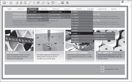
Low content: These sites are usually designed for the client who only wants to have an “online brochure.” Such sites generally include the basic information a user is looking for, such as information about the client, services and products offered, and contact information. Because these sites have a limited amount of content, they require more graphics to fill a page. This does not mean, however, that the entire page has to be filled with graphics. Much of it can also be white space, as shown in Figure 4.6. The ratio of content to images is generally around 20 percent to 80 percent, respectively.
Figure 4.6
Low-content design that uses graphics to supplement the limited amount of content.
© 2014 Cengage Learning.
Medium content: Many business sites created for the Web fall into this category. While clients for these sites may initially have a medium amount of content, they could be holding back on larger content so that they do not overwhelm the user on the homepage; such sites generally have three to five areas of limited content on the homepage. Figure 4.7 is an example of such a site. The content-to-images ratio is roughly 50 percent to 50 percent, respectively.
Figure 4.7
Medium-content design that has an even mix of content and graphics.
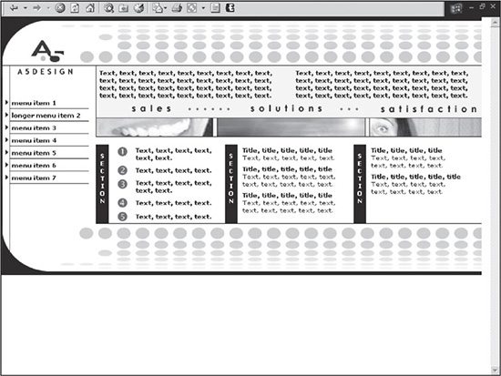
© 2014 Cengage Learning.
High content: These sites are all about disseminating information or selling a product. Because they have so much content, the amount of images is limited, particularly large-size images. In other words, while images are used, they are generally smaller, such as the blurred images in the center of the site shown in Figure 4.8. These sites typically have more than five areas of content.
Figure 4.8
High-content design that offers a large amount of content and limited graphics.
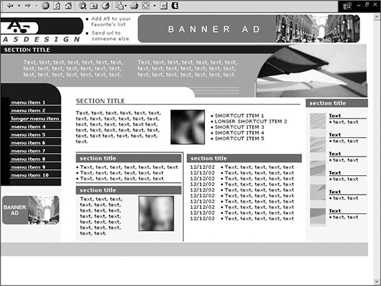
© 2014 Cengage Learning.
SUMMARY
No matter what the design philosophy is, usability should always be considered when creating a site. The user should not be confused by the naming of menu items or hyperlinks that go to unrelated sections, nor should he be overwhelmed by too much content.
A key factor in the usability and maintainability of a site is its navigation. Well-designed navigation will have items that can be easily added, edited, or deleted; download quickly; and are supported by the target users’ browsers.