
CHAPTER 10
CASE STUDY: MEDIUM-CONTENT CSS DESIGN
The complexity of a Web design can be deceptive. A design that looks simple can require more complex CSS coding, while a visually complex design may merely involve simple coding to achieve the proper mortising of images and content placement. The design in this chapter, while its look and feel appear similar to the design in Chapter 9, is more complex because it uses a three-column rather than a two-column design. Also, it is centered in the browser and uses mortised images on the top half of the homepage so the user can not only view the images but also click on them. The second level uses a screened version as the background image, which allows the design to add content freely over the image.
Design 122 Example
The design explained in this chapter is design 122 online (photo credits: www.idlerphotography.com).
UNDERSTANDING THE DESIGN’S STRUCTURE
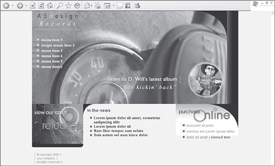
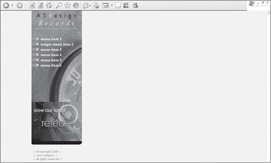
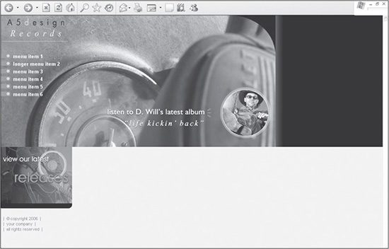
Figure 10.1 shows the design that is explained in this chapter. It involves two basic overall columns, one for the left side, which includes the menu, and one for the right, which includes additional nested <DIV> tags to position and style the content on the right. This includes the In the News and Purchase Online text areas.
Figure 10.1
The medium-content CSS design explained in this chapter.
© 2014 Cengage Learning.
Reasoning Behind Guides and Creating Slices in a Photoshop File
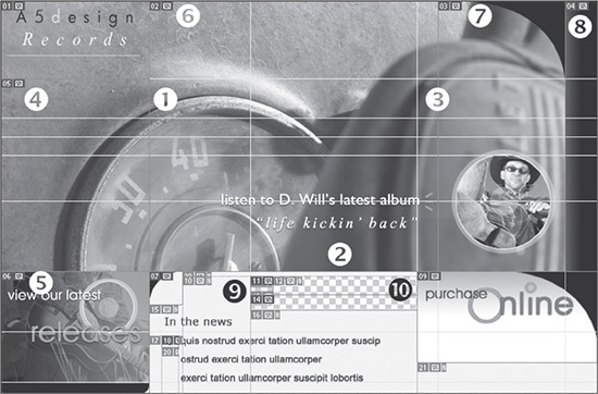
There are 11 slices included in this design, all deriving their positioning from the numerous guides that were added. Understanding these is the first step toward visualizing how to structure and style the various containers more efficiently.
Figure 10.2 outlines 10 of the most important slices and guides that the designer needs to understand. While some of them are used similarly in the design in Chapter 9, others offer additional ways to build mortised CSS sites.
Figure 10.2
Guides and slices strategically placed within the design.
© 2014 Cengage Learning.
 The guide to the left of number 1 is used to separate the design into left and right columns. The left column includes the menu, and the right column is a parent column that will have two columns, the center and right columns, nested inside it.
The guide below number 2 represents the guide that is used not only to outline the bottom of the background image in the menu, but also to separate the main graphical area on the right from the XHTML text (In the News and Purchase Online content) that is included below.
The guide to the left of number 3 is used to separate the center and right columns, both of which are nested inside the parent right column.
The slice indicated by number 4 is the background image that is used for the menu area of the design. One consideration in this type of design is that you don’t want the background to repeat vertically because it was not designed to do so. This caveat forces the designer to work within a specified height, which includes any height taken up by submenu items. By using a nonrepeatable background image, the designer can mortise it with the slice illustrated by number 5. If, however, the design were altered visually so that it did not matter if the two images were mortised together, the menu could be changed structurally to stretch down as far as the designer wanted.
Number 5 shows the slice that creates an image placed below the menu in the left column.
The images represented by numbers 6, 7, and 8 are mortised together to form the large image area of the right column. All three images are saved, so they can be hyperlinked or, for example, replaced by a Flash movie. Because they are nested in a fixed <DIV>, if the design were changed to be liquid, the background color on the right, which is black, would extend to the right of the images. The extension would be seamless because the right image is gradated into solid black.
The slices to the right of number 9 are used for the background images of each menu item in Normal and Hover modes. The images are cut from them so their backgrounds can be saved as transparent. This enables the items to be moved over the menu’s background image without containing the top image. This technique is explained in Chapter 9.
Number 10 indicates the image that is used as the background of the bottom-right column text area. While text is layered over it, it cannot be hyperlinked because it is a background image.
Understanding the Placement of CSS Containers
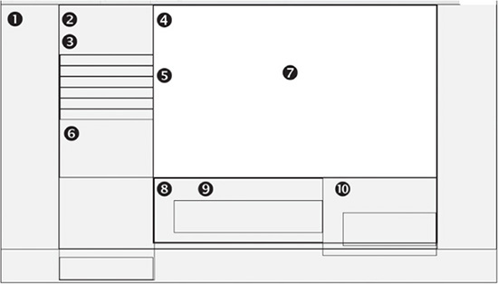
The number of <DIV> tags used in this design is similar to the design in Chapter 9. The main difference is in how they are used. Figure 10.3 shows the structure of the designs with the borders of the <DIV> tags turned on.
Figure 10.3
Ten of the most important containers used to build the design in this chapter.
© 2014 Cengage Learning.
The <DIV> tags are used for different functions in the design, such as setting up the basic infrastructure of the design, providing containers to position content within the infrastructure, and styling the content within the containers. Following are explanations for the 10 most useful containers in Figure 10.3:
1. The <DIV> tag to the left of number 1 is used for centering the design in IE 5 and 5.5. It extends the full width of the screen.
2. The <DIV> tag above number 2 determines whether the design has a fixed width or is a liquid layout.
3. The <DIV> tag to the left of number 3 contains both the left and right parent columns of the body. They are considered parent columns because the right column contains the code for the visual center and right columns of the design. This container extends to the right edges of the <DIV> outlined by number 2.
4. The <DIV> to the left of number 4 defines the right column. This contains everything to the right of the left column, which in this example, is for the sake of visual simplicity.
5. The menu column lies to the left of number 5, which is included in the left column.
6. Number 6 represents a <DIV> that contains the “view our latest releases” image in the left column below the menu.
7. Number 7 identifies the <DIV> that contains the top nested images in the right column.
8. The <DIV> to the left of number 8 is used to contain the center and right content columns that begin below the <DIV> that includes numbers 8, 9, and 10.
9. Number 9 shows the bottom-center content column that is nested inside number 8.
10. Number 10 represents the bottom-right content column nested inside number 8.
BUILDING THE STRUCTURE
Here are the step-by-step instructions for building the design. It is assumed that the Photoshop file has already been created or customized and the designer only needs to position the images and text.
Creating the XHTML and CSS Framework
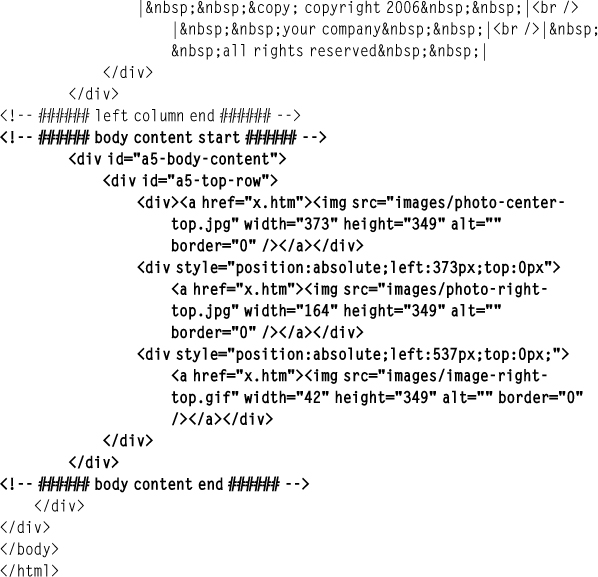
The first step for building the design is to create the XHTML framework and initial CSS containers. Listing 10.1 is the code that is used to output the page shown in Figure 10.4.
Figure 10.4
Basic XHTML and CSS framework for the design.
© 2014 Cengage Learning.
Listing 10.1 Code for Figure 10.4
<!DOCTYPE html PUBLIC "-//W3C//DTD XHTML 1.0 Transitional//EN"
"DTD/xhtml1-transitional.dtd">
<html xmlns="http://www.w3.org/1999/xhtml" xml:lang="en"
lang="en"><head><title>Design 122</title>
<meta http-equiv="Content-Type" content="text/html; charset=iso-8859-1" />
<style type="text/css">
/* ++++++++++ global general styles start ++++++++++*/
html, body {
margin:0px;
padding:0px;
font: 13px Arial, Helvetica, sans-serif;
color:#766D6D;
background:#F8F4EB;
}
/* ++++++++++ global general styles end ++++++++++*/
/* ++++++++++ global structure styles start ++++++++++*/
#a5-body-center {
text-align:center;
border:1px solid #000000;
}
#a5-body {
position: relative;
width: 770px; /* change this to a specific amount for a fixed
design or a relative amount if the design should expand to a percentage
of the screen. E.g., 770px or 100%, respectively. */
margin-left: auto;
margin-right: auto;
text-align:left;
padding-bottom:10px;
border:1px solid #000000;
}
/* ++++++++++ global structure styles end ++++++++++*/
</style>
</head>
<body>
<div id="a5-body-center">
<div id="a5-body">
</div>
</div>
</body>
</html>
There are several things to note about the code in Listing 10.1:
The CSS style sheet is commented into a couple of different sections. The global general styles comment tags contain the general styles, such as the formatting of the <HTML> and <BODY> tags, hyperlinks, and fonts.
Several rules define the <HTML> and <BODY> tags. The margin and padding properties are used to ensure that the design is placed in the very top-left corner of the browser, with no space between the design and the edges of the viewable area. The default font style is set using the shorthand FONT property. The default font color is defined with the COLOR property. The background color also is assigned (that is, #F8F4EB). This guarantees that all browsers display the site with the same background color because they would not otherwise always necessarily be the same.
The a5-body-center and a5-body rules are used to force the design to the side of the browser screen with a fixed width of 770 pixels. If the designer wanted to fill the full width of the screen, the value of 770px would need to be changed to 100%. If, however, the designer wanted to simply justify the design to the left, the value of the text-align property in the a5-body-center rule would need to be adjusted from center to left. The margin-left and margin-right properties in the a5-body rule ensure that the extra white space is evenly split on both sides. This system allows more than one site to be built with ease and flexibility, using the same default code, allowing the designer to adjust quickly to a client’s needs.
Both the a5-body-center and a5-body rules have their borders turned on using the following code: border:1px solid #000000;. For demonstration purposes, the code was added to both rules to show what the structure of the <DIV> tags looks like with no content added in them. Turning on the borders also helps a designer when building a site because it is not always apparent where elements are placed or where they are expanding. Rather than removing these rules, it is easier to change the value of 1px to 0px, turning the borders off. Troubleshooting often involves turning the borders back on because it saves times and takes up little download size to keep them in the style sheet.
Because the <div id="a5-body"> tag is nested inside the <div id="a5-bodycenter"> tag, it is indented. This allows for quicker recognition of tags that are nested inside each other, which becomes useful when the page has more code added later.
Adding the Left Column
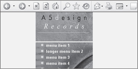
After the framework has been built, the left column needs to be added. This section includes the logo, menu, and bottom-left image of the design. Figure 10.5 shows what the design looks like after the code in Listing 10.2 has been added.
Figure 10.5
The design with the left column added.
© 2014 Cengage Learning.
New Code Is in Bold
The newly added code is bolded to differentiate it from the existing code that is being built upon in this case study.
Listing 10.2 Code for Figure 10.5
<!DOCTYPE html PUBLIC "-//W3C//DTD XHTML 1.0 Transitional//EN"
"DTD/xhtml1-transitional.dtd">
<html xmlns="http://www.w3.org/1999/xhtml" xml:lang="en"
lang="en"><head><title>Design 122</title>
<meta http-equiv="Content-Type" content="text/html;
charset=iso-8859-1" />
<style type="text/css">
/* ++++++++++ global general styles start ++++++++++*/
html, body {
margin:0px;
padding:0px;
font: 13px Arial, Helvetica, sans-serif;
color:#766D6D;
background:#F8F4EB;
}
/* ++++++++++ global general styles end ++++++++++*/
/* ++++++++++ global structure styles start ++++++++++*/
#a5-body-center {
text-align:center;
}
#a5-body {
position: relative;
width: 770px; /* change this to a specific amount for a fixed
design or a relative amount if the design should expand to a percentage
of the screen. E.g., 770px or 100%, respectively. */
margin-left: auto;
margin-right: auto;
text-align:left;
padding-bottom:10px;
border:0px solid #000000;
}
#a5-column-left {
position:absolute;
left:0px;
top:0px;
width:191px;
border:0px solid #000000;
}
#a5-menu {
font:bold 13px Arial, Helvetica, sans-serif;
height:249px;
background:url(images/bg-left-column.jpg) no-repeat;
}
#a5-menu a {
display: block;
text-align:left;
line-height:20px;
vertical-align: 30%;
height:20px;
padding-left:35px;
text-decoration:none;
background: url(images/bg-menu-off.gif) no-repeat 0px 0px;
color:#ffffff;
}
#a5-menu a:hover {
background: url(images/bg-menu-on.gif) no-repeat 0px 0px;
color:#F9F68C;
}
#a5-menu-sl {
width:191px;
color:#000000;
font:bold 12px Arial, Helvetica, sans-serif;
text-align:left;
}
#a5-menu-sl a {
display: block;
text-align:left;
line-height:18px;
vertical-align: 50%;
height:18px;
padding-left:40px;
font-weight:normal;
text-decoration:none;
background: url(images/bg-menu-off-sl.gif) no-repeat
0px 0px;
color:#000000;
}
#a5-menu-sl a:hover {
background: url(images/bg-menu-on-sl.gif) no-repeat
0px 0px;
color:#4C5C6B;
}
#a5-copyright {
font-size: 11px;
padding:20px 50px 10px 10px;
color:#978872;
}
/* ++++++++++ global structure styles end ++++++++++*/
</style>
</head>
<body>
<div id="a5-body-center">
<div id="a5-body">
<!-- ###### left column start ###### -->
<div id="a5-column-left">
<div><a href="index.htm"><img src="images/header-left.jpg"
width="191" height="100" alt="" border="0" /></a></div>
<div id="a5-menu">
<a href="index.htm">menu item 1</a>
<a href="menu-item-2.htm">longer menu item 2</a>
<a href="menu-item-3.htm">menu item 3</a>
<a href="index.htm">menu item 4</a>
<a href="index.htm">menu item 5</a>
<a href="index.htm">menu item 6</a>
</div>
<div><a href="index.htm"><img src="images/image-bottom-
left.jpg" width="191" height="162" alt=""
border="0" /></a></div>
<div id="a5-copyright">
| © copyright 2006 |<br />
| your company |<br />
| all rights reserved |
</div>
</div>
<!-- ###### left column end ###### -->
</div>
</div>
</body>
</html>
There are several things to note about the code in Listing 10.2:
The a5-column-left rule has absolute positioning assigned to it. Its left and top properties are both assigned 0px to force the <DIV> into the top-left corner of the a5-body container it is nested within. The width of the column is fixed at 191 pixels, using the width property. This ensures that the column’s width will not change, no matter what other content is included in the right column. It also forces the width of the left column so the menu items fill in its full width.
When the logo is added as the first item in the a5-column-left container, it needs to have <DIV> tags wrapped around it to eliminate extra space between it and the menu area below in some older browsers, such as IE 5, 5.5, and 6 (see Figure 10.6). While these are antiquated browsers, it’s still necessary to understand the code because it’s included in older designs included with the book.
Figure 10.6
Space that is added between the logo and the menu area in IE 5, 5.5, and 6 because <DIV> tags were not wrapped around the image.
© 2014 Cengage Learning.
The a5-menu rule is assigned the height of 249 pixels, which forces it to be the full height of the background image, which is also 249 pixels. To call the background image, a version of the shorthand property for backgrounds is used: background:url(images/bg- left-column.jpg) no-repeat;. Font size, bolding, and family also are assigned to this <DIV>, which will then cascade down to any nested or child containers.
The a5-menu a descendant rule is used to display and style each menu item. The display property with the block value will output each item in the <DIV> in its own row. The line-height is set to 20 pixels. Unlike the design in Chapter 9, the vertical-align property is not assigned here because it will move the text in relation to the background image, which is declared using the following shorthand code: background: url(images/bg-menu-off.gif) no- repeat 0px 0px;.
The a5-menu a:hover rule is used to reassign the background image from bg-menu-off.gif to bg-menu-on.gif and the color of the text from #ffffff to #F9F68C when the user mouses over the text.
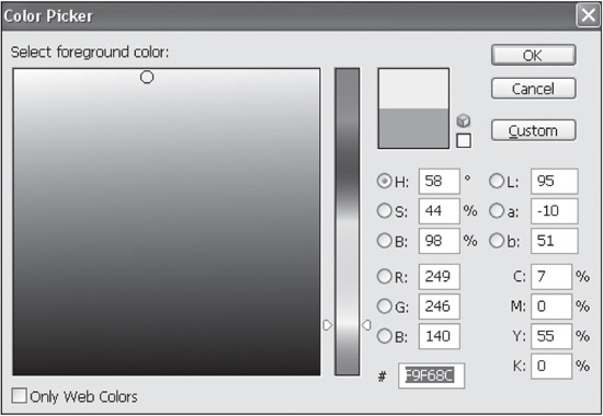
There is a case difference between the color of a link and the hover link (that is, #ffffff and #F9F68C). The reason for this is that #ffffff was entered manually while building the site, and #F9F68C was copied from the Color Picker in Photoshop when grabbing the exact HEX color (see Figure 10.7).
Figure 10.7
HEX color #F9F68C, which was pulled from the Color Picker in Photoshop.
© 2014 Cengage Learning.
The image-bottom-left.jpg image below the menu is added after the a5-menu <DIV> in the code. It has no styling added to it other than the <DIV> tags wrapped around it.
The a5-copyright rule positions the copyright text below the image-bottom-left.jpg image, using padding around the text. The padding:20px 50px 10px 10px; code adds 20 pixels of padding to the top of the text, 50 pixels to the right, 10 pixels to the bottom, and 10 pixels to the left.
Adding <DIV> to Nest Center and Inside-Right Columns
An a5-body-content <DIV> is added to create a right column inside which the top-right images, bottom-left content area, and bottom-right content area will be nested. Figure 10.8 shows what the design looks like with the a5-body-content <DIV> border turned on.
Figure 10.8
Page with the a5-body-content <DIV> added to form the right column.

© 2014 Cengage Learning.
This container is added because it will contain a background image in the second-level pages. By building the design around it in the homepage, the second-level pages, which are built from the homepage, are easier to construct because the base foundation of the code is already incorporated into the code. Following is the rule once it is added to the style sheet:
    #a5-body-content {
        position:relative;
        margin-left:191px;
        height:349px;
        border:1px solid #000000;
        }
There are three things to note about the preceding code:
The code has relative positioning so that it will flex to the full width of the a5-body container within which it is nested. This helps ensure that the design can also serve as a liquid design if the width of the a5-body rule is changed to 100%.
The container is assigned a value of 191px to its margin-left property. This forces its left side 191 pixels from the left side of the design, so it is placed just past the left column.
The height property is added to ensure that the container is 349 pixels high, which is the height of the background image that is added.
Adding the Top-Right Images
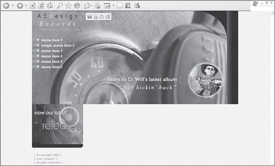
The first stage in adding the content in the right parent column is to add the top-right images. Figure 10.9 illustrates the design once the images are added into the code, which is included in Listing 10.3.
Figure 10.9
The first step to adding content to the right parent column is to add the mortised images.
© 2014 Cengage Learning.
New Code Is in Bold
The newly added code is bolded to differentiate it from the existing code that is being built upon in this case study.
Listing 10.3 Code for Figure 10.9
There are several things to note about the code in Listing 10.3:
The only rule that is added to the page-level style sheet is a5-top-row. This rule provides a container for the three images to be nested inside it. Because it is assigned relative positioning and a background value of #000000, a black background will expand to the right if the page is turned into a liquid design (see Figure 10.10).
Figure 10.10
The a5-top-row rule can be expanded to the full width of the page if the design is changed to a liquid format.
© 2014 Cengage Learning
Most of the styling in the a5-top-row container occurs at the local level. The first image is wrapped with <DIV> tags to ensure that no additional space is added to the bottom of the container in IE 5, 5.5, and 6, such as in Figure 10.11.
Figure 10.11
Additional space added to the bottom of the container in IE 5, 5.5, and 6 when <DIV> tags are not wrapped around the first image when it is added.
© 2014 Cengage Learning.
The other two images, however, are given absolute positioning, so they are mortised together. The first image is positioned 373 pixels from the left by adding the following style in the local <DIV> tag: style=“position:absolute;left:373px;top:0px”. This is 373 pixels because the coordinates of all images are based off the top-left corner of the a5-top-row <DIV> in which they are nested. Since the first image is 373 pixels wide, the second image must begin 373 pixels from the left (see Figure 10.12).
Figure 10.12
The top-right area after the second image is added 373 pixels from the left side of the container.
© 2014 Cengage Learning.
The third image is given absolute positioning that forces it 537 pixels from the left, which is the total width of the left image and center image: 373 pixels + 164 pixels = 537 pixels. Figure 10.9 shows what the design looks like with the addition of the third image, which, as with the other two images, is positioned 0 pixels from the top so that they all touch the top of the browser window.
Adding the Bottom, Center, and Right Content Areas
The final step in creating the homepage is to add the a5-bottom-row container and its contents. Figure 10.13 shows what the design looks like when the final code is added to the page (see Listing 10.4).
Figure 10.13
The design once the a5-bottom-row container and its contents are added.
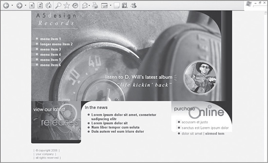
© 2014 Cengage Learning.
New Code Is in Bold
The newly added code is bolded to differentiate it from the existing code that is being built upon in this case study.
Listing 10.4 Code for Figure 10.13
<!DOCTYPE html PUBLIC "-//W3C//DTD XHTML 1.0 Transitional//EN"
"DTD/xhtml1-transitional.dtd">
<html xmlns="http://www.w3.org/1999/xhtml" xml:lang="en"
lang="en"><head><title>Design 122</title>
<meta http-equiv="Content-Type" content="text/html;
charset=iso-8859-1" />
<style type="text/css">
/* ++++++++++ global general styles start ++++++++++*/
html, body {
margin:0px;
padding:0px;
font: 13px Arial, Helvetica, sans-serif;
color:#766D6D;
background:#F8F4EB;
}
a:link { color:#CB951D; }
a:visited { color:#A8B32D; }
a:active { color:#A8B32D; }
a:hover { color:#000000; }
a.linklist1:link { text-decoration:none;color:#191718;}
a.linklist1:visited { text-decoration:none;color:#064791;}
a.linklist1:active { text-decoration:none;color:#064791;}
a.linklist1:hover { text-decoration:underline;color:#0781E1;}
a.linklist2:link { text-decoration:none;color:#0762AD;}
a.linklist2:visited { text-decoration:none;color:#064791;}
a.linklist2:active { text-decoration:none;color:#064791;}
a.linklist2:hover { text-decoration:underline;color:#191718;}
.color-1-text-12 {
font-family: arial, geneva, sans-serif;
font-size: 12pt;
color: #044465;
}
/* ++++++++++ global general styles end ++++++++++*/
/* ++++++++++ global structure styles start ++++++++++*/
#a5-body-center {
text-align:center;
}
#a5-body {
position: relative;
width: 770px; /* change this to a specific amount for a fixed
design or a relative amount if the design should expand to a percentage
of the screen. E.g., 770px or 100%, respectively. */
margin-left: auto;
margin-right: auto;
text-align:left;
padding-bottom:10px;
border:0px solid #000000;
}
#a5-column-left {
position:absolute;
left:0px;
top:0px;
width:191px;
border:0px solid #000000;
}
#a5-menu {
font:bold 13px Arial, Helvetica, sans-serif;
height:249px;
background:url(images/bg-left-column.jpg) no-repeat;
}
#a5-menu a {
display: block;
text-align:left;
line-height:20px;
vertical-align: 30%;
height:20px;
padding-left:35px;
text-decoration:none;
background: url(images/bg-menu-off.gif) no-repeat 0px 0px;
color:#ffffff;
}
#a5-menu a:hover {
background: url(images/bg-menu-on.gif) no-repeat 0px 0px;
color:#F9F68C;
}
#a5-menu-sl {
width:191px;
color:#000000;
font:bold 12px Arial, Helvetica, sans-serif;
text-align:left;
}
#a5-menu-sl a {
display: block;
text-align:left;
line-height:18px;
vertical-align: 50%;
height:18px;
padding-left:40px;
font-weight:normal;
text-decoration:none;
background: url(images/bg-menu-off-sl.gif) no-repeat
0px 0px;
color:#000000;
}
#a5-menu-sl a:hover {
background: url(images/bg-menu-on-sl.gif) no-repeat 0px 0px;
color:#4C5C6B;
}
#a5-copyright {
font-size: 11px;
padding:20px 50px 10px 10px;
color:#978872;
}
#a5-body-content {
position:relative;
margin-left:191px;
border:0px solid #000000;
}
#a5-top-row {
position:relative;
left:0px;
top:0px;
background:#000000;
border:0px solid #000000;
}
#a5-bottom-row {
position:relative;
left:0px;
top:0px;
height:100%;
border:0px solid #000000;
}
#a5-column-middle {
position:relative;
left:0px;
top:0px;
margin:0px 230px 0px 0px;
font-weight:bold;
background: url(images/bg-curve-bottom-middle.gif) no-repeat
top left;
border:0px solid #000000;
}
#list-1 {
margin-top:10px;
line-height:16px;
vertical-align:top;
list-style-image: url(images/bullet.gif);
}
#a5-column-right {
position:absolute;
right:-1px;/*explain this is a bug with IE */
top:0px;
width:230px;
background: url(images/bg-right-column.jpg) no-repeat 0px 0px;
border:0px solid #000000;
voice-family:""}"";
voice-family:inherit;
right:-1px;
width:230px;
}
html>body #a5-column-right {
right:0px;
width:230px;
}
#list-2 {
line-height:22px;
vertical-align:top;
list-style-image: url(images/bullet.gif);
}
/* ++++++++++ global structure styles end ++++++++++*/
</style>
</head>
<body>
<div id="a5-body-center">
<div id="a5-body">
<!-- ###### left column start ###### -->
<div id="a5-column-left">
<div><a href="index.htm"><img src="images/header-left.jpg"
width="191" height="100" alt="" border="0" /></a></div>
<div id="a5-menu">
<a href="index.htm">menu item 1</a>
<a href="menu-item-2.htm">longer menu item 2</a>
<a href="menu-item-3.htm">menu item 3</a>
<a href="index.htm">menu item 4</a>
<a href="index.htm">menu item 5</a>
<a href="index.htm">menu item 6</a>
</div>
<div><a href="index.htm"><img src="images/image-bottom-
left.jpg" width="191" height="162" alt="" border="0"
/></a></div>
<div id="a5-copyright">
| © copyright 2006 |<br />
| your company |<br />|
all rights reserved |
</div>
</div>
<!-- ###### left column end ###### -->
<!-- ###### body content start ###### -->
<div id="a5-body-content">
<div id="a5-top-row">
<div><a href="x.htm"><img src="images/photo-center-
top.jpg" width="373" height="349" alt=""
border="0" /></a></div>
<div style="position:absolute;left:373px;top:0px">
<a href="x.htm"><img src="images/photo-right-
top.jpg" width="164" height="349" alt="" border="0"
/></a></div>
<div style="position:absolute;left:537px;top:0px;">
<a href="x.htm"><img src="images/image-right-
top.gif" width="42" height="349" alt=""
border="0" /></a></div>
</div>
<div id="a5-bottom-row">
<div id="a5-column-middle">
<div class="color-1-text-12" style="padding:15px
0px 0px 15px;"><b>In the news</b></div>
<ul id="list-1">
<li><a href="x.htm" class="linklist1">Lorem
ipsum dolor sit amet, consetetur sadipscing
elitr</a></li>
<li><a href="x.htm" class="linklist1">Lorem
ipsum dolor sit</a></li>
<li><a href="x.htm" class="linklist1">Nam
liber tempor cum soluta</a></li>
<li><a href="x.htm" class="linklist1">Duis
autem vel eum iriure dolor</a></li>
</ul>
</div>
<div id="a5-column-right">
<ul id="list-2" style="margin-top:70px;">
<li><a href="x.htm" class="linklist2">accusam
et justo </a></li>
<li><a href="x.htm" class="linklist2">sanctus
est Lorem ipsum dolor</a></li>
<li><a href="x.htm" class="linklist2">dolor sit
amet</a> | <a href="x.htm" class=
"linklist2"><b>eirmod tem</b></a></li>
</ul>
</div>
</div>
</div>
<!-- ###### body content end ###### -->
</div>
</div>
</body>
</html>
There are several things to note about the code in Listing 10.4:
Rules are added between the global general styles comment tags for three types of links: the default links, the list in the bottom-center content area, and the list in the bottom-right content area. The default link style is added for all links without a specific class assigned to them. The a.linklist1:link rule is applied to the bottom-left list links, and the a.linklist2:link is assigned to the bottom-right list links. Both custom link rules were given general naming conventions so they could be assigned to lists that might be added elsewhere in the site.
The color-1-text-12 rule is added between the global general styles comment tags. It is used to style the In the News headline of the bottom-center content area.
The a5-bottom-row rule and container are added to position the bottom-center and bottom-right content areas. They are assigned relative positioning with both the left and right properties set to 0px, which positions the container below the a5-top-row <DIV>. It is assigned the height property with a value of 100% so larger amounts of content can be added to the column. Otherwise, the text will be cut off in IE 5, 5.5, and 6.
The a5-column-middle rule provides the container for the bottom-center content area. Because it is assigned relative positioning, it will stretch to the far right edge of the design. A larger body of text is included in the area for Figure 10.14 to show how the text could fill the design without any padding or margin values set.
Figure 10.14
If given no constraints, the a5-column-middle rule would allow content to stretch the full width of the design, such as in this example, which includes a larger amount of dummied content.

© 2014 Cengage Learning.
The advantage of this structure is that the center column can stretch if the design is changed to a liquid design. Because the bottom-right column is 233 pixels wide, the a5-column-middle rule is assigned 240 pixels of margin to the right. This guarantees that the text in the center column will not only stop before it reaches the right column’s area, but it will have 7 pixels of space between the two containers.
The a5-column-middle rule also has a background image declared in it, which provides the black curve in the top-left corner of the design.
The list-1 rule provides styling to the list that is included in the a5-column-middle container. The list-style-image is used in conjunction with the line-height rule and vertical- align rule to position the bullets in somewhat similar positions among the various tested browsers.
Adding the a5-column-right rule and content is the final step in completing the design. The container is assigned the Purchase Online background image. Because of a positioning bug in IE 6, the Tantek hack is used to position the container 1 pixel to the right of its default location so the entire container, and thus the background image, lines up with the image in the top row. If the hack is not used, the page will be positioned incorrectly, as shown in Figure 10.15.
To prevent the list in the a5-column-right container from covering the text portion of the background image (that is, the Purchase Online image), the list-2 rule is assigned a local style. This style sets the top margin to 70 pixels. The margin-top rule is separated from the list-2 rule in the page-level style sheet to enable the designer to control the positioning of the list if the rule is reused elsewhere in the site. If the two rules were combined, this list would always be forced down 70 pixels from the top wherever it was included.
Figure 10.15
The Tantek hack is used to position the bottom-right content area 1 pixel to the right or else there will be a 1-pixel difference between it and the image above in IE 6. This code can be easily removed because it is no longer necessary for contemporary browsers.
© 2014 Cengage Learning.
CONSTRUCTING SECOND-LEVEL PAGES
As with most sites, the second-level pages are based on the homepage design. This structure allows images from the homepage to be reused for subsequent pages, not only to provide visual consistency in the design, which improves usability, but also to allow browsers to cache the original images, making the page download quicker. In this design, two second-level templates are created: one that contains three columns and one that contains two columns.
Constructing a Second-Level Page with Three Columns
The first second-level template that is created is the page that appears when the designer clicks on the menu item titled Longer Menu Item 2. This page contains three columns. Such a design offers the ability to supplement pages with less content with a right column that could contain repetitive information, such as photos, announcements, and specials. Of course, this is not the only reason for a three-column design. The purpose, for example, could also be to provide a more advanced visual layout by adding another element, which, in turn, could have more elements added to it. Figure 10.16 shows what the design looks like when the final code (see Listing 10.5) is added to the page.
Figure 10.16
The three-column second-level template that is derived from the homepage design.
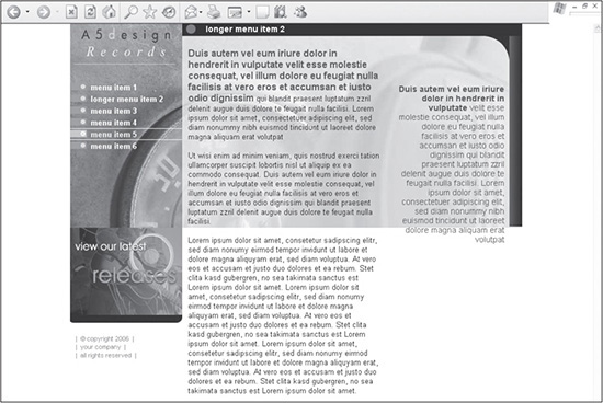
© 2014 Cengage Learning.
The newly added code is bolded to differentiate it from the existing code that is being built upon in this case study.
Listing 10.5 Code for Figure 10.16
<!DOCTYPE html PUBLIC "-//W3C//DTD XHTML 1.0 Transitional//EN"
"DTD/xhtml1-transitional.dtd">
<html xmlns="http://www.w3.org/1999/xhtml" xml:lang="en"
lang="en"><head><title>Design 122</title>
<meta http-equiv="Content-Type" content="text/html;
charset=iso-8859-1" />
<!-- link to main stylesheet that control text sizes and colors, among
other things -->
<link rel="stylesheet" href="mainstyle.css" type="text/css" />
<style>
/* ++++++++++ global sl structure styles start ++++++++++*/
#a5-body-content-sl {
position:relative;
margin-left:191px;
height:100%;
background: url(images/bg-body-content-sl.jpg) no-repeat 0px 0px;
border:0px solid #000000;
}
#a5-top-row-sl {
position:relative;
left:0px;
top:0px;
height:100%;
border:0px solid #000000;
}
#a5-sl-title {
height:24px;
font:bold 14px italic Arial, Helvetica, sans-serif;
background: #000000 url(images/bg-title.gif) no-repeat 0px 0px;
color:#ffffff;
padding:4px 0px 0px 40px;
margin-bottom:10px;
border:0px solid #000000;
voice-family:""}"";
voice-family:inherit;
height:20px;
}
html>body #a5-sl-title {
height:20px;
}
#a5-column-middle-sl {
position:relative;
left:0px;
top:10px;
margin:0px 230px 0px 10px;
padding-right:10pt;
border:0px solid #000000;
}
#a5-column-right-sl {
position:absolute;
right:-1px;
top:11px;
width:230px;
height:800px;
text-align:right;
background: url(images/bg-right-column-sl.gif) repeat-y
0px 0px;
border:0px solid #000000;
voice-family:""}"";
voice-family:inherit;
right:-1px;
top:10px;
width:230px;
}
html>body #a5-column-right-sl {
right:0px;
top:10px;
width:230px;
}
#a5-column-right-content-sl {
position:relative;
right:0px;
top:15px;
width:230px;
font: 14px italic Arial, Helvetica, sans-serif;
color:#044465;
padding:80px 30px 10px 20px;
border:0px solid #000000;
voice-family:""}"";
voice-family:inherit;
width:180px;
}
html>body #a5-column-right-content-sl {
width:180px;
}
/* ++++++++++ global sl structure styles end ++++++++++*/
</style>
</head>
<body>
<div id="a5-body-center">
<div id="a5-body">
<!-- ###### left column start ###### -->
<div id="a5-column-left">
<div><a href="index.htm"><img src="images/header-left.jpg"
width="191" height="100" alt="" border="0" /></a></div>
<div id="a5-menu">
<a href="index.htm">menu item 1</a>
<a href="menu-item-2.htm">longer menu item 2</a>
<a href="menu-item-3.htm">menu item 3</a>
<a href="index.htm">menu item 4</a>
<a href="index.htm">menu item 5</a>
<a href="index.htm">menu item 6</a>
</div>
<div><a href="index.htm"><img src="images/image-bottom-
left.jpg" width="191" height="162" alt="" border="0"
/></a></div>
<div id="a5-copyright">
| © copyright 2006 |<br />
| your company |<br />|
all rights reserved |
</div>
</div>
<!-- ###### left column end ###### -->
<!-- ###### body content start ###### -->
<div id="a5-body-content-sl">
<div id="a5-top-row-sl">
<div id="a5-sl-title">longer menu item 2</div>
<div id="a5-column-middle-sl">
<span class="color-1-text-12"><b>Duis autem vel eum iriure dolor in
hendrerit in vulputate velit esse molestie consequat, vel illum
dolore eu feugiat nulla facilisis at vero eros et accumsan et iusto
odio dignissim</b></span> qui blandit praesent luptatum zzril
delenit augue duis dolore te feugait nulla facilisi. Lorem ipsum
dolor sit amet, consectetuer adipiscing elit, sed diam nonummy nibh
euismod tincidunt ut laoreet dolore magna aliquam erat volutpat
<br /><br />
Ut wisi enim ad minim veniam, quis nostrud exerci tation ullamcorper
suscipit lobortis nisl ut aliquip ex ea commodo consequat. Duis
autem vel eum iriure dolor in hendrerit in vulputate velit esse
molestie consequat, vel illum dolore eu feugiat nulla facilisis at
vero eros et accumsan et iusto odio dignissim qui blandit praesent
luptatum zzril delenit augue duis dolore te feugait nulla facilisi.
<br /><br />
Lorem ipsum dolor sit amet, consetetur sadipscing elitr, sed diam
nonumy eirmod tempor invidunt ut labore et dolore magna aliquyam
erat, sed diam voluptua. At vero eos et accusam et justo duo
dolores et ea rebum. Stet clita kasd gubergren, no sea takimata
sanctus est Lorem ipsum dolor sit amet. Lorem ipsum dolor sit amet,
consetetur sadipscing elitr, sed diam nonumy eirmod tempor invidunt
ut labore et dolore magna aliquyam erat, sed diam voluptua. At vero
eos et accusam et justo duo dolores et ea rebum. Stet clita kasd
gubergren, no sea takimata sanctus est Lorem ipsum dolor sit amet.
Lorem ipsum dolor sit amet, consetetur sadipscing elitr, sed diam
nonumy eirmod tempor invidunt ut labore et dolore magna aliquyam
erat, sed diam voluptua. At vero eos et accusam et justo duo
dolores et ea rebum. Stet clita kasd gubergren, no sea takimata
sanctus est Lorem ipsum dolor sit amet.
</div>
<div id="a5-column-right-sl">
<div id="a5-column-right-content-sl">
<b>Duis autem vel eum iriure dolor in hendrerit in vulputate</b> velit
esse molestie consequat, vel illum dolore eu feugiat nulla
facilisis at vero eros et accumsan et iusto odio dignissim qui
blandit praesent luptatum zzril delenit augue duis dolore te
feugait nulla facilisi. Lorem ipsum dolor sit amet, consectetuer
adipiscing elit, sed diam nonummy nibh euismod tincidunt ut laoreet
dolore magna aliquam erat volutpat
</div>
</div>
</div>
</div>
<!-- ###### body content end ###### -->
</div>
</div>
</body>
</html>
There are several things to note about the code in Listing 10.5:
A second style sheet has been added for the second-level pages. For demonstration purposes, the style sheet for the homepage has been saved as mainstyle.css and includes a link to the page. The style sheet for the second-level pages has been included as a page-level style sheet, which will be interpreted after the first style sheet.
The a5-body-content rule has been renamed as the a5-body-content-sl rule. This enables the designer to include the background image bg- body-content-sl.jpg for the container. While the container was initially built into the homepage design, it is not assigned a background image until this page because the top-right images in the homepage need to be hyperlinked but do not need to have text flow over them. Saving the images together as one image and using it as a background image for this page maintains the look and feel of the top-right area of the homepage. It is assigned 100% height to ensure that the text will fill its full height. Otherwise, it could get cut off in IE 5, 5.5, and 6.
Reasoning for "-sl" Being Appended
The rules added in the second-level template have -sl appended to their names to signify that they are to be used for secondary pages. Otherwise, if the rules contain the same name in both the mainstyle.css and mainstyle-sl.css files, a browser may use the incorrect style for that page.
Because the content is now nested inside what was the a5-top-row container, it has to be renamed a5-top-row-sl and have its background color of #000000 removed. The background image is now more transparent, so this <DIV> does not necessarily need to have a background color if it is changed to a liquid format.
The a5-sl-title rule is added to include the page title for secondary pages at the top of the page. The height of the <DIV> is set at 24 pixels to guarantee that it expands to the specified height of the background image. Padding is used to position the title vertically in the container and 40 pixels from the left, which is taken up by the background image bg-title.gif. To ensure that the color of the bg-title.gif is continued across the screen, the shorthand background property is assigned a background color value of #000000. Because padding is used to position the text within the container, the Tantek hack is added to ensure that the height of the container is the same for both compliant and noncompliant browsers.
Similar to the bottom two nested containers that were used in the homepage (a5-column-middle and a5-column-right), the a5-column-middle-sl and a5-column-right-sl <DIV> tags were added to provide the two right columns of the design.
Because the a5-column-right-sl container is assigned an absolute positioning value, it also is assigned a height of 800 pixels to ensure that the text does not run beyond the container—not that there would be a visible difference because there is no repeating background image or color the text would run beyond. If the text were to run farther down the page than 800 pixels and the column were to include a background color, for example, the designer might want to change the forced height of the column so that the text did not pass the color.
The content included in the a5-column-right-sl container is nested inside the a5-column-right-content-sl <DIV> tag. The main thing to note about this rule is that it is assigned padding that forces it 80 pixels from the top, which guarantees the text will not be placed over the background image bg-right-column-sl. gif in the a5-column-right-sl column. This is done to avoid black text running over the black background of the image, which would make it appear invisible.
Constructing a Second-Level Page with Two Columns
The full-width second-level template included with this design is the page the designer comes to when clicking on the Menu Item 3 link in the menu. The purpose of this template is to provide a page where more content can be added. The designer, of course, may also choose to use the extra space to include a more customized layout on the page. Whatever the reason for using this template, the page allows more visual real estate with which to work. Figure 10.17 shows what the design looks like when the final code is added to the page (see Listing 10.6).
Figure 10.17
The two-column second-level template that is based on the homepage design.
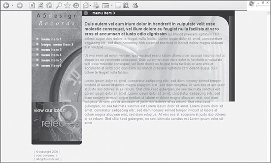
© 2014 Cengage Learning.
New Code Is in Bold
The newly added code is bolded to differentiate it from the existing code that is being built upon in this case study.
Listing 10.6 Code for Figure 10.17
<!DOCTYPE html PUBLIC "-//W3C//DTD XHTML 1.0 Transitional//EN"
"DTD/xhtml1-transitional.dtd">
<html xmlns="http://www.w3.org/1999/xhtml" xml:lang="en"
lang="en"><head><title>Design 122</title>
<meta http-equiv="Content-Type" content="text/html;
charset=iso-8859-1" />
<!-- link to main stylesheet that control text sizes and colors, among
other things -->
<link rel="stylesheet" href="mainstyle.css" type="text/css" />
<style>
/* ++++++++++ global sl structure styles start ++++++++++*/
#a5-body-content-sl {
position:relative;
margin-left:191px;
height:100%;
background: url(images/bg-body-content-sl.jpg) no-repeat 0px 0px;
border:0px solid #000000;
}
#a5-top-row-sl {
position:relative;
left:0px;
top:0px;
border:0px solid #000000;
}
#a5-sl-title {
height:24px;
font:bold 14px italic Arial, Helvetica, sans-serif;
background: #000000 url(images/bg-title.gif) no-repeat 0px 0px;
color:#ffffff;
padding:4px 0px 0px 40px;
margin-bottom:10px;
border:0px solid #000000;
voice-family:""}"";
voice-family:inherit;
height:20px;
}
html>body #a5-sl-title {
height:20px;
}
#a5-column-middle-sl {
position:relative;
left:0px;
top:10px;
margin:0px 230px 50px 10px;
padding-right:10pt;
padding-bottom:20px;
border:0px solid #000000;
}
#a5-column-right-sl {
position:absolute;
right:-1px;
top:11px;
width:230px;
height:800px;
text-align:right;
background: url(images/bg-right-column-sl.gif) repeat-y
0px 0px;
border:0px solid #000000;
voice-family:""}"";
voice-family:inherit;
right:-1px;
top:10px;
width:230px;
}
html>body #a5-column-right-sl {
right:0px;
top:10px;
width:230px;
}
#a5-column-right-content-sl {
position:relative;
right:0px;
top:15px;
width:230px;
font: 14px italic Arial, Helvetica, sans-serif;
color:#044465;
padding:80px 30px 10px 20px;
border:0px solid #000000;
voice-family:""}"";
voice-family:inherit;
width:180px;
}
html>body #a5-column-right-content-sl {
width:180px;
}
#a5-column-full-sl {
position:relative;
left:0px;
top:10px;
margin:0px 20px 0px 10px;
padding-right:10pt;
border:0px solid #000000;
}
/* ++++++++++ global sl structure styles end ++++++++++*/
</style>
</head>
<body>
<div id="a5-body-center">
<div id="a5-body">
<!-- ###### left column start ###### -->
<div id="a5-column-left">
<div><a href="index.htm"><img src="images/header-left.jpg"
width="191" height="100" alt="" border="0" /></a></div>
<div id="a5-menu">
<a href="index.htm">menu item 1</a>
<a href="menu-item-2.htm">longer menu item 2</a>
<a href="menu-item-3.htm">menu item 3</a>
<a href="index.htm">menu item 4</a>
<a href="index.htm">menu item 5</a>
<a href="index.htm">menu item 6</a>
</div>
<div><a href="index.htm"><img src="images/image-bottom-
left.jpg" width="191" height="162" alt="" border="0"
/></a></div>
<div id="a5-copyright">
| © copyright 2006 |<br />
| your company |<br />|
all rights reserved |
</div>
</div>
<!-- ###### left column end ###### -->
<!-- ###### body content start ###### -->
<div id="a5-body-content-sl">
<div id="a5-top-row-sl">
<div id="a5-sl-title">menu item 3</div>
<div id="a5-column-full-sl">
<span class="color-1-text-12"><b>Duis autem vel eum iriure dolor in
hendrerit in vulputate velit esse molestie consequat, vel illum
dolore eu feugiat nulla facilisis at vero eros et accumsan et
iusto odio dignissim</b></span> qui blandit praesent luptatum
zzril delenit augue duis dolore te feugait nulla facilisi. Lorem
ipsum dolor sit amet, consectetuer adipiscing elit, sed diam
nonummy nibh euismod tincidunt ut laoreet dolore magna aliquam
erat volutpat
<br /><br />
Ut wisi enim ad minim veniam, quis nostrud exerci tation ullamcorper
suscipit lobortis nisl ut aliquip ex ea commodo consequat. Duis
autem vel eum iriure dolor in hendrerit in vulputate velit esse
molestie consequat, vel illum dolore eu feugiat nulla facilisis at
vero eros et accumsan et iusto odio dignissim qui blandit praesent
luptatum zzril delenit augue duis dolore te feugait nulla facilisi.
<br /><br />
Lorem ipsum dolor sit amet, consetetur sadipscing elitr, sed diam
nonumy eirmod tempor invidunt ut labore et dolore magna aliquyam
erat, sed diam voluptua. At vero eos et accusam et justo duo
dolores et ea rebum. Stet clita kasd gubergren, no sea takimata
sanctus est Lorem ipsum dolor sit amet. Lorem ipsum dolor sit
amet, consetetur sadipscing elitr, sed diam nonumy eirmod tempor
invidunt ut labore et dolore magna aliquyam erat, sed diam
voluptua. At vero eos et accusam et justo duo dolores et ea rebum.
Stet clita kasd gubergren, no sea takimata sanctus est Lorem ipsum
dolor sit amet. Lorem ipsum dolor sit amet, consetetur sadipscing
elitr, sed diam nonumy eirmod tempor invidunt ut labore et dolore
magna aliquyam erat, sed diam voluptua. At vero eos et accusam et
justo duo dolores et ea rebum. Stet clita kasd gubergren, no sea
takimata sanctus est Lorem ipsum dolor sit amet.
</div>
</div>
</div>
<!-- ###### body content end ###### -->
</div>
</div>
</body>
</html>
There are several things to note about the code in Listing 10.6:
The only rule added to the second-level style sheet is a5-column-full-sl. This rule forces the container to fill the full width of the page, barring the assigned padding and margin values.
After the rule is added, the actual container replaces the a5-column-middlesl and a5-column-right-sl <DIV> tags in the code. Because it is assigned margin and padding settings, the text does not touch the right image.
SUMMARY
The design in this chapter is very different from the one in Chapter 9. It not only contains three columns in the homepage, but it also uses mortised images in the top-right section of the page. These images are then saved as one lighter background image that is included in the second-level pages. These pages use a second style sheet that is assigned specifically to them. To avoid any interpretation issues between the two style sheets, the rules in the second-level style sheet have -sl appended to the end. The two- and three-column structures in the second-level pages offer the designer more content layout flexibility, depending on the amount of content included in the design.