
CHAPTER 15
TIPS AND TECHNIQUES
When learning how to build websites, the most time-consuming aspect is not always creating the look and feel of the site in image editing software, such as Photoshop. Rather, more time is usually spent figuring out how to code the site. The tips and techniques included in this chapter will help the designer understand methods and work-arounds that he will probably need to learn when creating sites. While not all the tips will be useful while building one site, many of them will eventually arise if the reader builds many sites over time.
NAMING RULES AND PROPERTIES CORRECTLY
Occasionally, the designer may add a style and either the page does not reflect the proper styling or the styling is incorrect. A few common errors can occur:
 The style on the page does not match the correct spelling in the style sheet.
    <style type="text/css">
        #samplestyle {
        color:#ffffff;
        }
    </style>
    <div id="sample_style">
        This is sample text
    </div>
    <style type="text/css">
        #samplestyle {
        color:#ffffff;
        }
    </style>
    <div id="samplestyle">
        This is sample text
    </div>
The style on the page may be referencing an ID selector when the selector in the style sheet is actually a class or vice versa.
    <style type="text/css">
        .samplestyle {
        color:#ffffff;
        }
    </style>
    <div id="samplestyle">
        This is sample text
    </div>
Should read as
    <style type="text/css">
        .samplestyle {
        color:#ffffff;
        }
    </style>
    <div class="samplestyle">
        This is sample text
    </div>
The syntax of a style may not be correct. Missing semicolons are an occasional reason for this error.
    <style type="text/css">
        #samplestyle {
        color:#ffffff;
        background:red
        }
    </style>
    <style type="text/css">
        #samplestyle {
        color:#ffffff;
        background:red;
        }
    </style>
Class Can Be Called by Only One Tag
Although it does not have anything to do with styling, another naming error a designer can make is to call the same ID class with two separate tags in the XHTML. While the page may still display correctly, the XHTML will not validate because an ID class can be referenced only once in a document.
Two other naming issues are more difficult to find. Sometimes, without removing code to test the problem, the designer will not find where the error is occurring.
Two rules could have the same selector name. Because it is easy to copy a rule and simply modify it to serve as another rule, the designer can sometimes forget to rename the new rule. If a new rule has been added but its properties are not being applied in the browser, the problem could be that it has the same name as another rule.
    <style type="text/css">
            #style1 {
            color:yellow;
            background:black;
            }
            #style2 {
            color:white;
            background:blue;
            }
            #style1 {
            color:green;
            background:purple;
            }
        </style>

        <div id="style1">
            This is sample text
        </div>
        <div id="style3">
            This is sample text
        </div>
Should read as
    <style type="text/css">
        #style1 {
        color:yellow;
        background:black;
        }
        #style2 {
        color:white;
        background:blue;
        }
        #style3 {
        color:green;
        background:purple;
        }
    </style>
    <div id="style1">
        This is sample text
    </div>
    <div id="style3">
        This is sample text
    </div>
REMOVING BODY MARGINS AND PADDING
By default, browsers add top and left space between the browser window and the content that is output (see Figure 15.1). This space varies depending on the browser.
Figure 15.1
Website with default margins that add space between the top and left edges of the Web window and the design.
© 2014 Cengage Learning.
Removing the space is easily accomplished. The designer needs only to assign the style to the HTML and BODY selectors in the main style sheet:
html, body {
         margin:0px;
         padding:0px;
         background:#ffffff;
         }
Remove the Spacing
For most browsers, setting the margin to 0px removes the spacing.
Adding the margin and padding properties will make the page begin in the very top-left corner of the browser’s window (see Figure 15.2). It is also always good form to define the background color.
Figure 15.2
Page with the margin and padding properties for the <html> and <body> tags set to 0px.
© 2014 Cengage Learning.
CREATING THE FRAMEWORK FOR A FIXED-WIDTH CSS DESIGN
The five case studies in Chapters 9, 10, 11, 12, and 13 go into the specifics of creating fixed designs that can also be easily modified to be liquid layouts. This section explains the basics of creating the framework for such a design. Following are the various stages of creating such a design:
1. Add basic XHTML framework and initial style rule.
Things to note about the code in step 1:
As with table-based designs, the code in Listing 15.1 provides the basic structure that contains the DocType, character encoding labeling, embedded or linked style sheet, and the code and content that are to be displayed on the page. A rule then defines the margins, padding, font, font color, and background color for the <HTML> and <BODY> tags.
<!DOCTYPE html PUBLIC "-//W3C//DTD XHTML 1.0 Transitional//EN"
    "DTD/xhtml1-transitional.dtd">
<html><head><title>Fixed-Width Design</title>
<meta http-equiv="Content-Type" content="text/html;
   charset=iso-8859-1" />

    <style type="text/css">
    html, body {
        margin:0px;
        padding:0px;
        font: 13px Arial, Helvetica, sans-serif;
        color:#000000;
        background:#ffffff;
        }
    </style>
    </head>
    <body>
    </body>
    </html>
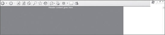
2. Create body and header rules in the style sheet and add code to the XHTML body (see Figure 15.3).
Figure 15.3
Design with header area added, along with a tag that restrains the width of the design to 770 pixels.
© 2014 Cengage Learning.
Things to note about the code in step 2:
The a5-body rule is used as a container to restrain the width of the entire page to 770 pixels. The advantage of being able to control the width is that if the designer wants the design to expand to the full width of the screen, the value of the width property simply needs to be set to 100%.
Default Width of DIV Tags Depends on Assigned Positioning
<DIV> tags, by default, will stretch to 100% width of the screen when assigned relative positioning. If absolute positioning is assigned, the tag, by default, will expand only as wide as the content expands the container.
The a5-header rule sets the basic properties of the <DIV> tag that will be assigned to the content inside the tag (see Listing 15.2).
<!DOCTYPE html PUBLIC "-//W3C//DTD XHTML 1.0 Transitional//EN"
        "DTD/xhtml1-transitional.dtd">
    <html><head><title>Fixed-Width Design</title>
    <meta http-equiv="Content-Type" content="text/html;
        charset=iso-8859-1" />
    <style type="text/css">
    html, body {
        margin:0px;
        padding:0px;
        font: 13px Arial, Helvetica, sans-serif;
        color:#000000;
        background:#ffffff;
        }
    #a5-body {
        position: absolute;
        left:0px;
        top:0px;
        width: 770px;
        text-align:left;
        }
    #a5-header {
        position:absolute;
        left:0px;
        top:0px;
        text-align:center;
        color:#ffffff;
        width:100%;
        background:red;
        height:180px;
        }
    </style>
    </head>
    <body>
    <div id="a5-body">
        <div id="a5-header">
            Header content goes here.
        </div>
    </div>
    </body>
    </html>
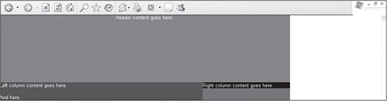
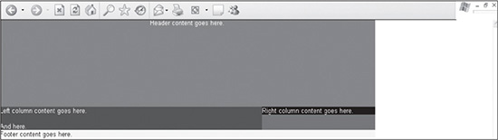
3. Create rules in the style sheet that not only create the left and right columns but also the rule they are nested inside of. Then add the code to the XHTML body (see Figure 15.4).
Figure 15.4
Design with the left and right columns added to a <DIV> tag that positions the content 180 pixels below the header <DIV>.
© 2014 Cengage Learning.
Things to note about the code in step 3:
The a5-main-content rule is added to force the positioning of the left and right columns. It is positioned below the header, which is set to 180 pixels high. Therefore, the rule positions the <DIV> tag 180 pixels from the top. It also separates the nested left and right columns from the bottom footer area that will be added.
The a5-column-left rule is created to force the <DIV> to the top-left corner of the a5-main-content <DIV> tag. The left property tells the <DIV> tag to position itself 0 pixels from the left side. The margin-right property of the rule restricts its positioning by telling it that it must end its width at 232 pixels from the right-hand side of the page or <DIV> tag in which it is nested.
The a5-column-right rule is added to position the column on the right side of the page and force its width to 232 pixels. The right property tells the <DIV> tag that it is to be 0 pixels from the right side of the page.
Columns Extend Vertically When Using Background Images
Nesting <DIV> tags do not always function the same as nesting tables. Figure 15.4 shows that the background color of the right column does not stretch to the full height of the a5-main-content tag in which it is nested. While the designer can force the height of the right column, if the left column grows, the right column will not change its height. This situation presents a problem when repeating a background color or image. The figure shows how the background of the a5- main-content extends vertically beyond the right column but not the left column because the left column is forcing the height. Unlike with table-based design, this changes the way a designer can control the look and feel of the site (see Listing 15.3).
<!DOCTYPE html PUBLIC "-//W3C//DTD XHTML 1.0 Transitional//EN"
        "DTD/xhtml1-transitional.dtd">
    <html><head><title>Fixed-Width Design</title>
    <meta http-equiv="Content-Type" content="text/html;
        charset=iso-8859-1" />
    <style type="text/css">
    html, body {
        margin:0px;
        padding:0px;
        font: 13px Arial, Helvetica, sans-serif;
        color:#000000;
        background:#ffffff;
        }
    #a5-body {
        position: absolute;
        left:0px;
        top:0px;
        width:770px;
        text-align:left;
        }
    #a5-header {
        position:absolute;
        left:0px;
        top:0px;
        text-align:center;
        color:#ffffff;
        width:100%;
        background:red;
        height:180px;
        }
    #a5-main-content {
        position:absolute;
        left:0px;
        top:180px;
        color:#ffffff;
        width:100%;
        background:green;
        border:0px solid #ffffff;
        }

         #a5-column-left {
             position:relative;
             left:0px;
             top:0px;
             color:#ffffff;
             margin-right:232px;
             border:0px solid #ffffff;
             background:blue;
             }
         #a5-column-right {
             position:absolute;
             right:0px;
             top:0px;
             color:#ffffff;
             width:232px;
             background:black;
             border:0px solid #ffffff;
             }
     </style>
     </head>
     <body>
     <div id="a5-body">
         <div id="a5-header">
             Header content goes here.
         </div>
         <div id="a5-main-content">
             <div id="a5-column-left">
                 Left column content goes here.<br /><br />And here.
             </div>
             <div id="a5-column-right">
                 Right column content goes here.
             </div>
         </div>
     </div>
     </body>
     </html>
4. Create a footer rule in the style sheet and add the code to the XHTML body (see Figure 15.5).
Figure 15.5
Design with the footer rule added.
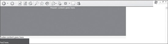
© 2014 Cengage Learning.
Things to note about the code in step 4:
The a5-footer rule is nested inside the a5- main-content tag. When the rule is assigned relative positioning, it is forced to the next line because the left and right columns fill the entire width of the page. If the a5- column-left rule were assigned absolute positioning without a width, the left and right columns together would not fill the entire width of the page, which would bump up the positioning of the a5-footer area, making the page look jumbled (see Figure 15.6).
The a5-footer rule does not need a width assigned because it is assigned relative positioning, which makes it fill 100% of the width by default (see Listing 15.4).
Figure 15.6
Completed framework of fixed-width design that includes two nested columns in a <DIV> tag that is positioned between the header and footer areas.
© 2014 Cengage Learning.
<!DOCTYPE html PUBLIC "-//W3C//DTD XHTML 1.0 Transitional//EN"
        "DTD/xhtml1-transitional.dtd">
    <html><head><title>Fixed-Width Design</title>
    <meta http-equiv="Content-Type" content="text/html;
        charset=iso-8859-1" />
    <style type="text/css">
    html, body {
        margin:0px;
        padding:0px;
        font: 13px Arial, Helvetica, sans-serif;
        color:#000000;
        background:#ffffff;
        }
    #a5-body {
        position: absolute;
        left:0px;
        top:0px;
        width:770px;
        text-align:left;
        }
    #a5-header {
        position:absolute;
        left:0px;
        top:0px;
        text-align:center;
        color:#ffffff;
        width:100%;
        background:red;
        height:180px;
        }
    #a5-main-content {
        position:absolute;
        left:0px;
        top:180px;
        color:#ffffff;
        width:100%;
        background:green;
        border:0px solid #ffffff;
        }

    #a5-column-left {
        position:absolute;
        left:0px;
        top:0px;
        color:#ffffff;
        margin-right:232px;
        border:0px solid #ffffff;
        background:blue;
        }
    #a5-column-right {
        position:absolute;
        right:0px;
        top:0px;
        color:#ffffff;
        width:232px;
        background:black;
        border:0px solid #ffffff;
        }
 #a5-footer {
     position:relative;
     left:0px;
     top:0px;
     color:#000000;
     background:yellow;
     border:0px solid #ffffff;
     }
</style>
</head>
<body>
<div id="a5-body">
    <div id="a5-header">
        Header content goes here.
    </div>
    <div id="a5-main-content">
        <div id="a5-column-left">
            Left column content goes here.<br /><br />And here.
        </div>
        <div id="a5-column-right">
            Right column content goes here.
        </div>

        <div id="a5-footer">
            Footer content goes here.
        </div>
    </div>
</div>
</body>
</html>
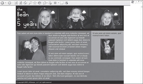
Typically, the designer adds text, images, and additional code to the framework as it is being built. Figure 15.7 is a simplified example of how the page would look with content added and the style sheet modified to not only make the page more attractive but to also customize various <DIV> tags.
Figure 15.7
Sample content added to framework of the site, which was modified to accompany the content and to make it more attractive.
© 2014 Cengage Learning.
TAKING INTO ACCOUNT INCREASING AND DECREASING COLUMN HEIGHTS
Although it is nice to include the footer row at the bottom of the design in Figure 15.7, there are a couple of caveats to this layout, at least when including containers that use absolute positioning:
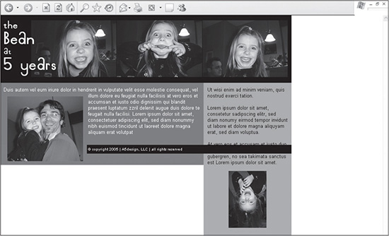
Because the positioning of the right column is set to absolute, if the content in the column were to be increased, it would not only stretch lower than the left column, but because the footer also has relative positioning assigned to it, the right column would also flow above or below it, depending on the browser (see Figure 15.8).
Figure 15.8
A problem with a container with absolute positioning (right column) running past a container with relative positioning (footer) that should, visually, remain below it.
© 2014 Cengage Learning.
If the content in the left column were to be decreased, not only would the right column extend below both it and the footer <DIV>, but the footer <DIV> would also move up past the a5- main-content <DIV> (see Figure 15.9).
Figure 15.9
If content is decreased in the left column, not only does the right column move below the footer but the footer also moves up.
© 2014 Cengage Learning.
Content Flows Around Floated Images
Because the photo in the left column of Figure 15.9 is floated, it is not included in the document flow, meaning other elements could pass above and below it, as well as in front of and behind it.
If the amount of content is going to change dynamically, this design structure may not be the best solution. The designer may consider not including a footer area and assigning different positions to the <DIV> tags, or the designer may want to use the design technique described in Chapter 12 or 13 that provides a solution to creating equal column designs.
CENTERING A FIXED-WIDTH DESIGN
Depending on the requirements, some sites need to be designed with liquid layouts—that is, they fill the full width of the screen. Yet others require a fixed width. HTML and XHTML used to make the process simple, but with the varied browser support of CSS, the process is a little more involved. One way requires wrapping two different <DIV> tags around the body. Following are the steps to accomplish this task:
1. Add a rule to the style sheet that centers the fixed-width design, which is set at 770 pixels for this example. This rule centers the body for IE 5 and 5.5. It would be extremely rare for this code still to be necessary, but it doesn’t hurt to explain its use.
    #a5-body-center {
            text-align:center;
            }
2. Add a second rule that sets the text-align property to left, assigns the left and right margins to auto, and defines the positioning as relative. Setting the positioning to relative will allow the design to be positioned relative to the <DIV> tag in which it is nested. The auto value of the margins will tell the browser to set the margins evenly on both sides, thus centering the code. The text-align:left; code is added because the a5-body-center rule that was added centers not only the body, but also the text in that container, by inheritance.
    #a5-body-center {
            text-align:center;
            }
        #a5-body {
            position: absolute;
            left:0px;
            top:0px;
            width:770px;
            text-align:left;
            }
3. Add the two <DIV> tags around the code between the <BODY> tags in the XHTML page. Listing 15.5 is the code that was used to create Figure 15.7.
Listing 15.5 Code for Figure 15.7
<!DOCTYPE html PUBLIC "-//W3C//DTD XHTML 1.0 Transitional//EN"
"DTD/xhtml1-transitional.dtd">
<html><head><title>Fixed-Width Design</title>
<meta http-equiv="Content-Type" content="text/html;
charset=iso-8859-1" />
<style type="text/css">
html, body {
margin:0px;
padding:0px;
font: 13px Arial, Helvetica, sans-serif;
color:#000000;
background:#ffffff;
}
#a5-body-center {
text-align:center;
}
#a5-body {
position: relative;
margin-left:auto;
margin-right:auto;
width:770px;
text-align:left;
}
#a5-header {
text-align:center;
color:#ffffff;
width:100%;
padding-top:15px;
background:black;
height:180px;
}
#a5-main-content {
position:absolute;
left:0px;
top:180px;
color:#ffffff;
width:100%;
background:#89766F;
border:0px solid #ffffff;
}
#a5-column-left {
position:relative;
left:0px;
top:0px;
color:#ffffff;
padding:10px;
margin-right:232px;
background:#7A7878;
border:0px solid #ffffff;
}
#a5-column-right {
position:absolute;
right:0px;
top:0px;
color:#000000;
height:100%;
width:232px;
background:#B0ADAD;
border:0px solid #ffffff;
}
#a5-footer {
position:relative;
left:0px;
top:0px;
font: 10px Arial, Helvetica, sans-serif;
padding:5px;
color:#ffffff;
background:#000000;
border:0px solid #ffffff;
}
</style>
</head>
<body>
<div id="a5-body-center">
<div id="a5-body">
<div id="a5-header">
<div><img src="images/photo_beanie_faces.jpg"
width="750" height="150" alt="" border="0" /></div>
</div>
<div id="a5-main-content">
<div id="a5-column-left">
Duis autem vel eum iriure dolor in hendrerit in
vulputate velit esse <span style="position:
relative;float:left;padding:10px;"><img
src="images/photo_beanie_daddy.jpg" width="200"
height="171" alt="" border="0" /></span>molestie
consequat, vel illum dolore eu feugiat nulla
facilisis at vero eros et accumsan et iusto odio
dignissim qui blandit praesent luptatum zzril
delenit augue duis dolore te feugait nulla
facilisi. Lorem ipsum dolor sit amet, consectetuer
adipiscing elit, sed diam nonummy nibh euismod
tincidunt ut laoreet dolore magna aliquam erat
volutpat
<br /><br />
Ut wisi enim ad minim veniam, quis nostrud exerci tation
ullamcorper suscipit lobortis nisl ut aliquip ex ea commodo
consequat. Duis autem vel eum iriure dolor in hendrerit in
vulputate velit esse molestie consequat, vel illum dolore eu
feugiat nulla facilisis at vero eros et accumsan et iusto
odio dignissim qui blandit praesent luptatum zzril delenit
augue duis dolore te feugait nulla facilisi.
<br /><br />
Lorem ipsum dolor sit amet, consetetur sadipscing elitr, sed diam
nonumy eirmod tempor invidunt ut labore et dolore magna
aliquyam erat, sed diam voluptua. At vero eos et accusam et
justo duo dolores et ea rebum. Stet clita kasd gubergren, no
sea takimata sanctus est Lorem ipsum dolor sit amet.
</div>
<div id="a5-column-right">
<div style="padding:10px;">
Ut wisi enim ad minim veniam, quis nostrud exerci tation.
<br />
<div style="text-align:center;padding:15px 0px 10px
0px;"><img src="images/photo_beanie_right.jpg"
width="100" height="150" alt="" border="0"
/></div>
</div>
</div>
<div id="a5-footer">
© copyright 2005 | A5design, LLC | all rights
reserved
</div>
</div>
</div>
</div>
</body>
</html>
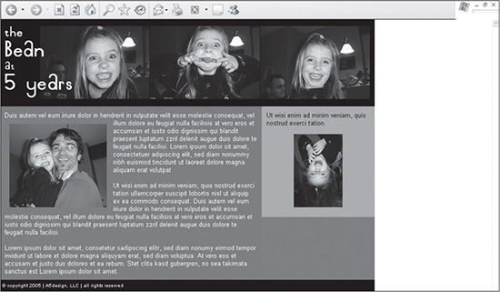
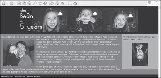
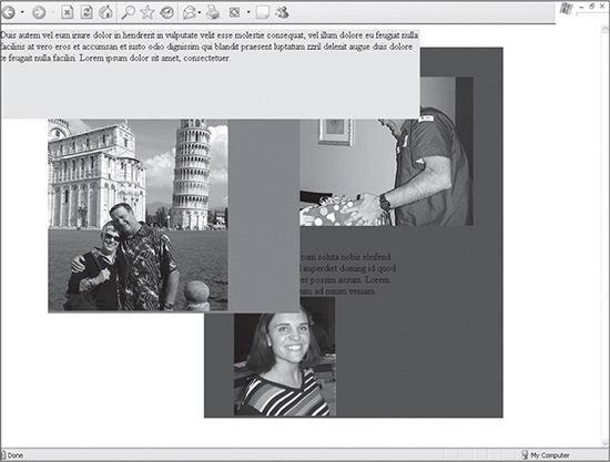
When the page is rendered, it would look like Figure 15.10. Notice that there is an even amount of space on both sides of the design.
Figure 15.10
Fixed-width design that is centered using CSS.
© 2014 Cengage Learning.
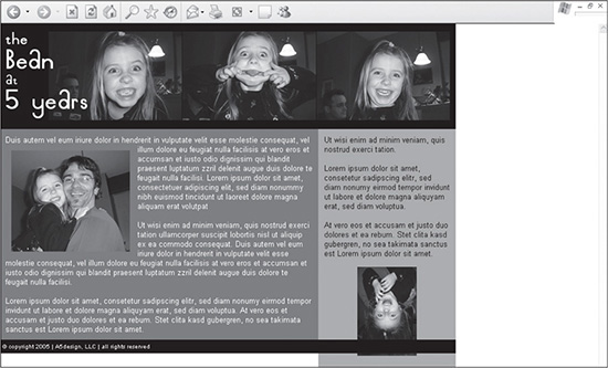
CREATING A LIQUID DESIGN
Because of the way the fixed design was created, modifying it to be a liquid design is very simple. All the designer needs to do is change the 770px value of the a5-body rule to 100%. This is because the left column will always try to fill the screen because it is assigned relative positioning and it is included in a <DIV> tag, which together defaults to 100% width. There are two main reasons the design works the way it does:
The left column has relative positioning assigned to it, so it can expand and contract, depending on the resolution or width of the screen.
While the positioning will stretch to 100% by default, it can also be controlled with the margin property. In this case, the margin-right property is set to 232px, which means the column will stretch within 232 pixels of the right side of the screen but no further.
Figure 15.11 shows how the page shown in Figure 15.10 expands when the value of the a5-body rule is changed from 770px to 100%.
Figure 15.11
Liquid design that fills the full width of the screen.
© 2014 Cengage Learning.
Chapters 9, 10, 11, 12, and 13 provide additional examples and explanations of how designs can be created to be liquid.
CREATING A LINE
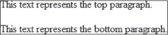
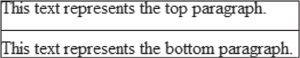
When XHTML tables were used to add lines in content, the designer could repeat a background image sideways along a table row or simply place an image in the table row, among other solutions. CSS-based layout made this much more simple. Because <DIV> tags are used so frequently in page layout, the tool for which to create a line, many times, is already there, and if it’s not, it’s easy to add. The code in Listing 15.6 shows two lines of text, representing paragraphs, which are separated by two <BR /> tags (see Figure 15.12).
Figure 15.12
Two paragraphs separated by <br /> tags.
© 2014 Cengage Learning.
Listing 15.6 Code Before <DIV> Tag Is Wrapped Around
This text represents the top paragraph.
<br /><br />
This text represents the bottom paragraph.
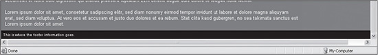
For a designer to add the line that is between the two paragraphs in Figure 15.13, a <DIV> tag can simply be wrapped around the top or bottom paragraph, with a basic style assigned to it (see Listing 15.7).
Figure 15.13
Line that is added between the two paragraphs in Figure 15.12.
© 2014 Cengage Learning.
Listing 15.7 Code that Creates a Line Using a <DIV> Tag
<div style="width:260px;margin:0px 0px 5px 0px;padding:0px 0px 10px 0px;border-bottom:1px
solid #000000;">
This text represents the top paragraph.
</div>
This text represents the bottom paragraph. Things to note about the style that is added to the <DIV> tag, resulting in the layout in Figure 15.13:
The width rule is added to control the width of the content. If the width is not set, the <DIV> tag would run as wide as the page allowed.
The margin rule is added to provide 5 pixels of separation between the line and the second paragraph. It basically is setting half the height that was created when the two <BR/> tags were added.
The padding rule sets the space between the first paragraph and the line, which is really the bottom border of the paragraph.
The border-bottom rule sets the border width to 1 px and the color to black.
USING BACKGROUND IMAGES AS DESIGN ELEMENTS
Back when Netscape 4.7 was the standard, there were all types of issues when designing with background images. These days, however, CSS-based design allows for the full use of background images, which includes layering nested background images on top of one another. This change allows for more design possibilities. One example is to use a background image for the entire site.
Figure 15.14 shows how background images can be used more extensively. There are four things to note about the design:
The background in the right column (right side of the infinity loop) is broken up from the background in the left column (left side of the loop, along with the woman). This is because the right image is best saved as a GIF file, while the left image should be saved as a JPG.
The entire left column of color is repeated as a background image in the page’s <BODY> tag, so it will repeat endlessly down the left-hand side. It repeats underneath the background image of the left column. Because the bottom of the left background image looks exactly like the page background image, there is seamless repeating.
Each menu item is assigned a background image to its left that serves as a bullet.
The bullet changes when the menu item is moused over, which is explained in the next section.
Figure 15.14
Design that uses background images as menu bullets, images for the left and right columns, and a repeating image for the entire page.
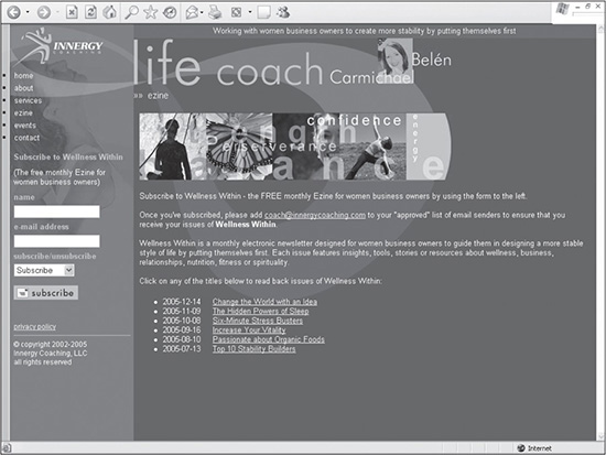
Source: Innergy Coaching, LLC.
CODING CSS MOUSEOVERS
Menu mouseovers used to require JavaScript to perform a simple image switch. Now, CSS allows the designer to simply replace the background image by assigning a different image when the user mouses over an item (see Figure 15.15). The three-step process is as follows:
Figure 15.15
CSS-driven mouseover in the menu section of the site.
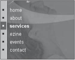
Source: Innergy Coaching, LLC.
1. The designer creates a rule that will be used to display the menu item when it is not moused over. The two main properties to pay attention to in the following code are display and background. The display property, when assigned a block value, tells the browser to vertically stack each hyperlinked menu item when it is included inside the a5-menu container. The background property, with its values, determines what image will be used for the menu item, including how it will be positioned and whether it will be repeated. In this example, the image will not be repeated, and it will be positioned in the top-left corner of the block.
     #a5-menu a {
             display: block;
             background: url(images/bg-menu-off.gif) no-repeat 0px 0px;
             text-decoration:none;
             color:#ffffff;
             font-weight:normal;
             padding: 3px 5px 2px 25px;
         }
2. The designer then adds the hover element to the hyperlinks. When the user mouses over a link, the background image is changed from bg-menu-off.gif to bg-menu-on.gif, with the same positioning of the image. The font is turned bold, so not only the image, but also the changing text color, identifies the link.
     #a5-menu a:hover {
             background: url(images/bg-menu-on.gif) no-repeat 0px 0px;
             font-weight:bold;
             color:#ffffff;
         }
3. The menu items need to be added to a container with the ID value of a5-menu.
    <div id="a5-menu">
       <a href="index.htm">home</a>
       <a href="about.htm">about</a>
       <a href="services.htm">services</a>
       <a href="ezine.htm">ezine</a>
       <a href="contact.htm">contact</a>
    </div>
CSS Menu Code Online
A more complex CSS menu that provides drop-down menus is available online. It allows for multi-level flyouts and customization possibilities.
USING JAVASCRIPT DROP-DOWN MENUS
Often, a site requires more than a flat menu. Rather, it requires drop-down menus so the user can access the various levels of key pages easily by perusing the menu on one page. Figure 15.16 provides an example of such a menu.
Figure 15.16
Example of a drop-down JavaScript menu.
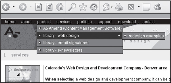
© 2014 Cengage Learning.
CSS Menus Easier to Code Than JavaScript
Unless the designer or developer understands JavaScript, creating such a menu can be time-intensive. This is one reason why CSS drop-down menus are quickly becoming the standard for many designers.
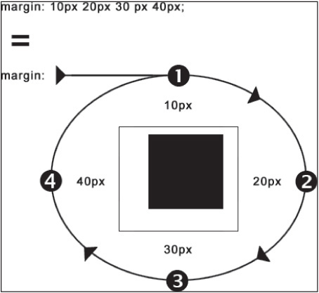
REMEMBERING THE ORDER OF MARGIN AND PADDING SHORTCUTS
Writing shorthand CSS properties and values makes designing and managing sites much easier. Sometimes remembering the order of the shorthand methods, however, is not always as easy. There is a visual reminder for the value order of the two most commonly used properties: margin and padding. Because the values are ordered in clockwise motion, they can be visualized as being positioned around a box, starting with the top border (see Figure 15.17).
Figure 15.17
A visual reminder of how the values are ordered with the shorthand versions of the margin and padding properties.
© 2014 Cengage Learning.
USING THE BORDER AND BACKGROUND PROPERTIES FOR TROUBLESHOOTING
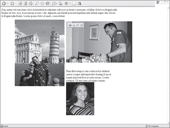
When developing CSS designs where containers of images and text are mortised together, it is important to know exactly where the boundaries of each box are. If this is not known, a simple process of adding a background color to a container can turn into a time-consuming task. Looking at Figure 15.18, it appears that the containers are properly positioned.
Figure 15.18
A page with three boxes laid out so that no overlap or misplacement appears.
© 2014 Cengage Learning.
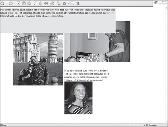
The truth, however, is while the text and images may be properly positioned, this does not mean the boxes that contain them are designed to be edited easily. Adding a background color to the top paragraph makes it readily apparent that the page’s infrastructure is not positioned as properly as it may appear without the background color (see Figure 15.19).
Figure 15.19
Results of adding a background color to the top container, which includes the text.
© 2014 Cengage Learning.
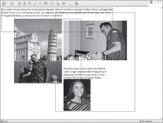
Before a designer can correct such a problem with a design, it is necessary to understand where the boundaries are for the elements that are going to be modified. Two methods can be used to view the borders:
Turn on the border of the elements by setting it to at least one pixel (see Figure 15.20). The code to do so is border:1px solid #000000;. When the designer is done testing the container, the value of the border size can be set to 0, such as border:0px solid #000000;. Much of the code in this book contains such lines. Because the extra code takes up a nominal amount of file size, it is easier to turn the border off than to remove the code. One advantage to this is that the designer can view the shapes of the containers and what is layered behind them because, other than the borders, they are transparent.
Figure 15.20
A page with the containers’ borders set to 1 to view their boundaries.
© 2014 Cengage Learning.
Similar to the example in Figure 15.19, the background color can be set to contrast with the background of adjacent containers (see Figure 15.21). The code to do so is background: red;. The advantage of this method is that the designer understands the exact width a container will take up. If, on the other hand, a designer is trying to position two boxes to the exact pixel, turning on the borders of the boxes will be confusing because compliant browsers will add the extra width to the total width. Thus, if a box is 200 pixels wide, it will grow to 202 if the border is set to 1, because one pixel will be added to both the left and right sides.
Figure 15.21
A page with the containers’ backgrounds set to various colors to view their locations.
© 2014 Cengage Learning.
COMMENTING OUT CODE FOR TROUBLESHOOTING
Any novice designer or developer can create code. An experienced designer or developer, however, can fix things “under the hood.” Being able to troubleshoot a page, whether it is XHTML, CSS, or a programming language, is a very necessary skill to have. One helpful method for testing pages is to remove code to either see how a page will react in terms of layout or to see if the problem disappears when the code is removed.
While code can be cut and the page can be saved to perform such testing, the code can be lost if the computer crashes before the code can be reinserted and resaved. A safer method is to comment out the code. This is accomplished by using comment tags, which tell the browser or server to hide the code inside them from the user. For most languages, comment tags work similarly to XHTML tags, where an opening tag is added to the beginning and a closing tag is added to the end of the code that is to be excluded. Comment tags vary depending on the language, and the following are three examples of commonly used tags:
XHTML: The opening tag is <!- -. The closing tag is - ->. The second line of the following code would be output by the server but not displayed by the browser:
     This is a sample line of text. <br />
     <!- - This is the line that would be commented out <br /> - ->
     This is the line of code the browser would begin displaying again.
Comment Tags Must Have Correct Syntax to Validate
An XHTML page will not validate if the comment tags do not have the correct syntax. If the developer, for instance, has too many hyphens in a comment tag, it will not validate.
CSS: The opening tag is /*. The closing tag is */. The second property of the following rule would not be interpreted by the browser:
    #photo2 {
        position:absolute;
        /* width:90px; */
        height:80px;
        }
JavaScript: This is one exception for using comment tags when the designer does not necessarily need to include a closing tag. The opening tag would merely be //. The second line of the following code would be output by the server but not interpreted by the browser:
    bullet_text_on = new Image
    // bullet_text_off = new Image
    bullet_text_on.src = "http://www.a5design.com/images/
        bullet_text_on.gif"
If, however, the designer wanted to comment out the entire section of code, an opening /* could be used, along with a closing */. Following is how the code would look if it all were to be commented out:
    bullet_text_on = new Image
    // bullet_text_off = new Image
    bullet_text_on.src = "http://www.a5design.com/images/
        bullet_text_on.gif"
USING UNIQUE NAMING CONVENTIONS
When designing and developing code, whether it is XHTML, CSS, or a programming language, it is usually a smart practice to come up with a unique naming convention because there will be times when a developer’s code has to be integrated with another developer’s code. If naming conventions conflict, then errors will occur that will require time to troubleshoot.
When creating ID and class selectors in CSS, for example, most of the rules in this book will begin with a5-, which is short for A5design. This helps prevent integrating a style sheet with another site’s style sheet. If both style sheets contain a selector for the header, odds are that the other one will not be named a5-header. Instead, it may likely be header.
AVOIDING HORIZONTAL SCROLLBARS
When designing a page, it is usually best to avoid use of a horizontal scroll bar (see Figure 15.22). While some users already feel bothered about scrolling vertically, scrolling horizontally, in many circles, is considered a cardinal sin. This is why a designer often wants to avoid making a page that is too wide, even if just by a few pixels, to make sure that a design does not activate the horizontal bar.
Figure 15.22
A page with the horizontal scrollbar activated because the page was made too wide.
© 2014 Cengage Learning.
Higher Monitor Resolution May Not Activate Horizontal Bar
The one exception to this rule is if the designer is creating a site for a higher resolution that some users will not have their monitors set to access.
While page width must obviously be taken into consideration, a more subtle consideration is the browser the site is being designed in. Compliant browsers do not include the right scroll bar until the height of the page requires it, unlike older versions of IE, which always include it. This means that if the designer creates a page in a compliant browser, an extra 18 pixels will be added to the page, which means the designer has 18 pixels less horizontal space to work with. This is why, in certain situations, it is smart to design sites initially in IE to ensure that the extra pixels are already included in the width.
USING CSS SHORTCUTS
The goal of this book is not necessarily to produce the most efficient CSS coding possible. Rather, it is to make the examples as simple as possible, thus ensuring that the concepts are understood more easily. If the designer wanted to create more efficient code, one way is to use CSS shortcuts. One example of such a shortcut is using an abbreviated HEX number, such as #fff instead of #ffffff. This, however, is just the beginning of many options. More shortcuts can be easily found by using a search engine.
UNDERSTANDING FONT UNITS
There are many considerations when it comes to what type of unit to use when sizing fonts on the Web. The options include pixels, points, ems, and percentages. Following are some things to consider when selecting a font:
Will the text be viewed in a browser, printed, or both?
What type of operating system is the design primarily meant for?
Do you want users to be able to resize the fonts using their browsers?
This subject requires thorough discussion, but it is being noted here for the designer to be aware of the various options for further possible investigation.
USING GLOBALLY DRIVEN <SPAN> AND <DIV> TAGS FOR PRINTING PURPOSES
Sometimes using local or in-line styles can benefit the designer if an element on that page, for example, is the only item in the site that needs to be modified. For example, if a warning on a page needs to be colored red, such an in-line style would work best. One disadvantage of using local or in-line styles is if the designer wants to add a printing style sheet. Because a printing style sheet enables, and sometimes requires, a designer to be able to set the display property to none, if those styles cannot be controlled from one document, then the designer will have to modify each of those pages, which not only takes time, but also creates the unnecessary risk of possibly missing a style without thorough testing.
USING INTERCHANGEABLE ELEMENTS WHEN DESIGNING REBRANDABLE SITES
Rebrandable sites often require a designer to create elements that can be easily customizable for various clients. Figure 15.23 is an example of such a site.
Figure 15.23
A rebrandable site with various reusable elements.
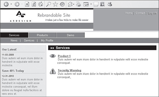
© 2014 Cengage Learning.
Following are five simple tricks being used to create more visual, reusable elements in Figure 15.23:
1. Layered CSS text that could serve as a drop shadow. By duplicating XHTML and CSS code, the designer can layer one element over the other. The CSS rule, of course, would need a unique name, but once it’s renamed, it can be positioned under the other. This method is used for menu text in the top-right corner in Figure 15.23. The top layer of text is saved as white, while the lower layer is saved as black. The lower layer is simply moved one pixel to the right and one pixel down.
2. In-line characters that are produced by XHTML code. There are many XHTML characters that can be used in sites as bullets or other elements to provide easy visual recognition by the user. The arrows to the left of the Services page title are created by the following code: ».
3. Icons that can be layered over any element without the risk of anti-aliasing affecting their quality. This element is not unique to Web design. Nearly all software uses it with its icons. The secret is to create clean edges that don’t blend into the background (see Figure 15.24).
Figure 15.24
An icon that can stand on its own without requiring anti-aliasing.
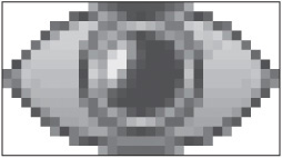
© 2014 Cengage Learning.
By not blending into the background, the icon can be moved anywhere on the page or have the background image changed without any consequences, other than the colors possibly not popping off the page. Figure 15.25 shows what the icon would look like on the page if its background were changed to black.
Figure 15.25
The same icon in Figure 15.24 with the background color changed to black.
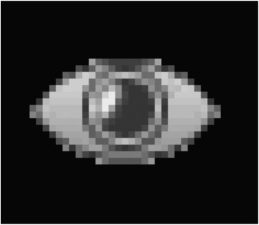
© 2014 Cengage Learning.
4. Using 24-bit PNGs. A trick that is easier than creating icons with clean edges is simply saving images as 24-bit PNGs. This way they can have edges that blend in with the background. The only downside is the file size of these images will tend to be larger.
5. Using linear shapes. With curves comes anti-aliasing, which makes it more difficult to change background colors of websites or portions of them. While curves are used in the icon, the designer is able to get away with that because the icon is small, making it more difficult to see the pixilation along the edges. This is why many sites use linear shapes that do not require any new images to be created. Instead, the background image is simply changed in the style sheet. All of the shapes in the header in Figure 15.23, barring the logo and the “Rebrandable Site” text, use CSS layered <DIV> tags to provide the design. It is a simple example, but one that illustrates the possibilities if the designer were to get creative.
INCLUDING HIDDEN <DIV> TAGS FOR FUTURE USE
When creating rebrandable sites, it is necessary sometimes for the designer to prepare for content that may be added to the source code down the road. One way to do this is to create containers in the code. When the display property is set to none, the container will then be “invisible” until the property is removed. Figure 15.26 shows how Figure 15.23 would look if the rule had its display property removed from the style sheet.
Figure 15.26
The same design as in Figure 15.23 but with a container in the right portion of the body made visible.
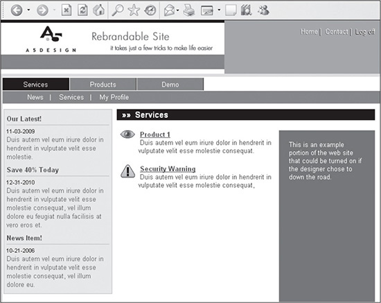
© 2014 Cengage Learning.
For a lot of sites, it is not overly difficult to go into the code to add elements after the site is live. However, some sites require more involved coding that may make it too time-consuming or difficult to add elements after the fact. This is a quick solution for sites with such future needs.
POSITIONING THE LINE-HEIGHT PROPERTY CORRECTLY
Using the line-height property allows the designer to not only play with a site’s typography, but also have the ability to increase or decrease the height of a text area for structural purposes. To do this, the following code is all that needs to be added to a rule: line-height:14px;. This property, however, will not be read by browsers if it is positioned above the font property. Following are examples of the incorrect and correct placement of the line-height property.
Incorrectly positioned line-height property:
#a5-column-left-text {
  line-height:60px;
  font: 10pt tahoma, arial, helvetica, sans-serif;
  }
Correctly positioned line-height property:
#a5-column-left-text {
  font: 10pt tahoma, arial, helvetica, sans-serif;
  line-height:60px;
  }
TESTING CONTINUALLY AND CONSISTENTLY
It is a good practice to continually test pages as they are being created, rather than waiting until the coding is completed, because coding problems can quickly compound themselves. If a container, for example, is assigned the wrong width, padding, or margins, other related <DIV> or <SPAN> tags may also be adjusted incorrectly. Once the initial problem is discovered, any number of changes may need to be made to make the design flow correctly.
Testing should also be done consistently. One method of testing is to always open the same browsers in the same order. The designer can then easily click on each browser and refresh it to see how the site appears. By using some method of consistency, the designer will recall more readily how each browser handles the nuances of CSS.
CREATING SOURCE IMAGE FILES THAT CAN BE EASILY CUSTOMIZED AND RESAVED
Most websites are in continual evolution. That is, they are constantly undergoing changes and revisions. While physically making changes to the source code of Web pages is not overly time-consuming, tweaking image files is an entirely different matter. There are two issues a designer should be aware of when editing images:
The quality of an image can only be maintained or degraded but not improved. Once an image is compressed, certain aspects of that file are permanently lost.
Images that are flattened (reduced to one layer) are difficult and sometimes impossible to edit, depending on the type of edits required.
For any designer who has had a client request that the “colors in an image or comp be replaced” or “this object be moved closer to that object,” understanding the importance of source files quickly becomes necessary. If the client wants these changes made to a flattened image, many times the task is difficult, if not impossible, without re-creating the image.
This is why the designer should always save source files for the images created. They can be the original photos or images used to create images, the final images fully uncompressed, or layered Photoshop files that can be edited easily. Each of these options offers the designer the ability to easily resave or edit a file—and usually with very little effort.
Whenever a designer creates a Photoshop file for an image or a design comp, that file should be saved in its original format without any flattening of the layers. If the designer needs to make revisions, then a new version of the file should be saved. While each Photoshop file for a Web page can easily reach 5MB, the disk space used for each version is more than a fair trade-off when the designer needs to create a website that uses two images less than 1KB each to serve as the mouseover images. For instance, what if the client asks that a file be cropped by 60 percent? Then, a day later, the client says the file was actually better the way it was. What then? If the original version of the file was not saved, the only option is to re-create the image. Take, for example, the comp shown in Figure 15.27. Considering that there are 64 layers in this image, reconstituting it could take hours.
Figure 15.27
Photoshop design that has 64 layers.
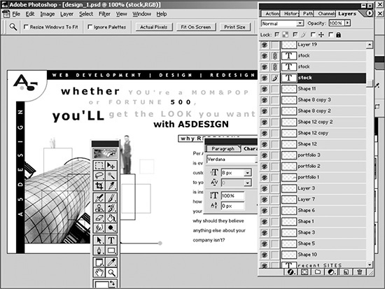
© Adobe® Systems Incorporated.
BREAKING OUT SECTIONS OF SOURCE IMAGE FILES
Saving source image files provides flexibility and ease in editing website images down the road. Some pieces can even be saved separately from their original files for added convenience. Figure 15.28, for example, shows a screenshot of a second-level page that uses such images. In the site, nearly all second- and third-level pages use the oval image on the right. In this example, the U.S. Capitol building is included in the oval. Each section, however, has its own image.
Figure 15.28
Site that uses a different photo in the right-hand oval for each section.
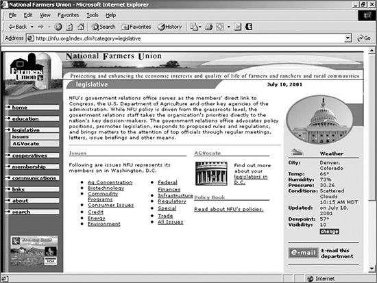
Source: National Farmers Union.
To make creating and editing these photos easier, the oval area was cropped from the source PSD file and saved as its own individual source file (see Figure 15.29). This allows the designer to apply that specific file to create or edit photos, rather than having to open the entire page and save the one desired image from that file.
Figure 15.29
Image used in Figure 16.28, which is saved from a source PSD file for all similar such images.

Source: National Farmers Union.
CREATING SMART NAVIGATION
Navigation can and should, in most cases, satisfy two requirements:
Enhance the usability of a site so that a user can find desired items or information easily and consistently.
Allow for easy and efficient creation, editing, deletion, and downloading of individual menu items.
The first of these two requirements depends more on the architecture of a site than anything else. If the positioning, hierarchy, and naming conventions of sections and subsections of the site’s architecture are intuitive, then the menu will only help capitalize on such planning and forethought.
The second requirement, however, is not always a given. It sometimes is less burdensome to create attractive menu items by saving them as images rather than as text. Doing so, though, limits the designer’s flexibility when maintaining menus, and it increases the download. Editing menu items as text is not only simpler, but it also helps facilitate easy maintenance of the site; source menu files need not be found, edited, and resaved. Text menu items also allow for a menu to be dynamically generated from a database. Because they are made up of XHTML text, such menu items also require a considerably smaller download.
Another aspect of navigation a designer must consider is whether to use horizontal or vertical menus. Each has its benefits. Horizontal navigation allows for the entire width of a screen to be used for a site that, for example, uses tables that require many columns of data. Vertical menus, though, offer the ease of unlimited growth. While horizontal menus eventually run out of space for items, adding more items to a vertical menu simply requires the user to scroll up and down, rather than forcing a redesign of the page. Horizontal menus, however, often employ drop-down menus to allow for more menu items to be included.
REUSING IMAGES
Using browser caching is an easy way to decrease a site’s download. The way it works is that once a browser downloads an image, it stores it in a temporary folder on the user’s computer. That way, if the image is called again from another page or even on the same page, the browser uses the image stored on the computer, rather than downloading another copy.
Following are three instances where graphics can be reused:
1. Framework graphics: Graphics that are included in the homepage design can, many times, easily be reused in the framework of subsequent pages if the containers are built and mortised correctly.
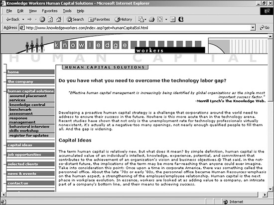
Figure 15.30 is a site that reuses the left and top images for the second- and third-level templates, such as the second-level page shown in Figure 15.31.
Figure 15.30
Site that reuses the left and top images on second- and third-level templates.

Source: Knowledge Workers, Inc.
Figure 15.31
Second-level page that reuses the left and top graphics of Figure 15.30.
Source: Knowledge Workers, Inc.
2. Menu mouseover images: Menu mouseovers are essential to designs that are created with the goal of high usability. Mouseovers allow a user to easily determine exactly where the cursor is pointing, something that is not always easy to do, due to the shape or size of a cursor. Using images for the text is not a wise choice when XHTML text can be used as the menu item and two images less than 1KB can each be reused as the On and Off states of the mouseovers. Figure 15.32 is a site that reuses two images for the mouseovers.
Figure 15.32
Website that uses two images less than 1KB each to serve as the mouseover images.
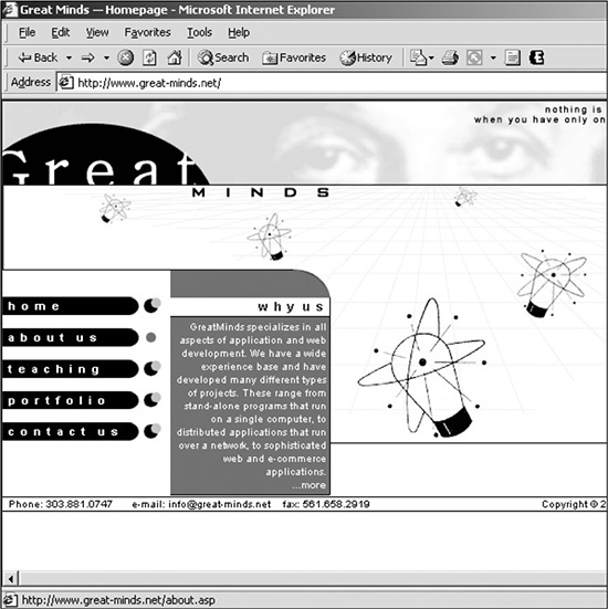
Source: Great Minds, Inc.
3. Corners: A good way of rounding the edges of a container is to use small corner images. While the rest of the area can be colored with the XHTML’s background color, an image can be reused for as many corners as necessary. Figure 15.33 is an example of such a corner.
Figure 15.33
Corner image that can be reused.
© 2014 Cengage Learning.
INDENTING AND COMMENTING CODE
Sometimes, it is difficult to tell which table is nested in which when building, editing, or troubleshooting complex mortised sites. Indenting and commenting code, however, can help alleviate this problem. Discovering the nesting order of containers is easier when the code for each nested container is indented farther to the right than the higher-level (parent) containers. Comments also help a designer locate a single piece of code from within the entire page. Following is a sample of code that uses both indenting and comments to identify sections:
<!-- ###### left column start ###### -->
<div id="a5-column-left">
<!--########## left column text start ##########-->
we create reasonably priced, highly professional web
designs, web sites, web applications, e-newsletters, and other visual, usable, and
functional work. while we create various custom designs for our clients, our best-
selling, internationally published designs are a good place to start to not only
understand our design skills but also to discover we’re not a flash-in-the-pan
design firm. following are a few shortcuts to more commonly requested information:
<!--########## left column text end ##########-->
</div>
<!-- ###### left column end ###### -->
REMOVING SPACES AND COMMENTS
Often, the designer’s goal is to find code easily for future editing. Sometimes, however, the goal is entirely about download speed. If the designer is more concerned about download, then removing extra spaces or comments will help decrease the file size of the page.
XHTML compression software can be found on download sites, such as www.tucows.com and www.download.com, which automates this process. The only thing the designer needs to remember is to save the original source page for easy editing in the future. Otherwise, having to edit the compressed code could be quite cumbersome.
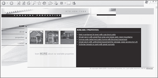
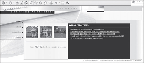
The code for the site shown in Figure 15.34 before removing the spaces and comments was nearly 18KB. After removing the extraneous code, the size was reduced by nearly 2KB. Although it could have been decreased even more by eliminating all the spaces, the text would have been jumbled, and the programming code would not have worked properly.
Figure 15.34
Site that could have nearly 2KB trimmed by removing spaces and comments.
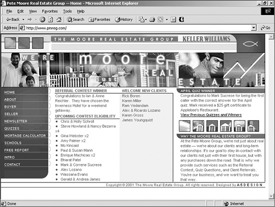
Source: The Moore Real Estate Group.
Removing Extraneous Spaces Only Helps
As mentioned in various examples in this book, while spacing in XHTML should not affect a CSS-driven design, it does do so in certain circumstances. In most cases, though, removing spaces only makes the browser interpret the code more accurately.
SUMMARY
Understanding common roadblocks and issues with designing websites can make a designer or developer much more efficient. If a designer creates enough sites, she will run into most of the issues outlined and hopefully be able to easily work through them with the help of this chapter. Some of the tips and techniques in this chapter included coding CSS mouseover menus, controlling content layout, using unique naming conventions, and learning basic testing tricks. If nothing else, the content in this chapter should help the designer imagine code in a more structured, forward-thinking way.