
CHAPTER 6
WHAT IS NEEDED TO BUILD MORTISED SITES
As an accomplished artist once said, “Everyone has the same tools. The only difference is how each person uses them.” This statement epitomizes mortised sites. Building such sites is not difficult, especially for the experienced Web designer. There is, in fact, a very low learning curve for such designers because mortised sites do not introduce any new Web development technologies. Other than learning a graphics software program, such as Adobe Photoshop, the designer need only learn creative methods of using XHTML, graphics, and CSS—common tools for a Web designer. Of course, using JavaScript (scripting language), Flash, programming languages, and other tools can also enhance a mortised site.
The difference in the quality of a site is determined by a designer’s knowledge of building sites and how the designer uses that knowledge. Two of the most important aspects to building such sites is using CSS to position the majority of content, rather than XHTML tables, and properly compressing and saving images. While CSS allows the designer to create nearly any layout possible, which may include additional programming, properly compressed and saved graphics make the site attractive and more usable. Together, they give the designer the means to build a homogenous site.
Before beginning to fully grasp these and other concepts, the designer should have an understanding of the big picture—that is, knowing the various steps that go into building a mortised site from conception to production. Following are 10 steps in the typical building of a mortised site:
1. Gathering and basing a site on requirements.
2. Creating comp(s) for the client.
3. Receiving a decision on the chosen comp and making edits.
4. Breaking up the comp into XHTML, graphics, and CSS.
5. Testing the page in the most widely used browsers.
6. Saving components of the page as include files and testing again.
7. Building second-level pages from the homepage template.
8. Working with the client as the site is built.
9. Testing the entire site.
10. Implementing or uploading the site.
This general overview helps a designer understand the entire process, which helps to make sense of the many specifics included in this book.
UNDERSTANDING THE CONCEPT OF MORTISING IMAGES
Building a mortised site is similar to piecing a puzzle together. The designer pieces images, content, and functionality together in a manner that allows form and function to complement each other rather than compete against each other.
Mortising can be accomplished at different levels. At the basic level, a designer can mortise just two images together. At the more advanced level, the designer can nest mortised containers (usually content in <SPAN> and <DIV> tags) inside mortised containers to accomplish complex designs. It all, however, begins with a basic understanding of how to piece together two or more images.
Figure 6.1 is an example of three images pieced together seamlessly. All of the images are compressed and saved in their best possible image format.
Figure 6.1
Three images mortised together.
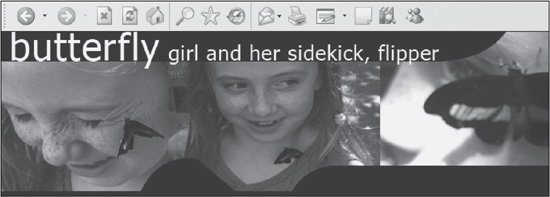
© 2014 Cengage Learning.
While they appear to be one image, when spaces are added in between the images, it becomes apparent that there are three separate images (see Figure 6.2).
Figure 6.2
Three images that are mortised together to form the image in Figure 6.1.
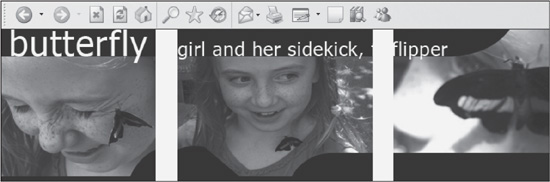
© 2014 Cengage Learning.
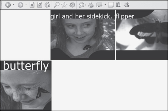
Following is the code for this example. While there are more involved mortising examples throughout the book, this particular code can be reused in many different ways. It is especially important to note that all the spaces have been removed so the images aren’t output incorrectly in some browsers, such as shown in Figure 6.3.
<div style="width:692px;"><span style="float:right;"><img src="images/photo-bottom-
center.jpg" width="266" height="209" alt="" border="0" /><img src=
"images/photo-bottom-right.jpg" width="213" height="209" alt=" "border="0" /></span>
<span style="float:left;"><img src="images/photo-bottom-left.jpg" width="213"
height="209" alt=" "border="0" /></span></div>
Figure 6.3
An example of how the images in Figure 6.2 will “fall apart” when normal spacing is added between the elements.
© 2014 Cengage Learning.
Notice how the first two images are nested together in a <SPAN> tag and then floated to the right of the left image. If the designer were to simply add all three images together or try floating them nearly any other way, they would not piece together seamlessly. It should also be noted that for this code to work, as well as other occasional CSS, it cannot have spaces in between it. Following is an example of how the code should not look:
<div style="width:692px;">
 <span style="float:right;">
 <img src="images/photo-bottom-center.jpg" width="266" height="209" alt=""
border="0" />
 <img src="images/photo-bottom-right.jpg" width="213" height="209" alt=""
border="0" /></span>
 <span style="float:left;">
 <img src="images/photo-bottom-left.jpg" width="213" height="209" alt=""
border="0" />
 </span>
</div>
There are several advantages to mortising:
 The designer can save parts of images in their best respective image formats. For instance, in Figure 6.2, any of the three images could be saved as a PNG and placed among the other two JPG images, if the designer needed such flexibility. Or that image could be saved as a background image of a container that could have text layered over it.
The designer can have more freedom with layouts. Although everything is saved and structured in rigid, linear shapes in CSS Web design, the design does not have to appear that way. Instead, text, colors, and images can flow through a page, leading the user’s eyes and creating a sense of motion or emotion with the design (see Figure 6.4).
The designer can be guaranteed of content and image placement because positioning is fixed.
Figure 6.4
Site that uses images to create a sense of motion.
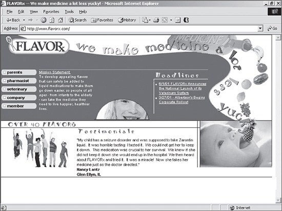
© 2014 FLAVORx.com.
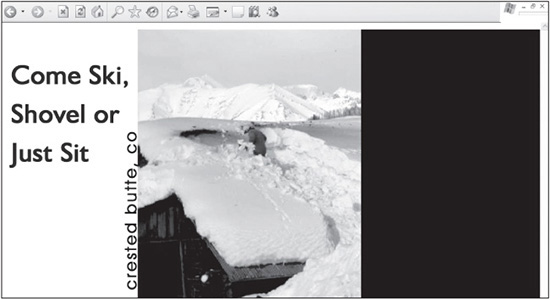
Figure 6.5 represents another way to mortise three images together. It shows how to place images together with absolute or relative positioning. The designer can control placement of an image by wrapping a container around it and assigning the position, top, left, and right properties to it. Figure 6.5 shows how the first of three images is positioned in a container with the ID of a5-header. It is assigned absolute positioning, placing it 0 pixels from the top and 0 pixels from the left side.
Figure 6.5
The first of three images positioned in the container.
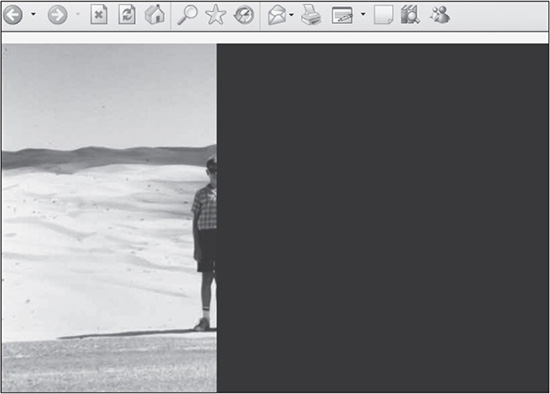
© 2014 Cengage Learning.
Background Color Helps with Differentiation
The 627-pixel-wide container is assigned a black background to differentiate it from the white background of the page.
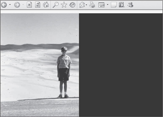
After the first image has a <DIV> wrapped around it and is placed in the parent container, a second image is added. It also has a container wrapped around it. This image, however, is placed 247 pixels from the left, which positions the two images together (see Figure 6.6).
Figure 6.6
The second of three images positioned in the container.
© 2014 Cengage Learning.
The third image is positioned 304 pixels from the left, which is the sum total width of the first two images (247 + 57 = 304 pixels). Depending on the instance of mortising, the right property can be used in place of the left property. Listing 6.1 is the code to build the completed mortised images in Figure 6.7.
Figure 6.7
All three images positioned in the container.
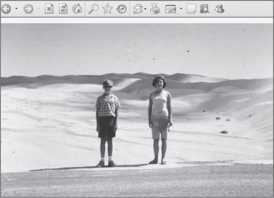
© 2014 Cengage Learning.
Listing 6.1 Code for Figure 6.7
  <!DOCTYPE html PUBLIC "-//W3C//DTD XHTML 1.0 Transitional//EN"
    "DTD/xhtml1-transitional.dtd">
  <html><head><title>Mortised Images</title>
  <style>
        #a5-header {
            position:relative;
            top:0px;
            left:0px;
            width:627px;
            height:400px;
            background:black;
        }
        #a5-photo-left {
            position:absolute;
            top:0px;
            left:0px;
        }

        #a5-photo-center {
            position:absolute;
            top:0px;
            left:247px;
        }
        #a5-photo-right {
            position:absolute;
            top:0px;
            left:304px;
        }
    </style>
    </head>
    <body>
    <div id="a5-header">
        <div id="a5-photo-left"><img src="images/photo-left.jpg"
            width="247" height="400" alt="" border="0" /></div>
        <div id="a5-photo-center"><img src="images/photo-center.jpg"
            width="57" height="400" alt="" border="0" /></div>
        <div id="a5-photo-right"><img src="images/photo-right.jpg"
            width="323" height="400" alt="" border="0" /></div>
    </div>
    </body>
    </html>
Placing background images in a container is another way to mortise images together. One reason a designer may want to do so is to place text over the image. Figure 6.8 shows how the left image of a container is added.
Figure 6.8
The left image added to the container.
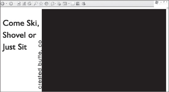
© 2014 Cengage Learning.
Background Color Helps with Differentiation
The 1,000-pixel-wide container is assigned a black background to differentiate it from the white background of the page.
Once the first image has been added, the second is inserted (see Figure 6.9). In this example, the left text is saved as an image, so the process of mortising the two images together is the same as the previous example.
Figure 6.9
The center image added to the container.
© 2014 Cengage Learning.
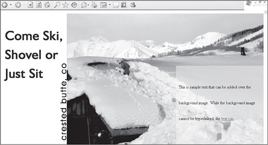
Adding the right container is where this example becomes more complex. The designer is going to size and position the a5-text-right <DIV>; however, the text is going to be added to another <DIV> that is nested inside. This allows for padding and line-height properties and values to be added at a local level. Listing 6.2 is the code used to create the final layout (see Figure 6.10).
Figure 6.10
Background image and text added to the right column.
© 2014 Cengage Learning.
Listing 6.2 Code for Figure 6.10
  <!DOCTYPE html PUBLIC "-//W3C//DTD XHTML 1.0 Transitional//EN"
    "DTD/xhtml1-transitional.dtd">
  <html><head><title>Mortised Images</title>
  <style>
        #a5-container {
            position:relative;
          ` top:0px;
            left:0px;
            width:1000px;
            height:500px;
            background:black;
        }
        #a5-image-left {
            position:absolute;
            top:0px;
            left:0px;
        }
        #a5-photo-center {
            position:absolute;
            top:0px;
            left:251px;
        }

        #a5-text-right {
            position:absolute;
            bottom:0px;
            right:0px;
            width:333px;
            height:500px;
            background:url("images/bg-right.jpg") no-repeat;
        }
    </style>
    </head>
    <body>
    <div id="a5-container">
        <div id="a5-image-left"><a href="x.htm"><img src="images/
          image-left.gif" width="251" height="500" alt="" border="0"
          /></a></div>
        <div id="a5-photo-center"><a href="x.htm"><img src="images/photo-
          center.jpg" width="416" height="500" alt="" border="0"
          /></a></div>
        <div id="a5-text-right">
          <div style="padding:250px 10px 10px 10px;line-height:60px;">
            This is sample text that can be added over the background
            image. While the background image cannot be hyperlinked,
            the <a href="x.htm">text can</a>.</div>
        </div>
      </div>
      </body>
      </html>
UNDERSTANDING XHTML
XHTML used to be more involved with Web design when table-based designs were the standard and tables had to be nested within each other to mortise Web page elements together. Today, XHTML plays a much smaller, almost insignificant, roll in creating professional-looking sites.
In CSS-driven designs, XHTML mainly provides the framework for the page, which includes the <HTML>, <HEAD>, <TITLE>, and <BODY> tags; the structure of containers, which includes <SPAN> and <DIV> tags; and the general tags for page elements to be built, such as forms and embedded elements like hyperlinks and images.
The majority of positioning and layout is now controlled with CSS. This is not to devalue XHTML code. Its tags are still crucial in creating code that can be read by search engines and text readers, among other things. The good thing for the designer is that the <TABLE>, <TR>, and <TD> tags are now used mainly for displaying table data, such as in a spreadsheet.
Using a Limited Number of Tags
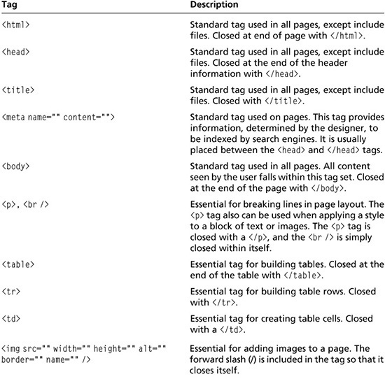
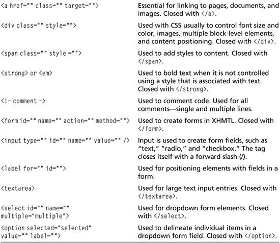
Out of more than 110 XHTML tags, a designer only needs to know a small number of them to build mortised sites with basic form functionality. Rather than spending time learning more tags, the designer can spend time logically and creatively manipulating this limited number of tags with CSS, rather than hundreds of lines of <TABLE> code. Included in Table 6.1 is a list of popular tags, along with some of their possible attributes and uses.
Table 6.1 Basic Tags for Building Mortised Sites
UNDERSTANDING GRAPHICS
Creating, using, saving, and compressing images in their best possible formats is essential to professional Web design. Because it is so important, the issue is addressed in depth in Chapter 7.
UNDERSTANDING CSS
Unlike in the past where CSS (Cascading Style Sheet) was used mainly to style text, it now plays, for the most part, the sole role in positioning and styling content, whether at the global, local, or inline level. Used to its greatest potential, one CSS document controls the styles of the entire site, similar to the concept of an include file (discussed later in this chapter). This book has been considerably rewritten to explain this new use of CSS and how it can be used to create highly professional websites. While Chapters 8 through 14 and 16 go into more specifics about this subject, the following sections are an overview a designer needs for a general understanding.
Understanding CSS Terminology
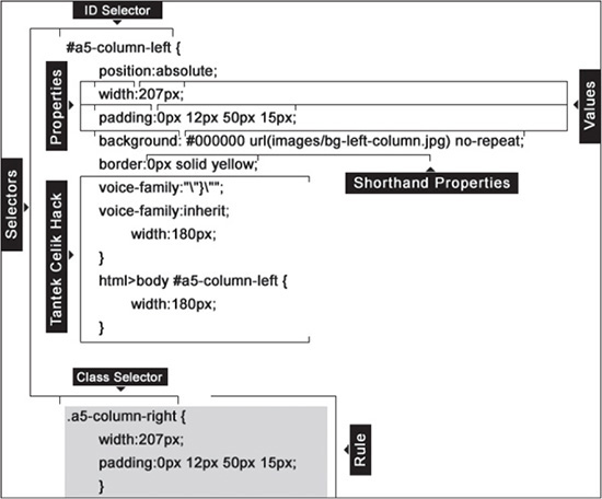
It is assumed that the designer has a working, if limited, knowledge of CSS. Recalling terminology, however, is not always the easiest thing to do, which is why Figure 6.11 was created. It provides a basic visual example of CSS elements and their terminology in a CSS style sheet.
Figure 6.11
A visual reference of CSS terminology, including an example of the Tantek Celik Hack, which is no longer used.
© 2014 Cengage Learning.
Following are the various items to note about the code in Figure 6.11:
Selectors: These are used when declaring and calling a particular rule. Figure 6.11 identifies two types of selectors, an ID selector and a Class selector, both of which can be used with XHTML tags, such as <P>, <DIV>, or <SPAN>.
Properties: Various aspects of a selector that can be used for different styles.
Values: The specific qualities of properties.
Shorthand Properties: A method of combining multiple related values for a property under one general property. An example would be combining padding-top: 10px; padding- right:15px; padding-bottom:25px; padding-left:30px into one property that looks like padding:10px 15px 25px 30px;.
Rule: The entire grouping of a selector, a property (or properties), and value(s).
Tantek Celik Hack: While this is not necessarily considered CSS terminology, it was kept in this edition of the book as a historical reminder of how CSS has progressed over the years. In the past, the designer used to have to include such code to ensure IE 5/5.5 rendered the width of a <DIV> tag similarly to other browsers. Fortunately, this is no longer an issue.
CSS Used in This Book
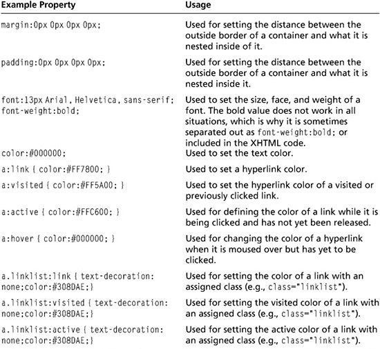
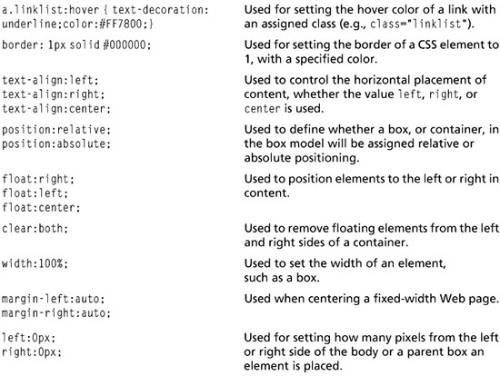
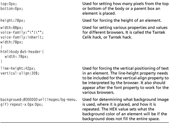
The CSS coding philosophy used in this book is to be creative with a limited number of CSS properties and values, rather than use those that do not necessarily function under all conditions. In other words, the goal is to be the most flexible with the smallest number of properties and values that are proven to work in the widest range of browsers and their versions. While there is a much wider array of possibilities for a designer, it is left to the designer to expand upon what is discussed in this book. Table 6.2 lists many properties that are used in this book. Many of them are shorthand examples, meaning one property is used to set the various values that could be broken up into other properties.
Table 6.2 Some of the CSS Properties Used in This Book
BLOCK- AND LINE-LEVEL TAGS
Block- and inline-level tags are at the core of positioning and styling content in a website. The most common block-level element is the <DIV> tag. The most common line-level tag is the <SPAN> tag. Together, they are used similarly to how XHTML tables were used to create mortised sites. The <DIV> tag is used as a “box” to place content in, position, and style, similar to a table. The <SPAN> tag is used to style individual elements inside a block-level tag, although a <DIV> tag can be, and frequently is, used to do the same. Chapter 8 provides a basic understanding of how these tags are used, while Chapters 9, 10, 11, 12, 13, and 14 provide actual case studies on how to do so. A more technical explanation of these type of tags can be found on the World Wide Web Consortium (W3C) site at www.w3.org/TR/REC-CSS2/visuren.html#q5.
Understanding the DocType Declaration
A DocType Declaration (DTD) is a line of code that should be included in the first line of every Web page, barring include files. The most basic explanation of a DTD is that it defines the rules of how a browser should render a Web page, based on W3C’s standards. Various types of declarations can be used, depending on how the designer wants a Web page to be interpreted by a browser and validated by the W3C. In other words, pages can be interpreted on their HTML, XHTML, or XML coding. The latest designs in this book are created using the following XHTML 1.0 transitional declaration:
<!DOCTYPE XHTML PUBLIC "-//W3C//DTD XHTML 1.0 Transitional//EN"
        "DTD/xhtml1-transitional.dtd">
Linking to CSS Style Sheets
While there are different ways to include a style sheet (such as linking, embedding, and including inline), imported style sheets offer one thing the others do not: they prevent older browsers that do not fully support CSS from crashing. In the past, style sheets were imported to keep browsers, such as Netscape 4.7, from choking on the CSS. Fortunately, this is more of a history lesson than a practical lesson, since Netscape is no longer a major player in the browser world. Listing 6.3 provides the code to import a style sheet:
Listing 6.3 Code Used to Import a Style Sheet
     <style type="text/css" media="all">
        @import "mainstyle.css";
    </style>
Including Print Style Sheets
A designer no longer has to create separate pages that are used specifically for printing a page. The following style sheet link simply needs to be added to the page’s code.
<link rel="stylesheet" href="print.css" type="text/css"
        media="print"/>
Once this link has been added, the browser will call a separate style sheet that it will use for printing purposes. Usually, the style sheet is a copied version of the main style sheet, which is then modified to display the page how the designer desires. If the header, for example, does not need to be printed, the designer can change the style sheet to hide that element of the page. Following are several things a designer should consider changing to make a page more printer-friendly:
The font size could be changed to points for printing purposes. Otherwise, the page may not print sizes, such as pixels, clearly.
Any section can be turned off by adding the rule display:none; to any <DIV> or <SPAN> tag. For example, the following style would be completed hidden from a Web page when the rule was added to the style in the second version:
    #a5-header {
     position:relative;
     top:0px;
     height:73px;
     background: red;}

    #a5-header {
     position:relative;
     top:0px;
     height:73px;
     background: red;
     display:none;}
By making this change, anything in the container with the id value of a5-header would be hidden from the printer. To test what the page will look like, the designer can select Print Preview in the browser rather than actually having to print it.
The text to be printed can be resized easily to fit the screen however the designer chooses.
Colors that may not print very well in grayscale, such as yellow, can be changed to a darker color.
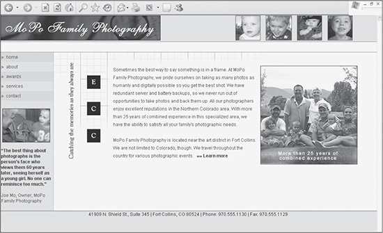
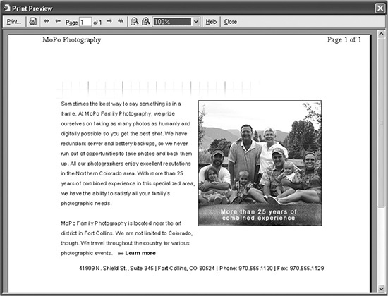
Figure 6.12 shows how a site is displayed in a browser. Figure 6.13 illustrates how drastically the same page can appear when reading a print style sheet. Many of the elements of the page, including the header, menu, and content columns, were removed so only the necessary information would be printed.
Figure 6.12
A Web page and how it appears with a nonprinting style sheet.
© 2014 Cengage Learning.
By simply selecting Print Preview in Internet Explorer, the browser will give the designer an idea of how the page will appear when it is printed. The great thing about this functionality is that the designer can test a page without actually having to print it.
Figure 6.13
The same Web page as in Figure 6.12, but in Print Preview mode it uses a print style sheet to determine what is printed.
© 2014 Cengage Learning.
UNDERSTANDING INCLUDE FILES
Include files are individual files that can be repeatedly called into different pages (for example, PHP, .NET, or JSP pages). A blessing to Web designers, include files not only allow a site to be modular (various easily interchangeable pieces), but more importantly, they also reduce maintenance time. An example of an include file might be the footer text of a site. Instead of placing the text in every page, a designer might include one line of code in every page that calls that footer text, which is saved as its own file. Then, when the footer needs to be edited, the designer edits only one page.
To use include files, all a designer needs is to host a site on a server that offers server-side processing, such as Microsoft (.NET pages), Apache HTTP Server (SHTML pages), and JSP server (JSP pages), or an open-source server that runs PHP pages. Following are examples of code that are used to include files into other files:
Code to call include file in a .NET page:
<!- - #include file="menu.txt" -->
Code to call include file in an SHTML page:
<!- -#include file="filename.shtml" -->
Code to call include file in a PHP page:
<?php include("pagename.php"); ?>
Code to call include file in a JSP page:
<%@ include file="menu.jsp" %>
SUMMARY
The three components of building mortised sites are XHTML, CSS, and graphics. A designer, however, should also understand several concepts, such as mortising images, using block- and line-level tags, and taking advantage of include files. Mortised sites have a low learning curve because they do not require a Web designer to learn any new technologies—just a different coding methodology. Building such sites also requires a limited amount of XHTML and CSS. The designer, rather, needs to use existing tools and methods in new, creative ways to build fast, highly usable, professional sites.