
CHAPTER 9
CASE STUDY: LOW-CONTENT CSS DESIGN
Since the introduction of CSS-based design, the majority of designs have taken a more simplistic look, similar to how they used to look before designers used more complex layouts using nested XHTML tables. As with the evolution of table-based layout, this most likely is simply just a result of the fact that most designers simply do not know how to technically create more complex designs that, many times, give a site a more professional unique look and feel that generally guarantee a longer shelf life. Instead, they simply replicate a few basic layouts that permeate the Web. This is the first chapter in this book that shows a designer how easy it is to create a more complex look by using CSS in more creative ways by breaking the “visual” confines of basic linear (rectangular and square) containers. In other words, this chapter explains how to make designs look how the designer wants them to look, rather than having to make a design look like images were merely placed in columns because that is all that could technically be done. The design in this chapter was created for 800 × 600 resolution; however, no matter the resolution, the same techniques apply to creating larger designs.
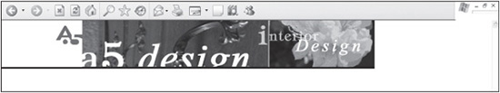
Design 121 Example
The design explained in this chapter is design 121 online (photo credits: www.idlerphotography.com).
UNDERSTANDING THE DESIGN’S STRUCTURE
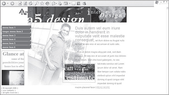
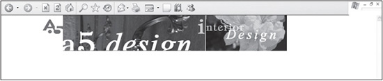
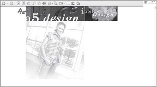
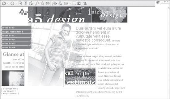
Before beginning to build a design, it is important that the designer understand the page’s infrastructure. The design shown in Figure 9.1 is a simple layout that uses a header and two columns below it to mortise the images together and therein place the content.
Figure 9.1
The low-content design explained in this chapter.
© 2014 Cengage Learning.
The Reasoning Behind Guides and Creating Slices in Photoshop Files
When building a design, you should usually create it first in image editing software, such as Photoshop, rather than spending time coding the actual design. While creating a comp, or sample design, is time-consuming, it will save time because most of the technical considerations are worked out during this phase of the process. It is also time-saving because the client is usually going to want to make changes to the design, and it is easier to make these changes when first creating the entire page. Then, once the design is approved, the designer simply needs to code it to appear as it does in the Photoshop file.
After a design is created in Photoshop, the designer is going to want to break up, or code, the design in XHTML and CSS. To begin this process, guides are placed to ensure that the elements are lined up in their correct positions. Slices, which are used to save areas of the design as images, can be fashioned easily once everything is positioned correctly.
Figure 9.2 shows how the guides and slices are positioned. The numbers added to the design are used to point out the 10 most important guides and slices.
Figure 9.2
Guides and slices strategically placed within the design.

© 2014 Cengage Learning.
There are several things to note about the guides and slices in Figure 9.2:
1. The horizontal guide just below number 1 is added to separate the header row from the lower part of the design.
2. The vertical guide to the left of number 2 separates the left column, which includes the menu, from the right column, which contains the main content for the page.
3. The three number 3s represent the slices that are used in the header area.
Slices
A slice is indicated by the small numbered rectangle in the top-left corner of each outlined rectangle or square.
4. The two number 4s indicate, to the left of them, the background images that are used in each menu item. The top number 4 represents the menu item when the user has not selected that item. The lower number 4 represents the background when the hyperlinked menu item is in hover mode.
5. The two number 5s represent slices used to save images for the design that are not mortised together with any others. The right image, which says, “call for a free estimate,” has the background image removed from it. This is accomplished by cropping out the background, and any other images, below the slice. When saving the Photoshop file, the designer can designate the checkered background, which is the background of the file, as a transparent background. This allows the image to be layered easily over any background in the file so that the background can appear through the area that is checkered. The advantage of this technique is that the image can then be moved anywhere over the background image of the woman, without the “estimate” image containing remnants of her checkered shirt. It is a coincidence that the Photoshop background and the woman’s shirt are both checkered. If the image contained the woman’s shirt, rather than that area being transparent, and was positioned differently, the image and background images would appear disjointed.
Anti-Aliasing Provides Smooth Curves
If the image had a curve and that image was saved with a transparent background, the curve would have a jagged edge because of anti-aliasing, which blends colors to give the perception of one color being curved.
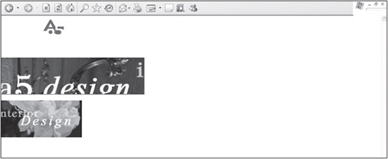
6. The slice to the left of number 6 represents the background image that is used for the page title row for second-level pages (see Figure 9.3). Often, it is easier to save images that are not necessarily used on the homepage with the source file that is used for the homepage. This can eliminate the need to save a completely new PSD (Photoshop) file for just one image.
Figure 9.3
The page title area on second-level pages that uses a background image saved from the Photoshop file created for the homepage.
© 2014 Cengage Learning.
Because multiple images are layered and saved over the background image of the woman, it is helpful to duplicate the source PSD file and save it independently so the background can be saved. When the file has been duplicated, the extra images, all slices, and most guides can be removed, leaving only the background image. The designer then adds a slice around the portion of the file that will be saved as an individual image.
One advantage of duplicating the existing homepage file and deleting excess images is that the background image’s placement remains the same. Because the main slice, represented by number 2 in Figure 9.2, is not removed, the designer knows exactly where to place the new slice. Figure 9.4 shows the homepage saved as a separate source file with all the original slices and excess images removed.
Figure 9.4
Homepage source file that is duplicated and saved as a separate file so the background image of the woman can be saved independently from the images layered over it.
© 2014 Cengage Learning.
Understanding the Placement of CSS Containers
More than 10 <DIV> tags are used to lay out the images saved from the Photoshop file and XHTML content. Figure 9.5 shows the <DIV> tags with all the images and content removed and their borders “turned on” by setting them to 1px.
Figure 9.5
Design with images and content removed and various <DIV> tags turned on.
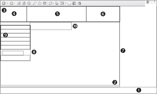
© 2014 Cengage Learning.
The <DIV> tags are used for different functions in the design, such as setting up its basic infrastructure, providing containers to position content within, and styling the content. Following are explanations of the 10 most useful <DIV> tags in Figure 9.5:
 The
The <DIV> tag above number 1 is used for centering the design in IE 5 and 5.5, if it is to have a fixed width. The container starts at the very top-left corner of the browser window. This style is no longer necessary for most sites, but it is mentioned here because it will still be included in designs from previous editions that are included online.
The <DIV> tag below number 2 determines whether the design has a fixed width or is a liquid layout. It also begins in the top-left corner of the browser window.
The <DIV> tag to the left of number 3 contains the images that are used in the header area.
Numbers 4, 5, and 6 are images in the header area that are assigned absolute positioning.
The <DIV> tag to the left of number 7 contains both the left and right columns of the body.
Number 8 defines the left column, which contains, among other things, the menu.
Number 9 represents the container that styles and positions the menu.
Number 10 is the <DIV> that contains the content in the right column. It expands to the full width of the design when enough content is included to force the full width.
BUILDING THE STRUCTURE
Following are the steps for constructing the design, step by step. It is assumed that the Photoshop file has already been created or customized and the designer need only position the images and text.
Creating the XHTML and CSS Framework
The first step to building the design is to create the XHTML framework and initial CSS containers. Listing 9.1 is the code that is used to output the page in Figure 9.6.
Figure 9.6
Basic XHTML and CSS framework for the design.
© 2014 Cengage Learning.
Listing 9.1 Code for Figure 9.6
<!DOCTYPE html PUBLIC "-//W3C//DTD XHTML 1.0 Transitional//EN"
        "DTD/xhtml1-transitional.dtd">
    <html xmlns="http://www.w3.org/1999/xhtml" xml:lang="en"
lang="en"><head><title>Design 121</title>
    <meta http-equiv="Content-Type" content="text/html;

        charset=iso-8859-1" />
    <style type="text/css">
    /* ++++++++++ global general styles start ++++++++++*/
    html, body {
        margin:0px;
        padding:0px;
        font: 13px Arial, Helvetica, sans-serif;
        color:#766D6D;
        background:#ffffff;
    }
    /* ++++++++++ global general styles end ++++++++++*/

    /* ++++++++++ global structure styles start ++++++++++*/
    #a5-body-center {
        text-align:left;
        border:1px solid #000000;
        }
    #a5-body {
        position: relative;
        width: 770px; /* change this to a specific amount for a fixed
            design or a relative amount if the design should expand to a percentage
of the screen. E.g., 770px or 100%, respectively. */
    /* remove these comment tags if the page is to be centered. The ’text-
        align’ property in the ’a5-body-center’ rule must also be changed
        from ’left’ to ’center’
        margin-left: auto;
        margin-right: auto;*/
        text-align:left;
        padding-bottom:10px;
        border:1px solid #000000;
        }
    /* ++++++++++ global structure styles end ++++++++++*/
    </style>
    </head>
    <body>
    <div id="a5-body-center">
        <div id="a5-body">
            Enter text here.
        </div>
    </div>
    </body>
    </html>
There are several things to note about the code in Listing 9.1:
The CSS style sheet is commented into a couple of different sections. The global general styles comment tags contain the general styles, such as the formatting of the <HTML> and <BODY> tags, hyperlinks, and fonts. The global structure styles comment tags include the styles used to define the structure of the design and elements included in that structure.
Several rules define the <HTML> and <BODY> tags. The margin and padding properties are used to ensure that the design is placed in the very top-left corner of the browser, with no space between the design and the edges of the viewable area. The default font style for the site is set using the shorthand FONT property. The default font color is defined with the COLOR property. The background color also is assigned, even if it is only white (that is, #ffffff). This guarantees that all browsers display the site with the same background color because the default color is not always the same among browsers.
The a5-body-center and a5-body rules are used to force the design to the left side of the browser screen with a fixed width of 770 pixels. If the designer wanted the design to fill the full width of the screen, the value of 770px would need to be changed to 100%. If, however, the designer wanted to center the design, the value of the text-align property in the a5-body-center rule would need to be changed from left to center. The margin-left and margin-right properties in the a5-body rule would only need to have the comment tags around them removed. This system gives the designer flexibility when more than one site is going to be built using this same default code. By adding this code to every design, it does not take much effort to quickly change a design to fit a client’s needs.
Both the a5-body-center and a5-body rules have their borders turned on using the following code: border:1px solid #000000;. For demonstration purposes, the code was added to both rules to show what the structure of the <DIV> tags looks like with no content added. Turning on the borders also helps when building a site because it is not always apparent where elements are placed or expanding to. Rather than remove these rules, it is easier to change the value of 1px to 0px, turning the borders off. Troubleshooting often involves turning the borders back on, thereby saving time and taking up very little download size by keeping them in the style sheet.
Because the <div id="a5-body"> is nested inside the <div id="a5-body-center"> tag, it is indented. This allows for quicker recognition of nested tags, which becomes a useful technique when the page has more code added to it later.
Adding the Header Content
Once the XHTML and basic CSS framework have been added, the header area is then added into the code. Listing 9.2 is the code that is used to output the page in Figure 9.7.
Figure 9.7
Design with all three header images added.
© 2014 Cengage Learning.
New Code Is in Bold
The newly added code is bolded to differentiate it from the existing code that is being built upon in this case study.
Listing 9.2 Code for Figure 9.7
 <!DOCTYPE html PUBLIC "-//W3C//DTD XHTML 1.0 Transitional//EN"
        "DTD/xhtml1-transitional.dtd">
    <html xmlns="http://www.w3.org/1999/xhtml" xml:lang="en"
lang="en"><head><title>Design 121</title>
    <meta http-equiv="Content-Type" content="text/html;
        charset=iso-8859-1" />
    <style type="text/css">
    /* ++++++++++ global general styles start ++++++++++*/
    html, body {
        margin:0px;
        padding:0px;
        font: 13px Arial, Helvetica, sans-serif;
        color:#766D6D;
        background:#ffffff;
        }
    /* ++++++++++ global general styles end ++++++++++*/
    /* ++++++++++ global structure styles start ++++++++++*/
    #a5-body-center {
        text-align:left;
        border:0px solid #000000;
        }

     #a5-body {
         position: relative;
         width: 770px; /* change this to a specific amount for a fixed
             design or a relative amount if the design should expand to a percentage
 of the screen. E.g., 770px or 100%, respectively. */
     /* remove these comment tags if the page is to be centered. The ’text-
         align’ property in the ’a5-body-center’ rule must also be changed
         from ’left’ to ’center’
         margin-left: auto;
         margin-right: auto;*/
         text-align:left;
         padding-bottom:10px;
         border:0px solid #000000;
         }
     /* ++++++++++ global structure styles end ++++++++++*/
     #a5-header {
         position:relative;
         left:0px;
         top:0px;
         height:98px;
         border:0px solid #000000;
         }
         #a5-header-center {
             position:absolute;
             left:169px;
             top:0px;
             }
         #a5-header-right {
             position:absolute;
             left:553px;
             top:0px;
             }
     </style>
     </head>
     <body>
     <div id="a5-body-center">
          <div id="a5-body">
     <!-- ###### header start ###### -->
              <div id="a5-header">
                  <div><a href="index.htm"><img src="images/header-left.gif"
                      width="169" height="98" alt="" border="0" /></a></div>

              <div id="a5-header-center"><img src="images/
                  header-center.jpg" width="384" height="98" alt=""
                  border="0" /></div>
              <div id="a5-header-right"><img src="images/
                  header-right.jpg" width="217" height="98" alt=""
                  border="0" /></div>
         </div>
 <!-- ###### header end ###### -->
      </div>
 </div>
 </body>
 </html>
There are several things to note about the code in Listing 9.2:
Three images are being mortised together in the header area, rather than just one (see Figure 9.8).
The a5-header rule is created to contain the three header images inside it. This container also allows the designer to easily move all those elements included inside it as one entity because their positioning is based off its top-left corner.
Because it is assigned relative positioning, with the left and top properties set to 0px, the a5-header container begins at the very top-left corner of the Web browser because the <DIV> tags it is nested inside also begin at the X,Y (0,0) coordinates of the page. The relative positioning also ensures that the <DIV> tag will stretch to the full width of the area it is occupying, which is 770 pixels. The height property of the rule, which is set to 98px, is added to ensure that the container collapses perfectly around the three images.
Otherwise, browsers may not structure the container similarly.
Figure 9.8
Three images that are mortised together in the header area.
© 2014 Cengage Learning.
<DIV> tags are wrapped around the header-left. gif image, which is the first image in the header area. This is to ensure that no additional space is added around the image, stretching the a5-header container too high, such as in Figure 9.9, which is a result of an entirely different cause, as noted.
To ensure that no space appears between the image and the container’s border around the image, the code must look like the following:
Rather than like this:
Both the a5-header-center and a5-header-right rules are added to the style sheet to position the other two images in the header area. Both of these rules use absolute positioning. This makes the left and top properties particularly important because they assign where the top-left corner of the container will be positioned. Because the first image is 169 pixels wide, the a5-header-center tag must start 169 pixels from the left—thus the 169px value. Because the center image is 384 pixels wide, that width added to the width of the first image determines that the third image must start 553 pixels from the left (384 + 169 = 553 pixels). This positioning works only if the borders are turned off, so they are not entered into the equation in some browsers. To guarantee that both images begin at the top of the a5-header container, the top property, with a value of 0px, is added to both rules.
Avoid Unnecessary Spaces
Sometimes, spaces or carriage returns in XHTML code can alter the way <DIV> tags are interpreted. The image located in the first <DIV> tag nested inside the a5-header <DIV> is a perfect example of this. If a space or carriage return is added after the closing </a> tag, the a5-header container will add extra space below the image(s) in IE 6 (see Figure 9.9). The background color of the container was set as black to show the difference in the image. It should be noted that one space in XHTML code will render one space in a design, if that space is in the content area. A space usually doesn’t make a difference between lines of code. This note is one exception to this rule.
Figure 9.9
Extra space added below the header area because of a carriage return in the XHTML code.
© 2014 Cengage Learning.
Adding <DIV> in Which to Nest Left and Right Columns
Before the left and right columns of the design can be added, a <DIV> must be added that can contain the columns. In this case, the a5-body-content container serves two functions:
Once the left and right columns are nested inside the <DIV>, the entire area can be moved easily in relation to the header area. If, for example, the design is customized to be 150 pixels high, the top property of the a5-body-center container would need to be changed to 150px.
A background image can be applied specifically to this section. In this case, it is the image of the woman.
Positioning Background Images
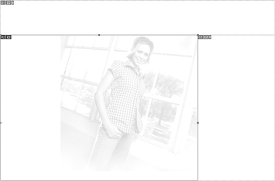
The background image can also be applied to the HTML, BODY rule and have its location controlled by the shorthand background rule: background: #ffffff url(images/bg-body-content.jpg) no-repeat 0px 98px;. The left (0px) and top (98px) properties at the end of the rule tell the background image where it should be displayed in relation to the top-left corner of the browser window.
Figure 9.10 shows what the image looks like when the <DIV> is added. Without content in the <DIV>, it would normally collapse and not show the background. The a5-body-content rule, however, has been assigned a height of 410px, which will guarantee that the entire image always shows, whether or not there is enough content included in the <DIV> to make it expand to its full height.
Figure 9.10
The page with the a5-body-content container added, which will not only contain the left and right columns, but will also display a background image.
© 2014 Cengage Learning.
Increasing Readability with a Margin
This rule is also assigned a margin-right property with the value of 15px. This is to ensure that eventually, when text is added to the center column, it will not touch the right side and make its readability more difficult.
Creating the Left Column
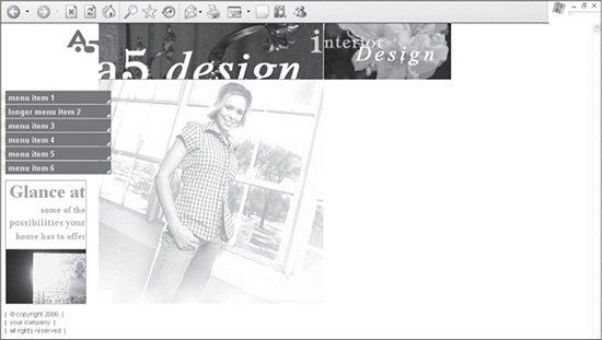
After the a5-body-content container has been added, the left column can be created. This column will contain the menu, the Glance At box, and the copyright areas. Listing 9.3 shows what the code looks like, which then displays the design, as shown in Figure 9.11.
Figure 9.11
The design with the left column added to the a5-body-content container.
© 2014 Cengage Learning.
New Code Is in Bold
The newly added code is bolded to differentiate it from the existing code that is being built upon in this case study.
Listing 9.3 Code for Figure 9.11
<!DOCTYPE html PUBLIC "-//W3C//DTD XHTML 1.0 Transitional//EN"
"DTD/xhtml1-transitional.dtd">
<html xmlns="http://www.w3.org/1999/xhtml" xml:lang="en"
lang="en"><head><title>Design 121</title>
<meta http-equiv="Content-Type" content="text/html;
charset=iso-8859-1" />
<style type="text/css">
/* ++++++++++ global general styles start ++++++++++*/
html, body {
margin:0px;
padding:0px;
font: 13px Arial, Helvetica, sans-serif;
color:#766D6D;
background:#ffffff;
}
/* ++++++++++ global general styles end ++++++++++*/
/* ++++++++++ global structure styles start ++++++++++*/
#a5-body-center {
text-align:left;
border:0px solid #000000;
}
#a5-body {
position: relative;
width: 770px; /* change this to a specific amount for a fixed
design or a relative amount if the design should expand to a percentage
of the screen. E.g., 770px or 100%, respectively. */
/* remove these comment tags if the page is to be centered. The ’text-
align’ property in the ’a5-body-center’ rule must also be changed
from ’left’ to ’center’
margin-left: auto;
margin-right: auto;*/
text-align:left;
padding-bottom:10px;
border:0px solid #000000;
}
/* ++++++++++ global structure styles end ++++++++++*/
#a5-header {
position:relative;
left:0px;
top:0px;
height:98px;
background:#000000;
}
#a5-header-left {
width:169px;
}
#a5-header-center {
position:absolute;
left:169px;
top:0px;
}
#a5-header-right {
position:absolute;
left:553px;
top:0px;
}
#a5-body-content {
position:relative;
background: #ffffff url(images/bg-body-content.jpg) no-repeat;
height:410px;
margin-right:15px;
border:0px solid #000000;
}
#a5-column-left {
position:absolute;
left:0px;
top:19px;
width:190px;
}
#a5-menu {
font:bold 13px Arial, Helvetica, sans-serif;
}
#a5-menu a {
display:block;
text-align:left;
line-height:23px;
vertical-align:50%;
padding-left:15px;
margin-bottom:1px;
text-decoration:none;
background: url(images/bg-menu-off.gif) no-repeat 0px 0px;
color:#E9F92C;
}
#a5-menu a:hover {
background: url(images/bg-menu-on.jpg) no-repeat 0px 0px;
margin-bottom:1px;
color:#E9F92C;
}
#a5-bottom-left-content {
width:136px;
font:bold 12pt times, garamond, serif;
line-height:26px;
text-align:right;
margin:9px 0px 0px 10px;
color:#DF9B05;
border:1px solid #999A8D;
}
#a5-copyright {
font-size:8pt;
padding:10px 50px 10px 10px;
color:#766D6D;
}
</style>
</head>
<body>
<div id="a5-body-center">
<div id="a5-body">
<!-- ###### header start ###### -->
<div id="a5-header">
<div><a href="index.htm"><img src="images/header-left.gif"
width="169" height="98" alt="" border="0" /></a></div>
<div id="a5-header-center"><img src="images/
header-center.jpg" width="384" height="98" alt=""
border="0" /></div>
<div id="a5-header-right"><img src="images/
header-right.jpg" width="217" height="98" alt=""
border="0" /></div>
</div>
<!-- ###### header end ###### -->
<!-- ###### body content start ###### -->
<div id="a5-body-content">
<div id="a5-column-left">
<div id="a5-menu">
<a href="index.htm">menu item 1</a>
<a href="menu-item-2.htm">longer menu item 2</a>
<a href="menu-item-3.htm">menu item 3</a>
<a href="index.htm">menu item 4</a>
<a href="index.htm">menu item 5</a>
<a href="index.htm">menu item 6</a>
</div>
<div id="a5-bottom-left-content">
<span style="font:bold 24pt times, garamond, serif;
">Glance at</span><br />
some of the<br />
<span style="font:bold 13pt times, garamond, serif;
">possibilities your</span><br />
house has to offer <div style="padding-top:10px;">
<a href="index.htm"><img src="images/
photo-bottom-left.jpg" width="136"
height="93" alt="" border="0" /></a></div>
</div>
<div id="a5-copyright">
| © copyright 2006
|<br />| your company |
<br />| all rights reserved
|
</div>
</div>
</div>
<!-- ###### body content start ###### -->
</div>
</div>
</body>
</html>
There are several things to note about the code in Listing 9.3:
The a5-column-left container is assigned absolute positioning. This guarantees that it will always be in the same location. The one disadvantage to absolute positioning is the a5-column-left container will fall outside the flow of the document, meaning it can end up vertically longer than the a5-column-left container. Fortunately, for this design, this would not be visible if that were the case because the column does not have a background color or image that the content needs to remain over.
The a5-menu container contains the menu items that are styled to enable easy mouseovers. The column is given a specific width to guarantee that the first element is positioned correctly in all browsers.
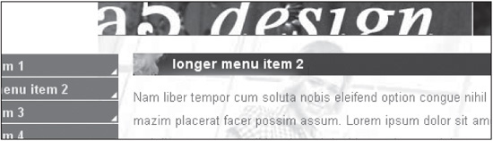
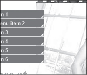
The a5-menu a descendant rule is used to display and style each menu item. The display property with the block value will output each item in the <DIV> is in its own row. The text is then left justified, assigning the text-align property a value of left. The line-height and vertical-align properties, which need to be used together for the vertical-align property to be interpreted, force the height of the menu item and how the text will be vertically aligned. The padding-left:15px; rule forces the menu items 15 pixels from the left so they do not fall on the circular image at the very left of the row. Because the menu is layered over the a5-body-content background image to the right, the margin-bottom:1px; rule is added to ensure that there is transparent spacing between the menu items so the layering effect is noticeable (see Figure 9.12).
Figure 9.12
The menu items are assigned a margin-bottom value of 1px to ensure that it is apparent that the menu is layered over the background image in the a5-body-content rule.
© 2014 Cengage Learning.
One of the most important properties of this rule is the shorthand background property, which assigns a background image to a hyperlink and thus an item in the menu. This property works in conjunction with the a5-menu a:hover rule, which changes the background image when the user mouses over a menu item, avoiding the need for JavaScript (see Figure 9.13).
Figure 9.13
Background image that is switched using the code background: url(images/bg-menu-on.jpg) no-repeat 0px 0px;.
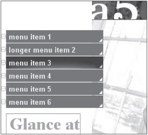
© 2014 Cengage Learning.
The a5-bottom-left-content rule is added to create a separate text section below the menu. It employs many of the properties already discussed in this chapter. What gives it a different appearance is that the border is turned on and given a different color. While default font styling is included in the rule, additional styling is used at a local level in the <DIV> tag to resize text, such as “Glance at.” The image in the container also is given local styling so that it has 10 pixels of padding between it and the text above it. If <DIV> tags are not added around the image, the border will not collapse around the image in some older browsers, such as IE 5, 5.5, and 6 browsers (see Figure 9.14).
The only unique thing to note about the a5-copyright rule is where it is placed. If either the left or right columns or <DIV> tags nested in them are assigned absolute positioning, then the copyright should probably not be included in a footer row across the bottom of the entire site; this is because if the text runs too long in these absolute-positioned <DIV> tags, they can extend below the footer, either over or under it.
Figure 9.14
An image in a container that will not allow the border to collapse around the bottom, in all browsers, unless additional <DIV> tags are added.
© 2014 Cengage Learning.
ADDING THE CENTER (RIGHT) COLUMN
At this stage, most of the coding has been accomplished for the homepage. The designer needs to add only a column to the right. Because this design could always be turned into a three-column design, the column to the right is called a5-column-center, leaving the possibility of naming a right column a5-column-right. Listing 9.4 shows the completed code for the homepage design, which is shown in Figure 9.15.
Figure 9.15
The completed design once the a5-column-right rule and content have been added.
© 2014 Cengage Learning.
New Code Is in Bold
The newly added code is bolded to differentiate it from the existing code that is being built upon in this case study.
Listing 9.4 Code for Figure 9.15
<!DOCTYPE html PUBLIC "-//W3C//DTD XHTML 1.0 Transitional//EN"
"DTD/xhtml1-transitional.dtd">
<html xmlns="http://www.w3.org/1999/xhtml" xml:lang="en"
lang="en"><head><title>Design 121</title>
<meta http-equiv="Content-Type" content="text/html;
charset=iso-8859-1" />
<style type="text/css">
/* ++++++++++ global general styles start ++++++++++*/
html, body {
margin:0px;
padding:0px;
font: 13px Arial, Helvetica, sans-serif;
color:#766D6D;
background:#ffffff;
}
/* ++++++++++ global general styles end ++++++++++*/
/* ++++++++++ global structure styles start ++++++++++*/
#a5-body-center {
text-align:left;
border:0px solid #000000;
}
#a5-body {
position: relative;
width: 770px; /* change this to a specific amount for a fixed
design or a relative amount if the design should expand to a percentage
of the screen. E.g., 770px or 100%, respectively. */
/* remove these comment tags if the page is to be centered. The
’text-align’ property in the ’a5-body-center’ rule must also be
changed from ’left’ to ’center’
margin-left: auto;
margin-right: auto;*/
text-align:left;
padding-bottom:10px;
border:0px solid #000000;
}
/* ++++++++++ global structure styles end ++++++++++*/
#a5-header {
position:relative;
left:0px;
top:0px;
height:98px;
background:#000000;
}
#a5-header-left {
width:169px;
}
#a5-header-center {
position:absolute;
left:169px;
top:0px;
}
#a5-header-right {
position:absolute;
left:553px;
top:0px;
}
#a5-body-content {
position:relative;
background: #ffffff url(images/bg-body-content.jpg) no-repeat;
height:410px;
margin-right:15px;
border:0px solid #000000;
}
#a5-column-left {
position:absolute;
left:0px;
top:19px;
width:190px;
}
#a5-menu {
font:bold 13px Arial, Helvetica, sans-serif;
}
#a5-menu a {
display:block;
text-align:left;
line-height:23px;
vertical-align: 50%;
padding-left:15px;
margin-bottom:1px;
text-decoration:none;
background: url(images/bg-menu-off.gif) no-repeat 0px 0px;
color:#E9F92C;
}
#a5-menu a:hover {
background: url(images/bg-menu-on.jpg) no-repeat 0px 0px;
margin-bottom:1px;
color:#E9F92C;
}
#a5-bottom-left-content {
width:136px;
font:bold 12pt times, garamond, serif;
line-height:26px;
text-align:right;
margin:9px 0px 0px 10px;
color:#DF9B05;
border:1px solid #999A8D;
}
#a5-copyright {
font-size: 8pt;
padding:10px 50px 10px 10px;
color:#766D6D;
}
#a5-column-center {
position:absolute;
left:190px;
top:0px;
line-height:18pt;
padding:24px 0px 0px 268px;
}
</style>
</head>
<body>
<div id="a5-body-center">
<div id="a5-body">
<!-- ###### header start ###### -->
<div id="a5-header">
<div><a href="index.htm"><img src="images/header-left.gif"
width="169" height="98" alt="" border="0" /></a></div>
<div id="a5-header-center"><img src="images/
header-center.jpg" width="384" height="98" alt=""
border="0" /></div>
<div id="a5-header-right"><img src="images/
header-right.jpg" width="217" height="98" alt=""
border="0" /></div>
</div>
<!-- ###### header end ###### -->
<!-- ###### body content start ###### -->
<div id="a5-body-content">
<div id="a5-column-left">
<div id="a5-menu">
<a href="index.htm">menu item 1</a>
<a href="menu-item-2.htm">longer menu item 2</a>
<a href="menu-item-3.htm">menu item 3</a>
<a href="index.htm">menu item 4</a>
<a href="index.htm">menu item 5</a>
<a href="index.htm">menu item 6</a>
</div>
<div id="a5-bottom-left-content">
<span style="font:bold 24pt times, garamond,
serif;">Glance at</span><br />
some of the<br />
<span style="font:bold 13pt times, garamond,
serif;">possibilities your</span><br />
house has to offer
<div style="padding-top:10px;"><a href="index.htm">
<img src="images/photo-bottom-left.jpg"
width="136" height="93" alt="" border="0" /></a></div>
</div>
<div id="a5-copyright">
| © copyright 2006 |<br />|
your company |<br />|
all rights reserved |
</div>
</div>
<div id="a5-column-center">
<span class="color1text18">Duis autem vel eum iriure
dolor in hendrerit in vulputate velit esse
malestie consequat,</span> vel illum dolore eu
feugiat nulla facilisis at vero eros et
accumsan et iusto odio.<br /><br />
Labore et dolore magna aliquyam erat, sed diam voluptua. At vero eos et
accusam et justo duo dolores et ea rebum. <span style="float:left;
padding:10px; margin-left:-86px;"><a href="index.htm"><img src=
"images/photo-center-middle.gif" width="199" height="117" alt=""
border="0" /></a></span>Stet clita kasd gubergren, no sea takimata
sanctus est Lorem ipsum dolor sit amet. Nam liber tempor cum
soluta nobis eleifend option nihil imperdiet doming id quod congue
nihil imperdiet doming id quod mazim placerat facer | <a href=
"index.htm">READ MORE</a>
</div>
</div>
<!-- ###### body content start ###### -->
</div>
</div>
</body>
</html>
There are several things to note about the code in Listing 9.4:
Only one rule is added to style the right column: a5-column-center. It is given absolute positioning to ensure that the content does not fill the full width of the remaining screen. If the design were a liquid design, relative positioning would be the desired value.
The <DIV> tag uses the left property to position the text 190 pixels from the left.
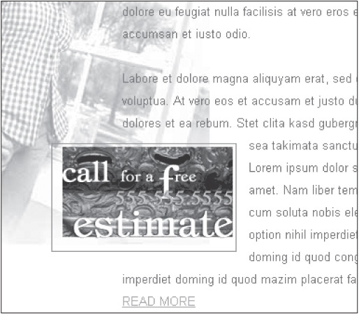
The “call for a free estimate” image included in the container’s text is assigned a local style that floats it to the left. The image is then assigned a margin-left property with the value of -86px. This forces the image to the left, partially outside the text flow (see Figure 9.16).
Figure 9.16
The design with the “call for a free estimate” image forced to the left, outside the main content flow.
© 2014 Cengage Learning.
This is where the transparency of the image between the border and the main part of the image becomes useful. This image can be added wherever the designer chooses within the content area. This is possible because the area between the border and the main part of the image will show the actual area over which it is layered.
CONSTRUCTING SECOND-LEVEL PAGES
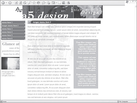
A portion of the homepage design can be reused many times with other pages to maintain consistency and to limit the additional download necessary for second-level pages. (That is, the user’s browser can cache certain images so they do not have to be downloaded again, making the page load faster.) When developing CSS sites, this process is much cleaner than with XHTML tables that can include many nested tables. Listing 9.5 shows the code used to create a second-level page after it has been customized from the homepage (see Figure 9.17).
Figure 9.17
A second-level page of the site constructed from the homepage design and code.

© 2014 Cengage Learning.
New Code Is in Bold
The newly added code is bolded to differentiate it from the existing code that is being built upon in this case study.
Listing 9.5 Code for Figure 9.17
<!DOCTYPE html PUBLIC "-//W3C//DTD XHTML 1.0 Transitional//EN"
"DTD/xhtml1-transitional.dtd">
<html xmlns="http://www.w3.org/1999/xhtml" xml:lang="en"
lang="en"><head><title>Design 121</title>
<meta http-equiv="Content-Type" content="text/html;
charset=iso-8859-1" />
<style type="text/css">
/* ++++++++++ global general styles start ++++++++++*/
html, body {
margin:0px;
padding:0px;
font: 13px Arial, Helvetica, sans-serif;
color:#766D6D;
background:#ffffff;
}
a:link { color:#CB951D; }
a:visited { color:#A8B32D; }
a:active { color:#A8B32D; }
a:hover { color:#000000; }
.color1text18 {
font-family: arial, geneva, sans-serif;
font-size: 18pt;
color: #A8B32D;
}
/* ++++++++++ global general styles end ++++++++++*/
/* ++++++++++ global structure styles start ++++++++++*/
#a5-body-center {
text-align:left;
}
#a5-body {
position: relative;
width: 770px; /* change this to a specific amount for a fixed
design or a relative amount if the design should expand to a percentage
of the screen. E.g., 770px or 100%, respectively. */
/* remove these comment tags if the page is to be centered. The
’text-align’ property in the ’a5-body-center’ rule must also be
changed from ’left’ to ’center’
margin-left: auto;
margin-right: auto;*/
text-align:left;
padding-bottom:10px;
border:0px solid #000000;
}
#a5-header {
position:relative;
left:0px;
top:0px;
height:98px;
border:0px solid #000000;
}
#a5-header-center {
position:absolute;
left:169px;
top:0px;
}
#a5-header-right {
position:absolute;
left:553px;
top:0px;
}
#a5-body-content {
position:relative;
background: #ffffff url(images/bg-body-content.jpg) no-repeat;
height:410px;
margin-right:15px;
border:0px solid #000000;
}
#a5-column-left {
position:absolute;
left:0px;
top:19px;
width:190px;
}
#a5-menu {
font:bold 13px Arial, Helvetica, sans-serif;
}
#a5-menu a {
display:block;
text-align:left;
line-height:23px;
vertical-align:50%;
padding-left:15px;
margin-bottom:1px;
text-decoration:none;
background: url(images/bg-menu-off.gif) no-repeat 0px 0px;
color:#E9F92C;
}
#a5-menu a:hover {
background: url(images/bg-menu-on.jpg) no-repeat 0px 0px;
margin-bottom:1px;
color:#E9F92C;
}
#a5-bottom-left-content {
width:136px;
font:bold 12pt times, garamond, serif;
line-height:26px;
text-align:right;
margin:9px 0px 0px 10px;
color:#DF9B05;
border:1px solid #999A8D;
}
#a5-copyright {
font-size: 8pt;
padding:10px 50px 10px 10px;
color:#766D6D;
}
#a5-column-center {
position:absolute;
left:190px;
top:0px;
line-height:18pt;
padding:24px 0px 0px 268px;
}
/* ++++++++++ global structure styles end ++++++++++*/
/* ++++++++++ second level start ++++++++++*/
#a5-body-content-sl {
position:relative;
background: #ffffff url(images/bg-body-content-sl.jpg) no-repeat;
height:410px;
margin-right:15px;
border:0px solid #000000;
}
#a5-column-center-sl {
position:absolute;
left:190px;
top:0px;
line-height:18pt;
padding:18px 0px 0px 18px;
}
#a5-sl-title {
height:24px;
font:bold 14px Arial, Helvetica, sans-serif;
background:#4E2124 url(images/bg-title.jpg) no-repeat
left top;
color:#ffffff;
padding:3px 0px 0px 40px;
margin-bottom:10px;
border:0px solid #000000;
voice-family:""}"";
voice-family:inherit;
height:20px;
}
html>body #a5-sl-title {
height:20px;
}
/* ++++++++++ second level end ++++++++++*/
</style>
</head>
<body>
<div id="a5-body-center">
<div id="a5-body">
<!-- ###### header start ###### -->
<div id="a5-header">
<div><a href="index.htm"><img src="images/header-left.gif"
width="169" height="98" alt="" border="0" /></a></div>
<div id="a5-header-center"><img src="images/
header-center.jpg" width="384" height="98" alt=""
border="0" /></div>
<div id="a5-header-right"><img src="images/
header-right.jpg" width="217" height="98" alt=""
border="0" /></div>
</div>
<!-- ###### header end ###### -->
<!-- ###### body content start ###### -->
<div id="a5-body-content-sl">
<div id="a5-column-left">
<div id="a5-menu">
<a href="index.htm">menu item 1</a>
<a href="menu-item-2.htm">longer menu item 2</a>
<a href="menu-item-3.htm">menu item 3</a>
<a href="index.htm">menu item 4</a>
<a href="index.htm">menu item 5</a>
<a href="index.htm">menu item 6</a>
</div>
<div id="a5-bottom-left-content">
<span style="font:bold 24pt times, garamond,
serif;">Glance at</span><br />
some of the<br />
<span style="font:bold 13pt times, garamond,
serif;">possibilities your</span><br />
house has to offer
<div style="padding-top:10px;"><a href="index.htm">
<img src="images/photo-bottom-left.jpg"
width="136" height="93" alt="" border="0"
/></a></div>
</div>
<div id="a5-copyright">
| © copyright 2006
|<br />| your company |
<br />| all rights reserved
|
</div>
</div>
<div id="a5-column-center-sl">
<!-- ###### title start ###### -->
<div id="a5-sl-title">longer menu item 2</div>
<!-- ###### title end ###### -->
Nam liber tempor cum soluta nobis eleifend option
congue nihil imperdiet doming id quod mazim
placerat facer possim assum. Lorem ipsum dolor sit
amet, consectetuer adipiscing elit, sed diam
nonummy nibh euismod tincidunt ut laoreet dolore
magna aliquam erat volutpat. Ut wisi enim ad minim
veniam, quis nostrud exerci tation ullamcorper
suscipit lobortis nisl ut aliquip ex ea commodo
consequat.
<br /><br />
Duis autem vel eum iriure dolor in hendrerit in vulputate velit esse molestie
consequat, vel illum dolore eu feugiat nulla facilisis.
<br /><br />
At vero eos et accusam et justo duo dolores et ea rebum. Stet clita kasd gubergren,
no sea takimata sanctus est Lorem ipsum dolor sit amet. Lorem ipsum dolor sit amet,
consetetur sadipscing elitr, sed diam nonumy eirmod tempor invidunt ut labore et
dolore magna aliquyam erat, sed diam voluptua. At vero eos et accusam et justo duo
dolores et ea rebum. Stet clita kasd gubergren, no sea takimata sanctus est Lorem
ipsum dolor sit amet. Lorem ipsum dolor sit amet, consetetur sadipscing elitr, At
accusam aliquyam diam diam dolore dolores duo eirmod eos erat, et nonumy sed tempor
et et invidunt justo labore Stet clita ea et gubergren, kasd magna no rebum. Sanctus
sea sed takimata ut vero voluptua. est Lorem ipsum
</div>
</div>
<!-- ###### body content end ###### -->
</div>
</div>
</body>
</html>
There are several things to note about the code in Listing 9.5:
The a5-body-content container is renamed a5-body-content-sl because it uses a different background image for the second-level pages that is lightened to help make the text more visible on the pages where it is layered over the woman. The a5-body-content-sl rule then calls this new image.
The margin-right:15px; code, as on the homepage, ensures that the text will never touch the right side of the browser window if it is a liquid design that expands to the full width of the screen.
The a5-sl-title rule is added to allow the designer to place a title on every page so the user knows which page is selected. The main thing to note about this code is that because the container is given padding, the Tantek hack is used so the height of the row is the same in the tested browsers, which included IE 5 and 5.5 for this design. A margin-bottom value of 10px is also added to provide space between the title area and the text for that page. It should be noted that this code is no longer necessary, so it can easily be deleted, and the rule modified. It is included in here because it is still included with older templates included with this book.
Adding a Floating Container for Additional Content
In the case study designs in Chapters 10, 11, 12, and 13, a third column is added to allow for more layout options. In this design, however, a new <DIV> is merely added and floated to the right side of the text to allow for similar functionality. Figure 9.18 illustrates what the new code (outlined in Listing 9.6) will look like.
Figure 9.18
A right text block area is added to second-level pages to allow for more layout possibilities.
© 2014 Cengage Learning.
New Code Is in Bold
The newly added code is bolded to differentiate it from the existing code that is being built upon in this case study.
Listing 9.6 Code for Figure 9.18
<!DOCTYPE html PUBLIC "-//W3C//DTD XHTML 1.0 Transitional//EN"
"DTD/xhtml1-transitional.dtd">
<html xmlns="http://www.w3.org/1999/xhtml" xml:lang="en"
lang="en"><head><title>Design 121</title>
<meta http-equiv="Content-Type" content="text/html;
charset=iso-8859-1" />
<style type="text/css">
/* ++++++++++ global general styles start ++++++++++*/
html, body {
margin:0px;
padding:0px;
font: 13px Arial, Helvetica, sans-serif;
color:#766D6D;
background:#ffffff;
}
a:link { color:#CB951D; }
a:visited { color:#A8B32D; }
a:active { color:#A8B32D; }
a:hover { color:#000000; }
.color1text18 {
font-family: arial, geneva, sans-serif;
font-size: 18pt;
color: #A8B32D;
}
/* ++++++++++ global general styles end ++++++++++*/
/* ++++++++++ global structure styles start ++++++++++*/
#a5-body-center {
text-align:left;
}
#a5-body {
position: relative;
width: 770px; /* change this to a specific amount for a fixed
design or a relative amount if the design should expand to a percentage
of the screen. E.g., 770px or 100%, respectively. */
/* remove these comment tags if the page is to be centered. The
’text-align’ property in the ’a5-body-center’ rule must also be
changed from ’left’ to ’center’
margin-left: auto;
margin-right: auto;*/
text-align:left;
padding-bottom:10px;
border:0px solid #000000;
}
#a5-header {
position:relative;
left:0px;
top:0px;
height:98px;
border:0px solid #000000;
}
#a5-header-center {
position:absolute;
left:169px;
top:0px;
}
#a5-header-right {
position:absolute;
left:553px;
top:0px;
}
#a5-body-content {
position:relative;
background: #ffffff url(images/bg-body-content.jpg) no-repeat;
height:410px;
margin-right:15px;
border:0px solid #000000;
}
#a5-column-left {
position:absolute;
left:0px;
top:19px;
width:190px;
}
#a5-menu {
font:bold 13px Arial, Helvetica, sans-serif;
}
#a5-menu a {
display:block;
text-align:left;
line-height:23px;
vertical-align:50%;
padding-left:15px;
margin-bottom:1px;
text-decoration:none;
background: url(images/bg-menu-off.gif) no-repeat 0px 0px;
color:#E9F92C;
}
#a5-menu a:hover {
background: url(images/bg-menu-on.jpg) no-repeat 0px 0px;
margin-bottom:1px;
color:#E9F92C;
}
#a5-bottom-left-content {
width:136px;
font:bold 12pt times, garamond, serif;
line-height:26px;
text-align:right;
margin:9px 0px 0px 10px;
color:#DF9B05;
border:1px solid #999A8D;
}
#a5-copyright {
font-size: 8pt;
padding:10px 50px 10px 10px;
color:#766D6D;
}
#a5-column-center {
position:absolute;
left:190px;
top:0px;
line-height:18pt;
padding:24px 0px 0px 268px;
}
/* ++++++++++ global structure styles end ++++++++++*/
/* ++++++++++ second level start ++++++++++*/
#a5-body-content-sl {
position:relative;
background: #ffffff url(images/bg-body-content-sl.jpg) no-repeat;
height:410px;
margin-right:15px;
border:0px solid #000000;
}
#a5-column-center-sl {
position:absolute;
left:190px;
top:0px;
line-height:18pt;
padding:18px 0px 0px 18px;
}
#a5-sl-title {
height:24px;
font:bold 14px Arial, Helvetica, sans-serif;
background:#4E2124 url(images/bg-title.jpg) no-repeat
left top;
color:#ffffff;
padding:3px 0px 0px 40px;
margin-bottom:10px;
border:0px solid #000000;
voice-family:""}"";
voice-family:inherit;
height:20px;
}
html>body #a5-sl-title {
height:20px;
}
#a5-content-right-sl {
float:right;
width:182px;
font:bold 12pt times, garamond, serif;
line-height:16px;
text-align:right;
padding:15px;
margin:10px 10px 10px 15px;
color:#ffffff;
border:1px solid #999A8D;
background:#C1C96A;
voice-family:""}"";
voice-family:inherit;
width:150px;
}
html>body #a5-content-right-sl {
width:150px;
}
/* ++++++++++ second level end ++++++++++*/
</style>
</head>
<body>
<div id="a5-body-center">
<div id="a5-body">
<!-- ###### header start ###### -->
<div id="a5-header">
<div><a href="index.htm"><img src="images/header-left.gif"
width="169" height="98" alt="" border="0" /></a></div>
<div id="a5-header-center"><img src="images/
header-center.jpg" width="384" height="98" alt=""
border="0" /></div>
<div id="a5-header-right"><img src="images/
header-right.jpg" width="217" height="98" alt=""
border="0" /></div>
</div>
<!-- ###### header end ###### -->
<!-- ###### body content start ###### -->
<div id="a5-body-content-sl">
<div id="a5-column-left">
<div id="a5-menu">
<a href="index.htm">menu item 1</a>
<a href="menu-item-2.htm">longer menu item 2</a>
<a href="menu-item-3.htm">menu item 3</a>
<a href="index.htm">menu item 4</a>
<a href="index.htm">menu item 5</a>
<a href="index.htm">menu item 6</a>
</div>
<div id="a5-bottom-left-content">
<span style="font:bold 24pt times, garamond,
serif;">Glance at</span><br />
some of the<br />
<span style="font:bold 13pt times, garamond,
serif;">possibilities your</span><br />
house has to offer
<div style="padding-top:10px;"><a href="index.htm">
<img src="images/photo-bottom-left.jpg"
width="136" height="93" alt="" border="0"
/></a></div>
</div>
<div id="a5-copyright">
| © copyright 2006 |
<br />| your company |
<br />| all rights reserved
|
</div>
</div>
<div id="a5-column-center-sl">
<!-- ###### title start ###### -->
<div id="a5-sl-title">longer menu item 2</div>
<!-- ###### title end ###### -->
Nam liber tempor cum soluta nobis eleifend option
congue nihil imperdiet doming id quod mazim
placerat facer possim assum. Lorem ipsum dolor sit
amet, consectetuer adipiscing elit, sed diam
nonummy nibh euismod tincidunt ut laoreet dolore
magna aliquam erat volutpat. Ut wisi enim ad minim
<div id="a5-content-right-sl">Nam liber tempor cum
soluta nobis eleifend option congue nihil imperdiet
doming id quod mazim placerat facer possim assum.
<br /><br />Duis autem vel eum iriure dolor in
hendrerit in vulputate velit esse molestie
consequat, vel illum dolore eu feugiat nulla
facilisis.<br /><br />Nam liber tempor cum soluta
nobis eleifend option congue nihil imperdiet doming
id quod mazim placerat facer possim assum.</div>
veniam, quis nostrud exerci tation ullamcorper
suscipit lobortis nisl ut aliquip ex ea commodo
consequat.
<br /><br />
Duis aut em vel eum iriure dolor in hendrerit in vulputate velit esse molestie
consequat, vel illum dolore eu feugiat nulla facilisis.
<br /><br />
At vero eos et accusam et justo duo dolores et ea rebum. Stet clita kasd gubergren,
no sea takimata sanctus est Lorem ipsum dolor sit amet. Lorem ipsum dolor sit amet,
consetetur sadipscing elitr, sed diam nonumy eirmod tempor invidunt ut labore et
dolore magna aliquyam erat, sed diam voluptua. At vero eos et accusam et justo duo
dolores et ea rebum. Stet clita kasd gubergren, no sea takimata sanctus est Lorem
ipsum dolor sit amet. Lorem ipsum dolor sit amet, consetetur sadipscing elitr, At
accusam aliquyam diam diam dolore dolores duo eirmod eos erat, et nonumy sed tempor et
et invidunt justo labore Stet clita ea et gubergren, kasd magna no rebum. Sanctus sea
sed takimata ut vero voluptua. est Lorem ipsum
</div>
</div>
<!-- ###### body content end ###### -->
</div>
</div>
</body>
</html>
There is one key thing to note about the code in Listing 9.6:
The a5-content-right-sl rule uses the Tantek hack to ensure that the width is the same among all tested browsers. While none of the CSS is new at this point in the design, floating a <DIV> in the text can have varied results. Depending on where the container is included in the text, various browsers will render the line wraps and the line height (at least for one or two lines) differently. The designer should definitely test pages that use this layout technique.
SUMMARY
The design built in this chapter is a two-column layout that allows for including a floating <DIV> area on second-level pages. The chapter explains how the design could work as a liquid design or as a fixed design. Other techniques, such as using switching background images for mouseovers, mortising images, and using transparent PNGs or GIFs in a layout, are discussed. While a designer may not follow this exact coding method, all the techniques can be applied independently when creating other designs.