
CHAPTER 13
CASE STUDY: BACKGROUND-BASED DESIGN
Another method that allows a designer to be creative is to base a design largely around a background image. With such a design, the majority of graphical elements are included with the image itself. The main disadvantage to such a design is that the background image can be a larger download size. The advantage to this method is that the designer has more flexibility in terms of creating imagery and a layout that isn’t limited as much by XHTML or CSS. Another advantage is that a designer can create designs that can have their look and feel easily modified by replacing only one image, whether on the homepage or on second-level pages.
The design in this chapter is not only used to create a mood with the graphics, but the homepage image also provides for the boxes in which to place the content. The downside to this design is that the sections are not scalable. In other words, if the client wants to expand the content, the imagery, along with the XHTML and CSS, would need to be modified so that the text did not flow outside of the boxes. The upside is the boxes can look much more attractive because the designer isn’t constricted as much by having to use various images, such as background or nested images, to create the look and feel.
This design structure isn’t robust or flexible enough for many sites. There are, however, an increasing number of clients who request that their sites use large, powerful graphics to communicate, rather than relying just on text. For clients such as these, this type of design may very well satisfy their needs.
Background Image Can Have Everything Layered Over It
The use of background image designs is not limited to the technique used in this chapter. Another possibility is to simply place a background image in the page and to layer images and text over it. The graphical elements can have their opacity changed so they appear somewhat transparent, and thus a part of the image. But, even better, the design can also use 24-bit PNG images over it, which allows for very clean transparent images over the background image. This not only allows for the layered images to be easily replaced, but the background image can also be easily replaced without affecting the layered elements.
Design 141 Example
The design explained in this chapter is design 141 online (photo credits: www.ronsternimages.com and www.a5design.com).
UNDERSTANDING THE DESIGN’S STRUCTURE
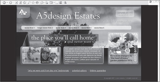
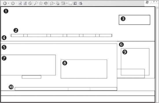
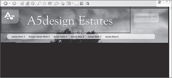
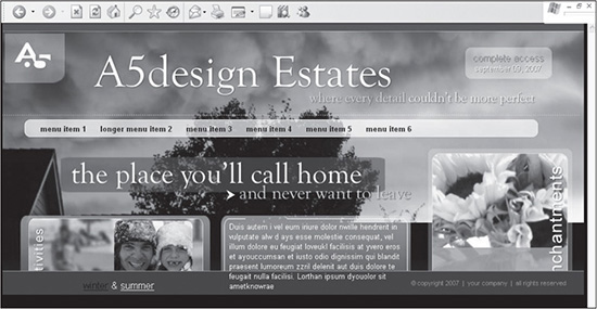
Figure 13.1 represents the background-based design explained in this chapter. Unlike the previous case studies in this book, the homepage of this design not only uses a background image for the majority of the imagery of the design, but it also uses fixed boxes for the content. Because the boxes are not scalable, the text inside them has absolute positioning assigned to it. Normally, such positioning might be a problem because it does not adhere to document flow, which can change how the text in other areas relates to increased or decreased content.
The majority of the text is still provided as XHTML text so that search engines can read it. Because most elements of the imagery, including photos layered over photos and the larger text, are part of the background image, the user will not be able to click on them. This is why another design trick is employed. Spacer GIFs, friend of the table-based designer, are sized, positioned, and hyperlinked accordingly over the areas of the design that need to be clickable. It’s similar to the older method of creating “hot spots” with image mapping.
Figure 13.1
The background-based design explained in this chapter.
© 2014 Cengage Learning.
Reasoning Behind Guides and the Creating of Slices in the Photoshop File
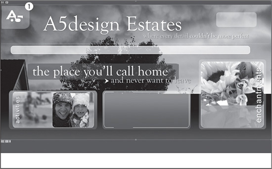
There is only one slice used for the homepage file of the design and two slices used for the secondary page design. Slice number 1 in Figure 13.2 illustrates the file that is used to provide the homepage images.
The goal of this design is to create a more graphically advanced design than with the designs in the previous case studies. To attain this for the current site, the design uses transparent images and curved corners coupled with various layered images. While much of this design could be accomplished using techniques explained previously in this book, a more simple design structure was used to provide the reader with another possibility.
Figure 13.2
The only slice, identified by number 1, that is used to build the homepage design.
© 2014 Cengage Learning.
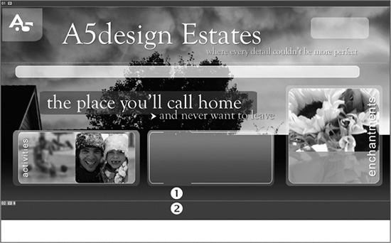
The one thing to note about Figure 13.2, other than there is only one slice, is that the bottom of the design uses a gradation that eventually turns into the color that is used for the background color of the design. This layout method allows the designer to simply set the background color of the page, identified by number 2 in Figure 13.3, to coincide with the color that is set just before the bottom of the slice is reached, identified by number 1 in the same figure.
Figure 13.3
The colors on both sides of the bottom of the slice, represented by numbers 1 and 2, are designed to be the same color, providing a seamless transition of images.
© 2014 Cengage Learning.
Figure 13.4
The blending technique used for the homepage in Figure 13.3 is employed exactly the same way for the second-level design.
© 2014 Cengage Learning.
This method of blending colors of an image into the background color is also used for the secondary page. Figure 13.4 shows how the colors were blended into the black below the trees, number 1, with the background color of the page, number 2.
The other slice to note in the secondary-level page (see Figure 13.4) is just to the left of number 3. This slice is used as a background image for the page title <DIV>.
Understanding the Placement of CSS Containers
There are 18 <DIV> tags that are used to create the homepage layout of this design. Many of them serve the same basic purpose for the structure of the site, as they do in the case study in Chapter 12. The thing to note about this design is that the majority of them are assigned absolute positioning.
Following are explanations of the 10 most useful containers, shown in Figure 13.5:
 The
The <DIV> tag to the top left of number 1 is used for centering the design in IE 5 and 5.5. It also represents the top-left corner of the a5-body container that is used to control, among other things, the width of the design. Number 1 also points out where the “complete access” code is included for the top-right portion of the design.
Number 2 is placed right above the a5-menu-box <DIV> it represents. This container not only controls the absolute placement of the menu, but it also includes a <DIV>, a5-menu, that is nested inside to provide the style for each menu item.
The top-right <DIV> tag, a5-header-right, is illustrated by the number 3. This is a fixed area that is used for the login area of the site.
Number 4 represents the header <DIV>, which contains the <DIV> tags that are illustrated by numbers 2 and 3.
The top-left corner of the left column begins at number 5.
Number 6 represents the right column of the design.
Number 7 shows the container that includes the hyperlinked spacer.gif and “winter & summer” text in the left column. This container, as well as the ones used for the center column content (represented by number 8) and the right column content (represented by number 9), are assigned absolute positioning.
The bottom text area is positioned using the <DIV> to the right of number 10.
Figure 13.5
Ten of the most important containers used to build the design.
© 2014 Cengage Learning.
BUILDING THE STRUCTURE
Following are the steps for building the design. It is assumed that the Photoshop file has already been created or customized and the designer just needs to position the images and text.
Creating the XHTML and CSS Framework
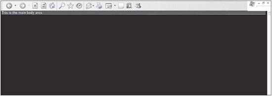
The first step in building the design is to create the XHTML framework and initial CSS containers. Listing 13.1 is the code that is used to output the page shown in Figure 13.6.
Figure 13.6
Basic XHTML and CSS framework for the design.
© 2014 Cengage Learning.
Listing 13.1 Code for Figure 13.6
<!DOCTYPE html PUBLIC "-//W3C//DTD XHTML 1.0 Transitional//EN"
DTD/xhtml1-transitional.dtd">
<html xmlns="http://www.w3.org/1999/xhtml" xml:lang="en"
lang="en"><head><title></title>
<meta http-equiv="Content-Type" content="text/html; charset=iso-8859-1" />
<style type="text/css">
  /* ++++++++++ global general styles start ++++++++++*/
  html, body {
    margin:0px;
    padding:0px;
    font:10pt arial, helvetica, sans-serif;
    background:#000000;
    color:#ffffff;
    }
  /* ++++++++++ global general styles end ++++++++++*/
  /* ++++++++++ global structure styles start ++++++++++*/
  #a5-body-center {
    text-align:center;
    }
  #a5-body {
    position:relative;
    width:1000px;
    margin-left:auto;
    margin-right:auto;
    text-align:left;
    background:#6A4203 url(images/bg-body.jpg) no-repeat;
    border:0px solid #ffffff;
    }

  /* ++++++++++ global structure styles end ++++++++++*/
</style>
</head>
<body>
<div id="a5-body-center">
  <div id="a5-body">
  This is the main body area.
  </div>
</div>
</body>
</html>
There are several things to note about the code in Listing 13.1:
The CSS style sheet is commented into two sections. The global general styles comment tags contain the general styles, such as the formatting of the <HTML> and <BODY> tags, hyperlinks, and fonts. The global structure styles comment tags include the styles used to define the structure of the design and elements included in that structure.
Several rules define the <HTML> and <BODY> tags. The margin and padding properties are used to ensure that the design is placed in the very top-left corner of the browser, with no space between the design and the edges. The default font style for the site is set using the shorthand FONT property. Defining the default font color is accomplished with the COLOR property. The background color also is assigned to ensure that all browsers display the same color, which is not always the case.
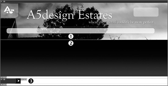
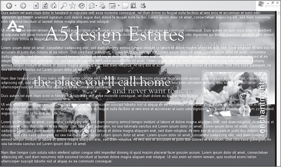
How this design differs from the others is that the majority of graphical elements are created using the background image. This image, bg-body.jpg, is declared in the a5-body rule. Figure 13.7 illustrates that when more content is added to the design, this image will begin to appear. The background color of #6A4203 also is added to the rule. This is the color that is at the bottom of the bg-body.jpg image, which enables the two to blend into each other.
The a5-body-center and a5-body rules are used to center the design in the browser window and to give it a fixed width of 1,000 pixels. If the designer wants to fill the full width of the screen for higher resolutions, the value of 1000px needs to be changed to 100%. If, however, the designer wants to simply justify the design to the left, the value of the text-align property in the a5-body-center rule needs to be changed from center to left. The margin-left and margin-right properties in the a5-body rule ensure that the extra white space is split evenly on both sides.
Figure 13.7
When content is added to the base code, the background image will begin to appear.
© 2014 Cengage Learning.
Adding the Header Area to the Framework
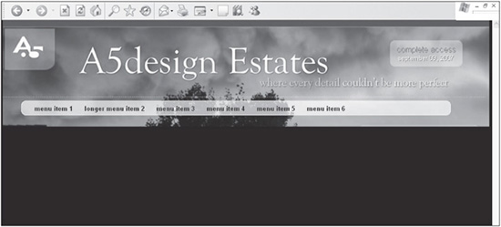
Depending on the design, the header area is usually the first area of content that needs to be added. This is certainly true for this case study. The header area not only contains the menu and the code for the login area, but it also takes up 220 pixels of vertical space with the design. Figure 13.8 shows the design with the header content, XHTML, and CSS added, which is included in Listing 13.2.
Figure 13.8
The design with the header content, XHTML, and CSS added.
© 2014 Cengage Learning.
The newly added code is bolded to differentiate it from the existing code that is being built upon in this case study.
Listing 13.2 Code for Figure 13.8
<!DOCTYPE html PUBLIC "-//W3C//DTD XHTML 1.0 Transitional//EN" "DTD/xhtml1-
transitional.dtd">
<html xmlns="http://www.w3.org/1999/xhtml" xml:lang="en"
lang="en"><head><title></title>
<meta http-equiv="Content-Type" content="text/html; charset=iso-8859-1" />
<style type="text/css">
/* ++++++++++ global general styles start ++++++++++*/
html, body {
margin:0px;
padding:0px;
font:10pt arial, helvetica, sans-serif;
background:#000000;
color:#ffffff;
}
a:link { text-decoration:none;color:#FF8037; }
a:visited { text-decoration:none;color:#FF8037; }
a:active { text-decoration:none;color:#FF8037; }
a:hover { text-decoration:underline;color:#ffffff; }
.color-1-text-10 {
font: 10pt arial, helvetica, sans-serif;
color: #ffffff;
}
.color-1-text-10 {
font: 10pt arial, helvetica, sans-serif;
color: #ffffff;
}
.color-1-text-13 {
font: 13pt arial, helvetica, sans-serif;
color: #ffffff;
}
.color-2-text-10 {
font: 10pt arial, helvetica, sans-serif;
olor: #92684B;
}
.color-2-text-13 {
font: 13pt arial, helvetica, sans-serif;
color: #92684B;
}
.color-3-text-8 {
font: 8pt arial, helvetica, sans-serif;
color: #A48B65;
}
.color-4-text-12 {
font: 12pt arial, helvetica, sans-serif;
color: #000000;
}
/* ++++++++++ global general styles end ++++++++++*/
/* ++++++++++ global structure styles start ++++++++++*/
#a5-body-center {
text-align:center;
}
#a5-body {
position:relative;
width:1000px;
margin-left:auto;
margin-right:auto;
text-align:left;
background:#6A4203 url(images/bg-body.jpg) no-repeat;
border:0px solid #ffffff;
}
#a5-header {
position:relative;
left:0px;
top:0px;
height:220px;
border:0px solid #000000;
}
#a5-header-right {
position:absolute;
top:52px;
right:30px;
height:60px;
width:200px;
text-align:center;
border:0px solid #000000;
}
#a5-header-right-bg {
position:absolute;
top:53px;
right:29px;
height:60px;
width:200px;
text-align:center;
border:0px solid #000000;
}
#a5-menu-box {
position:absolute;
top:175px;
left:65px;
line-height:40px;
vertical-align:50%;
color:#ffffff;
font:bold 10pt arial, helvetica, sans-serif;
border:0px solid #000000;
}
#a5-menu a {
display:inline;
text-decoration:none;
color:#030303;
}
#a5-menu a:hover {
text-decoration:underline;
color:#97370C;
}
/* ++++++++++ global structure styles end ++++++++++*/
</style>
</head>
<body>
<div id="a5-body-center">
<div id="a5-body">
<!-- # # # # # # header start # # # # # # -->
<div id="a5-header">
<div><a href="index.htm"><img src="images/spacer.gif"
width="770" height="157" alt="" border="0" /></a></div>
<div id="a5-header-right-bg" class="color-3-text-13">complete
access<br /><span class="color-3-text-10">september 09, 2007</span></div>
<div id="a5-header-right" class="color-1-text-13"><a
href="index.htm">complete access</a><br /><span class="color-1-text-
10">september 09, 2007</span></div>
<!-- # # # # # # menu start # # # # # # -->
<div id="a5-menu-box">
<div id="a5-menu">
<a href="index.htm">menu item 1</a>
<a href="menu-item-2.htm">longer menu item 2</a>
<a href="menu-item-3.htm">menu item 3</a>
<a href="menu-item-4.htm">menu item 4</a>
<a href="index.htm">menu item 5</a>
<a href="index.htm">menu item 6</a>
</div>
</div>
<!-- # # # # # # menu end # # # # # # -->
</div>
<!-- # # # # # # header end # # # # # # -->
</div>
</div>
</body>
</html>
There are several things to note about the code in Listing 13.2:
The basic hyperlink rules have been added to the design. These are used to style the “complete access” text in the top-right corner. They are also used to hyperlink the spacer.gif, which is the first of several such images that are layered over their respective visual elements in the background image. This method allows the designer to create more attractive and integrated graphics elements, while also enabling them to be hyperlinked easily. Figure 13.9 shows the header area with the spacer.gif layered over the area. The border of the image has been turned on and set to 2px to show how it’s positioned in the code.
Figure 13.9
The header area with a spacer.gif layered over the title area, which enables the designer to hyperlink the area.
© 2014 Cengage Learning.
The “complete access september 9, 2007” text and code in the top-right corner is duplicated so it can be layered on top of itself. This enables the designer to create an XHTML-based drop shadow and removes the need to create an image that not only takes more time to create and implement, but also isn’t search-engine and text-reader friendly. Both the a5-header-right and a5-header-right-bg styles that are used to create these duplicate styles are assigned absolute positioning. The latter moves the lower layer to the right and down 1 pixel. The important thing to note is the way that browsers position the <DIV> containers. The a5-header- right-bg container needs to come first in the XHTML code. The reason is because it is rendered, and then the layer that has a hyperlink assigned to it is rendered on top of it. If it is not positioned this way in the XHTML, the hyperlink will not work properly among the various browsers.
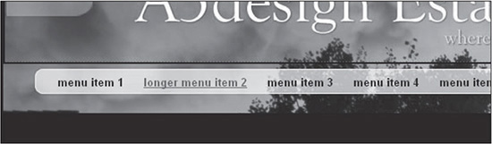
The a5-menu-box selector uses absolute positioning to place the menu area. The a5-menu a rule is then applied to every hyperlinked menu item that is included in the container. The display:inline; property/value combination determines that the menu items will be output horizontally in a line. The a5-menu a:hover; property/value combination changes the color of the hyperlink when it is moused over and turns on the underline below the link (see Figure 13.10).
Figure 13.10
The Longer Menu Item 2 link when it is moused over.
© 2014 Cengage Learning.
Adding the Body Content and Footer
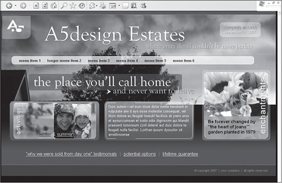
The structure of this design’s body content is not overly complicated compared to the previous designs. While it has left and center columns, they aren’t used for themajority of the placement of items, unlike the previous case studies. Rather, most of the content is positioned autonomously of other content because it is assigned absolute positioning. Listing 13.3 is all the code that is used to create the full design in Figure 13.11.
Figure 13.11
Design with the body content and footer added.
© 2014 Cengage Learning.
New Code Is in Bold
The newly added code is bolded to differentiate it from the existing code that is being built upon in this case study.
Listing 13.3 Code for Figure 13.11
<!DOCTYPE html PUBLIC "-//W3C//DTD XHTML 1.0 Transitional//EN" "DTD/xhtml1-
transitional.dtd">
<html xmlns="http://www.w3.org/1999/xhtml" xml:lang="en"
lang="en"><head><title></title>
<meta http-equiv="Content-Type" content="text/html; charset=iso-8859-1" />
<style type="text/css">
/* ++++++++++ global general styles start ++++++++++*/
html, body {
margin:0px;
padding:0px;
font: 10pt arial, helvetica, sans-serif;
background:#000000;
color:#ffffff;
}
a:link { text-decoration:none;color:#FF8037; }
a:visited { text-decoration:none;color:#FF8037; }
a:active { text-decoration:none;color:#FF8037; }
a:hover { text-decoration:underline;color:#ffffff; }
a.a5-right-column:link { text-decoration:none;color:#ffffff;}
a.a5-right-column:visited { text-decoration:none;color:#ffffff;}
a.a5-right-column:active { text-decoration:none;color:#ffffff;}
a.a5-right-column:hover { text-decoration:none;color:#809ED6;}
a.a5-link-light:link { text-decoration:underline;color:#ffffff;}
a.a5-link-light:visited { text-decoration:underline;color:#ffffff;}
a.a5-link-light:active { text-decoration:underline;color:#ffffff;}
a.a5-link-light:hover { text-decoration:underline;color:#92684B;}
a.a5-link-dark:link { text-decoration:underline;color:#000000;}
a.a5-link-dark:visited { text-decoration:underline;color:#000000;}
a.a5-link-dark:active { text-decoration:underline;color:#000000;}
a.a5-link-dark:hover { text-decoration:underline;color:#92684B;}
.color-1-text-10 {
font: 10pt arial, helvetica, sans-serif;
color: #ffffff;
}
.color-1-text-10 {
font: 10pt arial, helvetica, sans-serif;
color: #ffffff;
}
.color-1-text-13 {
font: 13pt arial, helvetica, sans-serif;
color: #ffffff;
}
.color-2-text-10 {
font: 10pt arial, helvetica, sans-serif;
color: #92684B;
}
.color-2-text-13 {
font: 13pt arial, helvetica, sans-serif;
color: #92684B;
}
.color-3-text-8 {
font: 8pt arial, helvetica, sans-serif;
color: #A48B65;
}
.color-4-text-12 {
font: 12pt arial, helvetica, sans-serif;
color: #000000;
}
/* ++++++++++ global general styles end ++++++++++*/
/* ++++++++++ global structure styles start ++++++++++*/
#a5-body-center {
text-align:center;
}
#a5-body {
position: relative;
width: 1000px;
margin-left: auto;
margin-right: auto;
text-align:left;
background:#6A4203 url(images/bg-body.jpg) no-repeat;
border:0px solid #ffffff;
}
#a5-header {
position:relative;
left:0px;
top:0px;
height:220px;
border:0px solid #000000;
}
#a5-header-right {
position:absolute;
top:52px;
right:30px;
height:60px;
width:200px;
text-align:center;
border:0px solid #000000;
}
#a5-header-right-bg {
position:absolute;
top:53px;
right:29px;
height:60px;
width:200px;
text-align:center;
border:0px solid #000000;
}
#a5-menu-box {
position:absolute;
top:175px;
left:65px;
line-height:40px;
vertical-align:50%;
color:#ffffff;
font:bold 10pt arial, helvetica, sans-serif;
border:0px solid #000000;
}
#a5-menu a {
display:inline;
text-decoration:none;
color:#030303;
}
#a5-menu a:hover {
text-decoration:underline;
color:#97370C;
}
#a5-left-middle-text {
position:absolute;
left:139px;
top:443px;
border:0px solid #ffffff;
}
#a5-left-middle-image {
position:absolute;
left:0px;
top:311px;
border:0px solid #ffffff;
}
#a5-center-middle-text {
position:absolute;
left:390px;
top:342px;
width:297px;
line-height:17px;
color:#ffffff;
border:0px solid #ffffff;
}
#a5-right-middle-image {
position:absolute;
right:28px;
top:225px;
border:0px solid #ffffff;
}
#a5-column-left {
float:left;
width:750px;
margin:15px 0px 0px 0px;
border:0px solid #ffffff;
}
#a5-column-left-text {
margin:280px 0px 0px 90px;
border:0px solid #000000;
}
#a5-column-center {
position:relative;
left:0px;
top:0px;
border:0px solid #000000;
}
#a5-column-center-text {
margin:177px 65px 0px 730px;
line-height:18px;
border:0px solid #000000;
}
#a5-footer-separator {
clear:both;
height:30px;
}
#a5-footer {
clear:both;
padding:0px 30px 0px 0px;
height:40px;
line-height:40px;
vertical-align:80%;
text-align:right;
border-top:1px solid #A48B65;
background:#482C01;
}
/* ++++++++++ global structure styles end ++++++++++*/
</style>
</head>
<body>
<div id="a5-body-center">
<div id="a5-body">
<!-- ###### header start ###### -->
<div id="a5-header">
<div><a href="index.htm"><img src="images/spacer.gif"
width="770" height="157" alt="" border="0" /></a></div>
<div id="a5-header-right-bg" class="color-2-text-
13">complete access<br /><span class="color-2-text-10">september 09,
2007</span></div>
<div id="a5-header-right" class="color-1-text-13"><a
href="index.htm">complete access</a><br /><span class="color-1-text-
10">september 09, 2007</span></div>
<!-- ###### menu start ###### -->
<div id="a5-menu-box">
<div id="a5-menu">
<a href="index.htm">menu item 1</a>
<a href="menu-item-2.htm">longer menu item 2</a>
<a href="menu-item-3.htm">menu item 3</a>
<a href="menu-item-4.htm">menu item 4</a>
<a href="index.htm">menu item 5</a>
<a href="index.htm">menu item 6</a>
</div>
</div>
<!-- ###### menu end ###### -->
</div>
<!-- ###### header end ###### -->
<!-- ###### left text box start ###### -->
<div id="a5-left-middle-text" class="color-1-text-13"><a
href="x.htm" class="a5-link-dark">winter</a> & <a href="x.htm"
class="a5-link-light">summer</a></div>
<div id="a5-left-middle-image"><a href="x.htm"><img
src="images/spacer.gif" width="355" height="130" alt="" border="0"
/></a></div>
<!-- ###### left text box end ###### -->
<!-- ###### center text box start ###### -->
<div id="a5-center-middle-text">Duis autem i vel eum iriure
dolor nwille hendrerit in vulputate alw d ays esse molestie consequat, vel
illum dolore eu feugiat loveukl facilisis at yvero eros et ayouccumsan et
iusto odio dignissim qui blandit praesent lumoreum zzril delenit aut duis
dolore te feugait nulla facilisi. Lorthan ipsum dyouolor sit
ametknowrae</div>
<div id="a5-right-middle-image"><img src="images/spacer.gif"
width="231" height="161" alt="" border="0" style="border:1px solid #ffffff;"
/></div>
<!-- ###### center text box end ###### -->
<!-- ###### left column start ###### -->
<div id="a5-column-left">
<div id="a5-column-left-text" class="color-1-text-13">
<a href="x.htm" class="a5-link-light">“why we were
sold from day one” testimonials</a> <span
style="color:#AD8B28;">|</span> <a href="x.htm" class="a5-link-
light">potential options</a> <span
style="color:#AD8B28;">|</span> <a href="x.htm" class="a5-link-
light">lifetime guarantee</a>
</div>
</div>
<!-- ###### left column end ###### -->
<!-- ###### center column start ###### -->
<div id="a5-column-center">
<div id="a5-column-center-text">
<span class="color-4-text-12"><strong>Be forever
changed by
"the heart of joans’" garden
planted in 1979</strong></span>
</div>
</div>
<!-- ###### center column end ###### -->
<!--########## footer start ##########-->
<div id="a5-footer-separator"> </div>
<div id="a5-footer" class="color-3-text-8">©copyright
2007 | your company | all rights
reserved</div>
<!--########## footer end ##########-->
</div>
</div>
</body>
</html>
Following are things to note about the code in Listing 13.3:
Several custom hyperlink rules (for example, a.a5-right-column:link { text-decoration:none;color:#ffffff;}), along with various text rules (for example, color-4-text-12), have been added to the style sheet to stylize the content throughout the page.
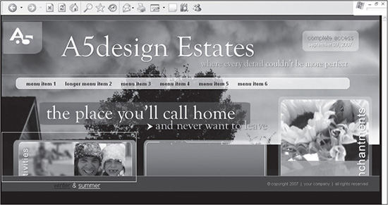
The a5-left-middle-text and a5-left-middle-image <DIV> tags are added to create the box that appears in the left column, although the visual aspect of it is assigned in the code. The container is positioned 139 pixels from the left side and 443 pixels from the top. The Winter and Summer hyperlinks are then styled with the a5-link-dark and a5-link-light styles, respectively. Figure 13.12 illustrates what the design looks like with only the left column added and with the border turned on for the spacer.gif that is added to make that section clickable. Because the text is in an absolutely positioned container, it does not push the footer down until code is later added into the a5-column-left <DIV>—at least in IE 6.
Once the left box has been populated, the a5-center-middle-text container is added. This container is positioned 390 pixels from the left and 443 pixels from the top, similar to the container for the left box (that is, a5-leftmiddle-text). The width is set to 297 pixels to force the text to remain within the “visible” confines of the center box. The length of the text would need to be controlled by the designer, whether that means hand coding or controlling the number of output characters from a database. Figure 13.13 shows what the design looks like with the content added for the container.
The a5-right-middle-image container is added to allow for the flowers area to be clickable. The “be forever changed” text on top of the flower image is added to the a5-column-center-text container, which is nested inside the a5-column-center <DIV>. The code that enables this can be found farther down the page. One advantage of adding this content, along with the “why we were sold from day one testimonials | potential options | lifetime guarantee” text in the a5-column-left column (refer back to Figure 13.1), is that it populates the left and center columns, which forces the footer to its desired position.
As mentioned in the previous bullet, the “why we were sold from day one testimonials | potential options | lifetime guarantee” text is added to the a5-column-left container. The text is then nested inside the a5-columncenter-text container. This nesting allows for the text area to have margins applied to the a5-column-center-text <DIV> without affecting the width of the a5-column-left container.
The a5-footer-separator container is added to provide a margin between the bottom of the content and the top of the footer.
Figure 13.12
Design with the text for the left box added.
© 2014 Cengage Learning.
Figure 13.13
Design with the text for the center box added.
© 2014 Cengage Learning.
CONSTRUCTING SECOND-LEVEL PAGES
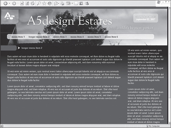
Similar to the previous three case studies, the homepage is reused and customized for secondary pages (see Figure 13.14). There are only a few changes that need to be made to create a modified version of the homepage:
Once the homepage is saved as menu-item-2.htm, the containers that have absolute positioning added to them are removed. This is yet one more reason the left and center columns were included with the homepage design. They can now be easily used to their full potential by just adding content to them.
The a5-column-left-text and a5-column-center-text containers are renamed to a5-column-left-text-sl and a5-column-center-text-sl, respectively. A rule for each is added to the style sheet to modify the placement of the content that each contains.
A second Photoshop file is created to provide a modified version of the background image. The a5-body-sl rule is added to the style sheet that calls this new image, titled bg-body-sl.jpg.
To provide a secondary page title, the a5-sl-title <DIV> is added at the top of the a5-column-left-text-sl container. A rule is added to the style sheet to stylize the text in that <DIV>.
Figure 13.14
A second-level template that is created from the homepage design.
© 2014 Cengage Learning.
SUMMARY
The purpose of this design is to offer the designer the ability to create more graphical sites. Rather than providing a flexible, scalable design, the XHTML and CSS are used to place content over the background image, which provides the majority of graphical elements. The majority of items on the homepage are assigned absolute positioning. The secondary pages, however, provide a more traditional way of placing and stylizing content, considering they will need to be much more flexible. While this design is limited in its flexibility, it gives an alternative for design that the other case studies cannot provide because this design uses the graphics and content placement in entirely different ways.