
Project Graphics
13.0 INTRODUCTION
PMBOK® Guide, 4th Ediiton
Chapter 9 Time Management
Chapter 10 Communications Management
6.6.2.3 Schedule Comparison Bar Charts
In Chapter 11, we defined the steps involved in establishing a formal program plan with detailed schedules to manage the total program. Any plan, schedule, drawing, or specification that will be read by more than one person must be expressed in a language that is understood by all recipients.
The ideal situation is to construct charts and schedules in suitable notation that can be used for both in-house control and out-of-house customer status reporting. Unfortunately, this is easier said than done. Customers and contractors are interested mainly in the three vital control parameters:
- Time
- Cost
- Performance
All schedules and charts should consider these three parameters and their relationship to corporate resources.
Information to ensure proper project evaluation is usually obtained through four methods:
- Firsthand observation
- Oral and written reports
- Review and technical interchange meetings
- Graphical displays
Firsthand observations are an excellent tool for obtaining unfiltered information, but they may not be possible on large projects. Although oral and written reports are a way of life, they often contain either too much or not enough detail, and significant information may be disguised. Review and technical interchange meetings provide face-to-face communications and can result in immediate agreement on problem definitions or solutions, such as changing a schedule. The difficulty is in the selection of attendees from the customer's and the contractor's organizations. Good graphical displays make the information easy to identify and are the prime means for tracking cost, schedule, and performance. Proper graphical displays can result in:
- Cutting project costs and reducing the time scale
- Coordinating and expediting planning
- Eliminating idle time
- Obtaining better scheduling and control of subcontractor activities
- Developing better troubleshooting procedures
- Cutting time for routine decisions, but allowing more time for decision-making
13.1 CUSTOMER REPORTING
PMBOK® Guide, 4th Edition
10.3.1.2 Performance Reporting
There are more than thirty visual methods for representing activities. The method chosen should depend on the intended audience. For example, upper-level management may be interested in costs and integration of activities, with very little detail. Summary-type charts normally suffice for this purpose. Daily practitioners, on the other hand, may require considerable detail. For customers, the presentation should include cost and performance data.
When presenting cost and performance data, figures and graphs should be easily understood and diagrams should quickly convey the intended message or objective. In many organizations, each department or division may have its own method of showing scheduling activities. Research and development organizations prefer to show the logic of activities rather than the integration of activities that would normally be representative of a manufacturing plant.
The ability to communicate is a prerequisite for successful management of a program. Program review meetings, technical interchange meetings, customer summary meetings, and in-house management control meetings all require different representative forms of current program performance status. The final form of the schedule may be bar charts, graphs, tables, bubble charts, or logic diagrams. These are described in the sections that follow.
13.2 BAR (GANTT) CHART
PMBOK® Guide, 4th Edition
6.6.2.3 Schedule Comparison Bar Charts
The most common type of display is the bar or Gantt chart, named for Henry Gantt, who first utilized this procedure in the early 1900s. The bar chart is a means of displaying simple activities or events plotted against time or dollars. An activity represents the amount of work required to proceed from one point in time to another. Events are described as either the starting or ending point for either one or several activities.
Bar charts are most commonly used for exhibiting program progress or defining specific work required to accomplish an objective. Bar charts often include such items as listings of activities, activity duration, schedule dates, and progress-to-date. Figure 13-1 shows nine activities required to start up a production line for a new product. Each bar in the figure represents a single activity. Figure 13-1 is a typical bar chart that would be developed by the program office at program inception.
Bar charts are advantageous in that they are simple to understand and easy to change. They are the simplest and least complex means of portraying progress (or the lack of it) and can easily be expanded to identify specific elements that may be either behind or ahead of schedule.
Bar charts provide only a vague description of how the entire program or project reacts as a system, and have three major limitations. First, bar charts do not show the interdependencies of the activities, and therefore do not represent a “network” of activities. This relationship between activities is crucial for controlling program costs. Without this relationship, bar charts have little predictive value. For example, does the long-lead procurement activity in Figure 13-1 require that the contract be signed before procurement can begin? Can the manufacturing plans be written without the material specifications activity being completed? The second major discrepancy is that the bar chart cannot show the results of either an early or a late start in activities. How will a slippage of the manufacturing schedules activity in Figure 13-1 affect the completion date of the program? Can the manufacturing schedules activity begin two weeks later than shown and still serve as an input to the bill of materials activity? What will be the result of a crash program to complete activities in sixteen weeks after go-ahead instead of the originally planned nineteen weeks? Bar charts do not reflect true project status because elements behind schedule do not mean that the program or project is behind schedule. The third limitation is that the bar chart does not show the uncertainty involved in performing the activity and, therefore, does not readily admit itself to sensitivity analysis. For instance, what is the shortest time that an activity might take? What is the longest time? What is the average or expected time to activity completion?
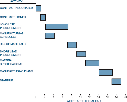
FIGURE 13-1. Bar chart for single activities.
Even with these limitations, bar charts do, in fact, serve as useful tools for program analysis. Some of the limitations of bar charts can be overcome by combining single activities, as shown in Figure 13-2. The weakness in this method is that the numbers representing each of the activities do not indicate whether this is the beginning or the end of the activity. Therefore, the numbers should represent events rather than activities, together with proper identification. As before, no distinction is made as to whether event 2 must be completed prior to the start of event 3 or event 4. The chart also fails to define clearly the relationship between the multiple activities on a single bar. For example, must event 3 be completed prior to event 5? Often, combined activity bar charts can be converted to milestone bar charts by placing small triangles at strategic locations in the bars to indicate completion of certain milestones within each activity or grouping of activities, as shown in Figure 13-3. The exact definition of a milestone differs from company to company, but usually implies some point where major activity either begins or ends, or cost data become critical.

FIGURE 13-2. Bar chart for combined activities.

FIGURE 13-3. Bar/milestone chart.
Bar charts can be converted to partial interrelationship charts by indicating (with arrows) the order in which activities must be performed. Figure 13-4 represents the partial interrelationship of the activities in Figures 13-1 and 13-2. A full interrelationship schedule is included under the discussion of PERT networks in Chapter 12.
The most common method of presenting data to both in-house management and the customer is through the use of bar charts. Care must be taken not to make the figures overly complex so that more than one interpretation can exist. A great deal of information and color can be included in bar charts. Figure 13-5 shows a grouped bar chart for comparison of three projects performed during different years. When using different shading techniques, each area must be easily definable and no major contrast should exist between shaded areas, except for possibly the current project. When grouped bars appear on one chart, nonshaded bars should be avoided. Each bar should have some sort of shading, whether it be cross-hatched or color-coded.

FIGURE 13-4. Partial interrelationship chart.

FIGURE 13-5. Grouped bar chart for performance comparison.
Contrasting shaded to nonshaded areas is normally used for comparing projected progress to actual progress, as shown in Figure 13-6. The tracking date line indicates the time when the cost data/performance data were analyzed. Project 1 is behind schedule, project 2 is ahead of schedule, and project 3 is on target. Unfortunately, the upper portion of Figure 13-6 does not indicate the costs attributed to the status of the three projects.

FIGURE 13-6. Cost and performance tracking schedule.
By plotting the total program costs against the same time axis (as shown in Figure 13-6), a comparison between cost and performance can be made. From the upper section of Figure 13-6 it is impossible to tell the current program cost position. From the lower section, however, it becomes evident that the program is heading for a cost overrun, possibly due to project 1. It is generally acceptable to have the same shading technique represent different situations, provided that clear separation between the shaded regions appears, as in Figure 13-6.
Another common means for comparing activities or projects is through the use of step arrangement bar charts. Figure 13-7 shows a step arrangement bar chart for a cost percentage breakdown of the five projects included within a program. Figure 13-7 can also be used for tracking, by shading certain portions of the steps that identify each project. This is not normally done, however, since this type of step arrangement tends to indicate that each step must be completed before the next step can begin.
Bar charts need not be represented horizontally. Figure 13-8 indicates the comparison between the 2000 and 2002 costs for the total program and raw materials. Three-dimensional vertical bar charts are often beautiful to behold. Figure 13-9 shows a typical three-dimensional bar chart for direct and indirect labor and material cost breakdowns.
Bar charts can be made colorful and appealing by combining them with other graphic techniques. Figure 13-10 shows a quantitative-pictorial bar chart for the distribution of total program costs. Figure 13-11 shows the same cost distribution as in Figure 13-10, but represented with the commonly used pie technique. Figure 13-12 illustrates how two quantitative bar charts can be used side by side to create a quick comparison. The right-hand side shows the labor hour percentages. Figure 13-12 works best if the scale of each axis is the same; otherwise the comparisons may appear distorted when, in fact, they are not.
The figures shown in this section do not, by any means, represent the only methods of presenting data in bar chart format. Several other methods are shown in the sections that follow.

FIGURE 13-7. Step arrangement bar chart for total cost as a percentage of the five program projects.

FIGURE 13-8. Cost comparison, 2000 versus 2002.
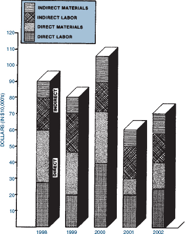
FIGURE 13-9. Direct and indirect material and labor cost breakdowns for all programs per year.
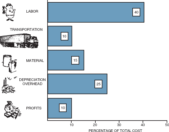
FIGURE 13-10. Total program cost distribution (quantitative-pictorial bar chart).

FIGURE 13-11. Distribution of the program dollar.
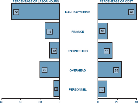
FIGURE 13-12. Divisional breakdown of costs and labor hours.
13.3 OTHER CONVENTIONAL PRESENTATION TECHNIQUES
Bar charts serve as a useful tool for presenting data at technical meetings. Unfortunately, programs must be won competitively or organized in-house before technical meeting presentations can be made. Competitive proposals or in-house project requests should contain descriptive figures and charts, not necessarily representing activities, but showing either planning, organizing, tracking, or technical procedures designed for the current program or used previously on other programs. Proposals generally contain figures that require either some interpolation or extrapolation. Figure 13-13 shows the breakdown of total program costs. Although this figure would also normally require interpretation, a monthly cost table accompanies it. If the table is not too extensive, then it can be included with the figure. This is shown in Figure 13-14. During proposal activities, the actual and cumulative delivery columns, as well as the dotted line in Figure 13-14, would be omitted, but would be included after updating for use in technical interchange meetings. It is normally a good practice to use previous figures and tables whenever possible because management becomes accustomed to the manner in which data are presented.
Another commonly used technique is schematic models. Organizational charts are schematic models that depict the interrelationships between individuals, organizations, or functions within an organization. One organizational chart normally cannot suffice for describing total program interrelationships. Figure 4-8 identified the Midas Program in relation to other programs within Dalton Corporation. The Midas Program is indicated by the bold lines. The program manager for the Midas Program was placed at the top of the column, even though his program may have the lowest priority. Each major unit of management for the Midas Program should be placed as close as possible to top-level management to indicate to the customer the “implied” relative importance of the program.

FIGURE 13-13. Total program cost breakdown.
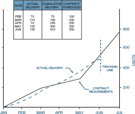
FIGURE 13-14. Delivery schedule tracking (line of balance).
Another type of schematic representation is the work flowchart, synonymous with the application of flowcharting for computer programming. Flowcharts are designed to describe, either symbolically or pictorially, the sequence of events required to complete an activity. Figure 13-15 shows the logic flow for production of molding VZ-3. The symbols shown in Figure 13-15 are universally accepted by several industries.
Pictorial representation, although often a costly procedure, can add color and quality to any proposal, and they are easier to understand than a logic or bubble chart. Because customers may request tours during activities to relate to the pictorial figures, program management should avoid pictorial representation of activities that may be closed off to customer viewing, possibly due to security or safety.
Block diagrams can also be used to describe the flow of activities. Figures 4-8 and 4-9 are examples of block diagrams. Block diagrams can be used to show how information is distributed throughout an organization or how a process or activity is assembled. Figure 13-16 shows the testing matrix for propellant samples. Figures similar to this are developed when tours are scheduled during the production or testing phase of a program. Figure 13-16 shows the customer not only where the testing will take place, but what tests will be conducted.

FIGURE 13-15. Logic flow for production of molding VZ-3.

FIGURE 13-16. Propellant samples testing matrix.
Block diagrams, schematics, pictorials, and logic flows all fulfill a necessary need for describing the wide variety of activities within a company. The figures and charts are more than descriptive techniques. They can also provide management with the necessary tools for decision-making.
13.4 LOGIC DIAGRAMS/NETWORKS
Probably the most difficult figure to construct is the logic diagram. Logic diagrams are developed to illustrate the inductive and deductive reasoning necessary to achieve some objective within a given time frame. The major difficulty in developing logic diagrams is the inability to answer such key questions as: What happens if something goes wrong? Can I quantify any part of the diagram's major elements?
Logic diagrams are constructed similarly to bar charts on the supposition that nothing will go wrong and are usually accompanied by detailed questions, possibly in a checklist format, that require answering. The following questions would be representative of those asked for an R&D project:
- What documentation is released to start the described activity and possibly the elements within each activity?
- What information is required before this documentation can be released? (What prior activities must be completed, work designed, studies finalized, etc?)
- What are the completion, or success, criteria for the activity?
- What are the alternatives for each phase of the program if success is not achieved?
- What other activities are directly dependent on the result of this activity?
- What other activities or inputs are required to perform this activity?
- What are the key decision points, if any, during the activity?
- What documentation signifies completion of the activity (i.e., report, drawing, etc.)?
- What management approval is required for final documentation?
These types of questions are applicable to many other forms of data presentation, not only logic diagrams.
13.5 STUDYING TIPS FOR THE PMI® PROJECT MANAGEMENT CERTIFICATION EXAM
This section is applicable as a review of the principles to support the knowledge areas and domain groups in the PMBOK® Guide. This chapter addresses:
- Time Management
- Communication Management
- Executing
- Controlling
Understanding the following principles is beneficial if the reader is using this text to study for the PMP® Certification Exam:
- How to identify the different ways that information can be displayed for reporting purposes
- Different types of graphical reporting techniques and their advantages and disadvantages
The following multiple-choice questions will be helpful in reviewing the principles of this chapter:
- Which of the following is a valid way of obtaining proper project performance information?
- First-hand observations
- Oral and written reports
- Review and technical interchange meetings
- All of the above
- Proper graphical display of information can result in:
ANSWERS
- D
- D
PROBLEMS
13–1 For each type of schedule defined in this chapter answer the following questions:
- Who prepares the schedule?
- Who updates the schedule?
- Who should present the data to the customers?
13–2 Should the customers have the right to dictate to the contractor how the schedule should be prepared and presented? What if this request contradicts company policies and procedures?
13–3 Should a different set of schedules and charts be maintained for out-of-house as well as in-house reporting? Should separate schedules be made for each level of management? Is there a more effective way to ease these types of problems?