We’ve filled the last few hundred pages with techniques for making great-looking images in Photoshop. What we haven’t done yet is look at how to get these images out of Photoshop. Perhaps you’ll be printing your image directly from Photoshop. Or perhaps you’re saving the file to be used in a page-layout application, such as InDesign or QuarkXPress, or on a Web page. How you save your image or how you print it is determined by what you want to do with it next.
In this chapter we’re going to explore two key subjects: how to save your images to disk and how to create printed or online output. Along the way, we’ll also discuss some of the concepts you’ll need to be familiar with in order to make good decisions in Photoshop, including halftoning methods, metadata, clipping paths, and transparency.
When Photoshop writes an image to disk, it really just saves a bunch of zeros and ones. But the zeros and ones that one program writes to disk may not be readable by another program. The same data can be written to disk in a variety of ways, called file formats. Different file formats may be as different as two languages (like Spanish versus Chinese), or as similar as two dialects of the same language (like American English versus British English).
The world would be a simpler place if everyone (and all software) spoke the same language, but that’s not going to happen. Fortunately, programs such as Photoshop, QuarkXPress, and InDesign can read and sometimes even write in multiple file formats. The important thing, then, is not for us to understand exactly what makes one different from the others, but rather what each file format’s strengths and weaknesses are, so that we can use them intelligently.
In the first part of this chapter, we’ll take an in-depth look at each of the many file formats that Photoshop understands. Note that we won’t cover camera raw formats or DNG here, because Photoshop can’t write these files—it can only read them using Adobe Camera Raw. We talk about those formats in Chapter 5, “Building a Digital Workflow.”
However, before we get to our discussion of file formats and compression, it’s useful to talk about the options you have in the Save As dialog: Format, Save, Color, and Image Previews settings.
Most descriptions of the Save As dialog options (see Figure 12-1) cover the options item by item, but that’s a shortsighted way of looking at them. To really understand the Save options, think about the big picture.

When you choose File > Save As in just about any program, two things happen: The program writes out an entirely new copy of the document, and that new document is what you work with after you click Save. If you specify a filename that’s the same as the filename of the document you’re working on, you replace it with your new version.
Tip
Think the list in the Format pop-up menu is too long? In the Photoshop application folder, you’ll find the Plug-InsFile Formats folder. Move any format plug-in out of the Plug-Ins folder, and it won’t show up in the menu any more. (Photoshop will still find it if it’s anywhere inside the Plug-Ins folder.
However, the traditional Save As approach doesn’t necessarily work well for Photoshop. In older versions of Photoshop, many users started with a layered file, used Save As to create a flattened version by turning off the Layers check box, and absentmindedly found themselves saving the flattened version over the layered version—a monumental loss if you wanted to be able to keep working with those layers.
Recent versions of Photoshop try to protect you from that type of data loss through the As A Copy option. When it’s on, As A Copy fundamentally changes what you’ll get from the Save As dialog. Instead of saving over the original, As A Copy creates a separate, new document.
On top of that, when Photoshop finishes saving as a copy, the document you return to is not the copy you saved—you return to the document that you were working on before you saved, because it’s the one that’s still full-featured. If you don’t realize you’re not working with the copy you just saved, you may end up very confused.
As A Copy will turn itself on if you choose Save As and then you turn off check boxes for any of the options in the Save section, because you’re telling Photoshop to discard data.
But As A Copy can also turn itself on if you don’t touch those Save check boxes. If you simply try to save to a format that can’t hold the features you’ve used in the document, As A Copy turns on, and you have to choose a more-capable format.
Tip
If the Save As dialog appears when you are just doing a simple Save (using the Save command), it means you’ve added a feature to the document that you can’t store in the document’s current format. This often happens if you start from a JPEG, add a layer, and then save. Go ahead and save the file in a more capable format, such as TIFF or PSD.
The bottom line: If As A Copy comes on, know that you’re about to save a less-capable file separately from the document you’ve been working on. And if you don’t want As A Copy to come on, then don’t change the state of the Save or Color check boxes, and choose a format that can preserve the checked features. Now that we’ve gotten that out of the way, let’s look over the options in the Save As dialog.
The Format pop-up menu lists all of the formats that can handle the document you’re saving. You can’t always see the formats you want, but when that happens, there are a couple of good reasons. If your Photoshop document uses features like color spaces or bit depths that are pretty far from the mainstream, such as 16-bit Lab color or 32-bit HDR, the list of file formats will be pretty short. If formats seem to be missing from the Format pop-up menu, try choosing Image > Duplicate, and on the Image > Mode submenu choose both RGB and 8 Bits/Channel. This will enable the widest range of file formats in the Format pop-up menu.
The check boxes in the Save section are available only if you’re saving a file that includes those features and you’ve chosen a file format that supports them. You already know about alpha channels and layers—we talked about those earlier. Annotations are the text or audio notes that you create using the Notes tool, and Spot Colors are channels that you’ve specifically designated for spot color inks (see Chapter 13, “Spot Colors and Duotones,” our bonus chapter that’s available online. For the URL, see the Introduction).
Tip
If the Annotations check box is on, you might want to see what those annotations are, in case they’re private notes that aren’t intended for clients or other recipients.
We’re not sure why you’d want to delete spot colors when you save your file, but if you wanted to, this is where you would do it. We think the Spot Colors check box is most useful as an indicator: When it’s grayed out, you can be sure that the file format you’ve chosen cannot handle spot colors. What we’d like is the ability to automatically merge the spot-color channels into our RGB or CMYK image (for when we want to send a proof to a client)—but this feature doesn’t do that.
The color options in the Save As dialog let you control whether or not you embed an ICC profile in the image, and, for some file formats, these options let you make a color conversion during the save.
Use Proof Setup. This option is only available for EPS and PDF formats, and for EPS DCS when Proof Setup is set to a CMYK profile. When turned on, it tells Photoshop to convert the image from its current space to the Proof Setup space, using the target profile and rendering intent specified there (see “Soft-Proofing Controls” in Chapter 4, “Color Settings”). When you turn on Use Proof Setup, the profile listed under the Embed Color Profile option changes to the one specified in Proof Setup. We don’t use this option much—it’s not intuitive, and we only use it in those rare cases where we’re already in the Save As dialog and realize that we forgot to convert the image to the correct output space.
Embed Color Profile. The easiest way to get accurate color when you move your image from one machine to another is by sending information about the image’s color space with it (see Chapter 4, “Color Settings”). You could write down the color space information on a piece of paper and mail it to the image’s recipient, or you could just turn on Embed Color Profile (it’s on by default unless you set your Color Management Policy to Off), which embeds the color information in the file itself. That said, there are two instances when you might consider turning off this check box.
You might not want to include the color profile when you need to send a file to an organization that doesn’t support color management. They may get nervous upon seeing an embedded profile, and screw up your image in one way or another.
Tip
If you’re working with Adobe InDesign and have an image that doesn’t match the InDesign document profile and doesn’t have an embedded profile, select the image on the InDesign layout, choose Object > Image Color Settings, and assign a profile just to that image. This way, it’s still possible to save the image without a CMYK profile and still render it correctly.
CMYK profiles are notoriously large (they may add between 700 K and 3 MB to the file size). If your file will be further edited on another machine, it’s important to include the profile. However, if you’ve got a tiny 100 K CMYK file that you want to send in an email to a friend for her newsletter, it’s ridiculous to add the profile to it. All the color images in this book use the same profile, so we did not save the profile in the images; instead, we brought the untagged images into Adobe InDesign and set the default document profile, which works just as well. Of course, if we had to send one of these images to a friend for further editing, they’d be lost unless we sent them our color profile, too.
Tip
Saving an icon or thumbnail preview can considerably lengthen the time it takes to save your image (especially for very large files). But if you include at least two types of previews, saving the second type takes hardly any additional time. Saving a full-size preview takes still longer, and is not very useful.
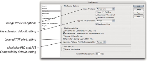
When you use Save As, by default Photoshop can create miniature preview images within your file if you choose Ask When Saving from the Image Previews pop-up menu in the File Handling pane of the Preferences dialog (see Figure 12-2). From then on, the Save As dialog offers you Preview choices: in Windows, you get a Thumbnail check box; on the Mac, you get three check boxes, one each for saving an icon, a thumbnail, and a full-size preview (see Figure 12-1). We don’t bother with these, because today’s operating systems and professional imaging programs like Bridge and Lightroom tend to create their own previews. But if you do want to use them, here’s what they are:
Icon. The first preview, Icon, acts as a desktop picture, so you can see (with a little imagination) what the image is when you’re staring at the file on your desktop. It doesn’t seem to work reliably in Windows.
Thumbnail. The second preview, Thumbnail, is provided for the Open dialogs of QuickTime-savvy applications. We leave this off because many programs create a thumbnail on the fly, whether you save one or not.
Full Size. You only see this on Photoshop in Mac OS X when Ask When Saving is turned on in File Handling preferences. It adds a 24-bit PICT resource that is the physical output size of the image, downsampled to 72 pixels per inch. You don’t need this for an EPS file, because that format can include its own full-size preview.
You might think you know how to open images, especially if you’ve been doing it in other programs all this time. But Photoshop has a few useful power options in case a file isn’t opening quite the way you expect.
If a file doesn’t open in Photoshop when you double-click it, try dragging it to the Photoshop program icon. If that doesn’t work, try choosing File > Open in Photoshop and locating the file.
If you see the file in the Open dialog but it isn’t selectable, try choosing the file’s format from the Enable pop-up menu. If that doesn’t work, try choosing All Documents from the Enable pop-up menu. This can help if you receive an image created on a different platform that’s missing the right file extension. The Enable pop-up menu can also help if you’re opening a document that contains more than one format and you want to dictate how it opens.
If you want to open multiple images, you can select more than one image in the Open dialog, or you can drag multiple images from the desktop or Bridge to Photoshop. You can also select multiple images in Bridge and just press the Return (Mac) or Enter key.
In the prepress world, most people don’t print directly from Photoshop—at least for their final output. Instead, they print from separation programs, presentation programs, or page-layout programs. In this section, we’re going to focus on the latter item: page-layout programs, such as Adobe InDesign and QuarkXPress.
Our assumption here is that if you’re printing from a page-layout program, you’re probably printing to a PostScript imagesetter or platesetter, resulting in paper, film, or plates with black-and-white halftoned images. We summarize the recommended file formats for prepress in Table 12-1. You’ll find more-detailed information about these formats in “File Formats,” later in this chapter.
Table 12-1. File formats for print
File format | Notes |
|---|---|
Photoshop | Preserves transparency, layers, clipping paths, and layers in InDesign and XPress |
TIFF | Preserves transparency and clipping paths |
Photoshop PDF | Preserves vector type and graphics |
EPS/DCS | Preserves vector type, graphics, and clipping paths; not color-managed; increasingly being replaced by PDF |
It appears that Adobe InDesign is taking the desktop publishing crown away from QuarkXPress, which reigned in the last gasp of the twentieth century. No matter which page-layout tool you use, it’s crucial that you consider how your images will transport from Photoshop to the printed page. There are some basic rules you should follow.
File formats. When it comes to printing from page-layout programs, always use TIFF, PDF, DCS, or EPS. With the latest versions of InDesign or XPress, you can also use the native Photoshop (PSD) format. We tend to use the TIFF format for almost all of our files, though we’ll occasionally use EPS or DCS for specialized effects, such as duotones or custom screening. If your image has vector artwork (like text layers) in it, you should use EPS or (preferably) PDF.
Tip
If you use the same layered Photoshop file multiple times in InDesign with different layer settings, make sure you choose Keep Layer Visibility Overrides from the When Updating Link pop-up menu in the Object Layer Options dialog in InDesign. If the images are set to Use Photoshop’s Layer Visibility and you update the Photoshop file, all your variations become the same (taking on the last layer visibility settings in Photoshop).
Placing layered Photoshop files in InDesign. There are advantages to placing layered Photoshop files into your InDesign layouts. One advantage is speed: You can drag a Photoshop document into an InDesign layout as soon as it’s ready, instead of going through another step to create a flattened copy. Also, you can use the Object > Object Layer Options command in InDesign to control which Photoshop layers or layer comps are visible. If you’re using layers to create variations on an image, you only need to place the layered original into InDesign once, duplicate it on the layout, and change which layers are visible in InDesign (see Figure 12-3).

This workflow is not without its costs. Because you aren’t locking down the image in a flattened file, there are all sorts of opportunities for things to go haywire. For example, a production person down the line may activate the wrong layer or layer comp. Also, layered Photoshop files take up more disk space, so the final package you deliver to your printer may take longer to transmit or require another DVD. But if you and your production team can stay on top of all that, go ahead and take advantage of the flexibility.
CMYK vs. RGB. The choice between importing RGB or CMYK images involves two decisions—when do you want to do your separations, and what program do you want to do them in? You can preseparate all your images with Photoshop (or another program), or you can place RGB images in InDesign or XPress and rely on their color management systems to do the separations for you.
Preseparating has a lot going for it. Images land on pages ready to print; the page-layout program just sends the channels down, with no processing necessary at print time. Note that CMYK EPS files are not color managed in the page-layout program, though CMYK TIFF files may be. That is, if the page-layout program’s CMS is turned on, your CMYK values may be altered at print time. To ensure that the image data stays the same, choose an output (target) profile that matches the image (source) profile.
Tip
If you have problems importing PSD or TIFF files into a layout program, try importing an 8-bit CMYK or RGB duplicate of the file. Some layout programs can’t display or handle higher bit depths or other color modes such as Lab. Also, some programs can’t display Photoshop files if the Maximize Compatibility option is off.
Placing unseparated RGB files has advantages as well, though. You can use the page-layout program’s color management system to produce better proofs using color printers, and you don’t have to target the images until the last minute, when you know all your press conditions and are ready to pull final seps (separations). However, when it comes right down to it, we separate almost all our images in Photoshop first. (But we archive the RGB files, just in case we need to reseparate to some other target.)
Rotating, scaling, cropping, et cetera. While you can perform all kinds of wonderful transformations in today’s page-layout programs, each rotated, scaled, skewed, and flipped image adds processing overhead. If you want to keep your page-layout workflow as simple and efficient as possible, transform and crop images before you import them into layouts.
Now, this advice is not absolute. If you’re on a deadline, staying in your page-layout program and making minor image adjustments can save a lot of time, and if your prepress service provider has up-to-date imagesetters, image adjustments in the layout might not slow down the job so much.
It also matters how essential and extensive the changes are. By “essential,” we mean something basic, like correcting a crooked horizon. If it’s likely that the correction will need to be made every time the image is used, then correct the original and never worry about it again. But if it’s more of a one-time design variation, it may be better to do it to the image only on the layout for that particular job.
Extreme cropping is a more clear-cut case. When you take an 8-megapixel digital SLR frame, crop it down to around 5 megapixels, and send it on to InDesign, InDesign receives 5 megapixels. But if you crop the image in InDesign, InDesign will import and manage 8 megapixels, which can turn out to be an ongoing performance drag on your system and on printers. InDesign and XPress can be configured to print only the cropped portion, so this won’t necessarily slow down output. Still, if you’re going to crop out a lot of an image, do it in Photoshop.
We all live in an illusion: When we see a leaf, our eye makes us think we see a continuous range of colors and tones, continuous lines, and continuous shapes. That’s an illusion, because the eye simply doesn’t work that way. Without going too far into visual physiology, suffice it to say that the eye works much like an incredibly high-resolution digital camera.
It turns out that because the brain is already so good at fooling us into thinking that we’re seeing detail where there is none, or continuous colors where there aren’t any, we can fool it even more. The process of imaging data is inherently one of fooling ourselves, and some methods are better than others. The two primary methods of imaging are halftone and contone. Let’s take a closer look at each of them.
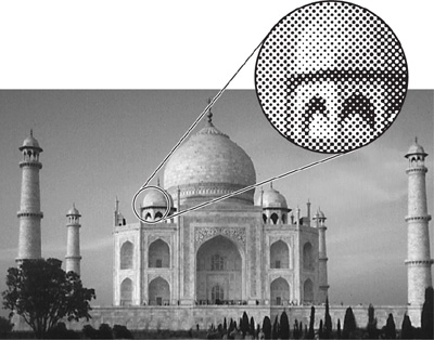
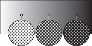
Printing presses, platesetters, inkjet printers, and laser printers all share one thing: they only print on or off, black or white. They can’t print shades of gray. To print 15 different colors, you’d have to run the paper through the machine 15 times with different-colored inks, or toners, or whatever. How ever, lithographers figured out in the late nineteenth century that they could create a tint of a colored ink by breaking the color down into a whole bunch of little spots. Our brain plays along with the game and tells us that we really are seeing the shade of gray, not just spots (see Figure 12-4). These spots make up the halftone of the image.
Tip
Want to play around with halftones? Start with a photo or a gradient, convert it to grayscale, choose Image > Mode > Bitmap, choose Halftone Screen from the Method pop-up menu, and click OK. In the Halftone screen dialog, try the different halftone methods and angles; the effects are easier to see if you specify a low screen frequency. Unfortunately, there’s no preview feature in the Halftone dialog, so you have to click OK to see the results.
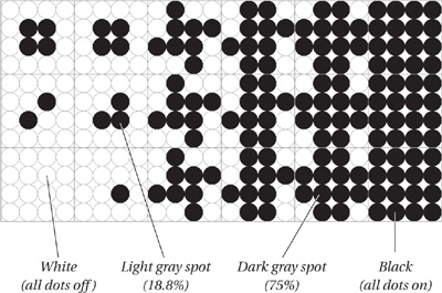
There are a number of ways to halftone an image, but the most common is to combine printer dots—those tiny square marks that platesetters or laser printers make, sometimes as small as ![]() of an inch—together into larger spots (see Figure 12-5). The darker the gray level, the larger the spot—the more dots are turned on. Each spot sits on a giant grid, so the center of each spot is always the same distance from its neighbors. (The spots don’t really get closer or farther from each other, just bigger and smaller; see Figure 12-6.)
of an inch—together into larger spots (see Figure 12-5). The darker the gray level, the larger the spot—the more dots are turned on. Each spot sits on a giant grid, so the center of each spot is always the same distance from its neighbors. (The spots don’t really get closer or farther from each other, just bigger and smaller; see Figure 12-6.)
You can print multicolor images by overlaying multiple color halftones (typically cyan, magenta, yellow, and black). Again, our eyes fool us into thinking we’re seeing thousands of colors when we’re only seeing four.
David and Conrad coauthored a book with Glenn Fleishman and Steve Roth called Real World Scanning and Halftones (3rd edition, Peachpit Press). That book covers halftoning in much more detail than we can get into here. However, we should at least cover the basics. Every halftone has three components, or attributes: screen frequency, screen angle, and spot shape.
Screen frequency. The more halftone spots you cram together within an inch, the tighter the grid, the smaller the spots, and so on. The number of halftone spots per inch is called halftone screen frequency, specified in lines per inch, or lpi (though we’re really talking about “rows of spots per inch,” not actual lines). Higher frequencies (small spots, tightly packed, like those in glossy magazines) look smoother. However, because of limits in digital halftoning, higher lpi values reproduce fewer levels of gray at a given output resolution and produce much more dot gain on a printing press, so tints clog up and go muddy more quickly (see “Image Differences,” later in this chapter).
Lower screen frequencies (as in newspapers) are rough-looking, but they’re easier to print, and you can achieve many levels of gray at lower output resolutions.
Screen angle. Halftone grids are not like bitmapped images; you can rotate them to any angle you want. (In a bitmapped image, the pixels are always in a horizontal/vertical orientation.) Halftones of grayscale images are typically printed at a 45-degree angle because the spots are least noticeable at this angle. However, color images are more complex.
When you overlap halftone grids, as in color printing, you may get distracting moiré (“mwah-RAY”) patterns that ruin the illusion. In order to minimize these patterns, it’s important to use specific angles. The greater the angle difference between overlapping screens (you can’t get them any farther apart than 45 degrees), the smaller the moiré pattern. With four-color process printing, the screens are typically printed 30 degrees apart at 15, 45, and 75 degrees (yellow, the lightest ink, is generally printed at 0 degrees—15 degrees offset from cyan).
Spot shape. The last attribute of halftones is the shape of each spot. The spot may be circular, square, a straight line, or even little pinwheels (see Figure 12-7). The standard PostScript spot shape is a round black spot in the highlights, square at 50 percent, and an inverted circle (white on black) in the shadows. Changing the shape of the spot is rarely necessary. However, if, for example, you’re producing cosmetics catalogs, or need to solve tonal shift problems printing on newsprint at coarse screen frequencies, controlling the halftone spot shape can definitely improve the quality of your job.

With binary devices such as platesetters and printers, you need to use a halftone to fool the eye into seeing shades of gray because you can’t create color or gray pixels. With a continuous-tone device, usually called contone, you can vary the color or gray shade of each pixel. Compared to halftoning, in contone images the pixels touch each other with no visible space between marks. Also, each pixel is a specific color made by building up varying densities of primary colors in the same spot.
A CRT monitor is an example of a contone imaging device, because the color of each pixel is made by mixing together varying amounts of red, green, and blue.
A dye-sublimation printer is another type of contone device. It overlays varying amounts of ink to build a color. Dye-subs are typically 300-dpi devices, but the lack of halftoning or white space between pixels makes images look surprisingly photorealistic. Because of the lack of resolution, hard-edged objects such as type or line art may appear fuzzy or jaggy, but the soft edges and blends found in natural images may be indistinguishable from chemically printed photographs.
There is one more method of simulating a “real-world,” continuous-tone image: using tiny spots to simulate tints and colors, but making those spots so small and so diffuse that the image appears contone. The three primary examples of this sort of imaging are: high-resolution inkjet; color laser; and stochastic screening, either on a conventional press or on a direct-digital press such as the HP Indigo E-Print or the Agfa Chromapress.
Inkjet. In inkjet technology, the printer sprays a fine mist of colored inks onto paper. The amount of each ink is varied, much like a contone printer, but it results in tiny spots on paper, often with paper white showing through, more like halftones. While older, low-resolution inkjets couldn’t be mistaken for contone imaging devices, prints from current high-resolution inkjets are so smooth that for all practical purposes, they can be considered contone devices. This holds true for both large-format inkjets like the Epson Stylus Pro 9880 and their desktop-size siblings. They use tiny droplet sizes of four, six, or more inks, deployed with very sophisticated error-diffusion screening, to produce results that are indistinguishable to the naked eye from a true continuous-tone print.
Tip
When we need to print from a PostScript-dependent program to a printer that doesn’t contain a PostScript RIP, we create an Acrobat PDF file of our document. Then we print the file from Acrobat (which acts like a PostScript RIP) to the inkjet. However, Adobe Creative Suite applications print beautifully through most inkjets’ raster drivers, so we just print from the native application file rather than messing around with this PDF work-around.
With inkjet printers, you’re expected to send down the image data and let the printer driver handle the details, so you can’t control ink percentages like you can on a press, unless you also use CMYK RIP software. Ultimately, CMYK RIPs are sometimes useful for inkjets used as proofing devices; but in our experience, if your goal is to produce final photo realistic output, you’re better off feeding RGB data to the printer. That said, we have obtained stunning results with some of the RGB RIPs designed for photographic output on inkjets, such as Colorbyte Software’s ImagePrint.
Stochastic screening. Earlier in this chapter we discussed how halftones are formed by clumping together groups of printer dots into a regularly spaced grid of spots. However, we oversimplified; this is actually only one way to make a halftone. Remember, a halftone is just a way to simulate tints or colors with tiny spots. Another method of halftoning is a diffusion dither (see Figure 12-8).

Diffusion dithers can create near-contone quality. Various vendors have created proprietary dithering techniques, usually called stochastic screening, that let you reproduce contone-like images from a printing press. Note that proprietary stochastic screening is a type of “frequency modulated” (FM) screen, more sophisticated than Photoshop diffusion dithering.
Stochastic screening can be an attractive option when you need to avoid the moiré patterns that can be caused by halftoning, or print with more than four inks, or need more detail at a given resolution. One of the reasons you see stochastic screening on far more desktop printers than presses is that it’s harder to control dot gain on a press, and the size of the stochastic dot also limits the amount of highlight detail you can reproduce. You can use software to create stochastic screens, but it’s more likely that you’ll work with a prepress service provider who can hook into the screening algorithms built into platesetters such as Agfa’s CrystalRaster or Linotype-Hell’s Diamond Screening.
Color laser printer. Most color laser printers use some kind of diffusion dither to simulate a very high screen frequency. It’s almost always best to let the laser printer do the screening using its own proprietary algorithms, rather than doing it ourselves. Controlling color on these devices isn’t easy—where possible, we prefer to send a calibrated RGB image through a color management system (see Chapter 4, “Color Settings”).
Now that we’ve explored the various imaging methods, we should recap and highlight some of the different techniques you can use in building images suitable for output on halftone and contone devices. We say “recap,” because we’ve mentioned most (if not all) of these in previous chapters, though never in one place.
Resolution. The first and foremost difference between contone and halftone imaging is the required image resolution. It’s quite a bit harder to work out the resolution needed for halftone output than it is for contone, so we’ll deal with halftone output first.
Resolution requirements for halftone output. For halftones, the halftone screen frequency matters much more than the resolution. You never need an image resolution above two times (2×) the halftone screen frequency (and often you can get almost-equivalent results with as little as 1.2× or 1.4×). Even if you’re printing on a 2400-dpi imagesetter, your image resolution can (and should) be much lower. For instance, printing at 150 lpi, you never need more than a 300-ppi image, and usually no higher than 225 ppi (we generally use the 1.5 multiplier; see Chapter 2, “Image Essentials”).
Resolution requirements for contone output. The resolution needed for a contone output device is easy to figure, but it can sometimes be hard to deliver. Your output resolution should simply match the resolution of the output device. If you’re printing to a 300-dpi dye-sub printer, your image resolution should be 300 ppi at the printed dimensions. The appropriate resolution for stochastic screening is less clear, but in general, you rarely need images over 300-ppi.
Resolution requirements for inkjet output. The necessary resolution for today’s photorealistic inkjets is to some extent a guessing game. In part, it depends on the paper stock—matte papers generally require less resolution than glossy ones. Anecdotal evidence suggests that a resolution around 240 ppi is sufficient for most images, but if you’re really picky, you may want to determine the ideal resolution for a particular paper stock yourself using good old trial and error. It’s certainly possible to send too much data to an inkjet printer, not only increasing print times unconscionably but also degrading the image: You do not want to send a 1440-ppi image to a 1440-dpi inkjet!
Synthetic targets composed of black and white line pairs show an improvement when they’re printed at an integral divisor of the printer resolution, such as 360 ppi on a 1440-dpi inkjet, but it’s uncertain how applicable this is to images with more natural content. For real-world photography, 240 to 360 ppi provides sufficient quality for most images. While in theory you could print the highest-quality image on an inkjet at 480 ppi, you’d see the difference only if you shot with a sufficiently sharp lens, with zero motion blur and no errors in sharpening.
Tonal and color correction. We talk a great deal about compressing tonal range (“targeting”) for halftone output in Chapter 7, “Image Adjustment Fundamentals,” so we won’t go into it here. Contone output needs less tonal and gamut compression than halftone output, because contone devices generally have a greater dynamic range and a wider gamut than do halftone devices. Keep a watchful eye on shadows and saturated colors—the most challenging tonal levels and colors to reproduce. Using the Proof Setup command with a good output profile can help a great deal.
Sharpening. As we noted back in Chapter 10, “Sharpness, Detail, and Noise Reduction,” contone images need less sharpening than halftone images do. But that doesn’t mean they don’t need any at all. Halftones, again because of their coarse screens and significant dot gain, mask details and edges in an image; sharpening can help compensate for both the blurriness of the scan and the blurriness of the halftone. And, halftones being what they are, you have a lot of room to play with sharpening before the picture becomes oversharpened (most people actually end up undersharpening).
In contone images, however, there’s a real risk of oversharpening. Not only should you use a lower Amount setting for unsharp masking, but also a smaller radius. Where a radius less than 1 is often lost in a halftone image, it’s usually appropriate in contone images. In this context, inkjet printers tend to behave more like contone devices.
Image mode. This last item, image mode, isn’t really dependent on what output method you’re using. However, because we still see people confused about image mode, we thought we’d throw in a recap here, too.
If you’re printing to a color contone device that outputs to film, or if the image is only seen on a color screen, you should leave your image in RGB mode. Contone and hybrid devices that print on paper use CMYK inks or toners, but in most cases you’ll get better results sending RGB and letting Photoshop or the printer handle the conversion. If you have a good profile for the output device, you can preview the output using Proof Setup and convert the image from your RGB editing space to the device’s space at print time (we discuss this in the next section). If you’re printing separations, though, you need to send a CMYK file.
As in almost every other Mac or Windows program, there are two menu items (and accompanying dialogs) tied to imaging: Page Setup and Print, both found under the File menu. Because Mac OS X and Windows XP currently don’t allow applications to add features to the Print and Page Setup dialogs, Adobe added the Print with Preview command to Photoshop CS2. It was such a useful idea that in Photoshop CS3, Adobe simply replaced the Print dialog with the former Print with Preview dialog. Most of the options you need to change when you’re printing from Photoshop can be accessed easily in the Print dialog (see Figure 12-9). If you use them correctly, you can avoid a lot of wasted paper.

The Print dialog lets you control the position, scaling, and color management of your image on the paper, which you can preview using the proxy image superimposed on a preview of the paper size. In Photoshop CS2, the proxy image wasn’t color-managed, but in Photoshop CS3, it is. In addition, turning on the Match Print Colors check box applies your current Proof Setup to the proxy.
Tip
In Mac OS X, you’ll probably see a Printer pop-up menu in the Page Setup dialog. If you see this, choose your printer here too—even if you’ve already chosen your printer in the Print dialog. If the wrong printer is chosen in Page Setup, the wrong paper sizes may be listed.
Printer and Page Setup. These options are not just here as a convenience. The only way that Photoshop knows how big it can print a document is from the paper sizes provided by the printer driver you’ve chosen. For accurate positioning and scaling, it’s important for you to set the printer, paper type, and options correctly. To do this, first choose your printer from the Printer pop-up menu, which lists the printer drivers installed on your computer. Then click Page Setup and ensure that all of the options are set correctly. Note that Page Setup is not provided by Photoshop—all Page Setup options are put there by the printer driver. Photoshop simply gives you access to Page Setup because it needs that information in order to calculate the available margins. This fact causes much confusion that’s hard to avoid, since printer driver and program options are typically walled off from each other in both Mac OS X and Windows.
Tip
If clicking the Center Image check box doesn’t center the image, the margins provided by the printer driver are asymmetrical. Open Page Setup and choose an option or paper size that provides equal or minimum margins, if available.
Scaling and positioning. You might just want to fit the image on the paper and center it. If so, leave Center Image and Scale to Fit Media checked. If you want to customize the image size, turn off Scale to Fit Media. If you want to customize its position, turn off Center Image. To be able to scale and position by dragging, Show Bounding Box must be turned on. You can’t change the aspect ratio of the image in this dialog.
The initial size that’s displayed when you open the Print dialog is based on the dimensions specified in the Image Size dialog. When you change the scaling, be aware that you aren’t creating any new pixels—the scaling options are just like changing the size or resolution in Image Size with the Resample Image check box turned off.
Tip
We recommend you always apply scaling in the Print dialog, and leave the scaling in Page Setup at 100 percent. The Print dialog doesn’t know about scaling applied in Page Setup; so if you apply scaling there, the preview and dimensions in the Print dialog will be incorrect.
Print Selected Area. To print just a small portion of an image, you don’t have to duplicate and crop the image. Simply draw a selection marquee around the area you want to print, then turn on the Print Selected Area check box in the Print dialog. This check box is unavailable if no selection exists or if the selection is nonrectangular or feathered.
The Output Options tell Photoshop how to print the document. A couple of these items (screens and transfer curves) also apply when you save files in various file formats. Some features in the dialog are determined by which printer driver is selected. Because these are standard system-level features, we’re going to skip them and get right to the good stuff: the Photoshop-specific items. Some Output options apply only to prepress-oriented PostScript printing, which is why Photoshop alerts you with the dialog shown in Figure 12-10 if you print to a non-PostScript printer. However, if you are primarily outputting to desktop printers, turn on the Don’t Show Again check box and forget about this warning, since the features mentioned in the alert won’t affect you.

Screen. This is a PostScript-only option. When you click the Screen button, Photoshop brings up the Halftone Screens dialog, where you can specify the halftone screen angle, frequency, and spot shape for your image (see Figure 12-11). When the Use Printer’s Default Screens check box is turned on (it is unless you go and change it), Photoshop won’t tell the printer anything about how the image should be screened. Leave this check box on unless you want to take responsibility for setting your own halftone screens. Photoshop gives you a wide array of possibilities for setting the halftone screen. However, most platesetters and imagesetters override the screen values (see “Overriding Screen Settings,” earlier in this chapter).

Tip
The diamond spot shape, perfected by Peter Fink, is better in almost every instance than the standard round spot because it greatly reduces the optical tonal jump that is sometimes visible in the mid-to-three-quarter tones—the 50 to 75 percent gray areas. We’ve also been told that the diamond spot is much better for silkscreening.
Frequency and Angle. The Frequency and Angle settings are self-explanatory.
Shape. When the Use Same Shape For All Inks check box is on, the Shape pop-up menu applies to each process color. We’d only change this for special low-frequency effects.
Use Accurate Screens. When you turn on the Use Accurate Screens check box, Photoshop includes the PostScript code to activate Accurate Screens in your PostScript RIP. However, if your RIP doesn’t have Accurate Screens technology, or if it uses some other screening technology, such as Balanced Screens or HQS, just leave this off.
Tip
If you’re not comfortable thinking of transfer curves as numbers, do what David does: He tries out his transfer curves in the Curves dialog first. When he gets a curve just the way he wants it, he saves the curve to disk (using the Save button in the Curves dialog), then goes to the Transfer Functions dialog and loads it.
Auto. If you don’t know what frequency/angle combinations to type in, check with your RIP vendor. If they don’t know, you’re probably in trouble. However, as a last resort, you could try clicking the Auto button and telling Photoshop approximately what screen frequency you want and the resolution of the printer you’re using.
Note that you can include these screen settings in EPS files (see “Encapsulated PostScript (EPS)” later in this chapter).
Transfer. A transfer curve is like taking a curve that you made in the Curves dialog and downloading it to your printer. It won’t change the saved image data, but when you print with the transfer curve, it modifies the printed gray levels. This option also works on non-PostScript printers.
It’s rare to use a transfer curve these days; they’ve mostly been replaced by printer profiles. If you do use them, click the Transfer button to open the Transfer dialog (see Figure 12-12). You can save a transfer curve with an image in any format that Photoshop supports, but the curve is only recognized when you print directly from Photoshop. To print images with transfer curves from a page-layout application, you need to use EPS files, but there’s no obvious signal to tell anyone working with the image that it contains a transfer curve, except that the values in the file aren’t the same as those that print. The only way to tell is to open the image in Photoshop and check to see if there’s a transfer curve specified. If you do use a transfer curve, make sure that whomever is responsible for printing the file knows it’s lurking there!

Tip
The Override Printer’s Default Functions check box appears at the bottom of the Transfer Functions dialog. Don’t turn this on unless you really know what you’re doing with transfer functions. If you’re printing through a linearized RIP, turning this check box on will override the linearization, and could give you nasty results.
Background. Background—and the next 11 features—are only relevant when you’re printing from Photoshop; you cannot save them in an EPS format (or any other format, for that matter) and expect them to carry over to other programs, like you can with Screen and Transfer.
Tip
If you typically make prints with a white border, you can make your highlights appear much snappier if you lay down a small amount of ink in the border. This works because our eyes tend to assume that the paper-white border is white. When you print a very light gray or yellow tone in the border, the eye still interprets this as paper white, so any specular highlights that use the actual paper white appear brighter than they really are.
When you print your image from Photoshop to a color printer, the area surrounding the image is typically left white (or clear if you’re printing on film). The Background feature lets you change the color that surrounds the image using the standard Photoshop Color Picker. The background color that you pick acts like a matte frame around the image to the edges of the printable area.
Border. If you add a border, Photoshop centers the frame on the edge of the image when you print; that is, half the frame overlaps the image, and half the frame overlaps the background. The border’s always black.
Bleed. Setting a Bleed value adjusts where Photoshop places the corner crop marks. This is useful for the increasingly rare act of manual stripping. Note that if you specify a 0.125-inch bleed, Photoshop sets the crop marks in 0.125 inches from the image boundary, not outside of it: It effectively says, “cut off the edges of this image.”
Interpolation. This PostScript-only item usually does absolutely nothing. In theory, this feature tells your printer to upsample low-resolution images at print time so they’ll print more smoothly. We’ve heard various claims that some PostScript Level 2 or greater printers are actually capable of doing this, but we’ve yet to see evidence of it. But thanks, Adobe, for giving us the choice!
Calibration Bars. This is a PostScript-only option. When you turn on the Calibration Bars check box in the Print dialog, Photoshop prints one (for grayscale images) or several (for color images) series of rectangles around the image (see Figure 12-13). Beneath the image is a ten-step gray wedge; to the left is the same gray wedge, but on each color plate; to the right is a series of colors: Yellow, yellow and magenta, magenta, magenta and cyan, cyan, cyan and yellow; cyan, magenta, and yellow; and black. Each color is 100 percent (solid).

Registration Marks. If you’re outputting separations, you need to add registration marks so that the printer can align the four colors properly. Turning on the Registration Marks check box adds ten registration marks (eight bull’s-eyes and two pinpoint types).
Corner Crop Marks. These specify where the edges of the image are. This is useful if you need to use a straightedge to trim a print down to the size you want. It’s essential if the image has a clear white background (like a silhouette); without crop marks, it’s impossible to tell where the image boundaries are.
Center Crop Marks. If you need to specify the centerpoint of your image, turn on the Center Crop Marks check box.
Description. David loves the ability of Photoshop to save a description with a file because of the File Info metadata tie-in to InDesign, but it’s also helpful when printing a whole mess of images that you need to peruse, file, or send to someone. When you turn on the Description check box in the Print dialog, the program prints whatever caption you have saved in File Info (under the File menu) beneath the image. If you haven’t saved a description, this feature doesn’t do anything.
You might even include your name or copyright information in the Description field of the File Info dialog, even though there are other fields for this. At least your name prints out with your images.
Newspaper publishers and stock-photo agencies can make much more elaborate use of the File Info feature, including credit lines, handling instructions, and keywords for database searches.
Labels. When you’re printing color separations, turning on the Labels check box is a must. This feature adds the file name above the image on each separation, and also adds the color plate name (cyan, magenta, yellow, black, or whatever other channel you’re printing). If you’re printing a spot color in addition to process colors, it’s even more vital that you label the spot separation.
Negative and Emulsion Down. When it comes to the Negative and Emulsion Down options, our advice is to ignore them unless you’re a prepress service provider printing to an imagesetter, and even then, these options are usually better set in the imagesetter RIP itself. For the record, Emulsion Down is a PostScript-only option, while Negative applies to non-PostScript printers too.
Encoding. Binary is more compact and therefore takes less time to send over a network, but because ASCII is more compatible, it’s often preferable on networks that are administered using DOS or Unix machines. Start by using binary; if it doesn’t work, try ASCII85, which is somewhat more compact than ASCII and almost always works.
JPEG is much smaller (and therefore faster) than either binary or ASCII, but uses slightly lossy compression, the effects of which may not be visible (see “Lossy Compression” later in this chapter). JPEG encoding only works when printing to PostScript Level 2 or 3 printers, because they know how to decompress JPEG.
The Color Management options inside the Print dialog let you tell Photoshop to do one of three things: perform a color conversion on the data that gets sent to the printer, pass the image data and the profile that describes it to the printer driver for printer driver color management, or simply send the pixels to the printer (see Figure 12-14).

Unlike the Output options, the Color Management options apply to any color output device, from a desktop inkjet printer to a platesetter.
Document versus Proof. By default, the Print option is always set to Document, which is either the space represented by the profile embedded in the image or, in the case of untagged images, by the current working space you’ve set for the document’s color mode in the Color Settings dialog (see Chapter 4, “Color Settings”).
The other option, Proof, tells Photoshop to convert the image from the document space to the profile specified in Proof Setup, using the rendering intent set in Proof Setup, before handing off the data to the printer. We use this feature when we’re trying to make a desktop printer simulate final printed output when we haven’t yet converted the file to the final output space. If, for example, we have a ProPhoto RGB image destined for press output, and we want to simulate the press on an inkjet printer, we set Proof Setup to simulate the press by choosing the press profile there, then click the Proof button in the Print dialog.
Tip
Don’t downsample high-bit files before printing from Photoshop. It’s both unnecessary and unwise to downsample jobs to 8 bits per channel prior to printing. Photoshop is smart enough to downsample the data and convert the color space before sending it to the printer.
When we do so, the Proof Setup Preset menu and the Simulate Paper Color and Simulate Black Ink check boxes become enabled, and the Rendering Intent menu becomes disabled. See “Proof Setup Preset,” slightly later in this chapter.
Color Handling. The Color Handling pop-up menu allows you to specify whether or not Photoshop will apply a color conversion before sending the data to the printer. There are four options:
Printer Manages Colors. This option tells Photoshop to send the data to the printer in its current document space with that space’s profile embedded. This option is designed for use with printers or printer drivers that perform their own color management.
Tip
One of the few times when Printer Manages Colors may be useful is when you’re debugging a color management problem. In theory, choosing this option should produce identical results to the next option—Photoshop Manages Colors—when the same printer profile is used and the printer driver is correctly configured. If it doesn’t, that may be useful information to know for troubleshooting.
We almost never use this option. It’s for devices using true PostScript color management (very rare), or when we print to an inkjet through a RIP that has been configured to translate the color correctly.
Photoshop Manages Colors. This sends the data to the printer using the color space of the Printer Profile in the next menu. We nearly always print this way because Photoshop performs all the necessary color conversions better than almost any other program or print driver. When you use this method, though, you must make sure that any color management options in the non-Photoshop section of your printer’s driver are turned off; otherwise you’ll get a double conversion, with results that range from unacceptable to ghastly.
If you choose Photoshop Manages Colors in the Color Handling pop-up menu, you can pick any ICC profile from the Printer Profile menu to tell Photoshop to convert the image to that profile’s space before handing it off to the printer. When you choose a profile, you are also given the opportunity to choose the rendering intent used for the conversion. This is usually the easiest, and sometimes the only, way to use custom rather than vendor-supplied profiles with inkjet printers.
Tip
You can print fewer than all four process colors when printing color separations. Before you print, use the Channels palette to hide the colors you don’t want. Another way is to enter a page range in the Pages field in the Print dialog. Pages 1 through 4 are the C, M, Y, and K channels, respectively, if all are visible. (For example, if you hide the magenta channel, page 2 becomes the yellow separation.) Keep in mind that if you print some separations at different times, or on different devices, they might not register perfectly on press.
No Color Management. We use No Color Management only when we’re printing a calibration target and only care about the numbers in the file, not the colors they represent, or when we’re printing an image that’s already been converted to the intended output space.
Separations. To print each color on its own plate (rather than a composite color image), select Separations from the Color Handling pop-up menu. This option is available only when you’re printing an image that’s already in CMYK or Duotone mode.
Proof Setup Preset. When you choose Proof as the source space, the Proof Setup Preset menu becomes enabled and the Rendering Intent menu becomes disabled. You can choose any saved Proof Setup preset from this menu—if you’ve applied a Proof Setup to the document, it defaults to that setup. When you print, Photoshop first converts the documents colors from the source space to the Proof Setup space using the rendering intent specified in Proof Setup. It then converts the Proof Setup colors to the printer space specified by Printer Profile. The rendering intent is controlled by the two check boxes, Simulate Paper Color and Simulate Black Ink, as follows:
When both check boxes are turned off, Photoshop converts the Proof Setup colors to the printer space using Relative Colorimetric rendering with Black Point Compensation, so the Proof Setup paper white is translated to the printer’s paper white, and the Proof Setup black is rendered as the blackest black the printer can reproduce.
When Simulate Black Ink is turned on, Photoshop converts the Proof Setup colors to the printer space using Relative Colorimetric rendering without Black Point Compensation: The Proof Setup paper white is still translated to the printer’s paper white, but the Proof Setup black is rendered as the actual shade of black that the final output being simulated will produce.
When Simulate Paper Color is turned on, Simulate Black Ink is turned on and dimmed. Photoshop converts the Proof Setup colors to the printer space using Absolute Colorimetric rendering: The Proof Setup paper white and ink black are reproduced exactly. If you’re simulating newsprint, for example, the paper white areas will print with some black and yellow to simulate the yellow-gray newsprint stock, and the blacks will print as relatively washed-out newsprint blacks.
In the past, most people either printed a Photoshop document from Photoshop or printed it from a layout program. With the rise of digital photography, another world of output has emerged: the online photo service. The big difference with online photo services is that they do not represent a single, easily targeted form of output. They encompass onscreen display of images on the Web, as well as printing on photographic paper, or even on products you can order, such as mugs and T-shirts. This means that an image needs to be saved in a way that looks good onscreen and can print reliably to photographic printers (we won’t worry too much about reproduction quality on mugs).
Types of online services. Photo services range from consumer-oriented services, where the most important feature is simplicity, to services designed for photographic professionals, fine-art photographers, and serious amateurs. Consumer photo services are now a commodity—your local drugstore probably offers in-store printing and free online galleries from files you upload through your Web browser. Most services expect you to upload JPEG files in the sRGB color space, even though most of their photo printers aren’t actually printing in the sRGB color space. You should aim for image resolutions of 240 to 300 ppi at the dimensions of the largest print you ever want to order.
Tip
Stock-photo agencies could be thought of as a type of online photo service. However, agencies can have different image requirements, which you should research and understand before you upload files to them.
Bridge CS3 contains a built-in link to a consumer photo service. Choose Tools > Photoshop > Online Photo Printing to connect to the Kodak Easy-Share printing service. (You may first need to choose Automatically Check for Services the first time you try this.)
Online services that are geared toward professionals offer more flexibility. They may support color spaces other than sRGB, such as AdobeRGB (1998) and ProPhoto RGB. To assist you in soft-proofing, they may have a custom ICC profile that represents their photo printers, and they may make them available for free download. You can add such a profile to the other profiles on your system and then use it in the Proof Setup command in Photoshop, so that you can work in your color space while tuning for their printer’s color space. The online gallery component of professionally oriented online services often provides more flexibility and security, such as customizable gallery appearance, private and password-protected galleries, long-term archiving, and the ability to let you take a cut of print sales.
Tip
If you want to save full image metadata (including EXIF data and keywords) with a JPEG file that you intend to send to an online service, create the JPEG file using the Save As command. If you want to strip the metadata, create the JPEG file using the Save For Web & Devices command.
Saving JPEGs for online services. Some services may restrict uploads to JPEG format only. Because JPEG is a lossy format, there is the question of how much compression to apply. If you’re determined to preserve every last bit of quality in your images, you could use maximum JPEG compression. In Photoshop, JPEG quality is represented on a scale of 1 to 12, where 12 is maximum (as in the Save As dialog) or on a scale of 1 to 100, where 100 is maximum (as in the Save For Web & Devices dialog). However, you may find it more reasonable to save your JPEG files a step or two below maximum quality. The reason is that the difference in quality among the near-maximum levels is hard to detect, but the differences in file size are significant. If you have 500 images to upload from an event, you’ll probably find that JPEG quality level 10 is indistinguishable from JPEG 12, but the JPEG 10 versions upload much more quickly and consume much less disk space. For JPEG images that are intended to be online masters, we don’t advocate dropping below JPEG 10.
Just as there are techniques for optimizing an image for paper, there are methods you can use to ensure good quality onscreen (as well as tips for preparing your onscreen image efficiently).
If you’re upgrading from Photoshop CS2, one of the things you’ll notice is that Adobe ImageReady is no longer included with Photoshop; many of its features have been moved into Photoshop. For Web capabilities beyond what Photoshop CS3 can do on its own, Adobe now offers Fireworks, acquired as part of its purchase of the former Macromedia. But you’ll only need to go beyond Photoshop if you’re getting pretty deep into Web graphics. If you’re a photographer wanting to put images on the Web, Photoshop CS3 gives you plenty of options.
At default Mac OS X and Windows display settings, an image displays lighter in Mac OS X than in Windows. The most significant difference is that Mac monitor gamma defaults to gamma 1.8, while Windows monitors default to gamma 2.2. There are several strategies for dealing with this mismatch, all involving compromises that we’ll discuss. Because the destination monitor is essentially unknown, your images are going to look much better (or worse) on some systems than on others. It’s simply impossible to produce images that will look good to every Web user. The best you can do is to aim for a point that will look OK on uncalibrated monitors (which is most monitors), and reasonably good on calibrated monitors. We suggest you choose one of the following alternatives:
Convert to sRGB. Back in Chapter 4, “Color Settings,” we discussed the sRGB color space, developed by several industry giants to describe the general characteristics of the “typical” Windows monitor. Given the marketing muscle behind sRGB, it’s probably the most sensible choice for your Web images. Note that this does not mean you have to edit in sRGB; just convert a copy when you’re done editing. This capability is built into the Save For Web & Devices dialog in Photoshop CS3 (see “Saving Images for the Web or Mobile Devices” a little later on).
Prepare two sets of images. We know some photographers who care so much about color that they’ve prepared two sets of their images—one at gamma 1.8 and one at gamma 2.2. Then they code their Web sites so that Mac users see the gamma 1.8 version while Windows users see the gamma 2.2 version. It’s a good theory, except it takes a lot more work, and more professional Mac users are now calibrating to gamma 2.2 anyway.
Tip
If you’re a Mac user who wants to more precisely anticipate how Windows users see your images, specify gamma 2.2 the next time you calibrate your monitor. The reasons for setting the Mac to gamma 1.8 are as old as the Mac itself, and thanks to modern color management, those reasons are not really relevant today. Changing monitor gamma won’t change the gamma of your Photoshop working space or your files.
Embed the profile. The best solution to the color mismatch problem is to embed an ICC profile in each image, either in the Save As dialog or by using the Edit > Assign Profile command. This approach relies on two conditions: that every person looking at your images has created a custom profile of their monitor, and that his or her browser supports embedded profiles. But let’s get real: The vast majority of Web browsers in use today are not color-managed, and of those that are (such as Safari), they’re being viewed mostly on monitors which are not calibrated. If you upload a file in a relatively large color space such as AdobeRGB (1998) or ProPhoto RGB with an embedded profile, in a non-color-managed browser it will actually look much worse than an image uploaded in sRGB, only because sRGB happens to be closer to (but still can’t exactly match) most uncalibrated monitor gamuts.
Embedding an RGB working space profile usually only adds about 0.5 K to a JPEG image, so file size is only a consideration if you need to upload the smallest possible files.
Note that Photoshop does not embed profiles in GIF files because they’re always in Indexed Color mode rather than RGB. If you must color-manage a GIF file, the Web page http://www.color.org/wpaper2.xalter suggests a way to do it.
Given this unresolvable conundrum, the easiest way out for now appears to be to convert to sRGB before uploading to the Web. If you have a color-savvy client who runs color-managed browsers on calibrated monitors, populating their in-house Web pages with larger-gamut images containing embedded profiles may be a reasonable option in that specific case.
Not only can you rarely predict tonal shifts in images for the screen, you can’t assume anything about color. As we’ve mentioned, it’s pretty likely that your audience’s monitors are not calibrated. If you expect your images to be viewed on mobile devices, the quality of the display may vary greatly, possibly displaying a limited range of colors. While monitor calibration is something you can barely hope for on desktop machines, it isn’t helpful at all on mobile devices.
When preserving color quality, it’s usually more important to retain the contrast between colors than the particular colors themselves. Image details that result from subtle changes in color (like the gentle folds in a red silk scarf) are often lost in translation unless you anticipate and compensate before exporting the image.
Desktop and notebook computers. Try looking at your image on a variety of Mac and Windows systems. If it’s only practical to test on the system you happen to own, you can also choose Windows RGB or Macintosh RGB from View > Proof Setup to approximate how the images look different on each platform. To see the pure, unproofed view again, turn off the View > Proof Colors command (toggle that command by pressing Command-Y in Mac OS X or Ctrl-Y in Windows).
Mobile devices. If you’re asked to optimize your images for use in content for cell phones or other mobile devices, you can use Adobe Device Central dialog, which emulates many handheld devices. We cover that later in this chapter.
These methods aren’t perfect, but they should give you an idea of how the image may look on different systems.
Should you use Web-safe colors? A generation of Web designers was taught that Web graphics should be saved using a Web-safe color palette. The problem is that “Web-safe” really should be “Save for 8 bit/channel monitors,” because this is only relevant when viewing images on a display set to 8bit/channel color (256 colors). Now, that was rather high-end for video cards made in the 1990s, but today, even cell phones and iPods support at least 16 bit/channel color, while computer displays support at least 24 bit/channel color. You may still be concerned about Web-safe color if you are working with an organization with very old equipment. Otherwise, don’t concern yourself with Web-safe color, especially for photos.
One of the wonderful advantages of working on images for screen display is that resolution is measured in pixels, and you need a lot fewer pixels to display an image on a monitor than you do to print it. This makes for very small images (relative to prepress sizes, at least). An 800-by-600-pixel image (rather large for a Web page) saved at JPEG Medium quality weighs in at just 52 K, while an image at roughly the same viewing size saved as an 8-bit Zip-compressed TIFF for print could occupy 4.5 MB, largely because the print version is set to a much higher resolution, such as 300 pixels per inch. The smaller file sizes of onscreen graphics mean faster processing times and lower RAM requirements.
You’ll notice we didn’t specify the resolution of the Web image. That’s because it doesn’t matter. On the Web, the only dimensions that matter are the pixel dimensions. If you put an 800-by-600-pixel image on a Web page, it doesn’t matter whether the image was set to 72 ppi or 2400 ppi—the browser will always run that image 800 monitor pixels across. Of course, because monitors have different pixel densities that are adjustable, you simply cannot assume the resolution of your Web audience’s monitor. All you can assume is that the same Web graphic will look larger on lower-resolution monitors (such as a 17-inch monitor set to 1024 by 768 pixels) and smaller on monitors set to higher resolutions (such as a 1680-by-1050-pixel notebook monitor). This is also why we don’t repeat the age-old myth that graphics are 72 ppi in Mac OS X or 96 ppi in Windows—that hasn’t been true for a very long time. Go ahead, we dare you: Draw a line 72 or 96 pixels across on your monitor, and hold a real-world ruler up to the screen. Chances are, your onscreen line won’t match up to one inch on your real-world ruler. Your true monitor resolution is simply the number of horizontal or vertical pixels of your monitor divided by its physical display height or width in inches, and of course, that number will be different on someone else’s monitor. So, for the Web and other onscreen media, pay attention to pixel dimensions, not pixels per inch.
Making images for the Web is a study in compromise: You can have either great-looking images or pictures that download quickly—pick one. The problem is that you need to see all the options to make an informed decision about how much to degrade your image in the name of small file sizes. The solution is the Save For Web & Devices feature.
Save For Web & Devices lets you see exactly what will happen to your images when you convert them to an online format. Better yet, it can display two or four versions at a time and let you tweak each of them until you get just the effect you want. To open this dialog, choose File > Save For Web & Devices or press Command-Option-Shift-S (Mac) or Ctrl-Alt-Shift-S (Windows). We summarize online file formats in Table 12-2, and talk about them in more detail in “File Formats,” later in this chapter.
Here are the basic steps you should follow after you open the Save for Web & Devices dialog (see Figure 12-15).
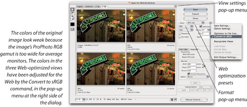
Switch to the 2-Up or 4-Up tab of the window. We like 4-Up except when we’re almost sure of what settings we’re going to use.
Leave the first panel set to Original (so you have something with which to compare your tests). Click on each of the other images and choose for it a preset configuration from the Settings pop-up menu. For a good spectrum of results, David usually starts with these three: JPEG Medium, GIF 64 Dither, and GIF 32 No Dither.
Visually check each image’s quality and size, and approximate download time (shown under each image).
Pick the one that is closest to what you’re trying to achieve, and tweak the settings to minimize the size while maintaining quality. Below we cover each of the settings and how they work.
When you’re ready, click OK (make sure the proper image is highlighted; whichever one is highlighted is the one that gets saved to disk).
Tip
In Photoshop CS3, you no longer have to remember to convert an image to sRGB before opening Save For Web & Devices. Just click the round button next to the Settings pop-up menu, and turn on the Convert To sRGB command. The dialog still contains the ICC Profile check box, which determines whether the profile is embedded.
The problem is that there are many settings in the dialog to tweak, many of them obscure. We’ll cover the ones that are most relevant to our interests—reproducing photographic images at an efficient file size.
Presets. The Presets pop-up menu lets you recall saved settings. There’s nothing magic about the settings that are already built-in; they’re only there to get you started. If you don’t like the built-in settings, you can delete them by choosing Delete Settings from the pop-up menu to the right of the Settings pop-up menu. If you want to add your own group of settings to the list, choose Save Settings instead; make sure the settings are saved in the Optimized Settings folder (inside your Photoshop Presets folder), with an .irs filename extension.
Format. If you prefer to arrange the settings manually, you should start by choosing GIF, JPEG, PNG, or WBMP from the Format pop-up menu. We discuss these formats in some detail in the last chapter and below.
Checking File Size. The file size that Photoshop displays in the lower-left corner of the document window doesn’t take into account any form of compression that might be applied. The file size you see in the Save for Web & Devices dialog is more accurate, but it’s still not perfect. The only way to find an image’s true (postcompression) file size is to save it to disk and switch out of Photoshop. On Mac OS X, select the file and choose File > Get Info. In Windows, right-click the file and choose Properties. If the file size is displayed as “27 K on disk (22,045 bytes used),” pay attention only to the second number. The first value actually varies depending on the block size of your hard disk formatting. If your disk uses 32 K blocks, a 2 K file will occupy 32 K on disk, and a 33 K file will use 64 K of disk space. The second number shows the actual amount of data someone would have to download to see the image, and it’s usually smaller than the disk space number.
Tip
When you have in mind specific file sizes for your Web graphics, Photoshop can figure out the compression settings for you. Choose Optimize to File Size from the unlabeled pop-out menu next to the Settings pop-up menu. In the Optimize To File Size dialog, enter the file size you want, select a Start With option, and click OK. You probably don’t want to simply accept whatever Photoshop gives you: Even the best images still require some tweaking.
The following features are all located in the unlabeled view settings pop-up menu (see Figure 12-16). Like the View menu in Photoshop, these settings do not affect the image data. They only affect how you’re viewing the image so that you can preview it under different scenarios.

Image Size. Do you need your final Web graphic to be smaller than the high-resolution version you have? Use the Image Size dialog to downsample the image before using Save For Web & Devices, or use the Image Size tab in the Save For Web & Devices dialog. Both do exactly the same thing, although the Image Size dialog provides more options.
Tip
If you’re starting with a very large image, such as a 10-megapixel digital SLR photo, it’s faster to resample it using the Image Size dialog rather than the Image Size tab in the Save For Web & Devices dialog.
Browser Dither. You don’t need to worry about this option (located in the unlabeled pop-out menu at the top right of the Save For Web & Devices dialog viewing area) unless you’re preparing images for an audience that has 8 bit/channel displays. It simulates how Web browsers dither on those monitors.
Display profiles. As we pointed out earlier, Mac OS X and Windows display images slightly differently by default. You can preview how the image will look under different viewing conditions by choosing one (such as Standard Windows Color) from the third section of the unlabeled pop-up menu at the top right corner of the viewing area.
Tip
Commands controlling the viewing area are also available on a context menu if you right-click or Ctrl-click (Mac) on a view.
Some users mistakenly believe that this menu assigns a profile or converts the image to a profile. Neither is true. The commands on the View Settings pop-up menu only change how you preview the effects of your settings, in the same way as the Proof Setup commands in Photoshop.
Download time. Each image in the Save for Web & Devices dialog lists the approximate time it would take to download the image. Of course, it’s just an estimate, but it can be a useful reality check. To change the setting for any view of the image, click the view and choose a new speed from the bottom half of the menu you get when you click the pop-up menu button at the top right corner of the viewing area.
Tip
You may think that fast broadband Internet speeds mean small file size is not the priority that is used to be. However, remember that the new frontier of the Internet is mobile, handheld devices, where not all networks are fast, and users may be charged per kilobyte. If your Photoshop images will be viewed by this audience, they’ll still appreciate small file sizes.
Other options. We’ve decided to concentrate on photographic images in this book, so we aren’t covering the Color Table option, since it’s used for controlling the colors in GIF images, which are not optimal for photographic reproduction. We’re also not covering the slicing and HTML export options (since those are mostly geared toward Web designers who for some reason aren’t using Adobe Dreamweaver instead) or the looping option and Animation palette for creating animated GIF graphics.
Cell phones and handheld devices represent millions of multimedia-capable devices with photographic-quality displays, which, of course, become platforms for personal and commercial image content. To preview an image for a mobile device, choose File > Save For Web & Devices (see Figure 12-17), set up the conversion specifications you want to test, and then click the Device Central button at the bottom of the Save for Web & Devices dialog. In the Adobe Device Central dialog, click the Emulator tab, and then on the left side of the dialog, double-click the name of device on which you want to preview the image.

New in Photoshop CS3 is the Zoomify feature. It’s a way of displaying high-resolution photos online without letting people download the entire image, and without having it take over the entire screen.
Tip
The degree of detail at the maximum Zoomify zoom level depends on the size of the image you feed into Zoomify, so if you want to limit the amount of detail, use the Image > Image Size command to downsample your image before you open the Zoomify Export dialog.
The principle is simple. Zoomify creates a Flash-based viewer window at the size of your choice, so you can fit it on your Web page. Inside this window is your image (Figure 12-18). To zoom in to see details, click the image; this enlarges the image without making the window bigger. To move around in the zoomed image, just drag the image. You can also navigate using the controls at the bottom of the Zoomify object that ends up on your Web page. It’s similar to how Google Maps works. Your audience will need to have Flash installed for their Web browser, but most browsers include it these days.

To create a Zoomify object, start with an 8 bit/channel image, and then choose File > Export > Zoomify to open the Zoomify export dialog (Figure 12-19), which contains some straightforward options for file export location, quality, and size of the viewer. Zoomify chops up the image into many small tiles, and uses its Flash application to reassemble them on the fly; the Image Tile Options control how much compression is applied.
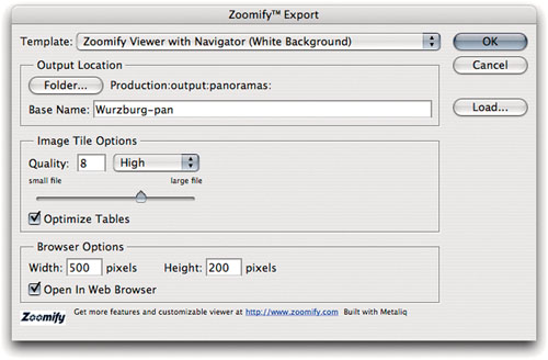
After you’ve specified the options and clicked OK, you need to copy the table code from the HTML document produced by Zoomify, and paste it into the code for your Web page. In the folder Zoomify creates, you can see the image tiles that were generated.
The Web Photo Gallery, found in the Automate submenu (under the File menu), is like the other automated features: It performs a task that you could do by hand, but it would be so painful and boring that you might fall out of your chair from the sheer monotony of the chore. In a nutshell, the Web Photo Gallery creates a Web page full of image thumbnails (see Figure 12-20). If you click on one of the thumbnails, it automatically links to a larger version of the picture. That’s about it.

With the increasing popularity of online photo services that provide ready-made galleries with all kinds of features, such as online print ordering and keyword searching, you may prefer not to make your own galleries and simply upload a bunch of photos to a service. The Web Photo Gallery feature is more useful if you want to upload photos to a Web site that you’re managing yourself, but all it will do is display the photos.
Customize your galleries. You don’t like the galleries that Photoshop creates? Not jazzy enough for you? No problem: You can always edit the HTML files in Dreamweaver, GoLive, or some other editor later. However, if you’re going to be making a lot of galleries, it would be more efficient to edit the built-in templates instead.
Find the Web Photo Gallery folder that contains the templates. It’s inside the Presets folder, in the Photoshop application folder.
Copy one of the template folders and name the duplicate folder as you would like it to appear in the Web Photo Gallery dialog.
Edit the files inside this folder using a text editor. You can edit them to some degree with a Web page editor, but because these files are templates rather than real Web pages, it’s safer to make your changes in the actual HTML code. This is because the template works by replacing certain codes with the settings you make in Photoshop. For instance, the %%BGCOLOR%% code in the template automatically gets stripped out and replaced with the background color you chose in the Web Photo Gallery dialog. You want to preserve these codes so that the options in the dialog work. If you always want the same background color, though, you can remove this code from the template and type in your own color.
Now, when you open the Web Photo Gallery dialog, your new template should appear in the Styles pop-up menu. Obviously, making templates requires some knowledge of HTML, but it’s surprisingly easy once you get the hang of it.
Photoshop can save or export files to a very long list of formats. In this section, we’ll guide you through them and the mind-numbing range of options you will encounter with some formats.
The Photoshop file format—otherwise known as Photoshop native format, or by its filename extension, PSD—used to be the only way to save everything that Photoshop is capable of producing: multiple layers, adjustment and type layers, layer effects, paths, multiple channels, clipping paths, screening and transfer settings, and so on. (Note that Undo states, histories, and snapshots are not saved in any file format.) The PSD file format is less necessary because almost anything you can save in a Photoshop file, you can now also save in either a TIFF or a Photoshop PDF file. It’s important to note, however, that other applications may not be able to read those formats properly. For instance, you can now save spot colors in a TIFF file, but no other programs currently handle those spot colors properly.
Saving a composite. By default, Photoshop pretty much insists on saving a flattened composite version of the image in every PSD file because it “maximizes file compatibility.” As a result, those of us who have become accustomed to using PSD to save files that consist only of a Background layer and some adjustment layers get a rude shock when we find out how large our Photoshop files are on disk.
You can prevent Photoshop from saving flattened composites in two ways, each tied to the Maximize PSD And PSB File Compatibility pop-up menu in the File Handling panel of the Preferences dialog. By default, this pop-up menu is set to Ask, which means that whenever you try to save a PSD file with layers, you get to choose whether or not you want to “maximize file compatibility.” Plus, you get a scary-looking warning (see Figure 12-21). The warning is there for two reasons:
Several other applications claim to be able to read Photoshop files, and while a few can actually read layered files, most just read the flattened composite. Adobe Illustrator, Adobe InDesign, and QuarkXPress 6.5 will all attempt to read Photoshop files even if the composite is not present, so if you’re using one of these, you can usually proceed without the composite—if your layered files are relatively straightforward. However, if your layers use any of the new blending modes such as Pin Light or Vivid Light, the layers will very likely not be read correctly, so it’s safer to include the composite. Plus, while InDesign and Illustrator can read 8-bit layered PSD files without a composite, they can’t handle 16-bit PSD files without one.
Future versions of Photoshop may change the layer-blending algorithms, which means that when you opened a layered document, it would look slightly different than it does now. Adobe reasons that with the flattened composite, you’ll still be able to retrieve the correct image appearance in future versions. Of course, if you someday open the composite rather than the layered document, you lose all your layers, so the advantage over saving a flattened copy is questionable.

Our advice? The more you use Photoshop native files in other programs, including photo organizers such as Lightroom, the more you want this option to be on, to avoid workflow headaches. If you usually use Photoshop files only within Photoshop, you’ll save disk space by turning this off. The way to stop this dialog from being annoying is to open the File Handling pane of the Preferences dialog, and choose Always or Never from the Maximize PSD And PSB File Compatibility pop-up menu, depending on your workflow. You’ll only be nagged if that pop-up menu is set to Ask, which really means “ask every time.”
Duotones. Because TIFF and PDF do almost everything that the native Photoshop file format does (and often do it better), we almost never use PSD files anymore. The exception is when using multitone images. Adobe InDesign CS and later can import PSD files saved in Duotone mode, and these files are more flexible than PDF, EPS, or DCS files. (See our online bonus chapter, Chapter 13, “Spot Colors and Duotones,” for more on spot colors and these file formats.)
Photoshop 2.0 format. This is an example of the Photoshop team’s philosophy of not removing features. This feature is present only for compatibility reasons. It’s available only in Mac OS X.
The Tagged Image File Format (TIFF, pronounced just as it reads) is the industry-standard bitmapped file format. Nearly every program that works with pixel-based images can handle TIFF files—either placing, printing, correcting, or editing the pixels. A Photoshop TIFF can be any dimension and resolution (at least we haven’t heard of any limits). You can save it in Grayscale, RGB, CMYK, or Lab color mode with 8 or 16 bits per channel, as 8-bit RGB indexed color, or as a (1-bit) black and white bitmap. Before you get totally carried away, though, bear in mind that TIFF files have a permanent, hard-coded file-size limit of 4 GB.
TIFF was once a very straightforward format—the only information it contained beyond the actual pixels themselves was the output size and resolution. But now, Photoshop can save TIFF files that contain just about everything you can put in a native Photoshop file, including vector data, clipping paths, transparency, spot-color channels, annotations, and adjustment layers. The only exception is that you can’t save a duotone as a TIFF. But beware: Just because you can save something in a TIFF doesn’t mean a program like InDesign or QuarkXPress can open or print it; you’ll see examples below.
Spot channels. Even though you can save spot channels in a TIFF, we know of no application other than Photoshop that can print them properly from a TIFF. And even though you can save your vector data (type and layer clipping paths) in a TIFF, it will print as a raster (pixels) image from any application other than Photoshop, not a vector image. So you need to be careful.
Ask Before Saving Layered TIFF Files. When you add layers to a TIFF that started out flat and try to save it, this option forces you to look at the TIFF Options dialog (which we discuss below).
When you save a layered TIFF, Photoshop always includes a flattened composite of the image. As with Photoshop native format, saving layers increases file size significantly. Applications such as QuarkXPress and InDesign import the flattened image, but if you later open the TIFF in Photoshop, it reads the layers.
When you save a TIFF, Photoshop lets you choose from among various options in the TIFF Options dialog (see Figure 12-22).

Compression. Photoshop lets you save the composite (flattened) information in TIFF files with LZW or ZIP (lossless), or JPEG (lossy) compression. LZW may still give a few antediluvian applications some problems, but is generally well-supported. However, LZW doesn’t work well on high-bit files—it actually makes them bigger rather than smaller. The only program (besides Photoshop) we know of that can read TIFF files with ZIP or JPEG compression is Adobe InDesign.
If you save your TIFF with ZIP or JPEG compression, you do get a warning that these compression options “are not supported in older TIFF readers”—which really means that they’re not supported by any application except InDesign, Photoshop, and recent versions of other Adobe programs such as Acrobat. We hope support widens, because ZIP compression is lossless and highly efficient. With layered TIFFs, you have the option of applying ZIP compression only to the layers while leaving the flattened composite uncompressed. We use this option a lot, because compressing the layers makes for a much smaller file, and the uncompressed flattened composite is still readable by other applications.
LZW compression is relatively inefficient—and useless on high-bit files—so we generally avoid it (David still uses LZW compression on screen shots, but when pressed, will admit he does so largely out of habit). We use ZIP compression on flattened images destined for InDesign: If we don’t know the final destination, we leave our flattened TIFFs uncompressed.
Pixel Order. Photoshop CS2 introduced a new TIFF option—Pixel Order—which lets you choose between Interleaved (known in Neolithic times as “chunky”) or Per Channel (also known as “planar”). The difference has to do with how each channel of an image is saved: Interleaved saves a pixel’s red channel value, then its green channel value, and then its blue channel value—repeating this cycle for each pixel in the image. That’s how every version of Photoshop before CS2 saved TIFFs. Per Channel saves the entire red channel, followed by the green channel, and finally the blue channel.
Most older programs simply can’t read Per Channel TIFFs, so we typically just stick with Interleaved. But if you’re trying to make your file as small as possible, Per Channel pixel order with ZIP compression produces the smallest file on high-bit images, and Interleaved pixel order with ZIP compression does the same on 8-bit ones.
Byte Order. For some reason, Mac OS X and Windows have different versions of TIFF. It has something to do with the file’s byte order and the processing methods of Motorola versus Intel CPUs. These days, no matter what brand of CPU you have in your computer, most programs understand how to read either order: If you find one that isn’t, that program is either old or poorly written.
Image Pyramid. This option is completely irrelevant for prepress work and was designed looking forward to a time when TIFFs might be used on the Web. The Image Pyramid is basically the contents of the Image Cache, covered in Chapter 6, “Essential Photoshop Tips and Tricks.” Since the necessary browser support essentially never materialized, we don’t see any reason to turn on the check box.
Transparency. When your image has transparency (the file is not flattened and has no Background layer), you can save the image transparency in the TIFF file by turning on the Save Transparency check box. Programs that understand transparency (such as InDesign), can read the transparency in these TIFF files. Older programs import the file as though it had been flattened.
Layer Compression. Photoshop also always compresses the layers in a layered TIFF files using either RLE or ZIP. If we’re saving layered TIFFs for placement in a page-layout application, we almost always leave the composite data uncompressed, but we choose ZIP compression on the layers (as we noted earlier). ZIP takes a bit longer to save, but it’s a much more efficient compression algorithm than RLE, so it results in significantly smaller files.
Compatibility. TIFF is, in many ways, the ideal bitmapped file format, but it has become increasingly flexible over the years, and that flexibility comes at the price of compatibility. Photoshop can easily save TIFFs that are either unreadable by other applications or may not print as expected from other applications. Photoshop can read anything it can save in a TIFF, so TIFF is great as a work file format for Photoshop. But as we’ve shown, other applications may not know what to do with all the features Photoshop can save in a TIFF image. What to do? We offer this rule of thumb: Assume that anything using or opening a Photoshop TIFF will read the flattened composite and ignore everything else, and assume that the only widely supported compression option for the flattened composite is LZW.
As we said back in Chapter 2, “Image Essentials,” Encapsulated PostScript (EPS) is really an object-oriented file format, but Photoshop can save pixel-based and vector (like text) image data in the EPS format. There are two things you should remember about EPS:
The primary use of EPS files is in page-layout software for printed output. They aren’t really useful for Web, video, or other types of output.
EPS is a twentieth-century file format that’s being replaced by PDF. Old, second-millennium software like Adobe PageMaker or Quark-XPress 4 handles EPS files better than PDF files, but for modern software (like InDesign CS3), PDF is the vector file format of choice, and is even the native file format of Illustrator.
When you save an image as EPS, Photoshop lets you set the file’s preview style and encoding, and it gives you a choice as to whether you want to include halftone screening, transfer curves, PostScript Color Management, and vector data (see Figure 12-23). Let’s look at each of these.
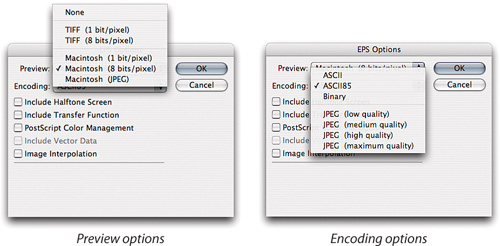
Preview. EPS files typically have two parts: the high-resolution PostScript data and a low-resolution screen preview. When you import an EPS file into a page-layout program (or a word processor or whatever), the computer usually displays the low-res image on the screen, and when you print the page to a PostScript printer, the computer usually uses the high-res PostScript code. (However, some more-intelligent programs like InDesign can actually read and display the complete contents of an EPS file, because they can render PostScript to the screen.)
On the Mac, Photoshop lets you save EPS files with five preview options. As we mentioned earlier, don’t bother with the Thumbnail and Full Size preview options in the Save As dialog, because the EPS preview options do the same thing while giving you more control.
TIFF. In Windows, Photoshop only offers 1-bit or 8-bit pixel TIFF from the Preview pop-up menu; we always choose 8-bit. On the Mac, the only time you should select one of these is when your image needs to be imported into a page-layout program on a PC. If you choose one of the PICT formats, the preview is lost when the file is moved to the PC (an EPS without a preview just looks like a gray box on pages, though it prints correctly). Some programs on the Mac, such as InDesign and XPress, can import PC EPS files with the preview image intact; but no programs that we know of on the PC can read Mac PICT previews. (However, InDesign on either platform can generate a preview on the fly for an EPS file that has lost its preview.)
PICT. Files that will stay on the Mac should be saved with a PICT preview. Photoshop gives you three choices: 1-bit, 8-bit, and JPEG. When you save an EPS file with a Macintosh JPEG preview, Photoshop has to take the time to build a JPEG preview. However, we gladly take the minor performance hit to get the benefits. JPEG previews are better looking, and take up less space on disk, than their 8-bit brethren. (A JPEG preview for a 300-dpi tabloid-size image is only about 90 K.)
If you’re concerned about disk space, you may choose to have no preview (None) or a black-and-white preview (1-bit, either TIFF or PICT). Personally, we’d rather suffer thumbscrews than use either of these when hard drive prices are so low.
Now let’s take a look at EPS encoding options.
ASCII vs. Binary. As we mentioned for this same option in the Print dialog, Binary is faster, and ASCII is more compatible; use ASCII only if you’re having problems with Binary.
JPEG compression. Instead of saving the EPS file with binary or ASCII encoding, you can choose some level of JPEG compression.
Note
Sorry, there’s no way to save an EPS file with lossless compression from Photoshop, even though PostScript Level 2 and 3 interpreters can decompress several lossless compression methods.
There are two downsides to creating JPEG EPS files, though. The first is that you can only print them on a printer that has PostScript Level 2 or PostScript 3. Other types of printers may not be able to decompress JPEG images that exist inside an EPS file.
The second problem with JPEG EPS files is a show-stopper: They may not separate properly when printed from QuarkXPress. If you run into this, what you’ll find is that the entire image comes out on the black plate. If for some reason you must use JPEG in this way, save the image as a JPEG-compressed DCS file instead.
Halftone screens and transfer functions. If you want to save halftone-screening or transfer-curve information in the image, you must save it as an EPS file. You can set the halftone screens and transfer functions in the Print dialog. Then, when saving the EPS, turn on the Include Halftone Screen check box.
Saving halftone screens in an EPS file is useful whenever you want to set specific screen frequencies and angles for an image and preserve them, such as when saving duotone, tritone, or quadtone images. Note that you can’t use InDesign or XPress to override EPS halftone settings.
PostScript Color Management. It’s unlikely that you’ll turn this on. It includes an ICC profile in the EPS file. If you’ve got a PostScript output device that knows about profiles, it can handle it, but otherwise the profile will be ignored. If you really need color management, we suggest using TIFF, PSD, JPEG, or PDF instead.
Include Vector Data. If your image includes vector data—vector text or vector clipping paths that haven’t been rasterized into pixels—then you must turn on the Include Vector Data check box. If you turn it off, all that vector data gets rasterized upon saving.
Note that this is a one-way street: Photoshop can export EPS files with vector data, but it cannot retain vectors when importing EPS files—it’ll rasterize them. Just another reason to use PDF instead of this ol’ format when possible.
Image Interpolation. As we noted for this feature in the Print dialog, this feature is of limited use and you probably won’t be turning it on.
DCS (Desktop Color Separation) is a special form of the EPS file format. However, it’s weird (and important) enough that Adobe added it as two separate file formats in the Save As dialog: Photoshop DCS 1.0 and Photoshop DCS 2.0.
Originally, DCS was designed to separate the high-resolution image data from a low-resolution “preview” version. The DCS 1.0 format always results in five files: four with high-resolution data for each color plate (cyan, magenta, yellow, and black), and one—called the master file—is what you import into a page-layout program. The master file contains three things: a low-resolution screen preview of the image, a low-resolution composite CMYK version, and pointers to the other four files.
Tip
If you don’t see Photoshop DCS listed in the Format pop-up menu of the Save As dialog, you may need to convert your image to CMYK. DCS isn’t available for other color modes.
There are two problems with DCS 1.0. First, some people don’t like to keep track of five files for each image (though to be fair, many other people think this is nifty because they can leave the high-resolution data on a server and just use the master file on their own systems). Second, there is no way to include spot colors.
Ultimately, we know of no good reason to use DCS 1.0, so we’ll focus on version 2.0, which does everything that 1.0 does, and more.
Of the various options in the DCS 2.0 Format dialog (see Figure 12-24), most of them are equivalent to the ones in the EPS Options dialog (which we discussed in the last section). For instance, Preview lets you determine the quality and kind of RGB screen preview; Encoding determines the format of the data within the file; and so on. In the DCS pop-up menu, you can choose whether you want one single file or multiple files on disk, and what sort of composite image you want.

DCS composites. Many people confuse a DCS composite image with the preview image. This is understandable, because they’re nearly identical. Both are low-resolution (72 ppi) representations of the original image; and both can be used instead of the high-res image for proofing.
The real difference is in their uses. The preview image is always in RGB mode and is designed for screen use only. The composite image is saved in CMYK mode (it’s the same as downsampling the high-res CMYK image to 72 ppi using Nearest Neighbor interpolation), and is meant for sending to a low-resolution color printer for use as a comp or a proof.
Tip
If your DCS file includes spot colors, your page-layout software must also have colors named exactly the same way (yes, InDesign, and XPress import these names automatically when you import a DCS 2.0 file).
For color-proofing devices that require color separations, you can force XPress to send the high-resolution data with a third-party XTension. Adobe InDesign CS2 and later can do this automatically. Honestly, though, we tend to think it’s better to proof images before you save them as DCS files; once they’re encapsulated like this, it’s hard to get any really accurate proofs from them.
Multifile or single file. Whether you tell Photoshop to write a single file or multiple files is up to you and your workflow. Probably the best reason to use multiple files is if you need or want to keep your high-resolution data in a separate place (like on a server or at your imaging bureau). This is especially helpful with very large files.
On the other hand, keeping track of so many files can be a pain, and the links to the high-res images can be broken if you rename or move those files. Fixing broken pointers is often easy: Just open the master file in a text editor and edit the filenames in the lines that begin with “%%PlateFile”.
However, don’t fear if you lose the master file entirely; you can always reassemble the separate DCS files in Photoshop, like so:
Open each of the high-res images in Photoshop. They’re all EPS files, and they’re all in Grayscale mode. Of course, opening these files will rasterize any vector data. Make sure that each file is flattened.
When all four of the files are open, select Merge Channels from the Channels palette’s pop-out menu.
Make sure the mode is set to CMYK and the Channels field is set to 4 (see Figure 12-25); click OK.
Photoshop is pretty good at guessing which file should be set to which color channel in the Merge CMYK Channels dialog, but if it guesses wrong, set the pop-up menus to the proper files.
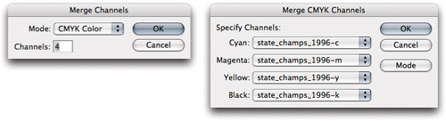
When you click OK, Photoshop merges the four grayscale files into a single, high-resolution CMYK file. You can now create the five DCS files again, if you want. (Note that if you have spot colors in your DCS files, you’ll have to add the additional channels manually, after you merge the CMYK channels.)
We like to use PDF whenever an image contains a significant amount of vector data (like text) that we want to maintain as sharp-edged vectors in the final output. While text is rasterized in TIFFs (making the edges pixelated) and converted to outlines in EPS files (making them slow to print if there’s a lot of text), PDF files handle text beautifully. Best of all, you can embed a font into your PDF file, so it will display and print correctly wherever it goes.
PDF is also an excellent format for sending proofs or samples to clients. Not only can you include password protection, but you can create multipage (multi-image) documents very easily by choosing File > Automate > PDF Presentation.
Round-tripping. When you save an image in the Photoshop PDF format, you’re offered a whole mess o’ options (see Figure 12-26). Some of these options actually override the options you chose in the Save As dialog. For example, the Layers check box in the Save As dialog normally determines whether Photoshop will place the layered data in the PDF file, too. However, Photoshop actually ignores that check box and instead pays attention to the Preserve Photoshop Editing Capabilities check box (in the Save Adobe PDF dialog). When you turn on Preserve Photoshop Editing Capabilities, you can keep all of the Photoshop features you used. If you turn off this option and reopen the file in Photoshop, it rasterizes the whole thing, even if you had saved your vector data.
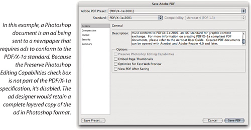
PDF Options. The other options in the Save Adobe PDF dialog are virtually identical to the PDF options from Acrobat Distiller or Adobe InDesign or any of the other Creative Suite applications. This includes the Adobe PDF Preset pop-up menu at the top of the dialog, which lets you choose a preset even if it was created in one of the other Creative Suite applications.
Tip
If you’re sending PDF files to a standardized workflow, you may simply need to choose one of the Adobe PDF Presets at the top of the Save Adobe PDF dialog. The company receiving your PDF files may also provide PDF presets for you to install. If either is true, just choose the right preset instead of editing all the settings.
Most important, the options you choose may degrade the image in the PDF, but as long as the Preserve Photoshop Editing Capabilities check box is turned on, these options won’t affect the behind-the-scenes PSD data that Photoshop saves with the PDF. For example, if you choose a low-resolution, low-quality JPEG compression in the PDF, the PDF image degrades, but the layered data does not. So when you open it in Photoshop and resave as PDF, you don’t recompress (and further degrade) your data.
The Graphics Interchange Format (commonly known as GIF), was once the “house-brand” image file format of the CompuServe online information service. That’s why this file format is listed as “CompuServe GIF” in the Save As dialog, even though GIF images have long since broken free of CompuServe’s corporate walls and are now a Web standard.
GIF files are designed for onscreen viewing, especially for images where file size is more important than quality, and for screens that only display 8-bit color (256 colors). Photoshop GIF files are always 8-bit indexed color images, making them acceptable for onscreen viewing, but totally unreasonable for printing. GIFs are automatically compressed using lossless LZW compression (see “Compressing Images,” later in this chapter). But we never save a GIF file with the Save As dialog; rather, we use the Save For Web & Devices dialog.
Earlier in this chapter we talked about JPEG as a compression method within another file format—like JPEG DCS—but these days, when most people say “JPEG,” they’re referring to the JPEG file format itself. Most JPEG images are found on the Web or coming out of digital cameras. The only problem with using the JPEG format for printing is that it’s lossy (see “Compressing Images,” later in this chapter). We recommend only using JPEG files in a prepress workflow if it’s essential that you drastically limit your file sizes.
Tip
JPEG is best used as an output format only. Avoid repeatedly editing and saving a JPEG file, or quality will degrade.
You might have noticed that you can save JPEG files in both the Save As dialog and in the Save For Web & Devices dialog. What’s the difference? In the Save For Web & Devices dialog, it’s assumed that you want the smallest file possible, so there are no options for features such as embedded previews, and by default, metadata isn’t included. If you want to include full metadata and more features, create JPEGs using Save As. If you want smaller files, create JPEGs using Save For Web & Devices.
Tip
If JPEG is not available in the Format pop-up menu in the Save As dialog, make sure your image is in 8-bits-channel mode.
By the way, don’t confuse JPEG with JPEG 2000, which is a newer, more capable format that unfortunately has not caught on. If you do want to use JPEG 2000, no problem—it’s one of the extra plug-ins available on your Photoshop installation CD (see “Uninstalled File Format Plug-ins,” later in this chapter).
For a while, it looked like GIF would take over the Internet. Then, in early 1995, CompuServe and Unisys shocked the world by demanding that developers whose software wrote or read GIF files pay a royalty fee for the right to use GIF. Legally, they were entitled; but no one had to pay before, and it jarred the electronic publishing community enough that a group of dedicated individuals came up with a new Web graphics file format.
The result of their work is the PNG format (pronounced “ping”). It officially stands for Portable Network Graphic, though it unofficially stands for “PNG’s Not GIF”. Not only is it a free format that any developer can use, but it does much more than GIF does.
For instance, PNG can support both 8-bit indexed color and full 24-bit color. Where GIF can include 1-bit transparency (where each pixel is either transparent or not), PNG has full 8-bit transparency with alpha channels, so a graphic could be partially opaque in some areas. PNG also includes some limited ability to handle color management on the Internet by recording monitor gamma and chromaticity. There are many other features, too (among which is the significant bonus of having a relatively unambiguous pronunciation).
Unfortunately, PNG has never been widely accepted by users or Web browsers, and the patents on GIF (which were based on GIF’s LZW compression scheme) expired back in 2004. Our prediction is that PNG will slowly fade away over the next couple of years.
The Photoshop Raw option is a way to read or write image data that doesn’t appear to be in a Photoshop-supported format. Sometimes these files are simply images that are missing file information that identifies them as images. Don’t confuse this with the Camera Raw format, which Photoshop can read but not write (see Chapter 5, “Building a Digital Workflow,” for more on Camera Raw.) If you’re trying to import from or export to some strange computer system, you may have to rely on Photoshop Raw because that system might not know from TIFF, EPS, or any other normal, everyday file format. This is becoming less of a problem as most mainframe systems (especially the imaging systems that are used for scientific or medical imaging) learn to read the newer, better file formats we’ve been discussing until now.
The Photoshop Raw option relies on the basics of bitmapped images (see Figure 12-27):
All bitmapped images are rectangular grids of pixels.
Some bitmapped images have header information at the beginning of the data.
Color data is usually either interleaved (such as alternating red, green, blue, red, green, blue, and so on) or noninterleaved (such as all the red information, then all the green, and finally all the blue).
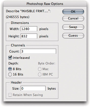
Note that Photoshop can only read data using the Raw data format if it’s saved as binary data; hexadecimal is out.
Make Photoshop guess for Raw data. Okay, someone gives you a file and you find you can’t open it using any of the Photoshop standard file format options. You decide to take a leap and attempt the Raw format. But when you ask your so-called friend about the file’s vital signs—“What are the pixel dimensions? Interleaved or noninterleaved color? Is there a header?”—he just stares at you blankly.
Fortunately, Photoshop can do a little guessing for you. If you click the Guess button in the Open as Raw dialog when the Width and Height fields are blank, Photoshop figures out a likely height/width combination for the image. If it’s a color image, you need to know if it’s RGB (three channels) or CMYK (four channels).
If there’s a header and your friend doesn’t know how big it is (in bytes), then it’s probably a lost cause. On the other hand, if your friend knows the pixel dimensions but not the header, you can click the Guess button while the Header field is blank.
Photoshop pictures go everywhere these days, as big as billboards and as small as little icons on cell phone screens. If you’re trying to make pictures for cell phones and wireless PDAs, we’ve got just the file format for you: WBMP (Wireless Bitmap). You can save files that are already in Bitmap mode as WBMP format from the Save As dialog, or any file as WBMP from the Save for Web & Devices dialog.
Windows Bitmap (BMP, pronounced by saying the letters) is the bitmap format native to Windows Paint. It’s rarely encountered outside of Windows and OS/2 Presentation Manager, and is hardly a professional’s file format. You can store a 1-, 4-, 8-, or 24-bit image of various dimensions and resolutions, but we still prefer TIFF, given its strong support by desktop-publishing applications and compatibility across different computer systems. If you’re creating wallpaper for your Windows desktop, this is the format for you!
Tip
Some older Mac plug-ins, such as the PhotoCD plug-in, don’t work on Intel Macs. To run them, you must switch Photoshop to Rosetta mode. Quit Photoshop, and then in the Finder, select the Photoshop application icon and choose File > Get Info. Turn on the Open in Rosetta check box, and start Photoshop. This will run Photoshop more slowly, because it won’t be running natively on Intel CPUs as long as Open in Rosetta is on. We recommend that you convert PhotoCD images to a format like TIFF, because Kodak no longer updates PhotoCD software.
As we noted back in the Preface, this book only covers a fraction of the potential uses of Photoshop—those centered around print production. People use this program for so many different things that we couldn’t hope to cover them all here. In the last two sections, we discussed each of the file formats that are relevant for professionals who are putting images on paper, film, or the Web. You, however, might be doing something interesting, different, or just plain odd. Don’t worry; Photoshop can probably still accommodate you. While we won’t cover all of the more obscure or just plain obsolete formats in the Save As or Export commands, we’ll tell you where they are in case you need them.
On your Photoshop or Creative Suite install disk, look in the folder GoodiesOptional Plug-insFile Formats. In there, you’ll find file format plug-ins such as Alias, ElectricImage, and even good old MacPaint. To install them, open up your Photoshop application folder (the one that’s already installed on your computer), go to Plug-ins/File Formats, and drop the plug-ins in the File Formats folder.
The reason the plug-ins aren’t installed is because they’re provided as a convenience, but they didn’t go through the same rigorous testing as the components that were installed. They’re the same as what shipped before.
Bitmapped images are pigs when it comes to hard disk space. In this day and age, when you can buy a 500 GB hard disk as cheaply as a pair of shoes, saving space on disk isn’t nearly as important an issue as trying to transfer that data. Whether you have a modestly fast connection to the Web on your handheld device or a T1 line in your office, moving massive files around is somewhat painful.
Our aim, then, is to stretch out the scarce resources we have on hand, and keep files that we need to move around reasonably small. And we’ve got three methods to accomplish this goal: work with smaller images (no, seriously!), archive our images when we’re not using them, and work with compressed file formats.
Let’s take the example of a 1-bit (black-and-white) bitmap, 100 pixels wide and tall. Without any compression, the computer stores the value (zero or one) for each one of the 10,000 pixels in the image. This is like staring into your sock drawer and saying, “I’ve got one blue sock and one blue sock and one black sock and one black sock,” and so on. We can compress our description in half by saying, “I’ve got one blue pair and one black pair.”
Run Length Encoding. Similarly, we can group the zeros and ones together by counting up common values in a row (see Figure 12-28). For instance, we could say, “There are 34 zeros, then 3 ones, then 55 zeros,” and so on. This is called Run Length Encoding (RLE), and it’s used by fax machines. We call it “lossless” because there is no loss of data when you compress or decompress the file—what goes in comes out exactly the same.

LZW, Huffman, and Zip. There are other forms of lossless compression. For instance, RLE compresses simple images (ones that have large solid-colored areas) down to almost nothing, but it can’t compress more complex images (like most grayscale images) very much. LZW (Lempel-Ziv-Welch, though you really don’t need to know that) and Huffman encoding work by tokenizing common strings of data.
In plain English, that means that instead of just looking for a string of the same color, these methods look for trends. If RLE sees “010101,” it can’t do any compression. But LZW and Huffman are smart enough algorithms to spot the pattern of alternating characters, and thereby compress that information. Zip is a considerably smarter version of LZW (smarter means it compresses better, but it may take slightly longer to do so).
The table of contents at the front of most books is a way of compressing information. If you ripped the table of contents out of this book and mailed it to someone else, they would be able to “unpack” it and read what’s in this book. But they wouldn’t actually be seeing the words you’re reading now. Instead, they’d read an “average” of each chapter. The more detailed chapters have more headings, so your friend would see more detail in them than he or she would in a simple-headed chapter like this one.
Bitmapped images can be similarly outlined (compressed), transmitted to someone else, and unpacked. And similarly, when you look at the unpacked version, you don’t get all the detail from the original image. For example, if 9 pixels in a 3-by-3 square are similar, you could replace them all with a single averaged value. That’s a nine-to-one compression. But the original data, the variances in those 9 pixels, is lost forever.
This sort of compression is called “lossy” compression because you lose data when compressing it. By losing some information, you can increase the compression immensely. Where a ZIP-compressed TIFF might be 40 percent of the original size, a lossy-compressed file can be 2 percent or less of the original file size.
Levels of JPEG compression. Lossy compression schemes typically give you a choice of how tight you pack the data. With low compression, you get larger files and higher quality. High compression yields lower quality and smaller files. How much quality do you lose? It depends on the level of the compression, the resolution of the image, and the content of the image.
The primary method is JPEG. Different programs implement JPEG differently, and with varying results. Note that JPEG is both a compression method and a file format in its own right, which is why a PDF can contain a JPEG-compressed image.
JPEG warnings. Images with hard edges, high contrast, and angular areas are most susceptible to artifacts from JPEG compression. Similarly, text (rasterized, not vector) almost always looks terrible after JPEG compression because it has such hard edges. On the other hand, compressing natural, scanned images using JPEG—especially those that are already somewhat grainy or impressionistic—probably won’t hurt them much at all, especially if you use the Maximum or High quality setting.
You should only use JPEG for final output, after you’ve finished all editing and correction. Tone or color correction on a JPEG image exaggerates the compression artifacts, and so does sharpening.
Over the years, we’ve found only a few universal truths. One of those is: “Fast, Cheap, or Good; you can have any two of the three.” Compression is certainly no exception. Compressing files can be a great way to save hard drive space (read: “save money”) and sometimes to cut down on printing times (read: “save more money”). But compressing and decompressing files also takes time (read: “lose the money that you just saved”).
Complicating this is that the more disks you have, the more time you have to spend managing them. In the end, you need to decide whether you’ll get more value out of the space you saved by compressing files and not having to buy and manage more disks, or from the time you’d save from not spending so much waiting for the CPU to finish compressing or decompressing the hundreds of images you edit. It kind of comes down to whether you have more money or time.