Tonal manipulation—adjusting the lightness or darkness of your images—is one of the most powerful and far-reaching capabilities in Photoshop, and at first it may seem like magic. But there’s nothing magical about it. Once you understand what’s happening as you adjust the controls—it all comes back to those ubiquitous zeros and ones—it starts to look less like magic and more like clever technology. But your increased understanding and productivity should more than make up for any loss in your sense of wonder, and besides, you’ll have more time to play.
Tonal manipulation makes the difference between a flat image that lies lifeless on the page and one that pops, drawing you into it. But the role of tonal correction goes far beyond that. When you correct color in an image, you’re really manipulating the tone of the individual color channels.
In fact, just about every edit you make in Photoshop involves tonal manipulation. In Chapter 8, “The Digital Darkroom,” we’ll show you some more esoteric techniques for getting great-looking images, but in this chapter we’ll concentrate on the fundamentals—the basic tonal manipulation tools and their effects on pixels. Much of this chapter is devoted to two tools—Levels and Curves—because until you’ve mastered these, you simply don’t know Photoshop! But we also cover the considerable number of other useful commands found on the Adjustments submenu in the Image menu.
Every tonal edit you make causes some data loss. The purpose of this bald statement isn’t to scare you, but simply to make you aware that like most things in digital imaging, editing tone and color involves a series of trade-offs. As you stretch and squeeze various parts of the tonal range, the trick is to throw away what you don’t need, and to keep what you do need. Teaching you that valuable trick is one of the goals of this book.
When you work with images in Photoshop, they’re often made up of one or more 8-bit channels, in which each pixel is represented by a value from 0 (black) to 255 (white). Grayscale images have one such channel, while color images have three (RGB or Lab) or four (CMYK). If you’re more adventurous, you may work with high-bit images, where each channel uses 16 bits per pixel to represent a value from 0 (black) to 32,768 (white).
You lose a great deal more information in 8-bit/channel files than you do in high-bit ones, simply because you have much less data to start with. Here’s a worst-case scenario that you can try yourself.
In Photoshop, choose File > New, and choose Default Photoshop Size from the Preset menu. Choose Grayscale from the Color Mode pop-up menu, and click OK.
Press D to set the default black foreground and white background colors. Using the Gradient tool (press G to select it), Shift-drag to create a horizontal gradient across the entire width of the image.
Choose Image > Adjust > Levels, change the gray Input slider (the middle Input setting) to 2.2, and click OK (see Figure 7-1). You’ll notice that the midtones are much lighter, but you may already be able to see some banding in the shadows.
Open the Levels dialog again (press Command-L in Mac OS X and Ctrl-L in Windows), and change the gray slider value to 0.5. The midtones are back almost to where you started, but you should be able to see that, instead of a smooth gradation, you have some distinct bands in the image (see Figure 7-2).
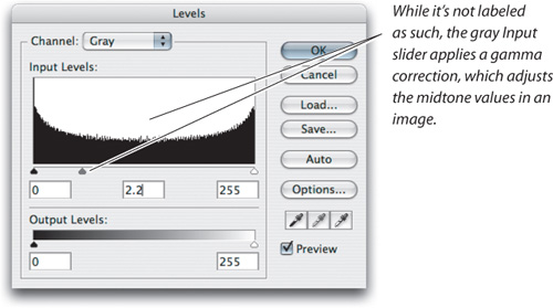
What happened here? With the first midtone adjustment, you lightened the midtones—stretching the shadows and compressing the highlights. With the second midtone adjustment, you darkened the midtones—stretching the highlights and compressing the shadows.
But with all that stretching and squeezing, you lost some levels. Instead of a smooth blend, with pixels occupying every value from 0 to 255, some of those levels became unpopulated—in fact, if we’re counting right, some 76 levels are no longer being used.
If you repeat the pair of midtone adjustments, you’ll see that each time you make an adjustment, the banding becomes more obvious as you lose more and more tonal information. Repeating the midtone adjustments half a dozen times produces a file that contains only 55 gray levels instead of 256. And once you’ve lost that information, there’s no way to bring it back.
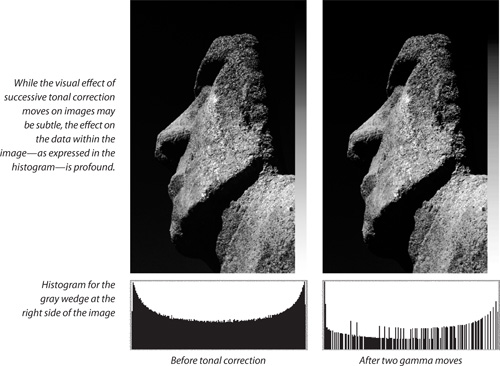
Now repeat the experiment, but create a 16-bit/channel file instead of an 8-bit one (in the New dialog, choose 16 bit from the menu to the right of the Color Mode pop-up menu). The difference between this result and the 8-bit result is dramatic, as shown in Figure 7-3.
This set of adjustments represents, as we noted earlier, a worst-case scenario. No one with any significant Photoshop experience would make edits like this, with one edit attempting to undo the effect of the previous one. (And now that you’ve read this, you won’t either!) In short, whenever you edit tone and color, you have a finite number of levels to play with, so when you push tones up and down, something has to give. See the sidebar, “Difference Is Detail: Tonal-Correction Issues,” on the next page.
Photography has always been about throwing away everything that can’t be reproduced in the photograph. We start with all the tone and color of the real world, with scene contrast ratios that can easily be in the 100,000:1 range. We reduce that to the contrast ratio we can capture on film or silicon, which—if we’re exceptionally lucky—may approach 10,000:1. By the time we get to reproducing the image in print, we have perhaps a 500:1 contrast ratio to play with. All tonal and color edits lose data in one of two ways:
When you stretch a tonal range, pixels that formerly had adjacent values may now differ by several levels. When you stretch the data too far, you lose the illusion of a continuous gradation, and you start to see distinct jumps in tone or color.
When you squeeze or compress a tonal range, pixels that formerly had different values are now compressed to the same value. If you compress the range too much, you may lose desirable detail.
This loss of image data may seem scarier than it really is. We simply want to make you aware where and how it happens, so that your editing techniques can protect the data you need and let go of the data you don’t need. To get there, we’d like to hammer home the following lessons:
All tonal manipulations incur some data loss.
Once the data is gone, you can’t bring it back.
You’ll minimize visible data loss when you work with more bits (such as 16-bit/channel images) compared to working with fewer bits (such as 8-bit/channel images).
Data loss from successive tonal manipulations is cumulative. If you can achieve the same result in one move versus five moves, one move will preserve more quality.
Successive edits that counteract each other should always be avoided.
Difference Is Detail: Tonal-Correction Issues
What do we mean when we talk about image information? Very simply, adjacent pixels with different values constitute image detail. If the difference is very slight, you won’t be able to see it (especially in shadows); but it’s there, waiting to be exploited. You can accentuate those differences—making those adjacent pixels more different—to bring out the detail.
The color of noise. Difference isn’t always detail, though. Low-cost scanners and digital cameras shot at high speeds introduce spurious differences between pixels. Those differences aren’t detail, they’re just noise (like the static on the radio that drowns out the traffic report), and they’re one of our least favorite things. When making tonal and color corrections, you need to decide what is desirable detail and what’s noise, accentuating the detail while minimizing the noise.
Posterization. Noise isn’t the only problem to deal with when you’re doing tonal correction, though. There’s also posterization—the stair-stepping of gray levels in distinct, visible jumps rather than smooth gradations (see Figure 7-4). Unless you’re working with a high-bit image, Photoshop gives you only 256 possible values for a gray pixel.
Posterization manifests itself in two ways. When you start making dark pixels more different, you eventually make them so different that the image looks splotchy—covered with patches of distinctly different pixels rather than smooth transitions. But posterization can also wipe out detail and turn smooth gradations into flat blobs.
Lost detail. When you accentuate detail in one part of the tonal range, making slightly different pixels more different (expanding the range), you lose detail in other areas, making slightly different pixels more similar (compressing the range).
For instance, when you stretch the shadow values apart to bring out shadow detail, you inevitably squeeze the highlight values together (see Figure 7-5). If you make two different pixel values the same, you can’t re-separate the original difference later—that detail is gone forever. That’s what we mean when we say that information is “lost.”
There are a number of practices and techniques that you can employ to minimize the tones and colors that you lose when editing images.
Get good data to begin with. Whether you’re shooting with a digital camera or scanning prints or film, pay attention to proper exposure. Some problems, such as clipped highlights in the capture data due to overexposure, simply can’t be fixed after capture no matter how many bits are in the file. The bigger the corrections you have to make later, the higher the chance of posterization and lost detail. It’s better to get the image as close to “right” as you possibly can while the image is in high-bit form. The whole point of high-bit capture is to make the most important decisions while you’ve got the high-bit data, so that you get the right 8-bit data when you downsample to 8 bits per channel. With digital cameras, it’s especially important to avoid underexposure: Because camera sensors are linear capture devices, underexposed images are much more prone to posterization and noise.
Capture high-bit data when possible. Most digital cameras and scanners sold today can capture at least 12 bits per channel. When you shoot in raw mode, a digital camera saves all 12 bits; in JPEG mode, a camera must convert images to 8-bit files.
Note
You gain nothing by capturing at a lower bit depth and converting to a higher one, such as capturing in 8-bit mode and editing in 16-bit mode. Converting to a higher bit depth just takes up more disk space and processing power.
When you set your digital camera or scanner to its highest bit depth, you are, in effect, telling your capture device to “just give me all the data you can capture” so that you can have the most flexibility in Photoshop. In the 16-bit/channel space, you have much more editing headroom before you run into posterization. Photoshop opens a file of any bit depth between 8 and 16 bits as a 16-bit image.
Don’t overdo it. Small tonal moves are much less destructive than big ones. The more you want to change an image, the more compromises you’ll have to make to avoid obvious posterization, artifacts due to noise, and loss of highlight and shadow detail.
Use adjustment layers. You can avoid some of the penalties incurred by successive corrections by using an adjustment layer instead of applying the changes directly to the image. Adjustment layers use more RAM and create bigger files, but the increased flexibility makes the trade-off worthwhile—especially when you find yourself needing to back off from previous edits. But since the various tools offered in adjustment layers operate identically to the way they work on flat files, we’ll discuss how the features (Curves, Levels, Hue/Saturation, and so on) work on flat files first. For a detailed discussion of adjustment layers, see Chapter 8, “The Digital Darkroom.”
Cover yourself. Since the data you lose is irretrievable, leave yourself a way out by working on a copy of the file, by saving your tonal adjustments in progress separately (without applying them to the image by applying your edits using adjustment layers), or by using any combination of the above. Or you can use the History palette to leave yourself an escape route—just remember that History only remembers the number of states you specify in the Preferences dialog, it’s only retained until you close the file, and it can consume mind-boggling amounts of scratch disk space.
With all these caveats in mind, let’s take a look at the tonal-manipulation tools in Photoshop.
Two Photoshop tools, Levels and Curves, let you address almost all tonal issues, and mastering them is a basic necessity for productive Photoshop work. As you’ll find out later in this book, Levels and Curves aren’t always necessarily the easiest way to correct tone, but until you’ve learned what they can do, you just don’t know Photoshop.
We should mention at this point that in Photoshop CS3, the Curves dialog is so improved and takes on so many features of the Levels dialog that there is much less of a need to use the Levels dialog. We don’t want the Levels dialog to go away because it’s still a simpler way to make basic corrections, but with the new Curves dialog, we expect to use Levels a lot less.
Two additional Photoshop features, the Histogram and Info palettes, provide information that can help guide your corrections. They let you analyze both the unedited image and the effect of your tonal manipulations. So before plunging into the Levels and Curves dialogs, both of which are quite deep, let’s look at the analytical tools: the Histogram palette and the Info palette.
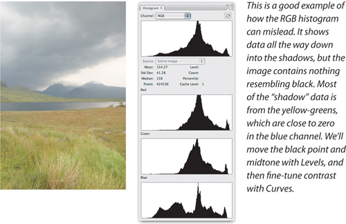
A histogram is a simple bar chart that plots the tonal levels from 0 to 255 along the horizontal axis, and the number of pixels at each level along the vertical axis (see Figure 7-6). If there are lots of pixels in shadow areas, the bars are concentrated on the left; the reverse is true with “high-key” images, where most of the information is in the highlights. The height of the bars is arbitrary—they’re simply comparative indicators of how many pixels have a given tonal value.
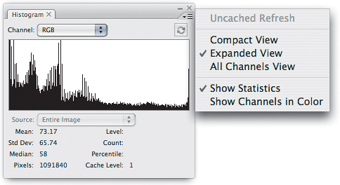
Some of the information offered by the Histogram palette may not seem particularly useful—for most image reproduction tasks, you really don’t need to know the median pixel value, or how many pixels in the image are at level 33. But histograms show some useful information at a glance.
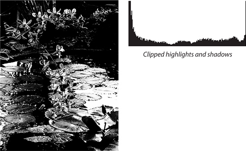
With a quick look at the histogram, you can see if the image has suffered clipping in the highlights or shadows (see Figure 7-7). If there’s a spike at either end of the histogram, the highlight or shadow values are almost certainly clipped—we say “almost” because there are some images that really do have a very large number of pure white or solid black areas. But they’re pretty rare.
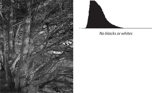
You can also see if the image covers the whole dynamic range (see Figure 7-8). If the data stops a long way south of the white point or a long way north of the black point, you’ll usually need to stretch the data out so that it occupies the whole dynamic range. There are exceptions, but the vast majority of images need a few pixels that are very close to pure white and a few pixels that are very close to solid black if they’re going to have decent contrast on output.
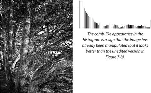
The overall appearance of the histogram also gives you a quick, rough-and-ready picture of the integrity of your image data (see Figure 7-9). A good capture uses the entire tonal range, and has a histogram with smooth contours. The actual location of the peaks and valleys depends entirely on the image content, but if the histogram shows obvious spikes, you’re probably dealing with a noisy capture device. If it has a comb-like appearance, it’s likely that the image has already been manipulated—perhaps by your scanning software or camera firmware.
Tip
If you start with high-quality, high-bit data, there are so many levels available that you can worry less about the overall look of the histogram, and instead concentrate on the overall tonal distribution, and whether any important highlight or shadow detail is being clipped.
The histogram also shows you where to examine the image for signs that you’ve gone too far in your tonal manipulations. If you look at the histograms produced by the earlier experiment in applying gamma adjustments to a gradient, you can see at a glance exactly what each successive adjustment did to the image, because spikes and gaps will start to appear throughout the histogram.
Note that a gap of only one level is almost certainly unnoticeable in the image—especially if it’s in the shadows or midtones—but once you start to see gaps of three or more levels, you may begin to notice visible posterization in the image. The location of the gap gives you a good idea of where in the tonal range the posterization is happening.
Once you’ve edited an image, the histogram may look pretty ugly. This is normal; in fact, it’s almost inevitable. The histogram is a guide, not a rule. Histograms are most useful for evaluating images before you start to edit. A histogram can show clipped endpoints and missing levels, but a good-looking histogram isn’t necessarily the sign of a good image. And many good-looking images have ugly histograms.
Fixing the histogram doesn’t mean you’ve fixed the image. If you want a nice-looking histogram, the Gaussian Blur filter with a 100-pixel radius will give you one, but there won’t be much left of the image! The histogram is just a handy way of looking at the data so that you can see how it relates to the image appearance. The image is what matters. Take what useful information you can from the histogram, but concentrate on the image.
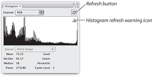
For performance reasons, while you work on an image, the Histogram palette shows you values based on the anti-aliased screen display of your image instead of evaluating the full resolution of your image. This view can hide posterization, giving you an unrealistically rosy picture of your data. Photoshop warns you of this by displaying a warning icon when the histogram is showing you an approximation of your data. To see what’s really going on, click the Refresh button in the Histogram palette. (See Figure 7-10.)
Like the Histogram palette, the Info palette is purely an informational display. It doesn’t let you do anything to the image besides analyze its contents. But where the Histogram palette shows a general picture of the entire file, the Info palette lets you analyze specific points in the image.
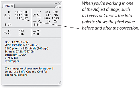
When you move the cursor across the image, the Info palette displays the pixel value under the cursor and its location in the image. More important, when you have one of the tonal- or color-correction dialogs (such as Levels or Curves) open, the Info palette displays the values for the pixel before and after the transformation (see Figure 7-11).
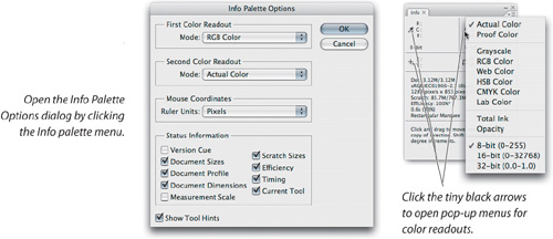
You can control what sorts of information the Info palette displays in one of two ways. You can select Palette Options from the Info palette menu to open the Info Palette Options dialog, or click a tiny black triangle to open a pop-up menu (see Figure 7-12). We have several different palette setups that we use for different kinds of work, and we use the Workspace feature, which captures the Info palette settings in addition to all the other palette locations, to load them as needed (see “Palettes and Workspaces” in Chapter 6, “Essential Photoshop Tips and Tricks”).
Tip
You can use the Info palette to hunt down hidden detail, particularly in deep shadows and bright highlights where it can be hard to see on the monitor. If the numbers change as you move the cursor over an area of the image, tonal differences are lurking—it may be detail waiting to be exploited or it may be noise that you’ll need to suppress, but something is hiding in there.
For grayscale, duotone, or multichannel images, we generally set the First Color Readout to RGB and the Second Color Readout to Actual Color. Actual Color automatically displays the color model of the image you’re viewing. We just about always display the mouse coordinates as pixels, because it makes it easier for us to return consistently to the same spot in the image.
Why display RGB values for a grayscale image? Simply for the precision. Grayscale and Total Ink show percentages, on a scale of 100 instead of 255. For outrageous precision, Photoshop can also display 16-bit values—ranging from 0 to 32,768—when you work on high-bit files. (If these numbers make your head explode, you’re not alone! We’d really like to be able to see the 8-bit and 16-bit values side by side, at least until we get used to thinking of midtone gray as 16,384.) Photoshop also supports high dynamic range (HDR) images with 32-bit floating-point values per channel, and the Info palette can display those too.
The numbers for R, G, and B are always the same in a grayscale image, so the level just displays them three times. Setting the second readout to Actual Color lets you read the dot percentage, so you can display levels and percentages at the same time. We use different setups for color images, which we cover later in this chapter.
Now let’s look at the tools you can use to actually change the image.
The Levels command opens a tonal-manipulation powerhouse (see Figure 7-13). This deceptively simple little dialog lets you identify the shadow and highlight points in the image, limit the highlight and shadow dot percentages, and make dramatic changes to the midtones, while providing real-time feedback via the onscreen image and the Info palette. For more detailed tonal corrections, we use the Curves command; but there are a couple of things that we can do in more easily in Levels, and for a considerable amount of grayscale work, it’s all we need.
The Levels dialog not only displays a histogram of the image, but it also lets you work with the histogram in very useful ways. If you understand what the histogram shows, the Levels controls suddenly become a lot less mysterious.
The three Input Levels sliders let you change the black point, the white point, and the midtone in the image. As you move the sliders, the numbers in the corresponding Input Levels fields change, so if you know what you’re doing, you can type in the numbers directly. But we still use the sliders most of the time, because they provide real-time feedback—by changing the image on screen—as we drag them. Here’s what they actually do.
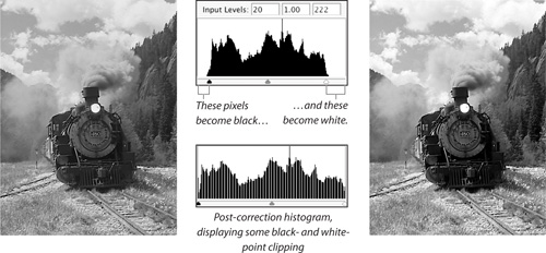
Black- and white-point sliders. Moving these sliders in toward the center stretches the dynamic range of the image. When you move the black-point slider away from its default position at 0 (zero) to a higher level, you’re telling Photoshop to set all the pixels at that level and lower (those to the left) to level 0 (black), and stretch all the levels to the right of the slider to fill the entire tonal range from 0 to 255. Moving the white-point slider does the same thing to the other end of the tonal range, setting all the pixels at the white-point slider and higher (those to the right of the slider) to level 255 (white), and stretching all the levels to the left of the slider to fill the tonal range from 0 to 255 (see Figure 7-14).
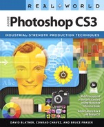
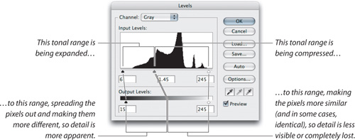
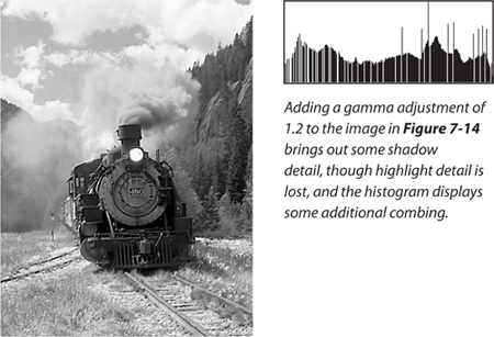
Gray slider. The gray slider lets you alter the midtones without changing the highlight and shadow points. When you move the gray slider, you’re telling Photoshop where you want the midtone gray value (50-percent gray, or level 128) to be. If you move it to the left, the image gets lighter, because you’re choosing a value that’s darker than 128 and making it 128. As you do so, the shadows get stretched to fill up that part of the tonal range, and the highlights get squeezed together (see Figure 7-15).
Conversely, if you move the slider to the right, the image gets darker because you’re choosing a lighter value and telling Photoshop to change it to level 128. The highlights get stretched, and the shadow values get squeezed together. David likes to think of this as grabbing a rubber band on both ends and in the middle, and pulling the middle part to the left or right; one side gets stretched out, and the other side gets bunched up.
The number that appears in the slider’s edit field is a gamma value—the exponent of a power curve equation, if that means anything to you. Values greater than 1 lighten the midtone, values less than 1 darken it, and a value of 1 leaves it unchanged. If you only adjust the midtone slider, you really are applying a pure gamma correction to the image, but if you also move the endpoints, you aren’t: instead, you’re applying an arbitrary three-point curve correction. If you want a more detailed mathematical understanding of gamma encoding and gamma correction, a good place to start is http://chriscox.org/gamma/, written by Photoshop engineer Chris Cox.
The Output Levels controls let you compress the tonal range of the image into fewer than the entire 256 possible gray levels. In the days before ICC profiles, we used to use these controls to make sure that our highlights didn’t blow out and our shadows didn’t plug up on press—the sliders let you limit black to a value higher than 0 and white to a value lower than 255. Good ICC profiles tend to make this practice unnecessary, since they take the minimum and maximum printable dot into account.
However, even though grayscale is a first-class citizen in good color-management standing in Photoshop, very few other applications recognize grayscale profiles. When we have grayscale images with no specular highlights (the very bright reflections one sees on polished metal or water), we still use the output sliders in levels to limit our highlight dot, and—in images with very critical shadow detail—our shadow dot. For images with specular highlights, we use Curves instead (we discuss that technique later in this chapter).
We also use the output sliders when we’re preparing images for slideshows that we burn to DVD and play on TV sets, and for producing “ghosted” images. And on those rare occasions when we’re forced to deal with old-style legacy CMYK setups that use a single dot-gain value, we may still use the output sliders to make sure that we don’t force our highlight or shadow dots into a range that the output process can’t print.
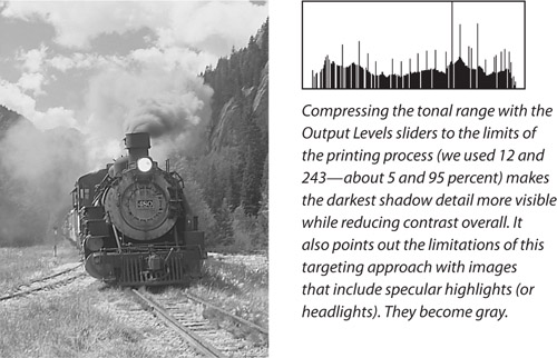
Black Output Levels. When this slider is at its default setting of 0, pixels in the image at level 0 will remain at level 0. As you increase the value of the slider, it limits the darkest pixels in the image to the level at which it’s set, compressing the entire tonal range.
White Output Levels. This behaves the same way as the black Output Levels slider, except that it limits the lightest pixels in the image rather than the darkest ones. Setting the slider to level 240, for instance, will put all the pixels that were at level 255 at 240, and so on (see Figure 7-16).
You might think that compressing the tonal range would fill in those gaps in the histogram caused by gamma and endpoint tweaks, and to a limited extent it will; but all that number crunching introduces rounding errors, so you’ll still see some levels going unused.
Leave some room when setting limits. Always leave yourself some room to move when you set input and output limits, particularly in the highlights. If you move the white Input slider so that your highlight detail starts at level 254, with your specular highlights at level 255, you run into two problems:
When you compress the tonal range for final optimization, your specular highlights go gray.
When you sharpen, some of the highlight detail blows out to white.
Brightness/Contrast in Photoshop CS3
For many years, everyone who taught or wrote about Photoshop passed along the same piece of advice: Never use the Image > Brightness/Contrast command on images, because you’ll push your highlight and shadow data off the edge of the histogram forever, losing those details.
That advice has changed.
In Photoshop CS3, Brightness/Contrast no longer loses highlight and shadow detail by default (see Figure 7-17). Brightness now works like the midtone slider in the Levels dialog, and Contrast now works as if you created an S-curve in the Curves dialog.
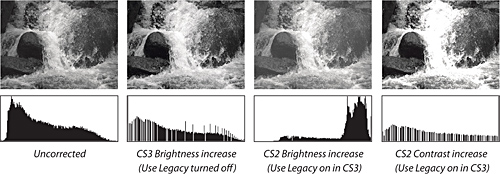
If, for some odd reason, you want Brightness/Contrast to work the way it used to in Photoshop CS2 and earlier, turn on the Brightness/Contrast dialog’s new Use Legacy check box. With Use Legacy turned on, the Brightness/Contrast adjustments are linear. For example, with Use Legacy turned on, the Brightness control simply shifts all the pixel values up or down the tonal range. Let’s say you increase Brightness by 10. Photoshop adds 10 to every pixel’s value, so value 0 becomes 10, 190 becomes 200, and every pixel with a value of 245 or above becomes 255 (you can’t go above 255). This is called “clipping the highlights” (they’re all the same value, so there’s no highlight detail). Plus, your shadows go flat because you lose all your true blacks. Similarly, with Use Legacy on, the Contrast control stretches the tonal range as you increase the contrast, throwing away information in both the highlights and the shadows, and potentially posterizing the tones in between. When you reduce the contrast, it compresses the tonal range, also losing tonal levels.
The Use Legacy check box can be useful when you’re modifying channels and masks (which are usually mostly black or white already). But when you edit images, just keep Use Legacy turned off and Brightness/Contrast will now be safe to use. Still, we prefer to use Curves or Levels, which provide more control.
To avoid these problems, try to keep your significant highlight detail below level 250. Shadow clipping is less critical, but keeping the unoptimized shadow detail in the 5 to 10 range is a safe way to go.
Likewise, unless your image has no true whites or blacks, leave some headroom when you set the output limits. For example, if your press can’t hold a dot smaller than 10 percent, don’t set the output limit to level 230. If you’re optimizing with the output sliders in Levels, set it to 232 or 233 so you get true whites in the printed piece. If you’ll be optimizing later with the Eyedroppers or Curves, set it somewhere around 237 or 240. This lets you fine-tune specular highlights using the Eyedroppers or Curves, but it also brings the image’s tonal range into the range that the press can handle. Again, we should emphasize that if you have a good ICC profile for your output, you don’t need to compress the dynamic range using the output sliders because the profile will take care of it for you.
There are a few very useful features in the Levels dialog that aren’t immediately obvious. But they can be huge time-savers.
Preview. As in other dialogs, use the Preview check box (press P) for a before-and-after comparison of the changes you’re making. When it’s unchecked, you see the existing image; when checked, you see what the image will look like if you click OK to apply the changes you’re making.
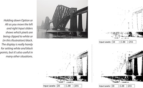
Black-point/white-point clipping display. Black-point and white-point clipping is the one feature that keeps us coming back to Levels instead of relying entirely on Curves to make tonal adjustments. It doesn’t work in Lab, CMYK, Indexed Color, or Bitmap modes—just Grayscale, RGB, Duotone, and Multichannel—but it’s immensely useful.
Tip
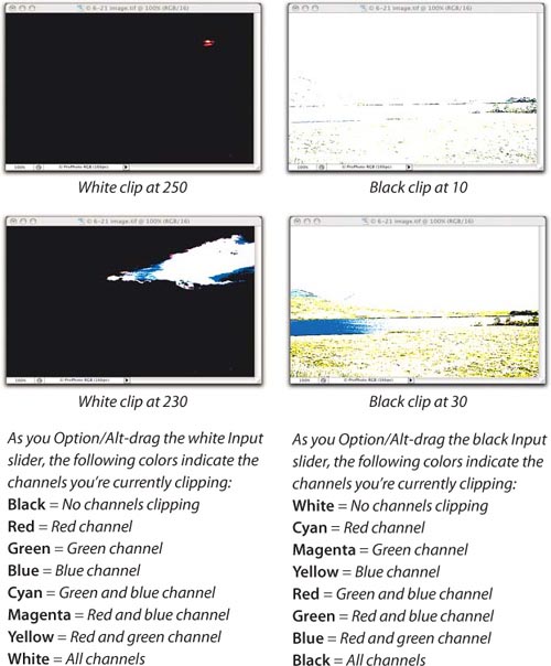
When you Option/Alt-drag Input sliders to view the clipping display, watch out for big clumps of pixels turning on or off. You generally want to set the black and white sliders to a level just outside these clumps, because excluding them removes a lot of detail.
When you set the black and white points, you typically want to set the white point to the lightest area that contains detail, and the shadow to the darkest point that contains detail. These aren’t always easy to see. Hold down the Option or Alt key while moving the black or white Input Levels sliders to see exactly which pixels are being clipped (see Figure 7-18).
Auto. Auto Levels and Auto Contrast work identically on grayscale images, though they differ in their handling of color ones. For grayscale, we advise avoiding both unless you want to auto-wreck your images. They automatically move the black and white Input sliders to clip a predetermined amount of data separately on each channel. If you have a large number of images that you know will benefit from a preliminary round of black and white clipping, you may want to consider running Auto Levels, but you’ll probably want to reduce the default clipping percentages from 0.50 percent to something lower (the minimum is 0.01 percent). To change the clipping percentage, click the Options button and enter your desired percentages in the dialog that appears.
Auto Color, however, is one of the more useful features for making quick fixes to color images (see “Auto Color,” later in this chapter).
Auto-reset. If you hold down the Option key (Mac) or Alt key (Windows), the Cancel button changes to Reset (if you click this, all the settings return to their default states).
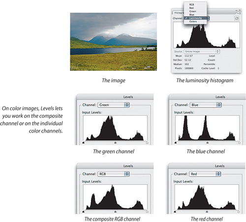
When you work on color images, Levels lets you work on a composite channel (all colors) or on the individual color channels in the image (see Figure 7-19).
When you work in the composite (RGB, CMYK, or Lab) channel, Levels works very much the same way it does on grayscale images. It makes the same adjustment to all the color channels, so in theory at least it only affects tone. In practice, it may introduce some color shifts when you make big corrections, so we tend to use Curves more than Levels on color images. But Levels is useful on color images in at least two ways:
We also use the Auto Color feature in Levels to make quick major corrections (see “Auto Color,” later in this chapter).
The Levels composite histogram. Like the Histogram palette, Levels displays the histogram for an individual channel when you’re viewing a single channel, and offers a Channels menu when you’re viewing the composite image. The composite histogram it displays (labeled RGB, CMYK, or Lab, depending on the image’s color space) is the same as the default composite histogram in the Histogram palette, but different from the Histogram palette’s Luminosity histogram.
In the Luminosity histogram, a level of 255 represents a white pixel. In the RGB and CMYK histograms in Levels, however, a level of 255 may represent a white pixel, but it could also represent a fully saturated color pixel—the histogram simply shows the maximum of all the individual color channels. Fortunately, the Levels dialog’s clipping display makes this clear (see Figure 7-20).
Note that saturation clipping isn’t necessarily a problem. It’s simply a signal that you should check the values in the unclipped channels to make sure that things are headed in the right direction. If you’re trying to clip to white and the unclipped channel is up around 250, or you’re trying to clip to black and the unclipped channel is under 10, you don’t really have a problem. But if the values in the unclipped channels are far away from white or black clipping, respectively, you may actually be creating very saturated colors that you didn’t want.
How Levels works on color images. As the composite histogram implies, any moves you make to the Levels sliders when you’re working in the composite channels apply equally to each individual color channel. In other words, you get identical results applying the same move individually to each color channel as you would applying the move once to the composite channel.
However, since the contents of the individual channels are quite different, applying the same moves to each can sometimes have unexpected results. The gray slider and the black and white Output sliders operate straightforwardly, but the black and white Input sliders require caution.
The white Input slider clips the highlights in each channel to level 255. This brightens the image overall, and neutral colors stay neutral. But it can have an undesirable effect on non-neutral colors, ranging from oversaturation to pronounced color shifts. The same applies to the black Input slider, although the effects are usually less obvious. The black Input slider clips the values in each channel to level 0, so when you apply it to a non-neutral color, you can end up removing all trace of one primary from the color, which also increases its saturation.
Because of this behavior, we use the black and white Input sliders primarily as image-evaluation tools in conjunction with the Option/Alt-key clipping display. They let you see exactly where your saturated colors are in relation to your neutral highlights and shadows. If the image is free of dangerously saturated colors, you can make small moves with the black and white Input sliders; but be careful of unintentional clipping, and keep a close eye on what’s happening to the saturation—it’s particularly easy to create out-of-gamut saturated colors in the shadows.
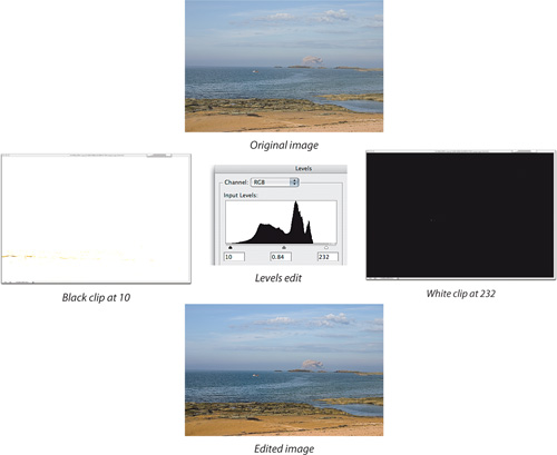
The image shown in Figure 7-21 is a good candidate for correction using Levels. It has no real color problems, and no dangerously saturated colors, but it’s washed-out and flat. The Levels clipping displays reveal that the only data above level 232 is a tiny specular highlight, and clipping the shadows at level 10 introduces a hint of true black. A midtone adjustment with the gamma slider completes the job—three quick moves make an immense difference to the image.
We usually use Levels to make only relatively small corrections like the one in Figure 7-21, because compared to Curves, it’s something of a blunt instrument. But some situations call for a sledgehammer rather than a scalpel, and the Auto Color feature in Levels is a case in point.
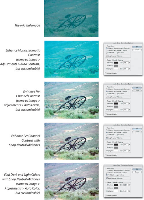
The Auto Levels feature in the Adjustments submenu (in the Image menu) generally wrecks color images, causing huge color shifts. Its younger sibling, Auto Contrast, while slightly more useful than Auto Levels, still leaves a great deal to be desired. However, the Auto Color feature can be very useful indeed for making major initial corrections, particularly on scans of color negatives or on images that need major adjustments in color balance and contrast.
Figure 7-22 shows a pretty desperate situation—the result of having your bags get lost by the airline and your undeveloped film going through numerous baggage scanners as it chases you around the world!
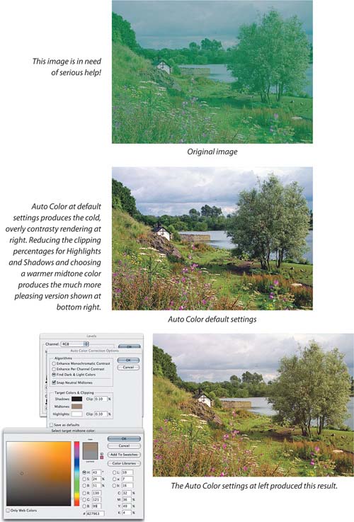
If you simply use Auto Color’s default settings (for example, if you simply chose Auto Color from the Adjust submenu), you’ll typically get a less-than-desirable result. With very little help, though, Auto Color can quickly get you a lot closer to where you need to be. Here’s how we use it:
Tip
If you plan to use Auto Color in the future, set it up and then turn on the Save as Defaults check box in the Auto Color Correction Options dialog. While correct settings differ among images, turning on Find Dark and Light Colors and Snap Neutral Midtones can save time, leaving you to adjust only the Shadow and Highlight Clip values and the Midtones target color when needed.
We always launch it by opening the Levels dialog and clicking the Options button.
We click the Find Dark and Light Colors button to get Auto Color rather than Auto Contrast, which for some annoying reason is the default.
We enable the Snap Neutral Midtones check box.
We adjust the clipping percentages from the ridiculously high default value of 0.50 percent to a much lower value, typically in the range of 0.00 to 0.05 percent, depending on the image content.
When necessary (that is, more often than not), we click the Midtones swatch to open the Color Picker and adjust the midtone target value.
In the example shown in Figure 7-22, we reduced the default clipping percentages to a lower value to avoid blowing out the highlights in the sky and plugging up the shadows. The default midtone color setting made the image too cold, so we chose an amber warming filter color and adjusted it by dragging the target circle in the Color Picker. The image updates as you change the target values, so the process is quick and interactive.
Tip
If nothing happens when you adjust the Midtones target color, make sure Snap Neutral Midtones is on.
You can adjust the midtone swatch color by changing the numbers in the Color Picker, or simply by dragging the target indicator in the color swatch. Neither method is better than the other—use whichever you find more convenient.
We don’t aim for perfection with Auto Color; rather, we use Auto Color to get the image into the ballpark, and fine-tune the results using the Curves dialog.
We like to think of Levels as an automatic transmission. Accordingly, we think of Curves as a manual transmission: It’s indispensable when you’re stuck in the snow, but it takes a bit more effort to master. The Curves dialog offers a different way of stretching and squeezing the bits, one that’s more powerful than Levels. But it also uses a different way of looking at the data.
Curves displays a graph that plots the relationship between input level and output level (unaltered and altered). Input levels run along the bottom, and output values run along the side. When you first choose the Curves command, the graph displays a straight 45-degree line—for each input level, the output level is identical (see Figure 7-23).
Tone curves are probably the most useful global image-manipulation tool ever invented; they’re indispensable for color correction, but they’re also very useful for fine control over grayscale work. You change the relationship between input level and output level by changing the shape of the curve, either by placing points or by drawing a curve freehand (with the pencil tool). We almost always place points on the curve because it’s much easier to be precise that way.
Tip
As in other Photoshop CS3 dialogs, you can apply dialog presets using the Preset menu at the top of the dialog, and you can load and save your own custom presets using the button menu to the right of the Preset pop-up menu. The built-in presets are new in CS3, and it’s worth taking a look in the Preset pop-up menu to see if any are useful to you.
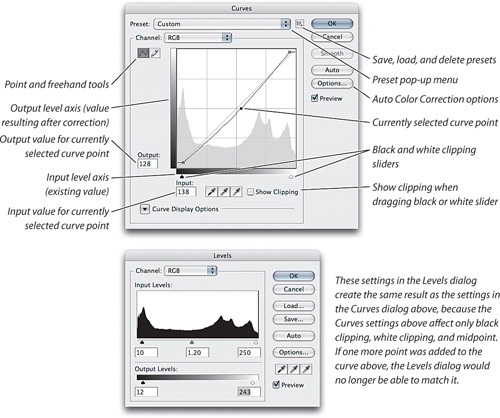
Curves versus Levels. Moving the curve midpoint right or left is similar to dragging the middle Input slider in Levels. Setting the other four Levels sliders is equivalent to setting the curve endpoints. Therefore, you can use Curves to produce any result that you can create with Levels. However, it doesn’t go the other way—Levels can’t do everything Curves can do. With Curves, you can add as many points as you need, so that you can adjust the output value for any input value along the tone curve.
The Curves dialog in Photoshop CS3 adds a histogram and Input/Output sliders with a clipping display. These may seem like minor additions, but they’re actually quite monumental. In previous versions, those features were available only in Levels, which meant that we often used both Levels and Curves to get the job done. Now, once you become comfortable with the power of Curves, you may have no reason to use Levels anymore.
Show Clipping. Turn this on to see the pixels that are currently being clipped by the black- or white-point slider at the bottom of the graph area. Show Clipping can show either black clipping or white clipping, but not both at the same time; the clipping you see is for the last slider you touched, or for black if you haven’t touched either slider since opening the dialog. Show Clipping works only when Show Amount Of is set to Light.
Photoshop CS3 throws in a few new ways to customize the Curves dialog. Also, customization options that used to be hidden features are now visible. We welcome this change, although it makes it harder to impress people with secret Photoshop tips at cocktail parties. In the Curves dialog, click Curve Display Options (see Figure 7-24) to reveal the options. All of these options are on by default, so if you want to simplify the display, you can turn off any of these options.
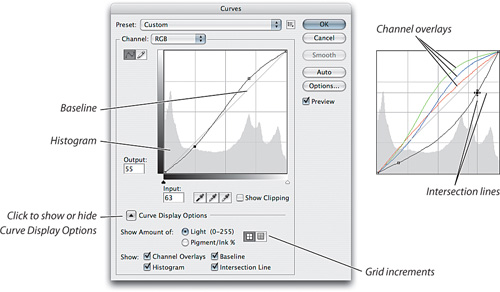
Show Amount Of. This option determines the units and graph orientation used to display values on the graph. Users who work with Web, video, and other RGB-based media are used to thinking of tone in terms of levels from 0 to 255. Users accustomed to working with ink on press will want to work with dot percentages. You can switch between them by selecting Light or Pigment/Ink, which flips the graph display. When you select Light, the 0,0 shadow point is at bottom left and the 255,255 highlight point is at top right. When you select Pigment/Ink%, the 0,0 highlight point is at the bottom left and the 100,100 shadow point is at the top right corner. RGB and Lab mode images default to Light; CMYK and Grayscale mode images default to Pigment/Ink.
Tip
Another way to toggle the grid increments is to Option-click (Mac) or Alt-click (Windows) the graph area.
Change Grid increments. You can also change the gridlines of the Curves dialog using the two icons next to the Show Amount Of options. The left icon (the default) displays gridlines in 25-percent increments, but if you select the right icon, the gridlines display in 10-percent increments instead. The 25-percent grid lets prepress folks think in terms of shadow, three-quarter-tone, midtone, quarter-tone, and highlight, while the 10-percent grid provides photographers with a reasonable simulation of the Zone System.
Show Channel Overlays. When you view the composite view (for example, choosing RGB from the Channels pop-up menu), the Curves dialog can display the curves of each channel in each channel’s color. However, you can’t edit the overlay curves—to do that, choose the name of the channel you want to edit from the Channel pop-up menu.
Show Histogram. The histogram is as useful here as it is in the Levels dialog, so we leave this on.
Show Baseline. This diagonal gray line reminds you of the shape of the unedited state of a curve. We don’t find it very useful in its current state; we’d prefer that it show you the shape of the curve at the time you opened the Curves dialog, before you started editing. Maybe in the future it will!
Show Intersection Line. This feature appears only as you drag a curve point. Intersection Line actually consists of two lines that lead from the cursor to all sides of the graph, so that you can see exactly where the curve point values cross the Input and Output axes.
In Photoshop CS3, setting the black and white points in Curves is simpler and better, and is now consistent with the Levels dialog. At the bottom of the graph area, you’ll find the same black and white sliders that you saw earlier in the Levels dialog, and they work the same way. To clip the black or white points, drag the black or white slider toward the center of the graph (see Figure 7-25). For instance, to limit the highlight dot to 5 percent, drag the white slider until the Output level displays as 243—or (if you’re displaying Pigment/Ink percentages) 5 percent. Similarly, dragging the black slider to the right so that the info readout reads Input 12, Output 0 clips all the pixels at level 12 or below and makes them all level 0. This is exactly the same as moving the black input slider in Levels from 0 to 12.
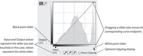
The black- and white-point sliders also give you the same interactive clipping preview that you saw in the Levels dialog back in Figure 7-20—to use it, Option-drag (Mac) or Alt-drag (Windows) either slider. If you don’t want to hold down keys, you can turn on the Show Clipping check box in the Curve Display Options. We prefer to use the interactive Option/Alt-drag method, because you can view the actual image at any time by releasing the Option/Alt key.
You can still adjust the black and white points by dragging the endpoints of the curve, as you could in previous versions of Photoshop (the endpoints will move the sliders for you), but dragging the points doesn’t give you the interactive Option/Alt-drag clipping preview. The Show Clipping check box works whether you drag the endpoints or the sliders.
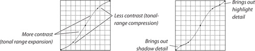
The great power of the Curves command comes from the fact that you aren’t limited to placing just one point on the curve. You can actually place as many as 16 curve points, though we rarely need that many. This lets you change the shape of the curve as well as its steepness (remember, steepness is contrast; the steeper an area of the curve, the more definition you’re pulling out between pixel values).
For example, an S-shaped curve increases contrast in the midtones, without blowing out the highlights or plugging up the shadows (see Figure 7-26). On the other hand, it sacrifices highlight and shadow detail by compressing those regions. We often use a small bump on the highlight end of the curve to stretch the highlights, or on the shadow end of the curve to open up the extreme shadows.
Selecting a curve point. Before you can edit a curve (other than dragging the clipping sliders), you need to select a curve point. The most obvious way to do this is to drag a point with the mouse.
Tip
Dragging curve points with the mouse is almost always the least efficient way to proceed. Once you master the various shortcuts we cover here, you’ll find that Command/Ctrl-clicking the image to place points and adjusting them using the arrow keys lets you edit precisely and quickly.
You can also select a point with the keyboard. To do this, press Control-Tab (yes, on both Mac and Windows) to cycle through the points on the curve, selecting the next one with each press, or reverse direction by pressing Control-Shift-Tab. If you’re editing curve point values numerically, selecting points with the keyboard lets you keep your hands on the keyboard.
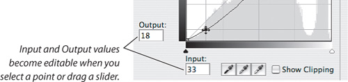
The Input/Output levels display. Whenever you move the cursor into the graph area, the Input and Output levels display changes to reflect the cursor’s x,y coordinates on the graph. For example, if you place the cursor at Input 128, Output 102 and click, the curve changes its shape to pass through that point, and the readouts become editable fields. The readouts also become editable whenever you select a curve point. All the pixels that were at level 128 change to level 102, and the rest of the midtones are darkened correspondingly (see Figure 7-27). You can follow the shape of the curve with the cursor and watch the info readout to determine exactly what’s happening to each level.
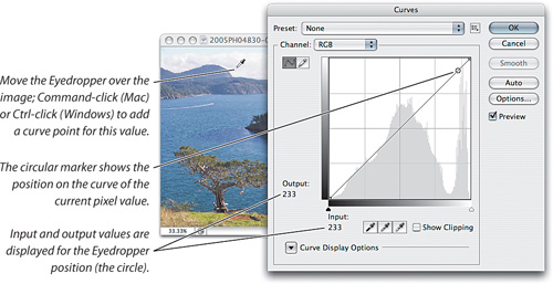
The Eyedropper. When the Curves dialog is open, the cursor automatically switches to the Eyedropper tool when you move it over the image. If you hold down the mouse button, the info display in the Curves dialog shows the input and output levels of the pixel(s) under the Eyedropper, and a hollow white circle shows the location of that point on the curve (see Figure 7-28). This makes it very easy to identify the levels in the regions you want to change, and to see just how much you’re changing them.
Tip
You can customize the sample size of the Eyedropper at any time by Ctrl-clicking (Mac) or right-clicking it on an image, even if a dialog is open. In Photoshop CS3, the maximum sample size is 101 by 101 Average—much better for high-resolution images than the 5-by-5-pixel maximum in Photoshop CS2.
For some reason, the Eyedropper feature doesn’t work when you’re adjusting the composite (CMYK) channel in a CMYK image, though it does when you’re adjusting individual channels.
Automatic curve point placement. When you Command-click (Mac) or Ctrl-click (Windows) in the image, Photoshop automatically places a point on the curve for the input value of the pixel on which you clicked. When you’re working in the composite channel of a color image, you can place curve points in the individual channels by Command-Shift-clicking (Mac) or Ctrl-Shift-clicking (Windows).
Numeric curve entry. For maximum precision, you can specify curve points numerically. We place or select a curve point, press Tab to highlight the Input or Output field as needed, and enter the value we want (see Figure 7-27).
Tip
The numeric field shortcuts that work in other dialogs work in Curves too: Press the up arrow or down arrow keys to change the value by one unit; add the Shift key to change the value by ten units.
Other Curves command goodies. The Curves dialog contains a few more tricks that we’ve already covered for other dialogs. Don’t forget to use the Preview check box (press P), the Auto and Options buttons (for the Auto Color Correction feature), and the hidden Reset button that takes the place of the Cancel button when you press Option (Mac) or Alt (Windows).
Today, RGB is the color mode in which most images start (when scanned or created with a digital camera), and end (when displayed on the Web, included in an onscreen presentation, used in a digital video project, or sent to an inkjet printer or photo-printing service). It might not even occur to you to work in a color mode other than RGB.
But those other color modes on the Image > Mode menu exist for a reason, and features like Curves and Levels work in more than one of those modes. In particular, CMYK is a natural choice when you are preparing images for press output, and some professionals who spend all day perfecting images for a press may not recommend anything but CMYK.
But don’t change modes on a whim. Although Photoshop makes it easy to flip among color modes, each change involves some data loss (as we discussed in Chapter 3, “Color Essentials”), although the amount depends on the quality and bit depth of the image.
Another penalty of changing modes is that some layer features can’t be carried across modes. For example, if you create curves in an RGB adjustment layer and convert to Lab mode, the RGB curves simply can’t be translated channel to channel and still look the same, because the channels are completely different. It’s a similar situation with blend modes. This is why Photoshop asks you if you want to flatten a document when you switch color modes.
Our simple rule. Don’t change color modes unless or until you have to, and do as much of your correction as possible in the image’s original color mode. The ideal number of color-mode conversions is one or none.
Naturally, there will be times when the simple rule won’t be enough. The most common example is when your source images are RGB, but you’re going to a CMYK press. In such a case, it’s not only a question of if you convert, but when you convert. To answer that question, we have some more guidelines for you.
If your image comes from an RGB source, such as a desktop scanner or a digital camera, you should do as much of your work as possible in RGB. You have the entire tonal range and color gamut of the original at your disposal, allowing you to take full advantage of the small differences between pixels that you want to emphasize in the image. Compared to CMYK, it’s also much easier to repurpose RGB images for different kinds of output, and using three channels instead of four keeps file sizes down.
RGB has less-obvious advantages as well. A number of Photoshop features, such as the clipping display in Levels, are available only in RGB, not in CMYK or Lab. If your final output requires RGB image data, such as a Web page, DVD, or an inkjet printer (see the tip on the next page), you’ll probably stay in RGB mode for your entire workflow.
If you received your images in CMYK form (such as images from a traditional drum scanner or images from an older edition of that job), it makes no sense to convert them to RGB for correction if they are going to press. You should stay in CMYK. If you find that you have to make major corrections, though, you’ll almost certainly get better results by rescanning the image instead of editing it in Photoshop. In high-end prepress shops, it’s not unusual to scan an image three times before the client signs off on it.
Tip
If you order a scan from a color house and you plan to manipulate the image yourself in Photoshop or use the image for different kinds of output, ask the shop to save the image in RGB format. Of course, if your job will ultimately require converting the image to CMYK, you’ll now be responsible for performing the final conversion.
Certain kinds of fine-tuning, such as black-plate editing, can only be done on the separated CMYK file. Similarly, Hue/Saturation changes in CMYK are generally more delicate than in RGB. But if you find you need to make large moves in CMYK after a mode change, it’s time to look at your CMYK settings in Color Settings, because the problem probably lies there—a wrong profile, incorrect settings in Custom CMYK, or color management policies that weren’t set the way you thought they were (see Chapter 4, “Color Settings”). In that case, it makes more sense to go back to the RGB original and reseparate it using new settings that get you closer to the desired result.
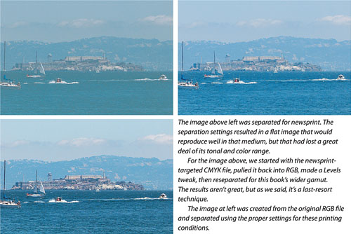
In dire emergencies, such as when you have a CMYK file separated for newsprint and you need to reproduce it on glossy stock, you may want to take the desperate step of converting it back to RGB, correcting, and reseparating to CMYK; but in general, treat RGB to CMYK as a strict one-way trip.
You may encounter people who maintain that if your work is destined for a press, you should work exclusively in CMYK. People who tell you to do everything in CMYK may have excellent traditional prepress skills and a deep understanding of process-color printing, but they probably are not comfortable working in RGB, and may not realize how much image information Photoshop loses during the conversion from RGB to CMYK. As a result, they may convert images to CMYK earlier in the workflow than we’d recommend, then make huge corrections in CMYK, trying to salvage a printable image from what’s left. When you prematurely convert to CMYK, you restrict yourself in at least four ways:
You lose a great deal of image information, making quality tonal and color correction much more difficult.
You optimize the image for a particular set of press conditions (paper, press, inks, and so on). If press conditions change, or if you want to print the image under various press conditions, you’re in a hole that’s difficult to climb out of.
You increase your file size by one-third, slowing most operations by that same amount.
You lose some convenient Photoshop features that work only in RGB, such as some filters and the Levels and Curves clipping displays.
For the vast majority of Photoshop users, those four reasons mean it’s best to work in RGB for as long as possible and convert your image to CMYK only after you’re finished with your other corrections and you know the printing conditions. It’s useful to keep an eye on the CMYK dot percentages while you work, but you don’t need to work in CMYK mode to do that, since the Info palette can display CMYK values for an image in any color mode, as we showed you earlier in this chapter. Using the View > Proof Setup > Custom command (see Chapter 8, “The Digital Darkroom”) with your CMYK output profile can also help you visually preview the CMYK results of your RGB edits.
Tip
Some believe that because inkjet printers use CMYK inks, jobs sent to them should be in CMYK. There are two problems with that: First, the inks used in inkjets are not the same as press CMYK inks. Second, inkjet driver software typically expects to receive RGB data and convert it to its specific CMYK inks. If you’re printing fine-art photographs on a large-format inkjet, staying in RGB mode should result in optimal quality. On the other hand, if you’re preparing a CMYK job for press output and you’re using an inkjet to proof it, don’t convert that job to RGB.
One of the great advantages to doing major corrections in RGB for prepress is that you have a built-in safeguard: It’s impossible to violate the ink limits specified by your CMYK profile or Custom CMYK settings, because they’ll always be imposed when you convert to CMYK. When you edit CMYK files directly, you have no such constraint—you can build up so much density in the shadows using Levels or Curves that you’re calling for 400-percent ink coverage. On a sheetfed press, this will create a mess. On a web press, it will create a potentially life-threatening situation! In any case, it’s something to avoid unless you’re printing to the rare desktop color printer that can handle 400-percent total ink.
If you work in print, you must learn to edit in CMYK. But it isn’t the only game in town.
We can think of two reasons to convert a CMYK image to RGB: You need an image for the Web or multimedia and a CMYK scan is all you have, or you need to repurpose the CMYK image for a larger-gamut output process. In either case, you need to expand the tonal range and color gamut. If you just do a mode change from CMYK to RGB, you’ll get a flat, lifeless image with washed-out color, because the tonal range and color gamut of the original were compressed in the initial RGB-to-CMYK conversion, and the mode change reproduces the compressed gamut and squashed tonal range faithfully in RGB.
Instead, use the Convert to Profile command, using perceptual intent, with black point compensation and dither turned on. Then, open Levels and click Auto. If this makes the image too saturated, back off the black- and white-point sliders a few levels. You’ll find this works surprisingly well (see Figure 7-29). That said, this is a last-resort technique. Work on a copy of the file, and watch for color shifts and posterization.
The somewhat obscure Lab color mode is far less popular than RGB or CMYK for editing, but the number of people editing in Lab mode is actually growing due to the special advantages it offers. For example, Lab mode separates luminance (its L channel) from color (its A and B channels), making it far easier to apply tonal corrections and filters (such as sharpening) without introducing hue shifts. This concept appeals to those who tweak the black plate in CMYK. The way that Lab mode puts opposing colors on its two A and B axes also makes it easy to remove color casts or enhance color contrast without wrecking the image or its tonality; we’ll cover a few quick fixes later in this chapter.
One of the big reasons that more people aren’t working in Lab mode is that going to Lab always adds a conversion step (since original image files are either RGB or CMYK), and we like to keep those conversions to a minimum. Also, Lab mode encompasses such a wide color gamut that editing in Lab usually works better with images containing 16 bits or more per channel, to keep posterization at bay. Also, as we mentioned earlier, if you used adjustment layers and blend modes, you can’t retain them when you change modes, and some Photoshop features that are available in RGB mode do not work in Lab mode. If you’re able to perform most of your layered editing in Lab mode and don’t need to convert your layered working file to another mode, only saving flattened RGB and CMYK copies for final output, mode conversion issues may not come up at all.
Because Lab can be so helpful in situations such as rescuing difficult images, there are times when Lab mode is certainly worth the side trip. If you want to explore the challenging yet powerful world of Lab, look for books by Dan Margulis—a good place to start is Photoshop Lab Color (Peachpit Press). Dan’s eye-opening techniques have transformed Lab mode from a color scientists’ exercise into a surprisingly valuable color-correction tool.
Now that you’re armed with all the preceding information, let’s look at some practical examples of working with Levels and Curves. We’ll look at several different scenarios, because we have two different reasons for editing images—see the upcoming sidebar, “Why We Edit.”
Tip
The dramatic rise of digital camera raw formats changes our classic order somewhat. In the days of film cameras, you would apply everything in this chapter in Photoshop. Today, if your starting point for an image is a camera raw file, you can do spotting and overall corrections during the raw conversion, using the high-quality tools in Adobe Camera Raw 4 and Adobe Lightroom 1.1. This gives you a polished master raw image. You would then use Photoshop for fine-tuning and localized fixes. You can use the color-correction tools in Camera Raw and Lightroom to apply many of the concepts in this chapter.
The classic order for preparing images for print is as follows:
Spotting, retouching, and dust and scratch removal
Global tonal correction
Global color correction
Selective tonal and/or color correction
Optimization (resizing, sharpening, handling out-of-gamut colors, compressing tonal range, converting to CMYK)
We loosely adhere to this, but a great deal depends on the image and on the quality of the image capture. For instance, you often have to lighten an image before you can even consider removing dust and scratches.
And sometimes it’s impossible to separate tonal correction and color correction. Changes to the color balance affect tonal values, too, because you’re manipulating the tone of the individual color channels. For example, if you add red to neutralize a cyan cast, you’ll also brighten the image because you’ll be adding light. If you reduce the green to neutralize a green cast, you’ll darken the image because you’ll be subtracting light.
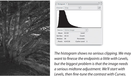
Before we edit an image, we always spend a few moments evaluating the image to see what needs to be done and to spot any potential pitfalls. We check the Histogram palette to get a general sense of the image’s dynamic range: If shadows or highlights are clipped, we can’t bring back any detail, but we may still be able to make the image look good. If all the data is clumped in the middle, with no true blacks or whites, we’ll probably want to expand the tonal range.
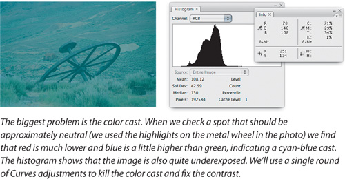
We also check the values in bright highlights and dark shadows on the Info palette, in case there’s detail lurking there that we can exploit. We’re pretty good at identifying color casts by eye, but we still check the Info palette—a magenta cast and a red cast, for example, appear fairly similar, but the prescription for fixing each is quite different.
Tip
Before you start, zoom to 100 percent (Actual Pixels) or higher and look at every pixel using the Home, Page Up, Page Down, and End keys. (To scroll sideways, press Page Up or Page Down along with the Command key in Mac OS X or the Ctrl key in Windows.) Check for dust or scratches, noise (especially in the blue channel), the strengths and weaknesses visible in each channel, and the tonal range in the histogram. A few minutes spent critically evaluating the image early on can save hours later on.
Fix the biggest problem first. The rule of thumb we’ve developed over the years is simple: Fix the biggest problem first. This is partly plain common sense. You often have to fix the biggest problem before you can even see what the other problems are. But it’s usually also the most effective approach, the one requiring the least work, and the one that degrades the image the least.
Leave yourself an escape route. The great Scot poet Robert Burns pointed out that “the best-laid schemes o’ mice and men gang aft agley.” He didn’t have the benefit of the History palette, or the Undo and Revert commands, but you do. History is a great feature, but it eventually it starts dropping the oldest states, so don’t consume them unnecessarily. If a particular move doesn’t work, just undo (Command-Z in Mac OS X, or Ctrl-Z in Windows)—you can reload any of the commands in the Adjustments submenu (in the Image menu) with the last-used settings by holding down the Option key (Mac) or Alt key (Windows) while selecting them either from the menu or with a keyboard shortcut. If a whole train of moves has led you down a blind alley, back up in the History palette or revert to the original version.
If you’re working on a complex or critical problem, work on a copy of the image. When you apply a move using Levels, Curves, or Hue/Saturation, save the image before you apply it. That way, you can always retrace your steps up to the point where things started to go wrong.
Tip
Take advantage of the Image > Duplicate command when you want to experiment with potential solutions without accidentally saving unwanted changes to the original file.
Adjustment layers let you avoid many of the pitfalls we’ve just discussed. You don’t need to get your edits right the first time because you can go back and change them at will, without damaging the underlying pixels. You automatically leave yourself an escape route because your edits float above the original image rather than being burned into it.
Sometimes it’s impractical to use adjustment layers because of file size and RAM constraints, particularly with high-bit files. Also, to use adjustment layers effectively, you need to know how the various controls operate on a flat file. So even if you plan to use adjustment layers for as much of your editing as possible—and we encourage you to do so—you still need to master the techniques we discuss in this chapter, and the pitfalls they entail. For a much deeper discussion of adjustment layers, see Chapter 8, “The Digital Darkroom.”
We show three unedited images in Figures 7-30 through 7-32 and the conclusions we draw as to what we need to do to them. We’ll execute the edits later in this chapter.
The evaluation process only takes a few seconds, and it’s time well spent. We may encounter other problems that aren’t obvious on the initial examination, but it’s relatively rare that we’ll encounter something that causes us to rethink the entire edit.
In the following examples, we’ll apply the edits directly to the image, but later you can perform the same edits with adjustment layers. So, now that you’re armed with a plan, let’s proceed to the edits.
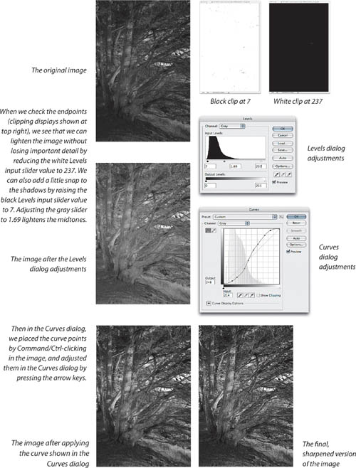
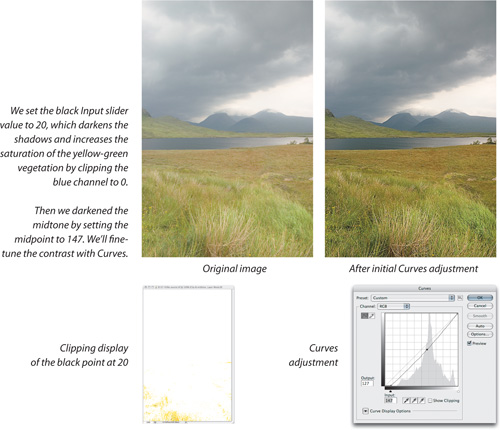
A midpoint fix. Figure 7-33 shows a simple Levels move that makes a huge improvement, and then gets to the finish line when we apply the Curves adjustment shown.
Tip
To better understand how curves work, try this exercise. Make an RGB gradient from white to black; somewhere between 512 and 1024 pixels wide works best. Use the Color Sampler tool to place color samplers—we suggest you start at approximately the midtone, quarter tone, and three-quarter tone areas. Then simply watch what happens to the numbers in the Info palette as you manipulate the composite channel (all three RGB values will change equally), and the individual color channels (one value will change while the rest stay the same).
We started by placing points that corresponded to the light, middle, and dark tones on the main tree trunk (points 4, 5, and 6, counting from the shadow [0,0] point), and adjusted them to increase the contrast. This cause both ends of the curve to clip, so the additional points were added to fine-tune the highlight and shadow contrast.
We could have made the entire set of adjustments using Curves, but it’s often easier to make basic changes in the simpler Levels dialog. You’ll see an example executed completely in the Curves dialog a little later.
We deliberately left a little headroom to accommodate sharpening. As you’ll learn in Chapter 10, “Sharpness, Detail, and Noise Reduction,” the process of sharpening images is really about adding contrast along edges, so sharpening always adds a little apparent contrast.
Sharpening also drives more pixels towards levels 255 and 0; the significance of this depends on the output process for which you’re preparing the image. Individual pixels being driven to black and white usually isn’t a concern—unless you’re printing at resolutions below 100 ppi, you’re unlikely to see them on output. For Web work, you may need to be a little more conservative.
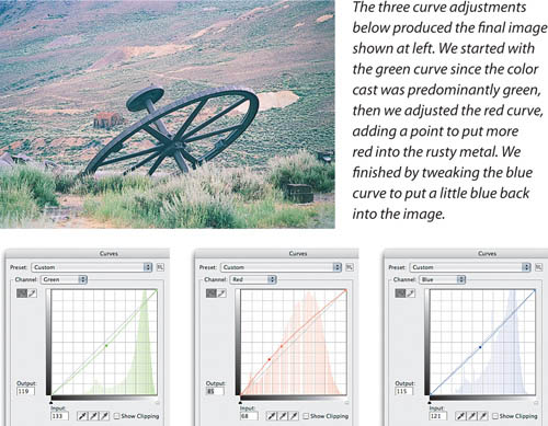
Cast away that color. Moving on to color, we’ll use Curves to neutralize the nasty color cast in the image from Figure 7-31. Obeying our maxim to fix the biggest problem first, we’ll start by tackling the color cast, then, since we’re already working in Curves, we’ll improve the contrast there.
Tip
To eliminate a color cast, look for something in the image that should be approximately neutral, then use Curves to make it so. Check the values on a should-be-neutral area with the Info palette, then use Curves to adjust the highest and lowest values to match the middle one. Nine times out of ten, the rest of the color simply falls into place.
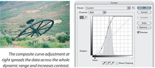
We use Curves to neutralize the color cast by identifying an area that should be neutral, as shown in Figure 7-34. This simple tweak removes the worst of the color cast, allowing us to turn our attention to the tonal issues. Figure 7-35 shows a tweak to the composite RGB curve that spreads the data across the entire dynamic range. We keep a watchful eye on the Curves histogram as we move the black and white points on the curve. Then we add a couple of points to improve the contrast.
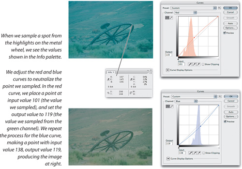
Now we can see that our first approximation at removing the color cast was less than totally successful—the image is pretty green. We return to the individual color channels and tweak the existing points with the arrow keys to produce the result shown in Figure 7-36.
Tip
To place a point on all channel curves at once, Command-Shift-click (Mac) or Ctrl-Shirt-Click (Windows) the image while Curves is open. When you view each channel in Curves, you’ll find a new point ready for adjustment. You can then Ctrl-Tab (on Mac and Windows) until you select the point, then press the arrow keys to move it, or press Tab to select the point’s Input or Output field.
Note that we made all these edits without closing the Curves dialog, so they’re applied as a single pass, avoiding any unnecessary image degradation. In this case, we decided to use Curves for the extra control it offers over contrast. But it’s instructive to compare the Curves rendering with alternate results produced by our other favorite technique for killing color casts: Auto Color. Figure 7-37 shows the results produced by the various Auto options.
You need to be comfortable with both techniques to decide which approach makes sense, taking into account both the quality requirements and the time you can afford to spend. Photoshop offers several ways to accomplish any given task, and as we’ve mentioned, when all you have is a hammer, everything tends to look like a nail. You don’t have to learn every single Photoshop feature—we doubt that’s possible—but if you master the techniques in this book, you’ll have strong Photoshop skills.
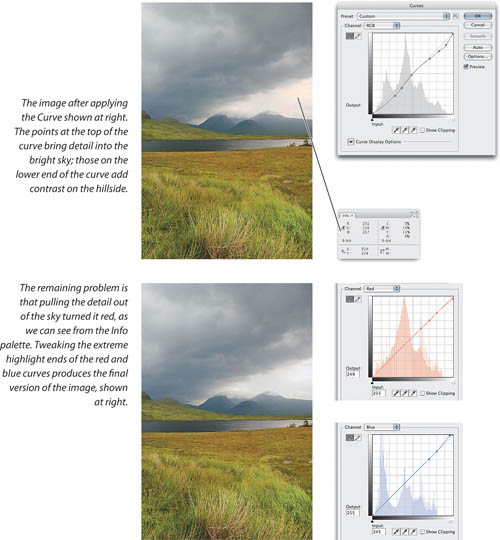
Make it pop. In the next example, we’ll use only Curves to correct the tone on a color image. Figure 7-38 shows the original image and the Curves correction. This is an improvement, but we can make matters still better, as shown in Figure 7-39.
Also common to the Levels and Curves dialogs are the black, white, and gray Eyedropper tools. Back in the days before color management, these were mission-critical tools. Nowadays, we rely on them much less, but they still warrant a mention.
The black and white Eyedroppers let you force the image pixel on which you click to the target value set for the Eyedropper, adjusting all other pixels accordingly. (If you want to know exactly what they do, see the sidebar, “The Math Behind the Eyedroppers” later in this chapter.)
Tip
If you already have a painting tool selected, press the Option key (Mac) or Alt key (Windows) to toggle between it and the Eyedropper tool.
You can click the Eyedropper cursor on any open Photoshop document. When a dialog is open and you position the cursor outside the dialog, you might see the Eyedropper; if you do, that means you can sample that color (from the Swatches palette, for example).
Setting minimum and maximum dots. In pre-color-management days, we always used to set our minimum highlight dot with the white Eyedropper, and more often than not we set our maximum shadow dot with the black one. Good ICC output profiles make this practice unnecessary because the profile has a detailed understanding of the tonal behavior of the output device, but we still use the Eyedroppers for unprofiled grayscale output, or in those increasingly rare situations where we’re forced to rely on an old-style Custom CMYK setting with a single dot-gain value.
Tip
To sample a color outside of Photoshop (such as a window open in another application), start dragging the Eyedropper from inside a Photoshop document and then release the mouse button only over the color you want to sample outside Photoshop. This is useful in Web and screen design, because it captures only the RGB color values of the color on the display. There is no way for Photoshop to determine the underlying color values in other applications.
Unlike the Output sliders in Levels, which simply compress the entire tonal range to minimum and maximum values, the Eyedroppers let us set a specific value for minimum highlight and maximum shadow dots. If we want to preserve specular highlights, we can set the white Eyedropper to the minimum printable dot value, then click on a diffuse highlight. This pins the diffuse highlight to the minimum dot, while allowing the brighter specular highlights to blow out to paper white.
Tip
The fastest way to load the Eyedroppers with a dot percentage is to use the Color Picker’s Brightness field. Subtract the desired dot percentage from 100, then enter the result in the Brightness field.
Figure 7-40 shows a case in point. We want to hold a dot in the diffuse highlights while allowing the specular highlights to reach paper white. Here we’re aiming for a 3 percent dot. Depending on the printing process you’re targeting, you may want to set a lower or higher value. To translate Levels to dot percentages, divide the levels value by 2.55, then subtract the result from 100 to get the dot percentage. (The tip at left can also help.) As previously mentioned, we only use this technique when we don’t have a good ICC output profile available, as in the following situations:
Grayscale images
Custom CMYK with single dot-gain values instead of dot-gain curves
RGB for non-color-managed, standard-definition television display (we set highlights to 235 and shadows to 15)
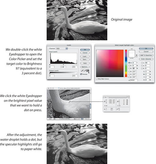
The rest of the time, we let the profile handle the minimum dot (though when highlight detail is critical, we check the Info palette numbers).
Killing color casts. We also use the Eyedroppers on occasion as a quick way to eliminate color casts. The black and white Eyedroppers force the pixel on which they’re clicked to the target values you set for the tools (the defaults are RGB 255 and RGB 0, respectively), scaling the individual color channels to meet the target value.
This behavior can cause some confusion. While the Eyedroppers appear in two nonlinear editing tools—Levels and Curves—their effect is a linear adjustment. So if you labor mightily in Levels or Curves, then apply the black or white Eyedroppers to the image, they promptly wipe out any adjustments you’d already made. This behavior leads us to use the Eyedroppers only when there’s a heavy cast near the shadows or highlights, and we’ve planned the correction.
The gray Eyedropper. The gray Eyedropper behaves quite differently from the black and white ones. It forces the clicked pixel to the target hue, while attempting to preserve brightness. By default the target is set to RGB 128 gray, since the tool was designed for gray-balancing. Unlike its black and white counterparts, it doesn’t undo other edits you’ve made in Levels or Curves, though it may change their effects.
We still use the gray Eyedropper occasionally for gray-balancing (as in the example shown in Figure 7-41), but now we’re much more likely to use Auto Color. The results produced by the gray Eyedropper depend critically on where you click in the image, while Auto Color responds in a much more predictable fashion. Instead of clicking around the image with the gray Eyedropper as we hunt for just the right sample pixel that will fix the gray balance, we can drive the color exactly where we want it to go by adjusting the Auto Color midtone target swatch (see Figure 7-22, much earlier in this chapter). In the example shown in Figure 7-41, we were already in the Curves dialog, and the gray Eyedropper was right there, so it made sense to try it, and in this case we obtained a good result.
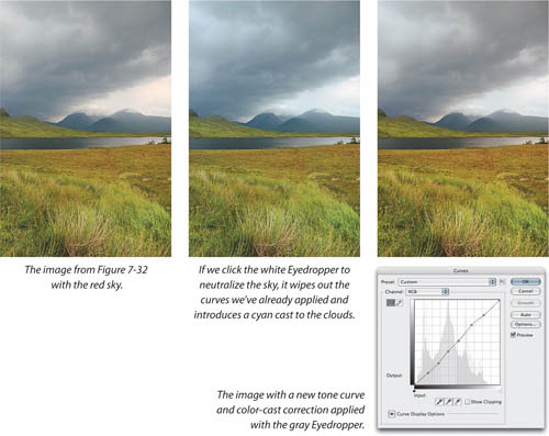
The Eyedroppers are pretty old technology, and have largely been superseded by newer additions to the Image > Adjustments submenu, but occasionally they’re just what you need. So investigate them, learn their behaviors, and use them, but be aware of their limitations.
We’d be remiss if we didn’t mention the freehand (pencil) tool in the Curves dialog, which lets you draw freehand curves rather than bending the curve by placing points. We really have only one use for this, but when we need it, nothing else does the job. We use the freehand tool to handle specular highlights on printing processes where the minimum highlight dot is relatively large, such as laser printer or newsprint output.
Trouble in the transition zone. If you’re dealing with newsprint or low-quality printing, the transition zone—that ambiguous area between white paper and the minimum reliable dot—can make your specular highlights messy. Some may drop out, while others may print with a visible dot. The solution is to make a curve that sets your brightest highlight detail to the minimum highlight dot value, and then blows everything brighter than that directly out to white. This is a two-step process.
Select the highlight point, then use the numeric fields to set your input point to a value corresponding to your brightest real detail, and an output value corresponding to your minimum printable dot. Figure 7-42 shows a point that sets the input value at 253 and the output value at 231, corresponding to a 10-percent dot. This sets all the pixels with a value of 253 to 231. But it also sets pixels with values of 253 through 255 to 231, which isn’t what you want. You want them to be white.
Select the pencil tool, and very carefully position it at the top edge of the curve graph until the input value reads 253 and the output value reads 255, then click the mouse button. (See Figure 7-42.) This keeps pixels with an input value of 252 set to an output value of 231, but blows out pixels with a value of 253 through 255 to paper white. Your highlight detail will print with a reliable dot, and your specular highlights will definitely blow out.
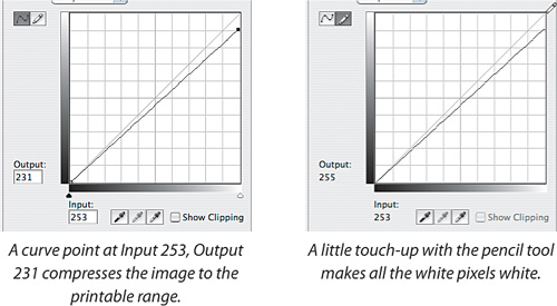
If this is something you have to do at all often, click the Save button to save the curve. Don’t click the Smooth button, because it will smooth the curve—which in this case is not what you want. You can load the saved curve whenever you need it, or even create an action that you run as a batch to process multiple images.
The color tools have improved so much in Photoshop CS3 and Camera Raw 4 that you can fix more kinds of problems more easily than you could before. These days, you have much less reason to convert to CMYK or Lab for big moves. But as we mentioned earlier, converting to Lab mode can enable a more direct way to make certain types of corrections:
You want to make major changes in tonality without introducing a color cast or any changes to the color relationships. In this case you can edit just the L channel. (However, you can achieve similar results in RGB mode by editing the master curve or a Curves adjustment layer and applying the Luminosity blend mode to it).
You are having trouble getting rid of a color cast using Auto Color or RGB Curves.
You want to create more contrast between magenta and green.
You want to create more contrast between blue and yellow.
In Figure 7-43, we have a sample image that can benefit from a Lab tweak. It’s a 16-bit image of a trees along a lake, and we’d like to boost the contrast a bit. The trees along the lake are one mass of similar color, but we think we can create more color contrast there by using Lab mode to enhance the complementary colors in the image.
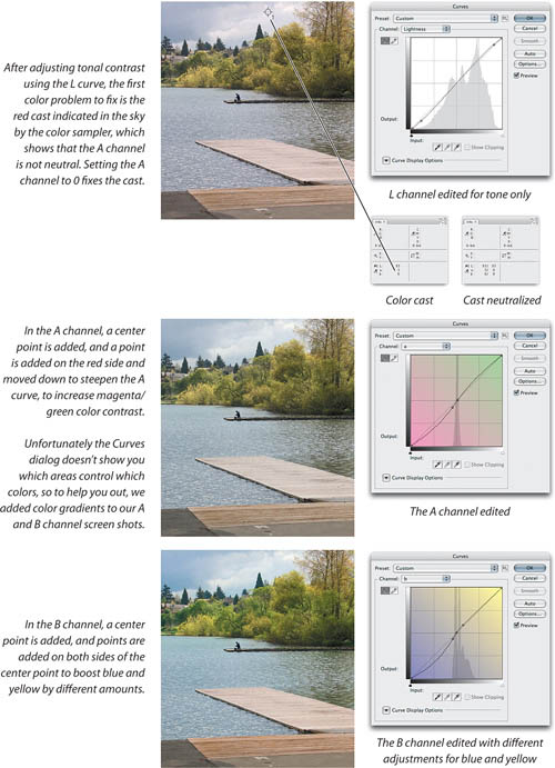
We’ve noticed that the sky might be too red, and the Info palette confirms our suspicion. We Shift-click a color sampler on the sky so we can track its values later.
Editing the L channel. After choosing Image > Adjustment > Curves, our first move is to edit the L (luminosity) channel, which in Lab mode contains all tonal information. Changes you make to the other two channels don’t affect tones at all. Edit the L curve as you would the RGB composite curve, (or the K curve when editing in CMYK). Our change boosts tonal contrast, but the colors are still a bit weak.
Editing the A channel. When we open the a channel curve, the first thing we do is add a point and set it to Input 0, Output 0. This locks down the current color balance in that channel, because (if you review Chapter 2, “Image Essentials”) the A channel of Lab mode has magenta on one end, and green on the other end. At the center—Input 0, Output 0—the A channel is neutral.
Tip
If you need an Eyedropper sample bigger than 5-by-5 pixels, make a marquee selection of the required size, choose Average from the Blur submenu (under the Filter menu), and read the result from the Info palette. Just don’t forget to undo the filter once you’ve read the values! (Or use a Smart Filter.)
The Info readout for the color sampler says L 93, A 3, B 0. We aren’t concerned with L (luminosity), we’re concerned with the A and B numbers; A is slightly red and B is neutral. We press Ctrl-Tab to select the 0,0 midpoint we added, and keeping an eye on the Info palette, we press the right arrow key to nudge the point until the A channel “after” readout (after the slash) reads 0. Now that the Info palette reads 0 for both the A and B channels, we know that point is now perfectly neutral.
Now we’ll do what we came here for: bumping up the color contrast. With the Curves dialog still open, we Command-click (Mac) or Ctrl-click (Windows) a green area of a tree to add a curve point, and press the down arrow and right arrow keys to nudge the point away from the center, making the curve steeper (pivoting it around the neutral center point) and boosting the contrast between green and magenta. Not only does this create more variation in the foliage, it boosts magenta in the wooden pier, setting it off against the green.
It’s normal for the A and B channel histograms to be narrow and centered—most of the action happens close to the center of Lab, where moderately saturated colors live in the real world. The gamut of Lab mode is so wide that you don’t have to get very far from the center to oversaturate your colors. Don’t steepen the curve so far that your colors go neon on you. (In the A and B channels, drawing a flat horizontal line across the center would desaturate the colors completely.)
Editing the B channel. We performed the same procedure on the B channel: We added a center pivot point and steepened the curve. However, we also added a point on the yellow side for more control. When we steepened the curve to boost the blue in the water, the yellow in the trees became too vivid, so we used the curve point on the yellow side to pull that side of the curve back in, closer to the baseline.
Lab is worth a try when you need to make large moves, quickly correct a color cast, or set complementary colors against each other, but you may find it easier to make subtle color changes in RGB mode (or for a camera raw image, using the HSL tab in Camera Raw to isolate a color).
When you’re evaluating and editing images, tracking pixel color values with the Info palette is critical. When you’re comparing or tracking two or more areas in an image, you don’t want to have to position the mouse in the same position every time. Fortunately, you don’t have to. To leave a marker that stays in one place and continuously reports the underlying color values, just drop a color sampler on the image. You can position as many as four color samplers in an image.
Tip
To delete a color sampler, Option-click (Mac) or Alt-click (Windows) it. If a painting tool is active, you can access the Color Sampler tool and edit color samplers using the same shortcuts you use for the Eyedropper tool, but you must also press Option (Mac) or Alt (Windows).
Color Sampler shortcuts. You can select the Color Sampler tool in the Tools palette, but that usually isn’t necessary. If you’re using the Eyedropper, you can temporarily switch to the Color Sampler tool by holding down Shift, so that Shift-clicking creates a color sampler. If you’re using a painting tool, Option-Shift-click (Mac) or Alt-Shift-click (Windows).
The time when you’re most likely to need a color sampler is when you’re inside an open dialog such as Levels or Curves, where the Tools palette is inaccessible. But because moving the mouse outside an open adjustment dialog turns the cursor into the Eyedropper, the Color Sampler shortcut works—you can Shift-click to drop a color sampler.
To reposition a color sampler, drag it. If you’re using the Eyedropper tool, Shift-drag a color sampler to move it. To delete a color sampler with the Color Sampler tool, Option-click (Mac) or Alt-click (Windows) the color sampler. To delete a color sampler while you’re using the Eyedropper tool or a painting tool, Option-Shift-click (Mac) or Alt-Shift-click (Windows) the color sampler.
When we see people trying to make skin tones less red or skies less purple with Curves, we have to roll our eyes and bite our tongues, which is uncomfortable to say the least! The best tool for addressing issues with hue and saturation is, believe it or not, the Hue/Saturation feature.
However, Hue/Saturation is a tad more mysterious than Levels and Curves for at least three reasons:
The relationship between the controls and the numbers that represent the image is much less obvious than it is in Levels and Curves.
Much of the power of Hue/Saturation is hidden—you have to dig to find it.
Unlike Levels and Curves, which are global adjustments (though we’ll show you how to turn them into local ones in Chapter 8, “The Digital Darkroom”) Hue/Saturation is, at heart, a localized correction tool.
But Hue/Saturation isn’t hard to master, and once you’ve done so, you’ll find it’s indispensable. The basic Hue/Saturation dialog looks deceptively simple—see Figure 7-44.
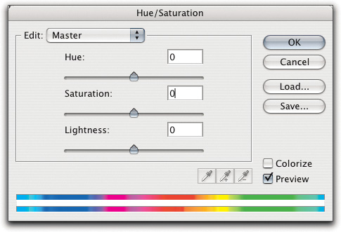
Unfortunately, the master panel of Hue/Saturation is of limited use. It does provides one of many ways of converting color images to grayscale (just reduce the Saturation slider all the way down to -100); it lets you produce colorized versions of color images using the Colorize check box; and it lets you produce “postcard” color by boosting saturation with the Saturation slider. The real power is hidden a little deeper, but let’s deal with Colorize first.
Figure 7-45 shows various treatments of an image with Colorize. The appearance is similar to a duotone, but the images are color images, and editable as such—you can run Hue/Saturation only on color images, while you can create duotones only from grayscale images.
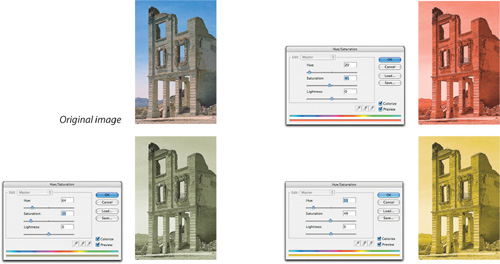
You can use Colorize for quick and easy simulations of sepiatones, cyanotypes, selenotypes, bromide prints, and the like, as well as creating images that were impossible to make using traditional darkroom methods.
Tip
Colorize is great for CMYK or RGB output, but if you’re trying to make a true multitone image and not simply an RGB or process-color simulation of one, choose Image > Duotone instead of applying Colorize.
When the Colorize check box is checked, the Hue slider sets the dominant hue (the number is the hue angle, the same as the Hue field in the Color Picker); the Saturation slider sets the saturation on a scale from 0 to 100, with 0 being grayscale (completely unsaturated) and 100 being fully saturated; and the Lightness slider lets you darken or lighten the image on a scale of –100 to 100, with the default center point at 0. If you experiment, you’ll find that the same settings produce different results depending on both the color mode (RGB, CMYK, or Lab), and the specific RGB or CMYK color space.
When the Colorize check box is disabled, the Lightness slider’s behavior doesn’t change, but the Hue and Saturation sliders behaviors do change.
The Hue slider. The Hue slider shifts all the colors in the image by the specified hue angle. Small shifts are sometimes useful, but shifting hue by more than 5 degrees or so usually produces effects that can charitably be described as “creative”—see Figure 7-46. The top color bar shows the original color, and the bottom color bar shifts to show the resulting color.
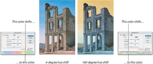
Global hue shifts are not usually useful except for creative effects, so we rarely use the Master Hue slider—instead, we adjust the hue of specific color ranges (see the next section, “The Color Panel Controls”).
Tip
Avoid using Saturation to create a black-and-white image—if you’re concerned about image quality, the new Black & White adjustment layer is far superior. See “The Color of Grayscale” in Chapter 11, “Essential Image Techniques.”
The Saturation slider. As with the Hue slider, the master Saturation slider is more chainsaw than scalpel. Boosting the master Saturation value can work in small doses, but it’s easy to drive your color into postcard territory (which is fine if you’re in the postcard business).
We’re much more likely to adjust the hue and saturation of individual color ranges separately (which we’ll show you how to do shortly), because with the Master panel sliders, when we get one color right, we’ve typically pushed another too far, and yet another not far enough.
The Lightness slider. We never use the Master panel’s Lightness slider—it simply shifts all the values, and usually clips either highlights or shadows. We do use the Lightness slider for individual colors, as we describe next.
The real power of Hue/Saturation is inside the individual color panels. When you open the Edit pop-up menu in the Hue/Saturation dialog, you can choose Reds, Yellows, Greens, Cyans, Blues, or Magentas. At first glance, the controls offered in the individual color panels may seem identical to those in the Master panel—there’s a Hue slider, a Saturation slider, and a Lightness slider. These work the same way as the Master panel sliders, only they’re constrained to operating on the selected color. What’s much less obvious is that the named color ranges are simply starting points that you can adjust to affect exactly the color range you want. The controls operate the same way in all the other color panels; the only difference between the panels is the menu name and the preset range of color they affect.
The not-so-obvious controls are at the bottom of the dialog. In between the two color bars are two inner vertical sliders and two outer triangular sliders. These define the range of color affected by the sliders (see Figure 7-47).
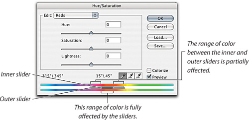
For additional feedback, the numbers above the color bar show you the hue angles of the four slider positions. You can adjust the range of color that will be fully affected by dragging the dark gray bar between the inner sliders, or by adjusting the inner sliders individually, and you can adjust the “feather”—the range of colors that will be partially affected—by dragging the outer sliders.
You can also adjust the range by selecting the three Eyedropper tools located above the color bars by clicking them in the image. The left Eyedropper centers the range of fully affected colors on the hue of the pixel on which you click; the center Eyedropper (with the plus sign) extends the range of fully selected colors to include the hue of the pixel on which you clicked; and the right Eyedropper (with the minus sign) excludes the hue of the pixel on which you clicked from the fully affected range of colors. The size of the feather doesn’t change with the Eyedroppers, but it moves as the fully affected color range expands and contracts. Essentially, the controls provide a color-range selection with a controllable feather.
Tip
We never bother choosing the different Eyedropper tools. The left Eyedropper is always selected by default, and as with other tools, you can temporarily switch to another form of the tool by pressing a modifier key. To use it to expand the color range, simply Shift-click; to eliminate colors from the color range, Option-click (Mac) or Alt-click (Windows).
It’s also worth noting that the preset ranges are simply arbitrary labels. There’s nothing to prevent you from tweaking six different ranges of reds, or greens, or yellows—though we find we rarely need more than three.
Skin tone adjustments. Hue/Saturation is invaluable for adjusting skin tones. It’s a great deal easier to adjust the red-yellow balance of Caucasian skin with the Hue slider than it is to do so with Curves—in Curves you usually have to adjust all three color curves to obtain the correct hue, where the Hue slider lets you get it right in a single move.
Tip
The color-range controls don’t provide additional visual feedback as to which colors are affected, which can make subtle changes hard to follow. Here’s a simple trick: Move the Hue slider all the way to the right or left before you start adjusting the color-range sliders, then set it back to 0 once you’ve adjusted the range.
Figure 7-48 shows an image of Bruce shot by our friend and colleague Jeff Schewe. As with many digital captures, the skin tones are a bit too red. We’ll use Hue/Saturation to make his complexion a little less florid.
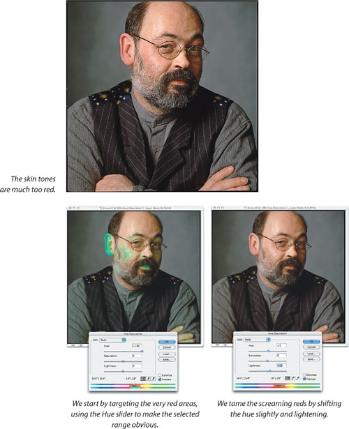
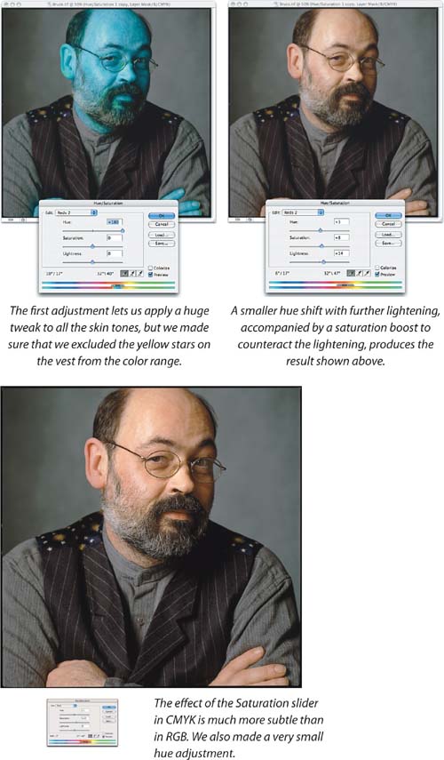
Making these kinds of adjustments with Curves is akin to medieval torture! In RGB, you’d have to manipulate at least two curves, and probably all three color curves plus the composite, and you’d probably have to bounce back and forth between the individual curves several times, since each move affects the others. In CMYK, a curve edit is even more complex since you have four color channels plus the composite rather than three.
Hue/Saturation is useful in both RGB and in CMYK, but it lends itself to much finer adjustments in CMYK than in RGB. In RGB, it manipulates light, while in CMYK it manipulates ink percentages. If you have sharp eyes, you will have noticed that we made the edits to this image in RGB with CMYK soft-proofing turned on.
When we’re preparing images for a CMYK destination, we always soft-proof, especially on Hue/Saturation adjustments. But even with good output profiles and a well-calibrated display, we’re likely to make small adjustments after conversion to CMYK, though we try to get as close as possible to the desired result in RGB. When we looked at CMYK proofs, we felt that the skin tone was just a hair too yellow-green, so we made one more correction before calling it final.
The Color Picker’s Gamut Warning. The View > Gamut Warning command (press Command-Shift-Y on Mac OS X or Ctrl-Shift-Y in Windows) isn’t something we find terribly useful on images. It shows us which RGB or Lab colors are outside the gamut of our CMYK working space, but it doesn’t show how far out of gamut they are, nor does it show us where the nearest in-gamut colors lie.
However, if you turn on the Gamut Warning command while you’re in the Color Picker, you can see exactly where the gamut boundary lies at different hue angles and lightness—see Figure 7-49.
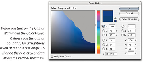
Bear in mind that the Gamut Warning always shows you the gamut of your current CMYK working space—see “Choosing a CMYK Working Space” in Chapter 4, “Color Settings”—so make sure that you have the correct CMYK profile loaded before you try to use this tip!
Matching hues. Another common task for which Hue/Saturation is well suited is matching hues across images. The light may change during an event, or you may simply have to force two disparate images to match.
Figure 7-50 shows a typical hue-matching challenge. Bruce stumbled across this wedding procession in La Paz, Bolivia, and had to switch from slide to color negative film halfway through. (The lack of oxygen at the 13,000-foot altitude made it somewhat miraculous that he managed to load any kind of film in the camera!)
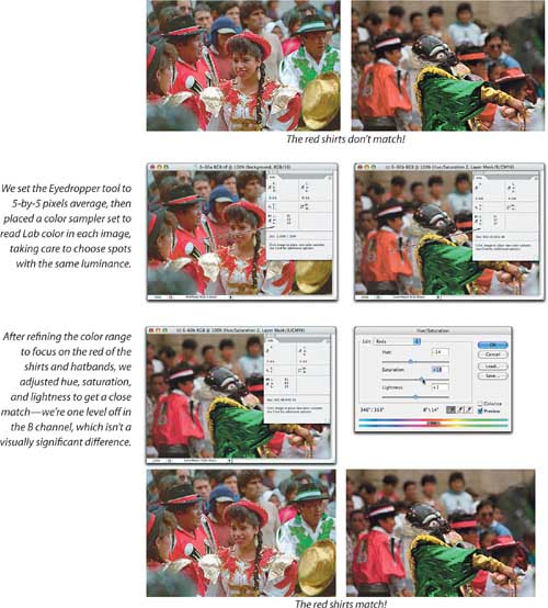
The red shirts are rendered as a magenta-red by one film stock and as an orange-red by the other. And just to make things a little more challenging, one image is in ProPhoto RGB and the other is in ColorMatch RGB, so the RGB numbers are of little help. Fortunately, the Info palette lets us display Lab values, so we’ll use these as a guide—on a well-calibrated system you can make the match by eye, but the numbers always provide a useful reality check, and Lab numbers act as a universal translator, letting you match colors in different color spaces, or even different color modes.
While the Image > Adjustment submenu offers a command labeled “Match Colors,” we confess that we’ve yet to find a way to make it produce predictable results, though it can make for some interesting creative effects. Hue/Saturation is quick and controllable.
Gamut-mapping. One further task for which we rely on Hue/Saturation is gamut-mapping—controlling the rendering of colors present in the source image that are outside the gamut of the output process. In theory, perceptual rendering is supposed to take care of this for you. In practice, though, it sometimes fails. All profile-creation tools make assumptions, almost invariably undocumented, about the source space they attempt to map into the gamut of the device being profiled, and when the source space doesn’t match the undocumented assumption, you can wind up with solid blobs of saturated color.
Sometimes the fix is as simple as just desaturating the color while looking at a soft-proofed version of the image. In other cases, you may be able to improve the rendering by adjusting hue and/or lightness too. You have to make the fix before converting to the output space, because after the conversion is done, all you can do is make the blobs more or less saturated—you can’t recover the differences that represented detail.
We can’t show you the out-of-gamut RGB colors in this book because the CMYK print process we use to print this book won’t let us. What we can do is to show you the unadjusted profile conversions of some problem images, the fixes we applied, and the results.
Figure 7-51 shows some problem images. The unadjusted versions are darn close to what we saw in the soft-proofs that alerted us to the potential problems. In all these instances, something—hue, lightness, or saturation—has to give. There’s an element of subjectivity in these decisions; we can’t get the color we really want, so we have to settle for something else. There’s no objectively correct answer as to what that something else is, but in all three cases, we feel that our choices are improvements over the straight, unadjusted profile conversions.
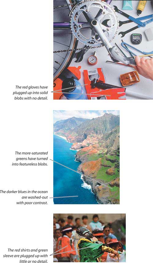
Figure 7-52 shows the adjusted images, along with the Hue/Saturation moves we used to make them. Only one of the examples—the red shirts in the last image—was fixed by a simple desaturation. The other fixes all involved changes to lightness and to hue, and in some cases the hue and lightness moves allowed us to boost saturation rather than decrease it.
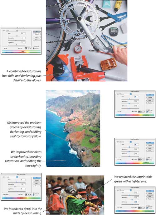
Printing blues with CMYK inks is always tricky, because CMYK spaces contain so few of them! In most other color ranges, desaturation is our first line of defense for out-of-gamut colors. However, in the blue regions, lightness moves are often more effective, as shown in the middle image in Figure 7-52.
Other Methods. Levels, Curves, and Hue/Saturation are the fundamental tools for adjusting global tone and color (we’ll show you to apply them as selective local adjustments in Chapter 8, “The Digital Darkroom”). But several of the other commands on the Adjustments submenu are extremely useful, albeit in fewer situations.
You must master Levels, Curves, and Hue/Saturation to consider yourself any kind of Photoshop user. But the more specialized tools—to which the remainder of this chapter is devoted—can save you time and let you produce better-quality work, which is, after all, the object of the whole exercise. Photoshop always offers multiple ways to do just about anything, but one way is usually better or faster than the others.
Replace Color (choose Image > Adjustments > Replace Color) is really a shortcut for making a Color Range selection (see “Color Range” in Chapter 9, “Making Selections”), then performing a Hue/Saturation tweak.
Replace Color doesn’t let you do anything you couldn’t do with Hue/Saturation, but if you only need to adjust a single color, it’s sometimes more convenient to use Replace Color. To emphasize the point that Photoshop always offers multiple methods of achieving the same goal, Figure 7-53 shows how we’d do the correction shown in Figure 7-50 using Replace Color instead of Hue/Saturation.
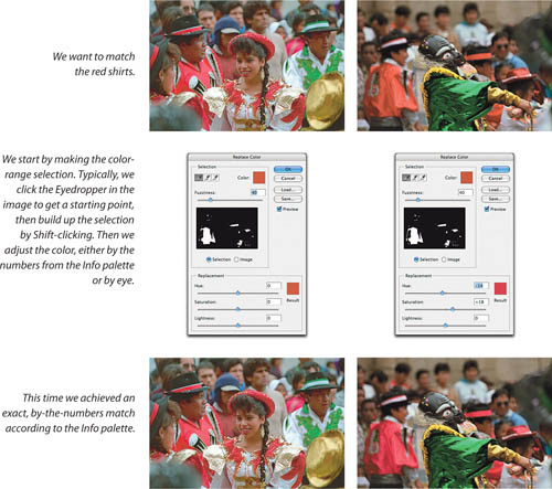
Selective Color (choose Image > Adjustments > Selective Color) mimics the “system color” or “color-in-color” controls found in most traditional prepress drum scanners. We use Selective Color as a fine-tuning tool on images that have already been converted to CMYK, where it’s a precision instrument for fine-tuning color. For RGB images, Selective Color doesn’t really do anything that can’t be done as easily with Hue/Saturation.
Selective Color lets you increase or decrease the percentage of Cyan, Magenta, Yellow, and Black in the nine preset color ranges that appear on the Colors menu (see Figure 7-54).
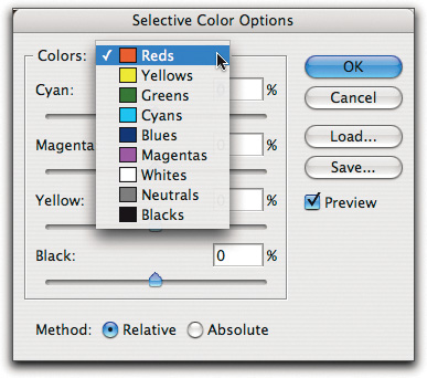
These color ranges are hard-wired—you can’t change them. In Absolute mode, Selective Color adds or subtracts the specified percentages of each ink from colors in the center of the color range.
So, for example, if you ask for –20 percent magenta from reds, in Absolute mode, a 100M 100Y red becomes an 80M 100Y red, an 80M 80 Y red becomes 64M 80Y, a 60M 60Y red becomes 48M 60Y, and a 40M 40Y red becomes 32M 40Y. As you move away from the pure-red axis, the percentage by which magenta is reduced lessens in proportion to how far off the red axis the color lies.
Absolute and Relative Methods. If you’re using a well-tuned color management system and are creating direct-to-plate output, stick with the Relative method. When using the Relative method, Selective Color looks at how much of the specified ink is present in each pixel in the color range, how close it is to the center of the named color range, and how saturated the color is, so the effect is gentler than Absolute mode on everything except the fully saturated colors corresponding to the named color ranges.
It’s hard to predict the final numbers from the numbers you plug in—it’s a complex formula—so use the Info palette if you need numeric feedback. Figure 7-55 shows one of the images from Figure 7-56, before and after fine-tuning with Selective Color.
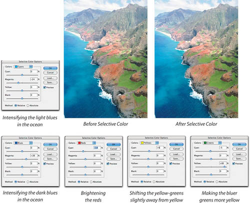
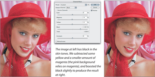
The before-and-after differences are quite subtle, though they’re obvious when pointed out. Relative mode is much more useful than Absolute for making fine adjustments to CMYK images, and these are the kinds of small but useful moves at which Selective Color excels.
The Absolute method was more useful back in the bad old days of the non-color-managed prepress workflow, when we burned film to make plates and a nominal 4 percent dot could reproduce as anything from paper white to around 7 percent. Then, we’d sometimes use Absolute mode on Whites and Neutrals, making small moves to tune the gray balance.
The Channel Mixer (choose Image > Adjustments > Channel Mixer) does what it says—you can mix the channels, combining content from one or more channels and feeding it into another. For maximum flexibility, the Channel Mixer is typically applied as an adjustment layer.
The Channel Mixer is a useful color-correction tool, but we don’t use it as a global correction tool on RGB images. We sometimes use it to make local corrections, typically to bring out highlight or shadow detail that’s only present in one channel.
On CMYK files, it’s useful for tweaking the black plate in specific color ranges, as we show in Figure 7-56. The original separation setup added black into the skin tones, making them muddy. We’d rather fix this by going back to the RGB original and reseparating the image, but that’s not always possible. Lightening the black plate in Levels or Curves would destroy the contrast—we only want to change the skin tones—and the Channel Mixer provides an easy means of doing so, with better feedback and finer control than Selective Color. We set the Output Channel to black, subtracted some of the magenta and yellow channels from the black, and boosted the black to preserve the black values in the shadows.
Tip
The Channel Mixer has been a popular way to convert color images to black-and-white images, but in Photoshop CS3 it’s much better and easier to use the new Black & White adjustment (see “The Color of Grayscale” in Chapter 11, “Essential Image Techniques”).
The Photo Filter command (choose Image > Adjustments > Photo Filter) is designed to simulate traditional over-the-lens warming and cooling filters, though it actually lets you choose custom colors in addition to the presets. Its effect is similar to a solid color layer set to Color Blend mode.
We find that the default 25-percent intensity is usually about twice what we need, and we often disable the Preserve Luminosity check box because it tends to exaggerate the effect in the highlights. Figure 7-57 shows some Photo Filter warming and cooling adjustments.
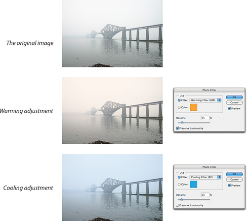
Photo Filter is particularly effective at low intensity settings. We typically use intensities in the 3 to 12 percent range, but we set our examples here a little higher to make the effect obvious in print.
You can also achieve many different creative effects using either the stronger preset colors, or by creating your own filter color—just double-click on the color swatch to open the Color Picker.
The Shadow/Highlight command is unlike all the other commands on the Image > Adjust submenu. All of the other commands treat each pixel the same way, while Shadow/Highlight is an adaptive command that evaluates and adjusts each pixel differently depending on the values of its neighboring pixels. Shadow/Highlight lets you recover detail from nearly blown-out highlights and nearly plugged shadows in a way that Curves or Levels just can’t do. Where Levels and Curves shift all pixels at the same level by equal amounts, Shadow/Highlight evaluates local contrast and preserves it by making adaptive, context-sensitive adjustments.
Tip
In Adobe Camera Raw, the Recovery and Fill Light commands are similar to the Shadow/Highlight feature in Photoshop.
In its default form, the Shadow/Highlight dialog is very simple—frankly, too simple to be of real use. Turn on the More Options check box to reveal the full capabilities of Shadow/Highlight (see Figure 7-58).
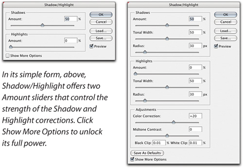
In its expanded mode, Shadow/Highlight offers Amount, Tonal Width, and Radius sliders for Shadows and for Highlights; a Color Correction slider (on grayscale images, it’s replaced by a Brightness slider); a Midtone Contrast slider; and clipping percentage fields for black and white. The interactions between the controls are fairly complex, so let’s look at them in turn.
Amount. The Amount sliders for Shadow and Highlight control the strength of the correction—they’re the “volume knobs.”
Tonal Width. The Tonal Width sliders dictate how far up the tonal range from black the Shadow correction applies, and how far down the tonal range from white the Highlight correction applies. They let you constrain the correction to the tonal range that needs it.
Radius. The Radius slider dictates the neighborhood that the command evaluates for each pixel, thereby affecting local contrast. A good rule of thumb is to set the Radius to the size of the features you’re trying to emphasize. If you set too large or too small a radius, you tend to lose detail rather than emphasizing it. The easiest way to master the Radius slider is to experiment with it.
Color Correction. The Color Correction slider is a saturation control, but it operates only on the corrected colors, not on colors that are unchanged by the correction. Increasing its value saturates the corrected colors; reducing it desaturates them. We generally find that the default value of +20 is usually about right, but don’t be afraid to experiment.
Tip
If you’re working with raw digital camera images with blown highlights, recover those highlights using the Recovery slider in Camera Raw, which has access to all of the image’s raw data, rather than using Shadow/Highlight to recover them.
Brightness. On grayscale images, the Brightness slider replaces the Color Correction slider. It lightens or darkens the image and unlike the Color Correction slider, it affects the entire image, not just the pixels that are affected by the Shadow and Highlight adjustments.
Midtone Contrast. The Midtone Contrast slider adjusts contrast—negative values decrease contrast and positive ones increase it. While its effect is most pronounced on the midtones, it affects the entire image, so use it carefully; if you push it too far, you might just end up undoing most of the effects of the Shadow and Highlight adjustments.
Black Clip/White Clip. The clipping percentages dictate how many of the corrected pixels are mapped to black (0) and white (255), so these controls let you adjust the contrast of the pixels close to black and white. Note that unlike the clipping percentage fields in Levels, these use three decimal places. Use them to fine-tune the contrast near the endpoints—when they’re set too low, the image can turn muddy.
Tip
Use care when using the Shadows Amount slider with underexposed or noisy images. Such images withstand less of a shadow boost before shadow noise appears.
Figure 7-59 shows a step-by step Shadow/Highlight correction of an image with blown highlights and plugged shadows. The result would be impossible to obtain with Curves or Levels! Shadow/Highlight is an amazingly flexible tool.
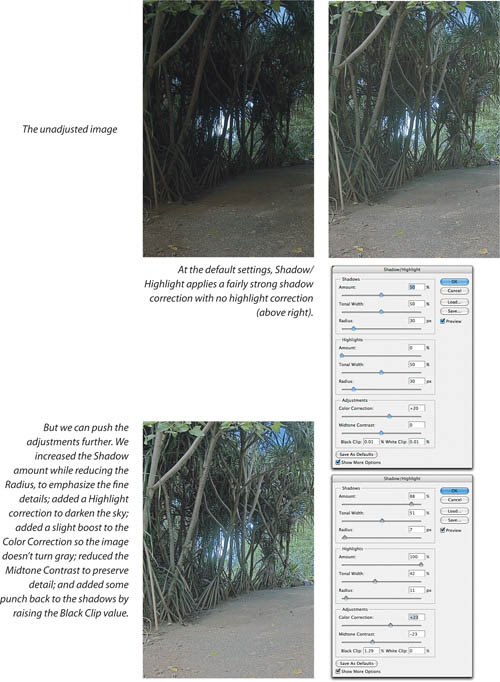
Shadow/Highlight isn’t available as an Adjustment layer. It has to calculate the value for each pixel based on surrounding pixels on the same layer, while adjustment layers only compare a pixel with the same pixel on layers behind it. The additional calculations required by Shadow/Highlight would make it agonizingly slower than any other adjustment layer. In Photoshop CS3, you can use Shadow Highlight as a Smart Filter, where you have more control over when the lengthy recalculations take place.
We’ve covered most of the tools on the Adjustments submenu, but we’ve left a few out, for the simple reason that we never use them. That said, we feel that a few words of explanation are in order, so here, briefly, are the tools we don’t use and our reasons for avoiding them.
Don’t feel that you have to do as we do, or even do as we say. If you find any of the following tools useful, you know something we don’t, and you can be proud of your hard-won knowledge. But first take a moment to ponder our critiques in case you are missing something.
The Color Balance command lets you make separate adjustments for red/cyan, green/magenta, and blue/yellow to three arbitrary tonal ranges labelled Highlights, Midtones, and Shadows. The problem is that these ranges overlap, and are never quite where we need them.
Nowadays, color crossovers are relatively rare—some early ’90s desktop flatbed scanners were rather notorious for producing them, but when we see them now they’re usually caused by shooting under mixed lighting, and the required corrections are usually selective rather than global. We find that it’s easier to tweak the color balance of different tonal ranges using Curves.
As we noted in the sidebar, “Brightness/Contrast in Photoshop CS3,” much earlier in this chapter. While Brightness/Contrast now “works right” in Photoshop CS3 since Adobe updated the feature to avoid highlight and shadow clipping by default, it’s still kind of a blunt instrument compared to Levels or Curves. If you actually want to blow out your highlights while washing out shadows, or make your highlights more gray while plugging up shadows, the Brightness slider is the perfect tool when you turn on the new Use Legacy check box. The Contrast slider with the Use Legacy check box on is likewise great for simultaneously blowing out highlights and plugging up shadows.
We suspect that the only reason that Brightness/Contrast still appears on the Adjustments submenu is that the Photoshop development team never removes features. There is simply nothing you can do with Brightness/Contrast that you can’t do as easily, with more control, using Levels or Curves.
Match Color sounds like a great idea. We’ve just never been able to get it to work with any significant degree of reliability. Match Color can produce some interesting creative effects, particularly when you use a source image with a completely different color palette from the one you’re adjusting, but the results depend a great deal on any selection you make in the source image, and if you want to tweak that selection, you have to Cancel out of the Match Color dialog to do so.
We find that we can create color matches a great deal more quickly by using either Hue/Saturation or Replace Color. Match Color is just too fickle and unpredictable for our taste.
Gradient Map is useful for making custom grayscale conversions and for creating truly wacky color effects. It’s low on our list of grayscale conversion methods because it takes a lot of work—you have to edit the gradient to get the results you want, then use Gradient Map to actually get them—and we don’t really do wacky color effects, though we have nothing against folks that do.
The Exposure command is really designed for working with HDR (High Dynamic Range) images. On those, it’s pretty useful—see “HDR Imaging” in Chapter 11, “Essential Image Techniques”—but on 8-bit or 16-bit/channel images, it doesn’t do anything useful that you can’t do just as easily with the gray Input slider in Levels. Worse, the Exposure and Offset sliders basically replicate the behavior of the Brightness slider in Brightness/Contrast.
We often use Invert on masks (when we masked the area we wanted revealed and vice versa), but it’s not something we’d ever do to an image. We never use Equalize—it redistributes the tonal values so that the brightest pixels are white, the darkest pixels are black, and the intermediate values are evenly distributed across the tonal range. We’ve yet to find a use for that, though we try to stay open-minded. These commands are more useful for image analysis or special effects than they are for photographic image processing.
Tip
You can use a Threshold adjustment layer to mark highlight or shadow levels without keeping the Levels or Curves dialog open.
Threshold is useful for turning images into 1-bit black-and-white bitmaps. We use it when we scan line art, but not as an image correction tool. Posterize does something we generally struggle to avoid!
Variations is a nice tool for learning to distinguish different color casts, but a very blunt instrument indeed for correcting them, and it’s limited to 8-bit/channel images. It doesn’t do anything that can’t be done with a great deal more control and precision using Hue/Saturation. If you’re still uncertain of your ability to distinguish a red cast from a magenta one, or a cyan cast from a blue one (and it does take practice), a quick look in Variations can help you make the call, but we don’t recommend using it to take whatever remedial action the image needs.