
Welcome to the heart of Real World Photoshop CS3. We consider every topic in this book to be important, but color management is one of those topics that can quickly make anyone feel stupid. If you’re under the delusion that you can use Photoshop without using color management, this chapter is a must-read. Without understanding how Photoshop handles color behind the scenes, there’s no way to get great color (or black-and-white) images out of this program.
Although behind the scenes, the color management system in Photoshop uses mathematics that approach rocket science, using these tools is much simpler: You just need to understand a few key concepts, learn where the buttons are, and use common sense in deciding when to push them.
In the last chapter, we broke the sad news that RGB and CMYK are very ambiguous ways of specifying color, since the actual color you get will vary from device to device. In this chapter, we’ll look at the features Photoshop offers to make what you see on the screen at least resemble, if not actually match, what you get in your printed output.
A color management system (CMS) is software that attempts to maintain the appearance of colors when reproduced on different devices. We stress the word “appearance” because it’s simply impossible to reproduce many of the colors found in the world in print, or even on a color monitor.
Color management often gets dressed up in much fancier clothing, but it really does only two things.
It lets you assign a specific color appearance to RGB or CMYK numbers that would otherwise be ambiguous.
Within the physical limitations of the devices involved, it lets you keep that specific color appearance as you send your images to different displays and output devices.
No matter how complicated color management options might appear, when you examine them more closely, they always serve those two purposes.
All CMSs employ three basic components:
The reference color space (also known as the profile connection space, or PCS) is a device-independent, perceptually based color space. Most current CMSs use a CIE-defined color space, such as CIE Lab or CIE XYZ. You never have to worry about the reference color space; it’s the theory behind how the software works. Think of it as the common ground for all color devices—a space that can represent any color.
The color-matching engine (sometimes known as the color matching method, or CMM) is the software that converts color meanings between different device-specific color spaces. Photoshop supports color matching engines other than the Adobe-branded one (ACE) that it shares with the other Adobe Creative Suite applications, but the only reason we can see for using a different engine is if you absolutely must obtain exactly the same conversions from non-Adobe products. In general, the differences between the various CMMs are slight. Think of the CMM as the universal translator between your color devices.
A profile can describe the behavior of a device like a scanner, monitor, or printer. For instance, a profile can tell the CMS “This is the reddest red that this device can output.” A profile can also define a “virtual color space” that’s unrelated to any particular device (the Adobe RGB space is an example of this; we’ll see how it’s useful later on). Profiles are the key to color management. Without a profile, 100 percent red has no specific meaning; with a profile, the color management system can say “Oh, that color of red!” Thanks to the ICC (International Color Consortium) specification, device profiles conform to a standard format that lets them work with all CMSs on all platforms. ColorSync profiles on the Mac and .icm or .icc profiles in Windows both follow the ICC spec and are interchangeable between platforms.
Of the three components, the first two are usually invisible to you. You might change them once in a lifetime, or more likely, you’ll never have to think about them at all. But profiles are something you’ll probably have to think about on a regular basis, especially if your images come from many sources or go to many different output media.
The key concept in using a CMS is conveying color meaning—making those ambiguous RGB and CMYK values unambiguous. If the system is going to keep the color consistent among different devices, it needs to know what color appearance each device in the process represents using RGB or CMYK numbers. If a CMS knows what RGB values a scanner produces when it scans specific colors, and it knows what colors a display produces when we send it specific RGB numbers, it can calculate the new RGB numbers it needs to send to the display to make it reproduce the colors represented by the scanner’s RGB numbers.
Tip
Embedded and tagged mean the same thing: A color profile is included inside the document file. When Photoshop reports that an image is untagged, it means no profile is embedded.
Profile embedding. When you embed a profile in an image, you aren’t changing the image. You’re simply providing a definition of what the numbers in the file mean in terms of actual colors you can see. That is, you’re assigning a specific color appearance to the RGB or CMYK numbers. If you don’t embed profiles in your images, the numbers in the file are ambiguous and open to many different interpretations. Embedding a profile simply tells color-management-savvy applications which interpretation you want to place on the numbers. Profile embedding is the easiest way to convey the color meaning—the intended color appearance—of the numbers in the digital image.
Source and target profiles. When you ask the color management system to make a conversion—to change the numbers in the file—the CMS needs to know where the RGB or CMYK color values came from and where you want to send them. When you open or create an image, you have to give the CMS this information by specifying a source profile and a target profile.
The source profile (which is sometimes already embedded in the file) says, “This RGB data is from such-and-such a scanner,” or “This RGB data is from such-and-such a monitor.” This tells the CMS what actual colors RGB or CMYK numbers represent. The target profile tells the CMS where the image is going, so that it can calculate the new RGB or CMYK numbers that will maintain the color in the image on the target device.
For example, imagine that a color management system works with words rather than colors. The purpose of the CMS would be to translate words from one language to another. If you just feed it a bunch of words, it can’t do anything. But if you give it the words and tell it that they were written by a French person (the source), it all of a sudden can understand what the words are saying. If you then tell it that you speak German (the target), it can translate the meaning faithfully for you.
Tip
Even the best CMS degrades your image when you convert it from one color space to another. While Photoshop tries to minimize conversion-related data loss by using a device-independent color space, it’s best to avoid converting an image between color spaces more than necessary.
The process. Back to pictures: When you scan artwork, you end up with RGB data. But for Photoshop to know what specific colors those RGB values are meant to represent, you have to tell it that the RGB data came from this particular scanner. When you choose your scanner’s device profile as the source profile, you’re telling Photoshop that this isn’t just any old RGB data; it’s the RGB data carefully defined by the scanner’s device profile.
To make the image on your printer match the original, you choose your printer profile as the target profile. The CMS takes the RGB values in the image and uses the scanner profile as the secret decoder ring that tells it what colors (in the reference color space) the RGB values represent. Then it calculates new RGB or CMYK values based on the printer profile, so it can produce the closest possible colors on your printer.
This is really the only thing CMSs do. They convert color data from one device’s color space (one “language”) to another. Pretty much everything you do with a CMS involves asking it to make the colors in a source and target profile match each other, and this same two-step is integral to the way Photoshop handles color.
Rendering intents. There’s one more wrinkle. Each device has a fixed range of color that it can reproduce, dictated by the laws of physics. Your monitor can’t reproduce a more saturated red than the red produced by the color filter or phosphor that a monitor uses to produce red. Your printer can’t reproduce a cyan more saturated than the printer’s cyan ink, or a white brighter than the white of the paper. The range of color a device can reproduce is called the color gamut. Colors present in the source space that aren’t reproducible in the destination space are called out-of-gamut colors. Since you can’t reproduce those colors in the destination space, you have to replace them with some other colors.
Tip
Here’s an easy way to remember the meaning of the source profile, the target profile, and the rendering intent: Think of them as where the color comes from, where the color is going, and how you want the color to get there.
The ICC profile specification includes four different methods of handling out-of-gamut colors, called rendering intents. (In Photoshop, they’re simply called intents.) The four rendering intents act as follows:
Perceptual. The Perceptual intent attempts to fit the gamut of the source space into the gamut of the target space in such a way that the overall color relationships, and hence the overall image appearance, are preserved, even though all the colors in the image may change somewhat in lightness and saturation. It’s a good choice for images that contain significant out-of-gamut colors.
Saturation. The Saturation intent maps fully saturated colors in the source to fully saturated colors in the target without concerning itself with hue or lightness. It’s mostly good for pie charts and such, where you just want vivid colors, but you can also use it as an alternative method of perceptual rendering, so it may be worth previewing the conversion using Saturation rendering to see if it does something useful. For more information on doing that, see “Soft-Proofing Controls,” later in this chapter.
Relative Colorimetric. The Relative Colorimetric intent maps white in the source to white in the target, so that white on your output is the white of the paper rather than the white of the source space, which may be different. It then reproduces all the in-gamut colors exactly, clipping out-of-gamut colors to the closest reproducible hue. For images that don’t contain significant out-of-gamut colors, it’s often a better choice than Perceptual because it preserves more of the original colors.
Absolute Colorimetric. The Absolute Colorimetric intent is the same as Relative Colorimetric, except that it doesn’t scale source white to target white. If your source space has a bluish white and your output is on a yellowish-white paper, Absolute Colorimetric rendering makes the printer lay down some cyan ink in the white areas to simulate the white of the original. It’s generally only used for proofing (see “Soft-Proofing Controls” later in this chapter).
To achieve the best possible color, Photoshop color management places a different emphasis on some mainstream color management concepts compared to other applications, and it adds some unique and useful concepts of its own. So before we dive into dialogs, let’s look at how color management is set up within Photoshop.
One of the places where Photoshop goes beyond other applications is in the area of color spaces. Applications that don’t pay special attention to color typically support only one color space per color model, and many of those might only support RGB. To prevent color conversions that might give you unwanted color changes, Photoshop can preserve the color spaces of individual documents. You can have multiple RGB and CMYK documents open at the same time, with each one using a different color space. This is great for service bureaus and others who work with images from many different sources, but it also opens several cans of worms. We now have to draw a distinction between the working space and the document space(s), and between working spaces and device spaces.
With per-document color, your chosen working space is just a fall-back position for untagged images (images that don’t have embedded profiles). Photoshop offers several different RGB working spaces, and enterprising third parties have created still more. It may seem sensible to edit in the space in which the image was captured—a scanner or digital camera space—or in the final output space, such as an RGB inkjet printer. But working spaces have important properties that make them better suited to image editing than the vast majority of device spaces.
Most device color spaces are not perceptually uniform. That means that when you edit your file, the same editing increment in Levels, Curves, Hue/Saturation, or whatever, may have a much larger effect on some parts of the tonal range and color gamut than on others.
Most device color spaces aren’t gray-balanced. One of the key features of the abstract RGB working spaces built into Photoshop (as well as most third-party working spaces) is that when R=G=B, you know you have a neutral gray. This isn’t true for most scanner RGB spaces, many digital camera RGB spaces, and pretty much all printer RGB spaces.
Output device spaces typically clip some colors in the image because their gamut is almost always smaller than the original capture. For instance, if you simply apply a monitor or inkjet printer profile to an image you just scanned, you may not get all the colors you deserve.
In contrast, color spaces that are designed to be working spaces tend to be uniform, and are invariably gray-balanced. They do, however, differ widely in their gamuts, so gamut size is one of the key considerations when choosing an RGB working space for a particular job (see “Choosing an RGB Working Space,” later in this chapter). So while you’re no longer forced to use abstract RGB working spaces, you should do so for any serious image editing. Picking an RGB working space and sticking to it will also make your life easier.
Whenever you open or create an image, Photoshop treats it as a tagged or an untagged image from the moment of opening or creation, depending on how you set the Color Management Policies in the Color Settings dialog in Photoshop. Tagged and untagged images behave differently:
Tagged images. Tagged images are those with an embedded profile, which may be different from the current working space profile. A tagged image keeps its original profile and stays in the “document space” rather than the working space, unless you explicitly assign a new profile, convert to a new profile, or untag the image, which discards the profile. The Color Management Policies let you automatically keep documents in their own space, convert them to the working space, or discard the profile.
Untagged images. Untagged images have no embedded profile. They exist as a bunch of numbers whose actual color meaning is open to interpretation. If you change the working space while an untagged image is open, the image gets reinterpreted to be in the new working space, and the appearance changes. If you move pixels (by copy and paste or drag and drop) to another image in the same color mode, the numerical values are moved to the new document. For operations where Photoshop needs to make an assumption about the actual colors the numbers represent, such as mode changes or displaying on the monitor, Photoshop treats untagged images as being in the current working space for that mode. It also does so when you move pixels to a document in a different color mode, such as pasting from an RGB document to a CMYK one.
You can always convert a tagged image to an untagged one, or vice versa, by using the Assign Profile command (Edit > Assign Profile), or the Embed Profile check box in the Save As dialog, to embed a profile.
Document Profiles at a Glance. You can tell at a glance whether a document is tagged or untagged in the status bar or in the Info palette. Both require a little bit of setup. To display the document profile in the status bar, choose Document Profile from the pop-up menu at the lower left of the document window (see Figure 4-1). To display the document profile in the Info palette, choose Options from the Info palette menu and select the Document Profile check box.
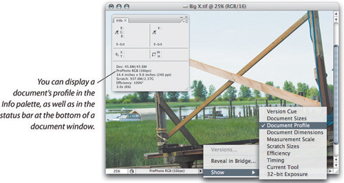
For tagged images, the status bar and Info palette show the profile name. For untagged images, they display “Untagged RGB” (or “Untagged CMYK,” or “Untagged Grayscale,” depending on the document’s mode).
A subtler clue can be found in the document window’s title bar. The pound sign (#) at the end of the title bar indicates an untagged document. An asterisk (*) at the end of the title bar indicates a document that’s tagged with a profile different from the current working space. If neither character appears, the document is tagged with the working space profile.
Tip
If you’re working in one of the full-screen modes, the status bar is hidden, and in that case the Info palette becomes a better place to keep tabs on document profiles.
To tag or not to tag? In the vast majority of cases, untagged documents are a bad thing because they force us to guess the intended appearance portrayed by the numbers in the file, and hence create extra work for everyone. The only situations that justify untagged documents are those where the numbers are unambiguous because of the context, or the appearance generated by the numbers is irrelevant.
For example, we didn’t embed profiles in any of the CMYK images we used in this book, because they’re all going to the same printing condition, and we set InDesign’s CMYK working space to the profile that describes that printing condition. Our CMYK profile is about 2.8 MB, so by not embedding it in every image, we saved a huge amount of disk space and FTP transmission time. The CMYK numbers are unambiguous, because they’re governed by the working space profile for the InDesign document.
By the same token, we don’t embed profiles in images destined for the Web. The very few Web browsers that pay any attention to embedded profiles assume that untagged RGB is sRGB, so we convert our Web images to sRGB, then export the image without the profile.
When we work with profiling targets, the whole point of the exercise is to find out what colors the device in question produces when we feed it the numbers in the target, so there’s no point in making any assumptions about the appearance represented by the numbers.
Last but not least, if you’re working in a closed-loop CMYK workflow, where you just don’t want the CMYK numbers to change when sent to your printing process, there’s no point in embedding a profile.
In all other situations, we strongly recommend embedding profiles in your images. Doing so lets you convey your color intentions clearly to all the devices and all the people in your workflow. Failure to do so forces the people to guess your intentions, causing extra work and frustration for all concerned.
One of the hardest—and most important—tasks in Photoshop is proofing what your final output will look like on your screen or on a color printer. Photoshop gives you very fine control over both, which we’ll talk about in great depth later in this chapter and in Chapter 12, “Image Storage and Output.” Here’s the quick version, though:
The Proof Setup command (View > Proof Setup) gives you full control over onscreen proofing simulations. Proof Setup’s simulations are window-specific, so you can simultaneously view the same file in different simulations.
You can view how different rendering intents will convert an image to a destination space before actually making the conversion.
You can see how an image prepared for one output process will behave when sent to another output process without adjustment: This is particularly useful when you’re faced with the prospect of repurposing CMYK files made for one printing condition to work with another.
You can work inside an accurate output simulation to optimize your image for a particular output process.
But to make this magic work, you must calibrate and profile your monitor, and we highly recommend that you take steps to control your viewing environment (see the sidebar “Creating a Consistent Environment,” later in this chapter).
In the days of film, when you could find out what the color should look like by looking at the film on a light table, you could argue that monitor profiling and calibration was in the “nice but not essential” category. But with the advent of digital capture, the monitor is the first place the image comes into existence in any meaningful way, so monitor calibration becomes an absolute mission-critical necessity!
Tip
Because Photoshop 6 was the first version of Photoshop to implement color management completely and properly (as far as we’re concerned), you must use Photoshop 6 or later to use and benefit from color management as we describe it in this book. (Yes, we do hear about some people who are still using Photoshop 5.)
When you work in any space except Monitor RGB, Photoshop uses the monitor’s profile to transform the data on the fly as it gets sent to the video card so that the monitor displays the color correctly. The great benefit of this approach is that it makes it possible for people using very different monitors on different platforms to view the same image the same way.
Remember: Photoshop displays everything through your monitor profile. If the profile doesn’t describe the real behavior of your monitor accurately, everything you see, and hence everything you do to your images, will be off by a little or a lot, depending on how inaccurate the profile is.
But to make this magic happen for you, you need an accurate profile for each monitor, and you need to let Photoshop know which profile it should use for the monitor. To display color accurately, Photoshop needs to know how your monitor behaves—what color white it produces, what sort of tonal response it has, and what actual colors it produces when it’s fed pure R, G, or B. Photoshop gets all its information about the monitor from the display profile. If you want the color on your monitor to be accurate, you must have a customized ICC profile that accurately describes the behavior of your monitor.
Tip
To see which monitor profile Photoshop is using, choose Edit > Color Settings, click the RGB pop-up menu, and look at the Monitor RGB command. The name of the monitor profile is appended to Monitor RGB. The monitor profile is the same as the one used by the operating system, such as the Displays system preference in Mac OS X.
You also have to maintain your monitor profile. Monitors drift over time, and though LCDs tend to drift much more slowly than CRTs, a profile that was accurate when it was created may not be accurate a week, a month, or a year later. In theory, there are two distinct ways to compensate for monitor drift.
You can create a new profile regularly—a process technically known as characterization.
You can adjust the behavior of the monitor regularly to bring its behavior into agreement with the behavior described by the profile, a process called calibration.
In practice, most monitor profiling tools do both, and they make no clear distinction between the two. The practical distinction boils down to the aim points you choose, and the reasons for preferring one approach over the other stem entirely from the features offered by the monitor.
Monitor profiling packages typically ask for the following parameters:
White luminance: The brightness of pure white on the monitor, specified in candelas per square meter (cd/m2), or foot-lamberts.
White point: The color of the monitor’s white, specified either in Kelvins or as a daylight temperature such as D50 or D65 (see the sidebar, “How White Are Your Whites?”). For practical monitor calibration purposes, you can treat 5000 K and D50, or 6500 K and D65, as interchangeable.
The tone response curve, usually specified as a gamma value.
Some packages also let you set a separate black luminance value, but only for CRT displays—LCD displays have a fixed contrast ratio, so the black luminance depends entirely on the white luminance.
The ability to calibrate a display depends on the controls that can affect its behavior. You can calibrate any display by changing the lookup tables in the video card that drives the display, but the glaring weakness in this approach is that all current video card lookup tables (LUTs) are 8 bits per channel. Whenever you edit an 8 bit/channel image, you end up with fewer levels than you had when you started, and the same holds true for tweaking the video card LUT.
Some displays allow you to make adjustments that change the display’s behavior, avoiding the losses inherent in tweaking the 8-bit video card lookup tables. With those displays, it makes sense to calibrate to a specific white point and/or gamma value.
Other displays—including most, but not all, LCD—have no physical adjustments other than the brightness of the backlight. With this type of display, it makes the most sense to profile its native, unadjusted behavior, and let the color management system—which typically uses 20 bits per channel instead of the video card LUT’s 8 bits—do the work of correcting the displayed colors.
Basic LCD monitors. Most current LCD monitors, including the Apple Cinema Displays, only allow you to adjust the brightness of the backlight. On these types of displays, it makes sense to set the brightness to a comfortable level (bearing in mind that, as with CRT monitors, the higher you set the white luminance, the faster you’ll wear out the display), then just profile the monitor at its native white point and gamma. If the software forces you to choose an explicit gamma value, use gamma 2.2.
High-end LCD monitors. Some high-end LCD monitors—notably the EIZO FlexScan and ColorEdge series—contain their own lookup tables, independent of the video card, with 10, 12, or even 14 bits of precision. The extra bits don’t let the monitor display more colors—the operating system pipeline through which applications communicate with the display is only 8 bits per channel wide—but they do let you calibrate the display to a specific white point and gamma without incurring the losses inherent in doing so in the 8-bit video card LUT. For these displays, we recommend a white point of D65, native gamma if it’s an option, and gamma 2.2 if it isn’t.
LED-backlit monitors. Just to confuse matters, there’s a new kid on the block. LED-backlit monitors use arrays of LEDs for the backlight instead of a fluorescent tube. Some LED backlights use white LEDs, but better models use separate arrays of red, green, and blue LEDs. With these RGB-array LED backlights, you can adjust the white point by varying the strength of the red, green, and blue LEDs. RGB-array LEDs are typically found in desktop monitors, while notebooks and other compact displays use white LEDs because they are smaller and lighter, though less adjustable.
LED-backlit monitors typically also have their own internal LUTs, which can be 12 bits (or higher) for desktop displays. We prefer profiling the native tone response of the display when the profiling software lets us do so, but we typically use gamma 2.2 when it doesn’t.
This type of display is just starting to appear on the market. As availability goes up and the prices come down, we expect them to replace fluorescent-backlit LCDs for serious imaging work. RGB-array LED backlights are capable of much larger gamuts than fluorescent-backlit displays.
CRT monitors. CRT monitors are pretty much an orphaned technology now. Sadly, the high-end CRTs, such as the Sony Artisan and the Barco Reference Calibrator, have been discontinued. Manufacture of high-end CRT displays has largely ceased.
But there are still a few CRTs in good working order out in the field. Most CRT displays allow separate control over the RGB guns. (Some only let you control two of the three, in which case the master gain control, usually labeled “Contrast,” controls the third.)
With CRT displays, we recommend adjusting the RGB gains to achieve the desired white point and target luminance. The gamma value, however, can only be achieved by adjusting the video card LUT. If the profiling package offers native gamma as an option, use it. Otherwise we recommend choosing gamma 2.2 because it’s closer to the native gamma of CRT displays than any of the other likely choices, and hence involves smaller tweaks to the video card LUT than other gamma settings do.
If you’re serious about working visually with Photoshop (rather than just going by the numbers), you’ll get the best results if you use a profiling package that includes a hardware measurement device. Various eyeball-based profiling utilities (such as Apple Display Calibrator software) are available, but they have two major drawbacks:
Most are designed for CRT displays, and don’t do a good job of estimating the tonal response of LCDs.
They use the user’s eyeballs as the measurement device. Our eyes are highly adaptable, which is great for a mammal living on planet Earth, but distinctly suboptimal when the goal is to set the monitor to a known state. Because human eyes involuntarily and uncontrollably adapt to the current ambient lighting conditions, they aren’t accurate enough for consistent color.
Tip
If a monitor profile you created makes images look like a psychedelic mess, the profile was probably generated incorrectly, or you might have used a bad profile as a starting point—especially if you calibrated by eye instead of using a hardware calibrator. A usable monitor profile should make images look natural, so if an image that you know is properly corrected looks way off, you probably need to profile the monitor again.
Colorimeters and spectrophotometers have none of the eye’s wonderful adaptability, so they always produce the same answer when fed the same stimulus. For monitor calibration and profiling, that’s a big advantage! If you must use eyeball-based tools, these guidelines may help improve the results:
Minimize your eyes’ adaptability by profiling under the same lighting conditions each time you make a profile. Ideally, the monitor should be the brightest thing in your field of view. (This is always true, but it’s particularly critical during profiling—see the sidebar “Creating a Consistent Environment.”)
Give the display at least a half an hour of warm-up time before profiling.
Many eyeball-based profiling tools take an existing profile as their starting point. Often, if you take an existing display profile built with the eyeball-based tool as your starting point, the end result is very bad indeed. Start with a known good profile.
Tip
Adobe Gamma was an eyeball-based calibrator included with earlier versions of Photoshop. If you still have it, don’t try to use it on LCDs. Adobe Gamma was designed for CRT monitors, and the mechanism it uses for estimating gamma doesn’t work well on LCD monitors.
A good many people are still reluctant to spend money on display profiling hardware and software. If you don’t care how the image looks on the monitor and you’re happy to just go by the numbers, you don’t really need a custom monitor profile or the gear to build one. In all other cases, and especially if you’re shooting with digital cameras, trying to save money by doing eyeball calibration and profiling is a classic example of being penny-wise and pound (or euro?) foolish. As with most things, with monitor-profiling tools you tend to get what you pay for, but even the least expensive instrumented package will return more accurate and more consistent results than any of the visual tools.
Use the capabilities of your monitor as a guide in setting aim points for calibration. The goal is to change the video card LUT as little as possible so that you get the full 256 shades per channel that the operating system allows you to send to the monitor.
Tip
When is your monitor worn out? One measure is when a monitor no longer reaches the target white luminance value of your profiling package. If you aren’t using a hardware calibrator, another less precise way to tell is if the monitor doesn’t seem bright enough when you turn up the contrast all the way.
Aim points and the working space. We should make it abundantly clear that the white point and gamma of your display are entirely independent of the white point and gamma of your RGB working space. The color management system translates working space white point and gamma seamlessly to that of your display. The goal in setting white point and gamma for the display is simply to make the display behave as well as it can.
White luminance. The trade-off in setting the white luminance is that you want it high enough to be comfortable, but low enough to avoid wearing out the display prematurely. If a display can’t reach 75 cd/m2 after profiling, it’s a candidate for replacement. LCDs are typically much brighter than CRTs, but overdriving them will wear them out just as it will with CRTs. A reasonable rule of thumb is to set the luminance at about 80 percent of full power (less if it appears too bright), until that setting becomes too dim. Then you can crank it up while starting to shop for a replacement.
Reasonable starting points are around 80–95 cd/m2 for CRT, and around 120 cd/m2 for LCDs (though if the display can produce a much higher luminance, you may want to set it higher).
Target white point. On displays with genuinely adjustable white points—which means CRTs and a very few exotic LCDs at this point—we recommend adjusting the display to a D65/6500 K white point. See the sidebar, “How White Are Your Whites?” for our detailed rationales for doing so. Some combinations of profiling package and display let the profiling package control the display’s internal controls via a DDC (Display Data Channel) connection, either through a separate USB connection or through the monitor cable itself. Besides being easier than adjusting the display through the front panel, DDC connections often allow the profiling package to make finer adjustments than the front-panel interface allows.
If the white point isn’t adjustable in the display itself, as is the case with most LCDs, we recommend profiling with the native white point—it’s usually very close to D65 anyway
Target gamma. With those profiling packages that allow it, we generally prefer to use native gamma as the aim point. Sometimes this is a hidden feature—for example, the Sony Artisan software in Expert mode lets you enter “---” (three dashes) to use the display’s native gamma.
If native gamma isn’t an option, we use gamma 2.2 for CRT displays. LCDs are a bit more complicated—the tonal response curve of an LCD doesn’t really match a gamma curve. With most LCDs and most profiling packages, if forced to choose a gamma value, we’ll use gamma 2.2.
Perhaps in recognition of the fact that LCDs don’t really follow a gamma curve, some profiling packages now offer more exotic tone-response curves. With “standard” LCDs that don’t have their own internal LUTs, we still prefer using native gamma if possible. But if that isn’t an option, or if you’re using a display with internal LUTs that the profiling software can address, we encourage you to investigate these options. We’ve obtained good results using the L* curve in Integrated Color Solutions’ ColorEyes, and the DICOM curve in NEC’s SpectraView II.
If you just want to go by the numbers. It’s possible to do good work with Photoshop using an uncalibrated, uncharacterized monitor—you just can’t trust what you see on the screen. If you want to simply go by the numbers—reading the RGB levels and the CMYK dot percentages—you can use the Info palette to check your color and simply ignore what you see on the monitor. Even with a calibrated monitor, it’s usually a good idea to check those numbers anyway.
If you aren’t concerned with the monitor appearance, open Color Settings, select the RGB pop-up menu in the Working Spaces section, and choose Monitor RGB. We don’t advocate this—we prefer to work visually—but it is possible, particularly if you’re working in a closed-loop environment where you always go to the same output conditions. Of course, if you do this, you may as well ignore the rest of this chapter.
Once you’ve created a custom monitor profile, it’s time to get to the meat of the color controls built into Photoshop. The Color Settings dialog (choose Edit > Color Settings, or press Command-Shift-K in Mac OS X or Ctrl-Shift-K in Windows; see Figure 4-2) functions as Color Central, letting you set up working spaces and color management policies for RGB, CMYK, and grayscale images. It also lets you specify what to do about missing or mismatched profiles. You can choose each of these settings individually or just use one of the presets, which then makes all the choices for you (customizing the settings gives you more control, of course). If you click the More Options button, the dialog expands to let you change the color management module (CMM), and the default rendering intent for conversions, as well as a few more esoteric controls we’ll discuss later in this section, and makes the full lists of installed profiles and presets available.
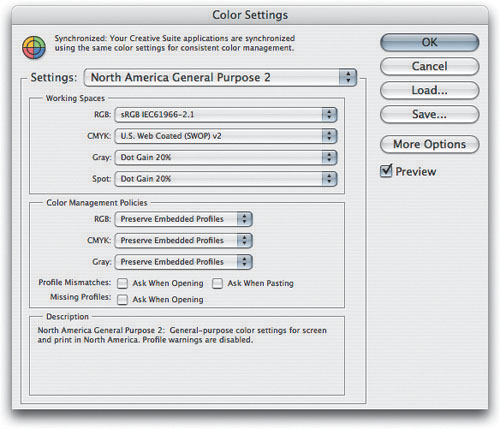
The Settings pop-up menu at the top of the Color Settings dialog lets you load presets to configure Color Settings with a single menu command that sets working spaces, policies, and warnings for you (see Figure 4-2). Presets are a reasonable place to start, but if you’ve gotten this far into this chapter, you’re obviously the kind of person who believes presets are made to be overwritten.
The real power of the Settings pop-up menu isn’t in the settings Photoshop provides, but rather in the fact that you can save your own settings to disk and then recall them quickly later. Even better, while you can always load a Color Settings preset from anywhere on your hard drive (using the Load button), if you save your settings in the right place, they become available from the Presets pop-up menu. (On Mac OS X, the “right place” is inside the LibraryApplication SupportAdobeColorSettings folder; in Windows, it’s inside Program FilesCommon FilesAdobeColorSettings.)
Tip
If you want any Color Settings preset to appear in the short version of the Settings pop-up menu, move it into the Recommended folder inside the Settings folder (at the location described on the right). If there are presets you don’t want to see, remove them from the Settings folder or the Recommended folder.
Saving presets that appear in the Settings menu offers an easy way to configure Photoshop for an entire workgroup. And if you own the entire Creative Suite, you can even synchronize the color settings to the same preset across all the CS applications: In Bridge, choose Edit > Creative Suite Color Settings, and click Synchronize Color Settings.
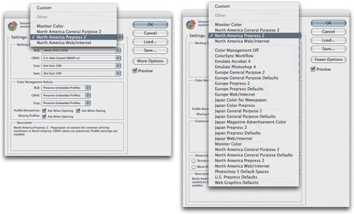
The presets that Adobe offers fall into two broad categories: those that ignore color management, and those that use it. As you can probably guess, we fall squarely into the “use it” camp.
General Purpose 2. The three General Purpose 2 presets (North American, Europe, and Japan) set the RGB working space to sRGB; they set the CMYK working space to U.S. Web Coated (SWOP) v.2 (North American), Euroscale Coated v2 (Europe), or Japan Color 2001 Coated (Japan); they set the Gray working space to Dot Gain 20%; and they set all the policies to Preserve Embedded Profiles while disabling the missing profile and profile mismatch warnings.
What’s the “2” all about? These presets are an improvement over the General Purpose Default settings that first appeared in Photoshop CS. The version 2 settings preserve embedded profiles for all color modes (which means you see the image displayed the same way it was when it was last saved), and they no longer use a different default rendering intent than all the other presets. The default rendering intent for all Photoshop CS3 presets is Relative Colorimetric with Black Point Compensation.
Tip
If you are working with a printer who provides a Color Settings preset optimized for their prepress workflow, install their preset and choose it in the Color Settings dialog.
Prepress 2. The three prepress settings—Europe, Japan, and U.S. Prepress 2—tell Photoshop to use color management wherever possible, and to give you as much feedback as possible about missing and mismatched profiles. They differ only in their choice of CMYK profiles and the dot gain for grayscale and spot colors (20 percent in the United States, and 15 percent in Europe and Japan). If your work is destined for a printing press and you don’t have a custom profile for your printing or proofing conditions, one of these choices may be a good starting point.
The North America and Japan Prepress 2 presets are identical to the prepress defaults that shipped with Photoshop CS. The Europe Prepress 2 preset uses the Europe ISO Coated FOGRA27 CMYK profile as the CMYK working space instead of the older Euroscale Coated v2, which, unlike the new profile, wasn’t readily traceable to any standardized printing condition, so we have to consider it an improvement.
Monitor Color. As its name suggests, Monitor Color loads your monitor profile as the RGB working space, and essentially tells Photoshop not to use color management, setting all the policies to Off (we discuss the meaning of policies later in this chapter). It treats all your documents as though they are in the working space for that color mode, ignoring any embedded profiles. For some inexplicable reason, though, it turns on the Profile Mismatch: Ask When Opening warning, which makes no sense since the profile will be ignored anyway.
Web/Internet. If you prepare images exclusively for the World Wide Web, the new Web/Internet presets (one each for North America, Europe, and Japan) may be quite useful. The Web is, of course, the same in Japan as it is in North America or Europe: The only difference between the three presets is the CMYK working space, which is U.S. Web Coated (SWOP) v2 for North America, Japan Color 2001 Coated for Japan, and Europe ISO Coated FOGRA27 for Europe.
The dangerous aspect of the Web/Internet presets is that they set the policy for RGB to Convert to Working RGB. That’s probably OK if all your work is destined for the Web, but since it automatically converts every RGB file to sRGB, you’ll be unhappy when larger-gamut RGB images destined for print get squashed into sRGB with no intervention on your part!
When you click the More Options button in Color Settings, you gain access to all the presets that ship with Photoshop (see Figure 4-3)—not just the ones designed for your region. If you upgraded from a previous version of Photoshop, you’ll see all the old presets from the previous version too. Most of the older presets had flaws, but some are downright dangerous.
Color Management Off. As its name suggests, Color Management Off tells Photoshop not to use color management, setting all the policies to Off (again, we discuss the individual policies later in this chapter). It treats all your documents as though they are in the working space for that color mode, ignoring any embedded profiles. It also loads your display profile as the RGB working space, so it could reasonably be called “Emulate Correctly Configured Photoshop 4,” but since hardly anyone ever configured color correctly in Photoshop 4, we won’t quibble.
Emulate Photoshop 4. Choosing Emulate Photoshop 4 ignores color management for the most part, setting different working spaces for RGB, CMYK, and grayscale (it uses Apple RGB as the working space on the Mac, and sRGB as the RGB working space in Windows). If you’re in a strictly-by-the-numbers all-CMYK print or all-RGB Web workflow, and you’re firmly convinced that color management has nothing to offer, this option might make sense. (But then why are you reading this chapter?) Even then, with a decent monitor profile, Color Management Off is a better alternative.
ColorSync Workflow. Macintosh users have one more option: ColorSync Workflow. This sets the ColorSync Default Profiles as the RGB, CMYK, and Gray working spaces. Since Tiger (Mac OS X 10.4) has no mechanism for setting default ColorSync profiles, this option is rendered useless under Tiger, and we tended to avoid it under earlier OS versions because it set the Engine to the Apple CMM rather than Adobe’s ACE, which we prefer.
If you’ve read this far, the odds are that none of the Color Settings presets is ideal for you, so don’t be afraid to customize them and create your own settings. The following sections deal with the individual settings in the Color Settings dialog that are likely candidates for customization.
So what are these strange things, the RGB working spaces that you choose in the Color Settings dialog? They’re arbitrary, device-independent RGB spaces. Some real techno-geeks will quibble with applying the term “device-independent” to an RGB space, preferring to reserve the term for purely synthetic, perceptually based color spaces like CIE Lab. To those folks, we suggest that while a useful distinction can be made between perceptually based spaces and RGB spaces, that distinction does not revolve around device independence. RGB working spaces in Photoshop don’t depend on the vagaries of any given piece of hardware, so we feel it’s truthful to call them “device-independent RGB.”
The RGB working spaces built into Photoshop are designed to provide a good environment for editing images. As such, they have two important properties that aren’t shared by the vast majority of device spaces.
Gray balance. The built-in working spaces are gray-balanced, meaning simply that equal amounts of R, G, and B always produce a neutral gray. This is hardly ever the case with device (scanner, camera, display, printer) spaces. Since one of the easiest ways to bring color into line is to find something that should be neutral and make it so, gray balance is an extremely useful property.
Perceptual uniformity. The built-in working spaces are approximately perceptually uniform, meaning that changing each channel’s numeric values in the image by the same increment results in about the same degree of visual change, no matter whether it’s in the highlights, the midtones, the shadows, the pastels, or the saturated colors. Again, device spaces generally don’t work that way.
Tip
The working space is most important when you open untagged images, because the working space is essentially a default color space for documents that aren’t already tagged with a profile. If you usually work with tagged images, the working space may not come into play very often.
All color-space conversions entail some data loss, but the conversion from capture (camera or scanner) to working space is, in our experience, invariably worthwhile, and when it’s done in 16-bit/channel mode, the loss is so trivial it’s just about undetectable. Even in 8-bit/channel mode, you’re likely to produce much better results editing in a working space rather than a device space.
Why not just use Lab? After all, Lab is, by design, a device-independent, perceptually uniform color space. But Lab has at least two properties that make it less than ideal as a standard editing space.
First, Lab is pretty nonintuitive when it comes to making color corrections—small adjustments to a* and b* values often produce large changes in unexpected directions. A bigger problem, however, is that Lab, by definition, contains all the colors you can see, and as a corollary, it also contains many “colors” you can’t see.
When we use 8 bits per channel to represent this whole range of color, the distance from one value to the next becomes large—uncomfortably large, in fact. And since any real image from a scanner or digital camera contains a much smaller range of color than Lab represents, you wind up wasting bits on colors you can’t capture, display, print, or even see. If you work with 16 bit/channel images, the gamut problem is much less of an issue, but editing in Lab is still not particularly friendly, and conversions from capture space to Lab generally involve more data loss due to quantization error than the conversion to RGB working spaces.
The main difference between RGB working spaces is the gamut size—the range of color that they can represent. You may think you should just choose the largest gamut available so that you’ll be sure of encompassing the gamuts of all your output processes, but (as is almost always the case in digital imaging) there’s a trade-off involved—at least if you’re using 8 bit/channel images.
As we explained in Chapter 2, “Image Essentials,” RGB images are made up of three grayscale channels, in which each pixel has a value from 0 to 255. This holds true for every 24-bit RGB image, irrespective of the working space it lives in. If you choose a very large-gamut space, the 256 possible data values in each channel are stretched to cover the entire gamut; the larger the gamut, the farther apart each value is from its neighbors.
The practical implication is that you have less editing headroom in a large-gamut space than you do in a small one: When you edit images, you invariably open up gaps in the tonal range as levels that were formerly adjacent get stretched apart. In a small-gamut space, the jump from level 126 to level 129 may be visually insignificant, whereas in a larger space, you’ll get obvious banding rather than a smooth transition.
The simplest option is to settle on a single RGB editing space for all your work, but you may wish to use a larger space for 48-bit images than you do for 24-bit ones, or a larger space for digital captures than for film scans. In a service bureau environment, you’ll have to support all sorts of RGB spaces—which is easy in Photoshop—in which case the default working space should simply be the one you use most.
If you’re working with legacy images that have already been edited in a small-gamut space, or JPEG digital captures, there’s no good reason to convert them to a larger space, and if you do, you may encounter some of the aforementioned issues. But if you work with scans from modern scanners, or raw captures from today’s digital cameras, large-gamut spaces are not only safe, but may be needed to do full justice to the image.
The naive presumption is that since RGB spaces are bigger than CMYK, they can hold all the CMYK colors we can print. That’s not really the case. RGB color spaces all have a characteristic three-dimensional shape, where maximum saturation happens at fairly high luminance levels. Print spaces have a different characteristic gamut shape, where maximum saturation is reached at lower luminances. If you bear in mind that you increase RGB saturation by adding light, and you increase print saturation by adding ink, this makes perfect sense.
Two-dimensional gamut plots disguise this fact, which is why they can be seriously misleading. Three-dimensional gamut plots make the relationships between gamuts much clearer. Figure 4-4 shows three views of Adobe RGB and U.S. Sheetfed Coated v2 CMYK plotted in three dimensions. The differences in size are obvious, but note the difference in shape.
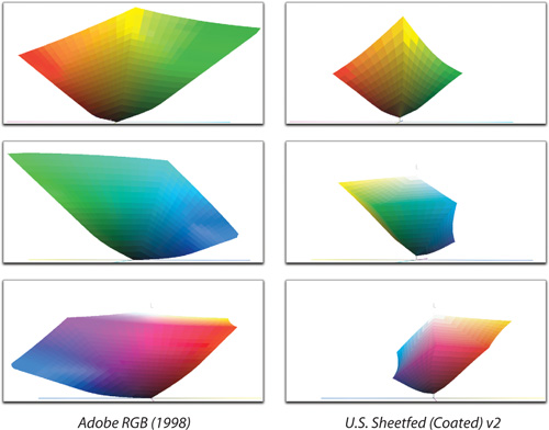
In fact, Adobe RGB (1998) just barely contains the gamut of U.S. Sheet-fed Coated v2 except for the saturated CMYK yellow, which lies just outside the gamut of Adobe RGB (1998). So if your primary concern is with press output, Adobe RGB (1998) may be a safe choice of working space.
For inkjet printing however, Adobe RGB (1998) may be on the small side. Figure 4-5 shows Epson Ultrachrome inks (the inks found in the Epson Stylus Photo 2200, 4000, 7600 and 9600 printers) on Premium Luster paper, plotted as a solid against Adobe RGB as a wireframe. Adobe RGB clips a huge chunk of the yellow-orange range, a significant chunk of saturated darker greens and blues, and a tiny bit of magenta-red. The pigmented Ultrachrome inks have a smaller gamut than the dye-based inks found in many inkjet printers, so this illustration is conservative.

Adobe RGB is the largest of the four “recommended” RGB working spaces that appear, along with Monitor RGB, in the RGB working space menu when Color Settings is opened with More Options turned off. Figure 4-6 shows Apple RGB, Colormatch RGB, and sRGB plotted against U.S. Sheetfed Coated v2.
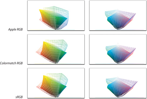
All three of the smaller spaces clip U.S. Sheetfed Coated v2 to a significant degree, though Colormatch clips the least. Needless to say (but we’ll say it anyway), if the color can’t be represented in the source space (in this case, working RGB), it won’t be present in the output either. Since CMYK inks give us a fairly small box of crayons to play with anyway, we’d prefer to be able to make full use of them without having any of our printable colors clipped by our choice of working space, so we regard Adobe RGB (1998) as the minimum requirement for RGB destined for print. (David uses it even for preparing Web graphics, and then converts to sRGB before exporting the untagged GIF, JPEG, or PNG file.)
Apple RGB and Colormatch RGB are legacy monitor-based spaces whose time has passed. Apple RGB is based on the original Apple 13-inch color monitor—it’s been out of production for more than 15 years—and Colormatch RGB is based on the almost-as-long-gone Radius Pressview. Unless you have to deal with massive amounts of legacy imagery in one of these spaces, there’s really no reason to use either as a working space. Essentially, the two rational choices from the four recommended spaces are sRGB for Web or multimedia image, and Adobe RGB for everything else. Then there’s Monitor RGB . . .
Monitor RGB. When you choose Monitor RGB, Photoshop uses your monitor profile as the RGB working space: It’s listed in the RGB Working Space menu as “Monitor RGB: YourMonitorProfileName.”
If you choose Monitor RGB, Photoshop displays RGB images by sending the numerical values in the RGB file directly to the video card. It uses the definition of those RGB values supplied by the monitor profile to convert RGB to other color spaces.
The only reason we can think of to choose Monitor RGB as your working space is if you’re working exclusively on Web graphic, and you need the RGB color in Photoshop to match the RGB color in non-color-managed applications like Adobe Dreamweaver. Using your monitor profile as the working space will ensure that RGB in Photoshop looks exactly the same as RGB in all your non-color-managed applications—unfortunately, it will also ensure that RGB looks different on your machine than it does on everyone else’s. (That’s why Photoshop introduced the idea of an RGB working space in the first place.)
If you’re a Windows user, you’ll likely find that the differences between Monitor RGB and sRGB are quite small. Mac users, though, will typically see a bigger difference. Web designers who work on the Mac may want to do most of their work using Monitor RGB, and then convert the final result to sRGB. That way, Windows users will see something close to what was intended, while Mac users who use Safari—or Internet Explorer with ColorSync turned on—will also see something close to the intended color. Mac users who use Firefox will see dark images, but they should be used to that . . .
On the other hand, many images destined for the Web also end up in print as repurposing becomes increasingly important. That’s why David uses the Adobe RGB working space even when he’s creating Web graphics. Then he uses soft-proofing in Photoshop to see what the image will look like on the Web (see “Soft-Proofing Controls,” later in this chapter).
If you check the Advanced Mode check box in Color Settings, the RGB menu expands to include every RGB profile installed on your machine. In Advanced mode, Photoshop allows you to use any RGB profile as an RGB working space, or even to create your own. Don’t go hog-wild with this! Editing in your SuperHamsterScan 9000 Turbo Z profile’s space is possible, but it probably won’t be perceptually uniform, and worse, it probably won’t be gray-balanced. It’s extremely hard to edit images well in a space that isn’t gray-balanced, and almost impossible to do so in one where the color balance shifts from dark to light (typical of capture profiles).
However, you may want to consider some working spaces that aren’t installed in the Recommended profiles folder. You can also define your own RGB working space, in which case you’ve definitely earned the title of Advanced User, but having already gone down that road, we recommend that you do so only after identifying very specific problems and exhausting all other available solutions.
David likes to keep things simple, and uses Adobe RGB virtually all of the time. Conrad uses different RGB working spaces for different purposes. It isn’t absolutely necessary to load these as working spaces in Color Settings—you can always use the Assign Profile command (see “Assign Profile” later in this chapter) to assign a profile other than the working space to an image—but if you’re going to be working with a bunch of images in the same space, it makes life slightly easier to load that space as the working space. The following is by no means an exhaustive list, but we’ve found each of these spaces useful.
Tip
Images you edit in Photoshop may not look the same in applications that don’t support color management. Depending on the color space you use, when sending images to others, you may need to use the Convert to Profile command to convert images to a more common color space. For example, all images published on Web pages should be converted to sRGB.
ProPhoto RGB. Formerly known as rgbMaster, and before that as ROMM (Reference Output Metric Method) RGB, Kodak’s ProPhoto RGB is an extremely wide-gamut RGB space. In fact, it’s so wide that its primaries are imaginary; there is no light source that could produce these colors, and we couldn’t see them if there was. It needs these extreme primaries to accommodate the dark, saturated colors we can readily achieve in print and that get clipped by smaller spaces. It’s wide enough that we recommend doing major edits only on high-bit files in ProPhoto RGB; small tweaks to 8 bit/channel files, however, are safe.
ProPhoto RGB has the ability to hold color difference that represents detail, rather than the ability to represent ridiculously saturated colors. The fact that it covers the entire gamut of all output spaces is simply a nice bonus.
EktaSpace. Developed by photographer Joseph Holmes, EktaSpace is a large-gamut space that’s a little more conservative, and hence a little more manageable, than ProPhoto RGB. There’s been some debate over whether EktaSpace really covers the entire E6 gamut. Our experiments suggest that, while it may be possible to capture colors in-camera (without resorting to games like exposing the film with a monochromatic laser) that will be clipped by EktaSpace, it’s not likely. EktaSpace will hold any colors you’re likely to encounter on E6 film that’s shot and processed under normal conditions. It’s possible to use 8 bit/channel images in EktaSpace, but you’ll get much more editing headroom with 16-bit files.
EktaSpace can be useful for transparency scans when it’s important to preserve the characteristics of the individual film stock. You can download the EktaSpace profile from www.josephholmes.com.
BruceRGB. Unlike both ProPhoto RGB and EktaSpace, BruceRGB is a small-gamut space. Bruce designed it to offer the maximum editing headroom on 8 bit/channel images destined for CMYK printing. It’s basically a compromise between Adobe RGB (1998), which is a little too big, and ColorMatch RGB, which is too small. It covers most of the gamut of CMYK offset printing and is a reasonable match to most RGB inkjet printers. It clips some cyans and oranges, but not much more so than Adobe RGB.
More recently, Bruce noted that today’s scanners and cameras are so much better than those from 1998, when he developed the space, that BruceRGB was no longer necessary for most people to use. In addition, it is now so much easier to work with high-bit images that if you need a color space larger than AdobeRGB, you might as well work in ProPhoto RGB at 16 bits per channel. However, BruceRGB is a good example of a custom RGB space created to handle a specific situation.
If you’re a hard-core imaging geek who likes to live dangerously, you can define your own RGB working space. It’s not that difficult, because an RGB working space is defined by just three primary xy values for red, green, and blue; a white point; and a gamma value. For example, if you use a high-quality scanning-back digital camera that lets you set the gray balance for each image, you may want to define a working space whose primaries are the same as the camera’s, thereby (in theory) ensuring that your working space matches your input device.
Tip
When you save custom RGB settings, you’re actually creating an ICC profile. In Mac OS X, save them in the LibraryColorSyncProfiles folder. In Windows 2000/XP, save profiles in the WinNTSystemSpoolDriversColor directory. That way, the profile that describes your RGB working space will be available to other ICC-aware applications.
To define a custom RGB working space, you first need to click the More Options button in Color Settings. This lets you choose Custom RGB from the RGB menu, which in turn opens the Custom RGB dialog (see Figure 4-7). Custom RGB allows you to choose a name for your custom space as well as specify the gamma, the white point, and the primaries. If you’re not already intimate with these terms, then you should probably just skip to “Choosing a CMYK Working Space.”

Gamma. The Gamma field lets you enter a value for the gamma of your working space. This is completely independent of your monitor gamma—there’s no reason to match your working space gamma to your monitor gamma, and there may be plenty of good reasons not to do so. To simplify (the long explanation would be very long and tedious), the gamma of the editing space controls the distribution of the bits over the tone curve. Our eyes don’t respond in a linear fashion to changes in brightness: A gamma of 2.2 is generally reckoned to be more or less perceptually uniform, so we recommend using that value for your working space gamma. It has the added benefit of devoting more bits to the shadows, which is where we find we usually need them during editing.
Tip
To find the xy chromaticities of the primaries for a chosen built-in space, first load that space from the RGB menu, and then choose Custom from the Primaries menu. The Primaries dialog appears, showing the xy chromaticities for the red, green, and blue primaries. If you wish, you can even plot them on a chromaticity chart like the one in Figure 4-8.

White Point. This setting defines the white point of the RGB working space. You can choose one of the ten built-in white point, or choose Custom to define a custom white point by entering xy chromaticities (the xy components of a color defined in CIE xyY). As with the gamma setting, the white point of the working space is independent of the monitor white point. It’s also independent of the output white point. For a variety of reasons, we suggest using D65 as the white point for most RGB spaces. (For a more detailed discussion of white points, see the sidebar “How White Are Your Whites?” earlier in this chapter.) If you use one of the built-in spaces, Photoshop will select this setting for you.
Primaries. The Primaries setting lets you choose from the Primaries menu, which contains six sets of phosphor-based primaries for common monitors and three sets of abstract primaries. Or you can enter custom xy values for R, G, and B to set the boundaries of the color gamut.
For example, here are the settings for BruceRGB:
White point = 6500K
Gamma = 2.2
Red xy = 0.6400 0.3300
Green xy = 0.2800 0.6500
Blue xy = 0.1500 0.0600
Defining custom RGB spaces isn’t for the faint of heart, and there are now so many RGB spaces available that relatively few people should need to build their own. But it’s always nice to know that you can.
Figure 4-8 shows a chromaticity plot of some of the spaces built in to Photoshop, compared with the chromaticities of SWOP inks. A word of caution: color gamuts are complex three-dimensional objects, and a chromaticity plot is very much an abstraction. We include this figure to help you visualize the implications of different RGB primaries, not as an exact comparison of their color gamuts.
It’s possible to load an RGB output profile as your working space. This may even seem like a good idea if you’re one of the many Photoshop users whose final output is a desktop inkjet printer. But even if you only ever print to an RGB printer, using your RGB output profile as your RGB working space is a bad idea. RGB output spaces have two properties that make them very difficult to use as working spaces: They’re rarely gray-balanced, and they’re far from perceptually uniform.
You may find that you want to make small adjustments to your image after converting it to your RGB printer space, but with a good output profile, you can obtain the same results more easily by keeping your image in the working space and using the soft-proofing controls in Photoshop to provide an accurate simulation of your output on screen (see “Soft-Proofing Controls,” later in this chapter).
To make the actual conversion from the working space to your printer’s RGB output space, you have several choices as to where to apply your RGB output profile. (See “Print,” later in this chapter.) The one place you don’t want to use your RGB output profile is as an RGB working space!
Unlike RGB working spaces, which may be entirely abstract and not based on any real device, CMYK working spaces always reflect some real combination of ink (or toner, or dye) and paper. The ideal situation is to have a custom ICC profile for the specific CMYK process to which you’re printing, but in the real world, some shops are ahead of others in achieving this workflow. If you do have a custom ICC profile for your CMYK print process or for an industry-standard proofing system such as Kodak Approval or Creo Spectrum, click the More Options button and load that profile into the CMYK pop-up menu in the Color Settings dialog.
When Color Settings is in its abbreviated form, your choices of CMYK working space are limited to the press profiles that are installed by Photoshop, plus Custom CMYK, which users of older versions of Photoshop may recognize as the old “Built-in” panel of Photoshop 5’s CMYK Setup. Mac users also get the option to choose ColorSync CMYK, which, with the advent of Tiger (Mac OS X 10.4), is hardwired to “Generic CMYK,” a profile that represents no printing condition known to mankind and so is best ignored.
Tip
If you’re using an accurate CMYK profile either as a working space or as a profile in tagged CMYK images, you shouldn’t have to worry about dot gain, GCR, and so on. Because a properly created profile represents the output conditions, all output characteristics should already be accounted for by the profile.
In the absence of a custom profile, Adobe’s press profiles are much, much better than the old mechanism in Photoshop 5 and earlier. They typically produce smoother gradations and better saturation than the old CMYK Setups, and the ink colors are more accurate.
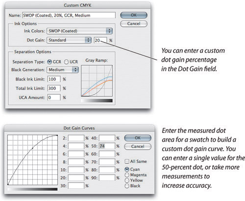
If you’re still working with a printer who is more comfortable with the old-style Photoshop CMYK setups, they’re still available. Choosing Custom CMYK from the CMYK pop-up menu opens the Custom CMYK dialog, as shown in Figure 4-9.

Before we get into the details of the Custom CMYK dialog, a disclaimer is in order. The Custom CMYK feature was born at the introduction of CMYK capabilities in Photoshop 2.0 (which shipped in June of 1991). The fact that it has persisted in one form or another through all subsequent revisions of Photoshop shows that it’s perfectly possible to make great color separations using this mechanism, but nevertheless, terms like “ancient,” “weird,” and “junk” are more than slightly applicable.
If you’re a relatively experienced Photoshop user and you’re comfortable with defining CMYK settings this way, we have a few tricks that you may find useful. But if you’re relatively new to the world of color and Photoshop, you’d be much better off spending your time and ingenuity investigating some of the many packages available for creating and editing ICC profiles (like GretagMacbeth ProfileMaker Pro or Monaco Profiler).
Ultimately, Adobe left Custom CMYK in Photoshop mostly for backward compatibility. ICC profiles are the wave of the future, and if you’re at the beginning of your learning curve, you’re better off concentrating on those instead. That said, there’s still some life in the old dog, and we’ve even been able to teach it a couple of new tricks!
The Custom CMYK dialog has two sections: Ink Options, which lets you define the colors of your inks and the way they behave on your paper stock; and Separation Options, which lets you tell Photoshop how you want the inks to build color when converting to CMYK. Note that the Custom CMYK mechanism is entirely separate from the ICC profiles built in to Photoshop (or anyone else’s)—the SWOP definitions in Custom CMYK, for example, bear only a passing resemblance to those in the U.S. Web Coated (SWOP) v2 profile, or to the current SWOP specification. Custom CMYK is not a mechanism for editing ICC profiles!
Tip
You can save a Custom CMYK setting as an ICC profile by choosing Save CMYK from the Color Settings CMYK menu. Profiles made this way support only the relative and absolute colorimetric rendering intents, so they’re more limited than profiles produced by full-blown profiling packages.
Ink Colors. The Ink Colors setting tells Photoshop about the color of the inks you’ll be using. You can create your own custom inkset or use one of the ink sets built in to Photoshop such as SWOP, Eurostandard, or Toyo, each of which has ink definitions for coated, uncoated, and newsprint stock (see Figure 4-10). The SWOP ink sets differ substantially from the current SWOP spec; but a great many Photoshop users have been using them for years, so you should talk to your commercial printer about which ink definitions to use.

The built-in ink sets are paper-specific (that is, if you print cyan on a slightly pink paper, it’ll look different than if you print it on a slightly blue paper). Unfortunately, no one seems to remember which paper stocks the built-in sets specify. Plus, even though there are rough standards for inks used on web presses, they actually vary widely, and a magenta on the West Coast might be different than one on the East Coast.
You can generally produce good results using one of the built-in ink sets. We used to provide directions for measuring inks and plugging the measurements into the Custom Ink Colors dialog, but quite honestly, if you have an instrument that can measure the inks, you almost certainly have accompanying profiling software that will do a far better job than Custom CMYK ever could, so we strongly recommend biting the bullet and building real profiles instead.
The Ink Colors dialog (see Figure 4-11) lets you set the CIE xyY or CIE Lab values for the eight progressive colors (cyan, magenta, yellow, black, cyan+magenta, cyan+yellow, magenta+yellow, cyan+magenta+yellow), and the white of the paper stock. The only way to determine these accurately is to measure them from press output with a spectrophotometer, but as noted above, if you have a spectrophotometer, you probably have a profiling package too, so just use it instead.

In truly dire emergencies, you can eyeball the ink colors. This technique isn’t particularly accurate—in fact, it’s a kludge—and we only recommend using it as a way to improve the color from desktop four-color inkjet and thermal-wax color printers driven by a CMYK RIP (raster image processor), though in a pinch, we might use it for a digital press or direct-to-plate scenario too. It doesn’t work with three-color CMY printers, or with inkjets that take RGB data and print through a QuickDraw or GDI (Graphics Device Interface) driver, or on dye-subs; we’ve tried. But it doesn’t require measuring equipment other than your eyeballs.
You need to print a set of color bars, which you must specify as CMYK colors (don’t make them in RGB and then convert). Then, choose Custom from the Ink Colors pop-up menu to open the Ink Colors dialog. Clicking on each color swatch opens the Color Picker dialog. You can then edit each progressive color to match your printed output. Generally, desktop printers use colorants that are purer and more saturated than press inks, so head in that general direction.
Don’t expect miracles from this technique—your results will depend on your monitor calibration, your lighting, and your skill in matching colors by eye. It should get you into the ballpark, but given the amount of work involved and the uncertain quality of the results, we recommend that you investigate obtaining, building, or commissioning an ICC profile instead.
Tuning CMYK Previews. If you find that CMYK images don’t look right on your screen (that is, they don’t match what you’re printing), there’s a good chance your monitor profile isn’t correct. However, if the problem doesn’t lie with the monitor profile, you can try to create a custom CMYK inkset just for viewing your images. You can sometimes improve the accuracy of the CMYK Preview by fine-tuning the ink colors, then saving the result with a name that clearly indicates it’s only to be used for viewing CMYK, not for creating it. The easiest way to do this is to open the CMYK image or images you’re trying to match, make a duplicate, and use Assign Profile to make it an untagged CMYK image (see “Assign Profile,” later in this chapter). Then go to Color Settings, turn on the Preview check box, choose Custom CMYK, choose Custom from the Ink Colors menu, and adjust the ink colors until you see the match you want. You may have to wait a second or two for the changes to show up in your image. Again, this technique is a kludge, and is no substitute for a good ICC profile, but in a pinch it can be better than nothing.
To save this setting, select Save CMYK from the Color Settings CMYK menu. This saves the settings as an ICC profile. Remember to name it something that tells you that it’s for viewing only; using this to convert RGB to CMYK could be disastrous. To use this profile for viewing, you’ll load it into the Customize Proof Condition dialog (see “Customize Proof Condition dialog,” later in this chapter). When you’re done making it, hit Cancel so you leave the dialogs without actually using this new setup.
Using Estimate Overprints for spot inks. The Estimate Overprints check box in Custom Ink Colors is primarily useful if you substitute Pantone spot inks (or other inks for which you have known CIE values) for CMYK—you can use Estimate Overprints to see how they’ll interact with one another. Be aware that this is a highly experimental procedure, and the strongest possible, closed-track, professional-driver, don’t-try-this-at-home caveats apply. But if you’re in a situation where you’re forced to do a job using spot inks instead of process inks, loading the spot inks into Custom Ink Colors and using Estimate Overprint will give you at least some idea of what’ll happen when you overprint them (see our online chapter, “Spot Colors and Duotones”). Using Estimate Overprints to avoid taking four measurements for the various CMY combinations is a very silly idea—the minimal time savings simply aren’t worth it.
Dot gain. When ink hits paper, it smooshes some, bleeds some, and generally “heavies up on press” (even if your press is a little desktop printer). That means that your 50-percent cyan halftone spot won’t look like 50 percent when it comes off a printing press. It’s your responsibility to take this dot gain into account when building your images, and if you don’t, your pictures will always appear too dark and muddy. Custom CMYK gives you two methods to compensate for dot gain (see Figure 4-12). The simpler method—entering a single percentage value—is also less accurate. Using individual dot gain curves for each ink will generally yield better results, but it takes a little more time and effort.
Where to adjust dot gain. Photoshop automatically compensates for dot gain when it converts images to CMYK for printing. It’s much less work to build the dot-gain compensation into the separation process than to try to compensate for it manually on an image-by-image basis. In a pinch, you can make slight compensations for dot gain in an already-separated CMYK file using Curves, but you’ll generally get better results by going back to the original RGB image, adjusting the dot-gain value in Custom CMYK, and generating a new CMYK file using the new settings. In fact, one of the few advantages Custom CMYK has over ICC profiles is the ease with which you can adjust for minor variations in dot gain between different papers.
You’ll hear all sorts of numbers bandied about with reference to dot gain, so it’s important to be clear about what Photoshop means—and what your service providers mean—by a given dot-gain percentage, as they’re often different (see the sidebar “Dot Gain: Coping with Midtone Spread”). All the built-in ink sets contain default dot gain values, but you shouldn’t consider them to be much more than a starting point. As we said earlier, the ink sets are paper-specific—the ink colors typically don’t vary much from paper stock to paper stock (unless you’re printing on puce, lime green, or goldenrod paper), but the dot gain can vary tremendously from one paper to another.
Table 4-1 shows some rough numbers for typical dot gain. If you come up with values that are vastly different from these, double-check your calculations or measurements, reread the sidebar “Dot Gain: Coping with Midtone Spread,” and talk to your service providers to make sure that there isn’t some misunderstanding. Bear in mind that higher halftone screen frequencies have more dot gain than low ones. The values in the table are based on 133- to 150-line screens with the exception of newsprint, which is based on an 85-line screen.
Dot Gain Curves. Single-value dot gains work reasonably well if you’re using one of the built-in ink sets because the differential gain for each ink has already been factored in, but Photoshop offers an easy, unambiguous way to define the anticipated dot gain in the form of Dot Gain Curves.
The only disadvantage to using Dot Gain Curves is that you need to use a densitometer (or a colorimeter or spectrophotometer that can read dot area) to read printed swatches. (You can often piggyback the swatches onto another job by printing them in the trim area, and if you don’t have one of these devices, your printer or service bureau probably does.)
Choosing Curves from the Dot Gain pop-up menu opens the Dot Gain Curves dialog (see Figure 4-12). It allows you to enter the actual dot values measured in 2, 4, 6, 8, 10, 20, 30, 40, 50, 60, 70, 80, and 90 percent patches for each ink. Measuring all the patches is probably overkill. In a pinch, you can simply measure the 50-percent dot and type in the measured value, but we recommend taking measurements of at least the 4, 6, 8, 10, 40, 50, and 80 percent swatches for each ink. Don’t be tempted by the All Same check box, because it’s very unusual to find exactly the same dot gains on all four inks.
Separation Options. The Separation Options section (see Figure 4-12) is where you tell Photoshop how you want to use the inks you’ve defined in the Ink Options section. It lets you control the total amount of ink you’ll put on the paper, as well as the black generation—the relationship between black and the other colors. Note that unlike the Ink Options settings, the Separation Options have no effect on the display of CMYK images—these only control how colors will convert to CMYK.
The decisions you make in Separation Options can make or break a print job, and there’s no single correct answer or hard-and-fast rules because every combination of press, ink, and paper has its own optimum settings. When it comes to determining them, there’s no substitute for experience. But understanding the way the Separation Options work is key to making sense of your own experience.
Rules, guidelines, and caveats. It’s important to remember that these guidelines are useful starting points, nothing more. You’ll hear all sorts of recommendations from experts; most are valid, but it’s unlikely that any of them will apply perfectly to your particular situation. Just how far it’s worth going to optimize your color separations for a specific press depends in part on the economics of the situation, and in part on the degree of process control used by the commercial printer. It’s the exception rather than the rule that every impression in a print run will be identical, but the amount of variation within a press run varies widely from shop to shop. Typically, the less variation, the higher the prices.
Tip
Need to test your printing specs on a budget? A printer can sometimes piggyback a test onto someone else’s print job, particularly if you show that you can offer them a significant amount of business. Preparing several different versions of an image (and a few color bars, too) and ganging them on a page can help you identify problems early.
Creating ideal separations for a given press is often an iterative process—you run press proofs and measure them, go back to original RGB files, reseparate them, and repeat the whole process until you arrive at the optimum conditions. This is both time-consuming and expensive, and for most jobs the economics simply don’t justify it. If you’re willing to dedicate a print run to testing, you’re better off ignoring the whole Custom CMYK mechanism and building a good ICC profile instead.
UCR vs. GCR. The Photoshop Classic separation engine offers two different methods of black generation: UCR (Undercolor Removal) and GCR (Gray Component Replacement). Both reduce the total amount of ink used to compensate for ink-trapping problems that appear when too much ink is applied to the page. (In this context, trapping is the propensity for one ink to adhere to others—it has nothing to do with building chokes and spreads to compensate for misregistration on press.)
UCR separations replace cyan, magenta, and yellow ink with black only in the neutral areas. This uses much less ink in the shadows.
GCR extends into color areas of the image as well—it replaces the proportions of cyan, magenta, and yellow that produce neutral gray with a corresponding percentage of black ink.
GCR separations are generally considered easier to control on press than are UCR separations, at least by the theoreticians. The downside of GCR is that it can make the shadow areas look flat and unsaturated since they’re being printed only with black ink, so many commercial printers distrust GCR separations. UCA (Undercolor Addition) allows you to compensate for flat shadows by adding some CMY back into the neutral shadow areas (see “Undercolor Addition (UCA),” later in this chapter).
Some experts contend that UCR separations are better for sheetfed presses and that GCR is better for web presses, but we just don’t buy it. We almost always use GCR separations with some UCA. But we’ve found that UCR sometimes works better than GCR when printing to newsprint with a low total ink limit—say, 220 to 240 percent. We suspect that many printers who profess to hate GCR separations often run them unknowingly, usually with good results, as long as the black generation amount isn’t too extreme.
Black generation can be image-specific: If we take the extreme examples represented by two images—one, a pile of silver coins, the other, a city skyline at night—the first is an ideal candidate for a fairly heavy black plate using Medium or Heavy GCR, since there’s little color, and carrying most of the image on the black plate improves detail and makes it easier to maintain neutral grays on press. The second image, though, will have significant color and detail in the deep shadows, and too heavy a black will make it flat and lifeless.
Black Generation. The Black Generation pop-up menu is available only when Separation Type is set to GCR. This feature lets you control the areas of the tonal range that Photoshop replaces with black (see Figure 4-13). For the vast majority of situations, we prefer a Light black setting, in which Photoshop begins to add black only after the 40-percent mark. Often, however, a Medium black (where black begins to replace colors after only 20 percent) may work better for newsprint. We almost never use the Heavy or Maximum black settings, but Maximum black can do wonders when printing images that were captured from your screen (like the screen shots in this book), and is also useful when printing to color laser printers.

Custom black generation. The Custom option allows you to create your own black-generation curve. This isn’t something you should undertake lightly—the black plate has an enormous influence on the tonal reproduction of the image. However, if you want to make slight modifications to one of the built-in black-generation curves, you can—choose the curve you want to view, then choose Custom. The Black Generation dialog appears with the last selected curve loaded (see Figure 4-14).

Tip
Here’s an easy way to check what values you’ll actually get from a given setup. Close all open documents, set the foreground and background colors to default, then click the black swatch to open the Color Picker. The CMYK percentages shown in the Color Picker are the ones the current setup will generate for black.
If your printer asks for a “skeleton black,” you can use the Custom option to create a skeleton black curve—a very light black setting that still extends high up into the tonal range, typically to 25 or 30 percent. You should attempt to do this only if the printer demands it, and even then, only if you have considerable experience in evaluating images by looking at the individual color plates.
Black Ink Limit. Black Ink Limit does just what it says—it limits the amount of black ink used in the deepest shadows. The Photoshop Classic mechanism seems to get less happy the further away this is set from 100 percent, so we generally recommend using 95 to 100 percent as a starting point. Below 95 percent, you get progressively less black ink than you requested. How much less will depend on the total ink limit.
Total Ink Limit. Total Ink Limit also does what it says—it limits the total amount of ink used in the deepest shadows. The ideal value depends on the combination of press, ink, and paper, but bear in mind that it isn’t necessarily desirable to use the maximum amount of ink that the printing process can handle. It’s generally true that more ink will yield a better image (within the limits of the press), but it also creates more problems with ink trapping and drying, show-through, and offsetting, and (for printers) it costs more because you’re using more ink. Your printer will know, better than anyone else, the trade-offs involved.
For high-quality sheetfed presses with coated stock, a total ink limit of 300 to 340 percent is a good starting point—you may be able to go even higher with some paper stocks. For newsprint, values can range from 220 to 280 percent (see the next section, “Typical Custom CMYK Setups”).
Undercolor Addition (UCA). UCA is used with GCR to compensate for loss of ink density in the neutral shadow areas. Using UCA lets you bring back richness to the shadows, yet still retain the benefits of easier color-ink balancing on the press that GCR offers.
The need for UCA is image-dependent. If your shadows look flat, the image can probably benefit from modest amounts of UCA. We rarely use more than 10 percent, and typically use less. (Because David doesn’t like to think a whole lot, he usually sets this to 5 percent and forgets about it.)
Table 4-2 (see page 108) gives some general guidelines for different types of print jobs. The dot-gain values are based on 133- to 150-line screens, except for newsprint, which assumes an 85-line screen. If you use these values, you should get acceptable separations; but every combination of press, ink, and paper has its own quirks, and your printer should know them better than anyone else. View these values as useful starting points, and get as much advice from your printer as you can.
Table 4-2. Suggested separation settings
Press and paper | Inks | Dot gain | Black generation | Black limit | Total ink | UCA |
|---|---|---|---|---|---|---|
Sheetfed Coated | SWOP (Coated) | 12–15% | GCR, Light | 100% | 320–340% | 0–10% |
Sheetfed Uncoated | SWOP (Uncoated) | 17–22% | GCR, Light | 100% | 270–300% | 0–10% |
Web Coated | SWOP (Coated) | 17–22% | GCR, Light | 100% | 300–320% | 0–10% |
Web Uncoated | SWOP (Uncoated) | 22–30% | GCR, Light | 100% | 280–300% | 0–10% |
Newsprint 1 | SWOP (Newsprint) | 30–40% | GCR, Medium | 95–100% | 260–280% | 0–10% |
Newsprint 2 | SWOP (Newsprint) | 30–40% | UCR | 70–80% | 220–240% |
Tip
You can easily add profiles to the list that appears in the CMYK menu in basic mode (when the More Options button is visible) by storing the profile, or an alias/shortcut to the profile, in the right place. In Mac OS X, that place is inside the LibraryApplication SupportAdobeColorProfilesRecommended folder. In Windows, it’s inside the Program FilesCommon FilesAdobeColorProfilesRecommended folder.
When you click the More Options button in Color Settings, you can choose any installed CMYK profile as the CMYK working space. Bear in mind that the Convert to Profile command lets you convert images to any CMYK profile, so it isn’t necessary to load a particular CMYK profile as the CMYK working space. It’s simply more convenient to load the CMYK profile you’re going to use most as the CMYK working space.
The main reason that some people continue to use the Photoshop Classic mechanism is that they’re stuck with one ICC profile with a single black generation. When you build your own CMYK profiles for a press or proofer, it’s always a good idea to build a family of profiles with different black generations—some profiling tools will even let you take an existing profile and regenerate it with new black generation settings.
Photoshop Classic is very old technology with more than its fair share of quirks. We debated leaving it out of this edition entirely, but we recognize that some people still rely on it. If you’re one of them, we gently suggest that you investigate twenty-first century profiling technology. It has evolved a great deal more in the past 15-odd years than has Photoshop Classic, and will let you produce better results with less work.
Grayscale is a first-class citizen in Photoshop, with its own profiles independent of RGB or CMYK. However, note that grayscale profiles only contain tone reproduction information; they have no information about the color of the black ink or of the paper.
When Color Settings is displayed with Fewer Options, you can choose among grayscale dot gains of 10, 15, 20, 25, or 30 percent, depending on your printing conditions. You can also choose either gamma 1.8 or 2.2, which are good choices for grayscale images destined for the screen, or for unknown printing conditions. Of course, there’s nothing to prevent you from using these gamma values for print images, or the dot-gain curves for onscreen use, but generally speaking, gammas are designed for onscreen and dot-gain curves are designed for print.
When you click the More Options button in Color Settings, you gain access to all the grayscale profiles installed on your system, as well as the ability to define custom grayscale working spaces (which you can then save as grayscale ICC profiles, if you want).
Custom Dot Gain. If you print a lot of grayscale work on the same sort of paper stock, it may well be worth it to build your own custom dot gain (remember, the more you customize, the better results you’ll get). You can define a custom dot gain by choosing Custom Dot Gain from the Gray menu in the Color Settings dialog. The Custom Dot Gain dialog (see Figure 4-15) lets you plug in values for the 2, 4, 6, 8, 10, 20, 30, 40, 50, 60, 70, 80, and 90 percent dots. You can enter a single value for the 50-percent field (for example, to define 18-percent dot gain, you’d enter 68 in the 50-percent field), but you’ll get much better results if you first print a ramp with patches for all the values in the dialog, then measure the actual dot area for each one, and enter them all in the dialog. This will give you a very accurate grayscale profile.
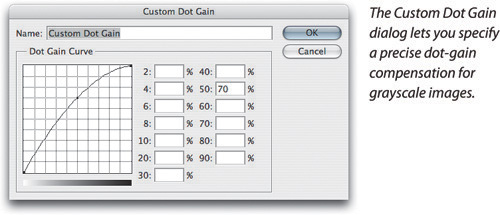
Of course, it’s not absolutely necessary to measure every single patch, but we strongly recommend that you at least measure the highlight (2, 4, 6, 8, and 10 percent) patches plus the 40- and 80-percent patches. Obtaining accurate measurements for the highlights lets you set your all-important highlight detail quickly and easily.
Custom Gamma. Grayscale gamma settings are designed primarily for onscreen images. We can’t envisage too many situations where you’d need to define a gamma other than the gamma 1.8 and gamma 2.2 built in to Photoshop, but if for some reason you need to do so, choose Custom Gamma from the Color Settings Gray menu. Permissible values range from 0.75 to 3.0 (see Figure 4-16).
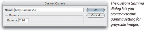
CMYK black channel. If you need to mix grayscale and color images in the same job, you might find it useful to simply load the black channel of your CMYK profile as your Gray working space. To do so, choose Load Gray from the Gray pop-up menu, then select the CMYK profile you wish to load from the dialog and click Load. The profile appears in the Gray pop-up menu as Black Ink—ProfileName. Note that the Black Ink Limit in a CMYK profile has no effect on grayscale images (because Black Ink Limit only applies when you convert to CMYK). The grayscale setting uses the dot gain of the black ink, letting you use the entire dynamic range of the black channel.
Save Gray. To use a custom grayscale setting elsewhere in Photoshop (for instance, in the Proof Setup, Assign Profile, or Convert to Profile dialogs) and in other ICC-savvy applications, you need to save your grayscale setting as an ICC profile. To do so, choose Save Gray from the Gray pop-up menu, browse to the appropriate folder or directory for your platform, and click Save. Your grayscale profile will now be available for use in any application that understands grayscale ICC profiles.
The Spot feature in the Color Settings dialog lets you specify a dot gain for spot colors. As with grayscale settings, spot color settings know nothing about the actual color of the ink and paper, and they contain no information about the way the spot ink interacts with other inks. Spot settings essentially behave identically to grayscale ones.
The Spot pop-up menu in the Color Settings dialog contains dot gain settings for 10, 15, 20, 25, and 30 percent dot gain. When you click the More Options button in Color Settings, you can also define a Custom Dot Gain, choose a custom grayscale profile, or load the black channel of a CMYK profile. The procedure for doing any of these is identical to that for Grayscale mode. But spot inks differ widely in how they behave on paper, and the only way to know what will happen is to print a tint build.
Loading the black channel of a CMYK profile for Spot is primarily useful if you need to use black as a spot color in a CMYK image: Making type, callouts, or drop shadows print with only black ink are good examples. But using tints of spot colors, which spot dot gains seem to invite, is a very uncertain process. The dot-gain curve ensures that the tint you request is the one you’ll get, but the only way to find out how the spot color will interact with the process inks is, unfortunately, to print it.
While the working space definitions allow you to tell Photoshop what colors the various numbers in your images represent, the Policies and Warnings sections of the Color Settings dialog (see Figure 4-17) do something quite different: They let you tell Photoshop how to use the interpretations of the numbers.

The policies control how Photoshop handles several aspects of color management. When you open a document with an embedded profile, the policies tell Photoshop to do one of the following:
Use the embedded profile instead of the working space, opening the document as a tagged document in its own document space (which may or may not be the same as the current working space).
Convert the image from the document space represented by the embedded profile to the current working space.
Ignore the profile and treat the document as untagged (in which case the numbers in the file are interpreted according to the current working space).
Ignore the profile and treat the document as a Tagged document in the working space.
When you create a new document, the policies tell Photoshop whether to treat it as an untagged document or as a tagged document in the working space.
When you move pixels between documents (by copying and pasting or by dragging), the policies tell Photoshop to move either the numerical values of the pixels or the colors those numerical values represent.
When you save a document, the policies tell Photoshop whether or not to embed the profile currently associated with the document. You can override the policy’s setting for profile embedding in the Save As dialog, but the policy dictates whether the Embed Color Profile check box is turned on or off when the dialog appears.
You can set individual policies for RGB, CMYK, and grayscale images, but the policies themselves behave almost identically in each color mode. The most sensible policy to use in a color-managed workflow is Preserve Embedded Profiles.
Off. The Off choice is somewhat misleadingly named, as there’s really no way to turn off color management entirely in Photoshop CS3. It does, however, treat your images pretty closely to the way Photoshop did prior to version 5. When you set the policy for a color mode to Off, Photoshop behaves like this:
When you open a file that contains an embedded profile, Photoshop discards the embedded profile and treats the image as untagged, unless the embedded profile happens to match the current working space. In that case, the image is treated as a tagged document in its own document space, which in this case happens to be the same as the working space. If you change the working space in the Color Settings dialog, all your untagged images will change, taking on the new working space definition, but the tagged images keep the old working space definition, now acting as a document space. (If you find this confusing and counterintuitive, you’re not alone. We think it would be a lot simpler if Off simply treated all your documents as untagged.)
When you save the document, no profile is embedded (unless you turn on Embed Profile in the Save As dialog, in which case the current working space profile is embedded), unless Photoshop is handling the document as a Tagged document because its embedded profile matched the working space that was in effect when it was opened. In that case, the profile that was embedded in the file when it was opened is re-embedded when you save, unless you turn off the Embed Color Profile check box in the Save As dialog (see Figure 4-18).
When you open a file that has no embedded profile, Photoshop treats it as untagged. When you save the document, no profile is embedded (unless you turn on Embed Color Profile in the Save As dialog, in which case the current working space profile is embedded).
When you create a new document, Photoshop treats it as untagged. When you save the document, no profile is embedded (unless you turn on Embed Color Profile in the Save As dialog, in which case the current working space profile is embedded).
When you transfer pixels between images in the same color mode by copy and paste or by drag and drop, the numerical values get transferred. That means if the two documents are in different color spaces, the colors change even though the numbers are preserved. (If the two images are in different color modes—CMYK and RGB, for instance—the color appearance is always preserved.)
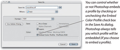
Off is the policy you want if you’re a dyed-in-the-wool, by-the-numbers type who has been cursing at Adobe for years for stuffing color management down your throat. Of course, you don’t have to set all the policies to Off. If you’re in an all-CMYK, by-the-numbers workflow, you can set the policy to Off just for CMYK, and still get the benefits of color management in the other spaces. Similarly, if your work is mostly for the Web, and you need RGB in Photoshop to behave the same as RGB in the vast majority of Web browsers, you can set the policy to Off for RGB. (Well, actually, as we noted earlier in the chapter, on the Mac you may also want to set your RGB working space to Monitor RGB to ensure that RGB in Photoshop matches RGB in your other, non-color-managed applications.)
However, if you want to use color management in Photoshop, you’ll want to choose one of the other policies and simply untag on a case-by-case basis documents that need to be untagged (see “Assign Profile,” later in this chapter).
Preserve Embedded Profiles. This is the third-millennium, industrial-strength color management approach. Preserve Embedded Profiles is the safe policy, in that it makes sure Photoshop doesn’t do color conversions when you don’t want it to. With this policy, the working spaces in Color Settings are there only as a convenience because each image can live in its own document space. On the other hand, it can also be the dangerous policy because if you’re not at least a little careful, you can wind up editing images in color spaces that are wildly inappropriate for editing. For instance, if your scanner software embeds its own profile in an image, this policy might mean you’re editing the image in the scanner’s space, which is significantly less than optimal. Overall, though, it’s the policy that we typically use. With this setting selected, here’s what happens to your images:
When you open an image that contains an embedded profile, Photoshop preserves the profile and treats the image as tagged, using the embedded profile as the document space (which may or may not be the current working space). When you save the document, the document space profile (the profile the image had when you opened it) is once again embedded in the saved file.
When you open an image with no embedded profile, Photoshop treats the image as an untagged image. (It preserves the lack of an embedded profile, if you will.) When you save the document, no profile is embedded (unless you turn on Embed Color Profile in the Save As dialog, in which case the current working space profile is embedded).
When you create a new document, Photoshop treats it as a tagged document and assigns the current working space profile as the document space. When you save the document, Photoshop embeds the document space profile. (Even if you change the working space in the Color Settings dialog, it has no effect on the image, which stays in the document space.)
When you transfer pixels between two RGB or two grayscale images (by copy and paste or drag and drop), the actual color gets transferred. If the two images are in different color spaces, the numbers change even though the color appearance is preserved.
When you transfer pixels between two CMYK images, the numerical values get transferred. If the two CMYK documents were in different CMYK spaces, the color appearance would change even though the numbers would be preserved. While this routine is the reverse of what happens with RGB and grayscale files, it is actually more logical and useful.
We believe quite strongly that Preserve Embedded Profiles is the best policy for the vast majority of Photoshop users. It keeps track of color for you and rarely performs any conversions that aren’t explicitly requested (and never does so if you keep the Profile Mismatch: Paste warning turned on). If you have to deal with files from many different sources, this is almost certainly the policy you want to use. It does a good job of keeping color management out of your face, but it also offers tremendous power and flexibility for hard-core color geeks.
Convert to Working Space. Convert to Working Space tells Photoshop to convert everything into your working RGB, CMYK, or grayscale. It tells Photoshop to convert images to the current default working space automatically. We find this method a bit too authoritarian, though if your workflow relies on picking a single RGB, CMYK, or grayscale color space and normalizing all your images into it, you’ll almost certainly want to use this policy. But we think it’s best thought of as an automation feature: If it does something you wanted done with no intervention, that’s great; on the other hand, if it does something unexpected behind your back, it’s not so great! Here’s what happens to your images with this setting selected:
When you open a file that already has the current working space profile embedded, Photoshop preserves the profile and treats the image as a tagged image, using the embedded profile as the document space. When you save the document, the document space profile (the profile the image had when you opened it) is once again embedded in the saved file, even if you change the working space in the Color Settings dialog when the image is open.
When you open a file that has an embedded profile different than the current working space, Photoshop converts the image from the embedded profile’s space to the current working space. From then on, it treats the image as a tagged image, with the working space profile that was in effect when it was opened as the document space.
When you open an image with no embedded profile, Photoshop treats the image as untagged. If you change the working space, Photoshop keeps the numbers in the file unchanged and reinterprets them as belonging to the new working space (so the appearance changes). When you save the document, profile embedding is turned off by default (though you can turn it on in the Save As dialog).
When you create a new document, Photoshop treats it as a tagged document in the current working space. If you later change the working space, Photoshop preserves the working space profile that was in effect when the document was created. When you save the document, that same profile is also embedded.
When you transfer pixels between two images (whether it’s RGB-to-RGB, RGB-to-CMYK, or whatever), the color appearance gets transferred, even if that means Photoshop changes the numbers (which it’ll have to do if the files are in different color spaces).
Convert to Working Space is a useful policy when you need all your images to be in the same space, such as when you’re compositing RGB images or repurposing CMYK images from several different sources for a single output. It’s a handy automation feature when you need to convert a bunch of pictures quickly. But unless you’re very sure about what you’re doing, it’s safer to use Preserve Embedded Profiles instead, and perform the conversions manually whenever you need to change an image’s working space (see “Applying Profiles Outside Color Settings,” later in this chapter).
Although they appear in the Color Management Policies section of the Color Settings dialog, the Missing Profile and Profile Mismatch warnings operate independently from the policies. (You can think of it this way: The policy determines the initial default setting of some of the warnings.) Unless you’re adamantly opposed to the use of color management, we suggest you turn all the warning check boxes on and keep them on until you decide you don’t need them. They offer choices, letting you override the default behavior of the policy you’ve chosen for a specific color mode, though we’d find them even more useful if they didn’t demand clairvoyance on our part and would let us see the image before making decisions.
Profile Mismatch: Ask When Opening. When Profile Mismatch: Ask When Opening is turned on, Photoshop alerts you when you open a document with an embedded profile that’s different from the current working space (see Figure 4-19). Even better, the Embedded Profile Mismatch dialog offers you three choices for handling the profile mismatch:
Use The Embedded Profile (Instead Of The Working Space) tells Photoshop to keep the embedded profile, treating the document as a tagged image in the embedded profile’s space. The embedded profile is then used to display the image, and is also used as the source profile for any subsequent color conversion. This is typically what you’d want.
Convert Document’s Colors To The Working Space does what it says: It performs a conversion from the embedded profile’s space to the current default working space. This makes sense if you need several images in the same working space (for example, to composite them).
Discard The Embedded Profile (Don’t Color Manage) strips off the embedded profile and opens the document as an untagged image. The numbers in the document are left unchanged and are interpreted according to the current working space definition. You might use this if you know you’re going to significantly edit the color and tone of the image and you don’t care about any color interpretations that were already assigned. Similarly, this might be appropriate for an image destined for the Web, especially if you’ll be saving it in the sRGB space.
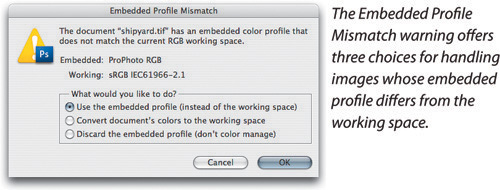
The Embedded Profile Mismatch dialog chooses one of these three as the default (the one that you’ll get if you just hit the Enter key). The default it picks depends on the policy you’ve chosen for that color mode. Of course, the dialog always allows you to override the default behavior for the policy on an image-by-image basis.
Profile Mismatch: Ask When Pasting. The second check box, Ask When Pasting, comes into play when you move pixels between two images that are in the same color mode, but in different color spaces (like sRGB to AdobeRGB, or from one CMYK setup to another). When this is selected, Photoshop asks you whether you want to paste the numerical values or the color appearance (see Figure 4-20). Note that when you copy and paste or drag and drop between images that are in different color modes (like RGB to CMYK), this alert doesn’t do anything because Photoshop only lets you paste the color appearance.
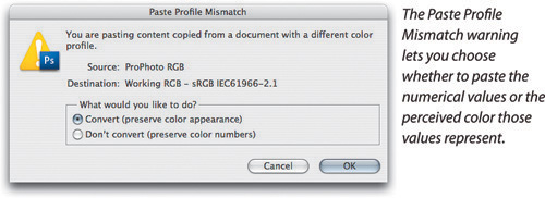
Just to be clear: In this dialog, Convert (Preserve Color Appearance) tells Photoshop to change the numbers in the image so that you get roughly the same color. It’s like doing a profile-to-profile conversion. We add the caveat “roughly” just in case a color in one profile simply cannot be represented in the gamut of the target profile. The Don’t Convert (Preserve Color Numbers) option simply copies the numbers from the source file into the target file without worrying about color changes. As with Profile Mismatch: Ask When Opening, the default option is set to match the current policy for the color mode.
Missing Profile: Ask When Opening. The third warning, Missing Profile: Ask When Opening, comes into play when you open a document with no embedded profile. When this is turned on, Photoshop lets you choose how you want it to interpret the numbers in documents with no embedded profiles (see Figure 4-21).
Leave As Is (Don’t Color Manage) tells Photoshop to treat the file as an untagged document. The numbers in the file are preserved and interpreted according to the current working space (which means that the appearance may change radically).
Assign Working Space tags the document with the current working space profile. As with the previous option, the numbers in the file are preserved and interpreted according to the current working space. The difference is that the document is treated as tagged, so it keeps that profile if you subsequently change the working space.
Assign Profile lets you tag the document with a profile other than the working space profile. Again, the numbers in the file are preserved, but in this case they’re interpreted according to the profile you choose.
Assign Profile And Then Convert Document To Working Space lets you assign a source profile to the document and then convert it to the working space. This is the only option of the four that actually changes the numbers in the file.
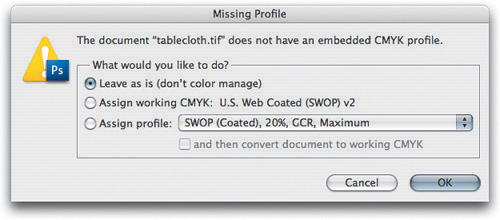
If you’re in a workflow in which you know where images are coming from and where they’re going, you can probably turn off the warning dialogs off. When you don’t need them, they do get kind of annoying after a while.
When you click the More Options button in the Color Settings dialog, you gain access to the Conversion Options and Advanced Controls, as well as to a wider range of profiles (we’ve discussed that earlier in this chapter). The Conversion Options can be useful in typical workflows, but the Advanced Controls are a grab-bag of options that may be useful to a very small number of serious players, and are dangerous buttons for almost everyone else.
The Conversion Options section of the dialog lets you control useful things like the default rendering intent in Photoshop and color management module (CMM)—things you probably won’t need to change very often, but might want to occasionally (see Figure 4-22).

Engine. The Engine pop-up menu lets you select the CMM that Photoshop uses for all its color space calculations. The options that appear on the menu depend on which CMMs are installed on your system. Unless you have really pressing reasons to use a different CMM, we recommend sticking with the Adobe (ACE) engine. When the engines work correctly, there is only a tiny change in pixel values with the different engines; except for the bugs, we’ve never noticed a visual difference.
Mac users will notice separate entries for the Apple CMM and Apple ColorSync. Apple CMM means that the Apple CMM will always be used.
Intent. The Intent pop-up menu is significantly more useful for the average user. Intent lets you choose the default rendering intent that Photoshop uses in any of the following color space conversions:
Converting documents on opening
Converting documents by choosing a different mode from the Mode menu (like separating RGB to CMYK)
Calculating the numbers that appear on the Info palette for color modes other than the one the document uses
Calculating the numbers that appear in the Color Picker for color modes other than the one the document uses
Every other feature in Photoshop that lets you convert colors from one profile’s space to another has its own rendering intent controls. The default rendering intent in Photoshop is relative colorimetric with black point compensation. These defaults are always the subject of some pretty heated debate. We offer three observations:
While some users may prefer perceptual rendering as the default choice, rendering intent is best treated as an image-specific and conversion-specific decision. Relative colorimetric renderings may actually do a better job than perceptual rendering when your images don’t have a lot of significant out-of-gamut colors.
Color conversions in Photoshop have always been relative colorimetric in the past.
It’s just a default. You can always override it to suit the needs of the image at hand.
Since Photoshop makes it very easy to both preview and apply different rendering intents for each image, the rendering intent setting here is more a matter of convenience than of necessity.
Use Black Point Compensation. The Use Black Point Compensation option, when selected, maps the black of the source profile to the black of the target profile, ensuring that the entire dynamic range of the output device is used. In many cases you’ll find no difference whether it’s turned on or off, because it depends on the contents of the particular profiles involved. See the sidebar “Black Is Black (or Is It?)” later in this chapter for a detailed look at the Black Point Compensation feature.
In earlier versions of Photoshop we offered a complex set of rules about when to turn this on and off, but we now recommend that you just leave Use Black Point Compensation turned on at all times.
Use Dither (8-bit/Channel Images). The Use Dither feature is somewhat esoteric. All color space conversions in Photoshop are performed in a high-bit space. When Use Dither is turned on, Photoshop adds a small amount of noise when the 8-bit channels are converted into the high-bit space. This makes banding or posterization much less likely to occur (that’s a good thing). But if your final output will be JPEG, this tiny dithering is likely to produce a larger file size (because it introduces more discrete colors into the image), and if you’re using Photoshop for scientific work, where you need to perform quantitative analysis on colors, you should turn this off, as it will introduce noise in your data. Otherwise, leave it on.
The Advanced Controls are aptly named. We recommend leaving them alone unless you have a pressing need to do otherwise, but in the interest of full disclosure, here’s what they do.
Desaturate Monitor Colors By. The Desaturate Monitor Colors By feature attempts to solve a problem with large-gamut working spaces: Rendering to the monitor is always relative colorimetric, so colors in the working space that lie outside the monitor gamut get clipped to the nearest equivalent the monitor can display. You can think of desaturating the monitor as the poor man’s perceptual rendering. Unless you’re working with a very large space like Kodak’s ProPhoto RGB, don’t even think about messing with this. Even then, we don’t use it—we find that the problem is much less severe than theory would lead one to expect.
For those brave (or foolhardy) souls who want to experiment with it, a setting in the 12 to 15 percent range seems somewhat useful for Kodak ProPhoto RGB, and 7 to 10 percent seems good for EktaSpace. If you’re working with one of these spaces, try turning the feature on and off to see if it’s doing anything useful for you. Whatever you do, don’t forget to turn it back off before you try to do any normal work; otherwise you’ll find yourself producing excessively colorful imagery!
Blend RGB Colors Using Gamma. The Blend RGB Colors Using Gamma feature controls how RGB colors blend together. To see its effect, try painting a bright green stroke on a red background with the check box turned off, and then again with the check box turned on and the value set to a gamma of 1.0. With the check box turned off, the edges of the stroke have a brownish hue, as they would if you were painting with paint. With it turned on, the edges are yellowish, as they would be if you were painting with light. You can think of the behavior with the check box off as artistically correct, and with it turned on as colorimetrically correct. Permissible values are from 1 to 2.2.
Why are we talking about the Color Picker in this chapter? Simply put, a great many people overlook the fact that the Color Picker is subject to the choices you make in Color Settings, because the numbers that appear in the Color Picker for all the color modes other than the current document’s mode are the product of color space conversions made using the default profiles, engine, and rendering intent.
We’ve lost count of the number of e-mails we’ve received from confused puppies who tried to specify black as 0C 0M 0Y 100K in an RGB document and then got bent out of shape because:
The resulting color was dark gray.
It picked up a bunch of C, M, and Y on conversion to CMYK.
Well, 100K isn’t black because black ink isn’t perfectly black or perfectly opaque—if it were, we’d never need to lay down more than 100 percent total ink. If you specify 0C 0M 0Y 100K in the Color Picker, then look at the RGB values, or the Lightness value in Lab, you’ll find that they aren’t zero. And unless your CMYK working space uses Maximum GCR, 0C 0M 0Y 100K isn’t a “legal” value for a converted RGB 000 black—we almost always want to add some amount of CMY to increase the density.
The Color Picker is governed by two simple rules:
The “real” color being specified is represented by the numbers relevant to the color mode of the current document, which may not be the numbers you’re entering. If you enter CMYK numbers while working on an RGB document, the color you’re actually specifying is represented by the numbers that appear in the RGB fields and vice versa.
When you specify color in a mode other than the document’s, the actual color is calculated by taking the color values you entered, then converting them to the document’s mode using the working space profile for the mode you specified as the source profile, the document’s profile as the destination profile, and the rendering intent specified in Color Settings.
When you think about it, it’s hard to imagine how this could work any other way, but how may of us think that way in the Color Picker?
The settings in the Color Settings dialog represent the fallback position for performing color conversions. But two commands on the Edit menu offer much more flexibility for applying profiles and performing conversions on an image-by-image basis. In fact, we hardly ever convert colors (from RGB to CMYK, for example) using plain ol’ mode changes, because we like to be able to preview and select the rendering intent that does the best job on the image at hand.
We still encounter many users who get confused as to when they should assign and when they should convert. Back at the beginning of this chapter, we told you that color management does only two things:
Associates a specific color appearance with a set of otherwise-ambiguous RGB or CMYK numbers.
Maintains that color appearance in a new context by changing the numbers to make the new device or process produce the desired color appearance.
Assign Profile is the mechanism for associating a color appearance with the RGB or CMYK numbers. Normally, you only have to do this with untagged images. Convert to Profile is one of the mechanisms for calculating a new set of numbers that maintain that color appearance, such as when you convert an RGB image to CMYK.
Assign Profile lets you tag an image with a specified profile or untag an image by removing its profile. It doesn’t do any conversions; it simply attaches a description (an interpretation, as it were) to the numbers in the image, or removes one (see Figure 4-23).

We mainly find Assign Profile useful when we’re trying to decide what profile should be attached to an untagged document. Unlike the profile assignment in the Missing Profile dialog, Assign Profile lets you preview the results of applying various profiles. This gives you the opportunity to make an educated guess rather than a blind one.
The Assign Profile dialog offers three options, which are identical to the first three options in the Missing Profile warning (see “Color Management Policies,” earlier in this chapter).
Don’t Color Manage This Document. Don’t Color Manage This Document tells Photoshop to treat it as an untagged document. The numbers in the file are preserved and are interpreted according to the current working space, and the embedded profile is stripped out. If you’re delivering final CMYK to shops that are scared or confused by color management, if you’re delivering images in sRGB for the Web, or if you’ve inadvertently embedded a profile in a calibration target, you can use this option to strip out the profile.
Working RGB or Working CMYK. Working RGB or Working CMYK (depending on the current color mode of the image) tags the document with the current working space’s profile (whatever is set in the Color Settings dialog). As with the previous option, the numbers in the file are preserved but reinterpreted according to the current working space. The difference is that the document is treated as tagged, so it keeps that profile if you later change the working space. If you’ve opened an untagged document and decided that it really does belong in the working space, use this option to make sure that it stays in the working space.
Profile. Profile lets you tag the document with a profile other than the default working space profile. Again, the numbers in the image are preserved, but in this case they’re interpreted according to the profile you assigned. For example, if you scan an image using software that doesn’t embed a profile, but you have a profile for your scanner, you can use this option to assign color meaning to the image you’ve just scanned. You’ll then probably want to use Convert to Profile (coming up next) to move the image into a more reasonable editing space, like AdobeRGB.
The Preview check box lets you preview the results of applying or removing a profile (it’s rare that we turn this off—the preview is pretty fast, even on a 2.5 GB file).
Convert to Profile, as its name suggests, lets you convert a document from its profile space (or, in the case of an untagged document, the current working space) to any other profiled space, with full control over how the conversion is done (see Figure 4-24).
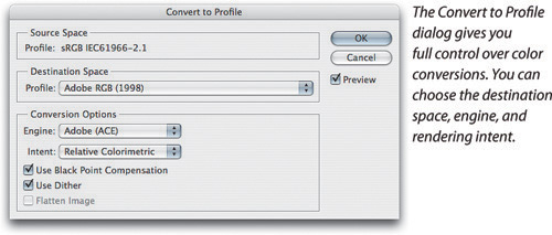
The Convert to Profile dialog displays the source profile and lets you specify a destination profile, engine, and rendering intent. It also allows you to turn black-point compensation on and off, decide whether to use dithering for 8 bit/channel images, and specify whether to flatten the image. Best of all, it lets you preview the results of the conversion correctly while the dialog is still open, so you can see the effects of the various options.
The engine, rendering intent, black-point compensation, and dithering options all work identically to those in the Color Settings dialog (see “Conversion Options,” earlier in this chapter).
The Flatten Image option is there as a convenience, for when you want to produce a final flat file for output. When we use Convert to Profile, we usually make a duplicate of the layered file first (choose Image > Duplicate), and then run Convert to Profile on the duplicate, with Flatten Image turned on—that way we keep our layered master files intact.
We use Convert to Profile instead of choosing an Image > Mode command for most conversions (whether converting RGB to CMYK, cross-rendering CMYK to CMYK, or whatever), because it offers more control, and especially because you can preview different rendering intents. Rendering intents only know about the color gamut of the source color space—they don’t know anything about how much of that gamut is actually used by the source image—so applying perceptual rendering to an image that contains no significant out-of-gamut colors compresses the gamut unnecessarily. With Convert to Profile, you can see how the different rendering intents will affect a particular image and choose accordingly.
If you’re sane, you probably want to get some sense of what your images are going to look like before you commit to $50,000 print run. There are three ways to proof your pictures: traditional (print film negatives and create a laminated proof like a Matchprint), on a color printer (like one of the new breed of inkjet printers), or on screen. On screen? If you’ve been paying attention during this chapter, you know that you can set up your system to trust what you see on screen. Proofing images on screen is called soft-proofing, and Photoshop offers soft-proofing capabilities with accuracy limited only by the accuracy of the profiles involved.
In Photoshop, soft-proofing has its own set of controls separate from the Color Settings dialog. These allow you to preview your output accurately, whether it’s RGB or CMYK. This is a huge advantage for those who print to RGB devices like film recorders or to photorealistic inkjet printers that pretend to be RGB devices. Soft-proofing is a big improvement for those who print CMYK too. We can soft-proof different conversions to CMYK while we’re still working in RGB and have them accurately depicted on screen. For example, you can quickly see how the same image would look on newsprint and in your glossy brochure.
Tip
You can open several windows for the same image (by choosing View > New View) and apply different soft-proofing settings to each window. This lets you see how the image will appear under different output scenarios. You can use this feature to adjust the unproofed image while watching the effect on multiple soft-proofed views of the same image.
The View > Proof Colors command lets you turn soft-proofing on and off. Soft-proofing changes only the onscreen display for the current document window, without altering other windows or saved image data. By default, Proof Colors works as follows:
It first simulates the conversion from the document’s space to working CMYK, using the rendering intent and black-point compensation settings specified in Color Settings.
It renders that simulation to the monitor using relative colorimetric rendering. If Black Point Compensation is turned on in Color Settings, it’s also applied to the rendering from the proof space to the monitor.
The default Proof Setup settings probably don’t represent the output you’re trying to preview, so to really benefit from soft-proofing, you need to be more specific. Your first stop is the Proof Setup submenu (see Figure 4-25), which governs exactly what Proof Colors shows you. If your actual output conditions are represented by one of the menu items, choose it so that Proof Setup will use those conditions when it shows you the soft proof.
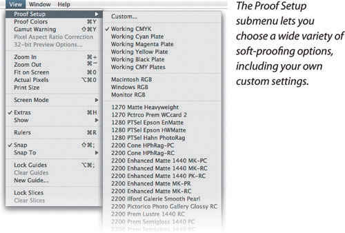
However, chances are that the output conditions listed by default on the Proof Setup submenu aren’t specific enough to represent your output conditions. To unleash the power of soft-proofing, you need to use the Customize Proof Condition dialog, which gives you the tools you need to nail your soft-proofs precisely and list them on the Proof Setup submenu.
The Customize Proof Condition dialog lets you independently control the rendering from the document’s space to the proof space, and from the proof space to the screen. It allows you to preview accurately just about any conceivable kind of output for which you have a profile. You can open the Customize Proof Condition dialog (see Figure 4-26) by choosing View > Proof Setup > Custom.
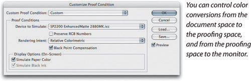
Custom Proof Condition. The Custom Proof Condition pop-up menu lets you recall setups that you’ve saved in the special Proofing folder. (On Mac OS X, this folder is in harddriveLibraryApplication SupportAdobeColorProofing. In Windows, it’s in the Program FilesCommon FilesAdobeColorProofing folder.) You can save proof setups anywhere on your hard disk by clicking Save, and load them by clicking the Load button, but the setups you save in the Proofing folder appear on the list automatically. (Even better, they also appear at the bottom of the Proof Setup submenu, where you can choose them directly.)
Device to Simulate. The Device to Simulate pop-up menu lets you specify the proofing space you want to simulate. You can choose any profile, but if you choose an input profile (for a scanner or digital camera), the Preserve Numbers check box becomes checked and dimmed, and all the other controls become unavailable. (We’re not sure why you would choose an input profile, but we suppose it’s nice to have the option.) Generally, you’ll want to choose an RGB, CMYK, or grayscale output profile.
Preserve RGB/CMYK/Gray Numbers. The Preserve Numbers check box, when selected, tells Photoshop to show you what your file would look like if you sent it to the output device without performing a color-space conversion. It’s available only when the image is in the same color mode as the selected profile (as when both are in RGB); when you turn it on, the Rendering Intent pop-up menu becomes unavailable, since no conversion is requested.
We’ve found that this feature is particularly useful when you have a CMYK file that was prepared for some other printing process. It shows you how the CMYK data will work on your output, which can help you decide whether you need to edit the image, convert it to a different CMYK space, or just send it as is. It’s also useful for seeing just how crummy your image will look if you send it to your desktop inkjet printer without converting it to the proper profile (see “Converting Colors When You Print,” later in this chapter).
Rendering Intent. The Rendering Intent pop-up menu lets you specify the rendering intent you want to use in the conversion from the document’s space to the proof space. This is particularly useful for helping you decide whether a given image would be better served by perceptual or relative colorimetric rendering to the output space. It defaults to the Color Settings default rendering intent until you change it, whereupon it remembers what you last used. However, when you save a proof setup, your selected rendering intent is saved with it; so, if you find that you’re continually being tripped up by the wrong intent, you can just save a proof setup with your preferred rendering intent.
Black Point Compensation. The Black Point Compensation check box lets you choose whether or not to use black-point compensation in the conversion from the document’s space to the proof space. You’ll almost invariably want to keep this turned on, but you can always unselect it and see the effect to make sure.
Display Options (On-screen). The check boxes in the Display Options section—Simulate Paper Color and Simulate Black Ink—control the rendering of the image from the proofing space to the monitor. When both Simulate Paper Color and Simulate Black Ink are turned off, Photoshop does a relative colorimetric rendering (with black-point compensation if that option is turned on in Color Settings). This rendering maps paper white to monitor white and ink black to monitor black using the entire dynamic range of the monitor. If you’re using a generic monitor profile, this is probably as good as you’ll get (of course, with a canned monitor profile, you can’t trust anything you see on screen anyway). With a good monitor profile, though, you should check out the alternatives.
When you turn on Simulate Black Ink, Photoshop turns off black-point compensation in the rendering from proof space to the monitor. As a result, the black you see on the monitor is the actual black you’ll get on output (within limits). Most monitor profiles have a “black hole” black point. The black ink simulation will be off by the amount that real monitor black differs from the monitor profile’s black point. (On a well-calibrated monitor, the inaccuracy is very slight.) If you’re printing to a low-dynamic-range process like newsprint or inkjet on uncoated paper Simulate Black Ink will give you a much better idea of the actual blacks you’ll get in print.
Turning on the Simulate Paper Color check box makes Photoshop do an absolute colorimetric rendering from the proof space to the display. (Simulate Black Ink becomes checked and dimmed, since black-point compensation is always disabled in absolute colorimetric conversions.) In theory at least, turning on Simulate Paper Color should give you the most accurate soft proof possible.
In practice, the most obvious effect of selecting Simulate Paper Color isn’t that it simulates the color of the paper, but rather that you see the compressed dynamic range of print. If you look at the image while turning on Simulate Paper Color, the effect is dramatic—so much so that we look away from the monitor when we turn it on, then wait a few seconds before looking at the image to allow our eyes to adapt to the new white point. More importantly, we also make sure that we hide all white user interface elements, so that our eyes can adapt.
Obviously, the quality of the soft-proofing simulation depends on the accuracy of your monitor calibration and on the quality of your profiles. But we believe that the relationship between the image on screen and the final printed output is, like all proofing relationships, one that you must learn. We’ve never seen a proofing system short of an actual press proof that really matches the final printed piece—laminated film proofs, for example, often show greater contrast than the press sheet, and may have a slight color cast too, but most people in the print industry have learned to discount the slight differences between proof and finished piece.
It’s also worth bearing in mind the limitations of the color science on which the whole ICC color management effort is based. We still have a great deal to learn about color perception, and while the science we have works surprisingly well in many situations, it’s only a model (see the sidebar “CIE Limitations and Soft-Proofing”). The bottom line is that each of the different soft-proofing renderings to the monitor can tell you something about your printed images. We recommend that you experiment with the settings and learn what works for you and what doesn’t.
The Proof Setup submenu (under the View menu) contains several other useful commands. For instance, when you’re viewing an RGB or grayscale image, you can view the individual CMYK plates (or the CMY progressive) you’d get if you converted to CMYK via the Image > Mode command. You can also use these commands to view the individual plates in CMYK files, but it’s much faster and easier to use the keyboard shortcuts to display individual channels or click on the eyeball icon in the Channels palette.
The next set of commands—Macintosh RGB, Windows RGB, and Monitor RGB—is available only for RGB, grayscale, and indexed color images, not for CMYK or Lab. They show you how your image would appear on a “typical” Mac monitor (as defined by the Apple RGB profile), a “typical” Windows monitor (as defined by the sRGB profile), and on your personal monitor (as defined by your monitor profile) if you displayed it on these monitors with no color management. These might be useful when producing Web graphics, for instance. The rest of the menu lists custom proof setups saved in the Proofing folder.
The soft-proofing features in Photoshop let you see how your image will really appear on output, so you can optimize the image to give the best possible rendition in the selected output space. They also help you to be lazy by letting you see if the same master file can produce acceptable results on all the output conditions to which you plan on sending it, relying on color management to handle the various conversions. So whether you’re a driven artist seeking perfection or a lowly production grunt doing the impossible on a daily basis, the soft-proofing tools in Photoshop will become an invaluable addition to your toolbox.
Photoshop lets you perform color conversions as it sends the data to a printer. You can either convert from the document space to a selected printer profile using a selected rendering intent, or from the document space to a selected Proof Setup space using the rendering intent in Proof Setup, and then to the printer profile. The second method lets you print an RGB file to a composite printer and make the printer simulate the CMYK output you’ve been soft-proofing—that is, it gives you a hard copy of your soft-proofed image without your having to first convert the image to final output CMYK.
If you’re familiar with Print with Preview in previous versions of Photoshop, you’ll notice that the Print dialog in Photoshop CS3 is essentially an improved version of Print with Preview.
We cover most of the cool new features in the Print dialog in Chapter 12, “Image Storage and Output;” however, we’ll cover the color management aspects of the dialog here.
Choose File > Print to open the Print dialog. To use the color management features in the Print dialog, choose Color Management from the unnamed pop-up menu that appears at the top of the options group on the right (see Figure 4-27).
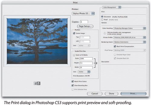
The color management options let you control the data that’s sent to the printer, choosing whether to let Photoshop do the conversion to the printer space (we invariably let Photoshop do the conversion).
Tip
You might notice the Match Print Colors check box in the Print dialog. New in Photoshop CS3, Match Print Colors does not affect the color conversions between Photoshop and the printer. All it does it apply your current Proof Setup to the proxy image in the Print dialog, so that the Print dialog can display a more accurate representation of the colors you’ll get.
Print. The Print radio buttons let you choose the Document space (to reproduce the image as well as your printer allows) or the Proof space (to produce a hard copy of your soft-proof simulation). If the image window from which you’re printing has a custom proof setup, it will appear as the Proof option; otherwise the choice reads Profile N/A. This is slightly misleading, because if you click the Proof radio button, it actually enables the Proof Setup Preset menu in Options, described below.
Options. The Options section lets you choose whether Photoshop sends converted data to the printer, and if it does, how to convert.
Color Handling. The Color Handling pop-up menu (see Figure 4-28) determines what options are available in the rest of the Options section.

Printer Manages Colors sends the source data unconverted. Use this option to let the printer driver do the color conversion to the printer space. Color-managing CMYK images on PostScript printers requires PostScript 3—on a PostScript Level 2 printer, choose Lab Color instead. PostScript color management varies enormously. We don’t recommend this method because Photoshop can usually do a better color conversion than most printer drivers.
Photoshop Manages Colors enables the Printer Profile menu. Photoshop converts the data sent to the printer to the profile space described by the profile chosen from the Printer Profile menu, using the rendering intent specified in the Rendering Intent pop-up menu.
Separations is available only for CMYK documents. It sends the individual plates to the printer, unmodified, as four separate pages. If you choose Separations, you may want to choose Options from the pop-up menu at the top right of the Print dialog so you can specify options such as crop and registration marks.
No Color Management is almost the same as Printer Manages Colors—it sends the numbers in the document to the printer, but it doesn’t include the profile that describes them. We use this option for printing profiling targets, and precious little else.
Printer Profile. The Printer Profile menu is enabled only when you choose Photoshop Manages Colors from the Color Handling menu. Choose the profile that describes the printer to which you’re printing and the paper and ink the printer is using.
Rendering Intent. The Rendering Intent menu is enabled when you choose either Printer Manages Colors or Photoshop Manages Colors from the Color Handling menu, but in our experience, it behaves reliably only in the former case. Choose the Rendering Intent that works best for the image by previewing the print using Proof Setup. (The Black Point Compensation check box is only enabled when Photoshop Manages Colors is selected in the Color Handling menu. As previously noted, we leave it turned on.)
Proof Setup. The Proof Setup menu is available with all Color Handling pop-up menu choices except Separations, and is enabled when you click the Proof radio button. Photoshop executes the conversion specified in the selected Proof Setup preset before sending the data to the printer using the options controlled by the Color Handling menu.
It also disables the Rendering Intent menu. The rendering of the simulated proof space to printer space is controlled instead by the Simulate Paper Color and Simulate Black Ink check boxes. When both are unselected, Photoshop converts the simulated proof data to the printer space using relative colorimetric rendering with black-point compensation. Checking Simulate Black Ink turns off the black-point compensation, while checking Simulate Paper Color makes Photoshop use absolute colorimetric rendering instead, forcing the printer to reproduce the actual “paper white” and actual “ink black” of the simulated proof.
In our experience, this feature works well when Photoshop Manages Colors is selected in the Color Handling menu, but can produce random results when any of the other alternatives are selected in the Color Handling menu. By all means, experiment, but don’t say we didn’t warn you!
Photoshop applies all the color management options you set up in the Print dialog to the data that gets sent to the printer driver. You won’t see any trace of them in the Print dialog. If you use the Print dialog to convert the image for output, make very sure that you don’t have another conversion specified in the Print dialog or you’ll get a double correction and a nasty print. Look for color management options like None or No Color Adjustment in the printer driver, and choose them to make sure that the driver doesn’t sabotage you by throwing an extra conversion into the mix.
The color management features through the Print dialog allow you to control your printing from a single master RGB source file precisely—whether you’re trying to reproduce an original image as exactly as possible or make your printer simulate all sorts of other output conditions. This helps you by saving time and by cutting down on the number of different versions you need to prepare for a given image.
All color management operations are dependent on a minimum of two profiles. Simply viewing a document requires the profile that describes the document and the profile that describes the current display. Other operations involve three or even more profiles. If you run into issues that don’t appear to be a result of operator error, it’s likely that one or more of the profiles involved is a weak link. Use the process-of-elimination method to troubleshoot problems. Test each profile in isolation and change one thing at a time. You’re likely to find the culprit much quicker than you will by flailing around and changing multiple parameters willy-nilly.
Color management isn’t a panacea, and it doesn’t remove the need for intelligent human color correction. It’s just a useful tool that provides a solid floor for you to stand on when you make your (hopefully intelligent, certainly human) corrections.