
After properly transforming all the quantitative and qualitative variables and fixing any missing data, what's left is just to detect any possible outlier and to deal with it by removing it from the data or by imputing it as if it were a missing case.
An outlier, sometimes also referred to as an anomaly, is an observation that is very different from all the others you have observed so far. It can be viewed as an unusual case that stands out, and it could pop up due to a mistake (an erroneous value completely out of scale) or simply a value that occurred (rarely, but it occurred). Though understanding the origin of an outlier could help to fix the problem in the most appropriate way (an error could be legitimately removed; a rare case could be kept or capped or even imputed as a missing case), what is of utmost concern is the effect of one or more outliers on your regression analysis results. Any anomalous data in a regression analysis means a distortion of the regression's coefficients and a limit on the ability of the model to correctly predict usual cases.
Tip
Despite the importance of controlling outliers, unfortunately practitioners often overlook this activity because, in contrast to the other preparations illustrated throughout the chapter, omitting to detect outliers won't stop the analysis you are working on and you will get your regression coefficients and results (both probably quite inexact). However, having an analysis run smoothly to the end doesn't mean that everything is fine with the analysis itself. An outlier can distort an analysis in two ways depending on whether the anomalous value is on the target variable or on the predictors.
In order to detect outliers, there are a few approaches, some based on the observation of variables taken singularly (the single-variable, or univariate, approach), and some based on reworking all the variables together into a synthetic measure (the multivariate approach).
The best single variable approach is based on the observation of standardized variables and on the plotting of box plots:
- Using standardized variables, everything scoring further than the absolute value of three standard deviations from the mean is suspect, though such a rule of thumb doesn't generalize well if the distribution is not normal
- Using boxplots, the interquartile range (shortened to IQR; it is the difference between the values at the 75th and the 25th percentile) is used to detect suspect outliers beyond the 75th and 25th percentiles. If there are examples whose values are outside the IQR, they can be considered suspicious, especially if their value is beyond 1.5 times the IQR's boundary value. If they exceed 3 times the IQR's limit, they are almost certainly outliers.
Tip
The Scikit-learn package offers a couple of classes for automatically detecting outliers using sophisticated approaches: EllipticEnvelope and OneClassSVM. Though a treatise of both these complex algorithms is out of scope here, if outliers or unusual data is the main problem with your data, we suggest having a look at this web page for some quick recipes you can adopt in your scripts: http://scikit-learn.org/stable/modules/outlier_detection.html. Otherwise, you could always read our previous book Python Data Science Essentials, Alberto Boschetti and Luca Massaron, Packt Publishing.
The first step in looking for outliers is to check the response variable. In observing plots of the variable distribution and of the residuals of the regression, it is important to check if there are values that, because of a too high or too low value, are out of the main distribution.
Usually, unless accompanied by outlying predictors, outliers in the response have little impact on the estimated coefficients; however, from a statistical point of view, since they affect the amount of the root-squared error, they reduce the explained variance (the squared r) and inflate the standard errors of the estimate. Both such effects represent a problem when your approach is a statistical one, whereas they are of little concern for data science purposes.
To figure out which responses are outliers, we should first monitor the target distribution. We start by recalling the Boston dataset:
In: boston = load_boston()
  dataset = pd.DataFrame(boston.data, columns=boston.feature_names)
  labels = boston.feature_names
  X = dataset
  y = boston.target
A boxplot function can hint at any outlying values in the target variable:
In: plt.boxplot(y,labels=('y'))
plt.show()

The box display and its whiskers tell us that quite a few values are out of the IQR, so they are suspect ones. We also notice a certain concentration at the value 50; in fact the values are capped at 50.
At this point, we can try to build our regression model and inspect the resulting residuals. We will standardize them using the Root Mean Squared error. An easy approach to implement though it is not the most precise, it is still enough good to reveal any significant problem:
In: scatter = plt.plot(linear_regression.predict(X), standardized_residuals, 'wo')
  plt.plot([-10,50],[0,0], "r-")
  plt.plot([-10,50],[3,3], "r--")
  plt.plot([-10,50],[-3,-3], "r--")
  plt.xlabel('fitted values')
  plt.ylabel('standardized residuals')
  plt.show()
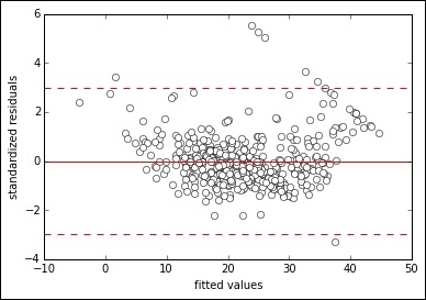
Making a scatterplot of the values fitted by the regression against the standardized residuals, we notice there are a few outlying cases over three standard deviations from the zero mean. The capped values especially, clearly visible in the graph as a line of points, seem problematic.
As we inspected the target variable, it is now time to have a look also at the predictors. If unusual observations were outliers in the target variable, similar cases in the predictors are instead named influential or high leverage observations because they can really make an impact on more than the sum of squared errors (SSE), this time influencing coefficients and the intercept—in a word, the entire regression solution (that's why they are so important to catch).
After standardizing, we start having a look at the distributions using boxplots:
In: standardization = StandardScaler(with_mean=True, with_std=True)
  Xs = standardization.fit_transform(X)
  boxplot = plt.boxplot(Xs[:,0:7],labels=labels[0:7])

In: boxplot = plt.boxplot(Xs[:,7:13],labels=labels[7:13])

After observing all the boxplots, we can conclude that there are variables with restricted variance, such as B, ZN, and CRIM, which are characterized by a long tail of values. There are also some suspect cases from DIS and LSTAT. We can delimit all these cases by looking for the values above the represented thresholds, variable after variable, but it would be helpful to catch all of them at once.
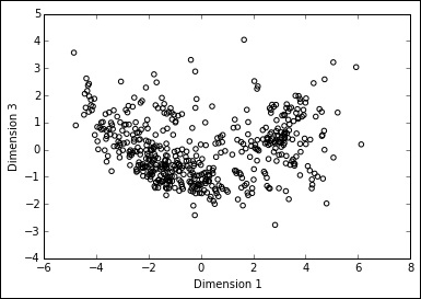
Principal Component Analysis (PCA) is a technique that can reduce complex datasets into fewer dimensions, the summation of the original variables of the dataset. Without delving too much into the technicalities of the algorithm, you just need to know that the new dimensions produced by the algorithm have decreasing explicatory power; consequently, plotting the top ones against each other is just like plotting all the dataset's information. By glancing at such synthetic representations, you can spot groups and isolated points that, if very far from the center of the graph, are also quite influential on the regression model.
In: from sklearn.decomposition import PCA pca = PCA() pca.fit(Xs) C = pca.transform(Xs) print (pca.explained_variance_ratio_) Out: [ 0.47097 0.11016 0.09547 0.06598 0.0642 0.05074 �.04146 0.0305 0.02134 0.01694 0.01432 0.01301 0.00489] In: import numpy as np import matplotlib.pyplot as plt explained_variance = pca.explained_variance_ratio_ plt.title('Portion of explained variance by component') range_ = [r+1 for r in range(len(explained_variance))] plt.bar(range_,explained_variance, color="b", alpha=0.4, align="center") plt.plot(range_,explained_variance,'ro-') for pos, pct in enumerate(explained_variance): plt.annotate(str(round(pct,2)), (pos+1,pct+0.007)) plt.xticks(range_) plt.show() Out:

The first dimension created by PCA can explain 47% of the dataset's information, the second and the third 11% and 9.5%, respectively (the explained_variance_ratio_ method can provide you with such information). Now all we have to do is to plot the first dimension against the second and the third and look for lonely points away from the center because those are our high leverage cases to be investigated:
In: scatter = plt.scatter(C[:,0],C[:,1], facecolors='none', edgecolors='black')
  plt.xlabel('Dimension 1')
  plt.ylabel('Dimension 2')

In: scatter = plt.scatter(C[:,0],C[:,2], facecolors='none', edgecolors='black')
  plt.xlabel('Dimension 1')
  plt.ylabel('Dimension 3')
Out:
After being able to detect outliers and influential observations, we just need to discuss what we can do with them. You might believe it's OK just to delete them but, on the contrary, removing or replacing an outlier is something to consider carefully.
In fact, outlying observations may be justified by three reasons (their remedies change accordingly):
- They are outliers because they are rare occurrences, so they appear unusual with regard to other observations. If this is the case, removing the data points could not be the correct solution because the points are part of the distribution you want to model and they stand out just because of chance. The best solution would be to increase the sample number. If augmenting your sample size is not possible, then remove them or try to resample in order to avoid having them drawn.
- Some errors have happened in the data processing and the outlying observations are from another distribution (some data has been mixed, maybe from different times or another geographical context). In this case, prompt removal is called for.
- The value is a mistake due to faulty input or processing. In such an occurrence, the value has to be considered as missing and you should perform an imputation of the now missing value to get a reasonable value.
Tip
As a rule, just keep in mind that removing data points is necessary only when the points are different from the data you want to use for prediction and when, by removing them, you get direct confirmation that they had a lot of influence on the coefficients or on the intercept of the regression model. In all other cases, avoid any kind of selection in order to improve the model since it is a form of data snooping (more on the topic of how data snooping can negatively affect your models in the next chapter).