Chapter 20
Doing More Advanced Analyses
IN THIS CHAPTER
![]() Conducting one-way ANOVAs
Conducting one-way ANOVAs
![]() Running post hoc tests
Running post hoc tests
![]() Graphing means
Graphing means
![]() Running multiple linear regression
Running multiple linear regression
![]() Making predictions
Making predictions
This chapter is a direct extension of Chapters 18 and 19. In Chapter 18, we discuss t-tests, which are used when the dependent variable is continuous and the independent variable has two categories. In this chapter, we will talk about the one-way ANOVA procedure, which is an extension of the independent samples t-test and is used when you have a continuous dependent variable and the independent variable has two or more categories.
In Chapter 19, we talk about simple linear regression, which is used when the dependent variable is continuous and there is one continuous independent variable. In this chapter, we talk about how to perform multiple linear regression, which is used when the dependent variable is continuous and there are various continuous independent variables.
Running the One-Way ANOVA Procedure
The purpose of the one-way ANOVA is to test whether the means of two or more separate groups differ from each other on a continuous dependent variable. Its goal is to determine if a significant difference exists among the groups. Analysis of variance (ANOVA) is a general method of drawing conclusions regarding differences in population means when two or more comparison groups are involved. The independent-samples t-test applies only to the simplest instance (two groups), whereas the one-way ANOVA procedure can accommodate more complex situations (three or more groups).
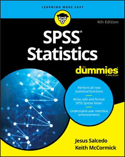
You might be wondering why this procedure is called analysis of variance instead of analysis of means (because you are comparing the means of several groups). The general idea behind ANOVA is that you have a population of interest and then draw random samples from this population, as shown in Figure 20-1.
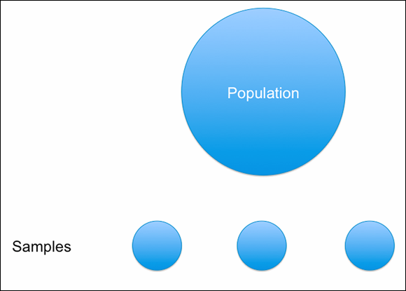
FIGURE 20-1: Population and samples.
Variation will occur within each sample because people differ from each other. This variation, shown in Figure 20-2, is called within-group variation. Likewise, because each sample is random, you would not be surprised if the mean of each sample is not exactly the same. This variation, which is shown in Figure 20-3, is called between-group variation. In essence, you now have two estimates of the population mean, one based on the variation within a sample and one based on the variation between the samples.
If the null hypotheses is correct and the amount of variation among group means (between-group variation) is compared to the amount of variation among observations within each group (within-group variation), the only source of variation among sample means would be the fact that the groups are composed of different individual observations. Thus, a ratio of the two sources of variation (between group/within group) should be about 1, as shown in Figure 20-4. The statistical distribution of this ratio is known as the F distribution. The ratio of 1 would indicate that no differences exist among the groups. However, if the variation between groups is much larger than the variation within the groups, the ratio, or F statistic, will be much larger than 1, indicating that differences exist among the groups.

FIGURE 20-2: Within-groups variation.
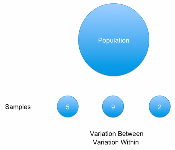
FIGURE 20-3: Between-groups variation.

FIGURE 20-4: The F ratio.
Going back to the idea of hypothesis testing, you can set up two hypotheses:
- Null hypothesis: The means of the groups will be the same. Stating the null hypothesis as an equation, we can say that the null hypothesis is true when there is similar variation between and within, which results in an F statistic of 1.
- Alternative hypothesis: The means of the groups will differ from each other. Stating the alternative hypothesis as an equation, we can say that the null hypothesis is not true when the variation between is much larger than the variation within, which results in an F statistic larger than 1.
In this example you investigate the relationship between employment category and years of education and current salary. You want to determine whether educational or salary differences exist among the different employment category groups.
Follow these steps to perform a one-way ANOVA:
-
From the main menu, choose File ⇒ Open ⇒ Data and load the employee_data.sav file.
You can download the file from the book’s companion website at
www.dummies.com/go/spss4e. The file contains employee information from a bank in the 1960s and has 10 variables and 474 cases. -
Choose Analyze ⇒ Compare Means ⇒ One-Way ANOVA.
The One-Way ANOVA dialog appears.
-
Select the Current Salary and Educational Level variables, then place them in the Dependent List box.
Continuous variables are placed in the Dependent List box.
-
Select the Employment Category variable and place it in the Factor box.
Categorical independent variables are placed in the Factor box. Because you are performing a one-way ANOVA, you can have only one independent variable, as shown in Figure 20-5.
A two-way ANOVA (two independent variables), three-way ANOVA (three independent variables), and so on are possible, but these need to be performed by choosing Choose Analyze ⇒ General Linear Model ⇒ Dialogs.
-
Select the Options button.
The Options dialog appears.
FIGURE 20-5: The completed One-Way ANOVA dialog.
-
Select the Descriptive, Homogeneity of Variance Test, Brown-Forsythe Test, and Welch Test options, as shown in Figure 20-6.
Descriptive provides group means and standard deviations. The homogeneity of variance test assesses the assumption of homogeneity of variance. Brown-Forsythe and Welch are robust tests that do not assume homogeneity of variance and thus can be used when this assumption is not met.

FIGURE 20-6: The completed Options dialog.
- Click Continue.
- Click OK.
 Every statistical test has assumptions. The better you meet these assumptions, the more you can trust the results of the test. The one-way ANOVA has four assumptions:
- The dependent variable is continuous.
- Two or more different groups are compared.
- The dependent variable is normally distributed within each category of the independent variable (normality). One-way ANOVA is robust to moderate violations of the normality assumption as long as the sample sizes are moderate to large (over 50 cases per group) and the dependent measure has the same distribution (for example, skewed to the right) within each comparison group.
- Similar variation exists within each category of the independent variable (homogeneity of variance). One-way ANOVA is robust to moderate violations of the homogeneity assumption as long as the sample sizes of the groups are similar.
As with all analyses, first look to see how many cases are in each group, along with the means and standard deviations. The Descriptives table shown in Figure 20-7 provides sample sizes, means, standard deviations, and standard errors for the groups on each of the dependent variables. The size of the groups ranges from 27 to 363 people. The means vary from 10.19 to 17.2 years of education; the one-way ANOVA procedure will assess if these means differ. The standard deviations vary from 1.61 to 2.33; the test of homogeneity of variance will assess if these standard deviations differ.
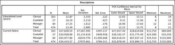
FIGURE 20-7: The Descriptives table.
You can see that managers have higher means than the other groups on the dependent variables. This mean comparison is precisely what the one-way ANOVA assesses — whether the differences between the means are significantly different from each other or if the differences you are seeing are just due to chance.
The next table of output is the test of homogeneity of variances, shown in Figure 20-8. The null hypothesis here is that the variances are equal, so if the significance level is low enough (as it is in the figure), you reject the null hypothesis and conclude the variances are not equal.
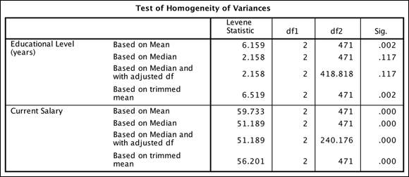
FIGURE 20-8: The Test of Homogeneity of Variances table.
In the one-way ANOVA, similar to in the independent-samples t-test, violation of the assumption of homogeneity of variances is more serious than violation of the assumption of normality. And like the independent-samples t-test, the one-way ANOVA applies a two-step strategy for testing:
- Test the homogeneity of variance assumption.
- If the assumption holds, proceed with the standard test (the ANOVA F-test) to test equality of means. If the null hypothesis of equal variances is rejected, use an adjusted F-test to test equality of means.
In the Test of Homogeneity of Variances table, Levene’s test for equality of variances is displayed. The test result is used to calculate the significance level (the Sig. column). The test of homogeneity of variance can be calculated using various criteria (mean, median, and so on), as shown in the table. However, most people look at the mean row, because they are comparing means.
The example did not meet the assumption of homogeneity of variance for the variables because the value in the Sig. column is less than 0.05 (a difference exists in the variation of the groups), so you need to look at the Robust Tests of Equality of Means table. However, before you do that, let’s take a look at the standard ANOVA table, which is the table you would inspect if the assumption of homogeneity of variance was met.
Most of the information in the ANOVA table (see Figure 20-9) is technical and not directly interpreted. Rather, the summaries are used to obtain the F statistic and, more importantly, the probability value you use in evaluating the population differences.

FIGURE 20-9: The ANOVA table.
The standard ANOVA table will provide the following information:
- The first column has a row for the between-group variation and a row for within-group variation.
- Sums of squares are intermediate summary numbers used in calculating the between-group variances (deviations of individual group means around the total sample mean) and within-group variances (deviations of individual observations around their respective sample group mean).
- The df column contains information about degrees of freedom, related to the number of groups and the number of individual observations within each group.
- Mean squares are measures of the between-group and within-group variation. (Sum of squares divided by their respective degrees of freedom.)
- The F statistic is the ratio of between-group to within-group variation and will be about 1 if the null hypothesis is true.
- The Sig. column provides the probability of obtaining the sample F ratio (taking into account the number of groups and sample size), if the null hypothesis is true.
In practice, most researchers move directly to the significance value because the columns containing the sums of squares, degrees of freedom, mean squares, and F statistic are all necessary for the probability calculation but are rarely interpreted in their own right. In the table, the low significance value will lead you to reject the null hypothesis of equal means. You can see that significant differences exist among the employment categories on education and salary.
When the condition of equal variances is not met, an adjusted F-test has to be used. SPSS Statistics provides two such tests, Welch and Brown-Forsythe. You selected both but you can use either test. The Robust Tests of Equality of Means table provides the details (see Figure 20-10). Again, the columns containing test statistic and degrees of freedom are technical details to compute the significance.
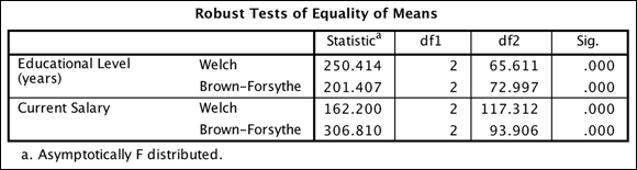
FIGURE 20-10: The Robust Tests of Equality of Means table.
Both tests mathematically attempt to adjust for the lack of homogeneity of variance. And both tests indicate that highly significant differences exist in education and current salary among employment categories, which is consistent with the conclusions drawn from the standard ANOVA. Having concluded that differences exist among the employment categories, you'll need to probe to find specifically which groups differ from which others.
Conducting Post Hoc Tests
Post hoc tests are typically performed only after the overall F-test indicates that population differences exist. At this point, there is usually interest in discovering just which group means differ from which others. In one aspect, the procedure is straightforward: Every possible pair of group means is tested for population differences and a summary table is produced.
As more tests are performed, however, the probability of obtaining at least one false-positive result increases. As an extreme example, if there are ten groups, 45 pairwise group comparisons (n*(n-1)/2) can be made. If testing at the .05 level, you would expect to obtain on average about two (.05 * 45) false-positive tests.
Statisticians have developed a number of methods to reduce the false-positive rate when multiple tests of this type are performed. Often, more than one post hoc test is used and the results are compared to provide more evidence about potential mean differences.
Follow these steps to perform post hoc tests for a one-way ANOVA:
-
From the main menu, choose File ⇒ Open ⇒ Data and load the employee_data.sav file.
Download the file at
www.dummies.com/go/spss4e. - Choose Analyze ⇒ Compare Means ⇒ One-Way ANOVA.
- Select the Current Salary and Educational Level variables, and place them in the Dependent List box.
- Select the Employment Category variable and place it in the Factor box.
- Click the Options button.
- Select the Descriptive, Homogeneity of Variance Test, Brown-Forsythe Test, and Welch Test options.
- Click Continue.
-
Select the Post Hoc button.
The Post Hoc Multiple Comparisons dialog appears. Post hoc analyses are accessed from the One-Way ANOVA dialog. Select the appropriate method of multiple comparisons, which depends on whether the assumption of homogeneity of variance has been met.
- Select Bonferroni and Games-Howell, as shown in Figure 20-11.
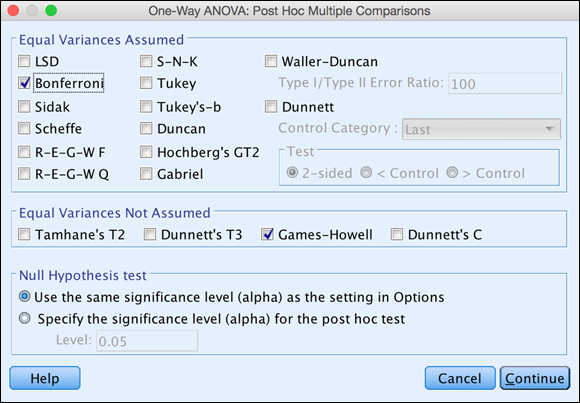
FIGURE 20-11: The completed Post Hoc Multiple Comparisons dialog.
- Click Continue.
-
Click OK.
The one-way ANOVA is now rerun, along with the post hoc tests.
Why so many tests in the dialog shown in Figure 20-11? The ideal post hoc test would demonstrate tight control of Type I (false-positive) errors, have good statistical power (probability of detecting true population differences), and be robust over assumption violations (failure of homogeneity of variance, non-normal error distributions). Unfortunately, there are implicit tradeoffs involving some of these desired features (Type I error and power) and no current post hoc procedure is best in all these areas.
In addition, pairwise tests can be based on different statistical distributions (t, F, studentized range, and others) and Type I errors can be controlled at different levels (per individual test, per family of tests, and variations in between), and you have a large collection of post hoc tests.
Statisticians don't agree on a single test that is optimal in all situations. However, the Bonferroni test is currently the most popular procedure. This procedure is based on an additive inequality, so the criterion level for each pairwise test is obtained by dividing the original criterion level (say .05) by the number of pairwise comparisons made. Thus, with five means, and therefore ten pairwise comparisons, each Bonferroni test will be performed at the .05/10 or .005 level.
Most post hoc procedures were derived assuming homogeneity of variance and normality of error. Post hoc tests in the Equal Variances Not Assumed section of the dialog adjust for unequal variances and sample sizes in the groups. Simulation studies suggest that Games-Howell can be more powerful than the other tests in this section, which is why you chose this test.
Back to the results of the post hoc tests, the Multiple Comparisons table shown in Figure 20-12 provides all pairwise comparisons. The rows are formed by every possible combination of groups. The Mean Difference (I-J) column contains the sample mean difference between each pairing of groups. If this difference is statistically significant at the specified level after applying the post hoc adjustments, an asterisk (*) appears beside the mean difference.
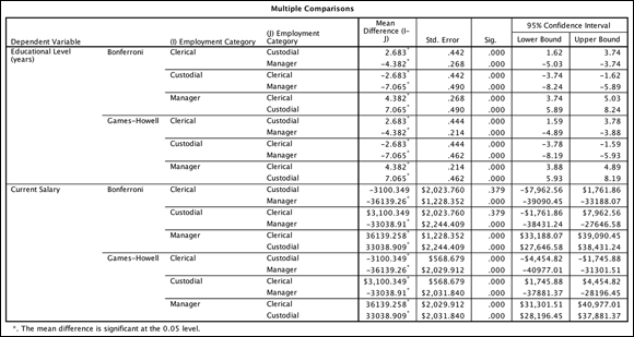
FIGURE 20-12: The Multiple Comparisons table.
The actual significance value for the test appears in the Sig. column. In addition, the standard errors and 95 percent confidence intervals for each mean difference provide information on the precision with which you've estimated the mean differences. As you would expect, if a mean difference is not significant, the confidence interval includes 0.
Also note that each pairwise comparison appears twice. For each such duplicate pair, the significance value is the same, but the signs are reversed for the mean difference and confidence interval values.
The clerical and custodial groups have a mean difference of 2.68 years of education. This difference is statistically significant at the specified level after applying the post hoc adjustments. The interval [1.62, 3.74] contains the difference between these two population means with 95 percent confidence.
Summarizing the entire table, you would say that regardless of the post hoc test used, all groups differed significantly from each other in the amount of education such that the manager group was the most educated, followed by the clerical group, and then the custodial group. Regarding current salary, regardless of the post hoc test used, the manager group had a higher current salary than either the clerical or custodial group. Interestingly, the Bonferroni procedure did not find a significant difference in current salary between the clerical and custodial groups, but the Games-Howell procedure did find a statistically significant difference such that the clerical group had a lower salary than the custodial group.
Comparing Means Graphically
As with t-tests, a simple error bar chart is the most effective way of comparing means. You will create an error bar chart corresponding to the one-way ANOVA of employment category and number of years of education. To see how the number of years of education varies across categories of employment, you'll use education as the Y-axis variable. Follow these steps to create a simple error bar chart:
-
From the main menu, choose File ⇒ Open ⇒ Data and load the employee_data.sav data file.
Download the file at
www.dummies.com/go/spss4e. - Choose Graphs ⇒ Chart Builder.
- In the Choose From list, select Bar.
- Select the seventh graph image (the Simple Error Bar tooltip) and drag it to the panel at the top of the window.
- Select the Educational Level variable, and place it in the Y-axis box.
- Select the Employment Category variable, and place it in the X-axis box.
-
Click OK.
The graph in Figure 20-13 appears.

FIGURE 20-13: A simple error bar graph displaying the relationship between years of education and employment category.
The error bar chart generates a graph depicting the relationship between a scale and categorical variable. It provides a visual sense of how far the groups are separated. The mean number of years of education for each employment category along with 95 percent confidence intervals is represented in the chart.
The confidence intervals for the employment categories don't overlap, which is consistent with the result from the one-way ANOVA. Because the confidence intervals do not overlap, the groups are significantly different from each other.
Running the Multiple Linear Regression Procedure
In Chapter 19, we discuss simple linear regression, where one continuous independent variable is used to predict a continuous dependent variable. In this section, we talk about multiple linear regression, where several continuous independent variables are used to predict or understand a continuous dependent variable.
When running a multiple regression, you will again be concerned with how well the equation fits the data, whether a linear model is the best fit to the data, whether any of the variables are significant predictors, and estimating the coefficients for the best-fitting prediction equation. In addition, you’ll be interested in the relative importance of each of the independent variables in predicting the dependent measure.
Returning to the idea of hypothesis testing, you can set up two hypotheses:
- Null hypothesis: The variables are not linearly related to each other. That is, the variables are independent.
- Alternative hypothesis: The variables are linearly related to each other. That is, the variables are associated.
To perform a multiple linear regression, follow these steps:
-
From the main menu, choose File ⇒ Open ⇒ Data and load the employee_data.sav data file.
Download the file at
www.dummies.com/go/spss4e. -
Choose Analyze ⇒ Regression ⇒ Linear.
In this example, you want to predict current salary from beginning salary, months on the job, number of years of education, gender, and previous job experience. You can place the predictor variables in the Independent(s) box.
-
Select the Beginning Salary variable, and place it in the Dependent box.
This is the variable for which you want to set up a prediction equation.
-
Select the Beginning Salary, Months Since Hire, Educational Level, Gender, and Previous Experience variables, and place them in the Independent(s) box, as shown in Figure 20-14.
These are the variables you’ll use to predict the dependent variable.
Gender is a dichotomous variable coded 0 for males and 1 for females, but it was added to the regression model because a variable coded as a dichotomy can be considered a continuous variable. Why? Because technically a continuous variable assumes that a one-unit change has the same meaning throughout the range of the scale. If a variable’s only possible codes are 0 and 1 (or 1 and 2), a one-unit change means the same thing throughout the scale. Thus, dichotomous variables can be used as predictor variables in regression. Regression also allows the use of nominal predictor variables if they’re converted into a series of dichotomous variables; this technique is called dummy coding.
FIGURE 20-14: The completed Linear Regression dialog.
- Click the Statistics button.
-
Select Casewise Diagnostics, and then select Collinearity Diagnostics (see Figure 20-15).
The Casewise Diagnostics check box requests information about all cases whose standardized residuals are more than three standard deviations from the fit line. Collinearity diagnostics displays a number of criteria that provide information on the amount of redundancy among the predictors. The Estimates and Model Fit options are selected by default.
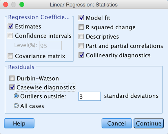
FIGURE 20-15: The completed Statistics dialog.
-
Click Continue.
Although you can run multiple regression at this point, you will request some diagnostic plots involving residuals and information about outliers. By default, no residual plots will appear. You'll request a histogram of the standardized residuals for a check of the normality of errors. Regression can produce summaries concerning various types of residuals. You'll request a scatterplot of the standardized residuals (*ZRESID) versus the standardized predicted values (*ZPRED) to allow for a check of the homogeneity of errors.
- Click the Plots button.
-
Select the Histogram option. Move *ZRESID (standardized residual values in Z score form) to the Y: box, and move *ZPRED (standardized predicted values in Z score form) to the X: box.
The dialog now looks like Figure 20-16.

FIGURE 20-16: The completed Plots dialog.
-
Click Continue.
The Save dialog appears. It adds new variables (predictions, errors) to the data file. You are just going to ask for the model predictions.
- Click the Save button.
- In the Predicted Values section, select Unstandardized (see Figure 20-17).
- Click Continue.
-
Click OK.
SPSS performs the linear regression.

FIGURE 20-17: The completed Save dialog.
Every statistical test has assumptions. The better you meet these assumptions, the more you can trust the results of the test. Linear regression assumes the following:
- The variables are continuous.
- The variables are linearly related (linearity).
- The variables are normally distributed (normality).
- No influential outliers exist.
- Similar variation exists throughout the regression line (homoscedasticity).
- Multicollinearity is absent. That is, the predictors are not highly correlated with each other.
The Model Summary table of multiple linear regression, like the table with simple linear regression, provides several measures of how well the model fits the data, as shown in Figure 20-18.
R is the correlation between the dependent measure and the combination of the independent variables, so the closer R is to 1, the better the fit. You have an R of 0.902, which is huge. R is the correlation between the dependent variable and the combination of the five independent variables you’re using. You can also think of R as the correlation between the dependent variable and the predicted values.
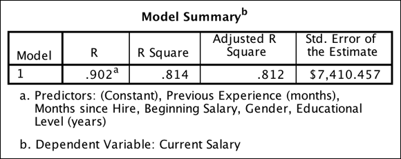
FIGURE 20-18: The Model Summary table.
As in simple linear regression, R square and adjusted R square are interpreted the same, except that now the amount of explained variance is from a group of predictors, not just one predictor. You have an R square of 0.814 and an adjusted R square of 0.812, which are about the same. These values tell you that your combination of five predictions can explain about 81 percent of the variation in the dependent variable, which is current salary.
The ANOVA table has a similar interpretation, except that now it tests whether any predictor variable has a significant effect on the dependent variable. The Sig. column provides the probability that the null hypothesis is true — that is, no relationship exists between the independent variables and dependent variable. As shown in Figure 20-19, the probability of the null hypothesis being correct is extremely small (less than 0.05), so the null hypothesis has to be rejected and a linear relationship exists between the dependent variable and the combination of independent variables.

FIGURE 20-19: The ANOVA table.
Because the results from the ANOVA table were statistically significant, turn next to the Coefficients table. If the results from the ANOVA table were not statistically significant, you would conclude that no relationship exists between the dependent variable and the combination of the predictors, so there would be no reason to continue investigating the results.
Because you do have a statistically significant model, however, you want to determine which predictors are statistically significant. You also want to see your prediction equation, as well as determine which predictors are the most important. To answer these questions, you turn to the Coefficients table shown in Figure 20-20.
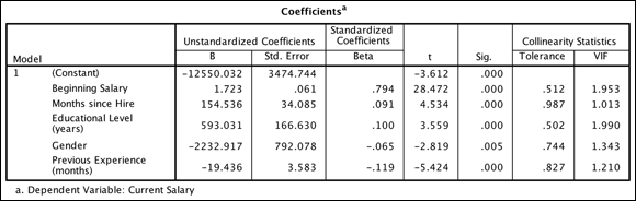
FIGURE 20-20: The Coefficients table.
Linear regression takes into consideration the effect each independent variable has on the dependent variable. In the Coefficients table, the independent variables appear in the order in which they were listed in the Linear Regression dialog, not in order of importance.
The B coefficients are important for both prediction and interpretive purposes. However, analysts usually look first to the t-test at the end of each row to determine which independent variables are significantly related to the outcome variable. Because five variables are in the equation, you're testing whether a linear relationship exists between each independent variable and the dependent variable after adjusting for the effects of the four other independent variables. Looking at the significance values, you see that all five predictors are statistically significant, so you need to retain all five predictors. (Often researchers will remove predictors that are not statistically significant because they are not contributing to the equation.)
The first column of the Coefficients table contains a list of the independent variables plus the constant (the intercept where the regression line crosses the y-axis). The intercept is the value of the dependent variable when the independent variable is 0.
The B column shows you how a one-unit change in an independent variable affects the dependent variable after controlling for all other variables in the model. For example, for each additional year of education completed, the expected increase in current salary is $593.03. The Months Since Hire variable has a B coefficient of $154.54, so each additional month increases current salary by $154.54. The Previous Experience variable has a B coefficient of -$19.44, so each additional month decreases current salary by -$19.44.
The Gender variable has a B coefficient of about -$2,232.92. This means that a one-unit change in gender (moving from male to female, or being female) is associated with a drop in current salary of -$2,232.92. Finally, the Beginning Salary variable has a B coefficient of $1.72, so each additional dollar increases current salary by $1.72. This coefficient is similar but not identical to the coefficient found in the simple regression using beginning salary alone (1.9).
In the simple regression, the B coefficient for beginning salary was estimated ignoring any other effects, because none were included in the model. Here the effect of beginning salary was evaluated after controlling (statistically adjusting) education level, sex, previous work experience, and months on the job. If the independent variables are correlated, the change in the B coefficient from simple to multiple regression can be substantial.
The B column also contains the regression coefficients you would use in a prediction equation. In this example, current salary can be predicted with the following equation:
Current Salary = -12550 + (1.7)(Beginning Salary) + (154.5)(Months Hired) + (-19.4)(Previous Experience) + (593)(Years of Education) + (-2232.9) (Gender)
The Std. Error column contains standard errors of the regression coefficients. The standard errors can be used to create a 95 percent confidence interval around the B coefficients.
If you simply look at the B coefficients, you might think that gender is the most important variable. However, the magnitude of the B coefficient is influenced by the amount of variation of the independent variable. The Beta coefficients explicitly adjust for such variation differences in the independent variables. Linear regression takes into account which independent variables have more effect than others.
Betas are standardized regression coefficients and are used to judge the relative importance of each of the independent variables. The values range between -1 and +1, so that the larger the value, the greater the importance of the variable. (If any Betas are above 1 in absolute value, it suggests a problem with the data, potentially multicollinearity.) In the example, the most important predictor is beginning salary, followed by previous experience, and then education level.
Regarding assumptions, multicollinearity, which is the common problem, occurs when the independent variables in a regression model are highly intercorrelated. This happens often in market research when ratings on many attributes of a product are analyzed, or in economics when many economic measures are used in an equation. The more variables you have, the greater the likelihood of multicollinearity occurring, although in principle only two variables are necessary for multicollinearity to occur.
The problem of multicollinearity is easy to understand. When you interpret a variable’s coefficient, you state what the effect of a variable is after controlling for the other variables in the equation. But if two or more variables vary together, you can’t hold one constant while varying the others.
Multicollinearity in typical data is a matter of degree, not an absolute condition. All survey data, for example, will have some multicollinearity. The question to ask is, “When is there too much?” SPSS provides a number of indicators of multicollinearity that are worthwhile to examine as standard checks in regression analysis.
You can begin your formal assessment of multicollinearity by examining the tolerance and VIF values in the Coefficients table. Tolerance is the proportion of variation in a predictor variable independent of any other predictor variables. Tolerance values will range from 0 to 1, where higher numbers are better. A tolerance of .10 means that an independent variable shares 90 percent of its variance with the one or more of the other independent variables and is largely redundant.
VIF values indicate how much larger the standard errors are (how much less precise the coefficient estimates are) due to correlation among the predictors. The VIF is equal to the inverse of the tolerance. It's a direct measure of the cost of multicollinearity in loss of precision, and is directly relevant when performing statistical tests and calculating confidence intervals. These values range from 1 to positive infinity. VIF values greater than the cutoff value of 5 indicate the possible presence of multicollinearity. In the example, you do not have a problem with multicollinearity.
If multicollinearity is detected in your dataset, you should attempt to adjust for it because it will make your regression coefficients unstable. The two most common ways to fix multicollinearity are to exclude redundant variables or combine redundant variables.
The Casewise Diagnostics table (see Figure 20-21) lists cases that are more than three standard deviations (in error) from the regression fit line. Assuming a normal distribution, errors of three standard deviations or more would happen less than 1 percent of the time by chance alone. In this data file, errors of three standard deviations or more would be about five outliers (.01*474), so the nine cases you have does not seem too excessive.
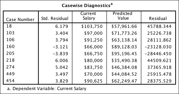
FIGURE 20-21: The Casewise Diagnostics table.
Residuals should normally be balanced between positive and negative values; when they are not, investigate the data further. In this data, seven residuals are positive, indicating that some additional investigation is required. It seems that the model is not predicting as well for higher current salaries, so you could see if these observations have anything in common. Because their case numbers (an ID variable can be substituted) are known, you could find them easily in the dataset to look at them more closely.
You also do not want to see very large prediction errors, but here two residuals are very, very high, over six standard deviations above the fit line, which indicates instances where the regression equation is very far off the mark.
To test the assumptions of regression, turn to the histogram of residuals shown in Figure 20-22. The residuals should be approximately normally distributed, which is basically true for the histogram. Note the distribution of the residuals with a normal bell-shaped curve superimposed. The residuals are fairly normal, although they are a bit too concentrated in the center and are somewhat positively skewed. However, just as with ANOVA, larger sample sizes protect against moderate departures from normality.

FIGURE 20-22: The histogram of residuals.
In the scatterplot of residuals shown in Figure 20-23, you hope to see a horizontally oriented blob of points with the residuals showing the same spread across different predicted values. Unfortunately, note the hint of a curving pattern: The residuals seem to slowly decrease, and then swing up at higher salaries. This type of pattern can mean the relationship is curvilinear.

FIGURE 20-23: The scatterplot of residuals.
Also, the spread of the residuals is much more pronounced at higher predicted salaries, which suggests lack of homogeneity of variance. Does this mean that the model you built is problematic? Not necessarily. But it does point out that you are doing a better job at predicting lower salaries, so you might trust the predictions of this model more for lowered salaried individuals. Alternatively, you can take this result and try to determine if you can use additional variables (for example, job category) to better understand higher salaried individuals and improve the model that way.
Viewing Relationships
You will use a scatterplot to visualize the relationship between the dependent variable and your predictions from the multiple linear regression model. Now that the unstandardized predicted value is in Data Editor, follow these steps to construct a scatterplot:
- Choose Graphs ⇒ Chart Builder.
- In the Choose From list, select Scatter/Dot.
- Select the second scatterplot diagram (the Simple Scatter with Fit Line tooltip), and drag it to the panel at the top.
- In the Variables list, select Unstandardized Predicted Value and drag it to the rectangle labeled X-Axis in the diagram.
- In the Variables list, select Current Salary and drag it to the rectangle labeled Y-Axis in the diagram.
-
Click OK.
The chart in Figure 20-24 appears.
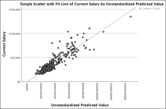
FIGURE 20-24: The scatterplot of current and beginning salary with a regression line.
The line superimposed on the scatterplot is the best straight line that describes the relationship. This line is the linear regression equation you developed. In the scatterplot, many points fall near the line, but as you found in the regression output, more spread (less concentration of data points) exists for higher current salary values.