
Contingency tables are used to examine the relationship between a subject's scores on two qualitative or categorical variables. They show the actual and expected distribution of cases in a cross-tabulated (pivoted) format for the two variables. The following table is an example of an actual (or observed) and expected distribution of cases over the Occupation column (on rows) and the MaritalStatus column (on columns):
|
Occupation/MaritalStatus |
Married |
Single |
Total |
|
Clerical Actual Expected |
4,745 4,946 |
4,388 4,187 |
9,133 9,133 |
|
Professional Actual Expected |
5,266 5,065 |
4,085 4,286 |
9,351 9,351 |
|
Total Actual Expected |
10,011 10,111 |
8,473 8,473 |
18,484 18,484 |
If the two variables are independent, then the actual distribution in every single cell should be approximately equal to the expected distribution in that cell. The expected distribution is used by calculating the marginal probability. For example, the marginal probability for value Married is 10,111/18,484 = 0.5416: there are more than 54% of married people in the sample. If the two variables are independent, then you would expect to have approximately 54% of married people among clericals and 54% among professionals. You might notice a dependency between two discrete variables by just viewing the contingency table for the two. However, a solid numerical measure is preferred.
If the columns are not contingent on the rows, then the rows and column frequencies are independent. The test of whether the columns are contingent on the rows is called the chi-squared test of independence. The null hypothesis is that there is no relationship between row and column frequencies. Therefore, there should be no difference between the observed (O) and expected (E) frequencies.
Chi-squared is simply a sum of normalized squared frequency deviations (that is, the sum of squares of differences between observed and expected frequencies divided by expected frequencies). This formula is also called the Pearson chi-squared formula, which is as follows:

There are already prepared tables with critical points for the chi-squared distribution. If the calculated chi-squared value is greater than a critical value in the table for the defined degrees of freedom and for a specific confidence level, you can reject the null hypothesis with that confidence (which means the variables are interdependent). Degrees of freedom, explained for a single variable in the previous chapter, are the product of the degrees of freedom for columns (C) and rows (R), as the following formula shows:

The following table is the chi-squared critical points table for the first 10 degrees of freedom. Greater differences between expected and actual data produce a larger chi-squared value. The larger the chi-squared value, the greater the probability that there really is a significant difference. The Probability row in the table shows you the maximal probability that the null hypothesis holds when the chi-squared value is greater than or equal to the value in the table for specific degrees of freedom:
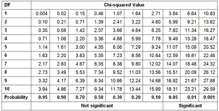
For example, you have calculated chi-squared for two discrete variables. The value is 16, and the degrees of freedom are 7. Search for the first smaller and first bigger value for the chi-squared in the row for degrees of freedom 7 in the table. The values are 14.07 and 18.48. Check the appropriate probability for these two values, which are 0.05 and 0.01. This means that there is less than a 5% probability that the two variables are independent of each other, and more than 1% that they are independent. This is a significant percentage, meaning that you can say the variables are dependent with more than 95% probability.
The following code re-reads the target mail data from a CSV file, adds the new data frame to the search path, and defines the levels for the Education factor variable:
TM = read.table("C:\SQL2017DevGuide\Chapter14_TM.csv",
    sep=",", header=TRUE,
    stringsAsFactors = TRUE);
    attach(TM);
Education = factor(Education, order=TRUE,
    levels=c("Partial High School",
        "High School","Partial College",
        "Bachelors", "Graduate Degree"));
You can create pivot tables with the table() or the xtabs() R functions, as the following code shows:
table(Education, Gender, BikeBuyer);
table(NumberCarsOwned, BikeBuyer);
xtabs(~Education + Gender + BikeBuyer);
xtabs(~NumberCarsOwned + BikeBuyer);
You can check the results yourself. Nevertheless, in order to test for independence, you need to store the pivot table in a variable. The following code checks for independence between two pairs of variables—Education and Gender and NumberCarsOwned and BikeBuyer:
tEduGen <- xtabs(~ Education + Gender);
tNcaBik <- xtabs(~ NumberCarsOwned + BikeBuyer);
chisq.test(tEduGen);
chisq.test(tNcaBik);
Here are the results:
data:  tEduGen
X-squared = 5.8402, df = 4, p-value = 0.2114
data:  tNcaBik
X-squared = 734.38, df = 4, p-value < 2.2e-16
From the chi-squared critical points table, you can see that you can confirm the null hypothesis for the first pair of variables, while you need to reject it for the second pair. The p-value tells you the probability that the null hypothesis is correct. Therefore, you can conclude that the variables NumberCarsOwned and BikeBuyer are associated.
You can measure the association by calculating one of the following coefficients: the phi coefficient, contingency coefficient, or Cramer's V coefficient. You can use the phi coefficient for two binary variables only. The formulas for the three coefficients are:


The contingency coefficient is not scaled between 0 and 1; for example, the highest possible value for a 2 x 2 table is 0.707. Anyway, the function assocstats() from the vcd package calculates all three of them; since the phi coefficient can be calculated for two binary variables only, it is not useful here. The following code installs the package and calls the function:
install.packages("vcd");
library(vcd);
assocstats(tEduGen);
assocstats(tNcaBik);
In addition, the vcd package includes the strucplot() function, which visualizes the contingency tables very nicely. The following code calls this function to visualize expected and observed frequencies for the two associated variables:
strucplot(tNcaBik, shade = TRUE, type = "expected", main = "Expected");
strucplot(tNcaBik, shade = TRUE, type = "observed", main = "Observed");
You can see a graphical representation of the observed frequencies in the following screenshot:
