
Chapter 5. Diagramming Simple SQL Queries
Look ere ye leap.
To convert the art of SQL tuning to a science requires a common language, a common paradigm for describing and solving SQL tuning problems. This book teaches, for the first time in print in any detail, a method that has served me well and served others I have taught over many years. I call this method the query diagramming method.
Like any new tool, the query diagramming method requires some up-front investment from the would-be tool user. However, mastery of this tool offers tremendous rewards, so I urge you to be patient; the method seems hard only for a while. Soon, it will lead you to answers you would never have found without the tool, with moderate effort, and in the end it can become so second-nature that (like the best tools) you forget you are using it.
Why a New Method?
Since I am asking for your patience, I begin with a discussion of why this tool is needed. Why not use a tool you already know, like SQL, for solving performance problems? The biggest problem with using SQL for tuning is that it presents both too much and not enough information to solve the tuning problem. SQL exists to describe, functionally, which columns and rows an application needs from which tables, matched on which join conditions, returned in which order. However, most of this information is wholly irrelevant to tuning a query. On the other hand, information that is relevant, essential even, to tuning a query—information about the data distributions in the database—is wholly missing from SQL. SQL is much like the old word problems so notorious in grade-school math, except that SQL is more likely to be missing vital information. Which would you find easier to solve—this:
While camping, Johnny cooked eight flapjacks, three sausages, one strip of bacon, and two eggs for himself and each of his friends, Jim, Mary, and Sue. The girls each gave one-third of their sausages, 25% of their flapjacks, and half their eggs to the boys. Jim dropped a flapjack and two sausages, and they were stolen by a raccoon. Johnny is allergic to maple syrup, and Mary had strawberries on half her flapjacks, but otherwise everyone used maple syrup on their flapjacks. How many flapjacks did the kids eat with maple syrup?
or this:
(8+(0.25 x 8)-1)+(0.75 x 8/2)+(0.75 x
        8)=?
The query diagram is the bare-bones synthesis of the tuning essentials of the SQL word problem and the key distribution data necessary to find the optimum execution plan. With the bare-bones synthesis, you lose distracting, irrelevant detail and gain focus on the core of the problem. The result is a far more compact language to use for both real-world problems and exercises. Problems that would take pages of SQL to describe (and, in the case of exercises, days to invent, for realistic problems that did not illegally expose proprietary code) distill to a simple, abstract, half-page diagram. Your learning rate accelerates enormously with this tool, partly because the similarities between tuning problems with functionally different queries become obvious; you recognize patterns and similarities that you would never notice at the SQL level and reuse your solutions with little effort.
No tool that I know of creates anything like the query diagram for you, just as no tool turns math word problems into simple arithmetic. Therefore, your first step in tuning SQL will be to translate the SQL problem into a query diagram problem. Just as translating word problems into arithmetic is usually the hardest step, you will likely find translating SQL tuning problems into query diagrams the hardest (or at least the most time-consuming) step in SQL tuning, especially at first. However, it is reassuring to consider that, although human languages grew up haphazardly to foster communication between complex human minds, SQL was designed with much more structure to communicate with computers. SQL tuning word problems occupy a much more restricted domain than natural-language word problems. With practice, translating SQL to its query diagram becomes fast and easy, even something you can do quickly in your head. Once you have the query diagram and even a novice-level understanding of the query-diagramming method, you will usually find the tuning problem trivial.
As an entirely unplanned bonus, query diagrams turn out to be a valuable aid in finding whole classes of subtle application-logic problems that are hard to uncover in testing because they affect mostly rare corner cases. In Chapter 7, I discuss in detail how to use these diagrams to help find and fix such application-logic problems.
In the following sections, I describe two styles of query diagrams: full and simplified. Full diagrams include all the data that is ever likely to be relevant to a tuning problem. Simplified diagrams are more qualitative and exclude data that is not usually necessary. I begin by describing full diagrams, because it is easier to understand simplified diagrams as full diagrams with details removed than to understand full diagrams as simplified diagrams with details added.
Full Query Diagrams
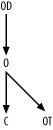
Example 5-1 is a simple query that illustrates all the significant elements of a query diagram.
SELECT D.Department_Name, E.Last_Name, E,First_Name
FROM Employees E, Departments D
WHERE E.Department_Id=D.Department_Id
  AND E.Exempt_Flag='Y'
  AND D.US_Based_Flag='Y';
This query translates to the query diagram in Figure 5-1.
First, I’ll describe the meaning of each of these elements, and then I’ll explain how to produce the diagram, using the SQL as a starting point.
Information Included in Query Diagrams
In mathematical terms, what you see in Figure 5-1 is a directed graph: a collection of
nodes and links, where the links often have arrows indicating their
directionality. The nodes in this diagram are represented by the
letters E and D. Alongside both the nodes and the two ends
of each link, numbers indicate further properties of the nodes and
links. In terms of the query, you can interpret these diagram elements
as follows.
Nodes
Nodes represent tables or table aliases in the
FROM clause—in this case, the
aliases E and D. You can choose to abbreviate table or
alias names as convenient, as long as doing so does not create
confusion.
Links
Links represent joins between tables, where an
arrow on one end of the link means that the join is
guaranteed to be unique on that end of the join. In this case,
Department_ID is the primary (unique) key to the table Departments, so the link includes an arrow
on the end pointing to the D
node. Since Department_ID is not
unique in the Employees table,
the other end of the link does not have an arrow. Following my
convention, always draw links with one arrow with the arrow pointing
downward. Consistency is useful here. When you always draw arrows
pointing downward, it becomes much easier to refer consistently to
master tables as always being located below detail tables. In Chapter 6 and Chapter 7, I describe rules of
thumb for finding optimum execution plans from a query diagram.
Since the rules of thumb treat joins to master tables differently
than joins to detail tables, the rules specifically refer to
downward joins and upward
joins as a shorthand means of distinguishing between the two
types.
Although you might guess that Department_ID is the primary key of
Departments, the SQL does not
explicitly declare which side of each join is a primary key and
which side is a foreign key. You need to check indexes or declared
keys to be certain that Department_ID is guaranteed to be unique
on Departments, so the arrow
combines information about the nature of the database keys and
information about which keys the SQL uses.
Underlined numbers
Underlined numbers next to the nodes represent the fraction of rows in
each table that will satisfy the filter conditions on that table,
where filter conditions are nonjoin conditions in the diagrammed SQL
that refer solely to that table. Figure 5-1 indicates that 10%
of the rows in Employees have
Exempt_Flag='Y' and 50% of the
rows in Departments have US_Based_Flag='Y‘. I call these the
filter ratios.
Frequently, there are no filter conditions at all on one or more of the tables. In that case, use 1.0 for the filter ratio (R), since 100% of the rows meet the (nonexistent) filter conditions on that table. Also, in such cases, I normally leave the filter ratio off the diagram entirely; the number’s absence implies R=1.0 for that table. A filter ratio cannot be greater than 1.0. You can often guess approximate filter ratios from knowledge of what the tables and columns represent (if you have such knowledge). It is best, when you have realistic production data distributions available, to find exact filter ratios by directly querying the data. Treat each filtered table, with just the filter clauses that apply to that table, as a single-table query, and find the selectivity of the filter conditions just as I describe in Chapter 2 under Section 2.6.
During the development phase of an application, you do not always know what filter ratio to expect when the application will run against production volumes. In that case, make your best estimate based on your knowledge of the application, not based on tiny, artificial data volumes on development databases.
Nonunderlined numbers
Nonunderlined numbers next to the two ends of the link represent the average number of rows found in the table on that end of the join per matching row from the other end of the join. I call these the join ratios. The join ratio on the nonunique end of the join is the detail join ratio, while the join on the unique end (with the arrow) is the master join ratio.
Master join ratios are always less than or equal to 1.0, because the unique key ensures against finding multiple masters per detail. In the common case of a detail table with a mandatory foreign key and perfect referential integrity (guaranteeing a matching master row), the master join ratio is exactly 1.0.
Detail join ratios can be any nonnegative number. They can be
less than 1.0, since some master-detail relationships allow zero,
one, or many detail rows, with the one-to-zero case dominating the
statistics. In the example, note that the average Employees row matches (joins to) a row in
Departments 98% of the time,
while the average Departments row
matches (joins to) 20 Employees.
Although you might guess approximate join ratios from knowledge of
what the tables represent, query these values when possible from the
real, full-volume data distributions. As with filter ratios, you
might need to estimate join ratios during the development phase of
an application.
What Query Diagrams Leave Out
As important as what query diagrams include is what they do not include. The following sections describe several things that query diagrams omit, and explain why that is the case.
Select lists
Query diagrams entirely exclude any reference to the
list of columns and expressions that a query selects (everything
between SELECT and FROM, that is). Query performance is
almost entirely determined by which rows in the database you touch
and how you reach them. What you do with those rows, which columns you return,
and which expressions you calculate are almost irrelevant to
performance. The main, but rare, exception to this rule is when you
occasionally select so few columns from a table that it turns out
the database can satisfy the query from data in an index, avoiding
access to the base table altogether. Occasionally, this index-only access can lead to major
savings, but it has little bearing on decisions you make about the
rest of the execution plan. You should decide whether to try
index-only access as a last step in the tuning process and only if
the best execution plan without this strategy turns out to be too
slow.
Ordering and aggregation
The diagram excludes any indication of ordering (ORDER
BY), grouping (GROUP
BY), or post-grouping filtering (HAVING). These operations are almost never
important. The sort step these generally imply is not free, but you
can usually do little to affect its cost, and its cost is usually
not the problem behind a badly performing query.
Table names
Query diagrams usually abstract table names to table aliases. Once you have the necessary table statistics, most other details are immaterial to the tuning problem. For example, it makes no difference which tables a query reads or which physical entities the tables represent. In the end, you must be able to translate the result back to actions on the original SQL and on the database (actions such as creating a new index, for example). However, when you are solving the abstract tuning problem, the more abstract the node names, the better. Analogously, when your objective is to correctly add a series of numbers, it’s no help to worry about whether you are dealing with items in an inventory or humans in a hospital. The more abstractly you view a problem, the clearer it is and the more clearly you notice analogies with similar, past problems that might have dealt with different entities.
Detailed join conditions
The details of join conditions are lost when you abstract joins as simple arrows with a couple of numbers coming from outside of the SQL. As long as you know the statistics of the join, the details of the join columns and how they are compared do not matter.
Absolute table sizes (as opposed to relative sizes)
The diagram does not represent table sizes. However, you can generally infer relative table sizes from the detail join ratio, by the upper end of the link. Given a query diagram, you need to know overall table sizes to estimate overall rows returned and runtime of the query, but it turns out that you do not need this information to estimate relative runtimes of the alternatives and therefore to find the best alternative. This is a helpful result, because you often must tune a query to run well not just on a single database instance, but also on a whole wide range of instances across many customers. Different customers frequently have different absolute table sizes, but the relative sizes of those tables tend not to vary so much, and join and filter ratios tend to vary far less; in fact, they tend to vary little enough that the differences can be ignored.
Tip
In my experience, it is a myth that one of the main advantages of cost-based optimizers is their ability to respond to varying table and index statistics with different plans for the same application’s SQL. This theoretical possibility is cited as an argument against manual tuning of an application’s SQL, since the result might (theoretically) hurt as many customers as it would help, by figuratively tying the optimizer’s hands. On the contrary, I have yet to find a single query that didn’t have an execution plan that worked fine on every data distribution I encountered or was likely to encounter. (These plans were not optimal for every distribution, but they were close enough to optimal so as not to matter.) As a result, careful manual tuning of a product’s SQL need not harm one customer to help another.
Filter condition details
The details of filter conditions are lost when you abstract them to simple numbers. You can choose an optimum path to the data without knowing anything about the details of how, or using which columns, the database excludes rows from a query result. You need only know how effective, numerically, each filter is for the purpose of excluding rows. Once you know that optimum abstract path, you need to return to the detailed conditions, in many cases, to deduce what to change. You can change indexes to enable that optimum path, or you can change the SQL to enable the database to exploit the indexes it already has, but this final step is simple once you know the optimum abstract path.
When Query Diagrams Help the Most
Just as some word problems are too simple to really require abstraction (e.g., “If Johnny has five apples and eats two, how many apples does he have left?”), some queries, like the one in Example 5-1, are so simple that an abstracted representation of the problem might not seem necessary. If all queries were two-way joins, you could manage fine without query diagrams. However, in real-world applications, it is common to join 6 or more tables, and joining 20 or more is not as rare as you might think, especially among the queries you will tune, since these more complex queries are more likely to need manual tuning. (My personal record is a 115-way join, and I routinely tune joins with more than 40 tables.) The more fully normalized your database and the more sophisticated your user interface, the more likely it is that you will have many-way joins. It is a myth that current databases cannot handle 20-way joins, although it is no myth that databases (some more than others) are much more likely to require manual tuning to get decent performance for such complex queries, as compared to simple queries.
Apart from the obvious advantages of stripping away irrelevant detail and focusing attention on just the abstract essentials, query diagrams offer another, more subtle benefit: practice problems are much easier to generate! In this chapter, I begin each problem with realistic SQL, but I cannot use real examples from proprietary applications I have tuned. So, for good examples, I invent an application database design and imagine real business scenarios that might generate each SQL statement. Once I have thoroughly demonstrated the process of reducing a SQL statement to a query diagram, the rest of the book will have problems that start with the query diagrams. Similarly, most of a math text focuses on abstract math, not on word problems. Abstraction yields compact problems and efficient teaching, and abstraction further saves me the bother of inventing hundreds of realistic-sounding word problems that correspond to the mathematical concepts I need to teach. You might not worry much about how much bother this saves me, but it saves you time as well. To better learn SQL tuning, one of the best exercises you can do is to invent SQL tuning problems and solve them. If you start with realistic SQL, you will find this a slow and painful process, but if you just invent problems expressed through query diagrams, you will find you can crank out exercises by the hundreds.
Conceptual Demonstration of Query Diagrams in Use
I have stated without proof that query diagrams abstract all the data needed to answer the most important questions about tuning. To avoid trying your patience and credulity too severely, I will demonstrate a way to use the query diagram in Figure 5-1 to tune its query in detail, especially to find the best join order. It turns out that the best access path, or execution plan, for most multitable queries involves indexed access to the first, driving table, followed by nested loops to the rest of the tables, where those nested loops follow indexes to their join keys, in some optimum join order.
Tip
For small master tables, you sometimes can do slightly better by replacing the nested-loops joins to those small tables with hash joins, but the improvement is usually minor and likely not worth the bother or the robustness risk that comes with a hash join.
However, for many-way joins, the number of possible join orders can easily be in the high millions or billions. Therefore, the single most important result will be a fast method to find the best join order.
Before I demonstrate the complex process of optimizing join
order for a many-way join using a query diagram, let’s just see what
the diagram in Figure 5-1
tells us about comparative costs of the two-way join in the underlying
SQL query, if you were to try both possible join orders. To a
surprisingly good approximation, the cost of all-indexed access, with
nested loops, is proportional to the number of table rows the database
accesses, so I will use rows touched as the proxy for query cost. If
you begin with the detail node E,
you cannot work out an absolute cost without assuming some rowcount for that table. However, the rowcount is
missing from the diagram, so let it be C and
follow the consequences algebraically:
Using an index on the filter for
E, the database must begin by touching 0.1 / C rows in the driving tableE.Following nested loops to master table
D, the master join ratio shows that the database will reach 0.1 / C x 0.98 rows ofD.Adding the results of Steps 1 and 2, the total count of table rows touched is (0.1 x C)+(0.1 x C x 0.98).
The total rowcount the database will reach, then, factoring out C and 0.1 from both terms, is C x (0.1 x (1+0.98)), or 0.198 x C.
Beginning with the other end of the join, let’s still express
the cost in terms of C, so first work out the
size of D in terms of
C. Given the size of D in terms of C, the
cost of the query in terms of C follows:
For every row in
D, the database finds on average 20 rows inE, based on the detail join ratio. However, just 98% of the rows inEeven match rows inD, so the total rowcount C must be 20/0.98 times larger than the rowcount ofD. Conversely, then, the rowcount ofDis C x 0.98/20.Following an index to reach only the filter rows on
Dresults in reaching half these rows for the driving table for this alternative, or C / 0.5 x 0.98/20.Following the join to
E, then, the database reaches 20 times as many rows in that table: 20 x C x 0.5 x 0.98/20, or C x 0.5 x 0.98.Adding the two rowcounts and factoring out the common terms as before, find the total cost: C x (0.5 x 0.98 x ((1/20)+1)), or 0.5145 x C.
The absolute cost is not really the question; the relative cost
is, so you can choose the best plan and, whatever
C is, 0.198 x C will surely
be much lower than 0.5145 x C. The query diagram
has all the information you need to know that the plan driving from
E and joining to D will surely be much faster (about 2.6
times faster) than the plan driving from D and joining to E. If you found these alternatives to be
much closer, you might worry whether the cost estimate based on simple
rowcounts was not quite right, and I will deal with that issue later.
The message here is that the query diagram answers the key questions
that are relevant to optimizing a query; you just need an efficient
way to use query diagrams for complex queries.
Creating Query Diagrams
Now that you see what a query diagram means, here are the steps to create one from an SQL statement, including some steps that will not apply to the particular query shown earlier, but that you will use for later queries:
Begin with an arbitrary choice of table alias in the
FROMclause, and place this in the middle of a blank page. For now, I will refer to this table as the focus table, simply meaning that this table will be the current point from which to add further details to the query diagram. I will choose aliasEas the starting point for the example, just because it is first in the query.Search for join conditions that match up to a single value of the focus table’s primary key. For each such join that you find, draw an arrow pointing down toward the focus table alias from above, labeling the other end of the arrow with the alias at the other end of the join. (You will usually find at most one join into a table from above, for reasons I will discuss later.) When the link represents an outer join, add an arrowhead halfway along the link and point the arrowhead toward the optional table.
In the example, there is no join to the
Employeestable’s primary key, presumed to beEmployee_ID. If you want to be certain thatDepartment_IDis not a poorly named primary key ofEmployees, you can check the table’s declared keys and unique indexes. If you suspect that it might really be unique but that the database designer failed to declare or enforce that uniqueness with either a declared key or index, you can check for uniqueness withSELECT COUNT(*),COUNT(DISTINCT Department_ID) FROM Employees;. However, you might be surprised how rarely there is any doubt about where the unique end of the join lies, just from column and table naming. You can generally get by just fine with intelligent guesses, revisiting those guesses only if the answer you come up with performs worse than you expect or require.Search for join conditions that go from a foreign key in the focus table to a primary key in another table, and draw arrows for those joins pointing down from the focus table, with aliases for the joined-to tables on the lower end of each arrow. When a link represents an outer join, add an arrowhead pointing to the optional table halfway along the link.
Shift focus to another, previously unvisited node in the diagram and repeat Steps 2 and 3 until you have nodes that represent every alias in the
FROMclause and arrows that represent every join. (For example, I represent a multipart join as a single arrow from a multipart foreign key to a multipart primary key.) Usually, you will find just a single arrow pointing down into a node, so you will normally search for fresh downward-pointing joins from nodes already on the lower, arrow end of a join. This usually leads to an upside-down tree structure, descending from a single detail table at the top.After completing all the nodes and links, fill in the numbers for filter ratios and join ratios based, if possible, on production-application table statistics. If you don’t have production data, then estimate as best you can. It is not necessary to add join ratios alongside links that represent outer joins. You almost always find that the optional table in an outer join (on the
(+)side of the join, in old Oracle notation, or following theLEFT OUTERkeywords in the newer style) has no filter condition, leaving the filter ratio equal to 1.0, which you denote by omitting it from the diagram.Place an asterisk next to the filter ratio for any filter that is guaranteed to return at most a single row. This is not a function just of the ratio and the rowcount of the table, since a condition might return an average of a single row without guaranteeing a maximum of a single row. To guarantee at most a single row, you should have a unique index or a well-understood application constraint that creates a true guarantee.
If you have available production data, it is the ideal source of
filter and join ratios. For Example 5-1, you would perform
the following queries (Q1 through
Q5) to determine these ratios
rigorously:
Q1: SELECT COUNT(*) A1 FROM EmployeesWHERE Exempt_Flag='Y';A1: 1,000Q2: SELECT COUNT(*) A2 FROM Employees;A2: 10,000Q3: SELECT COUNT(*) A3 FROM DepartmentsWHERE US_Based_Flag='Y';A3: 245Q4: SELECT COUNT(*) A4 FROM Departments;A4: 490Q5: SELECT COUNT(*) A5 FROM Employees E, Departments DWHERE E.Department_ID=D.Department_ID;A5: 9,800
With A1 through A5 representing the results these queries
return, respectively, do the following math:
To find the filter ratio for the
Enode, findA1/A2.To find the filter ratio for the
Dnode, findA3/A4.To find the detail join ratio, find
A5/A4, the rowcount of the unfiltered join divided by the master-table rowcount.To find the master join ratio, find
A5/A2, the rowcount of the unfiltered join divided by the detail-table rowcount.
For example, the results from queries Q1 through Q5—1,000, 10,000, 245, 490, and 9,800,
respectively—would yield precisely the filter and join ratios in Figure 5-1, and if you
multiplied all of these query results by the same constant, you would
still get the same ratios.
A More Complex Example
Now I illustrate the diagramming process for a query that is large enough to get interesting. I will diagram the query in Example 5-2, which expresses outer joins in the older Oracle style (try diagramming this query yourself first, if you feel ambitious).
SELECT C.Phone_Number, C.Honorific, C.First_Name, C.Last_Name,
C.Suffix, C.Address_ID, A.Address_ID, A.Street_Address_Line1,
A.Street_Address_Line2, A.City_Name, A.State_Abbreviation,
A.ZIP_Code, OD.Deferred_Shipment_Date, OD.Item_Count,
ODT.Text, OT.Text, P.Product_Description, S.Shipment_Date
FROM Orders O, Order_Details OD, Products P, Customers C, Shipments S,
Addresses A, Code_Translations ODT, Code_Translations OT
WHERE UPPER(C.Last_Name) LIKE :Last_Name||'%'
AND UPPER(C.First_Name) LIKE :First_Name||'%'
AND OD.Order_ID = O.Order_ID
AND O.Customer_ID = C.Customer_ID
AND OD.Product_ID = P.Product_ID(+)
AND OD.Shipment_ID = S.Shipment_ID(+)
AND S.Address_ID = A.Address_ID(+)
AND O.Status_Code = OT.Code
AND OT.Code_Type = 'ORDER_STATUS'
AND OD.Status_Code = ODT.Code
AND ODT.Code_Type = 'ORDER_DETAIL_STATUS'
AND O.Order_Date > :Now - 366
ORDER BY C.Customer_ID, O.Order_ID DESC, S.Shipment_ID, OD.Order_Detail_ID;As before, ignore all parts of the query except the FROM and WHERE clauses. All tables have intuitively
named primary keys except Code_Translations, which has a two-part
primary key: (Code_Type,
Code).
Note that when you find a single-table equality condition on
part of a primary key, such as in this query on Code_Translations, consider that condition
to be part of the join, not a filter condition.
When you treat a single-table condition as part of a join, you are
normally looking at a physical table that has two or more logical
subtables. I call these apples-and-oranges
tables: tables that hold somewhat different, but related
entity types within the same physical table. For purposes of
optimizing a query on these subtables, you are really interested only
in the statistics for the specific subtable the query references.
Therefore, qualify all queries for table statistics with the added
condition that specifies the subtable of interest, including the query
for overall rowcount (SELECT COUNT(*)
FROM <Table>), which
becomes, for this example, a subtable rowcount (SELECT COUNT(*) FROM Code_Translations WHERE
Code_Type='ORDER_STATUS').
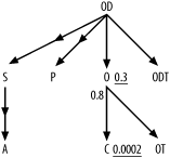
If you wish to complete the skeleton of the query diagram yourself, as an exercise, follow the steps for creating a query diagram shown earlier up to Step 4, and skip ahead to Figure 5-4 to see if you got it right.
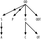
Diagram joins to the first focus
For Step 1, place the alias O, arbitrarily, in the center of the
diagram. For Step 2, search for any join to O’s primary key, O.Order_ID. You should find the join from
OD, which is represented in Figure 5-2 as a downward
arrow from OD to O. To help remember that you have
diagrammed this join, cross it out in the query.
Diagram joins from the first focus
Moving on to Step 3, search for other joins (not to Order_ID, but to foreign keys) to Orders, and add these as arrows pointing
down from O to C and to OT, since these joins reach Customers and Code_Translations on their primary keys.
At this point, the diagram matches Figure 5-3.
Change focus and repeat
This completes all joins that originate from alias O. To remember which part is complete,
cross out the O in the FROM clause, and cross out the joins
already diagrammed with links. Step 4 indicates you should repeat
Steps 2 and 3 with a new focus, but it does not go into details
about how to choose that focus. If you try every node as the focus
once, you will complete the diagram correctly regardless of order,
but you can save time with a couple of rules of thumb:
Try to complete upper parts of the diagram first. Since you have not yet tried the top node
ODas a focus, start there.Use undiagrammed joins to find a new focus that has at least some work remaining. Checking the list of joins that have not yet been crossed out would lead to the following list of potential candidates:
OD,P,S,A, andODT. However, out of this list, onlyODis now on the diagram, so it is the only focus now available to extend the diagram. If you happened to notice that there are no further joins toCandOT, you could cross them out in theFROMclause as requiring no further work.
By following these rules of thumb you can complete the diagram
faster. If at any stage you find the diagram getting crowded, you
can redraw what you have to spread things out better. The spatial
arrangement of the nodes is only for convenience; it carries no
meaning beyond the meaning conveyed by the arrows. For example, I
have drawn C to the left of
OT, but you could switch these if
it helps make the rest of the diagram fit the page.
Tip
The illustrators at O’Reilly have worked hard to make my example diagrams look nice, but you don’t have to. In most cases, no one will see your diagrams except you, and you will probably find your own diagrams sufficiently clear with little bother about their appearance.
You find no joins to the primary key of Order_Details (to OD.Order_Detail_ID, that is), so all links
to OD point downward to P, S,
and ODT, which all join to
OD with their primary keys. Since
S and P are optional tables in outer joins, add
downward-pointing arrowheads midway down these links. Cross out the
joins from OD that these three
new links represent. This leaves just one join left, an outer join
from S to the primary key of
A. Therefore, shift focus one
last time to S and add one last
arrow pointing downward to A,
with a midpoint arrowhead indicating this outer join. Cross
out the last join and you need not shift focus again, because all
joins and all aliases are on the diagram.
Tip
You should quickly confirm that no alias is orphaned (i.e., has no join condition at all linking it to the rest of the diagram). This occasionally happens, most often unintentionally, when the query includes a Cartesian join.
At this stage, if you’ve been following along, your join diagram should match the connectivity shown in Figure 5-4, although the spatial arrangement is immaterial. I call this the query skeleton or join skeleton; once you complete it, you need only fill in the numbers to represent relevant data distributions that come from the database, as in Step 5 of the diagramming process.
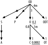
Compute filter and join ratios
There are no filter conditions on the optional tables
in the outer joins, so you do not need statistics regarding those
tables and joins. Also, recall that the apparent filter conditions
OT.Code_Type = 'ORDER_STATUS' and ODT.Code_Type = 'ORDER_DETAIL_STATUS' are part of the joins
to their respective tables, not true filter conditions, since they
are part of the join keys to reach those tables. That leaves only
the filter conditions on customer name and order date as true filter
conditions. If you wish to practice the method for finding the join
and filter ratios for the query diagram, try writing the queries to
work out those numbers and the formulae for calculating the ratios
before looking further ahead.
The selectivity of the conditions on first and last names
depends on the lengths of the matching patterns. Work out an
estimated selectivity, assuming that :Last_Name and :First_Name typically are bound to the
first three letters of each name and that the end users search on
common three-letter strings (as found in actual customer names)
proportionally more often than uncommon strings. Since this is an
Oracle example, use Oracle’s expression SUBSTR(Char_Col, 1, 3) for an expression
that returns the first three characters of each of these character
columns.
Recall that for the apples-and-oranges table Code_Translations, you should gather
statistics for specific types only, just as if each type was in its
own, separate physical table. In other words, if your query uses
order status codes in some join conditions, then query Code_Translations not for the total number
of rows in that table, but rather for the number of order status
rows. Only table rows for the types mentioned in the query turn out
to significantly influence query costs. You may end up querying the
same table twice, but for different subsets of the table. Example 5-3 queries Code_Translations once to count order
status codes and again to count order detail status codes.
The queries in Example 5-3 yield all the data you need for the join and filter ratios.
Q1: SELECT SUM(COUNT(*)*COUNT(*))/(SUM(COUNT(*))*SUM(COUNT(*))) A1FROM CustomersGROUP BY UPPER(SUBSTR(First_Name, 1, 3)), UPPER(SUBSTR(Last_Name, 1, 3));A1: 0.0002Q2: SELECT COUNT(*) A2 FROM Customers;A2: 5,000,000Q3: SELECT COUNT(*) A3 FROM OrdersWHERE Order_Date > SYSDATE - 366;A3: 1,200,000Q4: SELECT COUNT(*) A4 FROM Orders;A4: 4,000,000Q5: SELECT COUNT(*) A5 FROM Orders O, Customers CWHERE O.Customer_ID = C.Customer_ID;A5: 4,000,000Q6: SELECT COUNT(*) A6 FROM Order_Details;A6: 12,000,000Q7: SELECT COUNT(*) A7 FROM Orders O, Order_Details ODWHERE OD.Order_ID = O.Order_ID;A7: 12,000,000Q8: SELECT COUNT(*) A8 FROM Code_TranslationsWHERE Code_Type = 'ORDER_STATUS';A8: 4Q9: SELECT COUNT(*) A9 FROM Orders O, Code_Translations OTWHERE O.Status_Code = OT.CodeAND Code_Type = 'ORDER_STATUS';A9: 4,000,000Q10: SELECT COUNT(*) A10 FROM Code_TranslationsWHERE Code_Type = 'ORDER_DETAIL_STATUS';A10: 3Q11: SELECT COUNT(*) A11 FROM Order_Details OD, Code_Translations ODTWHERE OD.Status_Code = ODT.CodeAND Code_Type = 'ORDER_DETAIL_STATUS';A11: 12,000,000
Beginning with filter ratios, get the weighted-average filter
ratio for the conditions on Customers' first and last name directly
from A1. The result of that query
is 0.0002. Find the filter ratio on Orders from A3/A4,
which comes out to 0.3. Since no other alias has any filters, the
filter ratios on the others are 1.0, which you imply just by leaving
filter ratios off the query diagram for the other nodes.
Find the detail join ratios, to place alongside the upper end
of each inner join arrow, by dividing the count on the join of the
two tables by the count on the lower table (the master table of that
master-detail relationship). The ratios for the upper ends of the
joins from OD to O and ODT are 3 (A7/A4) and 4,000,000 (A11/A10), respectively.
Tip
To fit join ratios on the diagram, I will abbreviate millions as m and thousands as k, so I will diagram the last result as 4m.
The ratios for the upper ends of the joins from O to C
and OT are 0.8 (from A5/A2)
and 1,000,000 (or 1m, from A9/A8),
respectively.
Find the master join ratios for the lower ends of each
inner-join arrow, by dividing the count for the join by the upper
table count. When you have mandatory foreign keys and referential
integrity (foreign keys that do not fail to point to existing
primary-key values), you find master join ratios equal to exactly
1.0, as in every case in this example, from A7/A6,
A11/A6, A5/A4,
and A9/A4.
Check for any unique filter conditions that you would annotate with an asterisk (Step 6). In the case of this example, there are no such conditions.
Then, place all of these numbers onto the query diagram, as shown in Figure 5-5.
Shortcuts
Although the full process of completing a detailed, complete query diagram for a many-way join looks and is time-consuming, you can employ many shortcuts that usually reduce the process to a few minutes or even less:
You can usually guess from the names which columns are the primary keys.
You can usually ignore ratios for the outer joins and the optional tables they reach. Often, you can leave outer joins off the diagram altogether, at least for a preliminary solution that shows how much room for improvement the query has.
The master join ratio (on the primary-key end of a join) is almost always exactly 1.0, unless the foreign key is optional. Unless you have reason to suspect that the foreign key is frequently null or frequently points to no-longer-existing primary-key values, just leave it off, implying a value of 1.0. The master join ratio is never greater than 1.0.
Some databases implement constraints that rigorously guarantee referential integrity. Even without such constraints, well-built applications maintain referential integrity, or at least near-integrity, in their tables. If you guarantee, or at least assume, referential integrity, you can assume that nonnull foreign keys always point to valid primary keys. In this case, you do not need to run the (comparatively slow) query for joined-table counts to find the join factors. Instead, you just need the percentage of rows that have a null foreign key and the two table counts. To compute those, begin by executing SQL similar to this:
SELECT COUNT(*) D, COUNT(
<Foreign_Key_Column>) F FROM<Detail_Table>; SELECT COUNT(*) M FROM<Master_Table>;Letting
Dbe the first count from the first query,Fbe the second count from the same query, andMbe the count from the second query, the master join ratio is justF/D, while the detail join ratio isF/M.Join ratios rarely matter; usually, you can just guess. The detail join ratio matters most in the unusual case when it is much less than 1.0, and it matters somewhat whether the detail join factor is close to 1.0 or much larger. You can usually guess closely enough to get in the right ballpark.
Informed guesses for join factors are sometimes best! Even if your current data shows surprising statistics for a specific master-detail relationship, you might not want to depend on those statistics for manual query tuning, since they might change with time or might not apply to other database instances that will execute the same SQL. (This last issue is especially true if you are tuning for a shared application product.)
If you tune many queries from the same application, reuse join-ratio data as you encounter the same joins again and again.
Filter ratios matter the most but usually vary by orders of magnitude, and, when filter ratios are not close, order-of-magnitude guesses suffice. You almost never need more precision than the first nonzero digit (one significant figure, if you remember the term from high school science) to tune a query well for any of the ratios, so round the numbers you show. (For example, 0.043 rounds to 0.04 with one significant figure, and 472 rounds to 500.)
Just as for join ratios, informed guesses for filter ratios are sometimes best. An informed guess will likely yield a result that works well across a range of customers and over a long time. Overdependence on measured values might lead to optimizations that are not robust between application instances or over time.
The key value of diagramming is its effect on your understanding of the tuning problem. With practice, you can often identify the best plan in your head, without physically drawing the query diagram at all!
Interpreting Query Diagrams
Before I go further, take some time just to understand the content of the query diagram, so that you see more than just a confusing, abstract picture when you look at one. Given a few rules of thumb, interpreting a query diagram is simple. You might already be familiar with entity-relationship diagrams. There is a helpful, straightforward mapping between entity-relationship diagrams and the skeletons of query diagrams. Figure 5-6 shows the query skeleton for Example 5-1, alongside the corresponding subset of the entity-relationship diagram.
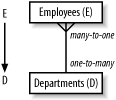
The entity-relationship diagram encodes the database design, which is independent of the query. Therefore, the query skeleton that encodes the same many-to-one relationship (with the arrow pointing to the one) also comes from the database design, not from the query. The query skeleton simply designates which subset of the database design is immediately relevant, so you restrict attention to just that subset encoded in the query skeleton. When the same table appears under multiple aliases, the query diagram also, in a sense, explodes the entity-relationship diagram, showing multiple joins to the same table as if they were joins to clones of that table; this clarifies the tuning problem these multiple joins involve.
With join ratios on the query skeleton, you encode quantitative data about the actual data, in place of the qualitative many indications in the entity-relationship diagram. With the join ratios, you say, on average, how many for many-to-one relationships (with the detail join ratio) and how-often-zero with the master join ratio, when you find many-to-zero-or-one relationships. This too is a function of the underlying data, though not of the database design, and it is independent of the query. These join ratios can vary across multiple database instances that run the same application with different detailed data, but within an instance, the join ratios are fixed across all queries that perform the same joins.
Tip
It is fortunate and true that the optimum plan is usually quite insensitive to the join ratios, because this almost always enables you to tune a query well for all customers of an application at once.
Only when you add filter ratios do you really pick up data that is specific to a given query (combined with data-distribution data), because filter conditions come from the query, not from the underlying data. This data shows the relative size of each subset of each table the query requires.
Query diagrams for correctly written queries (as I will show later) almost always have a single detail table at the top of the tree, with arrows pointing down to master (or lookup) tables below and further arrows (potentially) branching down from those. When you find this normal form for a query diagram, the query turns out to have a simple, natural interpretation:
A query is a question asked about the detail entities that map to that top detail table, with one or more joins to master tables below to find further data about those entities stored elsewhere for correct normalization.
For example, a query joining Employees and Departments is really just a question about
employees, where the database must go to the Departments table for employee information,
like Department_Name, that you store
in the Departments table for correct
normalization.
Tip
Yes, I know, to a database designer, Department_Name is a property of the
department, not of the employee, but I am speaking of the business
question, not the formal database. In normal business semantics, you
would certainly think of the department name (like other Departments properties) as a property of the
employees, inherited from Departments.
Questions about business entities that are important enough to have tables are natural in a business application, and these questions frequently require several levels of joins to find inherited data stored in master tables. Questions about strange, unnatural combinations of entities are not natural to a business, and when you examine query diagrams that fail to match the normal form, you will frequently find that these return useless results, results other than what the application requires, in at least some corner cases.
Following are the rules for query diagrams that match the normal form. The queries behind these normal-form diagrams are easy to interpret as sensible business questions about a single set of entities that map to the top table:
The query maps to one tree.
The tree has one root, exactly one table with no join to its primary key. All nodes other than the root node have a single downward-pointing arrow linking them to a detail node above, but any node can be at the top end of any number of downward-pointing arrows.
All joins have downward-pointing arrows (joins that are unique on at least one end).
Outer joins are unfiltered, pointing down, with only outer joins below outer joins.
The question that the query answers is basically a question about the entity represented at the top (root) of the tree (or about aggregations of that entity).
The other tables just provide reference data stored elsewhere for normalization.
Simplified Query Diagrams
You will see that much of the detail on a full query diagram is unnecessary for all but the rarest problems. When you focus on the essential elements, you usually need only the skeleton of the diagram and the approximate filter ratios. You occasionally need join ratios, but usually only when either the detail join ratio is less than about 1.5 or the master join ratio is less than 0.9. Unless you have reason to suspect these uncommon values for the master-detail relationship, you can save yourself the trouble of even measuring these values. This, in turn, means that less data is required to produce the simplified join diagrams. You won’t need table rowcounts for tables without filters. In practice, many-way joins usually have filters only on at most 3-5 tables, so this makes even the most complex query easy to diagram, without requiring many statistics-gathering queries.
Stripping away the usually unnecessary detail that I’ve just described, you can simplify Figure 5-5 to Figure 5-7.
Note that the detail join ratio from C to O in
Figure 5-5 is less than
1.5, so continue to show it even in the simplified diagram in Figure 5-7.
When it comes to filters, even approximate numbers are
often unnecessary if you know which filter is best and if the other
competing filters do not share the same parent detail node. In this
case, you can simply indicate the best filter with a capital F and lesser filters
with a lowercase f. Further simplify
Figure 5-7 to Figure 5-8.
Note that the detail join ratio from C to O is
less than 1.5, so continue to show it even in the fully simplified
diagram in Figure
5-8.
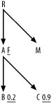
Although I’ve removed the filter ratios from Figure 5-8, you should continue
to place an asterisk next to any unique filters (filters guaranteed to
return no more than one row). You should also indicate actual filter
values for lesser filters that share the same parent detail node. For
example, if you have lesser filters on nodes B and C in
Figure 5-9, show their
actual filter ratios, as illustrated, since they share the parent detail
node A.
In practice, you can usually start with a simplified query diagram and add detail only as necessary. If the execution plan (which I explain how to derive in Chapter 6) you find from the simplified problem is so fast that further improvement is pointless, you are finished. (You might be surprised how often this happens.) For example, a batch query that runs in just a few seconds a few times per day is fast enough that further improvement is pointless. Likewise, you need not further tune any online query that runs in under 100 milliseconds that the end user community, as a whole, runs fewer than 1,000 times per day. If after this first round of tuning you think further improvement would still be worth the trouble, you can quickly check the feasibility of more improvement by checking whether you missed important join ratios. The fastest way to do this is to ask whether the single best filter accounts for almost all of the overall reduction in rowcount versus a wholly unfiltered query of just the most detailed table. Assuming that the join diagram maps out as an upside-down tree, the default expectation is that the whole query, without filters, would return the same number of rows as the most detailed table at the root of the join tree (at the top, that is).
With filters, you expect that each filter reduces that rowcount returned from the most detailed table (at the root of the join tree) by the filter ratio. If the best filter ratio times the rowcount of the most detailed table accounts for close to the number of rows that the whole query returns, you know you have not missed any important filter, and the simplified diagram suffices. On the other hand, if the most detailed table’s rowcount times the best filter (or what you thought was the best filter!) would yield far more rows than the actual query yields, then you might have missed an important source of row reduction and you should gather more statistics. If the product of all filter ratios (calculated or guessed) times the rowcount of the most detailed table does not come close to the whole-query rowcount, you should suspect that you need further information. In particular, you might have hidden join filters, which are join ratios that unexpectedly turn out to be much less than 1.0; recognizing these and using them for a better plan can yield important further gains.
Exercises (See Section A.1 for the solution to each exercise.)
SELECT ...
FROM Customers C, ZIP_Codes Z, ZIP_Demographics D, Regions R
WHERE C.ZIP_Code=Z.ZIP_Code
  AND Z.Demographic_ID=D.Demographic_ID
  AND Z.Region_ID=R.Region_ID
  AND C.Active_Flag='Y'
  AND C.Profiled_Flag='N'
  AND R.Name='SOUTHWEST'
  AND D.Name IN ('YUPPIE', 'OLDMONEY'),
Make the usual assumptions about primary-key names, except that the primary key of
ZIP_Codesis simplyZIP_Code, and note that theNamecolumns of bothREGIONSandZIP_Demographicsare also uniquely indexed. You have 5,000,000 rows inCustomers, 250,000 rows inZip_Codes, 20 rows inZIP_Demographics, and 5 rows inRegions. Assume all foreign keys are never null and always point to valid primary keys. The following query returns 2,000,000 rows:SELECT COUNT(*) FROM Customers C WHERE Active_Flag='Y' AND Profiled_Flag='N';
Diagram the following query:
SELECT ...
FROM Regions R, Zip_Codes Z, Customers C, Customer_Mailings CM,
     Mailings M, Catalogs Cat, Brands B
WHERE R.Region_ID(+)=Z.Region_ID
  AND Z.ZIP_Code(+)=C.ZIP_Code
  AND C.Customer_ID=CM.Customer_ID
  AND CM.Mailing_ID=M.Mailing_ID
  AND M.Catalog_ID=Cat.Catalog_ID
  AND Cat.Brand_ID=B.Brand_ID
  AND B.Name='OhSoGreen'
  AND M.Mailing_Date >= SYSDATE-365
GROUP BY... ORDER BY ...
Start with the same assumptions and statistics as in Exercise 1.
Customer_Mailingscontains 30,000,000 rows.Mailingscontains 40,000 rows.Catalogscontains 200 rows.Brandscontains 12 rows and has an alternate unique key onName. The following query returns 16,000 rows:SELECT COUNT(*) FROM Mailings M WHERE Mailing_Date >= SYSDATE-365;
Diagram the following query:
SELECT ...
FROM Code_Translations SPCT, Code_Translations TRCT, Code_Translations CTCT,
     Products P, Product_Lines PL, Inventory_Values IV, Brands B,
     Product_Locations Loc, Warehouses W, Regions R,
     Inventory_Taxing_Entities ITx, Inventory_Tax_Rates ITxR, Consignees C
WHERE W.Region_ID=R.Region_ID
  AND Loc.Warehouse_ID=W.Warehouse_ID
  AND W.Inventory_Taxing_Entity_ID=ITx.Inventory_Taxing_Entity_ID
  AND ITx.Inventory_Taxing_Entity_ID= ITxR.Inventory_Taxing_Entity_ID
  AND ITxR.Effective_Start_Date <= SYSDATE
  AND ITxR.Effective_End_Date > SYSDATE
  AND ITxR.Rate>0
  AND P.Product_ID=Loc.Product_ID
  AND Loc.Quantity>0
  AND P.Product_Line_ID=PL.Product_Line_ID(+)
  AND P.Product_ID=IV.Product_ID
  AND P.Taxable_Inventory_Flag='Y'
  AND P.Consignee_ID=C.Consignee_ID(+)
  AND P.Strategic_Product_Code=SPCT.Code
  AND SPCT.Code_Type='STRATEGIC_PRODUCT'
  AND P.Turnover_Rate_Code=TRCT.Code
  AND TRCT.Code_Type='TURNOVER_RATE'
  AND P.Consignment_Type_Code=CTCT.CODE
  AND CTCT.Code_Type='CONSIGNMENT_TYPE'
  AND IV.Effective_Start_Date <= SYSDATE
  AND IV.Effective_End_Date > SYSDATE
  AND IV.Unit_Value>0
  AND P.Brand_ID=B.Brand_ID
  AND B.Name='2Much$'
  AND ITX.Tax_Day_Of_Year='DEC31'
GROUP BY... ORDER BY ...
Start with the same assumptions and statistics as in Exercises 1 and 2, except that
W.Inventory_Taxing_Entity_IDpoints to a valid taxing entity only when it is not null, which is just 5% of the time. The counts for table rows are as follows:Products=8,500Product_Lines=120Inventory_Values=34,000Brands=12Product_Locations=176,000Warehouses=80Regions=5Inventory_Taxing_Entities=4Inventory_Tax_Rates=7Consignees=14Code_Translationshas a two-part primary key:Code_Type, Code.Inventory_ValuesandInventory_Tax_Rateshave a time-dependent primary key consisting of an ID and an effective date range, such that any given date falls in a single date range for any value of the key ID. Specifically, the join conditions to each of these tables are guaranteed to be unique by theEffective_Start_DateandEffective_End_Dateconditions, which are part of the joins, not separate filters. (Unfortunately, there is no convenient way to enforce that uniqueness through an index; it is a condition created by the application.) The following queries return the rowcounts shown in the lines that follow each query:Q1: SELECT COUNT(*) A1 FROM Inventory_Taxing_Entities ITxWHERE ITx.Tax_Day_Of_Year='DEC31'A1: 2Q2: SELECT COUNT(*) A2 FROM Inventory_Values IVWHERE IV.Unit_Value>0AND IV.Effective_Start_Date <= SYSDATEAND IV.Effective_End_Date > SYSDATEA2: 7,400Q3: SELECT COUNT(*) A3 FROM Products PWHERE P.Taxable_Inventory_Flag='Y'A3: 8,300Q4: SELECT COUNT(*) A4 FROM Product_Locations LocWHERE Loc.Quantity>0A4: 123,000Q5: SELECT COUNT(*) A5 FROM Inventory_Tax_Rates ITxRWHERE ITxR.RATE>0AND ITxR.Effective_Start_Date <= SYSDATEAND ITxR.Effective_End_Date > SYSDATEA5: 4Q6: SELECT COUNT(*) A6 FROM Inventory_Values IVWHERE IV.Effective_Start_Date <= SYSDATEAND IV.Effective_End_Date > SYSDATEA6: 8,500Q7: SELECT COUNT(*) A7 FROM INVENTORY_TAX_RATES ITxRWHERE ITxR.Effective_Start_Date <= SYSDATEAND ITxR.Effective_End_Date > SYSDATEA7: 4Q8: SELECT COUNT(*) A8 FROM Code_Translations SPCTWHERE Code_Type = 'STRATEGIC_PRODUCT'A8: 3Q9: SELECT COUNT(*) A9 FROM Code_Translations TRCTWHERE Code_Type = 'TURNOVER_RATE'A9: 2Q10: SELECT COUNT(*) A10 FROM CTCTWHERE Code_Type = 'CONSIGNMENT_TYPE'A10: 3Fully simplify the query diagram for Exercise 1. Try starting from the queries and the query statistics, rather than from the full query diagrams. Then, compare your result with what you get when you start from the full query diagrams that you already did.
Fully simplify the query diagram for Exercise 2, following the guidelines in Exercise 4.
Fully simplify the query diagram for Exercise 3, following the guidelines in Exercise 4.