Groupings can be added to summary, matrix, and joined reports to group together sections of report data. For example, you might want to group accounts by the number of employees that the account has.
To add a summary field, follow the steps as shown:
- Drag a field from within the Fields pane.
- Drag the field into the grouping section of the Preview pane.
- Wait for the loading dialog to complete.
- See what the field is showing in the grouping section.

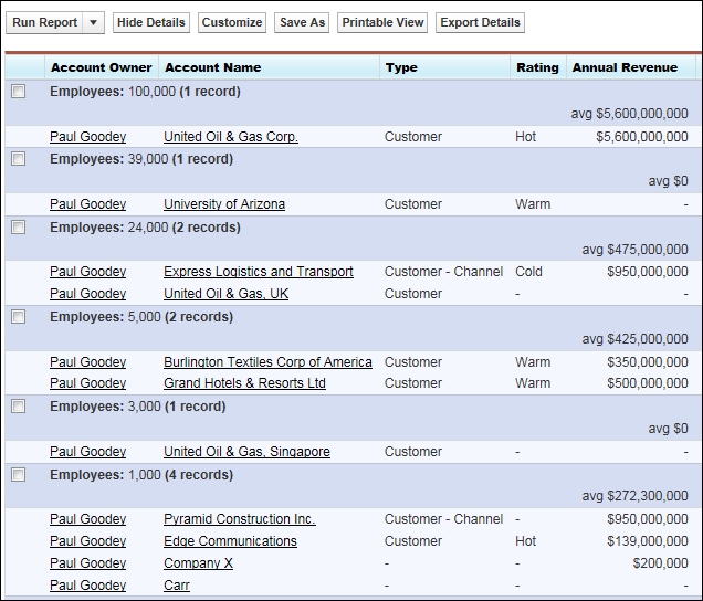
This will produce a report showing the grouped sections, as shown in the following screenshot:

Summary reports can have up to three grouping levels.
Matrix reports can have two rows and two column groupings. You cannot use the same field for both the row and column groupings.
Joined reports can have up to three grouping levels.
A summary field is the SUM, AVERAGE, MIN, or MAX for a number or a currency field. Summary fields are displayed at all grouping levels, including the grand total level for reports that have been created using the summary and matrix report formats.
To add a summary field, click on a column drop-down menu section (shown in the following screenshot) for a field in the report and choose Summarize this Field. You can also use this method to add a grouping by choosing Group by this Field, as shown here:
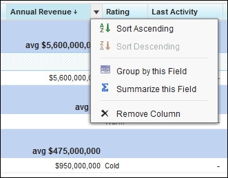
Clicking on the Summarize this Field button gives you the following options:

This will produce a report result, as shown in the following screenshot:
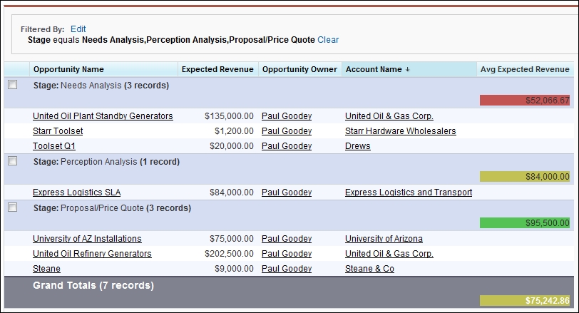
Conditional highlighting is a very powerful way to show whether the values in reports are within acceptable limits at a glance. By setting up conditional highlighting, you can specify different colors for different ranges of values in your reports. It is relatively easy to set up, and it offers great visual benefits, yet it is a feature that seems to be underused by users within Salesforce CRM.
To enable conditional highlighting, your report must contain at least one summary field or custom summary formula.
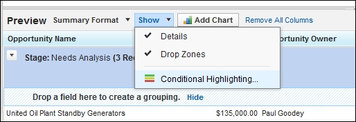
To set up conditional highlighting, click on Show and then click on Conditional Highlighting, as shown from within the Preview pane on the report builder page:
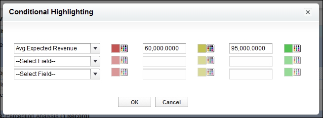
You then have the option to set colors according to whether the value falls below a low breakpoint threshold, above a high breakpoint threshold, or a value that sits between these range of values. The following table helps clarify the thresholds and the colors that will be seen, given the settings shown in the following screenshot:
|
The color to show data that is below the |
The threshold value between the In this example, this is |
The color to show data that is between the |
The threshold value between the In this example, this is |
The color to show data that is above the |
|
In this example, this is |
Values that are exactly the same as the |
In this example, this is |
Values that are exactly the same as the |
In this example, this is |
The settings are shown in the following screenshot:
When running the report, the result appears as shown in the following screenshot: