
Dashboards are visual information snapshots that are generated from the data in associated reports and are presented as graphical elements. These graphical elements are known as dashboard components, of which there are these five types: charts, gauges, tables, metrics, and Visualforce pages.
Dashboards can have up to 20 components, and you can control users' access to dashboards by storing them in folders with appropriate permissions, where folders can be public, hidden, or restricted to groups or roles.
Dashboards can be further configured to run with the concept of a running user, which means that the named user's security settings determine what data is to be displayed. Here, all dashboard viewers see data according to the security settings of the user who has been set as the running user irrespective of the dashboard viewer's own personal security settings.
A more flexible and dynamic approach, however, allows you to set the running user to be the logged-in user so that each user is presented with the dashboard according to their own data access level. This is known as dynamic dashboards.
In Salesforce CRM, the following dashboard component types are available:
- Horizontal Bar Chart
- Vertical Bar Chart
- Line Chart
- Pie Chart
- Donut Chart
- Funnel Chart
- Scatter Chart
- Gauge
- Metric
- Table
The logos to access these dashboard component types are shown in the following dashboard:
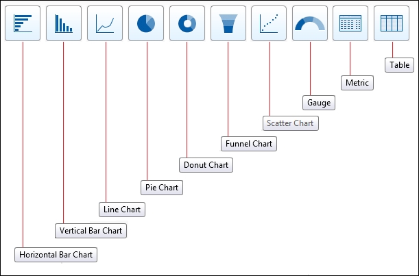
Chart component types can be used to show data graphically, where this variety of chart types can be selected: horizontal and vertical bar charts, line charts, pie, donut, funnel, and scatter charts.
Before creating dashboards, you need to have pre-prepared source reports containing the data you wish to display.
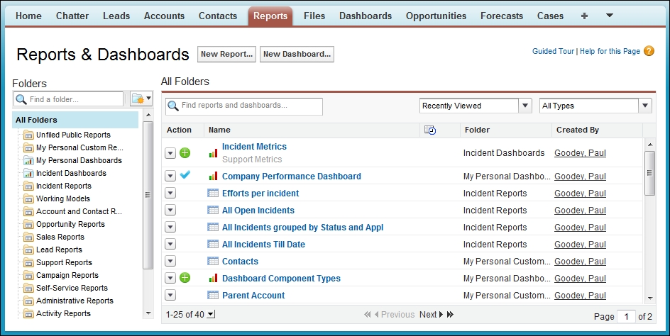
To create a dashboard, click on the Reports tab. This then presents the common reports and dashboards' main page with the Reports & Dashboards heading. On this page, click on the New Dashboard... button, as shown in the following screenshot:
A dynamic dashboard runs using the security settings of the user viewing the dashboard. Each user sees the dashboard according to his or her own access level. This approach helps you share one common set of dashboard components to users with different levels of access. A single dynamic dashboard can display a standard set of metrics across all levels of your organization.
Before setting up dynamic dashboards, you should create folders that are accessible to all dashboard viewers, in which you can store dynamic dashboards and corresponding component source reports.
To create dynamic dashboards, follow the steps given here:
- From the Dashboards tab, create a new dashboard by following the steps discussed earlier in this chapter.
- Click on the drop-down arrow button to the right of the View dashboard as field option.
- Select the Run as logged-in user option
- Optionally, check the Let authorized users change running user checkbox to enable those with permission to change the running user on the dashboard view page.
- Click on OK.
- Finally, click on Save on the main dashboard.
The Salesforce dashboard builder is a drag-and-drop interface that creates and modifies dashboards. To customize an existing dashboard, display it and then click on Edit. The dashboard builder main page presents options to set the properties for the dashboard and also change how the dashboard is viewed by selecting the appropriate running user option.
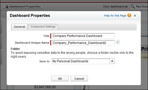
Clicking on Dashboard Properties allows you to set the title, a unique name, and the dashboard folder.
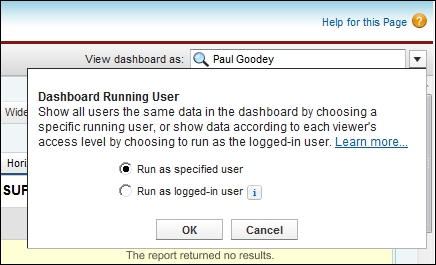
To view or set the running user for the dashboard, choose from the View dashboard as: option located on the top-right section of the page.
You can add a description to the dashboard by clicking on the Click to enter a dashboard description text at the top of the dashboard.
Within the main dashboard's editing page, you are able to add the specific dashboard components:
- Click on + to add a new column. Dashboards can have up to three columns.
- Click on x on a column to delete it. Before removing a column, move the dashboard components to another column if you want them to remain visible.
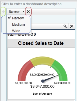
- To set the width of the column, you can select either Narrow, Medium, or Wide in the column width drop-down list, as shown next:
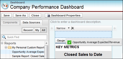
You can add components by dragging a component type onto a column and then dropping a data source (which is a source report) or a Visualforce page onto it.
You can also drop the data source first and then drop a component type onto it. To change the type or source after you have created it, you can drop a different one onto the component. Each component must have a type and a data source.
The following screenshot shows you the drag and drop feature using a report from the Data Sources tab:
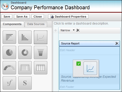
To drag and drop a line chart from the Components tab, you simply select, hold, and drag the icon onto the source, as shown here:
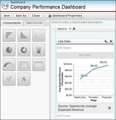
Again, using the drag and drop feature, it is possible to rearrange components. Start by grabbing components by the header bar and then dragging them to the right-side location on the dashboard.
As shown in the preceding screenshot, you can edit or delete the dashboard component and also edit the header, title, and footer.
Here, you can also delete the data source associated with the dashboard component.
To set dashboard properties, follow these steps:
- Edit a dashboard and click on Dashboard Properties.
- Enter a title for the dashboard.
- Select a folder to store the dashboard.
- Under Component Settings, select the title color and size, text color, and background fade. If you don't want a gradient, choose the same color for both Starting Color and Ending Color.
- Click on Save.
Deleting a dashboard also deletes the components within it, although the custom reports used by the components are not deleted. Deleted dashboards are moved to the recycle bin.
To delete a dashboard, follow these steps:
- Click on the Dashboards tab.
- Click on Go To Dashboards List.
- Choose the folder where the dashboard is stored.
- Click on Del next to the name of the dashboard.
Dashboards can be printed using the web browser's print option. Set the paper orientation to print in a landscape format so that it is wide enough for all three columns of dashboard components.
Note
Some dashboards might not print as expected due to browser issues. Here, you can try resizing the dashboard columns and removing the browser-imposed headers and footers. Also, setting the paper orientation to print in landscape format can help ensure that the printed output is wide enough for all three columns that contain the dashboard components.