
Performance Tips
Although we all love carrying the Internet in our pockets, getting it in such a small container has come with a number of compromises. Namely, mobile devices are considerably underpowered when compared with desktop alternatives. Therefore, when developing for mobile, performance should always be one of your main concerns.
Mobile bandwidth
One of the major challenges in mobile development is optimizing for mobile bandwidth. High-speed Internet allows web apps to fly for desktop browsers, but mobile apps tend to crawl at the speed of dial-up. Sure, advances in mobile networks have brought faster connections, but these improvements are met with increased expectations on what mobile apps should deliver. Furthermore, these networks can be spotty—you shouldn’t assume users always have 4G.
One of the best ways to improve the performance of your mobile app is to reduce its bandwidth needs.
Fewer images, more CSS
Assuming you don’t need any video or audio, the largest bandwidth consumer in your app is most likely imagery. Fortunately, modern mobile browsers offer a variety of CSS3 properties that can be used to avoid images wherever possible.
For instance, instead of using a separate image for each button in the Corks app, you used rounded corners, gradients, and borders generated purely with CSS. Although the CSS for these properties can be pretty long with vendor-specific prefixes, it is nothing compared to what it would cost in actual images. Furthermore, CSS is much easier to manage and modify whenever changes need to be made.
Beyond basic styling, you can really get creative and draw fairly complex objects using CSS. You can use border-radius to draw circles, border tricks to draw triangles, and then combine these with standard rectangles to draw any number of compound shapes. For more information, see http://jonraasch.com/blog/drawing-with-css.
Asset management—minification, gzipping, CDNs
In addition to avoiding images wherever possible, you should also be ensuring that the files in your app are served as small as possible. A few quick tricks can make substantial differences, typically cutting non-image file sizes by more than 75%.
First, make sure that you are minifying anything that can be minified: CSS, JavaScript, and HTML. Minification removes all the unnecessary white space from your files, and can significantly reduce file size.
To minify your files, we suggest using the YUI compressor and the command line. But if you aren’t comfortable with the command line, there are a variety of web-based minifiers, such as what you find at http://refresh-sf.com/yui/.
Next make sure to gzip all the files you minified. Gzipping takes the already compressed files and makes them even smaller, typically reducing their size by 60% to 85%. After gzipping your files, make sure to serve them with the right HTTP headers:
• Content-Encoding should be gzip.
• Content-Type should match the file type (for example, text/css, text/js, text/html).
Finally, it is a good idea to serve static assets from a separate subdomain. That’s because any file served on your main domain will be served not only with the file data, but also with HTTP header data. Header data includes all the cookies from the site and other bloat that should not be served with every single image, style sheet, or JavaScript file.
Avoid the extra bytes by serving images, style sheets, and JavaScripts from a different domain, either by setting up a subdomain manually or leveraging a CDN such as Amazon S3.
User agent redirection
Finally, if you are serving a separate desktop version of the app, you will encounter additional bandwidth concerns. That’s because desktop apps typically contain more content because they have more screen real estate to work with. This extraneous content can be easily hidden with CSS media queries; however, this is rarely the best approach.
That’s because the content hidden by CSS is still downloaded by the user’s device, even if the markup is never rendered. That causes a significant amount of bloat and an unnecessary strain on mobile bandwidth.
It is usually a good idea to leverage user agent redirection, to redirect mobile users to a separate mobile subdomain, which serves pared-down, mobile-specific markup.
You can also serve pared-down CSS with only the styles you need for mobile.
Although the approach is relatively straightforward, user agent redirection is actually quite complicated in practice. That’s because new devices and browsers are being released constantly, which makes the list of possible user agents ever expanding.
Furthermore, certain devices spoof the user agent strings of desktop browsers. For instance, some mobile devices pretend to be desktop browsers to trick websites into serving them fully featured non-mobile sites. This subterfuge makes the device seem better because it provides a richer browsing experience (even if that experience is slower and ultimately worse for the user).
Maintaining a completely current user agent list is a futile effort at best. Fortunately, a number of user agent services can do the legwork for you:
• Detect Mobile Browsers, www.detectmobilebrowsers.com: Basic mobile redirection in a variety of languages.
• MobileESP, http://blog.mobileesp.com/: PHP and JavaScript APIs for mobile device detection.
• WURFL, http://wurfl.sourceforge.net: WURFL is a frequently updated XML file that provides fine-grained information about mobile devices and their individual capabilities.
Because you only need basic mobile redirection, use one of the scripts from www.detectmobilebrowsers.com.
If you are using an Apache server, the best option is to use the Apache script, which is an .htaccess script that will redirect any mobile browser to your mobile subdomain. Simply replace http://detectmobilebrowser.com/mobile with your subdomain in the code, then add it to the .htaccess file in your site.
It’s a good idea to use the Apache script here since it will be the most efficient. The JavaScript version can cause more bandwidth problems than it solves, because users will begin downloading the full site page before the script kicks in and redirects them to the mobile site.
JavaScript optimizations
In addition to reduced bandwidth, mobile devices also suffer from poor processor performance. This means that you need to optimize your JavaScript, especially in a highly interactive app like Corks.
Focusing on big performance gains
You could, quite literally, optimize your app forever. However, instead of refactoring the entire codebase, wouldn’t you rather determine problem areas where you can see the biggest gains?
One important lesson is that you should rarely pre-optimize. That means that you shouldn’t go blindly through the Corks app, changing every piece of JavaScript that could run faster. Optimizations like this can make the codebase disorganized and difficult to read (not to mention the extra development hours).
Rather, you should optimize the code only after you notice an actual problem. For instance, when testing the app, you will probably find a section that runs slower than you like.
Now that you’ve narrowed down the piece of the app you want to improve, you can still optimize smarter. Are there any loops or functions that get called repeatedly? First take a look at these sections, because each improvement will be multiplied by the number of times it is called.
Besides the loops explicitly called in your code, you should also be aware of any hidden loops that are called by jQuery. For example, jQuery.animate() may look like a single function, but it sets up an interval that is called repeatedly over the duration of the animation.
Triggering hardware acceleration
Hardware acceleration is a great way to optimize choppy JavaScript animations in mobile devices. It’s one of my favorite optimization techniques; it’s not only easy to implement, but also leads to substantial performance gains.
Performance improvements don’t make animation faster; they make it smoother. That’s because better performance allows the browser to render the frames of the animation faster. More rendered frames mean a higher frame rate.
Hardware acceleration takes rendering tasks off the general processor (CPU) and offloads them to the graphics processor (GPU). This relieves the often-overworked CPU, and also achieves the rendering on the graphics card, which is more suited for these specific tasks.
Fortunately, triggering GPU processing is extremely easy in WebKit browsers (such as iOS Safari and Android Browser). To add hardware acceleration to any element in the DOM, simply attach the following CSS:
-webkit-transform: translateZ(0);
Be careful when using experimental CSS properties in different versions of Android and iOS (and even across different Android devices using the same version). Browser support may be lacking so it is important to test your app thoroughly, and accept degradation issues where applicable.
This snippet sets a 3D transformation on the element; however, because it translates by 0 units along the z-axis, it actually stays in the same place. This doesn’t modify the appearance, but it does trick the browser into thinking it is rendering 3D. Thus, if the device has a GPU, it will be used to render the element.
Now don’t go applying this hack to every element in the DOM. Most static elements don’t need this treatment, and you shouldn’t overload the GPU, or it won’t be able to help you in situations where you actually need hardware acceleration.
This hack is ideal for any heavily animated elements. If you notice a choppy animation, that’s a perfect time to use this technique
Going full screen in iOS
In Chapter 5 you learned how to use the UIWebView in iOS to provide a full screen experience for your app. While the UX implications of Full Screen mode are fairly obvious, it also introduces some subtler performance concerns.
UIWebView is used in full screen web apps as well as some native apps from the App Store.
Unlike Mobile Safari, the UIWebView cannot leverage the super-fast Nitro JS Engine. That means your JavaScript will run slower if the user bookmarks your app and launches it from the homescreen.
The reason for Apple’s decision to disable the Nitro JS Engine in UIWebView seems to be security. One of the biggest performance improvements in Nitro stems from the use of “Just-In-Time” (JIT) compilation. A JIT needs the ability to mark memory pages in RAM as executable, which goes against iOS’ core security measures.
While iOS is content to grant Mobile Safari these privileges, it is not comfortable extending the same privileges to web apps on the home screen. These apps run as native apps on the device, while leveraging externally sourced remote data. Granting this type of access to these types of apps is simply unacceptable in Apple’s “walled garden” model for iOS apps.
Object caching in jQuery
Another common technique for improving JavaScript performance is caching any objects you reuse as local variables. For instance, imagine you have to dig into an object to find a reference such as foo.bar.blah. If you end up referencing this inner item frequently, you can save processing power by caching it as a variable:
var localBlah = foo.bar.blah;
// whatever you want to do with localBlah
This technique used to make a sizable difference, but browsers have since optimized a great deal for deep object lookups. Therefore, you typically shouldn’t bother with this type of caching.
However, there are still a number of areas where caching can make a substantial difference. Namely within jQuery DOM references, such as:
$(‘div.special’).hide();
$(‘div.special’).addClass(‘blah’);
While jQuery’s Sizzle engine has optimized substantially for these types of references, DOM lookups are still one of the slowest processes in the library. Therefore, you should avoid repeating DOM lookups wherever possible.
In the preceding example, you can take advantage of jQuery chaining to knock out the second reference to this element:
$(‘div.special’).hide().addClass(‘blah’);
This is great for any situation where you are calling a number of methods on an element in succession. However, there are other times when you reference a given element multiple times throughout the code. In these cases, you should cache the lookup:
var $elem = $(‘div.special’);
$elem.hide();
...........
...........
$elem.addClass(‘blah’);
Now the next time you reference this element, you will be able to skip the lookup. Notice the $ pattern that is added to $elem—this is a common practice to signify that a variable represents a DOM reference.
Of course, there are times you wouldn’t want to cache a DOM lookup—for instance, when the collection of elements has changed.
Measuring JavaScript performance
Most development tasks can be accomplished in more than one way. When deciding between different approaches, it is often helpful to determine which is the best for performance.
For simple A/B testing, use a benchmark test, such as those provided at JSPerf (www.jsperf.com). JSPerf allows you to set up two scripts, and then run them in the browser of whichever device you are testing. The results of the tests show which script executed the fastest, as shown in Figures 12-10 and 12-11:

Figure 12-10: A basic benchmark test on JSPerf. In this test, the cached DOM reference is fastest.

Figure 12-11: You can easily compare different browsers and environments with JSPerf. Simply hit the performance test with each browser you want to test, and JSPerf will save the results for comparison.
For more complicated tests, and to have the capability to test within the actual app you’re building, you can use the Timeline in Chrome’s Developer Tools, as shown in Figure 12-12.
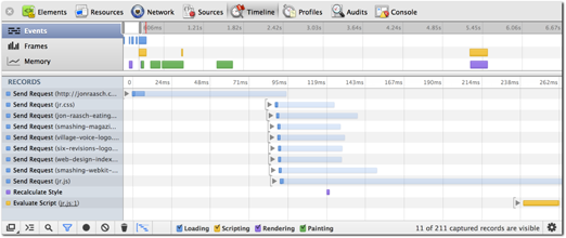
Figure 12-12: This Timeline shows how long it takes to process different aspects of the page.
The Timeline shows a variety of useful information. If you are concerned only with JavaScript processing, simply uncheck everything except Scripting.
CSS optimizations
Although you will most likely see larger performance gains from optimizing bandwidth or JavaScript, CSS optimizations can also provide worthwhile performance improvements for your app.
CSS performance is notoriously difficult to test, so you’ll mostly have to rely on qualitative assessments, such as whether the app seems faster.
Animating with CSS instead of JavaScript
You’ve already learned how to employ hardware acceleration to improve performance and make animations smoother. However, you can go the extra mile and make your animations even smoother by avoiding JavaScript altogether.
One of the new features available in CSS3 is animation, through both smooth transitions and versatile keyframe animations. Both types of animation are made with CSS, so all the animation occurs directly in the renderer. That said, the browser is able to optimize for these tasks much better than it can for JavaScript animation.
Switching your jQuery animations for CSS3 animations can lead to substantial frame rate increases and a smoother looking animation. However, this change comes with a few drawbacks:
• CSS animations can be a bit clunkier to work with than jQuery alternatives.
• Animating in the CSS can lead to poor architecture. Animation is a scripting task that must be triggered from the JavaScript layer; however, the actual animation is in the style sheet.
• CSS animations are not as versatile or powerful as jQuery alternatives.
CSS animations are not supported on older iOS/Android devices, where they will revert to static style changes without any animation. While this can often be included as graceful degradation, you can also provide a jQuery fallback if the animation is essential to your app.
For instance, say you want to slide a div out of the window while fading it out. In jQuery, you might write:
$(‘.my-div’).animate({
left: 3000,
opacity: 0
}, 1000, ‘swing’);
This script slides the div 3000px to the left and fades it out over the course of 1 second, using the swing easing function. As you will soon see, you can recreate all these aspects of the animation using CSS.
The easiest method to accomplish this involves CSS transitions. First, set up a new class, .hidden, for the element:
.my-div.hidden {
left: 3000px;
opacity: 0;
}
Next, set up a transition on the element:
.my-div {
-webkit-transition: all 1s ease;
-moz-transition: all 1s ease;
transition: all 1s ease;
}
Here, you set up a transition to smoothly animate any CSS changes to this element (taking advantage of various vendor prefixes for different browsers). Within this transition, you mirrored the properties of the jQuery animation: a duration of 1 second, and the ease timing function (which is similar to jQuery’s swing).
Finally, to trigger the animation, apply the class using jQuery:
$(‘.my-div’).addClass(‘hidden’);
Now, simply adding this class name triggers the animation, which will look much smoother on mobile devices. However, it still has a number of disadvantages:
• The same transition will be applied to any style change on this element. Although you can limit which properties get transitioned (and even set up different transitions for different properties), you cannot use different animations on a case-by-case basis. For instance, if you want to fade this element back in, it will also have to be done over a duration of 1 second.
• Callback functions can get tricky when used with transitions. The transition spec provides for an animationEnd event handler, which fires after the transition completes. However, this event fires on every transition of every property. In the preceding example, it would fire twice—once for each the left and opacity transitions.
• This approach can lead to poor architecture because animation tasks are offloaded to the CSS. This problem is exacerbated when combined with callbacks in animationEnd handlers.
You can use keyframe animation instead of transitions if you need more versatility in your animation.
Avoiding reflow
Reflow is a technical term describing how the browser lays out elements on the page in the rendering process. The process occurs not only on the initial page load, but also whenever anything on the page changes and requires a re-rendering of the layout.
Pages rarely avoid additional reflows, even if they don’t have any interactive content. That’s because reflows are governed by more than the markup on the page; they are also driven by the CSS.
For instance, take an image next to a block of text, as seen in Figure 12-13. On the initial page load, the browser has not downloaded this image, so it has no idea what its dimensions will be. Once it downloads, however, the browser needs enough room to accommodate the image, so it pushes the following content downward.

Figure 12-13: The image is first set to arbitrary placeholder dimensions and then pops to its real size after it finishes downloading.
You can avoid this reflow by setting explicit dimensions for the image in your CSS or markup. Simply define its height and width, and the browser will know what size to use before the image even downloads.
Another way to avoid reflow is through absolute positioning. By definition, elements with absolute position will not affect the layout of other elements. Thus you can “sandbox” the reflows of a given section by adding absolute position to its wrapper (e.g., isolate the reflows in a smaller scope).
Avoiding expensive properties
Mobile devices typically support the newer features available in CSS3. However, this can be a double-edged sword because these features are often more difficult to process, a problem exacerbated by these underpowered devices.
Earlier, you learned how to use CSS to avoid images and dramatically reduce your app’s bandwidth needs. Bear in mind, however, that these CSS properties require extra processing power.
For instance, a lot of Android devices show performance problems even with simple properties such as border-radius. For these devices, decide whether you’d be comfortable degrading to simpler styling (square corners), and if not, determine whether the bandwidth benefits of avoiding images justify the processing disadvantages.
And border-radius is just the tip of the iceberg. Processor intensive properties include gradient, box-shadow, text-shadow, and transform, to name a few. These properties may be integral to the styling of your app, but you need to test their performance across a variety of devices, and determine the compromises you’re willing to make if a problem comes up.